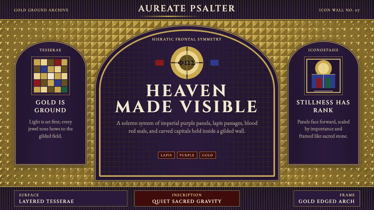
About Byzantine Mosaic / Icon
Byzantine Mosaic is gold ground and holy gravity. For more than a thousand years, from Hagia Sophia in Constantinople to San Vitale in Ravenna, mosaicists laid flat gold tesserae as the infinite light of God, setting against it frontal figures in jewel-toned robes — lapis blue, blood red, imperial purple, emerald green.
This system treats gold as the page itself: a shimmering divine ground, not decoration. Figures and panels are symmetrical, hierarchical, and arch-framed. Letterforms are Roman inscriptional, carved rather than drawn. The effect is quiet and sacred, never casual — the interface as icon, the viewer as pilgrim.
- Origin
- Constantinople / Ravenna / Mount Athos / Kyivan Rus'
- Era
- 330–1453 CE (Byzantine Empire); Orthodox icon tradition continues to today
- Key figures
- Emperor Justinian I · Andrei Rublev · Master mosaicists of Ravenna
- Movements
- Byzantine mosaic art · Orthodox icon painting · Italo-Byzantine style
Byzantine Mosaic / Icon design spec
Colors
Typography
The other 11 sections — buttons, cards, spacing, motion, techniques and more — open once you unlock. Download the DESIGN.md or send it to your AI in one click. Unlock once, yours forever.
Sign up nowStyles similar to Byzantine Mosaic / Icon
Also inspired by art & artists, with a close feel.
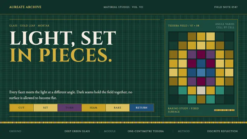 Ravenna Gold MosaicLight lives between pieces. Gold cells, green glass and dark seams make the surface shimmer.
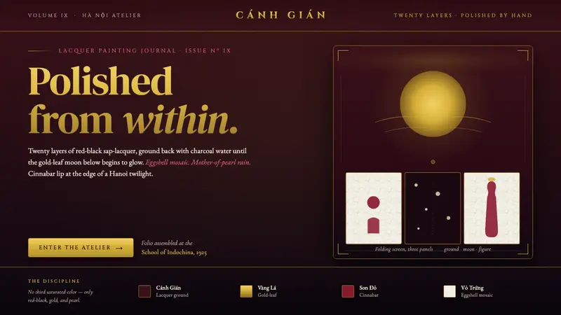 Vietnamese Sơn Mài LacquerTwenty layers polished to glass. Cockroach-wing red-black ground, gold-leaf moon, eggshell-mosaic figures.
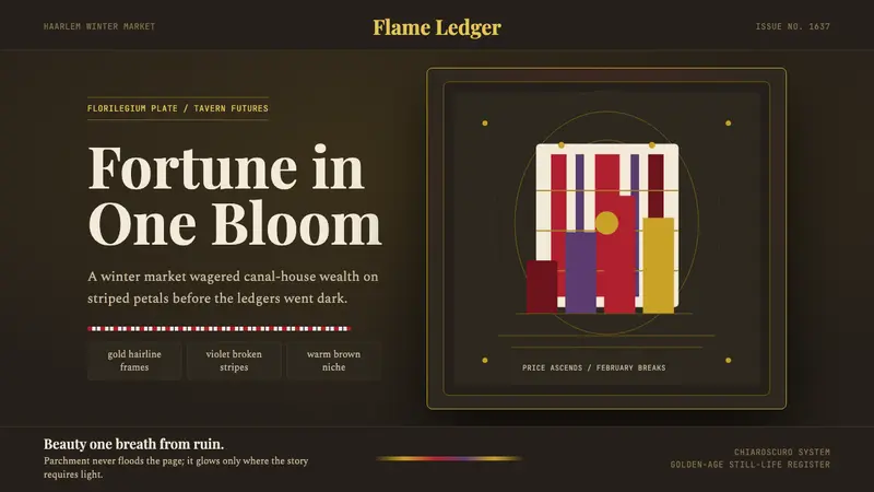 Dutch Tulip ManiaSpeculation burns in shadow. Flame red petals, violet stripes, gold frames on warm brown.
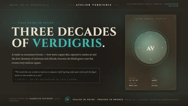 Bronze Patina StatueThree decades of weather, worn as a coat. Verdigris crust on dark bronze, engraved Roman capitals.