Design style guide设计风格指南
What is Bhutanese Drukpa Kagyu Thangka?什么是 Bhutanese Drukpa Kagyu Thangka?
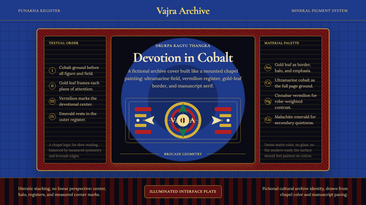
Bhutanese Drukpa Kagyu Thangka translates a thousand years of sacred chapel painting into a design language of mineral-deep cobalt grounds, brocade-patterned borders, and gold-leaf accents that treat every interactive element with the reverence of an illuminated manuscript.不丹竹巴噶举派唐卡将千年圣殿绘画传统转化为设计语言——矿物质感的深钴蓝底色、锦缎纹样边框,以及以金箔光泽对待每一个交互元素,如同一部数字手绘经卷。
Bhutanese Drukpa Kagyu Thangka in briefBhutanese Drukpa Kagyu Thangka 速览
Bhutanese Drukpa Kagyu Thangka is a design system rooted in the sacred scroll-painting tradition of Bhutan's dominant Buddhist lineage. Where Tibetan thangka painting from the Gelug school tends toward warmer ochre grounds, the Drukpa Kagyu tradition favored by Bhutanese monasteries is distinguished by its cooler, richer palette: deep ultramarine-cobalt backgrounds that evoke lapis lazuli pigment, figures rendered in vermilion and saffron against that mineral ground, and a pervasive ornamental vocabulary drawn from brocade textiles, cloud-scroll motifs, and the gold-leaf embellishment that covers architectural elements throughout Bhutan's dzongs.不丹竹巴噶举派唐卡是一套根植于不丹主流佛教传承之圣卷绘画传统的设计系统。西藏格鲁派唐卡倾向于较暖的赭石底色,而不丹寺院所推崇的竹巴噶举传统则以更冷、更浓郁的色盘为标志:深群青钴蓝背景召唤青金石颜料的矿物质感,朱砂红与番红黄的造像在这片矿物底色上浮现,锦缎纹样、云卷纹饰与金箔装饰构成普遍的装饰词汇——后者在不丹宗堡建筑的每一个构件上都无处不在。
The system's visual logic is inseparable from its devotional purpose. Thangka paintings are not decorative objects — they are meditation supports, teaching tools, and portable chapels. Every compositional choice follows a textual canon: the proportions of the deity figure, the arrangement of attendant figures, the symbolic color assigned to each direction of the mandala's compass, and the width of the ornamental border are all governed by iconometric treatises transmitted through the monastic lineage. The design system inherits this layered intentionality: nothing is placed arbitrarily. Structure serves meaning, and meaning is encoded in centuries-old conventions.这套系统的视觉逻辑与其礼拜功能不可分割。唐卡绘画并非装饰品,而是禅修支撑、教学工具与可携带的佛殿。每一项构图选择都遵循文字规范:造像比例、眷属排列、曼陀罗方位所对应的象征色彩、装饰边框的宽度,皆由经由宗派传承下来的量度论所规定。本设计系统承接这种层层叠叠的意图性:没有任何元素是随意放置的。结构服务于意义,意义被编码在历经数百年的惯例之中。
As a contemporary interface aesthetic, Bhutanese Drukpa Kagyu Thangka works through contrast and containment. The deep cobalt ground immediately establishes depth and gravity; warm gold accents on that darkness read as luminous rather than loud; and the brocade-pattern border system provides a structural frame that organizes content without imposing a Western grid rigidity. The overall register is rich, solemn, and ceremonial — appropriate for contexts where the product's authority and depth are as important as its usability.作为当代界面美学,不丹竹巴噶举派唐卡通过对比与围合发挥作用。深钴蓝底色立刻建立深度与庄重感;温暖的金色点缀在那片幽暗之上,读来是发光而非喧嚣;锦缎纹样边框体系提供结构框架,在不施加西方网格刚性的前提下组织内容。整体气质浓郁、庄穆而具仪式感——适合那些产品权威性与深度同可用性同等重要的场景。
See the Bhutanese Drukpa Kagyu Thangka design system →查看 Bhutanese Drukpa Kagyu Thangka 完整设计系统 →
Where does Bhutanese Drukpa Kagyu Thangka come from?Bhutanese Drukpa Kagyu Thangka 从何而来?
The Drukpa Kagyu lineage traces its founding to the twelfth century, when the Tibetan master Tsangpa Gyare Yeshe Dorje established the school after witnessing a vision of nine dragons rising from the earth — the name Druk, meaning 'dragon' or 'thunder dragon', became the lineage's symbol and eventually the name of Bhutan itself. The lineage's painting tradition drew on the broader Tibetan thangka canon but developed a distinctly cooler and more gold-saturated aesthetic as the school took root in the valleys of western and central Bhutan, where the high-altitude light, the mineral richness of locally sourced pigments, and the particular aesthetic preferences of Bhutanese patrons shaped the tradition over centuries.竹巴噶举传承的创立可追溯至十二世纪,藏族上师藏巴嘉热耶喜多吉在见到九条龙从大地腾升的异象后建立了此宗派——「竹」(Druk)意为「龙」或「雷龙」,成为传承的象征,最终也演变为不丹国名的来源。该传承的绘画传统脱胎于更广泛的藏族唐卡规范,但随着宗派在不丹西部与中部谷地扎根,逐渐形成了更冷峻、更富金色的独特美学——高原光线、本地矿物颜料的丰富性,以及不丹施主数百年来的特定审美偏好,共同塑造了这一传统。
The defining political and cultural event for Bhutanese religious art was the unification of Bhutan under Zhabdrung Ngawang Namgyal between 1616 and 1651. Zhabdrung — himself a Drukpa Kagyu master — constructed a series of dzongs, the fortress-monasteries that remain Bhutan's most distinctive architectural form, and established a unified national religious art program centered on the Zorig Chusum, the thirteen traditional arts and crafts. Thangka painting, known in Bhutanese as tshem, was codified as one of the thirteen crafts, and its iconometric rules, pigment recipes, and compositional conventions were standardized and transmitted through formal monastic training. The Punakha Dzong, completed in 1638 and still the winter seat of Bhutan's central monastic body, established the interior chapel aesthetic — deep cobalt walls, gold-leaf relief ornament, silk brocade altar skirts, and gilded bronze sculptures — that became the visual reference for the entire tradition.决定不丹宗教艺术面貌的关键政治与文化事件,是夏宗·阿旺南嘉(Zhabdrung Ngawang Namgyal)于1616至1651年间完成的不丹统一。夏宗本人既是竹巴噶举上师,又构建了一系列宗堡——这种要塞寺院至今仍是不丹最具辨识度的建筑形式——并以「卓尔钦松」(Zorig Chusum,十三传统艺术)为核心,建立起统一的国家宗教艺术体系。唐卡绘画(不丹语称「琛」)被编入十三艺之一,其量度规则、颜料配方与构图惯例经由正式的寺院训练得到系统化传承。普纳卡宗(1638年竣工,至今仍是不丹中央僧团冬季驻锡地)确立了佛殿内部的视觉标准——深钴蓝墙面、金箔浮雕装饰、丝绸锦缎供桌裙与鎏金铜像——成为整个传统的视觉参照原点。
The Zorig Chusum tradition was nearly broken during the late twentieth century as modernization brought imported visual culture and the economic pressure to train students in commercially viable skills rather than the years-long discipline of traditional painting. The founding of the Choki Traditional Art School in Thimphu in 1997 by Choki Dorji marked a deliberate effort to reverse this erosion. The school trains students in the full canonical curriculum: grinding and preparing mineral pigments from lapis, malachite, vermilion, and gold; constructing and sizing the cloth support; applying the precise iconometric grid that governs figure proportions; and completing the work with the gold-leaf outlining technique that gives Bhutanese thangka its characteristic luminosity.二十世纪末,随着现代化带来外来视觉文化的冲击,以及将学生培养转向商业实用技能的经济压力,卓尔钦松传统面临几近断裂的危机。1997年,曲吉多吉(Choki Dorji)在廷布创立了曲吉传统艺术学校,标志着一次有意识的逆转努力。该学校将学生培养纳入完整的经典课程:研磨并调制来自青金石、孔雀石、朱砂与黄金的矿物颜料;制作与上胶布质底材;施用规定造像比例的量度方格网;以及以金箔勾线技法完成作品——正是这一工序赋予不丹唐卡独特的发光质感。
Contemporary Bhutanese thangka painting exists in a dual register. Within the monastic tradition, it remains a living devotional practice — commissions for new monastery murals and portable thangkas continue, and the Choki school regularly provides painters for major restoration and new construction projects, including work at the Tashichho Dzong in Thimphu. Alongside this, the tradition has attracted international interest as both a fine-art commodity and an aesthetic reference point for design work that seeks to communicate depth, cultural rootedness, and the particular visual authority of a tradition that is simultaneously ancient and alive.当代不丹唐卡绘画存在于双重语境之中。在寺院传统内部,它仍是鲜活的礼拜实践——新寺院壁画与便携唐卡的委托制作持续进行,曲吉学校定期为重大修复与新建工程提供画僧,包括廷布扎西曲宗的相关工作。与此同时,这一传统吸引了国际社会的广泛关注,既作为精英艺术市场的商品,也作为设计领域的美学参照——对于那些希望传达深度、文化根性,以及一个既古老又鲜活之传统所特有视觉权威性的设计项目而言,竹巴噶举唐卡提供了无可取代的参照语言。
What defines the Bhutanese Drukpa Kagyu Thangka look?Bhutanese Drukpa Kagyu Thangka 的视觉特征是什么?
Ground and Depth底色与深度
The defining visual foundation of this system is a deep ultramarine-cobalt background that functions not as a neutral field but as an active depth. Unlike Western dark backgrounds that can read as empty or void, the Bhutanese chapel tradition treats the deep blue-black as the space of awakened mind — a saturated presence rather than an absence. Elements placed against it appear to float within rather than rest upon the surface. This creates a layered spatial quality that contemporary interface work can deploy to signal depth, gravitas, and interiority without resorting to simulated three-dimensionality.本系统的核心视觉基底是深群青钴蓝背景,它不是中性的衬底,而是一种主动的深度。与西方深色背景常带来的空洞感或虚无感不同,不丹佛殿传统将这片深蓝-黑作为觉醒心智的空间——是饱满的在场,而非缺席。置于其上的元素仿佛悬浮于内部,而非搁置于表面。这种层叠的空间质感,是当代界面设计无需借助模拟三维感便能传达深度、庄重与内敛性的有效手段。
Gold as Light金色即光
Gold in the thangka tradition is not an accent color but a fundamental structural material. Applied as a thin, burnished leaf over prepared grounds, it creates a surface that reflects ambient light with a warmth no paint pigment can replicate. In the design system, gold functions as the primary interactive and hierarchical signal: it marks the edges of figures, the titles of sections, the ornamental borders of frames, and the focal points of the composition. Against the deep cobalt ground, even a very thin gold line reads with extraordinary visual presence. The principle: gold should be applied sparingly enough that every instance retains its luminous authority rather than becoming background noise.唐卡传统中的金色并非强调色,而是一种根本性的结构材料。将薄薄一层金箔研磨打光于备好的底材之上,其表面反射环境光的温度是任何颜料都无法复制的。在本设计系统中,金色充当首要的交互与层级信号:标记造像轮廓、章节标题、画框装饰边框与构图的视觉焦点。在深钴蓝底色上,即便极细的金线也具有超凡的视觉存在感。原则在于:金色的使用必须足够节制,让每一处出现都保有其发光权威,而不沦为背景噪音。
Brocade Structure锦缎结构
Traditional thangka paintings are mounted in silk brocade borders before being rolled for storage — a textile frame in rust-red, gold, and deep blue that both protects the painted panel and orients the viewer's attention. This brocade logic translates into the design system as a border and container vocabulary: decorative frames around cards and panels, patterned dividers between content sections, and ornamental rules that carry visual weight without interrupting reading flow. The brocade border signals containment and completion — content within the frame is finished and considered, rather than merely accumulated.传统唐卡在卷存之前会装裱在丝绸锦缎边框内——以锈红、金色与深蓝构成的织物框架既保护绘画本体,又引导观者的注意力。这种锦缎逻辑在设计系统中转化为边框与容器词汇:卡片与面板的装饰框架、内容段落间的纹样分隔线,以及承载视觉分量而不打断阅读流的装饰性横线。锦缎边框传递围合与完成的信号——框内的内容是被精心考量过的整体,而非随意堆叠的集合。
Warm Pigment Figures暖色造像
Against the cool cobalt ground, the principal figures in Bhutanese thangka are rendered in warm, saturated pigments: vermilion red for wrathful protector deities, saffron and gold for peaceful bodhisattvas, deep green for certain emanations, and flesh tones built from layered warm washes. This systematic warm-cool contrast is the engine of the tradition's visual drama. In interface terms, it suggests placing warm-toned content elements — calls to action, featured items, primary navigation labels — against the cool deep background, creating a figure-ground distinction that is simultaneously aesthetic and functional.在清冷钴蓝底色的映衬下,不丹唐卡的主体造像以温暖、饱和的颜料绘就:忿怒护法神以朱砂红呈现,寂静菩萨以番红黄与金色为主调,某些化身以深绿表现,肤色则由层叠的温暖透明色叠加而成。这种系统性的冷暖对比是唐卡视觉张力的引擎。在界面设计中,这意味着将暖色内容元素——行动号召、特色展示、主导航标签——置于冷暗底色之上,形成一种兼具美学与功能的图地区分。
Iconometric Order量度秩序
The most discipline-specific characteristic of the thangka tradition is iconometry — the canon of proportional rules governing the placement and scaling of every figure in the composition. Before a monk-painter begins work, the canvas is divided into a precise grid from which the dimensions of the central figure, the positions of flanking attendants, the height of the throne, and the placement of landscape or architectural elements are all derived. The grid is not visible in the finished work, but its organizing logic pervades every spatial relationship. This principle translates into interface design as a commitment to proportional systems: establishing a base module and deriving all dimensions from it, so that even complex layouts maintain an underlying harmony that users perceive as order even when they cannot name its source.唐卡传统最具学科特殊性的特征是量度——规定构图中每一尊造像的位置与比例的规范体系。画僧动笔之前,画布先被划分为精确的方格网,中心造像的尺寸、胁侍的位置、法座的高度、山水或建筑元素的布局,皆由此网格推导而来。格网在成品中不可见,但其组织逻辑渗透于每一处空间关系之中。这一原则转化为界面设计的承诺,即坚守比例体系:确立一个基础模数,并从中推导所有尺度,使复杂版面也保有潜在的和谐——用户感受到这种秩序,即便无从说出其来源。
Layered Ornament层叠装饰
Unlike minimalist traditions that treat all ornament as decoration to be removed, the Bhutanese thangka tradition treats ornament as a carrier of meaning. Cloud-scroll borders signal the celestial realm; flame aureoles around figures indicate the heat of spiritual transformation; lotus thrones mark awakened status; jewelry details on deity figures identify the specific iconographic program. Ornament in this system is not surface dressing — it is semantic content. Contemporary application of this principle requires selecting ornamental elements that carry coherent meaning rather than deploying decorative patterns purely for visual richness. Each pattern choice should be justifiable as a signal, not merely a texture.与将一切装饰视为需要去除之物的极简传统不同,不丹唐卡传统将装饰视为意义的载体。云卷边框指示天界领域;造像周围的火焰光轮象征灵性转化的热能;莲花法座标记觉悟状态;造像身上的珠宝细节标识特定的图像学内涵。这套系统中的装饰不是表面装扮——它是语义内容。当代应用这一原则,要求选取承载连贯含义的装饰元素,而非仅为视觉丰富性而部署纹样。每一个纹样选择都应能被解释为一个信号,而不仅仅是一种质感。
Solemn Verticality庄穆纵向性
Thangka compositions are almost invariably vertical — the scroll format descends from the central deity figure through attendants, offerings, and landscape elements toward the patron dedication at the base. This vertical reading direction, from the sacred center outward and downward to the human world, gives the compositions their particular gravity. In interface design, this translates to an affinity for tall, vertical layouts with a strong central axis, generous top margins that establish hierarchy before content begins, and a downward reading flow reinforced by ornamental dividers and nested containers rather than horizontal banding.唐卡构图几乎无一例外是纵向的——卷轴格式从中心造像向下延伸,经过眷属、供品与山水元素,最终抵达画面下方的施主题记。这种从神圣中心向外向下、抵达人间的纵向阅读方向,赋予构图特有的庄重感。在界面设计中,这转化为对高耸纵向版面的亲和力:强烈的中心轴线、在内容开始之前即建立层级的充裕顶部留白,以及由装饰性分隔线与嵌套容器强化的向下阅读流——而非依赖横向分区。
See the Bhutanese Drukpa Kagyu Thangka design system →查看 Bhutanese Drukpa Kagyu Thangka 完整设计系统 →
Who shaped Bhutanese Drukpa Kagyu Thangka?谁塑造了 Bhutanese Drukpa Kagyu Thangka?
The Zhabdrung — literally 'at whose feet one submits' — was the Drukpa Kagyu hierarch who unified Bhutan in the first half of the seventeenth century and, in so doing, established the institutional framework within which Bhutanese religious art has been practiced ever since. His construction of the dzong network gave the thangka tradition its defining architectural patron contexts: the monastery fortress interiors, with their deep cobalt mural programs and gilded altar furniture, set the visual standard that all subsequent Bhutanese painting would aspire to. He is not only a historical figure but a symbol of the inseparability of religious, political, and aesthetic authority in the Bhutanese tradition.夏宗(字面意义为「臣服于其足下者」)是十七世纪上半叶统一不丹的竹巴噶举法王,也由此奠定了此后不丹宗教艺术赖以运作的制度框架。他修建的宗堡网络为唐卡传统提供了决定性的建筑赞助语境:深钴蓝壁画程序与鎏金供桌的宗堡内部,确立了此后所有不丹绘画所追求的视觉标准。他不仅是一个历史人物,更是不丹传统中宗教、政治与美学权威不可分割性的象征。
The eighth-century Indian tantric master who is credited with establishing Buddhism in Tibet and Bhutan is the most frequently depicted figure in Bhutanese thangka painting. Known in Bhutan as Guru Rinpoche, his iconography — the curled mustache, the khatvanga trident staff, the eight forms representing different aspects of his activity — is a complete visual vocabulary that every Bhutanese thangka painter masters as a prerequisite to any other commission. His presence in the thangka tradition represents the continuity of the Indian tantric transmission into the Himalayan world, and his eight manifestations serve as a catalogue of the visual range the tradition can express, from the gentleness of Pema Jungnay to the fierce blue-black of Dorje Drolo.这位八世纪的印度密续上师被认为是在西藏与不丹建立佛法的祖师,也是不丹唐卡绘画中描绘频率最高的造像。在不丹,他被尊称为「咕噜仁波切」,其图像标志——卷曲胡须、颅杖三叉戟、代表不同事业的八种化身——构成一套完整的视觉词汇,是每位不丹唐卡画僧在承接任何其他委托之前必须掌握的基础。他在唐卡传统中的在场代表印度密续传承延续进入喜马拉雅世界的脉络;其八大化身作为传统视觉幅度的目录,从莲花生的温柔形态到金刚橛那蓝黑色的忿怒相,涵盖了传统可表达的整个视觉范域。
The fifteenth-century Bhutanese tertön — 'treasure revealer', one who discovers concealed sacred texts and objects — whose rediscovered terma teachings became central to the Bhutanese Nyingma-Kagyu fusion tradition. Pema Lingpa is significant to the visual tradition because his revelations include iconometric texts specifying the precise proportional canons for deities particular to the Bhutanese lineage. His descendants, the Peling family, became hereditary custodians of a major temple complex and continued the patronage of thangka production across centuries. In Bhutanese visual culture, the terma tradition represents the possibility of innovation within strict canonical form — a concept relevant to design systems that seek to extend a tradition while respecting its governing principles.这位十五世纪的不丹「伏藏师」——「宝藏揭示者」,即发现隐藏圣典与圣物者——其所发掘的伏藏教法成为不丹宁玛-噶举融合传承的核心。白玛林巴对视觉传统的意义在于:他的伏藏文本包含不丹宗派特有诸尊的量度规范,精确规定了造像的比例法则。其后裔白林家族世代担任一座重要寺院建筑群的守护人,并在数百年间持续赞助唐卡制作。在不丹视觉文化中,伏藏传统代表着在严格规范内部进行创新的可能性——这一概念与那些希望在尊重传统根本原则的同时延伸传统的设计系统高度相关。
The 'Divine Madman' of Bhutan — a fifteenth-century Drukpa Kagyu master whose unconventional behavior and earthy humor made him a beloved popular figure while his paintings and poems contributed to the distinctly Bhutanese inflection of the shared Tibetan thangka tradition. Drukpa Kunley is significant to the design tradition not as a painter but as a symbol of the irreverent vitality that runs beneath the formal canonical surface of Bhutanese religious art. The tradition is ceremonial and structured, but it is not stiff — the humor and humanity visible in the narrative painting programs of many Bhutanese monastery murals reflects a tradition that never lost touch with ordinary life even while depicting the extraordinary.不丹的「疯圣」——这位十五世纪的竹巴噶举上师以其离经叛道的行为与质朴幽默而成为深受爱戴的民间人物,其绘画与诗歌为共同的藏族唐卡传统注入了鲜明的不丹地方色彩。竹巴昆烈对设计传统的意义不在于他作为画家的身份,而在于他作为一种象征:在不丹宗教艺术庄严规范的表面之下,流淌着不羁的生命力。这一传统是仪式性的、有结构的,但绝非僵硬——不丹许多宗堡壁画叙事程序中可见的幽默与人情味,反映了一种从未与日常生活失去联结的传统,即便它所描绘的是超凡之境。
The contemporary Bhutanese master who founded the Choki Traditional Art School in Thimphu in 1997, providing institutional continuity for the Zorig Chusum crafts at a moment when modernization threatened to break the chain of transmission. Under Choki Dorji's direction, the school developed a curriculum that maintains traditional iconometric, pigment-preparation, and compositional training while producing graduates capable of undertaking both traditional commissions and contemporary design applications. His work represents the most explicit living bridge between the historical thangka tradition and its contemporary design applications, and the school has trained painters who have worked on restoration projects throughout Bhutan as well as institutional clients internationally.这位当代不丹大师于1997年在廷布创立曲吉传统艺术学校,在现代化威胁传承链条断裂的关键时刻,为卓尔钦松工艺提供了制度性延续。在曲吉多吉的主持下,学校建立了一套在保持传统量度、颜料调制与构图训练的同时,培养学生承接传统委托与当代设计应用能力的课程体系。他的工作代表着历史唐卡传统与其当代设计应用之间最为明确的现实桥梁;学校所培养的画僧,既参与了不丹各地的修复项目,也服务于国际机构客户。
How do you use Bhutanese Drukpa Kagyu Thangka today?今天怎么用 Bhutanese Drukpa Kagyu Thangka?
Bhutanese Drukpa Kagyu Thangka is not a style to apply lightly. Its visual authority depends on understanding what the system is doing — creating depth through color, signaling hierarchy through gold, containing content through ornamental frames, and building gravity through a solemn vertical reading direction. Applied without this understanding, it risks producing work that is merely dark and ornamented rather than genuinely authoritative. The style rewards investment in its logic and penalizes surface-level borrowing.不丹竹巴噶举派唐卡并非可以随意套用的风格。其视觉权威依赖于对系统内在逻辑的理解——用色彩制造深度,用金色标示层级,用装饰框架围合内容,用庄穆的纵向阅读方向建立庄重感。若缺乏这种理解,作品极易流于黑暗而装饰繁复,而非真正具有权威性。这种风格嘉奖对逻辑的深入投入,惩罚表层借用。
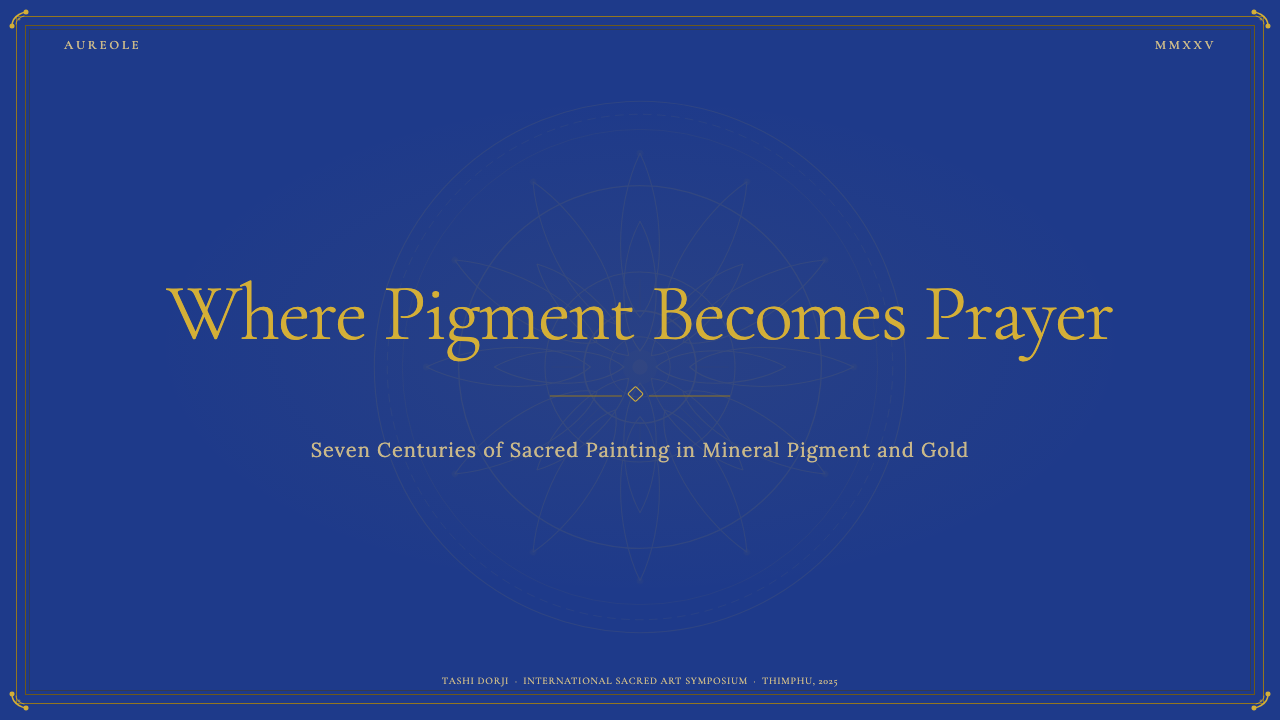
For presentation slides, the system excels on both cover and content pages. A cover benefits from the deep cobalt ground with the title rendered in gold-toned or warm light type, flanked by a border element derived from brocade geometry. Resist the temptation to center everything symmetrically — thangka compositions use a strong central axis but populate the field asymmetrically with figures, offerings, and landscape elements. Content slides should adopt the same ground color with section titles in warm light tones against the deep field; body text in a slightly cooler, more neutral light tone to distinguish it from headings; and thin gold-toned rules to mark section divisions. Data visualizations on this ground are striking: charts and diagrams in warm saffron and vermilion read as active signal against the cool depth.在演示文稿中,本系统在封面与内容页上均表现出色。封面适合以深钴蓝为底,标题以金调或暖亮色字体呈现,两侧饰以源于锦缎几何的边框元素。抵制将所有内容居中对齐的诱惑——唐卡构图使用强烈的中心轴线,但在画面中非对称地布置造像、供品与山水元素。内容页应采用相同底色,章节标题以暖亮调对抗深色底面;正文以略偏冷、更中性的亮调与标题区分;以细金调横线标记段落分隔。在此底色上的数据可视化极为醒目:番红黄与朱砂色的图表在冷暗深度中作为活跃信号显现。
For web interfaces, this system is well-suited to premium, high-gravity contexts: luxury product pages, institutional cultural organizations, spiritual wellness platforms, and any product where authority and depth are primary values. The approach works best with a strong vertical layout, generous spacing between content blocks treated as ornamental breathing room, and card components that use layered border ornament rather than flat lines. Navigation should be minimal and type-led — the ornamental weight is carried by the content frames, not the chrome. Reserve gold accents for primary interactive elements and calls to action so that every gold element reads as a signal worth attending to.对于网页界面,本系统适合高端、高庄重感的场景:奢侈品页面、机构文化组织、精神健康平台,以及任何以权威性与深度为首要价值的产品。方法在于:强纵向版面、将内容块之间的充裕间距作为装饰性呼吸空间、使用层叠边框装饰而非平直线条的卡片组件。导航应简洁且以文字为主——装饰分量由内容框架承载,而非由界面框架负担。将金色强调保留给主要交互元素与行动号召,使每一处金色出现都作为值得注意的信号发挥作用。
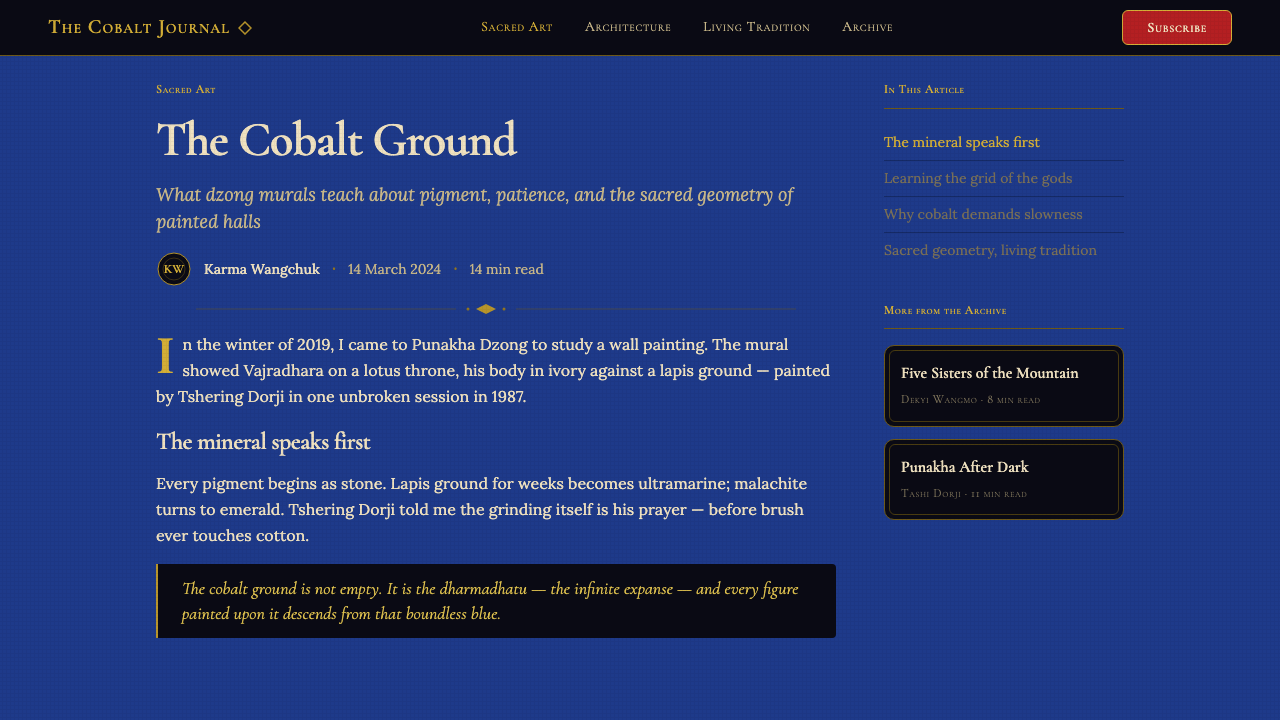
For editorial and marketing applications, the style produces richly atmospheric layouts. A feature article page using this system might set the introductory section against the deep cobalt ground in a full-width header block, then transition to a lighter ground for body text — mirroring the thangka convention of a richly colored central panel within a lighter mounting. Marketing pages benefit from alternating register: full-width hero blocks using the deep ground punctuated by lighter content sections, with the ornamental border vocabulary providing visual continuity across the contrast. The style handles typographic hierarchy well when warm light tones are used for headings and slightly cooler neutral tones for body copy.对于编辑与营销应用,这种风格产生氛围浓郁的版面。使用本系统的专题文章页面,可将引言段落设置为全宽页眉区块的深钴蓝底色,然后过渡到较浅底色的正文区域——映射唐卡「彩色中心面板置于较浅装裱材料之内」的传统惯例。营销页面受益于交替节奏:深色底面的全宽英雄区块,与较浅底色的内容段落交错出现,装饰边框词汇在对比中提供视觉连贯性。当暖亮色调用于标题、略偏冷的中性调用于正文时,这种风格对文字层级的处理游刃有余。
The most common mistake when applying this system is misunderstanding the role of gold. Because the style is so strongly associated with gold ornament, designers sometimes deploy gold across an entire interface — navigation bars, all headings, all interactive elements, background patterns — until the entire surface reads as uniformly gilded. Authentic thangka work deploys gold economically: it appears at structural edges, focal points, and hierarchically primary elements, while the majority of the composition is held in the cool cobalt and the warm pigment tones of the figures. When gold appears everywhere, it disappears as a signal. Reserve it for what is most important.应用本系统时最常见的错误,是误解了金色的角色。由于这种风格与金色装饰的关联如此强烈,设计师有时会将金色铺展至整个界面——导航栏、所有标题、所有交互元素、背景纹样——直至整个表面读来一片镀金。真实的唐卡作品对金色使用极为节制:它出现在结构边缘、视觉焦点与层级首要元素处,而构图的大部分仍保持在清冷钴蓝与造像暖色颜料的底色调之中。当金色无处不在,它便作为信号消失了。将它保留给最重要的内容。
See the Bhutanese Drukpa Kagyu Thangka design system →查看 Bhutanese Drukpa Kagyu Thangka 完整设计系统 →
Bhutanese Drukpa Kagyu Thangka — FAQBhutanese Drukpa Kagyu Thangka · 常见问题
How is Bhutanese Drukpa Kagyu Thangka different from Tibetan thangka style?不丹竹巴噶举派唐卡与藏族唐卡风格有何不同?
The two traditions share the same canonical foundation — the same iconometric texts, the same deity iconographies, the same compositional structures — but diverge in palette and decorative emphasis. Tibetan thangka from the dominant Gelug school tends to use warmer grounds, including ochre and rust-red priming colors, with a more restrained use of gold restricted to outlining and detail work. Bhutanese Drukpa Kagyu thangka characteristically uses a deeper, cooler cobalt blue as the primary ground, applies gold more liberally as both outlining and area fill on ornamental borders and architectural throne elements, and incorporates more prominent brocade textile references in the mounting and border design. The overall effect is more saturated, more jewel-like, and more ornamentally dense than central Tibetan work.两种传统共享相同的规范基础——相同的量度论、相同的造像图像学、相同的构图结构——但在色盘与装饰侧重上有所分化。以格鲁派为主流的藏族唐卡倾向于使用更暖的底色(包括赭石与锈红打底色),金色的使用更为克制,主要限于勾线与细节描绘。不丹竹巴噶举唐卡则以更深、更冷的群青钴蓝为主底色,更为大量地将金色用于勾线与装饰边框及法座建筑元素的面涂,并在装裱与边框设计中融入更为突出的锦缎织物元素。整体效果比西藏中部作品更为饱和、更具宝石感、装饰密度也更高。
Is this style appropriate for non-spiritual or commercial products?这种风格适用于非宗教类或商业产品吗?
Yes, with careful attention to context. The visual language of this system — deep grounds, gold accents, ornamental containment, solemn hierarchy — communicates authority, depth, and premium quality that translates effectively to commercial contexts that share those values. High-end hospitality, cultural institutions, artisanal goods, financial services, and editorial brands have all used related visual registers successfully. The most important consideration is sincerity rather than appropriation: the style should be applied because its values align with the product's values, not as exotic decoration. Avoid deploying religious iconographic elements — deity figures, mantric symbols, ritual implements — in commercial contexts where they would be used purely as aesthetic motifs stripped of meaning.可以,但需要审慎考量情境。本系统的视觉语言——深色底面、金色强调、装饰性围合、庄穆的层级秩序——传递权威性、深度与高端质感,能在共享这些价值观的商业情境中有效转化。高端酒店、文化机构、手工艺产品、金融服务与编辑类品牌都成功运用了相近的视觉调性。最重要的考量是真诚而非挪用:应用这种风格的依据应是其价值观与产品价值观的对齐,而非将其作为异域装饰。避免在商业情境中将宗教图像元素——造像、咒文符号、仪式法器——作为纯粹的美学母题使用,因为这样做会将其从意义中剥离。
How does the system handle light-background contexts if the deep cobalt ground isn't appropriate?若深钴蓝底色不合适,本系统如何应对浅色底面情境?
The system can be inverted, though it requires rethinking the hierarchy logic. On a light or near-white ground, the cobalt becomes an accent and structural color rather than a background, and gold must be used very sparingly since it reads poorly against light backgrounds at low contrast. The more successful light-ground interpretation draws on the mounting and brocade elements of the tradition: a warm cream or parchment ground with cobalt used for structural lines, headings, and primary interactive elements, gold reserved for micro-accents like icon fills or active state indicators, and ornamental border elements in a terracotta or warm ochre that references the rust-red brocade mounting without requiring the dark ground. This creates a lighter, more accessible register that retains the system's layered ornamental logic without the full depth of the chapel interior.本系统可以进行反转,但需要重新思考层级逻辑。在浅色或近白底面上,钴蓝成为强调色与结构色而非背景色;金色必须极为节制地使用,因为它在低对比度的浅色底面上效果欠佳。更成功的浅色底面诠释从传统的装裱与锦缎元素中汲取灵感:以温暖奶油色或羊皮纸色为底,钴蓝用于结构线条、标题与主要交互元素,金色保留给图标填充或激活状态指示等微型强调,装饰边框元素采用赭红或暖赭黄——参照锈红锦缎装裱而无需依赖深色底面。这创造了一种更明亮、更易接近的调性,在不要求佛殿内部全部深度的前提下,保留了本系统层叠装饰的内在逻辑。
What is the role of the brocade border pattern and when should it be used sparingly?锦缎边框纹样的作用是什么?何时应克制使用?
In traditional thangka mounting, the brocade border serves three functions: it protects the painted panel during rolling and transport, it frames the viewer's attention on the sacred image, and it signals the painting's status as a finished and consecrated object rather than a work in progress. In interface design, the border pattern vocabulary carries the same containment and completion signals — a card with an ornamental border reads as a finished, considered item rather than an accumulation of information. Use borders at the macro level: framing major content sections, feature cards, or full-page containers. Avoid applying them to every individual list item, data row, or minor UI component — overuse dilutes the containment signal and turns the ornament into visual noise. The brocade border is most powerful when it is reserved for elements that genuinely merit the 'this is finished and worth attending to' signal.在传统唐卡装裱中,锦缎边框具有三重功能:在卷存与运输时保护绘画本体;将观者的注意力框入圣像之中;以及标示绘画作为已完成且开过光之物的地位,而非尚在进行中的作品。在界面设计中,边框纹样词汇承载着同样的围合与完成信号——带有装饰边框的卡片读来是一个完整、经过考量的条目,而非信息的堆积。在宏观层级使用边框:框定主要内容段落、特色卡片或整页容器。避免将其应用于每一个列表条目、数据行或次要界面组件——过度使用会稀释围合信号,将装饰转化为视觉噪音。锦缎边框在被保留给真正值得传递「这是完整且值得关注」信号的元素时,发挥最大效力。
How should the system handle motion and animation?本系统应如何处理动态与动画?
The thangka tradition is static — painted on cloth, mounted in brocade, displayed in firelit chapels where the flicker of butter lamps creates the only movement. Motion in a design system informed by this tradition should therefore feel like the slow, deliberate emergence of something revealed rather than the rapid transitions of interaction-focused interfaces. Entrances should be measured and purposeful: elements appearing as if unveiled, with a moderate fade or a slow upward rise from slightly below the reading line. Transitions between states — hover, active, selected — work best with subtle warmth shifts: a gold-toned highlight becoming slightly brighter, a border ornament illuminating along its path. Avoid rapid animation, bouncing, elastic easing, or playful motion that would undercut the system's solemn register. The model is the lighting of a lamp in a darkened chapel: gradual, warm, and attended.唐卡传统是静态的——绘于布帛,装裱于锦缎,悬挂于酥油灯摇曳的佛殿之中,灯火的颤动是其中唯一的动态。由这一传统启发的设计系统中,动态感受应像被揭示之物缓慢而审慎地浮现,而非以交互导向界面惯有的快速切换。入场应有分寸且有意图:元素仿佛被揭开,以适度淡入或从阅读线稍下方缓慢上升的方式出现。状态切换——悬停、激活、选中——最适合以微妙的暖调变化表现:金调高亮略微变亮,边框装饰沿路径被照亮。避免快速动画、弹跳、弹性缓动或任何会消解本系统庄穆调性的嬉戏感运动。参照模型是在幽暗佛殿中点亮一盏灯:渐进、温暖、满怀专注。
Related design styles相关设计风格
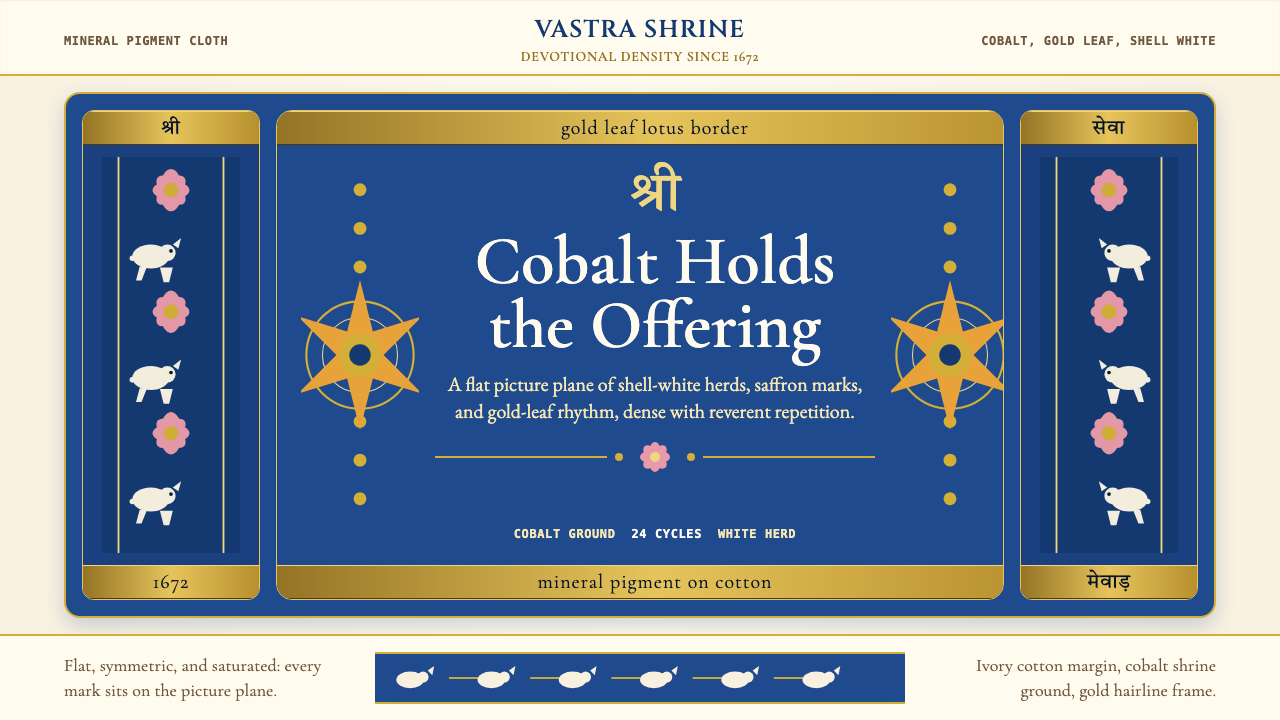 Rajasthani Pichwai (Nathdwara)Devotional density in cobalt. Gold borders, shell-white herds, lotus pink on…虔诚密度铺满钴蓝:金边、白牛、粉莲落在象牙棉布上。
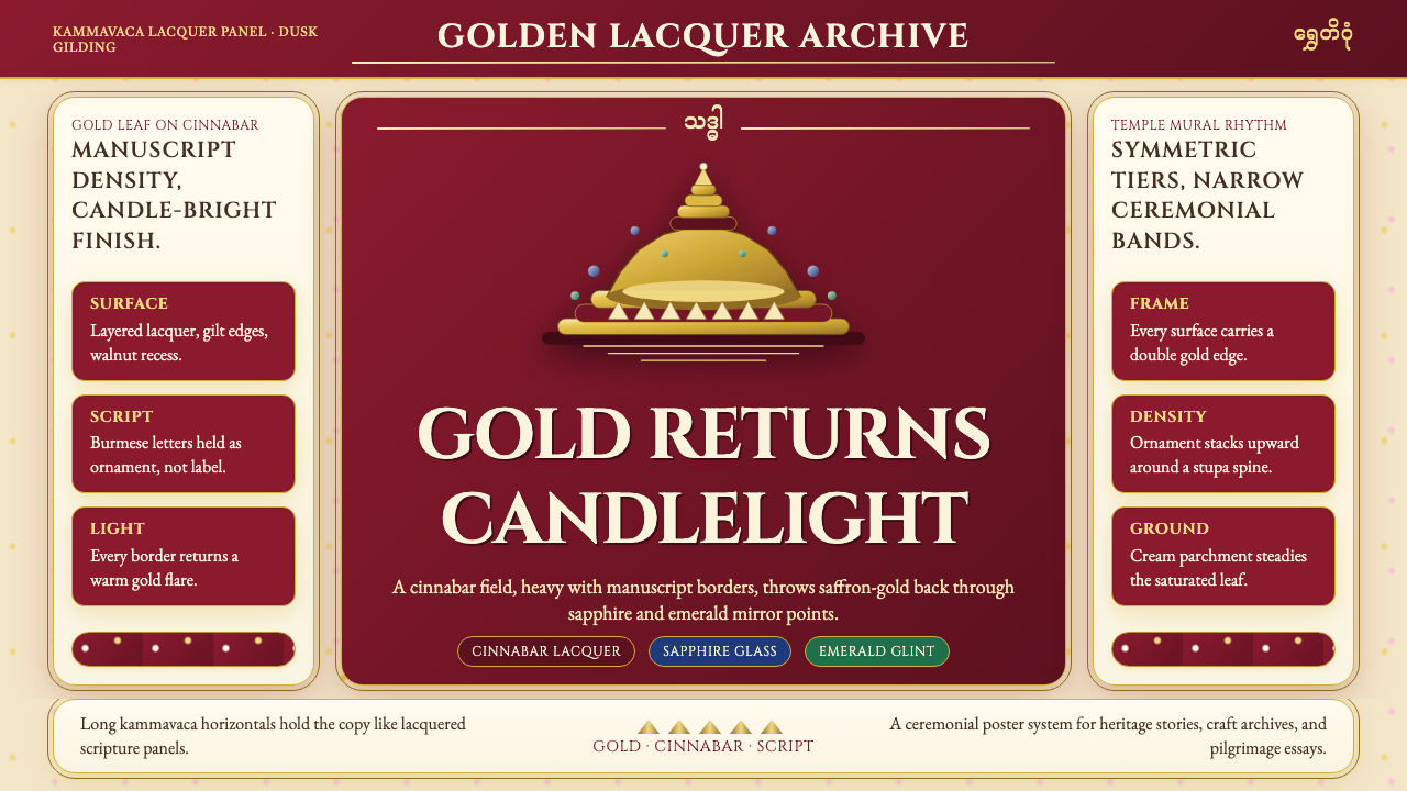 Burmese Shwedagon Gold-LacquerOpulence catches fire. Gold-leaf gradients on cinnabar panels frame a stupa s…虔诚的金色密度:朱漆面板上的金箔渐变,围出佛塔中轴。
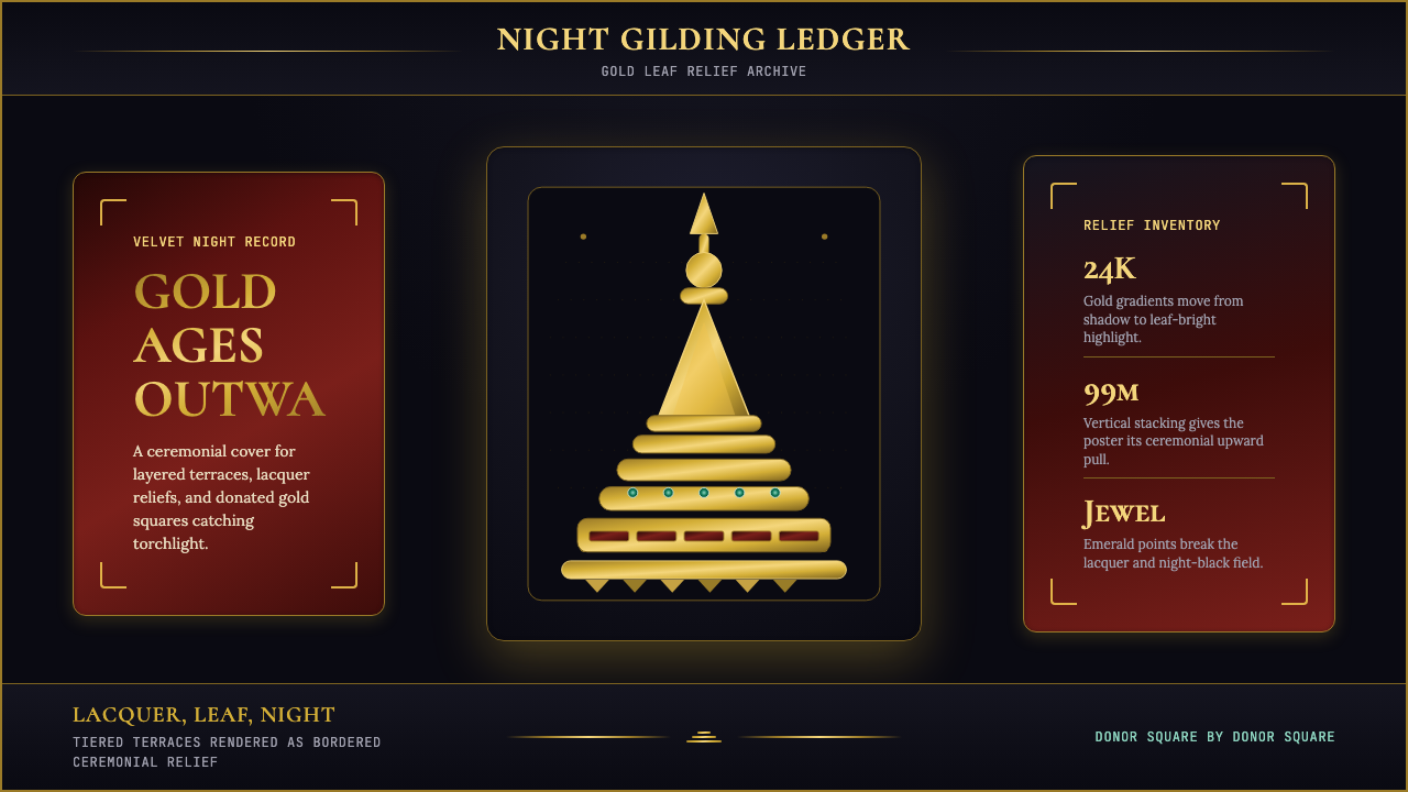 Burmese Shwedagon Stupa ReliefGold refuses restraint. Velvet black, teak-red lacquer, and tiered gradients…金色拒绝克制:黑夜、柚木红漆与层叠渐变堆出神圣密度。
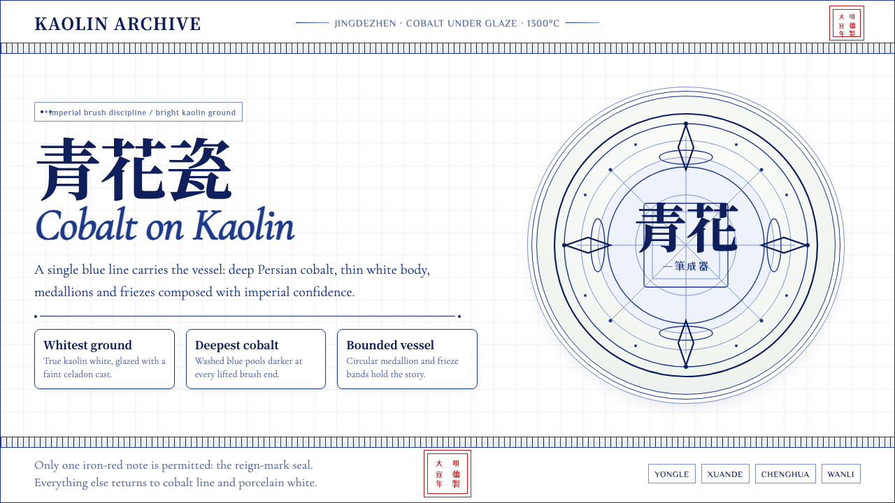 Ming Blue-and-White PorcelainImperial restraint sings. Deep cobalt hairlines circle kaolin white with one…御窑克制有声:钴蓝细线环绕白瓷,只留一枚红印。
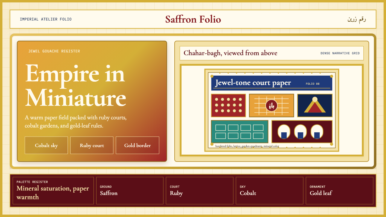 Mughal Miniature (Akbar era)Opulence refuses emptiness. Saffron paper, ruby panels, cobalt lattice, gold…华贵拒绝留白:番红花纸底、宝石红分栏、钴蓝格纹与金箔边饰。
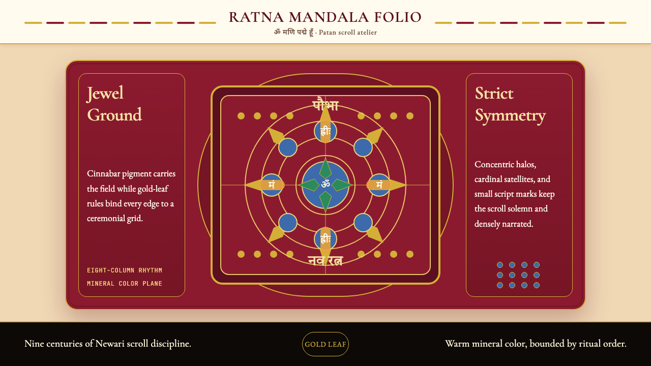 Nepali Paubha (Newari Scroll)Sacred density. Cinnabar ground, gold-leaf frame, lapis rings in strict symme…庄严而密集。朱砂红底、金箔框与青金石环严整对称。