What is Nepali Paubha (Newari Scroll)?什么是 Nepali Paubha (Newari Scroll)?
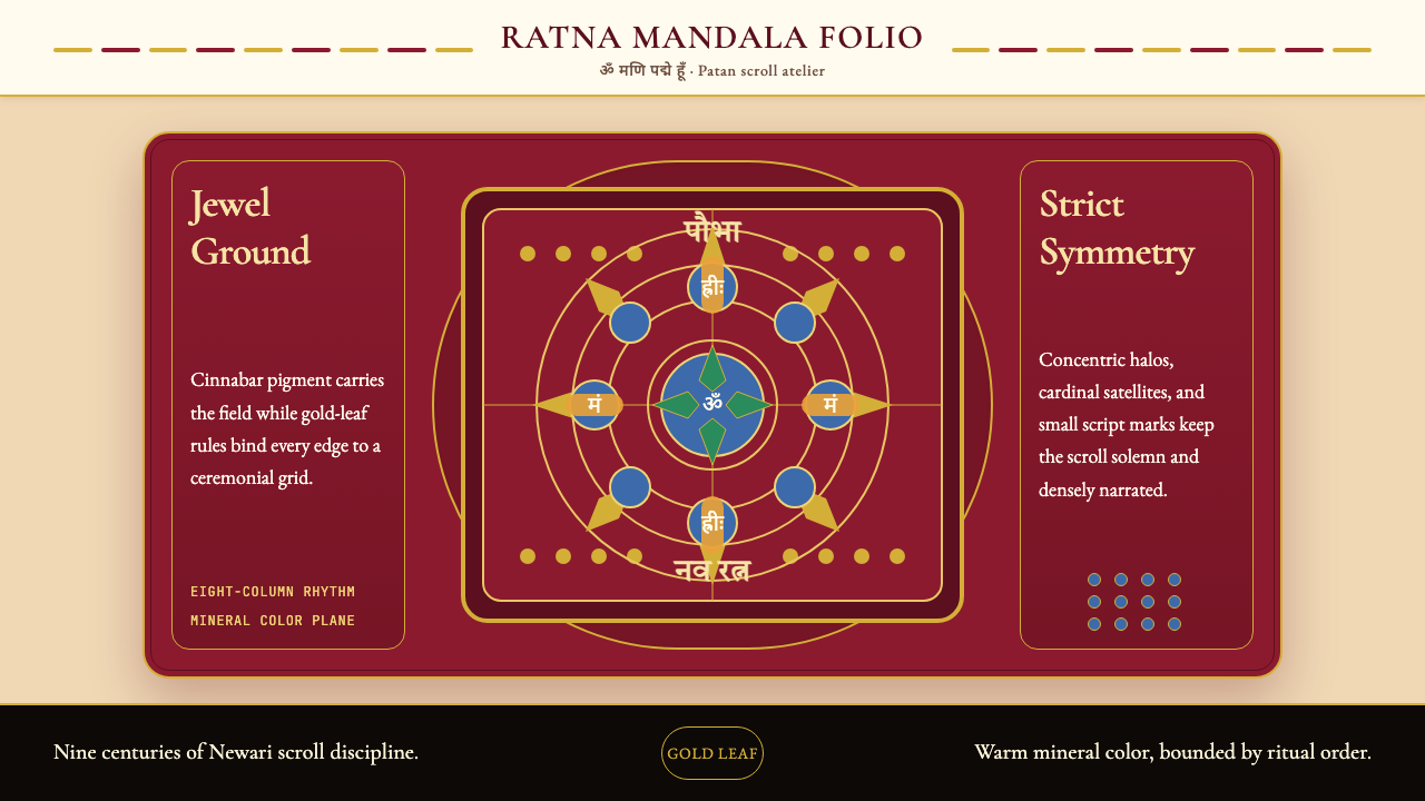
Paubha scroll painting is nine centuries of Newari devotion compressed into strict bilateral symmetry — cinnabar red ground, gold-leaf borders, and lapis halos radiating from a lotus-enthroned deity at the exact center.奉巴卷轴画是纽瓦尔人九百年虔诚的凝缩——朱砂红铺地、金箔勾框、青金石背光从莲台正中本尊向外层层放射,构成严整的左右对称宇宙。
Nepali Paubha (Newari Scroll) in briefNepali Paubha (Newari Scroll) 速览
Paubha (also spelled Paubhā, from the Sanskrit pata meaning 'cloth painting') is the sacred scroll-painting tradition of the Newari people of Nepal's Kathmandu Valley. Older than Tibetan Thangka and visually distinct from it, Paubha is characterized by a warmer chromatic chord, denser micro-detail, and a strict bilateral symmetry organized around a central deity seated on a lotus throne. Every composition is simultaneously a devotional image and a meditative diagram — a physical mandala intended for ritual use, temple installation, and consecrated gifting.「奉巴」(Paubha,亦作 Paubhā,源自梵语 pata,意为「布上绘画」)是尼泊尔加德满都谷地纽瓦尔人的神圣卷轴画传统。奉巴比西藏唐卡更古老,视觉上也截然不同——色温更暖、微细叙事密度更高,以严整的左右对称为核心组织原则,中央本尊端坐莲花宝座。每一幅奉巴同时是一幅礼拜圣像与一张冥想图解——一个实体曼荼罗,专为宗教仪轨、寺庙供奉与开光布施而制。
The visual language of Paubha is immediately identifiable. A jewel-saturated red ground — traditionally prepared from cinnabar — fills the field. A band of hammered gold-leaf frames the outer edge. At the center, the principal deity sits in rigid frontal symmetry, surrounded by a prabhamandala (radiant halo) of concentric golden rings. From that center, lesser deities, attendants, and symbolic motifs radiate outward in the cardinal and ordinal directions, filling every available register with precisely rendered micro-figures. Mineral pigments — lapis lazuli blue, malachite green, orpiment yellow, vermilion red, and gold — are applied flat, without shading or atmospheric perspective. Color functions as symbol and identification, not as naturalistic description.奉巴的视觉语言极易辨认。画面以珠宝般饱和的红色铺地——传统上以辰砂矿物研制。锤打金箔带沿外缘勾勒边框。中央主尊以严格正面对称端坐,周围环绕着同心金环组成的「光背曼荼罗」(prabhamandala)。从这个中心向外,小神祇、胁侍与象征性图案沿四方、八方辐射分布,将每一片可用画面填满精确描绘的微型人物。矿物颜料——青金石蓝、孔雀石绿、雌黄、朱砂红与金粉——平涂上色,无明暗渐变,无大气透视。色彩在此是符号与身份标识,而非自然主义描摹。
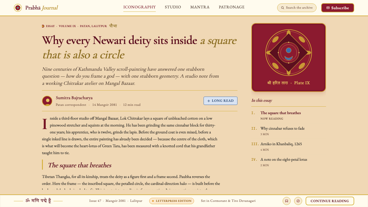
What distinguishes Paubha from neighboring traditions is its synthesis of Hindu and Buddhist iconography within a single visual system. A single scroll may depict Vajrayana Buddhist bodhisattvas alongside Hindu manifestations, reflecting the syncretic religious culture of the Malla-era Kathmandu Valley. The Chitrakar caste of Patan — hereditary painter-craftsmen who have held this practice for generations — follow strict iconometric canons (tala measurements) that prescribe the proportional relationships of every deity's body, hand gesture (mudra), attribute, and ornament. Deviation from these ratios is understood not as artistic license but as ritual error.奉巴有别于周边传统的关键,在于它在同一视觉体系内融合了印度教与佛教图像学。一幅画轴上可能同时出现金刚乘菩萨与印度教神祇的化身,折射出马拉王朝时代加德满都谷地的宗教融合文化。帕坦的奇特拉卡尔(Chitrakar)画师世家——世代承袭此技艺的职业画工——遵循严格的「度量典则」(tala 比例体系),精确规定每位神祇的身体比例、手印(mudra)、法器与饰物的尺度关系。偏离这些比例,不被视为艺术自由,而是仪轨上的错误。
See the Nepali Paubha (Newari Scroll) design system查看 Nepali Paubha (Newari Scroll) 完整设计系统
Where does Nepali Paubha (Newari Scroll) come from?Nepali Paubha (Newari Scroll) 从何而来?
The roots of Paubha painting reach back to the Buddhist manuscript illuminations and palm-leaf painting traditions of the Pala and Sena dynasties of eastern India (roughly the eighth through twelfth centuries), whose stylized iconography and mineral-pigment techniques traveled north across the Himalayan foothills into the Kathmandu Valley alongside the spread of Vajrayana Buddhism. The earliest surviving Paubhas date to the eleventh century and already display the compositional grammar — centered deity, radiant halo, symmetrical registers — that would define the tradition for the next nine hundred years.奉巴绘画的根源可追溯至印度东部帕拉王朝与塞纳王朝(约八至十二世纪)的佛教写本插图与贝叶画传统。那套程式化的图像学和矿物颜料技法,随金刚乘佛教的传播越过喜马拉雅山麓向北进入加德满都谷地。现存最早的奉巴作品年代可上溯至十一世纪,已呈现出此后九百年延续不变的构图语法——中央本尊、放射背光、左右对称的横向分层排布。
The golden age of Paubha production coincided with the Malla dynasty's rule over the Kathmandu Valley, spanning roughly 1200 to 1768. The Malla kings were lavish patrons of religious art: they commissioned monumental Paubhas for temple installations, sponsored the Chitrakar caste's workshops in Patan (also called Lalitpur), and documented iconographic standards in Sanskrit treatises. It was under Malla patronage that Paubha's formal vocabulary crystallized — the cinnabar red ground, the gold-leaf border band, the prabhamandala halo system, and the strict tala measurement canon all became codified conventions during this period.奉巴制作的黄金时代与马拉王朝统治加德满都谷地的时期(约1200至1768年)相重叠。马拉国王是宗教艺术的慷慨赞助者:他们委托制作供寺庙安奉的大幅奉巴,在帕坦(亦称拉利特普尔)资助奇特拉卡尔世家的画坊,并以梵文论典记录图像学规范。正是在马拉王朝的庇护下,奉巴的形式词汇得以结晶成型——朱砂红底、金箔边带、光背圆轮系统与严格的度量典则,均在此期间成为成文惯例。
The architect and sculptor Arniko (1245–1306) represents a pivotal figure in the outward transmission of Newari artistic tradition. Invited to the Yuan court of Kublai Khan at the age of seventeen, Arniko brought Newari building and painting techniques to China and Tibet, profoundly influencing the pagoda form and the aesthetic conventions of Tibetan Thangka painting. This historical exchange illustrates that Paubha was not a receiving tradition but an exporting one — Newari artistic knowledge flowed outward and shaped the visual cultures of a far larger Himalayan world.建筑师与雕塑家阿尼哥(Arniko,1245—1306年)是纽瓦尔艺术传统向外传播的关键人物。他在十七岁时受邀前往忽必烈的元朝宫廷,将纽瓦尔的建筑与绘画技法带入中国与西藏,深刻影响了宝塔形制及藏传唐卡绘画的美学惯例。这段历史交流说明,奉巴传统并非被动接受的终端,而是主动输出的源头——纽瓦尔艺术知识向外流溢,塑造了更广阔的喜马拉雅世界的视觉文化。
When the Shah dynasty unified Nepal in 1768 under Prithvi Narayan Shah, the Malla court system that had sustained the Chitrakar workshops was dissolved. Paubha production did not cease, but its institutional base narrowed. The tradition survived through the caste system itself — the Chitrakar families of Patan maintained the practice across generations as a hereditary craft identity, even as royal patronage gave way to commissions from religious institutions and eventually from private collectors and cultural preservation organizations. In the late twentieth century, scholars including the Buddhist iconographer Lokesh Chandra documented and published Paubha iconographic systems, helping to anchor the tradition academically while contemporary Chitrakar masters such as Lok Chitrakar and Anant Karma Charya continued active production.1768年,沙阿王朝在普里特维·纳拉扬·沙阿的统一下终结了马拉王朝的统治,支撑奇特拉卡尔画坊的宫廷制度随之瓦解。奉巴的制作并未停止,但其制度基础大幅收窄。这一传统依靠种姓制度本身得以延续——帕坦的奇特拉卡尔家族将此技艺作为世代传承的身份认同保存下来,即便皇室赞助转变为宗教机构的委托,再进一步演变为私人收藏家与文化保护机构的订单。二十世纪晚期,佛教图像学学者洛克什·钱德拉(Lokesh Chandra)系统记录并出版了奉巴的图像学体系,为这一传统提供了学术锚点;与此同时,洛克·奇特拉卡尔(Lok Chitrakar)与阿南特·卡尔玛·查尔亚(Anant Karma Charya)等当代大师仍在持续创作。
What defines the Nepali Paubha (Newari Scroll) look?Nepali Paubha (Newari Scroll) 的视觉特征是什么?
Chromatic Palette色彩体系
Paubha's palette is derived entirely from mineral and metallic sources, giving it an exceptional warmth and density that organic dyes cannot replicate. Cinnabar (mercury sulfide) produces the characteristic deep warm red that saturates the ground. Lapis lazuli yields a rich, slightly violet blue used for halos, sky registers, and deity garments. Malachite supplies a dense, opaque green. Orpiment provides a warm yellow-gold for secondary figures and attributes. Gold leaf and gold powder appear throughout — on borders, halos, jewelry, and architectural elements — not as accent but as structural necessity. This mineral foundation means that the palette reads as heavy, precious, and immovable: there is nothing airy or pastel in authentic Paubha.奉巴的色彩体系完全来源于矿物与金属材料,赋予画面有机染料无法复制的卓越温度与厚重感。辰砂(硫化汞)产生饱满而温暖的深红,铺满整个地色。青金石带来略带紫调的丰富蓝色,用于背光、天空层带与本尊法衣。孔雀石提供浓稠不透明的绿色。雌黄则为次要神祇与法器贡献温暖的黄金色调。金箔与金粉遍布全图——边框、光轮、璎珞与建筑构件——并非点缀,而是结构性必需。这种矿物基底使整个色板呈现出沉重、珍贵而不可撼动的质感:真实的奉巴中没有任何轻盈或粉彩的成分。
Strict Bilateral Symmetry严格双侧对称
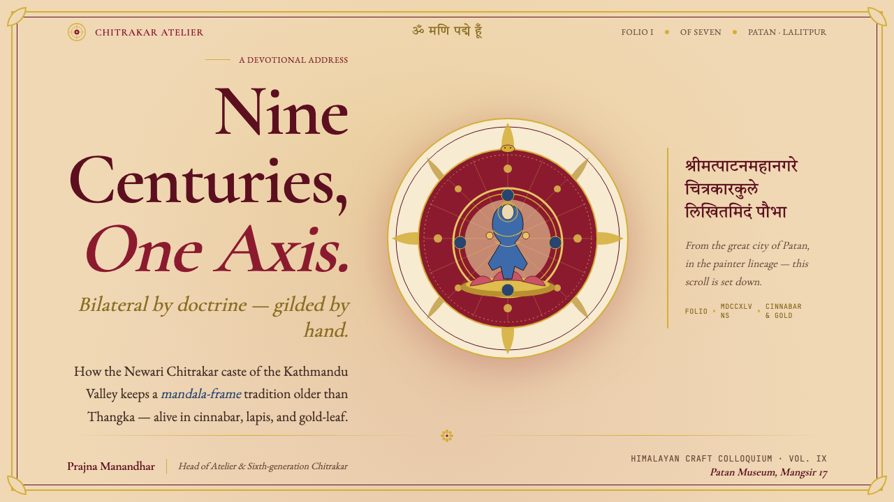
The compositional grammar of Paubha is built on a vertical axis of perfect bilateral symmetry. The principal deity occupies the exact center, flanked by mirror-image attendant figures, lotus scrolls, and subsidiary deities at every register. This symmetry is not merely aesthetic — it is cosmological, replicating the mandala's fundamental structure in which sacred center radiates outward in equal measure in all directions. Even when multiple deities populate a single composition, each cluster is balanced by its counterpart on the opposite side. The effect is one of absolute stillness and authority: nothing pulls the eye off center because the composition never permits an unbalanced weight.奉巴的构图语法建立在完美的双侧对称轴线之上。主尊占据画面正中,两侧以镜像方式对称排列胁侍、莲花卷草与次级神祇,每一横向层带均如此。这种对称并非单纯审美选择,而是宇宙论的再现——复制曼荼罗的根本结构:神圣中心向四面八方等量放射。即便一幅画中出现多位主尊,每一组群也与对侧的对应组群保持平衡。最终效果是绝对的静止与权威:没有任何东西将视线从中心拉开,因为构图从不允许失衡的重量出现。
Micro-Figural Density微细叙事密度
Every available space in a Paubha is occupied. Between the main deity registers, small panels contain narrative scenes from the life of the depicted deity, surrounding fields are filled with row upon row of smaller bodhisattvas or Buddhas rendered at near-miniature scale, and architectural border motifs pack the frame bands with jewels, scrolling vines, and guardian figures. This horror vacui quality — an almost compulsive filling of negative space — serves theological purpose: each micro-figure is a complete devotional object in its own right, and the accumulation of presences amplifies the painting's ritual potency. A Paubha is not to be taken in at a single glance but meditated upon across its entire surface.奉巴中的每一片空间都被填满。主尊层带之间,细小的方格嵌入本尊生平的叙事场景;周边区域以近乎袖珍比例密布行行菩萨或佛陀;建筑式边框带将宝珠、卷草与护法神像塞入每一条框带。这种对空白的近乎强迫式填充——「厌空」品质——服务于神学目的:每一微型图像本身即是完整的礼拜对象,众多存在的叠加放大了画作的仪轨效力。奉巴不是供人一眼扫过的图像,而是需要在整个画面上逐寸冥想的存在。
Flat Mineral Pigment Application矿物颜料平涂工法
Paubha painters work in a strictly flat register: pigments are applied in pure, bounded areas with no gradation, blending, or atmospheric shading. A deity's skin tone is a single uniform hue; a garment is a single color bounded by a precise ink line. Depth and volume are communicated exclusively through iconographic convention — a figure's posture, gesture, and attribute placement — not through tonal modeling. This flatness is not a technical limitation but a deliberate system: it keeps every element at equal visual distance from the viewer, appropriate for an image understood as a presence rather than a representation. The gold outlines that delineate each form are drawn with exceptional fineness, requiring a stability of hand that traditional Chitrakar training cultivates over many years.奉巴画师在严格平涂的语境中工作:颜料以纯粹、明确划定的区域施于画面,无渐变、无混合、无大气明暗。神祇的肤色是单一均匀的色调;法衣是被精确墨线界定的单一颜色。深度与体积完全通过图像学惯例传达——人物的姿态、手印与法器的位置——而非明暗塑形。这种平面性并非技术局限,而是一套刻意的体系:它使每个元素与观者保持等距,这与奉巴被理解为一种「临在」而非「再现」的属性相符。勾勒每个形体的金色线条以极细的精度绘就,要求一种稳定的手部控制——这是传统奇特拉卡尔训练历经多年才能养成的能力。
Iconometric Proportion Canon度量典则比例体系
Every figure in a Paubha is constructed according to tala measurement canons inherited from Sanskrit iconometric treatises. The tala — roughly the length from the hairline to the chin — serves as the base module from which all other proportions are derived: the height of the body, the width of the shoulders, the length of the limbs, and the size of each hand gesture all relate to the tala in prescribed ratios. These canons vary slightly by deity class and regional tradition, but the principle is constant: no figure may be drawn from observation or imagination. The painter's role is to transmit a received form correctly, not to invent. This constraint gives Paubha its characteristic look of figures that seem simultaneously ancient and precise — not because the painter has imposed a style, but because the canon has been faithfully applied.奉巴中的每一个人物都依据源自梵文度量典则论著的「度」(tala)体系建构。「度」——约等于发际线至下颌的长度——作为基础模数,其他所有比例均由此派生:身体高度、肩宽、四肢长度以及每个手印的大小,皆与「度」保持规定的比率关系。这些典则因神祇类别与地区传统略有差异,但原则始终如一:任何人物都不得凭观察或想象绘制。画师的职责是正确传达一种承传下来的形式,而非自行发明。这一约束赋予奉巴人物一种同时显得古老而精确的独特气质——不是因为画师强加了某种风格,而是因为典则得到了忠实的遵循。
Gold as Structural Element金色作为结构要素
In Paubha, gold is not decoration applied over a finished composition — it is a load-bearing structural element woven into the architecture of the image from the beginning. The outer border band is solid hammered gold leaf, establishing the painting's frame as a sacred threshold. The prabhamandala halo surrounding the central deity consists of multiple concentric rings in gold, each delineated with hair-fine lines. Gold powder mixed into the painting medium is used for the jewelry, crowns, and architectural canopies of all major figures. This pervasive use of gold gives the entire composition a luminous, unchanging quality — the painting seems to emit rather than reflect light — and signals to the viewer that the depicted world operates under different physical laws than the everyday.在奉巴中,金色并非施于成品之上的装饰,而是从画作建构之初便织入图像结构的承重要素。外缘边框带是实心锤打金箔,将画框确立为神圣的门槛。围绕中央主尊的光背圆轮由多圈同心金环组成,每圈之间以极细的线条划定。金粉混入绘画媒介,用于所有主要人物的璎珞、宝冠与建筑华盖。这种无处不在的金色赋予整幅作品一种发光的、不变的质感——画作仿佛是在发光而非反光——并向观者传达:所描绘的世界运行于不同于日常的物理法则之下。
Devotional Register Organization礼拜层带组织
Paubha compositions are organized into horizontal registers (layers) and radial zones that together create a legible cosmic map. The uppermost register typically depicts the transcendent realm: celestial Buddhas, bodhisattvas in their pure lands, or the cosmic deity at the apex of a hierarchical system. The middle register holds the principal deity's court — the main figure flanked by attendants, offering figures, and protective deities. The lower register frequently contains donor portraits, guardians, or scenes from the deity's mythological biography. This vertical stratification is not merely compositional but theological: movement from bottom to top traces a path from the mundane world upward through increasingly refined levels of reality toward enlightenment or liberation. The viewer's eye is guided on a structured spiritual ascent.奉巴的构图组织为水平层带(分层)与放射区域,共同构成一张可读的宇宙地图。最上方的层带通常呈现超越性领域:天界诸佛、处于净土的菩萨,或宇宙等级体系顶端的主神。中间层带容纳主尊的宫廷——主像居中,两侧有胁侍、供养人物与护法神。最下方的层带频繁出现施主画像、门卫护法或神祇神话传记的场景。这种垂直分层不仅是构图上的,更是神学上的:从下至上的移动描绘了一条从世俗世界向越来越精微的实在层次攀升、最终趋向觉悟或解脱的路径。观者的视线被引导着完成一次有序的精神上升之旅。
See the Nepali Paubha (Newari Scroll) design system查看 Nepali Paubha (Newari Scroll) 完整设计系统
Who shaped Nepali Paubha (Newari Scroll)?谁塑造了 Nepali Paubha (Newari Scroll)?
Born in Patan in 1245, Arniko led a team of Newari craftsmen to the Yuan court of Kublai Khan in 1260 at the invitation of the Tibetan lama Drogön Chögyal Phagpa. Over his forty-six years in China, he designed the iconic White Pagoda at Miaoying Temple in Beijing and served as superintendent of all craftsmen in China. His transmission of Newari building techniques and Buddhist iconographic conventions to China and Tibet makes him the most consequential historical figure in the outward diffusion of Paubha-adjacent visual culture, demonstrating that Newari artistic knowledge was of sufficient sophistication to reshape the visual identity of the Yuan empire.阿尼哥生于帕坦,1245年出生,1260年受藏传喇嘛八思巴邀请,率领纽瓦尔工匠队进入元朝忽必烈宫廷。在华四十六年间,他设计了北京妙应寺(白塔寺)标志性的白塔,并任职全国工匠总监。他将纽瓦尔建筑技法与佛教图像学惯例传入中国与西藏,使其成为奉巴相关视觉文化向外传播史上最具影响力的历史人物,证明纽瓦尔艺术知识的精密程度足以重塑元帝国的视觉面貌。
One of the foremost contemporary masters of the Paubha tradition, Lok Chitrakar of Patan has devoted his practice to both the production of technically orthodox Paubhas and the documentation and transmission of Chitrakar craft knowledge to younger generations. Working within the hereditary conventions of his caste, he has been instrumental in demonstrating that Paubha can sustain rigorous technical standards in the present era while remaining a living ritual art rather than a purely archival curiosity. His work has been exhibited internationally and has brought critical attention to the tradition at a moment when urbanization and changing patronage patterns in the Kathmandu Valley have put pressure on hereditary craft systems.洛克·奇特拉卡尔是帕坦最重要的当代奉巴大师之一。他的实践同时致力于在技术上严格正统的奉巴创作,以及将奇特拉卡尔工艺知识记录并传授给年轻一代。在世袭惯例的框架内工作,他有力地证明了奉巴能够在当代保持严格的技术标准,同时维持其作为活态仪轨艺术而非纯粹档案遗存的属性。他的作品已在国际上展出,并在城市化与赞助模式转变对加德满都谷地世袭工艺体系造成压力的当下,为这一传统带来了重要的学术与公众关注。
A senior Chitrakar practitioner and teacher, Anant Karma Charya has played a central role in codifying and transmitting the tala measurement system and iconographic conventions of Paubha to students both within and outside the Chitrakar caste. His pedagogical work addresses a structural challenge facing the tradition: as the hereditary caste system's social authority has diminished, the transmission mechanism for the highly specialized technical and iconographic knowledge embedded in Paubha practice has had to adapt, moving from family workshop apprenticeship toward more formal instructional settings without sacrificing the depth of content those conventions carry.阿南特·卡尔玛·查尔亚是奇特拉卡尔传统中的资深画师与教育者,在将奉巴的度量典则与图像学惯例系统化并传授给奇特拉卡尔种姓内外学生方面发挥了核心作用。他的教学工作直面这一传统所面临的结构性挑战:随着世袭种姓制度的社会权威式微,奉巴实践中高度专业化的技术与图像学知识的传承机制不得不作出调整——从家族画坊的学徒制向更正式的教学环境过渡,同时不牺牲这些惯例所承载的内容深度。
An Indian Buddhist iconographer and scholar, Lokesh Chandra's encyclopedic publications on Tibetan and Himalayan Buddhist iconography — including his multivolume dictionary of Buddhist iconography — provided systematic scholarly documentation that has been indispensable for understanding the iconographic programs of Paubha and for distinguishing its conventions from related Thangka traditions. By anchoring the visual vocabulary of Himalayan sacred art in rigorous textual and comparative analysis, Chandra created a reference framework that contemporary Paubha practitioners, curators, and collectors use to authenticate and interpret the tradition's works.洛克什·钱德拉是印度佛教图像学学者,其关于藏传及喜马拉雅佛教图像学的百科全书式著作——包括多卷本佛教图像学词典——提供了系统性的学术记录,对于理解奉巴的图像学程序、以及将其惯例与相关唐卡传统相区分,具有不可或缺的价值。通过将喜马拉雅神圣艺术的视觉词汇锚定于严谨的文献与比较分析,钱德拉建立了一套参考框架,当代奉巴从业者、策展人与收藏家用以鉴定和诠释这一传统的作品。
The founder of modern Nepal, Prithvi Narayan Shah's 1768 conquest of the Kathmandu Valley and unification of Nepal under Shah dynasty rule effectively ended the Malla court system that had been Paubha's primary institutional patron for over five centuries. While this political rupture is often framed in terms of military and dynastic history, its consequences for Paubha were profound: the dissolution of Malla royal workshops forced the Chitrakar caste to reorganize around temple, monastery, and eventually private patronage networks. The transition shaped the economics and social organization of Paubha production for the two and a half centuries that followed, making the tradition more dispersed but also more resilient to any single patron's withdrawal.普里特维·纳拉扬·沙阿是近代尼泊尔的缔造者。他1768年对加德满都谷地的征服与沙阿王朝的建立,事实上终结了五个多世纪以来作为奉巴首要制度赞助者的马拉宫廷体系。这场政治断裂通常在军事与王朝史的框架中被叙述,但其对奉巴的影响极为深远:马拉皇家画坊的解散迫使奇特拉卡尔种姓围绕寺庙、修道院以及最终的私人赞助网络重新组织。这一转变在此后两个半世纪中塑造了奉巴生产的经济模式与社会组织,使这一传统更加分散,但也更能抵御任何单一赞助者的撤离。
How do you use Nepali Paubha (Newari Scroll) today?今天怎么用 Nepali Paubha (Newari Scroll)?
Applying Paubha as a design reference requires understanding what the style actually does: it organizes complexity through symmetry, hierarchy, and density rather than simplification. It is not a minimalist system — it is a maximalist system with iron discipline. Borrowing its visual logic means choosing one or two of its structural principles — the bilateral symmetry, the radiant compositional grammar, the flat saturated palette — and deploying them with the same consistency that the Chitrakar masters applied to iconometric canons. Surface pastiche — applying a red background and gold borders without structural coherence — produces noise, not power.将奉巴作为设计参照,需要理解这种风格实际上在做什么:它通过对称、层级与密度——而非简化——来组织复杂性。奉巴不是一套极简主义体系,而是一套有着铁的纪律的最大主义体系。借用其视觉逻辑,意味着选取一两项结构性原则——双侧对称、放射状构图语法、平涂饱和色板——并以奇特拉卡尔大师对度量典则那般的一致性加以部署。表面的模仿——施以红色底与金色边框而无结构性凝聚力——产生的是噪音,而非力量。
For presentation slides, the Paubha visual vocabulary offers rich possibilities at both the cover and content level. A cover slide benefits from the tradition's compositional authority: a central figure, image, or title block sits on a deep cinnabar-red ground, flanked by symmetrically placed secondary elements — supporting points, brand marks, or decorative motifs — at equal visual weight on left and right. The gold-frame convention translates directly to a strong border band or ruled framing device that distinguishes the slide from the ambient screen. Content slides should respect the register system: use horizontal bands to organize information at different levels of hierarchy, with the most authoritative content occupying the visual center and supporting detail distributed symmetrically around it.在演示文稿中,奉巴的视觉词汇在封面与内容页层面都提供了丰富的可能性。封面页受益于这一传统的构图权威感:中央人物、图像或标题块置于深朱砂红地上,两侧以视觉等重的次要元素——支撑要点、品牌标志或装饰母题——对称排布于左右。金框惯例直接转化为强力边框带或直线框架装置,将幻灯片从周围屏幕中区分出来。内容页应尊重层带系统:用水平分带在不同层级上组织信息,最权威的内容占据视觉中心,支撑细节对称分布于其四周。
For web interfaces, Paubha-informed design is most effective on landing pages, feature showcases, and cultural institution websites where ceremonial weight and visual richness are appropriate. The approach: center the primary visual element on a deeply saturated ground, use a strong framing device — a bordered container, a rule-bounded panel — to create the sense of a sacred threshold, and populate secondary zones with symmetrically balanced content blocks. Dashboard and data contexts are harder: the tradition's density can become illegible at small scales and on tightly packed UI components. Where Paubha sensibility can survive in a dashboard is in the header, the state indicators, and the primary navigation — treating those areas as the high-register, high-formality zones while leaving the data fields comparatively minimal.对于网页界面,奉巴启发的设计在落地页、功能展示页与文化机构网站上最为有效——在那些场合,仪式性的庄重感与视觉丰富性是合适的。方法是:将主视觉元素居中置于高饱和度底色上,使用强力框架装置——有边框的容器、直线围合的面板——营造神圣门槛的感觉,再以对称平衡的内容块填充次要区域。仪表板与数据场景难度更高:这一传统的密度在小尺寸和紧凑UI组件中可能变得难以辨读。奉巴气质能在仪表板中存活的地方是页眉、状态指示器和主导航——将这些区域作为高层带、高礼仪性的区域,而将数据字段保持相对简洁。
For editorial and marketing work, the Paubha chromatic palette — cinnabar red, lapis blue, malachite green, gold — operates as an immediately distinctive signature when used with restraint. A single full-spread image on a cinnabar ground with gold typography creates impact that no generic dark or light layout can match. The flat, no-gradient treatment means that the palette reads cleanly in print, on screen, and in environmental graphics without translation loss. Marketing materials for heritage brands, cultural organizations, luxury goods, and spiritual wellness contexts can draw on the tradition's associations of preciousness, permanence, and sacred authority — provided the execution maintains the palette's mineral richness rather than digitally warming or cooling it toward contemporary gradient conventions.对于编辑与营销作品,奉巴的色彩体系——朱砂红、青金石蓝、孔雀石绿、金色——在克制使用时能成为极具辨识度的签名。一张以朱砂红为底、金色字体的整版图像所产生的冲击力,是任何通用深色或浅色版面无法匹敌的。平涂、无渐变的处理意味着这套色板在印刷、屏幕和环境图形中均能清晰呈现而无损耗。遗产品牌、文化机构、奢侈品与灵性健康场景的营销材料可以借用这一传统关于珍贵性、永恒性与神圣权威性的联想——前提是执行时保持色板的矿物质感的厚重,而非向当代渐变惯例方向进行数字化的暖化或冷化处理。
The most common mistake when referencing Paubha is confusing richness with busyness. Authentic Paubha is dense, but its density is organized: every element occupies a designated place in a hierarchical system, and nothing is random. Contemporary applications frequently import the surface visual qualities — saturated color, gold accents, symmetrical framing — while neglecting the compositional discipline that makes those qualities cohere. A Paubha-referencing design that is symmetrical in its overall frame but casually asymmetric in its internal elements, or that uses gold as scattered decoration rather than as a structural bordering and highlighting system, will read as confused rather than authoritative. Commit fully to the organizational logic or dial back the visual intensity to match the organizational rigor you can actually sustain.参照奉巴时最常见的错误,是将丰富性与繁乱混为一谈。真实的奉巴确实是密集的,但它的密集是有组织的:每一个元素都在层级体系中占据指定位置,没有任何东西是随机的。当代应用常常引进表面的视觉特质——饱和色彩、金色点缀、对称框架——却忽视了使这些特质得以凝聚的构图纪律。一件整体框架对称、内部元素却随意不对称的奉巴参照设计,或是将金色作为散落装饰而非结构性边框与标识体系使用的设计,读来只会让人觉得混乱,而非权威。要么全力投入这套组织逻辑,要么将视觉强度调低至与自己实际能维持的组织严谨度相匹配。
See the Nepali Paubha (Newari Scroll) design system查看 Nepali Paubha (Newari Scroll) 完整设计系统
Nepali Paubha (Newari Scroll) — FAQNepali Paubha (Newari Scroll) · 常见问题
How does Paubha differ from Tibetan Thangka painting?奉巴与藏传唐卡有何不同?
Paubha is older than Thangka and is its direct ancestor — Newari artistic conventions, carried north by craftsmen such as Arniko, significantly shaped early Thangka iconography and technique. Visually, Paubha tends toward warmer reds (cinnabar-dominant rather than the cooler iron-oxide reds of some Tibetan schools), denser compositional registers with less open ground showing, stricter bilateral symmetry, and a more pronounced Hindu-Buddhist syncretic content. Thangka, particularly in its Tibetan Gelug and Karma Gadri forms, developed its own regional conventions over centuries — including the distinctive pale blue-green grounds of the Menri style and the more atmospheric gold-ground compositions of older Kadampa works. Both traditions share the mineral pigment technique and the iconometric canon, but a practiced eye can distinguish them within moments by palette temperature, compositional density, and the relative emphasis on Hindu versus Buddhist iconography.奉巴比唐卡更古老,是后者的直接祖先——纽瓦尔的艺术惯例经由阿尼哥等工匠向北传播,深刻塑造了早期唐卡的图像学与技法。在视觉上,奉巴色温更暖(以辰砂红为主,而非某些藏传流派偏冷的铁红),构图层带更密集(底色裸露更少),双侧对称更严格,且印度教-佛教融合内容更为突出。唐卡,尤其是藏传格鲁与噶玛嘎孜风格,历经数百年发展出各自的地区惯例——包括门孜风格的淡蓝绿底色,以及更古老的噶当派作品中富有大气感的金底构图。两个传统共享矿物颜料技法与度量典则,但有经验的眼睛能在瞬间通过色温、构图密度以及印度教与佛教图像学的相对侧重加以区分。
Is Paubha only appropriate for spiritual or cultural contexts, or can it be used more broadly?奉巴只适合灵性或文化场景,还是可以更广泛地运用?
The tradition carries strong sacred associations, and using it carelessly in commercial contexts risks appearing appropriative or disrespectful — particularly if specific deity imagery is repurposed as decoration without acknowledgment of its religious significance. However, the visual principles underlying Paubha — its compositional symmetry, its radiant organizational grammar, its mineral chromatic warmth, its gold-as-structure convention — are formal properties that can be applied to secular design contexts with care and deliberateness. The distinction is between borrowing the visual system as design language and reproducing sacred imagery as branding. Cultural institutions, heritage brands, luxury goods, and educational materials represent contexts where Paubha visual language can be applied thoughtfully; fast-moving consumer goods, social media graphics, and contexts demanding irony or informality are poor fits.这一传统承载着强烈的神圣联想,在商业场景中粗心使用有挪用或不尊重之嫌——尤其是当特定神祇图像被不加说明地重新用作装饰时。然而,奉巴的底层视觉原则——构图对称性、放射状组织语法、矿物色彩温度、金色作为结构要素的惯例——是形式属性,可以以谨慎和自觉的方式应用于世俗设计场景。区别在于:将视觉体系作为设计语言加以借鉴,与将神圣图像作为品牌化手段加以复制,这是两件截然不同的事。文化机构、遗产品牌、奢侈品与教育材料是奉巴视觉语言可以被周到运用的场景;快速消费品、社交媒体图形,以及需要戏谑感或随意感的场合,则是糟糕的匹配。
What makes the Paubha palette feel so distinctly different from other warm-toned historical styles?是什么让奉巴的色板感觉与其他暖调历史风格如此不同?
The difference is mineral. Most historical warm-palette styles — Byzantine mosaic, Renaissance panel painting, Art Nouveau — use some combination of organic pigments, lead-based whites, and earth tones that produce warmth through richness and variety. Paubha's warmth comes from a more restricted and more intense mineral source: cinnabar red (mercury sulfide) has a distinctly warm, slightly orange-red character very different from iron-oxide earth reds; lapis lazuli blue has a depth and slight warmth that synthetic ultramarine lacks; orpiment yellow is more sulfurous and saturated than ochres or Naples yellows. Together, these minerals produce a palette that reads as hotter and more precious than historical Western warm palettes — closer to the interior of a fire or the surface of a gemstone than to an autumn landscape or a candlelit room. The pervasive gold further distinguishes it: used at this density, gold stops being a highlight and becomes the ambient light source of the entire composition.区别在于矿物来源。大多数历史上的暖调风格——拜占庭马赛克、文艺复兴木板画、新艺术运动——使用有机颜料、铅白与土质颜料的某种组合,通过丰富性与多样性来产生暖意。奉巴的温度来自更受限制也更强烈的矿物来源:辰砂(硫化汞)具有明显温暖、略带橙调的红色特质,与铁氧化物土红截然不同;青金石蓝拥有合成群青所缺乏的深度与轻微暖意;雌黄比赭黄或那不勒斯黄更具硫磺感与饱和度。这些矿物组合在一起,产生了一套读来比历史上西方暖调色板更炙热、更珍贵的色板——更接近火焰内部或宝石表面,而非秋日风景或烛光房间。无处不在的金色进一步使之区别于一切:在这种密度下使用,金色不再是高光,而成为整幅构图的环境光源。
Can the Paubha's strict symmetry be adapted for contemporary layouts without looking archaic?奉巴严格的对称性能否在当代版面中加以调适而不显得陈旧?
Yes, provided the adaptation is principled rather than casual. The key insight is that Paubha's symmetry is radial and hierarchical, not merely mirrored: it always emanates from a powerful central element, with everything else organized in relation to that center. Contemporary layouts that adopt this organizing logic — a dominant central element with supporting content distributed symmetrically around it — inherit the style's compositional authority without requiring the full visual vocabulary of halo rings and micro-deity registers. The contemporary risk is treating symmetry as blandness: a Paubha-inflected layout should be symmetrical and intense, not symmetrical and neutral. The center must be strong enough to justify the symmetrical frame around it. A weak or undifferentiated central element surrounded by carefully balanced secondary content will read as corporate rather than ceremonial.可以,前提是调适是有原则的,而非随意为之。关键洞察在于:奉巴的对称是放射状且层级性的,而非单纯的镜像——它始终从一个强力的中心元素向外放射,其他一切都以该中心为参照组织。当代版面若采用这一组织逻辑——一个主导性中心元素、支撑内容对称分布于其周围——便继承了这种风格的构图权威感,无需采用完整的光轮与微型神祇层带视觉词汇。当代的风险在于将对称等同于平淡:受奉巴启发的版面应该是对称而强烈的,而非对称而中性的。中心必须足够强大,以支撑其周围的对称框架。一个虚弱或无差别化的中心元素,被精心平衡的次要内容包围,读来会是企业感,而非仪式感。
How should a designer handle the density characteristic of Paubha — does every design using this reference need to be visually dense?设计师应如何处理奉巴的密度特征——所有以此为参照的设计都必须视觉上密集吗?
Density is not a requirement — hierarchy is. Paubha's density emerges from a specific function: every available surface is used to accumulate devotional presence, because more figures means greater ritual potency. A design application does not share this theological imperative, and importing the density without the organizing logic produces clutter, not richness. What can be productively borrowed is the principle of compositional completeness: no element should be placed casually, every zone should have a defined purpose, and the overall composition should have a sense of considered resolution rather than unfinished space. A Paubha-referencing design can be relatively spare — few elements, generous ground — while still carrying the tradition's sense of compositional authority, provided those few elements are placed with the same intentionality that the Chitrakar master applies to a painting that will serve as a ritual object.密度不是必要条件——层级感才是。奉巴的密度源于特定的功能:每一片可用表面都用于积累礼拜的临在,因为更多的神祇意味着更强的仪轨效力。设计应用并不共享这一神学命令,在缺乏组织逻辑的前提下引进密度,产生的是杂乱,而非丰富。可以富有成效地借鉴的,是构图完整性的原则:没有任何元素应被随意放置,每一个区域应有明确的功能定义,整体构图应具有一种经过深思熟虑的完结感,而非未完成的空洞。一件参照奉巴的设计可以相对简约——元素稀少、底色宽阔——同时仍然承载这一传统的构图权威感,前提是那少数元素的放置,与奇特拉卡尔大师绘制一幅将作为仪轨对象的画作时所运用的意图性同等充分。
Related design styles相关设计风格
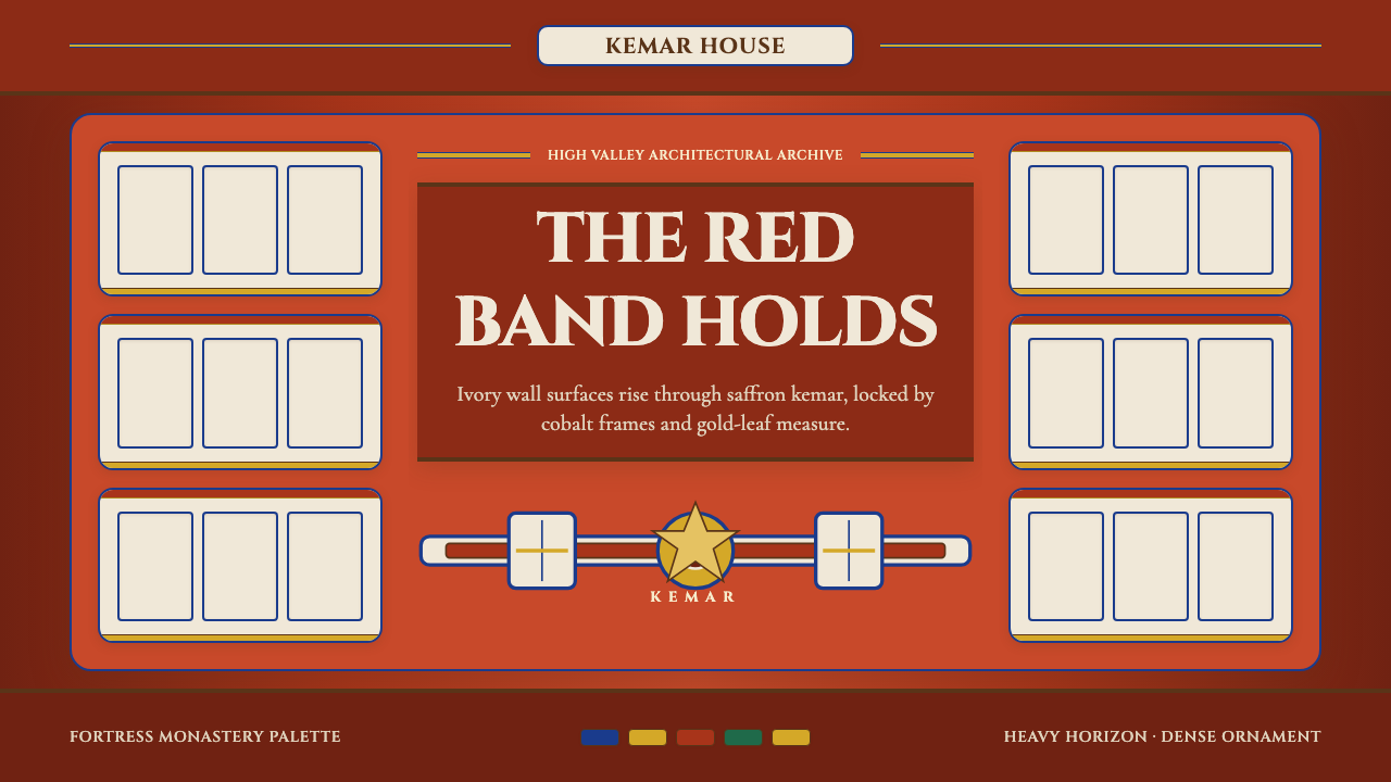 Bhutanese Dzong (Fortress Red)Monumental red holds the page. Cobalt frames and gold bands lock the fortress…厚重藏红掌控页面。钴蓝窗框与金色横带锁定宗堡节奏。
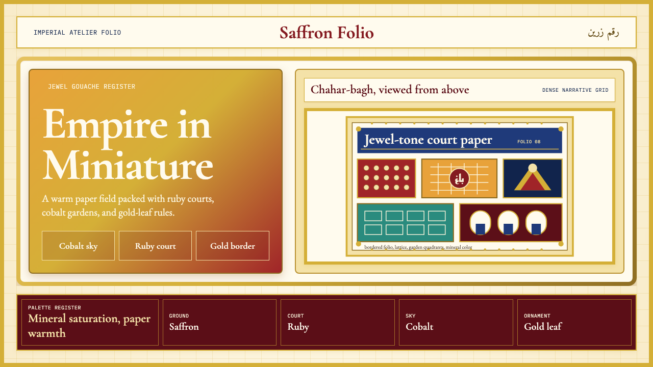 Mughal Miniature (Akbar era)Opulence refuses emptiness. Saffron paper, ruby panels, cobalt lattice, gold…华贵拒绝留白:番红花纸底、宝石红分栏、钴蓝格纹与金箔边饰。
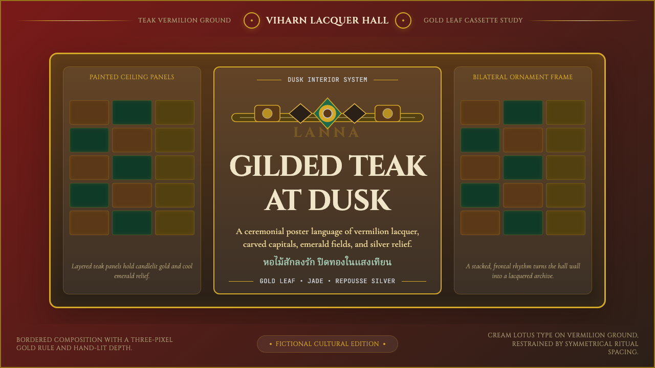 Thai Lanna Tai Yai TempleSacred lacquer glows. Vermilion ground, Cinzel capitals, gold cassette symmet…圣殿漆光沉静。朱红底、Cinzel 大字与金箔格框成仪式感。
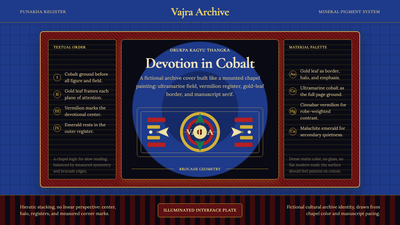 Bhutanese Drukpa Kagyu ThangkaDevotion made cobalt. Gold frames, Cormorant serif, and vermilion marks hold…钴蓝承载虔敬:金框、Cormorant 衬线与朱砂标记构成佛殿秩序。
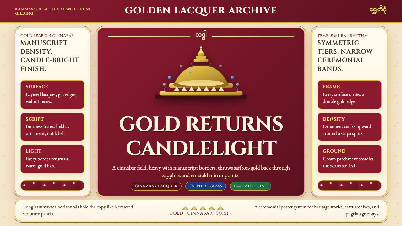 Burmese Shwedagon Gold-LacquerOpulence catches fire. Gold-leaf gradients on cinnabar panels frame a stupa s…虔诚的金色密度:朱漆面板上的金箔渐变,围出佛塔中轴。
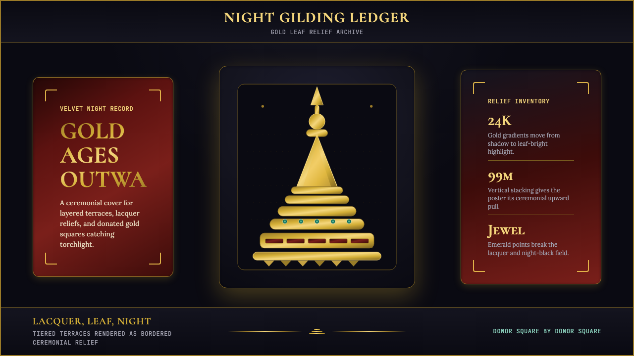 Burmese Shwedagon Stupa ReliefGold refuses restraint. Velvet black, teak-red lacquer, and tiered gradients…金色拒绝克制:黑夜、柚木红漆与层叠渐变堆出神圣密度。