What is Thai Lanna Tai Yai Temple?
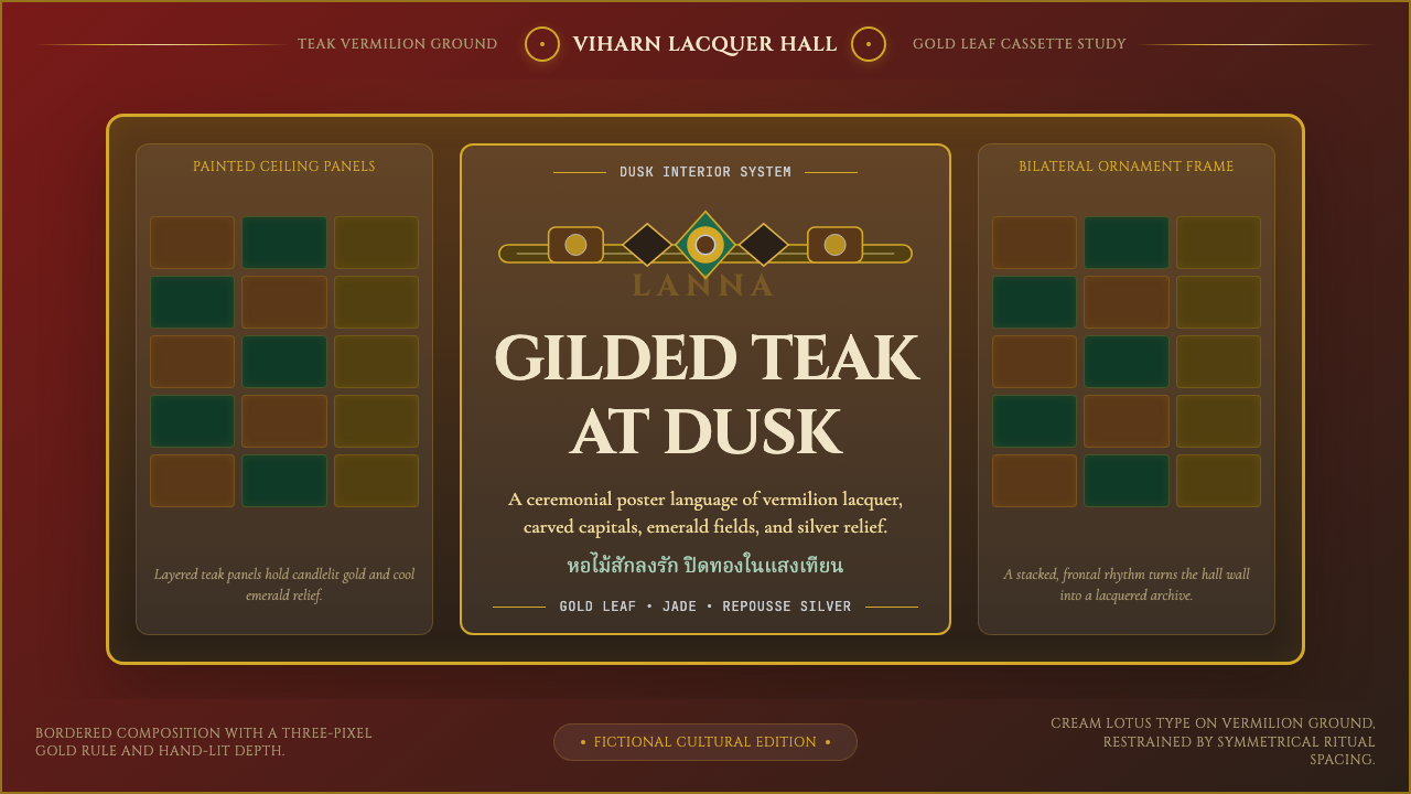
Sacred lacquer glows at dusk — Lanna temple design layers vermilion, gold leaf, and jade green into a visual language that has consecrated northern Thai Buddhism for seven centuries.
Thai Lanna Tai Yai Temple in brief
Thai Lanna Tai Yai Temple is the sacred design tradition that grew from the independent Lanna Kingdom of northern Thailand and the parallel Tai Yai — Shan — vernacular of what is today eastern Myanmar. It is defined by stacked multi-tiered roofs whose repeated gabled silhouettes rise like mountain terraces, by surfaces sheathed in deep teak-red lacquer and gold-leaf gilding, and by carved and painted interior ceilings divided into symmetrical cassettes that shimmer like an inverted jewel-box.
Unlike the central Thai style centered on Bangkok, which tends toward white-washed walls and strong vertical prangs, Lanna temple architecture is horizontal in emphasis and intensely chromatic in its interior atmosphere. The viharn — the assembly hall where monks chant and laypeople gather — is the spiritual heart of the compound, and its interior rewards prolonged looking: the lacquer ground absorbs candlelight warmly, the gold panels catch and release it, and the cooler silver of chedi repoussé plating offers contrast that keeps the eye moving across the surface.
This design system is not a historical relic but a living tradition. Monasteries across Chiang Mai, Chiang Rai, Mae Hong Son, and the Shan highland villages continue to commission new murals, replate deteriorated gold leaf, and build new structures within the idiom. When applied beyond its architectural origin — to digital interfaces, print, or presentation — it carries the specific gravity of a tradition that associates aesthetic restraint with spiritual seriousness, and surface richness with devotion rather than excess.
Where does Thai Lanna Tai Yai Temple come from?
The Lanna Kingdom was founded in 1296 when King Mengrai, who had already established Chiang Rai in 1262, selected a new capital site beside the Ping River and named it Chiang Mai — the New City. Mengrai's kingdom unified a mosaic of Tai-speaking upland principalities that stretched across what are today the northern provinces of Thailand and neighboring highland territories. Buddhism had already reached these valleys along the overland trade routes connecting Yunnan, the Shan plateau, and the Irrawaddy basin, and the viharn became almost immediately the primary form of civic and spiritual building — the space where royal legitimacy, monastic authority, and lay devotion were expressed in architectural terms.
The earliest surviving Lanna structures date to the late fourteenth and fifteenth centuries, and they reveal a synthesis of Burmese Pagan-era roof forms, Sri Lankan chedi proportions brought via Mon intermediaries, and local hardwood-and-lacquer construction techniques developed in the river valleys of the upland north. The roofline vocabulary — triple-tiered gables, deep overhanging eaves, upward-curving chofa finials that bracket the ridge like gilded crescents — became canonical across the kingdom and spread eastward into the Tai Yai territory of the Shan plateau, where local builders adapted it to available materials and slightly different ritual emphases.
The Lanna Kingdom fell to Burmese invasion in 1558 and entered nearly two centuries of intermittent Burmese rule, during which the temple-building tradition continued but absorbed additional Burmese decorative motifs — particularly the use of mirrored glass mosaic and more elaborate carved woodwork on gable panels. When Lanna was finally incorporated into the Siamese kingdom in the late eighteenth century, a second wave of influence from central Thailand introduced different proportions, but the northern aesthetic identity remained distinct enough that scholars and monks recognized it as a separate tradition worth preserving.
The most significant modern figure in the tradition's continuity is Khruba Sriwichai, a northern Thai monk who lived from around 1878 to 1939 and organized a series of restoration campaigns across Chiang Mai, Lamphun, and Lampang that repaired and rebuilt dozens of deteriorated temple structures using traditional Lanna methods. Khruba Sriwichai's campaigns attracted tens of thousands of lay volunteers who carried stones, mixed lime plaster, and applied gold leaf under monastic direction — making the restorations acts of communal devotion as much as architectural conservation. His work ensured that the lacquer-and-gold interior tradition survived into the twentieth century as a living practice rather than a museum relic, and his image still appears in devotional portraits throughout northern Thai temples.
What defines the Thai Lanna Tai Yai Temple look?
Color Hierarchy
The palette is organized around a strict hierarchy of warmth and preciousness. Teak-vermilion lacquer — a deep, resinous red-brown that reads closer to burgundy in shadow and ember-red in direct light — serves as the ground for all interior surfaces. Against this ground, gold-leaf panels define the most sacred zones: altar walls, the frames around Buddha images, the primary cassettes of the ceiling. Emerald jade green appears as a secondary accent on column bases, border bands, and secondary ceiling tiers. Cool repoussé silver, used on chedi plating and some votive objects, provides tonal relief. The result is a palette that moves from warmth to coolness in direct proportion to spatial importance.
Roof Silhouette
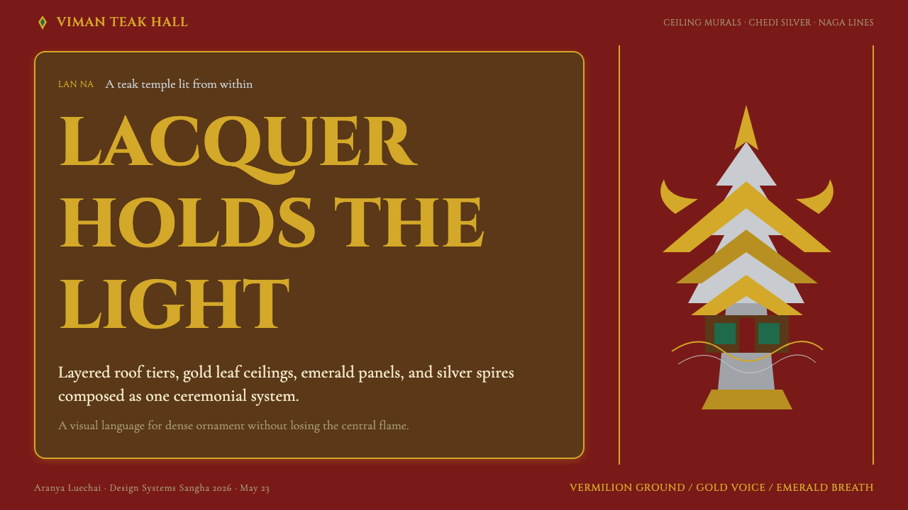
The defining exterior feature is the stacked multi-gabled roof, typically in three tiers, each gable slightly narrower than the one below. The roofline is not a continuous slope but a series of overlapping triangular forms that give the building a mountain-like profile. Chofa finials — gilded serpent-tail ornaments — curve upward at each ridge end, marking the transition between the sacred structure and the sky. The eave depth is generous, creating heavy horizontal shadow bands that articulate each tier clearly. In aggregate, the silhouette reads as a stepped pyramid viewed from the side.
Gold-Leaf Gilding and Lacquer Surface
The interaction between lacquer ground and gold-leaf surface is the tactile signature of the style. Traditional Lanna lacquerwork uses multiple layers of raw lacquer mixed with fine ash, each coat hand-applied and allowed to cure before the next, building up a surface of considerable depth that is simultaneously matte in the unexposed ground and luminous where the gold is applied. Gold is applied in sheets cut to geometric panel shapes, then burnished. The boundary between lacquer and gold is precise — a hard edge, not a transition — giving the surface a mosaic-like quality even though the panels are large.
Cassette Ceiling Geometry
The painted and carved ceilings of the Lanna viharn are organized into a grid of recessed cassette panels, each framed by gilded molding and painted with a different motif — typically a lotus, a flame mandala, a celestial being, or a repeating floral pattern derived from Yunnanese lacquerware. The cassette geometry is strictly symmetrical along both axes, creating a composition that reads as a single unified field from below despite being assembled from dozens of individual panels. The hierarchy of cassette sizes — a larger central field surrounded by progressively smaller units toward the edges — mirrors the spatial hierarchy of the room itself.
Repoussé Metalwork and Cool Contrast
Silver and sometimes white-metal repoussé — beaten metalwork whose relief patterns are formed from behind — appears on chedi exteriors, Buddha pedestals, and votive objects. In a palette dominated by warm gold and red, the cool silver surfaces function as necessary tonal counterweights. The repoussé relief patterns typically feature stylized floral scrolls, kinnara figures, and naga serpent forms. In the context of an interior dominated by warm light and warm colors, these silver surfaces catch light differently — cooler, sharper — and create the optical counterpoint that prevents the overall palette from becoming monotonous.
Candle-Scaled Intimacy
Despite the grandeur of its architectural forms, Lanna interior design is calibrated for the light output of oil lamps and candles — the illumination sources under which these spaces functioned for centuries before electrification. This means that the gold leaf is applied and burnished to a level of reflectivity that appears muted in daylight but alive in low, warm, directional light. The lacquer ground absorbs rather than reflects. Column gilding catches moving candlelight from multiple angles. The mural palette uses pigments dense enough to remain legible in near-darkness. Translating this tradition to digital contexts means understanding that it was designed for warmth and controlled luminosity rather than full-spectrum daylight brightness.
Symmetry as Sacred Order
In Lanna temple design, bilateral symmetry is not a compositional preference but a cosmological statement. The viharn plan is symmetrical on its main axis, with the principal Buddha image centered at the east end and the assembly space arranged evenly on either side. The ceiling cassettes, the altar backdrop panels, the flanking columns, and the painted mural programs on the side walls all echo this axial order. Asymmetry, where it exists, is an anomaly requiring explanation — typically a later addition or a repair. For design applications, this means that the Lanna idiom resists casual asymmetric layouts and rewards centered, hierarchical compositions where the most important element sits at the visual apex.
Who shaped Thai Lanna Tai Yai Temple?
Mengrai founded the Lanna Kingdom and established Chiang Mai in 1296. His patronage of Theravada Buddhism and his diplomatic alliances with neighboring Sukhothai created the political conditions under which Lanna temple architecture could develop its distinctive character. The canonical Lanna viharn form — triple-tiered roof, deep eaves, lacquered interior — appears to have stabilized during the century following his reign as royal patronage standardized construction across the kingdom.
The most venerated religious figure in modern northern Thai Buddhism, Khruba Sriwichai (c.1878–1939) organized restoration campaigns across Chiang Mai, Lamphun, and Lampang that saved dozens of deteriorated Lanna temple structures using traditional methods. He insisted on employing lacquerers, gilders, and carvers trained in the old ways, effectively functioning as a patron of the traditional crafts at a moment when modernization threatened to replace them. His image is ubiquitous in northern Thai temple compounds, and his approach to the tradition — protective rather than innovative — shaped how the style has been understood in the twentieth and twenty-first centuries.
An American scholar of Theravada Buddhism, Donald Swearer's research on the Lanna Buddhist tradition — particularly his studies of Khruba Sriwichai and the social dimensions of northern Thai temple patronage — provided the English-language scholarly framework through which the Lanna architectural tradition became accessible to international audiences. His work documented how the aesthetics of gold, lacquer, and layered rooflines were embedded in networks of community devotion rather than being purely royal or elite productions.
A German historian based in Chiang Mai for decades, Hans Penth devoted his career to the epigraphy and documentary history of the Lanna Kingdom. His work deciphering Lanna inscriptions and Shan-script records provided the chronological foundation — establishing when specific temples were built, restored, and patronized — that allowed art historians to map the development of the architectural style across the Lanna and Tai Yai regions with much greater precision than had previously been possible.
The Lanna lacquer-and-gilding tradition was sustained by generations of unnamed craftspeople — lacquerers who mixed resin from the Melanorrhoea usitata tree with ash and pigment, gilders who applied and burnished gold leaf onto prepared lacquer surfaces, and carvers who shaped the wooden armatures of ceiling cassettes and gable panels. Unlike European guild traditions that often preserved master names, the Lanna craft lineages were transmitted through workshop apprenticeship in a manner that left individual names largely unrecorded. The quality and consistency of surviving work testifies to a craft culture of considerable technical depth.
How do you use Thai Lanna Tai Yai Temple today?
Lanna temple design is a high-ceremony style — it conveys seriousness, depth, and layered cultural authority. Applying it correctly requires understanding that its visual weight comes from the interaction of warm ground and luminous accent, not from the accumulation of decorative detail. The single most common error is loading compositions with too many gilded elements, producing a cluttered surface rather than the measured alternation between absorption and radiance that defines the authentic idiom.
For presentation slides, the style excels on title and section-divider pages where a full-bleed vermilion or deep lacquer-red ground can carry a single centered heading in a display serif or capitalized text — the white or near-gold letterforms floating against the dark field in the manner of a temple inscription. Content slides work best when treated as restrained versions of the cassette ceiling logic: a clear grid, one accent color (gold-inflected amber or jade green) used to mark headings or data highlights, and generous negative space that allows the eye to rest. Data visualizations benefit from treating the chart background as the lacquer ground and the key data series as the gilded element — one warm, luminous accent against a darker field, with secondary data in muted neutral tones.
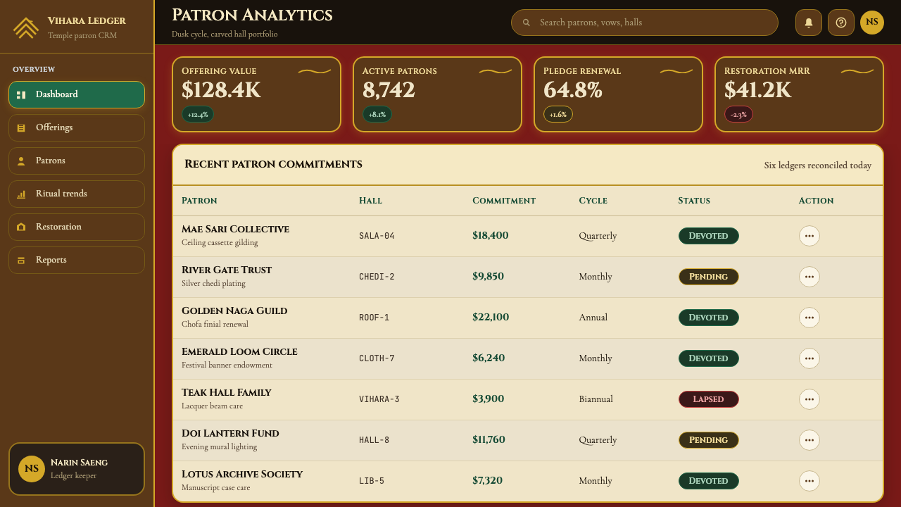
For web interfaces, the style is most appropriate for high-ceremony contexts: a heritage brand's landing page, a cultural institution's exhibition portal, a premium subscription tier page where scarcity and depth are the desired emotional register. Dashboard and application UI work is possible but requires restraint — the palette should be reduced to near-black backgrounds with a single gold or amber accent for interactive elements, and the ornamental cassette logic should be abstracted into bordered or lightly shadowed card containers rather than literally applied. Pricing pages benefit from using the tiered roof logic as a visual metaphor: the highest tier presented at the visual apex, with gold accents marking its distinction from lower tiers in jade or silver.
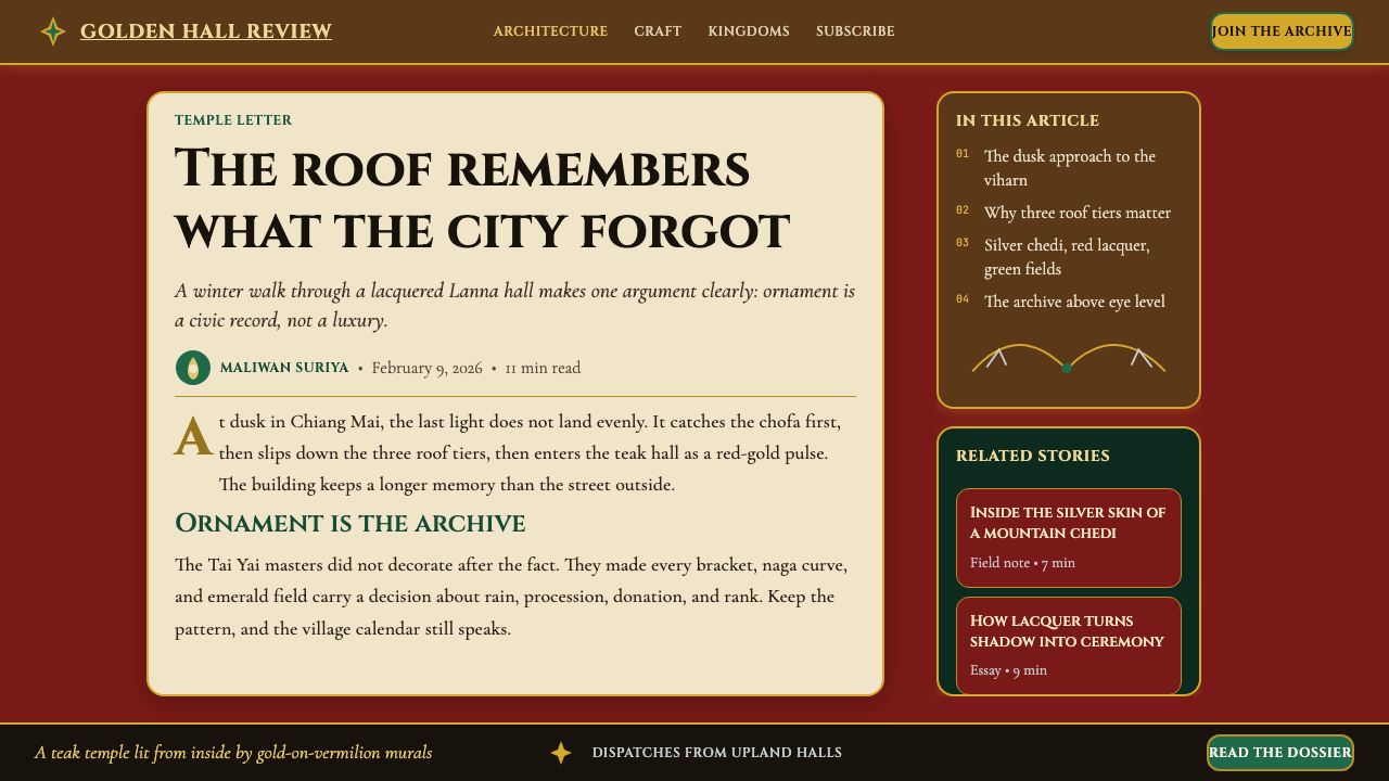
For editorial and marketing work, the style supports formal, considered layouts with strong vertical centering and generous margins. A feature article presented in this idiom might use a full-width lacquer-red header image, centered display type in a high-contrast light face, and body text in a warm near-black against an off-white field. Pull quotes take on the cassette logic — framed, centered, and slightly set apart from the body text column as if occupying their own panel. Marketing materials work well with the alternating ground logic: sections alternate between a near-black lacquer ground with gold or amber type and an off-white ground with dark type, maintaining the warm-cool rhythm without requiring literal gilt surfaces.
The most important mistake to avoid is treating this palette as if it were a general luxury aesthetic — all dark backgrounds, gold accents, and thin serif type. The Lanna idiom is specifically about the warmth of lacquer, the measured geometry of cassette panels, and the cool relief of silver against warm gold. Without the tonal relationship between these three registers — warm ground, warm luminous accent, cool contrast — the style collapses into generic dark-luxury. A second common mistake is applying the roof-tier silhouette or the lotus motif as a literal decorative element rather than as a structural principle. The roof form works as a compositional metaphor — layered, hierarchical, centered — but if rendered literally in a digital context it reads as clip art rather than structural logic.
Thai Lanna Tai Yai Temple — FAQ
What is the difference between Lanna and central Thai temple style?
Central Thai temple architecture — the style associated with Bangkok and Ayutthaya — is characterized by tall vertical prangs (corn-cob shaped towers), white-washed or gilded exterior walls, and an overall verticality that draws the eye upward. Lanna temple architecture is horizontally emphasized, with the stacked multi-tiered roof creating a stepped silhouette rather than a spire. The interior atmospheres also differ markedly: central Thai interiors tend toward white grounds with vivid mural paintings depicting the life of the Buddha, while Lanna interiors use the lacquer-and-gold surface system that creates a much darker, warmer, and more enveloping atmosphere. The Lanna tradition also incorporates strong Burmese and Shan influences that are largely absent from central Thai temple design.
Is this a dark-mode design system, and does it work on light backgrounds?
The authentic Lanna interior palette is dark-ground — the lacquer base is a deep, warm red-brown, not a neutral dark. It can be adapted to light backgrounds, but doing so requires careful re-thinking of which elements carry authority. On a light ground, the gold and jade accents need to be used with considerably more restraint to avoid looking festive or decorative rather than ceremonial. A practical approach is to use the lacquer-red only for full-bleed hero sections, header elements, and primary calls to action, while reserving off-white or warm cream grounds for body content areas. This maintains the vocabulary without forcing body text onto a dark ground where legibility suffers.
How do you handle the lotus and naga motifs in a digital context without them looking kitschy?
The key is to treat them as structural logic rather than surface decoration. The lotus, in Lanna art, is primarily a geometric form — a radially symmetrical arrangement of petals that functions like a mandala organizing principle. In a digital context this translates more cleanly into circular composition, radial grid structures, or centering logic than into a literal lotus image. The naga similarly is best understood as a sinuous border-and-threshold element — it marks transitions between sacred and non-sacred space. In practice, the naga-as-border can translate into a decorative rule or divider that emphasizes the boundary between content sections, rendered in gold or amber, without requiring a serpent figure. If the literal motifs are used, they should be at a scale and placement where they function architecturally — as a frame element or a centering anchor — not as a scattered repeating pattern.
Can Lanna temple design work for contemporary brands outside cultural or heritage contexts?
Yes, but with one important condition: the brand must be willing to carry the weight of the palette's associations rather than trying to strip them away. The lacquer-and-gold system communicates ceremony, depth, and a specific kind of measured abundance — values that translate well to premium hospitality, luxury goods, specialty food and beverage, wellness practices with a contemplative register, and cultural institutions. It is poorly suited to brands that want to project playfulness, speed, technology-forward thinking, or casual approachability. The style's age and cultural depth are features, not bugs — brands that try to use it ironically or casually almost always end up looking either appropriative or confused. Applied with full commitment to its tonal register, it is one of the most distinctive and recognizable palettes available to contemporary designers.
What role does symmetry play, and can compositions depart from it?
Symmetry in the Lanna tradition is cosmological — it expresses the idea that the sacred space is a microcosm of an ordered universe centered on the Buddha. This means that departing from symmetry carries a specific kind of visual weight: it signals that something is out of order, transitional, or deliberately subversive of the style's authority. In practical applications, this can be used intentionally — an asymmetric element introduced against a symmetric ground reads as an accent, an exception, or a point of dynamic interest precisely because the symmetry sets up the expectation. Full commitment to bilateral symmetry works best for ceremonial contexts: title slides, hero banners, formal product feature pages. Asymmetric layouts — common in editorial and long-form content — work within the idiom if the dominant structural elements (headers, section titles, major image blocks) remain centered even as body text and secondary elements are offset.
Related design styles
 Bhutanese Dzong (Fortress Red)Monumental red holds the page. Cobalt frames and gold bands lock the fortress…
 Lao Naga Temple StencilDevotional gilt, not chrome. Flat gold-leaf naga and flame stencils glow on o…
 Mughal Miniature (Akbar era)Opulence refuses emptiness. Saffron paper, ruby panels, cobalt lattice, gold…
 Nepali Paubha (Newari Scroll)Sacred density. Cinnabar ground, gold-leaf frame, lapis rings in strict symme…
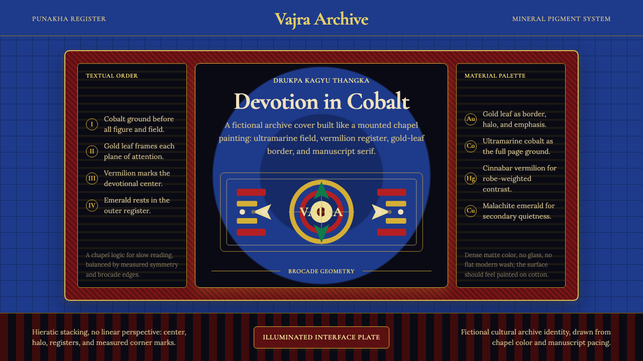 Bhutanese Drukpa Kagyu ThangkaDevotion made cobalt. Gold frames, Cormorant serif, and vermilion marks hold…
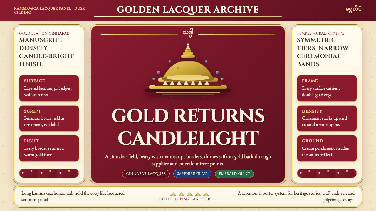 Burmese Shwedagon Gold-LacquerOpulence catches fire. Gold-leaf gradients on cinnabar panels frame a stupa s…