Design style guide设计风格指南
What is Burmese Shwedagon Stupa Relief?什么是 Burmese Shwedagon Stupa Relief?
The Shwedagon Pagoda blazes against the tropical night in a visual language where consecrated gold, teak-red lacquer, and jewel-toned accents collapse centuries of devotion into a single overwhelming composition.大金塔在热带夜色中灼灼燃烧——神圣的金色、柚木红漆与宝石般的点缀,将数百年的朝圣虔诚凝缩成一幅令人屏息的视觉构图。
Burmese Shwedagon Stupa Relief in briefBurmese Shwedagon Stupa Relief 速览
Burmese Shwedagon Stupa Relief is a design language drawn directly from the night experience of Yangon's Shwedagon Pagoda — a monument whose surface is clad in individual gold-leaf squares donated by pilgrims across many centuries, set against the absolute darkness of a tropical sky. The visual system translates this encounter into a contemporary design idiom: deep black grounds, brilliant gold-gradient ornament, velvet-dark lacquer panels, and gem-green accents that suggest the pagoda's emerald and sapphire settings.缅甸大金塔浮雕风格是一套直接从夜晚的大金塔体验中提炼出的设计语言。大金塔塔身覆盖着历代朝圣者逐片供奉的金箔,在热带夜空的绝对黑暗中烁烁生辉。这套视觉体系将这一相遇转化为当代设计语言:深黑底面、璀璨的金色渐变纹饰、天鹅绒般深沉的漆面板,以及令人联想到大金塔翡翠与蓝宝石镶嵌的宝石绿点缀。
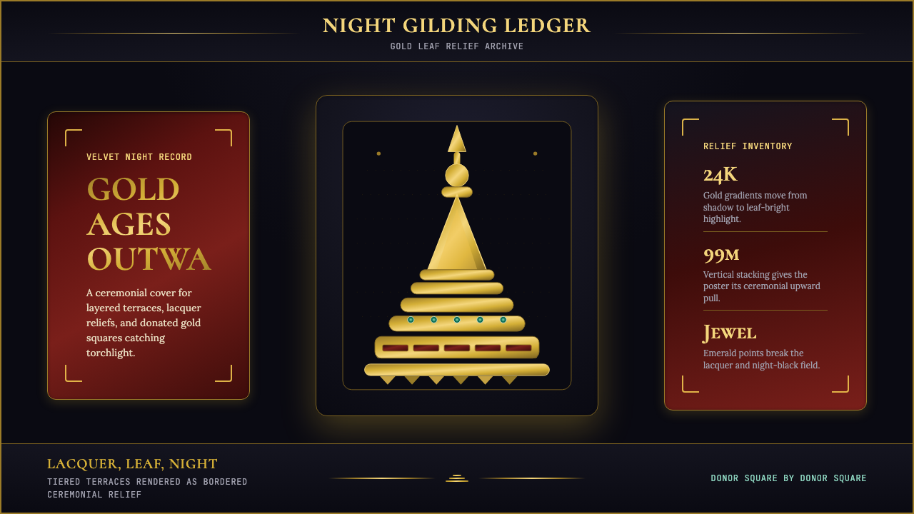
The language is one of sacred density. Where modernist traditions strip ornament away, this system layers it with purpose: each tier of gilded ornament references the stupa's ascending terraces, each border pattern echoes the chinthe-lion guardian figures and lotus motifs carved into the pagoda's stone base. Density is not clutter — it is devotional accumulation, and the visual logic treats each added element as an offering rather than decoration.这是一种神圣密度的语言。现代主义传统倾向于剥除装饰,而这套系统则以目的性的方式层叠装饰:每一层镀金纹饰都呼应着佛塔逐层升起的台阶,每一处边框图案都回响着雕刻于塔基石料上的狮身护法(chinthe)与莲花母题。密度不是杂乱——它是虔诚的累积,视觉逻辑将每一个新增元素视为供奉,而非装饰。
The result is a dark, luminous, ceremonially weighted aesthetic that stands in deliberate contrast to Western minimalism. Backgrounds are near-black or deep velvet; gold reads as warm, dimensional, and consecrated rather than showy; typography is formal and unhurried. The system is suited to any context where richness, reverence, and cultural specificity need to be communicated without apology.最终呈现出一种深沉、光辉、带有仪式感重量的美学,与西方极简主义形成刻意的对比。背景接近黑色或深邃的天鹅绒色;金色读起来是温暖的、有维度的、被神圣化的,而非炫耀的;字体庄重而从容。这套系统适用于任何需要毫无保留地传达丰盛、崇敬与文化特殊性的场景。
See the Burmese Shwedagon Stupa Relief design system →查看 Burmese Shwedagon Stupa Relief 完整设计系统 →
Where does Burmese Shwedagon Stupa Relief come from?Burmese Shwedagon Stupa Relief 从何而来?
The Shwedagon Pagoda has the deepest continuous sacred history of any Buddhist monument in Southeast Asia. According to tradition, it was originally raised in the sixth century BCE — contemporaneous with the historical Buddha — to enshrine eight of the Buddha's hairs gifted to two merchant brothers from the Mon kingdom. While this founding date lies in the realm of devotional history, excavated inscriptions and architectural evidence confirm continuous development since at least the eleventh century CE, making the pagoda a living architectural document spanning more than a thousand years of Burmese and Mon Buddhist practice.大金塔是东南亚任何一座佛教建筑中连续神圣历史最为悠久的。据传统记载,它最初建于公元前六世纪——与历史上的佛陀同时代——为供奉两位孟族商人所获赠的佛陀八根头发。尽管这一建立时间属于信仰传统的领域,已发掘的铭文与建筑实证确认了至少自公元十一世纪起的连续发展,使这座佛塔成为一份跨越千年以上缅甸与孟族佛教实践的活的建筑文献。
The monument's current visual identity is largely the product of the fifteenth through eighteenth centuries. Queen Shin Sawbu, who ruled Pegu in the mid-fifteenth century, is credited with establishing the tradition of weighing herself in gold and donating that weight in gold leaf to plate the stupa — a practice that initiated the cycles of re-plating that continue to this day. King Hsinbyushin of the Konbaung dynasty completed major reconstructions after a devastating earthquake in 1769, and it is largely his era's patronage that fixed the present proportions: a bell-shaped lower section rising through multiple terraces to a fluted spire and, at the very top, a jewel-tipped umbrella finial set with diamonds, rubies, sapphires, and emeralds.这座建筑目前的视觉形象,很大程度上是十五至十八世纪的产物。十五世纪中叶统治勃固的勃固女王信修浮,相传开创了以自身体重的黄金供奉、将等量金箔贴敷于佛塔的传统——这一做法开启了延续至今的周期性重新贴金传统。贡榜王朝的孟驳王(Hsinbyushin)在1769年一场毁灭性地震后完成了主要的重建工程,正是他那个时代的赞助,基本固定了现今的比例形态:钟形下部经由多层台阶升至竖纹尖顶,顶端是一把镶嵌着钻石、红宝石、蓝宝石与翡翠的宝石华盖。
The visual ecology of the Shwedagon is inseparable from Burmese lacquerware tradition, one of the country's oldest and most technically demanding crafts. Lacquer — derived from the thitsi tree — is applied in many layers over wicker, bamboo, or wood forms, polished between coats, and finally carved or painted with mythological figures, floral scrollwork, and ceremonial scenes. The deep red-brown of cured lacquer and the black of lacquered grounds are the pagoda's secondary palette, appearing in the decorative pavilions, offering tables, and shrine furniture that surround the main stupa. This craft lineage gives the design system its distinctive material registers: gold is never isolated but always set against the rich darkness of lacquered grounds.大金塔的视觉生态与缅甸漆器传统密不可分——后者是缅甸历史最悠久、技术要求最苛刻的工艺之一。漆液——取自硫黄漆树——以多层涂布于柳条、竹或木质骨架,层间打磨,最后雕刻或描绘神话人物、花卉卷草与仪式场景。固化漆器的深红棕色与黑色漆底是大金塔的副调色板,出现于主塔周围的装饰廊亭、供奉台与神龛陈设中。这一工艺传承赋予了这套设计系统其独特的材质语法:金色从不孤立存在,始终置于漆底丰富的黑暗之上。
Modern photographic documentation of the Shwedagon — particularly the nocturnal photography that became widespread from the late twentieth century onward — crystallized a specific visual interpretation of the monument: the stupa as a luminous object suspended in near-perfect darkness, its gold surface breaking the night with graduated warmth. This photographic register, rather than the daylight experience of the pagoda, is the direct visual ancestor of the Shwedagon Stupa Relief design language. Conservators and artisans including U Win Maung and Win Pe have documented the ongoing restoration practices, ensuring that the methods of gold-leaf application and lacquerwork that define the monument's material identity are preserved and transmitted.大金塔的现代摄影记录——尤其是二十世纪末以来广泛流传的夜景摄影——将这座建筑的特定视觉诠释凝固成型:佛塔作为一个悬浮于近乎完美黑暗中的发光体,其金色塔面以渐变的温暖色调劈破夜幕。这种摄影语法,而非白日的大金塔体验,是大金塔浮雕设计语言的直接视觉先祖。包括吴温茂(U Win Maung)与温培(Win Pe)在内的修复专家与工匠记录了持续进行的修缮实践,确保了定义这座建筑物质身份的贴金与漆器工艺得以保存与传承。
What defines the Burmese Shwedagon Stupa Relief look?Burmese Shwedagon Stupa Relief 的视觉特征是什么?
Gold as Sacred Material金色作为神圣物质
Gold in this system is not a flat tint but a material presence — warm, graduated, and multidirectional in its luminosity. It behaves as if lit from within, with deeper amber tones at edges and edges giving way to near-white brilliance at the most elevated surfaces. This graduated warmth directly references the visual behavior of actual gold leaf on curved architectural forms, where the angle of light produces constantly shifting tonal variation. Gold is reserved for the most structurally significant elements — headings, primary calls to action, structural borders — and never used as background fill for large areas, which would read as excess rather than consecration.这套系统中的金色并非平涂色块,而是一种材质存在——温暖、渐变、发光方向多元。它仿佛从内部发光,边缘处呈更深的琥珀调,最高处的表面则趋近耀眼的近白色。这种渐变的温暖感直接参照了弧形建筑构件上真实金箔的视觉行为——光线角度的变化在其上产生不断移动的色调变化。金色保留给结构上最重要的元素——标题、主要行动号召、结构性边框——绝不用于大面积背景填充,那样会读起来像铺张,而非神圣化。
Deep Black and Lacquer Grounds深黑与漆底
The primary background is a near-absolute black that reads as dense and material rather than digital void — evoking the polished lacquer grounds of Burmese decorative furniture and shrine objects. Against this ground, every gold element acquires heightened luminosity through contrast. Subsidiary surfaces use deep teak-brown and lacquer-red as grounding tones, giving large areas of the composition a sense of layered material depth rather than flat darkness. These lacquer-ground tones prevent the overall palette from collapsing into simple high-contrast black-and-gold, instead producing a composition with genuine tonal range.主背景是接近绝对的黑色,读起来是密实而物质性的,而非数字虚空——令人联想到缅甸装饰家具与神龛器物的抛光漆底。在这一底面上,每一个金色元素通过对比获得增强的光辉。次级表面使用深柚木棕与漆红作为基础色调,使构图的大面积区域呈现出层叠物质深度感,而非单调的平面黑暗。这些漆底色调防止整体色板坍缩为简单的黑金高对比,而是产生一种具有真实色调幅度的构图。
Jewel Accents宝石点缀
Emerald green and sapphire blue appear as controlled accent tones drawn from the literal gemstone settings at the pagoda's apex — the diamond-studded umbrella finial that terminates the spire is encrusted with rubies, sapphires, and emeralds. In the design system, these gem tones function as tertiary accents: high-saturation, small-area touches that create moments of brilliance within the predominantly gold-and-black composition. They are used for notification indicators, status elements, or decorative detail points — never as structural color for large layout elements.翡翠绿与蓝宝石蓝作为受控的点缀色调出现,取自大金塔顶端真实的宝石镶嵌——终结尖顶的镶钻华盖上嵌满了红宝石、蓝宝石与翡翠。在这套设计系统中,宝石色调作为三级点缀发挥作用:高饱和度、小面积的触点,在以金黑为主的构图中制造光彩一闪的时刻。它们用于通知指示器、状态元素或装饰细节点——绝不用作大型版面元素的结构色。
Tiered and Layered Ornament层叠装饰
Burmese stupa architecture is defined by ascent through multiple terraces — each tier slightly narrower than the one below, creating a rhythm of horizontal bands that draws the eye upward toward the spire. The design system translates this architectural logic into visual layering: borders nest within borders, panels are framed by decorative strips, and hierarchical information is organized in stacked tiers rather than flat columns. This layered approach is not gratuitous complexity but a deliberate structural metaphor — each ring of ornament marks a threshold, a step in an upward progression.缅甸佛塔建筑由多层台阶式上升来定义——每一层都略窄于其下一层,形成水平带状的节律,引领视线向上移向尖顶。这套设计系统将这一建筑逻辑转化为视觉分层:边框内套边框,面板被装饰条带框起,层级信息以叠层方式而非平列列组织。这种叠层方式不是无谓的复杂性,而是刻意的结构隐喻——每一圈装饰标志着一个门槛,一个向上进程中的台阶。
Ceremonial Typography仪式性字体排印
Type choices lean toward the formal and unhurried — high-contrast serif letterforms that carry a sense of weight, occasion, and deliberateness. Titles are set with generous letter-spacing and occupy central positions in compositions, echoing the inscriptional quality of stone-carved dedicatory texts found throughout the pagoda complex. Body text is treated as secondary information, given quieter weight and less visual prominence, ensuring that the ornamental and structural hierarchy of the composition is never undermined by typographic competition.字体选择倾向于庄重与从容——高对比度衬线字形,携带重量感、仪式感与深思熟虑的气质。标题以宽松的字距排布,占据构图的中心位置,呼应着散布于大金塔建筑群各处的石刻题记的铭文品质。正文被视为次级信息,给予较为安静的字重与较低的视觉显著度,确保构图中的装饰与结构层级从不被字体竞争所削弱。
Luminosity Through Contrast通过对比获得的光辉
The system's primary expressive mechanism is extreme value contrast between near-black grounds and near-white or bright-gold figures. This approach produces a sense of internal luminosity — elements appear to glow rather than simply to be colored. The effect is deliberately evocative of the candle-and-floodlight illumination of the actual pagoda at night, where points of intense brightness appear against absolute darkness. Intermediate grey tones are used sparingly, mainly for secondary informational elements, to preserve the drama of the primary contrast.这套系统的主要表现机制是近黑底面与近白或明金图形之间的极端明度对比。这种方式产生了一种内部光辉的感觉——元素看起来像是在发光,而不仅仅是被着色。这种效果刻意令人联想起夜晚大金塔实际的烛光与泛光灯照明:在绝对的黑暗中浮现出强烈亮度的光点。中间灰调被节制地使用,主要用于次级信息元素,以保留主对比的戏剧性张力。
Guardian and Protective Motifs护法与守护母题
Shwedagon's sculptural program includes chinthe — mythical lion-dragon guardian figures that flank every stairway entrance — alongside naga serpent railings, lotus-bud pinnacles, and floral petal scrollwork. These motifs enter the design system as structural border elements: corners and edges are marked by zoomorphic or botanical forms that signal protection, threshold, and sanctity. Rather than importing these motifs literally, the system uses their structural logic — bilateral symmetry, rhythmic repetition, hierarchical placement at entry points — to organize the visual field.大金塔的雕塑体系包括狮身兽(chinthe)——守护每一处阶梯入口的神话狮龙护法像——以及那迦蛇形扶手、莲花蕾尖顶与花卉卷草纹饰。这些母题以结构性边框元素的形式进入设计系统:角部与边缘以动物形或植物形标记,传达守护、门槛与神圣性。这套系统不是字面引入这些母题,而是使用其结构逻辑——双边对称、节奏性重复、在入口处的层级性摆布——来组织视觉场域。
See the Burmese Shwedagon Stupa Relief design system →查看 Burmese Shwedagon Stupa Relief 完整设计系统 →
Who shaped Burmese Shwedagon Stupa Relief?谁塑造了 Burmese Shwedagon Stupa Relief?
Queen Shin Sawbu ruled the Mon kingdom of Pegu in the mid-fifteenth century and is credited with initiating the tradition of weighing oneself in gold and donating that weight in gold leaf to plate the Shwedagon's stupa. This act established the devotional logic of the monument as a site of continuous material accumulation — a practice that has continued for more than five hundred years and accounts for the pagoda's current extraordinary surface density. Shin Sawbu is also credited with laying out the surrounding terrace complex and establishing protocols for the management of donations, making her as significant to the monument's organizational identity as to its material one.信修浮女王于十五世纪中叶统治孟族的勃固王国,相传开创了以自身体重的黄金供奉、将等量金箔贴敷于大金塔的传统。这一行为确立了这座建筑作为持续物质积累场所的虔诚逻辑——这一做法延续了五百余年,并造就了大金塔目前非凡的表面密度。信修浮还相传规划了周围的台阶建筑群,并制定了管理供奉的规范,使她对这座建筑的组织身份的贡献与对其物质身份的贡献同等重要。
Hsinbyushin, fourth king of the Konbaung dynasty, oversaw major reconstruction of the Shwedagon after a severe earthquake in 1769. His patronage funded the raising of the main stupa to close to its current height and the installation of the ornamental umbrella at the apex with its extraordinary gemstone settings. The Konbaung dynasty's investment in the pagoda — conducted against a background of military expansion and dynastic legitimation — is why the monument's current visual language reflects eighteenth-century Burmese royal aesthetics as much as it does older Mon Buddhist traditions.孟驳王,贡榜王朝第四位国王,在1769年一场严重地震后主持了大金塔的重大重建工程。他的赞助资助了主塔升至接近现今高度,并在顶端安置了嵌满宝石的装饰华盖。贡榜王朝对大金塔的投入——在军事扩张与王朝合法化的背景下进行——正是这座建筑目前的视觉语言同时反映十八世纪缅甸王家美学与更古老孟族佛教传统的原因。
U Win Maung is among the most significant figures in the documentation and conservation of Burmese Buddhist material culture in the twentieth century. His work on the architectural and decorative records of the Shwedagon and related monuments provided systematic photographic and measured documentation of the pagoda's ornamental program at a level of detail that had not previously existed. This documentation established the visual archive from which contemporary designers working in the Shwedagon idiom draw — the catalogued inventory of guardian figures, lotus capitals, naga railings, and tiered cornice profiles that defines the monument's ornamental vocabulary.吴温茂是二十世纪缅甸佛教物质文化记录与保护工作中最重要的人物之一。他对大金塔及相关建筑的建筑与装饰记录,以前所未有的细节深度提供了系统性的摄影与实测文献。这些记录建立了当代设计师在大金塔语汇中工作时所借鉴的视觉档案——护法像、莲花柱头、那迦扶手和层叠檐口线脚的系统目录,定义了这座建筑的装饰词汇。
Win Pe worked within the tradition of Burmese lacquerware conservation and was involved in the documentation of the craft techniques used in the production of the devotional objects, furniture, and architectural elements that populate the Shwedagon's surrounding terraces. His contribution to preserving the technical knowledge of thitsi-based lacquer application — the layering, polishing, and carving methods that produce the deep red-black surfaces characteristic of the tradition — helped ensure that the material language of Burmese sacred craft remained available to subsequent generations of artisans and, by extension, to designers working in this visual idiom.温培在缅甸漆器保护传统内工作,参与了记录大金塔周围台阶区域的供奉器物、家具与建筑元素所使用的工艺技术。他在保存硫黄漆(thitsi)涂装应用技术知识方面的贡献——产生这一传统特有的深红黑色表面的层涂、打磨与雕刻方法——帮助确保了缅甸神圣工艺的材质语言得以传承给后代工匠,进而传承给在这一视觉语汇中工作的设计师。
How do you use Burmese Shwedagon Stupa Relief today?今天怎么用 Burmese Shwedagon Stupa Relief?
The Shwedagon Stupa Relief language is among the most specific of all dark ceremonial aesthetics in terms of what it communicates: consecration, accumulated devotion, and culturally rooted grandeur. Applying it well requires understanding this specificity — it is not a generic dark-luxury mode but a system with a coherent material and spiritual ancestry. Used with that understanding, it is remarkably effective for high-stakes presentation contexts, premium digital products, and editorial work that needs to convey depth without distance.大金塔浮雕风格在所有深色仪式性美学中对传达内容最为具体:神圣化、积累的虔诚,以及植根于文化的宏伟。正确应用它,需要理解这种特殊性——它不是通用的深色奢华模式,而是一套拥有连贯物质与精神渊源的系统。带着这种理解使用它,在高规格演示场景、高端数字产品,以及需要传达深度而不产生距离感的编辑工作中,它的效果非常出众。
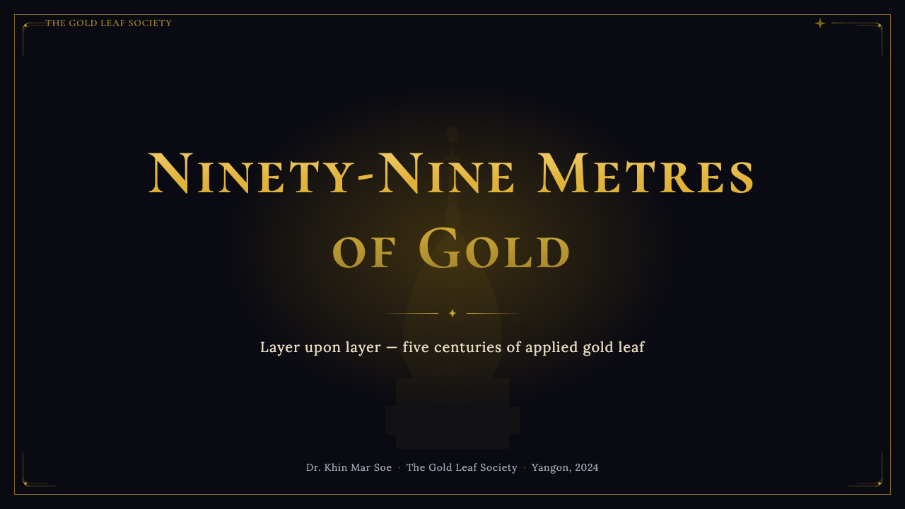
For presentation slides, the system is particularly powerful on cover pages and section dividers. A cover works best with a near-black ground, a central compositional element in layered gold gradient, and title text in high-contrast formal type — no busy backgrounds, no competing secondary imagery. Section dividers can introduce the lacquer-red accent as a banding element, creating a visual rhythm that echoes the pagoda's ascending terraces. Content slides should strip back to a simpler register: the ground remains dark, gold is reserved for headings and critical callouts, and body information is given in a neutral cream or soft warm white. Data visualization in this system works well when charts are treated as contained panels with gold-bordered frames, bars and segments picked out in the primary gold and gem-accent palette.在演示文稿中,这套系统在封面页与章节分隔页上尤为强大。封面最适合以接近黑色的底面为基础,以一个层叠金色渐变的中心构图元素为主体,标题采用高对比度的庄重字体——无繁复背景,无竞争性次级图像。章节分隔页可以引入漆红点缀作为带状元素,形成呼应大金塔逐层台阶的视觉节律。内容页应退至更简洁的语法:底面保持深色,金色保留给标题与关键提示,正文信息以中性奶油色或柔暖白色呈现。在这套系统中,数据可视化在图表被处理为带有金色边框的内含面板时效果最佳,柱条与扇区以主金色和宝石点缀色板提取。
For web interfaces, this language is well suited to premium product pages, cultural or museum contexts, luxury e-commerce, and entertainment platforms. The dark ground and gold hierarchy naturally organize a pricing page by tier — the highest tier takes the most gold; middle tiers use lacquer-red as their accent; base tiers step back to cream-and-warm-white on dark. Navigation should be restrained: wordmarks in gold, links in warm neutral, with active states highlighted by a thin gold underline rather than background fills. Cards should use a layered border treatment — a thin outer border in near-black, an inner inset of the lacquer-panel tone — that recalls the decorative frames of Burmese shrine furniture without directly copying them.对于网页界面,这种语言适合高端产品页面、文化或博物馆场景、奢侈品电子商务和娱乐平台。深色底面与金色层级自然地按等级组织定价页面——最高等级获得最多金色;中间等级以漆红为其点缀色;基础等级退至深色上的奶油与暖白。导航应保持克制:品牌标识以金色呈现,链接以暖中性色呈现,激活状态以细金色下划线高亮,而非背景填充。卡片应使用层叠边框处理——外层近黑细边,内嵌漆面板色调的内框——令人联想缅甸神龛家具的装饰边框,而不直接复制它们。
For editorial and marketing work, the style supports rich long-form reading environments and high-presence campaign imagery. An article layout in this language uses a dark masthead with the publication mark in gold, a slightly lightened content well for body text readability, and pull quotes or chapter headings in the full gold treatment. Marketing pages benefit from alternating full-width panels: a gold-on-near-black feature block, followed by a lacquer-warm-dark narrative section, followed by a gem-accent testimonial or feature point. The rhythm of these alternating sections creates the sense of ascending tiers — always moving the reader upward toward the core message.对于编辑与营销内容,这种风格支持丰富的长文阅读环境与高存在感的活动图像。采用这种语言的文章版面以深色报头搭配金色刊名,正文区域略微提亮以保证可读性,引用语或章节标题采用完整的金色处理。营销页面得益于交替的全宽面板:金色-近黑特性区块,接着是漆色暖深叙述段,接着是宝石点缀色的推荐语或特性要点。这些交替段落的节律制造出逐层上升的感觉——始终引领读者向上,朝向核心信息。
The most common mistake when working with this system is treating gold as a background color rather than a figure color. Gold placed as a solid fill beneath dark text inverts the fundamental contrast logic of the Shwedagon aesthetic — it washes out the luminous-against-dark effect that the system depends on. The second common error is mixing the system's ceremonial density with contemporary minimalist negative space conventions: the Shwedagon idiom requires compositional fullness — borders, layered frames, and ornamental weight — and looks under-realized when applied with a sparse hand. If the composition feels empty, add structure; do not add arbitrary color.使用这套系统时最常见的错误,是将金色视为背景色而非图形色。将金色作为实填色置于深色文字之下,颠覆了大金塔美学的基本对比逻辑——它会消解这套系统所依赖的「发光体映衬于黑暗」的效果。第二个常见错误是将这套系统的仪式性密度与当代极简负空间惯例混用:大金塔语汇需要构图的充实——边框、层叠框架与装饰重量——以稀疏之手应用时会显得未完成。如果构图感觉空洞,就加入结构;不要加入随意的色彩。
See the Burmese Shwedagon Stupa Relief design system →查看 Burmese Shwedagon Stupa Relief 完整设计系统 →
Burmese Shwedagon Stupa Relief — FAQBurmese Shwedagon Stupa Relief · 常见问题
How is Burmese Shwedagon Stupa Relief different from other gold-on-dark luxury aesthetics?大金塔浮雕风格与其他金色深底奢华美学有何不同?
Generic luxury gold-on-dark — as found in financial services, prestige automotive, or high fashion — typically uses gold as a flat metallic tone applied to a single compositional level. Shwedagon Stupa Relief layers gold across multiple tiers, uses graduated warmth rather than flat color, sets gold against lacquer grounds rather than pure black, and introduces jewel-tone accents drawn from an explicit architectural source. The result reads as devotionally specific rather than generically premium — it communicates a particular cultural and spiritual inheritance, not just market positioning.通用的金色深底奢华风格——见于金融服务、顶级汽车或高端时装——通常将金色作为一种平面金属调应用于单一构图层次。大金塔浮雕风格则将金色分布于多个层级,使用渐变暖色而非平涂色彩,将金色置于漆底而非纯黑底面之上,并引入来自具体建筑来源的宝石调点缀。结果读起来是信仰上特指的,而非通用的高端感——它传达的是特定的文化与精神传承,而非单纯的市场定位。
Can this aesthetic work for digital products aimed at non-Burmese audiences?这种美学能用于面向非缅甸受众的数字产品吗?
Yes, but the approach matters. Applied with fluency and genuine understanding of the source material — its architectural origins, its craft traditions, its devotional logic — the Shwedagon idiom translates into a powerful visual language for global premium contexts, because it communicates qualities (consecration, accumulated value, luminosity against darkness) that are widely legible. Applied superficially — simply using dark backgrounds and yellow-gold accents — it collapses into generic dark luxury and loses its distinctiveness. The system rewards investment in understanding rather than surface borrowing.可以,但方式很重要。以流利的方式并对源材料——其建筑来源、工艺传统与虔诚逻辑——有真正理解地应用时,大金塔语汇在全球高端语境中转化为一种强大的视觉语言,因为它传达的品质(神圣化、积累的价值、映衬于黑暗的光辉)是广泛可读的。肤浅地应用——仅仅使用深色背景与黄金色调——则会坍缩为通用深色奢华,失去其独特性。这套系统奖励深入理解,而非表面借用。
How do the jewel accents — emerald green and sapphire blue — get used without competing with the gold?宝石点缀——翡翠绿与蓝宝石蓝——如何在不与金色竞争的情况下使用?
The key is surface area and placement hierarchy. Gold covers the structurally significant elements — headings, primary borders, key calls to action. Jewel tones appear only in tertiary positions: small status indicators, corner decorative details, the occasional notification dot. They are never set directly adjacent to gold at equal scale — that would create harmonic competition rather than complement. When in doubt, restrict jewel accents to elements that are informationally secondary and physically small, so that their high saturation reads as a bright point rather than a competing focal element.关键在于面积与摆布层级。金色覆盖结构上重要的元素——标题、主要边框、关键行动号召。宝石调只出现在三级位置:小型状态指示器、角部装饰细节、偶尔的通知圆点。它们绝不在相同尺度上直接与金色相邻——那会产生和声性竞争而非互补。拿不准时,将宝石点缀限制于信息上次要且物理上微小的元素,使其高饱和度读起来是一个亮点,而非竞争性的焦点元素。
Is the decorative density of this system a problem for information-heavy interfaces?这套系统的装饰密度对信息密集型界面来说是否是个问题?
It requires management rather than avoidance. The solution is to distinguish clearly between two registers: the ceremonial frame and the informational content. Chrome elements — navigation, borders, section headers, footers — can carry the full ornamental density of the system. The content well itself should be treated more simply: dark but undecorated ground, clear typographic hierarchy, adequate spacing between information blocks. This separation means the overall composition reads as rich and structured, while individual content items remain legible and scannable. Think of it as the relationship between the pagoda's elaborately decorated terrace perimeter and the clear navigational paths laid out between the shrines.这需要管理而非回避。解决方案是清晰区分两种语法:仪式性框架与信息性内容。界面框架元素——导航、边框、段落标题、页脚——可以承载这套系统的完整装饰密度。内容区域本身应更简洁处理:深色但无装饰的底面,清晰的字体层级,信息块之间充足的间距。这种区分意味着整体构图读起来丰富而有结构,同时单个内容项保持易读与可扫描。可以将其理解为大金塔精雕细琢的台阶边界与神龛之间清晰导航通道之间的关系。
Does this aesthetic work for light-background or daytime-register interfaces?这种美学能用于浅色背景或白昼感界面吗?
With significant care, but it is not the natural register of this system. The Shwedagon idiom derives its power from the night experience of the pagoda — luminosity against absolute darkness. On a light ground, gold loses its luminous contrast, becomes closer to khaki or ochre, and the jewel accents lose their brilliance entirely. A light variant can work if the gold is reserved for the darkest elements in the composition — dark headings, strong borders on cream grounds — but it is a fundamentally different visual proposition. If a light interface is required, it may be worth considering whether a different style entirely is better suited to the context, or whether a restricted dark panel can be used as a component within an otherwise light layout.需要格外谨慎,但这不是这套系统的自然语法。大金塔语汇的力量来自夜晚的大金塔体验——在绝对黑暗中的光辉。在浅色底面上,金色失去了其光辉对比,变得更接近卡其色或赭石色,宝石点缀则完全失去光彩。如果金色被保留用于构图中最深的元素——奶油底上的深色标题、强边框——浅色变体是可行的,但这是一种根本不同的视觉命题。如果确实需要浅色界面,或许值得考虑是否有完全不同的风格更适合这一场景,或者是否可以在总体浅色版面中使用一个受限的深色面板作为组件。
Related design styles相关设计风格
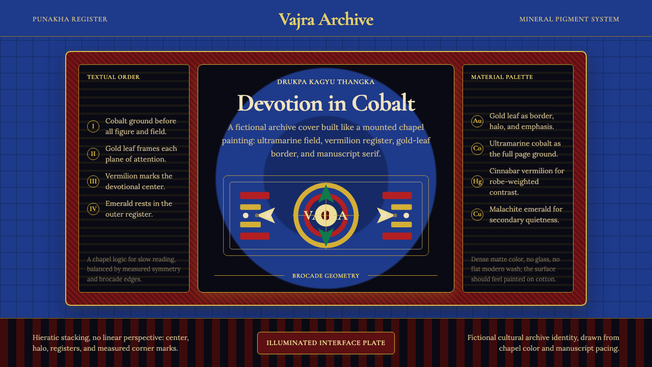 Bhutanese Drukpa Kagyu ThangkaDevotion made cobalt. Gold frames, Cormorant serif, and vermilion marks hold…钴蓝承载虔敬:金框、Cormorant 衬线与朱砂标记构成佛殿秩序。
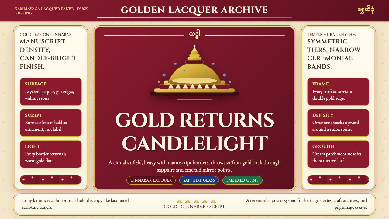 Burmese Shwedagon Gold-LacquerOpulence catches fire. Gold-leaf gradients on cinnabar panels frame a stupa s…虔诚的金色密度:朱漆面板上的金箔渐变,围出佛塔中轴。
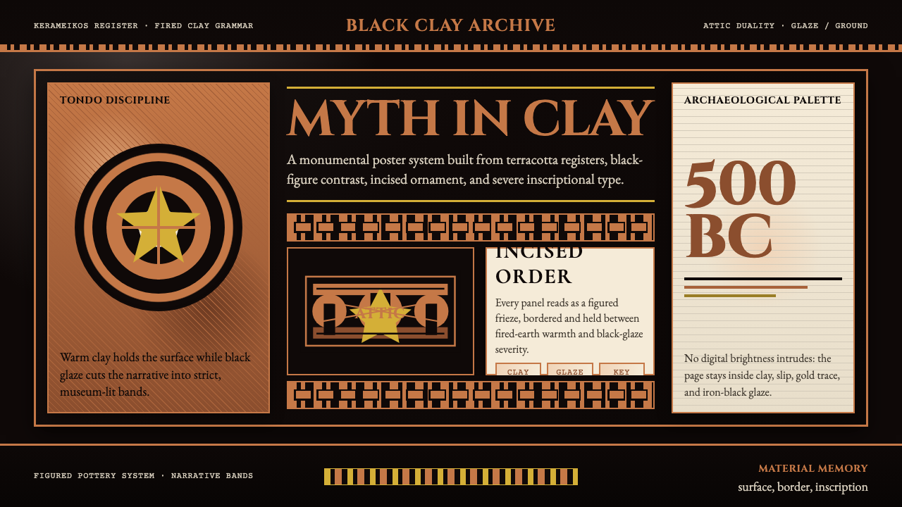 Greek Vase Attic (500 BC)Archaeological severity. Jet-black glaze, terracotta bands, and meander borde…考古般克制:黑釉底、赤陶饰带与回纹边框构成陶瓶式秩序。
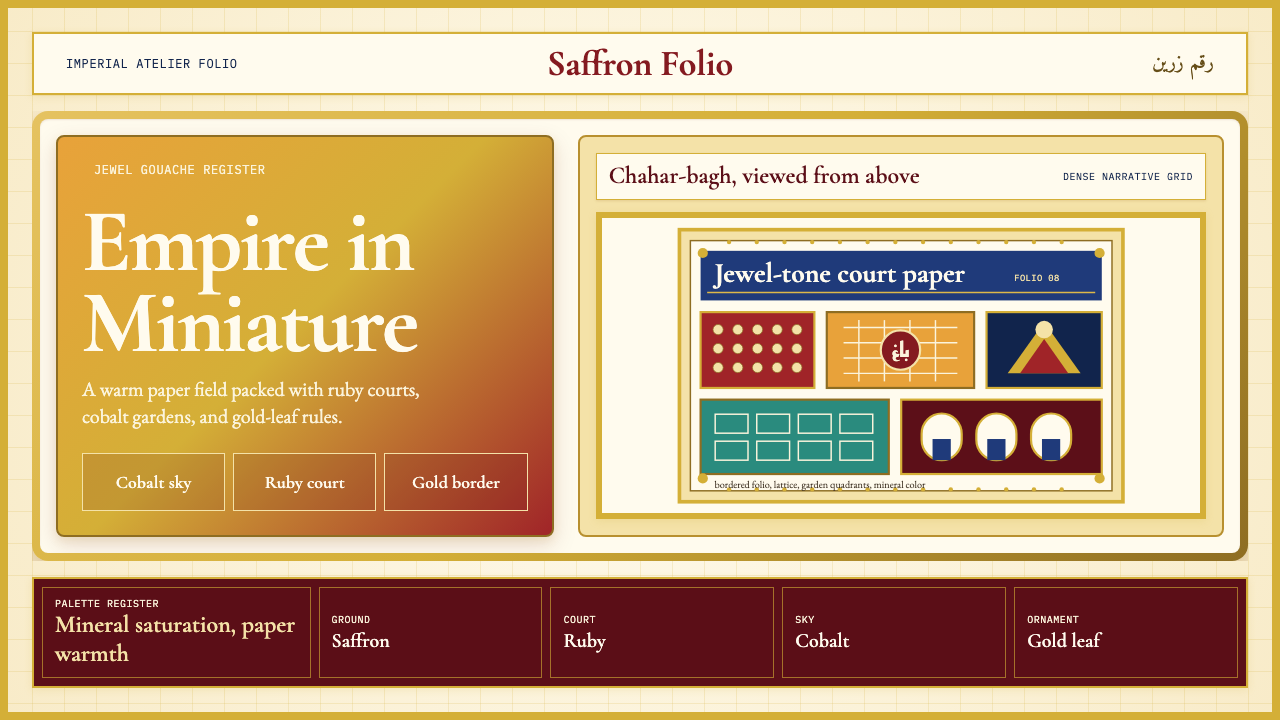 Mughal Miniature (Akbar era)Opulence refuses emptiness. Saffron paper, ruby panels, cobalt lattice, gold…华贵拒绝留白:番红花纸底、宝石红分栏、钴蓝格纹与金箔边饰。
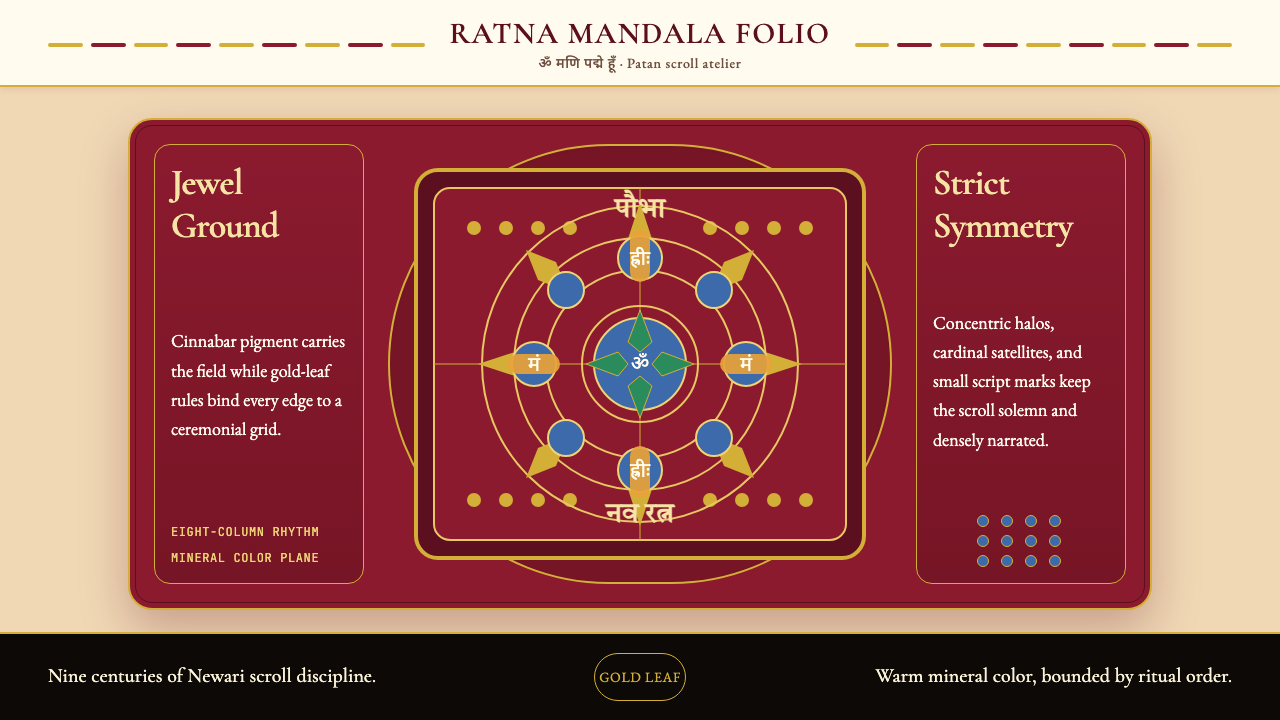 Nepali Paubha (Newari Scroll)Sacred density. Cinnabar ground, gold-leaf frame, lapis rings in strict symme…庄严而密集。朱砂红底、金箔框与青金石环严整对称。
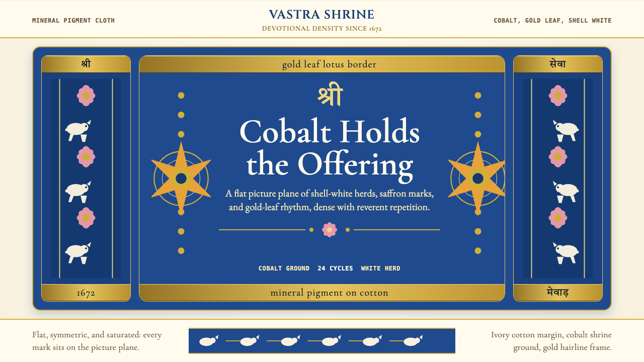 Rajasthani Pichwai (Nathdwara)Devotional density in cobalt. Gold borders, shell-white herds, lotus pink on…虔诚密度铺满钴蓝:金边、白牛、粉莲落在象牙棉布上。