Design style guide设计风格指南
What is Bhutanese Dzong (Fortress Red)?什么是 Bhutanese Dzong (Fortress Red)?
Saffron-red fortress walls rise from Himalayan valley floors — the Bhutanese dzong tradition translates monumental devotion into a design system built on saturated warmth, cobalt accents, and the heavy horizontality of mountain-fortress architecture.藏红宫墙从喜马拉雅谷底拔地而起——不丹宗堡传统将恢弘的信仰表达转化为一套以饱和暖色为骨、钴蓝为睛、山地堡寺厚重水平感为魂的设计系统。
Bhutanese Dzong (Fortress Red) in briefBhutanese Dzong (Fortress Red) 速览
Bhutanese Dzong (Fortress Red) is a design system rooted in the visual language of the dzong — the fortress-monastery complexes that have dominated Bhutan's valley confluences since the seventeenth century. The style takes as its foundation the kemar band: the deep saffron-red ceremonial stripe that encircles every dzong at the level of its upper floors, marking the sacred threshold between secular and monastic space. In this design system, that band becomes the page itself — a field of concentrated, red-orange warmth from which ivory whitewash surfaces and cobalt-blue window-frame accents emerge as highlights and structural breaks.不丹宗堡(堡寺藏红)是一套根植于宗堡视觉语言的设计系统——宗堡是十七世纪以来主导不丹各谷地交汇处的堡垒与寺院合一的建筑形态。这套风格以凯马带为基础:深藏红色的仪式彩带环绕每座宗堡上层楼面,标示世俗与寺院空间之间的神圣边界。在这套设计系统中,凯马带化为页面本身——一片浓郁的红橙暖场,灰泥白表面与钴蓝窗框作为高光与结构断点在其中浮现。
The aesthetic is one of calculated density and deliberate opulence. Where many historical styles pursue restraint as a virtue, the dzong tradition insists on the opposite: every wall is painted, every cornice is gilded, every beam end is carved. The design system translates this principle into rich layering — multiple horizontal registers, ornamental borders treated as structural elements, and a palette in which no color is allowed to be merely neutral. The result reads as ceremonial rather than decorative: gravity, not whimsy.这套美学讲究的是计算过的密度与刻意为之的华丽。许多历史风格以节制为美德,宗堡传统恰恰相反:每面墙都被涂绘,每道檐口都被镀金,每根梁端都被雕凿。这套设计系统将这一原则转化为丰富的层次叠压——多条水平序列、被当作结构元素对待的装饰边带,以及一套不允许任何颜色仅仅是中性存在的色盘。整体效果是仪式性而非装饰性的:庄严,而非奇巧。
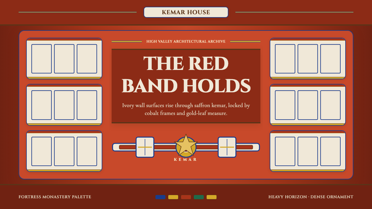
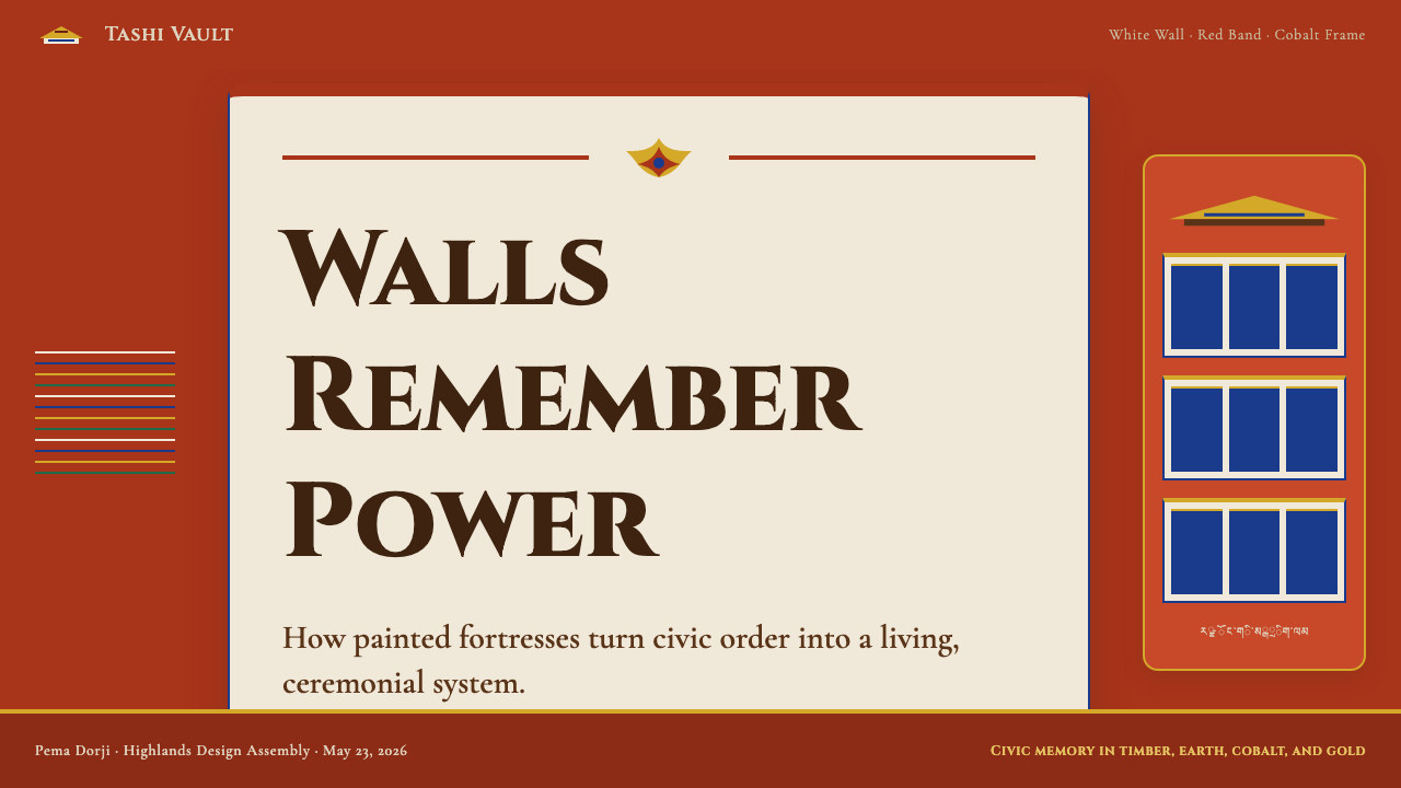
Visually, the style operates through strong horizontal banding. The architecture it references is organized by massive wall planes punctuated by projecting window bays, sloping walls that taper inward from base to parapet, and layered rooflines of gilded copper. This structural logic carries directly into layout: the composition divides into distinct horizontal zones — a dominant warm-red ground register, crisp white card surfaces sitting within it, cobalt window-frame elements framing content areas, and a band of gilded detail as a crowning accent. The overall effect is monumental even at modest scale.在视觉上,这种风格通过强烈的水平分带运作。它所参照的建筑由大面积墙面、突出的窗龛、从基部向雉堞内倾收分的斜墙,以及镀金铜瓦叠砌的多重屋顶共同组织。这种结构逻辑直接映射到版面:构图被划分为清晰的水平区块——一个主导性的暖红底色基础层、坐落其中的洁白卡片表面、以钴蓝窗框元素界定的内容区域,以及作为顶冠强调的金色细节带。整体效果在适度的尺度下依然呈现出纪念碑式的气势。
See the Bhutanese Dzong (Fortress Red) design system →查看 Bhutanese Dzong (Fortress Red) 完整设计系统 →
Where does Bhutanese Dzong (Fortress Red) come from?Bhutanese Dzong (Fortress Red) 从何而来?
The dzong as an architectural typology was codified in Bhutan in the 1630s by Zhabdrung Ngawang Namgyal, a Tibetan Buddhist lama of the Drukpa Kagyu lineage who fled Tibet and unified the Himalayan valleys that would become Bhutan under a single religious-political authority. The dzong served simultaneously as fortress, administrative center, and monastery — a three-part function that demanded an architecture both imposing and sacred. Punakha Dzong, founded in 1637 at the confluence of the Pho Chhu and Mo Chhu rivers, remains the most celebrated example, its whitewashed walls rising directly from the riverbank with the saffron-red kemar band marking the upper monastic quarters.宗堡作为一种建筑类型,在1630年代由夏仲·阿旺朗杰确立于不丹。他是竹巴噶举派的藏传佛教喇嘛,从西藏出走后将喜马拉雅各山谷统一在单一政教权威之下,建立了后来的不丹国。宗堡同时承担要塞、行政中心与寺院三重功能,因此要求一种既令人敬畏又具神圣气质的建筑形制。1637年建于朴曲与莫曲交汇处的普纳卡宗堡是其中最负盛名的范例:白灰墙体从河岸直立而起,深藏红凯马带标示着上层寺院区的位置。
The visual system of the dzong did not emerge from purely aesthetic deliberation. It was governed by a codified building manual known as the Bhutanese building canon, which prescribed not only structural dimensions but the hierarchical deployment of color, material, and ornament. The white of the lower walls was limewash over rammed earth — both structurally practical and symbolically pure. The deep red of the kemar band derived from a mixture of red ochre pigment and animal adhesive, applied annually in ceremonial renewal. Cobalt and gold appeared at the window cornices, carved from timber and painted by specialist artisans who belonged to hereditary craft guilds. The result was not decoration applied to architecture but color and ornament embedded in the building's structural and spiritual logic.宗堡的视觉系统并非出于纯粹的审美考量,而是受一套名为不丹建筑法典的成文建造手册所规范——这套手册不仅规定了结构尺寸,还规定了色彩、材料与装饰的等级秩序。下层墙面的白色来自夯土上的石灰水涂层,既有结构上的实用性,也承载着象征性的纯洁意涵。凯马带的深红色源自赭石颜料与动物胶的混合物,每年以仪式性的方式重新涂刷,以示更新。钴蓝与金色出现在木雕窗框之上,由属于世袭工匠行会的专业匠人绘制。由此产生的结果不是附着于建筑之上的装饰,而是嵌入建筑结构与精神逻辑之中的色彩与纹饰。
Bhutan's relative isolation from colonial-era disruption meant that the dzong tradition continued largely unbroken through the nineteenth and twentieth centuries. Unlike many Asian architectural traditions that experienced catastrophic rupture during colonial occupation, Bhutanese dzongs were maintained, rebuilt after earthquake and fire, and continue to function as active administrative and religious centers. Punakha Dzong, for instance, was damaged by floods and fire repeatedly and rebuilt each time to the original proportions. Trongsa Dzong — from which the ancestors of the current royal family governed before the establishment of the Wangchuck monarchy in 1907 — remains the most strategically positioned dzong, controlling the narrow ridge between eastern and western Bhutan, and still serves as a working administrative complex.不丹相对隔绝于殖民时代的冲击,使宗堡传统在十九、二十世纪基本保持延续。与许多亚洲建筑传统在殖民占领期间遭受灾难性断裂不同,不丹宗堡经历了维护、震后与火后重建,至今仍是运转中的行政与宗教中心。普纳卡宗堡曾多次遭受洪水与火灾,每次都按原有比例重建。通萨宗堡——旺楚克王朝1907年建立之前,现任王室的祖先从这里统治不丹——扼守东西不丹之间的狭长山脊,至今仍是一座运作中的行政建筑群。
Western scholarly attention to the Bhutanese dzong arrived primarily through scholars such as Michael Aris, whose archival and field research in the 1970s and 1980s documented the tradition's historical depth and architectural coherence. The art historian and curator Christian Schicklgruber brought museum-level attention to Bhutanese material culture through major exhibitions at the Museum of Ethnology in Vienna and the Museum Rietberg in Zurich. Zowo Penjor, the master craftsman credited with overseeing the construction of major dzong rebuilds in the twentieth century, represents the living continuity of the hereditary artisan tradition that produced the original buildings. Together, these figures helped establish the dzong as a subject of serious cross-cultural design scholarship rather than merely a picturesque subject for travel photography.西方学界对不丹宗堡的严肃关注主要来自迈克尔·阿里斯等学者。他在1970至80年代进行的档案与田野研究记录了这一传统的历史深度与建筑连贯性。艺术史学家与策展人克里斯蒂安·席克尔格鲁伯通过在维也纳民族学博物馆和苏黎世李特贝格博物馆举办的大型展览,将博物馆级别的学术关注带给了不丹物质文化。佐沃·朋措作为二十世纪主持多项宗堡重建工程的首席工匠,代表着制造原始建筑的世袭匠人传统的活态延续。这些人物共同确立了宗堡作为严肃跨文化设计学术研究对象的地位,而不仅仅是旅行摄影中的风景题材。
What defines the Bhutanese Dzong (Fortress Red) look?Bhutanese Dzong (Fortress Red) 的视觉特征是什么?
Color System色彩系统
The palette centers on deep saffron-red as the dominant ground — not a bright vermilion or muted terracotta but the specific warm-orange-red of iron-oxide pigment applied to sun-baked walls. Against this, ivory whitewash surfaces emerge as clean, luminous fields — the color of limewash over rammed earth rather than pure white. Cobalt blue, used for window cornices and painted details, is the sharpest accent, cool and mineral in quality. Gold or burnished yellow-ochre appears as a crowning detail, never as a dominant field. The system is triadic but hierarchical: red grounds everything, white provides surface, cobalt punctuates, gold crowns.色盘以深藏红为主导底色——不是明亮的朱砂红,也不是低调的赤陶色,而是氧化铁颜料涂于炙晒墙体上的那种特定暖橙红。与之相对,灰泥白表面以洁净、发光的区域浮现——那是石灰水涂于夯土之上的颜色,而非纯白。钴蓝用于窗框与彩绘细节,是最锐利的点睛色,质感冷峻而矿物感强。金色或磨光的黄赭色作为顶冠细节出现,从不充当主导色域。整个系统是三色性的,但有明确等级:红色奠基一切,白色提供表面,钴蓝点缀其间,金色收顶加冕。
Horizontal Banding水平分带
The most defining structural device in the style is the bold horizontal band — the architectural kemar stripe translated into a layout register. Compositions divide into distinct horizontal zones rather than a single undifferentiated field: a strong red or warm-ground base layer, an intermediate zone of white card surfaces, and a narrower upper accent band in cobalt or gold. This banding creates reading direction from bottom to top and gives even a simple page a sense of architectural sectional logic, as if the viewer were looking at an elevation drawing of a dzong wall.这种风格中最具定义性的结构手法是大胆的水平色带——宗堡建筑的凯马条带被转化为版面的分区序列。构图被分成清晰的水平区域,而非单一未分化的色场:厚重的红色或暖色底层、居中的白色卡片表面区域,以及较窄的钴蓝或金色上部强调带。这种分带创造了从下至上的阅读方向,使哪怕一页简单的设计都呈现出建筑剖面图式的逻辑——仿佛观者正在凝视一幅宗堡立面图。
Ornamental Framing装饰性框架
The dzong tradition treats framing as a sacred act: every window, every doorway, every panel is enclosed within a multi-layered border of painted and carved ornament. The design system inherits this sensibility — content areas sit within visible, substantial frames that are not mere outlines but layered systems of color and pattern. A card or image container is bordered by a combination of thin bright lines and a broader colored band, evoking the multi-layered painted cornices of the architecture. The frame does not call attention to itself at the expense of content; it situates the content in a context of deliberate ceremony.宗堡传统将框架视为神圣行为:每扇窗、每道门、每块嵌板都被多层彩绘和雕凿装饰所环绕。这套设计系统继承了这种感性——内容区域坐落于可见而厚重的框架之内,这些框架不只是轮廓线,而是色彩与图案的分层系统。一张卡片或图像容器由细亮线与较宽彩色带的组合所环绕,令人联想到建筑多层彩绘檐口。框架不以牺牲内容来吸引注意;它将内容置于一种刻意营造的仪式语境之中。
Weight and Mass重量与体量
Dzong architecture is characterized by the massive taper of its walls — structures that visibly grow thicker at the base than at the parapet, communicating weight, permanence, and inward gravitational pull. The design system translates this into visual heaviness: elements sit low and anchor firmly rather than floating. Typography tends toward generous weight at display sizes; spacing within components is contained rather than airy. The overall composition resists the urge toward lightness and levity — it insists on groundedness.宗堡建筑的特征是明显的收分斜墙——结构在基部明显宽于雉堞处,传达出重量感、永久性与向内的引力。设计系统将这一特质转化为视觉上的厚重感:元素低沉锚定,而非飘浮。展示级字体倾向于丰厚的字重;组件内部的间距是收敛而非疏阔的。整体构图抵制轻盈感与轻浮感的诱惑——它坚持一种扎根于地的稳重。
Timber Cornice Typography木雕檐口式字体排印
The carved and painted timber capitals of dzong window cornices suggest a typographic sensibility that is monumental, crisp, and ornamented without being frivolous. The style's type choices favor letterforms with visible stroke weight contrast and a suggestion of carved precision — characters that feel drawn with deliberateness rather than efficiency. Display type carries sufficient weight to read as architectural inscription; supporting text is set with generous leading to allow each line its own register, echoing the horizontal layers of the building itself.宗堡窗框上雕凿彩绘的木制檐口大写装饰,暗示着一种宏伟、清晰、有装饰感而不轻浮的字体排印气质。这种风格的字体选择偏爱笔画粗细对比明显、带有雕凿精度感的字形——每个字母感觉是深思熟虑而非追求效率地绘就的。展示文字具有足够的字重,使之读来有如建筑铭文;辅助文字使用充裕的行距,让每行文字占据自己的层次,与建筑本身的水平分层形成呼应。
Gilded Detail as Hierarchy Marker镀金细节作为层级标记
In dzong architecture, gold or gilded copper is reserved for the highest elements — roof finials, the crowning band above the kemar, and sacred object containers. It is never used lavishly across broad surfaces but appears as a concentrated accent that signals the pinnacle of a hierarchy. The design system observes the same discipline: gold-toned or burnished warm-yellow elements appear only at the top of a visual hierarchy — a headline, a badge, a key data point — and their restraint makes them feel genuinely precious rather than merely decorative.在宗堡建筑中,金色或镀金铜材被保留给最高等级的元素——屋顶宝瓶、凯马带上方的顶冠带以及圣物容器。它从不被大面积铺陈于宽阔表面,而是作为浓缩的点睛色出现,标示层级之巅。设计系统恪守同样的纪律:金色调或磨光暖黄色元素只出现在视觉层级的最顶端——一个标题、一枚徽章、一个关键数据点——其克制使它们真正呈现出珍贵感,而非仅仅是装饰。
Sacred Geometry and Symmetry神圣几何与对称
Unlike modernist traditions that favor asymmetric tension, dzong architecture is organized around bilateral symmetry — gateways centered on axes, courtyards flanked by mirrored wings, window patterns repeated at regular intervals across vast wall faces. The design system uses symmetry as a tool for conveying authority and ceremony: cover compositions are centrally anchored, content containers are evenly distributed, and decorative border patterns repeat at consistent intervals. Symmetry here is not stiffness — it is the visual language of institutional gravitas.与偏爱非对称张力的现代主义传统不同,宗堡建筑围绕双边对称组织——大门居轴而开,庭院由对称两翼夹持,窗户图案在宽阔墙面上等间距重复。设计系统将对称作为传达权威与仪式感的工具:封面构图居中锚定,内容容器均匀分布,装饰边带图案以一致的间隔重复。此处的对称不是僵化——它是体制庄重感的视觉语言。
See the Bhutanese Dzong (Fortress Red) design system →查看 Bhutanese Dzong (Fortress Red) 完整设计系统 →
Who shaped Bhutanese Dzong (Fortress Red)?谁塑造了 Bhutanese Dzong (Fortress Red)?
The Tibetan lama who fled his homeland and unified Bhutan's fractious valleys in the 1630s is the single figure most responsible for the dzong as a standardized architectural and visual form. His founding of Punakha Dzong in 1637 and the subsequent establishment of dzongs at strategic valley confluences across the country fixed the typology's proportions, color system, and functional organization. The visual system that this design style inherits — the kemar band, the whitewashed mass, the cobalt and gold cornices — was established not by an aesthetic preference but by Zhabdrung's codified building canon, which linked architectural form to religious and political authority.这位从西藏出走、于1630年代统一不丹各山谷的喇嘛,是宗堡作为标准化建筑与视觉形式的最重要奠基者。他于1637年创建普纳卡宗堡,随后在全国各战略性谷地汇流处建立宗堡群,确立了这一类型的比例体系、色彩秩序与功能组织。这套设计风格所继承的视觉系统——凯马带、白灰体量、钴蓝金饰窗框——并非出于审美偏好,而是由夏仲的成文建筑法典所确立,该法典将建筑形式与宗教及政治权威相联结。
The master craftsman credited with directing the major dzong reconstruction projects of the twentieth century represents the continuity of Bhutan's hereditary artisan tradition. In a context where architectural knowledge was transmitted through apprenticeship and guild lineage rather than written manuals, Zowo Penjor's role was to embody the accumulated craft knowledge of the dzong-building tradition. His work on major rebuilds — undertaken after earthquake, fire, and flood damage — demonstrates the tradition's capacity for self-renewal without stylistic drift: each rebuilt structure returned to the established proportions, palette, and ornamental vocabulary, not as archaeological reconstruction but as living practice.佐沃·朋措作为主持二十世纪重大宗堡重建工程的首席工匠,代表着不丹世袭匠人传统的活态延续。在一个建筑知识通过学徒制与行会世系而非文字手册传承的语境中,佐沃·朋措的角色是将宗堡建造传统的累积工艺知识具身化。他在震后、火后、洪后重建工程中的实践,展示了这一传统在无风格漂移的前提下自我更新的能力:每座重建建筑都回归既定的比例、色盘与装饰词汇,不是考古式的复原,而是活态的延续实践。
The British scholar of Tibetan and Himalayan studies, and the husband of Nobel Peace Prize laureate Aung San Suu Kyi, conducted foundational archival and field research on Bhutan's architectural and cultural heritage in the 1970s and 1980s. His work, including studies of the historical texts that governed dzong construction, helped establish the tradition as a subject of rigorous cross-cultural scholarship. By situating the dzong within a broader Himalayan political and religious history rather than treating it as a picturesque curiosity, Aris provided the scholarly grounding that allowed the style to be understood in structural rather than merely exotic terms.这位藏学与喜马拉雅研究领域的英国学者(同时也是诺贝尔和平奖得主昂山素季的丈夫)在1970至80年代对不丹的建筑与文化遗产进行了奠基性的档案与田野研究。他的工作(包括对规范宗堡建造的历史文献的研究)帮助将这一传统确立为严肃的跨文化学术研究对象。通过将宗堡置于更广阔的喜马拉雅政治与宗教史脉络中,而非将其视为风景奇观,阿里斯提供了使这种风格得以被从结构性而非猎奇性角度理解的学术根基。
The Austrian curator and ethnographer brought Bhutanese material culture — including the visual system of the dzongs — to major museum audiences through landmark exhibitions at the Museum of Ethnology in Vienna and the Museum Rietberg in Zurich. His catalogues documented the color canon, the craft hierarchy, and the sacred meaning of the ornamental system with a precision that transformed the dzong's visual vocabulary from ethnographic data into a designerly resource. By framing the dzong's aesthetic as a coherent, internally logical system rather than a collection of exotic decorative motifs, Schicklgruber's work made the tradition accessible for contemporary design interpretation.这位奥地利策展人与民族志学者通过在维也纳民族学博物馆和苏黎世李特贝格博物馆举办的里程碑式展览,将不丹物质文化(包括宗堡的视觉系统)带给了主要博物馆的观众。他的展览图录以相当的精准度记录了色彩法典、工艺等级与装饰系统的神圣含义,将宗堡的视觉词汇从民族志数据转化为设计资源。通过将宗堡的美学界定为一个连贯的、内部逻辑自洽的系统,而非一组异域装饰母题的汇集,席克尔格鲁伯的工作使这一传统为当代设计诠释敞开了入口。
Rather than a single individual, the Drukpa Kagyu monastic tradition — the Tibetan Buddhist lineage that Zhabdrung brought to Bhutan and that remains the state religion — collectively shaped the visual and spatial logic of the dzong as an ongoing institutional practice. The tradition's emphasis on elaborate ritual, hierarchical sacred space, and the use of material splendor as a vehicle for devotional attention directly generated the visual system that this design style inherits. The tradition continues to commission, maintain, and ceremonially renew the dzong's painted surfaces, ensuring that the aesthetic remains a living religious practice rather than a historical artifact.竹巴噶举寺院传统——夏仲带入不丹的藏传佛教支系,至今仍是不丹国教——作为一个持续运转的宗教机构,集体塑造了宗堡的视觉与空间逻辑,而非单一个人。这一传统对精心繁琐的仪轨、等级化神圣空间以及将物质辉煌作为虔诚专注媒介的强调,直接生成了这套设计风格所继承的视觉系统。该传统持续委托、维护并以仪式方式更新宗堡的彩绘表面,确保这套美学依然是活态的宗教实践,而非历史遗物。
How do you use Bhutanese Dzong (Fortress Red) today?今天怎么用 Bhutanese Dzong (Fortress Red)?
Bhutanese Dzong (Fortress Red) is a high-ceremony style best suited to contexts that need to project authority, cultural richness, and deliberate grandeur. Unlike styles that derive their power from restraint, this system gains authority through accumulation — layered registers, bold color contrast, and visible structural ornamentation all working together to produce a sense of institutional weight. The key discipline when applying it is not restraint across the board but restraint within each layer: every element should be chosen deliberately, but no layer should be absent.不丹宗堡(堡寺藏红)是一种高仪式感的风格,最适合需要投射权威感、文化丰富性与刻意宏伟气质的场景。与那些从克制中汲取力量的风格不同,这套系统通过积累获得权威——分层的序列、大胆的色彩对比与可见的结构装饰共同发力,产生一种机构分量感。应用它的关键纪律不是全面的节制,而是在每一层内部节制:每个元素都应被刻意选择,但没有一层应当缺席。
For presentation slides, the style excels on cover and transition pages where establishing a dominant visual impression matters more than dense information delivery. A cover built on this system uses the dominant warm-red field as the full-bleed background, with a white or ivory title panel sitting within it as if set into a window bay — bordered by a thin cobalt rule and a narrow gold accent band above. The title itself should be set in a letterform with genuine weight and presence, not a delicate face. Content slides are more restrained: a white or near-white ground, organized into clear horizontal bands by subtle but visible rules, with the red appearing only as a header bar or section marker. Data slides benefit from the color hierarchy — red for the primary data series, cobalt for secondary, gold for a highlighted key figure.在演示文稿中,这种风格在封面与过渡页上表现最佳——在这些地方,建立强烈视觉印象比密集传递信息更为重要。以这套系统构建的封面将主导性暖红色场铺满出血背景,白色或象牙色标题面板坐落其中,仿佛嵌入一个窗龛——由细钴蓝线围框,上方是一条窄金色强调带。标题本身应选用具有真实份量与气场的字形,而非纤细的字面。内容页则更为克制:白色或近白色底面,由细腻但可见的线条组织成清晰的水平带,红色只出现在页眉栏或区块标记中。数据页从色彩层级中获益——红色用于主要数据系列,钴蓝用于次要,金色用于需要突出的关键数字。
For web interfaces, this style translates powerfully to branded portal pages, cultural institution websites, and heritage tourism platforms where visual richness is expected and appropriate. The approach requires a robust grid: the horizontal banding logic should inform section breaks at the macro level, with each section of the page corresponding to a distinct register. Navigation bars and header areas can carry the deep red; content areas use the white or ivory ground; footer or summary sections can reintroduce the red or a deeper, warmer tone. Interactive states — hover, selected, active — are a natural place to deploy the cobalt accent, which reads as precise and decisive against the warm ground.对于网页界面,这种风格在品牌门户页、文化机构网站以及遗产旅游平台上效果强劲——在这些地方,视觉丰富性是被预期且合适的。这种方法需要一套稳健的网格:水平分带逻辑应在宏观层面指导区块分隔,页面的每个部分对应一个清晰的层次序列。导航栏与页眉区域可以承载深红色;内容区域使用白色或象牙色底面;页脚或总结性区块可以重新引入红色或更深沉的暖色调。交互状态——悬停、选中、激活——是自然部署钴蓝强调色的场所,它在暖色底面上读来精准而果断。
For editorial and marketing work, the style supports high-impact launch materials, cultural event programs, and institutional annual reports where ceremony and gravitas are explicitly desired values. A magazine spread or event program can treat the page as a dzong wall elevation: the dominant warm-red field occupies the outer columns or the lower horizontal band, with a central white panel carrying body text. Pull quotes or section headers work well in a cobalt or gold accent color, set large enough to read as architectural inscription rather than typographic emphasis. Avoid using the full ornamental weight of the style on documents primarily intended for prolonged reading — dense body text on warm red reduces legibility and fatigue readers.对于编辑与营销内容,这种风格支持高冲击力的发布材料、文化活动节目册以及机构年报——在这些场景中,仪式感与庄重感是被明确期望的价值。杂志跨页或活动节目可以将页面当作宗堡墙面的立面图:主导性暖红色场占据外侧列或下方水平带,中央白色面板承载正文内容。引文或章节标题使用钴蓝或金色强调色效果好,字号应足够大,使其读来如建筑铭文而非字体强调。避免在主要用于持续阅读的文档中全面使用这种风格的装饰分量——在暖红色底面上排布大段正文会降低易读性并使读者疲劳。
A common mistake when applying this style is treating the saffron-red as a background for body text across extended reading areas. The red ground is designed for impression and ceremony, not for sustained reading — it is the fortress wall, not the interior room. White or ivory surfaces within the composition are where extended content belongs; the red should command periphery, frame, and register breaks. A second common error is introducing additional colors outside the defined palette — neutrals, cool grays, or earth tones that feel harmonious in isolation but dilute the deliberate intensity of the red-cobalt-gold triadic system. The palette's authority depends on its compression; every addition weakens the overall effect.应用这种风格时最常见的错误,是在大面积持续阅读区域将藏红色作为正文的底色。红色底面是为印象与仪式设计的,而非为持续阅读——它是要塞外墙,不是内室。构图中的白色或象牙色表面才是延伸内容的归属;红色应当统领周边、框架与层次断口。第二种常见错误是引入定义色板之外的额外颜色——中性色、冷灰色或大地色,孤立看来和谐,却稀释了红-钴-金三色系统刻意营造的强度。色盘的权威来自其压缩性;每一次添加都会削弱整体效果。
See the Bhutanese Dzong (Fortress Red) design system →查看 Bhutanese Dzong (Fortress Red) 完整设计系统 →
Bhutanese Dzong (Fortress Red) — FAQBhutanese Dzong (Fortress Red) · 常见问题
Is this style appropriate only for Bhutanese or Buddhist cultural content?这种风格只适合不丹或佛教文化相关内容吗?
No — the dzong's visual system is culturally specific in its origins but transferable as a design language in the same way that Bauhaus geometry or Japanese wabi-sabi restraint can be applied across contexts. The style's strengths — saturated warmth, monumental horizontality, bold color triads, layered framing — are formal qualities that work wherever ceremonial authority and visual richness are desired values. That said, using it in contexts that require cultural sensitivity about Bhutanese Buddhism demands awareness: the visual elements carry meaning in their original context, and applications that trivialize or misrepresent that context can read as appropriative rather than inspired.不——宗堡的视觉系统起源于特定文化,但作为设计语言与包豪斯几何或日本侘寂美学在跨语境应用上具有同等的可移植性。这种风格的优势——饱和的暖色调、纪念碑式水平感、大胆的三色搭配、多层框架——是形式上的特质,在任何需要仪式权威与视觉丰富性的地方都能发挥作用。话虽如此,在涉及不丹佛教的文化敏感性场景中使用它,需要保持意识:视觉元素在其原始语境中承载着含义,而将其平庸化或误读的应用可能被视为挪用而非借鉴。
How does this style differ from other Himalayan or Tibetan-influenced aesthetics?这种风格与其他喜马拉雅或藏族美学有何区别?
The Bhutanese dzong tradition is visually distinct from Tibetan monastic architecture and Nepali or Indian Himalayan styles in several specific ways. Bhutanese dzongs use a particularly saturated, warm-biased red for the kemar band — deeper and more orange-tinged than the brick-reds common in Tibetan monastery complexes — combined with whitewashed earthen walls of exceptional brightness. The cobalt-and-gold window cornice combination is characteristic of Bhutanese dzong craftsmanship specifically. Tibetan aesthetics often feature more extensive use of gold on large surfaces and a broader range of muted earth tones; Nepali architecture draws more heavily on carved wood screens and brick; Indian Himalayan traditions vary enormously by region. The dzong style is unusually codified and legible as a system.不丹宗堡传统在视觉上与藏族寺院建筑以及尼泊尔或印度喜马拉雅风格有几处具体差异。不丹宗堡为凯马带使用了一种特别饱和、偏暖的红色——比藏族寺院建筑群中常见的砖红更深沉、更偏橙调——并与异常明亮的白灰夯土墙相配。钴蓝与金色的窗框组合是不丹宗堡工艺的特有标志。藏族美学往往在大面积表面更多使用金色,并有更宽广的低饱和大地色系;尼泊尔建筑更多依赖木雕格栅与砖材;印度喜马拉雅传统因地区而差异极大。宗堡风格作为一套系统,具有异乎寻常的规范性与可读性。
Can this style work in a minimal or digital-product context, or is it always maximalist?这种风格能用于简约或数字产品场景吗,还是注定是极繁主义的?
The style is not inherently maximalist — it is architectural in its logic, which means it organizes elements systematically rather than accumulating them arbitrarily. A minimal application of the dzong system is entirely possible: limit the palette strictly to the three-color triad, use the horizontal banding structure without the ornamental border layers, and apply the gilded accent only to a single headline or key action element. The result will be spare compared to the original architecture but will retain the style's defining formal qualities — the warm-red ground, the cobalt precision, the sense of deliberate hierarchy. The mistake is conflating 'rich' with 'cluttered': the actual dzong buildings, for all their ornamentation, are organized with extreme structural clarity.这种风格本质上不是极繁主义的——它的逻辑是建筑性的,这意味着它系统地组织元素,而非任意堆积。宗堡系统完全可以有简约的应用:严格将色盘限定为三色搭配,使用水平分带结构而不加装饰边带层,仅将金色强调用于单一标题或关键操作元素。与原始建筑相比,结果会显得简省,但会保留这种风格的决定性形式特质——暖红底色、钴蓝的精准、刻意层级感。错误在于将“丰富”与“杂乱”混为一谈:真实的宗堡建筑,无论装饰多么繁复,都以极度清晰的结构组织。
How should the cobalt accent be used without making designs feel garish?如何使用钴蓝强调色而不让设计显得俗艳?
The cobalt accent reads as garish when it competes with the red ground across large areas simultaneously. In the original architecture, cobalt appears at precise, architecturally bounded locations — window cornices, painted panel borders — not spread across walls. The same discipline applies in design: cobalt belongs at structural punctuation points, not as a background field or a repeating texture. It works best as a rule line, a border accent, an interactive state marker, or a small typographic element. Keep the total area of cobalt to a small fraction of the total composition and it will feel incisive and cool against the warmth of the red, rather than jarring.当钴蓝在大面积区域与红色底面同时竞争时,就会显得俗艳。在原始建筑中,钴蓝出现在精确的、由建筑界定的位置——窗框、彩绘嵌板边框——而非铺陈于整面墙上。同样的纪律适用于设计:钴蓝属于结构性的点缀位置,而非背景色场或重复纹理。它最有效的用法是线条规则、边框强调、交互状态标记或小尺度字体元素。将钴蓝的总面积控制在构图整体的极小比例内,它在红色的温暖中就会显得犀利而清凉,而非生硬刺眼。
Does the style suit dark-mode or dark-background interfaces?这种风格适合深色模式或深色背景界面吗?
The canonical dzong palette is built on warmth and strong contrast between the saturated red ground and the bright whitewash surfaces — a fundamentally light-on-dark and dark-on-light interaction rather than a dark-mode aesthetic. A deep-mode inversion is possible but requires reorienting the hierarchy: the red can shift to a deeper, more muted burgundy or burnt sienna to serve as a mid-tone, with the whitewash element becoming a light accent rather than the dominant surface. The cobalt and gold continue to work well against dark grounds. The risk is that the visual warmth and ceremonial opulence of the style depend heavily on the saturated red reading as luminous rather than somber; in purely dark contexts without careful calibration, the palette can feel heavy rather than grand.经典的宗堡色盘建立在温暖感与饱和红底和明亮白灰表面之间的强烈对比之上——这从根本上是一种浅底深色与深底浅色的交互关系,而非深色模式美学。深色模式的反转是可能的,但需要重新定向层级:红色可以转向更深沉、更低调的酒红或焦赭,作为中间调存在,白灰元素则成为浅色强调而非主导表面。钴蓝和金色在深色底面上依然表现良好。风险在于,这种风格的视觉温暖感与仪式性华丽感,很大程度上依赖饱和红色被读作发光而非阴沉;在纯深色语境中若不仔细校准,色盘可能显得沉重而非宏伟。
Related design styles相关设计风格
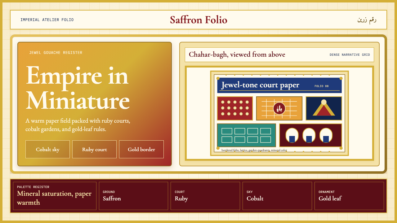 Mughal Miniature (Akbar era)Opulence refuses emptiness. Saffron paper, ruby panels, cobalt lattice, gold…华贵拒绝留白:番红花纸底、宝石红分栏、钴蓝格纹与金箔边饰。
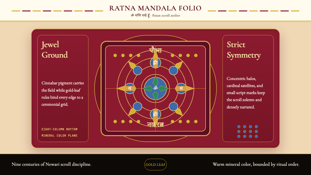 Nepali Paubha (Newari Scroll)Sacred density. Cinnabar ground, gold-leaf frame, lapis rings in strict symme…庄严而密集。朱砂红底、金箔框与青金石环严整对称。
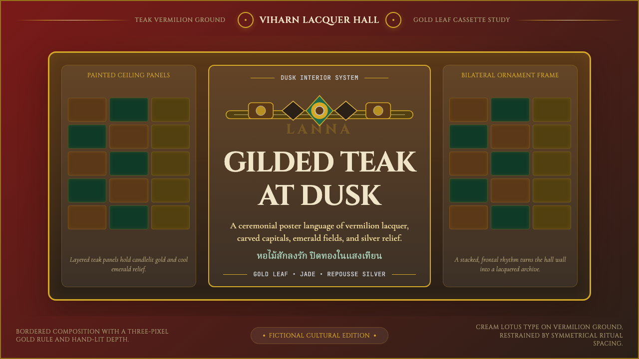 Thai Lanna Tai Yai TempleSacred lacquer glows. Vermilion ground, Cinzel capitals, gold cassette symmet…圣殿漆光沉静。朱红底、Cinzel 大字与金箔格框成仪式感。
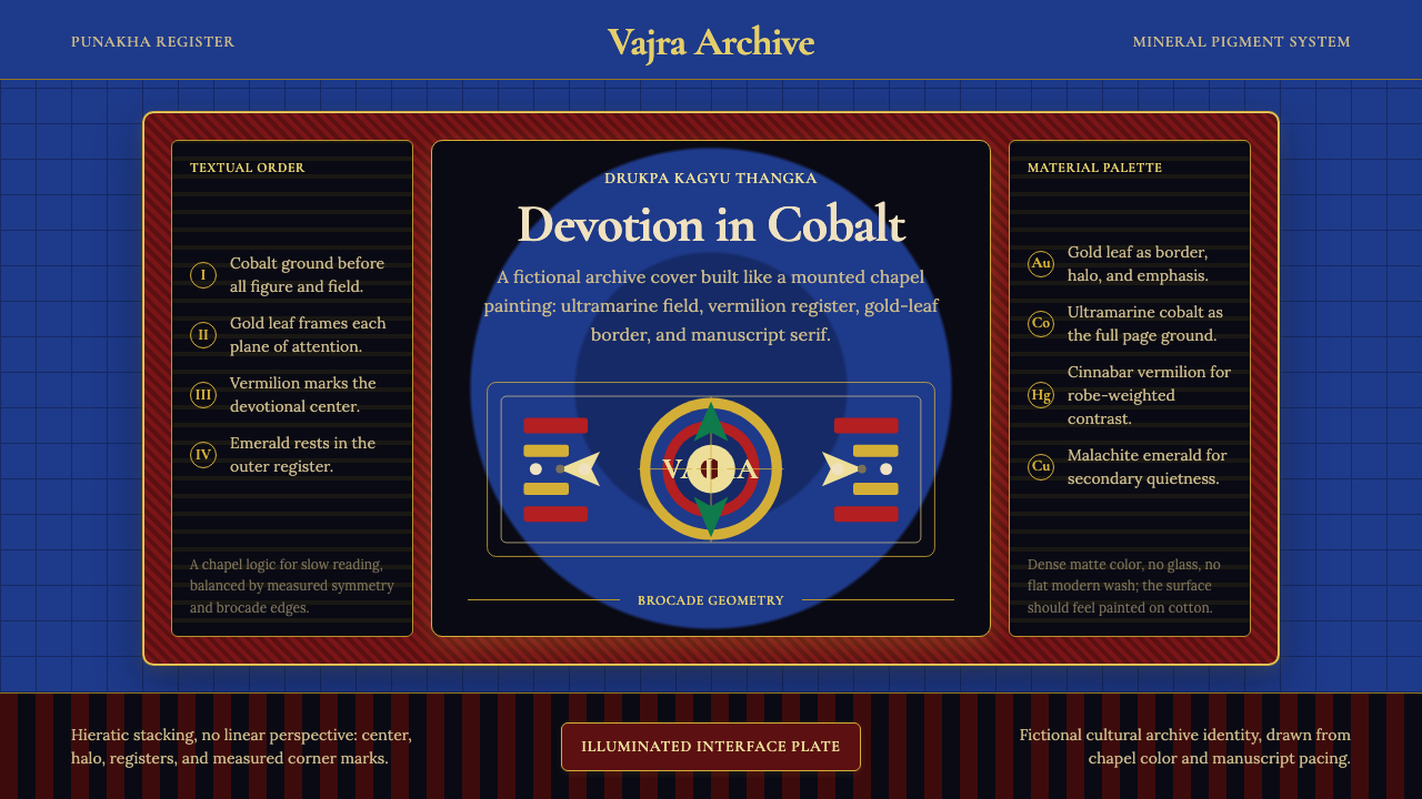 Bhutanese Drukpa Kagyu ThangkaDevotion made cobalt. Gold frames, Cormorant serif, and vermilion marks hold…钴蓝承载虔敬:金框、Cormorant 衬线与朱砂标记构成佛殿秩序。
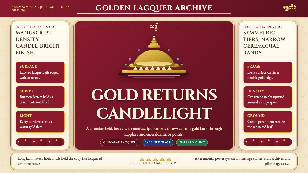 Burmese Shwedagon Gold-LacquerOpulence catches fire. Gold-leaf gradients on cinnabar panels frame a stupa s…虔诚的金色密度:朱漆面板上的金箔渐变,围出佛塔中轴。
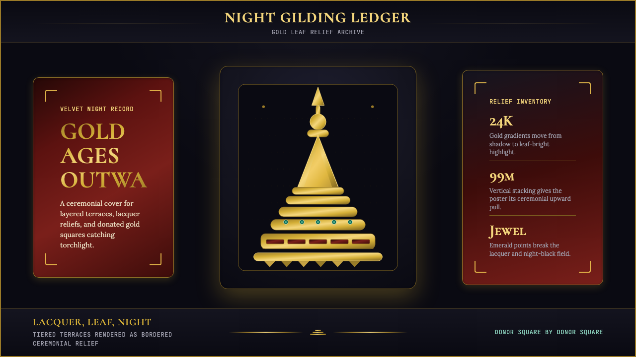 Burmese Shwedagon Stupa ReliefGold refuses restraint. Velvet black, teak-red lacquer, and tiered gradients…金色拒绝克制:黑夜、柚木红漆与层叠渐变堆出神圣密度。