What is Ming Blue-and-White Porcelain?什么是 Ming Blue-and-White Porcelain?
Ming Blue-and-White is the porcelain that Delft spent two centuries trying to imitate — imperial cobalt brushed over pure kaolin white, fired until every line sang.明青花是德尔夫特陶器苦学两百年也未追上的极品——钴蓝笔意覆于纯白胎体,一千三百度入窑,每一笔线都烧成了歌。
Ming Blue-and-White Porcelain in briefMing Blue-and-White Porcelain 速览
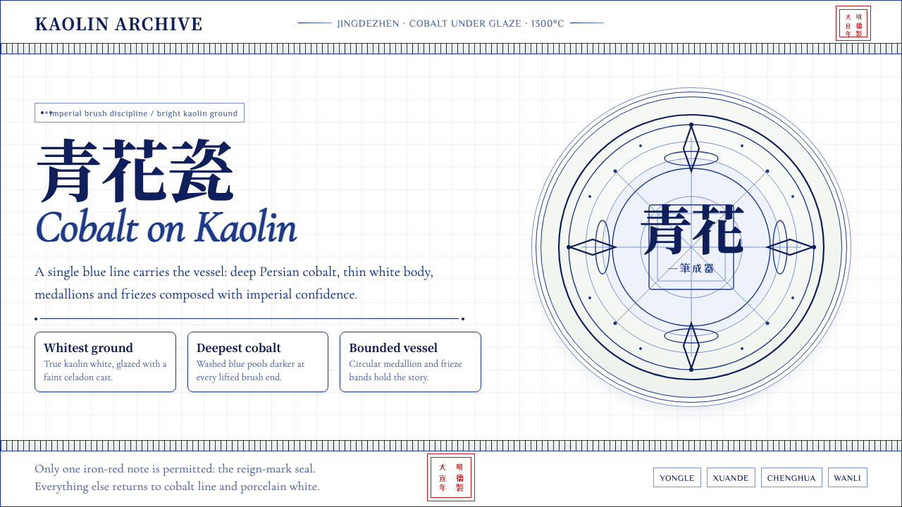
Ming Blue-and-White porcelain is the visual language of imperial restraint taken to its highest pitch: a pure, milk-white kaolin body painted with cobalt oxide — yielding a deep, luminous blue — then fired at temperatures that glass and most metals could not survive. The result is a surface that is simultaneously hard and delicate, its brushwork locked permanently into the glaze. Nothing is applied on top; everything lives inside.明青花瓷器是御窑克制美学登峰造极之作:纯白高岭土胎体,以钴料绘饰,烧出深邃而通透的蓝,窑温之高,连玻璃与大多数金属都难以承受。成品表面坚硬而纤薄,笔意永久封存于釉层之内,没有任何覆盖,一切皆活在釉里。
The aesthetic discipline is severe. The ground must be as white and as unblemished as possible. The blue must be as deep and as clear as the night sky over the Yellow Sea. The brushstroke must have the confidence and flow of a calligrapher at full speed — no hesitation, no correction, no second pass. Dragons encircle the shoulder of a jar; lotus scrolls wrap the belly; scholars and mountains compress into a medallion no wider than a thumb. Every centimeter is narrated space, yet the whole never feels crowded because the white ground breathes between every motif.审美纪律近乎苛刻。胎质须白净无瑕;蓝色须深邃如黄海夜空;笔触须如行草大师全速运笔——无迟疑,无修改,不可重描。龙纹盘肩,莲花缠枝裹腹,山水人物压缩进仅拇指宽的开光之内。每一寸都是叙事空间,然而整体从不拥塞,因为白色底釉在每个纹样之间呼吸。
What separates Ming Blue-and-White from later imitations — European Delftware, Japanese Arita, Qing reproductions — is the quality of the cobalt and the confidence of the line. The finest pieces from the Yongle and Xuande reigns were made with imported Persian cobalt known as Sumali blue (sumaliqing), which burned with a spontaneous darkness at high temperature, producing the characteristic ink-spot pooling that connoisseurs call heiban, or black stipple. No subsequent tradition fully replicated this specific depth of tone.明青花与后来的仿制品——欧洲代尔夫特陶、日本有田瓷、清代仿品——最根本的差异,在于钴料的质地与线条的气韵。永乐、宣德两朝的精品使用进口波斯钴料,世称「苏麻离青」,高温下自然晕散,形成所谓「黑斑」——那种凝厚如积墨的色晕。此后任何传统均未能完整复现这一深度。
See the Ming Blue-and-White Porcelain design system查看 Ming Blue-and-White Porcelain 完整设计系统
Where does Ming Blue-and-White Porcelain come from?Ming Blue-and-White Porcelain 从何而来?
Blue-and-white porcelain did not begin with the Ming dynasty. Its roots lie in the Yuan period (1271–1368), when Jingdezhen potters first learned to paint in cobalt under a transparent glaze, producing large display pieces — platters, jars, vases — intended for the Central Asian and Middle Eastern export markets. The cobalt itself came via the Silk Road from Persia, and the early designs often blended Chinese motifs with Islamic geometric sensibilities. The famous David Vases, dated by inscription to 1351, survive as the clearest evidence of how accomplished Yuan blue-and-white had already become.青花瓷并非始于明朝。其根系深植于元代(1271—1368年):景德镇工匠首先学会在透明釉下用钴料作画,生产大型陈设器——盘、罐、瓶——以供中亚与中东出口市场。钴料本身经丝绸之路从波斯运来,早期纹饰常将中国母题与伊斯兰几何趣味相融合。有铭文记年于1351年的「大卫瓶」至今留存,是元青花已达何等高度的最有力证明。
When Zhu Yuanzhang overthrew the Yuan and founded the Ming dynasty in 1368, he initially restricted luxury production, but his successors quickly recognized the diplomatic and economic power of fine porcelain. The Yongle Emperor (r. 1402–1424) brought Jingdezhen's imperial kilns to full production, and it was under his reign and that of his successor Xuande (r. 1425–1435) that the aesthetic reached what most scholars consider its classical peak. Yongle pieces are known for their exceptionally thin bodies and elegant floral arabesques. Xuande pieces introduced a slightly thicker, more robust form, with bolder compositions and the iconic reign mark — six characters in two rows of standard script inside a double circle — that became the model all subsequent kilns tried to replicate.1368年朱元璋推翻元朝、建立明朝后,起初限制奢侈品生产,但继任者很快认识到精美瓷器在外交与经济上的强大力量。永乐帝(1402—1424年在位)将景德镇御窑推向全面生产,在他与继任者宣德帝(1425—1435年在位)的治下,这一美学抵达了多数学者所公认的古典顶峰。永乐器以胎体异常薄透与优雅的花卉缠枝著称;宣德器引入了略厚、更具张力的器型,构图更雄健,并确立了标志性年款——「大明宣德年製」六字两行楷书双圈款——成为此后历代窑场竞相仿效的范本。
The Chenghua period (1465–1487) is celebrated for a different quality: delicacy to the point of translucency, and the development of the doucai (contending colors) technique, in which underglaze blue outlines are filled in with overglaze enamels after firing. Pure blue-and-white from this reign tends toward smaller, more intimate objects — cups, saucers, small jars — painted with scholarly restraint. The Wanli period (1573–1620) represents a final flourishing of extraordinary output volume, fueled by the massive demand from the maritime export trade. Kraak ware — the paneled, radiating-compartment style that flooded European markets and prompted the Dutch imitation industry — was largely a Wanli product.成化朝(1465—1487年)以另一种品质著称:薄若蝉翼、几近透明,并发展出「斗彩」技法——先以釉下钴蓝勾勒轮廓,烧成后再以釉上彩料填绘。此朝纯青花多为小巧而私密的器物——杯、碟、小罐——以书卷气的节制绘就。万历朝(1573—1620年)则代表着一次量产与出口的最终大繁荣,海上贸易的庞大需求驱动了极高的产量。「克拉克瓷」——那种分格放射式构图的器物,曾大量涌入欧洲市场并激起荷兰仿制业——主要即为万历产品。
The kilns at Jingdezhen operated under the direct supervision of an imperial commissioner. By the Xuande period this supervisory role had been systematized: potters, painters, glaze specialists, and kiln masters all worked in a division of labor whose output was recorded, inventoried, and matched against strict court specifications. Pieces that passed inspection bore the reign mark; those that failed were smashed. This institutional discipline — ruthless quality control under imperial authority — is one reason the best Ming blue-and-white has never been surpassed in technical consistency. Tang Ying, the great superintendent of the Qing imperial kilns who came two centuries later, wrote admiringly of the Ming potters and dedicated much of his career to understanding what they had achieved.景德镇御窑在御用监的直接监督下运作。至宣德朝,这一督造制度已高度系统化:制胎、绘画、施釉、把桩各司其职,产品被记录、造册、与严格的宫廷规格逐一比对。通过检验的器物钤盖年款;不合格者当场击碎。这种在皇权威权下实施的制度性约束——残酷的质量管控——是明青花精品在技术一致性上至今无人超越的原因之一。两百年后主持清代御窑的大监唐英,曾以钦佩之词记述明代陶工,并将毕生大半精力献给理解他们所达成的成就。
What defines the Ming Blue-and-White Porcelain look?Ming Blue-and-White Porcelain 的视觉特征是什么?
Palette色彩
The palette is intentionally binary: a pure, cool white ground against one single blue, ranging from the steely midnight of Xuande sumaliqing to the somewhat brighter, more even tone of mid-Ming domestic cobalt. There is no secondary hue, no warm accent, no neutral gray midtone. The white carries the negative space; the blue carries every narrative detail. This extreme restraint — a two-color system in which one of the two colors is the ground itself — produces a graphic clarity that no polychrome tradition achieves.色彩刻意保持二元:纯净、清冷的白色底釉,对应唯一的一种蓝——从宣德「苏麻离青」的钢铁午夜蓝,到明中期国产钴料稍明亮、更均匀的蓝调。没有辅色,没有暖色点睛,没有中性灰调。白色承载负空间;蓝色承载所有叙事细节。这种极端的克制——以底釉本身作为两色之一的双色系——产生了任何多彩传统都难以企及的图形清晰度。
Ground Quality胎釉质地
The white ground of the finest Ming pieces — particularly Yongle and Xuande — is not simply white; it has a subtle warmth and translucency that later Qing reproductions, which tend toward a glassier, cooler white, rarely match. This quality comes from the specific composition of the Jingdezhen kaolin and petuntse (china stone) mix, and from the way the high-fire reduction atmosphere affected the glaze surface. The ground reads as alive, not as a dead backdrop.最精的明器白釉——尤以永乐、宣德为甚——不仅仅是「白」:它带有一种微妙的暖意与透光性,后来清代仿品那种玻璃感更强、色调更冷的白釉鲜少能够比肩。这种品质源于景德镇高岭土与瓷石配比的特定化学结构,以及高温还原气氛对釉面的特殊作用。白釉是活的,不是死寂的底衬。
Brushwork笔意
Ming blue-and-white is painted with a brush, not printed or stenciled, and the best painters worked with the speed and authority of practiced calligraphers. A dragon's scale pattern consists of hundreds of small overlapping arc strokes, each placed without hesitation. Lotus petals have a pointed flick at the tip that can only be made in a single, uninterrupted gesture. The sumaliqing cobalt, being particularly fluid, recorded every quality of the stroke — pressure, speed, angle — permanently into the glaze. This is not illustration; it is calligraphy applied to form.明青花以毛笔绘制,非印刷亦非模板拓印,最优秀的画工以娴熟书法家的速度与气魄运笔。龙鳞由数百个小弧线叠压而成,每一笔落定无迟疑。莲花瓣尖那一挑,只能以一笔不断的动作完成。「苏麻离青」钴料流动性极强,将笔触的一切品质——力度、速度、角度——永久记录进釉层。这不是插画;这是施之于器形的书法。
Narrative Wrap叙事环绕
Ming decorative programs treat the vessel as a continuous narrative surface, not a flat field with a central image. Dragons, phoenixes, lotus scrolls, and scholar-in-landscape scenes circle the entire circumference without beginning or end — the composition is designed to be read while rotating the piece in the hand. Borders and registers (horizontal banding) organize the vertical dimension: a shoulder band, a body register, a foot band, each with its own motif vocabulary. The result is a total visual environment wrapped around a three-dimensional form.明代纹饰将器皿视为连续的叙事表面,而非带有中心图像的平面。龙凤、莲花缠枝、山水人物无头无尾地环绕整圈——构图是为转动器物于手中阅读而设计的。边栏与横向纹带在垂直维度上组织层次:肩部纹带、腹部主纹、足部纹带,各有专属的母题语汇。结果是一个包裹着三维形体的完整视觉环境。
Reign Mark年款
The six-character reign mark — giving the dynasty name and the emperor's reign title — appears on the base of the vessel in standard-script regular script, arranged in two columns of three characters, usually within a double circle or double square. This mark is not decorative in the casual sense; it is an official imperial imprimatur, equivalent to a government seal. The discipline required to write these six characters faultlessly in the cramped, curved space of a vessel base, after the piece has already been painted and before it enters the kiln, is itself a measure of the workshop's standard.六字年款——注明朝代与皇帝年号——以楷书书写于器底,分两列各三字,通常圈以双圈或双方框。此款并非随意意义上的装饰,而是官方皇家印鉴,相当于政府公章。在器物已绘纹饰、入窑之前,于底部弧曲的狭小空间内无误地写就这六个字,本身就是对工坊水准的检验。
Black Stipple (Heiban)黑斑
The sumaliqing cobalt used in Yongle and Xuande wares contains trace impurities — particularly manganese and iron — that at high temperature produce localized dark pooling within the blue. These spontaneous dark concentrations, called heiban (black stipple) or heidie (black spots), are not defects; they are proof of authenticity. Connoisseurs read them the way a wine expert reads sediment: as evidence of origin and process. No synthetic cobalt or later domestic Chinese cobalt fully reproduces this effect. The stipple gives the blue a depth and vitality that flat, evenly toned cobalt cannot achieve.永乐、宣德所用「苏麻离青」含有微量杂质——主要是锰与铁——高温下在蓝色内部形成局部深色积聚,称「黑斑」或「黑蝶」。这些自然晕散的深色凝结并非瑕疵,而是真品的凭证。鉴藏家读取它们,如同品酒师读取沉淀:视之为产地与工艺的佐证。合成钴料或后来的国产钴料均未能完整复现这一效果。黑斑赋予蓝色一种平涂、色调均匀的钴料所无法企及的深度与生命力。
Form and Function Unity形制与功能的统一
Ming imperial porcelain was not merely decorative. The forms — yuhuchunping (pear-shaped) vases, meiping (prunus) vases, large covered jars, stem cups, ewers — were each designed for specific ritual or ceremonial uses at court. The decorative program reinforces the function: a ewer used in Buddhist ritual carries lotus and cloud-scroll motifs; a jar for wine storage carries grape-vine and squirrel patterns borrowed from Central Asian textile traditions. Form, decoration, and use speak the same language.明代御瓷并非纯粹装饰物。器型——玉壶春瓶、梅瓶、大盖罐、高足杯、执壶——各为宫廷特定礼仪或典礼用途而设计。纹饰强化功能:佛教典仪所用执壶绘莲花云头;储酒大罐绘葡萄松鼠纹,源自中亚纺织传统。器型、纹饰与用途,三者同说一种语言。
See the Ming Blue-and-White Porcelain design system查看 Ming Blue-and-White Porcelain 完整设计系统
Who shaped Ming Blue-and-White Porcelain?谁塑造了 Ming Blue-and-White Porcelain?
The Yongle Emperor, third ruler of the Ming dynasty, oversaw the most ambitious expansion of the Jingdezhen imperial kilns. Under his reign, the importation of Persian sumaliqing cobalt was systematized, enabling the dense, spontaneously pooling blue that defines the early Ming aesthetic. Yongle pieces — particularly the sweetmeat boxes, ewer forms, and large platters made for both court use and diplomatic gifts — are among the most refined objects in the history of world ceramics. His court also hosted the great treasure fleet voyages of Zheng He, and blue-and-white porcelain served as a key diplomatic currency on those expeditions.明代第三位皇帝永乐帝主持了景德镇御窑最雄心勃勃的扩张。在他的治下,进口波斯「苏麻离青」钴料得以制度化,成就了早期明青花标志性的浓郁、自然晕散之蓝。永乐器——尤以果盒、执壶器型及供宫廷使用与外交馈赠的大盘为著——是世界陶瓷史上最精雅的器物之列。他的宫廷亦是郑和宝船远航的后盾,明青花瓷器在那些远征中充当了关键的外交货币。
The Xuande reign is widely regarded as the single greatest period in the history of blue-and-white porcelain. The emperor was himself a painter and calligrapher, and his personal aesthetic sensibility is visible in the confidence and clarity of the brushwork produced during his decade on the throne. Xuande reign marks are the most copied of all Chinese imperial marks — a fact that both confirms and complicates authentication. The technical achievements of his kilns — the specific depth of the sumaliqing blue, the quality of the glaze surface, the consistency of the firing — have never been equaled.宣德朝被学界普遍视为青花瓷史上最伟大的单一时期。皇帝本人是画家与书法家,他的个人审美情趣在这十年间御窑产品的笔意气韵中清晰可见。宣德年款是中国帝制款识中被仿写最多者——这一事实既印证了其地位,也给鉴定带来了复杂性。他的御窑在技术上所达成的成就——「苏麻离青」蓝色的特定深度、釉面质量、烧造一致性——从未被超越。
The Chenghua period refined blue-and-white toward a different ideal: smaller, more intimate objects, with a domestic cobalt that burned less intensely but more evenly than sumaliqing. The Chenghua aesthetic is delicate, almost understated — tiny chicken cups, small wine jars, cylindrical brush holders — painted with a fineness that requires magnification to fully appreciate. The period also saw the development of doucai, a technique in which underglaze blue outlines are completed with overglaze colored enamels, producing a polychrome effect of great delicacy. Chenghua pieces are among the most expensive individual lots ever sold at auction.成化朝将青花瓷提炼向另一种理想:更小巧、更私密的器物,以国产钴料烧就,发色不及「苏麻离青」浓烈,却更为均匀。成化美学纤秀而近乎低调——微型鸡缸杯、小酒罐、圆筒笔筒——以一种需要放大才能充分领会的细腻绘就。这一时期亦见证了「斗彩」的发展,以釉下蓝料勾勒轮廓,烧成后再以釉上彩料填绘,呈现出极为精雅的多彩效果。成化器是拍卖史上成交价最高的单件瓷器之列。
The Wanli period was the age of mass export. The kilns at Jingdezhen produced blue-and-white in quantities that no earlier reign had approached, flooding the maritime trade routes of Southeast Asia, the Middle East, and eventually Europe. The characteristic Wanli export style — dense, busy compositions, paneled borders, radiating medallions — became known in Europe as Kraak ware and directly inspired the founding of the Delft pottery industry. Wanli pieces are rarely as refined as Xuande or Chenghua work, but they represent the most globally consequential chapter in Chinese porcelain history: the moment when a single Chinese aesthetic reshaped ceramic traditions on four continents.万历朝是大规模出口的时代。景德镇御窑及民窑以前朝无可比拟的产量烧造青花,经海上贸易航线涌入东南亚、中东,乃至欧洲。万历出口瓷器的典型风格——繁密的构图、分格式边栏、放射形开光——在欧洲被称为「克拉克瓷」,直接催生了代尔夫特制陶业的诞生。万历器鲜少有宣德或成化器的精雅,但代表了中国瓷器史上对全球影响最深远的一章:一种中国美学重塑四大洲陶瓷传统的时刻。
Tang Ying served as superintendent of the imperial kilns at Jingdezhen during the Yongzheng and Qianlong reigns of the Qing dynasty, more than a century after the Ming's fall. He is included here because his detailed written records — technical treatises, poem sequences, official reports — are among the most valuable sources for understanding what Ming potters actually did and why it was so difficult to reproduce. Tang Ying spent years attempting to reverse-engineer the Ming sumaliqing effect using available Qing-era materials and never fully succeeded. His humility in the face of the Ming achievement is itself testimony to its stature.唐英在清代雍正、乾隆两朝任景德镇御窑厂督陶官,时距明朝覆灭已逾一个世纪。他列于此处,是因为他留下的详尽文字记录——技术论著、题画诗组、官方奏报——是理解明代陶工究竟做了什么、为何如此难以复制的最宝贵史料之一。唐英历年尝试以清代可得材料逆向复原明代「苏麻离青」效果,终未能完全成功。他面对明代成就时所表现出的谦逊,本身即是对其地位的有力证词。
How do you use Ming Blue-and-White Porcelain today?今天怎么用 Ming Blue-and-White Porcelain?
Ming Blue-and-White translates most naturally to design contexts that require authority without aggression, visual richness without color complexity, and a sense of craft and intention behind every mark. The core discipline is the same as the original kilns: a generous white or near-white ground, one deep and clear blue as the sole chromatic actor, and brushwork-derived line as the primary decorative vocabulary. Any layout that follows these three constraints will have the essential character of the style.明青花最自然地迁移到那些需要权威感而非攻击性、视觉丰富而无色彩复杂度、且每一笔迹背后都有手工意志的设计场景。核心纪律与御窑相同:慷慨的白色或近白色底面,一种深邃清透的蓝作为唯一的色彩主角,以及从笔触衍生的线条作为首要装饰语汇。任何版面只要遵循这三条约束,就具备了这种风格的根本气质。
For presentation slides, the style excels on cover pages where the compositional logic of Ming vessels can be borrowed directly: a large central motif — a dragon, a lotus medallion, an architectural cartouche rendered in the blue-on-white idiom — anchors the slide, while the title appears in a typeface chosen for calligraphic elegance rather than geometric starkness. Content slides should treat the blue sparingly: use it for key data labels, section headers, or a single emphatic rule line, letting the white field carry most of the text. Data visualizations — bar charts, flow diagrams, tables — take on a dignified, porcelain-like quality when rendered in a single deep blue against white, with no secondary palette.在演示文稿中,这种风格在封面页上尤为出色——明代瓷器的构图逻辑可以直接借用:一个大型中心纹样——蓝白笔意勾勒的龙纹、莲花开光、建筑边框——锚定画面,标题则用一种以书法优雅而非几何冷峻为取向的字体呈现。内容页应节制地使用蓝色:将其用于关键数据标注、章节标题或单条强调线,让白色底面承载大部分文字。数据可视化——柱状图、流程图、表格——以单一深蓝色呈现于白色底面,无需辅助色板,便自然呈现出端庄如瓷的品质。
For web interfaces, the style suits applications where perceived craft and cultural authority are values — luxury e-commerce, museum digital collections, cultural heritage platforms, premium editorial sites. The approach: a near-white background that carries a faint warmth (not a sterile technical white), deep blue reserved for interactive elements, active states, and primary calls to action. Secondary interface elements — borders, dividers, inactive states — are expressed in very light, desaturated blue-grays that echo the white ground without disrupting it. Navigation and typography should favor a typeface with calligraphic heritage — brushstroke-informed letterforms rather than purely geometric construction.对于网页界面,这种风格适合以手工感与文化权威为价值取向的应用场景——奢侈品电商、博物馆数字馆藏、文化遗产平台、高端编辑内容网站。方法如下:带有微微暖意的近白色背景(非消毒式技术白),深蓝色保留给交互元素、激活状态与主要行动号召。辅助界面元素——边框、分割线、非激活状态——以极浅、低饱和的蓝灰色表达,呼应白色底面而不打破它。排版字体应偏向有书法传承的字形——以笔触为灵感的字母构形,而非纯几何建构。
For editorial and marketing design, the combination of extreme restraint and visual richness makes Ming Blue-and-White unusually versatile. A magazine spread can use a single large blue illustration or pattern panel against a white field to achieve immediate visual authority. Marketing materials benefit from the style's association with rarity and precision: product photography floated on pure white with a single blue accent element reads as premium without requiring any explicit luxury signaling. Print collateral — invitations, certificates, packaging — gains a handcrafted quality when decorative registers are built from brushstroke-style line work rather than digital geometric fills.在编辑与营销设计中,极度克制与视觉丰富的结合使明青花具有异常的通用性。一个杂志跨页可以用单幅大面积蓝色插图或纹样面板对白色底面,即刻获得视觉权威感。营销物料受益于这种风格对稀有与精准的联想:产品摄影浮于纯白底面,配以单一蓝色点缀元素,无需任何显式奢侈信号即读作高端。印刷辅助物——请柬、证书、包装——当装饰纹带以笔触风格线条而非数字几何填充构建时,获得一种手工质感。
A common mistake when applying this style is treating blue as simply a brand color to be used at any weight and in any context. Authentic Ming Blue-and-White uses blue exclusively for painted marks — the content layer — never as a background or field color. Reversing this (white marks on a blue ground) is a legitimate variant but should be used sparingly, as a deliberate contrast moment rather than a default. A second common error is over-pattern: the visual richness of Ming decoration works because it is bounded by generous white ground on all sides. Filling every surface with pattern produces claustrophobia, not luxury. Let the white breathe.应用此风格时最常见的错误,是将蓝色仅仅视为一种可以任意分量、任意场景使用的品牌色。真实的明青花将蓝色专用于「绘制的痕迹」——内容层——从不用作背景或底色。反转用法(蓝底白纹)是合法的变体,但应作为刻意的对比时刻谨慎使用,而非默认选项。第二个常见错误是纹饰过满:明代装饰的视觉丰富之所以成立,恰恰是因为四周都有慷慨的白色底釉在呼吸。将每一寸表面填满纹样,带来的是幽闭恐惧,而非奢华感。让白色呼吸。
See the Ming Blue-and-White Porcelain design system查看 Ming Blue-and-White Porcelain 完整设计系统
Ming Blue-and-White Porcelain — FAQMing Blue-and-White Porcelain · 常见问题
What makes a Ming piece identifiably different from Qing blue-and-white?明青花与清代青花在视觉上有何根本区别?
The most immediate difference is in the quality and character of the blue. Ming cobalt — especially sumaliqing from the Yongle and Xuande periods — has a depth and spontaneous variation that no later period replicated: the blue pools, bleeds slightly at the edges of brushstrokes, and produces the characteristic dark stipple. Qing cobalt, while technically consistent and often intensely saturated, tends toward a flatter, more uniform tone. A second difference is in brushwork confidence: Ming painters worked at speed; Qing painters working in the revival tradition often over-refined, producing technically perfect but slightly static line. A third difference is in the white ground: Ming whites carry warmth; Qing whites tend toward a cooler, glassier surface.最直接的差异在于蓝色的质地与性格。明代钴料——尤以永乐、宣德「苏麻离青」为甚——具有后世任何时期都未能复现的深度与自然变化:蓝色在笔触边缘略有晕散,形成标志性的黑斑。清代钴料虽技术一致、饱和度往往更高,色调却趋于平整均匀。第二个差异在于笔意气韵:明代画工以速度运笔;清代仿古画工常过度细琢,技术上完美却略显凝滞。第三个差异在于白色底釉:明代白釉带有暖意;清代白釉趋向更冷、玻璃感更强的表面。
Is it appropriate to use pattern and illustration in this style, or should layouts be spare?这种风格适合使用纹样与插图吗,还是版面应当留白为主?
Both are appropriate, but the key is the ratio of decorated surface to open ground. Ming vessels themselves are heavily decorated — a Xuande jar might cover sixty or seventy percent of its surface with motifs — but the white ground is always present as rest and breath between elements. In layout terms, this means a design can be visually rich without being dense: a single large decorative panel in deep blue against a white field will read as Ming in character; five competing blue panels on the same spread will not. Use pattern as a focal architectural element, not as wallpaper.两者皆可,关键在于纹饰面积与留白底面的比例。明代器物本身纹饰密集——一件宣德罐可能有六七成表面覆有纹样——但白色底釉始终作为元素间的休憩与呼吸存在。落实到版面,意味着设计可以视觉丰富而不拥塞:一块大面积深蓝色装饰面板对白色底面,读起来具有明代气质;同一个跨页上五块相互竞争的蓝色面板则不然。将纹样用作聚焦性的建筑元素,而非壁纸。
Can this style work for dark-mode or dark-background interfaces?这种风格能用于深色模式或深色背景界面吗?
With significant caution. The historical style is fundamentally light-ground: white or near-white is not a stylistic choice but the structural base on which the blue is legible. A dark inversion — white marks on a dark ground, or a navy field with white motifs — moves away from Ming Blue-and-White and toward a different, possibly compelling aesthetic, but it should be understood as a departure rather than an application of the style. If a dark variant is required, the most coherent approach is a very deep, near-black navy field with white brushwork, reserving the full cobalt blue for accent moments only. Mixing cobalt blue on black with cobalt blue on white in the same interface produces confusion rather than richness.须十分谨慎。这一历史风格从根本上是浅色底面的:白色或近白色不是风格选择,而是蓝色得以清晰呈现的结构性基础。深色反转——深底白纹,或深海军蓝底白色纹样——已偏离明青花,走向另一种也许同样引人的美学,但应被理解为「出走」而非「应用」。若确需深色变体,最连贯的做法是以极深、近似黑色的深蓝色为底,白色笔触绘于其上,完整的钴蓝色仅在点睛时刻出现。在同一界面中将钴蓝在黑底上的用法与钴蓝在白底上的用法混合,带来的是混乱而非丰富。
How do I distinguish genuine Ming influence from generic blue-and-white pastiche?如何区分真正的明青花影响与泛泛的蓝白风格拼贴?
The test is whether the blue is doing the same work as cobalt brushwork on porcelain: marking narrative content against a white ground, with the confidence and variation of handmade line. If the blue is being used as a background fill, as a gradient, as a soft drop shadow, or as a block of flat color with no internal variation, it has lost the essential logic of the style. Similarly, if the white is not truly white — if it carries visible texture, pattern, or color — then it is no longer functioning as the kiln-fired ground that gives the blue its legibility. Authentic application keeps the white as pure and quiet as the best Xuande body: everything speaks through the blue marks on silence.检验标准是:蓝色是否在做钴料笔触在瓷胎上所做的事——以手绘线条的气韵与变化,在白色底面上标记叙事内容。如果蓝色被用作背景填充、渐变、柔和阴影,或内部毫无变化的纯色色块,它就已经失去了这种风格的根本逻辑。同样,如果白色不够纯粹——带有可见纹理、图案或色调——它就不再是赋予蓝色清晰度的窑火底釉。真实的应用让白色如最好的宣德胎体一样纯净与寂静:一切皆由沉默上的蓝色笔迹发声。
Why did the Delft potters fail to truly copy Ming Blue-and-White despite two centuries of effort?代尔夫特陶工苦学两百年,为何始终未能真正复制明青花?
The short answer is materials and fire. Dutch Delftware is earthenware coated in an opaque tin glaze, fired at much lower temperatures than Chinese porcelain. The fundamental problem is that no amount of skill can make tin glaze behave like a high-fire transparent porcelain glaze: the surface quality, translucency, and depth that make Ming blue-and-white luminous are properties of the glaze chemistry and the firing temperature, not of the decorative program. Delft potters could copy the motifs — and they did, prolifically — but the blue they painted on tin glaze is inherently different in character from cobalt embedded under a transparent high-fire glaze. The harder problem was the kaolin body itself: European potters did not discover true porcelain clay sources until the early eighteenth century, at Meissen. Until then, they were trying to reproduce the effect of a material they had never touched.简短的答案是:材料与火候。荷兰代尔夫特陶器是低温烧造的陶胎,表面覆以不透明锡釉,烧成温度远低于中国瓷器。根本的问题在于,再高超的技艺也无法让锡釉表现得像高温透明瓷釉:明青花的发光质感、透光性与深度,是釉料化学成分与烧成温度的产物,而非纹饰程序的产物。代尔夫特陶工可以——也确实大量地——复制纹样,但他们在锡釉上绘制的蓝色,与嵌入高温透明釉下的钴料在性质上根本不同。更深层的难题是高岭土胎体本身:欧洲陶工直到十八世纪初才在德国迈森发现真正的瓷土矿源。在此之前,他们试图复制的是一种从未触摸过的材料的效果。
Related design styles相关设计风格
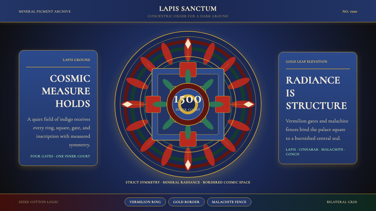 Tibetan Thangka Mandala (1500)Cosmic order, burnished dark. Lapis ground, gold borders, vermilion rings.宇宙秩序在暗处发光:青金石底、金箔边、朱砂环。
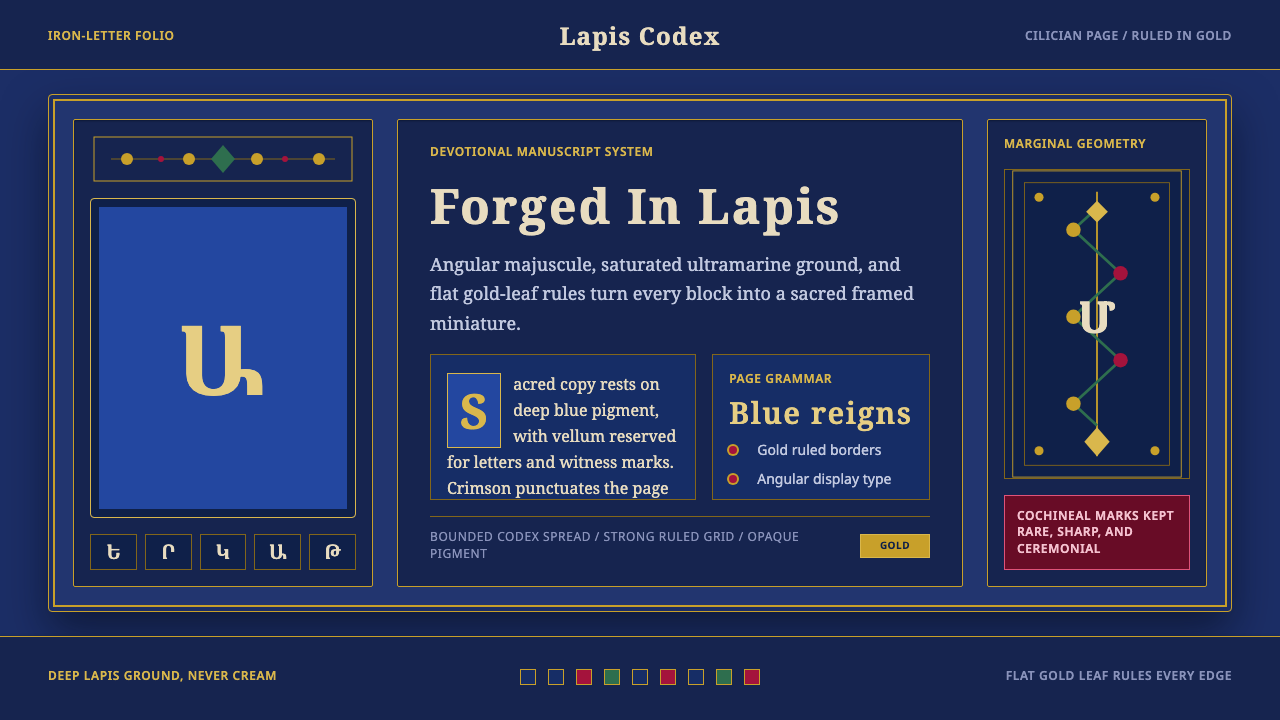 Armenian ErkatʿagirDevotional lapis reigns. Gold rules and angular serif glyphs frame a sacred g…虔敬青金石主宰:金色线框与棱角字形围合神圣网格。
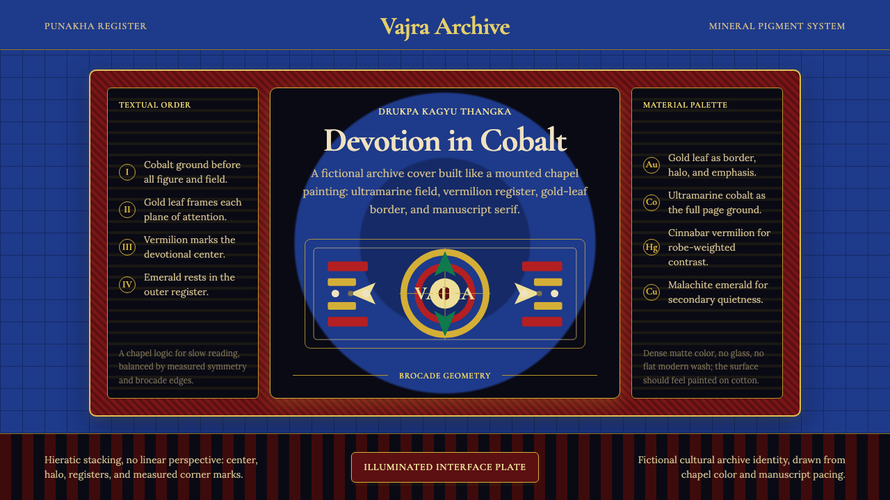 Bhutanese Drukpa Kagyu ThangkaDevotion made cobalt. Gold frames, Cormorant serif, and vermilion marks hold…钴蓝承载虔敬:金框、Cormorant 衬线与朱砂标记构成佛殿秩序。
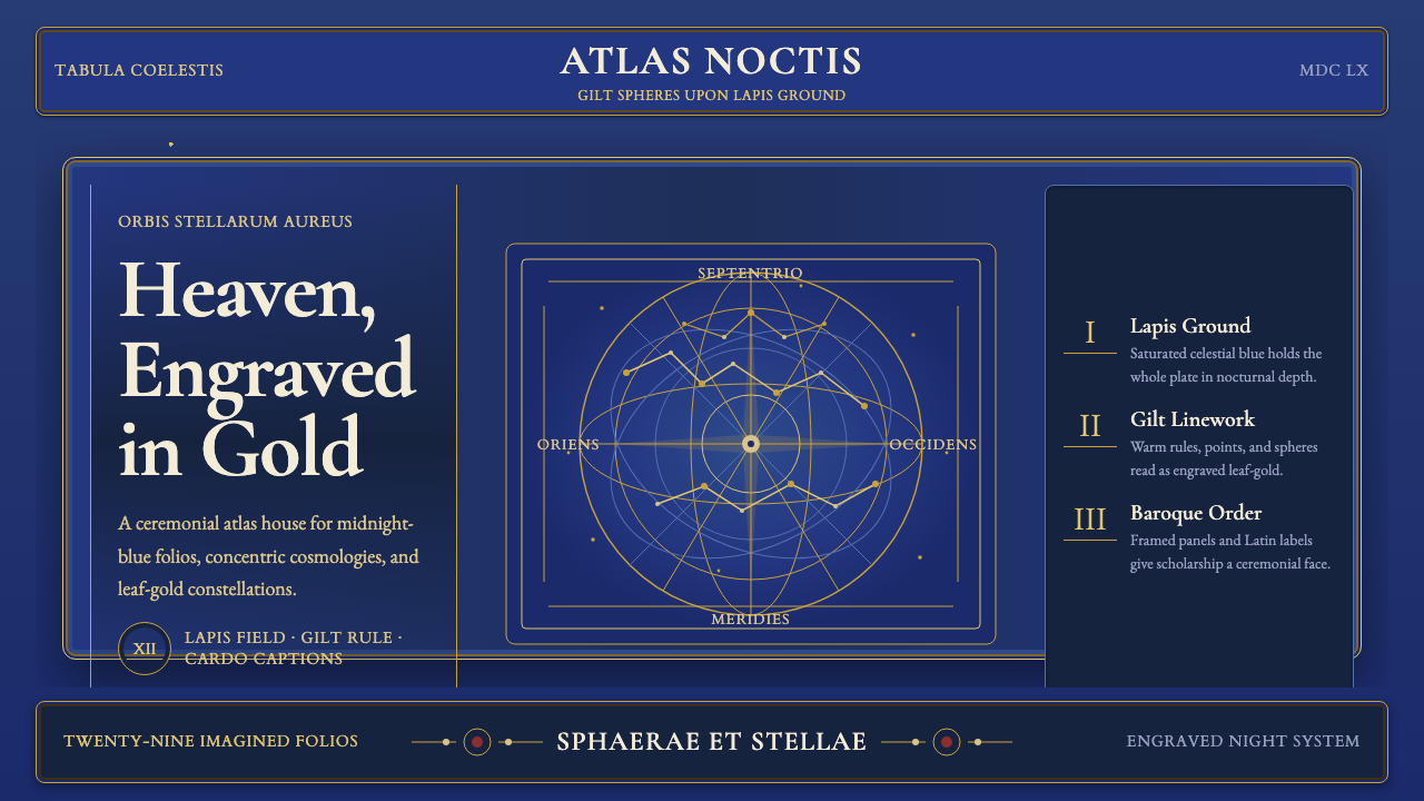 Cellarius Celestial AtlasCelestial luxury on lapis. Gilt serif type, star fields, and concentric chart…青金夜空里的天体奢华:鎏金衬线、星点与同心星图线。
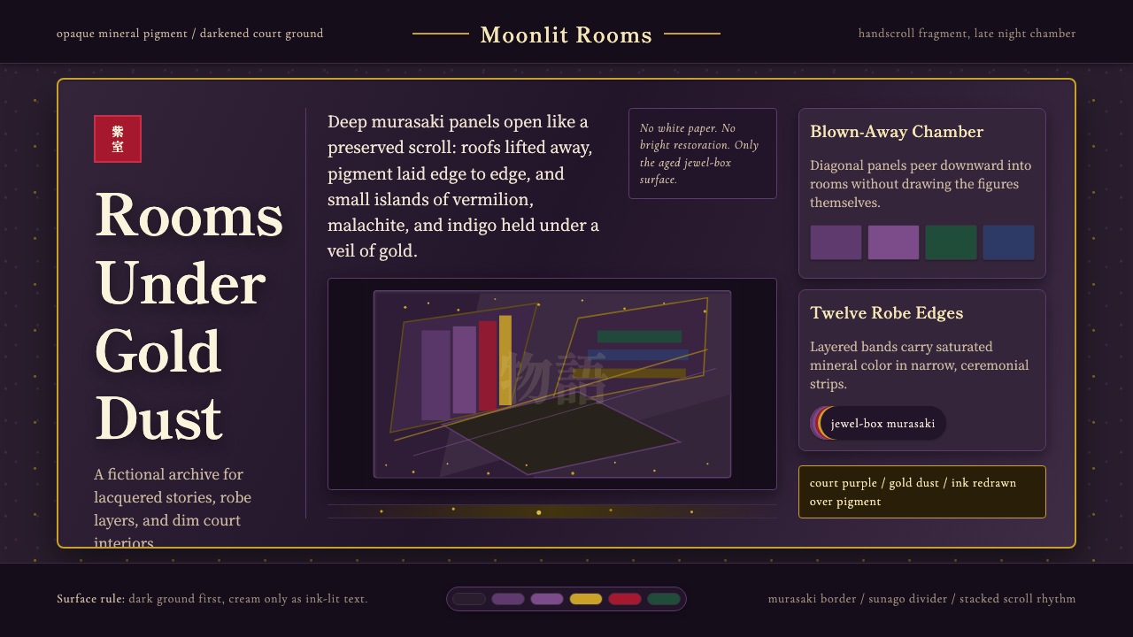 Heian Genji ScrollAged court opulence. Murasaki ground, gold dust, and stacked scroll panels.沉郁宫廷华彩:黯紫底、金砂、层叠绘卷面板。
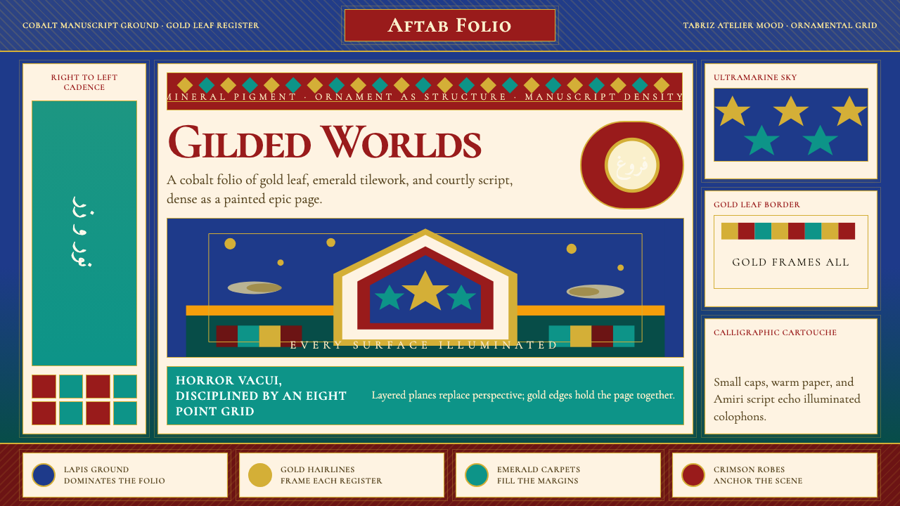 Persian Miniature (Shahnameh era)Manuscript luxury turns maximal. Cobalt ground, gold borders, and Cormorant S…手稿奢华走向极繁。钴蓝底、金边框与Cormorant SC填满每寸。