What is Heian Genji Scroll?
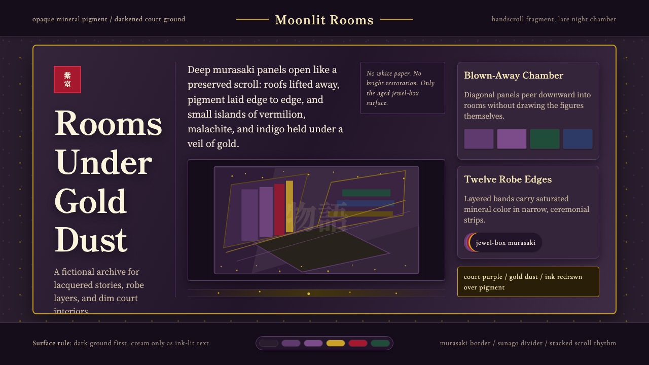
The Genji scroll style renders design as a jewel box that has darkened with nine centuries of age — court purple, scattered gold, and figures glimpsed through roofs that have been lifted clean away.
Heian Genji Scroll in brief
The Heian Genji Scroll style draws its visual language from the Genji Monogatari Emaki, the oldest surviving illustrated handscrolls of Murasaki Shikibu's eleventh-century novel The Tale of Genji. These twelfth-century paintings were made using onna-e tsukuri-e, a courtly technique in which opaque mineral pigment was built up edge-to-edge across the paper before ink outlines were redrawn on top, and gold dust was scattered across the surface like drifting cloud-bands. The result is not a delicate line drawing but a dense, saturated field of pigment — closer to lacquerwork than to sketching.
What makes the style instantly recognizable is a set of pictorial conventions unique to this courtly tradition. Roofs and ceilings are omitted entirely — a device called fukinuki yatai, 'blown-off roof' — so the viewer looks straight down into interior rooms as if the building had been sliced open from above. Faces are reduced to the barest possible notation, a hooked line for the nose and a thin stroke for each eye, a convention called hikime kagihana, so mood is carried by posture and the weight of robes rather than by expression. Court dress itself piles into as many as twelve layered, saturated colors, one visible sliver of each at collar and sleeve.
This system does not chase the pale, sun-faded look of a modern reproduction print. It preserves what nine centuries of darkening actually did to the pigment and paper backing: the once-brighter grounds have deepened into bruised purple-browns, murasaki gone heavy and umber at the edges. The resulting palette is a court-purple sovereign tone anchored by scattered gold, with vermilion and malachite green appearing only as accents — the visual memory of an object kept in a box, in the dark, for a very long time.
Where does Heian Genji Scroll come from?
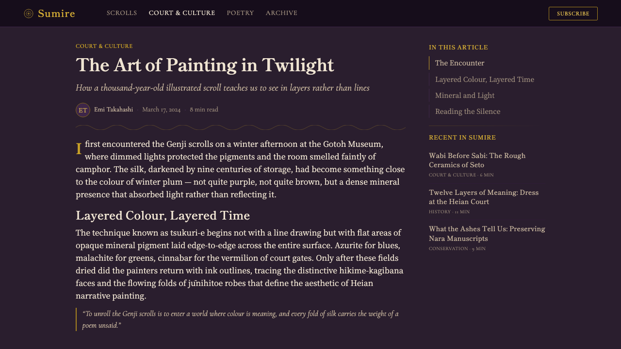
Murasaki Shikibu wrote The Tale of Genji at the Heian court around 1008, a fifty-four-chapter narrative following the romantic and political life of the courtier Hikaru Genji across three generations. It is widely regarded as one of the world's first novels, a work so foundational to Japanese court culture that illustrating it became, within a century of its completion, its own high art form.
The surviving Genji Monogatari Emaki scrolls date to the twelfth century, roughly a hundred years after the novel was written, and are attributed to court painters working in the yamato-e tradition — a native Japanese painting style developed in conscious distinction from Chinese-derived kara-e. The scrolls that survive today are fragmentary, held mostly in the Tokugawa Art Museum and the Gotoh Museum, and represent only a fraction of what once existed — entire chapters and their paintings have been lost to fire, war, and simple attrition over nine hundred years.
The technique itself, onna-e tsukuri-e, translates roughly to 'women's pictures, built-up painting,' a name reflecting both its association with court women's literature — The Tale of Genji, like much of the era's greatest prose, was written by and largely for women of the aristocracy — and its physical method of construction, in which pigment was layered and reworked rather than drawn in a single confident stroke.
The style sits within a broader Heian court aesthetic obsessed with layering as a marker of taste: layered robes signaled rank and seasonal awareness, layered poetry alluded to earlier poems, and layered pigment built these paintings. Nine centuries of aging then did something the original painters could not have designed for — it deepened every ground color and darkened every gold leaf, giving the surviving fragments a weight that reads, to a modern eye, as ancient treasure rather than decorative illustration.
What defines the Heian Genji Scroll look?
Color
The dominant tone is a deep, aged court purple — murasaki gone heavy with time, closer to a bruised plum than the bright violet of fresh pigment. Gold appears not as a solid fill but as scattered dust or drifting cloud-bands, concentrated in some areas and thin in others, never applied as an even wash. Vermilion and a muted malachite green are used sparingly, as accent notes against the purple ground rather than as competing dominant hues. Nothing in this palette is bright in the way contemporary digital color tends to be bright; every tone reads as pigment that has sat in low light for centuries.
Composition — The Blown-Off Roof
The signature compositional device of this tradition is fukinuki yatai, the 'blown-off roof': the ceiling and upper walls of a structure are simply omitted, letting the viewer look straight down into the room from a raised, oblique angle. This is not a perspective failure but a deliberate narrative choice — it lets the painter show private, interior court life without a roofline blocking the view. Interiors are typically shown as a diagonal wedge of floor and furnishings rather than a squared-off box, giving compositions a restless, tilted geometry.
Figures and Faces
Faces follow the hikime kagihana convention — 'a line for an eye, a hook for a nose' — reducing every courtier's face to the same minimal notation regardless of who they are or what they feel. This is a deliberate anti-portrait: identity and emotion are communicated instead through posture, the angle of a bowed head, and above all through the color and layering of the robes. A figure's rank is legible before the viewer even considers the face. Applied outside its original context, this principle translates into restraint about facial detail in favor of silhouette and color-coded hierarchy.
Layering — The Twelve-Unit Robe
Court dress in these paintings piles color upon color, historically referencing the jūnihitoe or 'twelve-layer' robe worn by high-ranking women, in which each layer's edge was cut and arranged to reveal a sliver of the color beneath at collar, sleeve, and hem. The visual logic is additive: no single color stands alone, and richness comes from the accumulation of many saturated layers rather than any one bold hue. Translated into flat design, this becomes a principle of stacked panels and layered surfaces, each contributing a visible edge of color to its neighbor, rather than a single flat block of one tone.
Gold as Atmosphere
Gold in these scrolls is not ornament applied to a finished image — it functions as weather, standing in for clouds, mist, or the passage of time within a single frame. It is scattered as dust (sunago) or laid as drifting bands that partially veil the scene beneath them, sometimes obscuring a whole corner of a composition. This is fundamentally different from gold used as a border or luxury signifier in most decorative traditions; here it behaves like atmosphere, uneven and directional, thickest where the painter wanted to suggest concealment or transition.
The Scroll Panel as Unit
Because the original works are handscrolls meant to be unrolled section by section rather than viewed all at once, each visible portion functions as a self-contained panel — a fragment that carries its own composition and its own passage of gold, even though it was conceived as one continuous narrative. Applied to modern layouts, this suggests treating each screen or card as its own complete jewel-box composition rather than a uniform tile in an undifferentiated grid — variation and asymmetry between panels are true to the source, not a departure from it.
Who shaped Heian Genji Scroll?
Murasaki Shikibu, a lady-in-waiting at the Heian court, wrote The Tale of Genji around 1008, providing the source narrative the surviving scrolls illustrate. Her prose style — attentive to seasonal detail, indirect emotional disclosure, and the layered symbolism of dress and color — shaped what the paintings needed to depict, and in large part how restrained and allusive their visual vocabulary became.
The painters who produced the twelfth-century Genji Monogatari Emaki remain largely anonymous, working within the yamato-e tradition as court professionals rather than individually celebrated artists. Their contribution was the technical vocabulary itself — the fukinuki yatai roofless interior, the hikime kagihana minimal face, the onna-e tsukuri-e layered-pigment method — refined across a workshop tradition rather than invented by a single hand.
The surviving fragments of the original scrolls are held today primarily by the Tokugawa Art Museum and the Gotoh Museum, and it is these physical objects — not a reconstructed version of the paintings — that supply the aged, darkened palette this style is built on. Their condition after nine centuries is treated as authentic visual information rather than damage to be corrected, which is why this style deliberately departs from brighter modern reproductions of the same scenes.
How do you use Heian Genji Scroll today?
Applying the Heian Genji Scroll style well means treating every surface as an aged, layered jewel box rather than a bright decorative pattern lifted from a Japanese-themed clip art set. The core discipline is restraint on brightness combined with generosity in layering — a deep, aged purple ground, gold used sparingly rather than as a border, and panels that each read as a complete, self-contained composition.
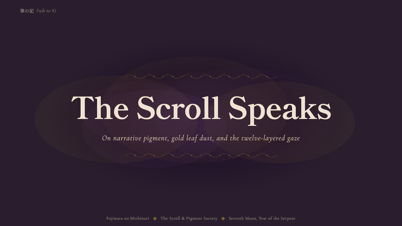
For presentation slides, the style is strongest on cover pages and section dividers, where a single large panel can carry the fukinuki yatai composition — an oblique, roofless view into a scene, with gold dust drifting across one corner. Content and data slides should treat each slide as its own scroll panel: a fixed, deep-purple ground, one clear hierarchy of text established through scale rather than color contrast, and gold reserved for a single accent element rather than applied broadly. Data visualizations should avoid bright, saturated chart colors in favor of the muted vermilion-and-malachite accent pairing against the purple ground.
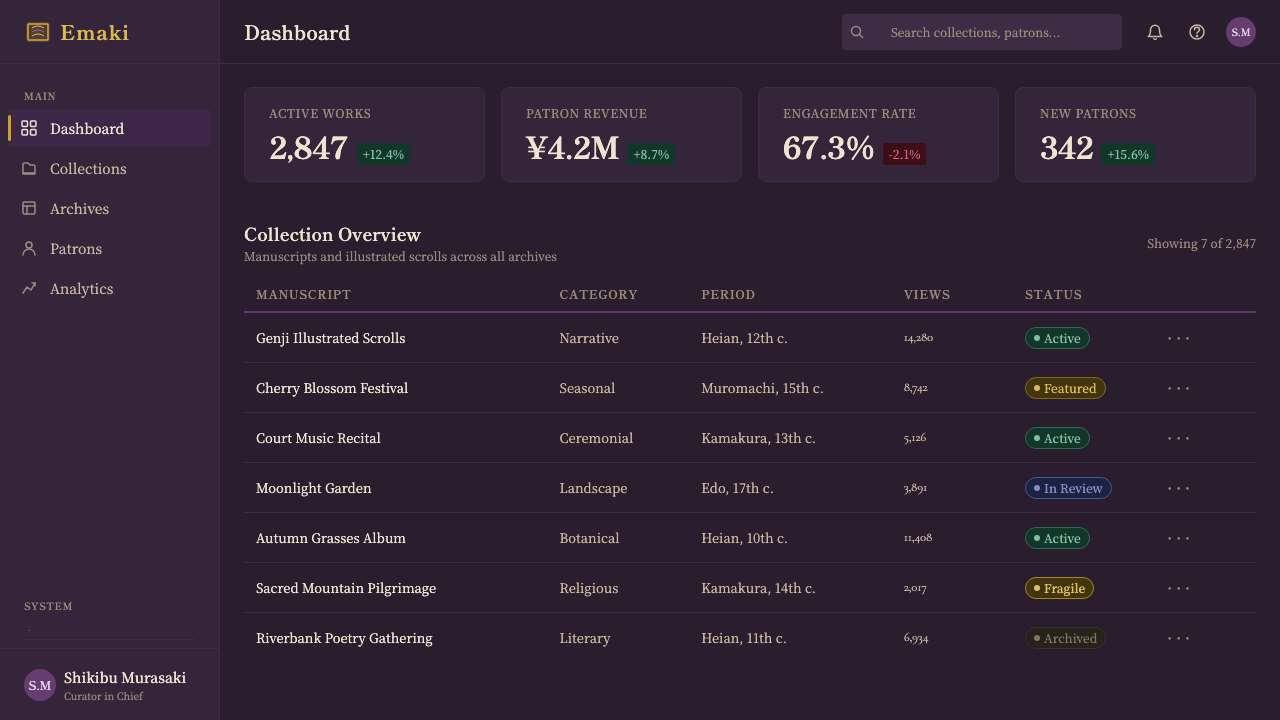
For web interfaces such as dashboards and pricing pages, the style translates into a dark, purple-toned ground rather than a neutral gray or black, with gold used only for the most important interactive or premium-tier signal — a highlighted plan, an active state — never as a general accent color repeated throughout the interface. Card components benefit from a layered-edge treatment reminiscent of the twelve-layer robe: a visible sliver of a second, related tone at one edge of a card rather than a flat single-color fill. Navigation and typography should stay restrained, since the source tradition subordinates linework to color and layering.
For editorial and marketing content, the style suits long-form storytelling, seasonal or narrative-driven brands, and any content that benefits from a sense of age, heritage, or quiet drama. A magazine-style layout can treat each section break as its own scroll panel, varying the gold placement and accent color from section to section the way successive panels of the original scrolls vary while remaining part of one continuous narrative. Marketing pages that lean on a single striking hero panel — deep purple ground, an oblique interior view, gold drifting across one corner — read as considerably more premium than pages that spread the same elements evenly across the whole page.
A common mistake is brightening the palette to make it more legible on screen, which destroys the entire premise of the style — the aged, darkened ground is the point, not an accident to be corrected. A second common mistake is applying gold as a uniform border or frame, the way a generic 'luxury' template might; in the source material gold behaves like drifting weather, and applying it as a tidy rectangular border erases exactly what makes it recognizable as this style rather than generic gilt decoration.
Heian Genji Scroll — FAQ
Is this the same as a generic 'traditional Japanese' design style?
No. Generic 'Japanese' design references tend to draw on later traditions — ukiyo-e woodblock prints, minimalist Zen aesthetics, or contemporary washi paper textures — all of which favor lighter grounds and considerably more restraint. The Heian Genji Scroll style is specific to one courtly tradition roughly a thousand years old: the roofless fukinuki yatai interior view, the minimal hikime kagihana face, and above all a palette that reflects nine centuries of physical darkening rather than a fresh, bright application of ink and color.
Why does the style avoid bright, saturated purple in favor of a darker tone?
Because the visual reference is the physical scrolls as they exist today, not as they looked freshly painted in the twelfth century. Nine hundred years of exposure to air, handling, and time have deepened the original pigment into heavier purple-browns. A bright, saturated purple would read as a generic 'royal purple' brand color rather than as this specific aged-scroll aesthetic. The darkness is not a stylistic exaggeration; it is the single most identifying feature of the source material.
How should gold be used differently from how it's used in typical 'luxury' templates?
Typical luxury templates use gold as a border or highlight applied consistently and evenly — a gold rule under a heading, a gold rectangle around a card. In the source scrolls, gold behaves like weather: scattered as fine dust in some areas, absent in others, sometimes laid as a drifting band that partially obscures the scene beneath it. Applying gold evenly, as a tidy border, erases exactly the quality that makes it recognizable as this style.
Why are faces drawn so minimally, and does this limit how the style can be used?
The hikime kagihana convention reduced every face to nearly the same minimal notation because Heian court painting was not interested in individual likeness — identity and emotion were meant to be read through posture and rank-signaling dress instead. This does not limit the style so much as redirect it: applications built around narrative panels, silhouette, color-coded hierarchy, and layered surface composition can use this style effectively without ever needing detailed facial rendering.
Does this style work for anything other than narrative or heritage-driven content?
It is strongest where narrative, heritage, seasonal atmosphere, or a sense of quiet drama are genuine assets — editorial storytelling, cultural and arts institutions, premium or heritage-positioned brands, and long-form content generally. It is a poor fit for contexts that need to feel fast, casual, or aggressively modern, since the entire system depends on the viewer reading weight and restraint as positive qualities. Functional interfaces like dashboards can borrow the palette and layering logic, but only when the product's own positioning tolerates a slower, more considered feeling.
Related design styles
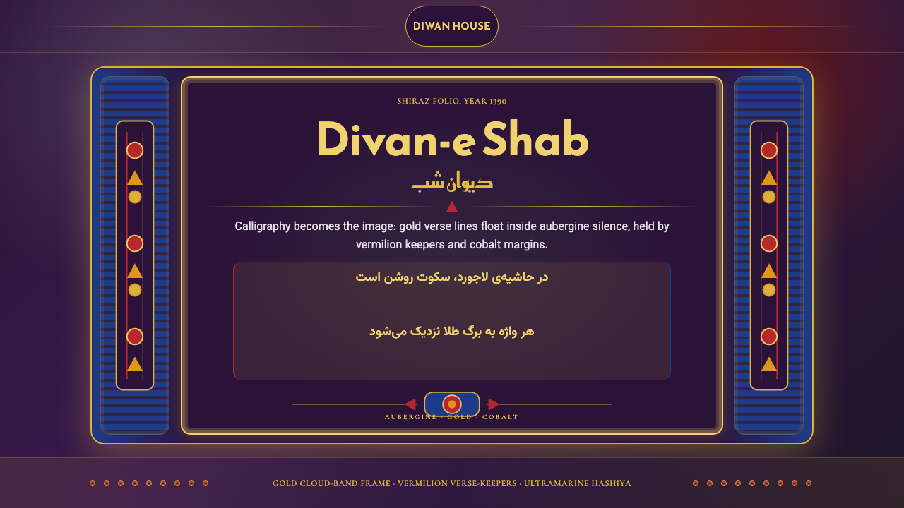 Iranian Shiraz Poetry Divan 1390Midnight manuscript glow. Aubergine fields, gold Kufi type, cobalt margins.
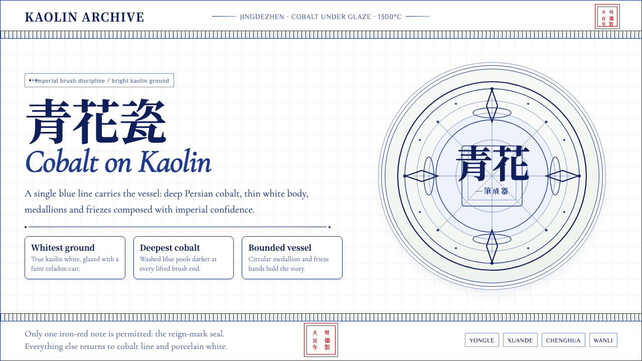 Ming Blue-and-White PorcelainImperial restraint sings. Deep cobalt hairlines circle kaolin white with one…
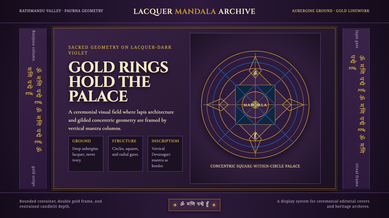 Newari Ranjana-Script MandalaCeremonial darkness. Gold mandala rings and lapis gates glow on aubergine lac…
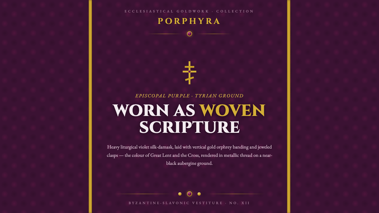 Russian Orthodox VestmentEpiscopal purple as woven sorrow. Aubergine damask, vertical gold orphrey ban…
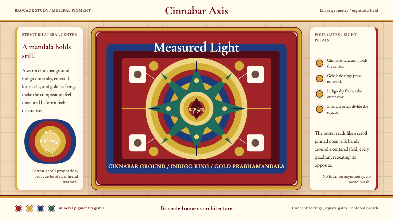 Tibetan Thangka MandalaSacred order burns warm. Cinnabar symmetry, gold halos, indigo rings, brocade…
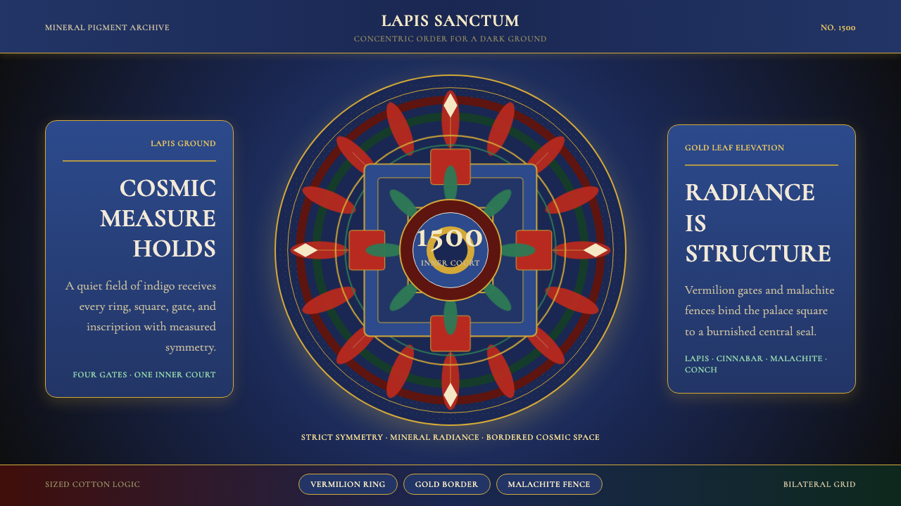 Tibetan Thangka Mandala (1500)Cosmic order, burnished dark. Lapis ground, gold borders, vermilion rings.