Design style guide设计风格指南
What is Tibetan Thangka Mandala (1500)?什么是 Tibetan Thangka Mandala (1500)?
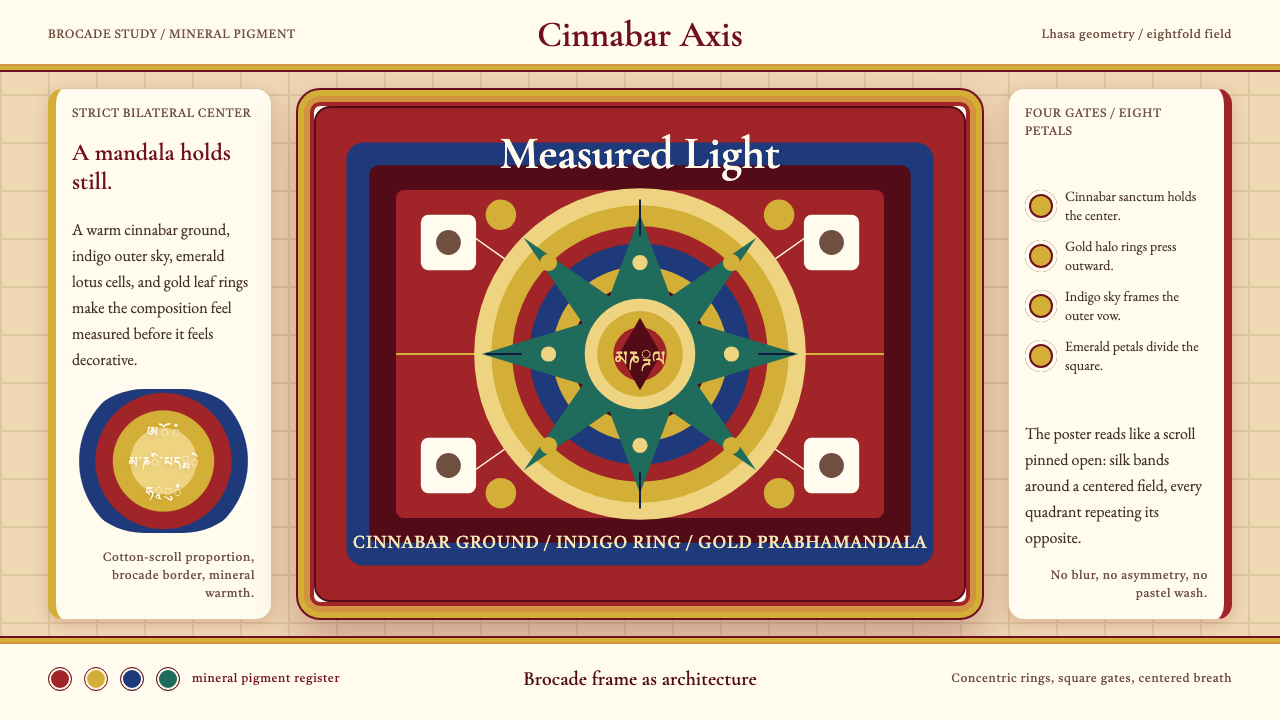
Tibetan thangka mandala painting encodes the entire cosmos into concentric rings of fire, lotus, and gold — a sacred geometry so precise it doubles as a design system.藏传唐卡坛城将整个宇宙压缩进同心的火焰、莲花与金箔——这套神圣几何严谨至可以直接充当设计规范。
Tibetan Thangka Mandala (1500) in briefTibetan Thangka Mandala (1500) 速览
Tibetan thangka mandala painting is one of the most rigorously codified visual traditions in the world. Produced across monastic ateliers in Lhasa, Shigatse, and the Kham region from roughly the eleventh century onward, these scroll paintings on sized cotton use mineral pigments of remarkable intensity: lapis lazuli ground to a deep, saturated indigo for the cosmic ground, cinnabar producing the blazing vermilion of lotus petals and fire rings, malachite yielding the protective emerald of outer barriers, and beaten gold leaf reserved for the radiance of divine figures.藏传唐卡坛城是世界上制作规范最为严苛的视觉传统之一。自约十一世纪起,拉萨、日喀则和康区的寺院画坊在定型棉布上以矿物颜料绘制卷轴,色彩浓烈惊人:青金石研磨后成为深厚饱和的靛蓝底色,朱砂调出莲瓣与火轮的炽烈赤红,孔雀石提炼出外护圈的翠绿,捶打过的金箔则专为神像的辉光而留。
Unlike traditions that developed organically through individual artistic expression, thangka composition is governed by canonical iconometric texts. Every mandala follows a fixed cosmological architecture: concentric rings of flame, vajra fences, and lotus petals surround a central palace with four directional gates, each aligned to a cardinal point and guarded by protective deities. The proportions are not aesthetic preferences but sacred measurements derived from scripture, making the mandala simultaneously a devotional object, a meditation support, and a precision diagram of enlightened reality.不同于通过个人艺术表达自然演化的传统,唐卡构图遵循经典的量度仪轨。每座坛城都依循固定的宇宙建筑蓝图:同心的火焰轮、金刚围栏与莲花瓣层层包裹中央宫城,宫城四向设门,各对应一个基本方位,由护法神明守卫。这些比例并非美学偏好,而是源自经典的神圣度量,使坛城同时成为礼拜对象、禅定所依和觉悟实相的精确图示。
The visual effect is one of radical symmetry punctuated by concentrated jewel color. The dark indigo ground recedes, pulling the eye inward through successive rings of saturated hue toward the innermost sanctum. Gold does not merely decorate — it functions as sacred luminance, marking the boundary between the transcendent and the visible world. This combination of extreme geometric precision and deeply saturated mineral color produces an aesthetic unlike anything in European or East Asian painting: austere and opulent simultaneously.视觉效果是极度对称与集中宝石色彩的交织。深靛蓝底色向内退却,引导目光穿越层层饱和色环,最终抵达最内在的圣殿。金色不仅仅是装饰——它作为神圣光辉而存在,标划出超验世界与可见世界之间的边界。这种极致几何精准与高度饱和矿物色彩的组合,产生出一种既不同于欧洲也不同于东亚绘画的独特美学:严整与华美同时并存。
See the Tibetan Thangka Mandala (1500) design system →查看 Tibetan Thangka Mandala (1500) 完整设计系统 →
Where does Tibetan Thangka Mandala (1500) come from?Tibetan Thangka Mandala (1500) 从何而来?
The thangka as a portable scroll painting emerged in Tibet during the eleventh century, coinciding with the second diffusion of Buddhism from India and Nepal into the Tibetan plateau. Early practitioners brought iconographic models from the great monastic universities of northern India — Nalanda and Vikramashila — and Tibetan artists adapted these models to their own mineral-rich environment and devotional needs. The word thangka derives from the Tibetan for 'recorded message' or 'thing that can be rolled up,' reflecting its essential nature as a portable teaching object that could travel with nomadic communities and be deployed in temporary ceremonial spaces.作为可携带卷轴画的唐卡出现于十一世纪的西藏,与佛教从印度和尼泊尔第二次传入青藏高原同步。早期传播者将图像范式从北印度的那烂陀、超岩寺等大型寺院大学带来,藏地画师结合当地丰富的矿物资源与礼拜需求对其加以改造。「唐卡」一词源自藏语,意为「录传之物」或「可卷起之物」,反映了它作为可移动教义载体的本质——既能随游牧族群迁徙,又能在临时仪式空间中展开使用。
By the fifteenth and sixteenth centuries, distinct regional schools had crystallized. The Menri school, founded by the master Menla Dondrup in the late fifteenth century in Tsang province, established the proportional canon that most Tibetan painters still follow: it specifies the precise measurements for every deity form, from the width of an eye to the curve of a halo. The Karma Gardri school, associated with the tenth Karmapa Chöying Dorje in the early seventeenth century, introduced softer shading influenced by Chinese ink-wash painting into the Tibetan vocabulary while retaining the strict iconometric framework. These two schools together define what most people recognize as classical Tibetan painting.至十五至十六世纪,各具特色的地方画派已然成形。门孜画派由大师门拉顿珠于十五世纪末在藏中地区创立,确立了大多数藏地画师至今仍遵循的比例法典:它规定了每一尊神像的精确尺度,从眼睛宽度到光环弧线,无所不包。噶玛噶孜画派由第十世噶玛巴确英多吉于十七世纪初开创,在保留严格量度仪轨的同时,将受汉地水墨影响的柔和渲染引入藏地画语。这两大画派共同定义了大多数人所认识的经典藏地绘画风格。
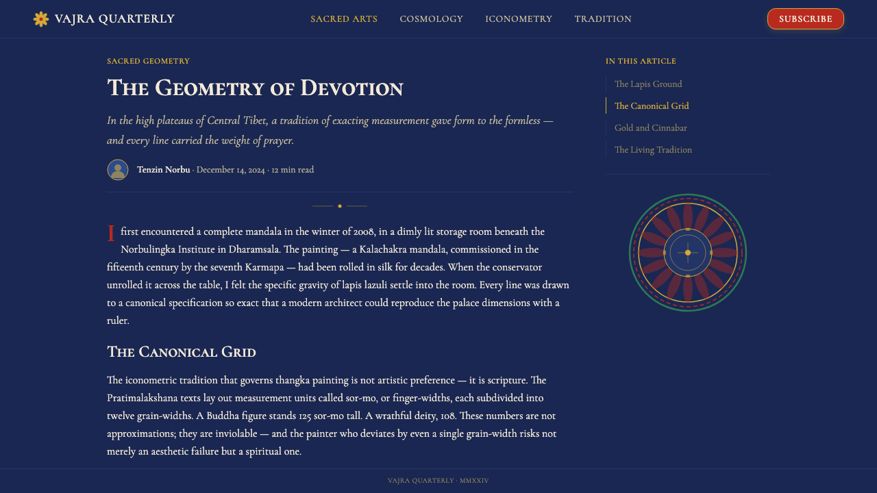
Mandala composition in particular draws on the Kalachakra tradition — a tantric system introduced into Tibet from India in the early eleventh century whose mandala design specifies a five-hundred-and-thirty-two deity arrangement across concentric circles, all governed by a single proportional grid. The Kalachakra mandala became a template for subsequent mandala traditions in Tibet, Nepal, Bhutan, and Mongolia, demonstrating how a single iconographic program could propagate across an entire cultural sphere while maintaining extraordinary formal precision.坛城构图尤其根植于时轮金刚传统——这一密法体系于十一世纪初由印度传入西藏,其坛城设计在同心圆结构中排布五百三十二尊神像,全部受一套比例网格统辖。时轮坛城成为后续西藏、尼泊尔、不丹和蒙古坛城传统的范本,展示了一套图像程序如何在整个文化圈中传播,同时保持令人惊叹的形式精准度。
Western scholarly attention to thangka came relatively late. Art historian David Jackson's comprehensive studies in the late twentieth century documented the major stylistic lineages and established the critical vocabulary for understanding regional and temporal differences. This scholarship helped reframe thangka from a purely ethnographic curiosity to a technically demanding fine-art tradition whose compositional logic has attracted the attention of designers, architects, and cognitive scientists studying the neurological effects of mandala geometry on attention and perception.西方学界对唐卡的关注来得相对较晚。艺术史家大卫·杰克逊于二十世纪末进行了系统性研究,记录了主要风格谱系,并建立了理解地区与时代差异的批评词汇。这些学术成果帮助将唐卡从纯粹的人类学奇观重新定位为一项技术要求极高的精细艺术传统,其构图逻辑已吸引设计师、建筑师及研究坛城几何对注意力与感知之神经效应的认知科学家的关注。
What defines the Tibetan Thangka Mandala (1500) look?Tibetan Thangka Mandala (1500) 的视觉特征是什么?
Color Ground底色基调
The dominant ground in classical thangka is a deep, saturated indigo derived from lapis lazuli — the richest, most expensive blue available to medieval painters. Against this ground, other hues read as luminous jewels rather than flat pigments. The indigo is not merely a background but a cosmological statement: it represents the infinite expanse of enlightened mind, the ground from which sacred form arises. Secondary grounds include midnight black for wrathful deity compositions and warm terracotta for certain regional variants. In each case, the ground is absolute rather than graduated.经典唐卡的主导底色是由青金石研磨而成的深厚饱和靛蓝——中世纪画师所能获得的最丰富、最昂贵的蓝色。其他色彩在这片底色映衬下,呈现出珠宝般的发光质地,而非平涂颜料的质感。靛蓝不仅仅是背景,更是宇宙论的陈述:它代表觉悟之心的无边广阔,神圣形态由此生起的根基。次要底色包括忿怒尊构图中的深黑,以及某些地方变体的温暖赭红。无论何种底色,均是绝对铺陈而非渐变过渡。
Sacred Palette神圣色谱
Thangka color is strictly mineral and symbolic. Vermilion from cinnabar denotes divine action, protective energy, and the fire rings that guard the mandala perimeter. Malachite green marks the outer barriers and the body color of certain protective deities. White, derived from calcite, signifies purity and the bodies of peaceful forms. Gold leaf, applied over a red clay base and burnished to mirror brightness, marks all divine radiance, sacred script, and architectural ornament within the palace structure. Each color carries iconographic meaning that overrides any naturalistic consideration: a deity's body may be blue, green, or white regardless of human anatomy.唐卡色彩严格取自矿物,并具有象征意义。朱砂提炼的赤红代表神圣行动、护卫力量以及守护坛城外围的火焰轮。孔雀石的翠绿标示外护圈和某些护法神明的身色。取自方解石的白色象征清净以及寂静尊的身色。金箔覆于朱底之上,磨至镜面光亮,用于所有神圣光辉、梵文经咒以及宫城内部的建筑装饰。每种颜色都承载着凌驾于自然主义考量之上的图像意义:一位神明的身体可以是蓝、绿或白,与人体解剖无关。
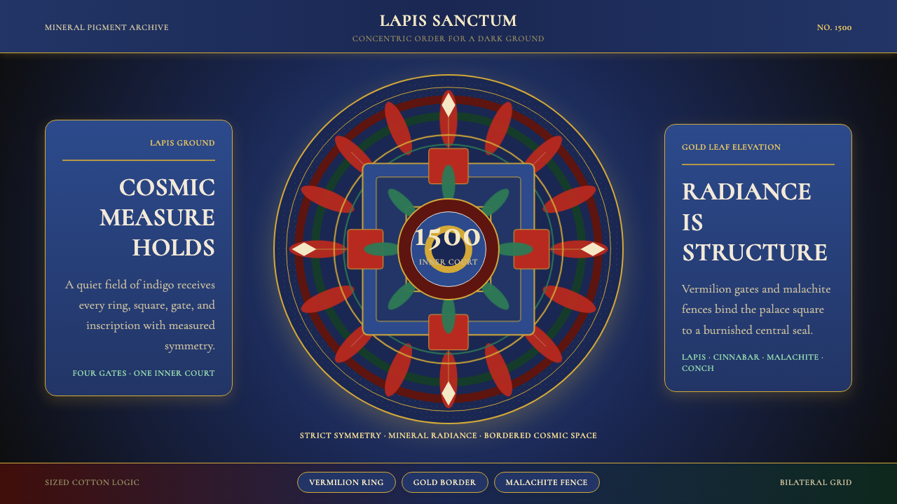
Concentric Architecture同心建筑结构
The mandala is not a decorative pattern but a three-dimensional sacred palace rendered in strict two-dimensional projection. The concentric rings moving outward from the center represent successive courtyards, gates, and protective barriers of a celestial architecture. This reading requires the viewer to mentally rotate the image: the square palace at the center is seen from above, while the gates at each cardinal direction project outward as if in elevation. The tension between plan view and elevation within a single image is a defining compositional feature, producing a spatial complexity that flat abstraction alone cannot achieve.坛城并非装饰性图案,而是一座三维神圣宫殿以严格二维投影方式呈现的结果。从中心向外展开的同心圆环代表天界建筑的层层院落、宫门与护卫壁垒。这一阅读方式要求观者在心理上旋转图像:中央的方形宫城以俯视角呈现,而四个方向的宫门则如立面图般向外展开。在同一图像中,平面图与立面图之间的张力是这种构图的决定性特征,产生出单纯平面抽象所无法实现的空间复杂性。
Bilateral Symmetry严格双轴对称
Mandala composition is governed by absolute bilateral symmetry along both horizontal and vertical axes, with the central deity as the organizing pivot. This symmetry is not the relaxed balance of decorative art but a metaphysical statement: the cosmos is equally ordered in all directions from the enlightened center. Deviations from symmetry — which do occur in subsidiary narrative registers around the main image — read as deliberate departures signaling different ontological status. The strict symmetry of the mandala interior makes even small asymmetries in the outer registers visually charged.坛城构图受绝对双轴对称法则约束,以中央主尊为组织枢纽,水平与垂直两轴均严格对称。这种对称并非装饰艺术中那种宽松的视觉平衡,而是一种形而上的陈述:宇宙从觉悟中心向各个方向均等展开。偏离对称的情况——确实出现于主图周边的附属叙事画带——被理解为刻意的偏离,标示着不同的本体论地位。坛城内部的严格对称,使外围画带中哪怕细微的不对称都在视觉上充满张力。
Line Weight and Gold Outline线条粗细与金色勾勒
Thangka line work is among the most demanding in any painting tradition. Outlines are drawn with mineral pigment at a consistent, controlled weight — neither the swelling-and-tapering of Chinese brushwork nor the mechanical uniformity of printmaking, but a calm, assured regularity that suggests the hand of a practitioner whose mind is as stable as the line itself. Gold is applied not only as broad areas of divine radiance but also as the finest possible outlines delineating folds within garments, individual hair strands, and the internal geometry of ornament. The contrast between broad mineral fields and hairline gold detail is a signature of the tradition's highest registers.唐卡线条是所有绘画传统中要求最高的技法之一。轮廓线以矿物颜料绘制,粗细保持一致、受控均匀——既非中国笔墨的粗细变化,亦非版画的机械统一,而是一种平静自信的规整,仿佛传达着画师在落笔时心如止水。金色的使用不仅体现在宽阔的神圣光辉区域,也体现在极细的金线勾勒上——描绘衣褶起伏、单根发丝以及装饰纹样的内部几何。宽阔矿物色域与金线细节之间的对比,是这一传统最高水准的标志。
Hierarchical Scaling等级性比例关系
Size in thangka follows sacred hierarchy, not perspectival recession. The central deity is depicted at the largest scale; attendant figures, protective deities, and narrative vignettes diminish in size according to their rank in the cosmological order, not their position in space. This means a figure in the foreground may be smaller than one depicted behind it if the latter holds higher ontological status. The result is an image that simultaneously operates as a devotional hierarchy chart and a visual meditation guide — the eye naturally travels inward and upward toward the figures of greatest authority.唐卡中的大小遵循神圣等级秩序,而非透视缩退。中央主尊以最大尺度描绘;侍从神像、护法神明与叙事细节则依其在宇宙秩序中的地位而缩小,而非依据空间位置。这意味着前景中的神像可能比其身后描绘的神像更小,若后者具有更高的本体论地位。由此产生的图像同时具备两种功能:一张虔诚的等级示意图,以及一份视觉禅定指引——目光自然向内向上流动,趋向最高权威的神明。
Decorative Grammar装饰语法
Thangka ornament is not added for visual richness but for iconographic precision. Every element — the flame patterns, the lotus petals, the vajra ornaments, the cloud scrolls in the outer registers — belongs to a fixed symbolic vocabulary whose meanings are specified in text. The lotus represents pure arising from impurity; the vajra thunderbolt represents indestructible reality; the cloud scroll marks the boundary between sacred and earthly space. None of these elements can be rearranged or substituted without changing the meaning of the image. Ornament here is grammar, not decoration.唐卡的装饰元素并非为视觉丰富而添加,而是服务于图像精确性的语法单位。每一种元素——火焰纹样、莲花瓣、金刚杵饰、外围画带中的云卷——都属于一套由经典文本规定其含义的固定象征词汇。莲花代表从污泥中清净生起;金刚杵代表不可摧毁的实相;云卷标示神圣空间与世俗空间之间的边界。这些元素不可随意重排或替换,否则图像的意义随之改变。此处的装饰是语法,而非修辞。
See the Tibetan Thangka Mandala (1500) design system →查看 Tibetan Thangka Mandala (1500) 完整设计系统 →
Who shaped Tibetan Thangka Mandala (1500)?谁塑造了 Tibetan Thangka Mandala (1500)?
The founder of the Menri school of Tibetan painting in the late fifteenth century, Menla Dondrup codified the proportional canon that governed Tibetan figure painting for the following five centuries. His system specified exact measurements for every deity in the Buddhist pantheon — a visual grammar that allowed painters across different monasteries and regions to maintain iconographic consistency despite the absence of photographic reproduction. The Menri canon is the closest equivalent in any pre-modern painting tradition to a rigorous design specification document.门拉顿珠是十五世纪末门孜画派的创立者,他将决定此后五个世纪藏地人物绘画的比例法典加以系统化。他的体系为佛教神像系统中的每一尊神像规定了精确尺度——一套视觉语法,使不同寺院和地区的画师在没有摄影复制手段的条件下仍能保持图像一致性。门孜法典是前现代绘画传统中最接近严格设计规范文件的存在。
The tenth Karmapa was both a senior Buddhist hierarch and an accomplished painter who founded or patronized the Karma Gardri school in the early seventeenth century. Under his influence, Tibetan thangka absorbed elements of Chinese painting — particularly softer shading techniques and naturalistic landscape rendering in the outer registers — without abandoning the strict iconometric framework of the interior mandala. The Karma Gardri school's synthesis demonstrates how a codified sacred art tradition can accommodate external aesthetic influences while maintaining its doctrinal core intact.第十世噶玛巴是德高望重的佛教领袖,同时也是一位造诣精深的画师,他于十七世纪初创立或赞助了噶玛噶孜画派。在他的影响下,藏传唐卡吸收了汉地绘画的元素——尤其是更为柔和的渲染技法以及外围画带中的写实山水意境——同时并未放弃坛城内部严格的量度仪轨框架。噶玛噶孜画派的综合实践展示了一套规范化的神圣艺术传统如何在保持教义核心完整的同时容纳外部美学影响。
A master painter of the seventeenth century closely associated with the fifth Dalai Lama's cultural renaissance in Lhasa, Chöying Gyatso exemplifies the thangka tradition at the height of its political and artistic confidence. Working during a period when the Ganden Phodrang government consolidated Tibetan political authority, his work reflects the ambition to produce images that were simultaneously devotional objects, diplomatic gifts for neighboring rulers, and demonstrations of cultural supremacy. The largest thangkas of this period — some measuring several stories in height when fully unfurled — required the coordination of entire monastic workshops and months of preparation.确英嘉措是十七世纪的绘画大师,与第五世达赖喇嘛在拉萨主导的文化复兴密切相关,代表了唐卡传统在政治与艺术自信顶峰时期的风貌。甘丹颇章政府巩固西藏政治权威的时代背景,使他的作品承担着多重功能:虔诚礼拜的对象、馈赠邻国统治者的外交礼品,以及文化优越性的展示。这一时期最大的唐卡——完全展开时高达数层楼——需要整个寺院画坊的协作和数月的准备工作。
The American art historian David Jackson produced the first systematic scholarly account of Tibetan painting styles and their historical development, culminating in his landmark volume 'A History of Tibetan Painting' published in 1996. By documenting the major lineages — Menri, Karma Gardri, Khyenri, and others — and establishing a chronological framework for their development, Jackson made it possible to speak of thangka as a complex art historical field rather than a uniform ethnographic artifact. His work established the critical vocabulary that allows scholars and designers alike to identify specific schools and periods within what might otherwise appear to be a single undifferentiated tradition.美国艺术史家大卫·杰克逊完成了藏地绘画风格及其历史演变的首部系统性学术记述,集大成之作是1996年出版的《藏地绘画史》。通过记录门孜、噶玛噶孜、钦孜等主要谱系并建立其发展的时间框架,杰克逊使将唐卡作为复杂艺术史领域加以探讨成为可能,而非仅仅视其为均质的民族志文物。他的研究建立了批评词汇,使学者与设计师都能在看似单一无差别的传统中辨识特定画派与时代特征。
A living master of classical Menri-school thangka working in Bhutan, Tashi Norbu represents the continuity of the tradition into the present day. His training follows the apprenticeship model that has governed thangka transmission for centuries: years of grinding pigments, copying proportion canons, and painting subsidiary figures before being permitted to attempt a central deity. His contemporary practice demonstrates that the tradition's constraints — the canonical proportions, the mineral palette, the strict symmetry — are not limitations but a framework within which individual mastery becomes visible through refinement rather than invention.扎西诺布是一位在不丹执业的门孜画派经典唐卡当代大师,代表着这一传统延续至今的生命力。他的训练遵循数百年来支配唐卡传承的师徒制:历经多年研磨颜料、临摹比例法典、绘制次要神像,方才获准尝试中央主尊。他的当代实践证明,这一传统的种种约束——量度法典、矿物色谱、严格对称——并非局限,而是一套框架,个人的卓越造诣在其中通过精炼而非创新得以彰显。
How do you use Tibetan Thangka Mandala (1500) today?今天怎么用 Tibetan Thangka Mandala (1500)?
Applying thangka mandala aesthetics to contemporary design requires understanding the tradition's underlying logic before borrowing its surface appearance. The mandala is not an ornamental pattern — it is a hierarchical spatial system in which every element's position, scale, and color carries fixed relational meaning. Designers who treat it as wallpaper will produce results that look busy and culturally appropriative; designers who engage with the underlying system — center-out hierarchy, jewel color against deep ground, symmetry as meaning — will find it yields interfaces and compositions of unusual authority.将唐卡坛城美学应用于当代设计,首先需要理解这一传统的内在逻辑,而非借用其表面外观。坛城并非装饰性图案——它是一套层级式空间系统,其中每个元素的位置、比例与色彩都承载着固定的关系意义。将其作为壁纸处理的设计师,产出的结果会显得繁乱且带有文化挪用之嫌;而真正与其内在系统接合的设计师——由中心向外的层级、深色底面上的宝石色彩、作为意义承载的对称——会发现它能产生具有非凡权威感的界面与构图。
For presentation slides, the tradition's most transferable quality is its treatment of the dark ground as a canvas for concentrated luminous color. A cover slide can use a deep indigo or midnight field with a single focal motif rendered in saturated warm tones at the center, surrounding text in white or pale gold at a smaller scale. The hierarchical scaling principle applies directly: the central headline should be notably larger than any supporting text, and the surrounding information should decrease in size and luminosity as it moves outward from the center. Resist the temptation to use multiple saturated hues simultaneously — one anchoring warm tone against deep blue is more powerful than a full spectrum.对于演示文稿,这一传统最具可移植性的特质是它将深色底面作为集中发光色彩的画布。封面幻灯片可以使用深靛蓝或深黑底面,在中央以饱和暖色调呈现单一焦点母题,周围文字以白色或浅金色以更小尺度排列。层级比例原则可以直接应用:中央标题应明显大于任何辅助文字,随着信息从中心向外辐射,尺度和亮度应逐渐降低。要抵制同时使用多种饱和色调的诱惑——一种锚定性暖色调搭配深蓝,远比铺开全色谱更有力量。
For web dashboards and data visualization, the mandala system offers a rigorous model for radial layouts and concentric information hierarchy. A dashboard organized around a central metric with secondary indicators arranged in concentric rings follows the same spatial logic as the mandala palace. Deep-field dark mode interfaces are particularly well-served by the thangka palette: indigo or deep slate as the ground, with data highlighted in warm amber or vermilion tones that read as luminous against the dark field. Navigation and chrome elements should be restrained — the decorative weight belongs to the data, just as secondary registers in a thangka defer to the central mandala.对于网页仪表板和数据可视化,坛城系统为环形布局和同心信息层级提供了严谨的范型。以核心指标为中心、次要指标按同心环排列的仪表板,遵循的正是与坛城宫城相同的空间逻辑。深色底面的暗色模式界面尤其适合唐卡色谱:靛蓝或深石板色作为底色,数据以温暖的琥珀色或朱砂色高亮,在深色底面上呈现发光质感。导航与界面边框元素应保持克制——装饰的重量属于数据,就如同唐卡中次要画带总是服从于中央坛城一样。
For editorial and marketing work, the tradition's most useful contribution is its treatment of the relationship between frame and interior. Thangka paintings always exist within a textile mounting — bands of silk brocade frame the painted surface in a specific color sequence. In editorial applications, this translates to a deliberate framing strategy: content sits within clearly defined borders, and the transitions between sections are treated as meaningful thresholds rather than invisible divisions. Advertising work can borrow the tradition's jewel-on-dark-ground principle: isolated objects, product shots, or type set against a very deep ground will carry the concentrated intensity of thangka iconography without requiring any direct stylistic quotation.对于编辑与营销内容,这一传统最有价值的贡献是它处理画框与图像内部之间关系的方式。唐卡画作始终存在于织物装裱之内——特定色序的锦缎丝绸裱边界定着绘画表面。在编辑应用中,这转化为一种刻意的框架策略:内容坐落于清晰界定的边界之内,各段落之间的过渡被视为有意义的门槛,而非无形的分割线。广告创作可以借用深色底面上的宝石原则:在极深的底面上单独呈现的物件、产品图或文字,将承载唐卡圣像学的集中强度,而无需任何直接的风格引用。
A common mistake when applying this aesthetic is confusing opulence with complexity. Thangka paintings appear elaborate because every element is rendered with extraordinary precision, not because many different things are happening simultaneously. The deepest trap for contemporary designers is multiplying the number of colors, textures, or competing focal points. Authentic application restrains itself: one deep ground, one or two concentrated hues, one clear center, and meticulous attention to whatever is present. Adding more elements degrades the concentrated luminosity that makes the tradition visually powerful.应用这种美学时常见的错误是将华美等同于复杂。唐卡画作之所以看起来精细繁复,是因为每个元素都以极致的精准度呈现,而非因为同时发生着许多不同的事情。当代设计师最深的陷阱,是倍增颜色种类、肌理层次或相互竞争的焦点。真正的应用需要自我约束:一种深色底面、一两种集中的色调、一个清晰的中心,以及对所有在场元素的一丝不苟。添加更多元素只会稀释使这一传统在视觉上具有力量的集中光辉。
See the Tibetan Thangka Mandala (1500) design system →查看 Tibetan Thangka Mandala (1500) 完整设计系统 →
Tibetan Thangka Mandala (1500) — FAQTibetan Thangka Mandala (1500) · 常见问题
Is using mandala imagery in design culturally appropriative?在设计中使用坛城图像是否构成文化挪用?
The question deserves serious consideration. The mandala is a living sacred form in Tibetan Buddhism, not a historical artifact, and its use in contexts that trivialize or decoratively neutralize its meaning is legitimately contested by practitioners. The most defensible design approach engages with the tradition's structural logic — its hierarchy, its color system, its spatial organization — rather than lifting its specific iconographic symbols (deity forms, seed syllables, or the specific deity arrangements of canonical mandalas). There is a meaningful difference between a dashboard organized on concentric radial principles and a logo that appropriates a specific Kalachakra mandala. The former learns from structural thinking; the latter borrows sacred content without acknowledgment.这个问题值得认真对待。坛城在藏传佛教中是鲜活的神圣形式,而非历史文物,在将其意义轻率化或装饰性中性化的语境下使用坛城图像,受到修行者合理的质疑。最具辩护力的设计方法是与这一传统的结构逻辑接合——其层级体系、色彩系统、空间组织——而非直接搬用其特定的图像符号(神像形态、种子字或规范坛城中具体的神像排布)。一个依照同心环形原则组织的仪表板,与一个挪用特定时轮坛城的标志之间,存在有意义的区别。前者从结构思维中汲取灵感,后者是在未加承认的情况下借用神圣内容。
How does the thangka palette work on light backgrounds rather than dark grounds?唐卡色谱在浅色背景而非深色底面上是否同样有效?
The jewel-color system is specifically designed for the deep-ground context and loses much of its power on light backgrounds. The vermilion, malachite green, and gold that read as luminous concentrations of color against deep indigo become merely saturated hues on white or cream — competent, even attractive, but ordinary. If a light-ground layout is required, the most effective approach is to invert the logic: use the deep indigo as a concentrated accent or feature-block color rather than the ground, and allow the jewel tones to appear as small focal elements within that indigo field. A white-ground design that borrows thangka color wholesale tends to look more like South Asian decorative textile design than Tibetan painting, which may or may not suit the project's intent.宝石色系是专为深色底面语境设计的,在浅色背景上会大幅失去其力量。在深靛蓝底面上呈现为发光色彩凝聚的赤红、孔雀石绿与金色,在白色或奶油底面上只是饱和色调——或许悦目,但归于平凡。若必须使用浅色底面版式,最有效的方法是倒置这一逻辑:将深靛蓝作为集中的强调色或特性区块色使用,而非用作底色,让宝石色调以小型焦点元素的形式在靛蓝色域内出现。大量借用唐卡色彩的白色底面设计,往往看起来更接近南亚装饰纺织品,而非藏地绘画——这是否符合项目意图,取决于具体情况。
Can thangka-inspired design work for minimal or text-heavy interfaces?受唐卡启发的设计能否适用于极简或大量文字的界面?
It can, but requires selective application. The tradition's most transferable lessons for text-heavy layouts are the hierarchical scaling principle and the deep-ground concentration strategy, not its decorative vocabulary. A long-form reading interface might apply thangka logic by using a very deep, slightly warm dark background with text rendered in a color that reads as warm white — recalling the relationship between gold inscription and deep ground in the thangka surface itself. Section headings and callouts might be rendered in a single jewel tone. The decorative layer — the borders, the flame rings, the lotus motifs — should be entirely absent. The goal is to retain the luminous focus of the tradition without its iconographic specificity.可以,但需要选择性应用。这一传统对大量文字版式最具可移植性的教益是层级比例原则和深色底面集中策略,而非其装饰词汇。一个长篇阅读界面可以通过以下方式应用唐卡逻辑:使用极深、略带暖意的深色背景,正文以暖白色呈现——让人联想到唐卡画面本身金色题铭与深色底面之间的关系。章节标题与引述可以用单一宝石色调呈现。装饰层——边框、火焰环、莲花母题——应完全缺席。目标是保留这一传统的发光聚焦感,而不带入其图像学的特殊性。
What distinguishes genuine thangka visual logic from generic 'Tibetan-inspired' decoration?真正的唐卡视觉逻辑与泛泛的「藏风」装饰有何区别?
The defining difference is whether the design uses the tradition's structural principles or merely its surface motifs. Generic Tibetan-inspired decoration typically borrows the color palette (deep blue, gold, vermilion) and overlays it with either Tibetan script as decoration or lotus and vajra motifs without regard for their compositional role. Genuine engagement with thangka visual logic means applying the mandala's spatial hierarchy — center-out organization, concentric structure, radial symmetry — and the tradition's color grammar — deep ground as cosmological field, gold as luminous marker of hierarchy, jewel tones as activated focal elements — in ways that produce compositions with the same concentrated spatial authority, even without any explicitly Tibetan iconographic content.决定性区别在于设计是否运用了这一传统的结构原则,还是仅仅借用了其表面母题。泛泛的藏风装饰通常借用色谱(深蓝、金色、朱红),并叠加藏文字符作为装饰,或不顾其构图功能地使用莲花与金刚杵母题。真正与唐卡视觉逻辑接合,意味着以能够产生同等集中空间权威感的方式应用坛城的空间层级——由中心向外的组织、同心结构、放射对称——以及这一传统的色彩语法——深色底面作为宇宙论场域,金色作为层级的发光标记,宝石色调作为激活的焦点元素——即便不含任何明确的藏族图像内容,也能如此。
How should gold be used in contemporary applications of this aesthetic?在这种美学的当代应用中,金色应如何处理?
In thangka, gold is sacred luminance — it is reserved for whatever carries the highest ontological weight in the composition: divine bodies, inscriptions, architectural ornament within the palace structure. In contemporary design, gold functions best when it follows the same scarcity principle. Using gold as a general accent or as a background texture diffuses its authority into mere decoration. The most effective contemporary applications treat gold as a marker of primary hierarchy: the element that is most important on any given surface — a headline, a key metric, a featured price point — is the one that receives gold treatment. Everything else defers. The same discipline that makes gold sacred in the thangka tradition makes it powerful in contemporary work.在唐卡中,金色是神圣的光辉——它被保留给构图中承载最高本体论分量的事物:神明身躯、经文题刻、宫城内部的建筑装饰。在当代设计中,金色遵循同样的稀缺原则时效果最佳。将金色作为通用强调色或背景肌理使用,会将其权威稀释为单纯的装饰。最有效的当代应用将金色视为主要层级的标记:任何给定表面上最重要的元素——一个标题、一个关键指标、一个特色价格点——才是获得金色处理的对象。其余一切退而次之。正是使金色在唐卡传统中成为神圣的那份自律,使其在当代设计中依然具有力量。
Related design styles相关设计风格
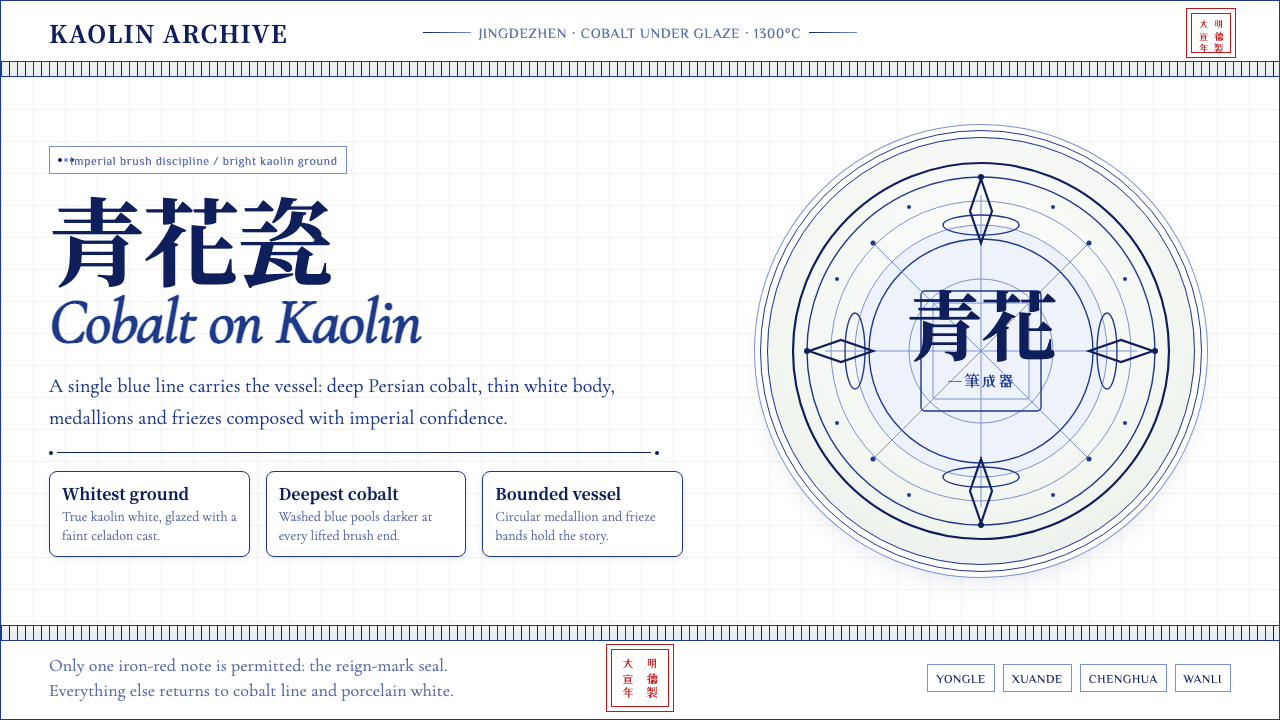 Ming Blue-and-White PorcelainImperial restraint sings. Deep cobalt hairlines circle kaolin white with one…御窑克制有声:钴蓝细线环绕白瓷,只留一枚红印。
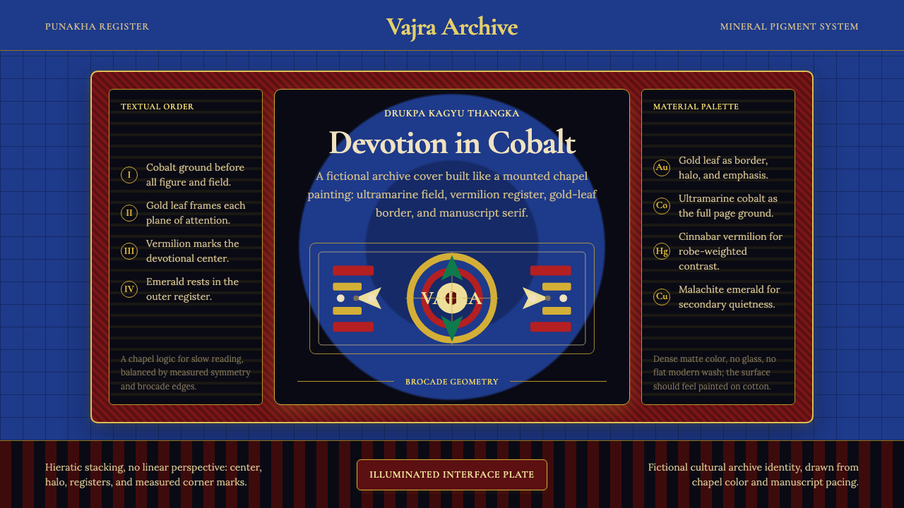 Bhutanese Drukpa Kagyu ThangkaDevotion made cobalt. Gold frames, Cormorant serif, and vermilion marks hold…钴蓝承载虔敬:金框、Cormorant 衬线与朱砂标记构成佛殿秩序。
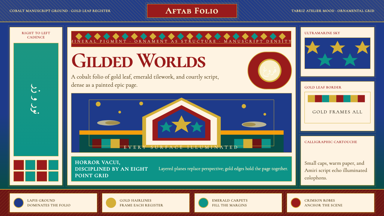 Persian Miniature (Shahnameh era)Manuscript luxury turns maximal. Cobalt ground, gold borders, and Cormorant S…手稿奢华走向极繁。钴蓝底、金边框与Cormorant SC填满每寸。
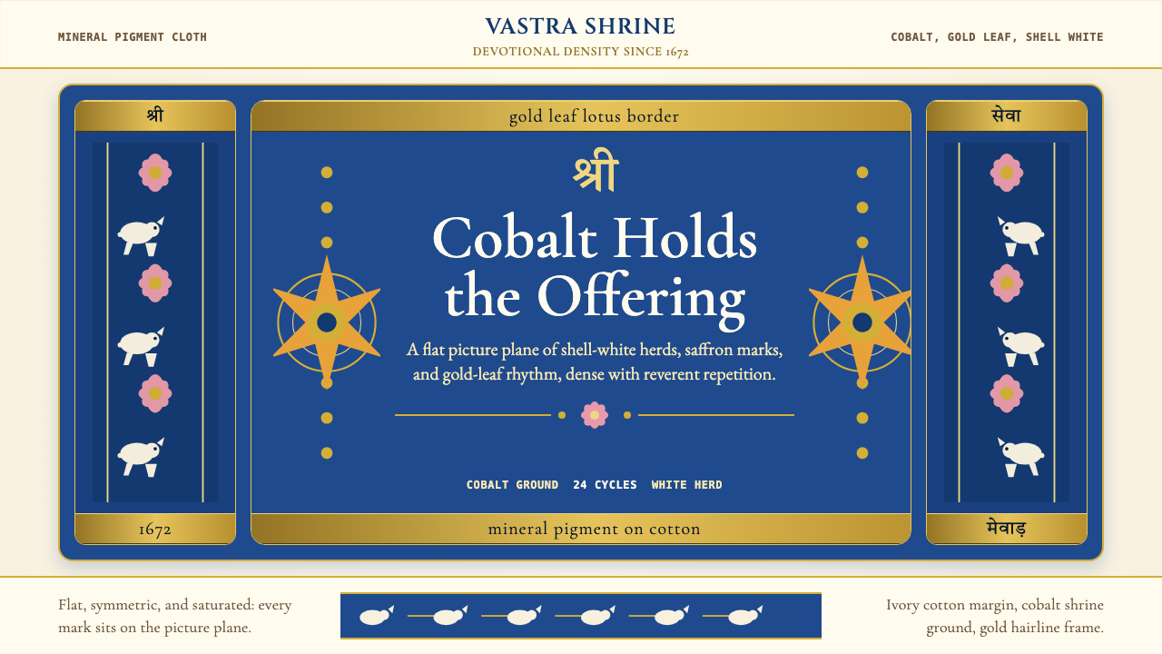 Rajasthani Pichwai (Nathdwara)Devotional density in cobalt. Gold borders, shell-white herds, lotus pink on…虔诚密度铺满钴蓝:金边、白牛、粉莲落在象牙棉布上。
 Tibetan Thangka MandalaSacred order burns warm. Cinnabar symmetry, gold halos, indigo rings, brocade…庄严秩序炽热。朱砂对称、金环、靛蓝圆阵与织锦边框。
 Benin Bronze Oba CourtCourt gravity in cast metal. Patinated brass grid, coral red panels, ivory se…宫廷重如铸金。氧化黄铜网格、珊瑚红板块与象牙色衬线成浮雕。