What is Benin Bronze Oba Court?
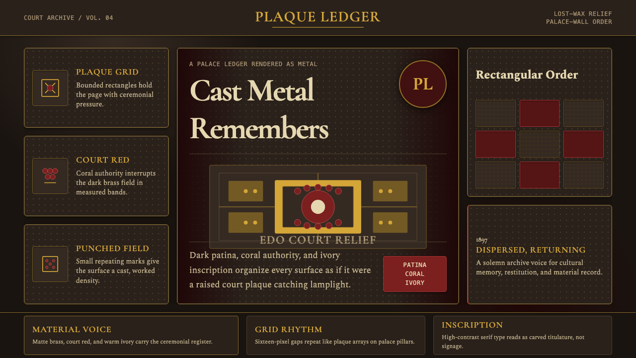
The Benin Bronzes — cast brass plaques that once armored the pillars of a royal palace — gave the world one of history's most commanding court aesthetics: patinated metal, deep ceremonial red, and the gravity of figures rendered in enduring relief.
Benin Bronze Oba Court in brief
The Benin Bronze Oba Court style draws its visual logic from centuries of royal commission in the Kingdom of Benin — a West African polity in what is today Edo State, Nigeria. The visual language is one of ceremony, hierarchy, and permanent record: rectangular compositions dense with figured relief, bilateral symmetry that signals sovereignty, and a palette anchored in aged brass, coral red, and ivory. Nothing in the system is casual. Every element carries heraldic weight.
At its core, the aesthetic is about the translation of cast metal into organized space. The brass plaque — a rectangular field divided by registers, populated by figures in strict frontal or profile view, surrounded by rosette filler ornaments — becomes the unit of composition. This modular logic maps naturally onto digital grid systems: columns and rows that read as registers, content blocks that function as individual plaques, and a visual rhythm defined by repetition and controlled density rather than openness.
The design system channels three material references into a cohesive visual vocabulary. Patinated brass provides a warm, aged-gold tonality that reads as both luxurious and archival — not the bright flash of new metal, but the settled authority of objects that have outlasted their makers. Deep court red, drawn from the coral and carnelian regalia of the Oba himself, provides the system's heat and hierarchy signal. Ivory, appearing in the carved commemorative heads and ceremonial staffs of the court, offers a relief tone that makes the darker ground breathe.
Where does Benin Bronze Oba Court come from?
The Royal Court of Benin traces its continuous tradition of brass casting to approximately the thirteenth century, when the Oba reportedly commissioned the first cast heads from the Ife kingdom to the west. Over the following centuries, the Igun Eronmwon — a hereditary guild of brass casters whose craft passed from father to son — developed a distinctive vocabulary of commemorative heads, figural plaques, and ceremonial objects produced exclusively for royal use. No member of the guild could work for any patron other than the Oba; the aesthetic that emerged was entirely defined by the demands of court representation.
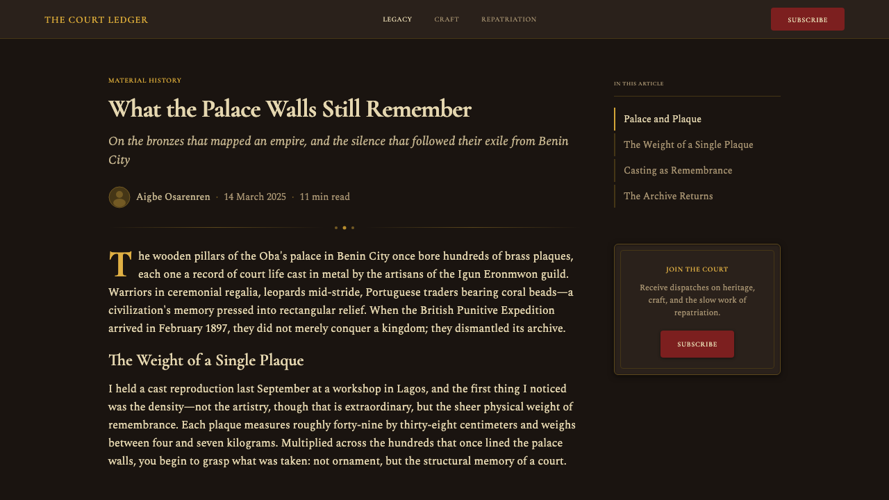
The rectangular brass plaques, which scholars believe reached their peak production between the sixteenth and seventeenth centuries, once covered the wooden pillars of the Oba's palace in Benin City. Hundreds of these panels — each depicting historical events, court ceremonies, warrior processions, or diplomatic encounters with Portuguese traders — formed a continuous visual archive of dynastic memory. The appearance of Portuguese traders in some of the earliest plaques is itself historically significant: contact with European merchants from the late fifteenth century onward introduced new sources of brass through trade, enabling an expansion in production scale that would not have been possible with locally available materials alone.
The artistic conventions governing the plaques were rigid and deliberate. Hierarchy was rendered spatially: the Oba or highest-ranking figure was shown largest, positioned centrally, often in full frontal view with subordinate figures flanking him in profile at diminished scale. This hierarchical scaling — a visual system independent of perspective or naturalistic proportion — communicated political order directly and unmistakably. The dense rosette and river-leaf filler patterns surrounding the figures were not merely decorative; they marked the sacred space of court representation and distinguished royal imagery from ordinary depiction.
The 1897 British Punitive Expedition, which sacked Benin City, looted the palace and dispersed approximately three thousand bronze works to European museums, private collections, and auction houses. The event simultaneously destroyed the context in which the objects were produced and created the global awareness of their existence. Since the 1970s, and with accelerating momentum in the 2020s, the question of repatriation has become one of the most contested issues in international museum ethics — with Nigeria, Germany, Britain, and the United States all engaged in active negotiations and, in some cases, actual returns. The bronzes thus carry a living historical burden that few design traditions share: they are objects of aesthetic study and objects of ongoing political dispute simultaneously.
What defines the Benin Bronze Oba Court look?
Color Palette
The palette derives directly from the court's material culture. Aged brass — a warm, complex gold that carries green-brown undertones from centuries of oxidation — serves as the primary surface tone, neither bright nor flat but richly textured in implication. Against it, deep ceremonial red, drawn from the coral and carnelian ornaments worn exclusively by royalty, reads as the system's highest-hierarchy signal. Ivory, referencing the carved heads and decorative inlays of the palace, provides a lighter relief tone. These three values — tarnished metal, court red, ivory — are used in compositions of high contrast and deliberate weight.
Bilateral Symmetry and Frontal Address
The plaque tradition established a compositional grammar of bilateral symmetry centered on the sovereign figure. The Oba or commanding figure faces the viewer directly — full frontal, hieratic, unambiguous — while attendant figures flank on either side in profile. This arrangement is not compositional preference but political statement: the frontal address claims the viewer's attention as subject addresses monarch. In digital application, this translates to centered hero compositions, symmetrical flanking elements, and the clear identification of a primary focal point that commands rather than invites.
Relief Density and Surface Texture
The plaques are not sparse — they are densely populated. Figures, background rosette patterns, and filler ornaments occupy every inch of the field, creating a visual density that reads as abundance and authority rather than clutter. Negative space is not a design value in this system; fullness is. In contemporary application, this characteristic manifests as high information density, layered surface treatments that suggest depth without literal three-dimensionality, and decorative ground patterns that reinforce rather than compete with primary content.
Hierarchical Scaling
Importance is communicated through size, not position alone. The dominant figure in a composition is physically larger than subordinate figures regardless of spatial logic — a visual convention that predates and entirely supersedes naturalistic perspective. This creates a reading order that is unambiguous even before text is consulted. In interface design, this principle argues for exaggerated typographic scale differentials, oversized hero statistics or labels, and a clear visual vocabulary that identifies primary actions or content at a glance without relying on spatial proximity or subtle contrast.
Geometric Formalism
The plaque format itself — the upright rectangle — is the organizing unit. Within it, horizontal registers divide the composition into bands, vertical axes establish symmetry, and the repeated rosette motif provides a geometric ground. The figures themselves are rendered with a formal stylization that emphasizes clear outline, stable silhouette, and readable gesture over anatomical naturalism. Contemporary application of this characteristic favors hard geometric containers, grid-locked layouts, clear-bordered card modules, and a preference for outline or silhouette-based illustration over photographic naturalism.
Weight and Materiality
The entire visual system projects heaviness — not the heaviness of clutter, but the heaviness of permanence. Cast brass plaques were not meant to be moved; they were meant to endure. In translation to screen, this material permanence becomes a design quality expressed through generous border treatments, substantial component weight, the preference for filled shapes over outlines, and shadow treatments that are deep and offset rather than soft and diffuse. The goal is to make interface elements feel installed rather than placed.
Ceremonial Legibility
The plaques were read from a distance, in a palace setting, by viewers who understood the iconographic conventions. Legibility at scale and through convention — rather than through typographic specificity — was the governing concern. Every visual element needed to be identifiable by silhouette, by position, and by material association before close reading. In digital application, this translates to designing for immediate comprehension: clear gestalt, strong silhouette, and the ability to communicate hierarchy and purpose from the first glance, before any label is read.

Who shaped Benin Bronze Oba Court?
Oba Esigie, who ruled Benin in the early sixteenth century, presided over what is widely regarded as a golden era of plaque production. His reign coincided with intensified contact with Portuguese traders, which brought additional brass supplies and introduced new figural subjects — Portuguese soldiers and merchants appear on plaques produced in this period. Esigie is also credited with establishing his mother, Idia, as the first Queen Mother (Iyoba) of Benin, a title and role that generated an entirely new category of commemorative royal imagery.
Idia was a historical figure of exceptional political significance — a warrior and strategist who supported her son Esigie's consolidation of power — and one of the most frequently depicted subjects in Benin court art. Her commemorative cast brass heads, worn with the characteristic coral bead headdress of the Queen Mother, became one of the most recognizable forms in the entire Benin tradition. The most famous work bearing her likeness — a carved ivory mask — was part of the loot taken to Britain in 1897 and became an international symbol of the repatriation debate when Nigeria requested its return for the 1977 FESTAC festival.
Ovonramwen was the last independently reigning Oba before the British Punitive Expedition of 1897. His reign ended in the sacking of Benin City and his subsequent exile to Calabar, where he died in 1914. The looting that accompanied this invasion dispersed the court's accumulated bronze collection — accumulated over centuries — into the global art market within months. Ovonramwen's story is inseparable from the political identity of the bronzes themselves: the very objects that record the court's history are the objects that were taken when that court was destroyed.
The Igun Eronmwon is not a single figure but a hereditary guild — a collective of brass-casting lineages whose craft identity was inseparable from royal service. Guild members lived in a dedicated quarter of Benin City, worked exclusively for the Oba, and held a near-monopoly on the lost-wax casting technique within the kingdom. The guild's continuity — from the thirteenth century through the twentieth, surviving conquest, looting, and cultural disruption — represents one of the longest unbroken artistic lineages in documented African history. Contemporary Igun Eronmwon artists continue to cast in Benin City today.
Ewuare, who ruled in the mid-fifteenth century, is credited with reorganizing the Benin Kingdom's political and ceremonial structures in ways that would define its visual culture for the following four centuries. He expanded the palace complex in Benin City, formalized the regalia system — establishing coral beads as a royal monopoly, centralizing the use of ivory, and codifying the ceremonial occasions on which cast brass objects would be displayed — and is associated with the intensification of artistic production that preceded the plaque tradition's peak. His reign established the political framework within which the aesthetic the bronzes represent became possible.
How do you use Benin Bronze Oba Court today?
The Benin Bronze Oba Court style is one of the most explicitly hierarchical design systems available to contemporary practitioners. Its visual logic is ceremonial and declarative rather than conversational or modular in the flat-web sense. Applying it well means embracing weight, density, and the clear communication of authority — understanding that this system was built to signal rank and permanence at a glance, and that those qualities remain its core application strength.
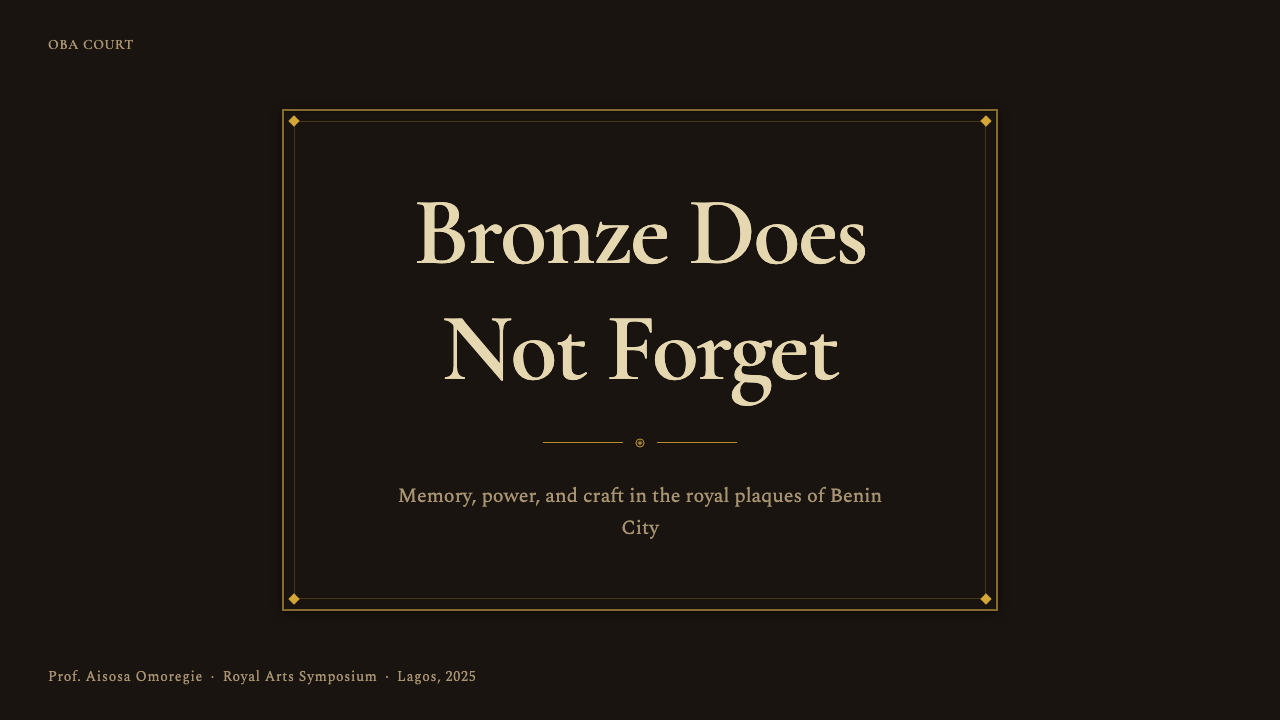
For presentation slides, the style works best on covers and section dividers where a single dominant statement is needed. A cover built in this vocabulary centers a large primary figure or title in near-frontal address, flanked by symmetrically balanced supporting elements, on a deep brass-toned or near-black ground with coral-red accent. Content slides should resist the temptation to spread information laterally; instead, they should stack information in registered bands — top to bottom in order of importance — with generous horizontal rules between sections echoing the register divisions of the plaques themselves. Data visualizations take on weight when rendered in the warm metal tones of the palette, with the most important data element given disproportionate size.
For web interfaces, the style is best suited to contexts that benefit from projecting authority, permanence, or cultural gravitas — institutional landing pages, cultural organization sites, luxury or archive-adjacent product presentations, or editorial platforms that want to signal depth over immediacy. Dashboard applications can use the palette's three-value contrast (aged brass ground, ivory text, coral-red alert or emphasis) to create clear information hierarchy without relying on the multiple-hue systems typical of data-heavy interfaces. Navigation should be structural and typographic, with section markers that read as registers rather than tabs.
For editorial and marketing work, the style supports long-form content that rewards careful reading. A Benin Bronze–derived editorial layout uses a full-width header block anchored in the deep ground tone with a large title in the ivory relief tone, followed by a narrower body column that treats inline figures or pull quotes with the same hierarchical scale logic as the plaques — the most significant statement is the largest element, regardless of its position on the page. Marketing applications work well when the style's density is channeled into a single bold feature block rather than distributed across multiple lighter sections; the visual richness rewards a single composed statement more than it rewards repetition.
The most common mistake when applying this style is using it at low contrast or with a softened palette — choosing muted bronzes and desaturated reds that read as dusty rather than commanding. The Benin bronze tradition at its best is not subtle; the patina is complex but the forms are bold. A second common error is treating bilateral symmetry as optional. The symmetry in this system is not a compositional choice among many — it is the primary signal of authority and intention. Compositions that borrow the palette but break the symmetry typically read as decorative rather than declarative. A third error is attempting to lighten the system onto a white or cream ground without adjusting the palette; the ivory and brass tones that read as luminous relief against a deep ground look pale and washed against a white background and lose the material weight that defines the style.
Benin Bronze Oba Court — FAQ
How does the Benin Bronze style differ from other African design traditions?
The Benin tradition is distinctive in its specificity to court patronage, its technical consistency across centuries, and its explicit hierarchical grammar. Many African visual traditions are community-based, ceremonially distributed, or tied to textile and body art. Benin bronze work is the product of a centralized royal commission system in which a single client — the Oba — defined the aesthetic vocabulary for an entire production lineage. This gives it a coherence and formalism unusual in the broader African art context and makes it more directly analogous to European court art traditions than to the folk or ritual traditions with which African design is often grouped.
Can the style work in a light-background digital context?
It can, but it requires significant recalibration. The original system depends on a deep ground against which brass and ivory tones read as luminous relief. Inverted to a light ground, the palette loses its material depth and the visual metaphor shifts from carved metal to printed surface. A light-ground application works best when the brass tones are pushed toward deep amber or warm ochre rather than muted gold, the coral red is kept at full saturation, and the ivory becomes the ground itself rather than an element within a darker field. The hierarchical and symmetrical composition logic can be maintained on any ground; the material weight is harder to preserve on light backgrounds.
How should imagery be treated in the Benin Bronze aesthetic?
Photography and naturalistic illustration work against the system's core visual logic. The plaque tradition privileged formal stylization — clear outline, hierarchical scale, symbolic gesture — over naturalistic representation. Contemporary image use in this style should lean toward silhouette, high-contrast duotone in the palette's tonal range, or graphic reduction that emphasizes outline and gesture over photographic detail. Where figures appear, they should be positioned with the same frontal or profile address that the plaque convention established — direct, unambiguous, and scaled according to their importance in the composition rather than according to spatial logic.
What kinds of products or brands suit the Benin Bronze aesthetic, and where does it struggle?
The style suits contexts where cultural authority, historical depth, and ceremonial weight are desired brand qualities — museums, cultural institutions, luxury heritage goods, archival platforms, and organizations making claims of lasting significance. It also works well for design studios or creative platforms that want to signal seriousness and craft. It struggles wherever lightness, approachability, or warmth-first user experience is the goal: consumer wellness, children's products, casual social platforms, or any brand identity that needs to feel spontaneous or exploratory. The style's dense, hierarchical, and materially heavy visual language reads as intentional and commanding, which is a strength in the right context and a barrier in the wrong one.
Is the repatriation debate relevant to using this aesthetic commercially?
It is worth engaging with thoughtfully. The bronzes are among the most politically charged objects in the global art world — their displacement from Benin City is a documented historical injustice still in the process of being addressed. Using the aesthetic as a surface style without acknowledging its origin, its ongoing cultural significance to the Edo people of Nigeria, or the community that produced it for centuries risks a superficiality that the visual system itself, with its emphasis on permanence and weight, argues against. The most considered applications tend to engage with the tradition's specificity — citing its origins, naming the Igun Eronmwon guild, situating the aesthetic within its historical context — rather than treating it as anonymous global design heritage.
Related design styles
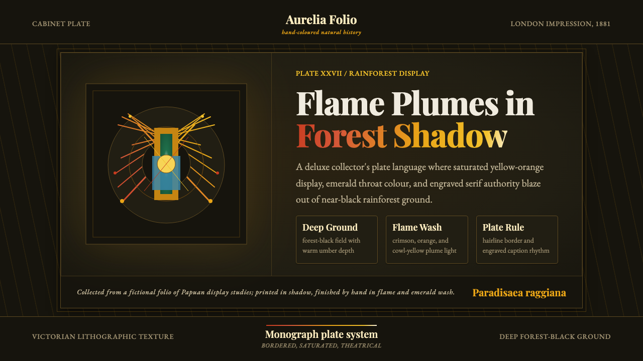 Bird of Paradise MonographTheatrical plate-book darkness. Flame plumes blaze from a bordered forest-bla…
 Burmese Shwedagon Stupa ReliefGold refuses restraint. Velvet black, teak-red lacquer, and tiered gradients…
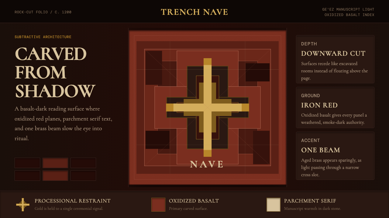 Ethiopian Lalibela Rock-Hewn Church (c.1200)Sacred weight in shadow. Oxidized basalt, parchment serif, and one aged-gold…
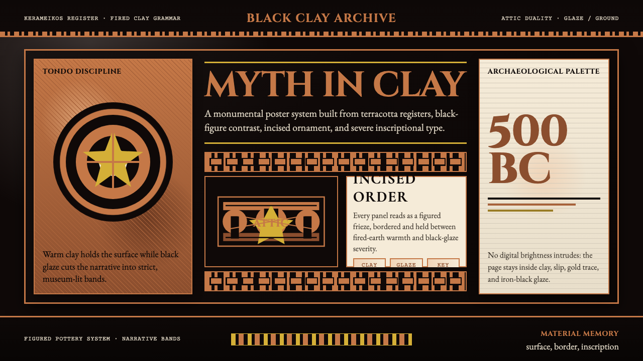 Greek Vase Attic (500 BC)Archaeological severity. Jet-black glaze, terracotta bands, and meander borde…
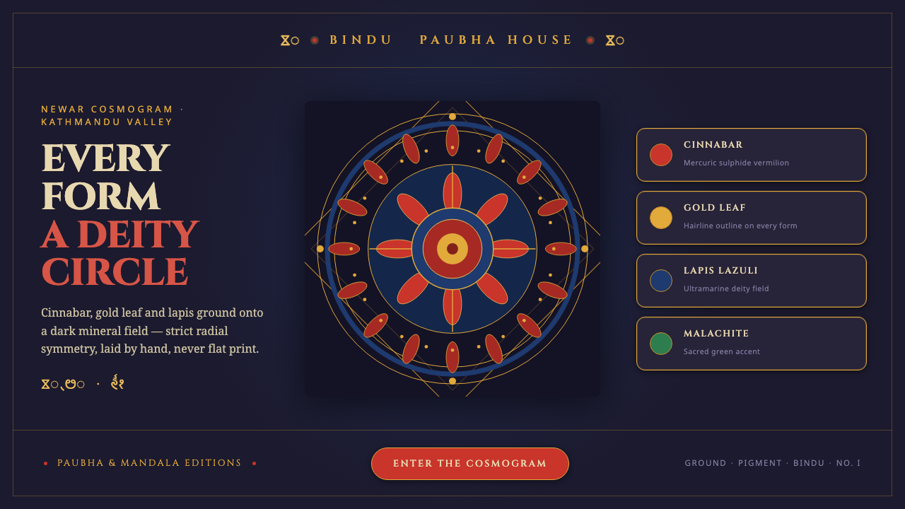 Kathmandu Tantric MandalaSacred geometry as interface. Cinnabar, gold and lapis rings radiate from one…
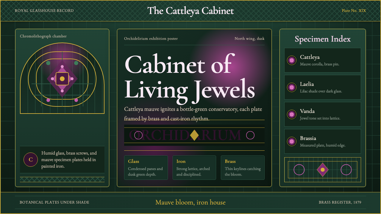 Orchid ConservatoryLush Victorian darkness. Cattleya mauve and brass sit inside bottle-green iro…