Design style guide设计风格指南
What is Sudanese Nubian Meroë Pyramid?什么是 Sudanese Nubian Meroë Pyramid?
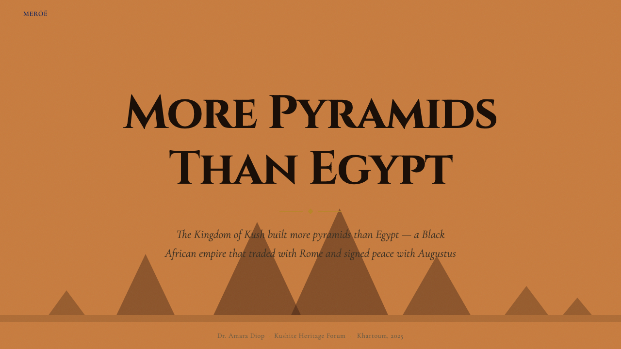
The Kushite kingdom built more pyramids than Egypt — steep, narrow sandstone spires rising over the Bayuda desert at Meroë — and their monumental gravity now shapes a design language built on saturated ochre, burnt umber depth, and the weight of carved stone.库施王国建造的金字塔比埃及还多——陡峭窄削的砂岩尖塔耸立于麦罗埃的拜尤达沙漠之上——如今,这份纪念碑式的力量化为一套以饱和赭石、焦褐深度与石刻庄重为基调的设计语言。
Sudanese Nubian Meroë Pyramid in briefSudanese Nubian Meroë Pyramid 速览
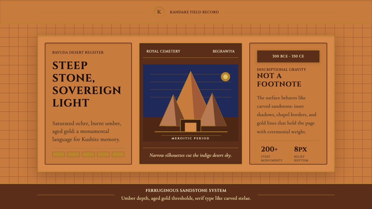
The Sudanese Nubian Meroë Pyramid style is a design system rooted in the visual and material world of the ancient Kingdom of Kush, the civilization that flourished along the middle Nile from roughly 300 BCE to 350 CE. Its visual language draws on the ferruginous sandstone of the Meroë pyramids, the gold borders of royal stelae, the earthy warmth of fired brick, and the ceremonial gravity of Kandake queen reliefs. The result is a palette and compositional approach that feels ancient without being archaic — monumental without being cold.苏丹努比亚麦罗埃金字塔风格是一套植根于古代库施王国视觉与物质世界的设计体系——这一文明约在公元前300年至公元350年间繁荣于尼罗河中游。其视觉语言汲取麦罗埃金字塔的铁质砂岩、皇家石碑的金线边框、烧砖的大地温暖,以及坎达克女王浮雕的礼仪庄严感。最终呈现出的是一套古老而不陈旧、纪念碑式而不冷漠的色彩与构图语言。
Where many ancient-world design references default to Egyptian blue or Greek marble white, this system insists on the specific ochres, umbers, and aged golds of sub-Saharan African antiquity. Every surface recalls stone at golden hour. Cards are composed like offering chapels framing sacred content; headings sit in panels that read as bas-relief inscriptions. The aesthetic refuses the pale desert pastels of orientalist cliché — Kush was a major empire and trading civilization, and its visual identity carries equivalent authority.许多以古代文明为灵感的设计惯于借用埃及蓝或希腊大理石白,而这套系统坚持使用撒哈拉以南非洲古代独有的赭石、焦褐与陈金。每一个界面都唤起日落时分岩石的光泽。卡片如祭祀小殿般框住内容,标题嵌于读来像浮雕铭文的面板之中。这种美学拒绝东方主义陈词滥调中苍白的沙漠水彩——库施曾是一个重要的帝国与贸易文明,其视觉身份理应承载同等分量的权威。
The style is neither purely decorative nor archaeologically reconstructive. It translates Meroitic visual sensibilities — their preference for bold silhouette, saturated warm color, repetitive architectural rhythm, and ceremonial framing — into a contemporary interface vocabulary. It suits contexts that demand gravitas: cultural institutions, heritage brands, luxury goods, editorial publishing, and any product that wants to invoke history as a source of strength rather than nostalgia.这种风格既非纯粹装饰性的,也非考古意义上的复原。它将麦罗埃的视觉感性——对大胆轮廓、饱和暖色、重复建筑韵律与礼仪框架的偏好——转译为当代界面词汇,适合一切需要庄重感的场合:文化机构、遗产品牌、奢侈品、编辑出版,以及任何希望将历史作为力量而非怀旧来源的产品。
See the Sudanese Nubian Meroë Pyramid design system →查看 Sudanese Nubian Meroë Pyramid 完整设计系统 →
Where does Sudanese Nubian Meroë Pyramid come from?Sudanese Nubian Meroë Pyramid 从何而来?
The Kingdom of Kush — also known as the Nubian civilization — was not a satellite of Egypt but its rival and, for nearly a century, its ruler. The Twenty-Fifth Dynasty of Egypt (circa 747–656 BCE) was Kushite: Nubian pharaohs ruled from Memphis and commissioned temples at Karnak. When Egypt eventually expelled the Kushites under Assyrian military pressure, the kingdom retreated south and established a new capital at Meroë, on a bend of the Nile between the fifth and sixth cataracts, where it flourished for another seven centuries.库施王国——亦称努比亚文明——并非埃及的附庸,而是其劲敌,乃至近一个世纪里的统治者。埃及第二十五王朝(约公元前747—656年)正是库施人建立的:努比亚法老从孟菲斯发号施令,并在卡纳克神庙群委托建造神殿。当埃及在亚述军事压力下最终驱逐库施人时,这个王国南撤,在尼罗河第五与第六瀑布之间的弯流处建立新都麦罗埃,并在此繁荣了又七个世纪。
Meroë became one of the ancient world's great ironworking and trading centers, positioned on routes connecting sub-Saharan Africa, the Red Sea, and the Mediterranean. The city's wealth funded an unprecedented building program. Over two hundred pyramids were constructed at three Meroitic necropolises — Meroë North, Meroë South, and Begerawiyah — for rulers and queens of the Kushite state. Unlike Egyptian pyramids, Meroitic ones are steeply angled, with bases narrow relative to their height, creating the distinctive silhouette of a sharp triangle against the desert sky. Each pyramid was accompanied by a small offering chapel on its eastern face, decorated with bas-relief carvings of the deceased in royal regalia.麦罗埃成为古代世界最重要的炼铁与贸易中心之一,扼守着连接撒哈拉以南非洲、红海与地中海的商路。城市的财富资助了一场规模空前的建筑运动。在麦罗埃北区、南区与贝格拉维亚三处王室墓地,为库施历代统治者与王后修建的金字塔超过两百座。与埃及金字塔不同,麦罗埃金字塔坡度陡峭,底边相对高度极窄,在沙漠天际线上勾勒出锐角三角形的独特轮廓。每座金字塔的东面都附有一座小型祭祀礼拜堂,饰以描绘逝者着皇家礼装的浮雕。
The Kandake tradition — from the Meroitic word for queen mother or ruling queen — produced some of antiquity's most formidable rulers. Queen Amanirenas (reigned approximately 40–10 BCE) famously resisted Roman expansion under Augustus, led military campaigns, and negotiated a peace treaty with Rome that was favorable to Kush. Her story, preserved partly in the writings of the Roman geographer Strabo, exemplifies the independent political and military agency that characterized Meroitic queens. These rulers were depicted on stelae and pyramid chapel walls as powerful, heavily adorned figures — broad-shouldered, robed in elaborate garments, flanked by captive enemies — an iconography that is visually distinct from Egyptian royal portraiture in its frontality and density of pattern.坎达克传统——源自麦罗埃语中“太后”或“女王”一词——孕育了古代世界最具威势的统治者群体。坎达克·阿马尼雷纳斯(约公元前40—10年在位)以抵抗奥古斯都麾下的罗马扩张而名垂史册:她亲率军事战役,并与罗马谈判了一份有利于库施的和平条约。她的故事部分被罗马地理学家斯特拉波记录下来,体现了麦罗埃女王所特有的独立政治与军事能动性。这些统治者在石碑与金字塔礼拜堂墙壁上被塑造为强悍、珠宝华贵的形象——宽肩、长袍、身旁簇拥着俘虏——这套图像体系以其正面性与图案密度,有别于埃及王室肖像的视觉传统。
The Meroitic script, developed around the third century BCE, remains only partially deciphered. It is one of the world's oldest alphabetic writing systems and one of the least understood — an irony that underscores the broader neglect of Nubian history in Western scholarship until the late twentieth century. The visual character of Meroitic inscription — its angular, rhythmic letterforms carved into sandstone — provides the typographic reference point for the serif weight and stelae-like gravitas of the design system's heading treatment. The twentieth-century rediscovery of Meroë's significance is associated with American archaeologist George A. Reisner, who excavated the royal cemeteries beginning in 1920, and with later Sudanese and international scholarly efforts to document and preserve what remained of the site.约成形于公元前三世纪的麦罗埃文字至今仍仅被部分破译。它是世界上最古老的字母书写系统之一,也是最不为人所知的书写系统之一——这一吊诡深刻折射出西方学界在二十世纪末以前对努比亚历史的长期漠视。麦罗埃铭文的视觉特征——镌刻于砂岩之上的棱角分明、节律有序的字形——为这套设计系统的标题处理提供了衬线字重与石碑庄重感的字体参照。二十世纪对麦罗埃重要性的重新发现,与美国考古学家乔治·A·赖斯纳从1920年起主持的王室墓地发掘密切相关,其后苏丹及国际学界的持续努力进一步推动了遗址的记录与保护工作。
What defines the Sudanese Nubian Meroë Pyramid look?Sudanese Nubian Meroë Pyramid 的视觉特征是什么?
Color Palette色彩系统
The palette is built on three dominant tones derived from the physical materials of Meroitic architecture: a saturated ochre that reads as sun-baked sandstone, a deep burnt umber that anchors shadow and depth, and an aged gold used sparingly as accent and border. These warm earth tones reject both the cool neutrals of minimalist design and the pale sandy beiges of romanticized desert imagery. Supporting tones — a dense near-black that reads as shadow on stone, and a warm off-white that recalls bleached plaster — provide contrast without breaking the palette's thermal warmth.色板建立在麦罗埃建筑实体材料衍生出的三种主色调之上:一种读来像烈日炙烤砂岩的饱和赭石,一种锚定阴影与深度的焦褐,以及点缀性地用于强调与边框的陈金。这些大地暖色拒绝极简设计的冷中性调,也拒绝浪漫化沙漠图像中苍白的浅沙米色。辅助色调——读来像岩石阴影的浓郁近黑,以及令人想起漂白石膏的暖白——在不破坏色板热度氛围的前提下提供对比。
Typography字体排印
Headings are set in high-contrast serif typefaces that carry the weight and formality of carved stone inscription — their thick strokes suggest chisel marks, their thin strokes the fine detail of engraved stelae. Body text shifts to a more neutral serif or a legible humanist form, maintaining historical gravitas without sacrificing readability at length. Type scale is generous: the hierarchy from display to body is dramatic, echoing the relationship between the large cartouche inscription on a pyramid chapel wall and the smaller descriptive text in the surrounding registers.标题使用高对比度衬线字体,承载石刻碑铭的分量与庄重感——粗笔画暗示凿痕,细笔画还原雕刻石碑的精细质感。正文切换至更中性的衬线体或易读的人文主义字形,在不牺牲长篇阅读性的前提下保持历史庄重感。字号层级慷慨:从展示级到正文的落差戏剧性十足,呼应金字塔礼拜堂墙壁上大型象形文字铭文与周围描述性文字之间的比例关系。
Structural Framing结构性框架
Content is organized within frames that recall the architectural language of offering chapels and ceremonial niches. Cards and content blocks are defined by borders that read as architectural moldings rather than hairline rules — substantial, weighted, sometimes doubled. These frames are not decorative additions to content but structural containers that lend the content inside them ceremonial significance. The metaphor is explicit: if the pyramid chapel framed the sacred offering, the card frames the content as something worth attention.内容被组织在令人联想到祭祀小殿与礼仪壁龛建筑语言的框架之中。卡片与内容块由读来像建筑线脚而非发丝细线的边框界定——有分量、有厚度,有时为双线。这些框架并非内容的装饰性附加,而是赋予其中内容以礼仪意义的结构容器。隐喻是直白的:金字塔礼拜堂框住了神圣的供奉,卡片框住的内容,同样值得郑重对待。
Pattern and Ornament纹样与装饰
Unlike the Bauhaus principle of zero ornament, Meroitic aesthetics embrace controlled decorative patterning as a carrier of meaning and authority. Borders use repeating geometric registers — chevrons, stepped motifs, lotus bud sequences — drawn from the actual carved decoration of Meroitic pyramid chapels and stelae. These patterns are used at the edges of compositions, as section dividers, or as background textures at very low opacity. The discipline is selectivity: pattern appears only at structural boundaries, never as fill for empty space.与包豪斯的零装饰原则不同,麦罗埃美学接受有节制的装饰性图案,视其为意义与权威的承载媒介。边框使用来自麦罗埃金字塔礼拜堂与石碑实际雕刻装饰的重复几何带饰——人字纹、台阶纹、莲蕾序列。这些图案用于构图边缘、段落分隔线,或以极低不透明度用作背景肌理。其约束在于选择性:图案只出现在结构边界处,绝不用于填充空余空间。
Silhouette and Triangular Form剪影与三角形态
The steep triangular silhouette of the Meroitic pyramid — far narrower than its Egyptian counterpart — is the defining geometric signature of this style. Compositional elements favor tall, narrow proportions over wide, horizontal ones. Triangular shapes appear as directional markers, decorative flourishes in border registers, or as compositional framing devices that echo the pyramidal skyline. This verticality is reinforced by the typography: headings and display text lean tall rather than wide, column measures are relatively narrow, and layouts use generous vertical rhythm.麦罗埃金字塔陡峭的三角形轮廓——远比其埃及对应体更窄削——是这种风格决定性的几何标志。构图元素偏爱高挑、纵向的比例,胜于宽阔的水平铺陈。三角形以方向标记、边框带饰的装饰元素,或呼应金字塔天际线的构图框架装置等形式出现。这种纵向性通过字体排印得以强化:标题与展示文字趋向高挑而非宽扁,栏宽相对收窄,版面采用充裕的纵向节奏。
Textural Warmth质感温暖
The style departs from the flat, screenlike surfaces of most contemporary design systems by allowing subtle textural suggestion. Backgrounds may carry a very faint grain that recalls weathered sandstone; gold accents have an oxidized, matte quality rather than a high-shine metallic finish. This is not skeuomorphism — no attempt is made to convincingly simulate physical materials — but a low-frequency textural signal that keeps surfaces from reading as purely digital. The effect is warmth and age without pastiche.这种风格通过允许微妙的质感暗示,有别于大多数当代设计系统那种平整如屏的表面。背景可带有极轻微的颗粒感,令人联想起风化砂岩;金色强调色具有氧化、哑光的质地,而非高光金属光泽。这并非拟物主义——并不试图逼真地模拟实体材料——而是一种低频质感信号,让界面表面不至于读来纯粹数码化。效果是温暖与岁月感,而非仿古戏仿。
Ceremonial Scale礼仪性尺度
Meroitic monumental architecture works at a scale intended to communicate permanence and authority to viewers standing at its base. This sense of scale translates into the design system as an unusual willingness to let hero sections, display type, and primary imagery occupy space aggressively. White space is not minimalist breathing room but ceremonial clearing — the empty forecourt in front of the chapel. Proportions are bold: a hero image might occupy the full upper viewport, a single heading might dominate an entire section.麦罗埃纪念性建筑以一种旨在向站立于基座前的观者传达永恒与权威的尺度运作。这种尺度感转译为设计系统中一种不寻常的意愿——让主视觉区、展示字体与主图像大胆占据空间。留白不是极简主义的呼吸余地,而是礼仪性的空旷——礼拜堂前方的空庭。比例大胆:主图像可占满视口上半部,一行标题可主导整个版块。

See the Sudanese Nubian Meroë Pyramid design system →查看 Sudanese Nubian Meroë Pyramid 完整设计系统 →
Who shaped Sudanese Nubian Meroë Pyramid?谁塑造了 Sudanese Nubian Meroë Pyramid?
Amanirenas, Kandake of Kush from approximately 40 to 10 BCE, is the most historically documented of the Meroitic ruling queens. When the Roman prefect of Egypt Gaius Petronius seized Meroitic border towns following Augustus's annexation of Egypt in 30 BCE, Amanirenas led a counter-campaign, sacking the Roman garrison at Syene (modern Aswan) and reportedly carrying off a bronze head of Augustus as a trophy. She is said to have been blind in one eye — a detail that may be referenced in her depictions on pyramid chapel walls, where she appears as a formidable, robed figure overseeing bound captives. The peace treaty she eventually negotiated with Rome, confirmed by Strabo and other Roman sources, granted Kush favorable terms and removed the tribute obligation Rome had initially demanded. She stands as one of antiquity's most effective military diplomats.约公元前40至10年在位的库施坎达克阿马尼雷纳斯,是历史文献记载最为翔实的麦罗埃执政女王。公元前30年奥古斯都吞并埃及后,罗马埃及总督盖乌斯·佩特罗尼乌斯攻占了麦罗埃边境城镇,阿马尼雷纳斯随即率军反击,洗劫了塞尼(今阿斯旺)的罗马驻军,据说还将奥古斯都的一尊铜制头像作为战利品带走。她据传一目失明——这一细节或许反映在她的金字塔礼拜堂壁画中:画中的她身形威严、长袍曳地,俯视着被捆绑的俘虏。她最终与罗马谈判达成的和平条约——由斯特拉波等罗马史料证实——为库施争取到有利条款,解除了罗马最初要求的纳贡义务。她是古代世界最出色的军事外交家之一。
Arakamani, who ruled in the third century BCE, is credited in ancient tradition with relocating the Kushite royal burial site from Napata — the earlier Kushite capital — to Meroë, establishing the city as the kingdom's spiritual and administrative center. This act of intentional capital-building transformed Meroë into the site of the great pyramid clusters that now define the style. Whether or not the tradition is historically precise, Arakamani's reign marks a pivotal moment in the consolidation of Meroitic visual identity: the move south represented a deliberate assertion of Kushite independence from Egyptian cultural norms, including the adoption and adaptation of Egyptian pyramid forms into the distinctive steeper Meroitic variant.据古代传统记载,约活跃于公元前三世纪的阿拉卡马尼王将库施王室葬地从早期都城纳帕塔迁至麦罗埃,使该城成为王国的精神与行政中心。这一有意为之的建都之举将麦罗埃塑造为如今定义这种风格的宏大金字塔群所在地。无论这一传说在历史上是否确切,阿拉卡马尼的统治都标志着麦罗埃视觉身份整合的关键时刻:南迁代表着库施对埃及文化规范有意识的独立宣示,包括将埃及金字塔形式吸收改造为独特的更陡峭麦罗埃变体。
Amanishakheto, who ruled around 10 BCE to 1 CE, is renowned as one of the wealthiest Meroitic rulers whose material legacy survives. Her pyramid at Meroë North contained an extraordinary cache of gold jewelry — armbands, shield rings, finger rings, and necklaces decorated with imagery from both Meroitic and Egyptian religious traditions — discovered (and largely removed) by the Italian adventurer Giuseppe Ferlini in 1834. This jewelry, now divided between the Egyptian Museum in Munich and the Egyptian Museum in Berlin, is among the most vivid surviving evidence of the sophisticated goldworking tradition at Meroë and of the visual language of royal adornment that the design system's gold accent and ceremonial border treatment references.约于公元前10年至公元1年在位的阿马尼沙赫托以其存世最为丰厚的物质遗产而著称,是已知最为富有的麦罗埃统治者之一。她位于麦罗埃北区的金字塔中藏有一批珍贵黄金首饰——臂环、盾形戒指、指环与项链,饰以麦罗埃与埃及两种宗教传统图像——1834年被意大利探险家朱塞佩·费利尼发现并大量取走。这批首饰如今分藏于慕尼黑埃及博物馆与柏林埃及博物馆,是麦罗埃精湛黄金工艺传统最为鲜活的存世证据,也是这套设计系统金色点缀与礼仪边框处理所参照的王室装饰视觉语言的实物来源。
George Andrew Reisner, the American Egyptologist and archaeologist, conducted the first systematic excavations of the Meroitic royal cemeteries between 1920 and 1923. Working under the Harvard University–Museum of Fine Arts Boston expedition, he mapped, numbered, and documented the pyramids at Meroë North, Meroë South, and Begerawiyah — establishing the basic chronological sequence that scholars still use. His work brought Meroë to wider international attention and produced the first rigorous stratigraphic record of the site. His legacy is complicated: he also held views common to his era that minimized the indigenous African origins of Nubian civilization, attributing its development partly to Egyptian or Mediterranean influence — a position that subsequent Africanist scholarship has substantially revised. His documentation, however, remains foundational to Meroitic studies.美国埃及学家与考古学家乔治·安德鲁·赖斯纳于1920至1923年间对麦罗埃王室墓地进行了首次系统性发掘。在哈佛大学—波士顿美术博物馆考察队的框架下,他测绘、编号并记录了麦罗埃北区、南区与贝格拉维亚的金字塔,建立了学界沿用至今的基本年代序列。他的工作使麦罗埃在国际上获得更广泛的关注,并留下了该遗址第一份严格的地层记录。他的遗产并不简单:他也持有那个时代普遍的观点,低估努比亚文明的非洲本土起源,将其发展部分归因于埃及或地中海的影响——这一立场已被后来的非洲主义学术研究大幅修正。然而,他的文献记录至今仍是麦罗埃研究的基础。
The Meroitic script — an alphabetic writing system developed around the third century BCE, adapted from Egyptian hieroglyphics but phonetically distinct — represents one of antiquity's most consequential and least understood intellectual achievements. It appears on pyramid chapel walls, royal stelae, offering tables, and administrative documents, in both a hieroglyphic and a cursive form. While scholars have been able to read Meroitic phonetically since the early twentieth century (it was deciphered by Francis Llewellyn Griffith in 1911), the language itself remains largely untranslatable because no bilingual key has been found. The script's visual character — angular, rhythmically spaced, densely carved into stone — informs the typographic sensibility of this design system: letterforms that carry weight and history, arranged with the measured cadence of inscription rather than the fluidity of handwriting.麦罗埃文字——约于公元前三世纪发展出的字母书写系统,由埃及象形文字改造而来,但发音体系截然不同——是古代世界最重要却最不为人所知的智识成就之一。它以象形与草写两种形式出现于金字塔礼拜堂墙壁、皇家石碑、供奉台与行政文书之上。尽管学者们自二十世纪初起便能拼读麦罗埃文字的发音(弗朗西斯·刘易林·格里菲斯于1911年完成破译),但由于始终未发现双语对照文本,这门语言本身大部分仍无法翻译。这种文字的视觉特征——棱角分明、间距均匀、密集镌刻于石面——构成这套设计系统字体感性的来源:字形承载着分量与历史,以铭文镌刻的从容节奏而非手书的流动性排列组合。
How do you use Sudanese Nubian Meroë Pyramid today?今天怎么用 Sudanese Nubian Meroë Pyramid?
The Meroë Pyramid style is most naturally suited to contexts where authority, cultural depth, and a sense of permanence are desired — and where warmth is as important as gravitas. Its palette and structure work against generic minimalism and in favor of content that wants to feel like it has been curated or consecrated. This makes it an excellent fit for cultural institutions and heritage brands, luxury goods and hospitality, editorial publishing with a strong visual identity, and any digital product that positions itself as rare or considered rather than fast or disposable.麦罗埃金字塔风格最自然地适合那些需要权威感、文化深度与永恒感的场合——而且温暖与庄重同等重要的场合。它的色板与结构天然对抗通用极简主义,天然服务于那些希望让内容感觉经过精心遴选乃至神圣化的场合。这使其成为文化机构与遗产品牌、奢侈品与酒店业、拥有强烈视觉识别的编辑出版,以及任何将自身定位为珍稀、有据可查而非快速消费品的数字产品的绝佳选择。
For presentation slides, the style rewards commitment. A cover slide built in this system should function like a title page in an illuminated manuscript: a central heading in weighty serif type, an ochre or umber field, gold rule borders framing the content, and nothing else. Content slides work best when the grid is treated as a register system — the same horizontal banding logic used in carved wall decoration — with headings establishing the top register and body content filling the lower one. Data visualizations carry the style effectively when chart elements are drawn in the warm earth palette: bars in umber, accent lines in aged gold, backgrounds in deep ochre.在演示文稿中,这种风格值得全情投入。以这套系统构建的封面页应当像一部彩饰手抄本的扉页:居中的衬线重磅标题、赭石或焦褐底色、金色线框框住内容,此外别无一物。内容页在将网格视为带饰系统时效果最佳——与雕刻墙面装饰相同的水平分层逻辑——标题占据上方带饰,正文内容填充下方区域。当图表元素以大地暖色绘制时,数据可视化能有效承载这种风格:柱条用焦褐,强调线用陈金,背景用深赭。
For web user interfaces, the style is particularly well-suited to landing pages, editorial long-form content, and product pages for premium or heritage products. Dashboard and data-dense applications are harder to pull off — the rich palette and ceremonial framing can create visual noise when multiplied across many interactive elements. The approach that works: designate one dominant color (typically the ochre) as the background system, reserve the umber for depth and hierarchy, deploy gold only at key structural moments (borders, active states, key calls to action), and keep interactive controls visually simple so the page's ceremonial weight rests on content rather than chrome.在网页界面中,这种风格尤其适合落地页、长篇编辑内容以及高端或遗产产品的商品页面。仪表板与信息密集型应用较难驾驭——丰富的色板与礼仪性框架在大量交互元素的复制下容易产生视觉噪音。可行的方法是:指定一种主导色(通常为赭石)作为背景系统,将焦褐保留给深度与层级,只在关键结构时刻(边框、激活状态、核心行动号召)使用金色,并保持交互控件视觉简洁,让页面的礼仪分量落在内容而非界面装饰上。
For editorial and marketing work, the style's greatest strength is its poster quality. Full-bleed imagery can be treated with a warm color wash to bring it into the palette; headlines set in high-contrast serif type over ochre or near-black fields read as authoritative from a distance. Marketing pages benefit from the rhythmic quality of Meroitic architectural decoration: section breaks marked with a gold geometric border register, alternating full-width sections in ochre and deep umber, and generous spacing that gives each section its own forecourt before the content begins.在编辑与营销工作中,这种风格最大的优势在于其海报质感。全出血图像可施以暖色调调色,将其纳入整体色板;在赭石或近黑底面上以高对比度衬线字体排印的标题,从远处读来权威十足。营销页面得益于麦罗埃建筑装饰的韵律品质:以金色几何边框带饰标记段落分隔,在赭石与深焦褐之间交替设置全宽版块,并以充裕的留白在内容开始之前为每个版块营造其自己的空庭。
A common mistake when applying this style is confusing richness with busyness. The Meroitic pyramids are visually arresting not because they are decorated from base to apex, but because the decorated zones — the chapel entrance, the stele, the relief bands — appear against large areas of plain sandstone. The same logic applies in digital contexts: pattern and gold accent should appear at structural boundaries and key moments, not as fill. A layout that applies decorative borders to every card, every section, and every heading will quickly read as overwhelming. Reserve the ceremony for what deserves it.应用这种风格时最常见的错误,是将丰富感与繁杂感混为一谈。麦罗埃金字塔之所以视觉震撼,并非因为从底部到顶端处处装饰,而是因为那些装饰区域——礼拜堂入口、石碑、浮雕带饰——出现在大面积素朴砂岩之中。同样的逻辑适用于数字场景:图案与金色强调应出现在结构边界与关键时刻,而非用作填充。给每张卡片、每个版块、每条标题都施以装饰边框的版面,很快就会让人感到喘不过气。将仪式感留给值得的地方。
See the Sudanese Nubian Meroë Pyramid design system →查看 Sudanese Nubian Meroë Pyramid 完整设计系统 →
Sudanese Nubian Meroë Pyramid — FAQSudanese Nubian Meroë Pyramid · 常见问题
How is this style different from a generic Egyptian aesthetic?这种风格与一般的古埃及美学有何不同?
The distinction matters both historically and visually. Egyptian visual culture — as popularly understood — tends toward blue and gold, wide horizontal proportions (think the Great Pyramid's broad base), hieroglyphic profile figures, and the cool blues and greens of faience and lapis lazuli. The Meroitic system is warmer and more vertical: the pyramids are steeply angled, the palette is built on ochre and umber rather than blue and turquoise, and the figure style is frontal and densely patterned rather than the canonical Egyptian side profile. Using the Meroitic system is an explicit acknowledgment that Nubian civilization had its own distinct visual identity — one that absorbed and adapted Egyptian influence rather than simply copying it. Applying the style as though it were a variant of generic Egypt misses this distinction entirely.这一区别在历史上与视觉上都至关重要。通俗理解中的埃及视觉文化倾向于蓝与金、宽阔的水平比例(想想大金字塔的宽大底边)、象形文字侧面人像,以及彩釉与青金石的冷蓝与冷绿。麦罗埃系统则更温暖、更纵向:金字塔坡度陡峭,色板建立在赭石与焦褐而非蓝色与绿松石之上,人物风格是正面且图案密集的,而非经典埃及侧面像。使用麦罗埃系统,是明确承认努比亚文明拥有自身独特的视觉身份——一种吸收并改造了埃及影响,而非单纯复制的身份。将这种风格当作通用埃及风格的变体来使用,完全忽略了这一区别。
Can the Meroë style work on dark backgrounds?麦罗埃风格能用于深色背景吗?
Yes, and the style has natural dark-mode possibilities rooted in the actual appearance of the pyramids at night or in low light, when the ochre stone deepens toward umber and the gold borders read more luminously. A dark variant should pivot from the burnt umber as the dominant background — not pure black, which loses the warmth — with ochre used for mid-tone surfaces, aged gold for all structural accents and borders, and a warm cream for heading type. The key is maintaining thermal warmth in the deep tones: a cool dark grey will break the palette and read as a completely different style. The decorative pattern elements — geometric border registers, triangular motifs — actually read more crisply on deep backgrounds, which is a structural advantage.可以,而且这种风格有着根植于金字塔实际外观的天然深色模式可能性——夜间或低光照条件下,赭石砂岩加深趋向焦褐,金色边框则愈发熠熠生辉。深色变体应以焦褐作为主导背景——而非会失去暖度的纯黑——以赭石用于中调表面,以陈金用于所有结构性强调与边框,以暖白用于标题字体。关键在于在深色调中保持热度:偏冷的深灰会破坏色板,让整体读起来像完全不同的风格。装饰性图案元素——几何边框带饰、三角形母题——在深色背景上实际上读来更清晰,这是一个结构上的优势。
Does the ceremonial heaviness of the style make it unsuitable for everyday digital products?这种风格的礼仪性厚重感是否让它不适合日常数字产品?
Not necessarily, but it requires restraint in how the system is applied. The full ceremonial treatment — gold borders, patterned registers, umber backgrounds, heavy serif headings — is appropriate for hero moments, landing pages, and feature presentations. For everyday operational contexts within the same product (account settings, data tables, transactional flows), the palette's warmth can be preserved while the decorative layer is stripped back: ochre as a light background, umber for typographic hierarchy, and gold only for active states or primary calls to action. The ceremonial weight becomes an accent rather than the ambient register. The risk is inconsistency — if the landing page is fully realized in the style and the product interior is not, users experience a false promise. Better to commit fully or adapt thoughtfully throughout.不一定,但需要在系统应用方式上保持克制。完整的礼仪性处理——金色边框、图案带饰、焦褐背景、重磅衬线标题——适合主视觉区、落地页与特色展示时刻。对于同一产品中日常操作性场景(账户设置、数据表格、交易流程),可以在保留色板温暖感的同时剥离装饰层:以赭石作为浅色背景,以焦褐用于字体层级,金色仅用于激活状态或主要行动号召。礼仪分量由此成为点缀,而非环境底色。风险在于不一致——如果落地页完整实现了这种风格而产品内页没有,用户会体验到一种落差感。更好的做法是全程全情投入,或全程经过深思熟虑地适配。
How does this style handle photography and illustration?这种风格如何处理摄影图像与插画?
Photography works best when it is treated as part of the palette rather than as a window onto a different visual world. Warm-toned photography — architectural, landscape, material — integrates naturally. Cooler or more contemporary photography can be color-graded toward the ochre-umber range, or treated with a warm overlay at low opacity that brings it into the system without eliminating photographic detail. High-contrast duotone treatment — one tone in umber, highlights in aged gold or warm cream — is another effective option. Illustration, if used, should echo the frontality and geometric density of Meroitic relief carving: figures should be composed, not naturalistic; patterns should be structural rather than decorative; and line weight should be bold enough to read as inscription rather than sketch.摄影图像最有效的处理是将其纳入色板系统,而非将其视为通往另一个视觉世界的窗口。暖色调摄影——建筑、景观、材质——自然融入。偏冷或更当代感的摄影可以调色至赭石-焦褐区间,或施以低不透明度暖色叠加,在不消除摄影细节的前提下将其纳入系统。双色调处理——一色为焦褐,高光为陈金或暖白——也是一种有效方案。插画若使用,应呼应麦罗埃浮雕雕刻的正面性与几何密度:人物应是构图性的而非写实的,图案应是结构性而非装饰性的,线条粗细应足够大胆,读来像铭刻而非素描。
Is the Meroë style culturally appropriate to use outside African or heritage contexts?在非洲或遗产相关场景之外使用麦罗埃风格,文化上是否恰当?
The question deserves a direct answer. Design systems are not the exclusive property of the cultures they reference, and historical aesthetic traditions have always traveled and been adapted across contexts. The more relevant considerations are intent, accuracy, and acknowledgment. Using this style because its monumental authority and warm palette genuinely serve a product's communication needs — and doing so with some knowledge of what the visual system actually references — is defensible. Using it as a generic exotic or ancient-world signifier, without any care for the specific Nubian civilization being referenced, is the kind of careless appropriation that reduces a rich tradition to wallpaper. The style's documentation — including its historical context and key figures — is part of what distinguishes thoughtful adoption from surface borrowing. Approach with specificity, not vagueness.这个问题值得直接回答。设计系统并非其所参照文化的专有财产,历史美学传统历来在不同场景中流传与改造。更相关的考量是意图、准确性与承认。使用这种风格,是因为其纪念碑式的权威感与暖色板真正服务于产品的传达需求——并对这套视觉系统实际参照的对象有所了解——这是站得住脚的。将其作为一种通用的异域感或古代世界符号使用,全然不顾其所参照的特定努比亚文明,则是将丰富传统贬低为装饰壁纸式的粗心挪用。这种风格的文献背景——包括其历史语境与关键人物——正是区分用心采纳与表面借用的重要部分。以具体而非模糊的态度去接近它。
Related design styles相关设计风格
 Ethiopian Lalibela Rock-Hewn Church (c.1200)Sacred weight in shadow. Oxidized basalt, parchment serif, and one aged-gold…阴影有圣坛重量。氧化玄武岩、羊皮纸衬线与一束旧金光。
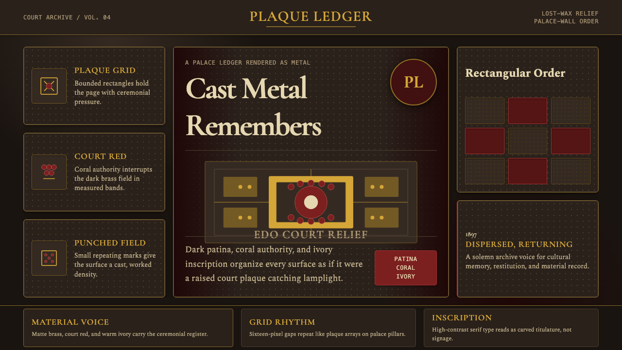 Benin Bronze Oba CourtCourt gravity in cast metal. Patinated brass grid, coral red panels, ivory se…宫廷重如铸金。氧化黄铜网格、珊瑚红板块与象牙色衬线成浮雕。
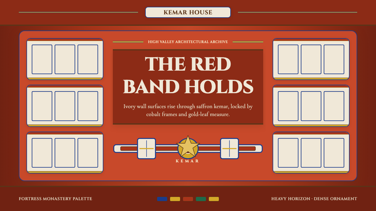 Bhutanese Dzong (Fortress Red)Monumental red holds the page. Cobalt frames and gold bands lock the fortress…厚重藏红掌控页面。钴蓝窗框与金色横带锁定宗堡节奏。
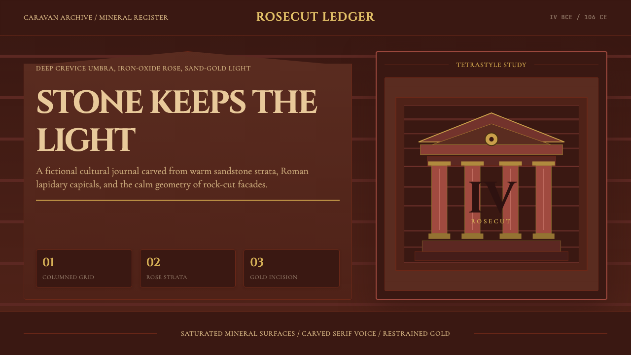 Jordanian Petra Rose NabataeanGeology feels monumental. Crevice umbra, rose strata, and Cinzel capitals car…地质感如纪念碑。暗峡底、玫瑰岩层与Cinzel碑铭体凿出页面。
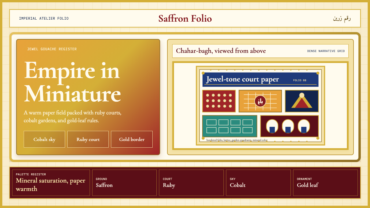 Mughal Miniature (Akbar era)Opulence refuses emptiness. Saffron paper, ruby panels, cobalt lattice, gold…华贵拒绝留白:番红花纸底、宝石红分栏、钴蓝格纹与金箔边饰。
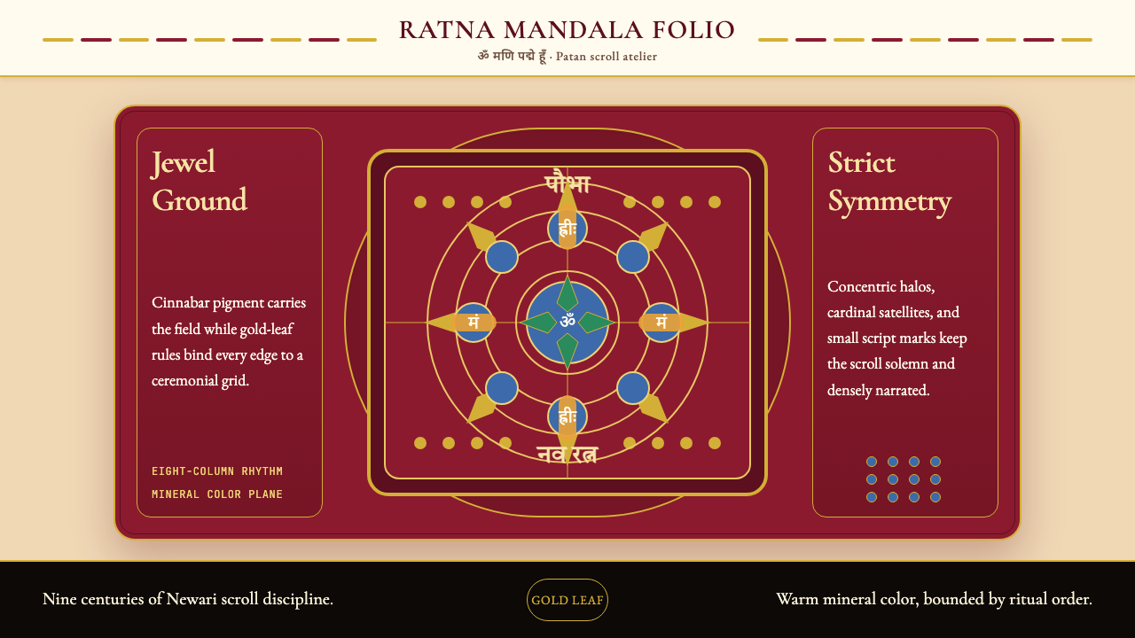 Nepali Paubha (Newari Scroll)Sacred density. Cinnabar ground, gold-leaf frame, lapis rings in strict symme…庄严而密集。朱砂红底、金箔框与青金石环严整对称。