What is Tibetan Thangka Mandala?什么是 Tibetan Thangka Mandala?
Eight centuries of sacred geometry compressed into a single scroll: Tibetan Thangka Mandala is devotional art where every circle, color, and gilded halo carries the weight of an unbroken iconographic canon.八百年神圣几何凝于一幅卷轴:藏传唐卡曼陀罗是将每一个圆环、每一种色彩、每一道金色光晕都承载着不间断图像传规之重的礼赞艺术。
Tibetan Thangka Mandala in briefTibetan Thangka Mandala 速览
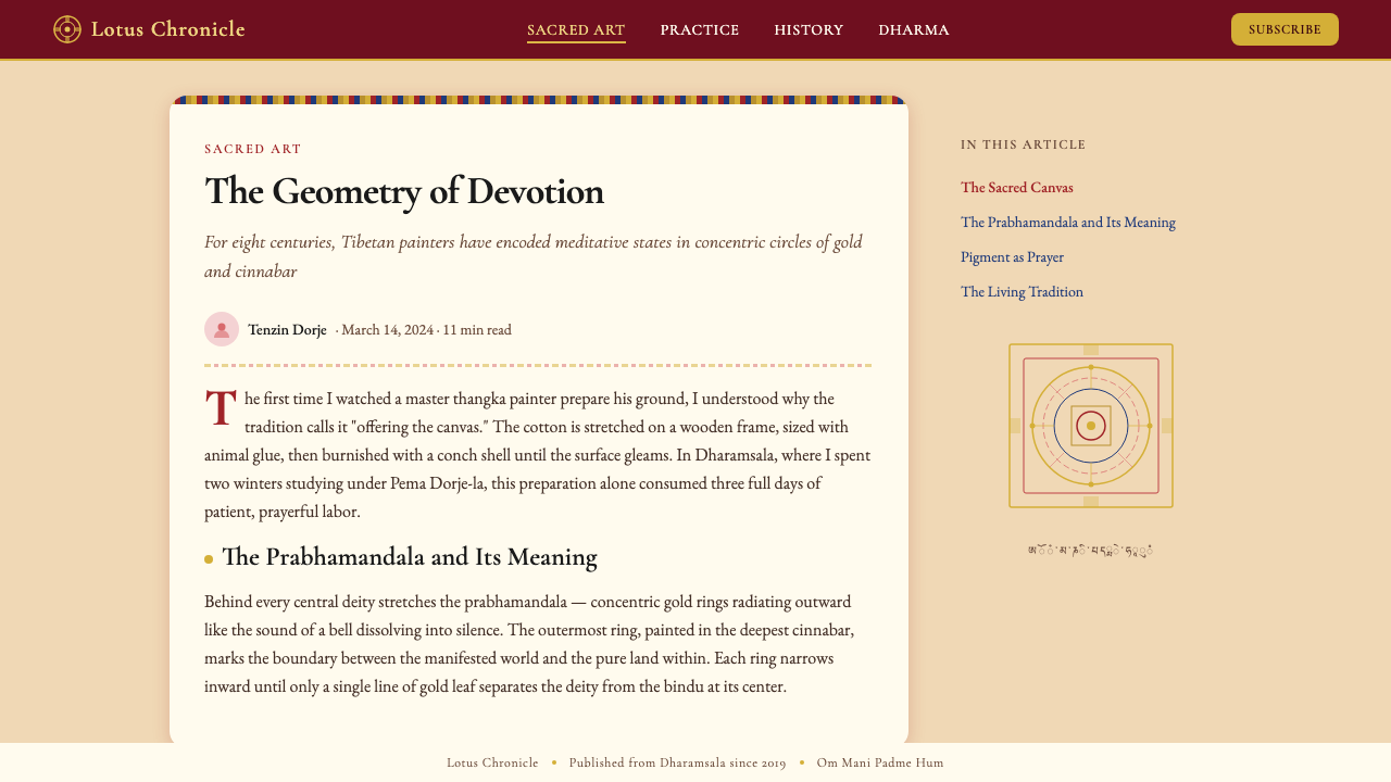
Tibetan Thangka Mandala is Vajrayana Buddhism's most concentrated visual meditation instrument — scroll paintings executed on primed cotton or silk, wrapped in layered silk brocade borders, depicting tutelary deities and mandala geometries according to iconometric measurement canons refined over eight centuries. The word thangka derives from the Tibetan meaning 'recorded message', and each painting functions simultaneously as portable altar, teaching aid, and object of contemplative focus. No element of the composition is arbitrary: the deity's hand gesture, the angle of a lotus petal, the sequence of concentric rings enclosing the central figure — all are prescribed by texts such as the Tibetan Kangyur and the iconometric treatises that govern proportional measurement.藏传唐卡曼陀罗是金刚乘佛教最精密的视觉冥想器物——以上过底料的棉布或丝绸为载体、外裹多层丝绸织锦边框的卷轴绘画,依照历经八百年提炼的量度经典,描绘本尊神祇与曼陀罗几何图阵。「唐卡」一词源于藏语,意为「记录的信息」,每幅画同时承担便携式神龛、教学媒介与禅观对象三重功能。构图中没有任何元素是随意的:神祇的手印、莲花瓣的角度、环绕中心主尊的同心圆序列——一切均由藏文《甘珠尔》及度量造像论典所规定。
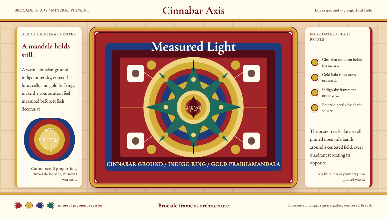
The color language of the Tibetan tradition is warmer and more saturated than its Bhutanese or Mongolian cousins. Saturated cinnabar red — derived historically from mineral vermilion — dominates large background fields and the layered brocade border. Deep indigo holds the sky behind mountain ranges; emerald green fills lotus petals and vegetation registers at the composition's base. Gold leaf, applied in quantity on halos, jewelry, and architectural elements, is not an accent but a structural material: it marks presence, sanctity, and radiating enlightenment energy. The palette is never pastel and never muted; intensity is a theological value, not an aesthetic preference.藏传唐卡的色彩语言比不丹或蒙古同源更温暖、更饱和。饱和的朱砂红——历史上源自矿物朱砂——主宰大面积背景底色与织锦边框的层叠色带。深靛蓝托起远山之后的天际;翠绿充填莲花瓣与画面下方的植被区域。金箔大量施用于头光、璎珞与建筑构件,并非点缀而是结构性材料:它标示存在、神圣性与光明能量的放射。这套色板从不柔和,从不沉默——色彩的强度是神学价值,而非审美偏好。
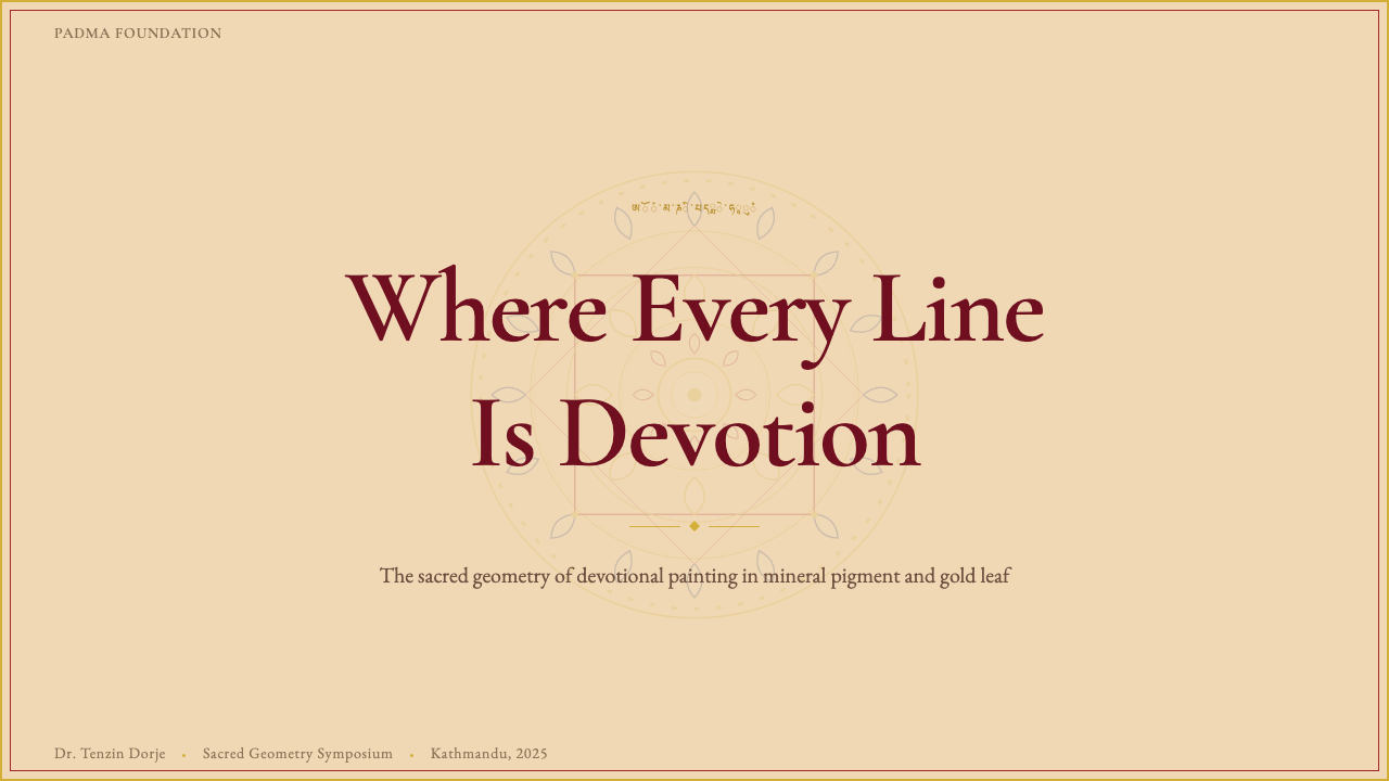
The mandala geometry embedded within a thangka is itself a cosmological diagram — a palace of the mind rendered in two dimensions. Concentric squares represent palace walls; concentric circles mark transitional thresholds. Attendant deities populate cardinal and intercardinal positions according to their rank and symbolic function. The organizing principle is perfect bilateral symmetry on every axis simultaneously, which sets it in sharp contrast to traditions such as Bauhaus or Japanese wabi-sabi where asymmetry carries expressive weight. In Thangka Mandala, symmetry is not a compositional device; it is an ontological statement about the nature of enlightened reality.嵌入唐卡的曼陀罗几何图阵本身是一幅宇宙论图解——以二维形式呈现的心灵宫殿。同心方形代表宫墙;同心圆环标记过渡门槛。侍从神祇依照各自的品位与象征功能分布于四方与四隅。其组织原则是在所有轴线上同时实现完美的双侧对称,这与包豪斯或日本侘寂等以非对称为表现载体的传统形成鲜明对比。在唐卡曼陀罗中,对称不是构图手法,而是关于觉悟实相本质的存在论陈述。
See the Tibetan Thangka Mandala design system查看 Tibetan Thangka Mandala 完整设计系统
Where does Tibetan Thangka Mandala come from?Tibetan Thangka Mandala 从何而来?
The thangka tradition emerged from the convergence of Indian Buddhist manuscript illustration, Nepalese Newari metalwork and painting conventions, and Central Asian pictorial traditions carried along the Silk Road into the Tibetan plateau. The earliest surviving thangkas date to the eleventh and twelfth centuries, a period when the second diffusion of Buddhism into Tibet (chidar) was generating intense demand for devotional objects. Monasteries required portable images that could travel with itinerant teachers and be unfurled before assembled communities; the scroll format answered both needs simultaneously. By the thirteenth century, the first codified iconometric measurement systems — specifying the proportional relationships of every feature of the deity's body — were being compiled from Indian Pala sources and adapted to Tibetan devotional requirements.唐卡传统源于印度佛教写本插图、尼泊尔纽瓦尔金属工艺与绘画惯例、以及经由丝绸之路传入西藏高原的中亚图像传统之交汇。现存最早的唐卡实物可追溯至十一、十二世纪,彼时佛教再度入藏(后弘期)正产生对礼佛器物的强烈需求。寺院需要可随游方教师携行、并在聚集信众前展开的便携图像;卷轴形制同时满足了这两项要求。至十三世纪,最初的系统化度量造像规范——规定神祇身体每一特征的比例关系——开始从印度波罗风格文献中整理汇编,并依藏传礼佛需求加以调适。
The Yuan dynasty (1271–1368) and its Mongol rulers proved decisive patrons. Kublai Khan's sponsorship of Tibetan Buddhism — particularly the Sakya school — channeled imperial resources into large-scale thangka production for both monastic and court settings. This period established the tradition of multi-workshop production, where specialists in deity outlines, color filling, gold-leaf application, and brocade mounting each contributed their expertise to a single object. The Ming dynasty (1368–1644) continued this patronage model and introduced Chinese aesthetic influences: more elaborate landscape registers in the lower and upper registers of the composition, greater attention to silk brocade border conventions imported from Chinese court textiles.元代(1271—1368年)及其蒙古统治者被证明是决定性的赞助人。忽必烈对藏传佛教——尤其是萨迦派——的扶持,将帝国资源注入大规模唐卡制作,供寺院与宫廷双重使用。这一时期确立了多工坊分工协作的传统:专攻神祇线稿、填色、贴金箔、装裱织锦的各路匠师各献所长,共同完成同一件器物。明代(1368—1644年)延续了这一赞助模式,并引入中国美学影响:画面上下区域出现更为精致的山水景致,对仿自中国宫廷织物的丝绸织锦边框规范也给予了更多关注。
The major regional painting schools crystallized between the fourteenth and seventeenth centuries. The Menri school, founded by Menla Döndrup in the fifteenth century, established what became the dominant central Tibetan canon: warm tonal relationships, precise deity proportions derived from the Kalachakra Tantra measurement system, and an emphasis on jewel-like color saturation. The Karma Gardri school, associated with the Karma Kagyu lineage and flourishing particularly in the Kham region of eastern Tibet, developed a naturalistic landscape vocabulary drawn partly from Chinese landscape painting, setting deities against atmospheric mountain scenery rendered in softer, cooler tonalities. These schools were not mutually exclusive — Kham workshops frequently synthesized both traditions.各主要地区画派在十四至十七世纪间逐渐成型。门孜画派由门拉顿珠于十五世纪创立,确立了后来成为西藏中部主流的图像规范:温暖的色调关系、源自《时轮金刚》量度体系的精确神祇比例,以及对宝石般色彩饱和度的强调。噶玛嘎孜画派与噶玛噶举传承相关联,尤盛于西藏东部的康区,发展出部分借鉴中国山水画的写实山景词汇,以更柔和、更清冷的色调将神祇置于大气氤氲的山岭背景之中。这两种画派并非互相排斥——康区画坊频繁综合两种传统。
The twentieth century brought both rupture and diaspora. The political upheavals of the 1950s and 1960s in Tibet forced large numbers of trained artists, teachers, and their materials into exile communities across India, Nepal, and Bhutan. Far from ending the tradition, this diaspora energized it: institutions such as the Norbulingka Institute in Dharamsala (founded 1988) systematically documented iconometric canons, trained new generations of painters, and established quality standards that could be transmitted outside the monastery system. Contemporary thangka production spans from traditional devotional commission in diaspora communities to limited-edition fine-art works collected internationally, with practitioners maintaining fidelity to the same measurement texts their predecessors used in the fifteenth century.二十世纪为唐卡传统带来了断裂与离散。五六十年代西藏的政治剧变迫使大批训练有素的艺术家、教师及其资料流亡至印度、尼泊尔、不丹的流亡社区。但这场离散非但没有终结这一传统,反而为其注入了活力:达兰萨拉的诺布岭卡研究所(创立于1988年)系统整理了度量图像规范,培训新一代画师,并建立起可在寺院体系之外传授的质量标准。当代唐卡生产横跨从流亡社区的传统礼佛委托定制,到被国际藏家收藏的限量版艺术作品,从业者至今仍恪守其十五世纪前辈所使用的同一批度量经典。
What defines the Tibetan Thangka Mandala look?Tibetan Thangka Mandala 的视觉特征是什么?
Color Palette色彩体系
The Thangka Mandala palette is built from mineral and earth pigments that produce a characteristic luminous density unavailable to synthetic paints. Cinnabar red — warm, slightly orange-leaning — dominates backgrounds and brocade borders. Indigo holds the upper sky registers. Emerald green fills vegetal and architectural elements. Ochre and warm earth tones model flesh and distant terrain. Gold leaf — applied over a red clay base — covers halos, crowns, and ornamental jewelry. These colors are never softened toward pastel and never dulled toward earth tones for decorative effect; their saturation intensity is the theological point.唐卡曼陀罗的色板以矿物颜料与土质色料为基础,产生合成颜料无法企及的特有发光密度。朱砂红——温暖而微微偏橙——主宰背景底色与织锦边框。靛蓝托起画面上方的天空区域。翠绿充填植物与建筑构件。赭石与温暖的土质色调塑造肤色与远景山地。金箔——施于朱砂底之上——覆盖头光、宝冠与装饰璎珞。这些颜色从不向粉彩方向柔化,也从不为装饰效果而向土色方向沉淀——色彩饱和强度本身就是神学要义所在。
Concentric Symmetry同心对称
The defining structural principle of the mandala is perfect radial and bilateral symmetry simultaneously. The central deity occupies a lotus throne at the exact geometric center; every surrounding register — rings of fire, vajra fences, lotus petals, attendant deity rows — mirrors itself across both horizontal and vertical axes. This symmetry is not approximated or gestural; it is measured and rule-governed by iconometric canons. The effect is one of absolute visual equilibrium, as if the composition were generating its own gravitational center.曼陀罗的决定性结构原则是同时实现完美的放射对称与双侧对称。中心主尊端坐于位于精确几何中心的莲花宝座上;每一层环绕区域——火焰圈、金刚栏、莲花瓣、侍从神祇行列——均在水平与垂直两轴上自我镜像。这种对称并非约略估算或姿态性的,而是由度量造像规范测量规定的。所产生的效果是绝对的视觉均衡,仿佛整个构图正在生成自身的引力中心。
Layered Spatial Registers分层空间区域
A fully realized thangka is divided into distinct horizontal registers that each carry separate narrative and symbolic content. The upper register typically depicts lineage masters and Buddhas of the five directions in smaller scale. The central register holds the principal deity and mandala. The lower register shows offering goddesses, protector deities, and landscape elements including water, earth, and stylized mountain ranges. These registers are spatially compressed — not depicted in perspective — so that sacred geography is legible as diagram rather than experienced as illusionistic space.一幅完整的唐卡被划分为若干各自承载独立叙事与象征内容的水平区域。上方区域通常以较小尺度描绘传承上师与五方佛。中心区域安置主尊神祇与曼陀罗几何图阵。下方区域呈现供养天女、护法神祇以及包括水体、大地与程式化山脉在内的景观要素。这些区域在空间上是压缩的——并非以透视法描绘——因此神圣地理以图解方式呈现,而非作为错觉空间被体验。
Gold as Structure金箔作为结构
Gold leaf in Thangka Mandala is not decorative highlight but structural material. Halos emanate from deity heads as concentric rings of burnished gold that mark the boundary between the sacred figure and the surrounding pictorial space. Crowns, jewelry, throne backs, and architectural ornaments are fully gilded. The gold does not simulate reflected light; it is presented as intrinsically luminous. This treatment creates a visual hierarchy so strong that the gold-covered areas read as categorically different from the painted areas — a distinction between what belongs to the sphere of enlightenment and what exists within ordinary phenomena.唐卡曼陀罗中的金箔不是装饰性的高光,而是结构性材料。头光从神祇头部向外放射,形成抛光金箔的同心圆环,标示神圣形象与周围图像空间之间的边界。宝冠、璎珞、宝座靠背与建筑装饰构件均全面贴金。金箔并不模拟反射光线,而是被呈现为本然发光之物。这种处理创造出如此强烈的视觉层级,以至于贴金区域与绘画区域在类别上判然有别——标示出属于觉悟领域之物与存在于凡俗现象之物之间的区分。
Iconometric Proportion度量造像比例
Every figure in a thangka is drawn according to a body-unit measurement grid derived from the principal deity's face measurement. The overall body height, the distance between facial features, the length of fingers and posture of limbs — all are specified numerically in the iconometric treatises and checked against a preliminary grid sketched directly onto the primed ground. This is not artistic convention in the modern sense; it is a doctrine holding that deviation from correct proportion produces a painting without spiritual potency. The precision required rivals architectural drafting.唐卡中的每一个形象都依照以主尊面部量度为基准推导出的身体单位测量网格绘制。整体身高、面部特征之间的距离、手指长度与四肢姿态——一切均在度量造像论典中有数字规定,并与直接绘于上过底料的画布上的预备网格进行核对。这不是现代意义上的艺术惯例,而是一种教义,认为偏离正确比例会使画作失去灵性效能。所要求的精确度堪比建筑制图。
Brocade Border System织锦边框体系
The silk brocade border that frames a thangka is as compositionally significant as the painting it contains. Borders are typically constructed from multiple bands of patterned silk in alternating warm and cool tones — deep red, orange-gold, and blue — that echo and frame the palette of the central image. The outermost band is usually a contrasting dark tone that functions as a visual full stop. This layered framing system transforms the thangka from a painting into an object — a complete artifact in which the textile and painted surfaces are conceived as a single composition.装裱唐卡的丝绸织锦边框在构图上与其所承载的绘画同等重要。边框通常由多道交替冷暖色调的提花丝绸色带构成——深红、橙金与蓝色——与中心图像的色板相互呼应并加以框定。最外层色带通常是形成对比的深色调,起到视觉句点的作用。这套层叠装裱体系将唐卡从一幅绘画转化为一件器物——一个织物表面与绘画表面被构想为单一构图的完整人工制品。
Flame and Lotus Motifs火焰与莲花母题
Two repeating motifs organize the transition between spatial zones throughout the composition. Stylized flame patterns — pointed, alternating red-orange and yellow-white — form the outermost protective ring of the mandala, signifying the burning away of conceptual obscurations. Lotus forms appear as thrones, as petal-rings enclosing deity positions, and as decorative ground lines. The lotus motif is always rendered in a highly conventionalized manner — each petal precisely outlined and filled with flat color — that maintains its diagrammatic readability at any scale. Both motifs are ancient pan-Buddhist symbols given a distinctively Tibetan formal treatment.两种反复出现的母题在整个构图中组织各空间区域之间的过渡。程式化的火焰纹样——尖锐的、红橙与黄白交替的——构成曼陀罗最外圈的护卫圆环,象征焚尽概念性遮蔽。莲花形式作为宝座出现,作为环绕神祇位置的莲瓣圆环出现,也作为装饰性地景线出现。莲花母题始终以高度程式化的方式呈现——每片花瓣精确勾勒轮廓并以平涂色彩填充——在任何尺度下都保持其图解性的可读性。两种母题均为古老的泛佛教象征,经过具有鲜明藏传特色的形式处理。
See the Tibetan Thangka Mandala design system查看 Tibetan Thangka Mandala 完整设计系统
Who shaped Tibetan Thangka Mandala?谁塑造了 Tibetan Thangka Mandala?
Menla Döndrup was a fifteenth-century Tibetan painter credited with founding the Menri school, which established the dominant iconometric canon for central Tibetan thangka production. His systematization of deity proportions — codified in terms of a face-unit body measurement grid — gave painters across the region a shared technical language that remained authoritative for centuries. The Menri school's warm tonal palette and precise compositional geometry became the benchmark against which later regional variants defined themselves, and his influence persists in contemporary academic Tibetan Buddhist art training.门拉顿珠是十五世纪的藏族画师,被认为是门孜画派的创始人,该画派确立了西藏中部唐卡制作的主流度量图像规范。他对神祇比例的系统化整理——以面部单位为基准的身体量度网格加以编码——为全区域画师提供了一套共同的技术语言,这套语言的权威性延续了数个世纪。门孜画派温暖的色调关系与精确的构图几何成为后来各地区流派据以自我界定的基准,其影响在当代学院式藏传佛教艺术教育中依然持续。
The Karma Gardri school, associated with the Karma Kagyu lineage of Tibetan Buddhism, flourished principally in the Kham region of eastern Tibet from the sixteenth century onward. Its masters developed a naturalistic landscape vocabulary drawn from Chinese landscape painting — particularly the atmospheric mountain scenery of Song and Ming dynasty masters — and integrated it with Vajrayana deity iconography. Where the Menri school emphasized jewel-like chromatic intensity and geometric formalism, the Karma Gardri painters introduced receding spatial depth, softer tonal modulation, and a more painterly treatment of clouds, water, and vegetation. Their synthesis produced some of the most visually complex thangkas in the tradition.噶玛嘎孜画派与藏传佛教噶玛噶举传承相关联,自十六世纪起主要在西藏东部的康区繁荣发展。该画派的大师们发展出一套借鉴中国山水画——尤其是宋明两代大师的大气山景——的写实景观词汇,并将其与金刚乘神祇图像学相融合。若说门孜画派强调宝石般的色彩强度与几何形式主义,则噶玛嘎孜画师引入了退远的空间深度、更柔和的色调调制,以及对云、水、植被更具绘画性的处理方式。他们的综合创作产生了该传统中视觉上最为复杂的一批唐卡。
The Norbulingka Institute, established in Dharamsala, India in 1988, represents the most systematic institutional response to the twentieth-century disruption of the thangka tradition. Founded under the patronage of the Fourteenth Dalai Lama, it combined a traditional arts training program — in which students complete multi-year apprenticeships in thangka painting, wood carving, and textile production — with a research and documentation mission to record iconometric texts and measurement canons before living knowledge holders were lost. Norbulingka trained painters now work across Asia, Europe, and North America, and the institute's standardized training materials have become a de facto international curriculum for Tibetan Buddhist art.诺布岭卡研究所于1988年在印度达兰萨拉创立,代表着二十世纪唐卡传统所受冲击之下最为系统性的制度应对。在第十四世达赖喇嘛的赞助下创立的该机构,将传统艺术培训项目——学生在唐卡绘画、木雕与纺织品制作方面完成多年学徒训练——与记录度量图像经典及量度规范以免在世传承人失传的研究与文献使命相结合。诺布岭卡培训的画师如今遍布亚洲、欧洲与北美;该机构的标准化培训材料已成为藏传佛教艺术事实上的国际课程体系。
The Gar lineage refers to a succession of painter-teachers associated with the western Tibetan region, whose distinct approach emphasized the integration of Kashmiri artistic influences — particularly their handling of architectural elements, ornamental patterning, and the treatment of deity faces with finer, more delicate features — into the broader Tibetan thangka vocabulary. The Gar masters represent the historical porousness of the Tibetan tradition to its Himalayan neighbors, demonstrating that even within the strict framework of iconometric canons, significant regional aesthetic identities emerged through sustained contact with adjacent artistic cultures.嘎尔传承指与西藏西部地区相关联的一系列画师-教师的传承,其独特取向强调将克什米尔艺术影响——尤其是其对建筑构件的处理、装饰纹样,以及以更纤细精致的面部特征处理神祇面容——融入更广泛的藏传唐卡词汇。嘎尔传承大师们代表了藏传传统对其喜马拉雅邻邦的历史性开放性,证明了即便在严格的度量图像规范框架内,通过与毗邻艺术文化的持续接触,也能形成显著的地区性美学身份。
The generation of thangka painters working today in exile communities across India, Nepal, the United States, and Europe occupies a position without historical precedent: trained in traditional iconometric methods but operating outside the monastic patronage system that originally sustained the art form. Leading figures among contemporary practitioners have navigated this position by accepting both devotional commissions from Buddhist centers worldwide and fine-art commissions from secular collectors, maintaining technical fidelity to the measurement canons while adapting format, scale, and mounting conventions to contemporary art-world contexts. Their work constitutes a living test of whether a tradition defined by sacred function can sustain its formal integrity outside that function.当今活跃于印度、尼泊尔、美国与欧洲流亡社区的唐卡画师一代,处于历史上前所未有的位置:接受传统度量图像方法训练,却在原本维系这一艺术形式的寺院赞助体系之外运作。当代从业者中的领军人物通过同时承接来自世界各地佛教中心的礼佛委托与世俗收藏家的艺术品委托来应对这一处境,在恪守量度规范技术准则的同时,将形制、尺寸与装裱惯例调适于当代艺术世界的语境。他们的作品构成了一项活生生的测验:一个以神圣功能为界定的传统,是否能在该功能之外维持其形式完整性。
How do you use Tibetan Thangka Mandala today?今天怎么用 Tibetan Thangka Mandala?
Thangka Mandala is among the most visually distinctive historical design systems available to contemporary practitioners, precisely because its principles are so different from the Western modernist tradition that dominates graphic and UI design education. Applying it correctly requires understanding what the visual system is actually doing: using radial symmetry to establish a gravitational center, using color saturation to signal sacred hierarchy rather than to create mood, using geometric concentric structure to organize information at multiple simultaneous levels. The style cannot be applied superficially without becoming pastiche; its power depends on committing to its structural logic.唐卡曼陀罗是当代从业者可资取用的视觉上最具辨识度的历史设计体系之一,恰恰是因为其原则与主导平面和界面设计教育的西方现代主义传统截然不同。正确应用它,需要理解这套视觉系统实际上在做什么:以放射对称建立引力中心,以色彩饱和度标示神圣层级而非营造情绪,以同心几何结构在多个层次上同时组织信息。这种风格无法被肤浅地应用而不沦为拙劣模仿;其力量取决于对其结构逻辑的全身心投入。
For presentation slides, the Thangka Mandala vocabulary works most powerfully on cover and section-break pages where a single strong impression is the goal. A cover benefits from a centralized mandala-derived composition: a bold geometric rosette or concentric ring structure anchors the title at the exact visual center, surrounded by carefully balanced decorative registers that echo the brocade border logic. The rich, saturated background — deep cinnabar red or indigo — with gold-toned title typography creates immediate visual authority. Content slides should be treated more sparingly: a narrow decorative band at the top or bottom references the brocade border without overwhelming the information. Data slides can adopt the concentric-ring logic as an organizing metaphor for radial charts, progress rings, or hierarchical relationship diagrams.在演示文稿中,唐卡曼陀罗词汇在封面与章节过渡页上最为有力,这些页面以产生单一强烈印象为目标。封面适合采用以中心为核心的曼陀罗式构图:一个醒目的几何花饰或同心圆环结构在精确的视觉中心锚定标题,周围是精心平衡的装饰区域,呼应织锦边框的逻辑。深饱和的背景——深朱砂红或靛蓝——配以金色调标题字体,立即营造出视觉权威感。内容页应处理得更为克制:顶部或底部的窄装饰带援引织锦边框而不压倒信息本身。数据页可将同心圆环逻辑作为放射图表、进度环或层级关系图的组织隐喻加以采用。
For web interfaces, the style is best suited to immersive editorial experiences, cultural institution homepages, cultural product landing pages, and luxury brand contexts where visual richness and craftsmanship signaling are primary objectives. Dashboard and productivity interfaces generally benefit less from this vocabulary, as the high visual density competes with scannability. When applied to a pricing or feature page, the approach works through contrast: a richly decorated hero section in the full palette, transitioning to a much quieter content area that uses only one or two colors from the system — deep red or gold — as accent tones against a near-neutral ground.对于网页界面,这种风格最适合沉浸式编辑体验、文化机构主页、文化产品落地页以及视觉丰富感与工艺感信号传递是首要目标的奢侈品牌场景。仪表板与效率工具界面通常从这套词汇中受益较少,因为高视觉密度会与可扫描性产生竞争。当应用于定价或功能页面时,方法通过对比起效:一个使用完整色板的富丽装饰的主视觉区域,过渡到一个更为安静的内容区域,后者仅将系统中的一两种颜色——深红或金色——作为强调色,铺设于接近中性的底面上。
For editorial and marketing applications, the Thangka Mandala vocabulary supports extraordinarily strong cover and poster treatments. A book cover or event poster in this style leads with a centralized deity-position composition — a product, face, or graphic mark at the geometric center, surrounded by concentric decorative rings — against a deeply saturated background. Marketing materials for cultural events, museum exhibitions, spiritual wellness brands, or high-craft luxury goods benefit from the style's combination of visual opulence and geometric precision. The brocade border logic translates directly into editorial page furniture: richly patterned header and footer bands that frame the content zone without competing with it.对于编辑与营销应用,唐卡曼陀罗词汇支持异常强烈的封面与海报处理。采用这种风格的书籍封面或活动海报以中心化的主尊位置构图为主导——产品、面孔或图形标识位于几何中心,被同心装饰圆环所环绕——置于深饱和的背景之上。文化活动、博物馆展览、精神健康品牌或高工艺奢侈品的营销材料,均能从这种风格将视觉华丽与几何精确相结合的特质中受益。织锦边框逻辑可直接转化为编辑版面家具:富有纹样的页眉与页脚色带框定内容区域,而不与之产生竞争。
A common mistake when applying Thangka Mandala aesthetics is treating the palette as purely decorative surface and ignoring the structural role of symmetry and concentric organization. Layouts that borrow the warm colors and gold accents but retain asymmetric, editorial-grid structure produce a visual confusion — the colors signal one system while the composition signals another. A second frequent error is under-committing to the background saturation: a timid or desaturated version of cinnabar red reads as merely 'warm red' rather than as a deliberate invocation of the tradition's visual intensity. The style rewards full commitment to its structural logic far more than partial adoption of its surface elements.应用唐卡曼陀罗美学时最常见的错误,是将色板视为纯粹的装饰性表面,而忽视对称与同心组织的结构性作用。借用了温暖色彩与金色强调、却保留了非对称编辑网格结构的版面,会产生视觉混乱——色彩在传递一套体系的信号,而构图在传递另一套体系的信号。第二个常见错误是对背景饱和度的投入不足:一个怯懦或低饱和的朱砂红版本只会被读作普通的「暖红色」,而非对这一传统视觉强度的刻意召唤。全身心投入其结构逻辑,远比局部采用其表面元素更能发挥这种风格的力量。
See the Tibetan Thangka Mandala design system查看 Tibetan Thangka Mandala 完整设计系统
Tibetan Thangka Mandala — FAQTibetan Thangka Mandala · 常见问题
Is Tibetan Thangka Mandala the same as general mandala art?藏传唐卡曼陀罗与一般的曼陀罗艺术是同一回事吗?
They share the concentric geometric organizing principle but differ substantially in every other respect. The term mandala (Sanskrit: circle) is applied broadly across Hindu, Jain, and Buddhist traditions, and in contemporary usage has been extended to any radially symmetric decorative pattern. Tibetan Thangka Mandala is a specific, highly codified tradition: its geometry is iconometrically prescribed rather than freely designed, its color relationships are fixed by iconographic convention rather than aesthetic preference, and the central element is always a Vajrayana deity with a specific identity and symbolic program. Using this style implies the full visual system — saturated mineral palette, gold-leaf hierarchy, brocade border logic, concentric deity registers — not merely a symmetric circle pattern.两者共享同心几何的组织原则,但在其他各方面均有实质差异。曼陀罗(梵文:圆)一词被广泛应用于印度教、耆那教与佛教传统,在当代用法中已延伸至任何放射对称的装饰纹样。藏传唐卡曼陀罗是一个特定的、高度成文化的传统:其几何图形由度量造像规范规定,而非自由设计;其色彩关系由图像学惯例而非审美偏好固定;其中心元素始终是具有特定身份与象征含义的金刚乘神祇。采用这种风格意味着承接完整的视觉体系——饱和矿物色板、金箔层级、织锦边框逻辑、同心神祇区域——而不仅仅是一个对称圆形纹样。
Can this aesthetic work on a light or white background?这种美学能在浅色或白色背景上使用吗?
Authentic thangkas are never executed on white or light grounds — the tradition requires a primed and toned surface, typically in warm ochre or deep red, that gives subsequent paint layers their characteristic luminosity. A light-background application is possible in contemporary design contexts but requires substantial adaptation. The approach that works is to treat the light ground as a negative space system — reserving the saturated palette for defined graphic elements such as concentric rings, borders, and central motifs — while keeping the majority of the surface quiet. This creates an effect closer to a museum artifact documentation aesthetic than to the immersive total-color experience of an authentic thangka, which may or may not serve the design intent.真实的唐卡从不在白色或浅色底面上制作——这一传统要求经过上料和着色的底面,通常是温暖的赭石或深红,为后续颜料层提供其特有的发光感。浅色背景的应用在当代设计场景中是可能的,但需要大幅调适。有效的方法是将浅色底面作为负空间体系处理——将饱和色板保留用于界定的图形元素,如同心圆环、边框与中心母题——同时保持大部分表面的安静。这产生的效果更接近博物馆藏品文献记录美学,而非真实唐卡的沉浸式全彩体验,这是否符合设计意图则因情境而异。
How do I use the gold element without looking kitschy?如何使用金色元素而不显得俗气?
In authentic thangkas, gold is structural and hierarchical rather than decorative. The discipline that prevents kitsch is function: gold appears only where the iconometric canon assigns it — halos, crowns, throne details — not as a general-purpose glamor layer. In contemporary design, the equivalent discipline is restriction: use gold-toned elements exclusively for the single highest-priority item in the hierarchy (a primary call-to-action, the central feature of a mandala-derived motif, the outermost border band) and withhold it from everything else. Gold paired with the full warm saturated palette reads as opulent; gold applied sparingly against a deeply saturated red or indigo ground reads as precise and authoritative. The difference is restraint in surface coverage.在真实的唐卡中,金色是结构性与层级性的,而非装饰性的。防止俗气的自律是功能性:金箔只出现在度量造像规范指定之处——头光、宝冠、宝座细部——而非作为通用的华丽图层。在当代设计中,等效的自律是限制:将金色调元素专门用于层级中单一优先级最高的项目(主要行动号召、曼陀罗衍生母题的中心特征、最外层边框色带),对其他所有元素予以保留。金色与完整的温暖饱和色板相配时,呈现出奢华感;金色克制地施于深饱和的红色或靛蓝底面时,则呈现出精确与权威感。两者的区别在于表面覆盖的克制程度。
What kinds of projects are a poor fit for this style?哪些类型的项目不适合这种风格?
The Thangka Mandala vocabulary struggles in contexts requiring visual neutrality, speed, or iterative information consumption. Productivity tools, enterprise software dashboards, news platforms, and e-commerce experiences benefit from lower visual density and faster cognitive processing than this style permits. The high chromatic intensity and symmetrical gravity of the mandala composition draw the eye to the center and hold it there — excellent for contemplative or high-impact single-message contexts, counterproductive for linear reading or task-completion interfaces. The style also sits uneasily beside corporate or institutional visual identities that depend on restraint for their authority signals; the richness can undermine rather than reinforce trust in those contexts.唐卡曼陀罗词汇在需要视觉中性、速度或迭代信息消费的场景中表现欠佳。效率工具、企业软件仪表板、新闻平台与电商体验,受益于比这种风格所允许的更低的视觉密度与更快的认知处理速度。曼陀罗构图的高色彩强度与对称引力将视线吸引至中心并将其留驻——对于冥想性或高冲击力单一信息场景而言极佳,但对于线性阅读或任务完成界面则适得其反。这种风格与依赖克制传递权威信号的企业或机构视觉识别系统也难以共存;在那些场景中,其华丽感可能削弱而非强化信任感。
How does the Tibetan tradition differ from other Buddhist painting traditions such as Japanese or Zen-influenced aesthetics?藏传传统与日本或受禅宗影响的佛教绘画传统有何不同?
The contrast is almost total. Japanese ink painting traditions influenced by Chan and Zen Buddhism prize emptiness, incompleteness, and the expressive potential of unpainted ground — a branch reaches across a white field; a brushstroke implies a mountain without describing it. This aesthetic, shaped by the wabi-sabi sensibility, values the evocative fragment over the complete statement. Tibetan thangka operates from the opposite premise: the painting surface must be completely and precisely filled according to an iconometric program, every space accounted for by a deity figure, decorative register, or symbolic element. Where Zen aesthetics celebrate absence, Thangka Mandala insists on fullness. Where Zen asymmetry suggests naturalness, Thangka symmetry asserts cosmic order. Both are Buddhist art traditions, but they represent fundamentally different visual theologies.两者的对比几乎是全面性的。受禅宗影响的日本水墨画传统推崇空、不完整,以及未着墨底面的表现潜力——一枝横伸于白色画面之上;一笔墨痕暗示山峦而不加描述。这种美学受侘寂审美塑造,珍视召唤性的片段胜于完整的陈述。藏传唐卡则从相反的前提出发:画面必须依照度量图像程序完整而精确地填满,每一寸空间都由神祇形象、装饰区域或象征元素所负责。禅的美学颂扬缺席,唐卡曼陀罗坚持充盈。禅的非对称暗示自然性,唐卡的对称则宣示宇宙秩序。两者都是佛教艺术传统,但代表着从根本上不同的视觉神学。
Related design styles相关设计风格
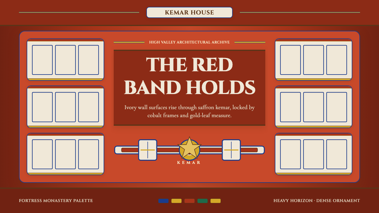 Bhutanese Dzong (Fortress Red)Monumental red holds the page. Cobalt frames and gold bands lock the fortress…厚重藏红掌控页面。钴蓝窗框与金色横带锁定宗堡节奏。
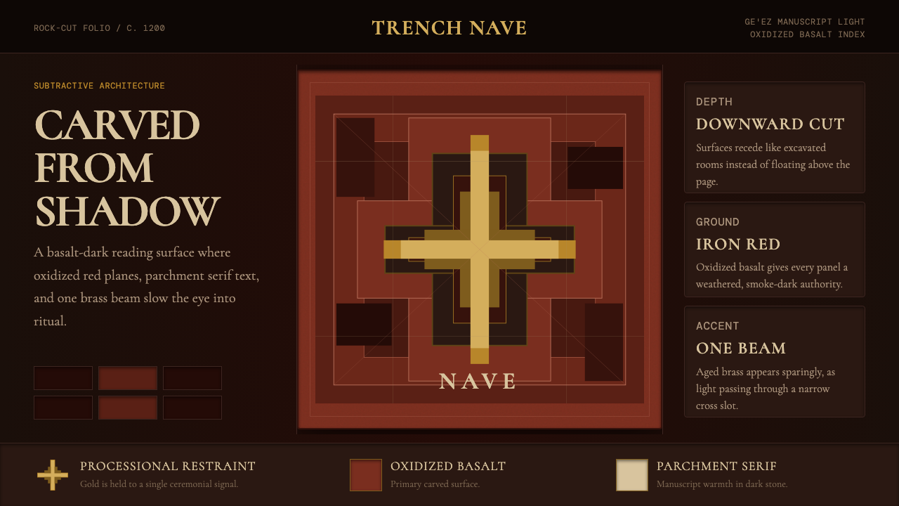 Ethiopian Lalibela Rock-Hewn Church (c.1200)Sacred weight in shadow. Oxidized basalt, parchment serif, and one aged-gold…阴影有圣坛重量。氧化玄武岩、羊皮纸衬线与一束旧金光。
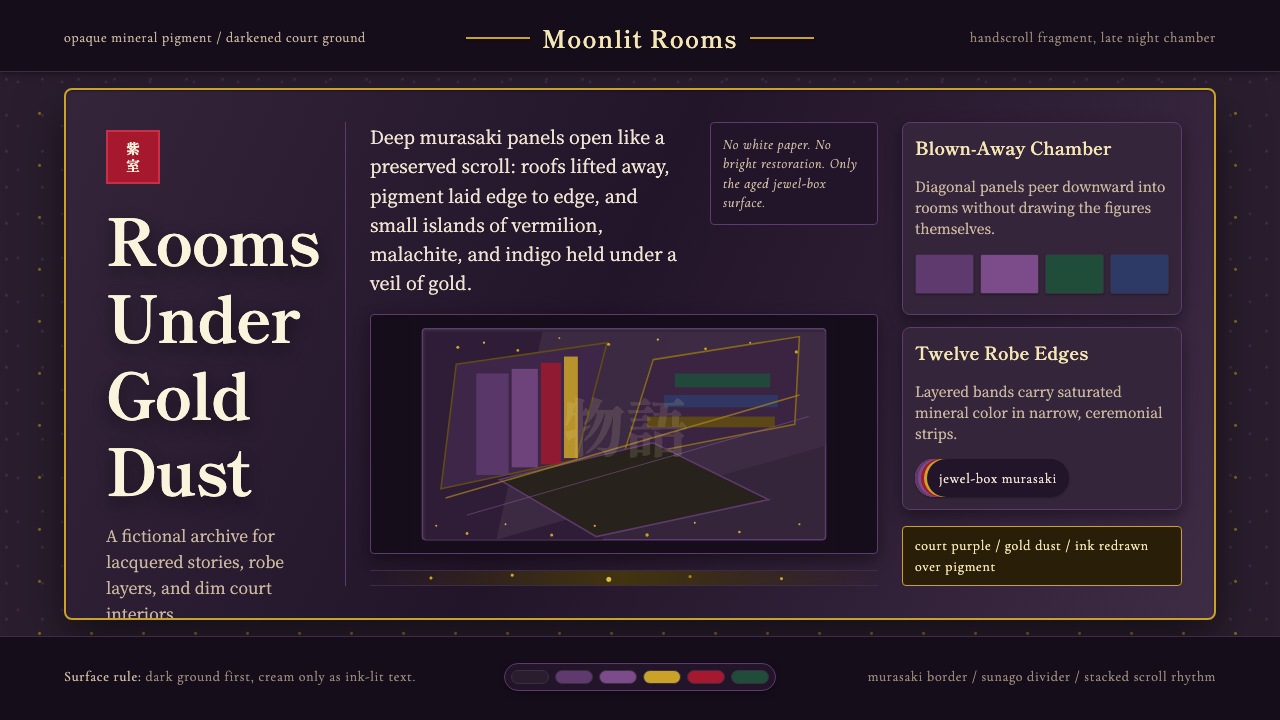 Heian Genji ScrollAged court opulence. Murasaki ground, gold dust, and stacked scroll panels.沉郁宫廷华彩:黯紫底、金砂、层叠绘卷面板。
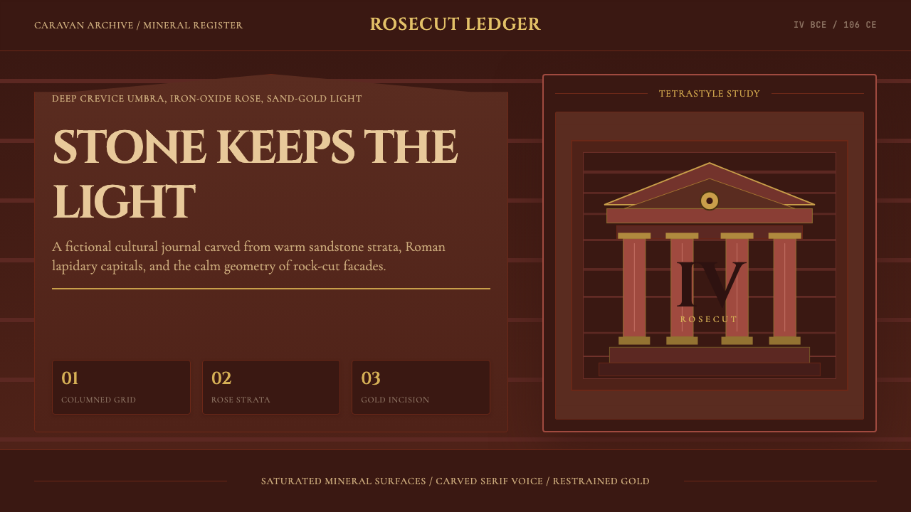 Jordanian Petra Rose NabataeanGeology feels monumental. Crevice umbra, rose strata, and Cinzel capitals car…地质感如纪念碑。暗峡底、玫瑰岩层与Cinzel碑铭体凿出页面。
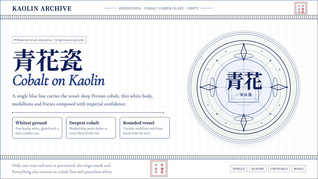 Ming Blue-and-White PorcelainImperial restraint sings. Deep cobalt hairlines circle kaolin white with one…御窑克制有声:钴蓝细线环绕白瓷,只留一枚红印。
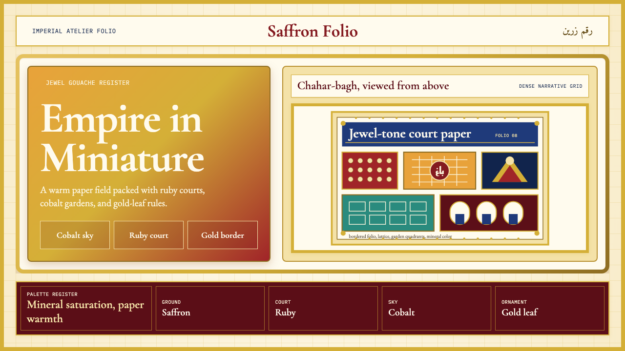 Mughal Miniature (Akbar era)Opulence refuses emptiness. Saffron paper, ruby panels, cobalt lattice, gold…华贵拒绝留白:番红花纸底、宝石红分栏、钴蓝格纹与金箔边饰。