What is Cellarius Celestial Atlas?
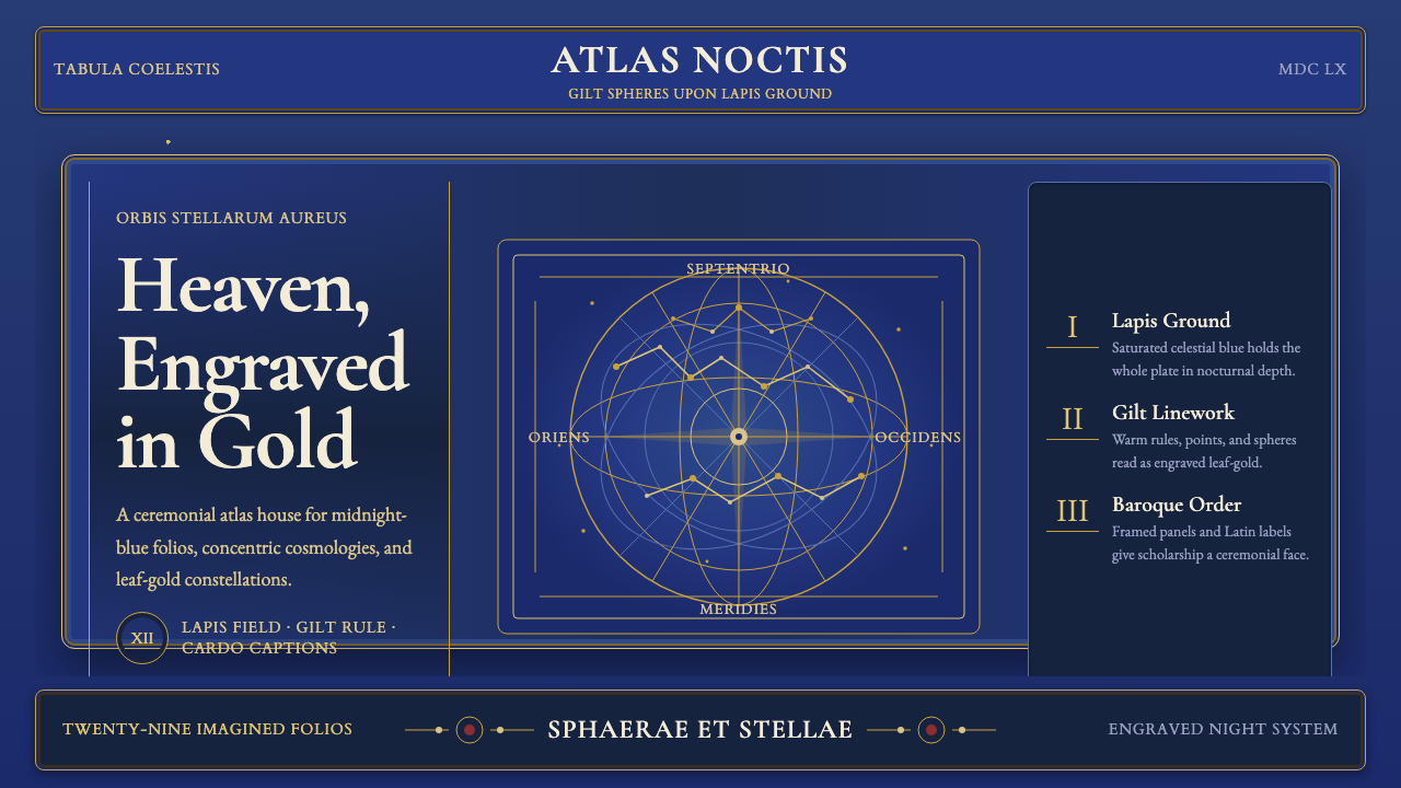
Andreas Cellarius did not merely map the heavens in 1660 — he gilded them. The Harmonia Macrocosmica is a Baroque atlas of twenty-nine double-folio copper engravings, each one saturated in deep ultramarine and worked over with gold leaf until stars, constellation lines, and ornate cartouche borders all gleam with the same warm lustre. As a design language, it delivers something rare: the authority of scientific precision fused with the opulence of courtly decoration.
Cellarius Celestial Atlas in brief
The Cellarius Celestial Atlas design system is rooted in Andreas Cellarius's Harmonia Macrocosmica, printed in Amsterdam in 1660 by publisher Johannes Janssonius. The atlas belongs to the Dutch Golden Age of cartography — a period when maps were simultaneously instruments of navigation, assertions of intellectual prestige, and luxury objects commissioned by wealthy merchants and scholars. Its visual language is defined by the collision of two things that rarely share a page: the rigorous geometry of celestial mechanics (concentric spheres, ecliptic circles, zodiac divisions) and the exuberant ornament of the Baroque (allegorical figures, sea monsters, putti, and architectural cartouche frames that sprawl across margins).
Visually, the atlas works through a principle of luminous contrast. A near-black ultramarine field — deep enough to suggest infinite space — serves as the ground from which all other elements emerge. Against this darkness, warm gold performs double duty: it traces the structural lines of the cosmos (constellation outlines, celestial equators, tropic circles) and decorates the non-scientific borders with engraved foliate ornament. The result is a visual hierarchy that feels inevitable — the eye moves from the glowing net of constellation lines outward to the gilded cartouche frames, then inward again to the serif Latin labels set in Garamond-style letterforms.
The system is emphatically not minimalist. It belongs to a Baroque tradition that equates richness of craft with intellectual seriousness — the complexity of the engraving signals the depth of the knowledge it contains. Yet beneath the ornament, there is rigorous structure: concentric circles divide space with mathematical precision, each zone labeled and annotated, every star plotted to a coordinate. The ornamental and the analytical are inseparable.
Where does Cellarius Celestial Atlas come from?
Andreas Cellarius was a Dutch-German mathematician and school rector, not a practicing astronomer. He completed the Harmonia Macrocosmica between approximately 1646 and 1660, drawing on the competing cosmological models of his era — Ptolemy's geocentric system, the Copernican heliocentric model, and Tycho Brahe's hybrid compromise — and presenting all three as visualized systems rather than advocating definitively for any one. This editorial decision was as much commercial as it was diplomatic: by illustrating every major cosmological theory, Cellarius made his atlas legible and valuable to readers across the ideological spectrum of seventeenth-century natural philosophy.
The publisher Johannes Janssonius was one of the dominant figures in Amsterdam's competitive atlas-publishing industry. By 1660, Amsterdam had displaced Antwerp as Europe's cartographic capital, and the Janssonius firm competed directly with Joan Blaeu's celebrated Atlas Maior. The Harmonia Macrocosmica was intended as the celestial counterpart to these terrestrial atlases — a statement of the same cultural ambition that made Dutch merchants commission maps of continents they had sailed. The copper engraving technique, hand-colouring with genuine mineral pigments (ultramarine from lapis lazuli, gold from metal leaf), and large folio format were all markers of the highest tier of Dutch luxury printing.
The iconographic program of the atlas draws on a long tradition of celestial sphere illustration stretching back to Ptolemy's Almagest and the medieval Islamic astronomical manuscripts that preserved and extended it. The allegorical figures populating each plate — figures holding armillary spheres, zodiac beasts prowling the margins, personifications of the four elements — descend from Renaissance cosmological illustration, itself inheriting from late antique imagery. Cellarius synthesized this iconographic history with the new precision of Baroque engraving, producing plates that were simultaneously state-of-the-art in their coordinate accuracy and deeply traditional in their visual vocabulary.
The atlas was issued only once in the seventeenth century, then largely forgotten until the nineteenth century, when antiquarian interest in Golden Age Dutch printing revived its reputation. Today it is among the most facsimile-reproduced and widely digitized historical atlases, appearing regularly in museum exhibitions and fine-art print markets. Its plates have been absorbed into contemporary visual culture as a shorthand for a particular kind of intellectual luxury: ornate, learned, and technically ambitious.
What defines the Cellarius Celestial Atlas look?
Night-Sky Ground
The defining chromatic decision of the atlas is its deep ultramarine ground — a saturated, near-black blue that reads simultaneously as outer space, deep ocean, and the velvet lining of a jewel box. All other elements exist in luminous contrast against this ground. In digital application, this means the background is never a neutral dark grey or a cold blue-black; it is warm, saturated, and weighted with depth. The ground is not negative space — it is itself a presence, the void from which stars and lines emerge.
Gold Linework
Warm gold performs the dual role of scientific notation and decorative ornament. Constellation lines — the structural skeleton of each plate — are rendered in gold, as are celestial equators, tropics, and the grid lines that divide celestial space into coordinate zones. The same gold reappears in the cartouche frames and foliate borders. This chromatic unity between functional line and decorative frame is what makes the atlas feel holistic rather than merely illustrated. Gold is not applied to everything; it is reserved for lines and edges, never used as a fill for large areas.
Serif Typography with Latin Register
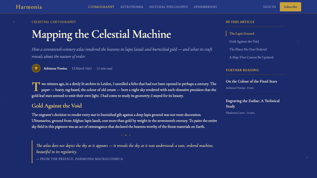
All text in the atlas is set in elegant serif letterforms — the humanist serifs of the Garamond tradition, with their bracketed curves and calligraphic stress. These letterforms carry the authority of learned Latin: even without reading the text, the letterform signals scholarship, permanence, and institutional weight. In the design system, this means choosing a serif typeface with genuine historical roots and using it at sizes where its optical details — the contrast between thick and thin strokes, the precise cut of serifs — are legible and purposeful. Type is treated as a map label: precise, annotating, never decorative in its own right.
Concentric Geometry
The structural organizing principle of the celestial atlas is concentricity: circles within circles, each ring annotated with its astronomical meaning — the zodiac belt, the tropics of Cancer and Capricorn, the celestial equator, the polar circles. This geometry is not merely decorative; it is the actual mathematical structure of the Ptolemaic and Copernican models being illustrated. In design application, this translates to a preference for circular and radial compositions, concentric rings as organizing devices, and curved rather than purely orthogonal grids. The circle carries cosmological meaning in this system; it implies completeness, order, and mathematical truth.
Baroque Cartouche Ornament
Every plate in the atlas is framed by an engraved cartouche — a structured ornamental border that incorporates architectural elements (columns, pediments, swags), figurative elements (mythological beings, putti, zodiac animals), and foliate ornament (acanthus scrolls, fruit garlands). The cartouche is not an afterthought; it is one of the primary visual statements of each plate, announcing that what lies inside is significant enough to warrant elaborate framing. In contemporary application, this principle translates to the use of structured decorative borders, elaborate header treatments, and framing devices that signal importance rather than simply contain content.
Constellation Figures as Illustration
Within the ultramarine field, each constellation is represented both by its star-points and by its mythological figure — Orion as a hunter, Scorpius as an articulated creature, Perseus holding the severed head of Medusa. These figures are rendered in gold and white against the night ground, outlines only, with no solid fills. They function as simultaneous legend and illustration: they identify the constellation and give it symbolic weight. In design, this suggests pairing data visualizations with figurative annotation, using illustrative elements that carry meaning rather than serving purely as decoration.
Layered Information Density
A single Cellarius plate holds an extraordinary amount of information without feeling chaotic: coordinate grids, star positions, constellation outlines, mythological figures, Latin annotations, cartouche text, and decorative figures all occupy the same field. This works because each type of information is expressed in a different visual register — line weight, scale, color temperature, and degree of detail — so that the eye can traverse multiple layers without losing its place. The design principle is hierarchical density rather than reduction: not fewer things, but things organized so that reading unfolds in stages.
Who shaped Cellarius Celestial Atlas?
Cellarius (c. 1596–1665) was a German-born mathematician and rector of the Latin school at Hoorn in the Netherlands. Despite working at some remove from the practicing astronomical community, he produced in the Harmonia Macrocosmica a synthesis of contemporary cosmological knowledge that is as much an art object as a scientific instrument. His achievement was editorial and visual rather than observational: selecting, organizing, and presenting competing cosmological models in engraved form accessible to educated lay readers. His other major work, the Architectura Militaris (1656), confirms his identity as a skilled synthesizer and communicator of technical knowledge.
Janssonius (1588–1664) was the Amsterdam publisher who commissioned and produced the Harmonia Macrocosmica. As one of the dominant atlas publishers of the Dutch Golden Age — in competition with the house of Blaeu — he understood that celestial atlases occupied the top of the prestige market for printed knowledge. His decision to produce the Harmonia as a companion volume to his terrestrial atlases positioned Cellarius's work as part of a comprehensive, authoritative visual account of the world in all its dimensions. The material quality of the production — large format, hand-coloured copper engraving, fine paper — reflects his ambitions for the atlas as both knowledge instrument and luxury object.
Ptolemy (c. 100–170 CE) was the Alexandrian mathematician and astronomer whose geocentric model of the cosmos — Earth at the centre, planets and stars arranged in concentric crystalline spheres — provided the organizing framework for Western and Islamic astronomy for nearly fifteen centuries. His Almagest codified the positions of 1,022 stars in 48 constellations, many of which appear in the Cellarius plates. Although the Harmonia Macrocosmica was published after the Copernican revolution had begun to challenge geocentrism, Ptolemy's system is presented in several plates as a legitimate cosmological model alongside the heliocentric alternatives, reflecting seventeenth-century natural philosophy's slow accommodation of competing truths.
Copernicus (1473–1543) proposed the heliocentric model — with the Sun at the centre of the planetary system — in his De revolutionibus orbium coelestium (1543). By the time Cellarius was composing the Harmonia Macrocosmica, the Copernican model had been mathematically refined by Johannes Kepler and empirically supported by Galileo's telescopic observations, yet it remained theologically contested and culturally not fully settled. Cellarius's decision to illustrate the Copernican model alongside the Ptolemaic and Tychonic systems gave the heliocentric view a visual authority and permanence it had not yet fully attained in scientific discourse. Several of the atlas's most dramatic plates depict the solar system in its heliocentric arrangement.
Tycho Brahe (1546–1601) was the Danish astronomer who proposed a hybrid cosmological model: the Earth remains stationary at the centre, but the other planets orbit the Sun, which in turn orbits the Earth. The Tychonic system allowed astronomers to accept some Copernican mathematics while preserving a motionless Earth — a crucial theological accommodation in the late sixteenth and early seventeenth centuries. His observational program at Uraniborg on the island of Hven produced the most accurate star catalogue of the pre-telescopic era, later used by Kepler to derive the laws of planetary motion. Cellarius devoted several plates specifically to the Tychonic model, making Brahe one of the three cosmological pillars of the Harmonia Macrocosmica.
How do you use Cellarius Celestial Atlas today?
The Cellarius Celestial Atlas is one of the most legible historical design references for contemporary dark-background interfaces, because its visual logic — light elements on a deep ground, structural lines in warm gold, ornamental framing concentrated at the periphery — maps cleanly onto modern screen design conventions. Applying it correctly means resisting the temptation to flatten it into generic 'dark mode with gold accents.' The system works because of the specific quality of its darkness (warm, saturated, not cold), the restraint of its gold (lines and edges only, never fills), and the legitimacy of its serif typography (humanist serifs, not display fonts).
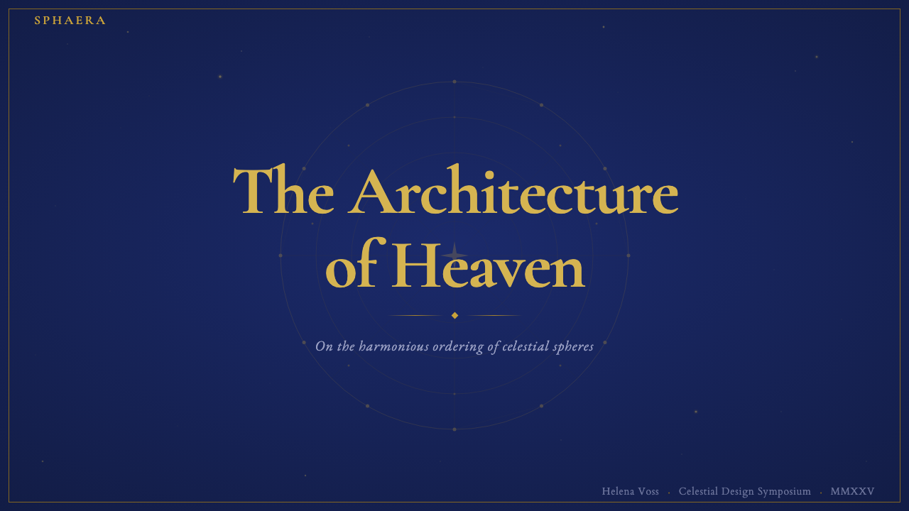
For presentation slides, this system works best on covers and section-break slides, where visual impact is the primary goal. A cover plate following Cellarius principles uses the deep ultramarine as a full-bleed background, positions a circular or radial graphic element at centre (a constellation diagram, an armillary sphere, a concentric ring composition), and places the title in a large warm-gold serif at the bottom or in a cartouche-framed inset. Content slides should shift to a light, near-white background — attempting to sustain the full atlas aesthetic across data-dense slides makes them illegible. The system's ornamental richness is a cover-page resource, not an all-slides commitment.
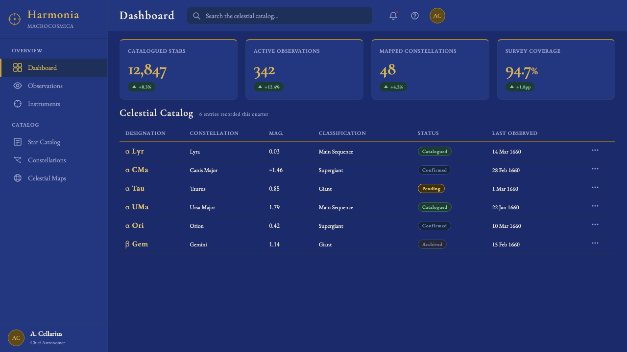
For web interfaces, the style is well-suited to hero sections, landing pages for premium products, and interactive visualizations with a historical or astronomical theme. The full dark-ultramarine treatment is most appropriate for full-width hero blocks or modal overlays; the rest of the interface can pull accent colors from the atlas palette (warm gold, deep blue) against a light ground, maintaining tonal coherence without the visual weight of the atlas throughout. Navigation and typographic elements should remain in the serif register; interfaces that mix the atlas palette with modern sans-serif UI conventions tend to cancel out each other's strengths.
For editorial and marketing work, the style supports luxury-brand aesthetics, cultural-institution materials, and any context where the product is positioned as learned, rare, or historically grounded. A Cellarius-derived editorial spread uses a full bleed of the deep ground on every left page, with the right page in near-white carrying the body text in a refined serif. Drop caps, ornamental rules derived from the cartouche ornament, and small celestial illustrations in the margins extend the system into the body of the text without overwhelming it. Pull quotes can be set in warm gold against the deep ground, making them visible as a distinct textual register without requiring a separate design language.
The most common mistake when applying this system is treating the gold as a color to be used freely across all elements — buttons, icons, background tints, hover states. In the source material, gold appears exclusively as line work and small-scale detail: star points, constellation outlines, cartouche frames, small type. When gold becomes a fill color or a background treatment, it loses its luminous contrast against the deep ground and the entire hierarchy collapses into visual noise. Gold is a precision instrument in this system, not a general accent color; every application of it should earn its place by tracing something structural or labeling something significant.
Cellarius Celestial Atlas — FAQ
Is this style appropriate for modern SaaS or tech products?
It depends entirely on what the product is communicating about itself. The Cellarius system signals antiquarian authority, scholarly luxury, and historical depth — qualities that read as aspirational for certain products (premium research tools, cultural platforms, high-end data visualization, astrological or astronomical applications) and as stylistic incongruence for others (productivity SaaS, consumer fintech, fast-moving startup contexts). The question to ask is whether 'historically grounded, painstakingly crafted, rare' is the brand territory you want to occupy. If yes, the style is a powerful tool; if the product needs to read as fast, lightweight, or modern-tech-native, this system will work against it.
How does this style differ from other dark, ornate aesthetics like Art Nouveau or Victorian Gothic?
The critical difference is the role of geometry. Art Nouveau ornament flows from organic, botanical curves — sinuous lines derived from plant forms, naturalistic figures, asymmetric compositions that resist the grid. Victorian Gothic borrows from medieval ecclesiastical architecture — pointed arches, tracery, deep saturation, symbolic darkness. The Cellarius system, by contrast, is scientifically geometric at its core: its circular forms are not decorative choices but mathematical necessities derived from celestial mechanics. The ornament exists at the periphery, framing a precise geometric center; it never colonizes the structural elements themselves. This gives the Cellarius aesthetic a discipline and legibility that neither Art Nouveau nor Victorian Gothic can match for information-dense applications.
Can the system work on a light background?
A partial light-ground variant is possible and useful, but it requires rethinking what gold does. On a deep ultramarine ground, gold is luminous precisely because it is lighter and warmer than its ground — the contrast is the effect. On a light ground, gold does not glow; it merely appears as a muted amber or ochre. A successful light-ground adaptation of this system shifts the primary contrast to deep ultramarine against the light ground — using the saturated blue as the dominant structural color — and reserves warm gold for small decorative details and accent type. The serif typography and concentric geometry can both translate well to light grounds; the system's structural logic remains intact.
How should constellation or star-field imagery be handled in contemporary interfaces?
Carefully and sparingly. The risk with star-field imagery in digital interfaces is that it quickly reads as generic 'space aesthetic' — the visual language of a thousand screensavers — rather than as the specific Baroque scientific-luxury register that the Cellarius system represents. The distinction lies in precision and restraint. Authentic use of this motif means rendering constellation lines as formal, geometric structures rather than atmospheric scatters; positioning star points as plotted coordinates rather than random sprinkles; and treating the constellation figures as annotating illustrations — present to label and identify, not to overwhelm. Dense atmospheric particle fields have no precedent in the Cellarius source material and should be avoided entirely.
What makes this system feel authentic rather than like a historical pastiche?
The difference between authentic application and pastiche usually comes down to whether the structural principles are understood or just the surface imagery. Surface-level Cellarius pastiche uses ultramarine and gold as color choices, scatters some star images, and calls it done. Authentic application understands why the gold is restrained to linework (it is celestial notation, not decoration), why the geometry is concentric rather than orthogonal (it maps a spherical cosmos, not a flat grid), why the type is in a humanist serif (it carries the authority of the scholarly Latin tradition), and why the ornament is confined to cartouche frames (the periphery enriches the center without competing with it). When those structural reasons are understood and replicated, the result is coherent; when only the surface is copied, the result is costume.
Related design styles
 Armenian ErkatʿagirDevotional lapis reigns. Gold rules and angular serif glyphs frame a sacred g…
 Bhutanese Drukpa Kagyu ThangkaDevotion made cobalt. Gold frames, Cormorant serif, and vermilion marks hold…
 Bird of Paradise MonographTheatrical plate-book darkness. Flame plumes blaze from a bordered forest-bla…
 Book of Kells Celtic (800)Sacred and precise. Vellum cream, lapis, vermilion, and gold knotwork.
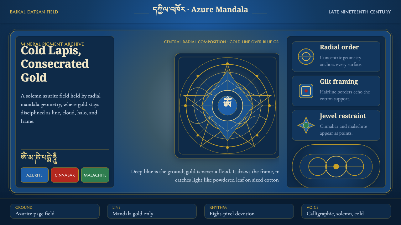 Buryat Buddhist Datsan ThangkaCold lapis holds silence. Gold mandala lines frame a solemn azurite field.
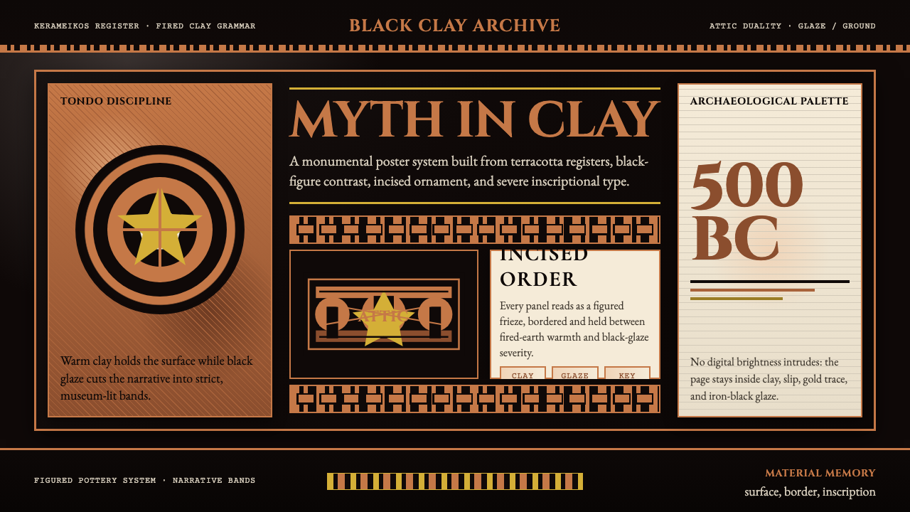 Greek Vase Attic (500 BC)Archaeological severity. Jet-black glaze, terracotta bands, and meander borde…