What is Orchid Conservatory?
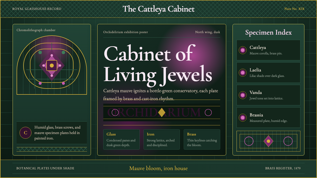
Orchid Conservatory bottles the Victorian obsession with rare tropical flowers behind glass and cast iron, letting cattleya mauve bloom against deep bottle-green ironwork under a humid hothouse glow.
Orchid Conservatory in brief
Orchid Conservatory is a design system built from a very specific nineteenth-century British obsession: orchidelirium, the collecting mania that sent plant hunters into the tropics to bring back impossibly exotic blooms for wealthy patrons to grow in glass-and-iron hothouses at home. The system's entire visual identity comes from standing inside one of those structures — a conservatory dense with foliage, humid air, and cast-iron framing holding up walls of glass.
Its color language pairs a rich cattleya mauve-magenta, echoing one of the most prized orchid genera of the era, against a deep bottle-green that stands in for painted structural ironwork. Brass fittings and hardware add a warm metallic note wherever a structural joint or fastening would plausibly appear. The overall feeling is lush and slightly dim, lit the way a real glasshouse is lit — filtered, diffused, and greenish through the glass and layered leaves.
Detail is meant to feel dense rather than sparse: the system draws on the visual conventions of chromolithograph botanical illustration, the era's method for reproducing flower studies in accurate, saturated color for scientific and collector's publications. Combined with arched conservatory curves and iron-lattice structure, the result reads as a framed botanical plate set into a shaded, plant-crowded interior rather than a flat decorative pattern.
Where does Orchid Conservatory come from?
Orchidelirium describes the intense collecting craze for orchids that gripped wealthy Britain through much of the nineteenth century, reaching its peak in the mid-to-late Victorian decades. Orchids were prized precisely because they were difficult: many species came from remote tropical forests, were slow and finicky to cultivate, and demanded the kind of controlled humid warmth that only an expensive, purpose-built glasshouse could provide. Owning a thriving orchid collection was therefore a direct display of wealth, patience, and access to distant empire — a living trophy rather than a static one.
The infrastructure that made this possible was itself a landmark of the era's engineering ambition. Advances in cast-iron framing and large-pane glass manufacturing allowed architects to build structures with far more glazed surface and far less solid wall than had previously been possible, letting daylight and warmth flood interior spaces year-round. The gardener and architect Joseph Paxton became the era's most celebrated practitioner of this technique, first perfecting glasshouse design at Chatsworth House for the Duke of Devonshire, then scaling the same principles up to the Crystal Palace, built for the 1851 Great Exhibition. The Royal Botanic Gardens at Kew built its own monumental example, the Palm House, designed by Decimus Burton and completed in 1848, using curved wrought-iron ribs to create a cathedral-like glass volume specifically to house tropical specimens.
Supplying the demand for exotic orchids became a commercial enterprise in its own right. Nurseries such as the Veitch family's operation sponsored plant-hunting expeditions to Central and South America, Southeast Asia, and the Pacific, competing to be first to bring back and successfully propagate newly discovered species. Frederick Sander, an orchid importer and nurseryman who styled himself the 'Orchid King,' built one of the largest such businesses of the period, cataloguing and supplying rare specimens to collectors across Europe.
The visual record of this obsession survives largely through botanical chromolithography — a color printing process capable of reproducing the saturated, precise color of a living flower far more faithfully than earlier hand-tinted engravings. These illustrated botanical publications, commissioned by nurseries and collectors alike to document new discoveries, are the direct visual ancestor of the system's rich, detailed floral imagery.
Orchid collecting also carried real risk and real cost, which is part of why it read as a display of status rather than a simple hobby. Plant hunters faced long sea voyages, disease, and outright failure — orchids are notoriously difficult to keep alive in transit, and entire shipments were regularly lost before ever reaching a British hothouse. The rarest specimens changed hands for sums comparable to fine art or jewelry, and a collector's glasshouse, staffed by dedicated gardeners who understood the exacting humidity and temperature each species required, functioned as a working laboratory as much as a showpiece.
What defines the Orchid Conservatory look?
Color
The palette pairs a rich cattleya mauve-magenta bloom color against a deep bottle-green that stands in for painted cast-iron structure, with warm brass accents at fittings and joints. Nothing in the system is pale or high-key; every hue is saturated and slightly darkened, consistent with the filtered, greenish light inside a planted glasshouse.
Iron-Lattice Structure
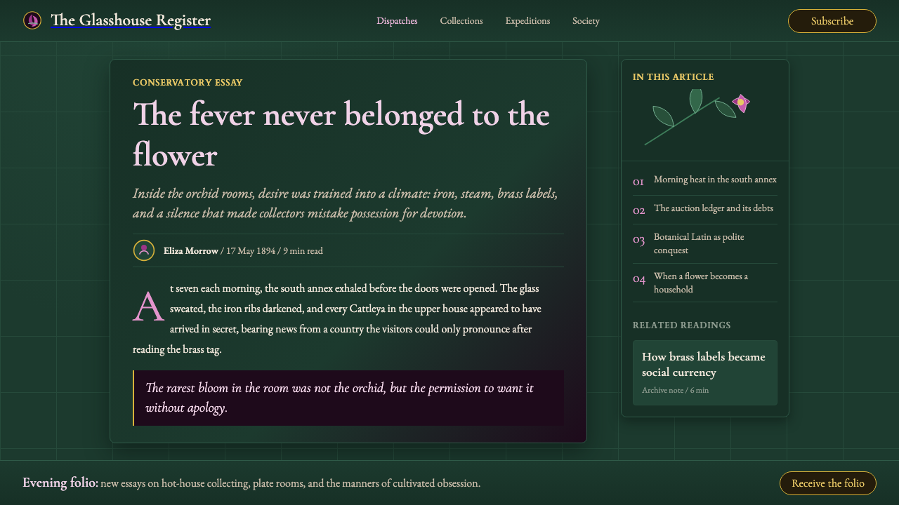
Structural elements borrow directly from Victorian glasshouse engineering: slender ribbed frameworks, arched curves, and a lattice logic that divides a surface into a grid of glazed panels. This structure is load-bearing in the visual sense — it organizes content the way iron ribs organize panes of glass, rather than acting as a decorative border.
Botanical Illustration
Floral imagery follows the conventions of chromolithograph botanical plates: precise, saturated, and scientifically observed rather than loosely painterly. Blooms are rendered with the accuracy of a specimen study meant for identification, not a stylized decorative motif — every petal and vein reads as if drawn from a real, specific flower.
Density and Foliage
The system deliberately avoids open, minimal composition. Leaves, vines, and layered plant forms crowd the edges and background the way a working conservatory is genuinely dense with growth, giving every panel a lush, slightly enclosed feeling rather than an airy one.
Glasshouse Light
Lighting throughout the system reads as filtered and humid rather than crisp and direct — the way daylight actually behaves once it has passed through layers of glass panes and overhanging foliage. This softens contrast and gives even bright accents a slightly muted, greenhouse-warmed quality.
Brass Detailing
Metal accents appear only where a real structural fastening would occur — hinges, rivets, framing joints — rendered as warm brass rather than cold chrome or steel. This detail signals period authenticity and adds a small note of luxury against the otherwise botanical, plant-dominated surface.
Who shaped Orchid Conservatory?
A gardener and self-taught architect who perfected large-scale glasshouse design at Chatsworth House for the Duke of Devonshire before scaling the same cast-iron-and-glass principles up to the Crystal Palace for the 1851 Great Exhibition, making him the era's most influential figure in the engineering that made orchid cultivation at scale possible.
An architect who designed the Palm House at the Royal Botanic Gardens, Kew, completed in 1848, using curved wrought-iron ribs to create a soaring, cathedral-like glass structure built specifically to shelter tropical plant collections including orchids.
An orchid importer and nurseryman who styled himself the 'Orchid King' and built one of the largest orchid-supply businesses of the Victorian period, sponsoring plant-hunting expeditions and cataloguing rare species for collectors across Europe.
A family-run nursery dynasty that sponsored numerous plant-collecting expeditions to Central and South America, Southeast Asia, and the Pacific, competing to discover and successfully propagate new orchid species and helping to fuel the collecting mania that gives the system its name.
How do you use Orchid Conservatory today?
Orchid Conservatory works best when it is allowed to feel dense and slightly enclosed rather than airy — the goal is to make a viewer feel they have stepped inside a working nineteenth-century glasshouse, not that they are looking at a floral wallpaper pattern applied to a modern layout.
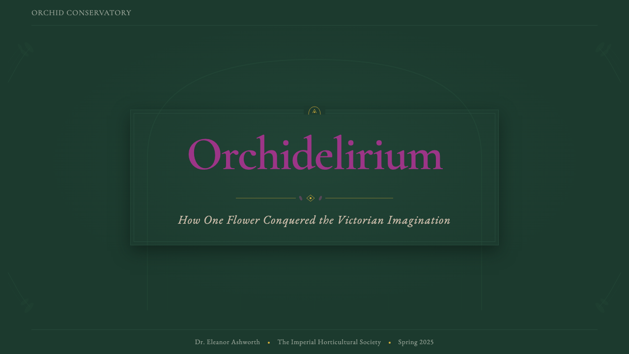
On presentation slide covers, the style suits a composition built around a single dramatic bloom or cluster of orchids set against the bottle-green iron-lattice structure, with the title treated almost like a specimen label rather than a bold modern headline. Content slides benefit from framing text within an implied glasshouse panel — a bordered section suggesting a single pane of glass — rather than letting text float on an open background. Data visuals can be rendered as if pressed into a botanical plate: charts framed with a thin ornamental border feel more at home in this system than charts floating free.
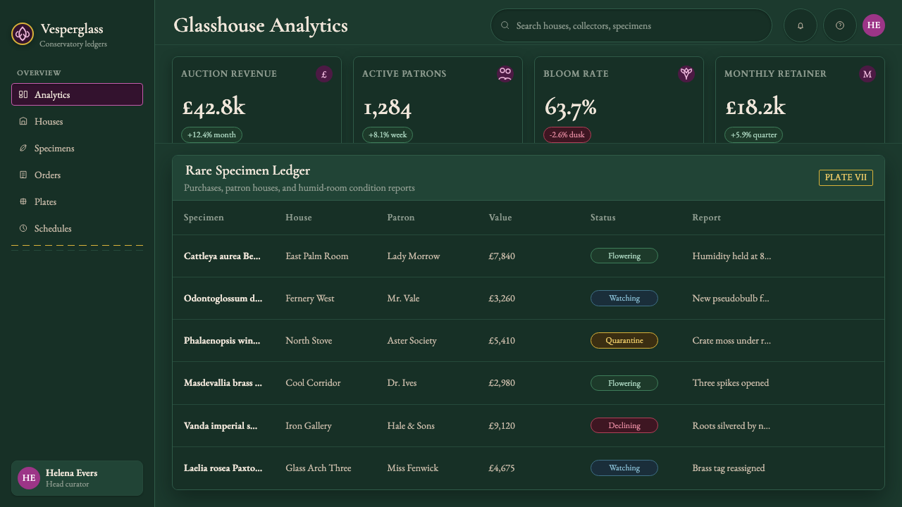
For web interfaces, the palette and density suit dashboards or product pages for anything premium, botanical, or heritage-adjacent — wellness brands, fine goods, hospitality. The deep bottle-green and mauve work well as a rich dark-mode alternative to typical black-and-white dashboards, with brass used sparingly for the single most important interactive element on a screen so it does not compete with the botanical imagery.
In editorial and marketing contexts, the system is well suited to long-form writing about craft, horticulture, natural history, or luxury heritage brands, where a reader benefits from feeling immersed rather than briefed. Marketing pages should let a small number of large, detailed botanical images carry most of the emotional weight, with supporting text kept restrained so it does not compete with the density of the illustration.
The most common mistake is treating the style as simply 'floral wallpaper' — applying flower patterns at low saturation across a flat, evenly lit background without the iron-lattice structure or the greenhouse's characteristic filtered light. Without the structural ironwork and the slightly dim, humid lighting, the system loses the specific nineteenth-century glasshouse feeling and collapses into generic botanical decoration.
Orchid Conservatory — FAQ
Is Orchid Conservatory just a floral pattern with a Victorian color scheme?
No — the color scheme is only one part of the system. What defines Orchid Conservatory is the combination of botanical imagery with the physical architecture of a Victorian glasshouse: iron-lattice framing, arched structural curves, brass fittings, and filtered, humid light. A flat floral pattern without that structural and lighting logic reads as generic decoration rather than as the specific historical setting the style is drawn from.
Why is bottle-green paired with cattleya mauve specifically?
The pairing directly reflects what a real Victorian conservatory looked like: painted cast-iron structural framing was very commonly finished in a deep bottle-green, and cattleya orchids — among the most prized and widely cultivated genera of the era — bloom in exactly that rich mauve-magenta range. The two colors are historically observed together rather than chosen for abstract color-theory reasons, which is part of what gives the system its specific, non-generic feel.
Can this style work in a bright, minimal layout?
It resists that direction more than most historical styles because its identity depends on density and filtered light — a real conservatory is crowded with plants and dimmed by layers of glass and leaves. Stripping away that density in favor of a bright, spare layout removes the very quality that makes the style recognizable. Where more breathing room is needed, it is better achieved through larger single botanical images with generous surrounding space, rather than by lightening the palette or thinning out the iron-lattice structure.
What kind of content should avoid Orchid Conservatory?
The style is a poor match for anything that needs to feel fast, minimal, or technologically forward — developer tools, productivity software, or brands built around speed and efficiency will feel weighed down by its deliberate density and period detail. It also does not suit content requiring high scannability with lots of competing data, since its rich imagery and filtered lighting are designed to slow a viewer down and invite lingering rather than quick scanning.
Related design styles
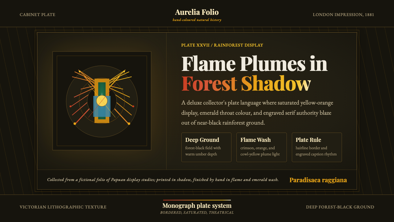 Bird of Paradise MonographTheatrical plate-book darkness. Flame plumes blaze from a bordered forest-bla…
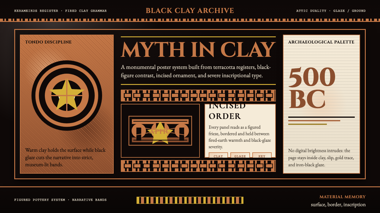 Greek Vase Attic (500 BC)Archaeological severity. Jet-black glaze, terracotta bands, and meander borde…
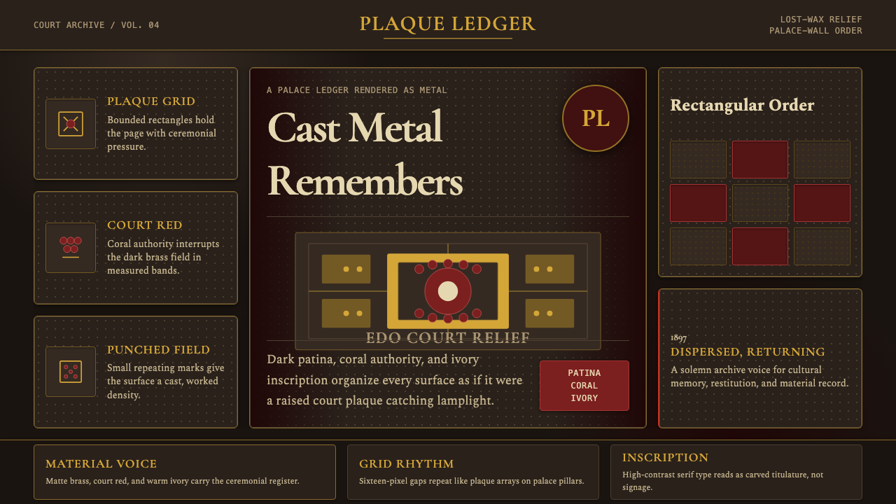 Benin Bronze Oba CourtCourt gravity in cast metal. Patinated brass grid, coral red panels, ivory se…
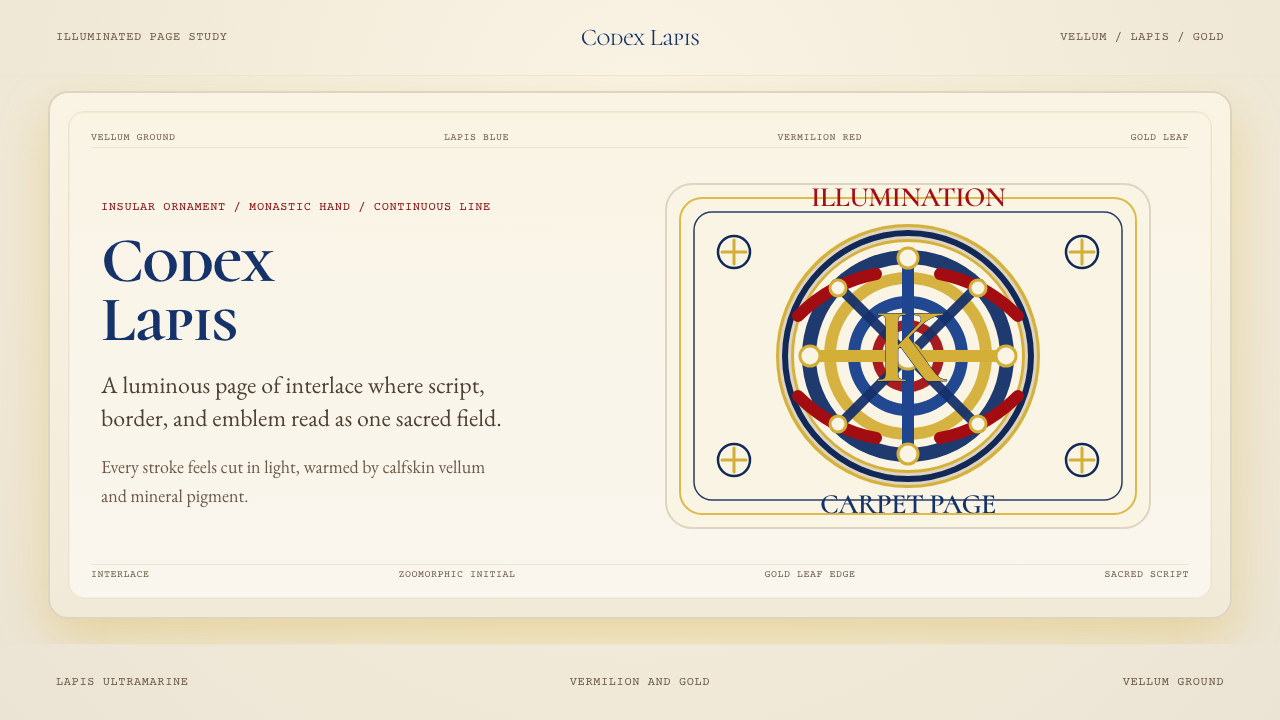 Book of Kells Celtic (800)Sacred and precise. Vellum cream, lapis, vermilion, and gold knotwork.
 Burmese Shwedagon Stupa ReliefGold refuses restraint. Velvet black, teak-red lacquer, and tiered gradients…
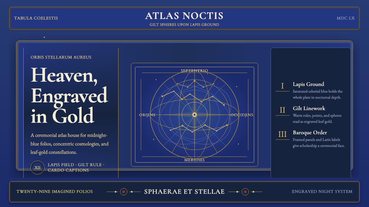 Cellarius Celestial AtlasCelestial luxury on lapis. Gilt serif type, star fields, and concentric chart…