What is Pompeii Fresco Villa of Mysteries?什么是 Pompeii Fresco Villa of Mysteries?
Two thousand years of volcanic ash could not dim the saturated cinnabar red of the Villa of the Mysteries — the most complete narrative wall-painting to survive from the ancient world.两千年的火山灰无法淡褪神秘别墅那饱和的朱砂红——这是古代世界现存最完整的叙事性壁画。
Pompeii Fresco Villa of Mysteries in briefPompeii Fresco Villa of Mysteries 速览
The Pompeii Fresco Villa of Mysteries design language is drawn directly from the most celebrated room in Roman painting: the triclinium frieze of the Villa of the Mysteries outside Pompeii, where twenty-nine life-size figures enact an unidentified Dionysiac ritual against a ground of intense cinnabar red. The style takes that monumental wall as its organizing principle — treating every surface as a plaster field divided into structural panels, every color as a mineral substance with material memory, and every line as the deliberate mark of a painter working fresco, where each stroke is permanent from the moment it touches wet lime.庞贝壁画神秘别墅设计语言直接源自罗马绘画中最负盛名的一间房间:庞贝城外神秘别墅的三斜榻厅(triclinium)壁画带,二十九尊真人大小的人物在强烈的朱砂红底色上演绎一场身份不明的狄俄尼索斯秘仪。这种风格将那面纪念碑式的墙壁作为组织原则——将每一个表面视为划分成结构性面板的灰泥场域,将每一种颜色视为承载物质记忆的矿物质,将每一条线视为湿壁画画家刻意留下的痕迹,因为每一笔触碰湿石灰的瞬间便已永恒。
The visual system rests on three primary materials translated into design: Pompeian red as the dominant page ground, cream lime-plaster as the field for content, and imperial gold as the accent that frames and elevates. Against these grounds, figures and text are rendered in the ochre-brown outlines characteristic of late Republican Roman wall-painting — a line quality that is simultaneously architectural and figurative, borrowed from the Second Pompeian Style tradition in which painted columns, pediments, and receding architectural vistas gave flat walls the illusion of depth without abandoning their identity as walls.这套视觉系统建立在三种基本材料的设计转译之上:庞贝红作为主导的页面底色,奶油色石灰膏作为内容承载面,帝国金作为框定与提升层次的点缀色。在这些底色之上,人物与文字以晚期共和国罗马壁画特有的赭褐色轮廓线呈现——这种线条品质同时兼具建筑性与具象性,借鉴自庞贝第二风格传统:那种风格中,绘制的柱廊、山墙与退远的建筑透视赋予平面墙壁深度幻觉,却并不放弃其作为墙壁的本质属性。
What distinguishes this style from generic classicism is its material specificity. The cinnabar used in ancient frescoes was among the most expensive pigments of the Roman world, produced from mercury ore mined in Spain, and its intensity was understood as a mark of patronal ambition. The cream of lime plaster carries the warmth of calcium carbonate aged over centuries, not the bright white of modern paint. The gold of gilded stucco ornament is warm and slightly matte — refined metal applied by hand — not the sharp metallic of digital gradients. Every color in the system carries the memory of a substance and a process.区别这种风格与普通古典主义的,是其材料的特殊性。古代壁画中使用的朱砂是罗马世界最昂贵的颜料之一,由西班牙汞矿提炼,其强烈的色彩被理解为赞助人雄心的标志。石灰膏的奶油色承载着碳酸钙历经数百年陈化的温暖,而非现代涂料的明亮白色。镀金灰泥装饰的金色是温暖而略带亚光的——手工施加的精炼金属——而非数字渐变的锐利金属感。系统中的每一种颜色都承载着一种物质与一个过程的记忆。
See the Pompeii Fresco Villa of Mysteries design system查看 Pompeii Fresco Villa of Mysteries 完整设计系统
Where does Pompeii Fresco Villa of Mysteries come from?Pompeii Fresco Villa of Mysteries 从何而来?
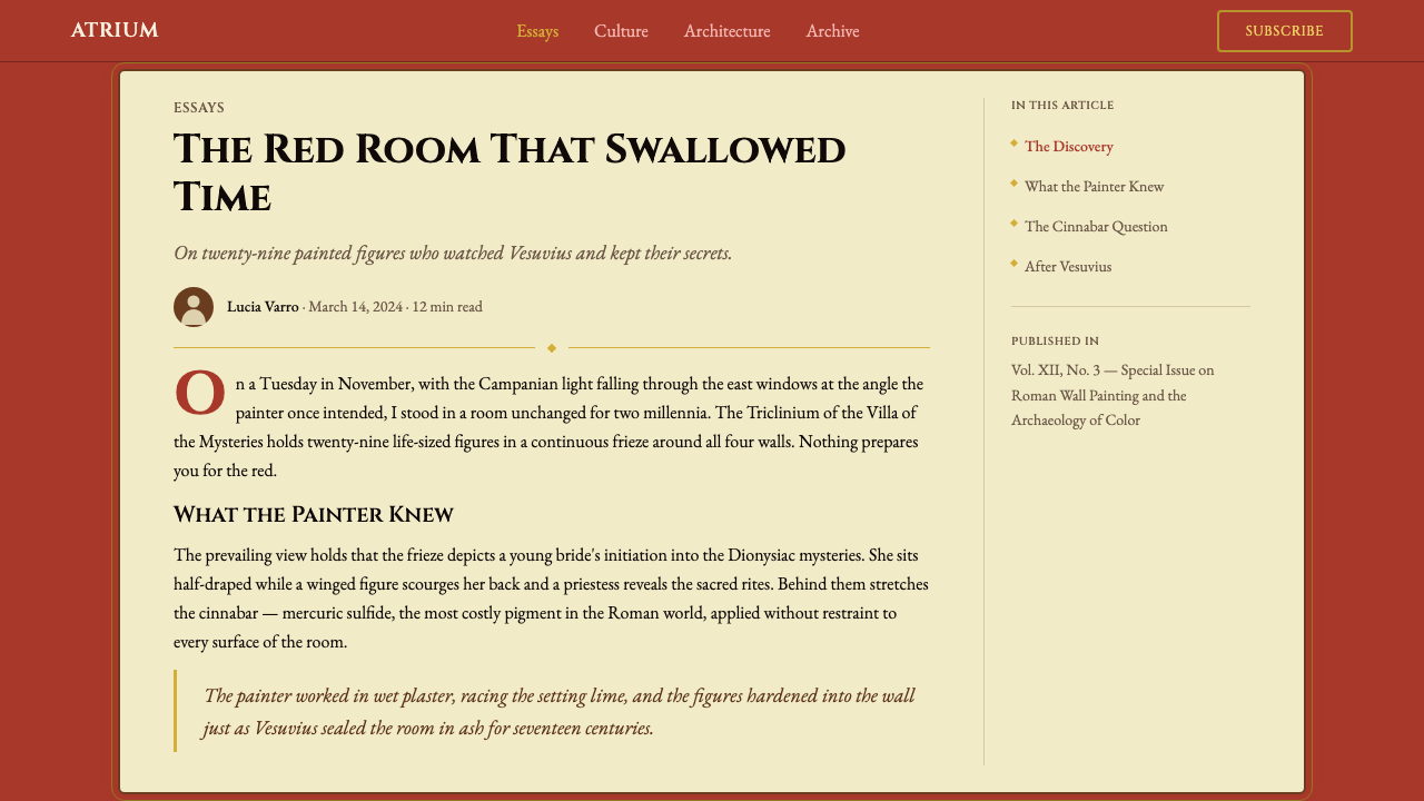
The Villa of the Mysteries was a large suburban estate on the western edge of Pompeii, roughly half a kilometer outside the Herculaneum Gate. Its most important room — the room from which the villa takes its modern name — was decorated sometime around 70 BCE in the mature Second Pompeian Style. The frieze runs continuously around three walls of the room, presenting what appears to be an initiation sequence into the mystery cult of Dionysus, the god of wine, ecstasy, and transformation. The figures include a terrified young woman, a winged female figure wielding a whip, a reclining Dionysus, a satyr gazing into a bowl, and a kneeling bride being prepared for ritual. Their identities and the precise meaning of the sequence remain debated by classical scholars, which is itself part of what makes the room compelling: it presents a narrative that was intentionally opaque to the uninitiated.神秘别墅是庞贝城西缘一座大型城郊庄园,位于赫库兰尼姆城门外约半公里处。其最重要的房间——这座别墅现代名称的由来——约在公元前70年以成熟的庞贝第二风格装饰。壁画带连续环绕房间三面墙壁,呈现的似乎是加入狄俄尼索斯——酒神、迷狂与蜕变之神——秘密崇拜的入会仪式。人物包括一名惊恐的年轻女子、一名持鞭的有翼女性形象、斜倚的狄俄尼索斯、凝视钵盂的萨堤尔,以及正在接受仪式准备的跪地新娘。她们的身份与序列的确切含义至今仍是古典学者争论的课题,这本身也是这个房间令人着迷之处:它呈现了一个对门外汉刻意晦涩的叙事。
The eruption of Vesuvius in 79 CE buried the villa under meters of volcanic pumice and ash, preserving it — along with most of Pompeii — until systematic excavation began in 1748. The Villa of the Mysteries was not fully excavated until 1909–1910, under the direction of Vittorio Spinazzola and subsequently Amedeo Maiuri, who served as Superintendent of Antiquities for Campania from 1924 to 1961 and whose extensive publications brought the villa and its fresco to international scholarly attention. The paradox of preservation-by-catastrophe — that the very disaster which destroyed Pompeii is what allowed us to see it — has been a theme in scholarship ever since, and it resonates in the design principle of treating color as a material that endures rather than a surface that refreshes.公元79年维苏威火山的爆发将别墅埋于数米深的火山浮石与火山灰之下,与庞贝大部分遗址一同保存至今——直到1748年系统性发掘开始。神秘别墅直到1909至1910年才被完整发掘,由维托里奥·斯皮纳佐拉主持,随后由阿梅代奥·迈乌里接管——迈乌里自1924年至1961年担任坎帕尼亚文物局局长,其大量出版物使别墅及其壁画进入国际学术视野。灾难性保存的悖论——正是那场摧毁庞贝的灾难使我们得以见到它——此后一直是学术讨论的主题,这一悖论也与设计原则产生共鸣:将颜色视为一种经久的物质,而非一个不断更新的表面。
The cinnabar red that dominates the frieze belongs to a specific Roman decorative tradition known as the red room or Pompeian red interior, in which a deep saturated ground served as both architectural frame and chromatic atmosphere. Roman pigment technology distinguished between several reds — minium (lead oxide), rubrica (iron oxide), and cinnabar (mercury sulfide) — and cinnabar, the most vivid and most expensive, was typically reserved for the most important rooms and the most ambitious patrons. Its use throughout the Villa of the Mysteries frieze signals the scale of the commission and the status of whoever owned the villa, still unknown.主导壁画带的朱砂红属于一种特定的罗马装饰传统,称为「红色房间」或庞贝红内室——深度饱和的底色同时充当建筑框架与色彩氛围。罗马颜料技术区分了数种红色——铅丹(氧化铅)、赤土(氧化铁)与朱砂(硫化汞)——朱砂是其中最鲜艳、也最昂贵的,通常只用于最重要的房间和最有雄心的赞助者。朱砂在整个神秘别墅壁画带中的使用,标示着委托的规模以及别墅主人的地位——其身份至今不明。
Post-excavation, the frieze became one of the most reproduced images in the history of classical archaeology. Elaine K. Gazda's scholarship on Roman copies and originals helped situate the Villa frieze within broader debates about the relationship between Greek prototypes and Roman adaptations, and about what constitutes originality in a culture that valued skilled replication as a form of cultural transmission. The color system itself — red ground, cream panel, gold frame — spread far beyond Campania through the excavation publications and subsequent influence on neoclassical interior design in the eighteenth and nineteenth centuries, entering the visual vocabulary of European decorative arts well before it became available as a digital design reference.发掘之后,这幅壁画带成为古典考古学史上被复制最多的图像之一。埃莱恩·K·加兹达关于罗马复制品与原作的学术研究,帮助将神秘别墅壁画置于关于希腊原型与罗马改编之间关系的更广泛讨论之中,以及关于在一种将熟练复制视为文化传承的文明中何为原创性的讨论。色彩系统本身——红色底面、奶油色面板、金色框架——通过发掘出版物的传播以及对十八、十九世纪新古典主义室内设计的后续影响,早在成为数字设计参考之前,便已远超坎帕尼亚地区,进入欧洲装饰艺术的视觉词汇。
What defines the Pompeii Fresco Villa of Mysteries look?Pompeii Fresco Villa of Mysteries 的视觉特征是什么?
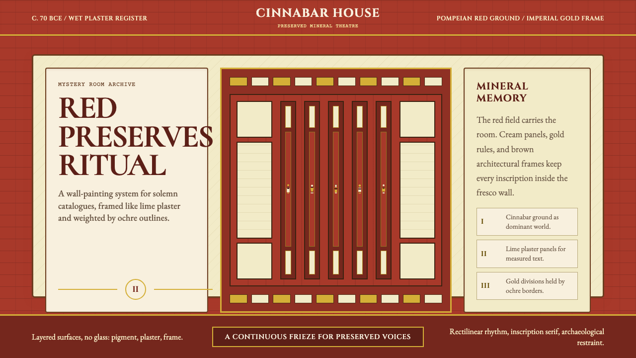
Pompeian Red Ground庞贝红底色
The dominant color of the system is a deep, saturated red derived from cinnabar — mercury sulfide ground to pigment and applied in Roman fresco. It is not a warm orange-red or a cool crimson: it sits in the middle range, intense without being harsh, carrying a slight mineral weight that distinguishes it from purely synthetic reds. In the design system, this red functions as the architectural ground — the wall itself — and content floats above it in cream panels. Using it as a background rather than an accent is essential to the style's authority.这套系统的主导色是源自朱砂的深度饱和红色——硫化汞研磨为颜料后施于罗马湿壁画。它既不是偏暖的橙红,也不是偏冷的深红:它处于中间范围,强烈而不刺眼,带有轻微的矿物质感,使其区别于纯合成红色。在设计系统中,这种红色充当建筑性底色——即墙面本身——内容则在其上的奶油色面板中浮现。将其作为背景而非点缀色使用,是这种风格权威感的关键。
Cream Lime-Plaster Panel石灰膏奶油色面板
Roman fresco technique applied colored pigment to wet lime plaster, and the cream-white of aged plaster — warmer than pure white, cooler than ivory — appears throughout the Villa frieze as the field for figures and architectural detail. In the design system, cream panels are the content zones: text, imagery, and data live here. The off-white is not neutral; it carries the visual temperature of a material that has been fired, applied, and dried. Setting type against cream rather than pure white reduces contrast just enough to give the layout a physical warmth.罗马湿壁画技术将彩色颜料施于湿石灰膏,而陈化石灰膏的奶油白色——比纯白偏暖,比象牙色偏冷——遍布神秘别墅壁画带,作为人物与建筑细节的承载面。在设计系统中,奶油色面板是内容区域:文字、图像与数据都在此处。这种非纯白并非中性;它承载着一种经过煅烧、施涂与干燥的材料的视觉温度。在奶油色而非纯白色上排版,将对比度降低到恰到好处的程度,赋予版面物质性的温暖。
Imperial Gold Ornament帝国金装饰
Gold in Roman decorative arts — applied as gilded stucco, gold leaf, or yellow ochre in fresco — served as the organizing edge: the frame, the border, the threshold between zones. In the design system, gold functions as both structural separator and hierarchical signal. It appears as thin banding around panels, as ornamental details on architectural motifs, and as the accent color for emphasis. The quality of gold in this system is warm and slightly matte, evoking metal applied by hand rather than a mechanical metallic finish.罗马装饰艺术中的金色——以镀金灰泥、金箔或湿壁画中的黄赭石施加——充当组织性边缘:框架、边界、区域之间的门槛。在设计系统中,金色同时作为结构性分隔符和层级信号。它以细带形式出现在面板周围,以装饰细节出现在建筑母题上,并作为强调的点缀色。这套系统中金色的品质是温暖而略带亚光的,唤起手工施加的金属质感,而非机械性的金属光泽。
Ochre-Brown Figural Outline赭褐色人物轮廓线
The figures in the Villa frieze are defined by a warm ochre-brown contour — iron-oxide pigment at lower saturation than the red ground — that gives them their weight and legibility against both red and cream fields. This outline quality is the system's primary figurative tool. In contemporary design application, it translates to illustration styles and icon treatments that use a warm brown stroke rather than black, keeping graphic elements embedded in the fresco palette rather than floating as modern digital objects.神秘别墅壁画带中的人物由温暖的赭褐色轮廓线界定——饱和度低于红色底面的氧化铁颜料——赋予人物在红色与奶油色两种底面上的重量感与可读性。这种轮廓线品质是系统的主要具象工具。在当代设计应用中,它转化为使用温暖棕色描边而非黑色的插图风格与图标处理方式,使图形元素嵌入壁画色板,而非作为现代数字对象漂浮其上。
Architectural Panel Structure建筑性面板结构
The Second Pompeian Style organized wall surfaces into zones separated by painted architectural elements: columns, pilasters, cornices, and entablatures rendered in trompe-l'oeil. The design system inherits this structural logic as a layout principle: every composition is understood as a wall divided into load-bearing zones. Horizontal bands at the top and bottom of the surface anchor the content field, just as a cornice and plinth anchor a Roman wall. This gives layouts a verticality and groundedness that purely grid-based systems sometimes lack.庞贝第二风格通过绘制的建筑元素将墙面组织为分隔的区域:以视觉欺骗手法(trompe-l'oeil)描绘的柱子、壁柱、飞檐与柱顶。设计系统将这种结构逻辑作为版面原则继承:每一个构图都被理解为一面划分为承重区域的墙壁。表面顶部与底部的水平带锚定内容区域,就像飞檐与台基锚定罗马墙壁一样。这赋予版面纯粹网格系统有时所缺乏的垂直感与稳定感。
Monumental Serif Typography纪念碑式衬线字体
Roman lettering — the carved capital inscriptions of monuments, milestones, and dedications — is the typographic reference for this system. The letters are proportioned according to classical optical correction, with strokes that taper to fine serifs evoking the chisel's action on stone. In the design system, this translates to display typography with pronounced stroke contrast, classic proportions, and the weightiness of an inscription rather than the neutrality of a text face. The serifs are not decorative additions; they are the formal residue of the tool and material that originally made the letters.罗马字母——纪念碑、里程碑与献词石碑上刻凿的大写铭文——是这套系统的字体排印参照。字母的比例依据古典光学矫正原则,笔画渐细至精致衬线,唤起凿子在石头上的动作。在设计系统中,这转化为具有明显笔画对比、古典比例以及铭文重量感而非文本字体中性感的展示字体。衬线并非装饰性添加,而是最初制作字母的工具与材料留下的形式痕迹。
Material Grain and Texture材料颗粒感与质地
Fresco is not a smooth medium. The grain of the plaster support, the crystalline structure of mineral pigments, and the slight variations in application created by working in a time-limited wet state all contribute to a surface that is both uniform in color and subtly alive in texture. The design system treats this quality as a principle: flat color fields carry a suggestion of material grain rather than the absolute smoothness of digital fills. This is achieved through treatment rather than heavy texture overlay — the goal is the memory of a substance, not the simulation of a photograph.湿壁画不是一种光滑的媒介。灰泥基底的颗粒感、矿物颜料的晶体结构,以及在时限性湿润状态中工作所造成的施涂轻微变化,共同创造了一个在颜色上均匀、在质地上却微妙生动的表面。设计系统将这种品质视为原则:平色区域携带材料颗粒感的暗示,而非数字填充的绝对光滑。这通过处理方式而非厚重的纹理叠加来实现——目标是物质的记忆,而非照片的模拟。
See the Pompeii Fresco Villa of Mysteries design system查看 Pompeii Fresco Villa of Mysteries 完整设计系统
Who shaped Pompeii Fresco Villa of Mysteries?谁塑造了 Pompeii Fresco Villa of Mysteries?
The artist or workshop responsible for the Villa of the Mysteries frieze is unknown — Roman fresco painters rarely signed their work, and the distinction between the master who designed the composition and the assistants who executed it is impossible to reconstruct at this distance. What is clear is that the frieze was painted by someone with command of the full Second Pompeian Style vocabulary: controlled foreshortening, psychologically differentiated figures, and a sophisticated understanding of how saturated red interacts with cream and gold at large scale. The anonymity is itself historically significant: it reflects Roman attitudes toward craft, in which the patron's ambition rather than the painter's identity was the legible statement.神秘别墅壁画带的作者或工坊已无从考证——罗马壁画画家极少署名,而在如此久远的距离上,无法区分设计构图的主画师与执行的助手。可以确定的是,这幅壁画出自对庞贝第二风格全部词汇掌握自如者之手:可控的透视缩短、心理上各具特色的人物形象,以及对饱和红色与奶油色、金色在大尺度下如何相互作用的精深理解。这种匿名性本身具有历史意义:它反映了罗马人对工艺的态度——赞助人的雄心而非画家的身份,才是可读的陈述。
Spinazzola directed the excavations at Pompeii from 1910 to 1923, introducing the practice of stratigraphic excavation and in-situ preservation that allowed the Villa of the Mysteries — and much of the Via dell'Abbondanza — to be documented more carefully than earlier nineteenth-century digs. His methodological innovations meant that the contextual relationships between architectural elements, fresco surfaces, and portable objects were preserved and recorded rather than dismantled. The quality of the Villa of the Mysteries as a preserved environment, rather than merely a source of extracted objects, owes substantially to his directorship.斯皮纳佐拉于1910至1923年主持庞贝的发掘工作,引入了地层发掘与原位保护的做法,使神秘别墅——以及丰饶大道的大部分——得以比十九世纪早期发掘更为审慎地记录。他的方法论创新意味着建筑元素、壁画表面与可移动文物之间的语境关系得以保存与记录,而非被拆散。神秘别墅作为一个保存完整的环境而非仅仅作为提取文物的来源,在很大程度上归功于他的主持。
Maiuri served as Superintendent of Antiquities for Campania from 1924 to 1961, making him the dominant figure in Pompeii scholarship for nearly four decades. His monograph on the Villa of the Mysteries, published in 1931, established the interpretive framework — initiation into the Dionysiac mysteries — that continues to shape popular understanding of the frieze. Maiuri also oversaw the physical consolidation of the villa as a site open to visitors, transforming it from an archaeological dig into a cultural monument. His interpretation of the frieze as a ritual sequence rather than a mythological narrative gave the design system its thematic coherence: a continuous story unfolding around a room, experienced by moving through space.迈乌里自1924年至1961年担任坎帕尼亚文物局局长,使他在近四十年间成为庞贝学术研究的主导人物。他1931年出版的神秘别墅专著确立了解读框架——加入狄俄尼索斯秘仪——这一框架至今持续塑造着公众对壁画带的理解。迈乌里还主持了别墅作为对外开放遗址的实体修复工作,将其从考古发掘现场转变为文化纪念地。他对壁画带作为仪式序列而非神话叙事的解读,赋予了设计系统主题连贯性:一个围绕房间展开的连续故事,通过穿越空间的移动来体验。
Gazda, a scholar of Roman art at the University of Michigan, edited the influential volume 'The Villa of the Mysteries in Pompeii: Ancient Ritual, Modern Muse' (2000), which gathered interdisciplinary perspectives on the frieze from classical archaeologists, art historians, and scholars of religion. Her broader work on Roman copying practices and the question of originality in Roman art is directly relevant to the design system: she argued that Roman visual culture valued skilled replication and creative adaptation as legitimate artistic operations, not as lesser alternatives to invention. This framing is useful for understanding how a design system inspired by ancient work can be both historically grounded and genuinely contemporary.加兹达是密歇根大学罗马艺术学者,主编了颇具影响力的论文集《庞贝神秘别墅:古代仪式,现代缪斯》(2000年),汇集了古典考古学家、艺术史学家与宗教学者对壁画带的跨学科视角。她关于罗马复制实践与罗马艺术原创性问题的更广泛研究与本设计系统直接相关:她论证罗马视觉文化将熟练的复制与创造性的改编视为合法的艺术操作,而非发明创造的次等替代。这一框架对于理解一套受古代作品启发的设计系统如何既有历史根基又真正当代,颇具启发意义。
Briullov, the Russian Romantic painter, visited Pompeii in 1827 and was so affected by the excavated city that he produced 'The Last Day of Pompeii' (1833), a monumental canvas that brought the eruption and the ruins to a mass European audience before photography made the site universally accessible. The painting, which toured major European cities and was purchased by the Russian Imperial family, established Pompeii as a romantic and tragic site of cultural imagination. Briullov's engagement with the color of Pompeii — especially its reds — influenced how the site was understood aesthetically by subsequent generations, and his work is part of the chain of reception that eventually made Pompeian red a recognizable design reference.俄罗斯浪漫主义画家布留洛夫于1827年造访庞贝,深受这座已发掘城市的震撼,创作了《庞贝末日》(1833年),一幅在摄影使该遗址获得普遍可及之前便将火山爆发与废墟带给欧洲大众的巨幅画作。这幅画巡展欧洲主要城市,并被俄罗斯皇室收藏,确立了庞贝作为文化想象中浪漫而悲剧性场所的地位。布留洛夫对庞贝色彩——尤其是其红色——的处理,影响了后世对该遗址美学的理解,他的作品是最终使庞贝红成为可辨认设计参照的接受链条的一部分。
How do you use Pompeii Fresco Villa of Mysteries today?今天怎么用 Pompeii Fresco Villa of Mysteries?
The Pompeii Fresco Villa of Mysteries style is not a neutral framework — it carries the weight of ritual, monumentality, and material history. Applying it correctly requires understanding what makes it different from other classically derived styles: it is warm where neoclassicism tends to be cool, material where art deco tends to be abstracted, and narrative where other ancient-inspired systems tend to be ornamental. The decision to use it should begin with the question of whether the content has the gravity the style demands.庞贝壁画神秘别墅风格并非一套中性框架——它承载着仪式、纪念性与物质历史的重量。正确应用它需要理解是什么使它区别于其他古典衍生风格:它在新古典主义偏冷的地方是温暖的,在装饰艺术偏抽象的地方是物质性的,在其他古代灵感系统偏装饰性的地方是叙事性的。使用它的决定应从一个问题开始:内容是否具有这种风格所要求的分量。
For presentation slides, the style works most powerfully when the red ground is used as an actual background rather than an accent. A cover slide with the cinnabar red occupying the full surface, a cream panel centered or offset for the title, and a thin gold rule framing the panel creates an immediate sense of authority. Content slides work best when they treat the cream field as the primary content zone, with the red visible only as a border or band — this prevents the dominant color from competing with text legibility. Data slides benefit from the panel system: charts and graphs seated within cream-bordered zones on a red ground take on the quality of framed artifacts rather than floating digital objects.在演示文稿中,当红色底面作为真正的背景而非点缀色使用时,这种风格最具力量。一张全面铺设朱砂红、奶油色面板居中或偏置承载标题、细金线框定面板的封面,立即营造出权威感。内容页最好将奶油色区域作为主要内容区,红色仅作为边框或色带出现——这避免了主导色与文字可读性形成竞争。数据页从面板系统中获益:置于红色底面奶油色边框区域内的图表,呈现出被框定文物的品质,而非漂浮的数字对象。
For web interfaces and dashboards, the style is well suited to contexts where gravitas and distinction are valued over approachability — premium product pages, cultural institution websites, editorial platforms, and high-end portfolio presentations. The approach is to use the red ground for hero sections and structural dividers, cream for content areas and cards, and gold as the interactive accent. Navigation should lean on the monumental serif for wordmarks and primary labels, with generous spacing that echoes the breathing room of the frieze's architectural zones. Avoid using the full Pompeian red on interactive elements like buttons at small scale — at that size the color reads as warning rather than heritage.对于网页界面与仪表板,这种风格适合庄重感与独特性优于亲和力的场景——高端产品页面、文化机构网站、编辑平台与高端作品集展示。方法是将红色底面用于英雄区块与结构性分隔,奶油色用于内容区域与卡片,金色作为交互点缀色。导航应倚重纪念碑式衬线字体处理文字标识与主要标签,以呼应壁画建筑区域呼吸空间的充裕间距。避免在小尺寸按钮等交互元素上使用完整的庞贝红——在那个尺度上,该颜色读来是警告而非历史感。
For editorial and marketing work, the style supports long-form and high-impact applications equally well. A feature article layout can use a red-ground header section with a cream body field below, with gold rules marking section breaks — the architecture of the wall translating directly into page structure. Marketing pages work well with alternating full-width sections in red and cream, creating a rhythm that echoes the alternating figure-ground of the frieze itself. Pull quotes and callouts gain authority when set in the monumental serif against the red ground with gold framing, creating moments that read as inscriptions rather than design elements.对于编辑与营销内容,这种风格同样适合长篇与高冲击力的应用。专题文章版面可以使用红色底面页眉区块,下方接奶油色正文区,以金线标记段落分隔——墙壁的建筑结构直接转化为页面结构。营销页面适合以红色与奶油色交替的全宽区块,创造呼应壁画本身图底交替节奏的韵律。引文与标注在以纪念碑式衬线字体呈现、红色底面配金色框架时获得权威感,创造出读来如铭文而非设计元素的时刻。
The most common mistake when working with this style is applying it as a color scheme alone — taking the red, cream, and gold without the structural logic that makes them cohere. A red background with modern sans-serif type and card-based layout does not produce a Pompeian result; it produces an anachronism that looks neither historical nor contemporary. The style requires committing to the panel architecture, the serif typography, and the material weight of each color. A second common mistake is adding too much gold: in the actual fresco, gold functions as a thin organizing line, not a fill color. Used as a fill, it quickly overwhelms the red-cream balance and tips the palette from monumental to merely opulent.使用这种风格时最常见的错误,是仅将其作为配色方案来应用——拿走红色、奶油色与金色,却不带走使它们融贯的结构逻辑。红色背景配以现代无衬线字体和卡片式版面,产生的不是庞贝风格,而是一种既不历史又不当代的时代错置。这种风格要求承诺于面板建筑结构、衬线字体排印以及每种颜色的物质重量。第二个常见错误是使用过多的金色:在真实壁画中,金色作为细细的组织性线条发挥功能,而非填充色。作为填充色使用时,它很快便压倒了红色与奶油色的平衡,使色板从纪念碑式滑向单纯的华丽。
See the Pompeii Fresco Villa of Mysteries design system查看 Pompeii Fresco Villa of Mysteries 完整设计系统
Pompeii Fresco Villa of Mysteries — FAQPompeii Fresco Villa of Mysteries · 常见问题
How does this style differ from generic neoclassicism or the Grand Tour aesthetic?这种风格与泛泛的新古典主义或壮游美学有何不同?
Neoclassicism, particularly in its eighteenth-century European form, tended toward the cool, pale, and restrained — white marble as the dominant reference, with classical motifs applied as surface decoration to essentially modern structures. The Villa of the Mysteries style begins instead from warm, saturated color as the architectural ground, and treats classical elements not as applied ornament but as load-bearing structure. The difference is between a building with classical columns applied to a modern facade and a room whose walls are themselves the art. The fresco tradition is also specifically Roman and specifically Campanian — not Athenian, not Renaissance, not generic antiquity.新古典主义,尤其是其十八世纪欧洲形态,倾向于冷峻、淡雅与克制——以白色大理石为主要参照,将古典母题作为表面装饰施加于本质上属于现代的结构之上。神秘别墅风格则从温暖、饱和的颜色作为建筑性底色出发,将古典元素视为承重结构而非附加装饰。这一差异类似于一栋在现代立面上附加古典柱廊的建筑与一间墙壁本身即为艺术的房间之间的差异。湿壁画传统也是特定属于罗马的、特定属于坎帕尼亚的——不是雅典风格,不是文艺复兴风格,不是泛化的古代风格。
Can this style work on a light or white background, or does it require the red ground?这种风格能用在浅色或白色背景上吗,还是必须使用红色底面?
The style can be adapted to light-ground applications, but it requires careful reconfiguration. Without the red as dominant ground, the cream becomes the primary surface and the red shifts to the role of accent — more similar to a classical interior detail palette than to the Villa frieze itself. This is a legitimate variation, particularly for contexts where the full red would be too intense for long-form reading (editorial body text, technical documentation). The risk is that a light-ground version without the red's presence can drift toward generic warm classicism. To maintain the system's identity in a light-ground variant, the gold and ochre-brown elements must carry more structural weight, and the typography must lean more explicitly on monumental forms.这种风格可以适应浅色底面的应用,但需要审慎的重新配置。没有红色作为主导底色,奶油色成为主要表面,红色转变为点缀色——更接近古典室内细节色板而非神秘别墅壁画本身。这是一种合理的变体,尤其适合完整红色对于长篇阅读过于强烈的场景(编辑性正文、技术文档)。风险在于,缺乏红色存在感的浅色底面版本可能漂移向泛化的暖色古典主义。为在浅色底面变体中维持系统的身份,金色与赭褐色元素必须承担更多结构重量,字体排印必须更明确地倚重纪念碑式形态。
How should imagery and photography be integrated into this style?图像与摄影应如何融入这种风格?
Photography in this system works best when it is treated with the same material logic as the fresco pigments — which means avoiding the clean, high-resolution, color-accurate aesthetic of contemporary stock photography. Images benefit from treatments that warm the color temperature, add a slight grain or texture consistent with the material palette, and reduce the dynamic range toward the tonal relationships of mineral pigment on plaster. Figurative imagery — portraiture, architectural photography, still life — integrates more naturally than landscape or abstract photography. When photography is used alongside the red and cream palette, it typically occupies a cream panel zone rather than the red ground, to prevent visual competition. Illustration that follows the ochre-brown outline convention is often more successful than photography for primary visual elements.在这套系统中,摄影在以与壁画颜料相同的物质逻辑处理时效果最佳——这意味着避免当代图库摄影的清洁、高分辨率、色彩准确的美学。图像从使色温变暖、添加与材料色板一致的轻微颗粒感或质地、将动态范围压缩向矿物颜料在灰泥上的色调关系等处理中获益。具象图像——人像、建筑摄影、静物——比风景或抽象摄影更自然地融合。当摄影与红色和奶油色色板并用时,它通常占据奶油色面板区域而非红色底面,以防止视觉上的竞争。遵循赭褐色轮廓线惯例的插图,对于主要视觉元素往往比摄影更为成功。
Is this style appropriate for digital products with accessibility requirements?这种风格适用于有无障碍要求的数字产品吗?
The core palette presents specific accessibility considerations. Pompeian red as a background color requires careful attention to the contrast ratio of any text placed against it — cream or near-white type on the saturated red will typically meet contrast requirements, but mid-tone colors introduced for hierarchy on the red ground may not. The cream-on-red combination that the style depends on for its primary content zones is generally accessible for display text at larger sizes; body text at reading sizes benefits from being placed on the cream panel with dark type rather than reversed out of the red. Gold as an interactive element requires supplementary signaling (shape, underline, or position) since it cannot carry sufficient contrast on its own for small interactive text. None of these constraints are obstacles to using the style — they are simply the conditions under which its material logic should be applied.核心色板涉及特定的无障碍考量。庞贝红作为背景色时,需要仔细关注其上任何文字的对比度——在饱和红色上的奶油色或近白色文字通常能满足对比度要求,但为在红色底面上建立层级而引入的中调色彩可能无法满足。这种风格主要内容区域所依赖的红底奶油色组合,对于较大尺寸的展示文字通常是无障碍的;阅读尺寸的正文文字从置于奶油色面板上配以深色文字中获益,而非从红色底面中反白。金色作为交互元素需要辅助信号(形状、下划线或位置),因为它本身无法为小型交互文字提供足够的对比度。这些限制都不是使用这种风格的障碍——它们只是应当在其中应用其物质逻辑的条件。
What kinds of content or products are a poor fit for this style?哪些类型的内容或产品不适合这种风格?
The Villa of the Mysteries style struggles in contexts that call for lightness, playfulness, or immediate approachability. Children's products, casual consumer applications, food and beverage brands where freshness is the primary value, and technology products positioning themselves as minimal or future-oriented will all find the style's weight working against them. The style also requires a certain scale to read correctly: at very small sizes — mobile app icons, small-format social content, compact UI components — the panel architecture collapses and the color system reads as heavy rather than monumental. It is equally misaligned with brands whose identity rests on speed, efficiency, or frictionlessness. The appropriate use cases are products and communications where depth, authority, cultural weight, and a sense of duration are assets rather than liabilities.神秘别墅风格在需要轻盈感、趣味性或即时亲和力的场景中表现欠佳。儿童产品、休闲消费者应用、以新鲜度为主要价值的食品饮料品牌,以及将自身定位为极简或面向未来的科技产品,都会发现这种风格的重量感与其诉求相悖。这种风格还需要一定的尺度才能正确呈现:在极小尺寸下——移动应用图标、小幅社交内容、紧凑的界面组件——面板建筑结构崩溃,色彩系统读来是沉重的而非纪念碑式的。它同样与身份建立在速度、效率或无摩擦感上的品牌格格不入。适合的使用场景是那些深度、权威、文化重量以及持久感是资产而非负担的产品与传播物。
Related design styles相关设计风格
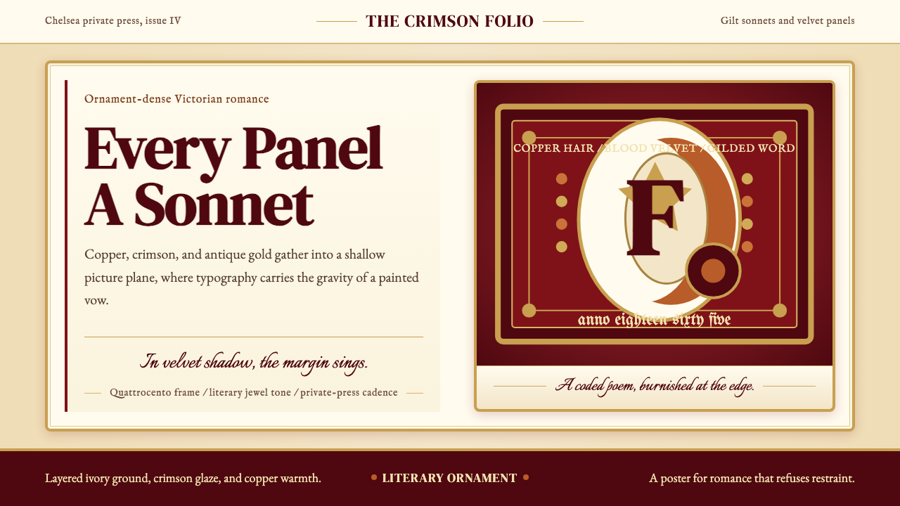 Rossetti — Pre-Raphaelite StunnerRomance refuses restraint. Crimson velvet, copper serif, and gilt frame turn…浪漫拒绝克制:血红天鹅绒、铜色衬线与鎏金画框让文字成诗。
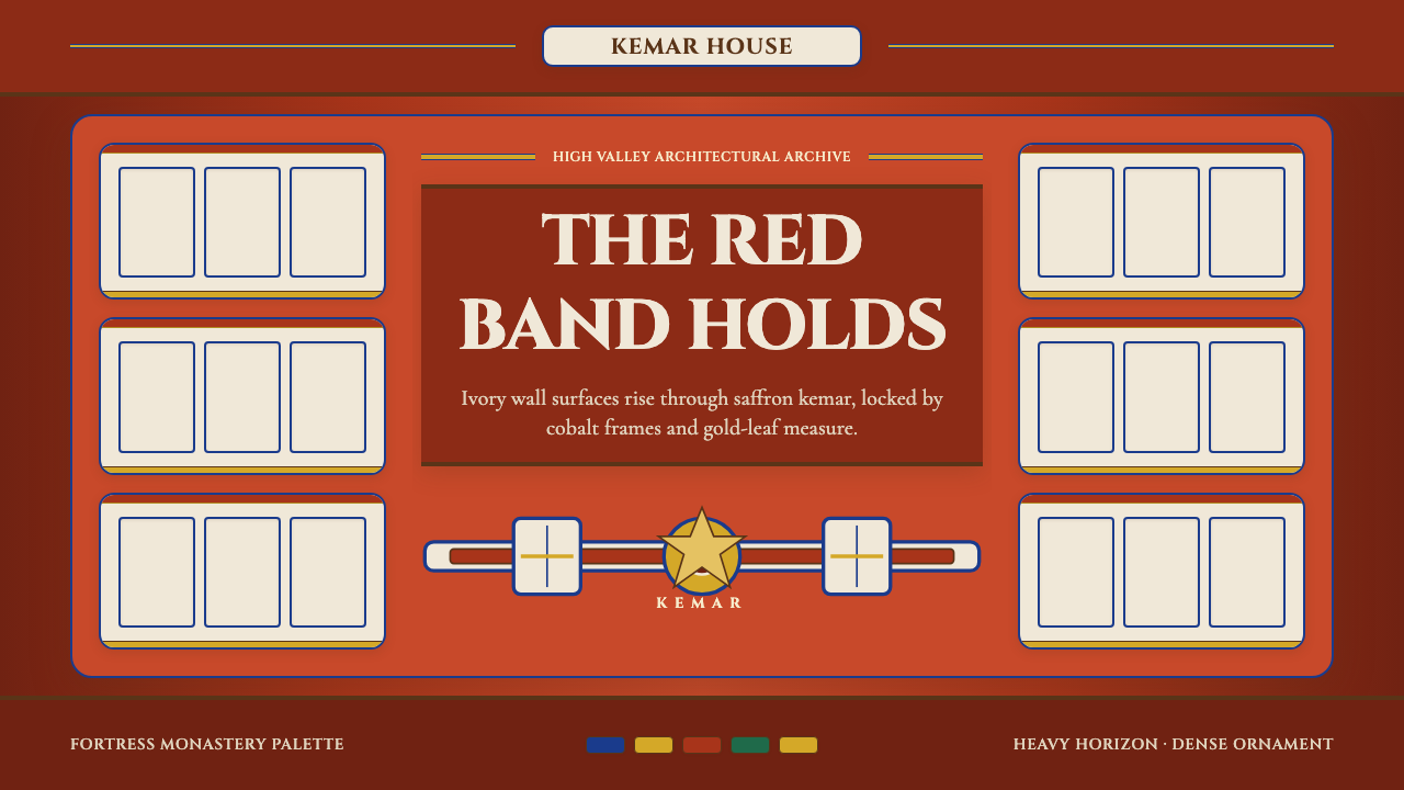 Bhutanese Dzong (Fortress Red)Monumental red holds the page. Cobalt frames and gold bands lock the fortress…厚重藏红掌控页面。钴蓝窗框与金色横带锁定宗堡节奏。
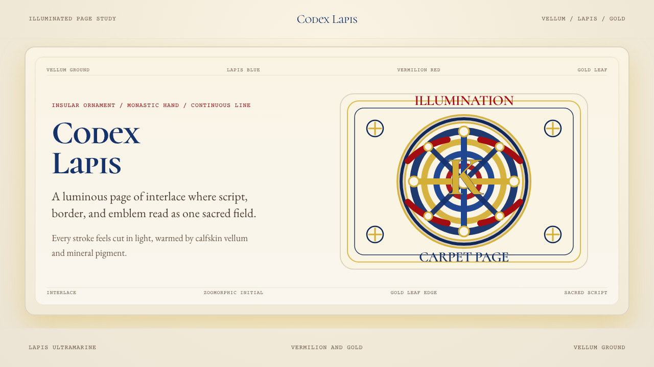 Book of Kells Celtic (800)Sacred and precise. Vellum cream, lapis, vermilion, and gold knotwork.神圣而精密。奶油羊皮底上铺陈青金石、朱砂与金色缠结纹。
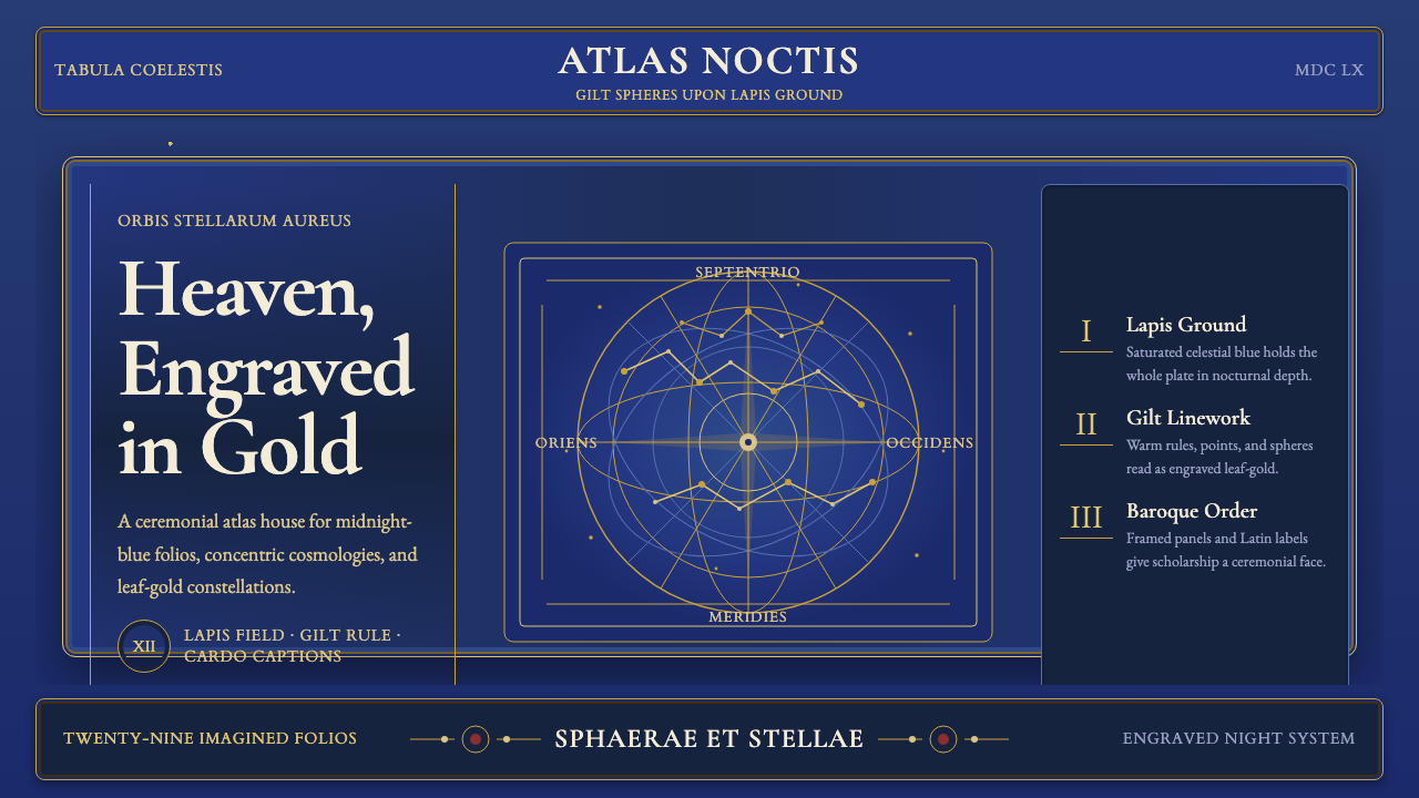 Cellarius Celestial AtlasCelestial luxury on lapis. Gilt serif type, star fields, and concentric chart…青金夜空里的天体奢华:鎏金衬线、星点与同心星图线。
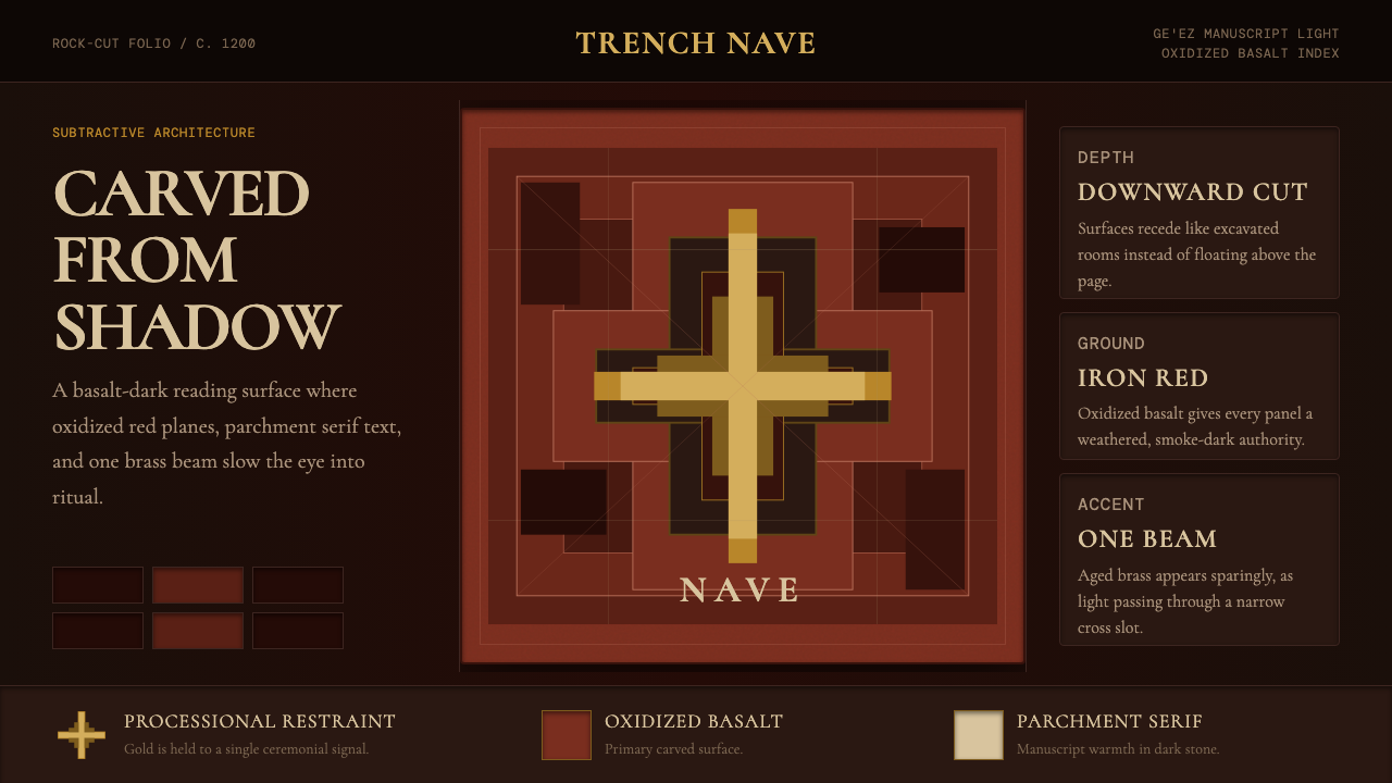 Ethiopian Lalibela Rock-Hewn Church (c.1200)Sacred weight in shadow. Oxidized basalt, parchment serif, and one aged-gold…阴影有圣坛重量。氧化玄武岩、羊皮纸衬线与一束旧金光。
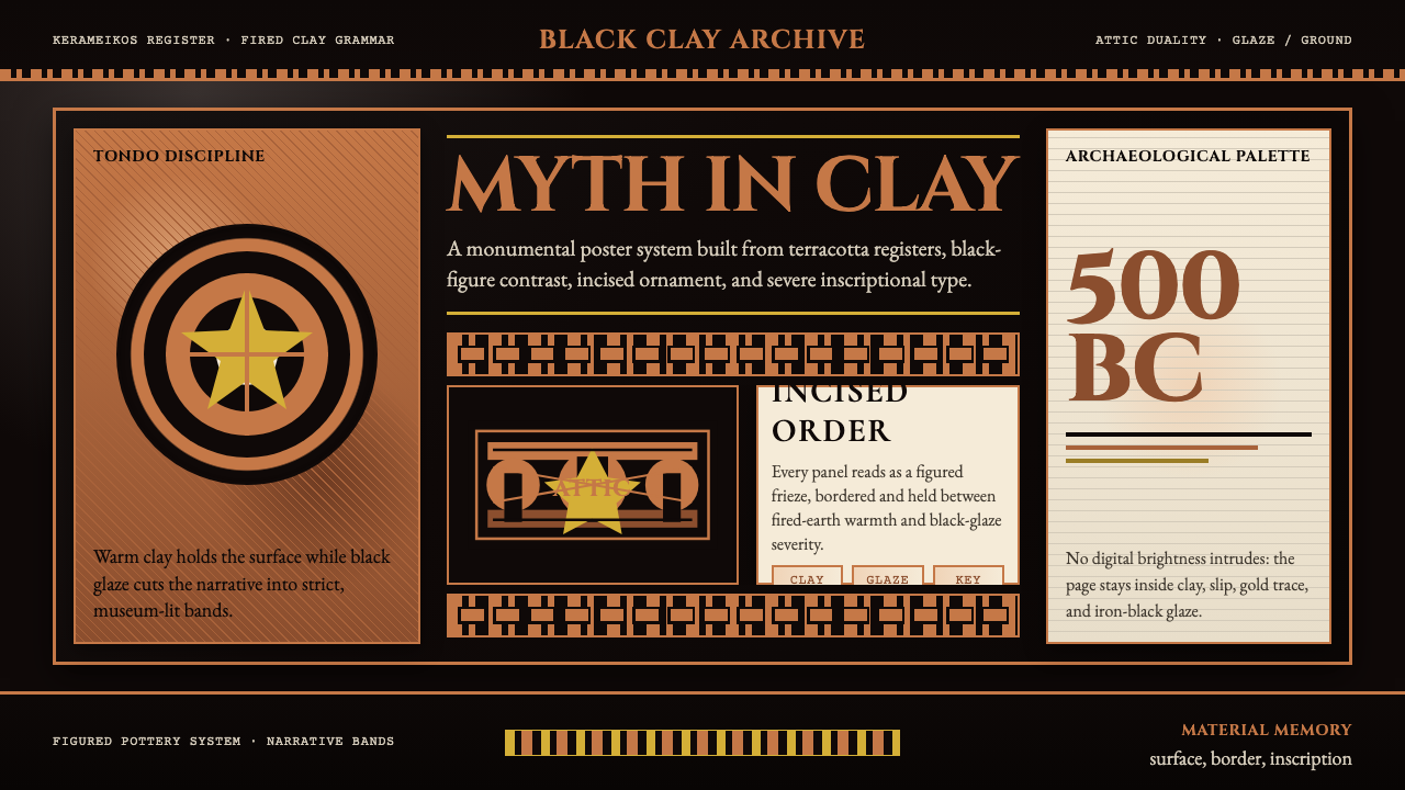 Greek Vase Attic (500 BC)Archaeological severity. Jet-black glaze, terracotta bands, and meander borde…考古般克制:黑釉底、赤陶饰带与回纹边框构成陶瓶式秩序。