What is Rossetti — Pre-Raphaelite Stunner?什么是 Rossetti — Pre-Raphaelite Stunner?
Rossetti's Pre-Raphaelite style dresses every surface in jewel-deep colour, cascading copper-red hair, and the density of an illuminated medieval manuscript.罗塞蒂的前拉斐尔派美学,用宝石般深邃的色彩、倾泻的铜红长发与中世纪彩饰手抄本的繁密,包裹每一寸画面。
Rossetti — Pre-Raphaelite Stunner in briefRossetti — Pre-Raphaelite Stunner 速览
Rossetti — Pre-Raphaelite Stunner is the visual language distilled from Dante Gabriel Rossetti's mature portrait phase of the 1860s and 1870s: a world of blood-crimson velvet, ancient-gold ornament, and half-length female figures whose copper-red hair fills the frame like a second subject. Every surface carries symbolic freight — pomegranates, lilies, convolvulus blossoms, and the occasional Latin inscription woven into the painted border. The mood is saturated, literary, and deliberately anti-academic.罗塞蒂前拉斐尔派「绝色佳人」美学,是从丹特·加百利·罗塞蒂1860至70年代成熟肖像期蒸馏而来的视觉语言:一个血色天鹅绒、古金装饰、铜红长发充满画框的世界,每一件静物——石榴、百合、旋花,以及偶尔嵌入画框边缘的拉丁铭文——都承载着象征重量。整体气质是饱满的、博学的、刻意反学院的。
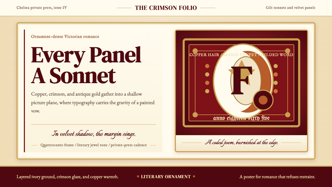
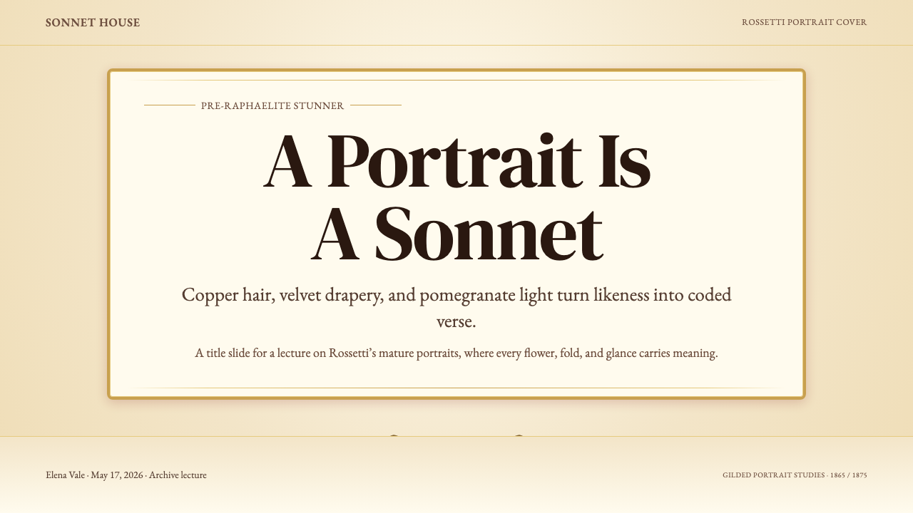
The palette is not simply rich; it is intentionally coded. Deep jewel tones — crimson, copper, antique gold, and deep olive — serve as emotional registers rather than neutral description. The composition follows a shallow picture plane derived from Italian Quattrocento painting: figures sit close to the surface, drapery presses against a dense decorative background, and depth is achieved through layered ornament rather than perspectival recession. Three-quarter and profile views dominate, the sitter's gaze directed slightly away from the viewer — an intimate withholding that charges the image with longing.这里的色彩并非单纯的「浓郁」,而是经过刻意编码的符号系统。深邃的宝石调——克里姆林深红、铜红、古董金、深橄榄——充当情感的坐标而非中性描述。构图遵循意大利早期文艺复兴(Quattrocento)的浅景深平面:人物贴近画面表层,衣褶紧压繁密的装饰背景,深度感由层叠的纹饰而非透视后退来完成。画面以四分之三侧脸或正侧面为主,模特目光微微偏离观者——一种亲密的回避,让画面充满悠长的渴望。
The style is ornament-rich and unapologetically literary. Rossetti was a poet as well as a painter, and his visual work and verse were designed to be read together. Titles are quotations; frames bear inscribed sonnets; flowers and objects carry the weight of Dante, Keats, and Arthurian legend. Applying this aesthetic today means embracing that density — layered texture, symbolic detail, and a romantic heaviness that places beauty above efficiency.这是一种装饰浓密、文学性极强的风格。罗塞蒂同时是诗人与画家,其视觉作品与诗句本为一体:画题是诗的引语,画框刻着他亲笔誊写的十四行诗,花卉与器物承载着但丁、济慈与亚瑟王传说的重量。在当代应用这种美学,意味着拥抱那份浓重——层叠的质感、象征性的细节,以及将美置于效率之上的浪漫。
See the Rossetti — Pre-Raphaelite Stunner design system查看 Rossetti — Pre-Raphaelite Stunner 完整设计系统
Where does Rossetti — Pre-Raphaelite Stunner come from?Rossetti — Pre-Raphaelite Stunner 从何而来?
The Pre-Raphaelite Brotherhood was founded in London in 1848 by seven young artists and writers — among them Dante Gabriel Rossetti, William Holman Hunt, and John Everett Millais — who shared a conviction that English painting had grown hollow since Raphael. They looked past the Renaissance High Style to the earlier Italian and Flemish masters: the vivid colour, flat picture planes, and minute botanical observation of painters working before 1500. Their name was a manifesto — a deliberate rejection of the academic tradition that stretched from Raphael through the Royal Academy.前拉斐尔兄弟会于1848年在伦敦由七位年轻艺术家与作家共同创立,其中包括丹特·加百利·罗塞蒂、威廉·霍尔曼·亨特和约翰·埃弗里特·米莱斯。他们共同相信:自拉斐尔以来,英国绘画已日趋空洞。他们越过文艺复兴盛期风格,回溯1500年以前的早期意大利与佛兰德斯大师:那种鲜艳的色彩、平面化的构图与精细入微的植物学观察。他们的名字本身就是宣言——是对从拉斐尔延续至皇家美术学院的学院传统的刻意否定。
Rossetti's relationship to the Brotherhood was always eccentric. He was its most charismatic member but also its most literary, most medieval, and most private. While his early work shared the Brotherhood's bright outdoor colour and moral earnestness, by the late 1850s he had moved decisively toward something different: the large-scale half-length portrait of a beautiful woman — the 'stunner,' as he and his circle called such figures — set against backgrounds of dense decorative patterning. These were not portraits in the conventional sense; they were icons. The subjects — first Elizabeth Siddal, his model and later wife, then Jane Morris, wife of his friend and collaborator William Morris — became vessels for an imagined world of medieval romance and Dantesque longing.罗塞蒂与兄弟会的关系始终是特立独行的。他是其中最富魅力的成员,但也是最文学化、最中世纪化、最私人化的一位。他早期的作品分享了兄弟会明亮的户外色彩与道德的严肃性,但到了1850年代末,他已决然转向另一种东西:大幅半身女性肖像——他与圈中好友称之为「绝色佳人」(stunner)——置于繁密装饰图案的背景之前。这些不是通常意义上的肖像,而是图像(icons)。主角——先是伊丽莎白·西达尔,他的模特与后来的妻子,继而是简·莫里斯,他的朋友兼合作者威廉·莫里斯之妻——成为盛载中世纪浪漫与但丁式渴望的容器。
The Chelsea house at Cheyne Walk, where Rossetti lived from 1862 after Siddal's death, became the physical environment for this mature style. He filled it with blue-and-white Chinese porcelain, Jacobean furniture, antique textiles, and live animals — peacocks, wombats, a zebu. The rooms were the paintings' atmosphere made habitable, and the aesthetic they generated fed directly into the broader Aesthetic Movement of the 1870s and 1880s, which held that the cultivation of beauty was a sufficient end in itself. Walter Pater, Oscar Wilde, and Aubrey Beardsley all owed intellectual debts to Rossetti's formulation of art as intense, private, beauty-saturated experience.罗塞蒂自1862年西达尔去世后迁入切尔西切恩道的府邸,成为这一成熟风格的物质环境。他用青花瓷、詹姆士时代家具、古董织物和活生生的动物——孔雀、袋熊、一头瘤牛——将房间填满。这些房间是画作氛围的可居住版本,它们生发的美学直接滋养了1870至80年代更广泛的唯美运动,后者认为对美的修炼本身便是充足的目的。沃尔特·佩特、奥斯卡·王尔德与奥布里·比亚兹莱,都在智识上欠下罗塞蒂将艺术界定为强烈、私密、美感饱和的体验的那份公式。
The historical context of the 1860s sharpens the style's meaning. Victorian academic painting was dominated by narrative moralising — large canvases depicting improving historical or religious scenes, colour kept subordinate to draughtsmanship. Rossetti's 'stunners' were a refusal of all this: small in format, private in subject, insistently non-narrative, and saturated in colour so deep it bordered on excess. The style was also entangled with the Arts and Crafts Movement through Rossetti's friendship with William Morris; the same principles that governed the painted surface — handcraft over industrial production, symbolic ornament over mere decoration, depth of material over cheapness — also governed Morris's wallpapers, textiles, and the founding of the firm Morris, Marshall, Faulkner and Co. in 1861.1860年代的历史语境使这种风格的意义更加清晰。维多利亚时代的学院绘画以说教性叙事为主——描绘教化性历史或宗教场景的大幅画作,色彩从属于素描技法。罗塞蒂的「绝色佳人」是对这一切的拒绝:格式小而私密,题材刻意非叙事,色彩饱和到濒临过度的边缘。这种风格也通过罗塞蒂与威廉·莫里斯的友谊,深度缠绕在工艺美术运动之中:同样的原则——手工胜过工业量产、象征性装饰胜过纯粹装饰、材料的深度胜过廉价——既支配了被画的表面,也支配了莫里斯的墙纸、织物,以及1861年创立的「莫里斯、马歇尔、福克纳公司」。
What defines the Rossetti — Pre-Raphaelite Stunner look?Rossetti — Pre-Raphaelite Stunner 的视觉特征是什么?
Colour色彩
The palette runs deep and warm: blood-crimson, copper-red, antique gold, deep olive, and midnight blue. These are jewel tones, not pastels — they carry the density of oil glaze built up in layers, the richness of dyed velvet, and the glow of medieval stained glass. No colour is used decoratively alone; each carries symbolic meaning. Crimson signals passion and sacrifice; gold signifies the sacred or ideal; olive and copper belong to the earthly and mortal. The palette is never cool, never neutral, and never flat — warmth and depth are non-negotiable.色板深沉而温暖:血色深红、铜红、古董金、深橄榄、午夜蓝。这是宝石调,不是粉彩——它们承载着层叠油画釉的厚度、染色天鹅绒的丰润与中世纪彩色玻璃窗的光辉。没有任何颜色是单纯装饰性的,每种颜色都带有象征含义:深红意味着热情与牺牲,金色象征神圣或理想,橄榄与铜色属于尘世与凡人。这套色板从不冷静,从不中性,从不平板——温暖与深度是不可妥协的。
Ornament and Surface Density装饰与表面密度
Every plane is loaded. Backgrounds are woven or embroidered patterns — honeysuckle, pomegranate, diaper-work, leaf-scroll — that press forward against the figure rather than receding. Drapery is rendered stitch by stitch, fabric fold by fold, with the loving exactitude of medieval tapestry. This is not background noise; it is structured abundance. The ornament is never random: each motif is chosen for symbolic resonance, creating a second layer of meaning beneath the primary image.每一个平面都承载了重量。背景是编织或刺绣图案——金银花、石榴、菱格网、叶卷纹——向前逼近人物而非向后退远。衣褶被一针一针、一褶一褶地描绘,带有中世纪挂毯般虔诚的精确。这不是背景噪音,而是有结构的丰盛。装饰从不随机:每个纹样因象征共鸣而入选,在主体图像之下形成第二层意义。
Shallow Picture Plane浅景深平面
Space is compressed. Figures occupy the foreground in a shallow box of depth, consistent with Rossetti's study of Quattrocento masters who placed their subjects against gilded or patterned grounds with minimal recession. There is no atmospheric perspective, no open landscape window, no deep spatial drama. This compression focuses the viewer's attention entirely on the surface — on texture, colour, and symbolic object — rather than on narrative space. The figure and her attributes fill the frame as a jewel fills its setting.空间是被压缩的。人物占据前景,处于极浅的深度箱中,与罗塞蒂研究的早期文艺复兴大师如出一辙——后者将主角置于鎏金或图案背景前,几乎没有任何空间后退。画面没有大气透视,没有向外敞开的风景窗,没有深邃的空间戏剧。这种压缩将观者的注意力完全集中于表面——质感、色彩和象征物件——而非叙事空间。人物与她的属物填满画框,如宝石填满镶座。
The Stunner Pose「绝色佳人」姿态
The characteristic figure is shown from the waist or chest upward, turned at a three-quarter angle or in pure profile. The gaze is averted — directed slightly past the viewer, or cast downward — creating a sense of interior absorption that is simultaneously accessible and withheld. The neck is long, the lips full, the hair abundant and typically loose or half-bound. Hands often hold a symbolic object — a flower, a mirror, a stringed instrument — or are caught in a gesture of offering or reverie. This pose is iconic rather than naturalistic; it is a convention as codified as a Byzantine saint's stance.典型人物以腰部或胸部以上呈现,以四分之三角度转向或取纯侧面。目光是回避的——微微越过观者而去,或向下投落——制造出一种内省的沉浸感,同时可及又有所保留。颈部修长,嘴唇丰厚,发量丰盛,通常散开或半束。双手常持一件象征物——花朵、镜子、弦乐器——或定格于奉献或沉思的姿态。这一姿态是图像性的而非自然主义的,如同拜占庭圣人像的站姿一样经过高度程式化。
Symbolic Botany象征性植物语言
Flowers and plants are never incidental. Rossetti inherited a Victorian and medieval tradition of floriography — the language of flowers — in which each species carried a fixed meaning: pomegranate for fertility and underworld descent, lily for purity, rose for love, convolvulus for persistence and entanglement. These appear in bouquets the sitter holds, in the woven background, in embroidered borders, and occasionally inscribed as text within the composition itself. A viewer conversant with the system reads the painting as a poem on two simultaneous registers.花卉与植物从不是偶然的。罗塞蒂继承了维多利亚时代与中世纪的花语传统——花卉语言——其中每个品种都承载固定的含义:石榴象征生育力与冥界的下降,百合象征纯洁,玫瑰象征爱情,旋花象征坚持与纠缠。这些意象出现于模特手持的花束中,出现在编织背景中,出现在刺绣边框中,偶尔以文字形式铭刻于构图之内。熟悉这套系统的观者,能在两个同时运行的层次上阅读这幅画——如同一首诗。
Literary Integration文学的融入
Rossetti's works are inseparable from text. Picture frames bear inscribed lines of his own sonnets, sometimes in the artist's own handwriting. Titles quote Dante, Keats, the Bible, or Rossetti's own verse cycle The House of Life. This is not illustrative art — it does not depict a scene from a text — but art that aspires to the condition of a poem: dense, allusive, calling for rereading. Any design working in this idiom carries that literary weight through titles, captions, ornamental text elements, and the names of typefaces that echo medieval manuscript culture.罗塞蒂的作品与文字不可分割。画框上刻着他亲笔十四行诗的诗句,有时是艺术家自己的笔迹。画题引用但丁、济慈、《圣经》,或他本人的诗集《生命之屋》。这不是插图艺术——它不描绘某段文字的场景——而是渴望抵达诗歌状态的艺术:浓密、好用典故、需要反复阅读。任何在这一语境中工作的设计,都应通过标题、说明文字、装饰性文本元素,以及呼应中世纪手抄本文化的字体气质,来承载那份文学重量。
Material Richness材质的丰富性
Texture is everywhere and always legible. Velvet absorbs light differently from silk; embroidery catches it differently from woven brocade. Rossetti rendered these distinctions with the patience of a goldsmith, and the visual system inherits that insistence. In contemporary design, this translates to a preference for paper stocks with tactile weight, layered visual textures that suggest depth, and typographic ornaments that recall hand-drawn or hand-pressed production. The underlying message is always that care — material, intellectual, emotional — has been lavished on the object.质感无处不在,且永远清晰可辨。天鹅绒对光的吸收方式不同于丝绸;刺绣对光的折射方式不同于织锦缎。罗塞蒂以金匠般的耐心描绘这些差异,这套视觉系统继承了这份坚持。在当代设计中,这转化为对具有触感重量的纸张、暗示深度的层叠视觉质感,以及令人联想到手绘或凸版印刷的字体装饰的偏好。潜在的信息始终是:对这件物品投注了——材料上、智识上、情感上的——充分的用心。
See the Rossetti — Pre-Raphaelite Stunner design system查看 Rossetti — Pre-Raphaelite Stunner 完整设计系统
Who shaped Rossetti — Pre-Raphaelite Stunner?谁塑造了 Rossetti — Pre-Raphaelite Stunner?
Rossetti was the dominant creative force of the Brotherhood's mature phase and the inventor of the 'stunner' portrait type. Poet, painter, and collector simultaneously, he was unusual among Victorian artists in his systematic integration of image and text — his sonnets and his paintings were designed to be read together, each illuminating the other. His models — above all Elizabeth Siddal and Jane Morris — became the faces of an entire aesthetic movement, and his Chelsea household at Tudor House on Cheyne Walk served as a magnetic centre for the Aesthetic Movement throughout the 1860s and 1870s.罗塞蒂是兄弟会成熟期最主要的创造力量,也是「绝色佳人」肖像类型的发明者。他同时是诗人、画家与收藏家,在维多利亚时代艺术家中,他以图像与文字的系统性融合独树一帜——他的十四行诗与画作设计为相互阅读,彼此照亮。他的模特——尤其是伊丽莎白·西达尔与简·莫里斯——成为整个美学运动的面孔。他在切尔西切恩道塔楼的府邸,在1860至70年代一直是唯美运动的磁力中心。
Siddal was Rossetti's primary model, muse, and eventually wife, and her particular physical appearance — auburn hair, pale skin, heavy-lidded eyes — became the template for the Pre-Raphaelite female ideal. She was also a gifted artist and poet in her own right, though her work remained largely unrecognised during her lifetime. Her death from a laudanum overdose in 1862 deepened Rossetti's existing medievalism into something more elegiac; the sonnets he buried with her and later exhumed became the nucleus of The House of Life.西达尔是罗塞蒂的首席模特、缪斯,最终也成为他的妻子。她独特的外貌——赤褐色的头发、苍白的皮肤、沉重的眼睑——成为前拉斐尔派女性理想的模板。她本身也是一位有才华的艺术家和诗人,尽管她的作品在生前大多未获认可。1862年她因鸦片酊过量去世,使罗塞蒂原有的中世纪情怀转化为更为挽歌式的色彩;他随她一同下葬、后又掘出的诗稿,成为《生命之屋》的核心。
Jane Morris, née Burden, became Rossetti's second great muse after Siddal's death and is the model for many of his most iconic later works, including Proserpine and La Pia de' Tolomei. Her dark features — heavy brows, a wide jaw, deep-set eyes — represented a different pole of the Pre-Raphaelite beauty ideal from Siddal's pallor. Her marriage to William Morris placed Rossetti at the centre of a complex web of artistic, personal, and commercial relationships that shaped both the Aesthetic Movement and the Arts and Crafts Movement.简·莫里斯(原名伯顿),在西达尔去世后成为罗塞蒂第二位伟大的缪斯,是他许多最具代表性的晚期作品的模特,包括《珀尔塞福涅》与《托洛梅伊的拉·皮亚》。她深沉的五官——浓重的眉毛、宽阔的下颌、深陷的眼睛——代表了前拉斐尔派美丽理想的另一极,与西达尔的苍白形成对照。她与威廉·莫里斯的婚姻,使罗塞蒂置身于一张复杂的艺术、个人与商业关系网络的中心,这张网络同时塑造了唯美运动与工艺美术运动。
Burne-Jones was the movement's second great painter and a crucial link between Pre-Raphaelitism and the Aesthetic Movement. Trained under Rossetti's influence, he developed a more elongated, otherworldly figure style and a preference for Arthurian and classical mythology over Rossetti's Dantesque themes. His collaborations with William Morris — on stained glass, tapestry, and book illustration — helped translate Pre-Raphaelite visual principles into the applied arts and gave the movement a durable decorative legacy extending well into the early twentieth century.伯恩-琼斯是该运动的第二位重要画家,也是前拉斐尔主义与唯美运动之间的关键纽带。在罗塞蒂的影响下成长,他发展出更为修长、超凡脱俗的人物风格,偏好亚瑟王传说与古典神话,而非罗塞蒂的但丁主题。他与威廉·莫里斯在彩色玻璃、挂毯与书籍插图上的合作,帮助将前拉斐尔派的视觉原则转化为应用艺术,并为该运动赋予了延伸至二十世纪初的持久装饰遗产。
Morris was a central figure in Rossetti's circle, though his own contribution was less painterly than organizational and commercial. His founding of Morris, Marshall, Faulkner and Co. in 1861 — with Rossetti and Burne-Jones among the partners — turned Pre-Raphaelite aesthetic principles into marketable goods: wallpapers, textiles, furniture, and stained glass. His insistence that beautiful design should be available to the everyday domestic environment, and his conviction that the machine age had impoverished craftsmanship, gave the movement a political edge that Rossetti's purely aesthetic programme lacked.莫里斯是罗塞蒂圈子的核心人物,尽管他本人的贡献不在绘画,而在组织与商业层面。1861年,他与罗塞蒂、伯恩-琼斯等人共同创立「莫里斯、马歇尔、福克纳公司」,将前拉斐尔派的美学原则转化为可销售的商品:墙纸、织物、家具与彩色玻璃。他坚信美丽的设计应当能够进入日常家居环境,也坚信机器时代已使手工艺贫乏化,这赋予了该运动一种政治锋芒,是罗塞蒂纯粹美学纲领所缺乏的。
How do you use Rossetti — Pre-Raphaelite Stunner today?今天怎么用 Rossetti — Pre-Raphaelite Stunner?
The Rossetti Pre-Raphaelite style is one of the most distinctive historical aesthetics available to contemporary designers, but it demands an honest commitment to density. It cannot be applied as a surface wash of crimson and gold over a clean modern layout — the result will feel like a costume rather than a conviction. To work in this idiom is to accept that ornament is meaning, that colour is symbol, and that every element on the surface should carry its own weight in the larger composition.罗塞蒂前拉斐尔派风格是当代设计师可借用的最具辨识度的历史美学之一,但它要求真诚地承担「密度」。它不能被当作深红与金色的表面涂料,刷在整洁的现代版面上——那样的结果只会像一件戏服,而非一种信念。在这一语境中工作,意味着接受:装饰即意义,色彩即象征,表面上的每一个元素都应在更大的构图中承担自己的重量。
For presentation slides, the style suits covers and chapter dividers above all. A cover page works best as an icon-like composition: a deep jewel-toned background, a single central figure or motif rendered in high detail, and a title set in a typeface with calligraphic or serif weight that evokes manuscript lettering. Section dividers benefit from a single symbolic botanical element — a pomegranate branch, a lily stem — placed against a richly textured ground. Content slides should pull back from the full ornamental density; a narrower palette of two jewel tones with generous margins allows the data or argument to breathe while the aesthetic frame remains consistent. Data charts take on an almost tapestry-like quality when bars and segments are coloured in deep crimson, antique gold, and olive against a cream or ivory field.在演示文稿中,这种风格最适合封面和章节分隔页。封面最好作为图像式构图:深邃的宝石调背景,一个精细描绘的中央人物或纹样,以及用具有书法感或衬线分量的字体设定的标题,令人联想到手抄本字母。章节分隔页则得益于单一的象征性植物元素——石榴枝、百合茎——置于质感丰富的底面上。内容幻灯片应从完整的装饰密度中退一步:两种宝石调组成较窄的色板,配以宽裕的页边距,让数据或论点得以呼吸,同时保持美学框架的一致。数据图表在将条形与扇区以深红、古董金与橄榄绿着色,置于奶油或象牙色底面时,会呈现出近乎挂毯般的品质。
For web interfaces, the style works best on landing pages, editorial features, and brand stories rather than transactional or functional dashboards. A hero section might pair a full-bleed background of deep crimson or antique-velvet texture with a headline in a generously spaced, classically weighted typeface. Pricing or feature sections should adopt a lighter register — ivory grounds, copper-toned accents — to avoid visual fatigue. Navigation benefits from gold or copper typographic weight rather than icon-heavy patterns. For product imagery, the style demands photographic treatment that echoes the shallow picture plane: subjects close to the surface, backgrounds that are textured rather than plain, props or florals chosen for symbolic resonance.对于网页界面,这种风格最适合落地页、编辑专题与品牌故事,而非交易型或功能性仪表板。英雄区块可以将深红色或古董天鹅绒质感的全出血背景,与间距慷慨、具有古典字重的标题字体配对。定价或功能区块应采用更轻盈的调性——象牙底、铜色强调——以避免视觉疲劳。导航得益于金色或铜色的字体分量,而非图标密集的模式。对于产品图像,这种风格要求呼应浅景深平面的摄影处理:主体靠近表面,背景有质感而非纯净,道具或花卉因象征共鸣而入选。
For editorial and marketing design, Pre-Raphaelite principles support deeply layered layouts: pull-quotes set in calligraphic display type against tonal backgrounds, botanical ornaments used as section markers rather than generic decorative dividers, and body text set in a warm-toned serif typeface with generous line-height. Marketing campaigns in this style communicate luxury, handcraft, and cultural depth — they are well suited to heritage brands, fashion houses, perfume and beauty lines, literary publishers, and cultural institutions. The symbolism of the botanical motifs can be adapted: a brand centred on fertility and growth might lean into pomegranate and vine imagery; one centred on purity might favour lily and white convolvulus.对于编辑与营销设计,前拉斐尔派原则支持深度层叠的版面:将引语设置在色调背景上的书法展示字体中,将植物装饰用作段落标记而非通用装饰分隔,正文以温调衬线字体设排,配以慷慨的行高。这种风格的营销活动传达奢华、手工与文化深度——非常适合遗产品牌、时装屋、香水与美妆系列、文学出版商及文化机构。植物纹样的象征性可以被适配:以生育力与成长为核心的品牌,可以倾向石榴与藤蔓意象;以纯洁为核心的品牌,则可偏好百合与白色旋花。
The most common mistake when applying this aesthetic is confusing richness with clutter. Pre-Raphaelite ornament is dense but never random — each element is chosen for symbolic fitness, and there is always a clear compositional hierarchy beneath the decorative surface. Designers who fill a layout with generic floral textures, mix multiple unrelated historical typeface styles, or apply the jewel palette at full saturation across every element will produce something that reads as period-costume excess rather than principled richness. The discipline of the original style lies in its specificity: each motif earns its place by carrying meaning, and the colour palette, however deep, is always internally coherent.应用这种美学时最常见的错误,是将「丰富」与「杂乱」混淆。前拉斐尔派的装饰是浓密的,但绝不随机——每个元素都因象征的适切性而入选,装饰表面之下始终有清晰的构图层级。那些用通用花卉纹理填满版面、混用多种不相关历史字体风格、或在每个元素上以全饱和度铺满宝石色板的设计师,产出的东西会被读作时代戏服式的过度,而非有原则的丰盛。原始风格的自律在于其特殊性:每个纹样因承载意义而赢得自己的位置,色彩色板无论多么深沉,在内部始终是连贯的。
See the Rossetti — Pre-Raphaelite Stunner design system查看 Rossetti — Pre-Raphaelite Stunner 完整设计系统
Rossetti — Pre-Raphaelite Stunner — FAQRossetti — Pre-Raphaelite Stunner · 常见问题
How is Pre-Raphaelite different from Art Nouveau, which also features organic ornament and rich colour?前拉斐尔派与新艺术运动有何不同?后者同样以有机装饰和丰富色彩为特征。
The two share ornamental density and a rejection of academic convention, but their logics are opposite in one key respect. Pre-Raphaelite ornament is symbolic and literary — each motif carries a specific meaning drawn from a shared cultural vocabulary of flowers, scripture, and classical myth. Art Nouveau ornament is formally generative — the arabesque line and the stylised plant form are ends in themselves, celebrated for their visual rhythm rather than their referential content. Pre-Raphaelite colour is jewel-deep and mineral; Art Nouveau colour is often greened, muted, and iridescent. And where Pre-Raphaelite composition is icon-like and compressed, Art Nouveau composition tends toward flowing, sinuous movement across a larger field.两者都有装饰的密度,都拒绝学院规范,但它们的逻辑在一个关键方面是相反的。前拉斐尔派的装饰是象征性与文学性的——每个纹样都承载从花卉、经文与古典神话共有文化词汇中汲取的特定含义。新艺术运动的装饰是形式生成性的——阿拉伯式曲线与程式化植物形态本身就是目的,因其视觉韵律而非所指内容而受到推崇。前拉斐尔派的色彩是宝石般深邃的、矿物质的;新艺术运动的色彩则常常偏绿、沉静、带有虹彩光泽。而前拉斐尔派构图呈图像式、被压缩的,新艺术运动构图则倾向于在更大的画面上流动、蜿蜒。
Can this style work in a digital-first context — screens, apps, UI components — or is it fundamentally print and physical?这种风格能在数字优先的语境中运作——屏幕、应用、UI组件——还是它从根本上属于印刷与实体?
It can work digitally, but it requires selective translation rather than direct transfer. The jewel palette translates well to screens — deep saturated tones are naturally suited to backlit displays. The symbolic botanical ornament works as illustrated headers, section dividers, or loading states. What does not translate is the tactile quality of physical richness: velvet depth, oil-glaze luminosity, and the weight of embossed paper. Digital applications of this style tend to succeed when they embrace the palette and the compositional compression while acknowledging that screen-based texture is always somewhat flat. The style works for brand identity systems, editorial web design, and prestige e-commerce — and struggles for utility-first products where decoration competes with function.它可以在数字领域运作,但需要选择性的转译,而非直接搬移。宝石色板可以很好地转译到屏幕上——深邃的饱和色调天然适合背光显示。象征性的植物装饰可以作为插图页眉、段落分隔或加载状态。无法转译的是实体丰富性的触觉品质:天鹅绒的深度、油画釉的光辉,以及浮雕纸张的重量。这种风格的数字应用,往往在拥抱色板与构图压缩的同时,坦然承认基于屏幕的质感在某种程度上始终是平面的,方能取得成功。这种风格适合品牌识别系统、编辑型网页设计与高端电商——而在装饰与功能竞争的实用优先产品中则力不从心。
Is the style inherently feminine, or can it be applied to contexts with a different gender register?这种风格本质上是女性化的吗?还是可以应用于具有不同性别调性的语境?
The 'stunner' portrait tradition is explicitly organized around the representation of idealised femininity, and that history is inseparable from the visual system. However, the underlying principles — symbolic ornament, jewel-toned palette, literary density — are not inherently gendered. Medieval manuscript culture, from which the style partly descends, was as much a masculine institution as a feminine one. In contemporary use, the aesthetic can be redirected toward gender-neutral or masculine registers by emphasizing the armorial and heraldic aspects of the medieval inheritance — shield shapes, motto banners, dark ground with gold inscription — while moderating the flowing hair and specific floral symbolism of the stunner portrait type. The palette alone is not gendered; its coding depends entirely on context.「绝色佳人」肖像传统明确围绕对理想化女性气质的呈现而组织,这段历史与视觉系统不可分割。然而,其底层原则——象征性装饰、宝石色板、文学密度——并非本质上是有性别归属的。中世纪手抄本文化(这种风格部分地源于此)在历史上既是男性机构也是女性机构。在当代应用中,这种美学可以通过强调中世纪遗产中的纹章与盾徽方面——盾牌形状、格言横幅、黑底金色铭文——同时淡化「绝色佳人」肖像类型中的飘逸发丝与特定花卉象征,从而被引导向性别中立或男性调性的语境。仅凭色板本身并无性别归属;其编码完全取决于语境。
How much text can this style comfortably carry — is it suited to information-dense layouts?这种风格能舒适地承载多少文字量——它适合信息密集型版面吗?
Pre-Raphaelite visual culture was itself extraordinarily text-dense — poems inscribed on frames, titles that were quotations, symbolic objects requiring glossaries to fully decode. The style is therefore not hostile to text; it is hostile to text that has no considered relationship to its visual surround. Long-form editorial layouts work well in this idiom because the decorative frame is understood as a structural device — the text column is the centre of the composition, the ornament its border. What does not work is dense functional text — terms and conditions, data tables, navigation labels — placed directly against elaborately textured backgrounds. The rule is: the more the text is meant to be read carefully and at length, the more this style can support it; the more it is meant to be scanned quickly, the more it will resist.前拉斐尔派的视觉文化本身就极其文字密集——诗句铭刻在画框上,标题是引语,象征性物件需要词汇表才能完全解码。因此这种风格并非排斥文字;它排斥的是与视觉环境没有经过深思熟虑的关联的文字。长篇编辑型版面在这一语境中表现良好,因为装饰性框架被理解为结构性设备——文字栏是构图的中心,装饰是它的边框。不奏效的是将密集的功能性文字——条款细则、数据表格、导航标签——直接置于精心设计的质感背景之前。规则是:文字越是要被仔细、长篇阅读,这种风格越能支持它;越是要被快速扫描,它就越会产生阻力。
What is the single most important rule for applying this style without it becoming pastiche?应用这种风格而不至于沦为模仿(pastiche)的最重要一条规则是什么?
Every element must earn its place through meaning, not through decorative impulse. Rossetti's original paintings are dense but never arbitrary — the pomegranate is there because Persephone ate it; the lily is there because it signals the sacred and the mortal simultaneously; the copper hair fills the frame because it is the painting's second subject, not because it is pretty. When contemporary designers import the surface vocabulary — the jewel tones, the botanical motifs, the textured grounds — without importing the logic of symbolic selection, the result is decoration with no argument behind it: beautiful, perhaps, but hollow. The discipline is to ask of every element: what does this mean? Why is this specific flower, this specific shade, this specific typeface choice here rather than another? When that question has a real answer, the style is working. When it does not, the design is costume.每一个元素都必须通过意义而非装饰冲动来赢得自己的位置。罗塞蒂原画是密集的,但从不随意——石榴在那里,因为珀尔塞福涅吃了它;百合在那里,因为它同时指向神圣与凡死;铜红色的长发充满画框,因为它是这幅画的第二主角,而不仅仅因为它美丽。当代设计师若只引入表面词汇——宝石色调、植物纹样、质感底面——而不引入象征性选择的逻辑,结果便是没有论点支撑的装饰:也许美丽,但是空洞。这里的自律在于追问每一个元素:这意味着什么?为什么是这种特定的花、这种特定的色调、这种特定的字体选择,而非另一种?当这个问题有真实的答案时,这种风格在运作。当它没有答案时,设计就是戏服。
Related design styles相关设计风格
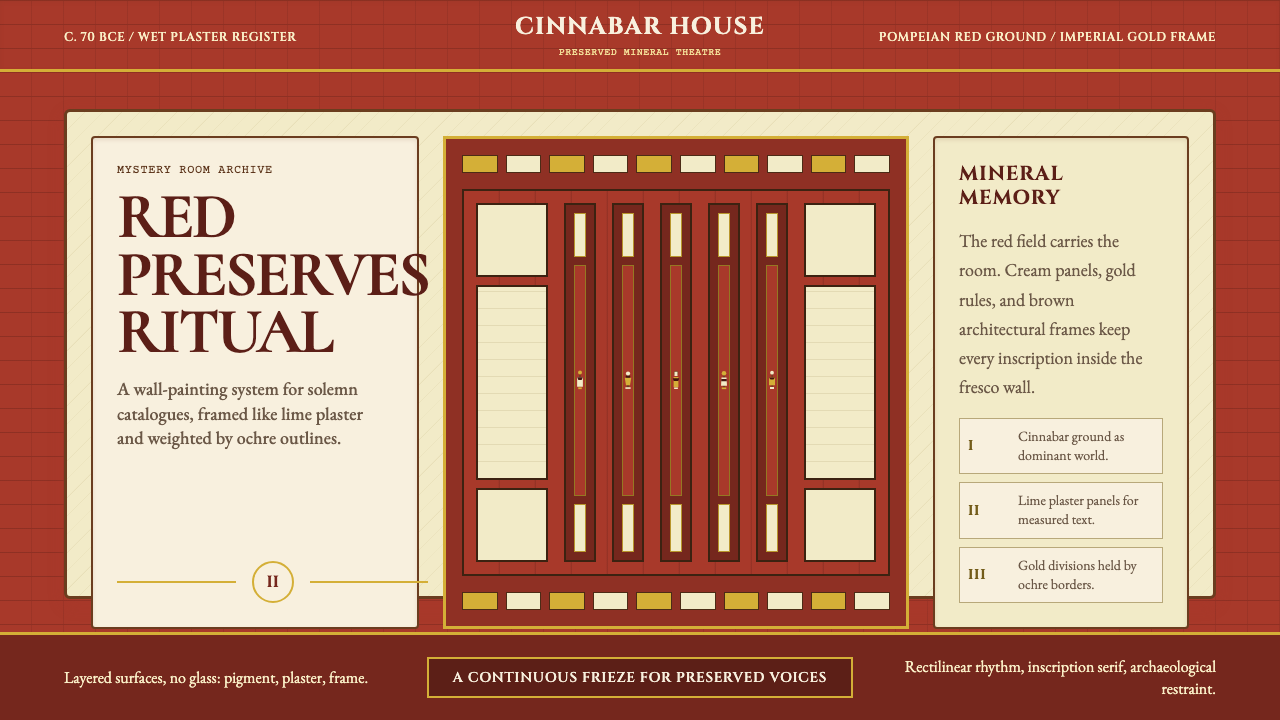 Pompeii Fresco Villa of MysteriesThe wall is the world. Pompeian red, cream plaster panels, and gold frames ho…墙面即世界。庞贝红、石灰奶油面板与金色框线托住仪式。
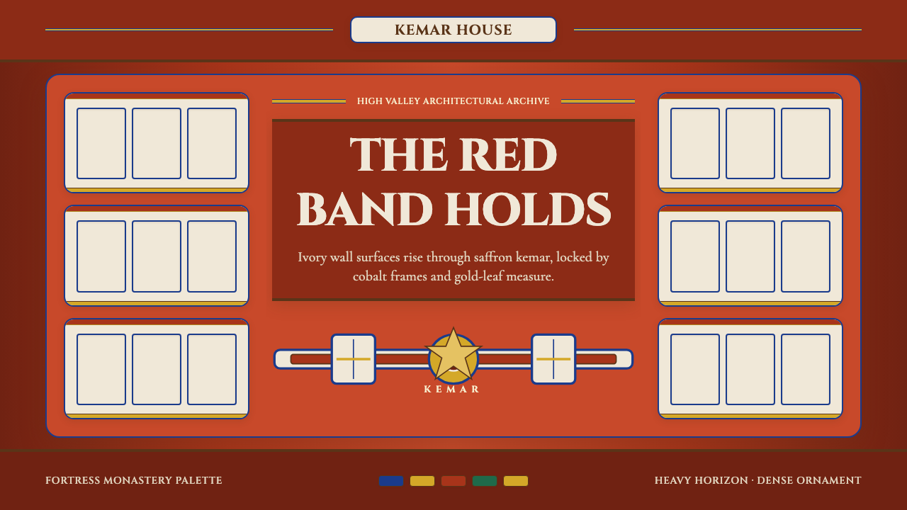 Bhutanese Dzong (Fortress Red)Monumental red holds the page. Cobalt frames and gold bands lock the fortress…厚重藏红掌控页面。钴蓝窗框与金色横带锁定宗堡节奏。
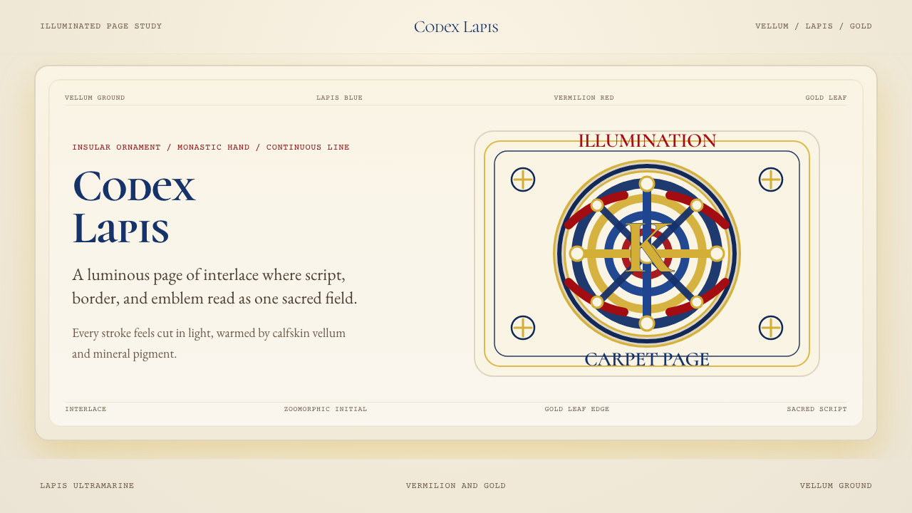 Book of Kells Celtic (800)Sacred and precise. Vellum cream, lapis, vermilion, and gold knotwork.神圣而精密。奶油羊皮底上铺陈青金石、朱砂与金色缠结纹。
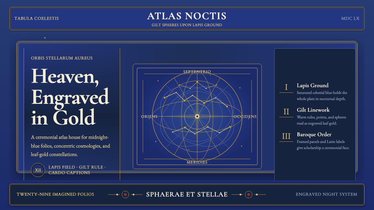 Cellarius Celestial AtlasCelestial luxury on lapis. Gilt serif type, star fields, and concentric chart…青金夜空里的天体奢华:鎏金衬线、星点与同心星图线。
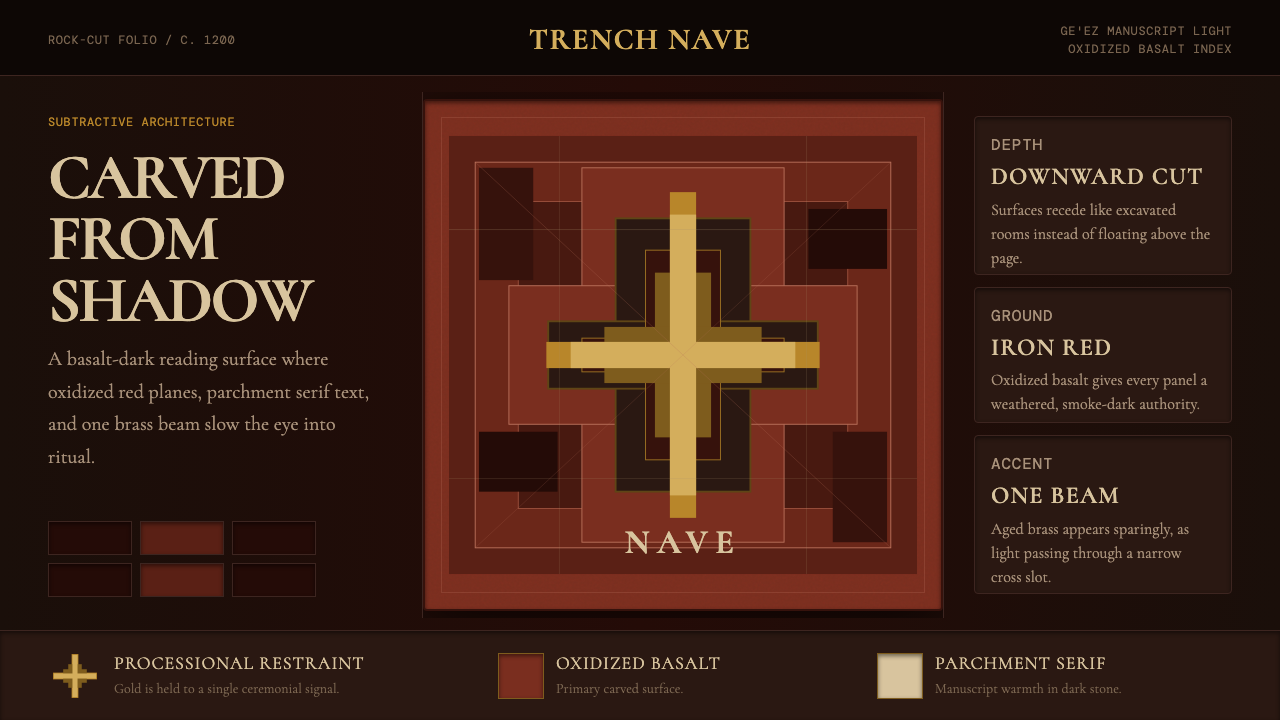 Ethiopian Lalibela Rock-Hewn Church (c.1200)Sacred weight in shadow. Oxidized basalt, parchment serif, and one aged-gold…阴影有圣坛重量。氧化玄武岩、羊皮纸衬线与一束旧金光。
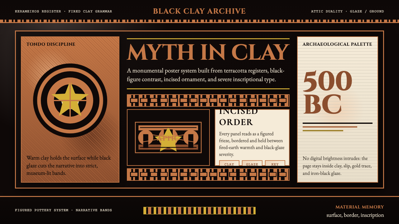 Greek Vase Attic (500 BC)Archaeological severity. Jet-black glaze, terracotta bands, and meander borde…考古般克制:黑釉底、赤陶饰带与回纹边框构成陶瓶式秩序。