What is Versailles Rococo Ornament?什么是 Versailles Rococo Ornament?
Versailles Rococo is the grammar of impossibly refined excess — every panel gilded, every curve answered by another curve, every surface a canvas for the royal art of beautiful abundance.凡尔赛洛可可是极致奢华的视觉语法——每一块护墙板都覆以鎏金,每一道弧线都由另一道弧线呼应,每一处表面都是皇家丰盛美学的画布。
Versailles Rococo Ornament in briefVersailles Rococo Ornament 速览
Versailles Rococo Ornament is the visual language of the French court between roughly 1700 and 1760 — the years spanning the Régence and the reign of Louis XV. It is a style defined by layered gilt ornament, asymmetric curvilinear forms, pale pastel grounds, and an absolute conviction that every available surface deserves embellishment. Where the late Baroque of Louis XIV imposed grandeur through symmetry and scale, Rococo introduced intimacy, wit, and deliberate asymmetry — an ornamental grammar that felt personal rather than imperial.凡尔赛洛可可装饰是法国宫廷在约1700至1760年间——涵盖摄政时期与路易十五统治年代——的视觉语言。这是一种以层叠鎏金装饰、不对称曲线形态、浅淡粉彩底色为标志的风格,其核心信念是:每一处可利用的表面都值得加以装点。路易十四晚期巴洛克以对称与体量灌输宏伟,而洛可可引入了私密感、机智与刻意的不对称——一套感觉属于个人而非帝国的装饰语法。
The style's defining visual motifs are the C-scroll and S-curve, the rocaille shell, the cartouche (an ornamental frame of scrollwork enclosing a painted or gilt field), and the trellis of climbing roses or vine tendrils. These elements appear not in isolation but in cascading combination: a cartouche becomes the frame for a painted scene; the painted scene is surrounded by cherubs modeled in low relief; the cherubs rest on foliate brackets that curve into the paneling itself. The effect is one of deliberate visual richness, in which the eye is invited to travel from ornament to ornament rather than rest on a single focal point.这种风格的核心视觉母题包括:C形涡卷与S形曲线、洛卡叶贝壳纹、卡图什(由涡卷装饰构成的框架,内镶绘画或鎏金画面),以及攀缘玫瑰或藤蔓卷须的格架图案。这些元素从不孤立出现,而是以层叠组合的方式呈现:卡图什成为绘画场景的边框;绘画场景由浅浮雕小天使环绕;小天使栖于向护墙板本身延伸的叶形托架之上。整体效果是刻意的视觉丰盛——观者的目光被引导着从一处装饰游走至另一处,而非停驻于单一焦点。
The palette is cream, pale gold, and soft pastels — dusty rose, sky blue, sage green, and ivory — with ormolu gilt (fire-gilded bronze) used for hardware, frames, and three-dimensional ornamental details. The style is light in tone even when dense in ornament. Shadows are minimal, surfaces read as warm and reflective, and the overall impression is of a room or composition saturated with refined delight rather than solemn grandeur.色调以奶油色、淡金色和柔和粉彩为主——尘粉玫红、天空蓝、鼠尾草绿与象牙白——而ormolu鎏金(火镀金铜质)则用于五金件、画框与立体装饰细节。这种风格即便在装饰密度极高时,整体色调仍然轻盈明亮:阴影极少,表面呈现温暖的反光质感,整体印象是一个充满精致愉悦而非庄严宏伟的房间或构图。
See the Versailles Rococo Ornament design system查看 Versailles Rococo Ornament 完整设计系统
Where does Versailles Rococo Ornament come from?Versailles Rococo Ornament 从何而来?
The roots of Versailles Rococo lie in a deliberate reaction against the ponderous formality of the Sun King's court. Louis XIV's Versailles — designed by Charles Le Brun under the doctrine of royal magnificence — was a machine of symbolic domination: symmetrical, axial, overwhelming in scale. When Louis XV came to power in 1723 (with the Duc d'Orléans as regent from 1715), the court's appetite shifted. The grand appartements of the palace were increasingly regarded as ceremonially correct but humanly inhabitable only with great discomfort. A new aesthetic sensibility sought rooms that were smaller, lighter, more personal — and the ornamental vocabulary adjusted to match.凡尔赛洛可可的根源,在于对太阳王宫廷沉重礼仪形式的刻意反叛。由夏尔·勒布伦在皇家壮丽原则下设计的路易十四凡尔赛宫,是象征性统治的机器:对称、轴线严格、规模压倒一切。当路易十五于1723年亲政(1715年起由奥尔良公爵摄政)后,宫廷的审美胃口发生了转变。宫殿的大套间在礼仪上被视为正确的,但作为人居空间却极度不舒适。一种新的审美感性追求更小、更轻、更私密的房间,装饰语汇随之调整以适应这一需求。
The Régence period (1715–1723) was the transitional moment. Designers including Charles Cressent and Juste-Aurèle Meissonnier began introducing asymmetry into ornament that had previously been rigidly mirrored. Meissonnier, appointed designer to the King's Chamber in 1726, was particularly radical: his published engravings showed cartouches in which no element on the left was answered by a corresponding element on the right, frames in which the scrollwork appeared to grow and twist organically rather than follow a geometric program. This asymmetric principle — called genre pittoresque by contemporaries — became the hallmark of the mature Rococo.摄政时期(1715—1723年)是这一转变的关键节点。包括夏尔·克雷桑和朱斯特-奥雷勒·梅松尼耶在内的设计师,开始将不对称性引入此前严格镜像对称的装饰之中。1726年被任命为国王寝宫设计师的梅松尼耶尤为激进:他出版的版画集展示了这样的卡图什——左侧没有任何元素与右侧对应,框架中的涡卷看起来是有机地生长扭曲,而非遵循几何程序。这一不对称原则——被同时代人称为「风景画风格」(genre pittoresque)——成为成熟洛可可的标志。
The style's cultural context was inseparable from the role of Madame de Pompadour, who became Louis XV's favorite in 1745 and exercised direct influence over royal artistic commissions for nearly twenty years. Pompadour was not merely a patron but an aesthetic intelligence: she directed the decoration of the Petit Trianon, championed the porcelain manufactory at Sèvres, and personally supervised the production of decorative objects for the royal apartments. Her taste — light, refined, feminine in the eighteenth-century sense — became the authoritative expression of what Versailles Rococo should look and feel like. The Boucher paintings commissioned for her apartments, the lacquered furniture, the Sèvres porcelain in her signature rose Pompadour ground color, all bear the coherence of a single sustained aesthetic vision.这种风格的文化语境与蓬巴杜夫人密不可分。她于1745年成为路易十五的宠臣,在近二十年间对皇家艺术委托行使直接影响力。蓬巴杜不仅仅是赞助人,更是一位审美智识者:她主导了小特里亚农宫的装饰,支持塞夫尔的瓷器工坊,并亲自监督皇家套间装饰物品的生产。她的品味——轻盈、精致、带有十八世纪意义上的女性气质——成为凡尔赛洛可可应有之观感与质感的权威表达。为她的套间委托创作的布歇绘画、漆制家具、以她标志性「蓬巴杜玫瑰」为底色的塞夫尔瓷器,都呈现出一种连贯的、由单一审美意志所维系的整体视觉气质。
The style's geographical reach extended well beyond Versailles. By the 1730s and 1740s, French ornamental engravings were being exported throughout Europe, and craftsmen in Bavaria, Prussia, Austria, and England were adapting the Rococo vocabulary to local traditions and materials. The German courts produced some of the most exuberant variations — the Amalienburg pavilion near Munich and the Würzburg Residenz represent the style at its most spatially ambitious. But Versailles itself remained the reference point: it was the French court's specifically restrained, aristocratic variant of Rococo — distinguished from German effusion by a certain tonal elegance — that set the international standard and that the style designation 'Versailles Rococo' is understood to invoke.这种风格的地理影响远超凡尔赛本身。至1730至40年代,法国装饰版画已被出口至全欧洲,巴伐利亚、普鲁士、奥地利和英国的工匠们将洛可可语汇与本地传统和材料融合改造。德意志宫廷产生了最为奔放的变体——慕尼黑附近的阿玛利亚堡与维尔茨堡官邸代表了这种风格在空间野心上的极致。但凡尔赛本身始终是参照点:正是法国宫廷特有的、相对克制的贵族洛可可变体——以一种音调上的优雅有别于德意志的热情奔放——确立了国际标准,而「凡尔赛洛可可」这一风格名称所指涉的,正是这一变体。
What defines the Versailles Rococo Ornament look?Versailles Rococo Ornament 的视觉特征是什么?
Asymmetric Curvilinear Ornament不对称曲线装饰
The defining structural principle of Versailles Rococo is asymmetry in service of organic energy. C-scrolls and S-curves do not mirror each other; instead, they cascade and interlock in configurations that appear to grow rather than be constructed. A cartouche will carry more ornamental weight on one side than the other; a bracket will curl in one direction while its neighbor curls in the opposite. This deliberate imbalance is not disorder — it is a sophisticated alternative to the classical axiom that beauty requires symmetry. The asymmetry gives the ornament a sense of arrested movement, as though the gilt bronze were caught mid-flow.凡尔赛洛可可的核心结构原则是服务于有机动感的不对称性。C形涡卷与S形曲线并不相互镜像,而是以层叠交织的方式呈现,看起来像是生长出来而非建构而成。一个卡图什在一侧会比另一侧承载更多装饰分量;一个托架向某个方向卷曲,而它的邻近者则向相反方向卷曲。这种刻意的失衡并非无序——它是对「美需要对称」这一古典公理的精妙替代方案。不对称性赋予装饰以凝固运动之感,仿佛鎏金铜质正被捕捉于流动途中。
Ormolu Gilt and Pastel Groundsormolu鎏金与粉彩底色
The signature color relationship of Versailles Rococo pairs warm gilt against pale, chalky grounds. The walls, paneling, and flat surfaces are held in creams, soft ivories, and dusty pastels — rose, sky blue, and celadon appear frequently — while ormolu hardware, frame moldings, and applied ornaments read as warm gilded accents. The palette is never cold or stark: the gilt introduces warmth, and the pastels absorb it without competing. This combination produces an interior luminosity that is simultaneously luxurious and delicate, quite distinct from the heavy gold-on-dark-ground of High Baroque.凡尔赛洛可可标志性的色彩关系,是温暖的鎏金与浅淡粉笔质感底色之间的配对。墙面、护墙板与平整表面保持在奶油色、柔和象牙白和尘粉色粉彩之间——玫红、天空蓝和青瓷绿频繁出现——而ormolu五金件、画框线脚与附加装饰则呈现为温暖的鎏金点缀。整个色调绝不寒冷或强硬:鎏金引入温度,粉彩色调吸纳这种温度而不与之竞争。这种组合产生了一种室内发光感,既奢华又纤细,与高度巴洛克的深底大面积金色截然不同。
Rocaille Shell and Nature Motifs洛卡叶贝壳纹与自然母题
The word 'rocaille' — from the French for rock and shell — names the style's most characteristic secondary motif: representations of shells, coral, rock formations, and water-worn surfaces that appear throughout cartouche surrounds, fireplace hoods, mirror frames, and ceiling corners. These natural references are never literal; they are stylized to the point of abstraction, rendered as crisp three-dimensional ornamental forms in plaster or gilt bronze. Alongside shells, the style deploys climbing roses, vine tendrils, laurel branches, and cherubs (putti) in painted or relief form, weaving a narrative of abundance and pastoral delight through every compositional level.「洛卡叶」(rocaille)一词来自法语中「岩石」与「贝壳」,命名了这种风格最具特征的次级母题:贝壳、珊瑚、岩石构造与水蚀表面的意象,遍布于卡图什边框、壁炉罩、镜框与天花角落之中。这些自然参照从不追求写实;它们被风格化至近乎抽象的程度,以石膏或鎏金铜质呈现为清晰的立体装饰形态。在贝壳之外,这种风格还运用攀缘玫瑰、藤蔓卷须、月桂枝条,以及以绘画或浮雕形式出现的小天使(putti),在每一个构图层次中编织丰盛与田园喜悦的叙事。
Hand-Painted Scenic Panels手绘风景嵌板
A distinctive feature of Versailles Rococo interiors — and the source of its most direct visual character in two-dimensional applications — is the hand-painted cartouche panel. Within an elaborate gilt surround, a small scene is painted in the manner of François Boucher: cherubs at play, garlands of flowers, pastoral vignettes of shepherdesses and lambs, or mythological scenes treated with an air of cheerful irreverence rather than classical gravity. The painting style is loose, warm, and theatrical — shadows are soft, flesh tones are rosy, and flowers are rendered with a painterly freedom that contrasts deliberately with the precision of the gilt ornament surrounding them.凡尔赛洛可可室内装饰的一个显著特征——也是其在二维应用中最直接的视觉来源——是手绘风景嵌板。在精致的鎏金边框内,以弗朗索瓦·布歇的风格绘制小场景:嬉戏的小天使、花环,牧羊女与羔羊的田园小品,或以愉快的轻松感而非古典庄重感处理的神话场景。绘画风格松动、温暖、戏剧性——阴影柔和,肤色玫红,花卉以画家式的自由笔触呈现,与环绕其周围的鎏金装饰的精确性形成刻意的对比。
Layered Ornamental Depth层叠装饰深度
Versailles Rococo operates through accumulation. No single ornamental element is meant to be read in isolation; each motif exists as part of a layered hierarchy in which the eye moves from the broadest organizing structure (a painted wall panel, a carved door surround) to progressively finer detail (the gilt molding, the rocaille shell at a corner, the flower painted within the cartouche, the individual petal of that flower). This principle of embedded ornamentation at multiple scales is perhaps the style's most demanding feature to apply — it requires committing to detail at every level of resolution rather than applying surface complexity only at the outermost layer.凡尔赛洛可可通过积累运作。没有任何单一装饰元素旨在被孤立解读;每个母题都作为层叠层级的一部分而存在,目光从最宏观的组织结构(一块绘制的护墙板、一个雕刻的门框)移向逐渐精细的细节(鎏金线脚、转角处的洛卡叶贝壳、卡图什内的绘画花卉、那朵花的单片花瓣)。这种在多个分辨率尺度上嵌套装饰的原则,或许是这种风格最难应用的特征——它要求在每一个细节层次上都做出承诺,而非仅在最外层施加表面复杂性。
Sinuous Furniture and Object Forms蜿蜒的家具与器物造型
In its three-dimensional expression, Versailles Rococo extended its curvilinear logic from walls and ceilings into the form of furniture and decorative objects. Charles Cressent's commodes feature cabriole legs that swell and narrow with an almost biological fluidity, drawer fronts that bulge outward in a bombé curve, and ormolu mounts whose foliate scrollwork flows across surfaces without beginning or end. The goal is the elimination of the right angle: where Baroque furniture imposed structure through mass and symmetry, Rococo furniture suggests growth, movement, and an aristocratic refusal to be geometrically constrained.在三维表达中,凡尔赛洛可可将其曲线逻辑从墙壁与天花板延伸至家具和装饰器物的造型之中。夏尔·克雷桑的五斗柜拥有弯腿——以近乎生物性的流动感膨胀收窄——鼓出弧形(bombé)的抽屉面板,以及ormolu鎏金饰件,其叶形涡卷无头无尾地流淌过器物表面。其目标是消除直角:巴洛克家具以体量与对称灌输结构感,而洛可可家具则暗示生长、运动,以及贵族对几何约束的优雅拒绝。
Theatrical Scale Contrast戏剧性的尺度对比
Versailles Rococo creates visual rhythm through deliberate scale contrast between the architectural ground and the ornamental detail applied to it. A wall panel might occupy several meters of cream-painted boiserie, interrupted by a cartouche that could be measured in hand-spans, which itself contains a painted scene rendered at the scale of a miniature. This orchestration of scales — from the architectural to the intimate — is one of the style's most sophisticated spatial achievements, and it translates directly into a principle for contemporary design: the style requires both a large organizing field and the commitment to populate it with detail at multiple, progressively smaller scales.凡尔赛洛可可通过建筑底面与施加其上的装饰细节之间刻意的尺度对比,制造视觉节奏。一块护墙板可能占据数米奶油色护墙木制品,被一个仅可用手掌丈量的卡图什打断,而这个卡图什本身又容纳了一幅以微型画尺度绘制的场景。这种从建筑尺度到私密尺度的多层次编排,是这种风格最精妙的空间成就之一,并直接转化为当代设计的一条原则:这种风格需要一个宏大的组织性底面,以及以多个逐渐缩小的尺度在其上填充细节的承诺。
See the Versailles Rococo Ornament design system查看 Versailles Rococo Ornament 完整设计系统
Who shaped Versailles Rococo Ornament?谁塑造了 Versailles Rococo Ornament?
Meissonnier was appointed designer to the King's Chamber in 1726 and is credited with radicalizing the Rococo's formal vocabulary. His engraved ornamental designs — widely circulated across Europe — broke decisively with bilateral symmetry, introducing cartouches and frames in which the scrollwork appeared to grow asymmetrically like a living form. His influence extended far beyond France: German and Austrian craftsmen adapted his published designs into the exuberant plasterwork of Bavarian churches and Prussian palace interiors. Meissonnier represents the intellectual core of the mature Rococo — the designer who gave the style its most principled argument for asymmetry as a positive aesthetic value.梅松尼耶于1726年被任命为国王寝宫设计师,被认为是洛可可形式语汇的激进化推手。他的装饰版画设计——在欧洲广泛流传——果断打破了双边对称,引入了涡卷装饰看起来像生命体般不对称生长的卡图什与框架。他的影响远超法国:德意志和奥地利工匠将他出版的设计改造成巴伐利亚教堂与普鲁士宫殿室内的奔放石膏装饰。梅松尼耶代表了成熟洛可可的思想核心——那位赋予这种风格以最有原则的论据、将不对称性确立为积极审美价值的设计师。
Boucher was First Painter to the King from 1765 and the period's most emblematic pictorial voice. His paintings — pastoral scenes populated by rosy-cheeked shepherdesses, plump cherubs, and mythological figures treated with cheerful lightness — supplied the imagery that animated Rococo interiors. His decorative panels appeared on Sèvres porcelain, in tapestry cartoons for the Beauvais and Gobelins workshops, and as overdoor paintings in royal and aristocratic apartments throughout France. Boucher's color sensibility — warm flesh tones, soft blues and pinks, a pervading quality of artificial outdoor light — is as definitive for Versailles Rococo as his subject matter, and any contemporary application of the style must reckon with his pictorial logic.布歇自1765年起担任国王首席画师,是这一时期最具标志性的图像表达者。他的绘画——以红润脸颊的牧羊女、丰满小天使和以轻盈愉快态度处理的神话人物为主的田园场景——为洛可可室内装饰提供了灵魂性图像。他的装饰嵌板出现在塞夫尔瓷器上、博韦与戈贝兰工坊的挂毯画稿中,以及法国各地皇家与贵族套间的门上绘画中。布歇的色彩感性——温暖的肤色、柔和的蓝与粉、弥漫全画的人工户外光质感——与他的题材同样是凡尔赛洛可可的定义性元素,任何当代对这种风格的应用都必须正视他的图像逻辑。
As Louis XV's chief mistress and artistic advisor from 1745 until her death in 1764, Pompadour exercised more sustained influence over the visual culture of Versailles Rococo than any single designer or craftsman. She directed the redecoration of the Petit Trianon, championed the establishment of the Sèvres porcelain manufactory, and oversaw the commissioning of Boucher's most important decorative cycles. Her personal aesthetic — preferring refinement and delicacy over sheer grandeur, lightness over mass, and the intimate over the monumental — became the defining taste of the mature style. The rose Pompadour ground color on Sèvres porcelain bears her name, and with it the style's most characteristic chromatic fingerprint.作为路易十五自1745年至1764年辞世前的首席情妇与艺术顾问,蓬巴杜夫人对凡尔赛洛可可视觉文化的影响,超过任何单一设计师或工匠。她主导了小特里亚农宫的重新装饰,支持了塞夫尔瓷器工坊的创立,并监督了布歇最重要的装饰系列作品的委托。她个人的审美偏好——倾向于精致与纤巧而非纯粹的宏伟,轻盈而非沉重,私密而非纪念碑式——成为成熟风格的定义性品味。塞夫尔瓷器上的「蓬巴杜玫瑰」底色以她的名字命名,连同这种风格最具特征的色彩指纹。
Cressent was the Régence and early Louis XV period's most celebrated cabinetmaker, whose furniture represents the translation of Rococo ornamental principles into three-dimensional form. His commodes — with their swelling bombé fronts, cabriole legs of exaggerated elegance, and ormolu mounts of extraordinary quality — demonstrate how completely the style rejected the right angle as an organizing principle. Cressent's ormolu work was so accomplished that he was repeatedly prosecuted by the guild of metalworkers for exceeding his permitted craft boundaries; he modeled and cast his own mounts rather than outsourcing them, treating the gilt bronze as a primary sculptural medium rather than a secondary decoration.克雷桑是摄政时期及路易十五初期最负盛名的细木工匠,他的家具代表了洛可可装饰原则向三维形态的转化。他的五斗柜——以其鼓出的弧形正面、夸张优雅的弯腿和质量卓越的ormolu鎏金饰件为特征——展示了这种风格对直角作为组织原则的彻底拒绝。克雷桑的鎏金铜工艺极为精湛,以至于他多次被金属工匠行会起诉,原因是他超越了被允许的工艺边界;他亲自塑造并铸造自己的饰件而非外包,将鎏金铜视为主要雕塑媒介而非次要装饰。
Gabriel served as Premier Architecte du Roi from 1742 and is responsible for the built form of the Versailles Rococo interior at its most architecturally coherent. His design for the Petit Trianon (completed 1768, technically on the cusp of the Neoclassical reaction) and the remodeling of royal apartments within the palace established the spatial proportions, boiserie configurations, and ornamental densities that define the canonical Versailles interior. Where Meissonnier was radical and Boucher was pictorial, Gabriel was integrative — the architect who gave the ornamental excess of the court a disciplined spatial container without extinguishing its character.加布里埃尔自1742年起担任国王首席建筑师,负责在建筑层面上最为连贯地呈现凡尔赛洛可可室内形态。他对小特里亚农宫的设计(1768年竣工,技术上处于新古典主义反动的边缘)以及对宫殿内皇家套间的改造,确立了定义经典凡尔赛室内的空间比例、护墙木制品配置与装饰密度。梅松尼耶是激进的,布歇是图像性的,而加布里埃尔是整合性的——他赋予宫廷装饰过剩以规训的空间容器,同时又不扼杀其性格的建筑师。
How do you use Versailles Rococo Ornament today?今天怎么用 Versailles Rococo Ornament?
Versailles Rococo is one of the most compositionally demanding historical styles to apply in contemporary design, because its visual richness requires genuine commitment to ornamental detail rather than surface-level gestures toward complexity. Understanding what the style is structurally doing — building layered hierarchies of ornament at progressively finer scales, using asymmetric curvilinear forms to create organic energy, pairing pale grounds against warm gilt accents — is the prerequisite for applying it coherently rather than merely imitating its most recognizable surface features.凡尔赛洛可可是当代设计中应用难度最高的历史风格之一,因为其视觉丰盛需要对装饰细节做出真正的承诺,而非仅仅在表面上做出趋向复杂性的姿态。理解这种风格在结构上做了什么——在逐渐精细的尺度上构建层叠的装饰层级,用不对称曲线形态制造有机动感,将浅淡底色与温暖鎏金点缀配对——是连贯地应用它而非仅仅模仿其最易识别表面特征的前提。
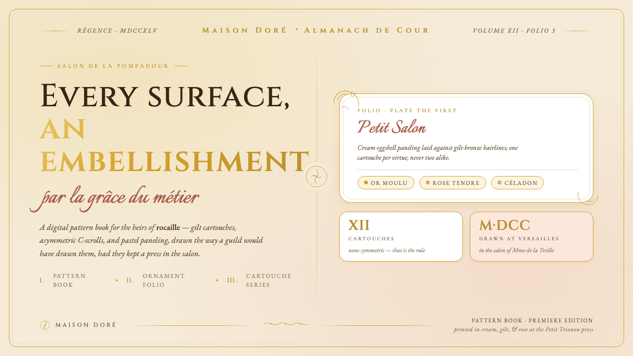
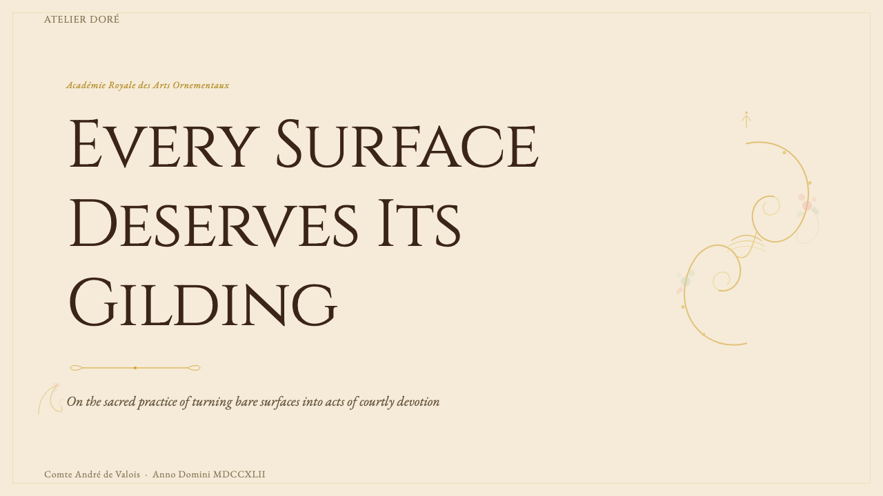
For presentation slides, the style divides naturally between cover treatments and content organization. A Rococo cover page works best when a single large cartouche or ornamental frame occupies the center or an asymmetric position, enclosing the title text within a field that reads as a painted or gilt panel. The background should hold a pale, chalky ground — ivory or dusty rose — with gilt ornamental borders at edges or corners. Content slides require a lighter hand: use ornamental rules or delicate scroll corners as structural dividers rather than full cartouche surrounds, and keep body text in a clean serif that reads as period-appropriate without becoming illegible. Data slides can incorporate ornamental frames around chart areas, treating each chart as a panel in a decorated cabinet, but the data itself should remain visually clear — the ornamentation frames the information rather than competing with it.对于演示文稿,这种风格在封面处理与内容组织之间自然分野。洛可可封面页在单个大型卡图什或装饰框架占据中心或不对称位置时效果最佳,将标题文字围合于读起来像绘画或鎏金嵌板的区域内。背景应保持浅淡粉笔质感的底色——象牙白或尘粉玫红——并在边缘或角落配以鎏金装饰边框。内容页需要更轻的笔触:使用装饰性分割线或精致的涡卷角饰作为结构分隔,而非完整的卡图什边框;正文排印采用干净的衬线字体,读来感觉与历史时代相符但不失易读性。数据页可在图表区域周围加入装饰框架,将每张图表视为装饰柜中的一块嵌板,但数据本身应保持视觉清晰——装饰是信息的框架,而非与之竞争。
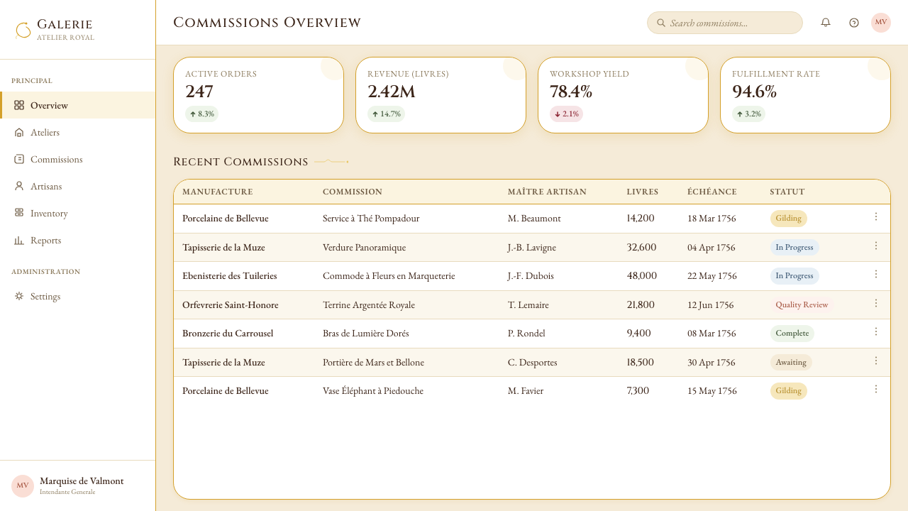
For web interfaces, Versailles Rococo is well suited to luxury product pages, high-end hospitality and event platforms, editorial mastheads, and any context where the user experience is meant to feel exclusive and historically resonant. Dashboard and utility applications are generally not good matches — the style's ornamental density conflicts with the scannability requirements of data-heavy interfaces. Where it applies, the approach is to use ornamental motifs as micro-details at the edges of interaction elements: a subtle scroll border on a modal overlay, a gilded rule separating sections, a cartouche shape used as a container for a pricing tier. The background hierarchy — pale cream primary, warmer ivory secondary, gilt accent — should be established first and applied consistently before any ornamental elements are introduced.对于网页界面,凡尔赛洛可可非常适合奢侈品产品页面、高端酒店与活动平台、编辑类刊头,以及任何用户体验旨在传递专属感与历史共鸣的场景。仪表板与功能性应用通常不是好的匹配——这种风格的装饰密度与数据密集型界面的可扫描性要求相冲突。在适用的场合,方法是将装饰母题用作交互元素边缘的微型细节:模态覆盖层上的微妙涡卷边框,分隔区块的鎏金分割线,用作定价层级容器的卡图什形状。背景层级——浅奶油色主调、较暖象牙白次调、鎏金点缀——应当首先建立并一致应用,然后才引入任何装饰元素。
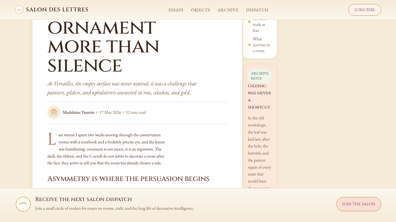
For editorial and marketing work, Versailles Rococo supports aspirational, celebratory, and heritage-positioning content particularly well. A magazine spread or editorial layout can use a large asymmetric ornamental border to frame a hero image, with body text set in a period-appropriate serif at a comfortable measure. Marketing pages for luxury goods, events, or cultural institutions benefit from the style's authority: a full-width header with a cream ground, gilt ornamental border, and centered serif headline establishes the tone immediately. Smaller ornamental vignettes — a single shell motif, a minimal scroll corner — can be used as pull-quote decorations or section markers throughout a longer document, providing visual rhythm without requiring full ornamental density on every page.对于编辑与营销内容,凡尔赛洛可可尤其适合表达志向性、庆典性和传承定位的内容。杂志跨页或编辑版面可以用一个大型不对称装饰边框来框住主视觉图像,正文以与历史时代相符的衬线字体排印于舒适的行宽中。奢侈品、活动或文化机构的营销页面得益于这种风格的权威感:奶油底色、鎏金装饰边框、居中衬线标题的全宽标题区,能立即建立基调。更小的装饰花饰——单个贝壳母题、极简的涡卷角饰——可用作较长文件中引言装饰或章节标记,在无需每页全密度装饰的前提下提供视觉节奏。
The most common mistake when applying Versailles Rococo is mistaking surface gilding for the style's substance. A dark background with bright gold overlays is not Rococo — it is a generic luxury gesture that lacks the style's defining characteristics of pale grounds, asymmetric curvilinearity, and layered ornamental depth. Equally problematic is applying a single ornamental element (one cartouche, one scroll border) to an otherwise clean modernist layout and calling it Rococo: the style requires internal consistency across multiple ornamental levels to read as intentional. The second common error is treating the style as symmetrical — adding matching ornamental elements to both sides of a composition — which directly contradicts the genre pittoresque asymmetry that defines it. Authentic application requires accepting that the composition will be weighted differently on each side, and trusting that the ornamental logic will produce its own balance.应用凡尔赛洛可可时最常见的错误,是将表面鎏金误认为这种风格的实质。深色背景叠加亮金色覆盖并非洛可可——那是一种通用的奢华姿态,缺乏这种风格的定义性特征:浅淡底色、不对称曲线性,以及层叠装饰深度。同样有问题的是:将单一装饰元素(一个卡图什、一道涡卷边框)施加于原本干净的现代主义版面上并称之为洛可可——这种风格需要跨越多个装饰层级的内部一致性,才能读来像是有意为之。第二个常见错误是将这种风格理解为对称的——在构图两侧添加对称的装饰元素——这直接违背了定义它的「风景画风格」不对称性。真实的应用要求接受构图两侧会有不同的视觉分量,并信任装饰逻辑自会产生其独特的平衡。
See the Versailles Rococo Ornament design system查看 Versailles Rococo Ornament 完整设计系统
Versailles Rococo Ornament — FAQVersailles Rococo Ornament · 常见问题
What is the difference between Rococo and Baroque, and why does it matter for design?洛可可与巴洛克有何区别?这对设计有何意义?
The most important practical distinction is symmetry versus asymmetry. Baroque design — particularly the Louis XIV French Baroque — is axiomatically symmetrical: every element on the left is answered by a corresponding element on the right, and the organizing axis is always legible. Rococo deliberately breaks this rule: C-scrolls and S-curves cascade without mirroring, cartouches carry unequal ornamental weight on each side, and the composition is balanced through visual tension rather than bilateral correspondence. In application, this means that adding symmetric ornamental borders to a layout will read as Baroque rather than Rococo, regardless of the motifs used. The second important distinction is tone: Baroque aims for grandeur and domination, Rococo aims for delight and refinement. Darker grounds, heavier mass, and more solemn color relationships belong to Baroque; pale pastels, light gilt, and a sense of graceful abundance belong to Rococo.最重要的实践区别在于对称与不对称。巴洛克设计——尤其是路易十四的法国巴洛克——在公理上是对称的:左侧的每个元素都有右侧对应元素呼应,组织轴线始终清晰可读。洛可可刻意打破这一规则:C形涡卷与S形曲线层叠流淌而不互为镜像,卡图什两侧承载不等量的装饰分量,构图通过视觉张力而非双边对应取得平衡。在应用中,这意味着向版面添加对称装饰边框,无论使用何种母题,都会被读作巴洛克而非洛可可。第二个重要区别是基调:巴洛克追求宏伟与统治感,洛可可追求愉悦与精致。更深的底色、更重的体量、更庄重的色彩关系属于巴洛克;浅淡粉彩、轻盈鎏金,以及一种优雅丰盛之感,属于洛可可。
Can Versailles Rococo work in digital interfaces, or is it too ornate for screens?凡尔赛洛可可能用于数字界面吗?还是说它对屏幕而言过于繁缛?
It can work, but it requires selective application rather than wholesale transplantation. The style's physical expression — deep-relief plasterwork, fire-gilded bronze, hand-painted boiserie — does not translate directly to a screen, and attempting to simulate these textures digitally tends to produce results that feel costume-like rather than genuinely luxurious. What does transfer successfully is the style's compositional logic: asymmetric layouts with ornamental frames, pale grounds with gilt accent lines, cartouche-shaped containers for featured content, and a serif typographic hierarchy that reads as period-coherent. The most effective digital applications use the style's ornamental vocabulary sparingly — two or three motifs applied consistently and with quality — rather than attempting full interior-decoration density, which overwhelms the screen and conflicts with interactive usability.可以,但需要选择性应用而非整体移植。这种风格的物质表达——深浮雕石膏、火镀金铜质、手绘护墙板——无法直接转化为屏幕,试图在数字环境中模拟这些质感往往产生像戏服而非真正奢华的效果。真正能成功转移的,是这种风格的构图逻辑:带装饰框架的不对称版面、浅淡底色配鎏金点缀线条、卡图什形状的特色内容容器,以及读来与历史时期连贯的衬线字体层级。最有效的数字应用是节制地使用这种风格的装饰语汇——两三个母题,一致且高质量地应用——而非试图复制室内装饰的全密度,那会压倒屏幕并与交互可用性产生冲突。
How do I avoid making Rococo look kitsch or costume-like in modern work?如何避免洛可可在现代作品中看起来像是廉价仿品或戏服效果?
The primary risk is over-referencing. Kitsch Rococo occurs when every available surface is covered in ornament without any structural justification, when the ornamental elements are lifted directly from historical sources without being redrawn or refined, and when the palette substitutes shiny metallic fills for the warm, matte quality of genuine gilt. The antidote is restraint in deployment and quality in execution. Use ornamental elements sparingly — one refined cartouche border rather than three competing ones — and invest in the quality of each individual element rather than compensating quantity for quality. The pale ground is as important as the gilt: without the breathing room of the cream or ivory field, the ornament reads as clutter rather than abundance. Finally, the asymmetry must be genuine: if the composition is symmetrical with ornamental appliqué added to both sides, it will read as stage set decoration rather than authentic Rococo structure.主要风险是过度引用。当每一处可用表面都被装饰覆盖而没有任何结构性依据,当装饰元素直接从历史资料中搬取而未经重新绘制或精炼,当色调以闪亮金属填充代替真实鎏金的温暖哑光质感时,媚俗的洛可可就出现了。解药是部署上的克制与执行上的质量。节制地使用装饰元素——一个精炼的卡图什边框而非三个互相竞争的——并投入于每个单独元素的质量,而非以数量弥补质量。浅淡底色与鎏金同样重要:没有奶油或象牙白画面的呼吸空间,装饰会被读作杂乱而非丰盛。最后,不对称必须是真实的:如果构图是对称的,仅在两侧添加装饰贴图,它会被读作舞台布景装饰而非真实的洛可可结构。
What typographic choices are most compatible with Versailles Rococo?什么样的字体排印选择与凡尔赛洛可可最为兼容?
The style pairs most naturally with high-contrast, transitional or old-style serif letterforms — the kind of type that would have been set in French printing houses of the early eighteenth century. These are typefaces with pronounced contrast between thick and thin strokes, bracketed serifs, and a calligraphic axis of stress. The type should feel like it belongs to the same cultural moment as the ornament: elegant, refined, and legible at the scale of a printed book or panel inscription rather than a billboard. Very modern geometric sans-serifs — the kind associated with mid-twentieth-century Swiss design — will read as anachronistic and oppositional to the ornamental richness. If a more legible sans-serif is needed for interface contexts, it should be a humanist design with some calligraphic character rather than a purely geometric one. Scale contrast within the type hierarchy is important: the style supports generous size differences between heading and body levels, reinforcing the ornamental principle of detail at multiple scales.这种风格与高对比度的过渡型或旧体衬线字形最为自然地配对——那种曾在十八世纪初法国印刷工坊排版的字体。这类字体具有笔画粗细间明显的对比度、带支架的衬线,以及书法式的笔轴倾斜。字体应当感觉上属于与装饰同一个文化时刻:优雅、精致,在印刷书籍或嵌板铭文的尺度下易读,而非广告牌尺度。非常现代的几何无衬线字体——那种与二十世纪中期瑞士设计相关联的类型——会被读作时代错位的,与装饰丰富性形成对立。如果界面场景需要更易读的无衬线字体,应选择具有一定书法特质的人文主义设计,而非纯几何型。字体层级内的尺度对比很重要:这种风格支持标题与正文层级之间慷慨的尺寸差异,强化了多尺度细节的装饰原则。
Is Versailles Rococo a style appropriate for brand identity, or mainly for editorial and decorative contexts?凡尔赛洛可可适合用于品牌识别,还是主要适用于编辑与装饰语境?
It is a viable brand identity style, but the category fit is narrow. The style communicates heritage, exclusivity, refinement, and European cultural authority. It is well suited to luxury goods brands (particularly fashion, jewelry, hospitality, and fragrance), cultural institutions with deep historical collections, events and galas seeking a period atmosphere, and publishing or editorial contexts where the subject matter engages with European history or aristocratic culture. It is not appropriate for technology products, financial services seeking to convey transparency and accessibility, food and beverage brands targeting young or casual audiences, or any context where the user relationship depends on directness and informality. The style makes strong implicit claims about the nature of the brand — claims about age, tradition, and cultural capital — that must be genuine or the style will read as affectation. A startup using Versailles Rococo visual language without substantive heritage to reference risks appearing absurd rather than luxurious.这是一种可行的品牌识别风格,但适配的品类范围较窄。这种风格传达传承感、专属性、精致感和欧洲文化权威。它非常适合奢侈品品牌(尤其是时装、珠宝、酒店和香水)、拥有深厚历史收藏的文化机构、追求历史时代氛围的活动与晚宴,以及题材涉及欧洲历史或贵族文化的出版与编辑语境。它不适合科技产品、追求传达透明度与可及性的金融服务、针对年轻或休闲受众的食品饮料品牌,以及任何用户关系依赖于直接性与非正式感的场景。这种风格对品牌的性质做出了强烈的隐性主张——关于历史、传统与文化资本的主张——而这些主张必须是真实的,否则这种风格会被读作矫饰。一个缺乏实质传承支撑而使用凡尔赛洛可可视觉语言的初创公司,面临的风险是显得荒诞而非奢华。
Related design styles相关设计风格
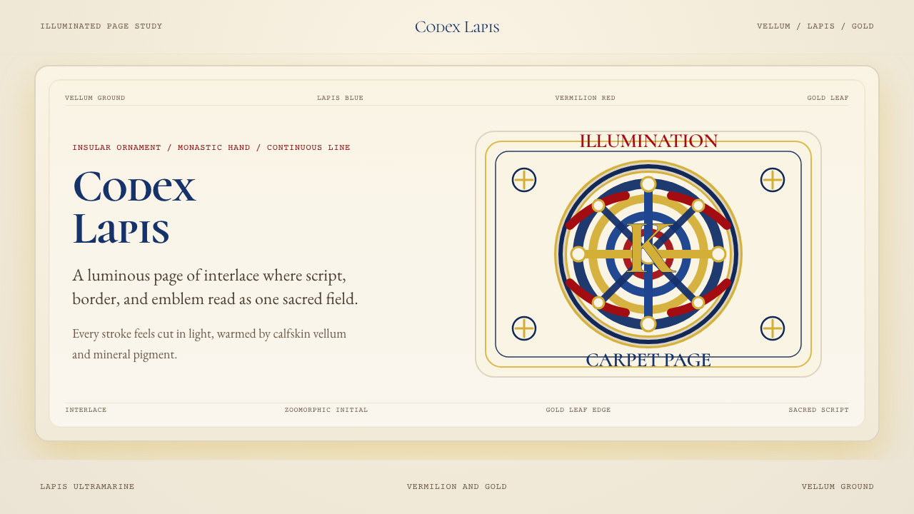 Book of Kells Celtic (800)Sacred and precise. Vellum cream, lapis, vermilion, and gold knotwork.神圣而精密。奶油羊皮底上铺陈青金石、朱砂与金色缠结纹。
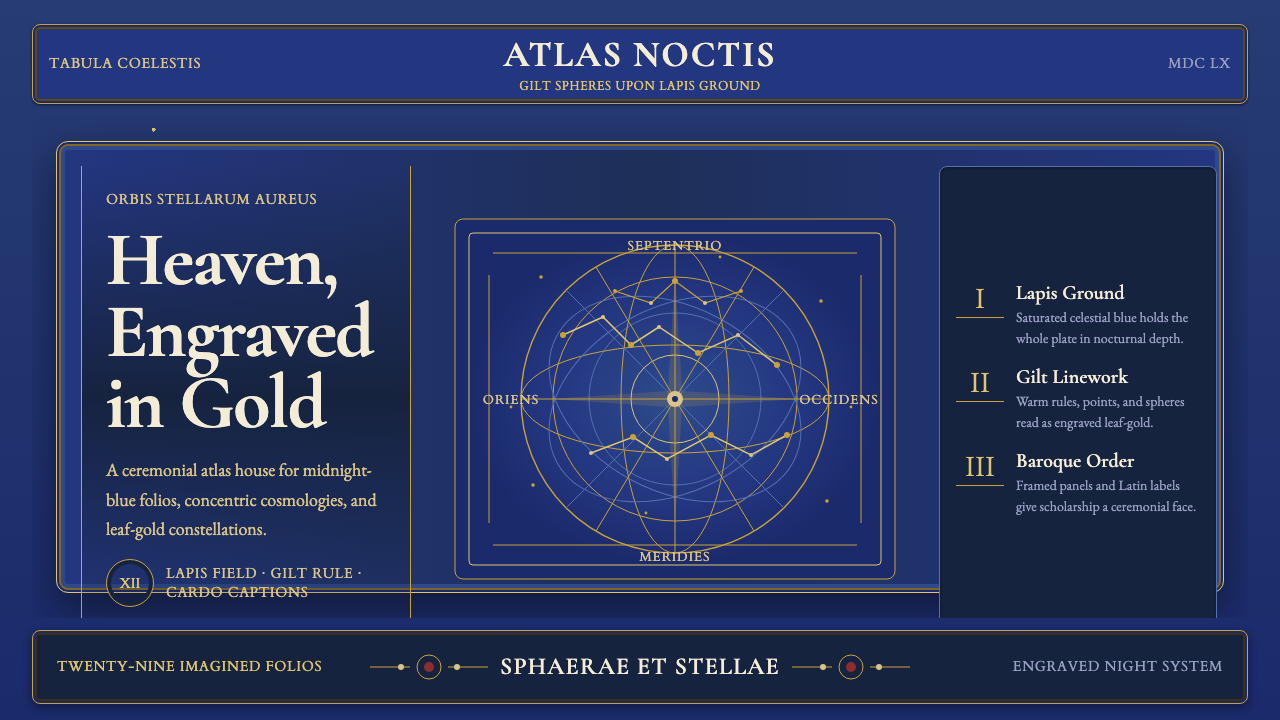 Cellarius Celestial AtlasCelestial luxury on lapis. Gilt serif type, star fields, and concentric chart…青金夜空里的天体奢华:鎏金衬线、星点与同心星图线。
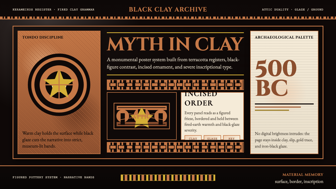 Greek Vase Attic (500 BC)Archaeological severity. Jet-black glaze, terracotta bands, and meander borde…考古般克制:黑釉底、赤陶饰带与回纹边框构成陶瓶式秩序。
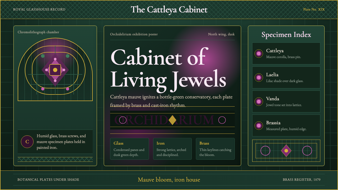 Orchid ConservatoryLush Victorian darkness. Cattleya mauve and brass sit inside bottle-green iro…繁茂的维多利亚暗调:卡特兰紫红与黄铜嵌入瓶绿铁格。
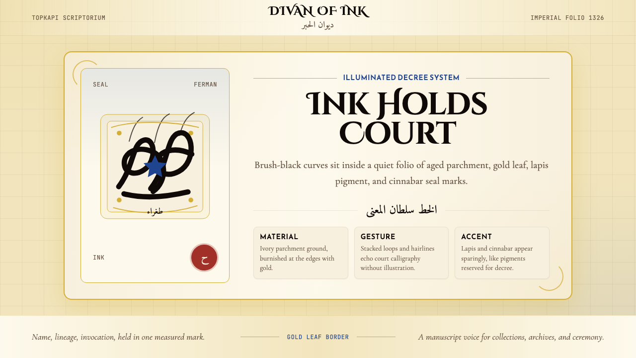 Ottoman Tughra CalligraphyImperial ink holds court. Gold borders, lapis panels, and Cinzel tughra-like…御墨自带威仪:金箔边框、青金石蓝与 Cinzel 花押式排版。
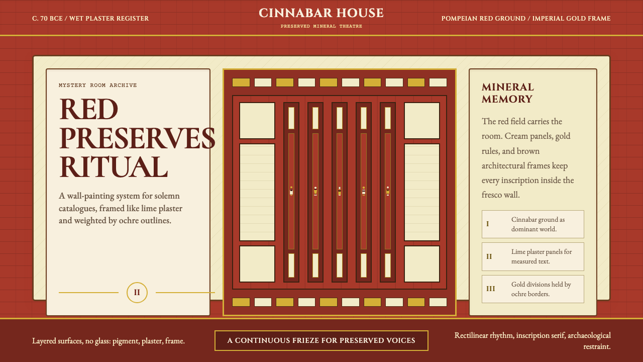 Pompeii Fresco Villa of MysteriesThe wall is the world. Pompeian red, cream plaster panels, and gold frames ho…墙面即世界。庞贝红、石灰奶油面板与金色框线托住仪式。