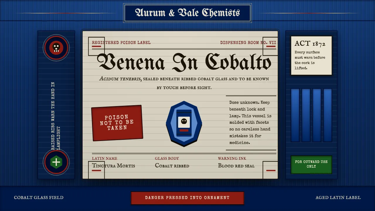
About Apothecary Poison Label
This is the dangerous-medicine aesthetic of the 19th-century pharmacy: a deep cobalt-blue bottle, ribbed and molded so a druggist could feel its poison by touch in lamplight, wearing a serif-framed paper label of Latin names. Every surface warns. The glass is dark, the rules are doubled, the skull is embossed. It treats safety as ornament — beauty pressed into the service of fear.
- Origin
- Western Europe
- Era
- pre-1900 (late Victorian); embossed poison-ware peak ~1870–1899
- Key figures
- Victorian dispensing chemists · druggists · poison-bottle glassmakers
- Movements
- Victorian pharmaceutical labelling · embossed poison-bottle safety design
Apothecary Poison Label design spec
Colors
Background
Surface
Primary
Secondary
Accent
Text
Typography
UnifrakturMaguntiaHeadings
IM Fell English SCBody
Special EliteMono
Unlock for 1 credit
The other 11 sections — buttons, cards, spacing, motion, techniques and more — open once you unlock. Download the DESIGN.md or send it to your AI in one click. Unlock once, yours forever.
Sign up nowHave an account? Sign in
Styles similar to Apothecary Poison Label
Also inspired by print & type, with a close feel.
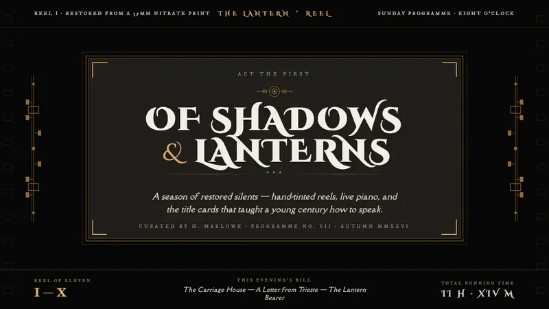 Silent Film IntertitleThe screen darkens, words appear. Warm off-white serif on jet-black film, framed in muted gilt.
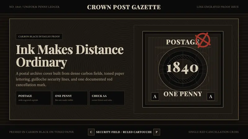 Penny Black StampBlack carries authority. Guilloche lines, Victorian serifs, and one red cross feel engraved.
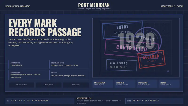 Vintage Passport StampsInk remembers passage. Indigo leaf, blue-violet cachets, red seal, typewriter serials.
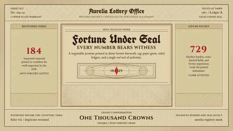 Engraved Lottery TicketLegal gravity in sepia. Guilloche borders, blackletter type, and a vermilion seal.