About Silent Film Intertitle
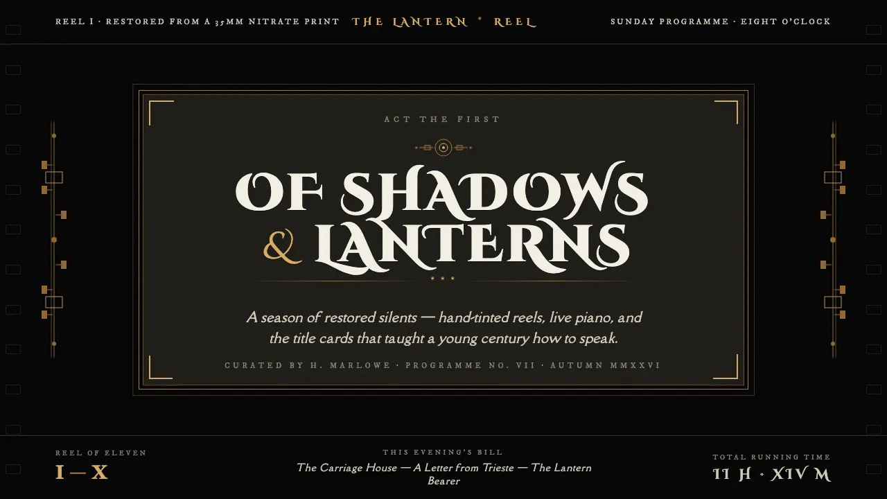
The silent-film intertitle is the title card spliced into a 1920s reel: warm hand-lettered off-white serif framed by ornate Art-Nouveau ornament, all on a solid jet-black field of unexposed film. The screen goes dark, the words appear, and the typography carries the whole scene.
This system rebuilds that title plate as an interface — engraved decorative caps, hand-set body serif, muted-gilt rules and corner flourishes, centered and symmetric inside an ornate border. The page is the black emulsion; the lettering is genuinely warm white, never lazy pure #FFF.
- Origin
- North America (Hollywood studio era) and international silent production
- Era
- c. 1900–1930 (peak intertitle craft mid-to-late 1920s)
- Key figures
- Studio title-card artists and letterers · the Pastel / Della Robbia typeface (revived as 'Silentina')
- Movements
- Silent-film typography · Art Nouveau decorative border ornament
Silent Film Intertitle design spec
Colors
Typography
The other 11 sections — buttons, cards, spacing, motion, techniques and more — open once you unlock. Download the DESIGN.md or send it to your AI in one click. Unlock once, yours forever.
Sign up nowStyles similar to Silent Film Intertitle
Also inspired by print & type, with a close feel.
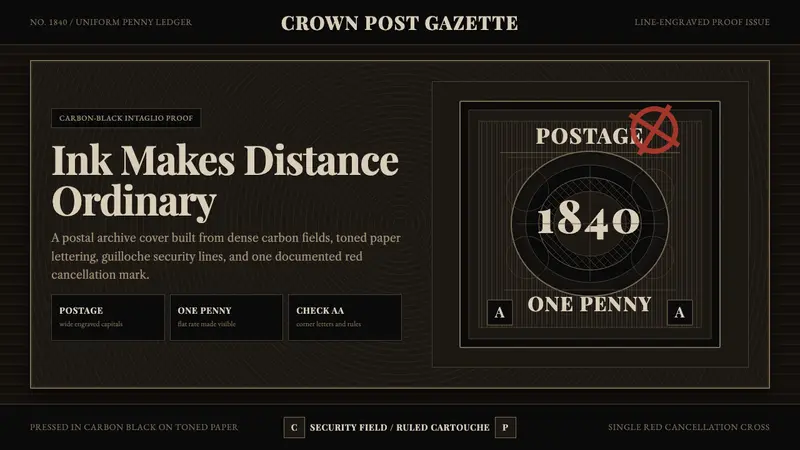 Penny Black StampBlack carries authority. Guilloche lines, Victorian serifs, and one red cross feel engraved.
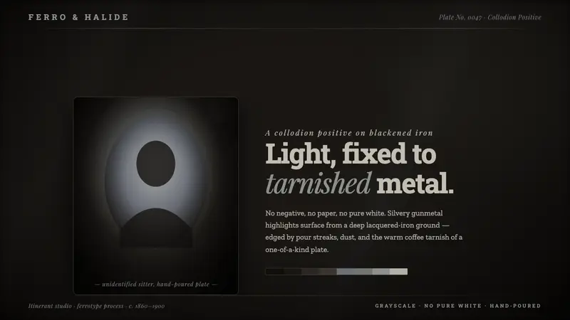 Tintype Wet PlateLight fixed to tarnished metal. Gunmetal grays rise from blackened iron, capped short of pure white.
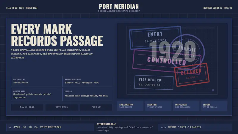 Vintage Passport StampsInk remembers passage. Indigo leaf, blue-violet cachets, red seal, typewriter serials.
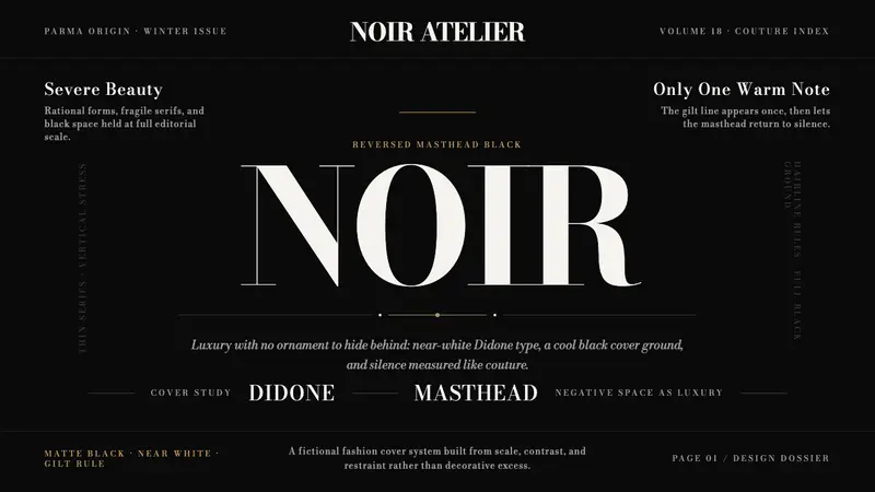 Bodoni Didone Fashion MastheadLuxury as black silence. White Bodoni, tiny coverlines, and one gilt hairline carry the page.