What is Silent Film Intertitle?
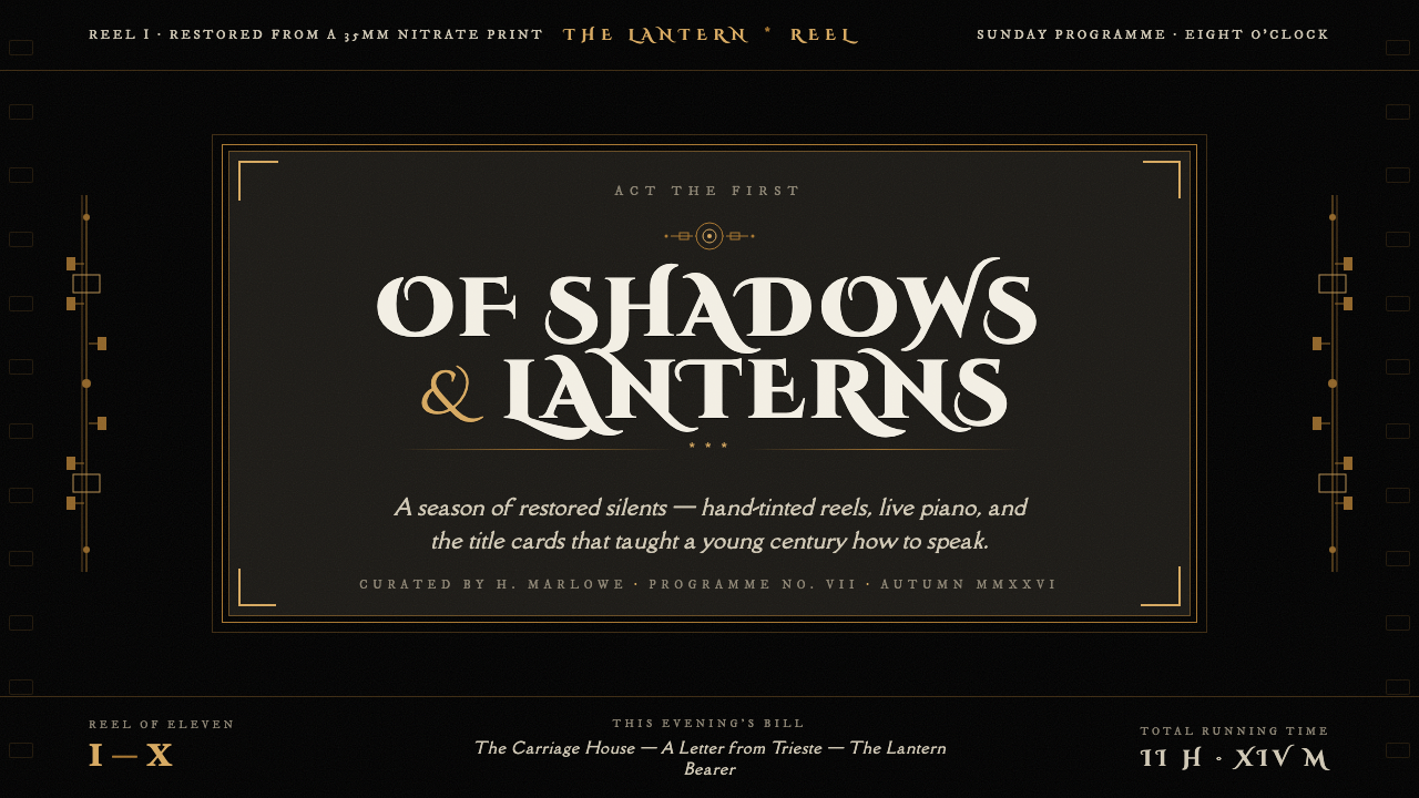
The silent-film intertitle turns darkness into a stage — warm letters, muted gilt, and the poised silence of a story carried entirely by type.
Silent Film Intertitle in brief
The silent-film intertitle is the title card spliced into a reel during the era of silent production, especially the studio-made films of the 1920s. Its visual language is deliberately theatrical: the screen falls to a solid jet-black field, warm off-white serif lettering appears at the center, and an ornate Art Nouveau border holds the words in place. With no spoken voice on the soundtrack, the title card makes typography carry the scene.
This is not merely a dark page with vintage decoration. The system depends on contrast between the near-void of the film field and the tactile presence of the lettering. The type feels hand-set and hand-lettered rather than mechanically neutral; the frame feels engraved rather than printed as a generic box. Muted gilt rules and corner flourishes create a ceremonial edge, while centered symmetry gives the message the composure of a formal title plate.
As an interface language, the style rebuilds the intertitle as a complete visual system. The page becomes black emulsion, the text becomes warm off-white, and ornament becomes a quiet structural device around the content. Every element is staged: the border establishes a boundary, the title commands attention, and supporting text remains subordinate without becoming visually dull.
Where does Silent Film Intertitle come from?
The intertitle belongs to the broad period of silent-film production from roughly 1900 to 1930, with its most accomplished title-card craft reaching a peak in the middle and later years of the 1920s. It developed across North America, particularly within the Hollywood studio era, and across international silent production. The form was modest in physical scale but immense in narrative responsibility: a dark interval of film became a designed surface on which words had to appear with immediate authority.
Its makers were studio title-card artists and letterers, specialists whose work joined writing, lettering, framing, and visual composition. The source material identifies silent-film typography and Art Nouveau decorative border ornament as the two central movements behind the style. These traditions meet in the intertitle’s characteristic tension: the wording must be read quickly and clearly, yet the surrounding frame gives the card the richness of a crafted object.
The Pastel and Della Robbia typeface is part of this typographic lineage and was later revived as Silentina. Its inclusion points to the particular character required by the style: a serif face with enough warmth and distinction to feel made for the screen, not merely transferred from ordinary body text. In a contemporary interface, the historic reference is best understood as a principle of atmosphere and letterform character, not as a license to imitate every period detail.
What defines the Silent Film Intertitle look?
Jet-Black Field
The background is an uninterrupted jet black, recalling the unexposed film field when the screen goes dark. It is not a decorative color choice but the condition that allows the title to appear with theatrical force. Texture, noise, and atmospheric imagery are unnecessary; the black field should feel absolute, still, and deep enough for the lettering to become the only illuminated presence.
Warm Off-White Serif
Lettering is warm off-white rather than cold, glaring white. The serif structure gives the words historical gravity, while the softened tone keeps them connected to paper, ink, and projected light. Against black, the type should feel luminous without becoming digital or clinical. The contrast is strong, but the mood remains human and tactile.
Hand-Lettered Character
The typography should suggest hand lettering and hand setting. Slightly individual forms, deliberate spacing, and a sense of crafted rhythm keep the title from feeling like a generic template. This quality does not mean irregularity for its own sake. The letters remain composed and legible; their value lies in making the message feel prepared for a particular scene.
Muted Gilt Ornament
Gilt appears as a muted structural accent, not as bright metallic spectacle. Rules, corner flourishes, and small ornamental details should frame the content with restraint. The finish is closer to aged engraving than polished luxury. Its role is to mark the title card as a crafted plate and to soften the severity of the black field without competing with the words.
Art Nouveau Border
The border draws from Art Nouveau ornament: flowing flourishes, ornamental symmetry, and a sense that the frame itself has been drawn rather than assembled from interface parts. It should be rich enough to establish period character, but organized enough to preserve a clear reading field. Ornament belongs at the perimeter, where it supports the message instead of interrupting it.
Centered Symmetry
The composition is centered and symmetric, giving the intertitle the stillness of a formal announcement. The border establishes the outer order, the title occupies the visual center, and supporting lines settle beneath it in measured relation. This balance is not passive. It creates suspense by holding every element in place until the words become the event.
Who shaped Silent Film Intertitle?
Studio title-card artists shaped the intertitle as a designed plate rather than an incidental label. Their contribution joined wording, lettering, framing, and screen presence into one composition. The style’s authority comes from this total treatment: the text is not placed inside an ornament after the fact, but conceived together with the dark field and the surrounding frame.
Studio letterers gave the intertitle its human scale and crafted rhythm. Their work is reflected in the preference for warm serif forms, carefully judged spacing, and decorative capitals that feel engraved or prepared by hand. In a digital reconstruction, the letterer’s role becomes a reminder that typography must carry atmosphere as well as information.
The Pastel and Della Robbia typeface, later revived as Silentina, represents the typographic reference associated with this system. Its importance is less about period costume than about a particular meeting of serif structure, display presence, and warmth. It helps define the kind of lettering that can stand alone on a black screen and still feel intimate rather than sterile.
How do you use Silent Film Intertitle today?
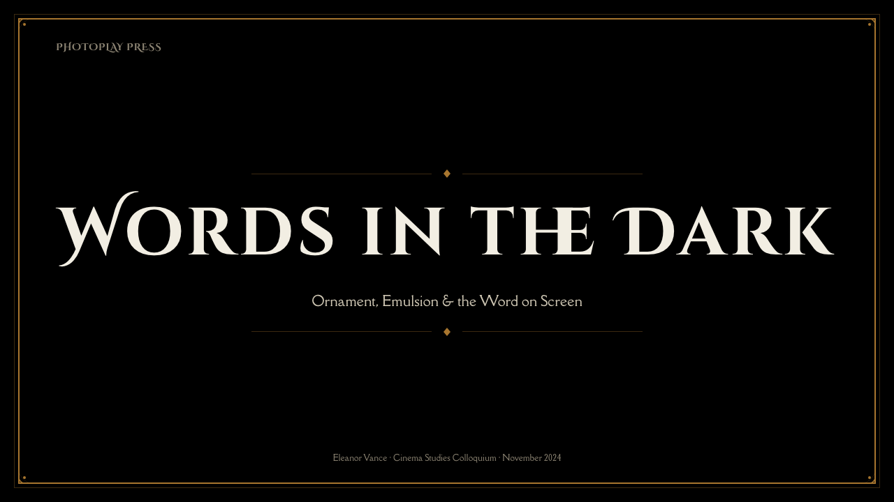
For presentation slides, use the intertitle logic across cover, content, and data pages. A cover should behave like a title plate: a black field, a centered statement, and a restrained gilt frame establish the mood before any explanation begins. Content slides can use the same centered hierarchy, with ornamental rules separating sections and warm serif text carrying the narrative. Data slides should simplify the ornament and let the information sit inside the frame like a formal notice; the system works through contrast and staging, not through decorative charts.
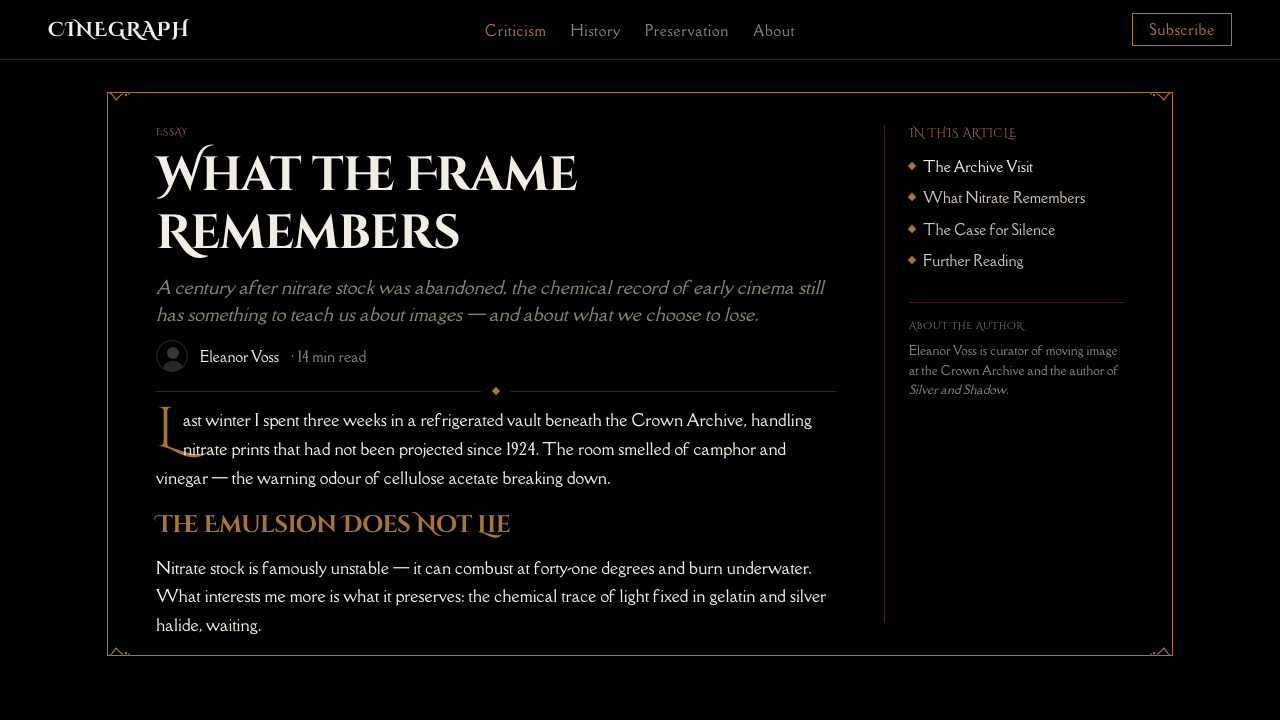
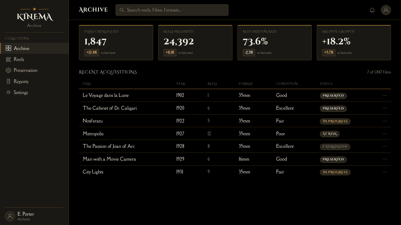
For web interfaces, the style suits dashboards and pricing pages that want to feel deliberate, cinematic, and highly controlled. A dashboard can use the black field as a quiet container for status, summaries, and selected metrics, while gilt rules define relationships between groups of information. A pricing page can treat each plan as a title card, using warm off-white type for names and restrained ornament for emphasis. Interaction states should remain legible and calm; the frame should support decision-making rather than turn every control into theatrical decoration.
For editorial and marketing work, the intertitle offers a strong way to turn short messages into events. Articles can open with a centered title plate, then move into a more spacious reading field while retaining the warm serif voice and occasional gilt rule. Campaign pages can use the black field for declarations, launches, and calls to attention, with the border acting as a recognizable signature. The approach is especially effective when the message is concise enough to receive the full weight of the composition.
The common mistake is treating the style as a pile of vintage signals: black background, ornate border, old-looking type, and gold accents all competing at once. That produces costume rather than atmosphere. The system depends on hierarchy. Keep the field quiet, let the lettering remain warm and readable, make ornament subordinate, and preserve the centered symmetry. Pure white, bright metallic gold, excessive flourishes, and multiple competing type treatments weaken the sense that the words themselves are the scene.
Silent Film Intertitle — FAQ
What exactly is a silent-film intertitle?
It is a title card spliced into a silent-film reel, most strongly associated with the studio-era productions of the 1920s. The card creates a dark interval in which words appear as the primary visual event. In this design system, that role is reconstructed through a jet-black field, warm off-white serif lettering, and an ornate Art Nouveau frame.
Why use warm off-white instead of pure white?
Warm off-white keeps the lettering connected to film, paper, ink, and handcraft. Pure white tends to feel clinical and digital against black, while the warmer tone gives the words a projected, tactile presence. The contrast remains clear, but the emotional register becomes less sterile and more human.
Does the border have to be ornate?
It should carry Art Nouveau character, but ornament does not need to overwhelm the reading field. The essential qualities are crafted linework, decorative symmetry, muted gilt, and a clear perimeter. If every flourish competes with the title, the design loses the quiet authority of an intertitle. Ornament works best when it frames the words and then recedes.
Can this style work outside a film-related product?
Yes, when the product benefits from ceremony, focus, and a strong sense of authored presentation. It can suit editorial launches, cultural pages, selected dashboards, and pricing experiences that want each message to feel deliberate. It is less suitable where the product depends on casual warmth, dense utility, or constant visual activity. The style asks the content to behave like an event, so the content must be concise enough to support that treatment.
What makes a digital version feel authentic rather than nostalgic?
Authenticity comes from treating the intertitle as a system of hierarchy, not as a collection of period props. The black field must remain quiet, the warm serif must carry the message, the gilt frame must establish structure, and centered symmetry must control the composition. When these relationships are consistent, the result feels purposeful. When they are replaced by random vintage effects, the design becomes imitation.
Related design styles
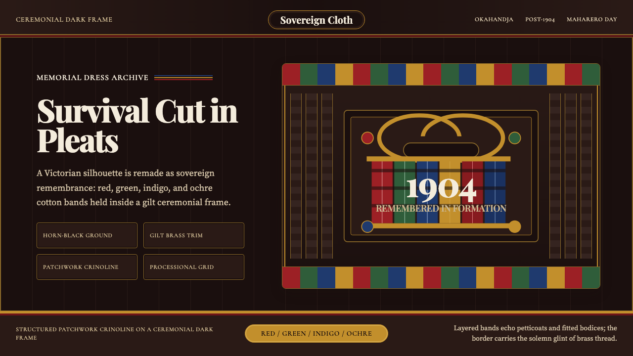 Herero Victorian Dress (Namibia)Memorial wears structure. Red, indigo, green pleats frame gilt brass on dark…
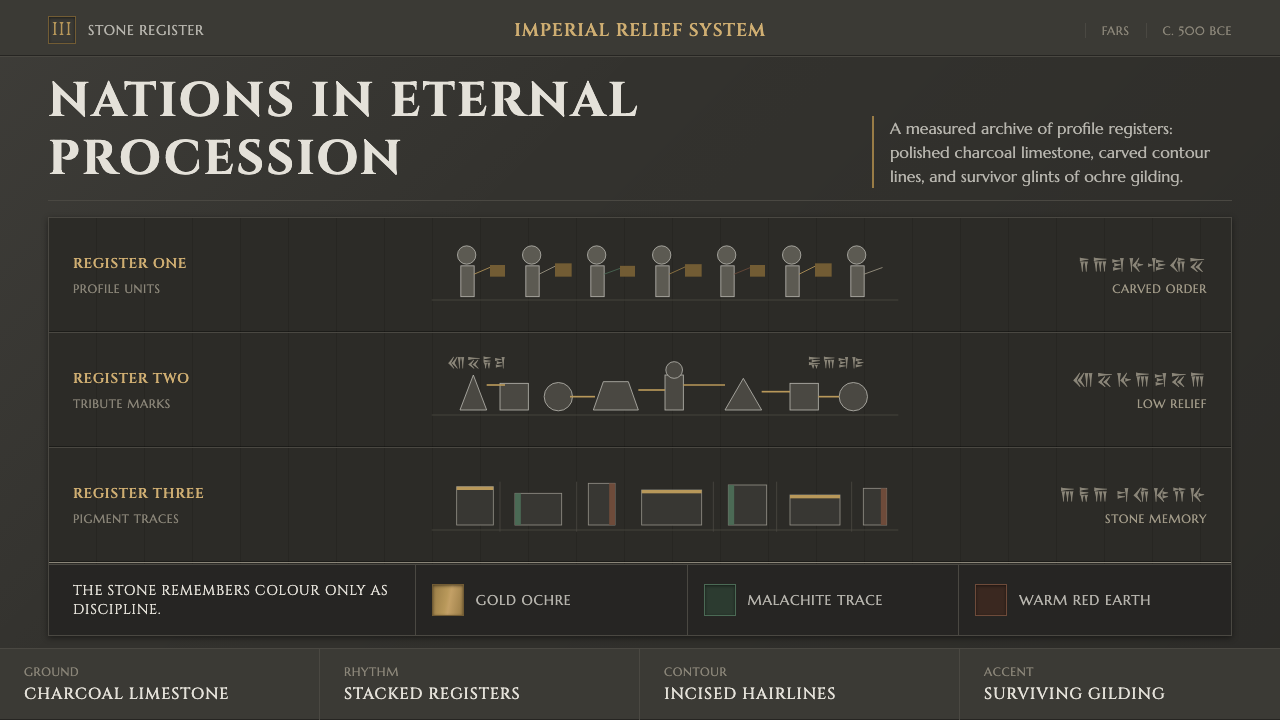 Achaemenid Persepolis ReliefImperial restraint in stone. Charcoal registers carry ochre, green, and red p…
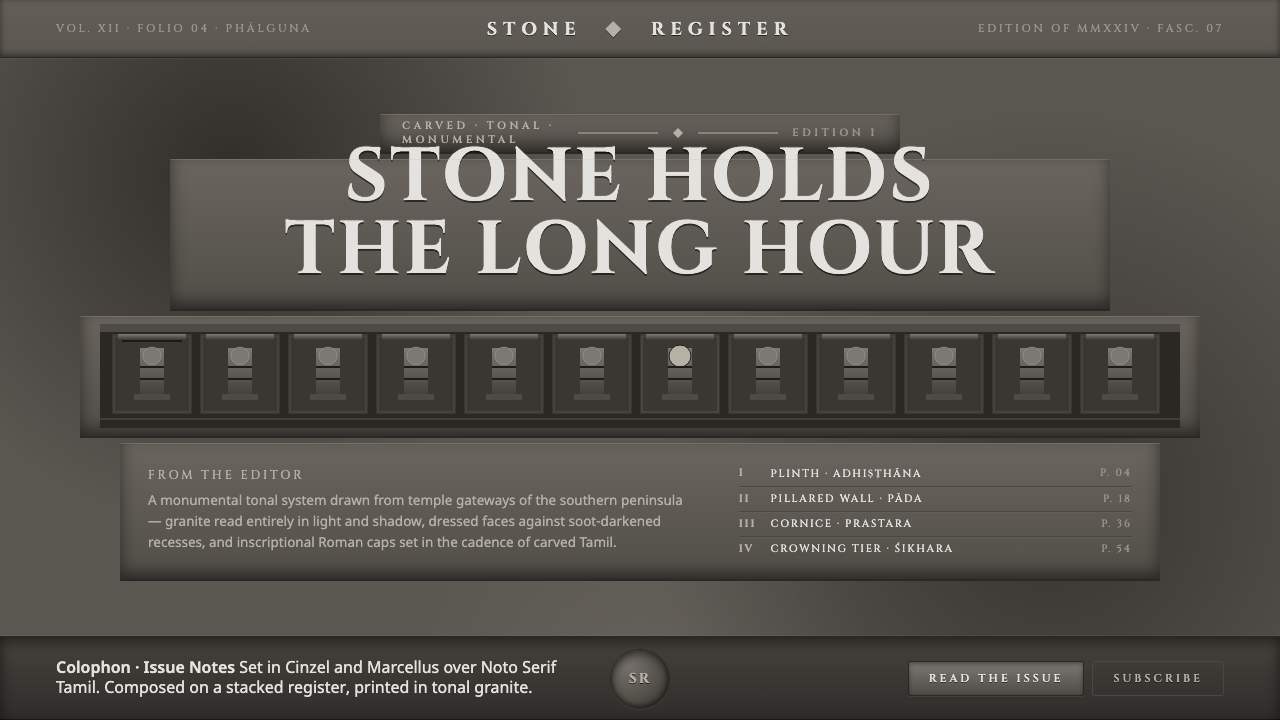 Dravidian Granite GrayscaleRead entirely in grayscale. Soot-dark recesses against dressed granite, Cinze…
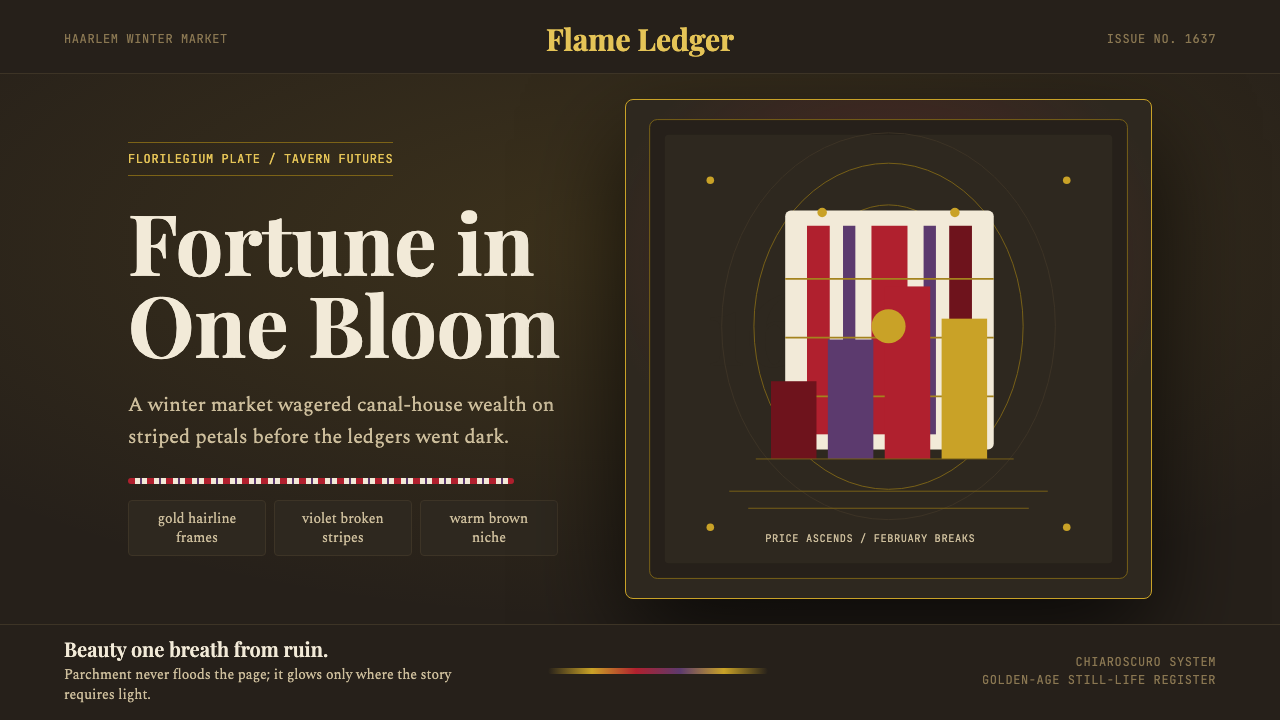 Dutch Tulip ManiaSpeculation burns in shadow. Flame red petals, violet stripes, gold frames on…
 German Expressionist CinemaDread is painted, not cast. Amber type, steel-blue flats, and oblique shadows…
 Persian Gray Stone ReliefStone remembers. Smoky weathered limestone, near-black shadow in every channe…