What is German Expressionist Cinema?
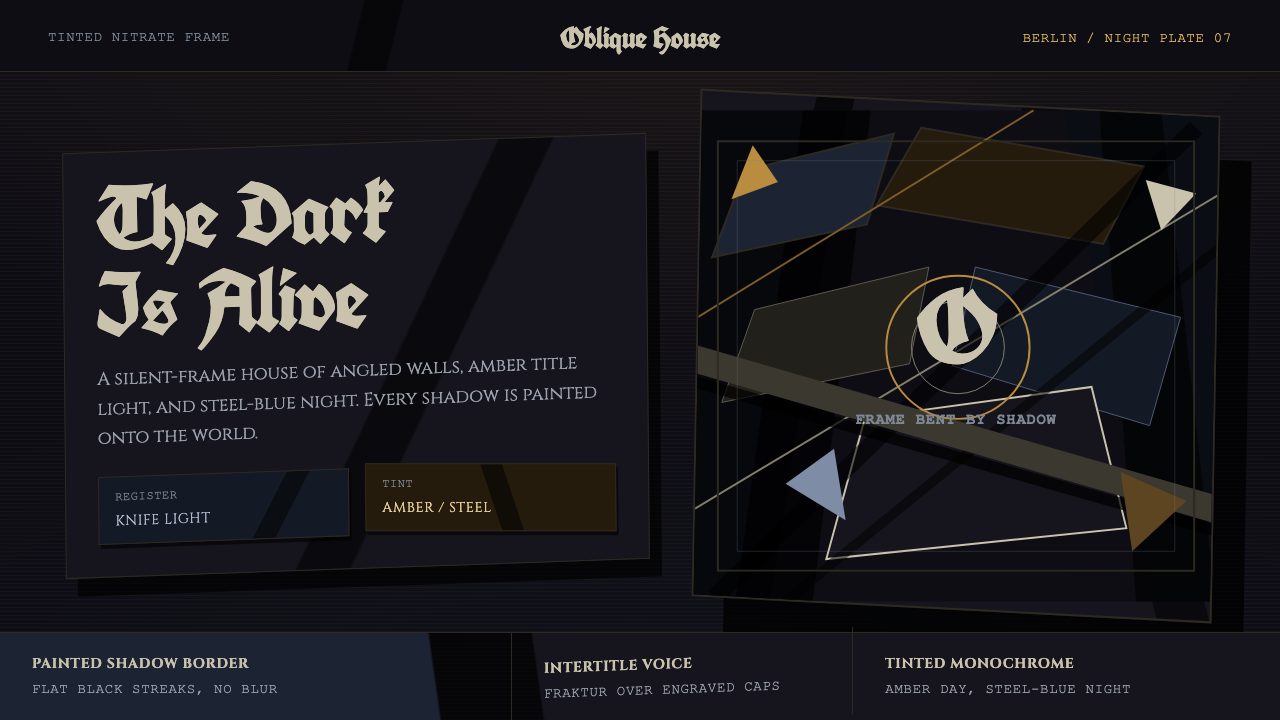
German Expressionist cinema turns the screen into a wounded psyche — amber titles, steel-blue nights, knife-like light, and painted shadows bending reality into dread.
German Expressionist Cinema in brief
German Expressionist cinema is the visual language of Weimar-era silent film, especially the period from around 1919 to 1927. Canonized by Das Cabinet des Dr. Caligari, which premiered in Berlin in 1920, it replaces believable space with jagged sets, acute angles, and oblique shadows painted directly onto scenery. Buildings lean, streets narrow into wedges, and darkness behaves less like an absence of light than an active force pressing into the frame.
Although these films are often remembered as black and white, original nitrate prints were exhibited with monochrome tinting. Amber commonly marked daylight, while steel blue signaled night. These restrained fields did not naturalize the image; they intensified its emotional temperature. The essential ground remained a near-black projected frame in which pale faces, angular architecture, and illuminated captions appeared momentarily before being reclaimed by darkness.
The style externalizes psychological disturbance. Rather than asking lighting and scenery to imitate the physical world, it makes them embody fear, instability, and suspicion. A shadow may be painted where no object could cast it; a doorway may taper impossibly; a diagonal may cut across both architecture and typography. The result is not decorative horror but a coherent expressive system in which the world itself has become unreliable.
Where does German Expressionist Cinema come from?
The style emerged from German silent cinema during the early Weimar era, with production centered in Berlin studios including Decla-Bioscop and UFA. Its defining historical marker is the Berlin premiere of Das Cabinet des Dr. Caligari in 1920. The film gathered distorted scenery, painted illumination, severe contrasts, and theatrical performance into a visual world whose instability was comprehensive rather than occasional.
Its imagery drew power from the material conditions of silent exhibition. Without spoken dialogue, architecture, gesture, title cards, and tonal contrast carried narrative pressure. Tinting added another expressive layer: amber daylight could feel feverish rather than warm, while steel-blue night made figures seem trapped inside a cold, artificial atmosphere. Because each sequence was governed by a dominant tint, color operated as mood and temporal orientation rather than local description.
The central innovation was to reject the assumption that a set should behave like neutral space. Walls, windows, paths, and shadows became graphic marks arranged inside the projected rectangle. Painted shadows remained fixed even as performers moved, separating darkness from ordinary cause and effect. Acute diagonals disturbed the horizontal stability of the frame, while irregular silhouettes made streets and interiors appear capable of tightening around their occupants.
German Expressionism belongs specifically to Weimar cinema, yet the source tradition also identifies it as a precursor to film noir. The connection lies in the dramatic organization of darkness: oblique shadows, compressed spaces, endangered figures, and light treated as an incision through blackness. Later forms might pursue more photographic realism, but the earlier Expressionist principle remains sharper and stranger — dread is designed into the world before the camera records it.
What defines the German Expressionist Cinema look?
Tinted Darkness
The palette begins with near-black, chalky light, amber daylight, and steel-blue night. Tinting should feel like a monochrome atmosphere spread across the frame, never a collection of brightly colored objects. Amber carries heat, age, and theatrical illumination; steel blue carries distance, nocturnal cold, and confinement. Modern saturated accents weaken the historical severity.
Painted Shadow
Shadows are designed marks rather than faithful records of illumination. They stretch diagonally, terminate abruptly, and may contradict the apparent position of a lamp or figure. Their edges are decisive and their shapes often resemble wedges, claws, or narrowing corridors. A convincing composition lets shadow invade structure instead of merely sitting behind an object.
Distorted Geometry
Perspective is expressive rather than accurate. Walls lean, windows become irregular slits, roofs break into teeth, and streets converge too sharply. Acute angles create pressure by denying the eye a stable horizon. Even rectangular panels should feel cut, tilted, or compressed, as though the frame cannot contain the world without deforming it.
Intertitle Typography
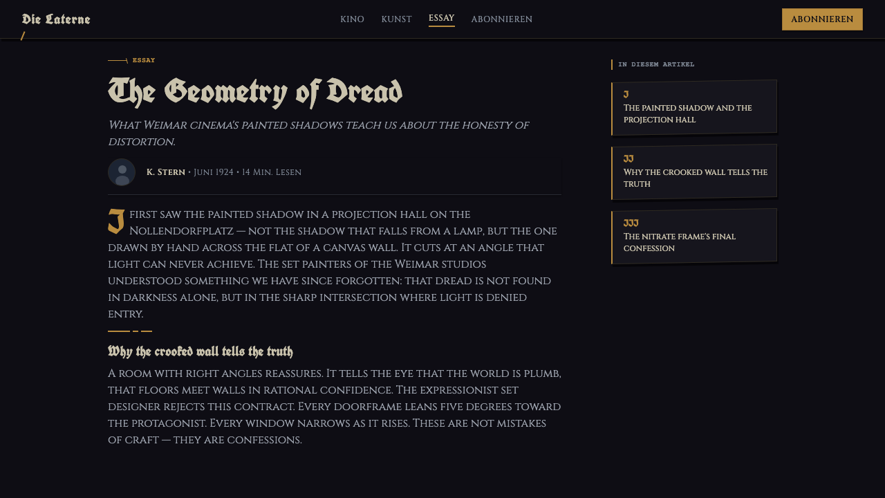
Typography moves among Gothic blackletter, engraved Roman capitals, and the declarative language of silent-film intertitles. Letterforms should appear carved, printed, or painted, not frictionlessly digital. Titles favor theatrical hierarchy and compressed phrasing, while surrounding ornament remains subordinate. Type belongs inside the same tinted darkness as the image rather than floating above it as a neutral interface layer.
Projected Frame
The composition behaves like light projected into a dark room. Blackness surrounds and often enters the visible scene, producing an image that feels bounded, fragile, and temporary. Vignetting may be suggested through irregular darkness, but soft photographic polish is inappropriate. The edge should feel like an unstable border between visibility and erasure.
Psychological Space
Every formal choice should intensify a mental condition. A tilted panel suggests disorientation; a narrowing passage suggests entrapment; a black wedge suggests threat before any figure appears. Empty areas are therefore not calm negative space but zones of anticipation. Authentic use coordinates geometry, light, type, and tint around one emotional pressure.
Who shaped German Expressionist Cinema?
Robert Wiene stands among the key figures attached to the tradition canonized by Das Cabinet des Dr. Caligari. Within the style’s public memory, his name belongs to the moment when distorted sets, painted shadow, and silent performance fused into a complete cinematic environment rather than appearing as isolated theatrical effects.
Hermann Warm is identified among the central figures of German Expressionist cinema’s formative visual language. His place in the source tradition underscores that the style cannot be reduced to camera lighting: its dread depends on scenery conceived graphically, where streets, walls, and darkness participate in the same distorted composition.
Walter Reimann belongs to the named constellation surrounding the movement’s canonical visual identity. His association points toward the collective construction of an image in which painted surfaces carry psychological meaning and apparent architectural defects become deliberate expressive decisions.
Walter Röhrig is another key figure named within the Berlin-centered tradition. His inclusion emphasizes the importance of the fabricated screen world: Expressionist terror begins in the shape of the set, the angle of a painted shadow, and the refusal of ordinary perspective before narrative action supplies an explicit threat.
Conrad Veidt is named among the movement’s defining figures, connecting its constructed environments to the human presence inside them. In this visual system, the performer does not restore normality; the body becomes another elongated, angular, high-contrast element caught between painted architecture and living darkness.
How do you use German Expressionist Cinema today?
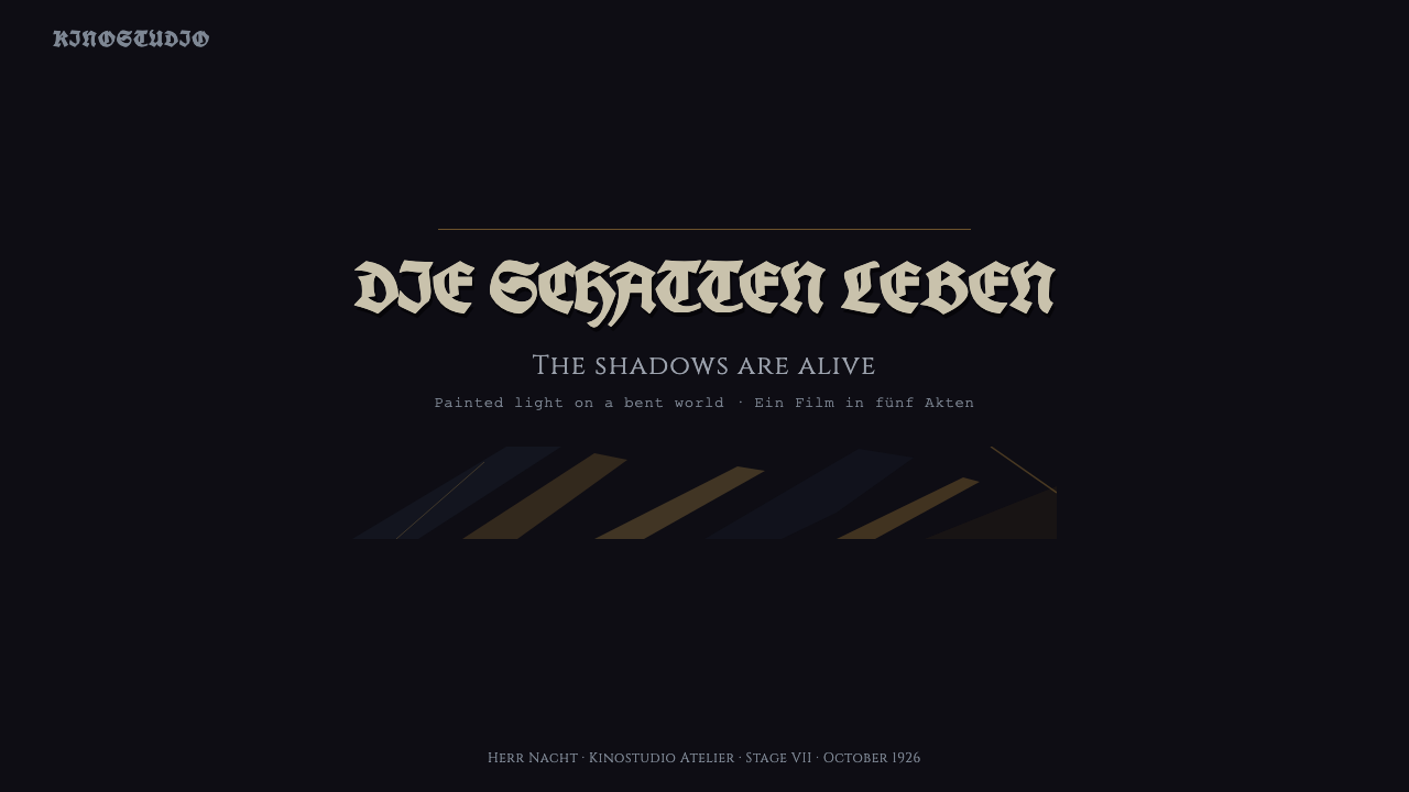
For presentation covers, begin with a near-black projected field and one dominant diagonal that appears to deform the title area. Amber lettering can suggest a daylight intertitle, while steel blue can establish nocturnal dread. Keep the composition sparse: a looming shadow, an irregular architectural silhouette, and a compressed title are usually more convincing than a collage of horror symbols.
Content slides should preserve legibility without neutralizing the style. Place text inside panels that resemble silent-film title cards or fragments of tilted scenery, but keep reading order unmistakable. Use pale text against darkness and reserve tinted fields for section changes or emphasis. Data slides work best when charts become stark silhouettes: bars may lean like buildings, divisions may follow oblique cuts, and highlighted values may emerge from a single amber or steel-blue field.
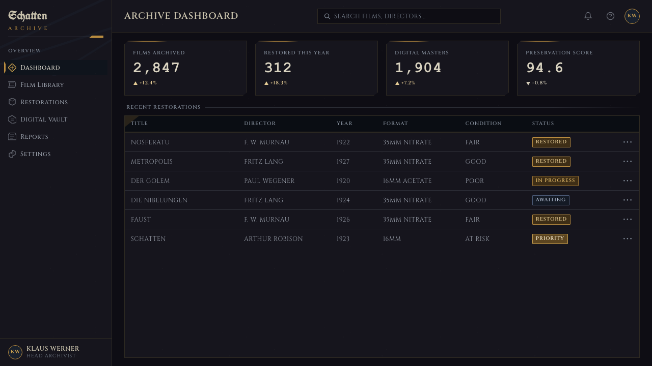
For web interfaces, German Expressionism suits atmospheric dashboards, archives, cultural platforms, and pricing pages that benefit from dramatic hierarchy. Navigation can resemble an intertitle sequence, while cards behave like illuminated openings cut into blackness. Pricing tiers should remain comparable, with distortion concentrated in borders, headings, and background shadows rather than in essential figures or controls. The style should heighten tension without making ordinary interaction feel uncertain.
Editorial and marketing layouts can use the projected frame as a narrative device. An article may alternate dense dark passages with tinted image fields, allowing pull quotes to appear like interruptions from a silent film. Campaign pages can move from amber introduction to steel-blue crisis and near-black conclusion. Photography, when present, should be treated as a high-contrast fragment within the composition rather than a bright naturalistic window.
The common mistake is to confuse Expressionist distortion with random crookedness. When every panel tilts differently, every word uses a theatrical face, and amber and blue compete across the same scene, dread dissolves into novelty. Choose one psychological pressure, one dominant tint, and a small family of related angles. Distortion should direct attention and imply threat; it should never obscure the information the design exists to communicate.
German Expressionist Cinema — FAQ
Is German Expressionist cinema simply black-and-white horror?
No. Its defining quality is not the absence of color or the presence of frightening subject matter, but the transformation of space into psychological expression. Original nitrate prints were also shown with amber and steel-blue tinting. A scene becomes Expressionist when scenery, shadow, perspective, typography, and performance all make emotional disturbance visible.
Why are the shadows painted instead of naturally cast?
A naturally cast shadow remains accountable to a light source, whereas a painted shadow can obey emotional logic alone. It can stretch farther than physics permits, point against the apparent illumination, or remain fixed while a figure moves. This independence makes darkness feel intentional and alive, turning the set into an image of fear rather than a place merely containing fear.
How should amber and steel blue be used together?
Treat them as separate atmospheric states rather than simultaneous accent colors. Amber is associated with daylight and can feel heated, aged, or theatrical; steel blue marks night and introduces cold distance. Moving between them can structure a sequence, but crowding both into every frame destroys the monochrome tinting logic. Near-black should remain the continuous ground connecting them.
Is German Expressionism the same as film noir?
No, though German Expressionist cinema is identified as a precursor to film noir. Both use oblique shadows, compressed spaces, and endangered figures, but Expressionism more openly distorts the physical world. Its sets may be visibly painted and geometrically impossible. Noir generally inherits the dramatic darkness while moving toward spaces that appear more photographically plausible.
Where does this style work poorly in contemporary design?
It struggles where calm neutrality, warmth, or effortless trust is the primary goal. Friendly consumer services, routine productivity tools, and information-dense operational screens can become exhausting if every surface implies menace. The style is strongest when dread, historical atmosphere, theatricality, or psychological tension supports the subject. Elsewhere, isolated devices such as a tinted title card or oblique divider are safer than a complete transformation of the interface.
Related design styles
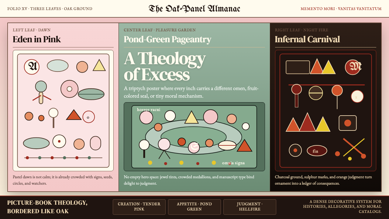 Bosch — Garden of Earthly DelightsHorror vacui becomes doctrine. Pink, green, and hellfire panels swarm with se…
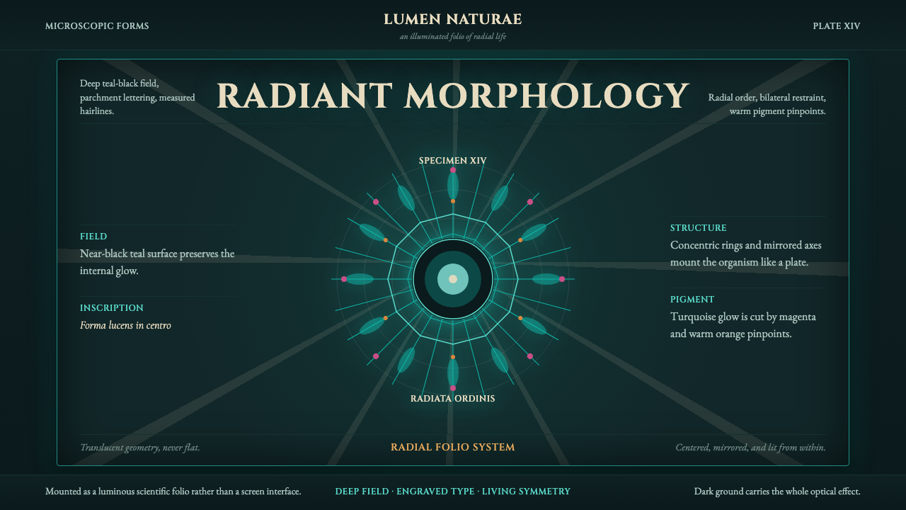 Haeckel KunstformenLuminous symmetry. Teal-black ground, Cinzel capitals, and radial turquoise s…
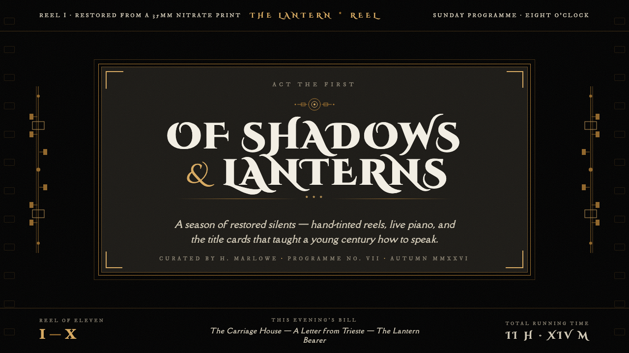 Silent Film IntertitleThe screen darkens, words appear. Warm off-white serif on jet-black film, fra…
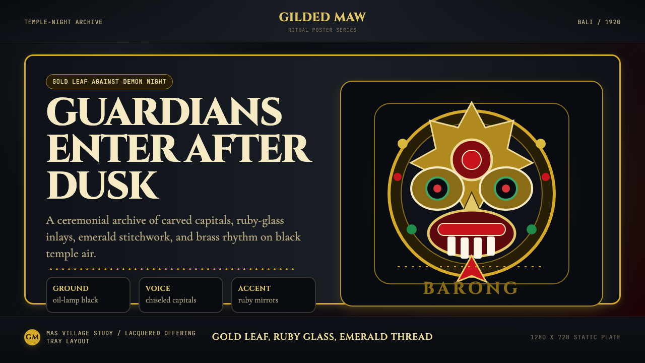 Balinese Barong Mask (1920)Protection glows after dark. Cinzel capitals frame gold, ruby, and emerald ge…
 Cigar Box LabelGilt maximalism glows. Gold Cinzel capitals lock into a tobacco-brown framed…
 Herero Victorian Dress (Namibia)Memorial wears structure. Red, indigo, green pleats frame gilt brass on dark…