What is Haeckel Kunstformen?
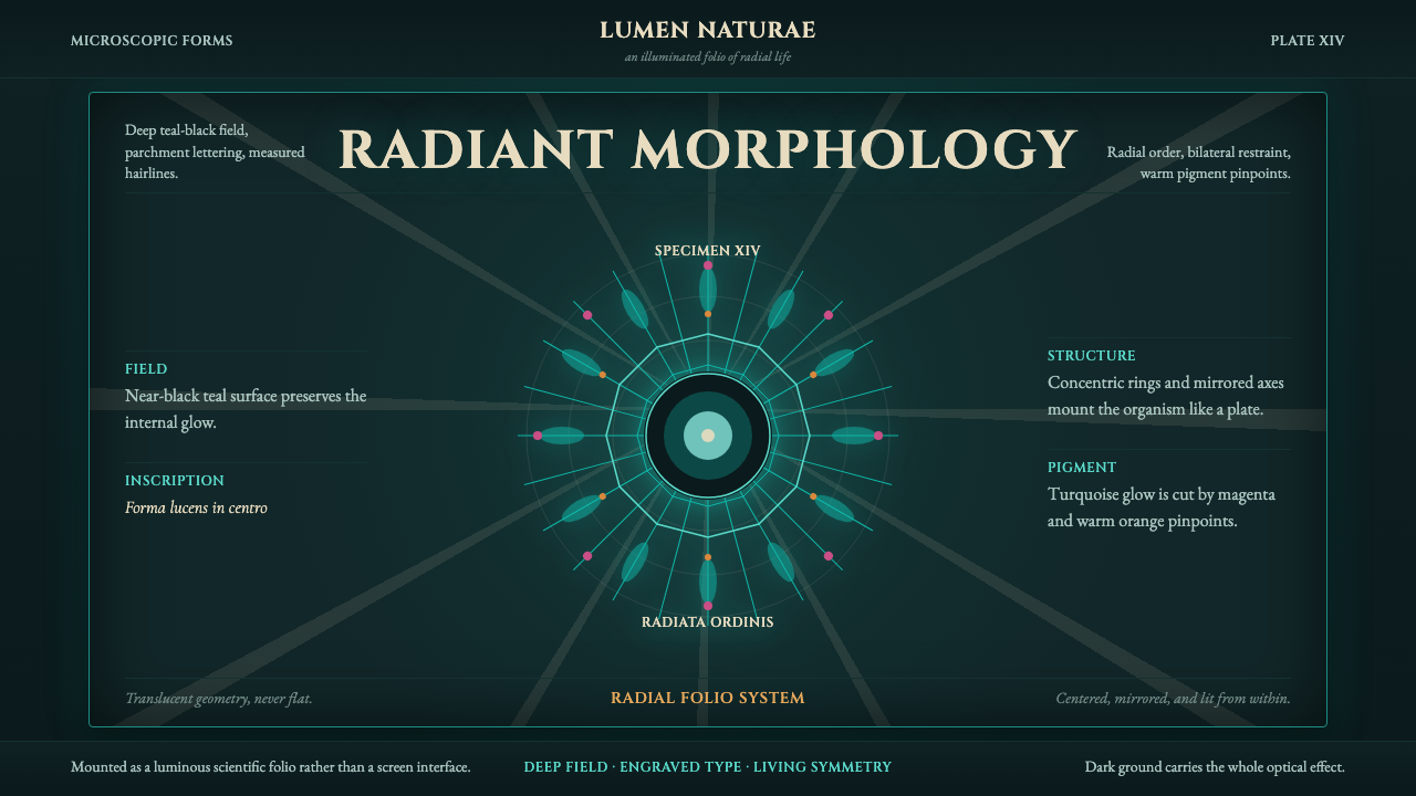
Haeckel Kunstformen turns the microscope into a cathedral — radial symmetry, luminous color glowing out of near-black, and organisms rendered as if they were stained glass.
Haeckel Kunstformen in brief
Haeckel Kunstformen is a design language drawn from Kunstformen der Natur ("Art Forms in Nature"), a set of 100 lithographic plates published in installments between 1899 and 1904 by the German naturalist Ernst Haeckel, printed by lithographer Adolf Giltsch. The plates depict radiolaria, medusae, diatoms, and other microscopic or marine organisms not as scientific diagrams but as ornamental compositions — each specimen centered, mirrored, and lit as though it were a jewel suspended in darkness.
The visual signature is unmistakable: a deep, near-black teal ground against which translucent turquoise forms seem to glow from within, accented by hits of pink-magenta and warm orange. Classical Roman capitals identify each plate, giving the whole system a scientific, almost taxonomic authority. Every composition is built on strict radial or bilateral symmetry — nothing is ever off-center, nothing is ever left asymmetric or scattered.
What makes this style transferable is the underlying logic rather than the biology. It is not "nature illustration" — it is a method for making almost anything (a UI panel, a book cover, a slide) feel like a specimen: pull it to the center, mirror it, light it against darkness, and frame it with rigor. The effect reads as precious, luminous, and faintly scientific all at once.
Where does Haeckel Kunstformen come from?
Ernst Haeckel (1834–1919) was one of the most consequential — and most controversial — biologists of the nineteenth century. A zoologist, naturalist, philosopher, and gifted draftsman, he was among the first and most vocal German popularizers of Charles Darwin's theory of evolution, coining terms still in use today including "ecology" and "phylum." His scientific career centered on marine invertebrates, and it was his decades of study of radiolaria — single-celled marine organisms with elaborate mineral skeletons, often invisible to the naked eye — that supplied the raw material for what became his most famous public work.
Kunstformen der Natur was published as ten portfolios of ten plates each, appearing between 1899 and 1904. Haeckel did not merely document specimens; he composed them. Working with Giltsch, he arranged organisms into mandala-like, symmetrical tableaux — a technique that owed as much to the decorative conventions of the day as to biological accuracy. The plates were meant to demonstrate a thesis close to Haeckel's philosophical core: that nature itself was inherently ordered and beautiful, and that this beauty was evidence of natural law rather than divine design.
The timing placed the work squarely inside the Art Nouveau moment (Jugendstil, in German-speaking Europe), and the plates were absorbed by that movement's designers and architects almost immediately. Haeckel's radiolarian forms — their radiating spines, their crystalline lattices — appealed directly to a generation already searching nature for organic, non-historicist ornament. The 1900 Paris Exposition Universelle featured an entrance gate modeled directly on Haeckel's radiolaria and jellyfish illustrations, a famous transmission from scientific plate to applied architectural ornament.
Kunstformen der Natur was published across Leipzig and Vienna, reflecting the German- and Austrian-speaking publishing networks of the period. Its influence did not stay confined to biology or to Art Nouveau — later design movements interested in organic pattern and radial structure returned to the plates repeatedly, and they remain, over a century later, among the most widely reproduced bodies of scientific illustration ever made.
What defines the Haeckel Kunstformen look?
Color
The palette is dominated by a deep, near-black teal that functions less like a background and more like deep water or open space — a void the specimens seem to float in. Against that darkness, translucent turquoise and cyan tones are used for the primary forms, built up in layers so the color reads as lit from behind rather than simply printed. Pink-magenta and warm orange appear only as small, precise accents — never as competing fields of color. The overall effect depends on darkness: a light background collapses the illusion of luminosity.
Typography
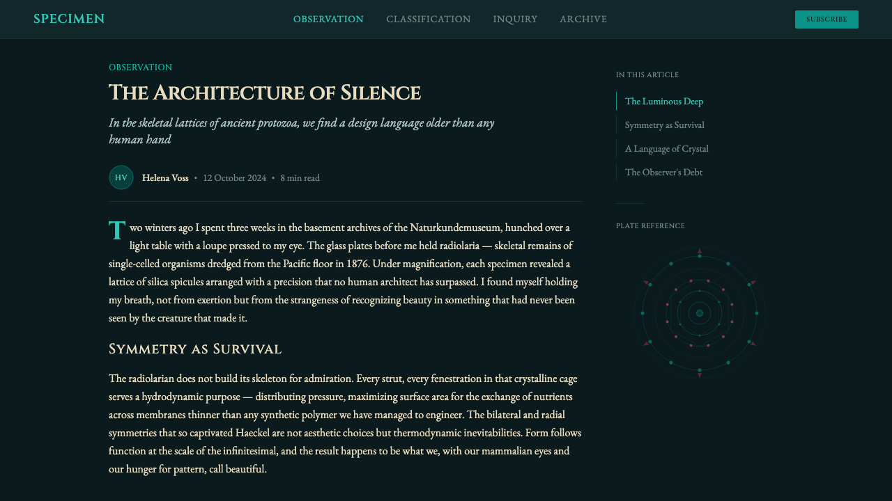
Lettering draws on classical Roman capitals — the kind of lettering associated with monuments and scientific plates rather than commercial print. Letterforms are used sparingly and with authority: a plate title, a species name, a caption, always centered or symmetrically placed, never sprawling across the composition. The register is closer to a museum label or a taxonomic key than to editorial body copy — precise, formal, and quiet, so the type never competes with the luminous forms it accompanies.
Radial and Bilateral Symmetry
Every composition obeys strict symmetry — either radiating outward from a single center like a mandala, or mirrored precisely along a vertical axis like a specimen pinned for display. This is the system's most rigid rule: nothing is ever off-balance, asymmetric, or scattered across the frame. A layout built in this style reads immediately as ordered and inevitable, because the eye can locate the center and axis at a glance and everything else follows from it.
Luminosity
Forms are rendered as if internally lit rather than externally illuminated — translucency and layered glow substitute for the hard highlights of reflected light. This is closer to stained glass or bioluminescence than to conventional shading: edges soften into the dark ground rather than casting a shadow away from it. Achieving this effect depends on contrast between saturated, glowing forms and a genuinely dark field; without that darkness, the forms simply look pale rather than lit.
Ornamental Precision
Detail is dense but never chaotic — spines, filaments, and lattice structures are rendered with a draftsman's exactness, each element repeating in careful rhythm rather than varying freely. This precision is what separates the style from generic "organic" or floral ornament: the forms feel measured and almost mathematical, closer to crystal structure or engineering diagrams than to loose botanical illustration, even though the subject matter is biological.
Framing and Containment
Each specimen is presented within an implied or literal frame — a plate boundary, a circular vignette, a centered stage — that separates it from any surrounding context. This containment reinforces the sense that what is shown is a specimen to be studied and admired, not a scene to be entered. Compositions rarely bleed to the edge without a clear boundary marking where the "specimen" ends and the void begins.
Scientific Authority
Beneath the ornament sits the register of a scientific plate: implied classification, implied naming, implied rigor. This is what keeps the style from tipping into pure decoration — every glowing form reads as though it has been observed, measured, and catalogued, even in contexts that have nothing to do with biology. That borrowed authority is one of the style's most useful properties: it lends anything it touches an air of being studied rather than merely decorated.
Who shaped Haeckel Kunstformen?
Haeckel was the naturalist, philosopher, and draftsman behind Kunstformen der Natur, and one of continental Europe's most influential popularizers of Darwinian evolution. His decades of research into radiolaria and other marine organisms gave him an unmatched personal archive of microscopic form, which he then composed — rather than merely documented — into symmetrical, decorative plates intended to argue that nature's beauty was itself evidence of natural order. His visual thinking, more than his prose, is what reached architects and designers.
Giltsch was the lithographer who translated Haeckel's specimens and sketches into the finished plates of Kunstformen der Natur. Lithography at this scale and precision was a demanding craft, and Giltsch's technical skill — particularly in rendering translucency and tonal depth on a dark ground — is a large part of why the plates achieve their glowing, jewel-like quality rather than reading as flat scientific diagrams.
Binet was a French architect who designed the monumental entrance gate to the 1900 Paris Exposition Universelle directly inspired by Haeckel's radiolaria and jellyfish plates — one of the most famous and direct transmissions of the Kunstformen der Natur aesthetic into large-scale applied architecture. His gate helped cement the association between Haeckel's scientific illustrations and the broader Art Nouveau vocabulary of organic, radiating ornament.
Gallé was a leading French Art Nouveau glassmaker and designer whose organic, botanically inspired work shared the same cultural moment as Haeckel's plates. While not a direct collaborator, Gallé's glasswork — with its layered, translucent color and naturalistic yet stylized forms — exemplifies the broader design environment that made Haeckel's luminous, symmetrical organisms feel immediately applicable to decorative and applied art rather than confined to scientific publishing.
How do you use Haeckel Kunstformen today?
Haeckel Kunstformen transfers well to almost any medium because its logic is compositional rather than literal — the goal is never to draw a radiolarian, it is to make whatever content exists behave like one: centered, symmetrical, glowing out of darkness, framed with quiet authority.
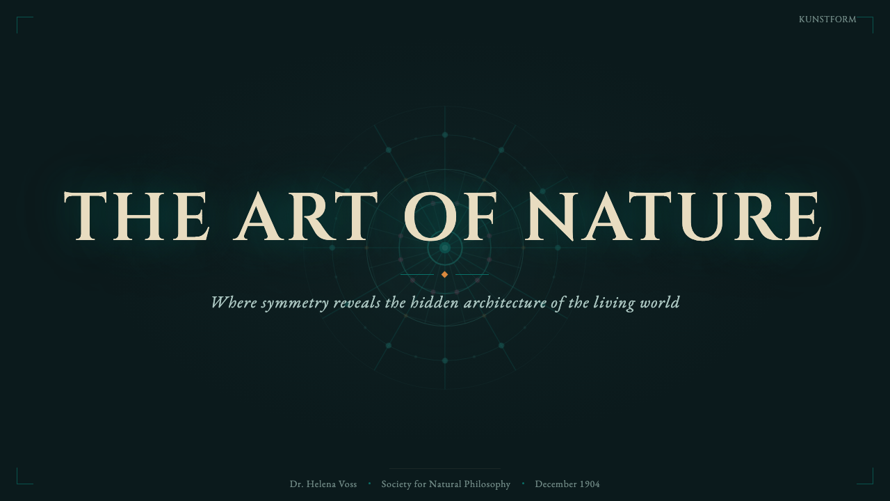
For presentation slides, this style is at its strongest on cover pages and single-concept content slides. A cover works well with one large, radially symmetric graphic element centered against the deep teal-black ground, with a Roman-capital title placed with restraint above or below it. Content and data slides should resist the instinct to fill space — a single glowing chart or diagram centered on the slide, framed by generous dark space, communicates more authority than a busy multi-column layout. Data visualizations benefit from being treated as specimens: one radial chart, cleanly lit, rather than a grid of small competing charts.
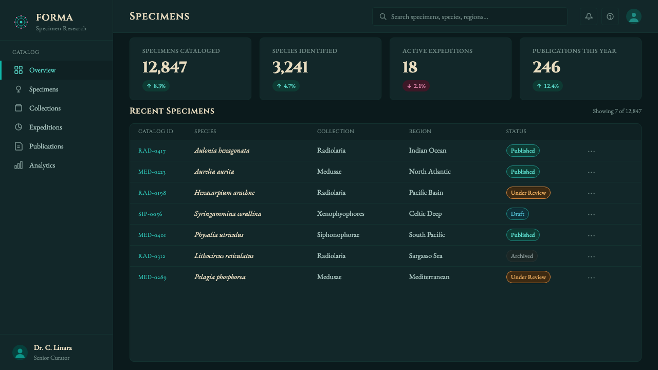
For web UI, the style suits dashboards and pricing pages that want to feel premium and slightly rare rather than busy or utilitarian. A dashboard built this way keeps panels dark and lets key numbers glow in translucent turquoise against the void, with accent color reserved strictly for alerts or the single most important figure on screen. Pricing pages benefit from the framing instinct — each plan presented as a centered, symmetrical "specimen" card rather than a plain comparison table, with the recommended tier given the brightest glow.
For editorial and marketing work, the style rewards restraint and centering over the sprawling layouts common in modern web design. A feature article or landing page in this idiom uses a dark field, a single strong centered image per section, and Roman-capital section markers rather than sans-serif labels. Marketing pages that want to signal rarity or scientific credibility — rather than speed or convenience — are natural fits.
The most common mistake is applying the color palette (dark teal, turquoise, pink-orange accents) without the symmetry and containment that make it read as Kunstformen rather than generic "dark mode." Without a genuine center, a genuine mirror axis, or a genuine frame separating specimen from void, the result is just a dark UI with unusual accent colors — the luminous, ceremonial quality disappears the moment the composition sprawls asymmetrically or the background lightens even slightly.
Haeckel Kunstformen — FAQ
Is Haeckel Kunstformen the same thing as Art Nouveau?
They are closely related but not identical. Kunstformen der Natur was published squarely within the Art Nouveau (Jugendstil) period and directly influenced its designers — the 1900 Paris Exposition gate modeled on Haeckel's radiolaria is a famous example. But Haeckel's plates are a narrower source: a scientist's decorative treatment of microscopic organisms, rendered with a taxonomic rigor that broader Art Nouveau (which drew on flowers, insects, and flowing linework generally) did not always share. Think of Haeckel Kunstformen as one especially disciplined, luminous tributary feeding into the wider Art Nouveau river.
Does this style require a dark background to work?
Essentially yes. The entire luminous effect depends on translucent, saturated color reading as glowing against genuine darkness — the same forms rendered on a light ground simply look pale and lose the sense of internal light. If a project cannot commit to a dark field, it is more honest to borrow only the symmetry and framing principles and pair them with a different color treatment, rather than force a light-background version of Kunstformen and lose the quality that defines it.
Why is symmetry treated as such a strict rule in this style?
Because symmetry is doing the same job the frame and the scientific lettering are doing: signaling that what's on screen has been observed, measured, and presented with rigor rather than assembled casually. Haeckel's own plates used symmetry to argue a philosophical point — that nature's order was itself evidence of natural law. Stylistically, that inherited rigor is what separates this system from generic organic or nature-inspired decoration, which tends toward loose, asymmetric, flowing composition. Break the symmetry and the specimen-like authority breaks with it.
How much color variation is allowed before it stops looking like Kunstformen?
Very little. The system reads correctly when one dark teal-black ground carries nearly all of the visual weight, one translucent turquoise family carries the primary forms, and pink-magenta or orange appear only as small, precise accents — never as a second competing field of color. Introducing multiple saturated hues across large areas, or lightening the ground to a mid-tone, both collapse the effect into something closer to generic vaporwave or jewel-tone decoration rather than the specific, restrained luminosity this style depends on.
What kinds of products or brands does this style struggle to suit?
It struggles wherever warmth, casualness, or high information density are the priority. Consumer social products, playful children's brands, and text-heavy utility tools all fight against a system built around a single centered specimen, generous dark space, and formal lettering. It also struggles in dense list-based interfaces, where there is no room for the symmetry and framing to register. It suits moments that want to feel considered, rare, or slightly ceremonial rather than fast and casual.
Related design styles
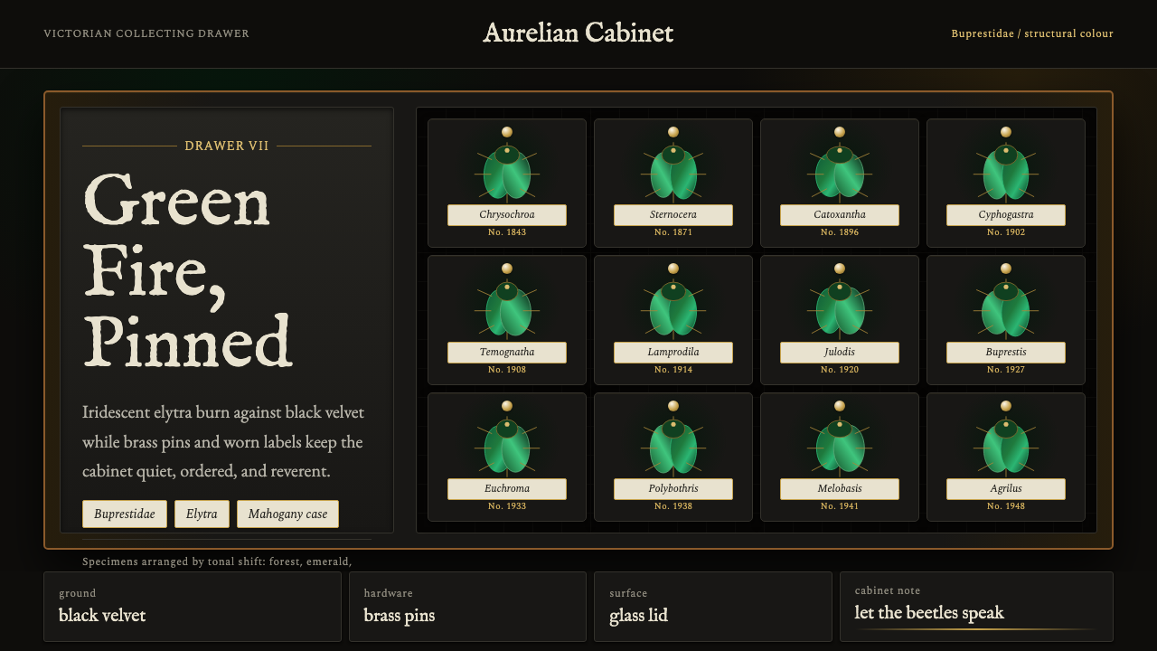 Beetle Specimen CabinetGreen burns in darkness. Emerald elytra grids glow under brass keylines and b…
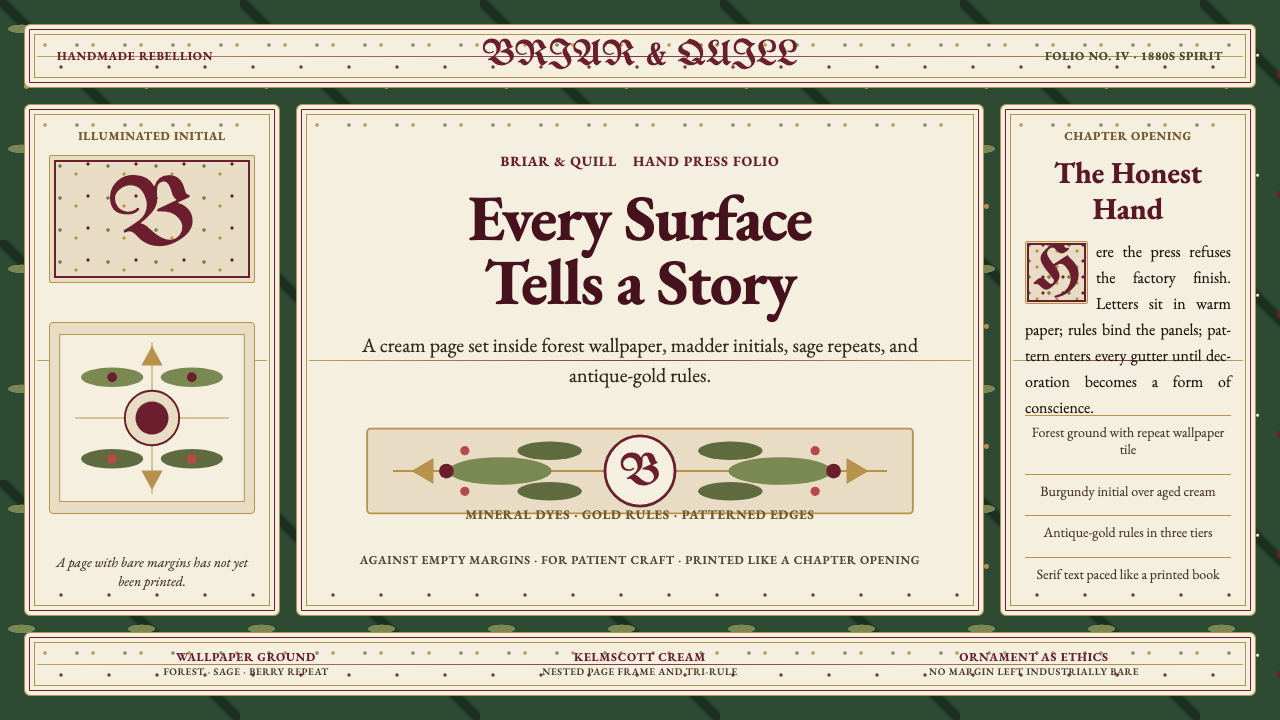 William Morris Arts & CraftsOrnament is the argument. Forest green wallpaper frames cream pages, gold rul…
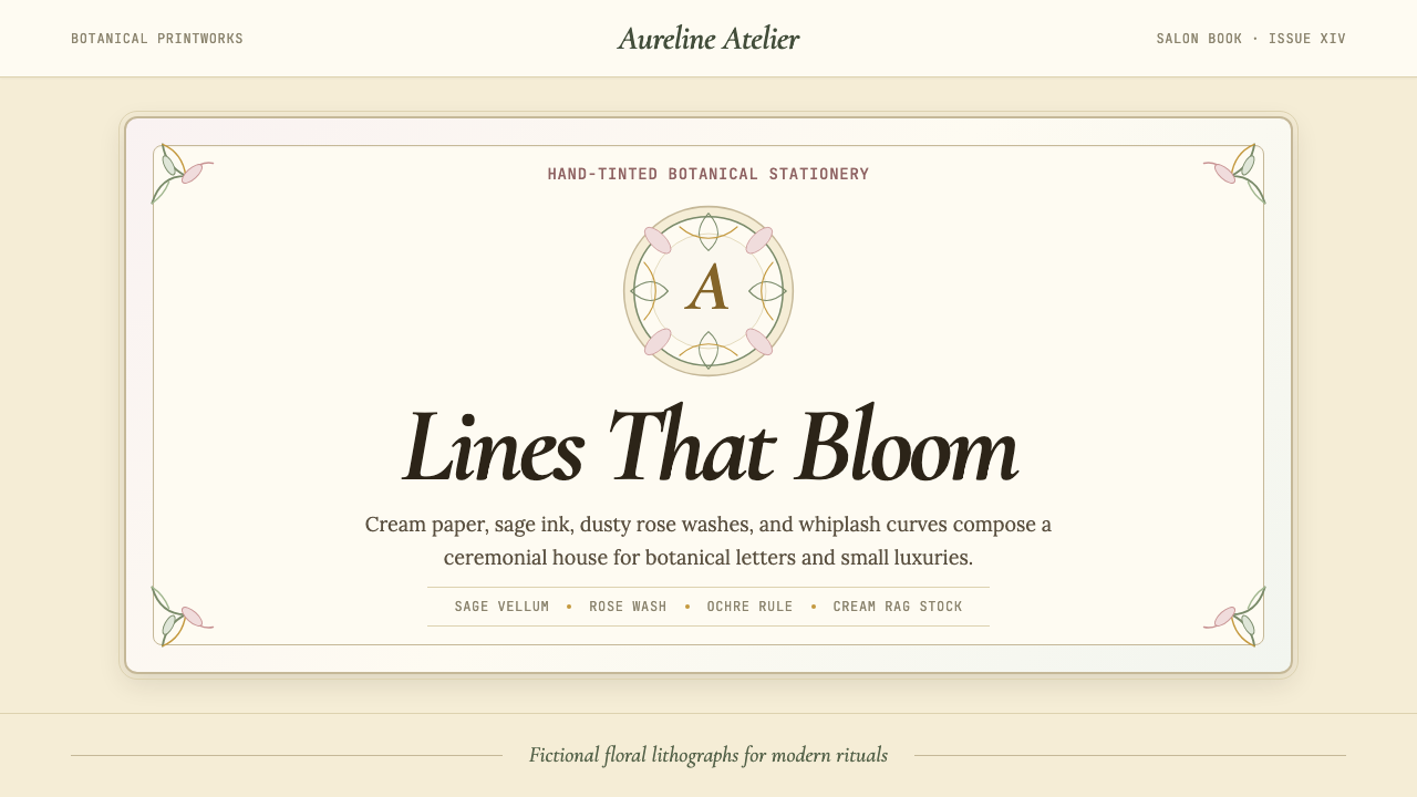 Art Nouveau (Mucha)Mucha's whiplash arabesques. Botanical halos, muted lithograph palette, no ma…
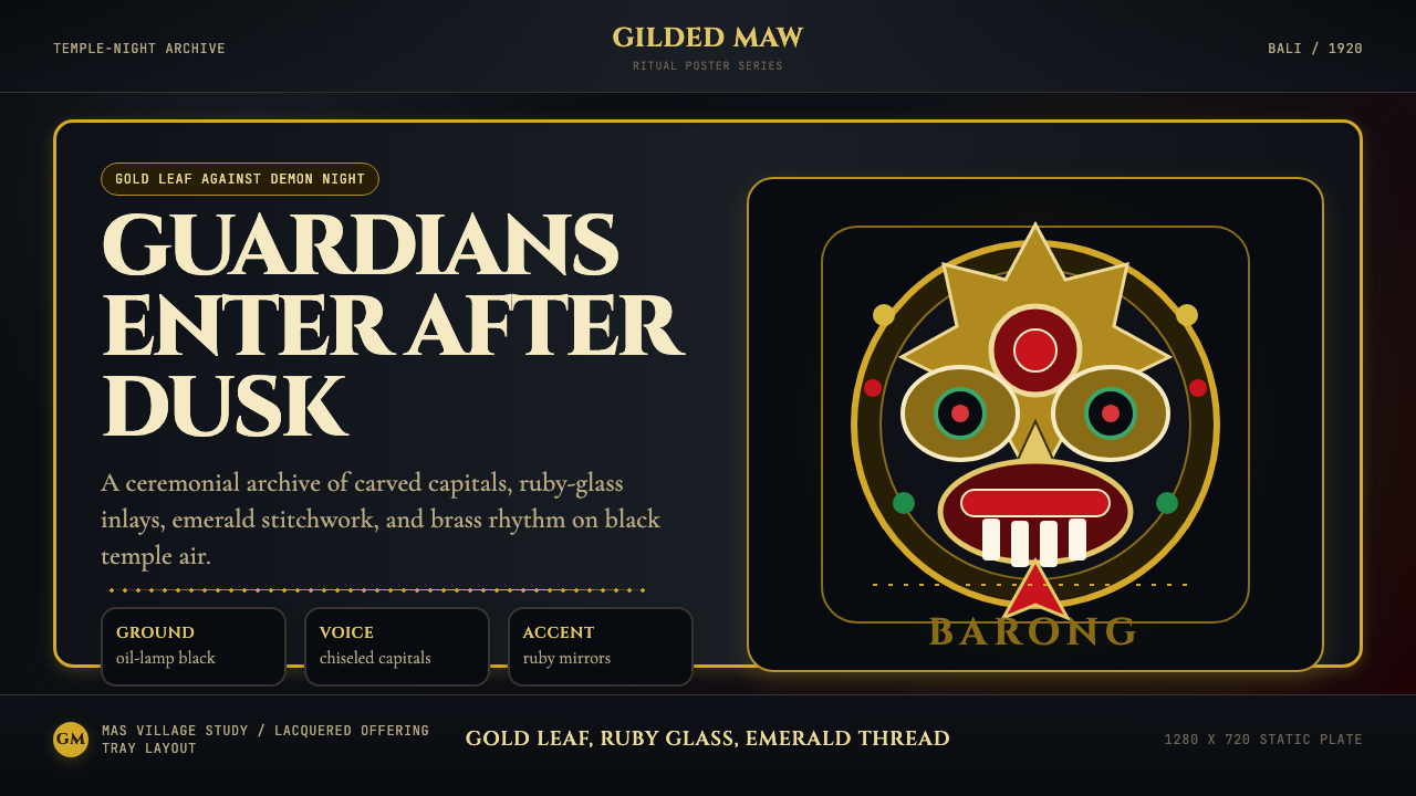 Balinese Barong Mask (1920)Protection glows after dark. Cinzel capitals frame gold, ruby, and emerald ge…
 Bhutanese Thangka (Druk Style)Sacred cool-mountain clarity. Cobalt fields, emerald ground, and gold halos f…
 Edo Kimono TextilePattern becomes language. Indigo repeats, cream resist lines, one vermilion p…