What is Bhutanese Thangka (Druk Style)?什么是 Bhutanese Thangka (Druk Style)?
Bhutanese Thangka fuses sacred Buddhist geometry with the cool mountain palette of the Thunder Dragon's kingdom — cobalt skies, emerald valleys, and burnished gold halos on cloth that unfurls once a year before tens of thousands.不丹唐卡将神圣的佛教几何与雷龙王国的冷峻山岳色调融为一体——钴蓝天空、翡翠山谷与灼灼金箔光环,织就的卷轴每年在万人面前徐徐展开。
Bhutanese Thangka (Druk Style) in briefBhutanese Thangka (Druk Style) 速览
Bhutanese Thangka — called Thongdrol in Dzongkha, meaning 'liberation through sight' — is the scroll-painting tradition of the Druk-Kagyu school of Vajrayana Buddhism, practiced in Bhutan (Druk Yul, the Land of the Thunder Dragon). These are not decorative objects. They are consecrated instruments of devotion: a worshipper who looks upon a Thongdrol at the moment of its ritual unfurling is believed to receive immediate merit. The largest examples, hung from fortress-monastery walls during annual Tshechu festivals at Punakha, Paro, and Thimphu, measure ten meters or more in height and require teams of monks and laypeople to unroll.不丹唐卡——宗喀语称 Thongdrol,意为「见即解脱」——是竹巴噶举派金刚乘佛教的卷轴绘画传统,发源并流行于不丹(雷龙之国)。这些画卷并非装饰品,而是经过开光的修行器物:信众在年度策秋节庆的仪轨展开时刻凝视 Thongdrol,据信可当即获得功德。普纳卡、帕罗、廷布等地宗堡悬挂的最大画卷高逾十米,需要一队僧侣与俗家弟子协力展开。
The visual language of Druk-style Thangka is immediately distinguishable from its Tibetan cousins by its temperature and atmosphere. Where the central Tibetan tradition tends toward warm saffron, ochre, and cinnabar grounds, the Bhutanese discipline is cooler and more mountain-aware. Deep cobalt dominates the sky fields; the landscape passages use emerald and jade greens that echo the fir-clad valleys of the eastern Himalayas. Vermilion robes and deep crimson anchor the figurative core, while gold leaf — applied to halos, lotus thrones, crown ornaments, and ritual implements — creates the luminous focal intensity that orients the viewer's gaze. The overall impression is of jewelry set in mountain air.竹巴风格唐卡的视觉语言与西藏唐卡在气温与氛围上截然不同。藏地中央传统倾向于温暖的藏红花黄、赭石与辰砂底色,不丹传统则更冷峻,更带山岳意识。深钴蓝主导天空区域;山水段落使用翡翠绿与玉绿,呼应喜马拉雅东麓的云杉山谷。朱砂袍与深绯红锚定人物核心,金箔——覆于光环、莲台、冠饰与法器——制造灼灼的视觉焦点,引导观者目光。整体印象如同山岳空气中镶嵌的珠宝。
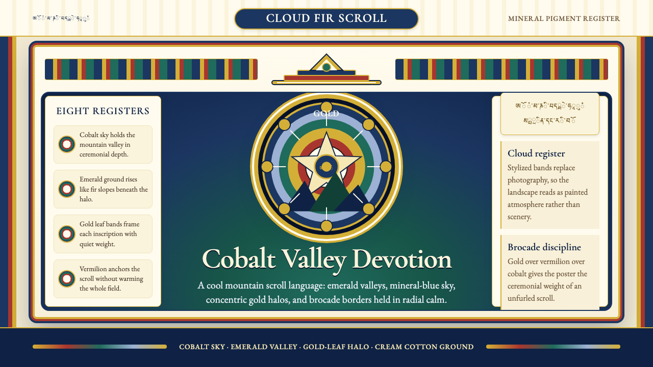
Compositionally, every Thangka follows a canonical architecture established by centuries of transmitted iconographic rules. The central deity — almost always the principal figure of the commissioning lineage — sits enthroned on a lotus, surrounded by a prescribed retinue of attendant bodhisattvas, protector deities, and offering figures arranged in precise hierarchical registers. Brocade borders frame the painted field, imitating the silk mountings of the physical scroll. Stylized cloud-rainbow aureoles, called rainbow light-halos, bracket the main figure and secondary panels. These compositional rules are not constraints to be loosened; they are the grammar without which the image cannot function as a sacred object.在构图上,每幅唐卡都遵循数百年图像传承规定的标准图式。中央主尊——几乎总是委画传承的主供本尊——跏趺于莲台,周围是依法位排布的侍奉菩萨、护法神与供养人物,按严格的尊卑层次分列各区。织锦边饰框住画面,仿照实体卷轴的丝绸装裱。程式化的云霞彩虹光晕——称作「彩虹光环」——环绕主尊与副幅。这些构图规则不是可以松动的束缚,而是图像得以作为圣物运作的语法本身。
See the Bhutanese Thangka (Druk Style) design system查看 Bhutanese Thangka (Druk Style) 完整设计系统
Where does Bhutanese Thangka (Druk Style) come from?Bhutanese Thangka (Druk Style) 从何而来?
The roots of Bhutanese Thangka reach back to the eighth century, when Padmasambhava — Guru Rinpoche, the 'Lotus-Born' — carried Vajrayana Buddhism from northwestern India and the Swat Valley into the high Himalayas. Padmasambhava is credited with converting Bhutan's mountain deities into dharma protectors and with establishing the first sacred sites at Tiger's Nest (Taktshang) and beyond. The visual culture he seeded drew from the Pala dynasty painting tradition of Bengal and Bihar, which had developed a sophisticated iconographic canon for rendering the Vajrayana pantheon. This Pala inheritance — elongated figures, jewel-studded crowns, precise hand gestures (mudras), and the use of lapis blue and gold as sacred pigments — underlies all subsequent Himalayan Buddhist painting.不丹唐卡的根脉可追溯至八世纪。莲花生大士(Padmasambhava,Guru Rinpoche,「莲花生」)从印度西北部与斯瓦特河谷将金刚乘佛教带入喜马拉雅高地,相传他将不丹的山岳神灵降伏为护法,并在虎穴寺(Taktshang)等地建立第一批圣地。他所播下的视觉文化汲取自孟加拉与比哈尔的帕拉王朝绘画传统——该传统已为金刚乘诸尊建立了一套精密的图像规范。帕拉遗产所确立的语汇:修长身形、珠宝冠饰、精准手印(mudra),以及青金石蓝与金箔作为圣色的用法,奠定了此后全部喜马拉雅佛教绘画的底层语法。
The Newari craftsmen of the Kathmandu Valley became critical intermediaries. From roughly the twelfth through the seventeenth centuries, Newari artists traveled to Tibet, Bhutan, and Sikkim as specialist painters and metal-casters, carrying refined technical knowledge of mineral pigment preparation, gold-leaf application, and the proportional canon (thigse) used to measure the Buddha's body. Their influence gave Himalayan Thangka its characteristic precision of line and the luminous mineral quality of its color fields. Bhutanese painting absorbed this Newari influence through direct apprenticeship and through the movement of sacred objects along the trade and pilgrimage routes connecting the valleys.加德满都谷地的尼瓦尔工匠扮演了关键的中介角色。大约从十二世纪至十七世纪,尼瓦尔艺术家以专业画师与铸铜师的身份游走于西藏、不丹与锡金,携带矿物颜料研磨、金箔铺贴以及佛陀身形比例规范(thigse)的精湛技艺。他们的影响赋予了喜马拉雅唐卡那种特有的线条精准性与色域的矿物光泽感。不丹绘画经由直接师徒传授,以及沿山谷贸易与朝圣路线流通的圣物,吸收了这套尼瓦尔传统。
The decisive political and aesthetic codification came in the seventeenth century. Zhabdrung Ngawang Namgyal, a lama who fled the Tsangpa rulers of central Tibet and arrived in Bhutan in 1616, unified the warring valleys under a single state and established the dual system of secular and religious governance that still defines Bhutanese identity. As part of his nation-building project, Zhabdrung commissioned a Bhutanese national art tradition that would be visually distinct from the Tibetan styles of his rivals. Fortress-monasteries (dzongs) were built and decorated with murals and Thangkas that emphasized the Druk-Kagyu lineage's particular iconographic vocabulary: the Eight Manifestations of Padmasambhava, the Cosmic Mandala, and above all the giant Thongdrol scrolls whose very scale proclaimed political and spiritual sovereignty.决定性的政治与美学规范化发生于十七世纪。夏宗·阿旺朗杰(Zhabdrung Ngawang Namgyal)——一位从西藏藏巴汗统治者麾下出走的喇嘛——于1616年抵达不丹,统一割据山谷,建立起至今仍定义不丹认同的政教合一双轨体制。作为国家建构工程的一部分,夏宗委托打造一套在视觉上有别于其对手所用藏地风格的不丹国家艺术传统。宗堡修建落成,以壁画与唐卡加以装饰,着重强调竹巴噶举派的专属图像词汇:莲花生大士八变、宇宙坛城,以及最重要的——那些以自身体量宣示政治与精神主权的巨幅 Thongdrol 卷轴。
In the modern period, Bhutan has made the preservation and transmission of traditional arts — including Thangka painting — a matter of official cultural policy. The National Institute for Zorig Chusum (the Thirteen Traditional Arts and Crafts), established in Thimphu in 1971 under royal patronage, trains students in the full canon: iconometry, mineral pigment preparation, gold-leaf techniques, and the transmission of compositional grids from master to apprentice. Master painters such as Asha Kama and Lopen Lhamo have been recognized as living cultural treasures. This institutional continuity means that Bhutanese Thangka is not an archaeological style but a living tradition whose practitioners can trace their lineage of instruction back through centuries of documented transmission.进入现代,不丹已将传统艺术(包括唐卡绘画)的保护与传承列为官方文化政策。1971年在廷布皇家赞助下建立的「佐日十三技艺学院」(National Institute for Zorig Chusum),系统培训学生掌握全套规范:图像度量学、矿物颜料研磨、金箔技法,以及从师傅到弟子的构图格网传承。阿夏嘎玛与洛本拉姆等大师已被认定为活态文化珍宝。这种制度性的连续传承意味着,不丹唐卡不是一种考古风格,而是一个活着的传统——其传人能够将自身的师承谱系上溯至数百年有案可查的传授链条。
What defines the Bhutanese Thangka (Druk Style) look?Bhutanese Thangka (Druk Style) 的视觉特征是什么?
Color Temperature色彩温度
The defining characteristic that separates Bhutanese Thangka from its Tibetan counterpart is a consistent coolness of palette. Sky fields are rendered in deep, saturated cobalt rather than the warmer turquoise or ultramarine found in central Tibetan work. Landscape passages favor emerald and jade greens over ochre or warm earth. Even the reds used for robes and ritual implements lean toward cool crimson rather than warm vermilion. This cool mountain atmosphere is not incidental — it reflects the specific geography of Bhutan's eastern Himalayan valleys, perpetually misted, cloud-filtered, and dominated by dark fir forests.将不丹唐卡与西藏唐卡区分开来的决定性特征,是色调始终如一的冷峻。天空区域以深沉、饱和的钴蓝渲染,而非西藏中部作品中更温暖的绿松石蓝或群青。山水段落偏爱翡翠绿与玉绿,而非赭石或暖土色。连袍服与法器所用的红色也倾向于冷绯而非暖朱砂。这种冷峻的山岳气氛并非偶然——它折射出不丹喜马拉雅东麓山谷特有的地理:常年云雾弥漫、光线经云层过滤,深色云杉森林主导视野。
Gold as Sacred Light金箔即圣光
Gold leaf and gold powder serve a theological function as much as an aesthetic one. In Vajrayana iconography, gold represents the unobstructed radiance of awakened mind — a quality that cannot be simulated with yellow pigment. The Bhutanese tradition applies gold with exceptional density and finish: halos are burnished to a mirror quality, crown ornaments and lotus petals are outlined in fine gold line, and entire sky registers may be laid with gold ground rather than cobalt. Against the cool blue and green fields, these gold passages ignite with a luminous intensity that is the visual correlate of the doctrine of liberation through sight.金箔与金粉在神学功能上与美学功能同等重要。在金刚乘图像学中,金色代表觉悟之心不受遮蔽的光辉——这种品质无法以黄色颜料模拟。不丹传统以格外浓密、精细的工艺施金:光环被磨光至镜面质感,冠饰与莲花瓣以细金线勾勒,整片天空区域有时铺以金地而非钴蓝。在冷蓝与翠绿的衬托下,这些金箔段落以灼灼光辉燃起,正是「见即解脱」教义的视觉对应物。
Hierarchical Register Composition尊卑层次构图
A Druk-style Thangka is not a freely composed painting but a precisely engineered diagram of sacred hierarchy. The central figure occupies the dominant visual field at the geometric center or upper center of the composition; its size relative to attendant figures directly encodes spiritual rank. Secondary deities, bodhisattvas, and offering figures are arranged in strict horizontal and vertical registers that read like a cosmological map. Nothing overlaps the main deity's halo without symbolic justification; nothing appears in the composition without belonging to a prescribed retinue. This hierarchical grid is measured using the traditional thigse proportional canon.竹巴风格唐卡不是自由构图的绘画,而是一张精密工程化的神圣等级图示。中央主尊占据构图几何中心或上方中心的主导画面;其相对于侍从图像的大小直接编码了灵性地位。次级神祇、菩萨与供养人物按严格的横向与纵向层次排列,宛如一张宇宙论地图。任何图像若无象征依据,不得叠压主尊光环;任何图像若不属于规定侍从,不得出现于构图之中。这套等级格网以传统的 thigse 比例规范度量。
Mineral Pigments and Textile Brocade矿物颜料与织锦边饰
Traditional Bhutanese Thangka is executed in mineral and earth pigments ground to precise grades of fineness and bound in an animal-glue medium. The characteristic cobalt comes from azurite; the emerald greens from malachite; the reds from cinnabar and red ochre; the whites from kaolin. These mineral pigments have a matte, stone-like opacity that is entirely unlike the translucency of oil paint, contributing to the flat, heraldic quality of the color fields. The painted panel is then mounted in a brocade silk frame — typically alternating bands of deep red, gold, and blue — that physically echoes the palette of the painted image and is itself considered a sacred object.传统不丹唐卡以矿物颜料与土质颜料绘制,研磨至精确的细度,以动物胶为介质。标志性的钴蓝来自蓝铜矿;翠绿来自孔雀石;红色来自辰砂与红赭;白色来自高岭土。这些矿物颜料具有哑光的、石质般的不透明性,与油画的透明感截然不同,赋予色域平整、纹章式的品质。画面完成后装裱于织锦丝绸框架之中——通常是深红、金与蓝的交替织带——在实物层面呼应画面色调,织锦本身亦被视为圣物。
Rainbow-Cloud Aureoles彩虹云霞光晕
The stylized cloud-and-rainbow halos that encircle the central deity and bracket secondary panels are among the most recognizable motifs of Bhutanese iconography. These aureoles layer concentric bands of color — typically cycling through the spectrum from warm inner to cool outer — and terminate in flame-like or cloud-scroll flourishes at the edges. They serve multiple functions simultaneously: they isolate the deity from the background, they represent the radiance of spiritual attainment, and they echo the actual cloud formations and rainbow phenomena common in Bhutan's monsoon mountain landscape. The Bhutanese aureole is more atmospheric and layered than its Tibetan equivalent, emphasizing the weathered sky rather than pure flame.环绕中央主尊并框住副幅的程式化云霞彩虹光晕,是不丹图像学中最具辨识度的母题之一。这些光晕由同心色带层叠而成——通常从内圈的暖色调渐次过渡至外圈的冷色调——边缘终结于火焰状或云卷饰。它们同时承担多重功能:将神祇与背景隔离,表征精神证悟的光辉,并呼应不丹季风山地常见的真实云象与彩虹现象。不丹光晕比西藏同类更具大气感与层次感,强调天象的气韵而非纯粹的火焰。
Codified Mudra and Iconometric Precision规范化手印与图像度量精准
Every gesture of every figure in a Thangka is drawn from a finite vocabulary of mudras codified in the Vajrayana ritual texts. The touching of fingertips to earth (earth-witness mudra), the cupped hands in lap (meditation mudra), the gesture of turning the wheel of dharma — each carries specific doctrinal content that a trained viewer reads as readily as text. These gestures are not approximated but measured: the thigse proportional system specifies the exact ratio of hand to arm to torso, the angle at which fingers extend, and the spatial relationship between the hand and the deity's heart center. Deviating from these measurements is not an artistic choice but a doctrinal error.唐卡中每尊图像的每个姿势,均来自金刚乘仪轨典籍所规范的有限手印词汇。指尖触地(降魔印)、双手置于腿上(禅定印)、转法轮印——每种手印都承载着特定的教义内容,受过训练的观者读取如同阅读文字。这些手势不是近似的,而是经过度量的:thigse 比例规范精确规定了手相对于臂与躯干的比值、手指伸展的角度,以及手与神祇心轮的空间关系。偏离这些度量不是艺术选择,而是教义错误。
Scale as Devotional Statement尺度即虔诚宣言
The giant Thongdrol scrolls — some measuring ten meters or more in height — are unique to the Bhutanese tradition and represent one of the most direct uses of sheer physical scale as a devotional and political instrument in any art tradition. The doctrine of liberation through sight depends on the scroll being seen; the larger the scroll, the greater the community of viewers who can receive merit simultaneously. At the same time, the scale of the Thongdrol visually asserts the authority of the lineage that commissioned and houses it. Even at reduced scale in print or screen applications, the Thangka idiom retains this quality of environmental immersion — the image does not invite the viewer to stand back and judge; it surrounds and includes.高逾十米的巨幅 Thongdrol 卷轴是不丹传统独有的创造,代表了任何艺术传统中以纯粹物理尺度作为虔诚与政治器具最直接的运用之一。「见即解脱」的教义依赖于卷轴被看见;卷轴越大,能够同时获得功德的信众社群就越广。与此同时,Thongdrol 的体量在视觉上宣示了委画并供奉它的传承的权威。即便在缩小比例的印刷或屏幕应用中,唐卡图像仍保留这种环境沉浸的品质——它不邀请观者退后评判,而是将人包围与纳入。
See the Bhutanese Thangka (Druk Style) design system查看 Bhutanese Thangka (Druk Style) 完整设计系统
Who shaped Bhutanese Thangka (Druk Style)?谁塑造了 Bhutanese Thangka (Druk Style)?
Padmasambhava — the Lotus-Born, or Guru Rinpoche — is the founding figure of the entire Bhutanese sacred art tradition. An eighth-century Indian tantric master from the Swat Valley, he is credited with introducing Vajrayana Buddhism to Tibet and Bhutan, converting indigenous mountain spirits into dharma protectors, and establishing the first monastic communities at sites including Tiger's Nest. Every Bhutanese Thangka tradition traces its iconographic license back to him; his Eight Manifestations — eight distinct forms with specific colors, mudras, and attributes — constitute the most frequently depicted subject in the Druk-style canon, and his enthroned form is the compositional template against which all other Thangka figures are measured.莲花生大士(Guru Rinpoche,「莲花生」)是整个不丹神圣艺术传统的立基人物。他是八世纪来自斯瓦特河谷的印度密宗大师,相传将金刚乘佛教引入西藏与不丹,降伏土著山岳神灵为护法,并在虎穴寺等地建立最初的僧团社区。每一套不丹唐卡传统都将其图像权威追溯至他;他的八大化身——八种各具特定色彩、手印与法器的形象——是竹巴风格图像规范中描绘最频繁的题材,其跏趺宝座像是衡量所有其他唐卡图像的构图母本。
Zhabdrung Ngawang Namgyal (1594–1651) is the political founder of Bhutan as a unified state and the architect of its distinctive national art tradition. A high-ranking lama of the Druk-Kagyu school who fled Tibet after a dispute over the reincarnation of the Drukpa Kagyu throne, he arrived in Bhutan in 1616 and systematically unified its warring valleys through military campaigns, diplomatic alliances, and the construction of dzongs — fortress-monasteries whose massive walls served as both military redoubts and ceremonial stages for the Thongdrol festivals. His consolidation created the institutional demand for a distinctly Bhutanese sacred art vocabulary, distinguishing it from the Gelug-influenced Tibetan styles of his political rivals.夏宗·阿旺朗杰(1594—1651年)是不丹作为统一国家的政治缔造者,也是其独特民族艺术传统的设计者。这位竹巴噶举派高僧因竹巴噶举法座转世之争而出走西藏,于1616年抵达不丹,通过军事征伐、外交联盟与修建宗堡,系统性地统一了割据山谷。宗堡高耸的城墙既是军事堡垒,也是 Thongdrol 节庆的仪式舞台。他的整合创造了对独特不丹神圣艺术词汇的制度性需求,使其有别于政治对手所倚重的格鲁派藏地风格。
Asha Kama is among the most celebrated Bhutanese master painters of the modern era, recognized by the royal government as a preeminent living exponent of the traditional Zorig Chusum arts. Working within the strict iconometric canon of the Druk tradition, Asha Kama is known for the exceptional quality of his mineral pigment preparation and the sustained precision of his gold-leaf work, particularly the burnished halo forms that are the most technically demanding element of Bhutanese Thangka. His practice bridges the institutional training of the National Institute for Zorig Chusum and the older system of direct master-apprentice transmission, and his students carry the lineage forward.阿夏嘎玛是当代不丹最受赞誉的画师大师之一,已获皇家政府认定为传统佐日十三技艺的杰出活态传承人。在竹巴传统严格图像度量规范的框架内,阿夏嘎玛以其矿物颜料研磨的卓越品质和金箔工艺的持续精准著称——尤其是磨光光环形式,这是不丹唐卡技术要求最高的元素。他的实践连接着佐日十三技艺学院的制度培训与更古老的师徒直传体系,其弟子将这一传承延续向前。
Lopen Lhamo is a rare example of a female master in the predominantly male tradition of Bhutanese sacred painting, and her recognition represents an expansion of the institutional canon. Her work adheres fully to the Druk-Kagyu iconographic specifications while demonstrating particular sensitivity in the rendering of consort figures, offering goddesses, and the landscape passages — the emerald mountain valleys and cloud-scroll aureoles — that define the distinctly Bhutanese atmosphere of the tradition. Her teaching practice at the National Institute has been instrumental in ensuring that the full technical vocabulary of mineral-pigment Thangka painting is transmitted to a new generation.洛本拉姆是以男性为主的不丹神圣绘画传统中罕见的女性大师,她的获认定代表了制度规范的拓展。她的作品完全遵守竹巴噶举派图像规范,同时在明妃、供养天女的刻画以及景观段落——翡翠山谷与云卷光晕——上展现出特别的敏锐感知,正是这些元素定义了该传统独特的不丹山岳气氛。她在佐日技艺学院的执教实践,对于确保矿物颜料唐卡绘画完整技术词汇传递给新一代至关重要。
No single Newari master is historically documented by name in the Bhutanese transmission, but the Newari craft community of the Kathmandu Valley collectively shaped the technical and aesthetic foundations of Bhutanese Thangka over several centuries of direct artistic exchange. Newari painters and bronze-casters traveled throughout the Himalayan kingdoms as specialist consultants, bringing with them the Pala-derived traditions of iconometric proportion, mineral pigment chemistry, and the specific gold-burnishing techniques that characterize the Bhutanese work. Their influence is legible in the characteristic precision of line, the mineral luminosity of the color fields, and the particular quality of the brocade-mounting tradition — all of which owe more to Newari workshop practice than to the Tibetan transmission.没有任何单一尼瓦尔大师在不丹传承中以姓名留存于历史记录,但加德满都谷地的尼瓦尔工匠群体在数百年直接艺术交流中,集体塑造了不丹唐卡的技术与美学基础。尼瓦尔画师与铸铜师以专业顾问身份游走于喜马拉雅各王国,携带源自帕拉传统的图像比例规范、矿物颜料化学知识,以及表征不丹作品的特定金箔磨光技法。他们的影响清晰可读于线条特有的精准性、色域的矿物光泽,以及织锦装裱传统的特定品质——这些都更多归功于尼瓦尔工坊实践,而非西藏传承。
How do you use Bhutanese Thangka (Druk Style) today?今天怎么用 Bhutanese Thangka (Druk Style)?
Bhutanese Thangka is among the most compositionally rich historical styles available to contemporary designers, and applying it well requires understanding what it is actually doing: using hierarchical scale to communicate importance, using cool mineral color to create atmosphere, using gold as sacred focal intensity, and using symmetrical-but-animated figure arrangements to create visual maps with built-in reading order. Treating it as mere pattern borrowing — lifting the cobalt and gold without engaging the compositional logic — produces results that are decorative but incoherent.不丹唐卡是当代设计师可取用的构图最丰富的历史风格之一,正确应用它需要理解其实际运作机制:以等级尺度传达重要性,以冷峻矿物色彩营造氛围,以金箔制造神圣的视觉焦点,以对称而生动的图像排布创造内置阅读顺序的视觉地图。将其仅作图案借用——取走钴蓝与金色而不介入构图逻辑——产出的结果装饰有余、内在失序。
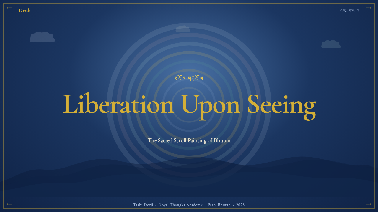
For presentation slides, the Thangka idiom translates most powerfully on cover and section-divider pages. A cover works best with a centered compositional anchor — a single strong visual element placed at the geometric center — surrounded by layered atmospheric fields that move from a deep cobalt outer zone to a lighter inner zone, with any title text placed in a position that would correspond to a lower register attendant figure. Content slides should adopt the register principle: clear horizontal bands separating data, text, and supporting visual elements, each band given its own visual weight. Data slides benefit from treating charts as mandala-like elements — radial or concentric structures — rather than conventional bar charts, particularly for showing proportional relationships or multi-layered categorical data.在演示文稿中,唐卡图像语言在封面与章节分隔页上最具力量。封面最适合使用居中构图锚点——单一强视觉元素置于几何中心——周围环绕着从深钴蓝外圈向较浅内圈渐进的层叠大气场,标题文字置于对应唐卡下区侍从图像的位置。内容页应采用层次原则:清晰的水平分区将数据、文字与辅助视觉元素各置其带,每一带被赋予各自的视觉重量。数据页适合将图表作为坛城式元素处理——放射状或同心圆结构——而非常规柱状图,尤其适用于展示比例关系或多层分类数据。
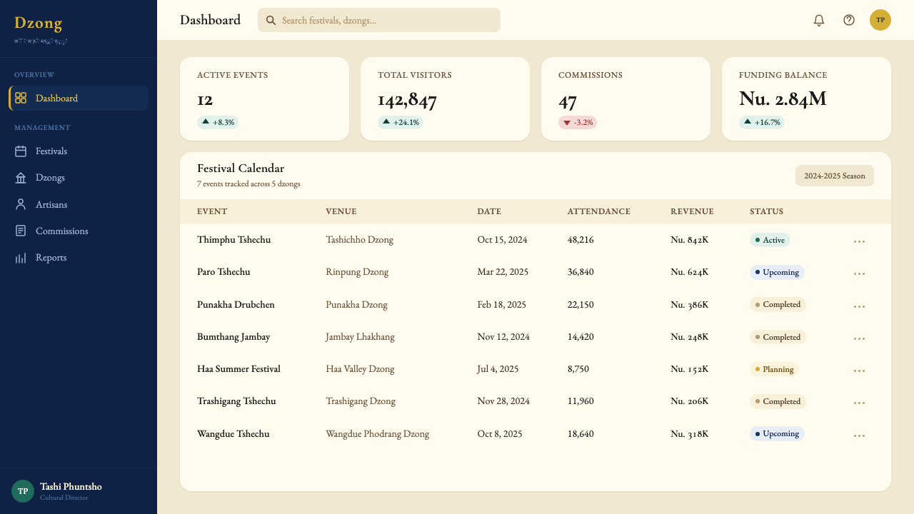
For web interfaces and dashboards, the Thangka palette — deep cobalt backgrounds, emerald accent zones, gold highlight — creates a high-contrast environment that handles data-dense displays without visual noise. The hierarchical register logic maps naturally onto component stacking: primary KPIs in the central, gold-highlighted zone; secondary metrics in flanking emerald panels; contextual data in the deep cobalt outer fields. Avoid the temptation to use every color simultaneously at full intensity; the Thangka effect depends on color temperature contrast — warm gold against cool blue — rather than saturation competition. Pricing pages benefit from the tier-differentiation logic: a center tier displayed with gold ornamental emphasis, flanking tiers in progressively cooler tones.对于网页界面与数据仪表板,唐卡色调——深钴蓝背景、翡翠绿强调区、金色高亮——营造出高对比度环境,在数据密集的展示中不显视觉噪音。等级层次逻辑自然映射于组件堆叠:核心 KPI 置于中央金色高亮区;次级指标置于两侧翡翠绿面板;上下文数据置于深钴蓝外圈。避免将所有色彩同时以全强度并置的冲动;唐卡效果依赖色彩温度的对比——暖金对冷蓝——而非饱和度的竞争。定价页面适合借用层级区分逻辑:中央档位以金色装饰强调,两侧档位以逐渐冷却的色调呈现。
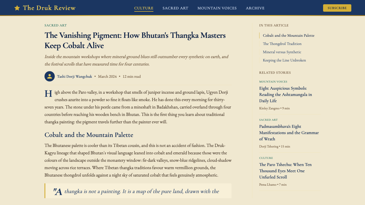
For editorial and marketing work, the style's brocade-border logic suggests a strong use of framing. An article layout might use a rich-colored outer margin — either deep cobalt or emerald — to frame a near-white content field, with section headings placed as if they were register labels in a sacred hierarchy. Marketing pages work well with the Thangka principle of focal density: rather than distributing visual interest across the full page, concentrate the most ornamented, most richly colored treatment at the one element you want the viewer to register first — the call-to-action, the hero statement, the product feature — and let everything else recede into atmospheric cool.对于编辑与营销内容,这种风格的织锦边饰逻辑暗示对框架的强势运用。文章版面可以使用富丽的有色外边距——深钴蓝或翡翠绿——框住接近白色的内容场,章节标题的放置如同神圣等级中的层次标签。营销页面适合借用唐卡的焦点密度原则:与其将视觉兴趣分散于整页,不如将最精饰、最富色彩的处理集中于你希望观者首先注册的那一元素——行动号召、英雄陈述、产品特性——并让其他一切退入冷峻的大气背景。
A common mistake when applying this style is confusing opulence with density. Authentic Thangka achieves its richness through precision and discipline, not through accumulating decorative elements. Every gold line serves a compositional function; every figure has a defined position in the hierarchy. When designers import the surface vocabulary — the gold, the cobalt, the layered ornament — without the underlying compositional logic, the result is merely busy rather than sacred. The rule to internalize is: maximum restraint in the number of elements, maximum intensity in the treatment of each element. One well-placed gold accent in a cool blue field is more powerful than a composition entirely gilded.应用这种风格时最常见的错误,是将富丽与密度混为一谈。真正的唐卡以精准与自律成就其丰盛,而非通过堆积装饰元素。每一条金线都服务于构图功能;每尊图像都在等级中占据明确位置。当设计师引入表面词汇——金色、钴蓝、层叠装饰——却不介入底层构图逻辑时,结果只是繁复而非神圣。需要内化的规则是:元素数量上保持最大克制,每个元素的处理上保持最大强度。一处冷蓝场中精准放置的金色强调,远比通篇镀金的构图更有力量。
See the Bhutanese Thangka (Druk Style) design system查看 Bhutanese Thangka (Druk Style) 完整设计系统
Bhutanese Thangka (Druk Style) — FAQBhutanese Thangka (Druk Style) · 常见问题
What is the difference between Bhutanese Thangka and Tibetan Thangka?不丹唐卡与西藏唐卡有何区别?
The two traditions share the same Vajrayana Buddhist iconographic foundation and the same basic compositional rules, but they diverge significantly in color temperature, atmospheric quality, and political iconographic emphasis. Tibetan Thangka — particularly the dominant Gelug school tradition — tends toward warmer palettes built around saffron, ochre, and warm ultramarine, with a greater emphasis on the elaborate cloud-and-flame backgrounds of the central deity. Bhutanese Druk-style Thangka is systematically cooler: cobalt rather than turquoise, emerald rather than ochre, and with the rainbow-cloud aureoles given greater atmospheric layering. Iconographically, the Bhutanese tradition emphasizes the Druk-Kagyu lineage figures — particularly the Eight Manifestations of Padmasambhava — rather than the Gelug protector-deity hierarchies that dominate in Lhasa-tradition Tibetan painting.两种传统共享同一套金刚乘佛教图像学基础与基本构图规范,但在色彩温度、大气品质与政治图像学侧重上存在显著分歧。西藏唐卡——尤其是主流格鲁派传统——倾向于以藏红花黄、赭石与暖群青为核心的温暖色调,更强调中央主尊繁复的云焰背景。不丹竹巴风格唐卡则系统性地更为冷峻:钴蓝而非绿松石蓝,翡翠绿而非赭石,彩虹云霞光晕被赋予更多大气层次感。在图像学上,不丹传统强调竹巴噶举派传承人物——尤其是莲花生大士八大化身——而非主导拉萨传统藏地绘画的格鲁派护法神等级体系。
Is it appropriate for secular or commercial design projects to use Thangka visual language?世俗或商业设计项目使用唐卡视觉语言是否合适?
This requires careful judgment. The compositional logic of Thangka — hierarchical registers, cool atmospheric color fields, gold focal intensity, brocade framing — can be applied abstractly in secular work without appropriating specifically sacred imagery. The line to respect is between drawing on the visual grammar and reproducing the sacred content: using cool layered atmospheric fields with gold accents is compositional influence; reproducing the specific iconographic forms of Padmasambhava or the Eight Manifestations in commercial work is a different matter and may reasonably offend practitioners. The safest approach is to work at the level of atmosphere, palette, and compositional architecture — rather than figurative reproduction — and to be transparent about the source tradition in any public context.这需要审慎判断。唐卡的构图逻辑——等级层次分区、冷峻大气色域、金色焦点强度、织锦框架——可以在世俗作品中抽象运用,而不必挪用专属的神圣图像。需要尊重的界限在于:借鉴视觉语法与复制神圣内容之间。使用冷峻层叠大气场与金色强调是构图影响;在商业作品中复制莲花生大士或八大化身的特定图像形式则是另一回事,可能合理地冒犯修行者。最稳妥的做法是在大气感、色调与构图架构层面用功——而非具象复制——并在任何公开场合对来源传统保持透明。
How does the Thangka approach to gold differ from other traditions that use gold?唐卡对金色的运用与其他使用金色的传统有何不同?
Gold in European medieval illuminated manuscripts served primarily as a ground — a flat field of luminosity replacing sky or background space. Gold in Byzantine icon painting functions similarly: a gold ground collapses pictorial depth and replaces it with divine timelessness. Gold in Bhutanese Thangka, by contrast, is primarily a finishing treatment applied to specific sacred elements within a colored compositional field. The cobalt or emerald background is painted first; gold is then applied to halos, crown ornaments, lotus petals, jewelry, and ritual implements as the final layer. This means the gold reads as an attribute of the figure — something emanating from it — rather than as the environment in which the figure exists. The burnishing process, which brings the gold to a mirror quality, adds a physical luminosity that cannot be achieved by any flat yellow pigment and that functions literally as a light source within the composition.欧洲中世纪彩饰手稿中的金色主要作为底面使用——一片替代天空或背景空间的发光平面。拜占庭圣像画中的金色功能相似:金底折叠了图像深度,以神圣的无时间性取而代之。不丹唐卡中的金色则相反,主要是施于彩色构图场中特定神圣元素的最终处理层。钴蓝或翡翠背景先行绘制;金箔随后作为最后一层覆于光环、冠饰、莲花瓣、珠宝与法器之上。这意味着金色被读解为图像的属性——某种从中散发之物——而非图像所处的环境。磨光工序将金箔带至镜面品质,赋予任何黄色平面颜料都无法实现的实体光辉,在构图内部字面意义上充当一个光源。
Can the Thangka compositional system work for non-religious, data-heavy interfaces?唐卡构图体系能否用于非宗教、数据密集型界面?
More effectively than it might seem. The hierarchical register logic — strict horizontal zones, each with a defined visual weight and reading priority — is fundamentally a spatial information architecture, not a doctrinal one. Dashboard design faces exactly the problem that Thangka composition solves: how to display many kinds of information simultaneously without visual chaos, while guiding the eye to the most important element first. The Thangka solution is to assign each class of information a zone, give the most critical zone the most intensive visual treatment (the equivalent of the central deity's gold halo), and allow the peripheral zones to recede atmospherically. Applied to a data dashboard, this means: primary KPIs in the center with highest contrast treatment, secondary breakdowns in flanking zones, contextual metadata in the coolest, least saturated outer fields.比表面看来更有效。等级层次逻辑——严格的水平分区,每区具有明确的视觉重量与阅读优先级——从根本上是一种空间信息架构,而非教义架构。仪表板设计面临的正是唐卡构图所解决的问题:如何在不造成视觉混乱的前提下同时展示多种信息,同时引导眼睛首先到达最重要的元素。唐卡的解法是:为每类信息分配一个区域,给最关键的区域最密集的视觉处理(相当于中央主尊的金箔光环),并让外围区域大气地退却。应用于数据仪表板,意味着:核心 KPI 置于中央以最高对比度处理,次级细分置于两侧区域,上下文元数据置于最冷、最低饱和度的外圈。
What is the most common mistake when using the Thangka palette in digital design?在数字设计中使用唐卡色调最常见的错误是什么?
The most common mistake is inverting the temperature logic: using warm tones — oranges, warm golds, saffrons — as the dominant background field and reserving cool tones as accents. Authentic Druk-style Thangka is built on a cool foundation with warm accents. The cobalt and emerald are the atmosphere; the gold is the point of maximum intensity. When this relationship is reversed, the composition loses the quality of luminous emergence — the sense that the gold is radiating outward from a cool surround — and becomes instead a uniformly warm, less differentiated field. The second most common mistake is using both gold and warm orange simultaneously as accent colors, which produces the color temperature of a different tradition entirely and loses the mountain atmosphere that defines the Bhutanese idiom.最常见的错误是颠倒色彩温度逻辑:以暖色调——橙色、暖金、藏红花黄——作为主导背景场,将冷色调保留为强调。真正的竹巴风格唐卡建立在冷峻基础与暖色强调之上。钴蓝与翡翠绿是大气;金色是最大强度的焦点。当这种关系被颠倒,构图就失去了那种光辉浮现的品质——金色从冷峻环境中向外辐射的感觉——转而成为均质温暖、缺乏分化的色场。第二常见的错误是将金色与暖橙色同时作为强调色使用,这会产出完全属于另一传统的色彩温度,丧失定义不丹图像语言的山岳气氛。
Related design styles相关设计风格
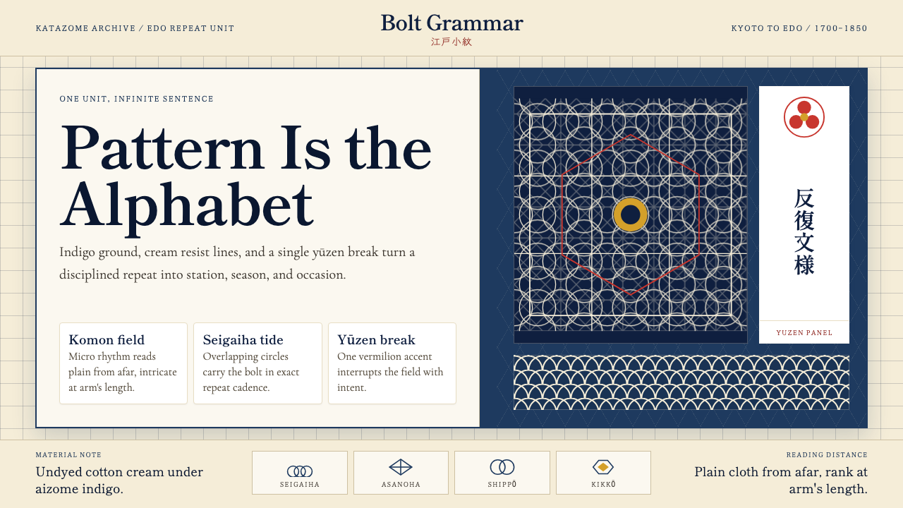 Edo Kimono TextilePattern becomes language. Indigo repeats, cream resist lines, one vermilion p…纹样即语言:靛蓝循环、米白留线,一块朱红破局。
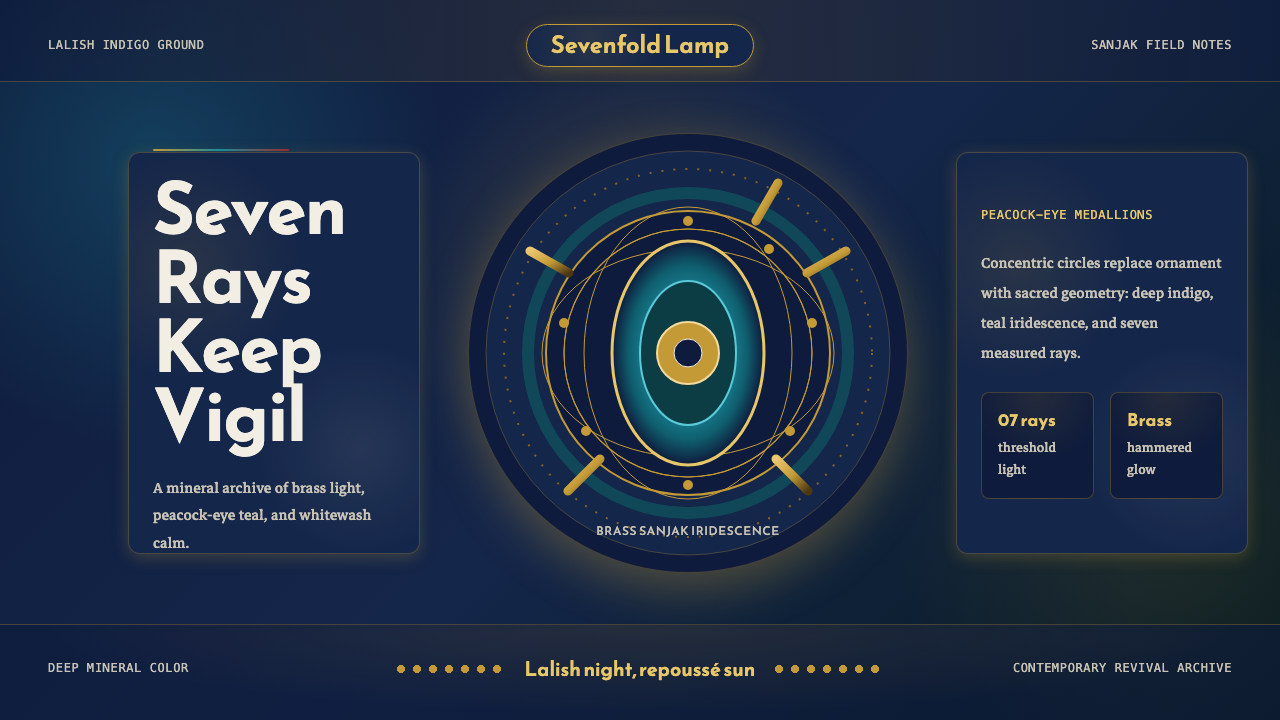 Kurdish Yazidi Peacock & SunSacred geometry glows. Lalish indigo holds brass rays and teal peacock-eye me…神圣几何在发光:拉利什靛蓝托住黄铜日芒与孔雀眼纹。
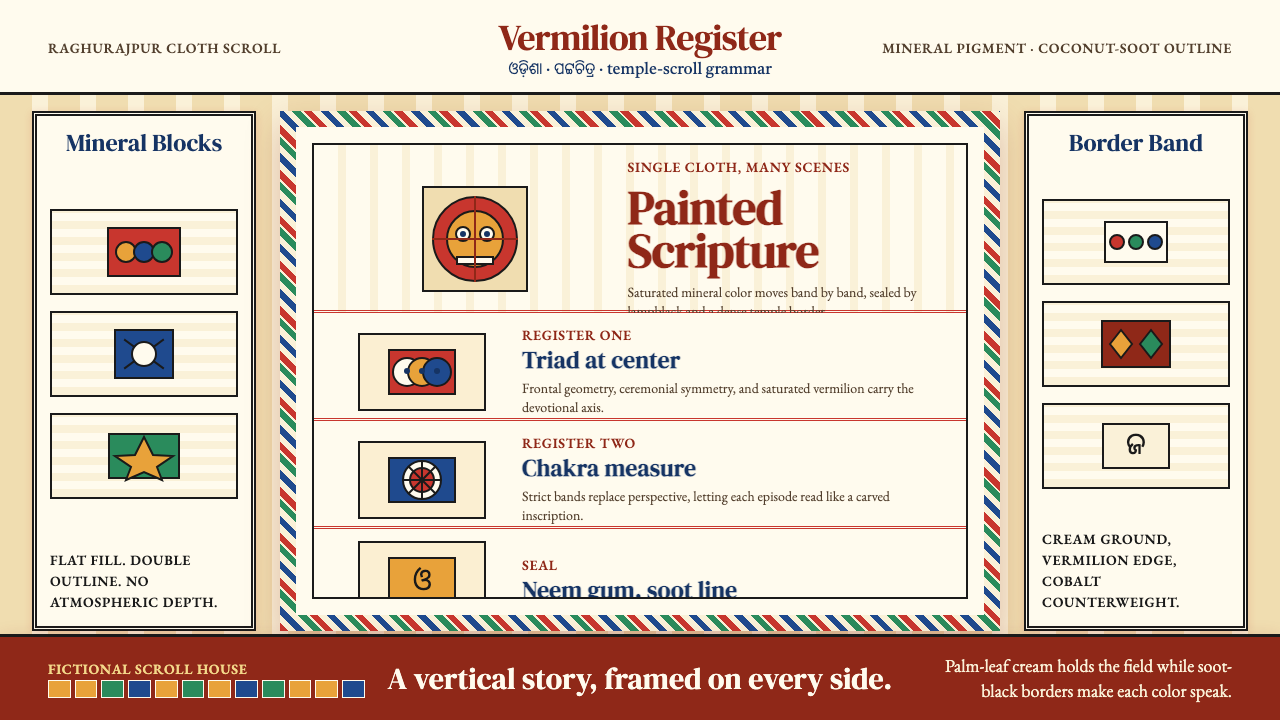 Pattachitra (Odisha Temple Scroll)Devotion as dense color. Vermilion bands and soot-black outlines stack like a…浓色即敬献:朱砂横带与烟黑描线层叠成寺庙长卷。
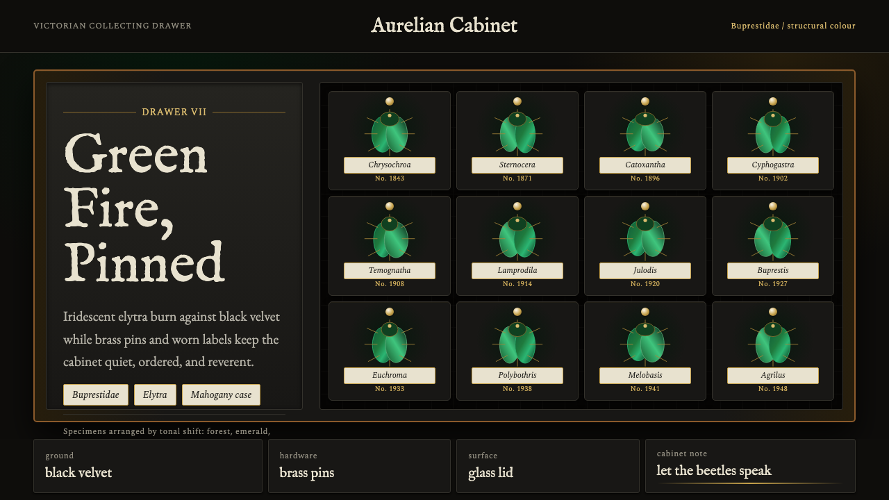 Beetle Specimen CabinetGreen burns in darkness. Emerald elytra grids glow under brass keylines and b…暗处燃起绿光。翡翠鞘翅格阵在黄铜线与黑绒底上发亮。
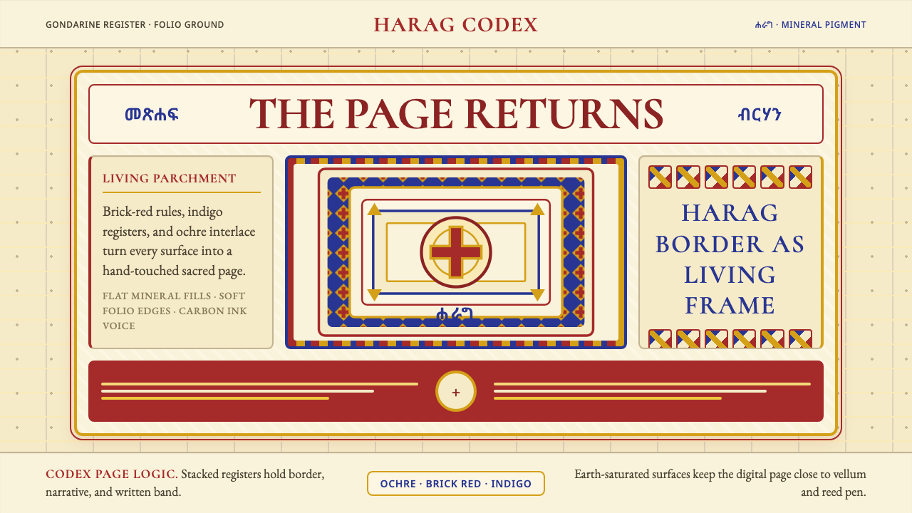 Ethiopian Orthodox ManuscriptSacred page, alive. Brick red, indigo, and ochre harag borders frame a starin…圣页有生命。砖红、靛蓝与赭金哈拉格边框凝视成像。
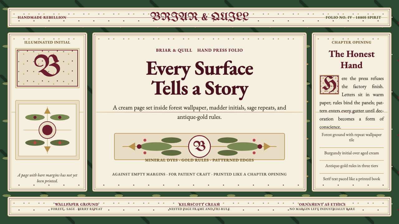 William Morris Arts & CraftsOrnament is the argument. Forest green wallpaper frames cream pages, gold rul…繁饰即立场。森林绿墙纸、米色书页、金线和衬线字构成手工感。