What is Beetle Specimen Cabinet?
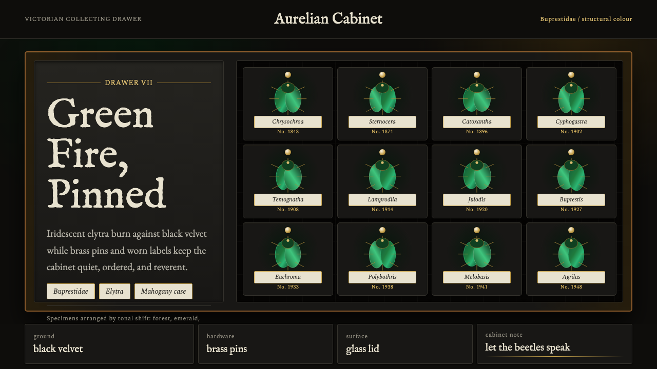
Beetle Specimen Cabinet takes the Victorian collector's drawer as a design system — jewel-toned iridescence pinned against near-black velvet, framed in warm wood and cool metal.
Beetle Specimen Cabinet in brief
Beetle Specimen Cabinet is a design language drawn from the Victorian entomology cabinet: rows of pinned jewel beetles whose shifting green burns against a near-black velvet ground, sealed beneath shallow glass-topped wooden drawers, labeled in the faded engraver's script of a museum ledger. It is a cataloguing aesthetic — an eye trained on the display case rather than the wilderness — and it treats every surface as a specimen tray waiting to be filled with something rare.
The style's whole identity rests on a single optical trick: structural color. Real jewel beetles (the Buprestidae family) do not carry green pigment the way a leaf does; their shells are built from microscopic layered structures that bend light, so the same beetle reads as deep forest, then pure emerald, then a bright metallic flash, depending on where you stand. Beetle Specimen Cabinet borrows that logic directly — it wants color that seems to move, not color that sits flat on a surface.
Everything besides that iridescent green is deliberately quiet. The ground is pushed almost to black, the framing material is warm and unobtrusive, and the labels are small, pale, and handwritten in character. The hierarchy is absolute: the specimen is the only thing allowed to shine, and the cabinet exists purely to hold it still and let it be looked at.
Where does Beetle Specimen Cabinet come from?
The visual source is the Victorian natural-history cabinet, a fixture of nineteenth-century collecting culture. Beginning in the early 1800s and accelerating through the Victorian era, European naturalists, gentleman-amateurs, and institutions built vast private and public collections of insects, shells, minerals, and birds' eggs, each specimen pinned, labeled, and filed into shallow wooden drawers with glass lids for viewing without handling. The cabinet was not just storage — it was an instrument of Enlightenment-era classification, a physical expression of the belief that the natural world could be catalogued and understood through careful arrangement.
Beetles held a privileged place in these collections, and jewel beetles most of all. Their durability made them ideal specimens: unlike soft-bodied insects, a beetle's hardened forewings (elytra) resist decay for centuries, and — crucially — they keep their color. Where a pinned butterfly's pigments fade under light within a few generations, a jewel beetle's structural color is physical, not chemical; it survives essentially unchanged as long as the shell itself survives. Victorian collectors and cabinet-makers noticed this durability and treated jewel beetles as centerpiece specimens, often given the best-lit, most prominent drawers.
The scientific study of structural color itself was part of the same nineteenth-century moment. Naturalists and early physicists were fascinated by iridescence in beetles, butterfly wings, and peacock feathers, and the phenomenon became a recurring case study in Victorian writing on optics and natural design — the beetle as proof that nature could produce color effects no pigment or dye could match. That fascination fed directly into the display culture: collectors arranged their brightest beetles to catch raking light, turning the cabinet drawer into a small theater for a color the eye could not quite pin down.
This collecting culture flourished across Western Europe's museums, natural-history societies, and private libraries, carried forward by naturalists, cabinet-makers who built the specialized glass-topped drawers, and the institutional entomologists who formalized taxonomy and labeling conventions. Beetle Specimen Cabinet compresses that whole apparatus — drawer, pin, label, specimen — into a single reusable design vocabulary.
What defines the Beetle Specimen Cabinet look?
Color
The palette is built around one dominant move: a jewel-toned, shifting green — read as structural color rather than flat pigment — set against a ground pushed almost to black. The green should behave like the real elytra it borrows from, appearing to deepen toward forest shadow in one area and lift toward a bright emerald or metallic highlight in another, as though catching light at an angle. Everything else in the palette recedes: warm neutral wood tones for framing, a cool metallic accent for hardware and linework, and small warm off-white passages reserved for labels. No other saturated hue competes with the green.
Materials and Surface
The style leans on a contrast of surfaces rather than a single texture: a deep, light-absorbing velvet-like ground for the ‘specimen’ area, a warm satin wood grain for the frame and structure around it, a cool hard metallic line for pins and edge details, and a clear glossy plane implied over the top, as if the whole composition sits under museum glass. This layering of soft-dark, warm-wood, cool-metal, and glass-clear is what makes the cabinet read as a physical object rather than a flat graphic.
Typography
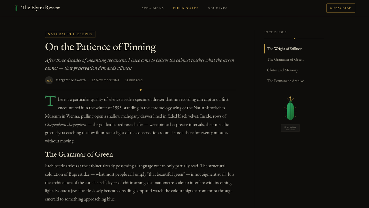
Labeling borrows the register of a hand-annotated museum ledger: small, quiet, slightly irregular lettering that reads as engraved or hand-lettered script rather than a clean contemporary sans-serif. Scale is used sparingly and with restraint — a specimen's ‘name’ might be set only modestly larger than its supporting data, because in a real cabinet no label is allowed to compete visually with the specimen itself. Body copy stays small and unobtrusive, closer to a caption than a headline.
Composition
Composition follows the logic of a specimen drawer: a grid of shallow, evenly spaced slots, each holding one ‘pinned’ element, with generous dark space between them so every specimen is isolated and legible on its own. Symmetry and repetition are expected — rows and columns rather than organic scatter — because the whole point of a cabinet is orderly comparison. A single focal specimen may be given more room and a slightly larger frame, echoing the way a real collector reserves the best-lit drawer position for a prize beetle.
Shape and Framing
Shapes are architectural rather than organic: rectangular drawer outlines, thin ruled dividers, small circular or oval accents standing in for pins. Corners are typically square or only very slightly softened — the cabinet is furniture, not packaging, and its geometry should feel built rather than styled. A fine hairline border is common around each specimen slot, doing the job the glass lid does in the physical object: marking a boundary you can see through but not cross.
Light and Shadow
Light behaves like a spotlight over a dim room: the dark ground stays largely flat and shadowless, while the beetle-green elements themselves carry an internal gradient that suggests a curved, glossy shell catching a single light source. This concentrates all of the drama into the specimen and leaves the rest of the surface calm — a deliberate imbalance, since a cabinet full of competing highlights would defeat the purpose of pinning attention to one jewel at a time.
Motion
Where the style extends into interactive or animated contexts, motion should mimic the beetle's own iridescence rather than generic slide or fade transitions: a slow shift in the green's highlight as if the viewing angle changed, or a gentle shimmer that sweeps across a surface the way light sweeps across a curved shell. Motion should be slow, subtle, and rare — used to reinforce the illusion of structural color, never to add generic decorative energy.

Who shaped Beetle Specimen Cabinet?
The jewel beetle family is the direct visual source for the entire style. Their elytra are built from microscopic layered structures that refract light rather than absorb it selectively the way pigment does, which is why the same beetle can flash forest green, emerald, and bright metallic highlight depending on viewing angle. Their durability — the shell's color survives essentially unfaded for centuries — is exactly why Victorian collectors prized them as centerpiece specimens, and why they remain the design's core visual reference.
The specialized craftsmen who built glass-topped specimen drawers gave the style its physical vocabulary: shallow wooden trays sized to hold pinned specimens in orderly rows, a hinged or lifting glass lid that permitted viewing without handling, and warm, unobtrusive wood chosen specifically so it would not compete visually with what was displayed inside. Their functional design choices — depth, spacing, framing — are the direct ancestors of the grid-and-drawer composition logic the style still follows.
The scientists who formalized specimen taxonomy and labeling conventions gave the style its informational register: small, precise, hand-lettered labels recording a name and classification beneath each specimen, arranged with a consistency that let a viewer compare drawer to drawer. Their insistence on careful documentation is why the style's typography always reads as restrained and cataloguing rather than expressive or decorative.
The broader nineteenth-century boom in private and institutional collecting is the cultural engine behind the style, not just its container. This was a moment when arranging the natural world into labeled, gridded drawers was itself considered a form of understanding it — which is why the style still feels less like a color palette and more like a whole worldview about order, rarity, and attention.
How do you use Beetle Specimen Cabinet today?
Beetle Specimen Cabinet is a strong choice whenever a brand or product wants to signal rarity, curation, and quiet authority rather than energy or approachability. Applying it well means preserving its central discipline — one glowing, shifting element against a calm dark field — rather than treating the jewel green as just another accent color to sprinkle across a layout.
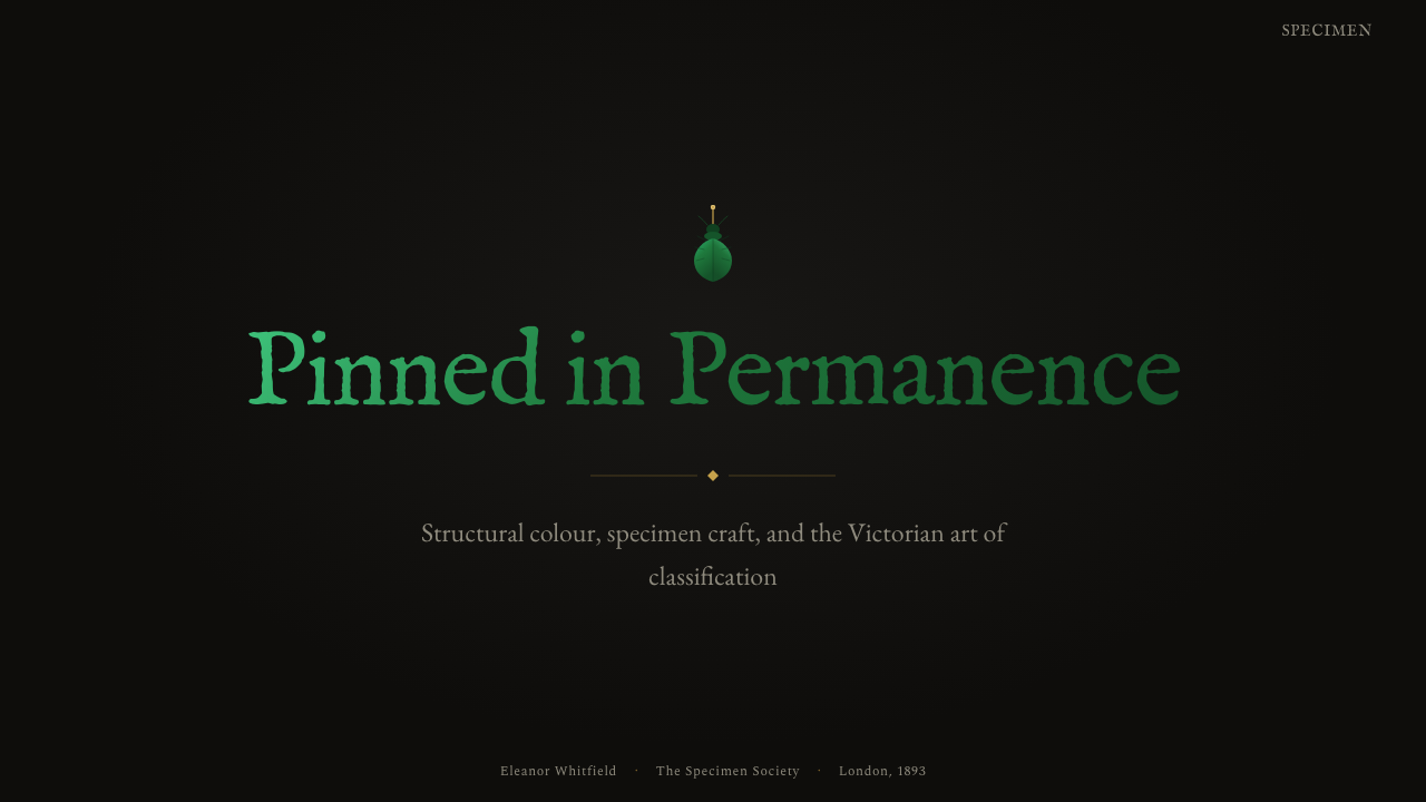
For presentation slides, the style suits a cover built like a single specimen drawer: a dark, near-black field with one prominent iridescent-green shape catching the eye, title copy set in the small, quiet, labeled register rather than a bold display headline. Content and data slides work best as a grid of ‘drawers’ — evenly spaced panels on a dark ground, each in the same restrained label typography, with the green reserved for the one data point or callout that should draw the eye first. Resist coloring every chart element green; a cabinet where every specimen glows equally is not a cabinet anymore.
For web UI, dashboards and pricing pages benefit from the same specimen-drawer logic: a dark, quiet base interface with metrics or plan tiers arranged in an even grid, wood-toned or metallic dividers marking the structure, and the iridescent green reserved specifically for the primary action, the recommended plan, or the single metric currently worth attention. Because the palette is naturally low-key everywhere except that one accent, this produces dashboards that feel calm rather than noisy, with a built-in hierarchy telling the user exactly where to look first.
For editorial and marketing use, the style rewards a slower, contemplative pacing — long-form articles about craft, rarity, or natural history sit especially well in it, with pull quotes set apart the way a prize specimen gets its own drawer. Marketing pages can lean into the ‘museum reveal’ feeling: a dark hero section where a single claim is lit up in the signature green while supporting copy stays small and label-like beneath it.
The most common mistake is treating the style as simply ‘dark background plus green,’ and then filling the composition with green everywhere — buttons, icons, borders, and text all glowing at once. That reads as a neon interface, not a specimen cabinet. The discipline that makes this style work is scarcity: the ground must stay genuinely quiet and near-black, the wood and metal accents must stay secondary, and the iridescent green must be rationed carefully enough that when it does appear, it still reads as a rare, deliberately lit specimen rather than a repeating decorative color.
Beetle Specimen Cabinet — FAQ
What makes Beetle Specimen Cabinet different from a generic dark-mode theme with a green accent?
A generic dark theme treats green as a flat accent applied wherever emphasis is needed. This style treats its green as structural color — it should feel like it shifts and catches light rather than sitting as one flat hue, and it should appear rarely enough to feel like a specimen rather than a system color. Without the warm wood framing, the metallic pin-like details, and the small labeled typography, the formula collapses into an ordinary dark UI theme rather than a cabinet.
Can this style work with a light background instead of a dark one?
The style depends heavily on contrast between a genuinely dark, near-black ground and a glowing iridescent-green element — that contrast is what makes the color read as ‘lit from within’ rather than simply printed. A light-background version is possible, but it needs a different device to create the same sense of a spotlit specimen, such as a strongly bordered, glass-like frame isolating the green element against a paler field. A light adaptation should be treated as a deliberate variant, not a simple color swap.
Does the style require literal beetle or insect imagery to work?
No. The style translates the cabinet's logic — pinned rarity, structural color, grid-and-drawer arrangement, restrained labeling — into a general visual system, not a requirement to illustrate literal insects. It works applied to abstract shapes, data visualizations, or product photography, as long as the underlying discipline holds: one shifting jewel-green element treated as precious, set against a calm dark field, framed by warm and metallic materials, labeled with quiet, small typography.
What kinds of products or brands should avoid this style?
The style struggles anywhere the brand needs to feel warm, playful, fast-moving, or mass-market. Its vocabulary — dim grounds, restrained labeling, a single precious highlight — signals rarity and quiet authority, which reads poorly for children's products, casual consumer apps, or anything positioned as approachable and everyday. It can also feel heavy where information density must be very high, since the style asks for generous dark space around each ‘specimen’ and resists being crowded.
How is this style different from a generic ‘nature’ or ‘botanical’ theme?
A botanical theme typically borrows organic color and texture directly — leaf greens, floral shapes, soft naturalistic gradients. This style borrows something more specific and more artificial-feeling: the museum's act of capturing and cataloguing a piece of nature, not nature itself. Its palette is narrower and more disciplined, its shapes are architectural rather than organic, and its whole mood is controlled display rather than living growth — closer to a jeweler's case than a garden.
Related design styles
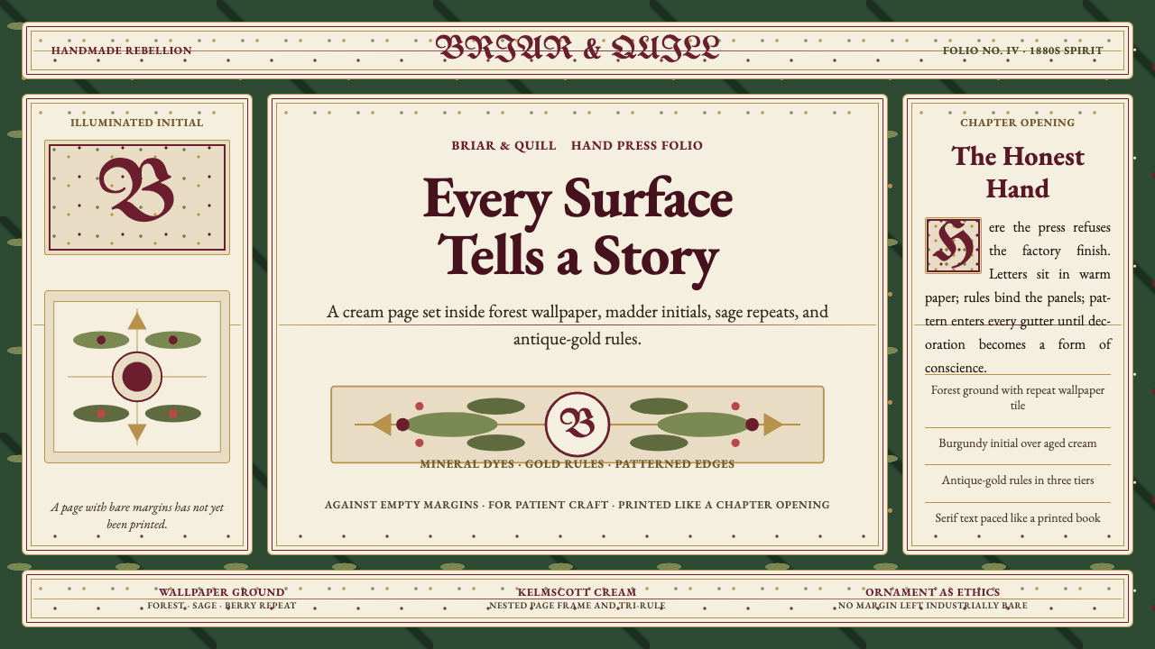 William Morris Arts & CraftsOrnament is the argument. Forest green wallpaper frames cream pages, gold rul…
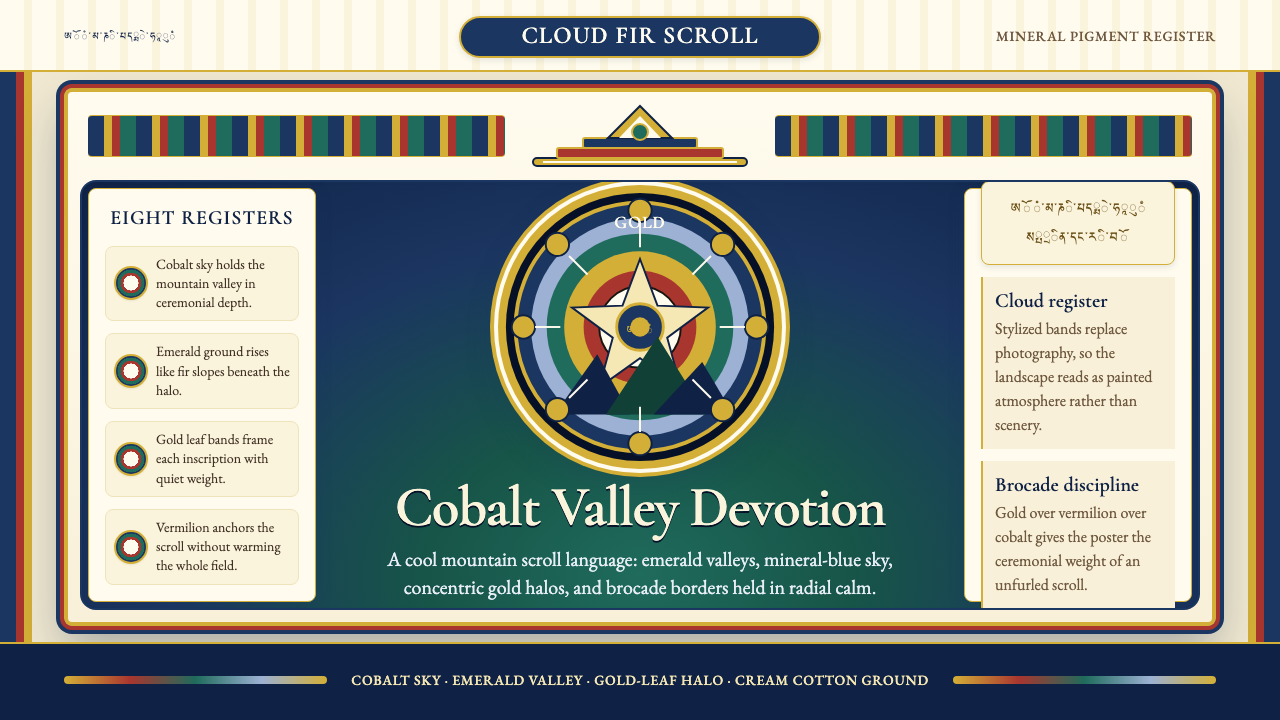 Bhutanese Thangka (Druk Style)Sacred cool-mountain clarity. Cobalt fields, emerald ground, and gold halos f…
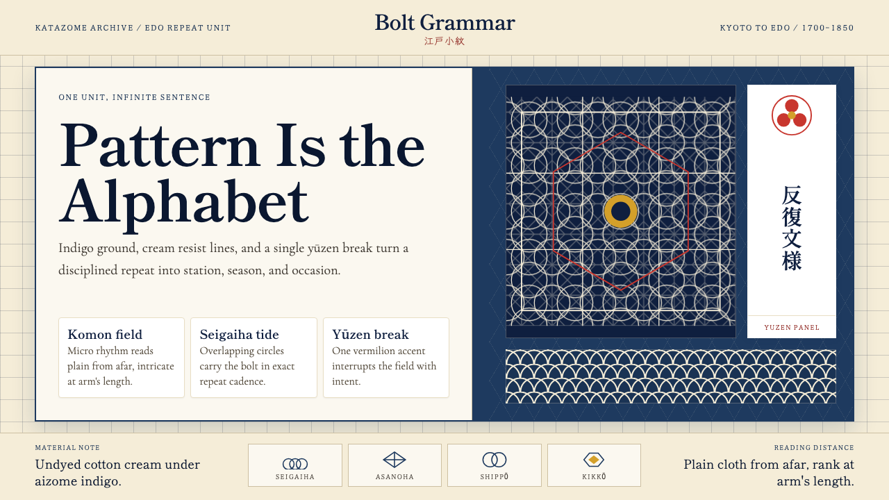 Edo Kimono TextilePattern becomes language. Indigo repeats, cream resist lines, one vermilion p…
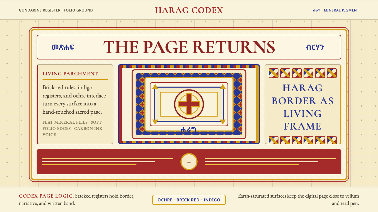 Ethiopian Orthodox ManuscriptSacred page, alive. Brick red, indigo, and ochre harag borders frame a starin…
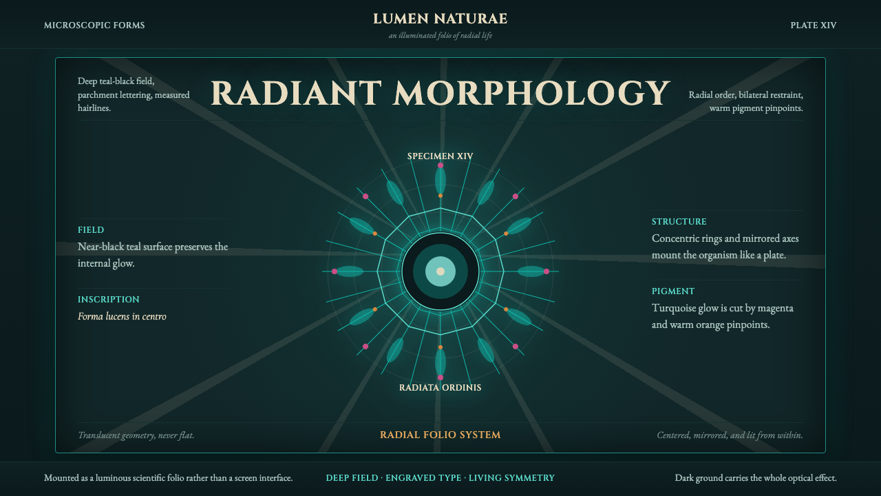 Haeckel KunstformenLuminous symmetry. Teal-black ground, Cinzel capitals, and radial turquoise s…
 Kurdish Yazidi Peacock & SunSacred geometry glows. Lalish indigo holds brass rays and teal peacock-eye me…