What is Edo Kimono Textile?什么是 Edo Kimono Textile?
For two and a half centuries, Edo craftsmen turned cloth into a social language — a single repeating motif able to announce season, rank, and occasion at a glance.两个半世纪里,江户工匠将布料变成社会语言——一个循环纹样,一眼即知季节、身份与场合。
Edo Kimono Textile in briefEdo Kimono Textile 速览
Edo Kimono Textile is Japan's most disciplined system of repeating-pattern design, developed across the Edo period from 1603 to 1868 and reaching its commercial peak between roughly 1700 and 1850. It encompasses komon stipple dyeing, edomon micro-pattern stencilling, yūzen resist-paste brushwork, and katazome stencil-resist technique — four distinct crafts that share a single formal ambition: to transform a length of silk or cotton into a visual vocabulary that every social class could read without instruction.江户绞染织物是日本最严谨的循环纹样设计体系,贯穿1603至1868年的整个江户时代,在1700至1850年间达到商业巅峰。它涵盖小纹点染、江户小纹细纹型染、友禅防染绘工和型染印花四种各具特色的工艺——四种手艺共享同一形式志向:将一匹丝绸或棉布变成每个社会阶层无需说明便能读懂的视觉词典。
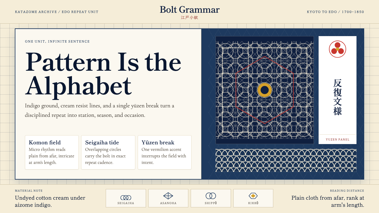
The aesthetic core is what Japanese dyers called the 'single unit tiled to infinity.' A pattern cell — perhaps an interlocking tortoiseshell, a hemp-leaf hexagonal lattice, a wave-crest seigaiha, or a seven-treasure shippo circle — is engineered at a precise scale, then repeated with mathematical regularity across the full width and length of the cloth. The ground is typically an indigo field or a chalk-white resist field; within this ground, motif and counter-motif lock together like a woven argument. A single accent panel — a yūzen-painted band of autumn grasses or blossoming plum — breaks the repeat at a calculated position, turning the whole garment into a studied contrast between rule and exception.美学核心是日本染织匠人所说的「一单元,无限延展」。一个纹样单元——龟甲交叠纹、麻叶六边形格、青海波波纹,或七宝连环圆——以精确的尺度设计,而后以数学般的规律铺满整匹布的宽度与长度。底色通常是靛蓝地或蜡白防染地;在这底色之上,主纹与副纹互相咬合,如同一场编织的辩论。一段友禅彩绘——秋草或梅花的晕染带——在计算好的位置打破循环,令整件和服成为规则与例外之间蓄意对照的沉思。
As a design system, Edo Kimono Textile is not primarily about naturalistic depiction. Cranes, pine, and chrysanthemum appear everywhere, but they are almost always distilled to their geometric essence — a crane becomes a dynamic diagonal; a pine needle becomes a radiating cluster of lines; a chrysanthemum becomes a concentric ring of petals resolved to near-perfect radial symmetry. The tradition teaches that beauty lies not in resemblance but in structural clarity, rhythmic recurrence, and the disciplined restraint of a palette that speaks loudly by speaking sparingly.作为设计体系,江户绞染织物并非首要关注自然写实。鹤、松、菊随处可见,但几乎都被提炼至几何本质——鹤化为动感的对角线,松针化为放射的线簇,菊化为近乎完美径向对称的同心花瓣圈。这一传统教导:美不在于形似,而在于结构清晰、节奏反复,以及以克制之色板大声言说的自律——少说,才是重说。
See the Edo Kimono Textile design system查看 Edo Kimono Textile 完整设计系统
Where does Edo Kimono Textile come from?Edo Kimono Textile 从何而来?
The Edo period began in 1603 when Tokugawa Ieyasu unified Japan under a military government based in Edo — the city that would later be renamed Tokyo. The Tokugawa shogunate enforced a rigid four-tier social hierarchy: samurai, farmers, artisans, and merchants. Sumptuary laws, issued and periodically renewed throughout the period, prohibited commoners from wearing silk garments decorated with gold thread or elaborate figurative embroidery. These restrictions had an unintended aesthetic consequence: urban merchants and artisans, barred from ostentatious display, channeled competitive energy into subtlety. The most desirable textiles became those whose sophistication was legible only to the initiated — pattern so fine it appeared solid from a distance, dye work so precise it looked printed.江户时代始于1603年,德川家康统一日本,在江户(后改名东京)建立幕府政权。德川幕府推行严格的四级社会等级制度:武士、农民、工匠与商人。整个江户时代屡次颁布并更新的奢侈禁令,禁止平民穿戴金线刺绣或繁复具象纹样的丝绸服装。这些限制带来了意想不到的美学后果:被剥夺炫耀性展示权利的城市商人和工匠,将竞争能量转化为对含蓄精妙的极致追求。最令人觊觎的织物,恰恰是那些只有行家方能读懂其精妙之处的——远看如素色实地的极细纹样,精准到仿佛机器印制的染工。
The technical traditions that fed this aesthetic came from Kyoto, the imperial capital and center of elite weaving since the Heian period. Kyoto's Nishijin district had produced luxury figured silks for the court and aristocracy for centuries. But in the seventeenth century a new technique emerged from a Kyoto fan-painter named Miyazaki Yūzensai, whose application of rice-paste resist to silk and subsequent multi-step dyeing process — named yūzen in his honor — made complex polychrome pictorial designs achievable on a previously impossible scale. Yūzen enabled the painted flora, birds, and landscapes that became the signature of Kyoto's export kimono market, and its techniques were refined and regionalized over the following century into distinct schools in Kyoto, Kanazawa (Kaga yūzen), and later Edo itself.滋养这一美学的技术传统来自京都——平安时代以来高级织造的中心,也是皇室与贵族生活的都城。京都西阵地区数百年来为宫廷与贵族生产豪华提花丝绸。但在十七世纪,一种新技法从一位名叫宫崎友禅斋的京都扇画师那里诞生——他将米糊防染料涂绘在丝绸上,再经多步骤套染,这一以其名字命名的「友禅」工艺,使复杂的多色具象图案得以在前所未有的规模上实现。友禅技法造就了京都出口和服市场标志性的彩绘花鸟山水,其技法在此后一个世纪里不断精炼,在京都、金泽(加贺友禅)乃至江户本土分化出各具风貌的流派。
In Edo, the dominant aesthetic ran in a different direction. The city's chōnin townsman culture — prosperous, sardonic, and proud of its independence from Kyoto court refinement — preferred a kind of restrained wit. The ideal was iki: a sophisticated understatement, a cool elegance that disdained obvious luxury. This sensibility produced komon, 'small pattern': an all-over stippled stencil design in which a single motif, sometimes no larger than a grain of rice, was repeated across the entire cloth in a monochromatic indigo-on-white or white-on-indigo scheme. Komon required extraordinary technical precision from the Ise katagami stencil-cutters, the Iwai family and their contemporaries, who developed paper stencils of such intricacy that hundreds of repeats could be applied with no visible seam.在江户城,主流美学走向了另一个方向。这座城市的町人文化——殷实、带着一丝玩世不恭、以独立于京都宫廷雅致而自豪——偏爱一种含蓄的机敏。理想是「粋」(iki):世故的低调,一种鄙视明显奢华的沉静优雅。这种感性孕育了「小纹」——满地点印的型染纹样,其中单一母题有时不过米粒大小,以靛蓝染白或白染靛蓝的单色方案铺满整匹布。小纹对伊势纸样刻师要求极高——岩井家族及其同时代的工匠们发展出精细到可以无缝衔接数百次印版、看不见接痕的纸型技艺。
By the mid-Edo period, the grammar of these pattern systems had become a shared cultural code. Certain motifs were season-locked: pine and crane for winter and longevity, cherry blossom for spring's brief perfection, autumn maple for transience. Others signified class aspiration or guild affiliation. The Rinpa school, founded by painters Hon'ami Kōetsu and Tawaraya Sōtatsu in the early seventeenth century and later codified by Ogata Kōrin, translated this pattern grammar into bold, decorative compositions for lacquerware, screens, and textiles that fused classical literary reference with vivid graphic clarity. Kōrin's compositions — fan shapes, water irises, autumn maples rendered in flat gold and color — crossed freely between textile design and the fine arts, establishing a visual language that survives in Japanese design to the present day.到江户中期,这套纹样体系的语法已成为共同的文化密码。特定纹样与季节绑定:松与鹤寓意冬日与长寿,樱花代表春天的短暂圆满,秋枫象征流逝无常。另一些纹样则标示阶层志向或行会归属。琳派——由本阿弥光悦与俵屋宗达于十七世纪初创立,后经尾形光琳加以定型——将这套纹样语法转化为漆器、屏风与织物上大胆而装饰性的构图,融汇古典文学意象与鲜明的图形清晰度。光琳的构图——扇形、水边燕子花、以平金与色彩铺叙的秋枫——在织物设计与纯艺术之间自由往来,确立了一套延续至今的日本视觉语言。
What defines the Edo Kimono Textile look?Edo Kimono Textile 的视觉特征是什么?
Color Philosophy色彩哲学
The Edo palette operates on disciplined restraint: a dominant indigo ground, a white or cream resist field, and one carefully placed accent drawn from vermilion, ochre, or gold. The system is almost never polychromatic at full saturation across the whole cloth; instead, a narrow range of tones in the ground color is punctuated by a single warm counter-note. This economy makes the accent extraordinarily powerful — a small vermilion panel or a thread of gold reads as a decisive statement precisely because it is surrounded by measured sobriety.江户色彩体系建立在自律克制之上:以靛蓝为主调底色,以白色或米白防染为留白,再以朱红、土黄或金色精心置入一处点睛之色。整匹布上几乎从不出现多色高饱和并置;相反,底色在窄幅色调范围内变化,由唯一的一个暖色反调打破。这种节约赋予了点睛色极强的力量——一小块朱红或一缕金线之所以能成为决断性的陈述,正因为它被节制的底色所包围。
Repeating Pattern Grammar循环纹样语法
The defining structural feature is the mathematically tiled repeat unit. Traditional motifs — hemp-leaf麻の葉 lattice, tortoiseshell龟甲, seigaiha wave-crest, shippo seven-treasure circles, ichimatsu checkerboard — are each built on geometric grids that interlock without visible seam across any length of cloth. The repeat unit is sized so that it reads clearly both at arm's length and in the aggregate as a tonal field. This dual legibility — pattern up close, texture from afar — is the system's central aesthetic achievement.这一体系的决定性结构特征是数学级精准的铺砌单元。传统纹样——麻叶格、龟甲纹、青海波、七宝连环、市松格——每一种都建立在几何网格之上,可在任意长度的布料上无缝衔接。单元的尺度设计使其在近处清晰可辨,在整体上又呈现为一片色调底面。这种双重可读性——近看是纹样,远看是肌理——正是这套体系核心的美学成就。
Resist and Stencil Technique防染与型染技艺
The visual character of Edo textile patterns is inseparable from the physical processes that created them. Katazome stencil resist produces motifs with a distinctive clean edge and a subtle handmade imprecision that no mechanical process exactly replicates. Yūzen resist-paste work creates gradients of extraordinary delicacy — color bleeding at the edge of a resist line in a way that appears natural and intended. The apparent precision of komon micro-patterns belies the extraordinary human skill required to cut the stencils and apply them without slippage.江户织物纹样的视觉特质与其物质工艺密不可分。型染防染产生的纹样具有独特的清晰轮廓,以及任何机械工艺都无法精确复制的微妙手工不规则感。友禅防染绘工则创造出极为精致的色彩渐晕——颜色在防染线边缘自然渗化,显得天然而有意。小纹细纹的表观精确性,掩盖了刻制纸型并精准施印所需要的非凡人工技艺。
Motif as Social Code纹样即社会密码
In Edo textile culture, every motif carried meaning that the contemporary viewer could decode. Crane and pine signaled longevity and fidelity; cherry blossom named spring and impermanence; paulownia marked imperial rank; ichimatsu checkerboard became associated with a celebrated kabuki actor and was subsequently adopted as a fashion statement by Edo townspeople. Selecting a pattern was not merely an aesthetic decision but a statement about season, occasion, aspiration, and social position — a vocabulary as legible as written language to anyone who had grown up inside the culture.在江户织物文化中,每一种纹样都承载着当时观者能够解读的含义。鹤与松象征长寿与坚贞,樱花点名春天与无常,桐纹标示皇室身份,市松格因一位著名歌舞伎演员而广为人知,随即被江户町人作为时尚宣言加以采用。选择一种纹样,不仅仅是美学决定,更是关于季节、场合、志向与社会地位的陈述——对于在这一文化中成长的人而言,其可读性不亚于书面文字。
The Accent Break点睛破局
A kimono composed entirely of one repeating pattern would be admirable but static. The tradition developed a compositional counterpoint: the bold accent panel, placed at the hem, collar, or sleeve, that interrupts the field with a contrasting technique or motif. Typically rendered in yūzen brushwork against a resist-dyed ground, this accent panel concentrates the garment's narrative — a burst of seasonal flowers, a water scene, a classical poetic reference. The contrast between the disciplined repeat and the expressive accent is the garment's primary visual argument, and it is this tension that contemporary design applications most productively borrow.一件全身铺满同一循环纹样的和服固然令人赞叹,却不免流于静止。这一传统发展出了构图上的对位手法:以大胆的点睛段落——置于衣摆、领口或袖端——以不同技法或纹样打断底面。这段点睛通常以友禅绘工呈现于防染底之上,凝聚了整件服装的叙事——一簇应时花卉、一幅水边图景、一则古典诗意引典。严谨循环与表达性点睛之间的对比,是整件服装的核心视觉论点,也是当代设计应用中最富成效地借鉴这一传统的地方。
Scale Modulation尺度调节
Edo pattern masters understood that the same motif at different scales produces entirely different effects. A hemp-leaf lattice at large scale reads as bold geometry; the same lattice reduced to near-invisible becomes an all-over texture that enriches the ground without competing with it. This deliberate modulation of scale — choosing the repeat size to govern whether the viewer sees pattern or field — is one of the tradition's most transferable formal insights. In contemporary layout and interface design, the principle maps directly onto the question of when to use pattern as foreground versus when to use it as background texture.江户纹样匠人深知,同一纹样在不同尺度下产生截然不同的效果。大尺度的麻叶格读来是大胆的几何形;缩小至几乎不可见时,同样的格纹便成为丰富底色却不喧宾夺主的满地肌理。这种对尺度的刻意调节——通过选择循环尺寸来决定观者看到的是纹样还是底面——是这一传统中可移植性最强的形式洞见之一。在当代版面与界面设计中,这一原则直接对应这样一个问题:何时将纹样用作前景,何时将其用作背景肌理。
Geometric Naturalism几何自然主义
Edo textile design occupies a precise middle ground between pure abstraction and representational naturalism. A seigaiha wave is unmistakably oceanic yet composed of arcs and quarter-circles. A chrysanthemum head is recognizable as a flower yet resolved into concentric rings of equal petals — a near-mandala. This fusion of geometric order with natural reference produces motifs that carry associative meaning (season, region, mythology) while remaining formally disciplined enough to tile seamlessly and to reproduce faithfully at any scale. It is an aesthetic position that neither pure geometric abstraction nor literal naturalism can achieve.江户织物设计精确地占据着纯粹抽象与写实自然主义之间的中间地带。青海波无疑令人联想海洋,却由弧线与四分之一圆构成;菊花头可辨识为花卉,却被解析为等间距花瓣的同心环——近乎曼陀罗。几何秩序与自然意象的融合,产生了既承载联想意义(季节、地域、神话),又保持足够形式自律以实现无缝铺砌和任意尺度忠实复制的纹样。这是纯粹几何抽象和字面写实主义都无法单独达到的美学立场。

See the Edo Kimono Textile design system查看 Edo Kimono Textile 完整设计系统
Who shaped Edo Kimono Textile?谁塑造了 Edo Kimono Textile?
A Kyoto fan-painter active in the late seventeenth century, Miyazaki Yūzensai is credited with developing or significantly refining the yūzen dyeing method — a process using rice-paste resist that enabled complex, polychromatic pictorial designs on silk. Before yūzen, elaborate multi-color figuration on silk required weaving or embroidery; Yūzensai's technique opened a new register of expression for flat-dyed cloth. The style named after him became the prestige technique of Kyoto's kimono market and remains one of Japan's most recognized textile arts.宫崎友禅斋是十七世纪末活跃于京都的扇画师,被认为是友禅染法的发明者或重要革新者——这一利用米糊防染、实现丝绸上复杂多色具象图案的工艺,在他之前,丝绸上的多色繁复纹样只能依靠织造或刺绣完成;友禅斋的技法为平染布料开辟了全新的表达维度。以其名字命名的友禅流派成为京都和服市场的尊贵技法,至今仍是日本最具代表性的染织艺术之一。
Ogata Kōrin (1658–1716) was the painter and designer who consolidated the Rinpa school's visual language into a form that could migrate freely between fine art, lacquerware, ceramics, and textile design. His compositions — irises, plum blossoms, and autumn maples rendered in bold flat areas of gold, silver, and pure color — established the principle that decorative art and fine art occupied a single continuum. Kōrin's work demonstrated that the repeating-pattern grammar of Japanese textile could support compositions of high artistic seriousness, and his influence on subsequent generations of kimono designers was profound.尾形光琳(1658—1716)是将琳派视觉语言整合为可自由游走于纯艺术、漆器、陶瓷与织物设计之间的统一形式的画家兼设计师。他的构图——以大面积平铺的金、银与纯色表现燕子花、梅花与秋枫——确立了装饰艺术与纯艺术处于同一连续统的原则。光琳的作品证明,日本织物的循环纹样语法可以承载高度艺术严肃性的构图,他对后世和服设计师的影响极为深远。
The Iwai family, based in the Ise region of central Japan, were among the foremost practitioners of katagami — the art of cutting paper stencils for textile dyeing. Ise katagami stencils were produced from sheets of persimmon-tannin-treated mulberry paper, sometimes laminated in multiple layers for durability, and cut with blades of extraordinary precision. The Iwai family's stencils enabled the komon micro-patterns that defined Edo townsman aesthetics: motifs so small and regular that the resulting cloth appeared monochrome at a distance, revealing its pattern only to the eye held close. Their craft tradition represents the technical foundation without which the komon aesthetic could not have existed.岩井家族来自日本中部的伊势地区,是制作纸型(型染用纸版)的顶尖工匠。伊势纸型由经柿涩处理的桑皮纸制成,有时多层叠压以增加耐用性,再以极度精密的刀具刻制。岩井家族的纸型成就了定义江户町人美学的小纹细纹:母题细小规整,使成品布料在远处呈现单色外观,只有凑近细看才显现出纹样。他们的工艺传统是小纹美学赖以存在的技术基础。
Hon'ami Kōetsu (1558–1637) was a calligrapher, potter, lacquerware designer, and cultural figure who, together with the painter Tawaraya Sōtatsu, founded the Rinpa artistic tradition. Kōetsu's synthesis of classical Japanese literary culture with bold, decorative visual form established a model for how refined aesthetic thinking could operate across multiple material domains simultaneously. His community at Takagamine, outside Kyoto, became a crucible for the cross-disciplinary aesthetic that would eventually reach textiles through Ogata Kōrin and persist as one of Japan's most recognizable design lineages.本阿弥光悦(1558—1637)是书法家、陶艺家、漆器设计师与文化名人,与画家俵屋宗达共同奠定了琳派艺术传统。光悦将日本古典文学文化与大胆装饰性视觉形式加以综合,为精致的美学思维如何同时跨越多种物质领域提供了范本。他在京都郊外鹰峰建立的艺术社区,成为跨学科美学的熔炉,这一美学最终经由尾形光琳延伸至织物领域,并延续为日本最具辨识度的设计谱系之一。
Tawaraya Sōtatsu (active early seventeenth century) was the painter whose collaboration with Hon'ami Kōetsu initiated the Rinpa school. His paintings on gold-leaf screens — crashing waves, deer in autumn fields, wind gods and thunder gods — translated the decorative potential of Japanese textile pattern into monumental pictorial form. Sōtatsu's technique of tarashikomi, flooding wet color into wet color to produce soft blooming edges, became a signature Rinpa effect that appeared on textiles as well as paintings. His work established that the boundary between pattern design and fine-art painting was, in Japanese aesthetics, essentially permeable.俵屋宗达(活跃于十七世纪初)是与本阿弥光悦合作、共同开创琳派的画家。他在金底屏风上的绘画——汹涌波涛、秋野群鹿、风神雷神——将日本织物纹样的装饰潜力转化为宏大的图绘形式。宗达独创的「垂流込」技法——以湿色晕入湿色产生柔软绽放的边缘——成为琳派的标志性效果,同时出现在织物与绘画上。他的作品确立了一点:在日本美学中,纹样设计与纯艺术绘画之间的边界,本质上是可穿透的。
How do you use Edo Kimono Textile today?今天怎么用 Edo Kimono Textile?
Edo Kimono Textile is among the most structurally sophisticated pattern systems available to contemporary designers, and applying it well requires understanding what makes it work: the discipline of a restrained palette anchored by deep indigo or near-black, the visual intelligence of a geometrically precise repeat unit, and the compositional boldness of a single accent break that gives the entire field a narrative direction. The system rewards those who engage with its logic rather than sampling its surface.江户绞染织物是当代设计师可以借鉴的结构最为精妙的纹样体系之一,要应用得好,需要理解使其奏效的关键:以深靛蓝或近黑色为锚的克制调色板、几何精密的循环单元的视觉智慧,以及赋予整片底面叙事方向的单一点睛破局的构图胆识。这套体系嘉奖那些深入其逻辑的人,而非仅采撷表面的人。
For presentation slides, the style offers genuine versatility across both cover and content pages. A cover built on this aesthetic uses a dense, seamless micro-pattern as the dominant background field — small enough to read as a rich texture rather than a competing graphic — with the title sitting in a clean, generously sized typeface against a solid indigo or cream ground panel that anchors one side of the composition. Content slides adopt the principle of the accent break: a primary field of restrained pattern or flat color is interrupted by a single bold element — a large data figure, a chapter heading, an illustrative motif — placed with deliberate asymmetry. Data visualization works well when bars and segments are colored according to the indigo-and-accent logic: a dominant cool ground tone, a single warm accent marking the key data point.在演示文稿中,这种风格在封面页与内容页上都具有真正的灵活性。基于这一美学建构的封面,以密集、无缝的细纹作为主导背景底面——小到足以读为丰富的肌理而非竞争性图形——标题以清晰、尺度慷慨的字体置于锚定构图一侧的靛蓝或奶油色实底板上。内容页采纳点睛破局原则:克制纹样或平涂色彩的主底面,被单一大胆元素打断——一个大数据数字、一个章节标题、一个说明性纹样——以刻意的非对称方式置入。数据可视化在遵循靛蓝加点睛色逻辑时效果最佳:主调冷色底,单一暖色标记关键数据点。
For web interfaces, the style translates most naturally into dashboards, pricing tiers, and editorial surfaces where layered information hierarchy is essential. The approach is to use the ground pattern at low opacity as a background texture on card surfaces or section dividers — present but not dominating — while reserving the saturated indigo and accent warmth for interactive states, category labels, and calls to action. Navigation and structural chrome should feel quiet and grid-anchored; the pattern energy lives in the content layer, not in chrome. Pricing-tier differentiation maps well onto the palette's accent logic: the majority tier takes the indigo ground, the featured tier takes the warm accent.对于网页界面,这一风格最自然地转化于仪表板、定价层级和编辑型页面——这些场合对分层信息层级至关重要。方法是将底面纹样以低透明度用作卡片表面或区块分隔线的背景肌理——存在但不主导——同时将饱和靛蓝与点睛暖色保留给交互状态、分类标签与行动号召。导航与结构性界面元素应感觉安静而网格紧绷;纹样能量居于内容层,而非界面框架。定价层级差异化与色板的点睛逻辑高度契合:多数层级取靛蓝底,主打层级取暖色点睛。
For editorial and marketing work, the tradition's poster-like quality — high contrast between a patterned field and a plain ground, strong geometric containment of type — makes it effective for feature covers, campaign headers, and brand identity applications that want to signal cultural depth alongside visual authority. A marketing page built in this register alternates between heavy indigo sections with cream type and cream sections with indigo type, using the accent color exclusively for primary calls to action. The micro-pattern appears as a textile-like section background at reduced opacity, never at full saturation where it would compete with text legibility. Social cards work well with a single dominant repeat-pattern field cropped tight, a white panel cut across it at an angle, and the headline set in strong, simple type.对于编辑与营销类内容,这一传统的海报品质——纹样底面与素色底面之间的高对比度、文字的强几何围合——使其在特刊封面、活动页头和需要同时传递文化深度与视觉权威感的品牌识别应用中极为有效。以这种调性建构的营销页面,在深靛蓝版块(奶油色文字)与奶油色版块(靛蓝文字)之间交替,行动号召色专属使用点睛色。细纹以降低透明度的形式作为区块背景肌理出现,绝不以全饱和度呈现以避免与文字可读性竞争。社交媒体卡片在紧裁的单一主导循环纹样底面上斜切白色面板、标题设以强劲简洁字体时效果最佳。
A common mistake when applying this style is treating the palette's warmth as permission to introduce multiple accent colors simultaneously. Authentic Edo textile aesthetics gain their power from chromatic economy: the moment you introduce a second warm accent — say, both a vermilion and a gold — the system loses its internal hierarchy and starts to read as merely decorative rather than structurally intentional. Similarly, enlarging the repeat unit to make the pattern more obvious undermines the dual-legibility principle: the motif should reward close inspection but dissolve into texture at reading distance. Finally, pairing this system with highly naturalistic photography or illustration creates a category mismatch — the tradition's strength is geometric restraint, and imagery that imports too much visual noise from the physical world works against it.应用这一风格时最常见的错误,是将色板的暖意理解为同时引入多种点睛色的许可。真正的江户织物美学的力量来自色彩节约:一旦引入第二种暖色点睛——比如同时使用朱红与金色——体系便失去内部层级,开始读来仅是装饰性的,而非结构性的意图。同样,放大循环单元以使纹样更显眼,会破坏双重可读性原则:纹样应在近看时值得细品,在阅读距离上应溶解为肌理。最后,将这一体系与高度写实的摄影或插图搭配,会产生类别错配——这一传统的优势在于几何克制,而从物理世界引入过多视觉噪声的图像,恰恰与之相悖。
See the Edo Kimono Textile design system查看 Edo Kimono Textile 完整设计系统
Edo Kimono Textile — FAQEdo Kimono Textile · 常见问题
How is Edo Kimono Textile different from other Japanese pattern traditions?江户绞染织物与其他日本纹样传统有何不同?
The key distinction is the combination of mathematical pattern discipline with a highly restricted palette and a defined accent-break compositional logic. Other Japanese textile traditions — Okinawan bingata, Kyoto Nishijin weaving, aizome solid-indigo dyeing — each have their own aesthetic laws, but none so directly encodes the social grammar of the Edo period's townsman culture. Bingata is polychromatic and South Asian in temperament; Nishijin weaving is technically complex but typically figurative and aristocratic in reference; aizome is monochromatic but without the sophisticated repeat-unit engineering. Edo textile is specifically the system built for a prosperous urban middle class that had to be subtle about it.关键区别在于数学级纹样自律、高度受限的调色板,以及明确的点睛破局构图逻辑三者的结合。其他日本织物传统——冲绳红型、京都西阵织、藍染素色——各有其美学法则,但没有哪一种如此直接地编码了江户时代町人文化的社会语法。红型色彩丰富,带有南岛气质;西阵织技术繁复但通常具象且贵族意味浓厚;藍染单色,但缺乏精密的循环单元工程。江户织物特指那套为必须含蓄行事的富裕城市中产阶层所建构的体系。
Can this style work in digital interfaces that need to feel light and modern?这种风格能用于需要感觉轻盈现代的数字界面吗?
Yes, with deliberate adaptation. The key is to use the micro-pattern at very low opacity on a near-white ground, so that the textile reference reads as surface richness rather than visual weight. The dominant ground color in this adaptation should be cream or pale warm white rather than full indigo — reserving the deep indigo for accent bars, icons, or selected-state indicators. The accent color (vermilion, gold, or a warm rust) appears sparingly, as it would in a formal komon kimono. This low-density version of the system retains the cultural specificity and the repeat-pattern intelligence while shedding the heaviness that a fully saturated indigo field would impose on a screen context.可以,但需要有意识地调适。关键是以极低透明度将细纹置于近白底面之上,使织物意象读来是表面的丰富感,而非视觉重量。在这种调适中,主导底色应是奶油色或浅暖白,而非满幅靛蓝——将深靛蓝保留给强调条、图标或选中状态指示符。点睛色(朱红、金色或暖锈色)如同正式小纹和服般克制出现。这套体系的低密度版本保留了文化特异性与循环纹样的视觉智慧,同时卸去了满幅饱和靛蓝底在屏幕语境中带来的沉重感。
Is this style appropriate for Western audiences or does it read as overly specific to Japanese culture?这种风格适合西方受众吗,还是会被读为过于特定于日本文化?
The style carries clear Japanese cultural reference, and that specificity is one of its strengths — it is not a generic 'Asian-influenced' pastiche but a coherent system with a documented history and a defined visual logic. For Western audiences, the question is whether the product or communication benefits from that specificity. Brands in fashion, hospitality, food, wellness, and cultural institutions frequently find that the system's cultural clarity is an asset rather than a barrier, because it signals genuine engagement with a tradition rather than superficial borrowing. Where the cultural reference feels misaligned with the product's core identity, the safer application is to use the structural principles — repeat-unit discipline, accent-break composition, restrained palette — while keeping the specific traditional motifs secondary.这种风格带有清晰的日本文化指涉,这种特异性正是其优势之一——它不是泛泛的「亚洲风情」拼凑,而是有文献记载的历史和明确视觉逻辑的连贯体系。对于西方受众,问题在于产品或传播内容是否从这种特异性中获益。时尚、酒店、餐饮、健康与文化机构类品牌,通常会发现这套体系的文化清晰度是资产而非障碍,因为它传递出对一种传统的真诚介入,而非表面借用。在文化指涉与产品核心身份感觉错位时,更稳妥的应用方式是使用其结构原则——循环单元自律、点睛破局构图、克制调色板——同时将具体的传统纹样置于次要位置。
How should the pattern repeat be scaled when used in digital or print layouts?在数字或印刷版面中使用时,纹样循环应如何定义尺度?
Scale is one of the most consequential decisions when applying Edo textile patterns to contemporary layouts. At small scale — where the individual repeat unit is barely distinguishable at normal viewing distance — the pattern functions as a rich background texture that adds depth without competing with foreground content. At medium scale — where the repeat unit is clearly visible but still tight — it operates as an active graphic element that gives the layout rhythm and visual interest. At large scale — where only one or two repeat units fit within a design element — the pattern risks reading as clumsy or decorative in the wrong sense. In most digital contexts, erring toward smaller repeat units preserves the dual-legibility logic that made the original textile tradition so elegant: texture from afar, pattern up close.在将江户织物纹样应用于当代版面时,尺度是最关键的决策之一。在小尺度下——在正常观看距离单个循环单元几乎难以辨认——纹样作为丰富的背景肌理,增添深度而不与前景内容竞争。在中等尺度下——循环单元清晰可见但仍然紧密——它作为赋予版面节奏与视觉趣味的活跃图形元素运作。在大尺度下——一个设计元素内只能容纳一两个循环单元——纹样有读来笨拙或装饰意味过于外露的风险。在大多数数字语境中,偏向较小的循环单元,保留了使原始织物传统如此优雅的双重可读性逻辑:远看是肌理,近看是纹样。
What is the difference between komon, yūzen, and katazome, and does it matter which one a designer references?小纹、友禅和型染有什么区别?设计师参照哪一种有关系吗?
The three techniques produce visually distinct results that carry different aesthetic implications. Komon is characterized by all-over micro-pattern in a monochromatic or near-monochromatic scheme — it is the most disciplined and restrained of the three, and referencing it suggests an aesthetic of subtle complexity and understated elegance. Yūzen is characterized by polychromatic brushwork with soft resist-dyed edges, often depicting naturalistic or semi-naturalistic subject matter — it is more expressive and painterly, and referencing it opens the palette toward more varied, illustrative applications. Katazome is a stencil-resist technique that produces clean-edged, repeating pattern in a limited palette — it sits between komon and yūzen in terms of visual complexity and color range. For most contemporary design applications, komon and katazome are the most structurally useful references because their mathematical regularity and chromatic restraint translate most directly into repeatable layout and interface patterns.三种技法产生视觉上各异的结果,承载不同的美学含义。小纹以满地细纹为特征,呈现单色或近单色方案——三者中最自律、最克制,参照小纹意味着追求含蓄复杂与低调优雅的美学。友禅以多色晕染绘工为特征,边缘呈防染柔化效果,常描绘写实或半写实题材——更具表现力和绘画感,参照友禅则向更多变的插图化应用打开了调色板。型染是产生清晰边缘、循环纹样、有限色板效果的型染防染技法——在视觉复杂度和色彩范围上介于小纹与友禅之间。对于大多数当代设计应用,小纹与型染是结构上最有用的参照,因为其数学规律性与色彩克制性最直接地转化为可复用的版面与界面纹样。
Related design styles相关设计风格
 Bhutanese Thangka (Druk Style)Sacred cool-mountain clarity. Cobalt fields, emerald ground, and gold halos f…冷峻山岳的神圣感:钴蓝场、翡翠地与金色光环构成卷轴。
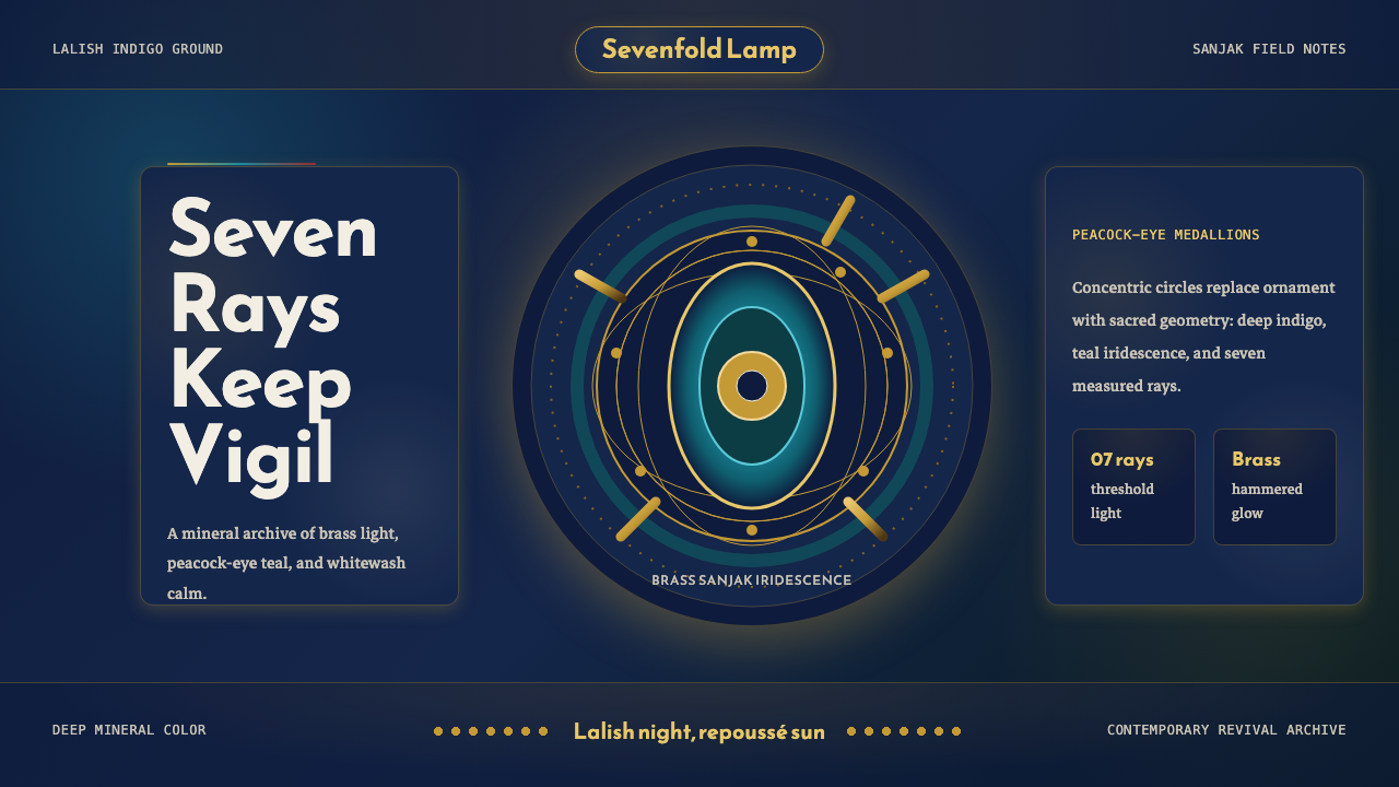 Kurdish Yazidi Peacock & SunSacred geometry glows. Lalish indigo holds brass rays and teal peacock-eye me…神圣几何在发光:拉利什靛蓝托住黄铜日芒与孔雀眼纹。
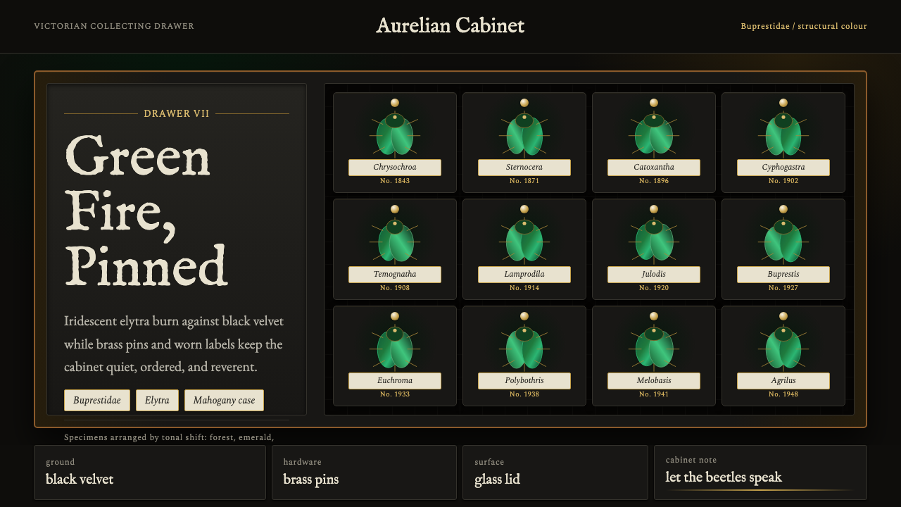 Beetle Specimen CabinetGreen burns in darkness. Emerald elytra grids glow under brass keylines and b…暗处燃起绿光。翡翠鞘翅格阵在黄铜线与黑绒底上发亮。
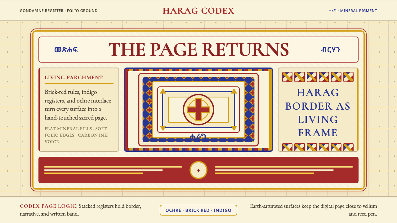 Ethiopian Orthodox ManuscriptSacred page, alive. Brick red, indigo, and ochre harag borders frame a starin…圣页有生命。砖红、靛蓝与赭金哈拉格边框凝视成像。
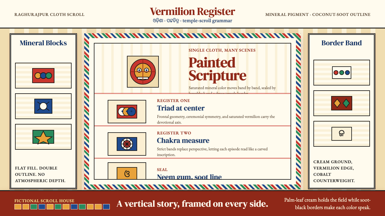 Pattachitra (Odisha Temple Scroll)Devotion as dense color. Vermilion bands and soot-black outlines stack like a…浓色即敬献:朱砂横带与烟黑描线层叠成寺庙长卷。
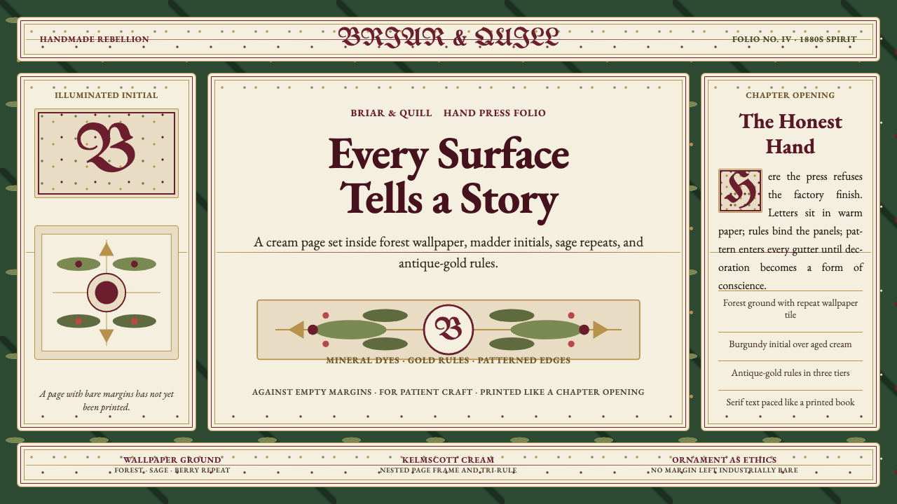 William Morris Arts & CraftsOrnament is the argument. Forest green wallpaper frames cream pages, gold rul…繁饰即立场。森林绿墙纸、米色书页、金线和衬线字构成手工感。