What is Pattachitra (Odisha Temple Scroll)?什么是 Pattachitra (Odisha Temple Scroll)?
Pattachitra is a thousand-year-old Odishan temple-scroll tradition where every sacred story is told in dense mineral color, thick soot-black outlines, and an unbroken ring of flowering borders.帕塔奇特拉是延续千年的奥里萨邦寺庙画卷传统——每一则神圣叙事都以饱满的矿物色彩、粗重的烟黑描线和一圈不间断的花卉边带娓娓道来。
Pattachitra (Odisha Temple Scroll) in briefPattachitra (Odisha Temple Scroll) 速览
Pattachitra — the name combines the Sanskrit words for cloth (patta) and picture (chitra) — is the sacred scroll-painting tradition of Odisha, India's eastern coastal state. Produced by hereditary chitrakar artist families in the village of Raghurajpur and the pilgrimage city of Puri, these paintings were created as portable devotional objects for worshippers who could not carry stone temple icons home. Each finished work presents a complete mythological narrative: the Jagannath triad of deities, the ten avatars of Vishnu, the childhood exploits of Krishna, or episodes from the Ramayana, rendered in flat registers stacked from top to bottom like the floors of a temple tower.帕塔奇特拉——名称来自梵语「布料」(patta)与「图画」(chitra)的组合——是印度东海岸奥里萨邦的神圣画卷传统。由拉古拉杰普尔村庄与普里朝圣城中世代相传的奇特拉卡(chitrakar)画师家族制作,这些画作最初是为无法带走石雕神像的朝拜者而创作的可携式供奉物。每件完成的作品都呈现一段完整的神话叙事:扎格纳特三神组合、毗湿奴的十大化身、克里希纳的童年传奇,或罗摩衍那的片段——以横向叠层的方式自上而下排列,如同一座神庙塔楼的多层楼阁。
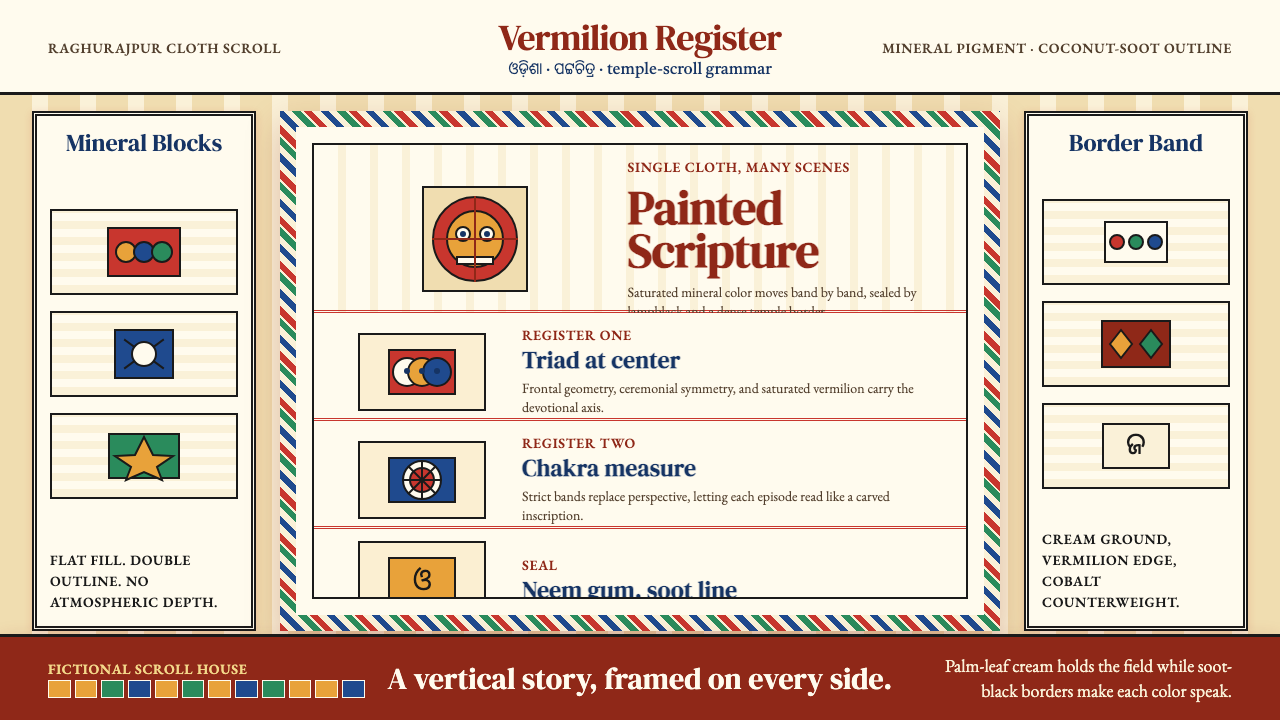
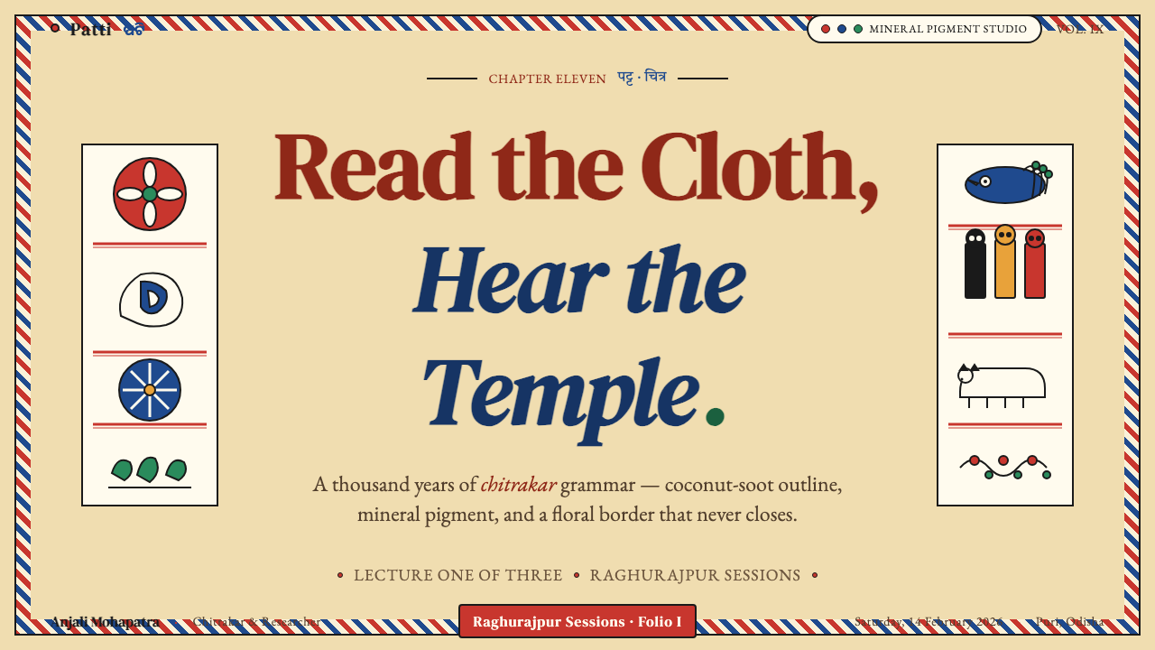
What makes the visual system immediately recognizable is the combination of two elements working in concert: the thick coconut-soot outline and the flat saturated mineral fill. Every figure — whether god, demon, devotee, elephant, or lotus — is first drawn with a bold black contour that asserts its presence against the pale ground, then filled with one of a small vocabulary of pure natural pigments: conch-white, turmeric yellow, vermilion red, indigo blue, lamp-black, or powdered stone green. No blending occurs between zones; no shadow falls across a figure's face. The result is a visual world of absolute color boundaries, where every form declares exactly what it is.让这套视觉体系一眼可辨的,是两个协同运作的元素:粗重的椰壳烟黑描线,与平涂的饱和矿物填色。每一个形象——无论是神明、恶魔、信徒、大象还是莲花——都先以大胆的黑色轮廓线勾勒,使其从浅色底面上凸显出来,再以一套有限的纯天然颜料之一填满内部:海贝白、姜黄黄、朱砂红、靛蓝、灯烟黑或碾磨石绿。色区之间不作调和,神祇面容上没有投影。由此呈现出一个以绝对色彩边界构建的视觉世界——每种形态都坦然宣示自己是什么。
The border is inseparable from the work. A Pattachitra without its dense floral frame — concentric bands of stylized lotus buds, creepers, and petals — is structurally incomplete. The border does not decorate the edge; it seals the sacred interior against the profane outside, completing an enclosure that mirrors the carved stone borders surrounding a temple doorway. This interplay between contained narrative and enveloping ornament is the defining formal tension of the tradition.边带与画作本身不可分割。没有密集花卉框架的帕塔奇特拉——那些同心叠绕的程式化莲蕾、蔓草与花瓣带——在结构上是不完整的。边带并非装饰边缘;它以一道封印将神圣的内部与世俗的外部隔绝,形成的包围结构与神庙门框上雕刻的石质边饰如出一辙。这种被包容的叙事与包覆性装饰之间的互动,是这一传统的核心形式张力所在。
See the Pattachitra (Odisha Temple Scroll) design system查看 Pattachitra (Odisha Temple Scroll) 完整设计系统
Where does Pattachitra (Odisha Temple Scroll) come from?Pattachitra (Odisha Temple Scroll) 从何而来?
The chitrakar tradition reaches back at least to the twelfth century, when the great Jagannath Temple at Puri was established under the Eastern Ganga dynasty — a lineage of rulers whose patronage of Vaishnava devotional culture shaped the religious landscape of the entire region. The painters were granted land adjacent to the temple precinct in exchange for supplying ritual paintings and decorated flags for festival processions. Their craft was therefore not folk art in the informal sense but a liturgically codified practice, regulated by temple authorities, with fixed iconographic rules for how deities could be depicted, what colors they required, and what postures they could occupy.奇特拉卡传统至少可追溯至十二世纪。彼时,普里的扎格纳特大神庙在东恒伽王朝的统治下建立——这一王朝以对毗湿奴派奉献文化的庇护,塑造了整个地区的宗教格局。画师家族获得毗邻神庙地块的封赏,以换取为节庆游行提供仪式画作与装饰旗帜。因此,他们的手艺并非通常意义上的民间艺术,而是经由庙宇当局规范的礼仪编码实践——神祇如何描绘、需要什么颜色、可以采用什么姿势,均有固定的图像学规则。
The golden period of the tradition ran from roughly 1200 to 1500 under successive Eastern Ganga and Suryavamsi royal courts, whose elaborate Ratha Yatra festival — in which colossal chariots carrying the Jagannath deities were pulled through the streets of Puri by tens of thousands of devotees — created enormous demand for painted ritual objects. Pattachitra panels lined chariot walls, decorated processional pavilions, and served as stand-in images for pilgrims to take home. The tradition survived later shifts in political patronage precisely because its function was embedded in a living festival cycle that continued regardless of which dynasty controlled the region.这一传统的黄金时期大约跨越1200至1500年,贯穿东恒伽王朝与苏里亚万希王朝的相继统治。这些宫廷赞助了规模宏大的战车节(Ratha Yatra)——载着扎格纳特神像的巨型战车由数万信徒在普里街道上牵引前行——为彩绘仪式用品创造了巨大需求。帕塔奇特拉画板装点车壁与游行亭阁,也作为朝圣者带回家中的替代圣像。这一传统在此后政治庇护屡经更迭中得以延续,正是因为其功能嵌入了无论哪个王朝统治此地都会持续举行的活态节庆循环之中。
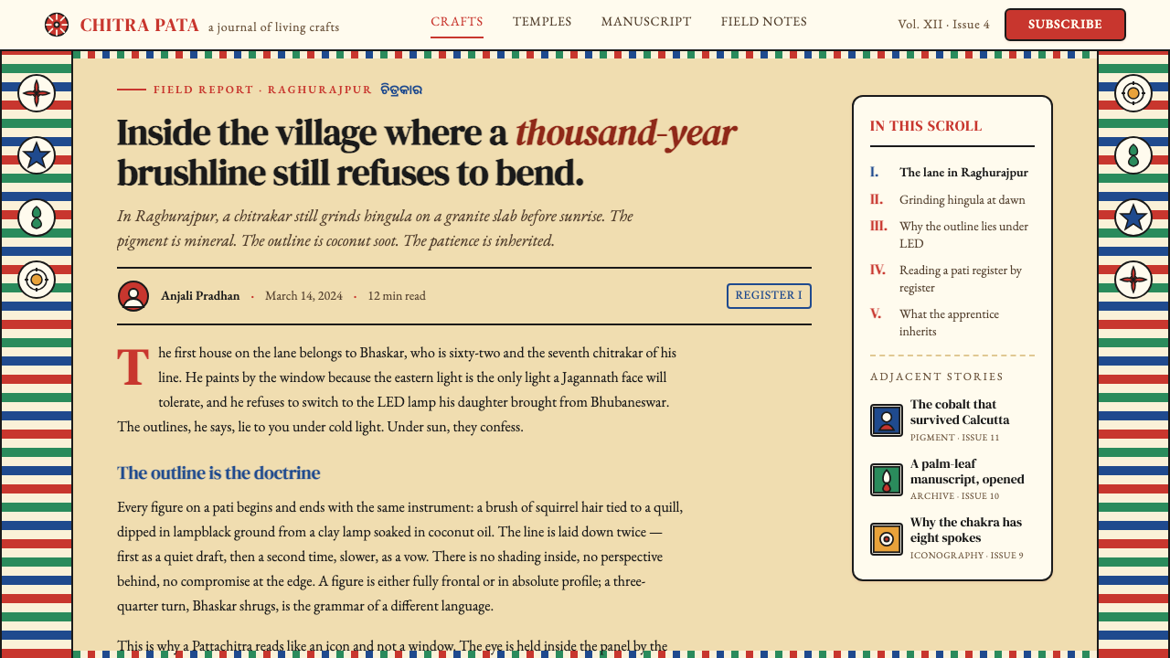
The medium itself reflects centuries of accumulated technical knowledge. The cotton cloth support is prepared by applying a paste of tamarind seed and powdered chalk, then polishing repeatedly with a smooth stone until the surface achieves a fine off-white texture that accepts pigment without bleed. Pigments are ground from natural sources — the deep red from pure vermilion, the white from conch shell, the yellow from orpiment or turmeric, the black from coconut-shell soot — and bound with the resin of the neem tree. A final coat of lacquer, applied by holding the finished work over a flame, seals the surface and gives the colors their characteristic warm depth. No synthetic pigment enters an orthodox Pattachitra.这一媒材本身凝聚了数百年积累的技术知识。棉布底材的处理方式是:涂抹罗望子籽与白垩粉调成的浆料,再反复以光滑石块打磨,直至表面呈现出一种能接受颜料而不洇渗的细腻米白质地。颜料研磨自天然原料——深红来自纯朱砂,白色来自海贝,黄色来自雌黄或姜黄,黑色来自椰壳烟炭——以楝树树脂为黏合剂。最后一道工序是将完成的作品置于火焰上方,涂施一层虫漆,封固画面并赋予色彩那种特有的温润深度。正统帕塔奇特拉不使用任何合成颜料。
The twentieth century brought both threat and renewal. As temple patronage declined and mass-produced printed images displaced handmade devotional objects, many chitrakar families shifted to painting secular tourist souvenirs, adapting the visual vocabulary to greeting cards, calendar illustrations, and export-market wall hangings. The craft attracted the attention of government craft-preservation programs in the 1970s and 1980s, and Raghurajpur was eventually declared a Heritage Crafts Village by the Odisha government. This formal recognition brought training programs, direct patronage, and international exhibition opportunities — while also generating debate among practitioners about which innovations were acceptable expansions of the tradition and which represented dilutions. Today, master painters such as those from the Mahapatra and Maharana lineages continue to produce orthodox ritual works alongside contemporary adaptations, maintaining a tradition that is simultaneously ancient and alive.二十世纪为这一传统带来了威胁与复兴的双重变奏。随着庙宇庇护的式微与大批量印刷圣像对手工供奉物的替代,许多奇特拉卡家族转而绘制世俗旅游纪念品,将视觉词汇改编为贺卡、挂历插图与出口挂画。1970至80年代,这一工艺引起政府工艺保护计划的关注,拉古拉杰普尔最终被奥里萨邦政府列为遗产手工艺村落。这一正式认定带来了培训项目、直接赞助与国际展览机会——同时也在从业者中引发了关于哪些创新是可接受的传统拓展、哪些又构成稀释的争议。如今,来自马哈帕特拉与马哈拉纳世家的大师画师们继续在正统仪式画作之外兼作当代改编,维系着这一既古老又鲜活的传统。
What defines the Pattachitra (Odisha Temple Scroll) look?Pattachitra (Odisha Temple Scroll) 的视觉特征是什么?
Color Palette色彩体系
The Pattachitra palette is small, saturated, and entirely mineral in origin. Vermilion red dominates structural zones and the bodies of major deities; turmeric yellow fills ornamental details and secondary figures; indigo blue reads as a cool counterweight; lamp-black provides the dominant outline and deep shadow zones; conch-white defines halos, garments, and ground areas. The palette carries devotional rather than naturalistic meaning — flesh is not skin-tone, sky is not atmospheric blue. Color identifies cosmic identity.帕塔奇特拉的色彩体系精简、饱满,全部来自矿物原料。朱砂红主导结构区域与主要神祇的身体;姜黄黄填充装饰细节与次要人物;靛蓝作为冷色的平衡对位;灯烟黑提供主导性的描线与深色区域;海贝白勾勒光环、衣饰与底色区域。这套色彩体系承载的是信仰意义而非自然主义意义——肤色不是皮肤的颜色,蓝色不是大气的蓝色。颜色标识的是宇宙身份。
Outline Dominance描线主导
The thick soot-black contour line is the structural skeleton of every Pattachitra image. Applied with a brush made from squirrel hair or plant fiber, it defines each form before color is added and reasserts figure boundaries after filling. The line never thinens for distance, never softens for mood, and never disappears into the ground. Its consistent weight across the composition creates a visual equality between foreground and background figures — a deliberate theological statement that no element of the sacred scene is less important than another.粗重的烟黑描线是每一件帕塔奇特拉作品的结构骨架。以松鼠毛或植物纤维制成的画笔施涂,它在填色之前界定每一个形象,在填色之后重申轮廓边界。描线从不因距离而变细,不因情绪而柔化,也不会消融于底色之中。其在整幅画面上一致的粗细,在前景与背景人物之间创造出一种视觉平等——这是一种刻意为之的神学陈述:神圣场景中的任何元素都不比其他元素次要。
Register-Band Composition横带叙事构图
Narrative unfolds in horizontal registers stacked vertically, like the floors of a temple tower read from the ground up. Each band contains one episode or one grouping of deities, separated from the next by a decorative stripe. There is no perspective recession, no spatial depth, no overlapping of figures that implies foreground and background in a naturalistic sense. The eye travels downward through time rather than inward through space. This compositional logic is directly borrowed from temple wall-carving practice, where narrative friezes wrap the exterior of the sanctum in exactly the same horizontal sequence.叙事在垂直叠放的横向带格中展开,犹如一座神庙塔楼的多层楼阁自下而上逐层阅读。每一带格容纳一个场景或一组神祇,以装饰条纹与相邻带格分隔。画面中没有透视退缩,没有空间纵深,没有暗示自然主义前后景关系的形象叠压。目光随时间向下移动,而非随空间向内延伸。这种构图逻辑直接借鉴于神庙墙面雕刻的做法——叙事横带以完全相同的水平序列环绕圣所外壁展开。
Floral Border System花卉边带系统
Every Pattachitra is enclosed within concentric bands of stylized floral ornament — typically alternating rows of lotus buds, scrolling creepers, and geometric petal formations. The border is not optional trim; it is a required structural element whose absence would render the painting ritually incomplete. The visual density of the border matches the density of the narrative interior, ensuring that no part of the surface is left empty. This horror vacui — the avoidance of empty space — is a consistent aesthetic principle across Odishan temple art in all media.每一件帕塔奇特拉都被同心排列的程式化花卉装饰带所包围——通常是莲蕾、蔓草与几何花瓣形交替出现的带层。边带不是可选的点缀;它是必须具备的结构性元素,缺失则意味着画作在仪式上的不完整。边带的视觉密度与内部叙事区域的密度相匹配,确保画面表面没有任何区域被留空。这种对空白的恐惧(horror vacui)是奥里萨邦神庙艺术在所有媒材中一以贯之的美学原则。
Frontality and Strict Pose Rules正面性与严格姿势规范
Human and divine figures in Pattachitra appear in only two orientations: full frontal or absolute profile. The three-quarter view — standard in Western representational art since the Renaissance — does not exist in this tradition. Eyes are shown in full frontal even when the head is in profile, an approach that predates and parallels the conventions of ancient Egyptian art. This strict posing is not a technical limitation but an iconographic choice: frontality signals divine presence and direct engagement with the viewer, while profile positions figures within the narrative action.帕塔奇特拉中的人物与神祇形象只有两种朝向:完全正面或绝对侧脸。自文艺复兴以来成为西方具象艺术标准的四分之三侧视角在这一传统中并不存在。即便头部处于侧面,眼睛也以正面方式呈现——这种处理方式早于并平行于古埃及艺术的惯例。这种严格的姿势规范并非技术局限,而是图像学选择:正面性传达神圣存在与对观者的直接凝视,而侧面则将人物置入叙事行动之中。
Fixed Iconographic Vocabulary固定图像学词汇
The subjects, attributes, and symbolic objects of Pattachitra are codified in texts called Silpa Shastras and transmitted orally within chitrakar families. Jagannath, Balabhadra, and Subhadra — the three principal deities of Puri — appear in stylized oval forms unique to this tradition. The conch, discus, lotus, and mace identify Vishnu; specific flower garlands, postures, and vahana (vehicle animals) identify each avatar. A trained viewer reads these symbols as a visual language, extracting narrative meaning from combinations of attributes rather than from depicted action.帕塔奇特拉的题材、属性与象征物件在称为《造像论》(Silpa Shastras)的文本中有明确规定,并在奇特拉卡家族内部以口授方式传承。普里三大主神——扎格纳特、巴拉巴德拉与苏巴德拉——以这一传统独有的程式化椭圆形态呈现。海螺、法轮、莲花与权杖标识毗湿奴;特定的花环、姿势与坐骑(vahana)动物标识各具体化身。训练有素的观看者将这些符号作为视觉语言来阅读,从属性的组合中提取叙事意义,而非从描绘的动作本身。
Natural Material Ethics天然材料伦理
The insistence on natural mineral and organic pigments is both an aesthetic position and a spiritual one. Synthetic pigments, however visually similar, are not considered appropriate for ritual paintings intended as offerings. The sourcing, preparation, and application of pigments are themselves ritualized activities — stones ground, shells calcined, soot collected from sacred lamps. The cloth must be handwoven and treated by the painter's own hands. This material chain connects the finished painting to the living world of plants, shells, stones, and fire in a way that a factory-produced equivalent cannot replicate.对天然矿物与有机颜料的坚持,既是美学立场,也是精神立场。合成颜料无论在视觉上多么相近,都被认为不适合用于作为供奉物的仪式画作。颜料的采集、研磨与施用本身就是仪式化的活动——研磨石料,煅烧贝壳,收集圣灯烟炭。棉布必须是手工织就的,并由画师本人亲手处理。这条材料链条以工厂生产的替代品无法复制的方式,将完成的画作与植物、贝壳、石头和火焰构成的活态世界相连接。
See the Pattachitra (Odisha Temple Scroll) design system查看 Pattachitra (Odisha Temple Scroll) 完整设计系统
Who shaped Pattachitra (Odisha Temple Scroll)?谁塑造了 Pattachitra (Odisha Temple Scroll)?
One of the most respected chitrakar masters of the twentieth century, Jagannath Mahapatra of Raghurajpur is credited with preserving orthodox Pattachitra iconographic standards during the period of greatest commercial pressure in the mid-twentieth century. He resisted simplifications demanded by the tourist souvenir market and continued to produce works in the full traditional sequence of preparation, including the cloth sizing and the layered lacquer finish. His example became a reference point when the Odisha government began formulating Heritage Crafts Village policies.拉古拉杰普尔的扎格纳特·马哈帕特拉是二十世纪最受尊敬的奇特拉卡大师之一,被誉为在二十世纪中叶商业压力最为强烈的时期,维护了正统帕塔奇特拉图像学标准的守护者。他抵制旅游纪念品市场要求的简化,坚持按照完整的传统工序制作作品,包括棉布上胶与层叠虫漆封面。奥里萨邦政府制定遗产手工艺村落政策时,他的实践成为重要参照。
Bhaskar Mahapatra represents the generation of chitrakar artists who expanded the tradition into contemporary exhibition contexts while maintaining fidelity to the iconographic rules. His work has been exhibited internationally, introducing Pattachitra's visual system to audiences unfamiliar with the Jagannath cult iconography it encodes. He is also known for documenting the oral technical knowledge of the Raghurajpur community — particularly the pigment preparation sequences — in forms that could be transmitted outside the family lineage.巴斯卡尔·马哈帕特拉代表了在忠实于图像学规则的同时,将这一传统拓展至当代展览语境的那一代奇特拉卡艺术家。他的作品曾在国际上展出,向不熟悉扎格纳特神庙图像学体系的观众呈现了帕塔奇特拉的视觉系统。他还以可在家族传承之外传播的方式记录了拉古拉杰普尔社区的口传技术知识,尤其是颜料制备的工序。
The Maharana lineage is one of the oldest continuously active chitrakar families in Raghurajpur, documented in temple records as suppliers of ritual paintings to the Jagannath Temple for many generations. The family's archive of older works — some dating to the nineteenth century — has served as the primary reference for iconographic authenticity in revival and certification programs. Several younger Maharana family members have become internationally recognized for works that apply the traditional formal vocabulary to non-mythological subjects, a controversial but influential expansion.马哈拉纳世系是拉古拉杰普尔历史最悠久、持续活跃的奇特拉卡家族之一,神庙档案中有多代向扎格纳特神庙供奉仪式画作的记录。这一家族保存的旧作——部分可追溯至十九世纪——在复兴与认证项目中被用作图像学真实性的主要参照。马哈拉纳家族的数位年轻成员因将传统形式词汇应用于非神话题材而在国际上获得认可,这是一种颇具争议却影响深远的拓展。
Not a single author but a corpus of Sanskrit canonical texts on sacred art-making, the Silpa Shastras define the proportional systems, color assignments, and iconographic attributes that govern how deities may be depicted across all Indian sacred arts including Pattachitra. For chitrakar painters, the Shastras function as a living rulebook transmitted through teacher-student apprenticeship. Their authority explains why Pattachitra iconography has remained recognizably stable across eight centuries despite the absence of any central institution enforcing it: the rules live in practitioners, not in academies.《造像论》(Silpa Shastras)并非某一单一作者的著作,而是梵语经典文本的汇编,规定了包括帕塔奇特拉在内的印度所有神圣艺术中神祇描绘所依据的比例体系、色彩分配与图像学属性。对于奇特拉卡画师而言,《造像论》是通过师徒传授关系传递的活态规则手册。其权威性解释了为何帕塔奇特拉的图像学在没有任何中央机构执行的情况下,跨越八个世纪依然保持可辨认的稳定性:规则活在从业者身上,而非存于学院之中。
The governmental body whose mid-twentieth-century intervention transformed Pattachitra from a declining cottage industry into a recognized national heritage. Working with master painters to document iconographic standards, establishing training programs for younger practitioners, and facilitating direct sales to collectors and institutions, the Council played a dual role: preservation apparatus and market intermediary. Its involvement is also credited with helping Raghurajpur receive its Heritage Crafts Village designation, which brought infrastructure investment and international visibility.这一政府机构在二十世纪中叶的介入,将帕塔奇特拉从一个日渐衰退的家庭手工业转变为公认的国家遗产。该机构与大师画师合作记录图像学标准,为年轻从业者建立培训项目,并促进与收藏家和机构的直接交易,发挥着保护装置与市场中介的双重作用。其参与也被认为推动了拉古拉杰普尔获得遗产手工艺村落的正式认定,带来了基础设施投资与国际知名度。
How do you use Pattachitra (Odisha Temple Scroll) today?今天怎么用 Pattachitra (Odisha Temple Scroll)?
Pattachitra is among the richest of the Indian regional traditions for contemporary design application, because its visual logic is systematic rather than arbitrary: each element — outline weight, color assignment, register structure, border enclosure — plays a defined role. Applying it well requires understanding that role, not simply borrowing the surface palette. The style rewards contexts where narrative density and ceremonial richness are communicative assets rather than liabilities.帕塔奇特拉是最适合当代设计应用的印度地域传统之一,原因在于它的视觉逻辑是系统性的而非任意的:每个元素——描线粗细、色彩分配、横带结构、边带封围——都扮演明确定义的角色。正确应用它,需要理解这些角色,而不只是借用表面的色彩体系。这种风格在叙事密度与仪式丰富感是传播资产而非负担的场景中,能够给予最大回报。
For presentation slides, Pattachitra's band-register structure translates directly into slide architecture. A cover page works best with a single iconic figure — centrally placed, fully enclosed by a border-band adapted into the slide margin, set against a warm off-white or parchment ground. The figure should be bold and outlined in dark, with flat areas of the dominant warm-red or ochre filling the majority of the composition. Content slides should use the register principle: divide the slide into two or three horizontal zones, each serving a distinct informational function (headline, body, data or callout), separated by a narrow decorative stripe rather than a line rule. Data visualization should embrace flat saturated fills — bars, segments, and nodes colored in the traditional mineral palette — with dark outlines giving each data element the same visual presence as a painted figure.在演示文稿中,帕塔奇特拉的横带寄存器结构可以直接转化为幻灯片架构。封面页最适合以单一标志性形象处理——居中放置,以改编自传统边带的装饰边框包围(作为幻灯片边距),铺设于温润的米白或羊皮纸色底面之上。形象应当大胆,以深色描线勾勒,以传统暖红或赭黄的大面积平涂色块填充构图主体。内容页应运用横带原则:将幻灯片分为两到三个水平区域,每个区域承担独立的信息功能(标题、正文、数据或引文),以窄装饰条纹而非直线分隔。数据可视化应当拥抱平涂饱和填色——以传统矿物色板为柱状图、扇形与节点着色——用深色描线赋予每个数据元素与画中形象相同的视觉存在感。
For web interfaces and dashboards, the style is well suited to contexts that benefit from ceremonial weightiness: luxury e-commerce, cultural institution websites, artisanal brand identities, or any interface where trust and heritage value are the primary signals. Apply a warm off-white as the dominant background, use the deep warm-red as the primary action color, and reserve indigo or dark tones for navigation and structural typography. Borders earn their place in this system: a card component with a visible border and a dense patterned top stripe communicates in the Pattachitra register, grounding digital elements in an aesthetic of material enclosure. Pricing pages can use tier differentiation with border-band variations — a denser ornamental band on the featured tier communicates premium status without resorting to bold color blocks alone.对于网页界面与仪表板,这种风格特别适合受益于仪式庄重感的场景:高端电商、文化机构网站、工匠品牌形象,或任何以信任与遗产价值为主要信号的界面。以温润米白作为主导背景色,以深暖红作为主要行动色,将靛蓝或深色调保留给导航与结构性排版。边框在这套系统中理所应当:带有可见边框与密集图案顶部横条的卡片组件,以帕塔奇特拉的语汇传达信息,将数字元素扎根于一种材料性包围的美学之中。定价页面可以用边带变体进行等级区分——特色等级上更为繁密的装饰边带传递高端地位,而无需单纯依赖粗色块。
For editorial and marketing work, Pattachitra's poster-like compression — many elements densely packed within an enclosing frame — translates effectively to social cards, event posters, and full-bleed section headers. A marketing hero panel that places product photography against a warm ground and frames it with a stylized floral border draws on the tradition's compositional language without replicating its sacred iconography. Editorial layouts can adapt the register structure to create strong section breaks: a full-width ornamental band between article sections signals a narrative transition while adding visual richness. The style works particularly well for cultural, travel, artisan, and wellness brands whose values align with handcraft, heritage, and careful making.对于编辑与营销内容,帕塔奇特拉海报式的压缩感——在封围框架内密集叠放的众多元素——可以有效转化为社交图片、活动海报与全宽版块标题。将产品摄影置于温润底面上、以程式化花卉边框包围的营销主视觉,借用了这一传统的构图语言,而不复制其神圣图像学。编辑版面可以将横带结构改编为强烈的章节分隔:文章段落之间的全宽装饰带在传达叙事转换的同时增添视觉丰富感。这种风格对文化、旅游、工匠与健康品牌尤为奏效,因为这些品牌的价值观与手工艺、遗产传承以及用心制作的精神相契合。
The most common mistake when applying Pattachitra is treating it as a surface texture rather than a structural system — scattering isolated lotus motifs across a layout as decoration while keeping the underlying grid and typographic logic unchanged. This produces pastiche: the ornamental vocabulary without the compositional logic that makes it coherent. A second mistake is abandoning flat color in favor of gradients and soft shadows; the mineral-pigment quality of the style depends entirely on the hard boundary between filled zones. A third is failing to observe scale proportions: Pattachitra's borders and outlines are meant to be substantial — they should read as structural, not as fine detail. Reduce them to hairlines and the style loses its presence entirely.应用帕塔奇特拉时最常见的错误,是将其视为表面纹理而非结构系统——将零散的莲花母题当装饰撒布于版面之上,同时保持底层网格与排版逻辑不变。这样产生的是拼贴:有装饰词汇而无使其连贯的构图逻辑。第二个错误是以渐变和柔和阴影取代平涂色块;这一风格的矿物颜料质感完全依赖于色区之间的硬性边界。第三个错误是忽视比例:帕塔奇特拉的边带与描线本应是厚重有分量的——它们应当读起来是结构性的,而非精细的装饰细节。将其缩减为细线,风格的存在感将荡然无存。
See the Pattachitra (Odisha Temple Scroll) design system查看 Pattachitra (Odisha Temple Scroll) 完整设计系统
Pattachitra (Odisha Temple Scroll) — FAQPattachitra (Odisha Temple Scroll) · 常见问题
Is Pattachitra only for religious or cultural contexts, or can it work in secular design?帕塔奇特拉只适合宗教或文化语境,还是也能在世俗设计中使用?
The tradition originated as sacred temple art, but its visual system — flat saturated color, bold outline, register-band composition, dense border — is entirely separable from its iconographic content. Contemporary designers apply the formal vocabulary to secular subjects regularly: product packaging, brand identities, illustrated editorial spreads, and cultural institution identities. What must be handled thoughtfully is the use of specific sacred iconography: the Jagannath triad form, the Dashavatara sequence, and the specific deity attributes are religious symbols with active devotional significance. Borrowing the visual structure without reproducing sacred emblems is both respectful and practically sound.这一传统起源于神圣的庙宇艺术,但其视觉系统——平涂饱和色、大胆描线、横带构图、密集边框——完全可以与图像学内容分离。当代设计师经常将这套形式词汇应用于世俗题材:产品包装、品牌形象、插图编辑版面与文化机构视觉识别。需要审慎对待的是特定神圣图像学的使用:扎格纳特三神的造型、十化身序列以及特定神祇的属性标识,都是具有现实信仰意义的宗教符号。借用视觉结构而不复制神圣标志,既是对信仰的尊重,在实践上也是稳妥的做法。
How does Pattachitra compare visually to other Indian regional painting traditions?帕塔奇特拉与其他印度地域绘画传统在视觉上有何区别?
The clearest distinguishing features are the outline weight and the border system. Madhubani painting from Bihar uses finer lines, more white space, and cross-hatched fill patterns rather than flat mineral fills. Warli painting from Maharashtra uses a white-on-red or white-on-brown palette with geometric human figures of extreme simplicity. Kalamkari from Andhra Pradesh shares the narrative register structure and the vegetable-dye palette but achieves finer detail through a pen-drawn line rather than a brush-laid contour. Pattachitra is the densest and most architecturally structured of these traditions — every centimeter of the surface is intentionally occupied, and the border-to-interior ratio is the highest.最清晰的区分特征是描线粗细与边带系统。比哈尔邦的马杜巴尼绘画使用更细的线条、更多的留白,以及交叉排线填充而非平涂矿物色块。马哈拉施特拉邦的瓦尔利绘画使用红底或棕底上的白色,以极为简约的几何人形为特征。安得拉邦的卡拉姆卡里与帕塔奇特拉共享叙事横带结构与植物染料色板,但通过画笔轮廓线而非刷绘轮廓实现更精细的细节。帕塔奇特拉是这些传统中最为密集、建筑感最强的——画面每一厘米都是有意占据的,边带与内部的面积比例是其中最高的。
What is the right way to handle the border in a Pattachitra-influenced digital design?在受帕塔奇特拉影响的数字设计中,应当如何处理边带?
The border is not decoration — in the original tradition it is structural, sealing the composition and completing the sacred enclosure. In digital adaptation, this principle suggests that the border should be applied at compositional boundaries: around a full card component, along the header band of a section, framing a full-page hero image. It should be visible enough to read as intentional structure, not fine enough to read as a hairline rule. The ornamental density of the border can be scaled to context — a simplified two-stripe version works for small cards, while the full concentric multi-band version suits hero panels and cover images. Color should follow the mineral palette: the border is typically darker and denser than the interior, not lighter.边带不是装饰——在原始传统中,它是结构性的,封印构图并完成神圣包围。在数字改编中,这一原则意味着边带应当应用于构图边界处:围绕完整的卡片组件,沿版块的标题带,框住全页主视觉图像。它应当足够醒目,以结构性意图被读取,而不应细到被读作单纯的分隔线。边带的装饰密度可以按场景调节——简化的双条纹版本适用于小型卡片,而完整的同心多层版本则适合主视觉面板与封面图像。色彩应遵循矿物色板:边带通常比内部更深、更密,而非更浅。
Can Pattachitra work with photography, or does it conflict with photographic imagery?帕塔奇特拉能与摄影图像结合使用吗,还是会产生冲突?
The original tradition contains no photography — all imagery is hand-painted and flat. In contemporary application, photography and the Pattachitra visual system can coexist when the photography is treated as a flat element rather than a naturalistic window. High-contrast cropped images on a warm ground, product photography silhouetted against parchment, or photography used inside a register band as one element of a larger composition — these all work. What conflicts is photographic imagery that depends on atmospheric depth, soft lighting, or moody gradients: the naturalism of fine photographic light directly contradicts the flat mineral quality of the Pattachitra palette. If photography must be used, err toward bold, graphic, frontal shots with simple backgrounds.原始传统中没有摄影——所有图像都是手绘且平面的。在当代应用中,当摄影被作为平面元素而非自然主义窗口处理时,摄影图像与帕塔奇特拉视觉系统可以共存。暖色底面上高对比度裁切的图像、羊皮纸底面上的产品轮廓摄影,或将摄影作为横带内更大构图中的一个元素来使用——这些都行得通。产生冲突的是那些依赖大气纵深、柔和光照或情绪渐变的摄影图像:精细摄影光线的自然主义直接与帕塔奇特拉色板的平涂矿物质感相矛盾。若必须使用摄影,倾向于背景简洁、构图大胆、图形感强、面向正面的拍摄。
Is there a risk of cultural appropriation when using Pattachitra in commercial design?在商业设计中使用帕塔奇特拉是否存在文化挪用的风险?
The question is legitimate and practitioners in Raghurajpur have raised it directly. Several principles help navigate it responsibly. First, distinguish between formal vocabulary and sacred iconography: using the register-band structure, the flat mineral palette, and the border system in an abstract or secular context is aesthetic borrowing; reproducing the Jagannath triad forms or specific deity attributes in a commercial context is a more sensitive matter. Second, attribution matters: acknowledging the Odishan chitrakar tradition by name in any published design context is basic intellectual honesty and signals awareness. Third, consider sourcing: when a project's budget allows, commissioning work from actual chitrakar artists — rather than generating approximate digital simulations — supports the living tradition and its practitioners directly.这是一个正当的问题,拉古拉杰普尔的从业者也已直接提出过。以下几条原则有助于负责任地应对。首先,区分形式词汇与神圣图像学:在抽象或世俗语境中使用横带结构、平涂矿物色板与边带系统,是美学借鉴;而在商业语境中复制扎格纳特三神造型或特定神祇属性,则是更为敏感的事情。其次,归因很重要:在任何发表的设计语境中以名称标注奥里萨邦奇特拉卡传统,是基本的知识诚信,也是表明自我认知的信号。第三,考虑来源:当项目预算允许时,委托真正的奇特拉卡艺术家创作——而不是生成近似的数字模拟——可以直接支持活态传统及其从业者。
Related design styles相关设计风格
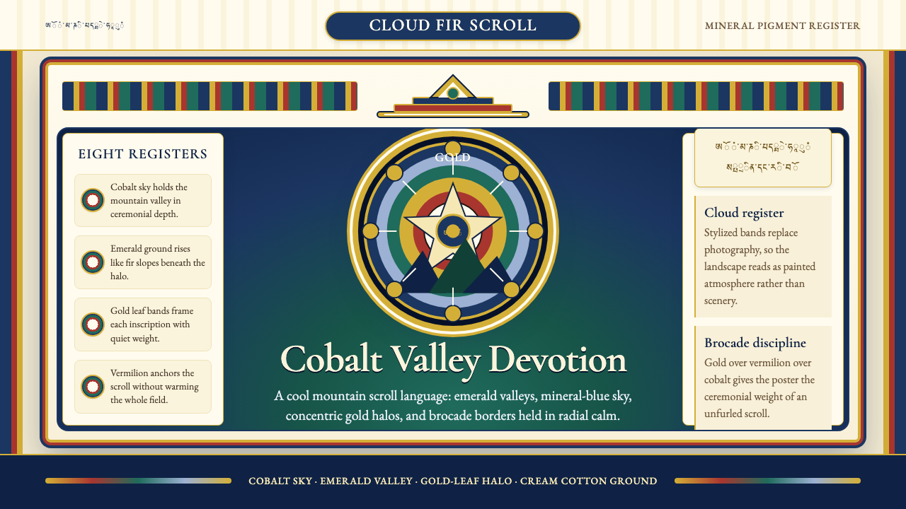 Bhutanese Thangka (Druk Style)Sacred cool-mountain clarity. Cobalt fields, emerald ground, and gold halos f…冷峻山岳的神圣感:钴蓝场、翡翠地与金色光环构成卷轴。
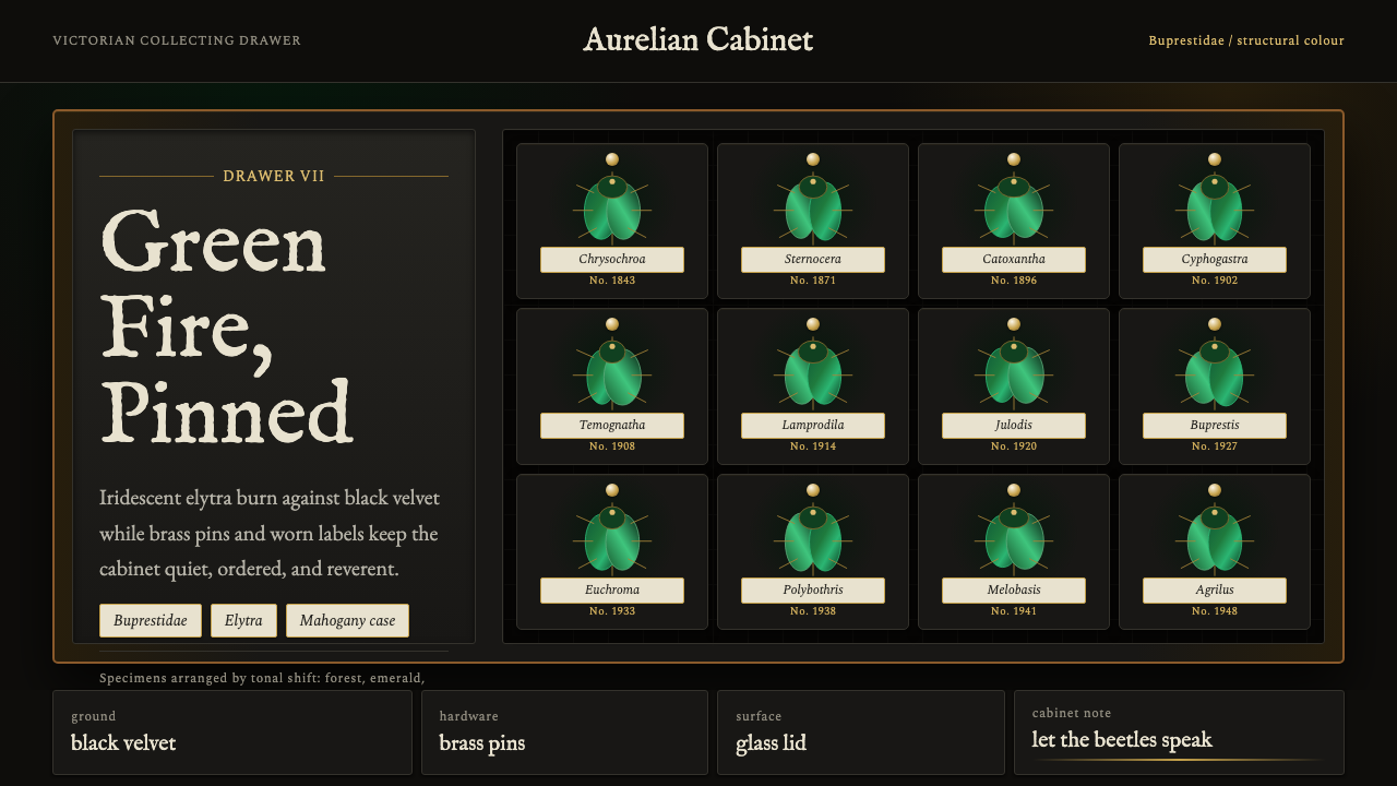 Beetle Specimen CabinetGreen burns in darkness. Emerald elytra grids glow under brass keylines and b…暗处燃起绿光。翡翠鞘翅格阵在黄铜线与黑绒底上发亮。
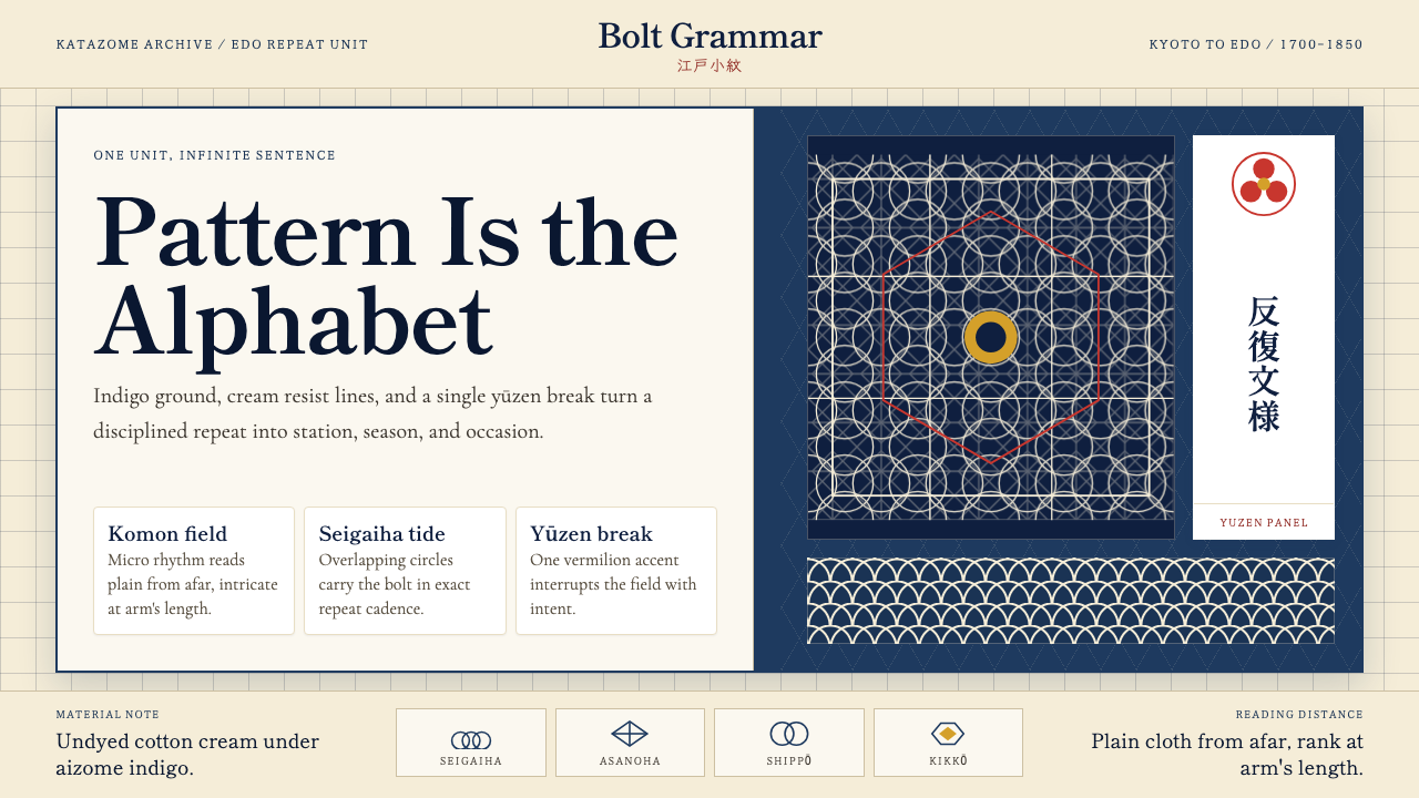 Edo Kimono TextilePattern becomes language. Indigo repeats, cream resist lines, one vermilion p…纹样即语言:靛蓝循环、米白留线,一块朱红破局。
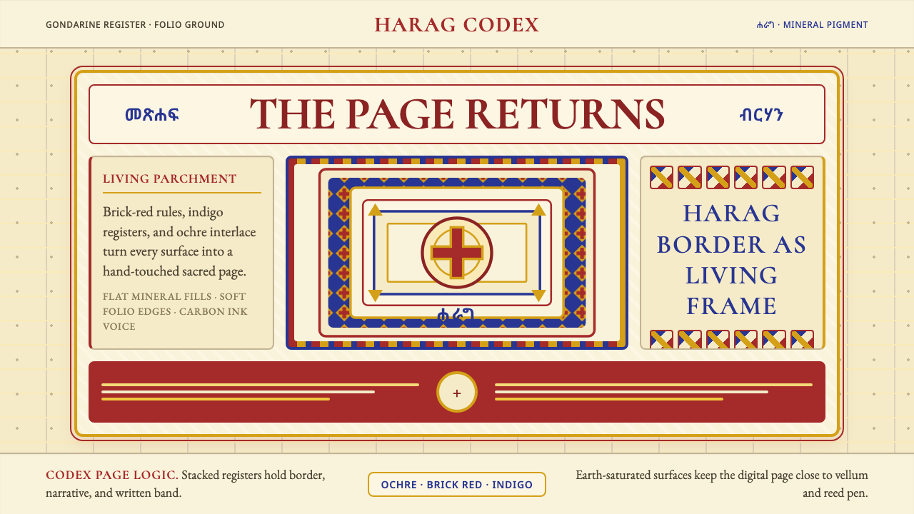 Ethiopian Orthodox ManuscriptSacred page, alive. Brick red, indigo, and ochre harag borders frame a starin…圣页有生命。砖红、靛蓝与赭金哈拉格边框凝视成像。
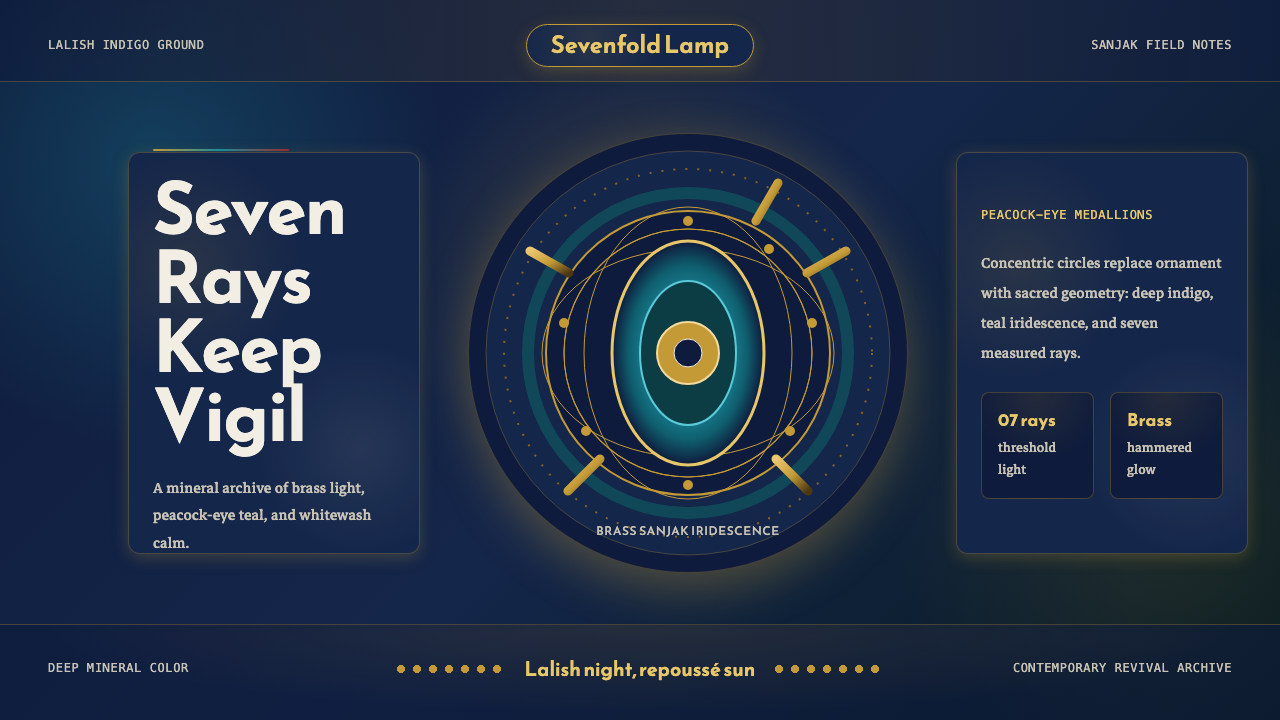 Kurdish Yazidi Peacock & SunSacred geometry glows. Lalish indigo holds brass rays and teal peacock-eye me…神圣几何在发光:拉利什靛蓝托住黄铜日芒与孔雀眼纹。
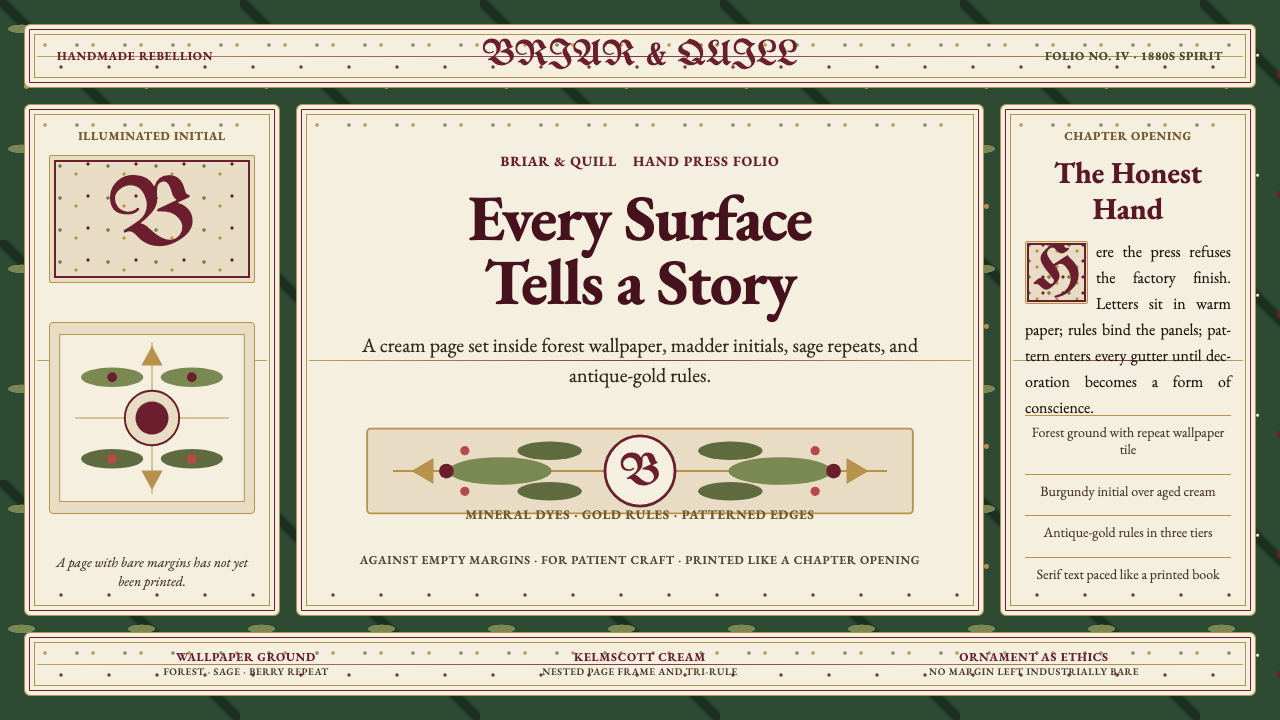 William Morris Arts & CraftsOrnament is the argument. Forest green wallpaper frames cream pages, gold rul…繁饰即立场。森林绿墙纸、米色书页、金线和衬线字构成手工感。