What is William Morris Arts & Crafts?什么是 William Morris Arts & Crafts?
William Morris turned medieval craft into a moral argument — every surface patterned, every object handmade, every margin filled with acanthus and strawberry-thief as a rebuke to the Victorian factory.威廉·莫里斯将中世纪手工艺变成一种道德立场——每一寸表面都铺满图案,每件物品都出自手工,每一处页边都以茛苕叶与草莓小偷向维多利亚工厂发出抗议。
William Morris Arts & Crafts in briefWilliam Morris Arts & Crafts 速览
The Arts and Crafts movement, as expressed through the work of William Morris and his circle, is Britain's most elaborate dissent from industrialism. Where the factory produced cheap, repetitive, and — in Morris's view — spiritually degraded goods, the movement produced dense floral wallpapers, hand-knotted carpets, stained-glass windows, tapestries, and hand-printed books that treated every object as an opportunity for the craftsperson to leave a human mark. The aesthetic is immediately recognizable: deep forest greens and rich burgundy grounds, cream or parchment fields for text, scrolling acanthus leaves and intertwined flowering vines filling every margin, and antique-gold rules binding each compositional panel.工艺美术运动,在威廉·莫里斯及其同仁的实践中,是英国对工业主义最繁复的一次异议。工厂生产廉价、重复、在莫里斯看来精神上已然堕落的商品;而这场运动则生产密实的花卉壁纸、手工编结的地毯、彩色玻璃窗、挂毯和手工印制的书籍,将每件物品都视为匠人留下人类印记的机会。其美学辨识度极高:深森林绿与浓郁勃艮第酒红为底,奶油色或羊皮纸色承载文字,卷曲的茛苕叶与交缠的花蔓铺满每一处页边,古金线条环抱每个构图面板。
The system draws heavily on medieval sources — Gothic illuminated manuscripts, Persian carpet patterns, Flemish millefleurs tapestries — filtered through Morris's passionate belief that ornament and use were not in conflict but were the same thing. A well-made textile was not decorated in addition to being functional; its pattern was evidence of the care and skill that made it functional in the deepest sense. This conviction extended to typography: the books produced by the Kelmscott Press, founded by Morris in 1891, set dense Caslon-style roman type inside elaborate woodcut borders, with chapter openings marked by large black-letter initial caps drawn by Morris himself.这套视觉体系大量借鉴中世纪资源——哥特式彩饰手稿、波斯地毯纹样、弗兰德斯千花挂毯——经由莫里斯的热切信念加以过滤:装饰与使用并不矛盾,二者本是一回事。一件制作精良的织物,不是在实用之外附加了装饰;它的图案正是使其在最深刻意义上实用的那种用心与技艺的证明。这一信念延伸至排版:莫里斯于1891年创立的凯尔姆斯科特出版社所出版的书籍,将密实的卡斯隆体罗马字置于精细的木刻边框之内,章节开头以莫里斯亲手绘制的大型黑体花饰首字母为标记。
Unlike the machine aesthetic that would follow it, the Arts and Crafts visual language treats empty space as a failure of attention rather than a virtue. Every edge carries pattern; every border invites a new layer of vine or blossom. The palette is warm and naturalistic — the greens of English meadows, the reds of madder dye, the golds of autumn foliage — deployed with the saturated confidence of medieval stained glass rather than the restraint of later modernist color theory. The effect is sumptuous, enveloping, and unambiguously handmade.与其后兴起的机器美学不同,工艺美术视觉语言将空白视为注意力的失职而非美德。每条边缘都承载图案,每道边框都邀请新一层藤蔓或花朵。色板温暖而自然——英格兰牧场的绿、茜草染料的红、秋日叶片的金——以中世纪彩色玻璃那般饱和的自信铺陈,而非后来现代主义色彩理论的克制。效果华美、沉浸,明白无误地出自手工。
See the William Morris Arts & Crafts design system查看 William Morris Arts & Crafts 完整设计系统
Where does William Morris Arts & Crafts come from?William Morris Arts & Crafts 从何而来?
William Morris was born in Walthamstow, Essex, in 1834, the son of a prosperous bill broker. His childhood was spent partly at Woodford Hall, a Georgian mansion whose grounds backed onto Epping Forest — and the experience of that ancient, tangled woodland would shape his ornamental imagination for the rest of his life. He arrived at Oxford in 1853 intending to take holy orders, but the university proved a crucible of different ambitions. There he met Edward Burne-Jones and fell under the influence of John Ruskin's writings, which argued that the quality of a society's art was a direct index of the moral condition of its labor. A workman forced to produce identical machine parts could not, by Ruskin's argument, be a fully human being. Morris absorbed this as a personal conviction.威廉·莫里斯1834年生于埃塞克斯郡沃尔瑟姆斯托,父亲是一位富裕的票据经纪人。他的童年部分在伍德福德庄园度过——那是一座背靠艾平森林的乔治亚风格大宅——古老而蔓生的林地经验塑造了他此后一生的装饰想象。1853年他进入牛津,本打算接受圣职,却在那里结识了爱德华·伯恩-琼斯,并受到约翰·罗斯金著作的深刻影响。罗斯金认为,一个社会的艺术品质是其劳动道德状况的直接指标:被迫生产同一零件的工人,在罗斯金看来,无法成为完整的人。莫里斯将这一观点内化为个人信念。
The immediate catalyst for Morris & Co was the furnishing of Morris's own home. When he married Jane Burden in 1859 and needed to outfit Red House — the radical building Philip Webb designed for him in Bexleyheath — he discovered that nothing in the commercial market met his standard. So he made it himself, recruiting Burne-Jones, Rossetti, Webb, and others to produce painted furniture, embroidered hangings, and stained glass. The firm Morris, Marshall, Faulkner & Co was formally established in 1861, reorganized as Morris & Co in 1875. The commercial success of its wallpapers — 'Trellis' designed in 1862, 'Daisy' in 1864, 'Acanthus' in 1875 — gave the firm a base from which to develop more ambitious work. 'Strawberry Thief' in 1883 and 'Willow Bough' in 1887 became emblematic of the movement's mature visual language.促成莫里斯公司诞生的直接契机是莫里斯自己的家居陈设。1859年与简·伯登成婚后,他需要为菲利普·韦布在贝克斯利希斯为他设计的激进建筑——红屋——置办家什,却发现商业市场上没有任何东西能达到他的标准。于是他自己动手,招募伯恩-琼斯、罗塞蒂、韦布等人制作彩绘家具、刺绣挂帘和彩色玻璃。莫里斯、马歇尔、福尔克纳公司于1861年正式成立,1875年改组为莫里斯公司。公司壁纸的商业成功——1862年的《棚架》、1864年的《雏菊》、1875年的《茛苕》——为更雄心勃勃的创作奠定了基础。1883年的《草莓小偷》与1887年的《柳枝》成为这场运动成熟视觉语言的标志。
The movement did not exist in isolation. Morris's circle overlapped substantially with the Pre-Raphaelite Brotherhood — Rossetti was a founding partner, and Burne-Jones remained a central collaborator for decades — and drew inspiration from the same rejection of academic convention and the same romance with medieval visual culture. But where the Pre-Raphaelites were primarily painters working within the fine-art tradition, Morris was insistent that the applied arts were equally serious and that the hierarchy separating them was itself a symptom of the industrial degradation he opposed. The Gothic Revival architect William Butterfield and, later, the theorist A. W. N. Pugin had already established the moral case for medieval architectural ornament; Morris extended this argument from buildings to everything that furnished them.这场运动并非孤立存在。莫里斯的圈子与前拉斐尔派兄弟会有大量交叠——罗塞蒂是创始合伙人,伯恩-琼斯则数十年间始终是核心合作者——并从同一种对学院派惯例的拒绝和对中世纪视觉文化的浪漫迷恋中汲取灵感。但前拉斐尔派主要是在纯艺术传统内工作的画家,莫里斯则坚持认为应用艺术同等严肃,将二者区隔的等级制度本身就是他所反对的工业堕落的症状。哥特复兴建筑师威廉·巴特菲尔德,以及理论家奥古斯都·普金,已经为中世纪建筑装饰确立了道德依据;莫里斯将这一论点从建筑本身延伸至其中的一切陈设。
The founding of the Kelmscott Press in 1891, three years before Morris's death, represented the purest distillation of his principles. Morris designed two typefaces — the Golden Type, based on Venetian humanist models, and the Troy Type, based on German Gothic — and oversaw the hand-printing of fifty-three books on handmade paper with hand-mixed inks. The culminating work, the 1896 Kelmscott Chaucer — illustrated by Burne-Jones and decorated throughout with Morris's woodcut borders — is widely regarded as the most beautiful book produced in the nineteenth century. Morris died in October 1896, the month of its completion. His daughter May Morris continued the embroidery work of the firm and became an important figure in the dissemination of the movement's textile traditions.凯尔姆斯科特出版社于1891年创立——距莫里斯去世仅三年——代表了他原则的最纯粹提炼。莫里斯设计了两款字体——以威尼斯人文主义原型为基础的黄金体,以及以德国哥特体为基础的特洛伊体——并亲自监督用手工纸和手工调配油墨手印五十三种书籍。最终之作——1896年的《凯尔姆斯科特乔叟作品集》,由伯恩-琼斯插图,通篇以莫里斯的木刻边框装饰——被普遍视为十九世纪最美的书。莫里斯于1896年10月去世,恰在此书完成的当月。他的女儿梅·莫里斯延续了公司的刺绣工作,并成为传播这场运动纺织传统的重要人物。
What defines the William Morris Arts & Crafts look?William Morris Arts & Crafts 的视觉特征是什么?
Color Palette色彩体系
The palette is rooted in natural dyes and medieval stained glass: deep forest greens, rich indigos, madder reds, saffron yellows, and warm creams. Morris was a committed user of vegetable dyes — he studied the craft at his Merton Abbey workshops from the early 1880s — and this commitment to natural colorants gives the palette its characteristic warmth and slight mutedness compared to aniline-dyed industrial competitors. Grounds are typically dark and saturated; text fields are reserved in cream or ivory, creating a high-contrast luminous window effect reminiscent of a manuscript page.色板植根于天然染料与中世纪彩色玻璃:深森林绿、浓郁靛蓝、茜草红、藏红花黄与暖奶油色。莫里斯是植物染料的坚定实践者——1880年代初起他在默顿修道院工坊研习此道——这种对天然色素的坚持赋予色板独特的温暖感,与苯胺染料工业品相比带有些许柔和的沉着。底色通常深沉而饱和,文字区域以奶油色或象牙色留出,形成高对比度的明亮窗口效果,令人联想到手稿书页。
Surface Pattern表面图案
Morris's patterns follow a rigorous underlying geometry — typically a diagonal or ogee grid — concealed beneath a naturalistic overlay of leaves, stems, and blossoms so dense that the structural armature is invisible on casual inspection. This disciplined informality is what distinguishes Morris's work from simple floral decoration: the repeat is always precise, the balance always maintained, even as the surface appears to grow and meander freely. The design vocabulary draws on acanthus, vine, honeysuckle, willow, pomegranate, and the native English flora Morris encountered on his Oxfordshire walks.莫里斯的图案遵循严格的底层几何结构——通常是斜向或鱼鳞形网格——隐藏于层层叠叠的叶片、茎干与花朵之下,密实到一眼看去几乎察觉不到骨架的存在。正是这种有纪律的自由感,将莫里斯的作品与简单花卉装饰区别开来:重复永远精准,平衡永远维持,即便表面看似在自由生长与蜿蜒流动。设计词汇取材于茛苕、葡萄藤、金银花、柳枝、石榴,以及莫里斯在牛津郡散步时遇见的本土英国植物。
Typography字体排印
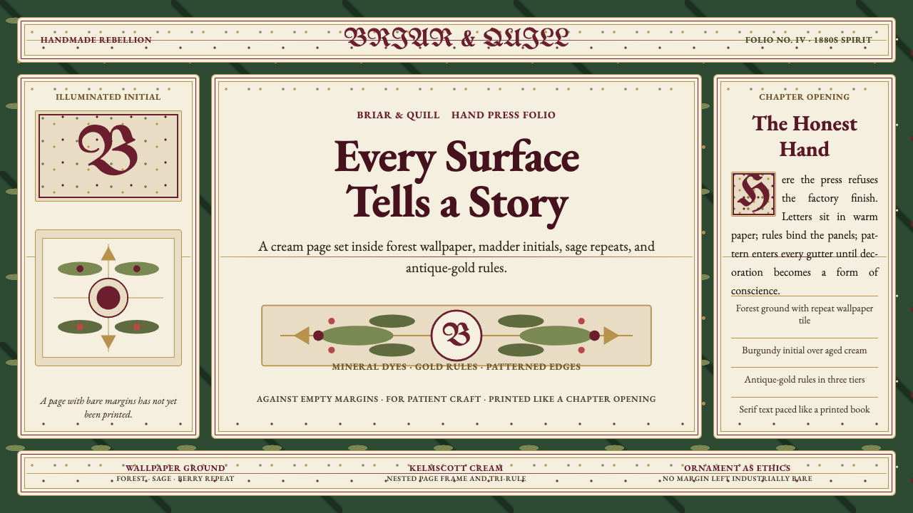
The Kelmscott Press established a typographic ideal that treats the page as a unified visual object rather than a container for text. Body type is a dense, humanist roman — warm, slightly thickened strokes, bracketed serifs — set tightly to fill the measure with textural richness. Opening capitals are large black-letter woodcut initials, often elaborated with surrounding vine ornament. Borders are multi-layered woodcut frames that mirror the wallpaper patterns, creating a visual continuity between the interior of the book and the room in which it is read. Running heads and folios are set in a contrasting but compatible style, reinforcing the hierarchy without breaking the decorative field.凯尔姆斯科特出版社确立的排版理想,将书页视为统一的视觉整体而非文字的容器。正文字体是一种密实的人文主义罗马体——笔画温暖、略微加粗,衬线带括号——排版紧凑,以充盈的质感填满行宽。章节首字是大型黑体木刻花饰字母,常以周围藤蔓纹样加以丰富。边框是多层木刻框架,与壁纸图案相互呼应,在书籍内部与阅读者所处房间之间形成视觉连贯。页眉与页码以对比却兼容的风格排设,在不打破装饰整体感的前提下强化层级。
Ornamental Density装饰密度
Where modernism would come to treat empty space as a positive value, Morris treated it as absence — as wasted opportunity. Every margin, every border, every spandrel between pattern repeats is an invitation to add another leaf, another blossom, another bird. This horror vacui is not carelessness; it is a deeply considered position about the relationship between maker, material, and viewer. The density creates an immersive quality: a Morris-patterned room or book page does not merely communicate — it envelops. The appropriate question when applying this style is not 'is this too busy?' but 'has every element earned its place through craft?'现代主义将空白视为积极价值,莫里斯则将其视为缺席——被浪费的机会。每道页边、每个边框、图案重复之间的每处余隙,都是添加另一片叶子、另朵花、另只鸟的邀请。这种对空白的惧怕并非随意为之;它是对制作者、材料与观者三者关系深思熟虑后的立场。密度创造了沉浸性:一个以莫里斯图案装饰的房间或书页,不仅仅是在传达信息——它是在包裹。应用这种风格时,正确的问题不是「这太繁杂了吗?」,而是「每个元素是否通过工艺赢得了它的位置?」
Gold Rules and Panel Structure金线与面板结构
Antique gold — not the bright yellow-gold of heraldry, but the muted, warm gold of gilded manuscript borders — serves as the primary structural divider across both textile and print work. Rules and lines in this warm metallic tone separate body text from ornamental border, frame chapter headings, and bind the composition into discrete panels. This paneled approach reflects the influence of medieval manuscript layout, where the text block, the commentary margin, and the illuminated border each occupied distinct but visually related zones. In contemporary applications the gold rule signals historicism and editorial authority simultaneously.古金色——不是纹章学中明亮的黄金,而是镀金手稿边框那种柔和、温暖的金——在纺织品与印刷品中都充当主要的结构性分割。这种暖金属色调的线条将正文与装饰边框分隔,框定章节标题,将构图绑定为独立却相关联的面板。这种面板化处理反映了中世纪手稿版式的影响,在那里文字区块、注释页边与彩饰边框各占独立但视觉上相关联的区域。在当代应用中,金线同时传递历史主义与编辑权威感。
Handcraft Texture手工质感
The Arts and Crafts aesthetic deliberately preserves evidence of the hand — the slight variation in a woodblock impression, the textural irregularity of handmade paper, the weave visible through a translucent textile layer. In digital applications of this style, this translates to a preference for textures that suggest fiber, paper grain, or worn surface over the clinical smoothness of flat digital design. Illustration tends toward engraving or woodcut character rather than digital vector cleanliness. The goal is not to simulate imperfection but to acknowledge that materials have their own histories and surfaces.工艺美术美学刻意保留手工的痕迹——木版印刷轻微的变异、手工纸的肌理不均、透过半透明织物层隐约可见的编织结构。在这种风格的数字化应用中,这体现为对能暗示纤维、纸张颗粒或磨损表面质感的偏好,而非数字平面设计的临床光滑。插图倾向于版画或木刻的气质,而非数字矢量的整洁。目标不是模拟不完美,而是承认材料有自己的历史与表面。
Medieval and Natural Symbolism中世纪与自然象征
The motif vocabulary is neither random nor purely decorative. Acanthus — the most recurring form in Morris's wallpapers — connects to classical and Gothic architectural carving, asserting continuity with pre-industrial craft traditions. The strawberry thief (a bird stealing fruit from a garden) carries pastoral and moral overtones. Pomegranates and vines reference both medieval religious iconography and Persian carpet traditions that Morris studied directly at the South Kensington Museum. Each motif arrives with layers of cultural meaning that the viewer may or may not consciously register but that give the work a seriousness beyond surface pattern.母题词汇既非随机,也非纯粹装饰。茛苕——莫里斯壁纸中出现最频繁的形态——与古典及哥特建筑雕刻相连,声明与前工业手工传统的延续性。草莓小偷(一只从花园中偷食果实的鸟)带有田园与道德的双重意涵。石榴与葡萄藤同时援引中世纪宗教图像学与莫里斯直接在南肯辛顿博物馆研习过的波斯地毯传统。每个母题都携带着层层文化含义,观者或许不会有意识地解读,但正是这些含义赋予作品超越表面图案的深度。
See the William Morris Arts & Crafts design system查看 William Morris Arts & Crafts 完整设计系统
Who shaped William Morris Arts & Crafts?谁塑造了 William Morris Arts & Crafts?
Morris (1834–1896) was simultaneously a designer, poet, novelist, translator, political activist, and printer — perhaps the most comprehensively engaged cultural figure of Victorian England. His wallpaper and textile designs produced at Merton Abbey from 1881 define the movement's visual identity. His later writing, particularly the utopian novel 'News from Nowhere' (1890), articulated the political vision underlying the aesthetic: a society where labor was creative, goods were beautiful, and industrial alienation had been abolished. The Kelmscott Press, which he operated for the last five years of his life, produced work that directly inspired the private press movement of the twentieth century.莫里斯(1834—1896年)同时是设计师、诗人、小说家、翻译家、政治活动家与印刷师——或许是维多利亚英格兰介入最全面的文化人物。他自1881年起在默顿修道院创作的壁纸与织物设计,确立了这场运动的视觉身份。他后期的写作,尤其是乌托邦小说《乌有乡消息》(1890年),阐明了美学背后的政治愿景:一个劳动具有创造性、物品皆美、工业异化已被废除的社会。他在生命最后五年运营的凯尔姆斯科特出版社,直接启发了二十世纪的私人出版运动。
Burne-Jones (1833–1898) was Morris's closest collaborator from their Oxford years until Morris's death, and the movement's principal figurative artist. His stained-glass designs for Morris & Co — produced for churches across Britain and North America — set the standard for late-Victorian ecclesiastical glass. His tapestry designs, including the 'Adoration of the Magi' series woven at Merton Abbey, demonstrate how Pre-Raphaelite figuration could be integrated into a fully decorative textile program without losing either narrative clarity or ornamental richness. The 87 illustrations he produced for the Kelmscott Chaucer represent the fullest synthesis of his painting sensibility with Morris's book-design system.伯恩-琼斯(1833—1898年)从牛津时代起直至莫里斯去世,始终是其最亲密的合作者,也是这场运动最主要的具象艺术家。他为莫里斯公司设计的彩色玻璃窗——供英国及北美各地教堂使用——确立了维多利亚晚期教会彩窗的标准。他的挂毯设计,包括在默顿修道院编织的《博士来朝》系列,展示了前拉斐尔派具象如何在不失叙事清晰度与装饰丰富性的前提下,融入完整的装饰纺织程序。他为凯尔姆斯科特版《乔叟作品集》创作的87幅插图,代表了他的绘画感性与莫里斯书籍设计体系最充分的综合。
Webb (1831–1915) was the architectural intelligence of the movement. His design of Red House in Bexleyheath (1859–1860) for Morris — a building that drew on English vernacular tradition and Gothic Revival principles while rejecting the period-style eclecticism dominant in Victorian architecture — gave the movement its founding domestic manifesto. As a partner in Morris & Co he designed furniture, metalwork, and animal motifs that grounded the firm's decorative program in structural thinking. His later houses, including Standen in West Sussex (now a National Trust property), demonstrate how the movement's aesthetic could be extended from interiors to entire domestic environments.韦布(1831—1915年)是这场运动的建筑智识。他为莫里斯在贝克斯利希斯设计的红屋(1859—1860年)——一座借鉴英国乡土传统与哥特复兴原则、同时拒绝维多利亚建筑主流的历史折衷主义的建筑——为这场运动留下了奠基性的家居宣言。作为莫里斯公司的合伙人,他设计的家具、金属制品与动物母题,将公司装饰方案建立在结构性思考的基础上。他后来的住宅作品,包括西萨塞克斯的斯坦登(现为英国国家信托财产),展示了这场运动的美学如何从室内延伸至完整的家居环境。
May Morris (1862–1938), William's younger daughter, became director of the embroidery workshop at Morris & Co in 1885, at the age of twenty-three, and ran it until the firm's closure in 1940. Her own embroidery designs extended her father's vocabulary with greater delicacy and a stronger emphasis on subtle color gradation. She was also a tireless advocate for the movement's ideals: she edited the twenty-four-volume collected works of her father, toured the United States twice to lecture on embroidery and the decorative arts, and was a founding member of the Women's Guild of Arts. Her work ensured that the Arts and Crafts textile tradition survived well into the twentieth century.梅·莫里斯(1862—1938年),威廉的小女儿,1885年年仅二十三岁便出任莫里斯公司刺绣工坊主任,并一直主持至1940年公司关闭。她自己的刺绣设计在父亲词汇的基础上更添细腻,并更着重微妙的色彩层次。她也是这场运动理念不知疲倦的倡导者:她编辑了父亲的二十四卷全集,两度赴美巡回讲授刺绣与装饰艺术,并是女性艺术协会的创始成员。她的工作确保了工艺美术纺织传统延续至二十世纪深处。
Rossetti (1828–1882) was a founding partner of the original Morris, Marshall, Faulkner & Co and the dominant personality of the Pre-Raphaelite Brotherhood. His contribution to the firm was primarily figurative: stained-glass designs, painted furniture panels, and the mythological iconography that gave the firm's early work its literary and medieval character. His personal influence on Morris — and his complicated romantic entanglement with Jane Morris — shaped the psychological and cultural context in which the movement developed. Though his direct involvement with Morris & Co diminished after the 1870s, the sensibility he introduced remained embedded in the movement's figural vocabulary.罗塞蒂(1828—1882年)是最初的莫里斯、马歇尔、福尔克纳公司的创始合伙人,也是前拉斐尔派兄弟会的核心人物。他对公司的贡献主要在于具象层面:彩色玻璃设计、彩绘家具面板,以及赋予公司早期作品文学与中世纪气质的神话图像学。他对莫里斯的个人影响——以及他与简·莫里斯之间复杂的情感纠葛——塑造了这场运动发展所处的心理与文化背景。尽管1870年代后他与莫里斯公司的直接合作逐渐减少,但他所引入的感性始终留存于这场运动的具象词汇之中。
How do you use William Morris Arts & Crafts today?今天怎么用 William Morris Arts & Crafts?
The Arts and Crafts aesthetic is among the most commitment-intensive historical styles to apply well, because it operates through density and accumulation rather than simplicity and constraint. Getting the surface pattern right, the palette warm, and the typographic hierarchy legible within heavy ornamental framing requires accepting that this style does not scale down gracefully: a single Morris-derived border element, deployed in isolation on an otherwise spare layout, reads as decorative nostalgia rather than a coherent system. The style works when it is applied comprehensively or not at all.工艺美术美学是应用难度最高的历史风格之一,因为它通过密度与积累而非简洁与约束来运作。在繁重的装饰框架内将表面图案、暖色调色板与清晰的排版层级调和到位,需要接受一个事实:这种风格无法优雅地缩减——将一个孤立的莫里斯风格边框元素放在一个整体简洁的版面上,读来像是装饰性的怀旧,而非连贯的系统。这种风格要么全面应用,要么不用。
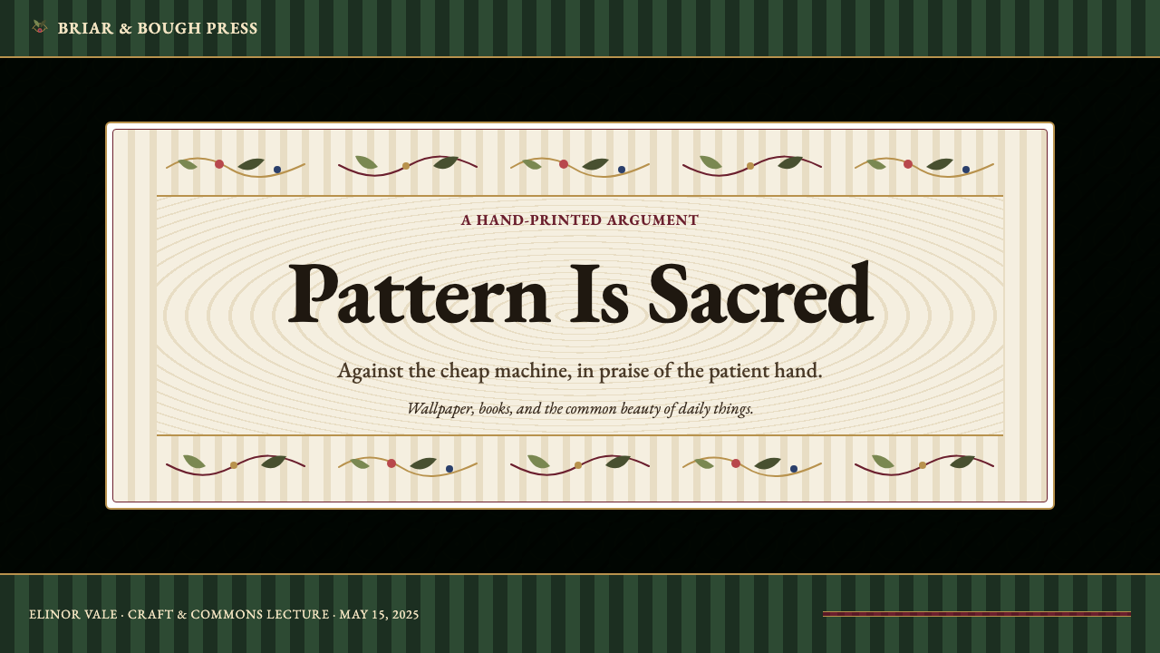
For presentation slides, the style is most effective when used for storytelling decks, editorial publications, or heritage brand presentations where the warmth and seriousness of the visual language reinforce the content. A cover slide benefits from treating the full bleed as a pattern field — forest green or deep indigo ground with a repeating vine or floral motif — with the title set in a large, warm serif on a cream panel at center, framed by a gold rule border. Content slides should reserve a narrow inner margin as a decorative zone, with body text set in a legible humanist roman against a near-white or parchment field. Data visualizations work best when rendered as simple, warm-toned infographics — bar charts in muted greens and golds, without gridlines or axis markers, placed within framing rules that echo the surrounding ornamental structure.在演示文稿方面,这种风格在叙事性幻灯片、编辑性出版物或遗产品牌演示中最为有效,因为视觉语言的温暖与庄重能强化内容本身。封面页可以将满版处理为图案底场——深森林绿或深靛蓝底色配以重复藤蔓或花卉纹样——中央以金线边框围合的奶油色面板承载大号温暖衬线体标题。内容页应在内侧保留窄边距作为装饰区域,正文以可读的人文主义罗马体设在接近白色或羊皮纸色的底面上。数据可视化最好呈现为简洁的暖色调信息图——以柔和绿色和金色构成的条形图,不加网格线或轴线标记,置于呼应周围装饰结构的框线之内。
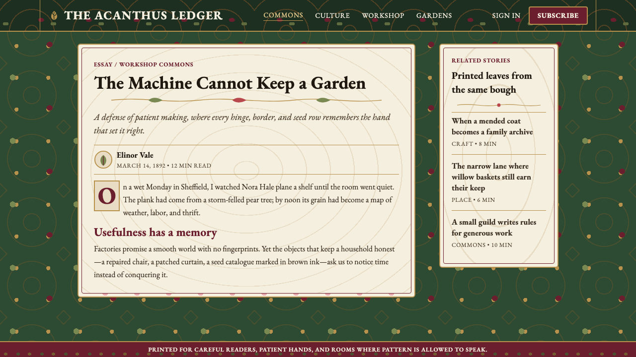
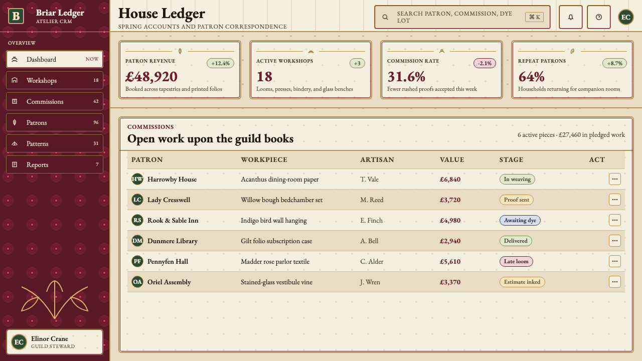
For web interfaces, the style is well suited to editorial sites, literary publishing platforms, independent bookshops, museum digital collections, and craft or heritage brand storefronts. The approach is to define a clear text-centered layout — a single wide column for body text, flanked by decorated margins — with pattern used at page edges and section breaks rather than behind functional content. Navigation should be typographically based, with a warm serif wordmark and link text in a contrasting but compatible weight. For pricing or product pages, the gold rule serves as a natural panel divider, and tier differentiation can be achieved through ground color variation — cream for standard, deep green for premium — rather than through badge or pill components. Avoid modern UI conventions like rounded cards, drop shadows, or icon-forward navigation: they conflict with the period logic.在网页界面方面,这种风格适合编辑类网站、文学出版平台、独立书店、博物馆数字馆藏,以及手工或遗产品牌的网络店铺。方法是定义以文字为中心的清晰版式——正文用一列宽栏,两侧以装饰边距相伴——图案用于页面边缘与段落分隔处,而非功能性内容的背景。导航应以字体为基础,使用暖色衬线体文字标识,链接文字以对比但兼容的字重呈现。对于定价或产品页面,金线天然充当面板分割线,层级区分可通过底色变化实现——标准级用奶油色,高级用深绿——而非通过徽章或药丸形组件。避免现代UI惯例如圆角卡片、投影阴影或以图标为主的导航:它们与这种风格的历史逻辑相冲突。
For editorial and marketing applications, the style excels in contexts where the brand narrative involves craft, provenance, authenticity, or cultural depth. A magazine spread using Arts and Crafts conventions places the headline in a large woodcut-style display setting, reserves a wide outer margin for a decorative border or running illustration, and uses pull quotes in a contrasting style that references Kelmscott marginal annotation. Marketing pages for heritage or artisan products benefit from alternating between full-pattern grounds and clean text panels, creating a rhythm between decorative richness and reading ease. The style also works well for event invitations, book covers, packaging, and long-form digital editorial where the reader is expected to engage slowly rather than scan.在编辑与营销应用方面,这种风格在品牌叙事涉及手工、出处、真实性或文化深度的语境中表现出色。采用工艺美术惯例的杂志跨页,以大号木刻感展示字体设置标题,在宽阔的外侧页边留给装饰边框或连续插图,用对比风格的内文引用呼应凯尔姆斯科特页边注释。遗产或手工产品的营销页面,通过交替使用全图案底场与干净文字面板,在装饰丰富性与阅读便利性之间制造节奏。这种风格同样适用于活动邀请函、书籍封面、包装,以及期待读者缓慢深读而非快速扫阅的长篇数字编辑内容。
The most common mistake when applying this style is importing individual motifs into an otherwise contemporary or minimal layout without committing to the system's underlying logic. A single acanthus border on a sans-serif slide, or a Morris-pattern header image on a flat UI, creates a collision rather than a synthesis. The second common mistake is using the pattern vocabulary at reduced size or low resolution: Morris's designs depend on the clarity of their repeat structure and the legibility of individual leaves and tendrils at the scale they were intended to be seen. A third mistake is substituting a bright, fully saturated palette for the warm, slightly muted naturalistic tones that define the historical work — the result reads as retro novelty rather than craft authority.应用这种风格时最常见的错误,是将单个母题引入一个整体当代或简约的版面,而不承诺这套系统的底层逻辑。一个茛苕边框放在无衬线体幻灯片上,或一张莫里斯图案页眉图片放在扁平化界面上,制造的是碰撞而非融合。第二个常见错误是在过小尺寸或低分辨率下使用图案词汇:莫里斯的设计依赖其重复结构的清晰度,以及单片叶子与藤蔓在预设观看比例下的可读性。第三个错误是用明亮、高饱和度的色板替代定义历史作品的温暖、略带柔和的自然色调——结果读来是复古新奇感,而非工艺权威感。
See the William Morris Arts & Crafts design system查看 William Morris Arts & Crafts 完整设计系统
William Morris Arts & Crafts — FAQWilliam Morris Arts & Crafts · 常见问题
Is Arts and Crafts the same as Art Nouveau?工艺美术运动和新艺术运动是同一回事吗?
They are closely related and often confused, but they are distinct movements with different centers of gravity. Arts and Crafts originated in Britain in the 1860s and was grounded in a moral argument about labor, craft, and the evils of industrial production. Its ornament is drawn primarily from medieval English and Gothic sources, and it values the visible evidence of the maker's hand. Art Nouveau emerged on the continent in the 1890s — in Belgium, France, Germany, and Austria — and adopted the Arts and Crafts commitment to the decorative arts while abandoning the medievalism and the political critique. Art Nouveau ornament is more stylized, more sinuous, and more influenced by Japanese woodblock prints than by English Gothic. The two movements share a love of natural forms and a rejection of historical eclecticism, but Arts and Crafts is fundamentally backward-looking and moral, while Art Nouveau is forward-looking and aesthetic.二者密切相关且常被混淆,但实为重心不同的两场运动。工艺美术运动起源于1860年代的英国,植根于关于劳动、手工与工业生产之恶的道德论述,其装饰主要取材于英国中世纪与哥特来源,重视制作者手工痕迹的可见性。新艺术运动兴起于1890年代的欧洲大陆——比利时、法国、德国与奥地利——它吸纳了工艺美术运动对装饰艺术的承诺,却抛弃了中世纪主义与政治批判。新艺术运动的装饰更为程式化、更为流动,受日本木版画的影响多于英国哥特。两场运动共享对自然形态的热爱与对历史折衷主义的拒绝,但工艺美术运动从根本上是向后看的与道德性的,而新艺术运动是向前看的与审美性的。
Can this style work for digital products, or is it too rooted in print?这种风格能用于数字产品吗,还是它太根植于印刷?
The style can work digitally, but it requires translation rather than direct transplantation. Morris's wallpaper patterns were designed for rooms with specific ambient light conditions, natural material surfaces, and a viewing distance of several feet; on a screen, at high resolution and with backlit luminosity, the same patterns will read differently — denser, more intense, potentially overwhelming. Successful digital applications of Arts and Crafts tend to use pattern selectively rather than comprehensively: as background texture on hero sections, as border ornament on editorial cards, as decorative flourish on feature typography. The warm color palette translates well to screens. The typographic conventions — rich humanist roman type, large ornamental initials — are achievable with contemporary web typography. The key adaptation is accepting that digital interfaces require more negative space than a Kelmscott page, and designing the pattern to appear in controlled doses rather than edge to edge.这种风格可以数字化应用,但需要转译而非直接移植。莫里斯的壁纸图案是为具有特定环境光线、天然材质表面、数英尺观看距离的房间设计的;在高分辨率、背光发光的屏幕上,相同图案的呈现将大为不同——更密实、更强烈、可能令人压迫。工艺美术风格成功的数字化应用,倾向于选择性而非全面性地使用图案:作为主视觉区块的背景纹理、编辑类卡片的边框装饰、特色排版的花饰元素。温暖的色板可以很好地移植至屏幕。排版惯例——丰富的人文主义罗马体、大型装饰性首字母——借助当代网络字体同样可以实现。关键的适配是接受数字界面需要比凯尔姆斯科特书页更多的留白,将图案设计为在受控剂量下出现,而非铺天盖地。
What is the right amount of pattern density for a contemporary application?在当代应用中,图案密度应该控制在什么程度?
There is no universal calibration, but a useful heuristic is to ask where the user's eye needs to rest and work from there. Pattern should fill the zones that frame functional content — borders, backgrounds, section dividers — but should not compete with text for attention. A practical approach: treat the central text column or content area as a plain or near-plain field, and reserve pattern for the outer thirds of the layout. On a slide deck, this means patterned borders and solid text panels. On a web page, it means a patterned hero and footer with clean content sections between. The density of the pattern itself can remain high — Morris's actual patterns at their full density — as long as its placement is architecturally considered. The problem is never the pattern being too dense; it is the pattern appearing where the eye needs clarity.没有普遍的校准标准,但一个有用的启发是:先确定用户的视线需要在哪里休息,再由此出发。图案应填充框定功能性内容的区域——边框、背景、段落分割——但不应与文字争夺注意力。一种实用方法:将中央文字栏或内容区域视为素净或接近素净的底场,图案保留给版式的外侧三分之一。在幻灯片中,这意味着有图案的边框与素净的文字面板。在网页中,这意味着有图案的主视觉区与页脚,之间是干净的内容区块。图案本身的密度可以保持在较高水平——莫里斯真实图案的完整密度——只要其放置经过建筑性的考量。问题从来不是图案太密;而是图案出现在眼睛需要清晰的地方。
How do I distinguish an authentic Arts and Crafts application from one that just uses floral decoration?如何区分真正的工艺美术风格应用与仅仅使用了花卉装饰的设计?
The distinguishing marks are structural rather than surface. An authentic Arts and Crafts application has an underlying grid logic — the pattern follows a mathematically precise repeat, even if that repeat is concealed beneath organic-looking surface detail. The palette is governed by the naturalistic logic of vegetable dyes: greens that suggest leaf and moss rather than lime or mint, reds that suggest madder and rust rather than cherry or tomato. Typography is historically grounded: serif type with a humanist character, not a geometric or transitional one. And the composition is paneled — text and image occupy framed zones, not flowing together in a continuous contemporary layout. Floral decoration that lacks these structural commitments, no matter how elaborate, will read as general vintage nostalgia rather than as Arts and Crafts.区别性标志在于结构而非表面。一个真正的工艺美术应用有其底层网格逻辑——图案遵循数学上精确的重复,即便这种重复被有机感的表面细节所掩盖。色板受植物染料的自然主义逻辑支配:绿色令人联想到叶片与苔藓,而非石灰或薄荷;红色令人联想到茜草与铁锈,而非樱桃或番茄。排版有历史依据:具有人文主义气质的衬线体,而非几何体或过渡体。构图是面板化的——文字与图像占据被框定的区域,而非在连续的当代版式中流动融合。缺乏这些结构性承诺的花卉装饰,无论多么繁复,读来都会是泛化的复古怀旧,而非工艺美术风格。
Is the style always light-background, or does a dark version exist?这种风格是否必须用浅色背景?存在深色版本吗?
Dark grounds are entirely historically authentic — Morris's own wallpapers frequently used deep forest green, indigo, or burgundy as the primary ground, with the floral motifs rendered in lighter values above them. The cream-panel-on-dark-ground composition is in many ways the more characteristic Arts and Crafts layout, closer to the stained-glass analogy that Morris invoked. A dark-ground version requires ensuring that the pattern motifs have sufficient contrast and that any text panels are reversed cleanly — cream or ivory type on the dark ground, or dark type within a clearly defined cream panel. The mistake to avoid is applying the dark ground to functional UI elements like input fields or data tables, where legibility demands that users be able to read at small sizes under various conditions. Pattern grounds work best in structural or decorative zones; functional zones should remain on light fields regardless of the overall palette.深色底面在历史上完全正宗——莫里斯自己的壁纸便常以深森林绿、靛蓝或勃艮第酒红为主底色,花卉母题以较浅的色值在其上呈现。深色底面上的奶油色面板构图,在许多方面更具代表性的工艺美术版式,更接近莫里斯所援引的彩色玻璃类比。深色底面版本需要确保图案母题有足够的对比度,且任何文字面板都能清晰反转——深色底面上用奶油色或象牙色文字,或在清晰界定的奶油色面板内用深色文字。需要避免的错误,是将深色底面应用于输入框或数据表格等功能性界面元素——在那里,可读性要求用户能在各种条件下以小字号阅读。图案底面最适合结构性或装饰性区域;无论整体色板如何,功能性区域应始终保持在浅色底面上。
Related design styles相关设计风格
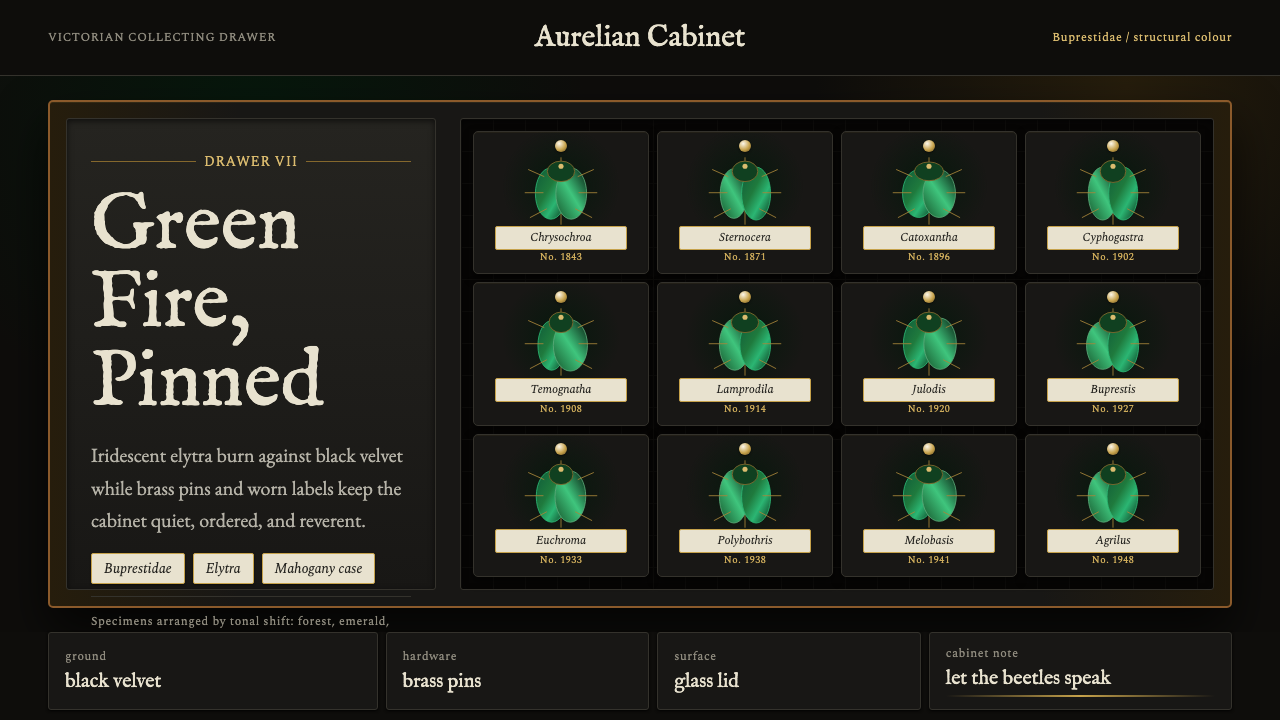 Beetle Specimen CabinetGreen burns in darkness. Emerald elytra grids glow under brass keylines and b…暗处燃起绿光。翡翠鞘翅格阵在黄铜线与黑绒底上发亮。
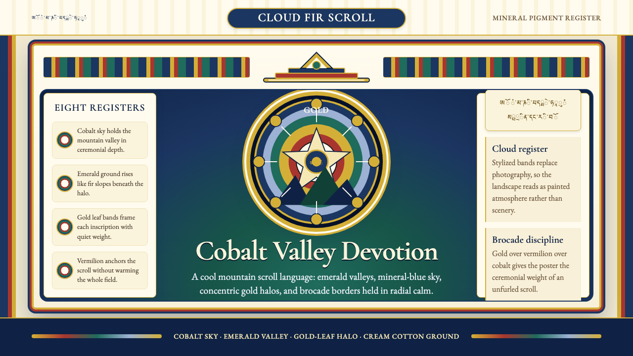 Bhutanese Thangka (Druk Style)Sacred cool-mountain clarity. Cobalt fields, emerald ground, and gold halos f…冷峻山岳的神圣感:钴蓝场、翡翠地与金色光环构成卷轴。
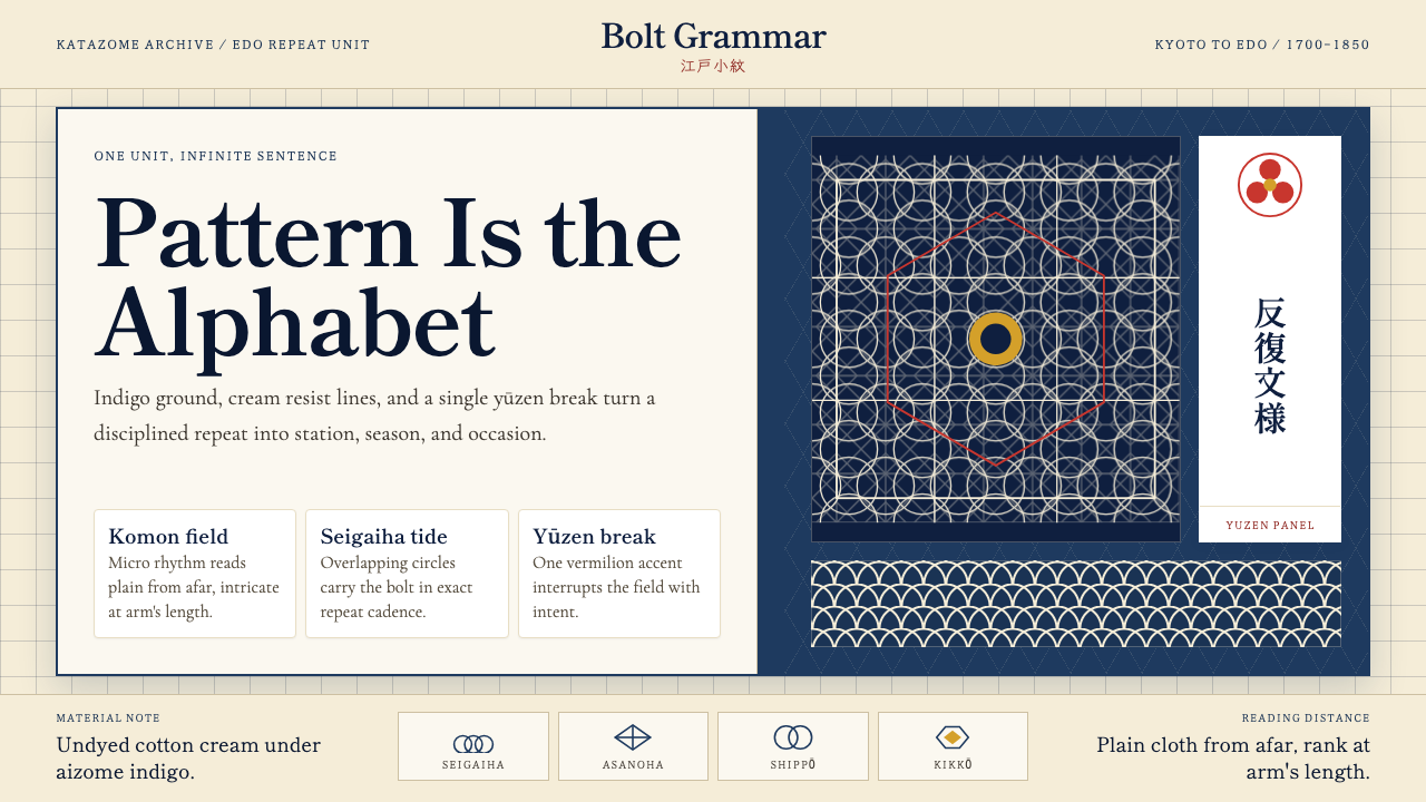 Edo Kimono TextilePattern becomes language. Indigo repeats, cream resist lines, one vermilion p…纹样即语言:靛蓝循环、米白留线,一块朱红破局。
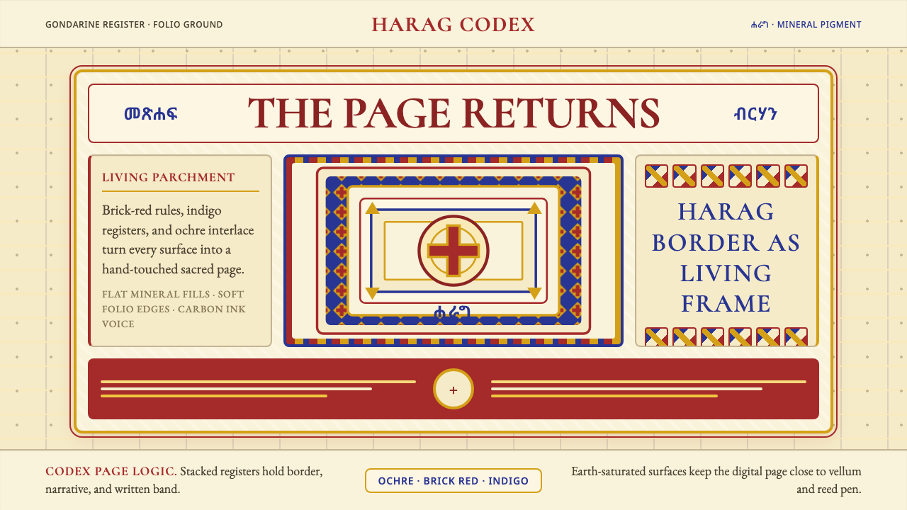 Ethiopian Orthodox ManuscriptSacred page, alive. Brick red, indigo, and ochre harag borders frame a starin…圣页有生命。砖红、靛蓝与赭金哈拉格边框凝视成像。
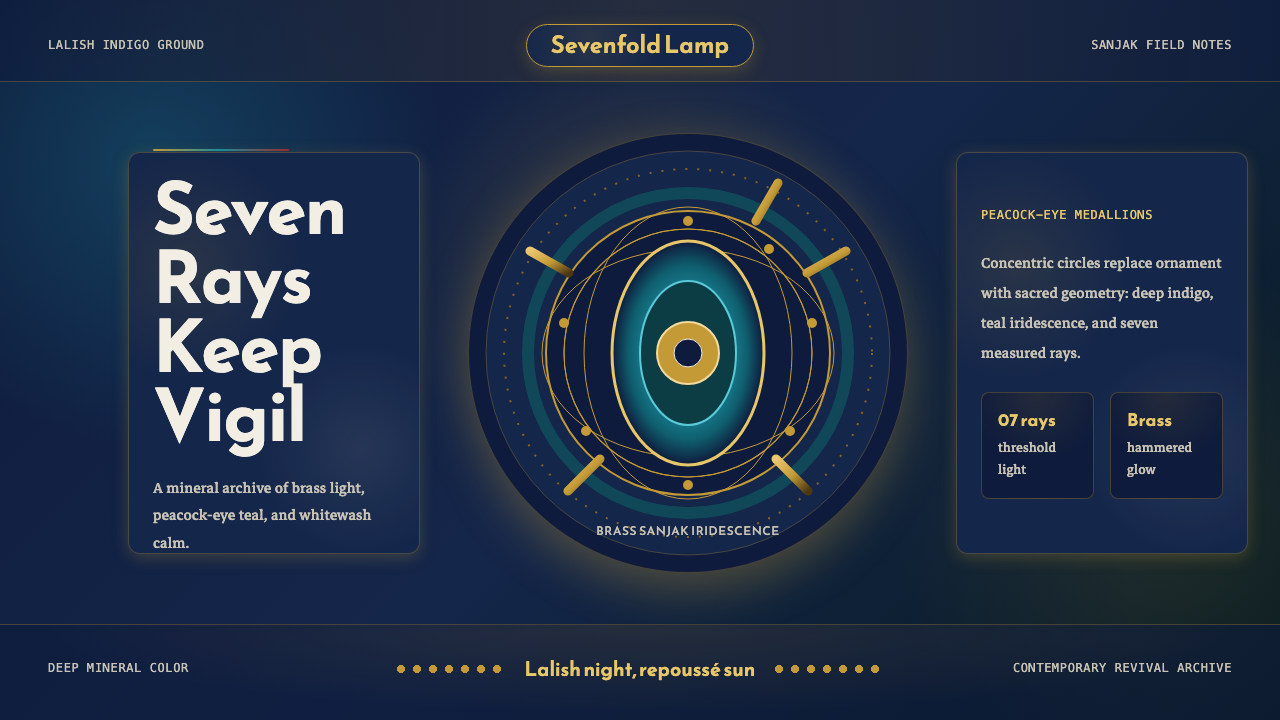 Kurdish Yazidi Peacock & SunSacred geometry glows. Lalish indigo holds brass rays and teal peacock-eye me…神圣几何在发光:拉利什靛蓝托住黄铜日芒与孔雀眼纹。
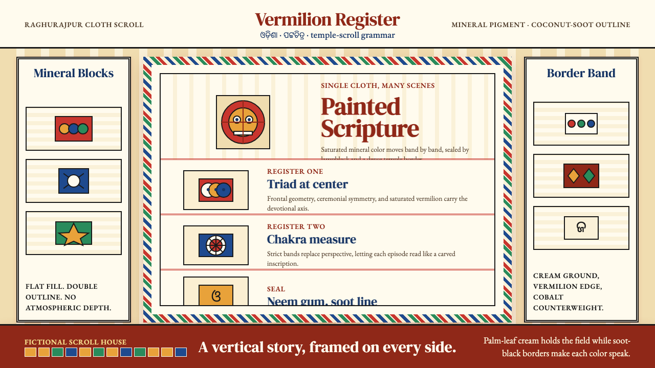 Pattachitra (Odisha Temple Scroll)Devotion as dense color. Vermilion bands and soot-black outlines stack like a…浓色即敬献:朱砂横带与烟黑描线层叠成寺庙长卷。