What is Ethiopian Orthodox Manuscript?什么是 Ethiopian Orthodox Manuscript?
Sacred parchment reimagined — brick-red halos, indigo archangels, and interlaced harag borders transform every surface into a living icon.圣页重生——砖红光环、靛蓝天使与哈拉格编织边框,将每一寸画面化为活的圣像。
Ethiopian Orthodox Manuscript in briefEthiopian Orthodox Manuscript 速览
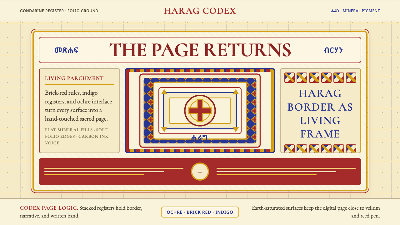
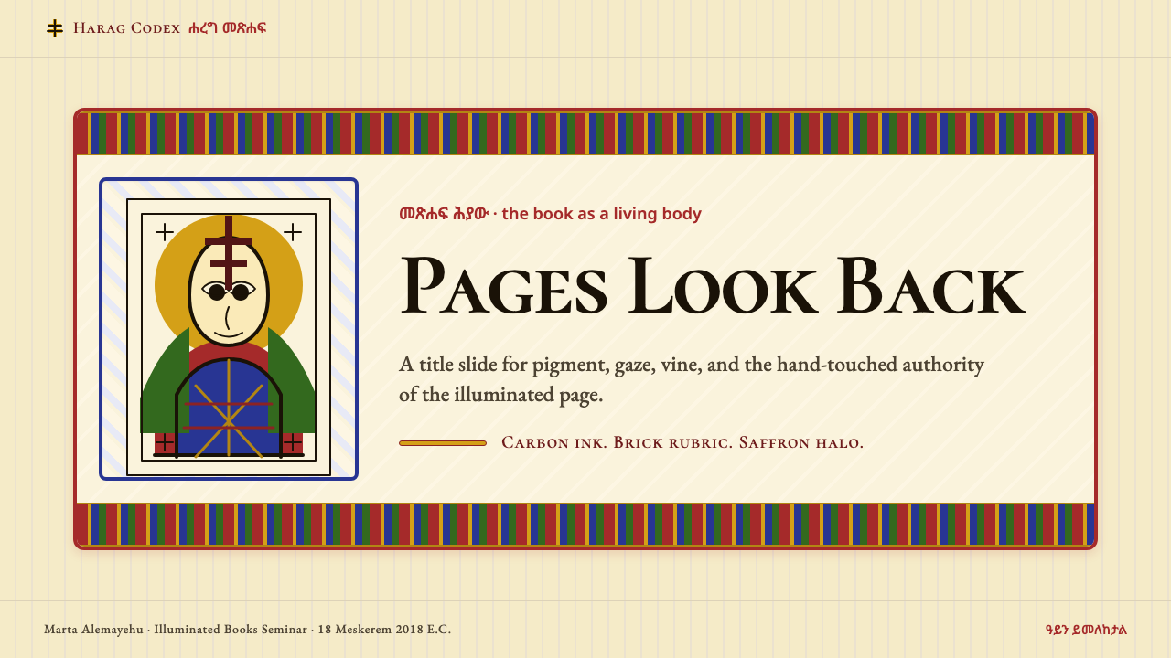
Ethiopian Orthodox Manuscript illumination is a centuries-old tradition of sacred book-making in which parchment codices were covered in mineral pigments, geometric interlace borders, and monumental figurative icons. The style is instantly identifiable: every saint and archangel gazes forward with enormous almond-shaped eyes, frontal and unflinching, transforming the book page into something that looks back. Halos glow brick-red against warm ochre grounds, robes fall in flat indigo and crimson planes, and tessellating vine-and-knot borders — called harag — frame each composition with the rhythmic intensity of woven textile.埃塞俄比亚东正教手抄本彩绘是一项历史悠久的圣书制作传统——羊皮纸抄本上覆满矿物颜料、几何编织边框与宏大的圣像人物。这种风格极易辨认:每一位圣人与天使长都以硕大的杏仁形双眼正视前方,目光坦然不移,将书页化为凝视观者的存在。光环以砖红色在暖赭色底面上燃烧,长袍以靛蓝与深红平铺展开,而层层交织的藤蔓结绳边框——称为「哈拉格」——以纺织品般的韵律感框住每一幅构图。
The design system translates these sacred conventions into a contemporary visual vocabulary. The palette remains earth-saturated: warm parchment grounds, mineral reds, deep indigos, and radiant ochre-golds replace the cool neutrals of modern interfaces. Pattern plays a structural role — harag interlace does not simply decorate margins but organizes, frames, and consecrates each region of the layout. Figural elements, when they appear, are rendered frontally and with confident outline rather than atmospheric shading. The result is a visual language that feels simultaneously ancient and graphic, hand-touched and bold.这套设计系统将这些圣图传统转化为当代视觉语言。色板保持大地色的饱和力量:温暖的羊皮纸底色、矿物红、深邃靛蓝与明亮的赭金,取代了现代界面惯用的冷调中性色。纹样承担结构性角色——哈拉格编织纹并非仅仅装饰页边,而是组织、框定并赋予版面每个区域以神圣意义。人物形象(若出现)以正面视角呈现,以有力的轮廓线而非大气渲染勾勒。由此形成的视觉语言兼具古老感与图形感,手绘质感与视觉力量并存。
Unlike styles rooted in restraint and reduction, Ethiopian Orthodox Manuscript embraces density and symbolic layering. Every choice — color, border, gaze, gesture — carries theological meaning. Applied to design, this tradition teaches that richness and legibility are not in opposition: when pattern is structured and palette is controlled, a dense visual field can still read with clarity and command.与以克制和削减为基础的风格不同,埃塞俄比亚东正教手抄本拥抱密度与象征性分层。每一个选择——色彩、边框、凝视、姿态——都承载神学意义。将这一传统引入设计,可以揭示一个道理:丰富与清晰并非对立——当纹样有结构、色板有节制,密集的视觉场域同样可以条理分明、力量充沛。
See the Ethiopian Orthodox Manuscript design system查看 Ethiopian Orthodox Manuscript 完整设计系统
Where does Ethiopian Orthodox Manuscript come from?Ethiopian Orthodox Manuscript 从何而来?
Christian manuscript illumination in Ethiopia can be traced to the Aksumite Empire, which adopted Christianity as its state religion in the fourth century under King Ezana — making Ethiopia one of the earliest Christian kingdoms in history. Monks at ancient centres such as Aksum and Lalibela copied and illustrated the Gospels, the Psalms, and liturgical texts, establishing visual conventions for depicting Christ, the Virgin Mary, and the archangels that would persist for more than a thousand years. Early Ethiopian iconography drew on both Coptic Egyptian and Byzantine sources, filtered through a distinctly African sacred imagination.埃塞俄比亚的基督教手抄本彩绘传统可追溯至阿克苏姆帝国。公元四世纪,国王埃扎纳将基督教立为国教,使埃塞俄比亚成为历史上最早接受基督教的国家之一。阿克苏姆与拉利贝拉等古老圣地的修道士抄写并彩绘《福音书》《诗篇》及礼仪文本,为描绘基督、圣母玛利亚与天使长确立了视觉规范,这些规范此后延续逾千年。早期埃塞俄比亚图像学汲取了科普特埃及与拜占庭的源泉,并经由非洲本土的神圣想象力加以过滤与转化。
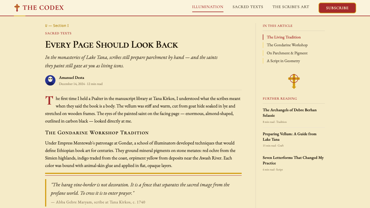
The style reached its apex during the Gondarine period, named for the imperial capital Gondar, which Emperor Fasilides founded in 1636. Under the patronage of emperors including Iyasu I (reigned 1682–1706) and Empress Mentewab (who wielded enormous cultural influence through the mid-eighteenth century), the monasteries of Lake Tana and the royal churches of Gondar became centres of manuscript production of extraordinary refinement. Monk-scribes and illuminators — mostly anonymous — developed the characteristic conventions of this school: the dramatically enlarged almond eye, the brick-red halo, the indigo and crimson robe rendered in flat mineral planes, and the densely patterned harag border drawn from older Aksumite geometric traditions.这一风格在贡德尔时期达到顶峰。贡德尔是皇帝法西利达斯于1636年建立的帝都,以此命名该时期。在伊亚苏一世(1682—1706年在位)和梅奈特瓦布皇后(十八世纪中叶拥有巨大文化影响力)的庇护下,塔纳湖的修道院与贡德尔的皇家教堂成为精美绝伦的手抄本生产中心。大多匿名的修道士书写者与彩绘师发展出这一画派的典型规范:显著放大的杏仁形眼睛、砖红色光环、以矿物颜料平涂的靛蓝与深红长袍,以及源自更古老的阿克苏姆几何传统的密集哈拉格边框。
The harag — from the Ge'ez word for vine or tendril — is perhaps the most immediately recognizable feature of Ethiopian manuscript decoration. These interlaced borders, woven from repeating cruciform and knotwork units, appear at the heads and feet of text columns, around full-page miniatures, and as dividers within the page. Their origins lie in the knotwork traditions of early Christian manuscript art shared across the Nile Valley and the Red Sea world, but Ethiopian illuminators developed the harag into a uniquely elaborate and rhythmically complex form. The borders are never purely decorative: they sanctify the space they enclose, marking the transition between the everyday and the sacred.哈拉格——源自古埃塞俄比亚语(Ge'ez)中「藤蔓」或「卷须」之意——或许是埃塞俄比亚手抄本装饰中最一目了然的特征。这些由十字形与绳结单元反复编织而成的交织边框,出现在文字栏的首尾、整页细密画的四周,以及页面内的分隔处。其渊源在于尼罗河流域与红海世界早期基督教手抄本艺术共有的结绳传统,但埃塞俄比亚彩绘师将哈拉格发展为一种独特精细、韵律复杂的形式。这些边框从不仅仅是装饰:它们圣化所围合的空间,标志着日常与神圣之间的过渡。
Ethiopian manuscripts were produced on vellum — typically calfskin or goatskin — prepared by stretching and scraping. The pigments used were almost entirely mineral and plant-based: red ochre and vermilion for the halos and garments, indigo derived from the plant Indigofera tinctoria for the deep blue robes, yellow ochre for grounds and gilded accents, carbon black for outlines and script. The binding itself was a sacred object: thick wooden boards wrapped in blind-tooled leather, fastened with leather cords, and carried in embroidered cloth bags. Many of these codices survive in the monasteries of Lake Tana and in the Ethiopian National Library, still used in liturgical practice today.埃塞俄比亚手抄本书写于牛皮纸或山羊皮纸——通过拉伸与刮磨制成。所用颜料几乎全部来自矿物与植物:赭红与朱砂用于光环与衣袍,源自蓝草(木蓝属植物)的靛蓝用于深蓝长袍,黄赭石用于底色与镀金装饰,炭黑用于轮廓线与文字。装订本身也是圣物:厚重木板外覆盲压皮革,以皮绳固定,并装入刺绣布袋中随身携带。许多此类抄本至今仍保存于塔纳湖的修道院与埃塞俄比亚国家图书馆,并继续在礼仪实践中被使用。
What defines the Ethiopian Orthodox Manuscript look?Ethiopian Orthodox Manuscript 的视觉特征是什么?
Palette色板
The color vocabulary is warm, mineral, and earth-saturated. Brick red anchors halos and structural accents, carrying sacred energy; indigo and deep crimson fill the flat planes of robes and architectural elements; warm ochre and raw-parchment tones form the ground from which figures emerge. Black is used for decisive outlines and Ge'ez script. The overall effect is richly chromatic but never chaotic — each hue occupies a defined role derived from centuries of theological convention rather than aesthetic whim.色彩词汇温暖、矿物感强、大地色饱和度高。砖红色锚定光环与结构性强调,承载神圣能量;靛蓝与深红填充长袍与建筑元素的平铺色块;暖赭石与生羊皮纸色调构成人物浮现其上的底色。黑色用于有力的轮廓线与古埃塞俄比亚文字。整体效果色彩丰富却不失秩序——每种色调都在数百年神学传统中占据明确角色,而非出于审美任意。
The Frontal Gaze正面凝视
Every significant figure — Christ, the Virgin, archangels, saints — is rendered facing directly forward, with dramatically enlarged almond eyes that meet the viewer without deviation. This is not a stylistic convention alone but a theological statement: the icon is a window through which the sacred and the human exchange presence. The gaze commands rather than invites; it transforms a book page into a sacred encounter. In design terms, this frontality creates anchoring focal points of absolute stillness amid any surrounding pattern.每一位重要人物——基督、圣母、天使长、圣徒——均以正面视角呈现,硕大的杏仁形双眼毫不偏转地直视观者。这不仅是风格惯例,更是神学陈述:圣像是一扇窗,神圣与人类通过它相互凝视。这种目光是命令性的而非邀请性的;它将书页化为神圣的相遇。在设计语言中,这种正面性在任何周围纹样中创造出绝对静止的锚定焦点。
Harag Border哈拉格边框
The harag is a repeating interlace pattern of vine tendrils, cruciform knots, and geometric loops that frames every significant region of the manuscript page. It is drawn with extraordinary precision — each unit interlocking with the next in a continuous rhythm — and colored in contrasting mineral tones so that the weave reads clearly against its ground. The harag simultaneously organizes space, marks hierarchy, and transforms the margin from dead zone to active sacred boundary. In contemporary application it functions as a structural framing device of great visual weight.哈拉格是一种由藤蔓卷须、十字形绳结与几何环圈反复编织而成的交织纹样,用于框定手抄本页面的每一个重要区域。其绘制精度极高——每个单元与相邻单元环环相扣,形成连续的韵律——并以对比鲜明的矿物色调着色,使编织纹在底色上清晰可读。哈拉格同时承担组织空间、标示层级、以及将页边从空白地带转化为活跃神圣边界的功能。在当代应用中,它是视觉分量极强的结构性框架装置。
Flat Mineral Planes矿物色平涂
Figures and garments are rendered in flat, unmodulated planes of pure mineral color — no gradients, no cast shadows, no attempt to simulate the fall of light across fabric. A robe is a shape of indigo; a halo is a disk of brick red; a face is a plane of warm ochre outlined in black. This flatness is not a technical limitation but a theological commitment: the sacred figure exists outside ordinary space and time, and therefore outside ordinary illumination. It produces a bold, graphic quality that reads at distance with the force of a printed emblem.人物与衣物以纯矿物色的平面、无渐变、无投影的方式呈现,不试图模拟光线在布料上的折射。长袍是一片靛蓝色块;光环是一个砖红色圆盘;面部是以黑色勾勒轮廓的暖赭色平面。这种平涂并非技术局限,而是神学承诺:神圣形象存在于普通时空之外,因而也存在于普通光照之外。它产生大胆而图形感强烈的视觉品质,在远距离观看时依然以徽标般的力量传达。
Dense Symbolic Pattern密集象征纹样
Ethiopian manuscript pages are never empty. Background fields behind figures may be filled with repeat geometric patterns — crosshatch, stepped diamonds, or stylized flora — drawn from Aksumite decorative traditions. These fills do not merely occupy space; they signal the sanctified nature of the depicted realm. Density is a value, not a failure of restraint. The skilled illuminator controls density through pattern scale and color contrast rather than by leaving areas bare, achieving visual richness that remains ordered and legible.埃塞俄比亚手抄本的页面从不留白。人物身后的背景区域可能填满几何重复纹样——交叉线格、阶梯菱形或程式化植物纹——源自阿克苏姆装饰传统。这些填充纹样不仅仅是占据空间;它们标志着所描绘领域的神圣性质。密度是一种价值,而非克制失败的表现。技艺精湛的彩绘师通过纹样尺度与色彩对比控制密度,而非依赖留白,由此实现丰富而有序、层次清晰的视觉效果。
Outline Dominance轮廓线主导
Strong, confident black outlines define every form — faces, robes, architectural frames, harag units. The line is not a supplement to color but co-equal with it: the outline establishes the shape, and color fills within. This approach gives the style its graphic legibility at any scale and its ability to absorb dense surrounding pattern without losing figure-ground distinction. It also means that individual elements can be isolated and used independently without losing their identity — a quality that transfers well to digital icon systems and typographic ornaments.粗重有力的黑色轮廓线界定每一个形体——面部、衣袍、建筑框架、哈拉格单元。轮廓线并非色彩的补充,而与色彩地位平等:轮廓确立形状,色彩在内填充。这种方式赋予这一风格在任何尺度下的图形清晰度,以及在密集背景纹样中保持图地区分的能力。这也意味着单个元素可以被隔离独立使用而不失其辨识度——这一品质在数字图标系统与排版装饰物中同样适用。
Warm Parchment Ground温暖羊皮纸底色
The ground of every composition is the warm, slightly irregular tone of prepared animal skin — not the cool white of modern paper or the absolute white of a digital canvas. This warmth is foundational: it unifies the mineral pigments laid over it, softens the visual field, and gives the work its sense of age and tactility. In digital translation, the ground should suggest organic material — warm off-white or deep parchment — rather than defaulting to pure white, which strips the palette of its characteristic depth and cohesion.每幅构图的底色是预处理动物皮革温暖而略带不规则的色调——而非现代纸张的冷白或数字画布的绝对白色。这种温度是基础性的:它统一了铺设其上的矿物颜料,柔化视觉场域,赋予作品以年代感与触感。在数字化转译中,底色应当传达有机材料的质感——温暖的灰白或深羊皮纸色——而不是默认使用纯白,那将剥夺色板特有的深度与凝聚力。
See the Ethiopian Orthodox Manuscript design system查看 Ethiopian Orthodox Manuscript 完整设计系统
Who shaped Ethiopian Orthodox Manuscript?谁塑造了 Ethiopian Orthodox Manuscript?
Mentewab (c. 1706–1773) was the most powerful patron of the arts in Gondarine Ethiopia. As queen consort to Emperor Bakaffa and regent during her son Iyasu II's reign, she commissioned churches, monasteries, and illuminated manuscripts on an extraordinary scale. The church of Narga Selassie on an island in Lake Tana, built under her patronage and decorated with manuscript-influenced wall paintings, is among the finest surviving examples of Gondarine sacred art. Her support gave illuminators the resources and stability to develop the Gondarine school's most refined formal conventions.梅奈特瓦布(约1706—1773年)是贡德尔时期埃塞俄比亚最具权势的艺术赞助人。作为巴卡法皇帝的皇后与伊亚苏二世在位期间的摄政,她大规模委托建造教堂、修道院并制作彩绘手抄本。塔纳湖小岛上的纳尔加塞拉西教堂由她资助兴建,并以受手抄本影响的壁画装饰,是现存最精美的贡德尔神圣艺术范例之一。她的支持为彩绘师提供了资源与稳定性,使贡德尔画派得以发展出最为精致的形式规范。
Iyasu I (reigned 1682–1706), known as 'the Great,' presided over the height of the Gondarine cultural renaissance. His reign saw intense activity at the Lake Tana monasteries, where scriptoria produced illuminated Gospels, Books of the Hours, and hagiographies in the fully developed Gondarine style. Iyasu himself commissioned the decoration of Debre Berhan Selassie church in Gondar — its ceiling covered in painted angel faces — which became a touchstone of the tradition. His patronage established the visual norms that subsequent generations of monk-scribes would inherit and refine.伊亚苏一世(1682—1706年在位),人称「大帝」,主持了贡德尔文化复兴的巅峰时期。他在位期间,塔纳湖修道院的抄本室大量生产彩绘《福音书》、《日课书》与圣徒传记,均采用发展成熟的贡德尔风格。伊亚苏本人委托装饰了贡德尔的德布雷贝尔汉塞拉西教堂——其天顶满绘天使面孔——成为这一传统的标志性作品。他的赞助确立了后世修道士书写者所继承与精进的视觉规范。
The Gondarine school was produced almost entirely by anonymous religious artists — monk-scribes who were simultaneously theologians, calligraphers, and painters. Working within strict iconographic conventions inherited from older Coptic and Byzantine sources, they nonetheless developed a collectively distinctive hand: the dramatically enlarged eye, the particular geometry of the harag border, the characteristic brick-red halo. Their anonymity was deliberate — the point was not the artist but the sacred text and image. Their collective achievement across two centuries constitutes one of the most distinctive bodies of sacred art produced anywhere in the pre-modern world.贡德尔画派几乎全部由匿名宗教艺术家创作——修道士书写者同时身兼神学家、书法家与画师。在严格遵循科普特与拜占庭图像学传统的同时,他们仍发展出集体性的鲜明风格:显著放大的眼睛、哈拉格边框的特定几何形、标志性的砖红光环。他们的匿名是刻意的——重要的不是艺术家,而是神圣文本与图像。他们跨越两个世纪的集体成就,构成了前现代世界任何地方所产生的最具特色的神圣艺术遗产之一。
Emperor Zara Yaqob (reigned 1434–1468) is not primarily remembered as an art patron but as the ruler who standardized Ethiopian Orthodox liturgical practice, settling doctrinal disputes and enforcing uniform observance across the kingdom. His reforms had direct consequences for manuscript production: by establishing canonical texts, feast cycles, and iconographic programs for the veneration of Mary and the saints, he gave illuminators a settled visual theology to work from. The iconographic conventions that reached their apex in the Gondarine period were partly the outcome of the doctrinal clarity his reign imposed.扎拉·雅各布皇帝(1434—1468年在位)主要不以艺术赞助人身份留名,而是以统一埃塞俄比亚东正教礼仪实践的君主著称——他平息教义争端,在全国推行统一的宗教仪式。他的改革对手抄本生产产生了直接影响:通过确立圣典文本、节庆周期以及崇拜圣母与圣徒的图像程序,他为彩绘师提供了有据可依的视觉神学体系。在贡德尔时期达到顶峰的图像学传统,部分正是他在位期间所确立的教义清晰度的产物。
How do you use Ethiopian Orthodox Manuscript today?今天怎么用 Ethiopian Orthodox Manuscript?
Ethiopian Orthodox Manuscript is one of the few historical design traditions that explicitly rewards density and symbolic layering — making it well-suited to contexts where richness, warmth, and cultural depth are desired values. Applying it correctly requires understanding its underlying logic: every element earns its place through structural or symbolic function. The harag border does not merely decorate; it demarcates sacred space. The frontal figure does not merely illustrate; it commands presence. Reproducing the visual surface without this intentionality produces pastiche.埃塞俄比亚东正教手抄本是少数明确奖励密度与象征性分层的历史设计传统之一——这使其非常适合追求丰富感、温暖感与文化深度的场景。正确应用它需要理解其内在逻辑:每一个元素都通过结构性或象征性功能赢得存在的权利。哈拉格边框不仅仅是装饰;它划定神圣空间。正面人物不仅仅是插图;它命令存在的临在。仅复制视觉表面而缺乏这种意图,只会产生风格拼贴。
For presentation slides, the tradition works powerfully on cover pages and section dividers. A cover benefits from a central frontal motif — an icon-like image or a bold geometric emblem — surrounded by harag-derived interlace framing on warm parchment ground. Section title slides can use a full-width harag band across the top or bottom as a structural marker, with the title set in large, confident type against a warm ground. Content slides require restraint: the harag should appear as a contained border element, not a full-page fill, and body text must have sufficient breathing room against the warm background. Data slides work best when charts are treated as flat geometric objects framed within the visual system — use the brick-red and indigo palette to encode data series, with the ochre ground providing neutral space.对于演示文稿,这一传统在封面页与章节分隔页上效果强烈。封面适合以一个正面母题——图标式图像或粗重几何徽标——为中心,以源自哈拉格的编织边框围绕,置于温暖羊皮纸底色上。章节标题页可以在顶部或底部使用全宽哈拉格带作为结构标记,标题以大号、有力的字体置于暖色底面。内容页则需要克制:哈拉格应作为局限性边框元素出现,而非铺满整页;正文须在温暖背景上拥有足够的呼吸空间。数据页的图表最好被当作平面几何对象,框定于视觉系统内——以砖红与靛蓝色板编码数据系列,赭金底色提供中性空间。
For web interfaces and dashboards, the style is most effective in contexts that call for warmth, cultural resonance, and premium positioning — cultural institutions, heritage brands, editorial platforms, and artisanal or hand-crafted product lines. Navigation and header regions take well to harag-patterned borders; cards and panels sit naturally on warm parchment-toned backgrounds with strong outlined frames. Interactive states can use the brick-red as an active accent. Pricing pages work with tier distinction encoded in palette — indigo for premium tiers, ochre for standard — with harag framing separating each column. The style does not suit contexts requiring clinical neutrality or hyper-minimalism.对于网页界面与仪表板,这一风格在追求温暖感、文化共鸣与高端定位的场景中最为有效——文化机构、遗产品牌、编辑平台,以及手工艺或手作产品线。导航与顶部区域适合哈拉格纹样边框;卡片与面板自然地置于以强轮廓线框架、暖羊皮纸色调背景上。交互状态可以使用砖红色作为激活强调色。定价页面可以用色板编码层级区分——靛蓝用于高级层,赭金用于标准层——以哈拉格边框分隔各列。这一风格不适合需要临床中性或极致简约的场景。
For editorial and marketing work, the tradition supports deep visual hierarchy and strong section identity. A long-form article layout can use harag-derived drop caps and section dividers, a warm parchment background for the text field, and bold outlined pull-quotes in brick-red or indigo. Marketing pages benefit from alternating full-width bands: warm ochre ground with dark figural or typographic elements, then deep indigo ground with parchment-toned type. Every call-to-action should feel like an illuminated initial — given a bordered frame and a warm accent — rather than a flat button. Photography, when used, should be treated as icon-like: tightly cropped, given a strong outlined border, and placed frontally rather than in casual documentary angles.对于编辑与营销内容,这一传统支持深度视觉层级与强烈的章节识别度。长篇文章排版可以使用哈拉格衍生的首字下沉与章节分隔符,以温暖羊皮纸色为文字区底色,并以砖红或靛蓝设置醒目的带框引语。营销页面可以交替使用全宽色块:暖赭金底配深色人物或字体元素,再接深靛蓝底配羊皮纸色字体。每一个行动号召都应有如一个彩绘首字母——置于带框架的温暖强调色中——而非平面按钮。摄影图像(若使用)应当以图标方式处理:紧密裁切,配以粗轮廓线边框,以正面角度放置而非随意的纪实角度。
A common mistake when applying Ethiopian Orthodox Manuscript is treating it as surface decoration — adding a harag border to an otherwise conventional layout and considering the job done. The tradition requires that the pattern serve a genuine structural role: framing, separating, or consecrating specific regions. A second frequent error is lightening the palette toward pastels in an attempt to modernize. The power of this style comes from its mineral saturation and warm depth; diluting the palette to soft dusty tones breaks the internal coherence that makes the system work. Use the full weight of brick-red, deep indigo, and warm ochre, and let the parchment ground do the work of softening and unifying.应用埃塞俄比亚东正教手抄本风格时最常见的错误,是将其视为表面装饰——在一个本质上普通的版面上添加一个哈拉格边框便认为大功告成。这一传统要求纹样发挥真正的结构性作用:框定、分隔或圣化特定区域。另一个常见错误是将色板向粉彩调减淡,试图以此「现代化」。这一风格的力量来自矿物颜料的饱和度与温暖深度;将色板稀释为柔和暗淡的色调,会破坏使整个系统运作的内在凝聚力。请使用砖红、深靛蓝与暖赭金的充分力量,让羊皮纸底色来完成柔化与统一的工作。
See the Ethiopian Orthodox Manuscript design system查看 Ethiopian Orthodox Manuscript 完整设计系统
Ethiopian Orthodox Manuscript — FAQEthiopian Orthodox Manuscript · 常见问题
How does Ethiopian Orthodox Manuscript differ from other African art traditions?埃塞俄比亚东正教手抄本与其他非洲艺术传统有何不同?
Ethiopian Orthodox Manuscript is a Christian liturgical art tradition rooted in the specific theology and book culture of the Ethiopian Orthodox Tewahedo Church — one of the oldest Christian churches in the world. It shares with other African sacred traditions a taste for symbolic pattern and mineral-saturated color, but its direct lineage runs through Coptic Egypt and Byzantine iconography rather than through the West African, sub-Saharan, or indigenous traditions more commonly associated with the term 'African art.' The frontal gaze, the halo, the codex format, and the hagiographic subject matter all place it squarely within the Eastern Christian sacred art family.埃塞俄比亚东正教手抄本是一种基督教礼仪艺术传统,植根于埃塞俄比亚东正教特瓦赫多教会(世界上最古老的基督教会之一)的特定神学与书籍文化。它与其他非洲神圣传统共享对象征性纹样与矿物色饱和度的偏好,但其直接传承来自科普特埃及与拜占庭图像学,而非通常与「非洲艺术」一词相关联的西非、撒哈拉以南或本土传统。正面凝视、光环、抄本形式以及圣徒传记题材,都将其牢牢置于东方基督教神圣艺术家族之内。
Can this style work in dark-background layouts?这种风格能用于深色背景版面吗?
The canonical ground of Ethiopian manuscript illumination is warm parchment — not black or dark. A dark inversion is possible but requires significant care. On a dark background, the brick-red loses its halo-warmth and can read as aggressive; the indigo can disappear against near-black grounds. A dark variant works best when it treats deep indigo or near-black as the ground, uses warm ochre and parchment-tone as the primary light elements, and reserves brick-red as a concentrated accent for borders and focal points only. The harag pattern can be rendered in a slightly lighter tone of the ground color — giving it presence without competing with foreground content.埃塞俄比亚手抄本彩绘的标准底色是温暖的羊皮纸色——而非黑色或深色。深色反转版本可行,但需要相当的谨慎。在深色背景上,砖红失去其光环的温暖感,可能显得攻击性;靛蓝在近黑背景上可能消失。深色变体最有效的方式是:以深靛蓝或近黑为底色,以暖赭金与羊皮纸色调作为主要的明亮元素,将砖红保留为仅用于边框与焦点的集中强调色。哈拉格纹样可以用比底色稍亮的同色调绘制——赋予存在感而不与前景内容竞争。
Is this style appropriate for secular or commercial contexts?这种风格适合世俗或商业场景吗?
Yes, with appropriate sensitivity. The visual language of Ethiopian Orthodox Manuscript can be applied to secular design work — the aesthetic system is rich enough to stand on its own formal merits independent of its religious origins. Cultural institutions, museums, heritage tourism, artisanal brands, and editorial projects regularly draw on sacred art traditions without theological intent. The key is to engage with the tradition with knowledge and respect rather than reducing it to exotic surface decoration. Avoid using specific devotional iconography (individual saints, crosses, sacred texts) in ways that are trivializing or purely ornamental. The harag border, the palette, and the compositional conventions are broadly available; the specific sacred imagery carries more responsibility.可以,但需要适当的敏感性。埃塞俄比亚东正教手抄本的视觉语言可以应用于世俗设计工作——这套美学系统在形式上足够丰富,可以独立于其宗教起源之外成立。文化机构、博物馆、遗产旅游、手工艺品牌和编辑项目定期借鉴神圣艺术传统而不带神学意图。关键是以知识与尊重而非将其简化为异域表面装饰的态度来接触这一传统。避免以琐化或纯装饰性的方式使用特定的虔诚圣像(个别圣徒、十字架、神圣文本)。哈拉格边框、色板与构图惯例是普遍可用的;具体的神圣图像则承载更多责任。
How do I apply the harag pattern without it overwhelming the layout?如何使用哈拉格纹样而不让版面显得过于拥挤?
Scale and containment are the two key controls. A harag pattern read at large scale — covering a wide margin or a full background — will dominate; the same pattern rendered at small scale in a contained border strip becomes a structural accent without competing with content. In practice, limit harag to defined zones: page or slide edges, section headers, card frames, or decorative dividers. Keep the interior content zone — the area where text and primary visual elements live — free of pattern, using only the warm ground color. The contrast between patterned border and open interior is what gives the style its characteristic tension between richness and legibility.尺度与限制是两个关键控制变量。大尺度的哈拉格纹样——覆盖宽阔页边或整个背景——会主导版面;同样的纹样以小尺度绘制在局限性的边框带中,则成为不与内容竞争的结构性强调。实践中,将哈拉格限制在明确的区域:页面或幻灯片边缘、章节标题、卡片框架或装饰分隔符。内容区域内部——文字与主要视觉元素所在的区域——只使用温暖底色,不铺设纹样。纹样边框与开放内部之间的对比,正是赋予这种风格在丰富感与清晰度之间特有张力的关键。
What makes Ethiopian Orthodox Manuscript different from Byzantine or Coptic icon art?埃塞俄比亚东正教手抄本与拜占庭或科普特圣像艺术有何不同?
All three traditions share the frontal gaze, the theological use of gold or warm color for sacred ground, and the flat rendering of form without naturalistic shadow — they are related branches of Eastern Christian sacred art. The differences lie in specifics. Byzantine icons tend toward more refined elongated proportions and a cooler, more golden palette with greater use of gold leaf. Coptic art is bolder and more graphic, with heavier outlines and a stronger contrast between figure and ground, but lacks the elaborate interlace border tradition. Ethiopian manuscript art is distinguished above all by the harag border — an indigenous pattern tradition with no close parallel in Byzantine or Coptic work — and by a warmer, earthier palette rooted in locally available mineral pigments rather than imported Byzantine gold and lapis.三种传统都共享正面凝视、以金色或暖色底面表达神圣的神学用法,以及无自然主义阴影的平面形体处理——它们是东方基督教神圣艺术的相关分支。差异在于具体细节。拜占庭圣像倾向于更为精致的修长比例,以及更冷、更具金色感的色板,大量使用金箔。科普特艺术更大胆、更具图形感,有更粗重的轮廓线与更强烈的图地对比,但缺乏精细的编织边框传统。埃塞俄比亚手抄本艺术的独特之处,首先在于哈拉格边框——一种在拜占庭或科普特作品中没有近似对应物的本土纹样传统——以及一套植根于当地矿物颜料、更温暖大地色调的色板,而非进口拜占庭金箔与青金石。
Related design styles相关设计风格
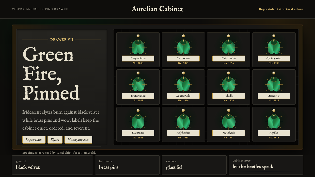 Beetle Specimen CabinetGreen burns in darkness. Emerald elytra grids glow under brass keylines and b…暗处燃起绿光。翡翠鞘翅格阵在黄铜线与黑绒底上发亮。
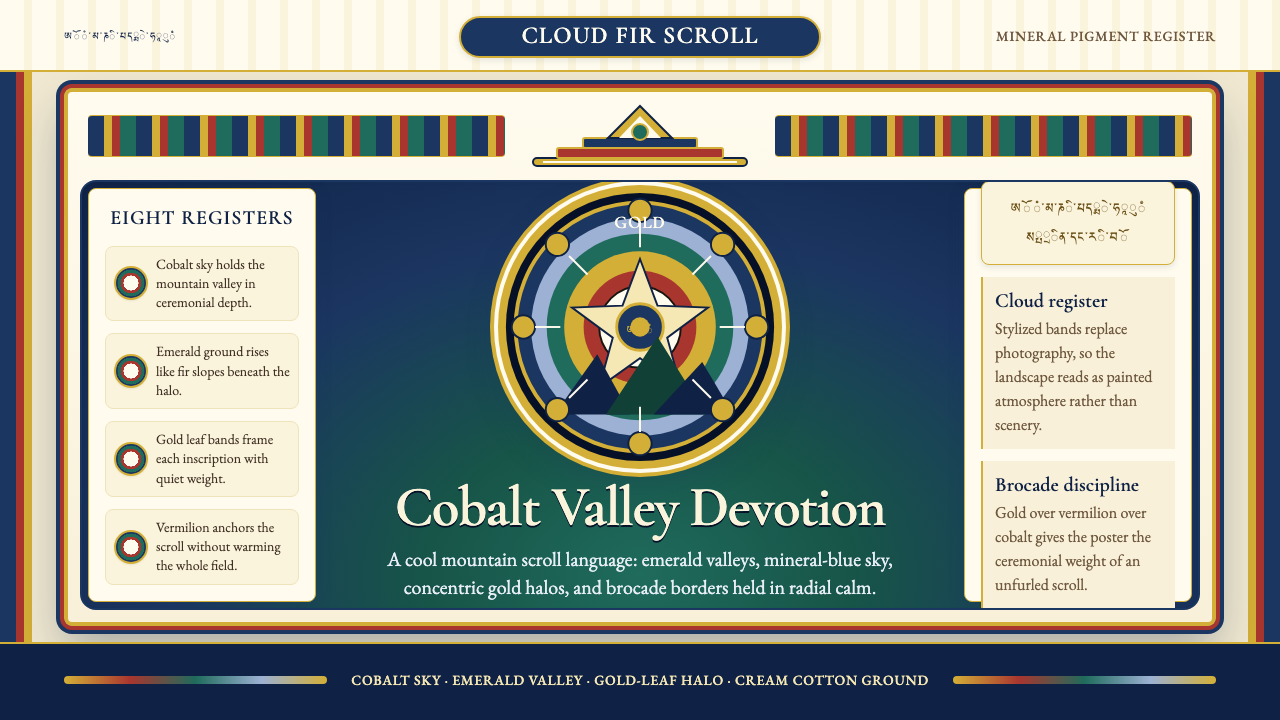 Bhutanese Thangka (Druk Style)Sacred cool-mountain clarity. Cobalt fields, emerald ground, and gold halos f…冷峻山岳的神圣感:钴蓝场、翡翠地与金色光环构成卷轴。
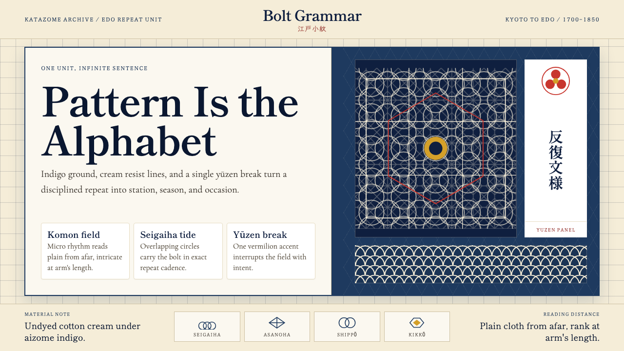 Edo Kimono TextilePattern becomes language. Indigo repeats, cream resist lines, one vermilion p…纹样即语言:靛蓝循环、米白留线,一块朱红破局。
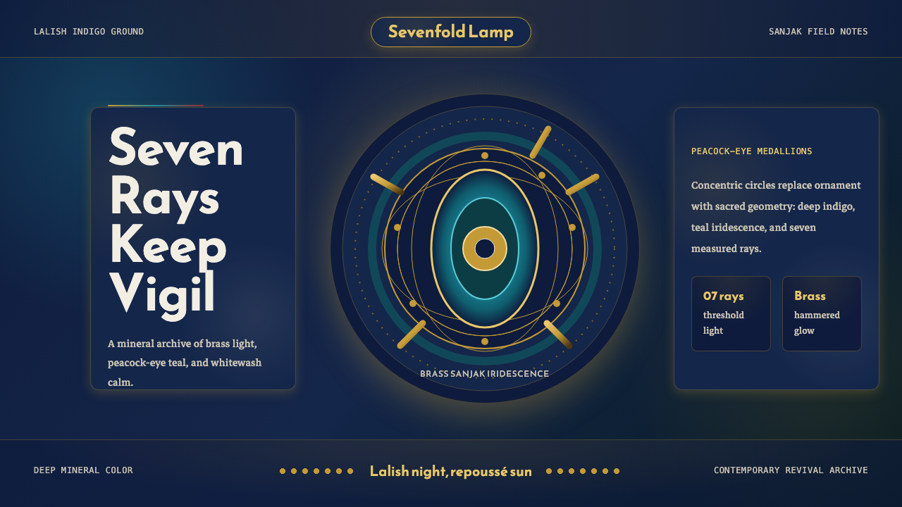 Kurdish Yazidi Peacock & SunSacred geometry glows. Lalish indigo holds brass rays and teal peacock-eye me…神圣几何在发光:拉利什靛蓝托住黄铜日芒与孔雀眼纹。
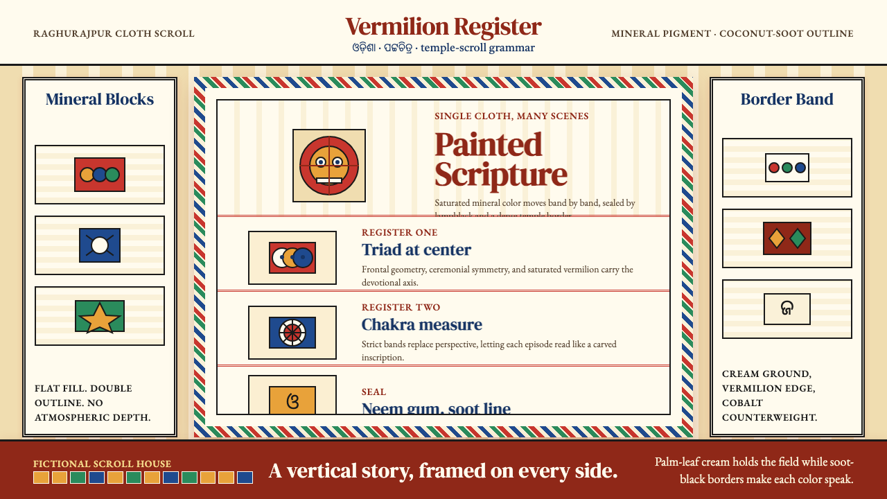 Pattachitra (Odisha Temple Scroll)Devotion as dense color. Vermilion bands and soot-black outlines stack like a…浓色即敬献:朱砂横带与烟黑描线层叠成寺庙长卷。
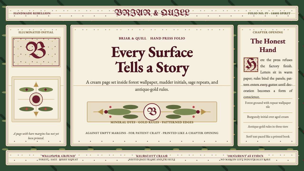 William Morris Arts & CraftsOrnament is the argument. Forest green wallpaper frames cream pages, gold rul…繁饰即立场。森林绿墙纸、米色书页、金线和衬线字构成手工感。