What is Art Nouveau (Mucha)?什么是 Art Nouveau (Mucha)?
Mucha's whiplash arabesques transformed the theatre poster into a garden of botanical halos, muted lithographic warmth, and sinuous line that made ornament inseparable from meaning.穆夏的鞭线式花纹将剧院海报变成了植物光环与柔和石版印刷暖意交织的花园,让装饰与意义浑然一体。
Art Nouveau (Mucha) in briefArt Nouveau (Mucha) 速览
Art Nouveau (Mucha) is the graphic strand of the broader Art Nouveau movement, centred on the poster and decorative print work of the Czech-French artist Alphonse Mucha. Where Art Nouveau's architectural branch expressed itself in ironwork balconies and curved façades, Mucha's graphic language translated the same organic sensibility into a two-dimensional vocabulary of sinuous line, botanical ornament, warm ground tones recalling lithograph paper, and feminine figures encircled by halos of flowers and stylized foliage.新艺术运动(穆夏)是广泛的新艺术运动在平面领域的代表分支,以捷克裔法国艺术家阿尔丰斯·穆夏的海报与装饰版画为核心。新艺术运动的建筑分支以铁艺阳台和弧形立面为表达媒介,而穆夏的平面语言则将同样的有机感性转化为二维词汇:蜿蜒的线条、植物装饰、令人联想到石版画纸张的温暖底色,以及被花卉与程式化叶饰光环所环绕的女性形象。
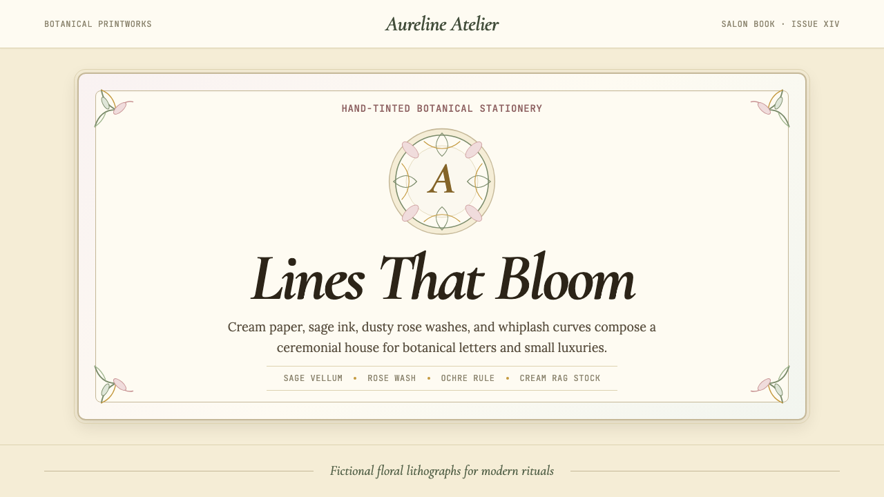
The defining quality of the Mucha aesthetic is the integration of figure and frame. In his celebrated posters for the actress Sarah Bernhardt — beginning with the Gismonda lithograph of 1894 — the border is not a container imposed on an image but an organic extension of the image itself: vines curl into lettering, hair dissolves into petal patterns, and the decorative roundel at the top echoes the form of the figure below. Every element is motivated by the same flowing logic, so that the eye moves through the composition as through a garden rather than as across a grid.穆夏美学的核心品质在于人物与画框的融合。在他为女演员莎拉·伯恩哈特创作的著名海报中——从1894年的《吉斯蒙达》石版画开始——边框并非强加于图像的容器,而是图像本身的有机延伸:藤蔓蜿蜒入文字之中,发丝融化为花瓣图案,顶部的圆形装饰呼应着下方人物的形态。每一个元素都被同一种流动逻辑所驱动,使观者的目光穿越画面如同漫步花园,而非扫视网格。
Colour in this tradition is muted and warm — the palette of aged lithograph prints, not fresh paint. Creamy ivory grounds, sage greens, dusty roses, soft ochres, and muted golds dominate. Saturated primaries appear only as small accents; the overall impression is of harmonious, slightly faded richness rather than contrast or drama. This palette was partly a technical consequence of chromolithography's layered ink process and partly a deliberate aesthetic choice that aligned with Art Nouveau's preference for nature over industry.这一传统中的色彩是柔和而温暖的——那是石版印刷品岁月沉淀后的色调,而非新鲜颜料的鲜亮。奶油色底面、灰绿、灰玫瑰、柔和赭黄与暗金主导一切。高饱和的纯色只作为小面积点缀出现;整体印象是和谐的、略带褪色意味的丰富感,而非对比或戏剧张力。这种色板在一定程度上是彩色石版印刷分层叠印工艺的技术产物,也是有意为之的审美选择——契合新艺术运动崇尚自然而非工业的倾向。
See the Art Nouveau (Mucha) design system查看 Art Nouveau (Mucha) 完整设计系统
Where does Art Nouveau (Mucha) come from?Art Nouveau (Mucha) 从何而来?
Art Nouveau emerged in the late 1880s and reached its peak between roughly 1890 and 1910, flowering simultaneously across Paris, Brussels, Vienna, Prague, and Glasgow. Its immediate context was a reaction against Victorian historicism — the practice of borrowing Gothic, Renaissance, or classical ornament without organic justification — and against the dehumanizing aesthetics of early industrial production. The movement drew on a diverse set of precedents: Japanese woodblock prints (whose flat colour areas and asymmetric compositions entered Europe through the Japonisme craze of the 1860s and 1870s), the British Arts and Crafts movement's insistence on the unity of fine and applied art, and the Symbolist painters' interest in mood, mythology, and the unconscious.新艺术运动在1880年代末兴起,约在1890至1910年间达到顶峰,同时在巴黎、布鲁塞尔、维也纳、布拉格和格拉斯哥各地开花。其直接背景是对维多利亚时代历史主义的反动——那种不假思索地借用哥特式、文艺复兴或古典装饰的惯例——以及对早期工业生产去人性化美学的抵抗。该运动汲取了多元的先驱资源:日本浮世绘版画(其平涂色块与非对称构图在1860至70年代的「日本主义」热潮中传入欧洲)、英国工艺美术运动对纯艺术与应用艺术统一的坚持,以及象征主义画家对情绪、神话与无意识的关注。
Alphonse Mucha arrived in Paris from Moravia in 1887, studying painting and struggling for recognition. The turning point came on Christmas Eve 1894, when the printing house Lemercier was urgently seeking an artist to produce a poster for Gismonda, a new play starring Sarah Bernhardt at the Théâtre de la Renaissance. Most staff were on holiday; Mucha, working nearby, accepted the commission and delivered a design unlike anything then current in Parisian print culture. The poster was tall and narrow in a Byzantine format, the figure depicted nearly life-size, the ornament drawn from Byzantine mosaics and Slavic folk patterns, the palette deliberately muted against the city's prevailing taste for loud chromolithographic color. Bernhardt was so pleased she offered Mucha a six-year exclusive contract. He became, almost overnight, the defining visual voice of the Belle Époque.阿尔丰斯·穆夏于1887年从摩拉维亚来到巴黎,一边学习绘画一边为生计奔波。转折点来自1894年平安夜:印刷所勒梅西耶正急需一位艺术家为莎拉·伯恩哈特在文艺复兴剧院主演的新剧《吉斯蒙达》制作海报,大多数工作人员正在休假,在附近工作的穆夏接下委托,交出了一件与当时巴黎印刷文化截然不同的设计。海报采用拜占庭式的高窄格式,人物几乎以真人比例呈现,装饰取材于拜占庭马赛克与斯拉夫民间图案,色调刻意柔和,与这座城市当时盛行的鲜艳彩色石版印刷趣味形成对照。伯恩哈特欣喜若狂,当即为穆夏提供了六年独家合同。他几乎在一夜之间成为美好年代最具代表性的视觉声音。
The broader Art Nouveau movement was simultaneously developing in architecture and decorative arts. In Brussels, Victor Horta was completing the Hôtel Tassel (1893), whose staircase ironwork traced the same whiplash curves that Mucha was drawing on poster paper. In Paris, Hector Guimard was designing the now-iconic Métro entrances — cast iron botanical fantasies that transported daily commuters through a threshold of ornamental growth. In Vienna, the Secession group formed in 1897 around Gustav Klimt, producing work whose gilded flatness and erotic symbolism pushed the movement's decorative ambition toward obsession. In Glasgow, Charles Rennie Mackintosh and the so-called Glasgow Four developed a more rectilinear variant that would later influence Art Deco and even proto-modernism.更广泛的新艺术运动同时在建筑与装饰艺术领域展开。在布鲁塞尔,维克多·霍尔塔正在完工的塔塞尔公馆(1893年)的楼梯铁艺,勾勒出与穆夏在海报纸上绘制的同样的鞭线曲线。在巴黎,埃克托尔·吉马尔正在设计如今标志性的地铁入口——铸铁植物幻想将每日通勤者带入一道装饰性生长的门槛。在维也纳,围绕古斯塔夫·克林姆于1897年组建的分离派,创作了镀金平涂与情欲象征主义的作品,将该运动的装饰野心推向痴迷的边界。在格拉斯哥,查尔斯·雷尼·麦金托什与所谓的「格拉斯哥四人组」发展出一种更具几何感的变体,后来影响了装饰艺术运动乃至早期现代主义。
The movement's decline was swift and complete. By 1910, avant-garde taste was shifting toward Cubism and early abstraction; the sinuous ornament that had seemed radical in 1895 read, a decade later, as over-ripe and sentimental. The First World War accelerated the change: post-war cultures demanded efficiency, directness, and a break from pre-war luxury. Art Deco, which emerged in the 1920s, retained some of Art Nouveau's love of surface richness but replaced organic curves with streamlined geometry. Art Nouveau was largely dismissed by modernist critics for most of the mid-twentieth century; its rehabilitation came with the countercultural movements of the 1960s, when the psychedelic poster revival found in Mucha's arabesques an ideal visual language for altered perception and organic consciousness.该运动的衰落迅速而彻底。1910年前后,先锋趣味已向立体主义和早期抽象主义转移;1895年看来激进的蜿蜒装饰,十年后却显得过熟而伤感。第一次世界大战加速了这一转变:战后文化渴求效率、直接与对战前奢华的决裂。1920年代兴起的装饰艺术保留了新艺术运动对表面丰富性的热爱,却以流线型几何取代了有机曲线。在二十世纪中叶的大部分时间里,新艺术运动被现代主义批评者基本摒弃;其复权来自1960年代的反文化运动——迷幻海报的复兴在穆夏的阿拉伯花纹中找到了表达感官转变与有机意识的理想视觉语言。
What defines the Art Nouveau (Mucha) look?Art Nouveau (Mucha) 的视觉特征是什么?
Whiplash Line鞭线曲线
The signature mark of the Mucha style is the long, elastic S-curve — called the whiplash line — that appears everywhere from hair and drapery to botanical stems and decorative borders. Unlike the mechanical curve of a compass or the geometric arc of Art Deco, the whiplash line is hand-drawn in quality: it accelerates and tapers, doubles back and intertwines. It suggests growth, movement, and organic energy rather than engineered precision. In layout terms, this means that rigid horizontal or vertical axes are avoided in favor of diagonal flow and interlocking curves that guide the eye continuously through the composition.穆夏风格的标志性笔触是长而富有弹性的S形曲线——即「鞭线」——它出现在发丝、褶皱、植物茎蔓与装饰边框的每一处。与圆规的机械弧线或装饰艺术的几何弧度不同,鞭线具有手绘的质感:它加速、收细、回折、交缠。它所传递的是生长、运动与有机能量,而非工程精度。在版面层面,这意味着刻板的水平或垂直轴线被对角流动与相互咬合的曲线所取代,引导目光在构图中持续游走。
Botanical Halo and Frame植物光环与有机画框
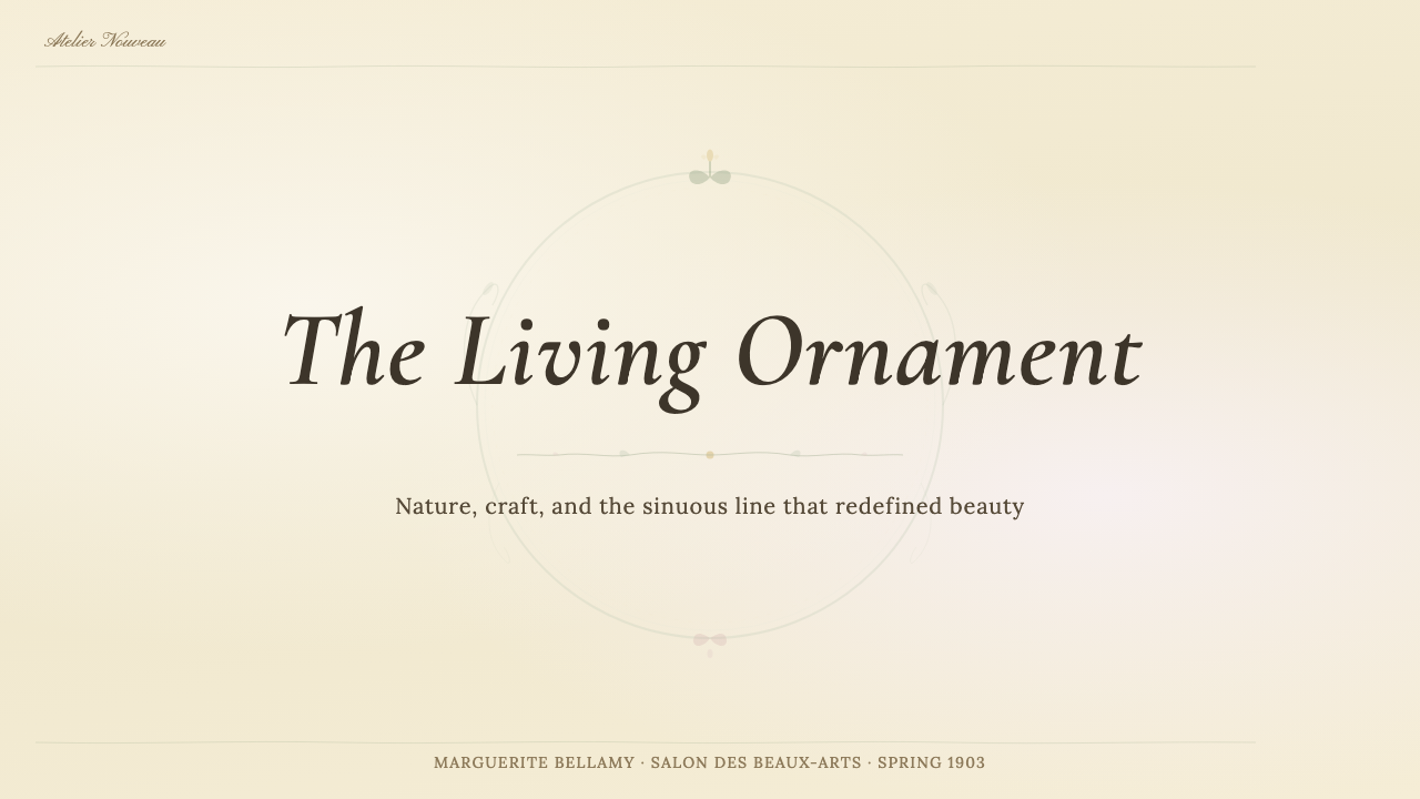
Mucha habitually enclosed his central figures within circular or arched halos composed of flowers, leaves, and interlacing stems — a device borrowed from Byzantine icon painting and recast in organic form. The frame is not a neutral boundary but an active element that participates in the composition: vines reach inward, flowers orient toward the figure, and the ornamental roundel at the top of a poster functions as a kind of visual crown. This integration of figure and surround means there is no dead space; every margin is inhabited by purposeful organic form.穆夏习惯性地将中心人物包裹在由花卉、叶片与交缠茎蔓构成的圆形或拱形光环中——这一手法借鉴自拜占庭圣像画,并以有机形式重新诠释。画框并非中立的边界,而是积极参与构图的元素:藤蔓向内伸展,花朵朝向人物,海报顶部的圆形装饰起到视觉皇冠的作用。人物与周围环境的这种融合意味着没有死角空间:每处边缘都被有目的的有机形态所填充。
Muted Lithographic Palette柔和的石版印刷色调
The colour palette draws directly from the visual character of chromolithographic printing as practiced in the 1890s: warm ivory grounds, muted sage and moss greens, dusty rose and blush, soft ochres and ambers, and desaturated golds. These are not clean, bright hues but colours that appear to have been filtered through time — slightly aged, slightly powdery, slightly warm. Saturated contrast is used sparingly, typically only to draw attention to a single focal element such as a jewel, a title letterform, or an eye. The overall effect is of unified tonal warmth rather than chromatic drama.色板直接取材于1890年代彩色石版印刷的视觉特质:温暖的象牙白底色,柔和的灰绿与苔绿,灰玫瑰与浅粉,柔和的赭黄与琥珀,以及去饱和的暗金。这些并非干净明亮的色相,而是仿佛经过时间过滤的色彩——略带陈旧感、略显粉质、略带暖意。高饱和的对比只被节制地用于吸引对单一焦点元素的注意,如宝石、标题字形或眼睛。整体效果是统一的色调温暖,而非色彩上的戏剧感。
Ornamental Typography装饰性排印
Lettering in the Mucha tradition is itself an ornamental element, designed to coexist with the botanical frame rather than sit apart from it. Letterforms tend toward rounded, flowing serifs or hand-drawn caps in which strokes taper and swell in the same rhythm as the surrounding line work. Text is often arched, curved, or set along a path defined by the composition's organic flow. There is no sharp separation between image and text zones — type grows out of the decorative field the way a flower grows from a stem.穆夏传统中的字体本身就是装饰元素,被设计为与植物画框共存,而非独立于其外。字形倾向于圆润流动的衬线体或手绘大写字母,其笔画粗细变化与周围线条的节奏一致——粗细收放。文字常常呈弧形、曲线排列,或沿构图有机流动所界定的路径设置。图像区域与文字区域之间没有清晰的分割——字体从装饰场域中生长而出,如同花朵生自茎蔓。
Feminine Figuration女性形象
The central figure in most Mucha compositions is a woman in a state of repose or gentle movement, rendered with elongated proportions, flowing drapery, and abundant hair that dissolves into the surrounding ornament. This is not mere convention but a structural choice: the female form provided the long vertical axis that his tall, narrow poster format demanded, and the flowing hair and loose robes gave him the organic line material that the decorative system required. The figure is idealized but not cold — there is a warmth and accessibility to Mucha's figuration that distinguishes it from the more unsettling femmes fatales of other Symbolist artists.穆夏大多数构图的中心人物是处于静止或轻缓运动中的女性,以修长的比例、流动的褶皱和丰盈的发丝呈现,发丝融化入周围的装饰之中。这不仅是惯例,更是结构性选择:女性形象提供了其高窄海报格式所需的竖向主轴,而飘动的发丝与宽松的袍服则为装饰系统提供了所需的有机线条素材。人物是理想化的,但并不冷漠——穆夏形象所具有的温暖与亲和力,将其与其他象征主义艺术家更令人不安的蛇蝎美人区别开来。
Surface Pattern and Mosaic Detail表面图案与马赛克细节
Mucha filled the ornamental zones of his compositions with dense, precise patterning derived from Byzantine mosaic, Slavic folk embroidery, and Art Nouveau's general fascination with the decorative surface. Backgrounds are rarely plain; they are filled with low-contrast geometric grids, repeating floral cells, or delicate stippled textures that give depth without competing with the primary figuration. This layered approach to surface — figure over ornamental halo over patterned ground — creates a richness of visual depth that chromolithography could render in multiple ink passes, and that digital work must approach through careful tonal layering.穆夏用源自拜占庭马赛克、斯拉夫民间刺绣以及新艺术运动对装饰表面普遍迷恋的密集精准图案,填充构图的装饰区域。背景很少是纯粹素净的:低对比度的几何网格、重复的花卉单元或细腻的点画肌理为画面带来深度,同时又不与主体形象产生竞争。这种对表面的分层处理——人物覆于装饰光环之上,光环覆于图案底面之上——创造出视觉深度的丰富性,彩色石版印刷可以通过多遍叠印实现,数字作品则须通过细心的色调分层来接近这一效果。
Integration of Text and Image文字与图像的融合
One of the most radical aspects of Mucha's poster design — and one of the most instructive for contemporary designers — is the complete refusal to treat text as a separate layer placed over an image. In his work, title lettering, actor's name, venue, and date are integrated into the pictorial structure. Text zones are prepared by the composition itself: an arch of flowers creates a natural space for a title; a band of mosaic pattern forms a legible ground for credits. This integration makes the information hierarchy feel inevitable rather than imposed.穆夏海报设计中最具革命性的方面之一——也是对当代设计师最具启发性的一点——是对将文字视为叠加在图像之上的独立图层这一惯例的彻底拒绝。在他的作品中,标题字体、演员姓名、演出场馆与日期被整合进图像结构之中。文字区域由构图本身预先准备好:一拱花朵为标题创造了天然空间;一带马赛克图案为制作信息提供了易读的底面。这种融合使信息层级感觉是顺理成章的,而非强加于上的。
See the Art Nouveau (Mucha) design system查看 Art Nouveau (Mucha) 完整设计系统
Who shaped Art Nouveau (Mucha)?谁塑造了 Art Nouveau (Mucha)?
Born in Moravia in 1860, Mucha trained as a theatre scene painter before arriving in Paris in 1887. His overnight fame after the Gismonda poster of 1894 led to an extraordinary decade of poster commissions — for Bernhardt's theatrical seasons, for the cigarette paper brand Job, for the biscuit maker Lefèvre-Utile, for champagne houses and travel companies — that defined the visual culture of the Belle Époque. In later life he became deeply committed to Slavic nationalism and devoted two decades to the Slav Epic, a cycle of twenty enormous history paintings celebrating Slavic civilization. He died in Prague in 1939, shortly after the Nazi occupation of Czechoslovakia.穆夏于1860年生于摩拉维亚,以剧场布景画师身份接受训练,1887年来到巴黎。1894年《吉斯蒙达》海报一夜成名,带来了接连不断的委托——为伯恩哈特的剧院演出季,为卷烟纸品牌Job,为饼干制造商勒费夫尔-于蒂勒,为香槟酒庄与旅行公司——共同界定了美好年代的视觉文化。晚年,他对斯拉夫民族主义产生了深厚的情感,将二十年时光献给《斯拉夫史诗》——一组由二十幅巨型历史画构成的系列作品,讴歌斯拉夫文明。他于1939年在布拉格去世,时值纳粹占领捷克斯洛伐克后不久。
The French architect Guimard is best known for the Paris Métro entrances he designed between 1900 and 1913 — cast-iron structures in the form of giant organic growths, their lamp standards resembling insect antennae, their canopies suggesting botanical forms. These entrances brought Art Nouveau directly into the experience of daily urban life and demonstrated that the movement's ornamental logic was not limited to flat print work but could be realized at architectural scale. Several original Guimard entrances survive in Paris; others were exported to museums in New York and Montreal.法国建筑师吉马尔以其在1900至1913年间设计的巴黎地铁入口最为人所知——铸铁结构呈巨型有机生长之态,灯柱如昆虫触角,遮篷宛如植物形态。这些入口将新艺术运动直接带入日常城市生活的体验,证明该运动的装饰逻辑不局限于平面印刷,而是可以在建筑尺度上实现。数个原始吉马尔地铁入口至今仍存于巴黎;另有一些被移至纽约和蒙特利尔的博物馆。
The Viennese painter Klimt was the central figure of the Vienna Secession, a group of artists who broke from the conservative Künstlerhaus in 1897 to pursue a more radical decorative ambition. Klimt's mature work — The Kiss, Portrait of Adele Bloch-Bauer I, the Beethoven Frieze — pushed Art Nouveau's love of surface pattern to an extreme: figures are embedded in fields of gilded geometric ornament so dense that the boundary between person and decoration dissolves. His use of gold leaf, Byzantine mosaic reference, and Symbolist eroticism influenced generations of decorative artists and connects directly to the same sources Mucha was drawing from in Paris.维也纳画家克林姆是维也纳分离派的核心人物——这一艺术家群体于1897年从保守的艺术家协会中分裂出来,追求更为激进的装饰野心。克林姆的成熟作品——《吻》、《阿黛尔·布洛赫-鲍尔肖像一》、《贝多芬横饰带》——将新艺术运动对表面图案的热爱推向极致:人物被嵌入如此密集的镀金几何装饰场域之中,以至于人与装饰之间的界限消融。他对金箔、拜占庭马赛克参照与象征主义情欲的运用影响了几代装饰艺术家,也与穆夏在巴黎所汲取的同一源泉直接相连。
The English illustrator Beardsley was Art Nouveau's most radical graphic voice in Britain, producing black-and-white ink illustrations of startling psychological intensity for publications including The Yellow Book and Oscar Wilde's Salomé. His work shares with Mucha the organic line, the decorative flatness, and the integration of text and image, but it diverges sharply in mood: where Mucha is warm and accessible, Beardsley is ironic, transgressive, and frequently disturbing. His short career — he died of tuberculosis in 1898 at twenty-five — compressed an enormous influence into a very small body of work.英国插图画家比亚兹莱是新艺术运动在英国最为激进的平面声音,他为《黄皮书》和奥斯卡·王尔德的《莎乐美》等出版物创作了心理张力令人震惊的黑白墨水插图。他的作品与穆夏共享有机线条、装饰平面性以及文字与图像的融合,但在气质上截然相异:穆夏是温暖而亲和的,比亚兹莱则是讽刺的、越轨的,且常常令人不安。他短暂的职业生涯——1898年因肺结核去世时年仅二十五岁——将巨大的影响力压缩进极少量的作品之中。
Though not a visual artist, the French actress Sarah Bernhardt was the human catalyst for Mucha's career and for the Art Nouveau poster as a cultural form. Her requirement that Mucha be given exclusive control over the visual identity of her theatrical seasons meant that Paris was plastered for a decade with a consistent, evolving graphic language centred on his ornamental style. Bernhardt was also an astute businesswoman who understood that the poster was not merely advertising but a cultural artefact that audiences would collect, display, and discuss — a recognition that elevated the graphic poster to the status of art.尽管并非视觉艺术家,法国女演员莎拉·伯恩哈特却是穆夏职业生涯以及新艺术运动海报作为文化形式的人文催化剂。她要求穆夏对其剧院演出季的视觉形象拥有独家掌控权,这意味着巴黎在整整十年间都被以他的装饰风格为核心的一致而持续演进的平面语言所铺满。伯恩哈特也是一位精明的商人,她深知海报不仅仅是广告,而是观众会收藏、展示与谈论的文化制品——正是这一认识将平面海报提升至艺术的地位。
How do you use Art Nouveau (Mucha) today?今天怎么用 Art Nouveau (Mucha)?
Art Nouveau (Mucha) is one of the most atmospherically distinctive historical styles available to contemporary designers, but it is also one of the easiest to apply superficially and one of the hardest to apply authentically. The temptation is to add a floral border and call it done. Authentic application requires understanding the system's underlying logic: that figure and frame are not separate layers but a single integrated composition, that the palette is warm and muted rather than bright, and that every ornamental element is motivated by the same organic line rhythm.新艺术运动(穆夏)是当代设计师可以调用的大气感最为独特的历史风格之一,但也是最容易流于表面、最难做到真正到位的风格之一。诱惑在于添加一个花卉边框便宣告完成。真正的应用需要理解这套系统的内在逻辑:人物与画框不是独立的图层,而是一个统一整合的构图;色板是温暖而柔和的,而非明亮的;每一个装饰元素都由同一种有机线条节奏所驱动。
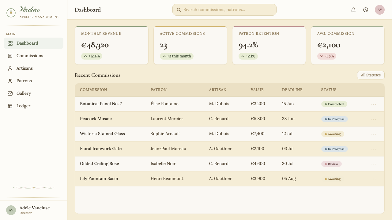
For presentation slides, the style is most powerful on cover and section divider pages. A cover benefits from the full Mucha compositional logic: a central illustration or photograph treated with a warm-toned overlay, surrounded by a botanical frame that integrates with the title lettering. Section dividers can use the arched halo motif — a large botanical roundel at the top, text set in a flowing serif below. Content slides should be lighter in ornamental density: a subtle corner flourish, a botanical ruled line, and a warm cream ground are sufficient to maintain stylistic continuity without overwhelming the data. Data slides work best when chart frames echo the organic line of the broader system — soft-edged panels rather than hard rectangular boxes.对于演示文稿,这种风格在封面与章节分隔页上最为有力。封面受益于完整的穆夏构图逻辑:一幅中心插图或经暖调处理的照片,被与标题字体融合的植物画框所环绕。章节分隔页可以使用拱形光环母题——顶部一个大型植物圆形装饰,文字以流动衬线体排于其下。内容页面应在装饰密度上保持克制:角落处的细小花饰、一条植物式分割线与温暖的奶油色底面,足以维持风格延续,而不至于淹没数据。数据页面最适合让图表框架呼应整体系统的有机线条——软边面板而非硬矩形盒子。
For web interfaces, the style suits editorial platforms, cultural institutions, luxury goods, beauty brands, and any product where richness and craftsmanship are core values. A dashboard in this style replaces hard-edged card components with softly bordered panels, uses a warm off-white ground rather than stark white or dark grey, and introduces botanical motif elements as decorative dividers or section markers. Pricing pages can use the botanical halo as a highlight device around a featured tier. Navigation elements benefit from flowing serif typography and subtle ornamental separators between items. The critical discipline is restraint: one or two ornamental moments per screen, not every element decorated.对于网页界面,这种风格适合编辑平台、文化机构、奢侈品、美妆品牌,以及任何以丰富感与工艺性为核心价值的产品。这种风格下的仪表板以柔和边框的面板取代硬边卡片组件,使用温暖的米白色底面而非纯白或深灰,并引入植物母题元素作为装饰性分隔线或区域标记。定价页面可以将植物光环用作围绕特色定价层的高亮装置。导航元素受益于流动衬线排印与条目之间细腻的装饰性分隔符。关键的约束在于克制:每个屏幕一两处装饰性亮点,而非每个元素都装饰。
For editorial and marketing work, Mucha's compositional logic translates directly to high-end magazine layouts, event posters, packaging, and brand identity systems for artisanal or culturally positioned products. An event poster can follow the original Mucha format directly — tall and narrow, central figure, botanical arch, title integrated into the frame. Editorial spreads work well with a warm-toned photographic treatment on one page and a botanical ornamental frame containing the article title and standfirst on the other. Marketing emails and social cards can use a simplified version of the palette — ivory ground, sage green accent, a single ornamental flourish — without attempting the full compositional complexity.对于编辑与营销内容,穆夏的构图逻辑直接转化为高端杂志版面、活动海报、包装以及手工艺品或具有文化定位的产品品牌识别系统。活动海报可以直接遵循原始穆夏格式——高窄、中心人物、植物拱形、标题融入画框。编辑跨页适合一页采用暖调摄影处理,另一页以植物装饰框容纳文章标题与引言。营销邮件与社交媒体卡片可以使用简化版色板——象牙白底、灰绿点缀、单一装饰花饰——而无需尝试完整的构图复杂度。
A common mistake when applying this style is treating the palette as an opportunity for colour saturation. The defining quality of the Mucha palette is its restraint: colours are muted, slightly grayed, slightly aged. Introducing bright, clean hues — vivid greens, sharp pinks, bold purples — immediately breaks the lithographic illusion that the palette is designed to evoke. A related mistake is applying ornament indiscriminately: Art Nouveau ornament is not a texture to be tiled but a compositional device that must be motivated by the specific structure of each layout. Borders that do not relate to the central image, botanical motifs scattered at random, and decorative type that conflicts with the figuration are all signs of superficial application. The discipline of the style is integration, not accumulation.应用这种风格时最常见的错误是将色板理解为色彩饱和度的许可。穆夏色板的核心品质在于克制:色彩是柔和的、略带灰调的、略显陈旧感的。引入明亮干净的色相——鲜艳的绿、锐利的粉、大胆的紫——立刻打破色板意在唤起的石版印刷幻觉。另一个相关错误是不加辨别地使用装饰:新艺术运动的装饰不是可以平铺的纹理,而是必须由每个版面的具体结构所驱动的构图装置。与中心图像毫无关联的边框、随意散布的植物母题、与形象构图相冲突的装饰性字体,都是肤浅应用的迹象。这种风格的约束在于整合,而非堆砌。
See the Art Nouveau (Mucha) design system查看 Art Nouveau (Mucha) 完整设计系统
Art Nouveau (Mucha) — FAQArt Nouveau (Mucha) · 常见问题
Is Art Nouveau (Mucha) the same as Art Deco?新艺术运动(穆夏)和装饰艺术是同一回事吗?
They are historically sequential but visually and philosophically opposed. Art Nouveau (roughly 1890–1910) is characterized by organic, sinuous curves derived from natural forms, warm and muted palettes, and the integration of ornament with structure. Art Deco (roughly 1920–1940) is characterized by streamlined geometric forms, high-contrast bold palettes, and the separation of decorative surface from structural logic. Art Deco emerged partly as a reaction against Art Nouveau's perceived excess and sentimentality, replacing biological curves with machine-age geometry. The two styles are occasionally confused because both are richly ornamental and both have strong associations with luxury and the decorative arts — but their underlying visual logic is fundamentally different.两者在历史上前后相继,但在视觉与哲学上截然对立。新艺术运动(约1890至1910年)以源自自然形态的有机蜿蜒曲线、温暖柔和的色板,以及装饰与结构的融合为特征。装饰艺术(约1920至1940年)则以流线型几何形态、高对比度的大胆色板,以及装饰表面与结构逻辑的分离为特征。装饰艺术部分作为对新艺术运动被认为过度和感伤的反动而兴起,以机器时代的几何取代了生物曲线。两种风格偶尔被混淆,因为两者都装饰丰富,都与奢华和装饰艺术有强烈关联——但其内在视觉逻辑从根本上是不同的。
Can Art Nouveau (Mucha) work in digital interfaces, or is it only for print?新艺术运动(穆夏)能用于数字界面吗,还是仅适合印刷?
The style originated in print and its visual logic — botanical frames, ornamental borders, integrated lettering — is most natural in static compositions. That said, it translates well to digital contexts when applied with appropriate restraint. The key adaptation is density: a Mucha poster can sustain extremely high ornamental density because it is read at length and close range; a web page or app screen is scanned at speed and must preserve large areas of calm ground to remain functional. In practice, this means using botanical ornament as accent rather than as overall texture — a decorative header illustration, a botanical divider, a warm-toned background — while keeping the majority of the interface clean. Motion can be used sparingly: a slow unfurling vine animation on a loading screen, for example, is appropriate; ornament that animates constantly is not.这种风格起源于印刷,其视觉逻辑——植物画框、装饰边框、融合字体——在静态构图中最为自然。尽管如此,在适当克制地应用时,它能很好地转化到数字语境中。关键的适配在于密度:穆夏的海报能承受极高的装饰密度,因为它是在较近距离被仔细阅读的;而网页或应用界面是被快速扫视的,必须保留大量平静底面才能维持功能性。在实践中,这意味着将植物装饰用作点缀而非整体纹理——一幅装饰性标题插图、一条植物分割线、一个暖调背景——同时保持界面大部分区域的简洁。动效可以节制地使用:例如加载页面上缓缓展开的藤蔓动画是恰当的;持续运动的装饰则不然。
How does the Mucha palette differ from a generic vintage palette?穆夏色板与普通复古色板有何不同?
Generic vintage palettes tend toward faded, desaturated versions of any hue — a kind of uniform dustiness applied across the board. The Mucha palette is more specific: it is warm-biased (ochres, ambers, ivories, warm greens), lithographic in character (layered and slightly chalky rather than uniformly faded), and organized around tonal harmony rather than contrast. Sage green and dusty rose appear repeatedly because they were favored chromolithographic pigments, not because they represent a generic retro sensibility. The palette also allows for moments of slightly higher saturation — a deeper gold, a richer rose — used to draw attention to specific focal points. The discipline is in keeping these accents warm rather than cool, and muted relative to their surroundings rather than bright.普通复古色板倾向于任何色相的褪色去饱和版本——一种均匀施加于整体的尘埃感。穆夏色板则更为具体:它偏向暖色调(赭黄、琥珀、象牙白、暖绿),具有石版印刷特质(分层叠加、略带粉质感,而非均匀褪色),并以色调和谐而非对比为组织原则。灰绿与灰玫瑰反复出现,是因为它们是受欢迎的彩色石版印刷颜料,而非代表一种通用的复古感性。色板也允许略高饱和度的局部出现——更深的金色,更丰富的玫瑰色——用于吸引对特定焦点的注意。约束在于保持这些点缀色的暖调而非冷调,以及相对于周围环境的柔和而非明亮。
Is this style appropriate for brands that want to appear modern and forward-looking?这种风格适合希望呈现现代感和前瞻性的品牌吗?
Not straightforwardly. Art Nouveau (Mucha) carries strong historical associations — the Belle Époque, fin-de-siècle Paris, the theatre world of the 1890s — and these associations are part of its appeal in the right contexts: heritage brands, cultural institutions, artisanal producers, luxury goods, and products that want to position themselves as rare and handcrafted. For brands that need to communicate innovation, speed, technological capability, or disruptive modernity, the style is a poor fit. The exception is when a brand deliberately wants to contrast old-world craft against high-tech context — a fine perfume sold through a modern e-commerce platform, for example — in which case the style's nostalgic richness can read as a deliberate statement of values rather than an accident of taste.并不直接适合。新艺术运动(穆夏)带有强烈的历史联想——美好年代、世纪末的巴黎、1890年代的剧院世界——而这些联想在恰当的语境中正是其吸引力所在:传统品牌、文化机构、手工艺生产者、奢侈品,以及希望将自身定位为稀有与手工制作的产品。对于需要传达创新、速度、技术能力或颠覆性现代感的品牌而言,这种风格并不匹配。例外情况是当品牌刻意希望以旧世界工艺对照高科技语境时——例如通过现代电商平台销售的高级香水——在这种情况下,这种风格的怀旧丰富感可以被解读为有意为之的价值陈述,而非趣味的偶然。
What is the biggest technical challenge when reproducing this style digitally?以数字方式复现这种风格时最大的技术挑战是什么?
The hardest thing to reproduce is the layered, slightly imperfect quality of chromolithographic printing — the sense that colours have been built up through successive ink passes, each slightly misregistered, each adding warmth and depth rather than pure additive brightness. Digital rendering defaults to clean, precisely layered colour that reads as bright and synthetic rather than warm and aged. The practical approach is to work with slightly warm-biased colours rather than neutral hues, to avoid pure white grounds in favour of ivory or warm off-white, to introduce very subtle noise or grain to large flat colour areas, and to ensure that greens and roses have enough grey in them to read as muted rather than vivid. The organic line work — the whiplash curves and botanical forms — should feel hand-drawn in character even if executed digitally: variable stroke weight, slight irregularity, and tapering ends contribute more to authenticity than any amount of additional ornamental complexity.最难复现的是彩色石版印刷的分层、略带不完美的质感——那种色彩通过多遍叠印逐层累积的感觉,每一遍略有套印偏差,每一遍增添温暖与深度而非纯粹的叠加亮度。数字渲染默认产生干净、精确分层的色彩,呈现明亮而合成的感觉,而非温暖与陈旧感。实际的做法是:使用略带暖色偏向的色彩而非中性色相;以象牙白或温暖的米白取代纯白底面;为大面积纯色区域引入极为细腻的噪点或颗粒感;确保绿色与玫瑰色含有足够的灰调,使其呈现柔和而非鲜艳的效果。有机线条——鞭线曲线与植物形态——即使以数字方式执行,也应具有手绘的质感:可变的笔画粗细、轻微的不规则性、收细的线端,对于真实感的贡献远超任何数量上的额外装饰复杂度。
Related design styles相关设计风格
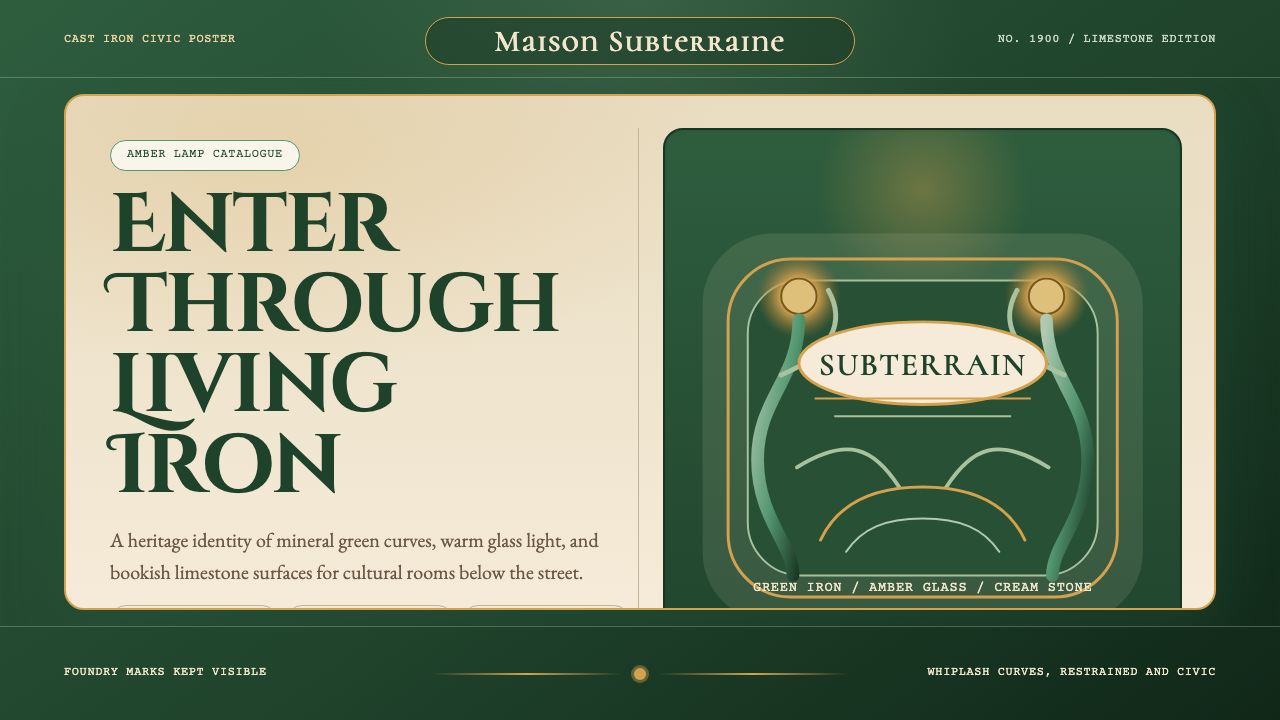 Paris Metro Guimard (1900)Civic sculpture, softly lit. Metro green ironwork frames amber glow and limes…公共雕塑般温暖:地铁绿铁线框住琥珀光与石灰岩字体。
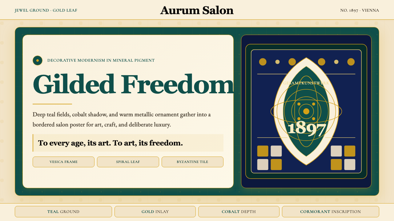 Wiener Secession (Klimt)Opulence made modern. Teal grounds, gold inlay, vesica frames and Cormorant d…奢华被现代化:深翠绿底、金箔嵌线、杏仁框与Cormorant标题。
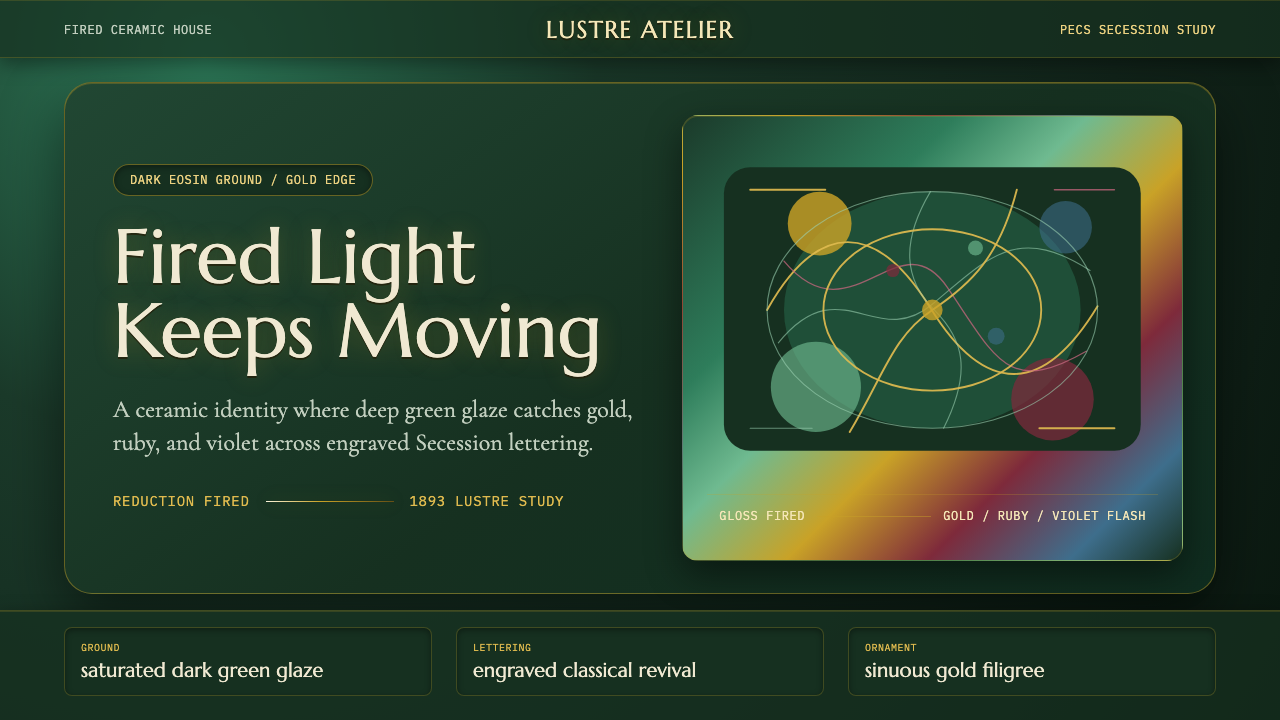 Zsolnay Eosin CeramicsGlaze becomes theater. Dark eosin green flashes gold, ruby, and violet throug…釉色即剧场:深绿釉地在分离派曲线中闪出金、红与紫。
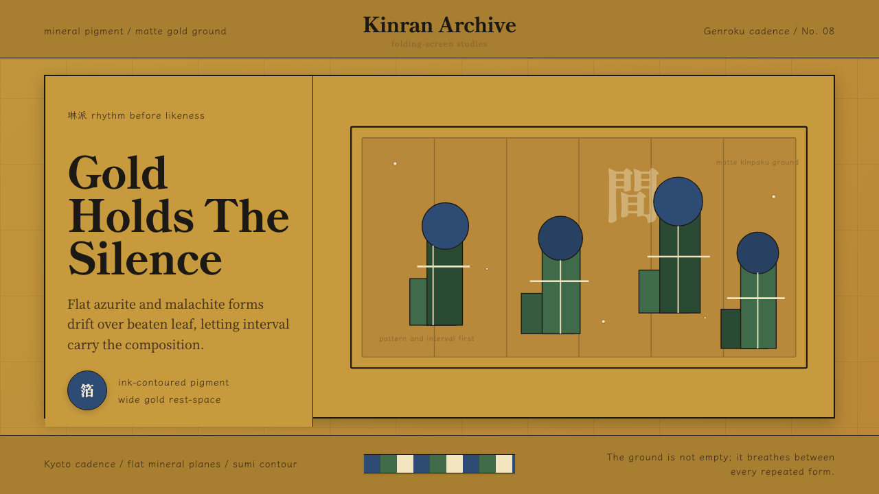 Edo Rinpa (Kōrin)Matte gold breathes. Azurite and malachite repeats float across inked screen…哑金会呼吸:群青与绿青反复漂浮在墨线屏风折面上。
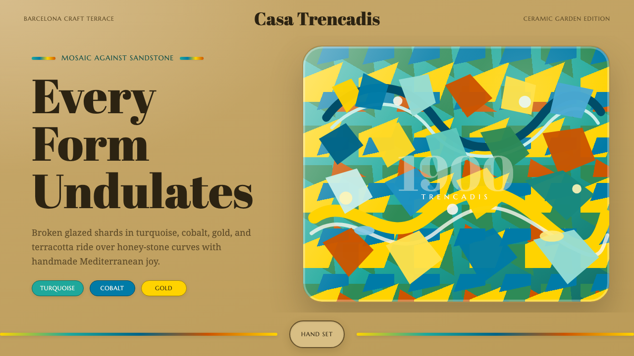 Gaudí ModernismeJoy made in shards. Turquoise, cobalt and gold tessellate over honey-sandston…碎瓷拼出欢愉:绿松石、钴蓝与金黄沿蜂蜜砂岩起伏。
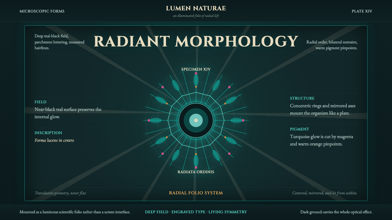 Haeckel KunstformenLuminous symmetry. Teal-black ground, Cinzel capitals, and radial turquoise s…发光的对称性。深青黑底、Cinzel 罗马大写和放射状青绿标本。