What is Wiener Secession (Klimt)?什么是 Wiener Secession (Klimt)?
Klimt and nineteen dissidents walked out of Vienna's art establishment in 1897 and returned with gold leaf, jewel-saturated color, and a new definition of beauty that fused Byzantine opulence with fin-de-siècle modernism.1897年,克里姆特与十九位艺术家脱离维也纳艺术建制,带着金箔、珠宝色调与拜占庭奢华和世纪末现代主义的全新融合归来,重新定义了美的边界。
Wiener Secession (Klimt) in briefWiener Secession (Klimt) 速览
The Wiener Secession — Vienna Secession — is the visual language born from one of European modernism's most dramatic institutional ruptures. Nineteen artists, led by painter Gustav Klimt, resigned from the conservative Künstlerhaus in April 1897 and formed their own exhibition society. Within a year they had built their own exhibition hall, launched their journal Ver Sacrum (Sacred Spring), and declared the founding principle that would define everything they made: 'To every age its art, to art its freedom.' What they created was neither pure historicism nor pure abstraction — it was a maximalist synthesis that took the opulence of Byzantine gold-leaf mosaics, the sinuous line of French Art Nouveau, and the geometric ambitions of nascent modernism and wove them into a single, unmistakable idiom.维也纳分离派是欧洲现代主义最戏剧性的体制决裂之一所诞生的视觉语言。1897年4月,以画家古斯塔夫·克里姆特为首的十九位艺术家集体辞去维也纳艺术家协会的成员资格,另立展览协会。不到一年,他们建起了自己的展览馆,创办了期刊《圣春》(Ver Sacrum),并宣告了一条定义此后一切创作的建立原则:「每个时代有其艺术,艺术有其自由。」他们所创造的,既非纯粹的历史主义,也非纯粹的抽象主义——而是一种极繁主义的综合体:取拜占庭金箔马赛克的奢华、法国新艺术运动的流动曲线,以及初生现代主义的几何野心,将三者编织成一套无可混淆的独特语汇。
Visually, Secession work at its peak — roughly the decade from 1898 to 1909, spanning Klimt's gold-phase paintings and the landmark Beethoven Frieze — is defined by the collision of two impulses that should not coexist but do. The first is intense decorative richness: surfaces dissolve into spiraling ornament, tessellated pattern, and fields of warm gold that flatten and dematerialize the picture plane. The second is modernist structural clarity: within that ornament, figures are composed with decisive, simplified silhouettes, spatial recession is suppressed rather than simulated, and negative space is treated as an active compositional force. The result is work that is simultaneously ancient and radical, overwhelming and precise.分离派视觉成就的顶峰——大约从1898年到1909年,跨越克里姆特的黄金时期绘画与里程碑式的《贝多芬横饰带》——由两种本不该共存却奇异共融的冲动所定义。其一是强烈的装饰丰富性:画面表面溶解于螺旋状纹饰、密铺图案与温暖金色之中,画面平面被拉平、去物质化。其二是现代主义的结构清晰性:在那些纹饰之中,人物以果断、简洁的轮廓构成,空间退深被压制而非模拟,负空间被当作积极的构图力量来处理。其结果是一种既古老又激进、既令人叹为观止又严谨精确的作品形态。
The Secession's contribution to design — as distinct from fine art — runs through the Wiener Werkstätte (Vienna Workshops), the craft and design cooperative co-founded by Koloman Moser and Josef Hoffmann in 1903. Where Klimt's paintings explored the full gilded extremity of the style, Werkstätte products translated its principles into furniture, textiles, jewelry, and graphic design. The Werkstätte aesthetic was somewhat more restrained than Klimt's painting — more geometric, less dense with ornament — but it retained the movement's core commitments: rich, non-naturalistic color; the elevation of applied craft to fine art status; and the belief that a beautifully designed spoon or postcard was as serious an artistic act as a canvas.分离派对设计领域——区别于纯艺术——的贡献,经由维也纳工坊(Wiener Werkstätte)得以延伸。这家由科罗曼·莫泽与约瑟夫·霍夫曼于1903年联合创立的工艺与设计合作社,将分离派的原则转译进家具、纺织品、珠宝与平面设计中。工坊美学相较克里姆特的绘画略为克制——更具几何感,纹饰密度较低——但保留了运动的核心承诺:丰富的非自然主义色彩;将应用工艺提升至纯艺术地位的信念;以及一把精心设计的汤匙或一张明信片与一幅画布同等严肃的艺术主张。
See the Wiener Secession (Klimt) design system查看 Wiener Secession (Klimt) 完整设计系统
Where does Wiener Secession (Klimt) come from?Wiener Secession (Klimt) 从何而来?
Vienna in the 1890s was the capital of a crumbling empire and one of the most intellectually charged cities in the world. Freud was developing psychoanalysis a few streets away from where Klimt was painting. Mahler was conducting at the Opera. Wittgenstein was growing up in a palace whose walls were hung with Klimt commissions. The Habsburg cultural establishment, however, remained locked in a conservative historicism — neoclassical, academic, and deeply suspicious of international modernist currents. It was this tension between an extraordinarily vital intellectual culture and a calcified official art world that produced the Secession's founding rupture.1890年代的维也纳是一个日暮帝国的首都,也是世界上思想最活跃的城市之一。弗洛伊德在克里姆特作画的几条街外发展他的精神分析理论;马勒在歌剧院指挥;维特根斯坦在挂满克里姆特委托作品的宫殿中成长。然而哈布斯堡文化建制依然深陷保守的历史主义——新古典学院派,对国际现代主义潮流充满戒备。正是这种极度充沛的思想文化与僵化的官方艺术世界之间的张力,催生了分离派的建立性决裂。
The immediate trigger was institutional. The Künstlerhaus, Vienna's dominant artists' association, controlled access to exhibitions and sales through a jury system that younger and more experimentally inclined artists found stifling. Klimt, already celebrated for his academic murals in the Kunsthistorisches Museum, led the resignation in April 1897. The founding members included painters, architects, and designers — a breadth that reflected the Secession's core ambition to dissolve the hierarchy between fine and applied art. Joseph Maria Olbrich designed the Secession Building, completed in 1898, whose gilded openwork dome — the 'golden cabbage' as Viennese wits called it — became an immediate architectural landmark and a physical manifesto of the movement's aesthetic.直接导火索是制度性的。维也纳艺术家协会通过评审委员会制度控制着展览与销售渠道,年轻的实验性艺术家对此深感窒息。克里姆特——彼时已因在艺术史博物馆绘制学院派壁画而享有盛名——于1897年4月领衔辞职。创始成员涵盖画家、建筑师与设计师,这种广度本身就折射出分离派的核心抱负:消解纯艺术与应用艺术之间的等级壁垒。约瑟夫·玛利亚·奥尔布里希设计了分离派展览馆,竣工于1898年。那座镂空鎏金穹顶——维也纳人戏称为「金色白菜」——即刻成为建筑地标,也是运动美学的实体宣言。
The journal Ver Sacrum, published from 1898 to 1903, was the Secession's primary vehicle for disseminating its ideas beyond Vienna. It featured contributions from across European modernism — including work influenced by the British Arts and Crafts movement and the Scottish designer Charles Rennie Mackintosh, whose rectilinear style made a strong impression on the Vienna exhibition of 1900 and helped push the Austrian version of Art Nouveau toward greater geometric discipline. The journal itself was a designed object: its format, typography, and ornamental borders were integral to its argument that design and editorial content were inseparable.《圣春》期刊(1898—1903年出版)是分离派向维也纳以外传播思想的主要媒介。它汇聚了欧洲现代主义各路力量的贡献——包括受英国工艺美术运动影响的作品,以及苏格兰设计师查尔斯·雷尼·麦金托什的作品。麦金托什直角化的风格在1900年的维也纳展览上留下深刻印象,帮助奥地利版本的新艺术运动走向更强的几何纪律。期刊本身就是一件设计作品:其版式、排印与纹饰边框与编辑内容相互一体,本身就是设计与内容不可分割这一主张的实证。
Klimt's gold phase, generally dated from around 1903 and reaching its apex with The Kiss (1907–08) and the portrait of Adele Bloch-Bauer I (1907), drew directly on his exposure to Byzantine mosaics — particularly those at Ravenna, which he visited in 1903. The gold-leaf surface technique he developed — applying actual gold and silver leaf to areas of the canvas alongside oil and other media — was not nostalgic quotation but structural transformation: gold flatness destroyed pictorial depth and collapsed the boundary between figure and decorative field in ways that anticipate later modernist collage. The Beethoven Frieze (1902), painted for the fourteenth Secession exhibition, demonstrated the movement at its most integrated: a ninety-seven-foot mural in which architecture, ornament, figuration, and symbolic program were designed as a single unified experience.克里姆特的黄金时期——通常认为始于1903年前后,以《吻》(1907—08年)与《阿黛尔·布洛赫-鲍尔一世》(1907年)肖像达到顶点——直接源于他对拜占庭马赛克的接触,尤其是1903年造访拉文纳之后。他所发展的金箔表面技法——在画布上将真正的金箔与银箔和油彩及其他媒材并置——并非怀旧的引用,而是结构性的转化:金色的平坦性摧毁了图画深度,将人物与装饰域之间的边界消解,以一种预示后来现代主义拼贴的方式重塑了画面。《贝多芬横饰带》(1902年)为第十四届分离派展览而作,展示了这一运动最高度整合的状态:一幅九十七英尺长的壁画,建筑、纹饰、具象与象征程序被设计为一个统一的整体体验。
What defines the Wiener Secession (Klimt) look?Wiener Secession (Klimt) 的视觉特征是什么?
Gold and Metallic Richness金色与金属质感
Gold is not an accent in Secession work — it is a structural material. Warm metallic gold deployed across large surface areas collapses the distinction between figure and ground, between painting and mosaic, between two and three dimensions. The effect is simultaneously ancient and modern: it references Byzantine devotional art while destroying perspectival illusion in a way that anticipates abstraction. Silver leaf appears as a cooler counterpoint. Together, the metallic surfaces give Secession compositions a jewel-box intensity that no other historical style produces.在分离派作品中,金色不是点缀——它是结构性材料。温暖的金属金色大面积铺展,消解了人物与背景之间、绘画与马赛克之间、二维与三维之间的区分。效果同时指向古代与现代:它援引拜占庭宗教艺术的传统,同时以一种预示抽象主义的方式摧毁透视幻觉。银箔作为更冷的对位色出现。两种金属表面共同赋予分离派构图一种珠宝盒般的强度,这是其他任何历史风格都无法产生的。
Jewel-Saturated Color Grounds珠宝色调底色
Beyond gold, the Secession palette draws from a deep, gem-like range: deep teal and peacock blue reminiscent of lapis lazuli and malachite, rich cobalt, warm amber, and the deep violet of Byzantine imperial dye. These are not atmospheric or naturalistic colors — they are declarative, drawing the eye forward rather than into depth. Applied as grounds, they give every compositional element above them an intensity amplified by contrast. The palette reads as simultaneously decorative and solemn, which mirrors the movement's ambition to make secular beauty as serious as sacred art.在金色之外,分离派色板取材于深邃的宝石色域:令人联想到青金石与孔雀石的深翠绿与孔雀蓝、浓郁的钴蓝、温暖的琥珀色,以及拜占庭皇家染料的深紫。这些色彩既非大气性的,也非自然主义的——它们是宣示性的,将目光引向前景而非深处。作为底色铺陈,它们通过对比放大了其上每一个构图元素的强度。这套色板同时散发装饰性与庄严感,恰好映照了运动的抱负:使世俗之美与神圣艺术一样严肃。
Spiral and Vesica Patterning螺旋与杏仁形纹样
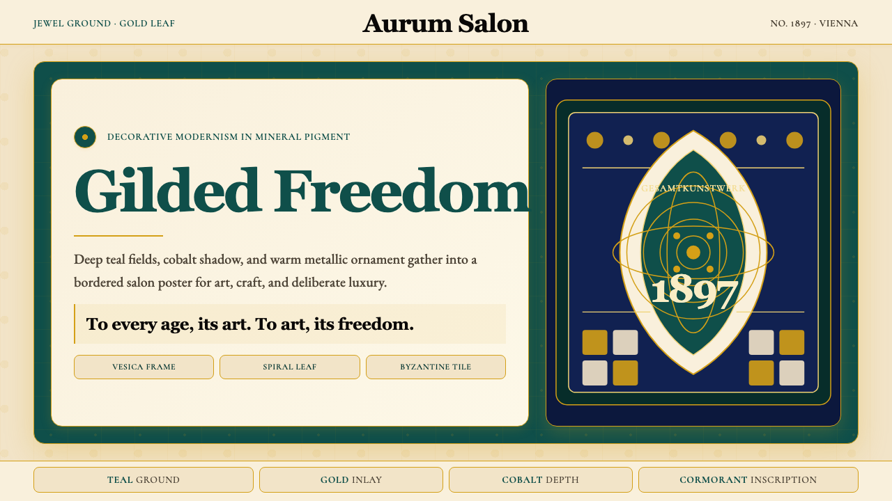
The ornamental vocabulary of Secession work centers on two geometric units: the spiral and the vesica piscis (the almond or eye-shaped form created by the intersection of two circles). Spirals appear as continuous interlocking chains that tile entire compositional zones, echoing ancient Celtic and Mycenaean precedents while remaining entirely contemporary in their graphic sharpness. The vesica frame appears as an isolating device for faces, figures, and key symbolic elements, lending an icon-like frontal gravity to whatever it encloses. Both forms carry the sense of order within proliferation — the sense that infinite ornamental complexity resolves into underlying geometric law.分离派作品的纹饰词汇以两个几何单元为核心:螺旋形与杏仁形(即两圆相交所产生的眼形或鱼形,拉丁文称Vesica Piscis)。螺旋形以连续的咬合链铺满整片构图区域,呼应古凯尔特与迈锡尼的先例,同时在图形锐利度上保持完全当代的品质。杏仁形框架作为隔离装置出现,用于环绕面部、人物与关键象征性元素,赋予其所围合的对象以圣像般的正面庄重感。两种形式都传递出繁殖中秩序的感觉——无限复杂的纹饰最终归结为潜在几何法则的感觉。
Flattened Figure and Suppressed Depth平面化人物与压缩的空间深度
One of the Secession's most powerful formal moves is the treatment of the figure. Faces and hands may be rendered with full naturalistic modeling — the painters were academically trained and their figurative skill was real — but the bodies and the space around them dissolve into ornamental pattern. There is no consistent light source, no cast shadow suggesting three-dimensional space, no atmospheric perspective receding to a horizon. The effect is a productive tension: the human presence is emotionally immediate while the spatial context is resolutely flat. This selective deployment of depth — present where it creates psychological intensity, absent where pattern requires unity — is one of the style's most difficult qualities to reproduce convincingly.分离派最有力的形式操作之一是对人物的处理。面部与双手可能以完整的自然主义塑造呈现——画家们接受过学院训练,其具象技巧是真实的——但身体与周遭空间则消解入纹饰图案之中。没有一致的光源,没有暗示三维空间的投影,没有向地平线退缩的大气透视。效果是一种富有张力的并置:人的存在在情感上直接而即时,空间语境却坚定地平坦。这种深度的选择性部署——在能创造心理强度之处有深度,在图案需要统一性之处消除深度——是该风格最难以令人信服地复现的特质之一。
Classical Serif Typography with Generous Contrast具有强烈对比的古典衬线字体排印
Secession graphic work — posters, journal pages, exhibition catalogues — uses period-appropriate classical serif letterforms, often with strong contrast between thick and thin strokes that amplifies the jewel-like intensity of the overall palette. Type is not treated as a neutral carrier of information; it participates in the ornamental program. Headlines are often set large enough to function as architectural elements in the composition, framing or anchoring the pictorial content. The hand-lettering tradition, still powerful in 1890s design, means that letterforms in Secession work often have a calligraphic expressiveness that distinguishes them from mechanically composed type.分离派的平面作品——海报、期刊页面、展览图录——使用符合历史的古典衬线字体,粗细笔画之间的强烈对比进一步放大了整体色板的珠宝般强度。文字不被视为中性的信息载体,它参与纹饰程序。标题字号往往足够大,在构图中起到建筑性元素的作用,框架化或锚定图像内容。手绘字传统在1890年代设计中仍具强大影响力,这意味着分离派作品中的字形往往具有书法性的表现力,使其区别于机械排版。
Symbolic and Allegorical Subject Matter象征性与寓言性题材
The Secession was not purely a formal movement — it was deeply engaged with symbolist content. Eros, death, transcendence, the cycle of nature, and the redemptive power of art are recurring subjects. This content demands a visual language that is simultaneously legible as representation and excessive as symbol — which is precisely what the movement's gilded, pattern-saturated surfaces deliver. Applied to contemporary design contexts, this symbolic dimension is not directly exportable, but its formal consequence is: the Secession aesthetic carries a weight of intentionality that distinguishes it from purely decorative historicism.分离派不是纯粹的形式运动——它深度投入象征主义内容。爱欲、死亡、超越、自然的循环、艺术的救赎力量,是反复出现的主题。这些内容需要一种视觉语言,既能作为再现而清晰可读,又能作为象征而过量充盈——这正是运动镀金、纹饰饱和的画面所提供的。应用于当代设计语境时,这一象征维度无法直接移植,但其形式后果可以:分离派美学承载着一种意图的重量,将其与纯粹的装饰性历史主义区别开来。
Synthesis of Fine and Applied Art纯艺术与应用艺术的融合
Perhaps the Secession's most consequential idea was the refusal of hierarchy between fine and applied art. A Klimt painting and a Moser textile were understood as expressions of the same underlying aesthetic intelligence. This meant that the style was designed from the beginning to travel across media: wall, canvas, poster, journal, piece of jewelry, piece of furniture. The formal consistency that makes Secession work recognizable across such different objects — the jewel colors, the ornamental density, the gold — is not accidental. It was the deliberate result of a philosophy that insisted beauty was indivisible.分离派最具深远影响的理念,或许是拒绝纯艺术与应用艺术之间的等级区分。克里姆特的一幅绘画与莫泽的一块纺织品,被理解为同一潜在美学智识的表达。这意味着该风格从一开始就被设计为跨媒介流动:墙面、画布、海报、期刊、珠宝、家具。使分离派作品在如此不同的对象上都能被辨认的形式一致性——宝石色调、纹饰密度、金色——并非偶然,而是一种哲学信念的刻意结果:美是不可分割的。
See the Wiener Secession (Klimt) design system查看 Wiener Secession (Klimt) 完整设计系统
Who shaped Wiener Secession (Klimt)?谁塑造了 Wiener Secession (Klimt)?
Klimt was the president of the Secession at its founding and the movement's defining artistic intelligence. His trajectory from academic muralist — his early ceiling paintings for the Kunsthistorisches Museum are competent historicist work — to the radical gold-leaf canvases of his mature period represents one of the sharpest individual stylistic transformations in modernism's early history. His University paintings (Philosophy, Medicine, Jurisprudence), commissioned for the University of Vienna in 1894 and delivered between 1899 and 1907, provoked a formal scandal because they replaced the expected allegorical clarity with ambiguous, densely symbolic figuration — a controversy that illuminates exactly what made the Secession so unsettling to the academic establishment. His gold-phase masterworks, including The Kiss and Danaë, remain the most widely recognized images of the entire movement.克里姆特是分离派创立时的主席,也是运动最具决定性的艺术智识。他从学院派壁画家——其为艺术史博物馆创作的早期天顶画是合格的历史主义作品——到成熟期激进金箔画布的轨迹,代表了现代主义早期历史中最剧烈的个人风格转变之一。他受维也纳大学委托、于1894年起创作并在1899至1907年间陆续交付的大学装饰画(《哲学》《医学》《法理学》)引发了正式的丑闻,因为它们以模糊的、密集象征性的人物群像取代了预期的寓言清晰性——这场争议恰好揭示了分离派为何如此令学院建制感到不安。他黄金时期的代表作,包括《吻》与《达娜厄》,至今仍是整个运动最广为人知的图像。
Moser was perhaps the Secession's most versatile designer, working fluently across illustration, textile design, furniture, stained glass, postage stamps, and poster art. His visual language, while participating in the Secession's ornamental richness, tends toward greater geometric order than Klimt's — in this he anticipates the Werkstätte's subsequent evolution toward a more rectilinear Art Deco sensibility. He co-founded the Wiener Werkstätte with Hoffmann in 1903, which became the primary vehicle for translating Secession aesthetics into designed objects for domestic life. His poster designs for the Secession exhibitions are among the period's most accomplished examples of integrated typographic and ornamental composition.莫泽或许是分离派最多才多艺的设计师,在插图、纺织品设计、家具、彩色玻璃、邮票与海报艺术之间游刃有余。他的视觉语言在参与分离派装饰丰富性的同时,比克里姆特更倾向于几何秩序——在这一点上,他预示了工坊此后向更具直角感的装饰艺术倾向的演变。他与霍夫曼于1903年联合创立了维也纳工坊,这成为将分离派美学转译为日常生活设计对象的主要媒介。他为分离派展览创作的海报设计,是那个时期排印与纹饰构图整合最出色的范例之一。
Hoffmann was the Secession's primary architect and the designer who most deliberately moved the movement's aesthetic toward geometric restraint. His Palais Stoclet in Brussels (begun 1905), often called the first truly modern house, is a landmark of the transition from Art Nouveau to early modernism: its exterior marble surfaces are edged with gilded bronze trim, creating a gridded, almost abstract surface that reads as simultaneously Secession and proto-Deco. At the Wiener Werkstätte, Hoffmann oversaw the creation of an integrated aesthetic for interior environments that influenced European design well into the 1920s. His interest in the right angle as a design principle earned him the nickname 'Quadratl-Hoffmann' — Square Hoffmann — among contemporaries.霍夫曼是分离派的主要建筑师,也是最刻意将运动美学引向几何克制的设计师。他在布鲁塞尔的斯托克雷宫(始建于1905年)——常被称为第一座真正意义上的现代建筑——是从新艺术运动向早期现代主义过渡的里程碑:其外墙大理石表面以镀金铜边收口,形成一种网格化的、近乎抽象的表皮,同时读出分离派与原装饰艺术的气质。在维也纳工坊,霍夫曼主持创造了一套室内环境的整合美学,影响欧洲设计直至1920年代。他对直角作为设计原则的热衷,为他赢得了同时代人的绰号:「方格霍夫曼」。
Wagner was the elder statesman among the Secession's associated architects — a generation older than Klimt, already a professor at the Vienna Academy when the movement formed. His importance to the Secession lies in his theoretical articulation of what Viennese modernism should be. His treatise Moderne Architektur (1895) argued that architecture must proceed from contemporary conditions — materials, construction methods, social needs — rather than historical precedent. His built work in Vienna, including the Postal Savings Bank (1904–12) with its aluminum-bolted marble cladding and glass-roofed banking hall, demonstrated that ornament and structural rationalism were not inherently opposed — a position that the Secession's entire program depended on.瓦格纳是分离派建筑圈中的元老重臣——比克里姆特年长一代,运动成立时已是维也纳美术学院教授。他对分离派的意义在于对维也纳现代主义应为何物的理论阐明。他1895年的论著《现代建筑》主张,建筑必须从当代条件出发——材料、建造方法、社会需求——而非历史先例。他在维也纳的建成作品,包括铝栓大理石贴面与玻璃屋顶营业大厅的邮政储蓄银行(1904—1912年),证明了纹饰与结构理性主义并非天然对立——而这一立场正是分离派整个纲领所依赖的基础。
Schiele was a generation younger than Klimt and represents the Secession's most psychologically intense extension. He studied under Klimt's influence and participated in Secession exhibitions, but his work took the movement's symbolist undercurrent in a rawer direction — replacing Klimt's golden opulence with angular, anguished figuration rendered in harsh color against near-empty grounds. Schiele's contribution is important to understanding the Secession's full range: it was not only a style of richness and beauty but of psychological urgency, and that urgency could be expressed through austerity as much as through ornamental excess. His draftsmanship, widely considered among the finest of the early twentieth century, demonstrates that line quality was as central to Secession aesthetics as surface pattern.席勒比克里姆特年轻一代,代表了分离派心理强度的最极端延伸。他在克里姆特的影响下成长,参与过分离派展览,但其作品将运动的象征主义暗流引向了更为生猛的方向——以尖锐、痛苦的人物形态替代克里姆特的镀金奢华,在近乎空无的底面上以强烈色彩呈现。席勒的贡献对理解分离派的完整幅度至关重要:它不仅是一种丰盛与美的风格,也是一种心理紧迫性的风格,而那种紧迫性可以通过简约表达,正如可以通过纹饰过剩表达。他的素描技艺——被广泛认为是二十世纪初最杰出的之一——证明了线条质量在分离派美学中与表面图案同等核心。
How do you use Wiener Secession (Klimt) today?今天怎么用 Wiener Secession (Klimt)?
The Wiener Secession style is among the most demanding historical aesthetics to apply in contemporary design work, precisely because its power depends on a specific balance between richness and precision. Applied carelessly, it becomes pastiche — a costume of gold and teal without the underlying structural logic. Applied thoughtfully, it produces work of genuine visual weight: the sense that a layout or presentation has been made rather than assembled, that every compositional decision was intentional. The key discipline is understanding that ornament in Secession work is never arbitrary — it is always bounded, always organized by the geometric units that underlie it.维也纳分离派风格是当代设计实践中最难驾驭的历史美学之一,原因恰恰在于其力量依赖于丰富性与精确性之间的特定平衡。漫不经心地应用,它沦为戏服——金色与翠绿的装扮,缺乏支撑的结构逻辑。用心地应用,它产生具有真实视觉分量的作品:一种版面或演示被精心制作而非拼凑组装的感觉,每一个构图决定都出于意图。关键的自律在于理解:分离派作品中的纹饰从不任意——它始终有边界,始终由其下层的几何单元所组织。
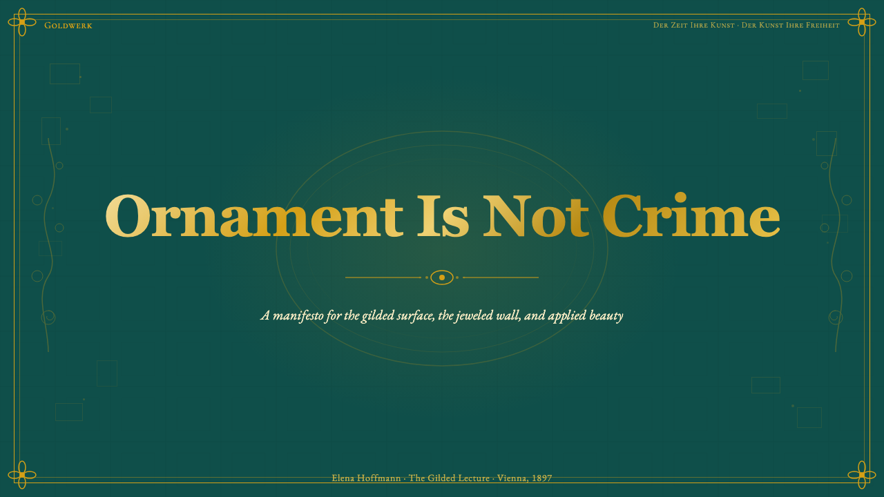
For presentation slides, the Secession idiom works best on cover and section-divider pages rather than content-heavy body slides. A cover designed in this style should commit to a deep jewel-toned ground — deep teal, cobalt, or warm amber — with gold used for key typographic elements and a single ornamental motif that frames the title. The framing device should be simple — a vesica-derived oval, a spiral border, a symmetric geometric panel — so that the ornament reads as intentional architecture rather than decorative noise. Body slides within the same deck should be restrained: the jewel-toned palette can be carried in small accents — a colored rule, a tinted section header — against a lighter field. Data slides benefit from treating charts as ornamental objects in their own right: a warm gold-toned bar chart on a deep teal ground reads as designed rather than merely generated.在演示文稿中,分离派风格最适合用于封面页与章节分隔页,而非内容密集的正文页。以这种风格设计的封面应当坚定地采用深宝石色调底面——深翠绿、钴蓝或温暖琥珀色——以金色用于关键排版元素,并用单一纹饰母题框架标题。框架装置应保持简洁——杏仁形椭圆、螺旋边框、对称几何面板——让纹饰读来像是刻意的建筑而非装饰性噪音。同一套演示中的正文页则应保持克制:宝石色调色板可以在小面积强调元素中延续——彩色分割线、着色的章节标题——衬托于较浅的底面之上。数据页面适合将图表本身视为纹饰对象:深翠绿底上的暖金色柱状图读来像是设计的结果,而非仅仅生成的产物。
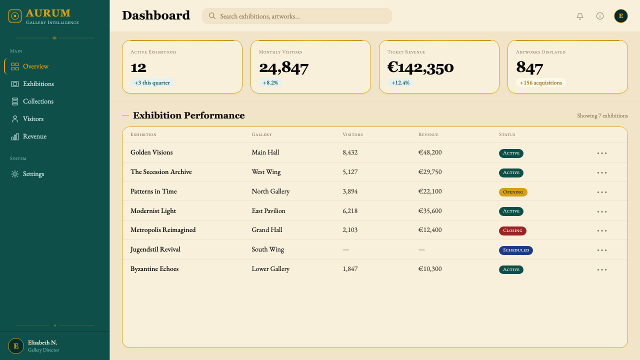
For web interfaces — particularly dashboards, pricing pages, and brand-forward landing pages — the Secession aesthetic translates into a distinctive vocabulary of richness and order. A dark teal or deep cobalt primary surface provides the jewel-box ground; warm metallic-toned borders, dividers, and highlights replace the all-purpose gray that dominates most contemporary UI. Typography should be classical and high-contrast in stroke weight, used sparingly so that individual text elements carry genuine visual gravity. Navigation and UI chrome should be treated as architectural elements — framed, bordered, given weight — rather than as minimalist ghosts. The risk is heaviness: the palette and ornamental vocabulary must be applied with genuine editorial discipline, with generous use of near-white or very pale tonal grounds for content areas.对于网页界面——尤其是仪表板、定价页面与品牌导向的落地页——分离派美学转译为一套丰富与秩序并存的独特词汇。深翠绿或深钴蓝的主底面提供珠宝盒般的基础;温暖的金属色调边框、分割线与高光,取代主导当代大多数界面设计的万能灰色。字体排印应古典、笔画对比鲜明,克制使用以使每个文字元素具备真实的视觉分量。导航与界面结构元素应被当作建筑性元素处理——加框、加边、赋予重量——而非作为极简主义的幽灵。风险在于沉重:色板与纹饰词汇必须以真正的编辑自律来应用,内容区域需慷慨地使用接近白色或极浅色调的底面。
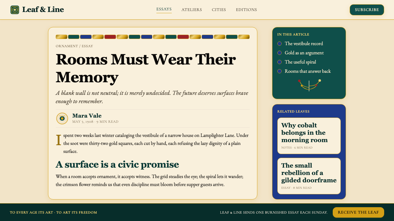
For editorial and marketing design — posters, magazine spreads, event collateral, brand identity systems — the Secession offers one of the richest historical precedents available. A marketing poster in this style positions itself at the furthest possible remove from the anti-aesthetic of much contemporary digital design: it declares that beauty is a value, that richness is not excess, that the act of looking should itself be pleasurable. This positioning makes the style well-suited to luxury brands, cultural institutions, arts organizations, fashion, and any product that earns a premium through perceived quality and aesthetic seriousness. The ornamental vocabulary — spirals, vesica frames, tessellated geometric grounds — should be designed rather than sourced from clip art, or the result will read as costume. The typographic dimension is equally important: classical serifs with genuine historical authority, set with care for optical spacing and hierarchical contrast, anchor the richness of the pictorial elements.对于编辑与营销设计——海报、杂志版面、活动周边、品牌识别系统——分离派提供了现有最丰富的历史先例之一。以这种风格制作的营销海报将自身置于与当代数字设计反美学倾向的最远端:它宣告美是一种价值,丰富不是过剩,观看的行为本身应当令人愉悦。这种定位使风格特别适合奢侈品品牌、文化机构、艺术组织、时装,以及任何通过感知品质与美学严肃性赢得溢价的产品。纹饰词汇——螺旋、杏仁框、密铺几何底纹——应当是被设计出来的,而非从素材库中取来,否则结果只会像戏服。排印维度同样重要:具有真实历史权威的古典衬线字体,以对光学间距和层级对比的精心考量排印,锚定图像元素的丰富性。
A persistent mistake when applying the Secession aesthetic is treating gold as a color when it is actually a surface quality. Digital gold — simulated through warm yellow or orange tones — reads as flat and cheap against the jewel-saturated grounds that the Secession requires. Wherever budget and medium allow, the metallic quality should be suggested through gradient-free tonal contrast: a pale warm tone against a deep warm tone, with the darkest values suggesting shadow and the lightest suggesting reflected light, never through a literal gradient or glow effect. A second common mistake is combining the jewel palette with contemporary UI conventions — rounded corners, soft shadows, blur effects — that belong to a completely different visual logic. The Secession aesthetic demands hard edges, deliberate ornament, and a refusal of the casualness that the contemporary 'friendly' UI vocabulary implies. Mixing the two produces work that satisfies neither expectation.应用分离派美学时最持久的错误,是将金色当作颜色处理,而它实际上是一种表面质感。数字化的金色——通过暖黄或橙色调模拟——在分离派所需要的宝石色饱和底面上读来平淡而廉价。只要预算与媒介允许,金属质感应当通过无渐变的色调对比来暗示:浅暖色调对深暖色调,最深的值暗示阴影,最浅的值暗示反射光,绝不通过字面意义上的渐变或发光效果实现。第二个常见错误是将宝石色板与当代界面设计惯例相结合——圆角、柔和阴影、模糊效果——这些属于截然不同的视觉逻辑。分离派美学要求硬边、刻意的纹饰,以及对当代「友好」界面词汇所蕴含的随意感的拒绝。两者的混合产生既不满足任何一方期待的作品。
See the Wiener Secession (Klimt) design system查看 Wiener Secession (Klimt) 完整设计系统
Wiener Secession (Klimt) — FAQWiener Secession (Klimt) · 常见问题
How is Wiener Secession different from French Art Nouveau?维也纳分离派与法国新艺术运动有何不同?
Both movements emerged in the 1890s as reactions against academic historicism, and both elevated ornament and the applied arts. But their visual languages diverge sharply. French Art Nouveau — the style of Mucha, Guimard, and the Nancy School — is characterized by organic naturalism: the curving line derives from plant forms, and the palette tends toward the soft, botanical, and pastel. Viennese Secession ornament is more geometric and more abstract, drawing on ancient precedents — Byzantine, Celtic, Mycenaean — rather than the natural world. Klimt's gold surfaces have no French equivalent. The Secession also developed a stronger architectural and design dimension through the Wiener Werkstätte, moving more decisively toward what would become the rectilinear order of Art Deco. The two movements are cousins, not twins.两个运动都兴起于1890年代,作为对学院历史主义的反动,且都提升了纹饰与应用艺术的地位。但其视觉语言截然分叉。法国新艺术运动——慕夏、吉马尔与南锡学派的风格——以有机自然主义为特征:曲线源自植物形态,色板倾向柔和、植物性与淡彩色调。维也纳分离派的纹饰更具几何感与抽象性,援引古代先例——拜占庭、凯尔特、迈锡尼——而非自然世界。克里姆特的金色表面在法国没有对应物。分离派还通过维也纳工坊发展出了更强的建筑与设计维度,更果断地走向后来成为装饰艺术直角秩序的方向。两个运动是表兄弟关系,而非双胞胎。
Is the Secession style appropriate for digital products, or is it too historical?分离派风格适合数字产品吗,还是过于历史化?
The Secession is absolutely usable in digital contexts — but it requires honest selection about which of its qualities translate and which do not. What translates well: the jewel-saturated color palette, the gold-accented typographic hierarchy, the geometric ornamental borders, the sense of visual weight and deliberate richness. What does not translate: the actual use of gold leaf (obviously), the dense figural symbolism of Klimt's paintings, and the hand-made quality of period ornament that gives it life. Digital applications work best when they abstract the Secession's visual principles rather than literally reproducing its period artifacts. A dashboard with a deep teal ground, warm metallic-toned dividers, and high-contrast classical typography is Secession-derived without being historical costume.分离派在数字语境中完全可用——但需要诚实地选择哪些特质可以转译,哪些不能。可以良好转译的:宝石色饱和色板、金色强调的排版层级、几何纹饰边框、视觉分量感与刻意的丰富性。不能转译的:实际使用金箔(显然)、克里姆特绘画中密集的人物象征主义,以及赋予历史纹饰生命力的手工制作质感。数字应用在抽象分离派视觉原则而非字面再现其历史工艺品时效果最佳。一个深翠绿底面、暖金属色调分割线、高对比度古典字体排印的仪表板,是分离派衍生的,而非历史戏服。
What is the Gesamtkunstwerk ideal and why does it matter for applying this style?「总体艺术作品」理想是什么?为何它对应用这种风格至关重要?
Gesamtkunstwerk — total work of art, a concept drawn from Wagner's operatic theory — was a central ambition of the Secession. The idea is that architecture, painting, furniture, textiles, typography, and even cutlery should be conceived as a single unified aesthetic experience, each element designed in relation to the whole. The Beethoven Frieze in its original installation was a Gesamtkunstwerk: Klimt's frieze, Max Klinger's sculpture, and the architectural setting of the Secession Building were intended to be experienced as one. This matters practically because applying Secession aesthetics to only one element of a designed environment — say, a hero image in an otherwise generic-looking website — will always look incongruous. The style rewards systemic application: every touchpoint of a brand or presentation should participate in the same visual logic.「总体艺术作品」(Gesamtkunstwerk)——总体的艺术创作,概念源自瓦格纳的歌剧理论——是分离派的核心抱负。这一理念认为,建筑、绘画、家具、纺织品、字体排印乃至餐具,应当被构思为一个统一的整体美学体验,每个元素都在与整体的关系中被设计。《贝多芬横饰带》在其原始安装语境中就是一件总体艺术作品:克里姆特的横饰带、马克斯·克林格的雕塑,以及分离派展览馆的建筑空间,被设计为一个整体来体验。这在实践中至关重要:将分离派美学只应用于设计环境中的某一个元素——比如一个其他部分外观普通的网站上的英雄图像——将始终显得格格不入。这种风格奖励系统性应用:品牌或演示的每个触点都应参与同一套视觉逻辑。
How does the Secession relate to Art Deco — are they interchangeable?分离派与装饰艺术运动有何关联?两者可以互换吗?
They are not interchangeable, though Art Deco grew directly from the Secession's later, more geometric phase. The Wiener Werkstätte's rectilinear work — Hoffmann's grid-based surfaces, Moser's more geometric patterns — prefigured Art Deco's emphasis on angular symmetry and machine-age streamlining. But the Secession at its fullest expression, dominated by Klimt's gold-phase painting, is far more organic, symbolically loaded, and spiritually inflected than Art Deco ever was. Art Deco is extroverted, commercial, and confident; the Secession is inward, symbolist, and weighted with fin-de-siècle anxiety. Art Deco tends toward sleek surfaces; the Secession tends toward dense, accumulated ornament. Confusing them produces work that satisfies neither — Art Deco applied with Secession symbolism reads as confused, and Secession color applied with Art Deco geometry reads as cold.两者不可互换,尽管装饰艺术运动直接源于分离派后期更具几何感的阶段。维也纳工坊的直角化作品——霍夫曼以网格为基础的表面、莫泽更具几何感的图案——预示了装饰艺术运动对角度对称与机器时代流线美的强调。但分离派在其最充分的表达中——以克里姆特黄金时期绘画为主导——远比装饰艺术运动更有机、更充满象征负荷、更具精神性。装饰艺术运动外向、商业化且自信;分离派内敛、象征主义,充满世纪末的焦虑。装饰艺术倾向于光滑的表面;分离派倾向于密集、累积的纹饰。混淆两者会产生两方都不满足的作品——以分离派象征主义应用装饰艺术读来混乱,以装饰艺术几何应用分离派色彩读来冰冷。
Can the Secession aesthetic work for a light-background layout, or does it require dark grounds?分离派美学能用于浅色背景版面吗,还是必须依赖深色底面?
The historic Secession worked across both light and dark grounds — Ver Sacrum journal pages often used cream or white grounds for body text with ornamental elements and color accents confined to borders, headers, and illustration areas. A light-ground Secession layout is entirely legitimate, but it requires careful calibration. The jewel-saturated palette needs a resting place: cream or warm ivory grounds allow the deep teal, cobalt, and gold accents to read with full intensity rather than competing. On pure white, Secession ornament can look stark or harsh — the historic preference for warm rather than cool whites is not accidental. The gold accent remains essential regardless of ground color; without it, the result tends to read as generic historicist ornament rather than as distinctively Secession.历史上的分离派在浅色与深色底面上都有应用——《圣春》期刊页面常以奶油色或白色底面承载正文,纹饰元素与色彩强调仅限于边框、标题与插图区域。浅色底面的分离派版面是完全合理的,但需要细心校准。宝石色饱和的色板需要一个休息之处:奶油色或暖象牙色底面使深翠绿、钴蓝与金色强调以完整强度显现,而非相互竞争。在纯白色上,分离派纹饰可能显得生硬或刺眼——历史上偏好暖白而非冷白,并非偶然。无论底色如何,金色强调始终是不可或缺的;没有它,结果往往读来像是普通的历史主义纹饰,而非独特的分离派。
Related design styles相关设计风格
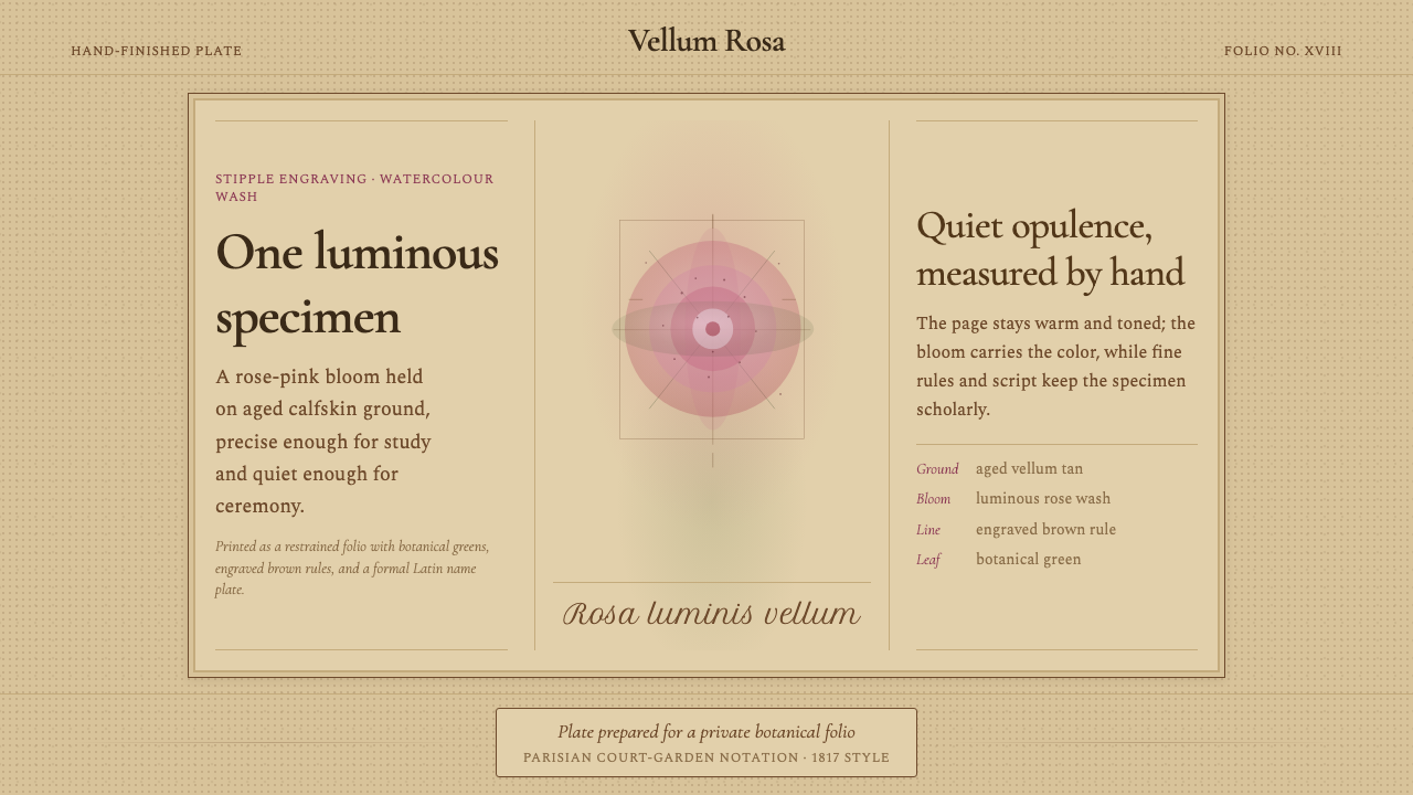 Redouté BotanicalScholarly opulence. Rose wash on aged vellum, framed by engraved brown rules.考究而低调华美:陈年羊皮纸上的玫瑰水彩,由棕色刻线框定。
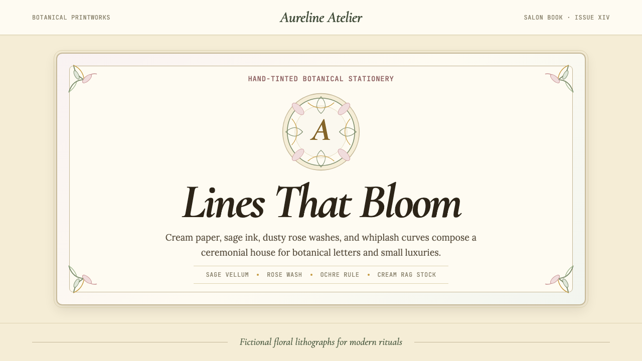 Art Nouveau (Mucha)Mucha's whiplash arabesques. Botanical halos, muted lithograph palette, no ma…穆夏的鞭线式有机曲线:植物光环、柔和石版印刷色、奶油纸底——拒绝机械刻意的边缘。
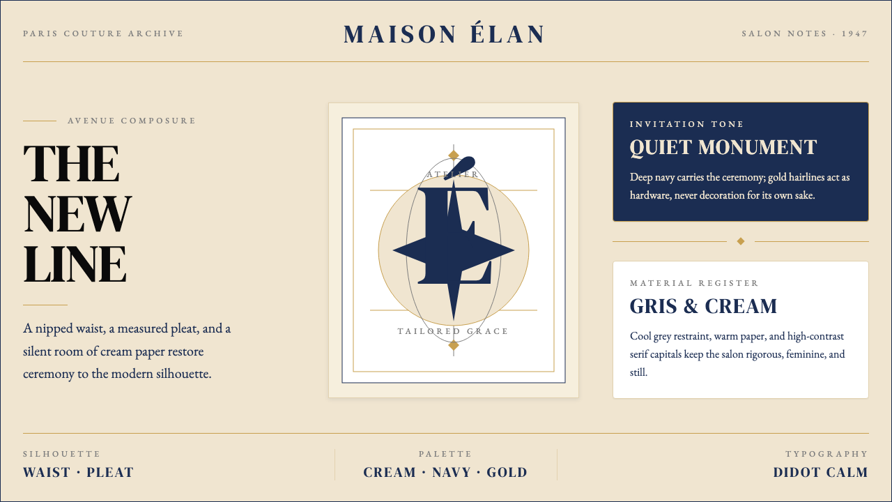 Dior New Look (1947)Couture speaks softly. Cream ground, navy Didot capitals, and gold hairlines…高级订制低声发言:米白底、海军蓝Didot大写与金色发丝线稳住全场。
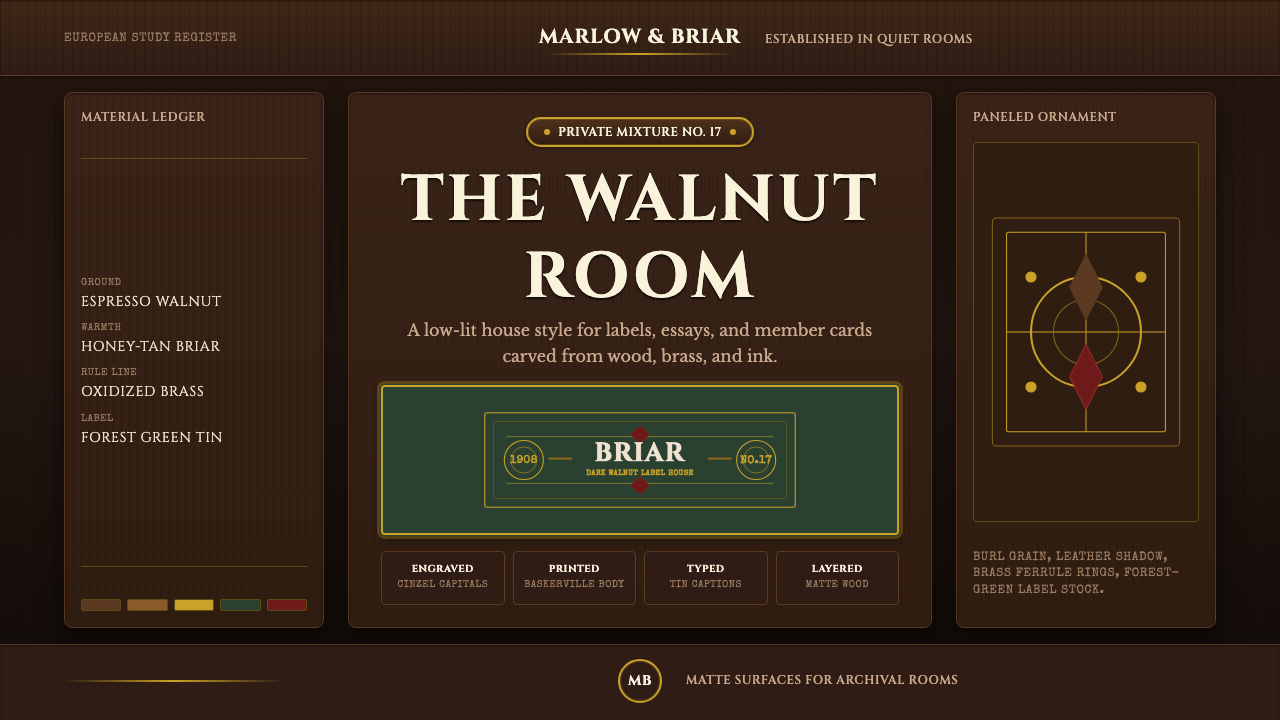 Briar Pipe & TobaccoWarm gloom, precisely aged. Brass rules and Cinzel capitals sit on espresso w…温暖幽暗而考究:黄铜细线与Cinzel大写落在浓咖胡桃木上。
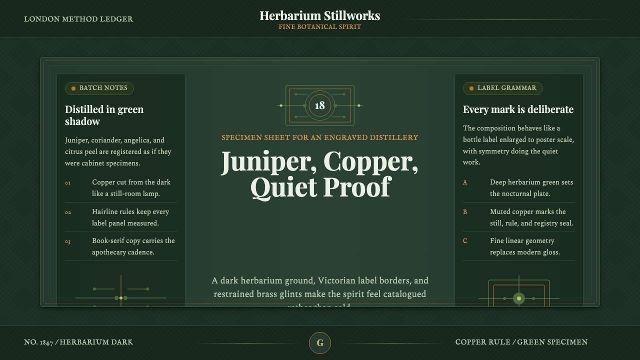 Gin BotanicalHerbarium precision. Dark green frames, Playfair serif, and copper rules hold…标本册般精确。深绿框线、Playfair 衬线与铜色细则定住画面。
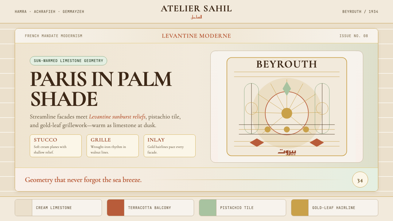 Lebanese Art Deco (Beirut)Cosmopolitan warmth. Cormorant friezes, gold hairlines, terracotta-pistachio…都市暖意。Cormorant 楣饰、金线与赤陶开心果灰泥。