What is Redouté Botanical?
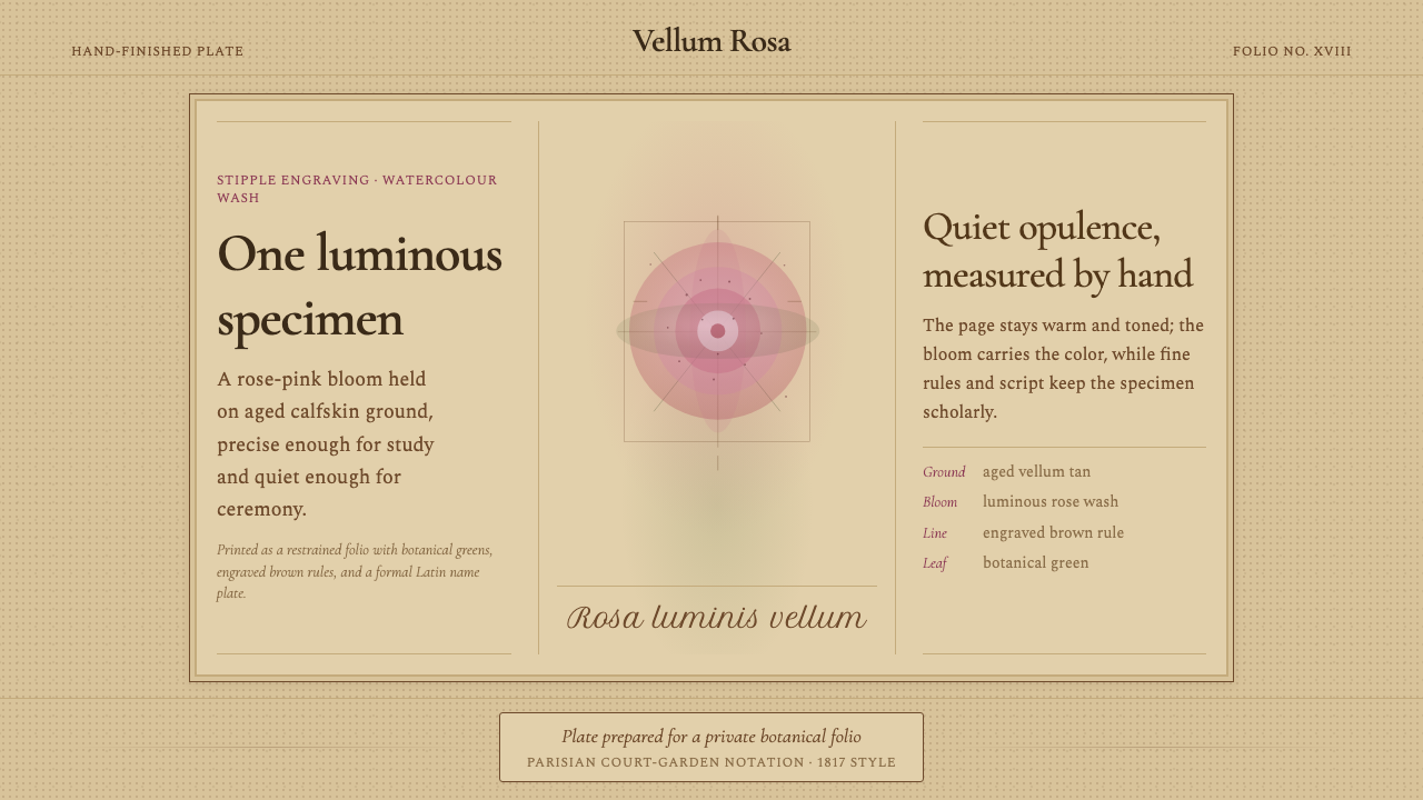
Redouté Botanical carries the scholarly opulence of an imperial rose plate into the interface — aged vellum, a single luminous bloom, and Latin nomenclature set with quiet precision.
Redouté Botanical in brief
Redouté Botanical takes its name and its visual logic directly from the work of Pierre-Joseph Redouté, the botanical illustrator known as the 'Raphael of Flowers,' whose stipple-engraved and hand-finished plates of roses and other flowering plants defined an entire genre of scientific illustration around the turn of the nineteenth century. The style treats a single botanical specimen — rendered with luminous, precise color against a warm, aged ground — as the entire compositional subject, with no competing elements.
The defining surface is a warm, aged-vellum tone, evoking the calfskin parchment Redouté's finished plates were often printed and hand-colored on, rather than a bright, neutral white page. Against that ground, a single bloom carries the composition's color and life — typically a luminous rose-pink, though the underlying logic applies to any single dominant floral hue — surrounded by fine, precise botanical greens rendering leaves and stems with scientific accuracy rather than loose decorative flourish.
Text in this system takes the form of elegant Latin binomial nomenclature, set in a period-appropriate serif alongside more formal script for titling, echoing the scientific captioning that accompanied each specimen in Redouté's published volumes. The overall effect is restrained rather than showy: scientific precision and quiet luxury together, never garish color or crowded ornament.
Where does Redouté Botanical come from?
Pierre-Joseph Redouté was born in 1759 in the Belgian Ardennes into a family of painters, and trained initially in the family tradition before moving to Paris, where he came under the influence of botanical illustration and the scientific patronage networks of the late eighteenth century. His technical breakthrough came through study in England, where he learned stipple engraving — a printmaking technique using tiny dots rather than continuous lines to render tonal gradation — which he then combined with color printing and hand-finishing in watercolor over calfskin vellum, a combination that gave his plates an unusually luminous, painterly quality compared to conventional line engravings of botanical subjects.
Redouté's career was closely tied to the highest levels of French court patronage across a period of enormous political upheaval. He served as court painter to Queen Marie Antoinette before the French Revolution, survived the revolutionary period, and then found an even more consequential patron in Empress Joséphine, wife of Napoleon Bonaparte, at her garden estate of Malmaison outside Paris. Joséphine was an avid botanical collector who assembled one of the great rose gardens of the era at Malmaison, and Redouté was commissioned to document its specimens in exhaustive detail.
This patronage produced Les Roses, published in installments between 1817 and 1824, a collection of 168 plates depicting rose varieties with a level of scientific accuracy and painterly refinement that made it the definitive rose reference of its era and one of the most celebrated works in the entire history of botanical illustration. The project continued even after Joséphine's death in 1814, underscoring how central her patronage and garden had been to its conception.
Redouté's method — stipple engraving printed in color and finished by hand in watercolor — situated his work at an intersection of scientific documentation and fine art: precise enough to serve botanists identifying species, yet luminous and composed enough to function as standalone decorative prints for wealthy collectors. This dual identity, part scientific record and part aristocratic luxury object, is central to why the style reads as simultaneously scholarly and opulent rather than purely functional or purely decorative.
What defines the Redouté Botanical look?
Color
A warm, aged-vellum ground supports a single luminous floral hue — most often rose-pink — alongside fine, accurate botanical greens for foliage. The palette stays narrow and controlled: this is not a riot of floral color but a single specimen rendered with jewel-like precision against a warm neutral.
Typography
Latin binomial nomenclature is set in a period serif for scientific captions, paired with a more formal script register reserved for titling — echoing the printed and hand-lettered captions that accompanied each plate in Redouté's published volumes. The two registers are used consistently, never mixed within a single caption role.
Botanical accuracy
Leaves, stems, and petal structure are rendered with scientific precision rather than loose decorative interpretation — every element should look as though it could genuinely be used to identify the species, matching the documentary intent behind the original plates.
Single-specimen focus
Compositions center on one dominant bloom or specimen rather than a busy floral arrangement — the restraint of showing one flower in full, careful detail is what separates this style from generic decorative floral pattern.
Engraved framing
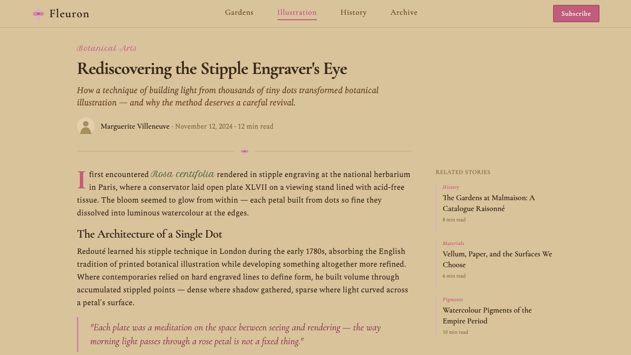
Fine brown engraved rules frame the composition the way a plate border frames a specimen in a bound botanical volume — precise, thin, and consistent, never ornate or heavily decorated, since the frame's role is to present the specimen rather than compete with it.
Luminosity
The floral color should read as luminous and jewel-like, a quality Redouté achieved by layering hand-applied watercolor over a stipple-engraved base — the color should feel like it glows slightly from within rather than sitting flat on the surface.
Quiet opulence
The overall register is scholarly and restrained rather than showy or maximalist — this is the visual language of a scientific plate that happens to be exquisite, not a deliberately luxurious ornamental object. Restraint in composition is what makes the luxury feel earned rather than performed.
Who shaped Redouté Botanical?
The Belgian-born botanical illustrator known as the 'Raphael of Flowers,' Redouté combined stipple engraving learned in England with color printing and hand-finished watercolor on calfskin vellum, producing plates of unusual luminosity. He served as court painter to Marie Antoinette and later Empress Joséphine, and his rose plates, especially Les Roses, remain the definitive reference of botanical illustration's golden age.
Wife of Napoleon Bonaparte and an avid botanical collector, Joséphine assembled one of the great rose gardens of the era at her Malmaison estate outside Paris, commissioning Redouté to document its specimens. Her patronage was the direct catalyst for Les Roses, and her garden's ambition — collecting rose varieties from across Europe — shaped the scope and scientific seriousness of the resulting plates.
Queen of France before the Revolution, Marie Antoinette employed Redouté as a court painter early in his career, situating him within the highest circles of French royal patronage before the political upheaval of the 1790s. This early court connection established the pattern of aristocratic botanical patronage that would later culminate in his work for Joséphine.
How do you use Redouté Botanical today?
Redouté Botanical is a style of restrained, scientific luxury — applying it well means treating the single specimen as the star and keeping every supporting element quiet enough to let that specimen's precision and color carry the composition.
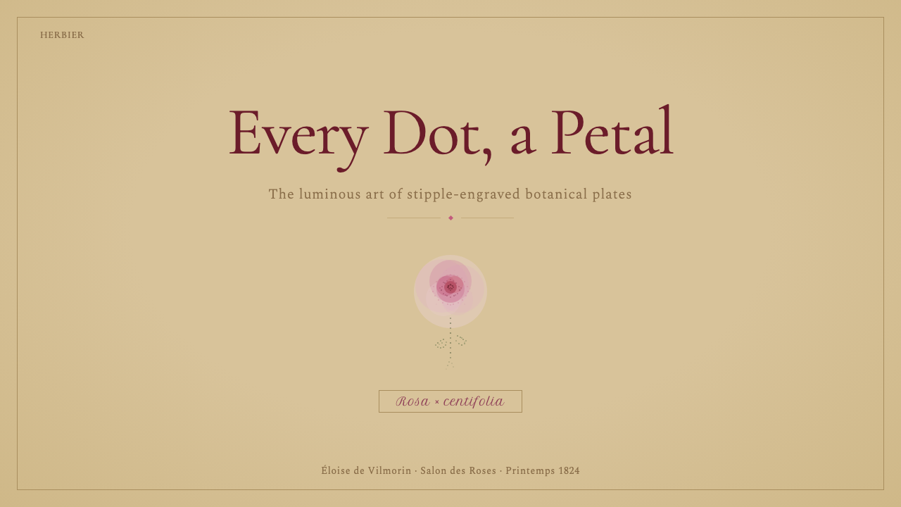
For presentation slides, the style makes an elegant cover treatment for content in wellness, beauty, hospitality, or fine goods: a single bloom rendered in careful detail against the aged-vellum ground, with title text set in the formal script register beneath or beside it. Content slides should keep the vellum tone consistent as the base and introduce botanical line motifs only at margins or as small section markers, never as a busy repeating pattern across a data-heavy page.
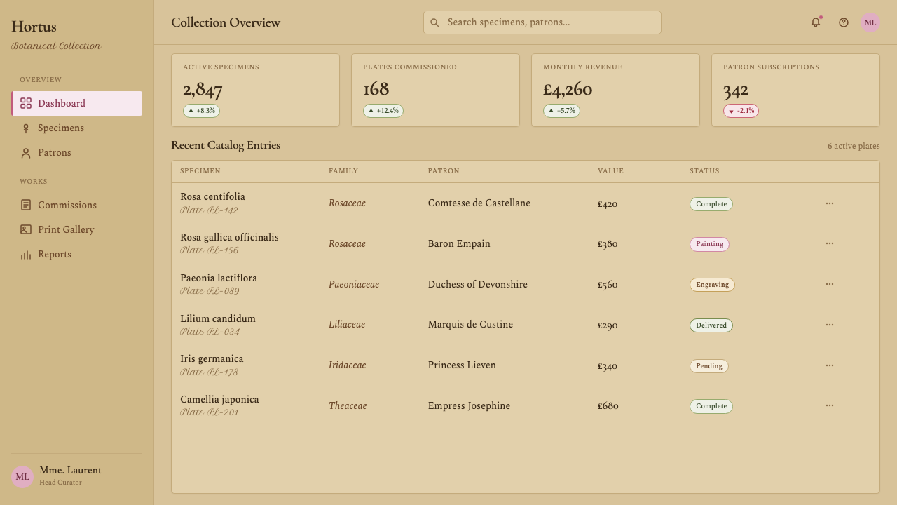
For web interfaces, this style suits beauty and fragrance e-commerce, wellness and garden products, boutique hospitality, and heritage or luxury goods brands wanting scholarly credibility alongside visual refinement. Dense dashboards are a weaker fit — the single-specimen, generous-negative-space logic works against compact, repetitive data display, so any product use should reserve the style for hero moments and product storytelling rather than functional data screens.
For editorial and marketing work, the style is particularly strong for product pages built around a single hero item, garden or botanical journalism, and heritage brand storytelling that wants to invoke scientific authority alongside old-world elegance. A magazine feature benefits from the engraved-frame device used consistently around image and pull-quote alike, tying the whole spread together the way plate borders unify a bound volume.
A common mistake is crowding the composition with multiple blooms or a busy garden scene in pursuit of more visual richness — this undoes the single-specimen restraint that gives Redouté's actual plates their scientific and aesthetic authority. Another mistake is using saturated, poster-bright color rather than the luminous but controlled color achieved through layered watercolor over engraving; the palette should always feel refined rather than vivid for its own sake.
Redouté Botanical — FAQ
Why is a single flower the focus rather than a fuller floral arrangement?
Redouté's original plates were scientific documents meant to record a single specimen with enough precision to aid botanical identification, commissioned for Empress Joséphine's rose collection at Malmaison specifically to catalogue individual varieties. Showing one flower in careful, complete detail — rather than a crowded arrangement — is what gives the style its documentary authority and its sense of quiet luxury; a busy bouquet reads as decorative pattern, while a single specimen reads as a scientific plate.
What is stipple engraving, and why does it matter for this style's color quality?
Stipple engraving is a printmaking technique that builds tone through tiny dots rather than continuous lines, which Redouté learned during time in England and then combined with color printing and hand-finished watercolor. This combination — dotted tonal structure beneath layered hand color — is what gives his plates, and this style, their distinctively luminous, almost glowing color quality, quite different from the flatter look of conventional line engraving or simple flat digital color fills.
Is this style tied specifically to roses, or can other flowers be used?
Redouté's most famous work, Les Roses, focused on roses specifically, but he illustrated many other flowering plants across his career, and the underlying visual logic — a single specimen rendered with scientific precision and luminous color against an aged-vellum ground — applies equally well to other blooms. What matters is preserving the single-specimen focus and documentary precision, not the specific choice of flower.
Why does the style favor Latin nomenclature over a common flower name?
Redouté's published plates were scientific documents, and each specimen was captioned with its formal Latin binomial name as part of the documentary record, consistent with the botanical cataloguing conventions of his era. Using Latin nomenclature in this style preserves that scholarly framing — it signals scientific seriousness rather than purely decorative floral branding, which is central to the style's identity as quiet, credible opulence rather than showy prettiness.
How opulent should this style actually feel — is it a maximalist or minimalist aesthetic?
It sits deliberately between the two. The style is not minimalist in the sense of empty or spare — the specimen itself is rendered with rich, luminous detail and the composition includes fine engraved framing and formal script typography. But it is not maximalist either — there is only ever one specimen, a narrow palette, and generous surrounding space. The opulence comes from the quality and precision of a small number of elements, not from quantity or density of decoration.
Related design styles
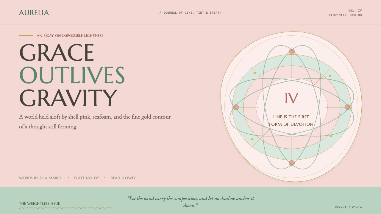 Botticelli Birth of Venus (1486)Grace defeats gravity. Shell pink, seafoam, and fine gilt contours keep every…
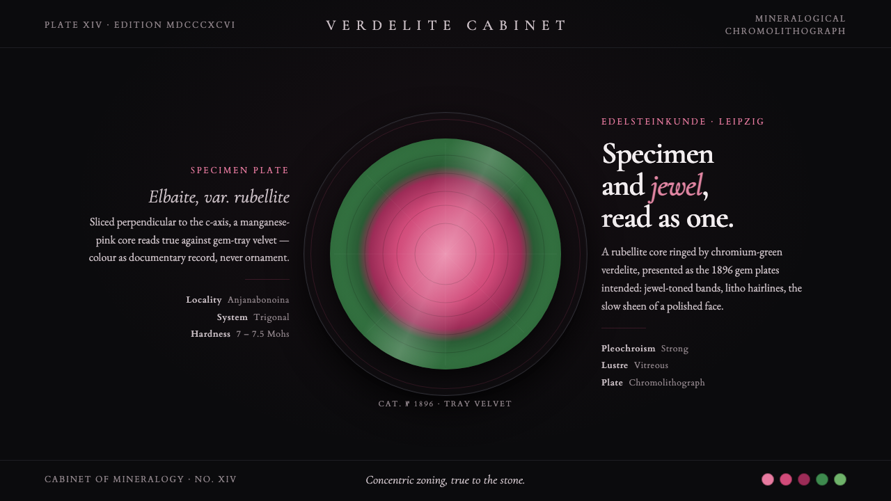 Tourmaline Crystal SliceSpecimen and jewel as one. A watermelon-tourmaline slice — pink core, green r…
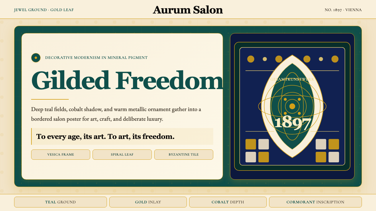 Wiener Secession (Klimt)Opulence made modern. Teal grounds, gold inlay, vesica frames and Cormorant d…
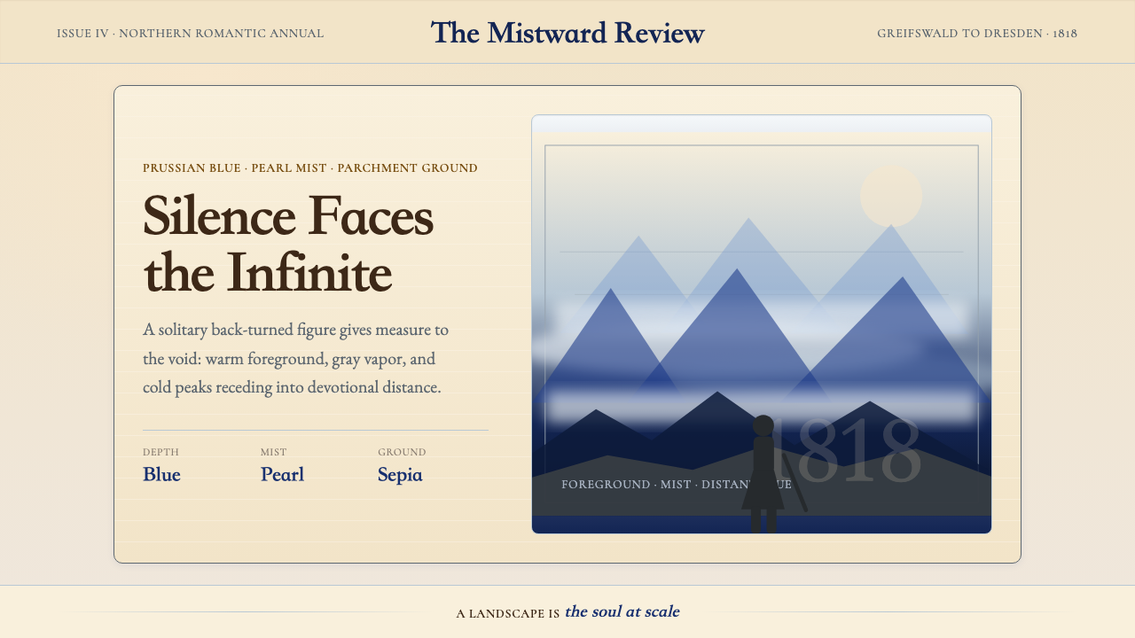 Caspar David FriedrichSilence becomes vast. Prussian blue depth, pearl mist, and parchment framing…
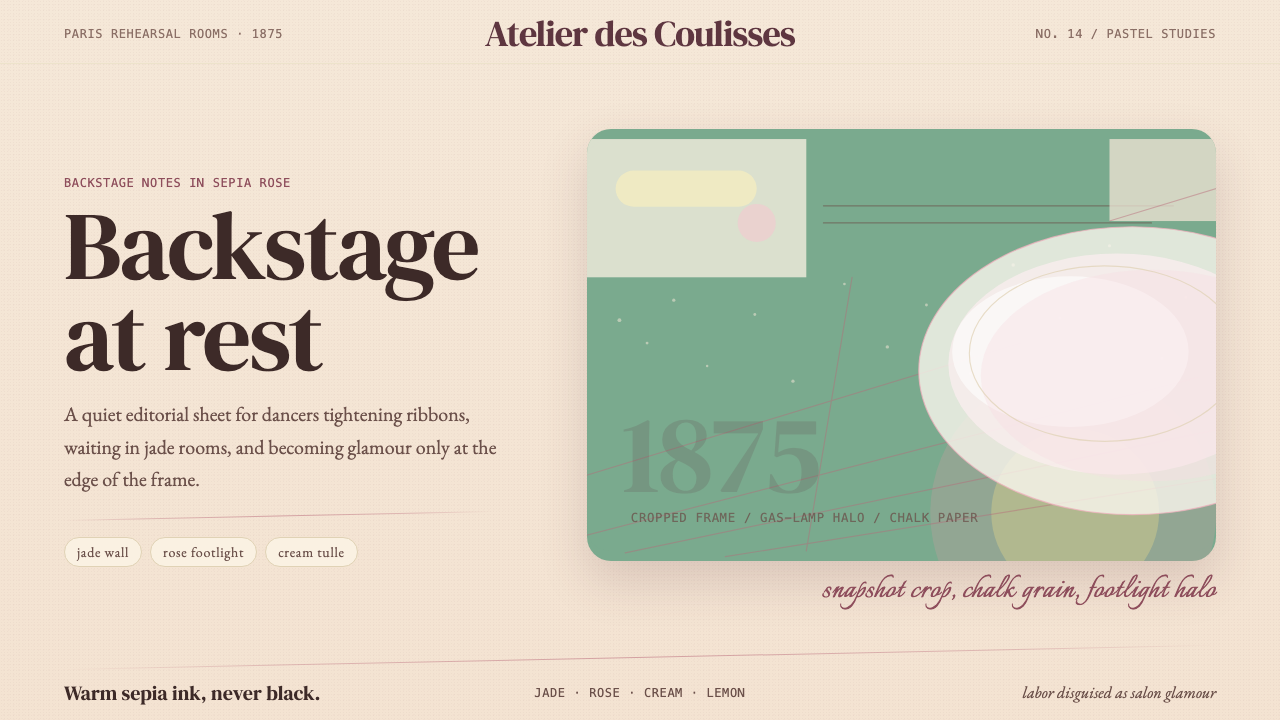 Degas Ballet PastelsBackstage glamour is labor. Jade walls, rose footlights, cropped serifs on cr…
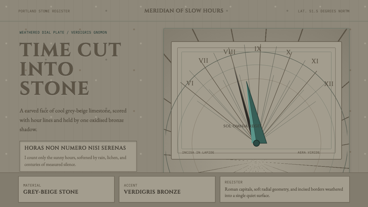 Engraved SundialStone refuses haste. Grey-beige hour lines and verdigris gnomon carve silence.