What is Bordeaux Wine Château?
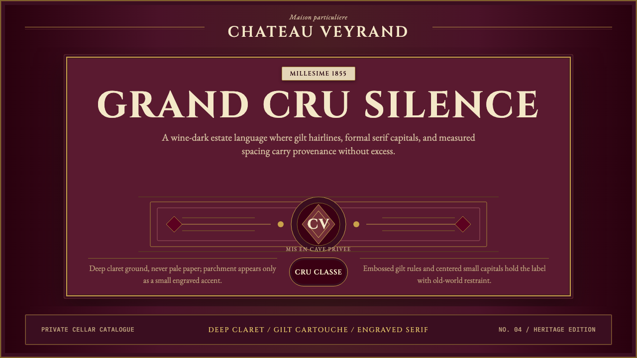
Bordeaux Wine Château is the visual grammar of grand-cru prestige — deep claret grounds, embossed gold, and the engraved-serif authority of estate labels elevated from the bottle to the screen.
Bordeaux Wine Château in brief
Bordeaux Wine Château is a design style rooted in the centuries-old visual conventions of French grand-cru estate labeling. Its palette is drawn from the wine itself — deep claret and burgundy grounds — rather than from the pale parchment of the label's paper. Against that rich, dark field sit embossed-gold type, fine ruled borders, copperplate ornaments, and high-contrast serif letterforms set in formal centered symmetry. It is a system of prestige signals refined over generations of Médoc négociants and estate engravers.
The style is heritage, not nostalgia. Where nostalgic or vintage aesthetics reach for aged texture as decoration, Bordeaux Château uses formal tradition as a structural argument: the darkness of the ground connotes depth and aging; the gold type implies permanence and craft; the centered, symmetrical composition signals gravity and restraint. Every element earns its place by the same logic that governs what appears on a bottle from a great growth — if it does not belong to the estate's vocabulary of distinction, it does not appear.
On screen, this translates into an unusual set of priorities. Dark-ground luxury is the default, not an optional variant. Negative space is treated with the same care as the printed cartouche — generous borders function as the wine label's deckled edge. Typography hierarchy is built through formality and contrast of cut rather than weight alone: a roman titling face against italic subordinate text creates the same layered authority as an estate name above a vintage date.
Where does Bordeaux Wine Château come from?
The visual language of Bordeaux wine labels took its settled form in the mid-nineteenth century, crystallizing around the Médoc Classification of 1855. When Napoleon III ordered a ranking of Bordeaux estates for the Exposition Universelle in Paris, the négociants of the Chartrons merchant quarter produced a hierarchy of sixty châteaux that has barely changed since. The classification created an immediate commercial need for visual differentiation: a First Growth required labels that communicated its rank at a glance, through typography and ornament rather than through written explanation. The solution was engraving — intaglio copper plates that could reproduce fine lines, hairline serifs, and tonal gradients impossible with letterpress alone.
Copperplate engraving as a label-production technique dates to the seventeenth century in France, but its application to wine estates was systematized in Bordeaux during the eighteenth and early nineteenth centuries. Estates such as Château Margaux and Château Latour commissioned engravers to produce cartouches — framed ornamental compositions containing the estate crest, name, and appellation — that could be reproduced consistently across thousands of bottles. The engraved line naturally produces certain aesthetic outcomes: fine strokes thicker on the diagonal, hairlines on the vertical, slight ink spread that reads as richness rather than imprecision. These physical constraints of the medium became the aesthetic conventions of the style.
The dark ground — claret or deep burgundy rather than white or cream — is itself a relatively modern convention in printed labels, but one that the digital interpretation of this style adopts as foundational. Historically, some of the most celebrated Bordeaux estate labels used cream or white grounds, with the prestige signal carried entirely by the engraved crest, the typeface selection, and the formality of the centered layout. The dark-ground variant draws more directly from the color of the wine itself, from the deep-hued foil capsules that cover the cork, and from the heavy glass of the bottle, creating a visual system where the label and the object it adorns share a continuous material logic.
By the late nineteenth century, the Bordeaux château label had become an internationally recognized sign of premium quality — imitated in wine regions from Napa to the Barossa, adopted as a prestige signal in spirits, chocolate, and other luxury goods. The contemporary digital version of this aesthetic inherits its authority from that accumulated recognition. Designers working in this style are not merely choosing a look; they are accessing a shared cultural encoding in which gilt rules, claret grounds, and engraved serifs carry connotations of age, scarcity, and certification that no amount of copywriting can replicate.
What defines the Bordeaux Wine Château look?
Ground Color
The defining move of this style is placing everything on a deep, wine-dark ground — the color of poured claret or aged burgundy. This is not merely a dark background: it is the color of the subject matter itself, used structurally. Lighter tones appear only as the parchment of a framed label element within the composition, or as the highlighted surface of gilded type. The darkness implies cellaring, patience, and depth in a way that no typeface choice or ornament can substitute for.
Gold and Metallic Accents
Gilt lines, crests, and letterforms are the style's primary luxury signal. On physical labels, this is achieved through foil stamping or embossing; in digital work, the effect is translated through warm gold tones — rich and slightly amber rather than brassy or yellow — used sparingly and with high contrast against the dark ground. The gold should feel earned: a thin ruled border, the initials of an estate, the outline of a crest. Overuse collapses it into kitsch. The correct distribution is closer to accent than to fill.
Engraved Serif Typography
The typography of this style derives from the engraved letterpress tradition: high-contrast serifs with thick body strokes and fine hairlines that recall the variable pressure of a copper intaglio plate. Titling faces should feel formal and vertically stressed — the opposite of humanist warmth. Small capitals are preferred over mixed case for secondary labeling, mimicking the way estate names and appellation designations appear on actual labels. All caps for the principal name, small caps or modest italics for supporting information, body text in a proportional roman cut.
Centered Formal Symmetry
The composition of a Bordeaux estate label is emphatically centered and hierarchical. The estate crest occupies the apex; below it the name in the largest type; below that the classification or vintage; at the base the appellation and bottling information. This vertical hierarchy, arranged on a single central axis, communicates institutional seriousness. On screen, strict centering with generous lateral margins replicates the label's composed, framed quality. Asymmetric layouts read as contemporary interventions, not as authentic expressions of this visual tradition.
Fine Rule Borders and Ornamental Frames
Ruled frames — thin lines enclosing the composition at one or more levels — are structural to this aesthetic. On a physical label, a double-ruled border separates the label from the bottle; an inner ornamental border frames the crest. In digital compositions, these frames serve the same function: they contain the content, signal that the composition is complete, and invoke the cartouche tradition of formal certification. The ornamental vocabulary is limited — corner flourishes, small symmetrical motifs — and any element should be fine enough to feel engraved rather than printed.
Restrained Ornamentation
Unlike Victorian decoration, which accumulates ornament as proof of value, the Bordeaux style signals value through restraint. A single crest, one ruled frame, a sparse use of gilt: the discipline is the message. This is ornamentation governed by hierarchy rather than abundance. The cartouche at the center should be the most visually complex element, with everything else subordinated to it. A common failure is to add embellishment at multiple points of the composition simultaneously — it destroys the hierarchy that gives the style its authority.
Material Richness Without Texture
Despite evoking the physical richness of embossed foil, heavy glass, and aged paper, the digital Bordeaux style does not rely on simulated textures. The sense of material presence comes from color depth, contrast ratios, and typographic formality rather than from photographic paper grain or overlay effects. A noisy or grunged-up version of this style mistakes surface aging for depth, adding visual clutter where the authentic tradition relies on compositional gravity. The materials should feel implied by the quality of the decisions, not demonstrated through literal texture simulation.
Who shaped Bordeaux Wine Château?
From 1945 onward, Château Mouton Rothschild has commissioned a different artist each year to design the upper portion of its vintage label — a practice initiated by Philippe de Rothschild that brought artists including Picasso, Miró, Chagall, and Andy Warhol into direct contact with the formal constraints of estate label design. The resulting labels demonstrate how the fixed conventions of the Bordeaux format — centered crest zone, ruled borders, formal serif typography — can accommodate contemporary artistic expression without surrendering their institutional authority. The annual label series is now collected independently of the wine.
The 1855 Médoc Classification, commissioned by Napoleon III and compiled by the Bordeaux Chamber of Commerce, established a five-tier hierarchy of sixty estates that gave formal structure to what had previously been a fluid prestige market. The classification did not create the visual language of Bordeaux labels — that was already in place — but it intensified the commercial need for labels to communicate tier at a glance. The visual conventions that resulted — the formal crest, the classification statement below the estate name, the hierarchical typography — have remained largely unchanged across more than a century and a half, making this one of the most durable corporate identity systems in history.
Pétrus, the celebrated Pomerol estate, demonstrates a variant of the Bordeaux château aesthetic operating at its most austere. Its label uses no crest, no elaborate ornamental border, and relatively minimal ornamentation — just the estate name in formal serif capitals against a cream ground, with a small stylized leaf motif. The label's restraint, which might appear simple at first glance, is in fact an extreme expression of the principle that the hierarchy and quality of the decisions should carry the prestige rather than the quantity of ornament. Pétrus demonstrates that the Bordeaux aesthetic is scalable from elaborate engraved crests down to near-typographic minimalism without losing its essential character.
The great Bordeaux négociant houses — Barton & Guestier, Calvet, Ginestet — developed their own parallel visual vocabularies through the eighteenth and nineteenth centuries, distinct from individual château labels but drawing on the same engraved-serif, ruled-border tradition. The négociant house mark, applied across dozens or hundreds of different wines, required a visual identity that could carry prestige across a portfolio rather than signaling the specific terroir of a single estate. This commercial context drove the development of the more systematized, grid-legible version of the Bordeaux aesthetic that informs most contemporary digital interpretations of the style.
Château Margaux represents the convergence of architectural and graphic identity in the Bordeaux tradition. The château itself — a neoclassical colonnaded manor built in the early nineteenth century to plans attributed to Louis Combes — became an image reproduced on estate materials, reinforcing the connection between the visual language of the label and the physical dignity of the property. The engraved rendering of the château façade that has appeared on Margaux materials since the nineteenth century is one of the earliest examples of architectural identity being mobilized as a prestige signal in luxury goods branding, a practice now universal in high-end wine, spirits, and hospitality.
How do you use Bordeaux Wine Château today?
Bordeaux Wine Château is one of the few luxury design systems that succeeds on dark grounds almost exclusively. Unlike styles where a dark variant is an option, here the dark claret ground is the primary and the pale parchment label is the secondary — used only when a framed label element within a composition is called for. Understanding this inversion is the first step to using the style correctly: you are designing the bottle's body, not its label.
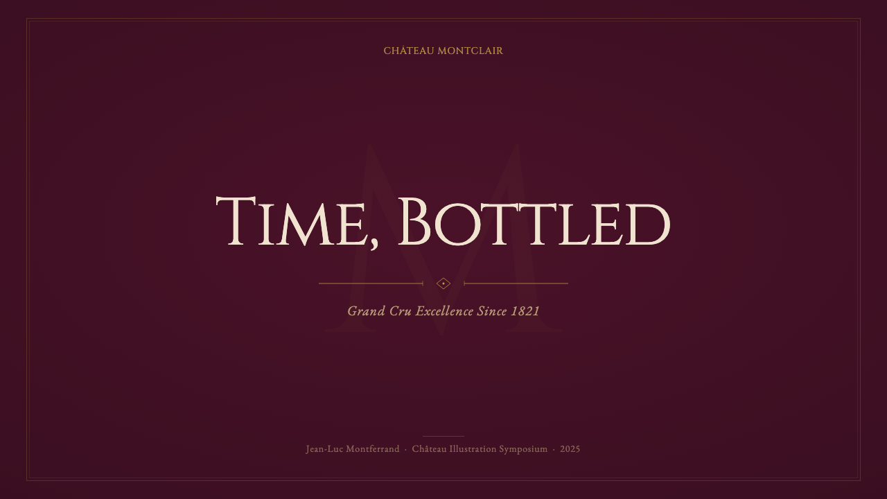
For presentation slides, this style rewards restraint above all other values. A cover slide works best as a near-full-bleed field of deep claret or burgundy, with the title centered in formal serif capitals and a thin gold ruled border containing the composition. Avoid more than two type sizes on any single slide — the authority of the style comes from hierarchy, not variety. For content slides, use a narrow centered column with generous lateral margins; the negative space at the sides functions as the label's white edge on the bottle. Data visualization should be reduced to essential graphic marks — a clean line chart, a two-color bar comparison — with any label or annotation set in small serif capitals matching the titling face.
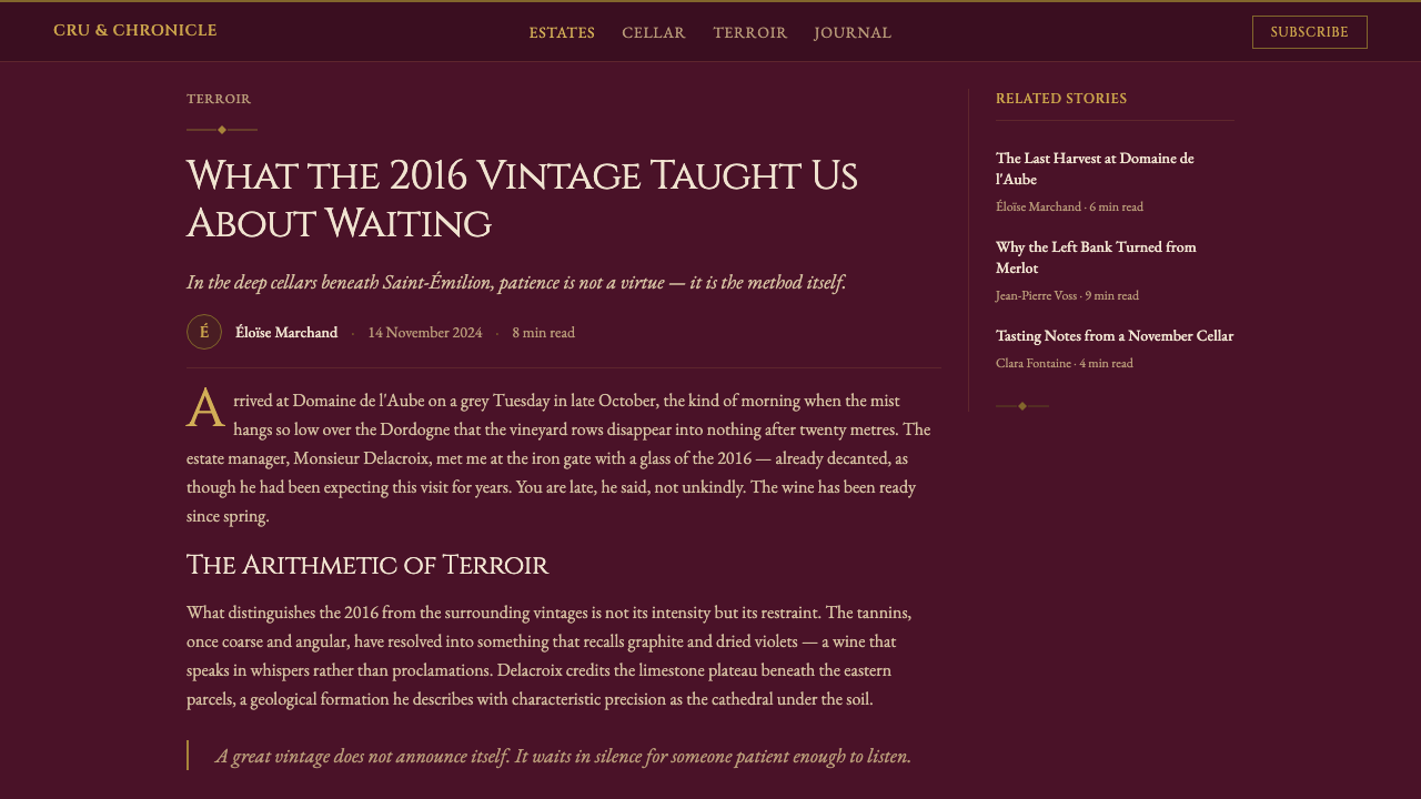
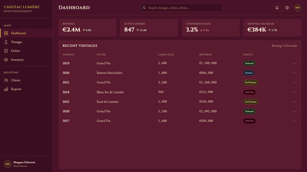
For web interfaces and product pages, this style suits high-consideration purchase contexts: fine wines and spirits e-commerce, auction platforms, members-only club sites, premium subscription services, and luxury goods with heritage credentials. The approach: dark ground throughout, gold as the single accent color for interactive states and calls to action, centered or narrow-column typography for body text, ruled horizontal dividers as section breaks. Card components should have thin gold borders rather than shadows — a shadow would introduce a naturalistic depth that conflicts with the engraved formality of the style. Navigation should be spare and typographic, with no icons except geometric indicators.
For editorial and marketing use, this style excels in annual report covers, fund documentation, event invitations, tasting notes, and any context where the communication of heritage and gravity is commercially valuable. A pattern that works well: a full-page dark ground, a centered ornamental border in gold, the organization name in engraved-style serif capitals, a single supporting detail in small caps below. For multi-page documents, carry the dark-ground treatment to section openers and let interior pages use a lighter ground — cream or very pale warm gray — to rest the eye, while keeping the serif typography consistent.
The most common mistake when applying this style is importing contemporary luxury conventions — gradient glows, embossed soft-shadow text, photographic texture overlays — in the belief that more richness equals more luxury. The opposite is true here. A gradient behind the title type, a lens flare accent, a marble or velvet texture overlay: each of these additions signals contemporary premium rather than aged authority, and the combination signals confused ambition. The discipline of this style requires removing, not adding. When in doubt, strip an element out rather than adding its alternative.
Bordeaux Wine Château — FAQ
How does this style differ from generic dark-luxury aesthetics?
Generic dark luxury — common in beauty, fashion, and nightlife branding — typically uses soft-glow lighting effects, gradient surfaces, and sans-serif typography with wide letter-spacing to suggest exclusivity. Bordeaux Château is its mirror opposite: no gradients, no glow, no geometric sans-serifs. The authority comes from formal conventions that predate modern graphic design by centuries — engraved serifs, ruled frames, centered symmetry — rather than from contemporary visual idioms of premium. The test: if the layout would look at home on a technology product or a high-end perfume, it is probably generic dark luxury. If it looks like it belongs on a bottle from a 150-year-old estate, it is the Bordeaux style.
Can this style work for non-wine products?
Yes, and it has been used successfully across a range of heritage luxury categories: aged spirits (cognac, armagnac, single malt Scotch), premium chocolate and confectionery, rare book publishing, private members clubs, auction houses, estate agencies dealing in historic properties, and investment fund documentation. The style works wherever the product's value proposition is built on age, scarcity, process, and institutional credibility rather than on innovation, personalization, or emotional warmth. It is poorly suited to consumer technology, food delivery, social platforms, children's products, wellness applications, or any category where approachability and freshness are the primary brand values.
How strictly should the centered symmetry be applied?
For the primary brand-mark or hero composition — the equivalent of the label face — centered symmetry should be maintained strictly. This is where the style's authority is established. For supporting layouts (interior pages, data presentations, secondary UI components), a degree of structural asymmetry is acceptable provided the typographic hierarchy remains formal and the color palette stays consistent. The key distinction is between the ceremonial composition and the workaday layout: the ceremony demands strict centering; the workday can tolerate a aligned grid. A useful rule: any element that appears on a cover or a hero section should be symmetrically composed; anything in running text or data can follow a grid.
What is the right approach to photography in this style?
Photography fits the Bordeaux Château style only when treated with the same formal discipline as the typography. A naturalistic lifestyle photograph — a hand holding a glass, a vineyard at golden hour — introduces contemporary advertising conventions that immediately dilute the engraved formality of the aesthetic. If photography must appear, it should be treated as a formal portrait: high-contrast, classically composed with central symmetry, tightly cropped to remove environmental context, and reproduced in a near-monochrome duotone aligned to the palette. The subject should be the object itself — the bottle, the glass, the estate — not a person experiencing it. When in doubt, an engraved architectural illustration or an ornamental device communicates the style more authentically than any photograph.
Is this style appropriate for digital-first products, or does it always feel anachronistic?
It need not feel anachronistic if the product's authority genuinely comes from age and institutional credibility. A new platform that has no heritage background will struggle to make Bordeaux Château feel earned — the visual conventions will read as costume rather than character. But for a financial institution, auction house, private bank, or any organization whose value is inseparable from its longevity, the style can operate authentically even on a modern responsive interface. The key is that the style's formal claims should correspond to something real in the organization's history or offering. When a two-year-old SaaS startup uses it, the visual vocabulary claims a credibility the product cannot support, and discerning users will register the gap.
Related design styles
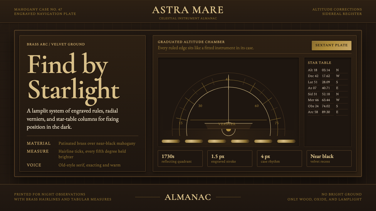 Sextant NavigationPrecision feels ceremonial. Brass ticks and mahogany grids chart the dark by…
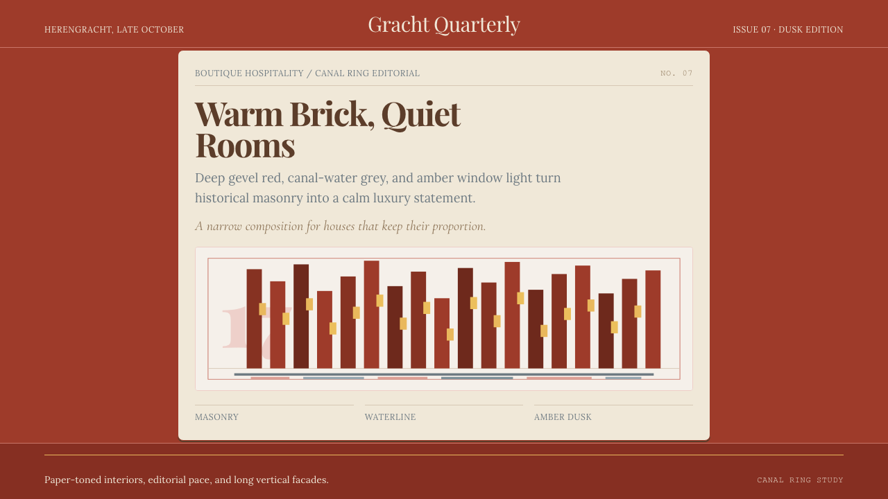 Amsterdam Canal HouseQuiet luxury in brick and cream. Playfair serif, narrow columns, amber window…
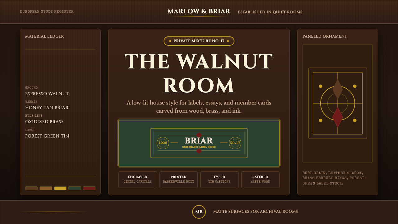 Briar Pipe & TobaccoWarm gloom, precisely aged. Brass rules and Cinzel capitals sit on espresso w…
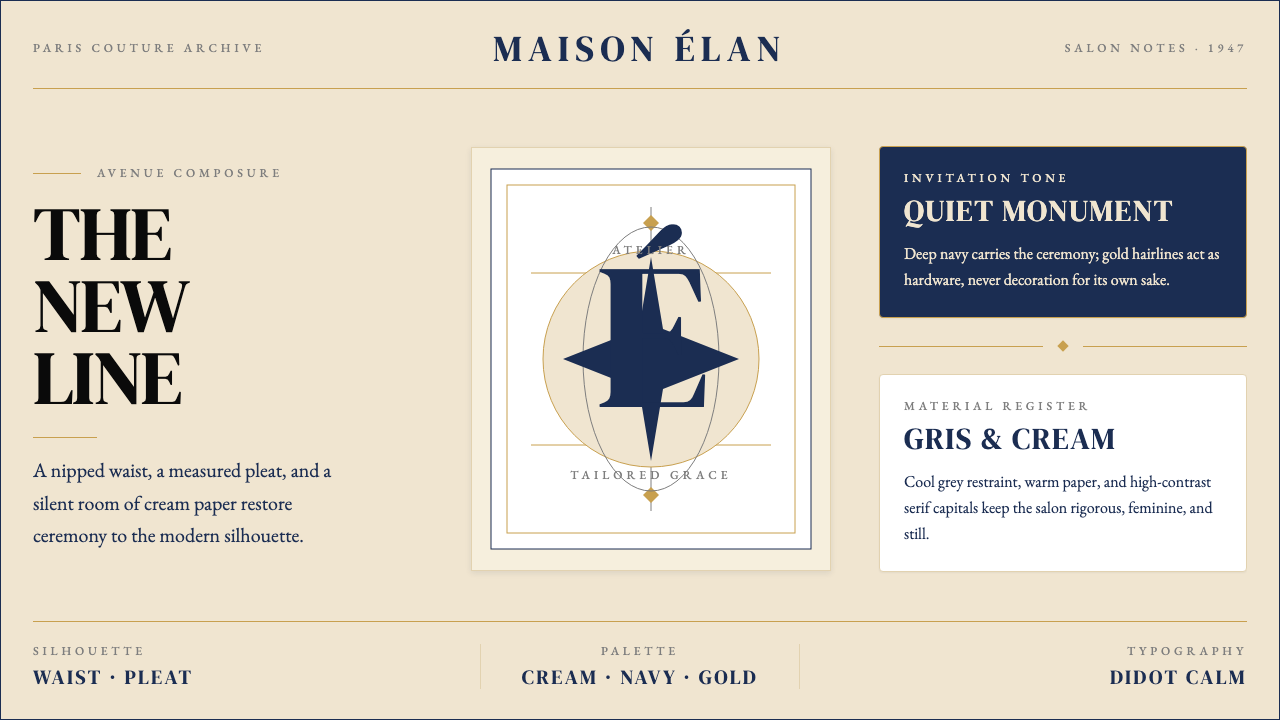 Dior New Look (1947)Couture speaks softly. Cream ground, navy Didot capitals, and gold hairlines…
 Medieval Illuminated ManuscriptTreats every page as sacred. Oxblood vellum, Cinzel capitals, gold-rule borde…
 Bayer UranometriaGrave celestial folio. Olive-slate grid, brass stars, Greek labels, old-style…