What is Sextant Navigation?
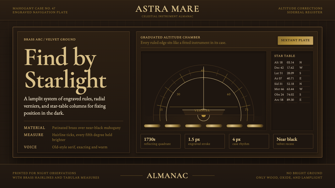
Sextant Navigation renders the Enlightenment's most precise instrument as a living interface — warm brass, near-black velvet, dense engraved scales, and the quiet authority of a tool that once placed a ship within a mile of truth anywhere on earth.
Sextant Navigation in brief
Sextant Navigation is a design system rooted in the visual world of pre-1900 marine navigation instruments — specifically the reflecting sextant as crafted by the great British and French instrument houses for the Royal Navy and merchant fleets. The palette is built from aged brass, deep mahogany, and near-black velvet, all catching the warm ambient light of a ship's chart room rather than bright daylight. Every decorative decision is grounded in the actual toolcraft of celestial position-finding: graduated arc scales, radial vernier indices, engraved star tables, and the fine angle ticks that allowed an officer to read arc-minutes in the middle of the night.
The system operates in the territory between scientific precision and ceremonial weight. Like the instruments it references, it is not minimalist — the engraving is dense, the surfaces are rich, the typographic texture is close. But every element earns its presence by doing work: scales exist to be read, tables exist to be consulted, brass frames exist to protect glass optics. Ornamentation and function have merged so completely that they become indistinguishable, which is exactly what the great instrument makers of the 1730–1900 period achieved in physical brass and glass.
Visually, the style reads as dark luxury instrumentation. Deep warm backgrounds anchor bright incised lines and carefully set tabular type. Radial and arc geometries echo the sextant's measuring arc. The overall effect is of something built to last centuries — empirical, authoritative, and entirely free of fashionable decoration.
Where does Sextant Navigation come from?
The reflecting quadrant — direct ancestor of the sextant — was invented independently around 1730 by John Hadley in England and Thomas Godfrey in Pennsylvania. Both men solved the same problem: how to measure the altitude of the sun or a star above the horizon with enough precision to compute latitude, on a pitching deck, without a fixed reference surface. The solution was the double-reflection principle: two mirrors aligned to bring the reflected image of a celestial body down to the horizon simultaneously, allowing the observer to read the angle between them directly off a graduated scale. The arc of Hadley's original instrument spanned an eighth of a circle — hence the name 'octant.' When the arc was extended to a sixth of a circle, the instrument became the sextant, capable of measuring angles up to 120 degrees and thus useful for lunar distance calculations as well as altitude.
The great London instrument houses — Dollond, Heath and Company, Ramsden, Troughton and Simms — refined the sextant over the following century and a half into an instrument of extraordinary mechanical precision. Jesse Ramsden's dividing engine, developed in the 1770s, automated the engraving of graduated scales with accuracy previously impossible by hand. The result was a device whose arc could be read to fractions of an arc-minute using the vernier scale — a secondary sliding scale invented by Pierre Vernier in 1631 that subdivides the smallest main-scale division into ten or more readable parts. This vernier detail — radial lines fanning across two overlapping scales — became one of the most distinctive visual signatures of the instrument.
The sextant's working context shaped its aesthetic completely. Chart rooms were lit by oil lamp. Instruments needed to be legible under low warm light at all hours. The combination of polished brass, engraved black-filled graduations, and near-black velvet lining in the mahogany case was not chosen for elegance but for legibility under real operational conditions. The warmth of the palette — aged gold against deep wood and shadow — is a functional outcome masquerading as taste. Similarly, the density of star tables printed on good paper and stored alongside the instrument reflects the actual computational burden of celestial navigation: every fix required consulting tables of logarithms, solar declination, and hourly angle to convert a raw sextant reading into a usable position line.
By the mid-nineteenth century, the sextant had become the defining instrument of the age of sail and the early age of steam — universally carried, universally trusted, and universally understood as the primary tool for placing a vessel on the globe. Its form changed very little between 1780 and 1900, which speaks to a kind of design completion: the object had found its optimal shape. This stability, combined with the extraordinary craft investment each instrument represented, gave sextants an almost talismanic authority that persisted even after electronic navigation made them redundant. The design vocabulary the instrument generated — dense engraved scales, warm brass, radial geometry, velvet-lined precision cases — has become a shorthand for empirical authority, careful measurement, and the romance of navigating by starlight.
What defines the Sextant Navigation look?
Palette
The color range is narrow and atmospheric: aged brass as the primary warm tone, occupying highlights and metallic surfaces; near-black as the dominant background, carrying the weight of deep velvet and shadowed mahogany; engraved line detail in bright gold or pale cream against dark grounds. Accent comes from the subtle warmth differential between fresh brass and patinated brass — a distinction that implies age, use, and authority without any additional color. There are no cool tones, no saturated hues, no pure white grounds in the classic application of this style.
Engraved Line Quality
The defining mark of the style is the character of its ruled lines: they are fine, precise, and slightly incised in quality — not painted or printed but cut into a surface and filled. Graduated scales read as dense radiating or concentric systems of marks, varying in length to signal major and minor divisions. This line quality is fundamentally different from drawn or calligraphic strokes; it has the mechanical regularity of a dividing engine and the visual thinness of a sharpened steel rule. In digital interpretation, this means hairline strokes, optical precision, and a sense of weight through density rather than through stroke width.
Radial and Arc Geometry
Where Bauhaus favors the square and the straight edge, Sextant Navigation favors the arc and the radius. The sextant's measuring arc — a precise sector of a circle — becomes a structural motif that recurs in layouts, decorative borders, and interface chrome. Radial gradations fanning from a pivot point replicate the vernier index. Circular insets recall the drum of a micrometer thimble or the eyepiece of a telescope. This geometry is not imposed decoratively; it mirrors the actual physical structure of the instrument and the mathematics — spherical trigonometry — that the instrument was built to serve.
Tabular Typography
Star tables, logarithm tables, and angle conversion charts were physical companions of the sextant, printed in the dense tabular formats demanded by computation-heavy celestial navigation. The typographic register of Sextant Navigation inherits this directly: columns of close-set figures, clear tabular rules, minimal leading, and a preference for old-style or transitional serif letterforms that trace their lineage to eighteenth-century navigation manuals and nautical almanacs. Labels are short and exact — degrees, minutes, seconds, star names in their catalog abbreviations — and white or cream on dark grounds rather than the reverse.
Material Warmth and Patina
Sextant Navigation does not simulate freshly machined metal. The aesthetic is specifically that of aged, handled, trusted instruments: brass that has been touched thousands of times and carries a warm oxidized patina, mahogany cases whose grain has deepened with decades of ship's air and oil. Worn surfaces, muted reflections, and the sense of things used carefully over long time are all part of the register. This patina is not decay — it is evidence of trustworthiness. In digital terms, this means subtle texture, slightly muted rather than saturated golds, and the avoidance of anything that reads as new, untouched, or freshly manufactured.
Instrumental Density
A sextant face is not spare. Every square centimeter of an instrument serves a purpose, and the visual result is dense without being cluttered — dense in the way that a circuit board or a musical score is dense, where every element is doing specific work and can be read by someone who knows the system. Sextant Navigation inherits this density: layouts carry more information per area than typical contemporary minimalist design, but the information is organized by strict hierarchical logic — major divisions, minor divisions, labels, reference values — rather than accumulated decoratively. Negative space is not the organizing principle; disciplined information architecture is.
Ceremonial Precision
The sextant was not merely a tool — it was a ritual object. Taking a sight at noon involved a practiced sequence of acts: removing the instrument from its case, adjusting the index mirror, sweeping the horizon, locking the reading, and recording the angle in the log. This ritual quality — the sense that what is being done matters enormously and requires total attention — inflects the design register. Sextant Navigation design feels deliberate. Every element asks to be read carefully, not scanned. The interaction model implied is one of consultation and study rather than quick browsing.
Who shaped Sextant Navigation?
The English mathematician and instrument maker John Hadley demonstrated a reflecting quadrant to the Royal Society in 1731, having corresponded about the theoretical principle with Edmund Halley years earlier. Hadley's design employed two mirrors to bring the celestial body and the horizon into coincidence, eliminating the error introduced by the observer holding the instrument by hand. His original octant — arc spanning an eighth of a circle — was the immediate ancestor of the sextant. Hadley also made significant contributions to reflecting telescope design, which fed directly into the optical engineering of subsequent marine instruments.
Ramsden was the London instrument maker who fundamentally changed the sextant's production by inventing the circular dividing engine in the 1770s. Before Ramsden's engine, graduated scales were divided by hand — a process so demanding that a skilled workman might spend weeks producing a single arc of acceptable accuracy. The dividing engine automated this to a level of precision that hand work could not approach, and it made the sextant affordable to a much wider range of ships and navigators. Ramsden's shop produced instruments of legendary accuracy and established London as the world center of precision scientific instrument manufacture.
The French mathematician Pierre Vernier published his description of the vernier scale in 1631 — nearly a century before the sextant itself existed — but his invention became inseparable from the instrument's visual identity. The vernier is a secondary sliding scale placed alongside the main graduated arc, designed so that one of its graduation lines always aligns precisely with a main-scale line, allowing the reading to be subdivided into fractions invisible to the naked eye on the primary scale alone. In practice, vernier scales on sextants allowed readings to fractions of an arc-minute. Visually, the overlapping radial lines of main scale and vernier index are among the most distinctively beautiful elements of the instrument.
Maskelyne served as Britain's fifth Astronomer Royal from 1765 to 1811 and was the primary force behind the Nautical Almanac, first published in 1767. The Almanac provided navigators with precomputed tables of lunar distances and solar declination that reduced the computational burden of a noon sighting from hours to minutes. The Almanac is inseparable from the sextant's history: without reliable tables, the instrument's mechanical precision was unrealizable in practice. The dense, close-set typographic format of the original Almanac — columns of figures for every hour of every day — directly establishes the tabular typographic aesthetic that Sextant Navigation inherits.
Edward Troughton was perhaps the finest sextant maker of the late eighteenth and early nineteenth centuries, known for instruments of exceptional arc quality and finish. His firm, eventually Troughton and Simms, remained one of the premier London instrument houses through the Victorian era. Troughton pioneered improvements to the arc's silvering (for legibility under lamplight) and to the telescope mounting that allowed more precise alignment of the index mirror. A Troughton sextant represented the pinnacle of what the instrument could be: not the most affordable or most portable, but the most trustworthy in situations where position error cost ships and lives.
How do you use Sextant Navigation today?
Sextant Navigation is not a versatile all-purpose design style — it is specific, and using it well requires matching it to contexts where its values resonate: authority, precision, historical depth, the sense that what is being communicated has been carefully measured and verified. It works for products and documents that need to signal trust through the visual register of instruments and expertise rather than through conventional branding warmth.
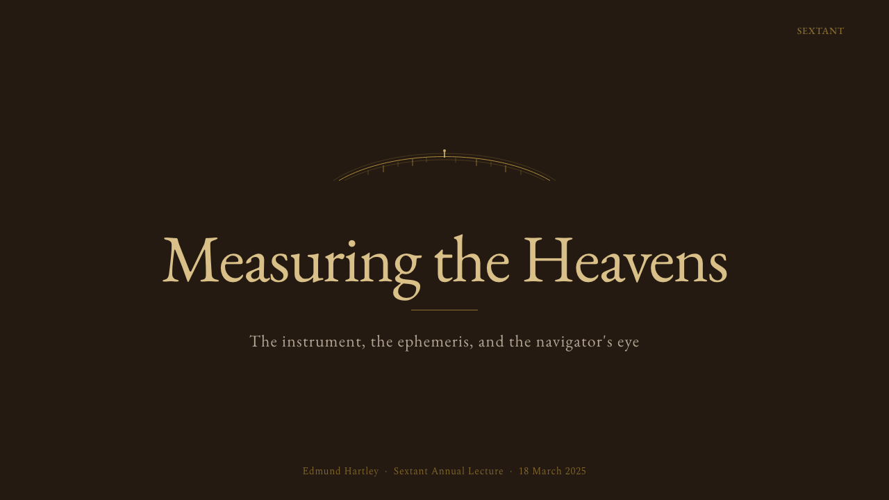
For presentation slides, the style suits covers and chapter-break pages more than dense content slides. A cover can be built around a single arc or radial motif on a near-black ground, with the title set in a transitional or old-style serif that echoes the typography of eighteenth-century chart rooms. Content slides work best when they inherit the tabular discipline: data organized in close-set columns, hierarchies established by size rather than color, grid lines that look ruled rather than decorative. The style struggles with slides that require bright illustration or photography — it is at its best when the content itself is numerical, systematic, or archival.
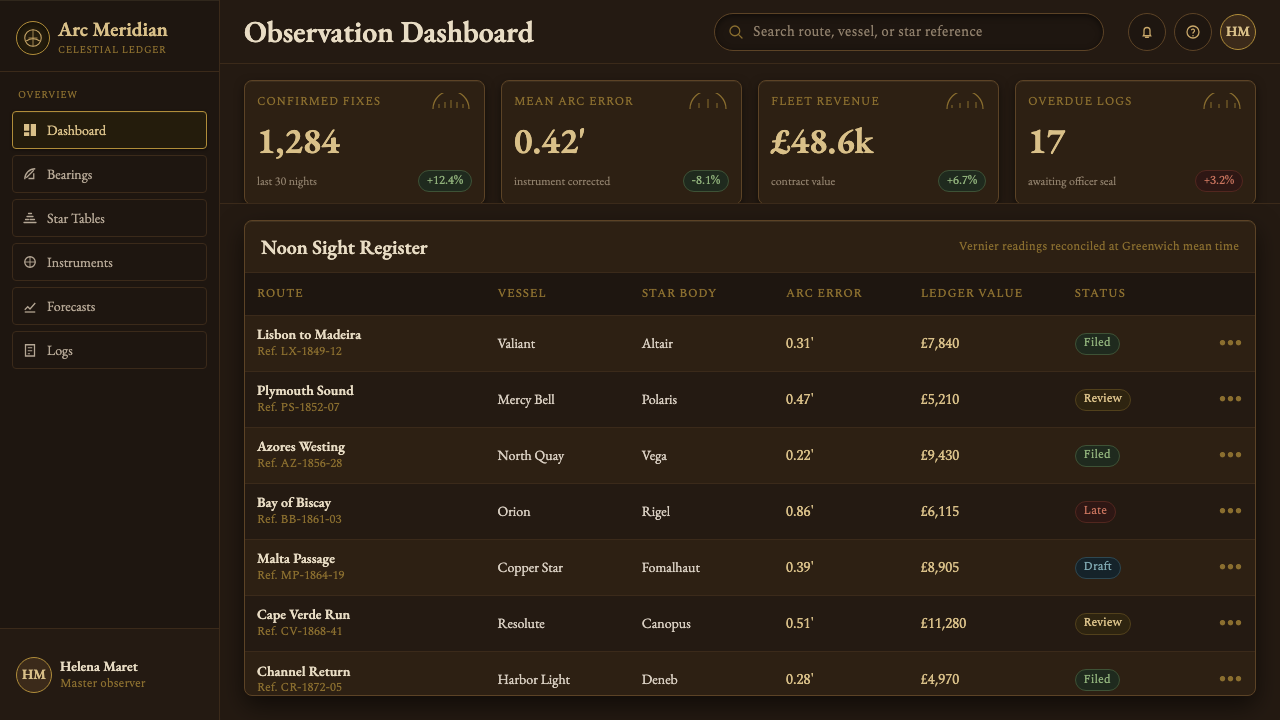
For web and dashboard interfaces, Sextant Navigation is well suited to instruments, analytics tools, financial data products, and any platform where the user's primary task is reading and interpreting information rather than browsing and discovering. The appropriate application keeps the background very dark, uses the warm brass tones sparingly for interactive states and active elements, and reserves the crisp pale lines for data visualization. Avoid applying this style to consumer-facing e-commerce or social features — the deliberate, consultative interaction model it implies works against the immediacy those contexts need.
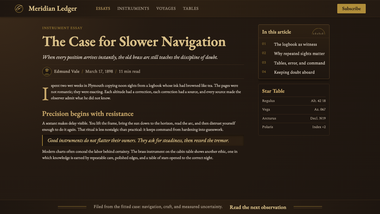
For editorial and print-inspired digital work, the style supports long-form reading experiences with dense information content: technical reference documents, historical atlases, annotated archival reproductions. The tabular typographic heritage works directly here. Section breaks can be marked with arc ornaments or simple ruled lines — not decorative flourishes but functional dividers. Running heads and folios should feel like chart marginalia: small, precise, out of the way but always present.
The most common mistake when applying this style is importing the surface aesthetics — brass tones, dark backgrounds, serif type — without the underlying logic of precision and density. A few floating elements on a dark ground with gold accents does not constitute Sextant Navigation; the style requires density, hierarchy, and the sense that every element is present because it serves a specific informational function. Decoration borrowed from the instrument world without that functional discipline produces pastiche: it looks like costume rather than character.
Sextant Navigation — FAQ
How is Sextant Navigation different from general steampunk or vintage aesthetics?
Steampunk is primarily an imaginative genre aesthetic — it combines Victorian-era visual elements with speculative technology, and its organizing principle is fantasy and eclecticism. Sextant Navigation is the opposite: it is rooted in a specific real instrument from a specific historical period and trade, and its visual logic derives from actual functional constraints of that instrument and its working context. There is no speculative technology, no mixed-era anachronism, no decorative excess for its own sake. The brass is there because real sextants were made of brass; the density is there because real star tables were dense. When the functional logic is respected, the result reads as authority; when it is abandoned for surface texture, the result reads as cosplay.
Can this style work in light-background applications?
The historical instrument world was predominantly dark-ground — the velvet case lining, the shadowed chart room, the dark mahogany all establish this. A light-ground variant is possible but requires significant reinterpretation. On a cream or aged-parchment ground, the brass and engraved-line vocabulary can still work if the palette is shifted toward warm ivory and brown rather than neutral white and grey. The key is maintaining the quality of precise ruled lines and the sense of aged material: light-ground Sextant Navigation should feel like a page from an eighteenth-century navigation manual, not like a modern minimal interface that has borrowed a few period elements.
How should photography and imagery be handled in this style?
The instrument aesthetic is fundamentally non-photographic — real sextants used engraving and printing, not photography. If imagery must be included, it should be treated in a way consistent with the instrument register: high contrast approaching duotone, cropped to isolate geometric or mechanical qualities, and reproduced at a scale and position that makes it read as a diagram or plate rather than an illustration. Historical instrument photographs, astronomical charts, star maps, and wave diagrams all sit comfortably in the style's reference world. Lifestyle photography, environmental scenes, and people shown in context do not — they import a naturalistic warmth that undermines the cool empirical authority the style depends on.
What makes the typography of this style distinctive?
Sextant Navigation typography descends from the typographic conventions of eighteenth and early nineteenth-century scientific publication — navigation manuals, almanacs, astronomical tables, and instrument makers' catalogues. The distinctive features are: preference for transitional or old-style serif designs over modern or humanist ones; close-set figure columns with minimal leading and consistent alignment on decimal points; running text at a narrower measure than contemporary convention; and section identification through small-cap labels, ruled lines, or engraved-style ornamental dividers. The typographic mood is dense, legible under difficult conditions, and designed to be consulted rather than read continuously — which makes it particularly well-suited to reference interfaces, documentation, and analytical dashboards.
Is this style appropriate for modern technology products?
Appropriateness depends on what the product needs to communicate. Sextant Navigation works well for technology products that need to signal depth of expertise, historical credibility, or the kind of authority that comes from careful measurement and long institutional memory — certain fintech tools, astronomical or geospatial software, archival and research platforms, high-end scientific instrumentation interfaces. It does not work well for consumer technology products that compete on ease, speed, and approachability, or for products in markets where contemporary visual currency matters more than historical gravitas. The style's deliberateness is a feature in contexts of high-stakes information consumption and a liability in contexts of casual or first-time interaction.
Related design styles
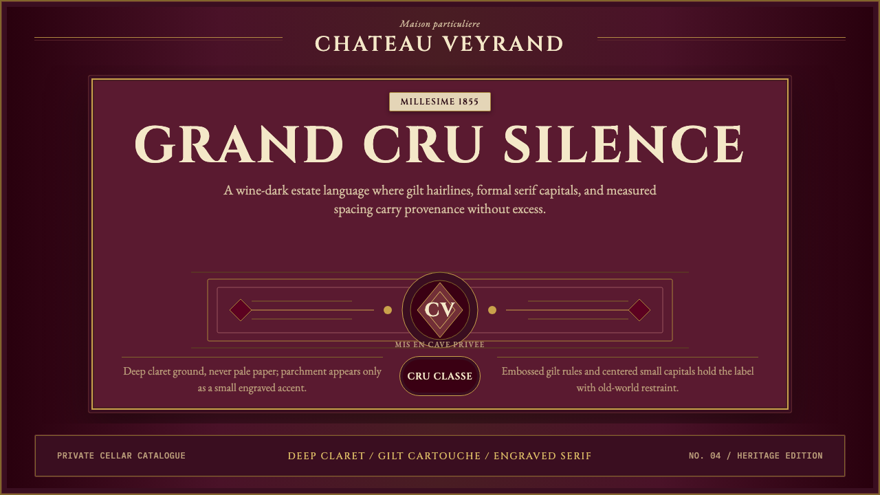 Bordeaux Wine ChâteauAged claret authority. Cinzel capitals, gilt rules, and label symmetry on win…
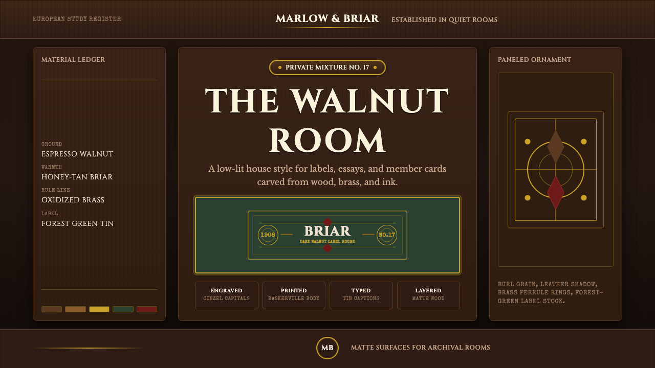 Briar Pipe & TobaccoWarm gloom, precisely aged. Brass rules and Cinzel capitals sit on espresso w…
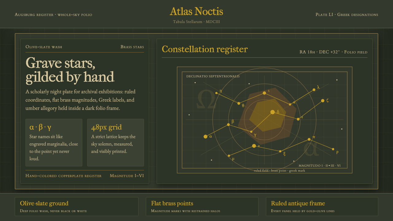 Bayer UranometriaGrave celestial folio. Olive-slate grid, brass stars, Greek labels, old-style…
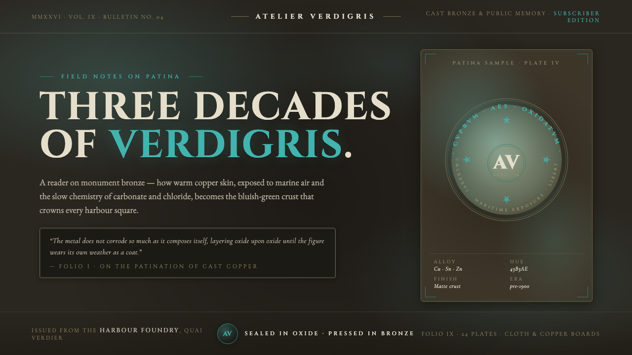 Bronze Patina StatueThree decades of weather, worn as a coat. Verdigris crust on dark bronze, eng…
 Dior New Look (1947)Couture speaks softly. Cream ground, navy Didot capitals, and gold hairlines…
 Dracula Gothic (1897)Victorian dread after dark. Blood-red initials and tarnished gilt haunt coffi…