What is Amsterdam Canal House?什么是 Amsterdam Canal House?
Amsterdam Canal House translates the quiet grandeur of seventeenth-century Grachtengordel merchant architecture into a modern visual system where deep brick warmth, canal grey, and amber window-glow create an atmosphere of unhurried, layered luxury.阿姆斯特丹运河屋将十七世纪绅士运河带商人建筑的静谧气度,提炼为一套以深砖红暖意、运河灰绿与琥珀窗光构筑的现代视觉语言——从容、层次丰富、低调奢华。
Amsterdam Canal House in briefAmsterdam Canal House 速览
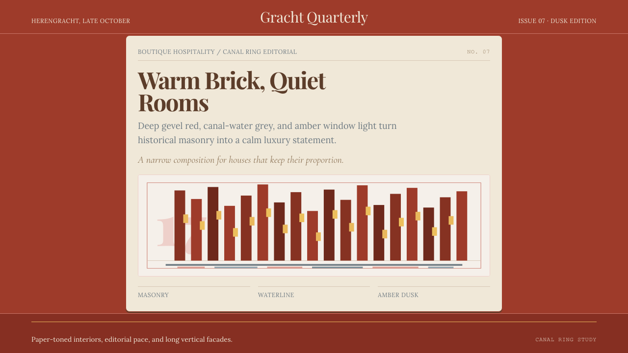
Amsterdam Canal House is a design system rooted in the visual character of the historic Grachtengordel — the concentric ring of seventeenth-century canals that forms the heart of Amsterdam's UNESCO-listed historic center. The palette draws from the narrow gabled townhouses that line those waterways: deep warm brick for the facades, a grey-green that mirrors the canal water, cream tones recalling lime-washed interior plaster, and a muted amber that evokes the glow of leaded-glass windows at dusk. Together these hues produce an effect simultaneously grounded and luminous — historically resonant without being nostalgic.阿姆斯特丹运河屋是一套植根于历史性绳索运河带(Grachtengordel)视觉特征的设计系统。绳索运河带由同心排列的十七世纪运河构成,是阿姆斯特丹联合国教科文组织历史中心的核心地带。色板取材于沿运河排列的窄山墙联排住宅:深暖砖红对应建筑外墙,灰绿色映照运河水面,奶油调子来自石灰粉刷的内墙,静谧的琥珀色则唤起黄昏时铅框玻璃窗透出的光芒。这几种色彩共同营造出一种既沉稳又明亮的氛围——历史感深厚,却不流于怀旧。
The typographic character of the system pairs editorial serif headlines with a warm, readable serif for body text. The resulting combination recalls the beautifully proportioned letterpress printing that flourished in the Dutch Golden Age — a tradition that gave the world some of the finest book typefaces of the early modern period. Surfaces in the system are never stark white but lean toward cream or warm paper tones, reinforcing the sense that every document or interface is something worth holding, not just scanning.系统的字体性格以编辑感衬线字体担纲标题,以温润易读的衬线字体承托正文。这一搭配令人联想到荷兰黄金时代蓬勃发展的精美铅字印刷传统——那个时代为早期现代世界贡献了一批最出色的书籍字体。系统中的底面从不采用刺眼的纯白,而是偏向奶油色或暖纸调,使每一份文档或界面都散发出值得驻留的质感,而非仅供快速浏览。
What distinguishes Amsterdam Canal House from other heritage-inflected design systems is its restraint. It does not deploy ornament freely or quote architectural decoration literally. Instead it absorbs the proportional logic and material warmth of canal-house architecture and re-expresses that logic in contemporary layouts. The result is editorial without pretension — a system that feels genuinely cultivated rather than costumed.阿姆斯特丹运河屋区别于其他带有历史色彩设计系统的,是它的克制。它不随意堆砌装饰,也不直接引用建筑细节。相反,它吸收了运河屋建筑的比例逻辑与材料温度,并将这种逻辑在当代版面中重新表达出来。最终效果兼具编辑感而不显造作——是真正有修养的气质,而非刻意的装扮。
See the Amsterdam Canal House design system查看 Amsterdam Canal House 完整设计系统
Where does Amsterdam Canal House come from?Amsterdam Canal House 从何而来?
The visual sources of Amsterdam Canal House reach back to the Dutch Golden Age, specifically the decades between roughly 1600 and 1680, when Amsterdam was the wealthiest trading city in the world. The Grachtengordel — a planned urban expansion of three concentric semi-circular canals, the Herengracht, Keizersgracht, and Prinsengracht — was constructed during this period. Its narrow, deep lots produced a distinctive building typology: tall, narrow brick facades with elaborately shaped gables (step gables, neck gables, bell gables) that served as both structural expression and merchant status display. The city architect Hendrick de Keyser (1565–1621) was instrumental in formalizing this architectural language, introducing Dutch Renaissance ornament and the use of local sand-lime brick in civic and private buildings alike.阿姆斯特丹运河屋的视觉源头可追溯至荷兰黄金时代,尤其是约1600至1680年间——彼时阿姆斯特丹是世界上最富庶的贸易城市。绳索运河带作为一项有规划的城市扩张工程,由绅士运河(Herengracht)、皇帝运河(Keizersgracht)与王子运河(Prinsengracht)三条同心半圆运河构成,正是在这一时期兴建而成。细长深窄的用地形制催生了独特的建筑类型:高挑、窄幅的砖砌立面,配以精心塑造的山墙(阶梯山墙、颈式山墙、钟式山墙),既是结构表现,也是商人地位的公开展示。城市建筑师亨德里克·德·凯泽(1565—1621年)在规范这套建筑语言方面居功至伟——他将荷兰文艺复兴装饰与当地沙灰砖的使用引入公共建筑与私宅之中。
The canal houses were not merely domestic; they were instruments of commercial power. Merchants stored goods in their upper floors and attic spaces, conducted business in street-level offices, and received clients in formal ground-floor reception rooms. The facades were therefore public-facing statements of reliability, taste, and wealth — and the visual language of deep brick, white limestone trim, and warm interior light became inseparable from the idea of Dutch mercantile prestige. This association of warm brick warmth with trustworthy, understated prosperity is one the Amsterdam Canal House design system consciously inherits.运河屋绝不仅仅是住宅,它们是商业权力的工具。商人在上层楼面与阁楼储存货物,在临街办公室处理业务,在正式的底层接待室会见客户。建筑立面因此是面向公众的可靠性、品味与财富宣言——深沉的砖红、白色石灰石收边与室内暖光,由此成为荷兰商业声望不可分割的符号。这种砖红暖意与值得信赖的低调繁荣之间的关联,正是阿姆斯特丹运河屋设计系统有意继承的遗产。
The twentieth century brought a second wave of influence through the Amsterdam School movement (roughly 1910–1930), a variant of Art Nouveau and Expressionism that flourished among Amsterdam's municipal architects. Designers like Michel de Klerk and Piet Kramer transformed social-housing blocks into sculptural brick buildings with ornamental brickwork, rounded corners, and organic metalwork. While the Amsterdam School was more overtly decorative than the austere Golden Age tradition, it deepened the cultural association between Amsterdam's urban identity and the expressive potential of brick as a building material. The warm, textured quality of brick — its capacity to absorb and glow with light rather than merely reflecting it — became a defining characteristic of the city's architectural self-image.二十世纪,阿姆斯特丹学派运动(约1910—1930年)带来了第二波影响浪潮。这一植根于阿姆斯特丹市政建筑师群体的新艺术与表现主义变体,由米歇尔·德·克勒克与彼得·克拉默等设计师将社会住宅楼群转化为带有装饰性砌砖、圆润角部与有机金属构件的雕塑般建筑。阿姆斯特丹学派比朴素的黄金时代传统更具装饰性,但它深化了阿姆斯特丹城市认同与砖作为建筑材料的表现潜力之间的文化关联。砖的温暖、质感——其吸收并漫射光线而非单纯反射的特质——成为这座城市建筑自我形象的决定性特征。
The modern design revival that informs the contemporary Amsterdam Canal House system emerged in the 2010s from the boutique-hotel movement. Properties like Pulitzer Amsterdam — a hotel assembled from twenty-five interconnected Golden Age canal houses — and The Hoxton Amsterdam demonstrated that the spatial vocabulary and material warmth of historic canal houses could be translated directly into hospitality interiors and subsequently into brand identity. Philip Knatchbull and the Sharan Pasricha-led Ennismore group (operating The Hoxton) were among the hospitality designers who showed that this visual language could feel genuinely contemporary rather than merely period-correct. This hospitality-led revival provided the bridge between a seventeenth-century urban aesthetic and its twenty-first-century design application.推动当代阿姆斯特丹运河屋系统形成的现代设计复兴,兴起于2010年代的精品酒店运动。普利策阿姆斯特丹酒店(由二十五栋相互连通的黄金时代运河屋组成)与霍克斯顿阿姆斯特丹等物业,证明了历史运河屋的空间词汇与材料温度可以直接转化为款待业室内设计,并进而渗透至品牌视觉识别。菲利普·纳奇布尔以及由沙兰·帕斯里查领导的Ennismore集团(运营霍克斯顿品牌)等款待业设计师展示了这套视觉语言如何在真正意义上呈现当代感,而非仅仅还原历史风貌。这场由款待业引领的复兴,在十七世纪城市美学与其二十一世纪设计应用之间架起了一座桥梁。
What defines the Amsterdam Canal House look?Amsterdam Canal House 的视觉特征是什么?
Color Palette色彩体系
The palette is anchored by a deep, warm brick red drawn from the gevel — the Dutch word for the characteristic facade of a canal house — alongside a cool canal grey-green that reads as quiet and recessive. A cream tone, warm enough to suggest aged paper or lime plaster rather than digital white, provides the primary surface for text. Amber — the color of candlelight seen through period glass — serves as the accent, deployed sparingly to signal warmth and attention. This combination avoids both the coldness of cool-white modernism and the heaviness of brown-dominated heritage palettes.色板以深暖砖红为核心锚点——砖红取自荷兰语「gevel」(运河屋标志性外墙)的质感——辅以内敛静谧的冷调运河灰绿。一抹暖奶油调子提供主要文字底面,其温度令人联想到陈年纸张或石灰粉刷,而非数字白。琥珀色——烛光透过历史玻璃折射出的色调——作为点缀色,克制地用于传递温度与注意力。这一组合既回避了冷白现代主义的疏离感,也避免了棕色主导的传统色板的沉重感。
Typography字体排印
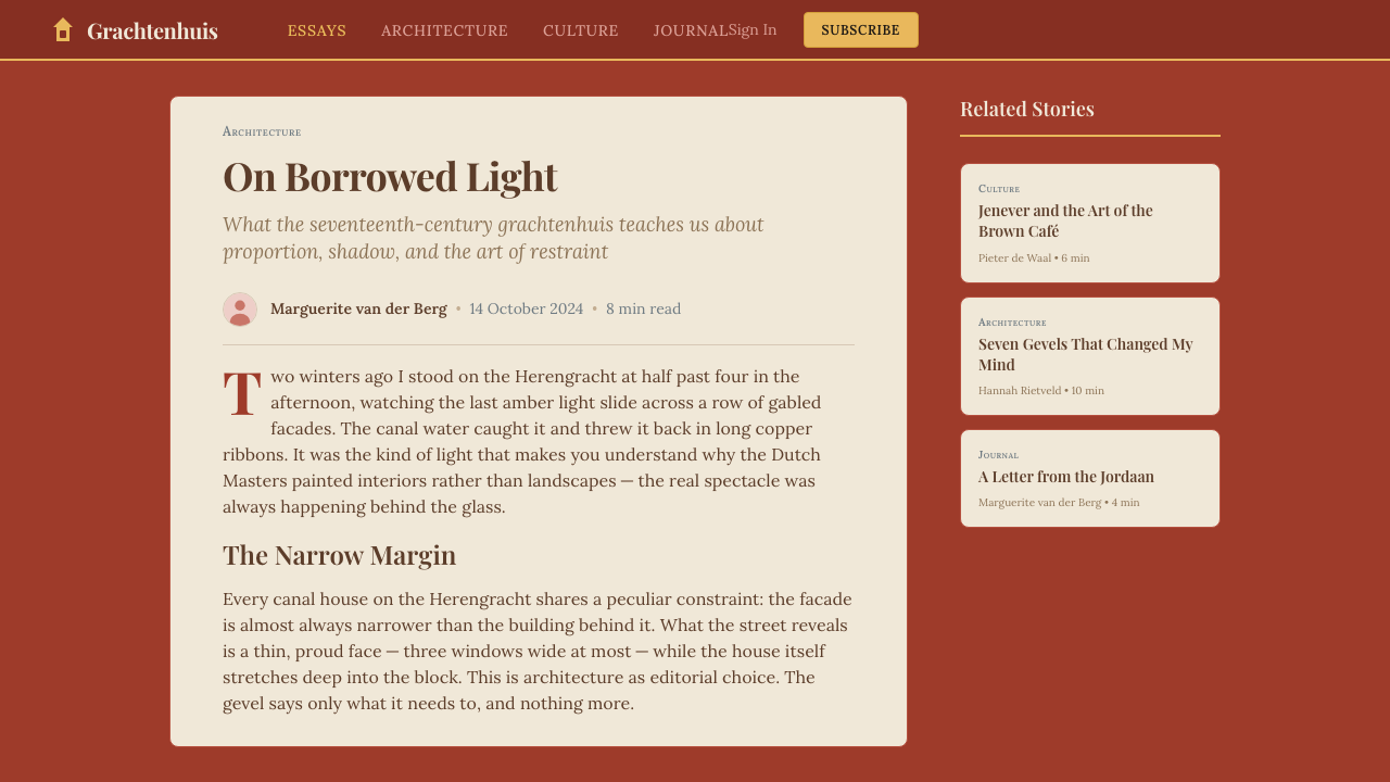
Headline typography is drawn from the editorial serif tradition — display-weight serifs with carefully crafted contrast between thick strokes and thin hairlines, a quality that echoes the precision of Dutch Golden Age letterpress printing. Body text uses a warmer, more humanist serif that reads comfortably at length, reinforcing the sense that this is a system built for sustained reading rather than quick scanning. Type is set with generous leading and deliberate tracking, giving the overall composition an unhurried quality. The system does not employ decorative scripts or display fonts that mimic historical calligraphy; the historical resonance is achieved through proportion and weight, not through pastiche.标题字体源自编辑衬线传统——展示字重衬线体,粗主笔与细发丝笔画之间对比精心打磨,呼应荷兰黄金时代铅字印刷的精密气质。正文采用更暖、更具人文主义气息的衬线字体,长篇阅读舒适流畅,强化了这套系统为沉浸阅读而非快速扫视而生的质感。排版采用宽松行距与刻意的字距处理,赋予整体构图从容不迫的节奏。系统不使用装饰性手写体或模仿历史书法的展示字体——历史共鸣通过比例与字重来实现,而非通过仿古手段。
Surface and Texture底面与质感
In the Amsterdam Canal House system, surfaces are not neutral. The primary surface is cream-paper card — warm, slightly weighted, with an implied texture that recalls fine cotton stationery or museum catalogue paper. Against masonry-toned backgrounds, these card surfaces float with a sense of physical presence. The masonry background itself reads as warm and rough rather than smooth, suggesting the grain of aged brick rather than polished stone. This layering of card on brick creates depth without resorting to digital shadow effects — the depth is semantic, architectural.在阿姆斯特丹运河屋系统中,底面并不中性。主底面是奶油纸质卡片——温暖、略带分量感,带有隐约的质感,令人联想到上等棉质信纸或博物馆图录用纸。在砖石调底色的衬托下,这些卡片底面浮现出实体般的存在感。砖石底色本身显得温暖而粗粝而非光滑,暗示陈年砖块的纹理而非抛光石材。卡片叠于砖石之上的层次,无需借助数字投影效果即可制造深度——那是一种语义性的、建筑性的深度。
Proportion and Grid比例与网格
Canal house facades are narrow and tall by necessity — Amsterdam's historic property tax was calculated by facade width, incentivizing slender buildings of great height. This vertical proportion is absorbed into the design system as a preference for narrow columns, tall card formats, and layouts that breathe vertically rather than sprawling horizontally. Navigation elements and captions are placed with architectural deliberateness: left-aligned in narrow side columns, as if positioned in the margin of a well-designed book. The grid is structured but not mechanical; a slight asymmetry — the kind that results from genuine composition rather than formula — gives the layouts a crafted rather than templated quality.运河屋立面因历史原因必然窄而高——阿姆斯特丹历史上按立面宽度征税,由此催生了大量纤细高挑的建筑。这种竖向比例被吸收进设计系统,体现为对窄列、竖版卡片格式以及竖向呼吸而非横向铺展的版面偏好。导航元素与注释以建筑师般的审慎落位:左对齐于窄侧边栏,如同置于一本精心设计书籍的页边空白处。网格结构严谨但不机械;一丝轻微的不对称——那种源于真正构图而非公式推算的不对称——赋予版面手工打造的质感,而非模板批量生产的痕迹。
Light and Glow光线与光晕
Lighting in the Amsterdam Canal House system is warm and directional, never diffuse or clinical. The amber accent color carries the primary light role — it appears as a highlight on interactive elements, as a warm rule or divider, or as the tint of an icon or callout. When shadows are used, they are not hard-offset geometric shapes in the Bauhaus manner, but rather soft, warm penumbrae that suggest candlelight or afternoon sun filtering through tall windows. This is one of the defining contrasts with the Bauhaus system: where Bauhaus uses shadow as structure, Amsterdam Canal House uses light as atmosphere.阿姆斯特丹运河屋系统中的光线是温暖而有方向感的,绝不漫射或冷峻。琥珀色点缀色承担主要的光线角色——出现于交互元素的高光处,作为暖色分割线,或作为图标与引用框的色调。若使用投影,则不是包豪斯式的硬边偏移几何形,而是柔和温暖的半影,令人联想到烛光或午后阳光透过高窗筛落。这是与包豪斯系统最具决定性的差异之一:包豪斯以投影为结构,阿姆斯特丹运河屋以光线为氛围。
Ornamentation and Restraint装饰与克制
Unlike the Amsterdam School movement, which embraced expressive ornamental brickwork and decorative flourishes, the Amsterdam Canal House design system applies ornament with extreme economy. Where it appears at all — a fine ruled line, a small gable-shaped graphic motif, a subtle corner bracket — it is used to mark boundaries or signal transitions rather than to decorate surfaces. The underlying principle is closer to the bare facades of the Herengracht's most severe houses than to the exuberant ornament of the Amsterdam School. Ornament, when it exists, earns its place through structural justification.与拥抱表现性装饰砌砖和繁复细节的阿姆斯特丹学派不同,阿姆斯特丹运河屋设计系统以极度节省的方式使用装饰。凡装饰出现之处——一条细线、一个小型山墙轮廓图形母题、一处微妙的角隅括弧——皆用于标定边界或指示过渡,而非用于修饰底面。其潜在原则更接近绅士运河沿岸最朴素立面的简洁,而非阿姆斯特丹学派的华丽装饰。装饰若存在,必须以结构功能为正当理由。
Editorial Hierarchy编辑层级
The Amsterdam Canal House system produces layouts with a clear and unhurried information hierarchy. A single dominant headline occupies the upper register; supporting information is set at a noticeably smaller size in the same serif family; captions and metadata occupy their own quiet zone, set in a reduced size with increased tracking. This three-tier hierarchy — prominent, supporting, marginal — reflects the way a well-designed book or catalogue page distributes attention: readers know immediately where to look first, and nothing competes aggressively for their gaze. The hierarchy is achieved through size and weight contrast alone, never through color contrast or emphatic decorative dividers.阿姆斯特丹运河屋系统产出的版面具有清晰而从容的信息层级。单一主导标题占据上部区域;辅助信息以明显较小的尺寸、相同的衬线家族排列;注释与元数据栖居于自成一格的静谧区域,以缩减字号配以加大字距处理。这种三级层级——主要、辅助、边注——反映了精心设计的书籍或图录页面分配注意力的方式:读者立刻知道先看哪里,没有任何元素咄咄逼人地竞争视线。层级完全依靠大小与字重对比来实现,绝不借助色彩对比或强调性装饰分割线。
See the Amsterdam Canal House design system查看 Amsterdam Canal House 完整设计系统
Who shaped Amsterdam Canal House?谁塑造了 Amsterdam Canal House?
As Amsterdam's official city sculptor and architect from 1595 until his death in 1621, Hendrick de Keyser defined the canonical visual language of the Grachtengordel townhouse. He introduced Dutch Renaissance refinements — limestone pilasters, sandstone keystones, and decorative gable carvings — to the local tradition of load-bearing brick construction, creating a hybrid that was simultaneously robust and elegant. His Westerkerk and Zuiderkerk churches, along with his work on private merchant houses, established the proportional vocabulary and material combination — brick with stone accents — that would define Amsterdam's urban image for the next three centuries and continue to underpin the Amsterdam Canal House design system today.作为阿姆斯特丹自1595年至1621年辞世的官方城市雕塑家与建筑师,亨德里克·德·凯泽确立了绳索运河带联排住宅的经典视觉语言。他将荷兰文艺复兴细节——石灰石壁柱、砂岩拱心石与装饰性山墙雕刻——引入当地承重砖砌传统,创造出一种既坚实又优雅的混合形态。他的西教堂、南教堂以及私人商宅作品,确立了砖与石材点缀相结合的比例词汇与材料组合,这一组合定义了阿姆斯特丹城市形象长达三个世纪,并持续作为当代阿姆斯特丹运河屋设计系统的基础。
The leading designer of the Amsterdam School movement, Michel de Klerk (1884–1923) demonstrated that the expressive potential of brick was far greater than the canal house tradition had exploited. His social-housing complexes in the Spaarndammerbuurt and De Dageraad neighborhoods treat brick not as a structural cladding but as a plastic material to be shaped, curved, and detailed into dynamic sculptural surfaces. De Klerk's work expanded the cultural understanding of what brick could communicate — not just mercantile solidity, but craft warmth, material honesty, and civic care. His influence resonates in the Amsterdam Canal House system's emphasis on brick as a material with expressive depth rather than mere historical reference.阿姆斯特丹学派运动的领军设计师米歇尔·德·克勒克(1884—1923年)证明了砖的表现潜力远超运河屋传统所发掘的程度。他在斯帕尔恩达默布尔特和黎明社区设计的社会住宅建筑群,将砖不视为结构覆层,而是可被塑造、弯曲、精心处理为动态雕塑般表面的可塑性材料。德·克勒克的工作拓展了人们对砖的文化理解——它传达的不仅是商业上的稳重,更是工艺温度、材料诚实与公民关怀。他的影响回荡于阿姆斯特丹运河屋系统对砖作为具有表现深度材料(而非单纯历史引用)的强调之中。
Philip Knatchbull, through his direction of Pulitzer Amsterdam, provided one of the most influential demonstrations that the visual and spatial language of historic canal houses could be translated into a fully functional contemporary hospitality environment without pastiche. By assembling twenty-five interconnected Golden Age townhouses into a single hotel — preserving original beam ceilings, brick walls, and narrow stair halls while introducing modern comfort — Knatchbull showed that warm brick, cream plaster, and amber light could form a coherent modern identity rather than a museum reconstruction. The Pulitzer's design language directly seeded the contemporary Amsterdam Canal House visual system.菲利普·纳奇布尔通过主导普利策阿姆斯特丹酒店,提供了历史运河屋的视觉与空间语言可以被转化为功能完整的当代款待业环境、而无需仿古复制的最具影响力的示范之一。他将二十五栋相互连通的黄金时代联排住宅组合成一家酒店——保留原有木梁天花板、砖墙与窄梯间的同时引入现代舒适设施——由此证明暖砖、奶油灰泥与琥珀光线可以构成连贯的现代身份认同,而非博物馆重建。普利策酒店的设计语言直接孕育了当代阿姆斯特丹运河屋视觉系统。
As founder of Ennismore and the creative force behind The Hoxton hotel brand, Sharan Pasricha developed a parallel approach to Amsterdam canal house aesthetic: where Pulitzer Amsterdam was faithful to preservation, The Hoxton Amsterdam interpreted the same material vocabulary — brick, timber, warm plaster — through a more contemporary editorial lens. The Hoxton's brand identity demonstrated that the canal house system could be made accessible and design-forward without losing its essential warmth and material character. Pasricha's work in Amsterdam contributed to establishing the language as a recognized contemporary design register, not merely a historic preservation exercise.作为Ennismore创始人与霍克斯顿酒店品牌背后的创意力量,沙兰·帕斯里查发展出了诠释阿姆斯特丹运河屋美学的平行路径:普利策阿姆斯特丹忠于历史保护,而霍克斯顿阿姆斯特丹则以更具当代感的编辑视角重新诠释同一套材料词汇——砖、木材、暖色灰泥。霍克斯顿的品牌视觉识别证明,运河屋系统可以在不失其本质温度与材料性格的前提下,呈现出易于亲近且设计前瞻的面貌。帕斯里查在阿姆斯特丹的工作,助力将这套语言确立为一种公认的当代设计语域,而非单纯的历史保护练习。
Set Hotels, the group encompassing Pulitzer Amsterdam alongside other design-forward European properties, has been significant in codifying the canal house aesthetic as a transferable brand system rather than a site-specific anomaly. By applying consistent material choices — the brick warmth, the cream card surfaces, the amber accent, the editorial serif typography — across properties in different European cities, Set Hotels demonstrated that the Amsterdam canal house visual language had sufficient formal coherence to travel beyond its geographic origin. This codification is one of the direct precedents for how the Amsterdam Canal House design system is structured today.Set Hotels集团旗下涵盖普利策阿姆斯特丹与其他富有设计感的欧洲物业,在将运河屋美学整理为可移植的品牌系统(而非特定场地的个案)方面发挥了重要作用。通过在不同欧洲城市的物业中统一应用一致的材料选择——砖的暖意、奶油卡片底面、琥珀点缀色、编辑性衬线字体——Set Hotels证明了阿姆斯特丹运河屋视觉语言具有足够的形式连贯性,可以超越其地理起源而广泛旅行。这一整理工作是阿姆斯特丹运河屋设计系统今日架构方式的直接先例之一。
How do you use Amsterdam Canal House today?今天怎么用 Amsterdam Canal House?
Amsterdam Canal House is among the more contextually specific design systems — its warmth, material depth, and editorial character are genuine strengths in the right contexts, and genuine liabilities in the wrong ones. Applying it correctly begins with understanding what emotional register it occupies: quiet authority, understated luxury, and the kind of trustworthiness that is demonstrated through sustained quality rather than loud assertion. Products and services that embody those values — boutique hospitality, premium financial services, cultural institutions, luxury editorial, high-end real estate — find the system immediately expressive. Mass-market consumer products, high-energy e-commerce, and interfaces that depend on speed and urgency will typically find it too slow and too warm.阿姆斯特丹运河屋是语境特异性较强的设计系统之一——其温度、材料深度与编辑性格在合适的语境中是真正的优势,在错误的语境中则是真正的负担。正确应用它,首先要理解它所占据的情感语域:静谧的权威、低调的奢华,以及那种通过持续品质而非大声宣告来证明自身的可信赖感。体现上述价值观的产品与服务——精品款待业、高端金融服务、文化机构、奢侈品编辑内容、高端房地产——会发现这套系统即刻富有表现力。大众消费品、高能耗电子商务以及依赖速度与紧迫感的界面,通常会觉得它过于迟缓、过于温暖。
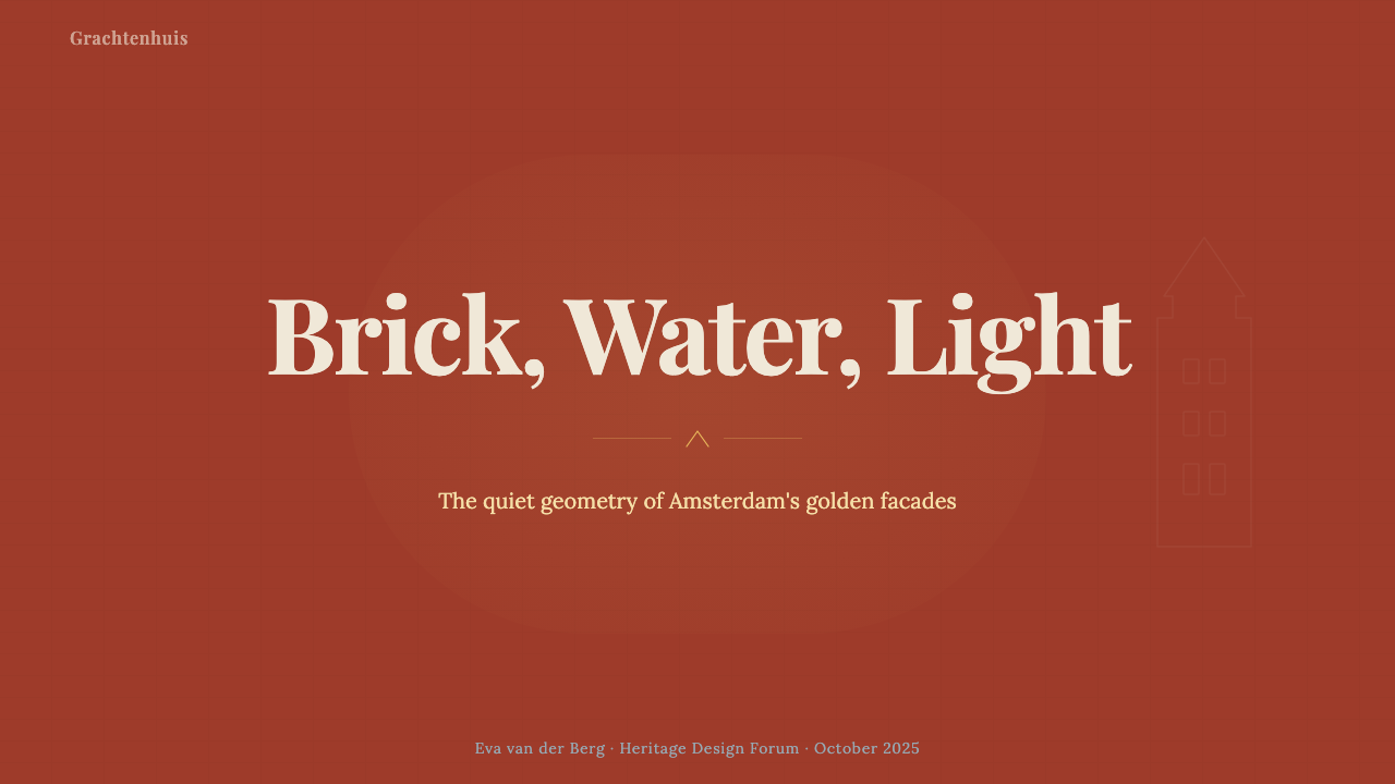
For presentation slides, Amsterdam Canal House excels at cover pages that need to feel expensive without being ostentatious. A strong cover composition uses a cream card surface centered or offset on a brick-warm background, with a serif headline in a generous size set at comfortable tracking. A single amber accent — a thin rule, a small motif, a highlighted word — provides focal warmth without overloading the palette. Content slides should maintain narrow text columns with generous margins, setting body text in the warm serif and using the brick or canal-grey tones only as section markers or background zones, never as competing figure elements. Data slides work well when chart elements are assigned to the palette's restrained range — brick for primary data series, canal grey for secondary, cream as a neutral reference line — keeping the analytical quality warm rather than clinical.在演示文稿中,阿姆斯特丹运河屋尤其擅长制作需要显得昂贵而不炫耀的封面页。强劲的封面构图将奶油卡片底面居中或偏移置于砖红暖色背景之上,配以宽松字距的大尺寸衬线标题。单一的琥珀色点缀——一条细线、一个小图形母题、一个高亮单词——提供焦点温度,而不使色板过载。内容页应保持窄文字列与宽阔页边留白,以暖衬线字体排列正文,仅将砖红色或运河灰用作段落标记或背景色区,绝不作为相互竞争的图形元素。数据页在将图表元素分配至色板克制色域时效果出色——砖红用于主要数据系列,运河灰用于次要系列,奶油色用作中性参考线——使分析性品质保持温暖而非冷峻。
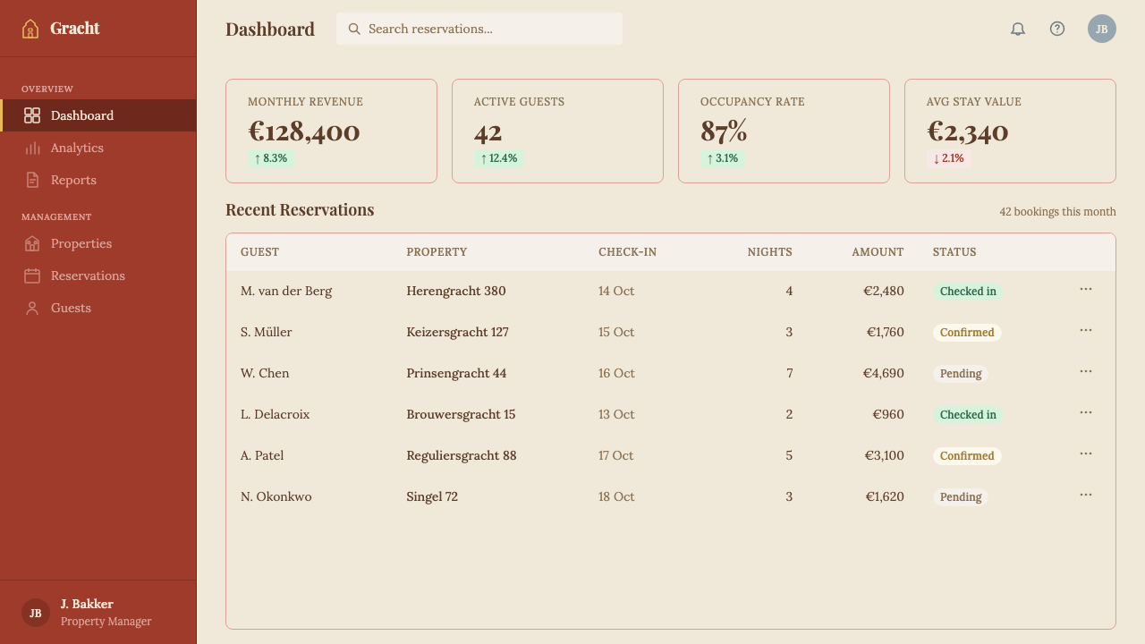
For web interfaces, the system is particularly well-suited to dashboards, pricing pages, and product-detail pages where a sense of considered craftsmanship builds user trust. The approach is to set a warm cream or off-white as the dominant surface, reserve brick red for primary interactive states and calls-to-action, and use canal grey as the structural color for borders, dividers, and secondary typography. Card components should feel physically present — a soft warm shadow, never a hard-offset one, with a slight border reinforcing their material quality. Navigation should be typographic, using the editorial serif at a moderate scale, with amber highlights indicating the active state. Avoid the temptation to introduce additional accent colors; the restraint of the palette is integral to its authority.在网页界面中,这套系统尤其适用于仪表板、定价页面与产品详情页——在这些场景中,精心打磨的工艺感可以建立用户信任。方法是以暖奶油色或近白色作为主底面,将砖红保留给主要交互状态与行动号召,用运河灰作为边框、分割线与次要字体的结构色。卡片组件应具备实体感——以柔和暖投影而非硬边偏移投影,辅以轻微边框强化其材料品质。导航应具字体性,以编辑衬线体作中等尺寸,以琥珀色高光指示活跃状态。抵制引入额外点缀色的诱惑;色板的克制性是其权威感不可分割的组成部分。
For editorial and marketing work, Amsterdam Canal House produces layouts with genuine depth and readability. A feature article layout uses a dominant serif headline, a deck or standfirst in the same family at a smaller size, and body text set in a measure that encourages a comfortable reading pace — narrow enough to feel curated, wide enough not to feel cramped. Pull quotes or callouts are set in the amber-warm accent tone, using scale rather than color shock to attract attention. Marketing pages benefit from alternating surface zones — cream card sections for product or service descriptions, brick-warm background sections for testimonials or context-setting — creating a spatial rhythm that mimics walking through the rooms of a well-proportioned building. Photography, where used, should lean toward warm natural light, shallow depth of field, and material textures rather than bright flat product photography.在编辑与营销内容中,阿姆斯特丹运河屋产出具有真实深度与可读性的版面。专题文章版面使用主导衬线标题,以同一字体家族的较小字号排列引言或导语,以舒适节奏鼓励阅读的行宽排列正文——窄到感觉经过精选,却又宽到不显局促。引用语或重点框以琥珀暖调点缀色排列,以尺寸对比而非色彩冲击吸引注意力。营销页面得益于交替的底面区域——奶油卡片区呈现产品或服务描述,砖红暖底区承载推荐语或背景叙事——制造出一种空间韵律,仿佛穿行于比例匀称的建筑各室之间。摄影图像(若使用)应偏向暖色自然光、浅景深与材料纹理,而非明亮平淡的产品摄影。
A common mistake when applying Amsterdam Canal House is allowing the warmth of the palette to drift into muddiness. The system's distinguishing quality is that its warmth is layered and specific — deep brick against cream against amber — not a generalized brownish haze. This means each color must be used at its own distinct value and saturation, never blended or faded together. A second common error is overusing the serif in its heaviest weights across all levels of hierarchy, which produces a funereal solemnity rather than cultivated authority. The editorial character of the system depends on deliberate contrast between a prominent heavyweight headline and a lighter, more open body setting — the contrast is what gives the system its sense of a well-edited page rather than a uniformly dense document.应用阿姆斯特丹运河屋时最常见的错误,是让色板的暖意漂移为混浊。这套系统的区别性品质在于其温度是有层次且具体的——深砖红、奶油、琥珀各居其位——而非笼统的棕黄色雾霾。这意味着每种颜色必须以各自明确的明度与饱和度使用,绝不融混或淡化在一起。第二个常见错误是在所有层级中过度使用最重字重的衬线字体,由此产生葬礼般的庄严感,而非修养所带来的权威感。系统的编辑性格依赖于重磅标题与较轻、更开阔的正文排版之间的刻意对比——正是这种对比赋予系统精心编辑的页面感,而非均质浓密的文件感。另一个陷阱是字面的历史主义——添加装饰性建筑母题、伪做旧质感或历史装饰,令人感觉是换了戏服而非真正有修养。系统对历史的引用应体现在比例、材料调性与排印逻辑中,而非剪贴画式的山墙轮廓或人工做旧表面。目标是让当代读者在情感上认出阿姆斯特丹运河屋的氛围,而非对它的复刻再现。
A further pitfall is literal historicism — adding decorative architectural motifs, faux-aged textures, or period ornament that reads as costumed rather than cultivated. The system's historical references should be felt in proportion, material tone, and typographic logic, not seen in clip-art gables or artificially distressed surfaces. The goal is a contemporary reader's emotional recognition of Amsterdam's canal house atmosphere, not a reproduction of it.
See the Amsterdam Canal House design system查看 Amsterdam Canal House 完整设计系统
Amsterdam Canal House — FAQAmsterdam Canal House · 常见问题
How does Amsterdam Canal House differ from other warm, heritage-inflected design systems?阿姆斯特丹运河屋与其他带有历史温度的设计系统有何不同?
The key difference is specificity of source and restraint of application. Many warm heritage systems draw on a general impression of aged materials and historical typography without a precise cultural anchor. Amsterdam Canal House has a specific geographic and historical referent — the Grachtengordel and its seventeenth-century merchant architecture — and it applies that referent through proportion, material tone, and typographic logic rather than through decorative quotation. It is also more editorially rigorous than, say, a Tuscan or English country house system: the Dutch mercantile tradition prized clarity and legibility alongside warmth, and that combination of the editorial and the comfortable is central to the system's character.关键差异在于来源的明确性与应用的克制性。许多带有温度感的历史系统从陈年材料与历史字体的泛泛印象中汲取灵感,却缺乏精确的文化锚点。阿姆斯特丹运河屋有明确的地理与历史参照——绳索运河带及其十七世纪商人建筑——并通过比例、材料调性与排印逻辑来应用这一参照,而非通过装饰性引用。它也比托斯卡纳或英国乡村屋系统更具编辑严谨性:荷兰商业传统在温度之外同样重视清晰度与易读性,正是编辑感与舒适感的这一结合,构成了这套系统性格的核心。
Can Amsterdam Canal House work effectively in dark mode or on dark backgrounds?阿姆斯特丹运河屋能在深色模式或深色背景上有效运作吗?
It can, but the inversion requires care. The system's canonical form is light-ground: cream surfaces against warm masonry backgrounds, with amber as the primary accent. A dark inversion works best when it treats deep brick red as the dominant dark surface — richer and warmer than pure black or neutral dark grey — and reserves cream for primary body text and headlines. Amber remains effective as an accent in this configuration. Canal grey becomes a lighter structural element against the dark field. What does not work well is inverting the system to cool dark backgrounds (near-black or dark blue-grey), because the warmth that gives the system its identity is dependent on the warmth of the dark register, not just of the light surfaces.可以,但反转需要谨慎处理。这套系统的标准形态是浅底:奶油底面衬于暖砖石背景,琥珀色担任主要点缀。深色反转最有效的做法是将深砖红作为主导深色底面——比纯黑或中性深灰更富层次、更具温度——并将奶油色保留给主要正文与标题。琥珀色在这一配置中作为点缀色依然有效。运河灰则成为深色底面上较浅的结构性元素。效果欠佳的做法是将系统反转至冷调深色背景(接近纯黑或深蓝灰),因为赋予系统身份感的温度依赖的是深色调本身的温暖,而非仅仅依赖浅色底面。
Is the system appropriate for digital-native products, or does it only suit traditional editorial contexts?这套系统适合数字原生产品吗,还是只适合传统编辑语境?
The system is genuinely effective in digital-native contexts where its core values — trustworthiness, considered craft, understated authority — align with the product's positioning. SaaS platforms for finance, legal, or property; subscription services in the premium cultural or educational space; and professional portfolio sites all find the system a strong fit. It is less suited to high-frequency interaction products (social feeds, messaging apps, gaming interfaces) where the deliberate pace of the typography and the warmth of the palette would feel mismatched with the product's energy. The test is not whether the product is digital or editorial, but whether the product's values and the system's values overlap.在核心价值——可信赖感、审慎的工艺感、低调的权威——与产品定位相契合的数字原生语境中,这套系统真正有效。面向金融、法律或房地产的SaaS平台;高端文化或教育领域的订阅服务;以及专业作品集网站,都会发现这套系统极为契合。它不太适合高频交互产品(社交信息流、即时通讯应用、游戏界面),在那些场景中,字体的从容节奏与色板的温暖感会与产品本身的节奏产生错位。判断标准不在于产品是数字的还是编辑的,而在于产品的价值观与系统的价值观是否重叠。
How should the brick red be used without the composition feeling heavy or dated?如何使用砖红色而不使构图显得沉重或过时?
Brick red carries weight visually, and that weight is an asset — but it must be used in measured quantities. The most effective approach is to treat brick red as a background zone rather than a foreground element: a section-dividing band, a card background for a callout, or a navigation bar. When used as a foreground color — for a headline, a call-to-action button, or a data series in a chart — it should be deployed against cream rather than white, because white will make the brick tone read as aggressive, while cream will allow it to read as warm and grounded. Avoid applying brick red as a tint or gradient; it loses its material specificity and becomes generic. At full, clear value against cream, it is exactly right.砖红色视觉上具有分量感,而这种分量感是优势——但必须适量使用。最有效的方法是将砖红作为背景区域而非前景元素:一条段落分隔带、一个引用框的卡片背景,或一条导航栏。当用作前景色时——标题、行动号召按钮,或图表中的数据系列——应置于奶油底面而非纯白底面之上,因为纯白会使砖红色调显得具有攻击性,而奶油色将使其呈现为温暖而沉稳的质感。避免将砖红用作色调或渐变——它会失去材料的特异性,变得泛泛。以完整、清晰的饱和度置于奶油底面上,才是恰到好处。
What makes this system feel luxurious rather than simply old-fashioned?是什么让这套系统给人奢华感而非单纯的过时感?
The distinction between luxurious and merely old-fashioned lies in selectivity and contemporary application. A system that quotes historical sources indiscriminately — using every period convention simultaneously — produces pastiche. Amsterdam Canal House achieves a luxurious quality by selecting the proportional logic, material warmth, and editorial typography of its sources and applying them with contemporary restraint. The layouts are clean; the hierarchies are clear; the color palette is limited and deliberate. The historical references are felt as atmosphere rather than seen as quotation. Luxury in design is typically a product of restraint — of knowing what not to include — and the Amsterdam Canal House system's authority comes precisely from what it refuses: excess ornament, competing color families, overwrought texture, and any element that is not earning its place on the page.奢华与单纯过时之间的区别,在于选择性与当代应用。不加区分地引用历史来源——同时堆砌所有时代惯例——产生的是仿古。阿姆斯特丹运河屋通过选取其来源的比例逻辑、材料温度与编辑性排印,并以当代克制加以应用,实现了奢华的品质。版面干净;层级清晰;色板有限且刻意为之。历史引用以氛围的形式被感受,而非以引用的形式被看见。设计中的奢华通常是克制的产物——知道什么不该放进来——而阿姆斯特丹运河屋系统的权威感,恰恰来自它所拒绝的东西:过剩的装饰、相互竞争的色彩家族、过度的质感处理,以及任何无法在页面上证明自身存在理由的元素。
Related design styles相关设计风格
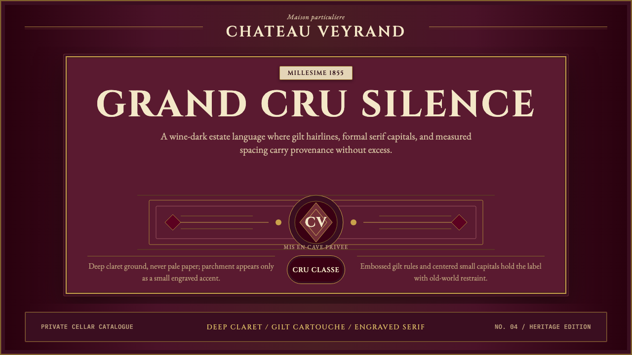 Bordeaux Wine ChâteauAged claret authority. Cinzel capitals, gilt rules, and label symmetry on win…沉静的酒红权威:Cinzel大写、金色细线与酒标式对称。
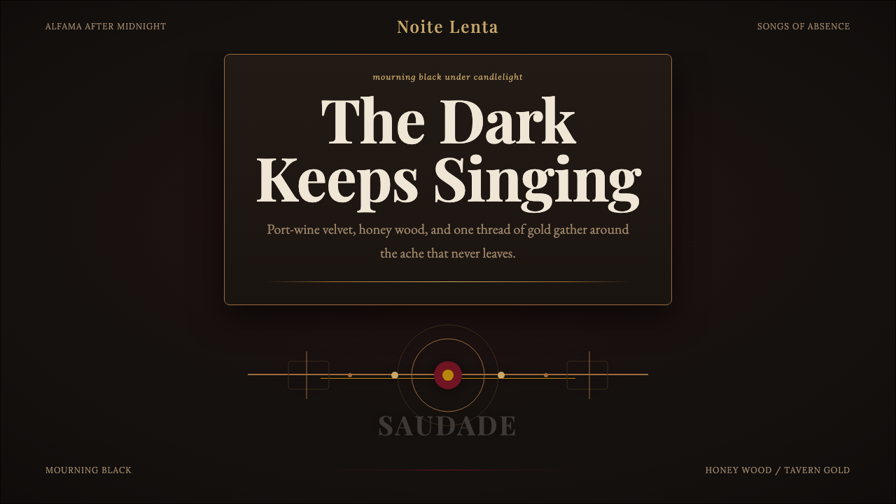 Fado SaudadeSaudade in shadow. Mourning black holds wine red, honey wood, and one gold li…阴影里的思念:哀黑托住酒红、蜜木与一线烛金。
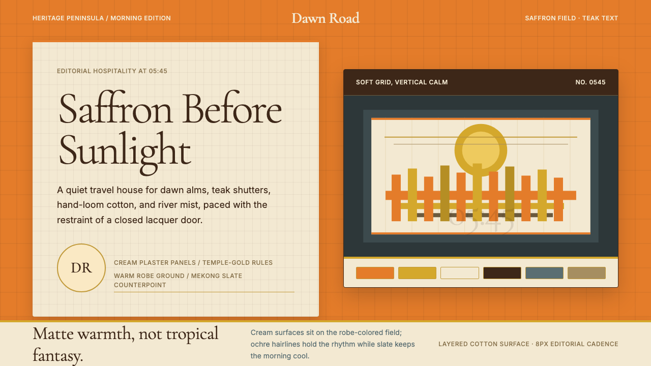 Luang Prabang Temple TourismReverent dawn luxury. Saffron field, cream panels, and teak serif type carry…晨曦中的克制奢华。藏红花底、奶油面板与柚木衬线传递静谧。
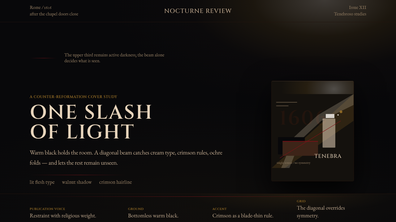 Caravaggio TenebrismDarkness acts first. Warm-black voids, Cinzel capitals, and one ochre raking…黑暗先发声:暖黑空场、Cinzel 大写与赭石斜光。
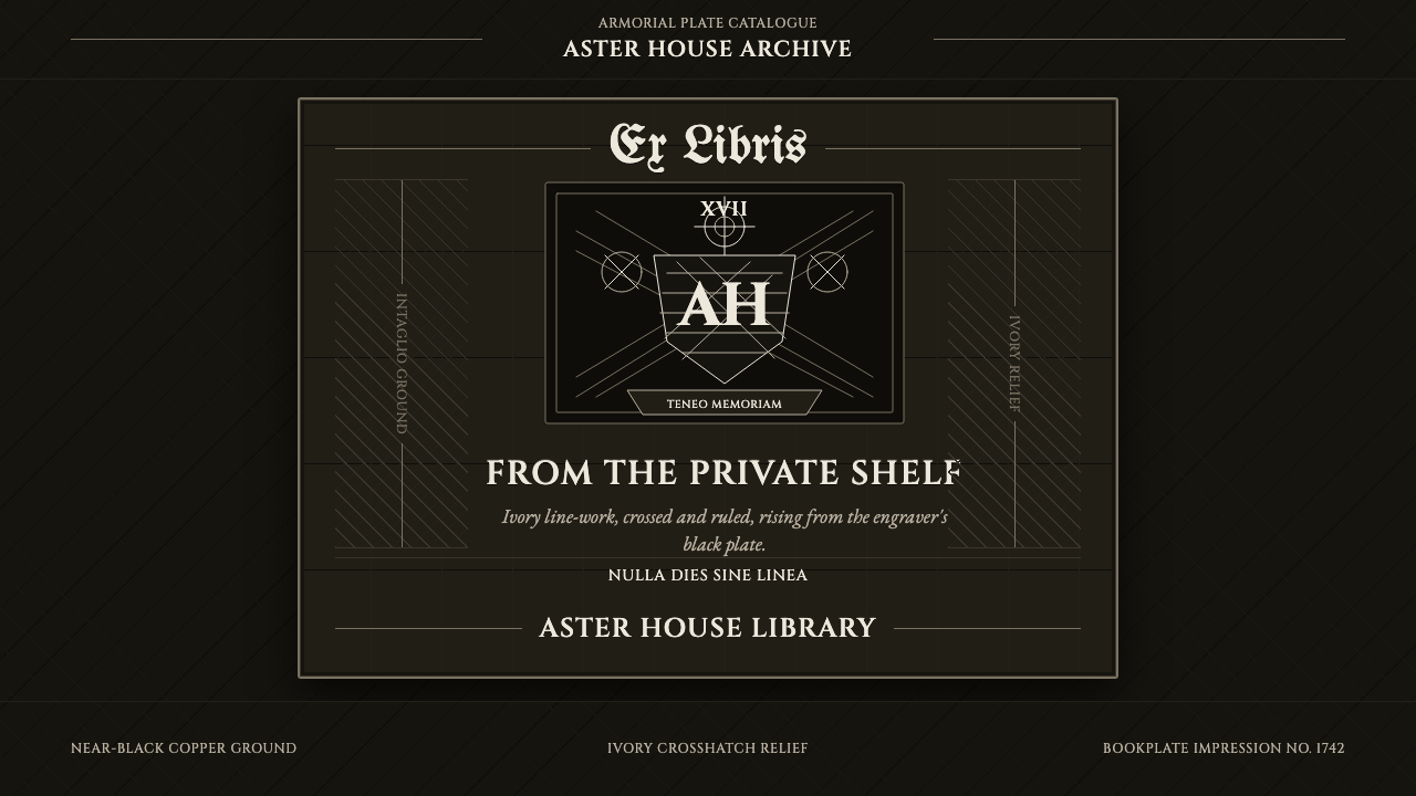 Ex Libris BookplateScholarly ownership, cut in ivory. Cinzel caps and crosshatch rules rise from…学者藏书的象牙刻痕。Cinzel 大写与交叉排线浮出黑版。
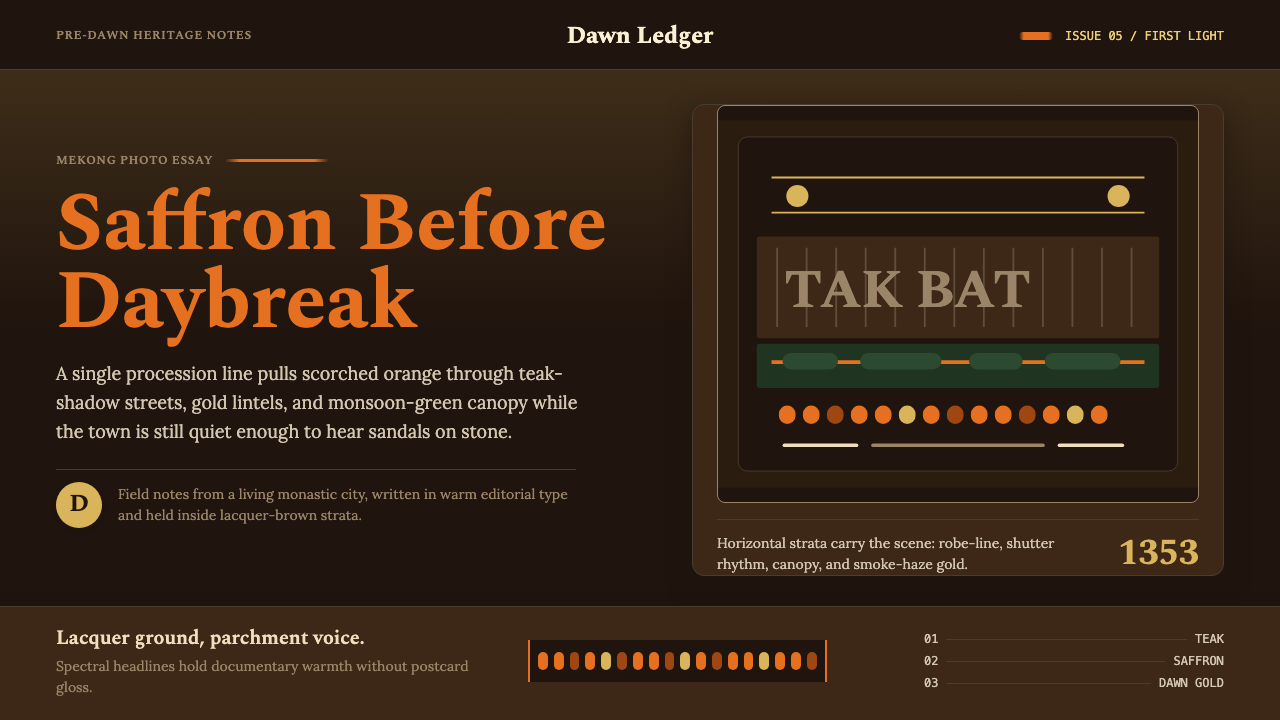 Luang Prabang Saffron AlmsDawn has weight. Saffron bands cut through teak brown and smoke-gold editoria…黎明有重量:藏红带穿过柚木棕与烟金色编辑字体。