Design style guide设计风格指南
What is Luang Prabang Temple Tourism?什么是 Luang Prabang Temple Tourism?
Luang Prabang temple tourism design captures the precise visual hush of 5:45 AM on Sakkaline Road — saffron robes moving through gray dawn, lacquered shutters still closed, the Mekong mist not yet lifted.琅勃拉邦寺庙旅游设计,捕捉的是沙卡林路清晨五点四十五分的精确静谧——藏红花色袈裟在灰色黎明中移动,漆木百叶窗尚未开启,湄公河晨雾未散。
Luang Prabang Temple Tourism in briefLuang Prabang Temple Tourism 速览
Luang Prabang temple tourism is a design language born from the visual identity of one of Southeast Asia's most singular cities — a UNESCO World Heritage site where French colonial architecture and Theravada Buddhist temple culture have coexisted since the late nineteenth century. The style is most visible in the branding and interiors of the luxury heritage hospitality brands that settled in Luang Prabang after the UNESCO listing in 1995: Amantaka, Belmond La Résidence Phou Vao, and the cluster of boutique maisons along the Mekong peninsula. It carries the color and quietude of the alms-giving ceremony, the baci ritual, and the ochre-washed temple walls that define the city's morning light.琅勃拉邦寺庙旅游设计语言,诞生于东南亚最独特城市之一的视觉身份——这座联合国教科文组织世界遗产地,自十九世纪末以来,法国殖民建筑与上座部佛教寺庙文化在此并存共生。这套风格在1995年申遗成功后入驻琅勃拉邦的奢华遗产酒店品牌中最为清晰可见:安缦塔卡、贝尔蒙德普瓦欧行宫,以及湄公河半岛沿线的精品院落群。它承载着施粥礼的色彩与宁静,巴锡祭礼的氛围,以及赭黄色庙墙在晨光中界定城市气质的方式。
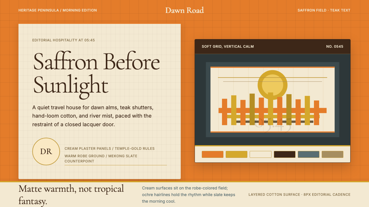
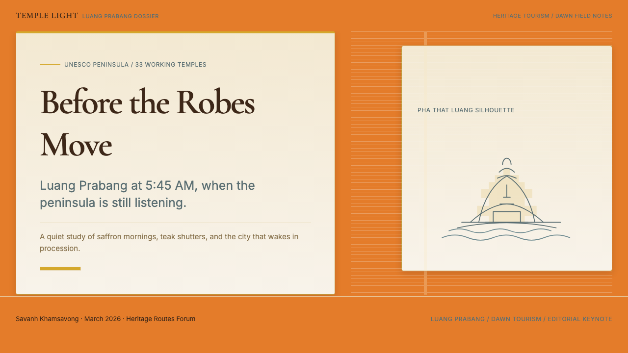
The palette is the system's most distinctive feature and its most radical decision. Where heritage tourism design elsewhere tends toward safe neutral grounds — stone, sand, taupe — Luang Prabang temple tourism goes directly to the robe itself. The background reads as the actual color of a Theravada monk's saffron fabric: warm, living, slightly orange-shifted, not gold and not amber. Against this charged ground, cream surfaces evoke hand-loom cotton and French-colonial plaster. Teak-brown text recalls the lacquered shutters and carved temple beams that shade every street in the historic quarter. Temple-gold ochre is the accent — the flash of gilded stupa finials, the edge of an alms bowl catching early sun.调色板是这套系统最鲜明的特征,也是最大胆的决定。其他地方的遗产旅游设计通常倾向于安全的中性底色——石灰、沙土、灰褐——而琅勃拉邦寺庙旅游设计直接取材于袈裟本身。页面底色即上座部僧袍的真实颜色:温暖、鲜活,略微偏橙,既非金色亦非琥珀。在这充满张力的底色之上,奶油色表面唤起手织棉布与法殖时期灰泥墙面的质感;柚木棕文字让人联想到历史街区每条街道上漆木百叶窗与雕刻庙梁的颜色;寺庙金赭色是点缀——镀金塔刹在阳光下的一道光,化缘钵沿在晨光中的一抹闪耀。
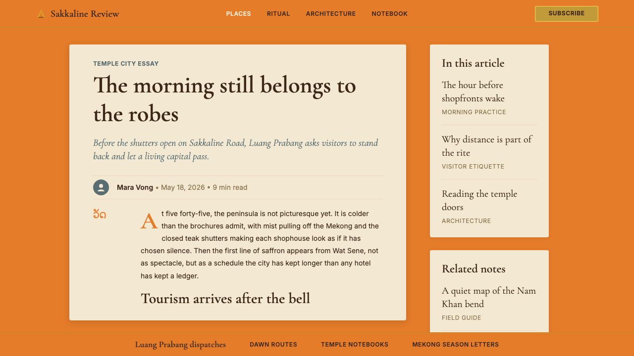
The typographic register is editorial and unhurried. Serif letterforms with bracketed strokes and moderate contrast carry the weight of the style, evoking the precision of mid-century French printing that the colonial publishing houses brought to Indochina. Headlines sit in generous leading; body text is set at a measure that invites reading rather than scanning. Nothing in the system rushes. The overall effect is that of a well-made destination magazine, or the printed menu of a restaurant where the cuisine warrants attention.排版格调是编辑性的、从容不迫的。带括号衬脚、笔画对比适中的衬线字形承担起这套风格的重量,唤起殖民时期出版机构带入印度支那的中世纪法国印刷传统的精确气质。标题置于宽松行距之中;正文以适合阅读而非扫描的行宽排版。这套系统里没有任何东西在催促人。整体效果如同一本制作精良的目的地杂志,或一家值得认真品味的餐厅精心印制的菜单。
See the Luang Prabang Temple Tourism design system →查看 Luang Prabang Temple Tourism 完整设计系统 →
Where does Luang Prabang Temple Tourism come from?Luang Prabang Temple Tourism 从何而来?
Luang Prabang's design identity crystallized in the decade following its UNESCO World Heritage listing in December 1995. The listing — which recognized the city's exceptional fusion of Lao traditional architecture and European colonial urban planning built over several centuries of interaction — triggered an influx of international hospitality investment that had been largely absent during the preceding decades of political isolation. The Lao People's Democratic Republic had maintained tight restrictions on foreign tourism and investment since 1975; the UNESCO designation provided political cover and international legitimacy for a careful reopening.琅勃拉邦的设计身份,在1995年12月获得联合国教科文组织世界遗产认定后的十年间逐步成形。这一认定——表彰该城市将老挝传统建筑与数百年互动中形成的欧洲殖民城市规划融合为一的杰出成就——引发了国际酒店业投资的涌入,而这在此前数十年的政治封闭期内几乎是缺席的。老挝人民民主共和国自1975年以来对外国旅游和投资实施严格限制;联合国教科文组织的认定为审慎开放提供了政治依据与国际合法性。
The hospitality brands that arrived in the early 2000s faced a distinctive design problem. The city's appeal was explicitly monastic and vernacular — the thing tourists came to see was the alms-giving procession, the gilded wats, the French-Lao merchant houses with their shuttered facades — and any branding that leaned too heavily on conventional luxury signifiers (black, deep navy, sterile white) would jar against this visual environment. Adrian Zecha, founder of Aman Resorts, had already refined a philosophy of resort design that sourced its visual language from the host culture rather than imposing a global luxury standard. His team's work on Amantaka — a conversion of the former French colonial college on the Sakkaline Road — established the template: saffron fields, teak-toned typography, cream surfaces, and a restrained use of gilt as accent rather than dominant color.2000年代初抵达的酒店品牌面临一个独特的设计难题。这座城市的吸引力明确地与僧侣生活和乡土风貌相关——游客来此观看的,是化缘游行、镀金寺庙,以及带着百叶窗立面的法-老式商人宅院——任何过度依赖常规奢华符号(黑色、深海军蓝、无菌白)的品牌形象,都会与这一视觉环境产生冲突。安缦度假村创始人阿德里安·泽查已经提炼出一套度假村设计哲学:从东道主文化中汲取视觉语言,而非强加一套全球奢华标准。他的团队在安缦塔卡的作品——将沙卡林路上原法国殖民地学院改建而成——确立了这套模板:藏红花色底面、柚木色调排版、奶油色表面,以及将镀金作为点缀而非主色的克制用法。
Francis Engelmann and the Belmond design team approached the same brief at La Résidence Phou Vao from a different elevation — the hotel sits above the city, with views across the temple rooftops — but arrived at an adjacent visual language. Both properties drew on a shared archive of reference: the orange of Theravada robes, the ochre wash of temple walls, the teak and lacquer of historic Lao joinery, and the muted cream of French colonial plaster. By the mid-2000s, these shared references had cohered into a recognizable visual dialect that smaller boutique properties along the Nam Khan and Mekong riverbanks adopted and refined.弗朗西斯·恩格尔曼与贝尔蒙德设计团队在普瓦欧行宫面对同一设计课题时,出发点不同——这家酒店坐落于城市上方,可俯瞰寺庙屋顶——但最终形成了相近的视觉语言。两处住宿都取材于同一组参照档案:上座部袈裟的橙色,寺庙墙面的赭黄色涂抹,老挝历史建筑中柚木与漆料的运用,以及法国殖民时期灰泥的柔和奶油色。到2000年代中期,这些共同的参照已凝聚成可辨认的视觉方言,南坎河与湄公河沿岸较小的精品住宿也陆续采纳并精炼。
The movements that shaped this style — post-UNESCO heritage tourism, French-Indochinese revival hospitality, and Theravada Buddhist visitor design — each contributed distinct values. Heritage tourism introduced the discipline of restraint: the visual language must not compete with the site itself. French-Indochinese revival brought the editorial serif tradition and the comfortable relationship between cream grounds and warm accent colors. Theravada Buddhist visitor design contributed the most specific element: the saffron ground itself, treated not as decoration but as documentary fact — the color that defines the city's most iconic daily ritual, the tak bat alms-giving ceremony that takes place on Sakkaline Road every morning before sunrise.塑造这套风格的几股潮流——联合国教科文组织认定后的遗产旅游、法属印度支那复兴风格的酒店业,以及面向上座部佛教访客的设计——各自贡献了独特的价值。遗产旅游引入了克制的纪律:视觉语言不能与遗址本身竞争。法属印度支那复兴带来了编辑性衬线传统,以及奶油色底面与暖调点缀色之间的从容关系。面向上座部佛教访客的设计贡献了最具特异性的元素:藏红花色底面本身——不作为装饰处理,而作为纪实性事实——那是每天日出前在沙卡林路举行的托钵化缘仪式(Tak Bat)所定义的城市颜色。
What defines the Luang Prabang Temple Tourism look?Luang Prabang Temple Tourism 的视觉特征是什么?
Color色彩
The palette's defining move is placing saffron — the warm, slightly orange-shifted color of a Theravada monk's robe — at the page or surface level, as ground rather than accent. This is unusual in luxury hospitality design, where warm backgrounds typically read as dated or informal. Here it reads as documentary: the color that defines the city's most iconic daily ritual becomes the substrate of all visual communication. Against this ground, cream surfaces (recalling hand-loom cotton and colonial plaster) provide quiet relief, teak-brown anchors all typography and structural elements, and temple-gold ochre is applied sparingly as a true accent — the gleam of a stupa finial, the edge of an alms bowl, a headline underline.这套调色板最决定性的举措,是将藏红花色——上座部僧袍那种温暖、略微偏橙的色调——置于页面或表面层面,作为底色而非点缀。这在奢华酒店设计中十分少见,因为暖色底面通常会显得过时或随意。在这里,它读作纪实:定义城市最标志性日常仪式的颜色,成为所有视觉传达的基底。在这一底色之上,奶油色表面(唤起手织棉布与殖民时期灰泥)提供宁静的视觉缓冲;柚木棕锚定所有排版与结构元素;寺庙金赭色被克制地用作真正的点缀——塔刹的光泽,化缘钵沿的一抹,标题下方的线条。
Typography字体排印
Serif letterforms with visible bracketed serifs and deliberate stroke contrast anchor the typographic system. The editorial register draws from the tradition of mid-century French typography — the kind brought to Indochina by colonial publishing houses and preserved in the printed matter of Lao cultural institutions. Headlines are generously spaced and set at unhurried scale; subheadings use a lighter cut of the same family, maintaining tonal unity across hierarchy levels. Body text is set at a reading-friendly measure, never compressed. All-caps settings appear only in navigational or categorical labels, where they function as directional markers rather than decorative emphasis.带可见括号衬脚、笔画对比鲜明的衬线字形是这套排版系统的锚点。编辑性格调源于中世纪法国字体传统——那种由殖民出版机构带入印度支那、在老挝文化机构印刷品中得以保存的传统。标题以宽松间距、从容比例排版;副标题使用同一字族的较细字重,在层级之间保持色调统一。正文以适合阅读的行宽排版,从不压缩。全大写仅出现在导航或分类标签中,作为方向性标记而非装饰性强调。
Surface and Texture表面与质感
The visual texture of the style is matte, warm, and slightly tactile — evoking hand-loom cotton, aged plaster, and polished teak rather than glass, chrome, or lacquered surfaces at high gloss. In screen applications, this translates to backgrounds with a subtle warmth that reads as slightly off-white or aged-cream rather than pure neutral. Gradients do not appear; color transitions, where they occur, are blocked and deliberate. The overall surface temperature is the opposite of the cool, precision-engineered gloss associated with contemporary tech or minimal Scandinavian aesthetics.这套风格的视觉质感是哑光、温暖、略带触感的——唤起手织棉布、陈年灰泥与抛光柚木,而非玻璃、镀铬或高光漆面。在屏幕应用中,这转化为带有微妙温度的背景,读起来略显偏白或陈年奶油色,而非纯粹中性。渐变不会出现;色彩过渡若有也是分块而刻意的。整体表面温度与当代科技或极简北欧美学所代表的那种冷峻、精密、高光感截然相反。
Composition and Spacing构图与留白
Layouts are generous and unhurried. Generous margins and vertical rhythm are treated as values in themselves — the negative space signals that neither the brand nor the guest is in a rush. A two-column structure frequently appears, with a narrower text column and a wider visual column, echoing the proportions of a heritage-travel editorial spread. Elements are never crowded against each other; even informational density is achieved through careful hierarchy rather than compression of space. The overall tempo of a well-executed page in this style reads like the cadence of the morning alms-giving procession: steady, deliberate, and full of unhurried pauses.版面宽松而从容。充裕的页边距与垂直节奏被视为价值本身——留白传递出品牌与宾客都无需赶时间的信号。双栏结构频繁出现:较窄的文字栏与较宽的视觉栏,呼应遗产旅游编辑版面的比例。元素之间从不拥挤;即便是信息密度较高的区域,也通过细致的层级而非压缩空间来实现。一个执行到位的页面整体节奏,读来如同晨间化缘游行的步调:稳定、从容,充满不急不忙的停顿。
Imagery图像处理
Photography is used sparingly and treated with a warm color grading that leans into golden-hour and pre-dawn light — the two moments of day when Luang Prabang's visual character is most pronounced. Images are typically editorial in framing: a detail of carved teak, monks moving through mist, a breakfast tray on a colonial veranda. Wide-angle crowd or action shots are avoided; the camera is contemplative, not journalistic. In layouts, photography occupies discrete frames rather than bleeding to full-bleed backgrounds, preserving the typographic and color architecture of the surrounding system.摄影被克制使用,以偏向黄金时段与日出前光线的暖调色彩处理——一天中琅勃拉邦视觉特质最为鲜明的两个时刻。图像的取景通常具有编辑性:柚木雕刻的细节,僧侣穿越晨雾,殖民地游廊上的早餐托盘。宽角度的人群或动作镜头被刻意回避;相机是冥想性的,而非新闻性的。在版面中,摄影占据独立框格,而非延伸为全出血背景,以此保留周围系统的排版与色彩结构。
Ornament and Iconography装饰与图像符号
Ornamental elements, where they appear, are drawn from Lao temple craft rather than from generic Southeast Asian decorative vocabularies. A naga-scale border detail, the repeating flame motif of a stupa finial, or the geometric lattice of a temple window screen may appear as dividers or marginal marks — but always as precise quotations from a specific visual tradition, not as generic 'exotic' texture. This precision is essential to the style's credibility: the design must demonstrate that it has looked carefully at Luang Prabang specifically, not at a generalized idea of Buddhist Asia.装饰元素若出现,取材于老挝寺庙工艺,而非泛泛的东南亚装饰词汇。那伽鳞纹边框细节、宝塔刹顶的火焰重复纹样,或寺庙窗格的几何格栅,可能作为分割线或页边标记出现——但始终是对特定视觉传统的精确引用,而非泛化的「异域」质感。这种精确性对这套风格的可信度至关重要:设计必须证明它认真审视的是琅勃拉邦本身,而非一个笼统的佛教亚洲概念。
Hierarchy and Restraint层级与克制
The system achieves hierarchy through restraint rather than emphasis. Rather than using multiple colors, weights, and sizes simultaneously to signal importance, Luang Prabang temple tourism design tends to use a single elevated element — a large heading in teak-brown, a single ochre rule beneath a section title — against a consistent, quiet ground. The effect is that everything of primary importance is already visible in the first reading of the page; nothing needs to compete for attention because the visual temperature is consistent enough that a small elevation reads clearly.这套系统通过克制而非强调来实现层级。与其同时使用多种颜色、字重和尺寸来标示重要性,琅勃拉邦寺庙旅游设计倾向于在一致、安静的底面上使用单一升高的元素——一个柚木棕大标题,一条章节标题下方的赭色细线。效果是:所有主要重要的内容在第一次阅读页面时就已清晰可见;无需任何元素争夺注意力,因为视觉温度足够一致,微小的提升即能清晰传达。
See the Luang Prabang Temple Tourism design system →查看 Luang Prabang Temple Tourism 完整设计系统 →
Who shaped Luang Prabang Temple Tourism?谁塑造了 Luang Prabang Temple Tourism?
Zecha founded Aman Resorts in 1988 with Amanpuri in Thailand and developed a design philosophy that became the template for the post-UNESCO Luang Prabang hospitality aesthetic. His core principle — that a luxury resort's visual identity should be derived from the host culture rather than imposed from outside — was the foundational brief that produced Amantaka's saffron-and-teak palette. Zecha's approach demonstrated that deep cultural specificity and commercial luxury were not in tension but mutually reinforcing: guests came precisely because the design looked, felt, and smelled like Luang Prabang and nowhere else.泽查于1988年在泰国以阿曼布里创立了安缦度假村,并发展出一套设计哲学,成为联合国教科文组织认定后琅勃拉邦酒店美学的模板。他的核心原则——奢华度假村的视觉身份应从东道主文化中汲取,而非由外部强加——正是产生安缦塔卡藏红花与柚木调色板的基础设计任务书。泽查的方式证明,深度文化特异性与商业奢华并非相互矛盾,而是相互强化:宾客来此,恰恰是因为这里的设计看起来、感觉起来、闻起来都像琅勃拉邦,而不像任何其他地方。
Engelmann worked within the Belmond design team and was instrumental in developing the visual language for La Résidence Phou Vao. His contribution was the elevation perspective: rather than situating the design within the historic quarter's streetscape, he drew from the view across the valley — the ochre temple rooflines seen from above, the density of tropical canopy interspersed with gilded spires. This produced a slightly more panoramic and airy variation of the core style, with a stronger emphasis on open composition and a more restrained use of the saffron ground relative to cream and teak tones.恩格尔曼在贝尔蒙德设计团队工作,对普瓦欧行宫视觉语言的发展发挥了关键作用。他的贡献是高处视角:与其将设计置于历史街区的街景之中,他从俯瞰山谷的视角取材——从高处望去的赭黄色寺庙屋脊线,热带树冠的密度与镀金塔尖的穿插。这产生了这套核心风格的一个略微全景、更为通透的变体,更强调开阔构图,相较于奶油色和柚木色调,藏红花底色的使用更为克制。
The Belmond group brought a sophisticated hotel-heritage design methodology that had been refined across properties in Venice, the Scottish Highlands, and Peru before reaching Laos. The team's approach was systematic: thorough archival research into the French-Lao colonial period (approximately 1893 to 1954), consultation with local craft traditions in teak joinery and silk weaving, and a commitment to sourcing materials and artisans within the region where possible. The resulting design language was not pastiche but an informed synthesis — a visual argument that the French-Lao colonial period produced a coherent aesthetic worth treating seriously as a source.贝尔蒙德集团带来了一套精密的酒店遗产设计方法论,在抵达老挝之前,这套方法已在威尼斯、苏格兰高地和秘鲁的项目中得到磨练。团队的方法是系统性的:对法属老挝殖民时期(约1893年至1954年)进行彻底的档案研究,咨询柚木细木工和丝织等当地工艺传统,并尽可能在当地采购材料和工匠。由此产生的设计语言不是拼贴,而是有据可查的综合——一个视觉论点:法属老挝殖民时期产生了一套连贯的美学,值得作为严肃的参照来源认真对待。
The committee's 1995 decision to list Luang Prabang as a World Heritage site was the single most consequential event in the formation of this design language. The listing created the conditions — international legitimacy, tourism infrastructure investment, a preservation mandate — under which the luxury hospitality industry arrived and commissioned the design work that defined the style. It also imposed a visual discipline on all commercial development within the heritage zone: new construction had to respect scale, material, and color standards derived from the existing built fabric. This constraint pushed designers toward the local material palette rather than international luxury conventions.联合国教科文组织世界遗产委员会1995年将琅勃拉邦列入世界遗产的决定,是形成这套设计语言最关键的单一事件。这一认定创造了条件——国际合法性、旅游基础设施投资、保护授权——奢华酒店业在此背景下进驻,并委托定义了这套风格的设计工作。它也对遗产区内所有商业开发施加了视觉纪律:新建筑必须尊重从现有建成环境中提炼出的比例、材料与色彩标准。这一限制将设计师推向本地材料调色板,而非国际奢华惯例。
Strictly speaking not a named individual, but the monastic tradition of Luang Prabang — maintained across the city's thirty-three active wats by a continuous community of monks and novices — is the primary source of the style's defining color. The tak bat alms-giving ceremony, conducted every morning before sunrise along Sakkaline Road, produces the scene that all subsequent design work in this tradition references: hundreds of saffron robes against gray dawn light, lacquered teak, French-colonial facades, and the slow river beyond. No designer of the style chose the saffron ground arbitrarily — it is a direct visual quotation from this daily, centuries-old ritual.严格来说,这并非一个具名个人,但琅勃拉邦的上座部僧侣传统——由城市三十三座活跃寺庙中持续不断的僧团与沙弥所维持——是这套风格定义性颜色的主要来源。每天日出前在沙卡林路举行的托钵化缘仪式(Tak Bat),产生了所有后续属于这一传统的设计作品所参照的场景:数百件藏红花色袈裟映衬着灰色晨光、漆面柚木、法国殖民时期立面,以及远处缓慢流淌的河流。这套风格的设计者选择藏红花底色,并非随意而为——它是对这一每日举行、延续数百年的仪式的直接视觉引用。
How do you use Luang Prabang Temple Tourism today?今天怎么用 Luang Prabang Temple Tourism?
Applying Luang Prabang temple tourism design correctly requires understanding that its logic is atmospheric before it is decorative. The system is not a collection of motifs to be borrowed selectively — saffron background here, a teak-tone headline there — but a coherent environmental argument: everything in the frame should feel as if it belongs to the same unhurried morning. This means that misapplication is usually not a matter of using the wrong color but of using the right colors at the wrong pace or density. Crowded layouts, tight leading, or aggressive calls to action read as category errors in this system.正确应用琅勃拉邦寺庙旅游设计,需要理解其逻辑首先是氛围性的,其次才是装饰性的。这套系统不是一组可以选择性借用的母题——这里一个藏红花背景,那里一个柚木色标题——而是一个连贯的环境论点:框架内的所有元素都应感觉属于同一个从容的清晨。这意味着,错误应用通常不是使用了错误的颜色,而是以错误的节奏或密度使用了正确的颜色。在这套系统中,拥挤的版面、紧压的行距或强势的行动号召,读来都是范畴性的错误。
For presentation slides, the style works particularly well for destination briefings, cultural heritage reports, travel editorial decks, and hospitality brand reviews. A cover slide benefits from a full saffron ground with the title set in teak-brown and a single ochre accent line beneath — a composition that reads as composed and specific rather than generic warm-toned luxury. Content slides should use the saffron ground sparingly, reserving it for cover and section dividers; content body slides work better on cream or near-white grounds with teak-brown text. Data slides in this style treat charts as editorial objects: simple, unhurried, with bar fills in ochre or teak and sparse labeling that trusts the audience to read rather than scan.对于演示文稿,这套风格尤其适合目的地简报、文化遗产报告、旅游编辑提案和酒店品牌回顾。封面幻灯片适合以完整藏红花底面为主,标题以柚木棕设置,下方一条赭色点缀线——一个读来有条有理、具体而非泛化暖调奢华感的构图。内容幻灯片应克制使用藏红花底面,将其保留给封面与章节分隔页;内容主体幻灯片在奶油色或近白色底面上配以柚木棕文字效果更佳。这套风格的数据幻灯片将图表作为编辑性对象处理:简洁、从容,柱形以赭色或柚木色填充,标注稀疏,信任受众阅读而非扫描。
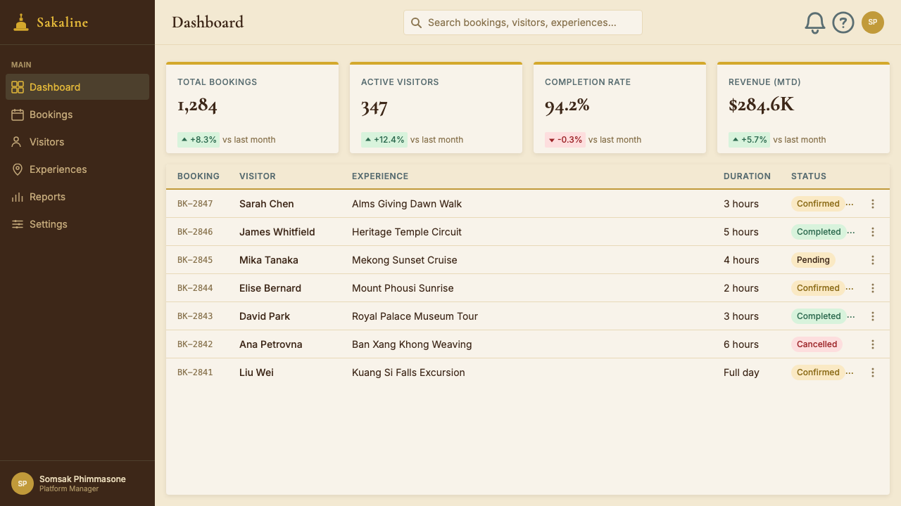
For web and digital interfaces, the style is best suited to contexts where deliberation and cultural depth are the product: cultural tourism platforms, heritage hotel booking experiences, museum collection interfaces, and destination editorial sites. A pricing or booking page in this system uses generous vertical spacing, avoids bright interactive-state colors in favor of teak-brown hover states, and treats the call-to-action button as a considered object — matte, unhurried, confident — rather than a bright object demanding immediate click. Dashboards should be avoided: the palette and spacing conventions do not lend themselves to information density.对于网页与数字界面,这套风格最适合思考与文化深度是产品核心的场景:文化旅游平台、遗产酒店预订体验、博物馆馆藏界面以及目的地编辑网站。这套系统中的定价或预订页面使用充裕的垂直间距,避免使用鲜亮的交互状态色,转而以柚木棕作为悬停状态色,并将行动号召按钮视为一个经过考量的对象——哑光、从容、自信——而非一个要求立即点击的明亮物体。应当避免仪表板场景:这套调色板与间距惯例不适合信息密度较高的应用。
For editorial and marketing contexts — printed travel editorial, destination brand identity systems, cultural institution communications — the style is highly transferable. A brand identity system for a heritage hotel or cultural tourism board can use this language across a wide range of touchpoints: printed stationery with cream grounds and teak-brown text, signage in matte-finished warm grounds, wayfinding in serif type with ochre accent rules. Marketing copy should match the visual register: unhurried, specific, observational. The worst marketing copy for this system tries to sell experiences through urgency or superlatives; the best sells them through precise, calm description of what is actually there.对于编辑与营销场景——印刷旅游编辑、目的地品牌识别系统、文化机构传播材料——这套风格具有很强的可移植性。遗产酒店或文化旅游局的品牌识别系统,可以在广泛的触点上使用这套语言:奶油底面柚木棕文字的印刷文具,哑光处理暖底面的标识系统,衬线字体配赭色点缀线的导向标牌。营销文案应与视觉格调匹配:从容、具体、观察性的。这套系统最糟糕的营销文案试图用紧迫感或最高级来推销体验;最好的文案通过对实际存在之物的精确、平静的描述来打动人。
A common failure mode when applying this style is substituting a generic warm-neutral palette for the specific saffron ground. Designers who are uncomfortable with the boldness of the robe color often reach for a safer beige or warm gray, but this drains the system of its most distinctive quality — the documentary specificity that makes it feel like it was designed in Luang Prabang rather than for a generalized idea of Southeast Asian heritage. Another frequent mistake is adding digital-native interaction patterns — drop shadows with high opacity, saturated hover states, bold notification badges — that introduce a visual temperature the system cannot absorb. Every addition should be tested against the question: would this look correct at 5:45 AM on Sakkaline Road?应用这套风格时常见的失败模式,是用泛化的暖中性色调替代特定的藏红花底面。对袈裟颜色的大胆感不自在的设计师,往往会转向更安全的米色或暖灰色,但这会抽空这套系统最鲜明的特质——那种让它感觉是在琅勃拉邦设计、而非为东南亚遗产的笼统概念设计的纪实特异性。另一个常见错误是添加数字原生的交互模式——高透明度阴影、饱和悬停状态、粗体通知徽章——引入这套系统无法消化的视觉温度。每一个添加都应以这个问题来检验:这在沙卡林路清晨五点四十五分看起来正确吗?
See the Luang Prabang Temple Tourism design system →查看 Luang Prabang Temple Tourism 完整设计系统 →
Luang Prabang Temple Tourism — FAQLuang Prabang Temple Tourism · 常见问题
How does this style differ from generic Southeast Asian luxury design?这套风格与泛化的东南亚奢华设计有何不同?
Generic Southeast Asian luxury design tends to reach for a shortlist of shared signifiers — tropical green, dark wood, raw stone, and a warm-neutral ground — that apply equally to Bali, Phuket, and Siem Reap. Luang Prabang temple tourism design is specific in a way that generic approaches are not: the saffron ground is the actual color of the Theravada robe in the city's alms-giving ceremony, not a decorative choice. The editorial serif tradition traces to the French colonial publishing houses that operated in Laos specifically. The naga and flame motifs are Lao Buddhist, not pan-Buddhist. Specificity is not just an aesthetic preference here — it is the commercial logic of the style. The brands that built it were selling Luang Prabang, not 'Southeast Asia'.泛化的东南亚奢华设计倾向于借助一份通用符号清单——热带绿、深色木料、原石,以及暖中性底面——这些符号同样适用于巴厘岛、普吉岛和暹粒。琅勃拉邦寺庙旅游设计的特异性是泛化方式所不具备的:藏红花底面是这座城市化缘仪式中上座部僧袍的真实颜色,而非装饰性选择。编辑性衬线传统可以追溯到专门在老挝运营的法国殖民出版机构。那伽与火焰纹样是老挝佛教的,而非泛佛教的。特异性在这里不仅仅是美学偏好——它是这套风格的商业逻辑。构建这套风格的品牌出售的是琅勃拉邦,而非「东南亚」。
Can this design language work for non-hospitality products?这套设计语言能用于非酒店类产品吗?
Yes, with deliberate repositioning. The style works for any product where cultural depth, deliberation, and considered luxury are values the audience will recognize and trust: cultural institution publications, destination tourism boards, heritage brand identities, travel editorial, and high-end food or beverage brands with a specific provenance story. It works less well for products where the context requires speed, urgency, or technical authority — fintech, productivity software, or any context where users are task-oriented rather than exploratory. The operative question is whether the product's promise involves a pause — a moment of considered choice — or a workflow. Luang Prabang temple tourism design is a system built for the pause.可以,但需要有意识地重新定位。这套风格适用于任何受众会认可并信任其文化深度、从容感和经过考量的奢华感的产品:文化机构出版物、目的地旅游局、遗产品牌识别、旅游编辑内容,以及有具体产地故事的高端食品或饮品品牌。它在要求速度、紧迫感或技术权威性的产品场景中效果较差——金融科技、生产力软件,或任何用户以任务导向而非探索性方式使用的场景。关键问题是:这个产品的承诺是否包含一个停顿——一个经过考量的选择时刻——还是一个工作流。琅勃拉邦寺庙旅游设计是为停顿而建的系统。
Is it appropriate for non-Lao brands to use this visual language?非老挝品牌使用这套视觉语言合适吗?
The question is worth taking seriously. The style emerged from international hospitality brands applying cultural research carefully rather than appropriating carelessly — Aman and Belmond both invested in local craft, local materials, and local expertise before arriving at the visual language they published. For brands without that grounding, the risk is that the saffron ground and Lao temple ornament read as costume rather than as research. The test is specificity: if a brand can explain exactly which elements it is borrowing, from which tradition, and why they are appropriate to its product or context, the usage is defensible. If the connection is 'it looks warm and exotic,' it is not.这个问题值得认真对待。这套风格源于国际酒店品牌认真进行文化研究、而非随意挪用的结果——安缦和贝尔蒙德在形成并公布其视觉语言之前,都投入了当地工艺、本地材料和本地专业知识。对于缺乏这种根基的品牌而言,风险在于:藏红花底面和老挝寺庙装饰纹样会读作戏服,而非研究成果。检验标准是特异性:如果一个品牌能够清楚地解释它在借用哪些元素、来自哪个传统、以及为何这些元素适合其产品或场景,这种使用就是站得住脚的。如果联系仅仅是「看起来温暖而异域」,那就不是。
How does the style handle dark or night-mode contexts?这套风格如何处理深色或夜间模式场景?
The canonical form of this style is light-ground and morning-lit — it is built around the pre-dawn and golden-hour light of a specific place at a specific time. A dark inversion is possible but requires rethinking the color relationships from the ground up rather than simply inverting values. On a deep teak-brown or near-black ground, saffron shifts from a ground color to a bright accent and risks reading as garish unless used with significant restraint. Cream becomes a lighter midtone. The most successful dark-mode adaptations in this style use a very deep warm-brown ground — the color of the interior of a Lao lacquered cabinet — with ochre and cream as the primary tonal range and saffron appearing only at the level of small detail or icon.这套风格的标准形态是浅色底面、晨光照耀的——它围绕特定地点特定时刻的日出前与黄金时段光线构建。深色反转是可能的,但需要从底部重新思考色彩关系,而非简单地翻转数值。在深柚木棕或近黑色底面上,藏红花从底面色转变为明亮点缀色,若不加以显著克制,有读来俗艳的风险。奶油色成为较浅的中间调。这套风格中最成功的深色模式改编,使用极深的暖褐色底面——老挝漆器橱柜内部的颜色——以赭色和奶油色作为主要色调范围,藏红花仅在小细节或图标层面出现。
What is the single most common mistake when referencing this style?参考这套风格时最常见的单一错误是什么?
Using the palette without the pace. Designers who encounter the saffron-teak-cream-ochre combination often apply it at a tempo that the palette cannot sustain — tight layouts, multiple calls to action, dense information hierarchies — which produces something that looks like warm-toned conventional design rather than Luang Prabang. The palette is not the system; the unhurried, contemplative pace is the system, and the palette expresses it. A well-spaced, generously leaded, single-focus page in muted taupe with one ochre accent line will feel more like this style than a busy saffron-background layout with ten competing elements. The rule is simple: if the page could not be read calmly over a breakfast table in a garden beside the Mekong, it has drifted from its source.使用了调色板,却没有匹配节奏。接触到藏红花-柚木-奶油-赭色组合的设计师,往往以这套调色板无法承载的节奏应用它——紧凑的版面、多个行动号召、密集的信息层级——最终产生看起来像暖调常规设计而非琅勃拉邦的东西。调色板不是系统;从容、冥想性的节奏才是系统,调色板只是它的表达方式。一个间距充裕、行距宽松、只有单一焦点的柔和灰褐色底面页面,配上一条赭色点缀线,比一个拥有十个竞争元素的繁忙藏红花背景版面更接近这套风格的感觉。规则很简单:如果这个页面无法在湄公河边花园中的早餐桌旁平静地阅读,它就已经偏离了它的源头。
Related design styles相关设计风格
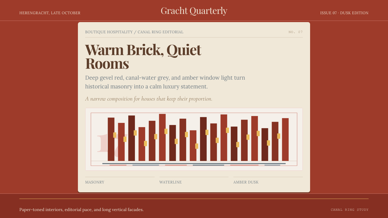 Amsterdam Canal HouseQuiet luxury in brick and cream. Playfair serif, narrow columns, amber window…克制的奢华。砖红配奶油纸面,窄列与琥珀窗光。
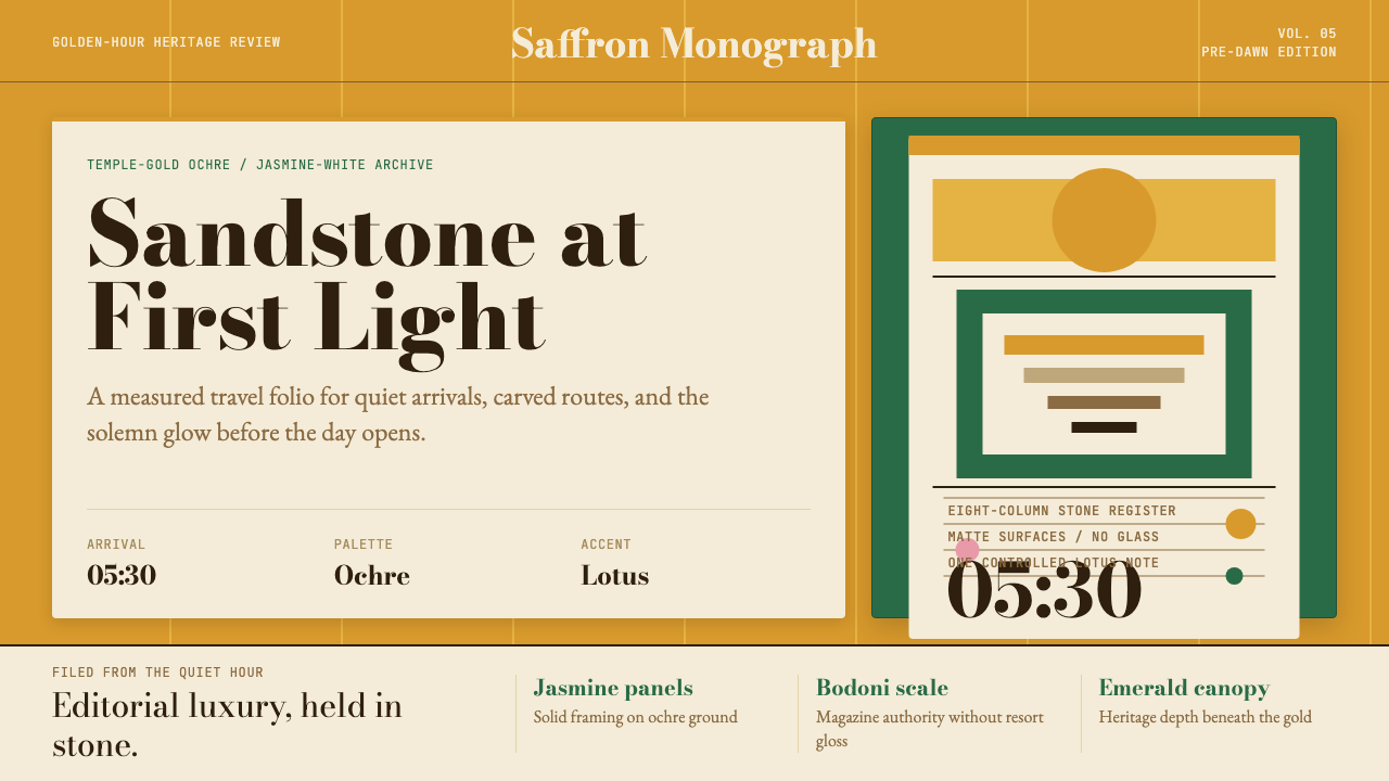 Cambodian Angkor Tourism ModernQuiet authority at dawn. Ochre ground, Bodoni serif, jasmine panels, one lotu…黎明般安静有力:赭金底、Bodoni衬线、茉莉白面板与一笔莲粉。
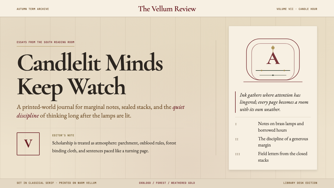 Dark AcademiaCandlelit nostalgia for old books. Parchment grounds, oxblood accents, classi…西方古典教育的浪漫想象:羊皮纸底色、牛血红点缀、古典衬线——一本被翻阅无数次的…
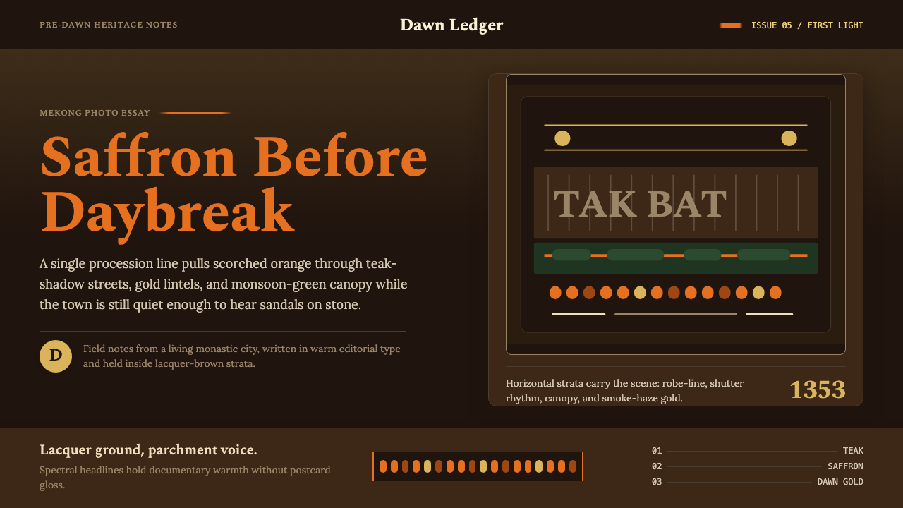 Luang Prabang Saffron AlmsDawn has weight. Saffron bands cut through teak brown and smoke-gold editoria…黎明有重量:藏红带穿过柚木棕与烟金色编辑字体。
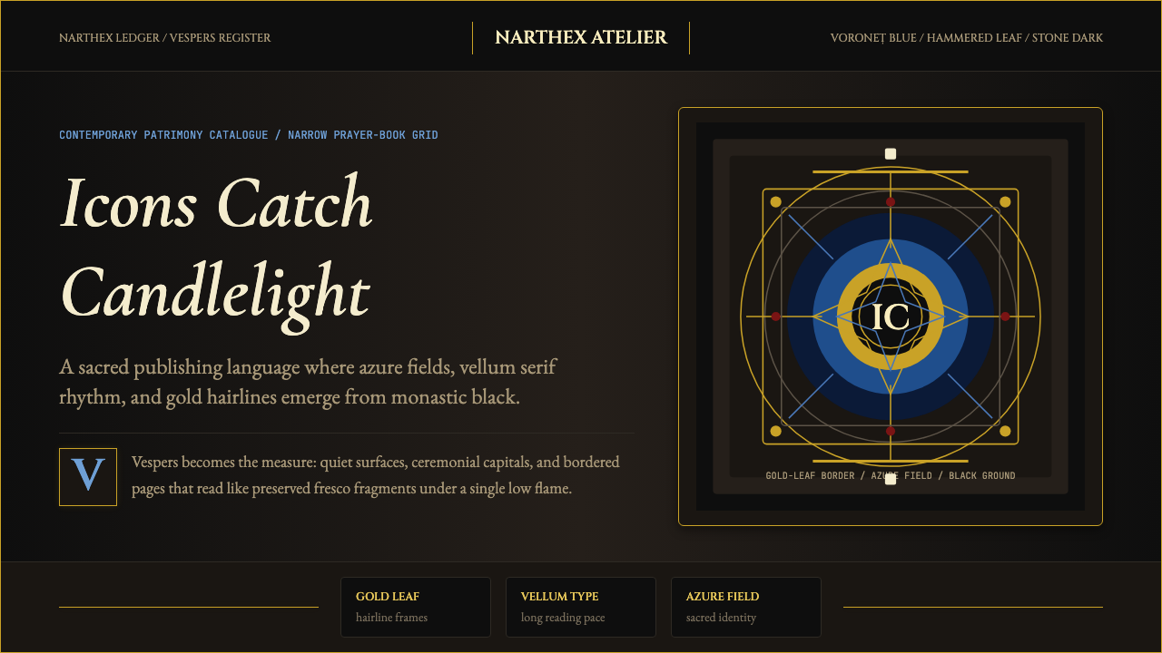 Romanian Orthodox Modern RevivalSacred dark refuses sparkle. Voroneț blue halos and gold hairlines rise from…神圣暗场拒绝亮俗:沃罗内茨蓝光环与金箔细线从修道院黑中浮起。
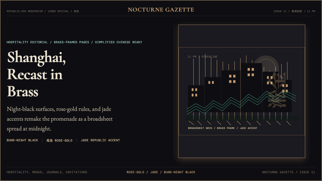 Shanghai Bund Art Deco RevivalNight-black Deco luxury. Rose-gold lines, jade accents, and broadsheet type s…夜黑装饰艺术质感。淞金线条、翡翠点缀与报刊排版定调。