What is Dark Academia?什么是 Dark Academia?
Dark Academia translates candlelit library nostalgia into warm parchment grounds, oxblood accents, and classical serif type that feels like a well-loved book spread open on a mahogany desk.暗黑学院风将烛光图书馆的怀旧情绪转化为温暖的羊皮纸底色、牛血红点缀和古典衬线字体,仿佛一本被翻阅无数次的精装书静静摊开在桃花心木书桌上。
Dark Academia in briefDark Academia 速览
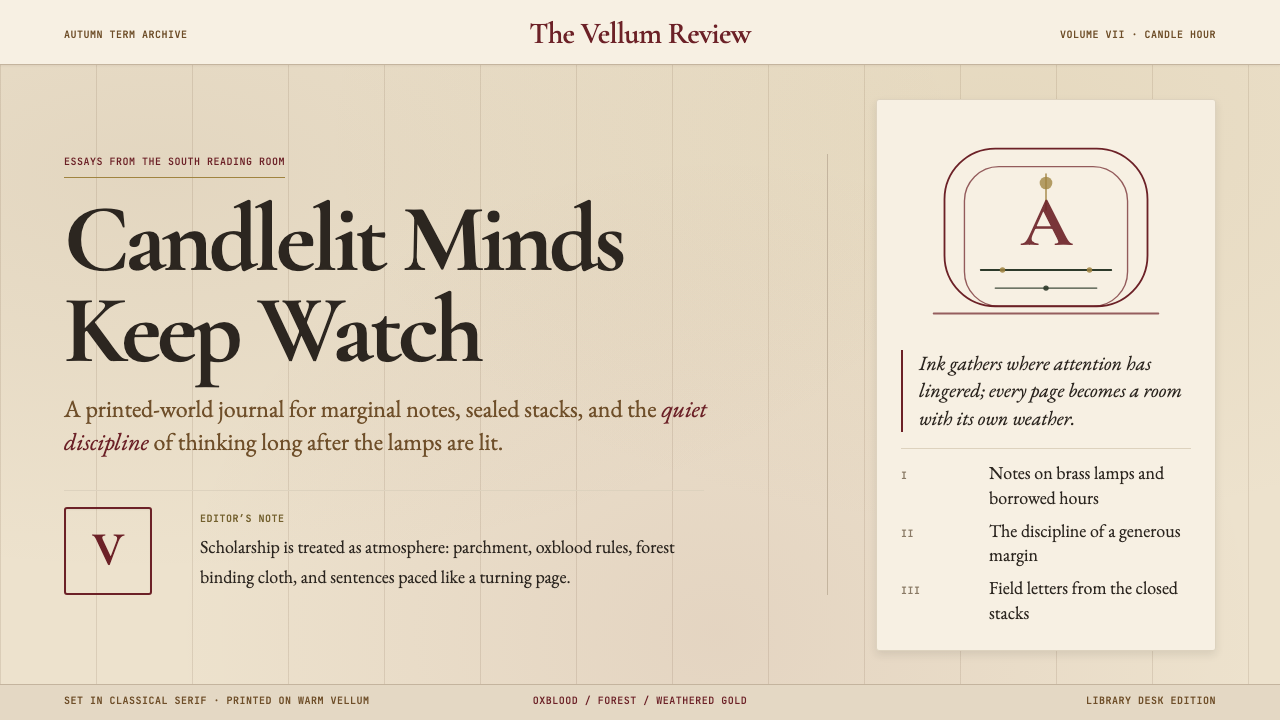
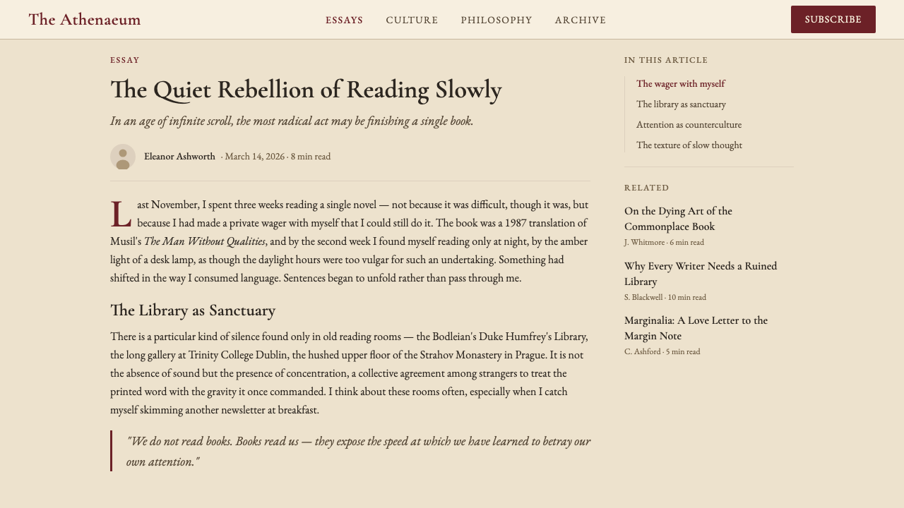
Dark Academia is an internet-born aesthetic that romanticizes the atmosphere of Western classical education — candlelit reading rooms, leather-bound volumes stacked on oak shelves, fountain-pen marginalia, the smell of old paper, and the moody collegiate drama of 1990s prep-school cinema. As a visual design system, it translates that literary nostalgia into a palette of warm, slightly aged neutrals anchored by a deep oxblood or burgundy accent, a typographic hierarchy built around classical serif letterforms, and layouts that feel generous, column-based, and deliberately unhurried.暗黑学院风是一种诞生于互联网的美学,它将西方古典教育的氛围浪漫化——烛光阅览室、叠放在橡木书架上的皮革装帧古籍、钢笔批注的痕迹、旧纸张的气味,以及九十年代校园电影中那种忧郁而迷人的学院戏剧感。作为视觉设计系统,它将这种文学怀旧转化为一套温暖而略带岁月感的中性色板,以深邃的牛血红或勃艮第酒红作为点缀色,以古典衬线字体构建排版层级,版面宽裕、以栏为单位,刻意营造出一种从容不迫的阅读节奏。
The style is fundamentally about evoking a sense of accumulated knowledge and refined taste without ostentation. Where Bauhaus strips ornament away to reveal structural logic, Dark Academia layers on just enough ornamentation — a subtle texture, a ruled divider, a drop capital — to suggest that the designed object has a history, that it belongs to an ongoing scholarly tradition rather than a moment of trend. The result is rich without being baroque: controlled, legible, and emotionally warm.这种风格从根本上是关于如何唤起知识积累与精炼品味的感受,而无需炫耀。包豪斯剥去装饰以呈现结构逻辑,暗黑学院风则恰好相反——它叠加恰到好处的装饰细节:细腻的纸张肌理、标尺分割线、首字下沉——让设计对象看起来有历史,好像它属于一个延续中的学术传统,而非某个瞬逝的潮流。结果是丰富而不繁复:有节制、易阅读,并带有情感上的温度。
Visually, Dark Academia work is recognizable through its restraint in color and its generosity in space. Backgrounds evoke aged paper rather than clinical white — warm off-whites, tawny creams, soft sepia tones. Text is set in classical serifs with careful attention to line-length and leading that supports sustained reading. Ornamental detail is present but purposeful: horizontal rules, initial capitals, subtle vignettes at section breaks. Nothing is garish; everything aspires to the dignity of a printed scholarly monograph.在视觉上,暗黑学院风以色彩的克制和空间的慷慨为特征。背景不是刺眼的临床白,而是唤起旧纸张感的暖白、棕褐奶油色或柔和的棕褐色调。文字以古典衬线字体排布,对行长和行距的处理一丝不苟,以支撑持续的阅读体验。装饰细节存在但有目的性:水平分割线、首字母大写、段落分隔处的细腻晕影。没有任何元素是刺目的;一切都追求印刷学术专著的那种庄重感。
Where does Dark Academia come from?Dark Academia 从何而来?
Dark Academia as a named aesthetic crystallized on Tumblr around 2015, where users assembled mood boards combining photographs of Gothic university architecture, candlelit study scenes, handwritten Latin passages, and stills from films such as Dead Poets Society (1989) and The Secret History's spiritual cinematic cousins. The emotional palette — melancholy, intellectual longing, the bittersweet pleasure of obsessive study — found a ready audience among readers and students who felt that contemporary visual culture offered them no adequate representation of the inner life of the serious reader.暗黑学院风作为一种有名称的美学,约2015年在Tumblr上成型——用户在那里拼贴情绪板,将哥特式大学建筑的照片、烛光自习场景、手写的拉丁文段落,以及《死亡诗社》(1989年)等电影的剧照汇聚在一起。这套情绪调性——忧郁、智识渴望、沉迷学习的苦甜之感——在那些觉得当代视觉文化无法呈现严肃读者内心世界的读者与学生中找到了共鸣。
The style's literary anchor is Donna Tartt's 1992 debut novel The Secret History, which follows a group of classics students at a small Vermont college whose devotion to ancient Greek thought tips into moral catastrophe. Tartt's descriptions of autumnal New England landscapes, firelit common rooms, and the physical texture of scholarly objects — monogrammed notebooks, heavy wooden furniture, tweed and wool — gave the aesthetic its emotional vocabulary before the internet gave it its name. Evelyn Waugh's Brideshead Revisited (1945) and its television adaptation provided a British Oxbridge counterpart: punting on the river, stone quadrangles, the sad glamour of aristocratic academic decline.这一风格的文学锚点是唐娜·塔特1992年的处女作小说《秘史》。小说讲述佛蒙特州一所小型学院的一群古典学学生,他们对古希腊思想的痴迷最终滑向道德灾难。塔特对秋日新英格兰景色、壁炉旁的公共休息室以及学术物品质感——印有字母缩写的笔记本、厚重的木质家具、花呢与羊毛——的描绘,在互联网为之命名之前就已赋予这种美学以情感词汇。伊夫林·沃的《故园风雨后》(1945年)及其电视改编剧则提供了英国牛剑的对应版本:在河上撑篙、石砌四方院、贵族学院衰落的悲伤魅力。
The style exploded in visibility during 2020 and 2021. The global pandemic, which closed universities and confined students to home, produced a widespread longing for the physical experience of institutional learning — the library as sanctuary, the seminar room as social world. TikTok's BookTok community and YouTube study-with-me videos gave Dark Academia its second life, now as an aspirational lifestyle aesthetic as much as a purely visual one. Users dressed in tweed and corduroys, filmed themselves studying by lamplight, and built vast archives of recommended reading lists under the hashtag.这一风格在2020至2021年间的能见度急剧提升。全球疫情关闭了大学、将学生困于家中,由此引发了对机构学习之实体体验的广泛渴望——图书馆作为庇护所,研讨室作为社交世界。TikTok上的BookTok社群和YouTube的「与我同学」视频给了暗黑学院风第二次生命,此时它既是纯粹的视觉美学,也是一种充满向往感的生活方式。用户穿着花呢与灯芯绒,在台灯下拍摄自己学习的画面,并在同名话题标签下建起庞大的书单档案库。
The visual roots of Dark Academia reach back further than Tumblr, drawing on a long tradition of Gothic Revival architecture, Victorian print culture, and the early twentieth-century Arts and Crafts movement's reverence for handcraft and natural materials. Oxford and Cambridge's medieval college buildings, the Bodleian Library's Jacobean interior, the engraved frontispieces of eighteenth-century scholarly editions — these are the aesthetic ancestors the style is consciously invoking. As a design system it translates that inheritance into contemporary digital contexts, making it one of the few internet-born aesthetics with a genuinely deep historical root system.暗黑学院风的视觉根系比Tumblr更为深远,汲取了哥特复兴建筑、维多利亚时代印刷文化以及二十世纪初工艺美术运动对手工技艺与天然材料的崇敬。牛津与剑桥的中世纪学院建筑、博德利图书馆的詹姆斯一世时代内饰、十八世纪学术版本的雕版卷首画——这些是这种风格有意援引的美学祖先。作为设计系统,它将这份遗产转化进当代数字语境,使之成为少数几种具有真正深厚历史根脉的互联网原生美学之一。
What defines the Dark Academia look?Dark Academia 的视觉特征是什么?
Color色彩
The palette centers on a family of warm neutrals — aged parchment, tawny cream, soft sepia — that function as the background register, evoking old paper and worn linen. Against these grounds, a deep oxblood or burgundy red serves as the primary accent, used for headings, ruled lines, initial capitals, and occasional borders. Near-black or very dark brown replaces pure black for body text, softening the contrast to something closer to iron-gall ink on laid paper. Secondary accents — a muted forest green or a dusty gold — appear rarely, used to differentiate navigational elements or secondary information tiers. The overall effect is warm, slightly aged, and entirely free of the cool grays and pure whites that dominate contemporary digital interfaces.色板以一族暖中性色为核心——旧羊皮纸色、棕褐奶油色、柔和的棕褐色——作为背景层,唤起旧纸张与磨损亚麻布的质感。以这些底色为背景,深邃的牛血红或勃艮第酒红作为主要点缀色,用于标题、标尺线、首字母大写和偶尔出现的边框。接近黑色的极深棕色取代纯黑用于正文排版,将对比度柔化至更接近铁胆墨水在精制纸上的效果。次要点缀——静默的森林绿或带有尘灰感的金色——极少出现,用于区分导航元素或次级信息层级。整体效果温暖、略带岁月感,完全摆脱了当代数字界面主流的冷灰色与纯白色。
Typography字体排印
Classical serif letterforms are the typographic foundation — specifically the kind associated with scholarly publishing: old-style proportions, moderate stroke contrast, and bracketed serifs that give each character a sense of hand-cut individuality. Headlines are set large and with deliberate gravity, often in a weight that reads as authoritative rather than merely decorative. Body text is set at a generous measure — the column width of a well-formatted academic paper — with leading that invites slow reading. Small capitals appear in section headers and running titles, recalling the conventions of traditional book typography. Italics are used liberally for emphasis and for titles of works cited, as convention in scholarly writing demands.古典衬线字形是排版的基础——特别是与学术出版相关联的那种:旧式比例、适中的笔画粗细对比、括弧衬线,赋予每个字符手工刻制般的个体感。标题字号大而庄重,字重读来有权威感而非仅仅装饰性。正文以宽裕的行宽排布——如同格式精良的学术论文的栏宽——行距邀请慢速阅读。小型大写字母出现在章节标题与天头页码中,回应传统书籍排印的惯例。斜体字自由地用于强调和引用作品标题,一如学术写作的规范所要求。
Texture and Surface质感与表面
Where Bauhaus insists on flat, textureless surfaces, Dark Academia embraces subtle texture as an expressive tool. Paper grain, faint linen weave, the ghost of a watermark, a very light vignette darkening the edges of a field — these textures are never loud enough to interfere with readability, but they are present enough to suggest that the surface has a material history. The effect is the difference between a freshly minted coin and one that has passed through many hands: both are readable, but only one has depth. Digital implementations translate this through very low-contrast noise layers or subtly warm gradients that stop well short of obvious visual effects.包豪斯坚持平整无纹理的表面,暗黑学院风则将细腻质感视为表现工具加以拥抱。纸张纹理、隐约的亚麻织纹、水印的幽灵、在区域边缘微微压暗的晕影——这些质感从不强烈到影响可读性,但它们的存在足以暗示这个表面有其物质历史。效果犹如一枚崭新铸造的硬币与一枚经过无数双手的硬币之间的区别:两者都清晰可读,但只有一个有深度。数字化实现通过极低对比度的噪点层或微妙的暖色渐变来转化这一效果,但始终远未达到明显视觉特效的程度。
Ornament and Detail装饰与细节
Dark Academia permits — and encourages — a degree of decorative detail that would be anathema in strictly functionalist styles. Horizontal rules separating sections, decorative initial capitals beginning chapters, small fleurons or asterisms marking paragraph breaks, thin borders framing pull quotes — these elements are drawn from the vocabulary of traditional book design and used with the restraint of a practiced editor. The test is always whether the ornament serves the reading experience: does it clarify structure, signal transition, or give the eye a moment of rest? Ornament that merely decorates without orienting is still excess, even within this style.暗黑学院风允许——甚至鼓励——一定程度的装饰细节,这在严格功能主义风格中将是禁忌。分隔章节的水平标尺线、开启章节的装饰首字母、标记段落间隔的小花饰或星号组合、为引文加框的细边框——这些元素取自传统书籍设计的词汇,并以经验丰富的编辑的克制加以运用。检验标准始终是:这个装饰是否服务于阅读体验?它是否澄清了结构、标示了过渡,或给眼睛提供了一个片刻的休憩?即便在这种风格内部,单纯装饰而不导向的装饰仍然是多余的。
Layout and Measure版面与行宽
Layouts are column-based and generous with white space — or more precisely, warm off-white space — in a way that foregrounds the reading experience rather than information density. The dominant organizational metaphor is the book spread: a primary text column accompanied by a narrower margin column for notes, dates, or annotations. Hierarchy is established through typographic scale and the strategic use of rules, not through color blocking or heavy graphical containers. Headers sit closer to the text they introduce than to the text above, following classical book conventions. Breathing room is built into every transition: between headline and body, between section and section, between image and caption.版面以栏为基础,空白空间——更准确地说,是暖调的非纯白空间——处理慷慨,以阅读体验而非信息密度为前景。主要的组织隐喻是书页展开:一个主文本栏,配以更窄的页边栏用于注释、日期或批注。层级通过排版比例和标尺线的策略性运用建立,而非通过色块或沉重的图形容器。标题与它所引导的文本的距离,比与上方文本的距离更近,遵循古典书籍的惯例。每个过渡都内置呼吸空间:标题与正文之间、章节与章节之间、图像与图注之间。
Imagery and Illustration图像与插图
Photography in Dark Academia contexts is heavily filtered toward mood: high contrast, slightly desaturated or warm-toned, with a compositional preference for intimate scale, shallow focus, and the presence of books, writing instruments, architectural stone, or natural materials. Candlelight, overcast window light, and the amber glow of a reading lamp are the preferred light sources. Illustration, when it appears, draws on the vocabulary of copperplate engraving and botanical or anatomical print traditions — precise, fine-lined, and emphatically hand-made in appearance. Maps, heraldic devices, and cartouches are referenced ornamentally rather than functionally, lending a sense of historical depth to otherwise contemporary layouts.暗黑学院风语境中的摄影图像,在情绪上被强烈筛选:高对比度、轻微去饱和或暖色调,构图偏好亲密的尺度、浅景深,以及书籍、书写工具、建筑石材或天然材料的出现。烛光、阴云窗光和阅读灯的琥珀暖光是首选光源。插图(若出现)借用铜版雕刻与植物学或解剖学印刷传统的词汇——精准、线条纤细、外观强调手工制作感。地图、纹章装置和卷轴铭牌作为装饰性而非功能性元素被援引,为当代版面赋予历史深度感。
Mood and Register情绪与气质
The tonal register of Dark Academia is melancholic, intellectual, and aspirational without being cold. It is the aesthetic of the person who would rather spend a Sunday afternoon with a difficult book than with a trending content feed — and who wants their digital tools to acknowledge that preference. This emotional orientation shapes design decisions that might otherwise seem arbitrary: the choice of warm over cool backgrounds, the preference for slow typographic rhythms over dynamic layouts, the use of literary quotation as interface text rather than actionable microcopy. Dark Academia design speaks to the user as a reader and thinker, not as a consumer to be converted.暗黑学院风的格调是忧郁的、智识的、充满向往感但并不冷漠的。它是那种宁愿用一个周日下午啃一本难读之书、也不愿刷热门内容流的人的美学——并且希望自己的数字工具承认这种偏好。这种情感取向塑造了一些乍看随意实则有意为之的设计决定:选择暖底色而非冷底色,偏好缓慢的排版节奏而非动感版面,以文学引语而非可操作的微文案作为界面文字。暗黑学院风的设计将用户视为读者和思考者,而非有待转化的消费者。
Who shaped Dark Academia?谁塑造了 Dark Academia?
Tartt's 1992 debut novel The Secret History is the single most cited source text for Dark Academia as both a literary genre and a visual aesthetic. Its precise, sensory descriptions of autumnal Vermont, Greek texts studied by firelight, and the physical objects of scholarly life — leather satchels, bone-handled penknives, editions of Plato — gave the aesthetic its emotional and material vocabulary years before social media codified it into a visual category. Tartt's 2013 Pulitzer Prize-winning novel The Goldfinch extended the style's range into art history and object obsession, reinforcing the connection between Dark Academia and the romantic attachment to beautiful, meaningful things.塔特1992年的处女作小说《秘史》是暗黑学院风作为文学类型和视觉美学被援引最多的源文本。她对秋日佛蒙特州、在壁炉旁研读的希腊文本以及学术生活物品——皮革书包、骨柄折刀、柏拉图版本——的精准感官描绘,在社交媒体将其编码为视觉类别之前多年,就已赋予这种美学以情感和物质词汇。塔特2013年荣获普利策奖的小说《金翅雀》将这种风格的范围延伸至艺术史与对物品的迷恋,强化了暗黑学院风与对美丽而有意义之物的浪漫依恋之间的联结。
Australian director Peter Weir's Dead Poets Society (1989) is perhaps the most visually influential film in the Dark Academia canon. Shot in warm, low-contrast autumn light against the stone and wood interiors of an American boarding school, the film established the cinematic grammar that later mood boards would perpetually sample: the circle of boys reading poetry by torch-light in a cave, the wood-paneled classroom hung with photographs of alumni, the headmaster's study lined with leather-bound volumes. Weir's visual approach — intimate, temporally displaced, saturated with the melancholy of institutions — became a template that countless Dark Academia designers return to without necessarily knowing its source.澳大利亚导演彼得·威尔的《死亡诗社》(1989年)或许是暗黑学院风经典中视觉影响力最大的电影。影片在温暖、低对比度的秋光中,以一所美国寄宿学校的石材与木质内饰为背景拍摄,确立了后来的情绪板将反复采样的电影语法:男孩们在山洞中围成圆圈举着火把朗读诗歌,木镶板教室里悬挂着历届校友照片,校长书房里摆满皮革装帧的卷册。威尔的视觉手法——亲密的、时间错置的、浸润着机构生活的忧郁——成为无数暗黑学院风设计师在不知其源头的情况下反复回望的模板。
Waugh's 1945 novel Brideshead Revisited and its celebrated 1981 ITV television adaptation supplied Dark Academia with its British Oxbridge reference frame: punting on the River Cherwell, stone quadrangles golden in late summer light, the sad glamour of aristocratic intellectual life, and the particular melancholy of looking back on a period of beauty that cannot be recovered. The novel's narrator, Charles Ryder, is himself an aspiring artist shaped by his encounter with the Flyte family and their ancestral home — a figure of aesthetic longing that maps almost exactly onto the Dark Academia reader's self-image. The adaptation's lush production design, full of chintz, oil paintings, and the burnished light of country houses, is a primary visual source for the style.沃的1945年小说《故园风雨后》及其广受赞誉的1981年ITV电视改编剧,为暗黑学院风提供了英国牛剑的参照框架:在彻韦尔河上撑篙、暮夏金光中的石砌四方院、贵族知识生活的悲伤魅力,以及对一段无法追回的美好岁月的特殊怅惘。小说的叙述者查尔斯·莱德本身是一位渴望成为艺术家的人,他的成形源于与弗莱特家族及其祖宅的邂逅——这个充满审美渴望的人物形象,几乎与暗黑学院风读者的自我想象完全重合。改编剧华丽的制作设计,充满印花棉布、油画和庄园宅邸的光泽感,是这种风格的主要视觉源泉之一。
The fictional English teacher portrayed by Robin Williams in Dead Poets Society has become a shorthand figure within Dark Academia for the ideal of passionate, humanistic teaching — the educator who treats literature as a matter of life and death rather than a curriculum to be administered. The character's famous 'O Captain! My Captain!' scene, in which students stand on their desks in defiance of institutional conformity, gave Dark Academia one of its most replicated visual motifs: the individual act of intellectual courage performed within the physical space of an institution. As a symbolic figure rather than a historical one, Keating represents the style's emotional core — the belief that rigorous study and emotional intensity are not opposites but complements.由罗宾·威廉姆斯在《死亡诗社》中扮演的虚构英语教师,已成为暗黑学院风内部对激情而人文主义式教学理想的简称——将文学视为生死攸关之事而非有待执行的课程大纲的教育者。这个人物著名的「哦,船长!我的船长!」场景——学生们站上课桌以对抗机构化的整齐划一——赋予了暗黑学院风其中一个被复制最多的视觉母题:在机构的实体空间内发生的个人智识勇气之举。作为一个象征性而非历史性的人物,基廷代表了这种风格的情感核心——相信严格的学习与情感的强度不是对立面,而是互补的。
Although the Harry Potter series (1997–2007) predates the explicit naming of Dark Academia, Rowling's visual world — Hogwarts' torchlit stone corridors, the Great Hall with its floating candles, the library's restricted section, house colors worn as identity markers — provided an extraordinarily influential template for millions of readers before any of them encountered the term. The Warner Bros. film adaptations, with their warm practical lighting, aged prop libraries, and carefully crafted Gothic architecture, gave Dark Academia much of its popular visual grammar. The style's widespread legibility today is partly a function of the films having trained an entire generation to find warmly lit stone interiors and candlelit study scenes aesthetically compelling.尽管《哈利·波特》系列(1997—2007年)早于「暗黑学院风」这一名称的出现,罗琳的视觉世界——霍格沃茨火炬照耀的石砌走廊、大礼堂漂浮的蜡烛、图书馆的禁书区、作为身份标记的学院色彩——在数百万读者接触这个词汇之前,已为他们提供了极具影响力的模板。华纳兄弟的电影改编,以其温暖的实景照明、做旧的道具图书馆和精心打造的哥特式建筑,为暗黑学院风贡献了大量流行视觉语法。这种风格今日的广泛可读性,一部分正是因为这些电影训练了整整一代人,使他们发现温暖灯光的石质内饰和烛光自习场景具有美学吸引力。
How do you use Dark Academia today?今天怎么用 Dark Academia?
Dark Academia is among the most emotionally specific aesthetics available to a designer: it does not merely look a certain way but evokes a certain kind of relationship between the reader and the page. Applying it successfully requires internalizing that relationship — the unhurried intimacy of reading by lamplight, the sense that the content being presented has weight and consequence — and then making every design decision in service of that feeling rather than in service of trend.暗黑学院风是设计师可以运用的情感最为明确的美学之一:它不仅仅呈现某种外观,更唤起读者与页面之间某种特定的关系。成功应用它,需要将这种关系内化——在灯光下阅读时那种从容的亲密感,被呈现内容所具有的分量与意义感——然后让每一个设计决定服务于这种感受,而非服务于潮流。
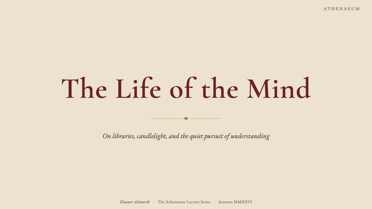
For presentation slides, Dark Academia functions best as a complete system rather than a surface treatment. A cover slide benefits from a single strong typographic statement — a title in a classical serif at generous scale against a warm parchment ground — with a thin horizontal rule and a subtitle set in small capitals below. Content slides should preserve wide margins and avoid filling every available area: the negative space is not wasted but is part of the reading experience. Data visualizations take on a different quality in this style — bar charts rendered with restrained color use and careful axis labeling, tables set in the style of a well-formatted reference work, diagrams that feel more like architectural drawings than dashboard widgets. The overall deck should feel like a beautifully produced monograph, not a slide deck competing for attention at high speed.在演示文稿中,暗黑学院风作为一个完整系统运作效果最好,而非作为表面处理。封面幻灯片适合单一有力的排版陈述——标题以古典衬线字体在温暖的羊皮纸底色上以宽裕比例呈现——配以细水平线和置于其下以小型大写字母排布的副标题。内容页应保留宽阔页边,避免填满每一块可用空间:留白不是浪费,而是阅读体验的组成部分。数据可视化在这种风格中呈现出不同的品质——以克制色彩和精心轴标签呈现的柱状图、以精良参考书目风格排布的表格、感觉更像建筑图纸而非仪表板小部件的图示。整套幻灯片应感觉像一本制作精美的专著,而非一套争相在高速中抓人眼球的演示文档。
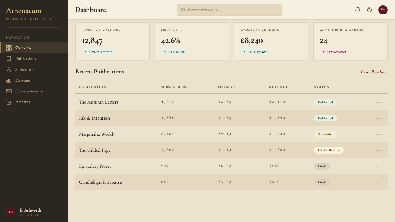
For web interfaces, Dark Academia is ideally suited to contexts where the user is expected to read carefully rather than scan quickly: editorial publications, long-form journalism, digital humanities platforms, online course materials, personal essay blogs, and subscription products that position themselves around depth and curation. Dashboard applications can employ the style selectively — using the color palette and typographic hierarchy while adopting a more structured grid for data density. Pricing pages benefit from the style's natural authority: a simple two or three-column table with typographic hierarchy and no gradient button styles communicates honest value better than heavily styled contemporary alternatives.对于网页界面,暗黑学院风最适合用户被期待仔细阅读而非快速扫描的场景:编辑类出版物、长篇新闻报道、数字人文平台、在线课程材料、个人随笔博客,以及将自身定位于深度与策展的订阅产品。仪表板应用可以有选择地运用这种风格——使用色板和排版层级,同时为数据密度采用更结构化的网格。定价页面受益于这种风格天然的权威感:一个简洁的两到三列表格,以排版层级呈现,不使用渐变按钮样式,传达出比重度风格化的当代替代方案更为诚实的价值感。
For editorial and marketing work, Dark Academia excels at contexts that need to signal intellectual seriousness and cultural ambition. A book launch campaign, a university admissions communication, an arts organization's season brochure, a cultural magazine's feature spread — all of these are natural homes for the style. Marketing pages work well with a vertical rhythm that recalls book chapter structure: a wide introductory section, a testimonial area set in the style of a pull quote in an academic journal, a features section with ruled dividers rather than card containers. Email newsletters in this style are among the most readable in contemporary digital communication — the combination of generous measure, classical serif, warm background, and restrained decoration produces an experience closer to opening a letter than a promotional email.对于编辑与营销内容,暗黑学院风在需要传达智识严肃性与文化抱负的场景中表现卓越。书籍发布活动、大学招生传播、艺术机构的季度册子、文化杂志的专题跨页——这些都是这种风格的天然栖息地。营销页面适合以一种唤起书籍章节结构的垂直节奏运作:宽阔的引言区域、以学术期刊引文风格排布的推荐语区域、以标尺分割线而非卡片容器呈现的特性区域。以这种风格制作的电子邮件通讯,是当代数字传播中可读性最强的之一——宽裕行宽、古典衬线、暖调背景和克制装饰的组合,产生的体验更接近拆开一封信,而非打开一封促销邮件。
A common mistake when applying Dark Academia is conflating darkness of mood with darkness of palette. The authentic style is not typically a dark-background design — it is warm and cream-grounded, with deep accents rather than inverted color values. Filling the screen with black or very dark brown and calling it Dark Academia produces something closer to gothic horror than academic nostalgia. A second mistake is over-ornamenting: adding every available flourish — watermarks, ink textures, wax seal motifs, dramatic vignettes — simultaneously produces visual noise rather than atmosphere. Restraint is as important here as in any minimalist style; the difference is that here the restraint operates on ornament rather than on structure.应用暗黑学院风时最常见的错误,是将情绪上的「暗」与色板上的「暗」相混淆。真实的风格通常并非深色背景设计——它以温暖的奶油色为底,以深色作为点缀而非反转色值。将屏幕填满黑色或极深棕色并称之为暗黑学院风,产生的东西更接近哥特恐怖而非学院怀旧。第二个错误是过度装饰:同时添加所有可用的花饰——水印、墨水质感、蜡封图章、戏剧性晕影——产生的是视觉噪音而非氛围。克制在这里与任何极简主义风格同样重要;区别在于,这里的克制作用于装饰而非结构。第三个更微妙的错误是忽视排版节奏。这种风格的情感体验几乎完全依赖于阅读的舒适与愉悦:若正文字号过小、行距过紧、行宽过宽或过窄,氛围会立即破功。在精炼任何表面细节之前,先确保核心排版系统——一套恰当选择的古典衬线字体,以适合阅读的字号、宽裕的行距和允许舒适完成每行的行宽排布——正在正常运作。其他一切都是对这个必须首先稳固的基础的丰富与延伸。
A third and subtler error is neglecting typographic rhythm. The emotional experience of this style depends almost entirely on reading being comfortable and pleasurable: if the body text is too small, the line-height too tight, or the measure too wide or too narrow, the spell breaks instantly. Before refining any surface detail, ensure that the core typographic system — a well-chosen classical serif at a reading-friendly size, set with generous leading and a measure that allows comfortable line completion — is working. Everything else is elaboration of a foundation that must first be sound.
Dark Academia — FAQDark Academia · 常见问题
Is Dark Academia the same as gothic design?暗黑学院风与哥特设计是同一回事吗?
They overlap but are distinct. Gothic design draws on medieval ecclesiastical architecture and Victorian-era horror illustration — pointed arches, gargoyles, dramatic high-contrast black-and-white palettes, and a theatricality that courts the transgressive and the macabre. Dark Academia, by contrast, is warm and scholarly: its references are the university library rather than the cathedral crypt, the antiquarian bookshop rather than the ruined abbey. The mood is melancholy rather than threatening. Where gothic design often deploys darkness aggressively, Dark Academia uses warmth and depth to create a sense of protected interiority — the feeling of being safely enclosed in a world of books and ideas.两者有重叠,但截然不同。哥特设计借鉴中世纪教堂建筑和维多利亚时代的恐怖插图——尖顶拱门、石像鬼、戏剧性的高对比度黑白色板,以及一种追求越轨感与阴森感的剧场性。暗黑学院风则相反,它温暖而具有学术性:它的参照是大学图书馆而非大教堂地窟,是古书店而非废弃修道院。情绪是忧郁而非威胁性的。哥特设计往往攻击性地部署黑暗,暗黑学院风则用温暖与深度营造一种被保护的内在感——被书籍与思想的世界安全包裹的感受。
Can Dark Academia work for a brand that is not directly related to education or books?暗黑学院风能用于与教育或书籍没有直接关联的品牌吗?
Yes, but the brand's values must be compatible. The style works well for any product or service that can credibly claim depth, curation, and sustained attention as core values: specialty food and beverage brands, luxury goods, long-form journalism, personal finance tools positioning themselves around thoughtful decision-making, premium software for creative professionals, travel experiences emphasizing cultural immersion. It works poorly for products that depend on speed, volume, and impulse — e-commerce with high transaction rates, social media tools, casual gaming, fast fashion. The test is not category but value alignment: does this product want the user to slow down and pay attention? If yes, Dark Academia is worth considering.可以,但品牌的价值观必须相容。这种风格适合任何能够可信地将深度、策展和持续专注声称为核心价值的产品或服务:特色食品与饮料品牌、奢侈品、长篇新闻报道、将自身定位于深思熟虑决策的个人理财工具、为创意专业人士服务的高端软件、强调文化沉浸的旅行体验。它不适合依赖速度、数量和冲动消费的产品——交易频繁的电商、社交媒体工具、休闲游戏、快时尚。检验标准不是类别而是价值对齐:这个产品是否希望用户放慢速度并专注?如果是,暗黑学院风值得考虑。
How does Dark Academia differ from vintage or retro design?暗黑学院风与复古设计有何不同?
Vintage and retro design are primarily about period-accurate surface reproduction — the color palette, illustration style, typeface fashions, and printing artifacts of a specific decade are replicated to evoke nostalgia for that era. Dark Academia is not period-specific in the same way: it does not aim to reproduce any particular decade but instead synthesizes a timeless scholarly atmosphere drawn from multiple centuries of European academic culture. A Dark Academia layout should not feel like it was made in the 1890s or the 1950s; it should feel like it could have been made at any point during a long tradition of careful scholarly publishing. The reference is institutional and cultural continuity, not temporal specificity.复古设计主要关于特定时期表面特征的精确再现——某个特定十年的色板、插图风格、字体时尚和印刷痕迹被复制,以唤起对那个时代的怀旧感。暗黑学院风则不同:它并非以相同方式针对某个特定时期,而是综合了来自欧洲学术文化数个世纪的永恒学术氛围。暗黑学院风的版面不应让人感觉是在1890年代或1950年代制作的;它应该感觉像是可以在悠长的谨慎学术出版传统中的任何时间点制作的。参照是机构与文化的延续性,而非时间上的特殊性。
Does Dark Academia require actual aged or textured backgrounds, or can it work on a clean flat surface?暗黑学院风是否需要真实的旧化或纹理背景,还是能在干净平整的表面上运作?
It can work on a flat surface, but texture is a genuine asset rather than an optional extra. On a clean flat warm-cream background with no texture, the style relies entirely on typography and color to carry the atmosphere — which is achievable with rigorous typographic craft but harder than it sounds. The subtlest possible texture — barely-there paper grain that is invisible at a glance but present under close inspection — adds a layer of sensory depth that reinforces the literary reference without calling attention to itself. The practical recommendation: use texture, but keep it so subtle that most users will not consciously notice it. Its job is to prevent the background from feeling like a digital surface, not to become a design statement in itself.可以在平整表面上运作,但质感是真正的资产而非可选的附加。在干净平整的暖奶油色背景上没有任何质感时,这种风格完全依靠排版和色彩来承载氛围——以严格的排版技艺是可以实现的,但比听起来更难。最微妙的质感——一瞥看不见、仔细看才察觉的若有若无纸张纹理——增添了一层感官深度,在不引起注意的前提下强化了文学参照。实用建议:使用质感,但保持如此微妙以至于大多数用户不会有意识地注意到它。它的工作是防止背景感觉像数字表面,而非本身成为一种设计陈述。
Is Dark Academia suitable for mobile interfaces, or does it work better at larger screen sizes?暗黑学院风适合移动端界面吗,还是在更大屏幕上表现更好?
The style adapts to mobile, but requires deliberate adjustment. The wide-measure reading column and margin-annotation structure that define the style at desktop scale cannot be preserved at mobile width — the measure must narrow, the margin column must collapse into the main flow, and the generous spacing that creates the book-like feel requires careful calibration to remain present without producing a layout that is impractically long. The typographic foundation — classical serif, warm background, restrained color use — translates without difficulty. The ornamental details — rules, initial capitals, fleurons — must be used more sparingly on small screens, where they can easily overwhelm rather than accent. The style works well for long-form reading applications at mobile scale; it is harder to justify for task-oriented interfaces where the decorative overhead competes with efficiency.这种风格可以适配移动端,但需要有意识的调整。在桌面端定义这种风格的宽行宽阅读栏和页边批注结构,在移动端宽度下无法保留——行宽必须收窄,页边栏必须折叠进主流,营造书籍感的宽裕间距需要仔细校准,以在保持存在感的同时不产生实际上过长的版面。排版基础——古典衬线、暖调背景、克制用色——可以无障碍地移植。装饰细节——标尺线、首字母大写、花饰——在小屏幕上必须更为节制,否则容易压倒而非点缀。这种风格在移动端规模的长篇阅读应用中表现良好;对于任务导向型界面,装饰性的开销与效率的竞争使其更难以合理化。
Related design styles相关设计风格
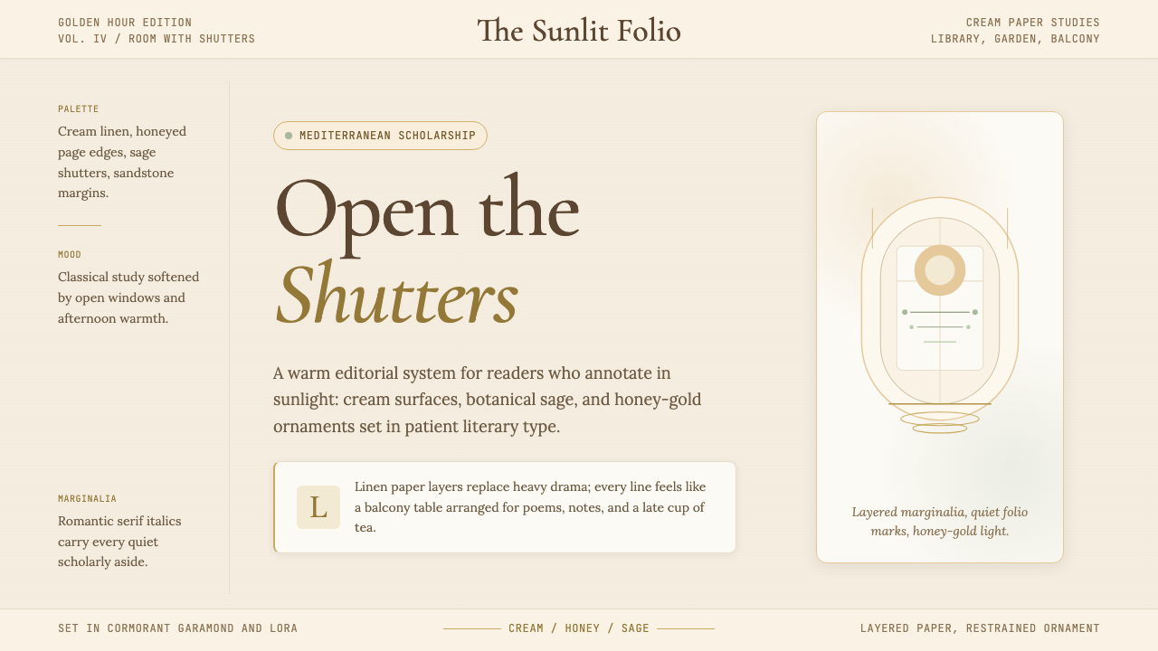 Light AcademiaScholarship turns sunlit. Cream linen, honey gold, sage botanicals, and roman…学术被阳光照亮:奶油亚麻、蜂蜜金、鼠尾草植物与浪漫斜体。
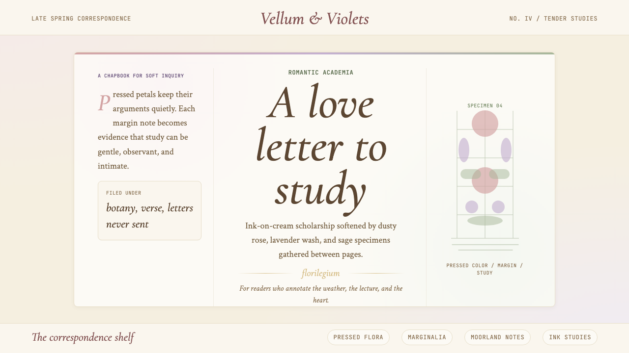 Romantic AcademiaScholarship turns tender. Dusty rose and lavender frame ink-on-cream poetry w…学问变得温柔:灰玫瑰与薰衣草框住米白纸上的墨字与压花。
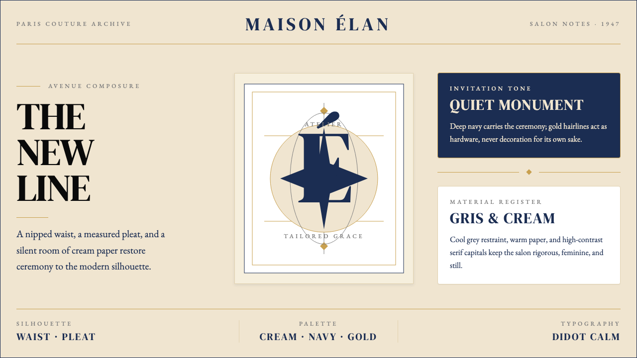 Dior New Look (1947)Couture speaks softly. Cream ground, navy Didot capitals, and gold hairlines…高级订制低声发言:米白底、海军蓝Didot大写与金色发丝线稳住全场。
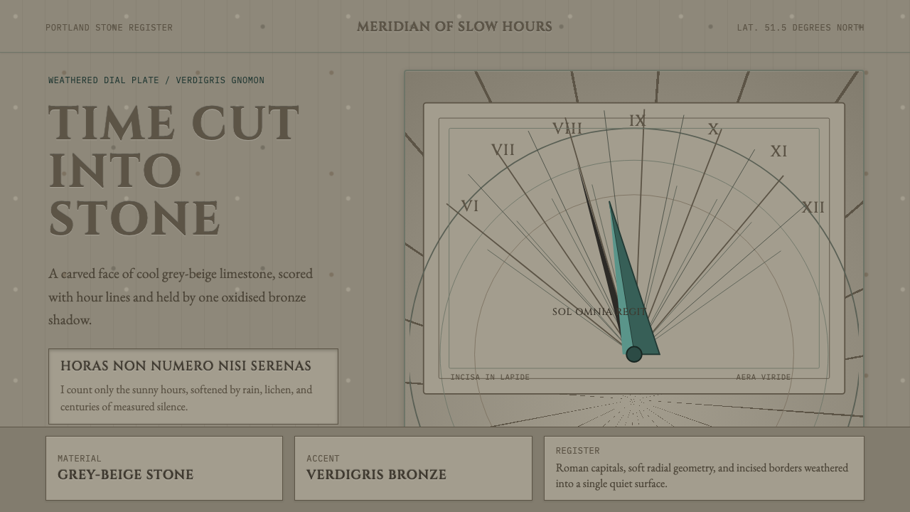 Engraved SundialStone refuses haste. Grey-beige hour lines and verdigris gnomon carve silence.石头拒绝急迫。灰米色时线与铜绿晷针刻出静默。
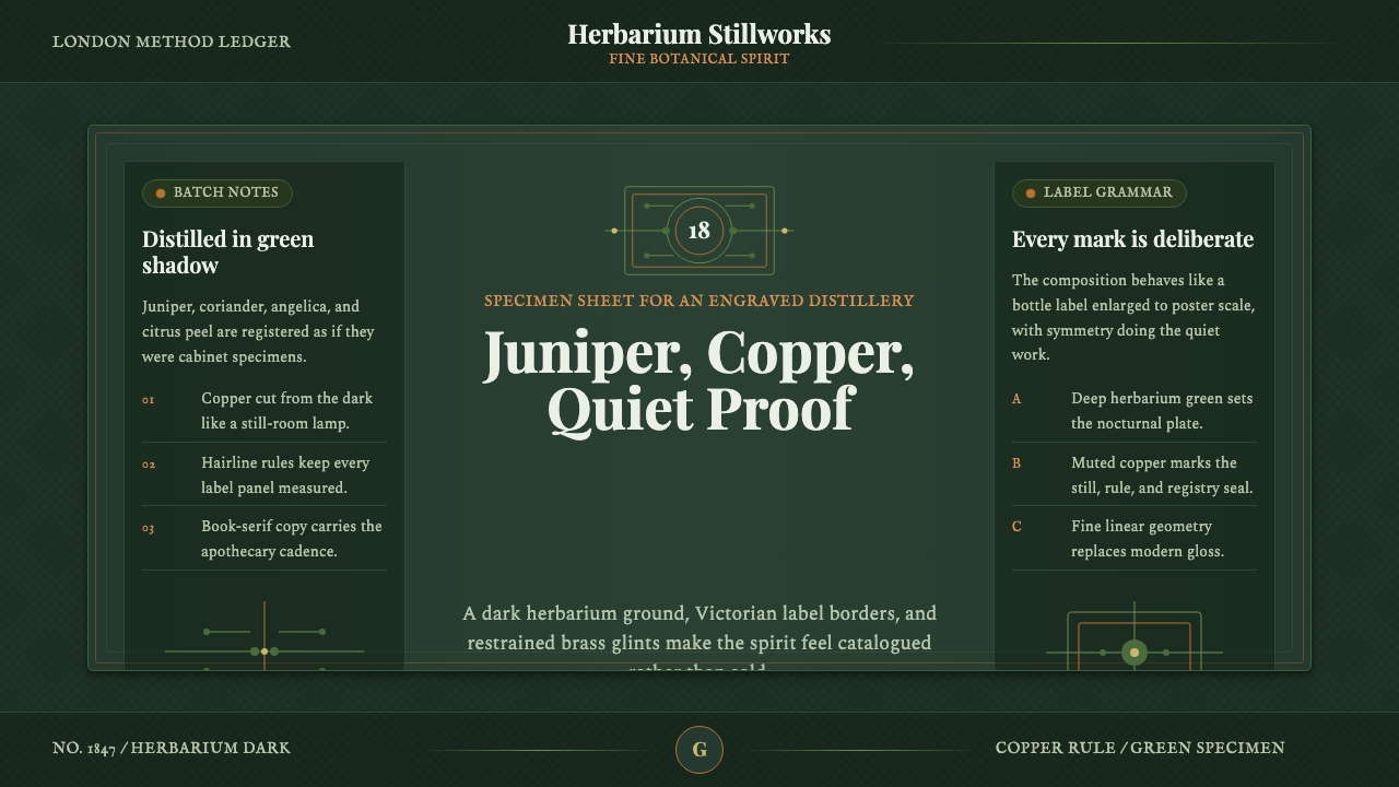 Gin BotanicalHerbarium precision. Dark green frames, Playfair serif, and copper rules hold…标本册般精确。深绿框线、Playfair 衬线与铜色细则定住画面。
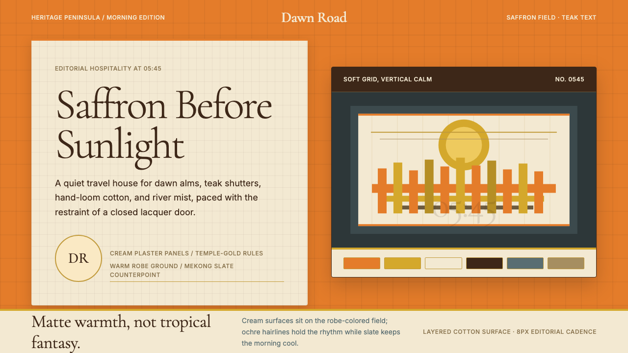 Luang Prabang Temple TourismReverent dawn luxury. Saffron field, cream panels, and teak serif type carry…晨曦中的克制奢华。藏红花底、奶油面板与柚木衬线传递静谧。