What is Light Academia?什么是 Light Academia?
Light Academia bathes scholarly romanticism in golden-hour warmth — cream linen, honey-toned grounds, sage botanical accents, and generous serif italics that feel lifted from a sunlit Mediterranean library.浅色学院风以黄金时刻的暖光浸润学术浪漫主义——奶油亚麻、蜂蜜色底面、鼠尾草绿植物点缀,以及如从阳光照耀的地中海图书馆中取来的慷慨斜体衬线字。
Light Academia in briefLight Academia 速览
Light Academia is a design aesthetic that translates the mood of sunlit classical scholarship into a visual language: warm cream and parchment backgrounds, honey-gold accents, dusty sage and muted olive botanical notes, romantic serif typography used with generous italics and deliberate white space, and an overall sense of softness and cultivated ease. Where its counterpart Dark Academia favors candlelit gloom and Gothic severity, Light Academia reaches for the golden afternoon of a Tuscan reading room or a Greek island balcony stacked with dog-eared paperbacks.浅色学院风是一种将阳光照耀下的古典学术氛围转化为视觉语言的设计美学:温暖的奶油色与羊皮纸色底面、蜂蜜金强调色、沾染尘土感的鼠尾草绿与暗橄榄绿植物气息、以慷慨斜体与刻意留白运用的浪漫衬线字体,以及整体上的柔和与从容。与其对照物「暗色学院风」偏爱烛光幽暗与哥特式严肃不同,浅色学院风所追求的是托斯卡纳阅读室的金色午后,或是堆满折角平装书的希腊海岛阳台。
As a design system, the style draws on the visual grammar of Edwardian stationery, Renaissance botanical illustration, and the warm materiality of linen, aged vellum, and hand-pressed paper. Ornamentation is permitted — even welcomed — but it must feel earned and organic: a delicate vine border, a pressed-flower motif, a pull-quote set in an italic of unusual elegance. The palette is warm throughout, avoiding cool grays and stark whites in favor of tones that suggest paper aged by sunlight rather than bleached by fluorescence.作为设计体系,这种风格汲取爱德华时代文具、文艺复兴植物插图,以及亚麻布、做旧牛皮纸与手压纸张的温暖物质感。装饰不仅被允许,甚至被欢迎——但它必须显得自然而有机:一道细腻的藤蔓边框、一枚压花图案、一段以优雅斜体排设的引言。整体色调保持温暖,刻意回避冷灰色与耀眼的纯白,转而选择那些让人联想到被阳光熏黄而非荧光漂白的纸张色调。
Light Academia occupies a specific emotional register: it is aspirational without being cold, intellectual without being austere, and decorative without tipping into maximalism. It suits content that wants to feel learned, considered, and gently beautiful — and it performs especially well when the subject matter itself carries associations of literature, travel, history, or the pleasures of slow reading.浅色学院风占据一种特定的情感频段:它有抱负而不显冷漠,有学识而不流于苦涩,有装饰而不陷入繁复。它适合那些希望传达「经过深思、温柔动人」气质的内容——在主题本身带有文学、旅行、历史或慢阅读之美的联想时,它的表现尤为出众。
See the Light Academia design system查看 Light Academia 完整设计系统
Where does Light Academia come from?Light Academia 从何而来?
Light Academia did not emerge from a design school or a publishing house — it was named and defined entirely within internet culture. The broader Dark Academia aesthetic had circulated on Tumblr since approximately 2015, built around Oxford gothic imagery, Latin phrases, and the romanticism of rain-soaked libraries. By 2019 and into 2020, a counter-aesthetic began to crystallize: lighter in palette, Mediterranean rather than Northern European in reference, more attuned to warmth and open-air scholarship than to brooding interiors. Tumblr's aesthetic-classification community gave it the name Light Academia, distinguishing it from its sibling by temperament and color rather than by subject matter — both aesthetics share the same love of classical literature, antiquity, and the figure of the devoted student.浅色学院风并非诞生于某所设计学院或某家出版社,而是完全由互联网文化命名并定义。更宏观的「暗色学院风」美学自2015年前后就在 Tumblr 上流传,围绕牛津哥特式图像、拉丁语短句与雨浸图书馆的浪漫情调构建。进入2019年至2020年,一种对照性美学开始成形:色调更明亮,参照系从北欧转向地中海,更倾向于温暖与户外学术氛围,而非沉郁的室内场景。Tumblr 的美学分类社区为其命名为「浅色学院风」,以气质与色彩而非主题将其与兄弟风格区分——两种美学对古典文学、上古世界与勤学苦读形象的热爱实则别无二致。
TikTok became the primary amplification engine between 2020 and 2024. Under hashtags such as #lightacademia, creators assembled mood boards pairing cream linen clothing, vintage poetry collections, golden-hour outdoor reading scenes, and sketches of Grecian urns. The visual grammar that emerged from tens of thousands of such posts was remarkably consistent: warm grounds, dusty botanical palettes, romantic type, and the suggestion of leisurely intellectual pleasure. Unlike many microaesthetics that fragment quickly into sub-niches, Light Academia maintained its coherence, partly because its source references — Mediterranean light, Renaissance illustration, Edwardian pastoral — are themselves so visually stable.TikTok 成为2020至2024年间主要的放大引擎。在 #lightacademia 等话题标签下,创作者拼合了奶油亚麻服装、复古诗集、黄金时刻户外阅读场景与希腊双耳瓶素描的情绪版。数万条帖子所涌现的视觉语法具有惊人的一致性:温暖底面、尘土感植物色调、浪漫字体,以及悠闲智识享受的暗示。不像许多微美学很快碎裂为细分圈层,浅色学院风保持了相当的凝聚力——部分原因在于其源头参照——地中海光线、文艺复兴插图、爱德华时代的田园风格——本身就拥有极为稳定的视觉特征。
The movement drew its visual references from several well-established traditions. The palette and material warmth connect directly to the golden-age illustration of the late nineteenth and early twentieth centuries — the botanical watercolors, the illuminated poetry anthologies, the hand-lettered correspondence that typified Edwardian print culture. The romanticization of antiquity references the Grand Tour aesthetic: the eighteenth-century tradition in which wealthy Europeans traveled to Greece and Italy and returned with sketchbooks full of ruins, landscapes, and classical statuary. These are not coincidental associations — Light Academia actively cultivates them as cultural credentials.这一运动的视觉参照来自几个根基深厚的传统。色调与物质温度直接连接到十九世纪末至二十世纪初的黄金时代插图传统——那些植物水彩画、手写诗歌选集、爱德华时代印刷文化所特有的手工书信。对上古世界的浪漫化,则呼应了「壮游」(Grand Tour)美学:十八世纪欧洲富裕阶层前往希腊和意大利旅行,满载着废墟、风景与古典雕像的速写本而归。这些联想并非巧合——浅色学院风主动将它们培养为文化凭证。
The post-pandemic timing of the aesthetic's peak growth (2021–2024) is significant. During a period of physical restriction, Light Academia offered a form of imaginative travel: the warm balcony in Sorrento, the dusty Florentine archive, the Greek island reading nook. The aesthetic became, in part, a comfort culture — a way of inhabiting a sunlit scholarly life through images and objects when actual travel or library access was limited. This origin in comfort and longing gives Light Academia its characteristic warmth, which distinguishes it structurally from aesthetics rooted in irony or shock.这一美学在后疫情时代(2021—2024年)达到峰值,时机意味深长。在身体流动受限的时期,浅色学院风提供了一种想象性旅行:索伦托温暖的阳台、弗洛伦萨尘封的档案室、希腊海岛的阅读角落。这种美学在相当程度上成为一种慰藉文化——当实际旅行或图书馆探访受到限制时,用图像与物件栖居于一种阳光照耀的学者生活。这种源自慰藉与向往的起源,赋予了浅色学院风标志性的温度,使它从结构上区别于那些以反讽或冲击为根基的美学。
What defines the Light Academia look?Light Academia 的视觉特征是什么?
Palette色调
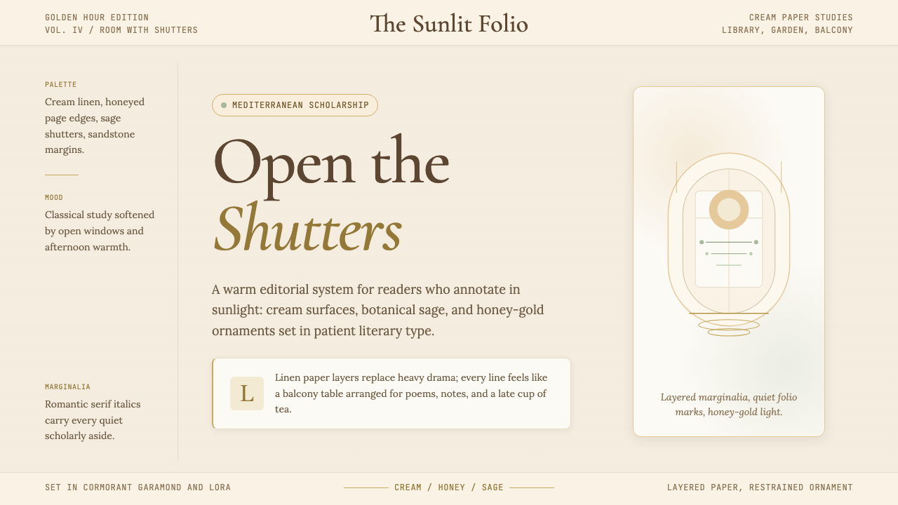
The foundational colors are warm creams and parchment tones — backgrounds that suggest aged paper rather than freshly printed stock. Honey gold and burnished amber serve as accent tones, appearing in ruled lines, pull-quote markers, and ornamental details. Sage green and dusty olive provide botanical counterpoints, and muted terracotta or rose tones appear sparingly as warmth accents. The palette avoids cool neutrals entirely: every tone leans warm, and even the near-blacks carry a slight sepia quality. Contrast is soft rather than stark.基础色为温暖的奶油色与羊皮纸色——令人联想到做旧纸张而非新鲜印刷品的底面色调。蜂蜜金与磨砂琥珀色充当强调色,出现在直线、引文标记与装饰细节中。鼠尾草绿与暗橄榄绿提供植物感的色彩对位,暗赤陶色或玫瑰色则作为点缀偶尔出现。色板完全回避冷中性色:每种色调都偏暖,甚至近乎黑色的深色也带有轻微的棕褐质感。整体对比柔和,而非鲜明。
Typography字体排印
Serif typefaces are the foundation, chosen for their warmth and historical association with scholarship — letterforms with pronounced thick-thin contrast, elegant bracketed serifs, and italics that feel genuinely calligraphic rather than merely slanted. Italics are used liberally: for subheadings, pull quotes, captions, and any text that requires a tone of reflective emphasis. Display type may be large and ornamental, with fine inline or engraved detailing. Body text is set at a comfortable, generous measure with ample leading, evoking the unhurried pace of a well-typeset book rather than a dense digital document.衬线字体是基础,因其温度与学术历史联想而被选用——字形带有明显的粗细对比、优雅的括号式衬线,以及感觉真正具有书法气质而非仅仅倾斜的斜体。斜体被自由运用:用于副标题、引文、图注,以及任何需要沉思强调语气的文本。展示字体可以大而装饰性,带有精细的内嵌或雕刻般的细节。正文排设在舒适而宽裕的行宽下,行距充足,唤起经过精心排版的书籍的从容节奏,而非密集的数字文档。
Ornamentation装饰元素
Unlike styles that treat ornamentation as a defect, Light Academia welcomes considered decorative detail. Thin line borders, delicate botanical engravings, pressed-flower motifs, and ornamental dividers are all at home in this aesthetic — provided they remain restrained in weight and consistent in mood. The key test is whether an ornamental element feels discovered (as if it belonged to an old book) rather than designed (as if it was added for visual richness). Antiquarian illustration details — the single vignette, the marginal vine, the classical medallion — are characteristic choices.与将装饰视为缺陷的风格不同,浅色学院风欢迎经过深思的装饰细节。细线边框、精致的植物版画、压花图案与装饰分隔线在这种美学中都如鱼得水——前提是它们在分量上保持克制,在气质上保持统一。关键的判断是:一个装饰元素是否感觉像是被「发现」的(仿佛它本属于某本旧书),而非被「设计」的(仿佛它是为了丰富视觉而添加的)。古书商式插图细节——单幅小插图、边缘藤蔓、古典徽章——是典型的选择。
Texture and Materiality质感与物质感
Light Academia is one of the few contemporary design aesthetics that actively invites the simulation of physical texture. Linen grain, watercolor paper tooth, the soft bleed of ink into absorbent stock — these textural references reinforce the style's association with handcraft and pre-digital scholarship. In digital applications, this texture is typically applied with a light hand: a barely-visible grain overlay on a background, a slightly rough edge on an ornamental element. The goal is to make surfaces feel tactile and warm rather than glassy and frictionless.浅色学院风是少数几种主动欢迎物理质感模拟的当代设计美学之一。亚麻布纹理、水彩纸的齿感、墨水渗入吸水纸张的柔和晕散——这些质感参照强化了这种风格与手工艺及前数字时代学术的联想。在数字应用中,这种质感通常以轻盈的手法施加:背景上几乎不可见的颗粒覆盖层、装饰元素上略显粗糙的边缘。目标是让表面感觉触感温暖,而非光滑无摩擦。
Botanical and Natural Motifs植物与自然母题
Botanical imagery — drawn in the manner of scientific illustration, with careful line work and a muted, naturalistic palette — is the most distinctive recurring motif in Light Academia. Ferns, pressed wildflowers, laurel branches, ivy, and classical architectural plant detail (acanthus, vine scroll) appear as borders, background elements, and standalone decorative marks. The scientific illustration tradition is preferred over more stylized florals: the goal is scholarly accuracy filtered through romantic feeling, not the exuberant pattern-making of Victorian wallpaper.植物图像——以科学插图的方式绘制,带有精细的线描与低调、写实的色调——是浅色学院风中最具辨识度的反复出现母题。蕨类植物、压制的野花、月桂枝、常春藤,以及古典建筑植物细节(莨苕叶饰、藤蔓涡卷)以边框、背景元素与独立装饰标记的形式出现。这里偏爱科学插图传统,而非更风格化的花卉图案:目标是经由浪漫情感过滤的学术精确性,而非维多利亚时代壁纸的热情奔放。
Soft, Diffused Light柔和的漫射光
If Bauhaus uses hard shadows as geometric decisions, Light Academia uses soft, luminous glow as its atmospheric equivalent. Backgrounds may shade very gently from a warmer center to cooler edges, evoking the quality of afternoon sunlight falling through a gauze curtain. Imagery, when used, is treated with warm tonal adjustments that bring it into the palette's temperature register. Shadows, when present, are soft and low-contrast, suggesting ambient room light rather than a single overhead source. The overall effect should feel like looking at something in natural, warm daylight.如果说包豪斯将硬边投影作为几何决定,浅色学院风则以柔和的、发光的光晕作为其大气等价物。背景可以从较暖的中心极轻柔地向较凉的边缘渐变,唤起午后阳光透过纱帘的质感。图像在使用时,经过温暖的色调调整,被带入色板的温度频段。阴影若出现,则是柔和而低对比度的,暗示环境室内光而非单一顶光。整体效果应当感觉像是在自然的、温暖的日光下观看某物。
Compositional Generosity构图的慷慨
Light Academia layouts breathe. Generous margins, wide leading, ample space between ornamental elements and text — the composition is never crowded or anxious. This spaciousness is partly aesthetic (it evokes the well-designed book) and partly philosophical: the style is about the pleasures of taking one's time, and a cramped layout contradicts that ethos. Section breaks are marked with small ornaments or ruled lines rather than abrupt cuts. The reading experience — even in a slide deck or a web page — should feel unhurried.浅色学院风的版面需要呼吸空间。宽裕的页边距、充足的行距、装饰元素与文本之间的充分间隔——构图绝不拥挤或焦虑。这种宽敞感一半是美学的(它唤起设计精良的书籍),一半是哲学的:这种风格关乎慢慢享受时间之乐,而逼仄的版面与这种精神相悖。段落之间以小装饰物或直线标记,而非突兀的断裂。阅读体验——即便是在幻灯片或网页中——也应当感觉从容不迫。
See the Light Academia design system查看 Light Academia 完整设计系统
Who shaped Light Academia?谁塑造了 Light Academia?
The anonymous collective of Tumblr curators who developed the taxonomy of internet aesthetics — including Dark Academia and its lighter counterpart — between approximately 2015 and 2021 were the foundational authors of Light Academia as a named, defined visual category. Their practice of assembling mood boards, defining visual rules, and naming microaesthetics created a new form of collective design criticism that operated entirely outside institutional design culture. Without their taxonomic work, Light Academia would have remained a diffuse mood rather than a coherent system.大约在2015至2021年间,一批匿名 Tumblr 策展人发展出了网络美学分类法——包括暗色学院风及其较明亮的对照物——他们是「浅色学院风」作为命名、定义视觉类别的根本性创作者。他们拼合情绪版、定义视觉规则、为微美学命名的实践,创造了一种完全在体制设计文化之外运作的集体设计批评新形式。没有他们的分类工作,浅色学院风将只是一种弥漫的情绪,而非一套连贯的体系。
The wave of TikTok creators who translated Light Academia from a Tumblr taxonomy into a living visual culture between 2020 and 2024 were responsible for the aesthetic's mainstream reach and its remarkable visual consistency. By combining outfit composition, reading atmosphere, stationery styling, and ambient sound into short-form video, they demonstrated that Light Academia was not merely a static mood board but a complete lifestyle aesthetic with defined rules for color, material, spatial arrangement, and pace. Their collective output constitutes the largest body of Light Academia primary material in existence.2020至2024年间,一批 TikTok 创作者将浅色学院风从 Tumblr 分类体系转化为鲜活的视觉文化,他们是这一美学获得主流影响力与惊人视觉一致性的关键推手。通过将服装搭配、阅读氛围、文具造型与环境声音融合为短视频,他们证明了浅色学院风不仅仅是一张静态的情绪板,而是一套对色彩、材质、空间排布与节奏有明确规则的完整生活美学。他们的集体产出构成了迄今最庞大的浅色学院风一手素材库。
Among the most influential individual voices in the Light Academia community, Notes by Anna represents the editorial and stationery dimension of the aesthetic — carefully composed flat lays of handwritten notes, vintage pens, botanical specimens, and aged paper that served as reference images for thousands of practitioners. This type of content creator, bridging study-culture productivity aesthetics with the historical and romantic dimensions of Light Academia, helped define how the style translates into physical objects and analog practice, not just digital imagery.在浅色学院风社区中最具影响力的个人声音之一,「Notes by Anna」代表了这一美学的编辑与文具维度——精心构图的平铺照,内含手写笔记、复古钢笔、植物标本与做旧纸张,为数以千计的实践者提供了参考图像。这类内容创作者将学习文化生产力美学与浅色学院风的历史浪漫维度相连接,帮助界定了这种风格如何转化为实体物件与模拟实践,而不仅仅是数字图像。
The anonymous and named botanical illustrators working in the late nineteenth and early twentieth centuries — producing the meticulous watercolor plates for natural history publications, the engraved headpieces for poetry anthologies, and the hand-lettered correspondence cards that typified the era — are the primary visual ancestors of Light Academia's ornamental vocabulary. Their work established the combination of scientific precision and romantic warmth, muted naturalistic palette, and material intimacy that Light Academia consciously revives. The style is, in a real sense, a digital homage to this pre-photographic illustration tradition.活跃于十九世纪末至二十世纪初的匿名与具名植物插图画家们——他们为自然史出版物绘制精细的水彩图版,为诗歌选集雕刻题头小图,以及制作那个时代特有的手写信件卡——是浅色学院风装饰词汇的主要视觉先祖。他们的作品确立了科学精确与浪漫温度的结合、低调写实的色板,以及浅色学院风有意复兴的物质亲密感。这种风格从真实意义上说,是对这一前摄影插图传统的数字致敬。
The eighteenth-century tradition of the Grand Tour — in which educated Europeans traveled to Italy and Greece to sketch ruins, study classical antiquity, and collect artifacts — produced a body of visual material that Light Academia draws on directly: the warm-toned landscape watercolor, the architectural sketchbook, the engraved souvenir print of a Roman forum or a Grecian temple. This tradition established the combination of scholarly purpose and sensory pleasure, of learning as an aesthetic experience, that sits at the heart of both Dark and Light Academia. The specific Mediterranean warmth of Light Academia's palette is a direct inheritance from this eighteenth-century visual record.十八世纪的「壮游」传统——受过教育的欧洲人前往意大利与希腊,速写废墟、研究古典上古文明、收集文物——留下了一批浅色学院风直接援引的视觉素材:暖色调的风景水彩画、建筑速写本、罗马广场或希腊神庙的雕版纪念品印刷品。这一传统确立了学术目的与感官享受的结合,确立了将学习视为审美体验的态度,而这正是暗色与浅色学院风共同的核心。浅色学院风色板中特有的地中海温度,是对这一十八世纪视觉记录的直接继承。
How do you use Light Academia today?今天怎么用 Light Academia?
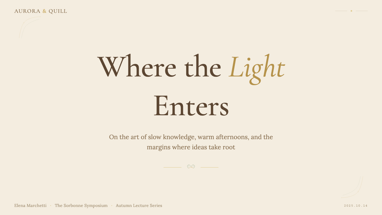
Light Academia is among the more immediately evocative styles available for presentation design, because its mood is so consistently legible. A cover slide benefits from restraint: a warm cream background, a single centered or elegantly offset title set in a large romantic serif, a thin ornamental rule or a small botanical vignette beneath the subtitle, and nothing else. The warmth of the ground does the atmospheric work; the cover need not be busy to feel considered. The risk to avoid is overcrowding the cover with multiple botanical elements, multiple type treatments, and a texture layer — the style reads as refined when spare and as fussy when loaded.浅色学院风是演示设计中氛围最为清晰可读的风格之一,因为它的情绪始终如一地可感知。封面幻灯片适合克制:温暖的奶油色背景、居中或优雅偏移的大型浪漫衬线字体标题、副标题下方一道细装饰线或一枚小植物小插图,此外什么都不需要。底面的温度承担了大气氛围的工作,封面无需热闹也能显得经过深思。需要避免的风险是:用多个植物元素、多种字体处理和一层质感叠压封面——这种风格在简洁时显得精致,在堆砌时显得繁琐。
Content slides in Light Academia should establish a consistent typographic hierarchy: a heading set in a large, optionally italic serif; a subheading in a smaller, roman weight of the same face; body text at a comfortable size with generous leading. Section dividers work well as thin horizontal rules with a small centered ornament, or as a single botanical detail marking the transition. Data slides require a conscious decision: Light Academia's warmth does not naturally suit hard-edged bar charts. The most effective approach is to render data as area fills with soft edges, or to use the warm accent tones — honey gold, muted terracotta — for bars and segments, and let the surrounding whitespace do the visual work of separation.浅色学院风的内容幻灯片应建立连贯的字体层级:大字、可选斜体的衬线字体标题;同一字体较小罗马体字重的副标题;舒适字号、充足行距的正文。段落分隔符以带居中小装饰的细水平线效果最佳,或以单个植物细节标记过渡。数据幻灯片需要有意识的决策:浅色学院风的温度并不天然适合硬边柱状图。最有效的方法是将数据渲染为带柔和边缘的面积填充,或用暖强调色——蜂蜜金、暗赤陶——为柱条与扇区着色,让周围的空白承担视觉分隔的工作。
For web interfaces, Light Academia is best applied to contexts where the product itself wants to evoke considered, unhurried quality: editorial publications, course or education platforms, literary subscription services, premium stationery or gift brands, and hospitality brands with a cultural or heritage positioning. The approach: a warm off-white or parchment background throughout; all body text in a dark sepia or near-black tone; headings in a serif of character, not a default system font; accent colors drawn from the honey-gold and sage-green range used only for links, hover states, and selected states. Navigation should be typographic and spacious — word-spaced, not icon-dense. Pricing pages and feature lists benefit from thin-ruled tables rather than card grids, and pull-quotes styled in large italics break up long-form content naturally.在网页界面中,浅色学院风最适合产品本身希望唤起「经过深思、从容不迫的品质感」的场景:编辑类出版物、课程或教育平台、文学订阅服务、高端文具或礼品品牌,以及有文化或传承定位的酒店品牌。方法如下:全程使用温暖的近白色或羊皮纸色背景;所有正文用深棕褐或接近黑色的色调;标题用有性格的衬线字体,而非系统默认字体;强调色取自蜂蜜金与鼠尾草绿范围,仅用于链接、悬停状态与选中状态。导航应当字体性、宽敞——单词间距充裕,而非图标密集。定价页面与功能列表适合细线表格而非卡片网格,以大号斜体排设的引文自然地打断长篇内容。
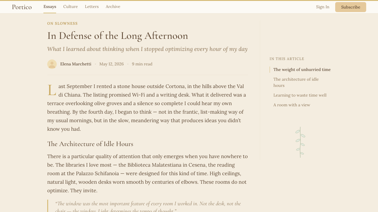
In editorial and marketing contexts, Light Academia supports long-form content especially well. An article or report layout might use a wide left margin for botanical marginalia or running pull-quotes, a centered body text column with generous line spacing, and section breaks marked by a thin rule and a small ornamental detail. Marketing pages work with the style's inherent warmth and sense of quality: hero sections with warm-toned photography (golden-hour light, outdoor reading, library interiors) paired with serif headlines in a cream-on-warm-dark combination. Email newsletters translate extremely well into this style — a parchment-toned header band, a botanical header illustration, typeset content with visible hierarchy, and a text-based call-to-action in a honey-gold accent are all the ingredients needed for a newsletter that feels genuinely distinctive.在编辑与营销场景中,浅色学院风对长篇内容的支持尤为出色。一篇文章或报告版面可以用宽左边距放置植物边注或滚动引文,居中的正文栏搭配充足行距,段落断口以细线与小装饰细节标记。营销页面适合这种风格固有的温度与品质感:英雄区域搭配暖色调摄影(黄金时刻光线、户外阅读、图书馆内景),配以奶油底深底的衬线大标题。电子邮件通讯极其适合这种风格——羊皮纸色调的标题带、植物插图标头、有清晰层级的排版内容,以及蜂蜜金强调色的文字行动召唤,就是让一封通讯感觉真正与众不同的全部要素。
A common mistake when applying Light Academia is confusing warmth with softness to the point of losing legibility and structure. The style permits and welcomes decorative detail, but it still requires clear typographic hierarchy, sufficient contrast between text and ground, and purposeful use of space. Another frequent error is applying a general vintage-brown filter to everything — authentic Light Academia uses a range of specifically warm tones (cream, honey, sage, rose, parchment) rather than a uniform sepia wash. A third mistake is using too many competing ornamental elements: a vine border, a pressed-flower motif, a watercolor wash, and a decorative initial all in the same composition produces visual noise rather than scholarly elegance. Restraint in the number of ornamental types — choosing one or two and using them consistently — preserves the aesthetic's characteristic sense of cultivation.应用浅色学院风时最常见的错误,是将温度与柔软混淆到失去可读性与结构的程度。这种风格允许并欢迎装饰细节,但它仍然需要清晰的字体层级、文字与底面之间充分的对比度,以及有目的的空间使用。另一个频繁出现的错误是给所有东西施加一种通用的复古棕色滤镜——真实的浅色学院风使用一系列特定的暖色调(奶油、蜂蜜、鼠尾草、玫瑰、羊皮纸),而非一层均匀的棕褐色水洗。第三个错误是使用过多相互竞争的装饰元素:同一构图中同时出现藤蔓边框、压花图案、水彩渲染与装饰首字母,产生的是视觉噪音而非学术优雅。克制装饰类型的数量——选择一到两种并一以贯之地使用——才能保留这种美学标志性的教养感。
See the Light Academia design system查看 Light Academia 完整设计系统
Light Academia — FAQLight Academia · 常见问题
What is the difference between Light Academia and Dark Academia as design systems?作为设计体系,浅色学院风与暗色学院风有何不同?
The subject matter is nearly identical — classical literature, antiquity, scholarly romanticism, botanical detail — but the temperature and emotional register are opposite. Dark Academia draws its palette from candlelight, aged wood, and Gothic stone: deep sepia, charcoal, forest green, burgundy, against near-black grounds. Its emotional register is brooding, melancholic, and intense. Light Academia draws its palette from Mediterranean afternoon light, linen, and watercolor paper: cream, honey gold, sage, rose, against warm off-white grounds. Its emotional register is aspirational, serene, and gently joyful. In practical terms, Dark Academia suits products that want to convey depth, mystery, or intellectual gravity, while Light Academia suits products that want to convey warmth, quality, and cultivated pleasure.两者的主题内容几乎相同——古典文学、上古世界、学术浪漫主义、植物细节——但温度与情感频段截然相反。暗色学院风的色板来自烛光、做旧木材与哥特式石材:深棕褐色、木炭色、森林绿、深红,映衬近乎黑色的底面。它的情感频段是沉郁、忧郁而强烈的。浅色学院风的色板来自地中海的午后光线、亚麻布与水彩纸:奶油色、蜂蜜金、鼠尾草绿、玫瑰色,映衬温暖的近白色底面。它的情感频段是充满抱负、宁静而温柔喜悦的。在实际应用中,暗色学院风适合希望传达深度、神秘或智识分量的产品,而浅色学院风适合希望传达温度、品质与教养享受的产品。
Is Light Academia too feminine or niche for professional design contexts?浅色学院风对于专业设计场景来说是否过于女性化或小众?
The aesthetic does have a demographic skew in its internet origins — the TikTok and Tumblr communities that named it were predominantly young women. But as a design system, Light Academia's principles (warm palette, serif typography, botanical ornamentation, generous spacing) are not inherently gendered. The eighteenth-century Grand Tour tradition, the Edwardian literary press, and the nineteenth-century botanical illustration industry were all substantially male-dominated fields that shared the same visual vocabulary. Whether a design feels appropriately professional depends far more on how the principles are applied — the degree of ornamental restraint, the clarity of typographic hierarchy, the quality of spatial decisions — than on the style's internet cultural associations. Applied with discipline, Light Academia is fully appropriate for premium editorial, cultural institutions, education, and hospitality brands.这一美学在其互联网起源中确实存在受众偏向——命名它的 TikTok 与 Tumblr 社区以年轻女性为主。但作为设计体系,浅色学院风的原则(暖色板、衬线字体、植物装饰、慷慨间距)并不天然具有性别属性。十八世纪的「壮游」传统、爱德华时代的文学出版界,以及十九世纪的植物插图行业,都是以男性为主的领域,却同样共享这套视觉词汇。一个设计是否感觉适当专业,远比风格在互联网文化中的联想更取决于原则的应用方式——装饰克制的程度、字体层级的清晰度、空间决策的质量。运用得当,浅色学院风对高端编辑、文化机构、教育和酒店品牌完全适合。
How does Light Academia handle digital interfaces without feeling anachronistic?浅色学院风如何处理数字界面,而不显得过时不协调?
The key is to treat the aesthetic's historical references as a temperature and mood — not as a literal reproduction of historical artifacts. A Light Academia web interface should not attempt to simulate a nineteenth-century book; it should use a warm parchment background, a carefully chosen serif typeface, and restrained botanical detail to create an atmosphere of considered quality. Interactive elements (buttons, links, hover states) work perfectly well within this vocabulary when styled in honey-gold or sage-green against warm grounds — they simply need to look purposeful rather than ornamental. The greatest anachronism risk is in loading states, modals, and system UI components: keeping these typographically clean rather than over-ornamented prevents the design from reading as costume rather than style.关键在于将这种美学的历史参照视为一种温度与情绪——而非历史文物的字面复制。一个浅色学院风的网页界面不应尝试模拟十九世纪的书籍;它应该用温暖的羊皮纸底面、精心选择的衬线字体和克制的植物细节,营造一种经过深思的品质氛围。交互元素(按钮、链接、悬停状态)在这套词汇中完全可以运作——当它们以蜂蜜金或鼠尾草绿映衬暖色底面时,只需看起来有目的而非装饰性。最大的时代错位风险在于加载状态、模态框与系统 UI 组件:让这些保持字体排印上的简洁而非过度装饰,才能防止设计读起来像是服装造型而非风格选择。
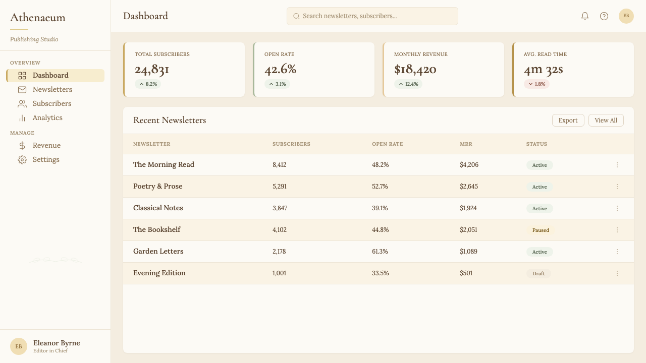
Can Light Academia work for data-heavy or technical products?浅色学院风能用于数据密集或技术性产品吗?
With deliberate adaptation, yes. The style's warm palette and generous spacing actually make data more readable than many cooler, denser alternatives, because the visual environment is calm and the contrast is soft enough to avoid visual fatigue. The main challenge is that Light Academia's ornamental details are incompatible with the kind of information density that technical dashboards require — a botanical border has no place on a real-time analytics panel. The solution is to apply the palette and typographic principles (warm background, serif headings, generous spacing, honey-gold or sage accent) while setting aside the ornamental vocabulary entirely. The result is something closer to a refined, warm minimal style than to classic Light Academia, but it retains the distinctive temperature of the aesthetic without its decorative excess.经过刻意调整,可以。这种风格的暖色板与宽裕间距实际上比许多更冷、更密集的替代方案让数据更易读,因为视觉环境平静,对比度柔和到足以避免视觉疲劳。主要挑战在于浅色学院风的装饰细节与技术仪表板所需的信息密度不相容——植物边框在实时分析面板上没有立足之地。解决方案是应用色板与字体排印原则(暖底面、衬线标题、宽裕间距、蜂蜜金或鼠尾草绿强调),同时完全搁置装饰词汇。结果更接近一种精致的、暖调极简风格,而非经典浅色学院风,但它在没有装饰过剩的情况下保留了这种美学的独特温度。
What makes Light Academia feel authentic rather than generic vintage?是什么让浅色学院风感觉是真实的,而非普通的复古风?
Three things separate authentic Light Academia from generic warm-vintage pastiche. First, specificity of reference: the style draws on particular traditions — Edwardian botanical illustration, Grand Tour watercolor, classical antiquarian engraving — rather than a vague notion of 'old.' Using references with genuine historical specificity rather than generic sepia-toned textures gives the work credibility. Second, typographic discipline: Light Academia uses serif type with real character and intentional italic application — not a default serif at a comfortable size, but a typeface chosen for its historical associations and deployed with awareness of its rhythm and weight. Third, restraint in ornamentation: the style allows more decoration than most contemporary design systems, but it requires that decoration to feel discovered rather than assembled. One well-chosen botanical detail used consistently throughout a project reads as cultivated; ten botanical details used inconsistently reads as collage.三件事将真实的浅色学院风与通用的暖调复古仿制品区分开来。第一,参照的特定性:这种风格援引特定的传统——爱德华时代的植物插图、壮游水彩画、古典古书商雕版——而非模糊的「旧」的概念。使用具有真正历史特殊性的参照,而非通用的棕褐色质感,赋予作品可信度。第二,字体排印的自律:浅色学院风使用有真实性格的衬线字体,以及有意识的斜体应用——不是某个舒适字号的默认衬线字体,而是因其历史联想而被选择、带着对其节奏与字重的认知部署的字体。第三,装饰的克制:这种风格允许比大多数当代设计体系更多的装饰,但它要求装饰感觉像是被「发现」而非被「拼凑」。一个精心选择的植物细节在整个项目中一以贯之地使用,读起来像是有教养的;十个植物细节不一致地使用,读起来像是拼贴。
Related design styles相关设计风格
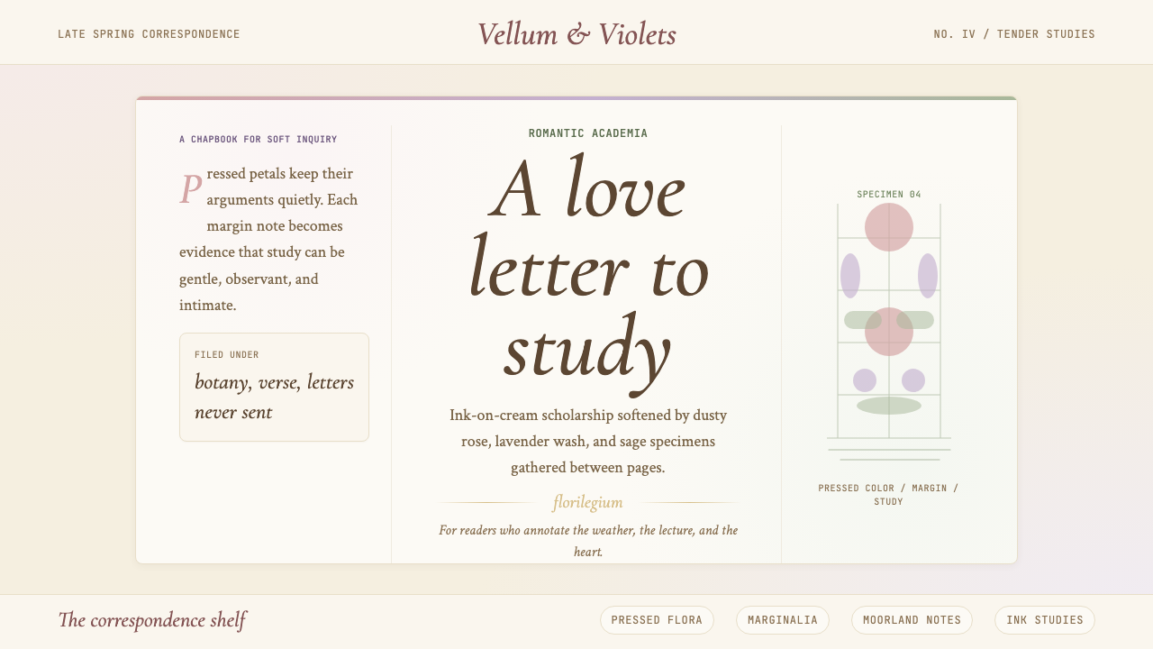 Romantic AcademiaScholarship turns tender. Dusty rose and lavender frame ink-on-cream poetry w…学问变得温柔:灰玫瑰与薰衣草框住米白纸上的墨字与压花。
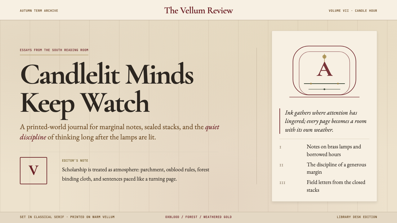 Dark AcademiaCandlelit nostalgia for old books. Parchment grounds, oxblood accents, classi…西方古典教育的浪漫想象:羊皮纸底色、牛血红点缀、古典衬线——一本被翻阅无数次的…
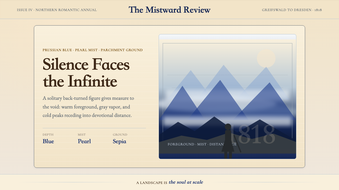 Caspar David FriedrichSilence becomes vast. Prussian blue depth, pearl mist, and parchment framing…寂静变得辽阔:普鲁士蓝纵深、珍珠雾与羊皮纸框层层后退。
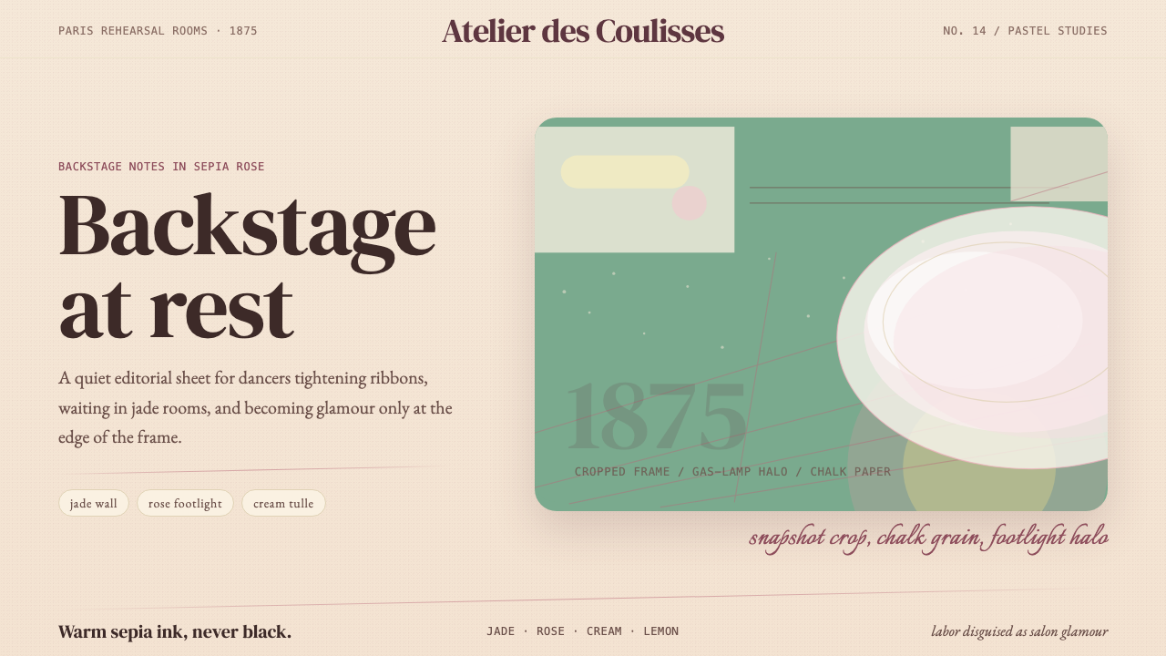 Degas Ballet PastelsBackstage glamour is labor. Jade walls, rose footlights, cropped serifs on cr…后台华丽即劳动。玉墙、玫瑰脚灯与裁切衬线落在奶油纸上。
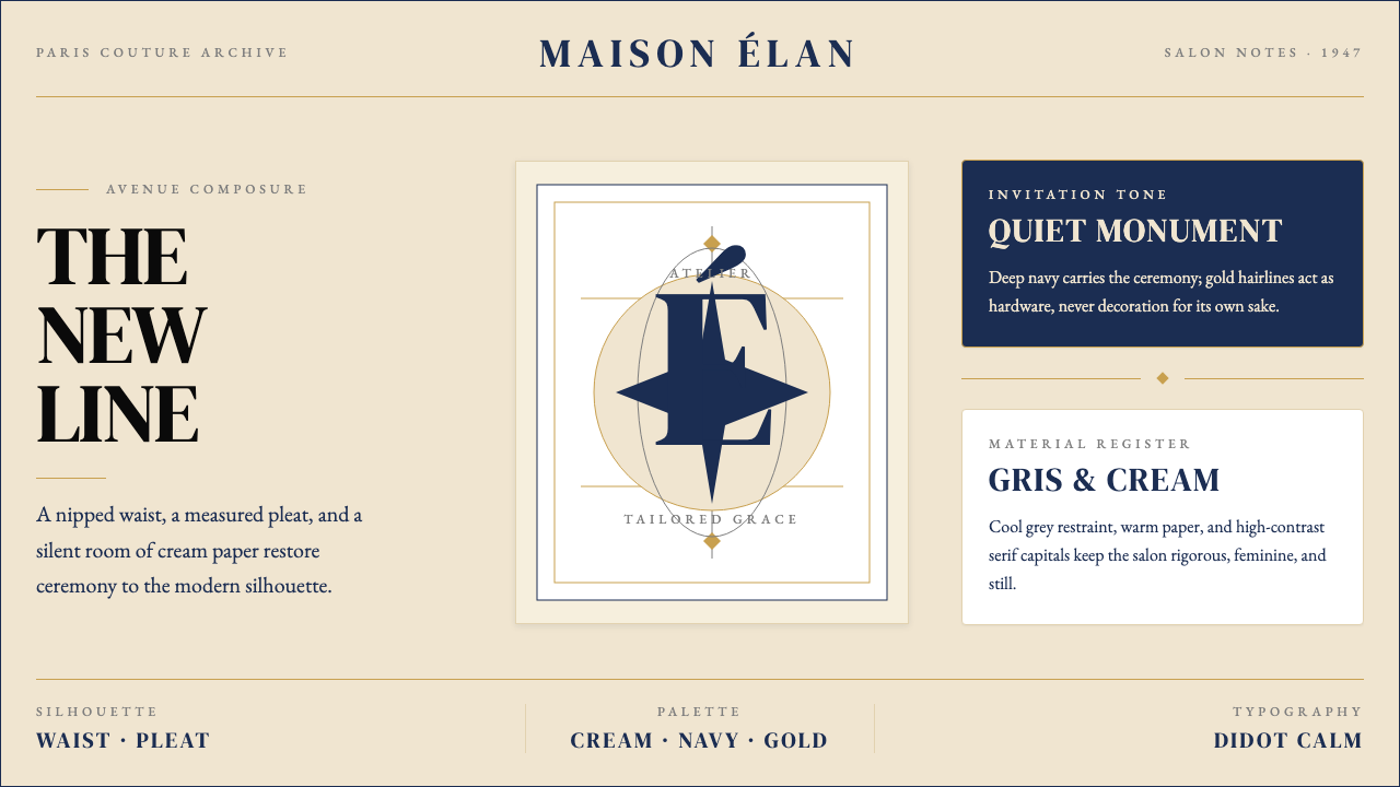 Dior New Look (1947)Couture speaks softly. Cream ground, navy Didot capitals, and gold hairlines…高级订制低声发言:米白底、海军蓝Didot大写与金色发丝线稳住全场。
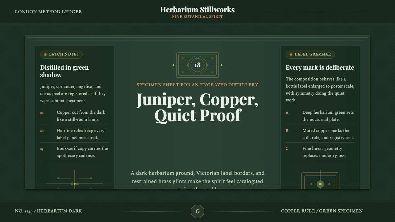 Gin BotanicalHerbarium precision. Dark green frames, Playfair serif, and copper rules hold…标本册般精确。深绿框线、Playfair 衬线与铜色细则定住画面。