What is Gin Botanical?
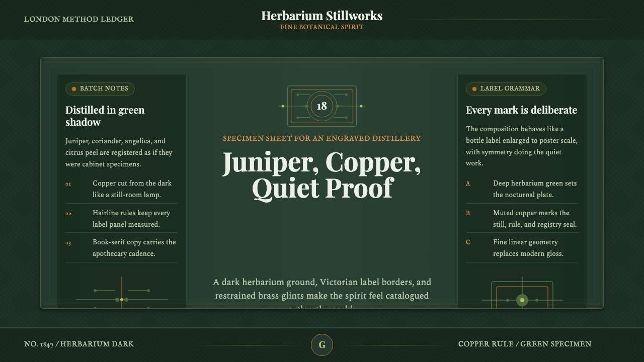
Gin Botanical takes the herbarium and the apothecary label as its ancestors — a deep, herb-dark ground engraved with juniper and root, held together by copper light and a distiller's obsessive symmetry.
Gin Botanical in brief
Gin Botanical is the visual language of the craft-gin revival that began spreading out of Britain and Western Europe in the 2010s — the small-batch distillers who wrapped juniper-forward spirits not in the clean, modern gloss of mainstream liquor branding, but in something older and more studious: the look of an eighteenth-century botanical engraving pinned to the wall of an apothecary's back room.
The style borrows its authority from two much older traditions. The first is scientific botanical illustration — the fine, obsessive line-work naturalists used to record a plant's every vein and serration before photography existed. The second is the apothecary label — the framed, symmetrical, hand-lettered panels that once told a customer exactly what was inside a bottle and trusted them to take it seriously. Gin Botanical fuses the two: a deep, herbarium-dark ground standing in for the specimen sheet's aged paper, botanicals traced in engraver's line rather than painted or photographed, and label-like framing devices that treat every panel as a small ceremony.
What makes it read as gin rather than as botany in general is the metal. Copper and a muted, tarnished brass appear throughout — in rules, in frame corners, in the glint that catches a berry's line-work — evoking the pot stills these distilleries actually use. The result sits deliberately apart from the bright, mixology-bar aesthetic of modern spirits marketing: it is quieter, more exacting, and more willing to let dark space do the work.
Where does Gin Botanical come from?
Craft gin's modern boom is usually traced to the early 2000s, when a handful of small British distillers began challenging the assumption that gin was a commodity spirit defined only by juniper and alcohol strength. Sipsmith, founded in London in 2009, is widely credited as the first new copper-pot-still distillery to open in the city in nearly two centuries, having navigated licensing rules that had effectively frozen out small producers since the Victorian era. Its success — and the wave of small distilleries that followed across Britain, Scotland, and the German Black Forest — created a new category of packaging problem: how do you signal handcraft and botanical seriousness on a shelf crowded with century-old commodity brands?
The answer these distillers reached for was not invention but retrieval. Rather than designing something new, many turned to the visual conventions of two much older professions that had always taken plants seriously: the apothecary, who labeled tinctures with exacting, symmetrical typography because a mistake could be dangerous, and the botanical illustrator, whose engraved plates — descending from a tradition running through eighteenth- and nineteenth-century natural history publishing — rendered a plant's structure with scientific precision rather than decorative license. Both traditions communicated the same message: this was made carefully, by someone who understood exactly what was in it.
Hendrick's, a Scottish gin launched in 1999 and widely credited with popularizing the Victorian-apothecary aesthetic in spirits branding at scale, leaned into this vocabulary early and unapologetically — framed botanical vignettes, dense line-engraved illustration, a self-consciously antiquated tone that stood in deliberate contrast to the vodka-clean branding dominating the spirits aisle at the time. Monkey 47, a Black Forest gin distilled from a list of forty-seven botanicals, extended the same instinct into a more encyclopedic register, its labeling and packaging reading like a naturalist's inventory of ingredients rather than a simple brand mark.
By the 2010s this had crystallized into a recognizable house style across the category — not a single distillery's invention but a shared visual dialect that small producers reached for because it did real communicative work. A crowded specimen sheet of botanicals said, credibly, that a great many ingredients had gone into the bottle. A symmetrical crest said heritage, even for a distillery only a few years old. Copper details said, quite literally, that a still had been involved.
What defines the Gin Botanical look?
Color
The ground is a deep, near-black herbarium dark rather than true black — closer to the color of aged botanical paper seen under low light. Juniper and herb greens sit on top of this dark field as the dominant living color, muted rather than bright, as if pressed rather than growing. Copper and a dulled, tarnished brass function as the accent metal throughout, standing in for the pot-still hardware itself; these metals are always warm and slightly aged, never chrome-bright the way a modern product shot would render metal.
Typography
Headline type draws on the elegant, high-contrast serif tradition associated with eighteenth-century printing — letterforms with dramatic thick-and-thin stroke variation that historically signaled quality and permanence on a label or title page. Supporting text favors a more restrained classical serif or a careful small-caps treatment, evoking the hand-set type of old apothecary and specimen labels rather than anything contemporary or digital. Letterspacing on labels and headers tends to be generous and deliberate, giving even short words the weight of an official designation rather than a casual caption.
Line-Engraved Botanicals
The signature motif is the botanical rendered in fine engraver's line — juniper berries, root systems, leaf clusters, and citrus peel drawn with the same obsessive, cross-hatched precision a naturalist would use to document a specimen for scientific record. These are never photographic and never softly illustrated in flat color; the line itself carries all the information, building shadow and volume through density of hatching rather than through gradient or tone. The botanicals are usually arranged with the same symmetry and containment as the crests and frames around them, more specimen-plate than casual sprig.
Symmetric Crests and Framing
Composition leans heavily on the symmetric crest — a centered emblem, often flanked by mirrored botanical flourishes, that borrows directly from heraldic and pharmaceutical label conventions to project an instant sense of established authority. Bottle-label panels are typically framed with hairline rules, sometimes doubled or nested, creating a sense of a document that has been formally bordered and sealed rather than simply printed. This framing discipline extends beyond the label itself into the wider visual system: content is organized into distinct, rule-bordered panels rather than flowing loosely across a page.
Hairline Rules and Precision
Thin, exact rules — never thick bars — do the structural work throughout: dividing sections, underscoring headers, bordering panels, and connecting related elements. Their thinness is the point: a heavy rule would read as modern graphic design, while a hairline rule reads as engraved or hand-drawn, consistent with the specimen-sheet register. These rules are frequently doubled (a fine line paired with a slightly finer one) to add a sense of ceremonial precision without adding visual weight.
Apothecary-Label Structure
Information is organized the way an apothecary label organizes a compound's contents: hierarchical, formal, and unhurried, with a clear distinction between the primary designation (large, centered, high-contrast) and the supporting detail (smaller, quieter, often in small caps or a restrained italic). Nothing is arranged for casual scanning the way a modern consumer label is; the implicit assumption is that the reader will take their time, the way a chemist or a distiller would read a formula rather than glance at a barcode.
Restraint Over Gloss
Every decision in the system favors restraint over modern beverage gloss: no bright highlights simulating wet glass, no saturated color blocking, no playful or casual mark-making. Dark space is used generously and confidently rather than filled with incidental decoration — the herbarium ground is allowed to simply be dark, letting the copper accents and engraved line do all of the visual talking. The overall effect is closer to a serious reference document than an advertisement, which is precisely the credibility the style is built to project.
Who shaped Gin Botanical?
Founded in London in 2009, Sipsmith is widely credited as the first new copper-pot-still distillery to open in the city in nearly two centuries, after its founders navigated licensing regulations that had long favored large commodity producers. Its packaging paired an unfussy confidence with classical, label-like typography, helping establish the idea that a gin's visual identity could signal small-batch, hands-on distillation rather than industrial-scale production.
A Scottish gin launched in 1999, Hendrick's is widely credited with popularizing the Victorian-apothecary aesthetic in spirits branding at a category-defining scale — framed botanical vignettes, dense engraved illustration, and a deliberately antiquated, almost medicinal tone that stood apart from the cleaner branding common in spirits at the time. Its visual approach demonstrated that a gin brand could differentiate through historical borrowing rather than modern minimalism.
A gin distilled in the Black Forest from a list of forty-seven botanicals, Monkey 47 extended the apothecary-label instinct into a more encyclopedic register, with labeling that reads like a naturalist's detailed inventory of ingredients. Its packaging reinforced the idea that visual density and specimen-like precision could themselves communicate craft and rigor.
How do you use Gin Botanical today?
Gin Botanical is a strong choice wherever a product wants to project heritage, precision, and hand-crafted seriousness rather than speed or convenience — but it demands genuine restraint to execute well, since its entire credibility rests on looking studied rather than decorated.
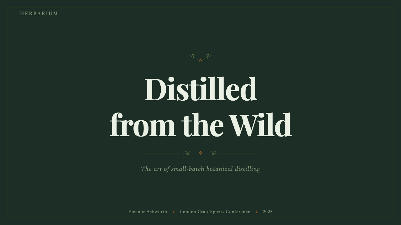
For presentation slides, the style suits a cover page built around a centered, symmetric crest-like mark with the deep herbarium ground behind it, title type set in the high-contrast classical serif and given generous letterspacing so it reads as a formal designation rather than a headline. Content slides should treat each block of information as its own framed panel, bordered in hairline rule, with a single line-engraved botanical motif used sparingly as a section marker rather than scattered decoratively across the page. Data should be presented with the same unhurried formality as the rest of the system — plain, precisely ruled tables read more authentically in this style than colorful modern charts.
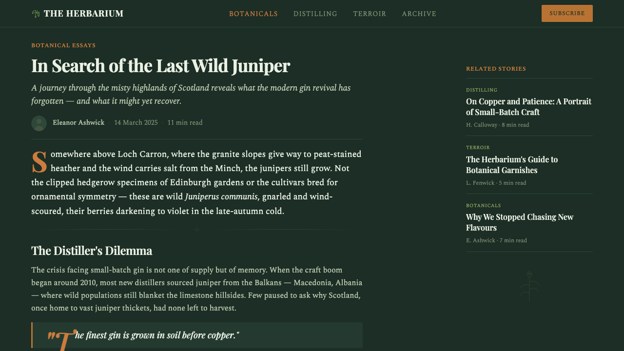
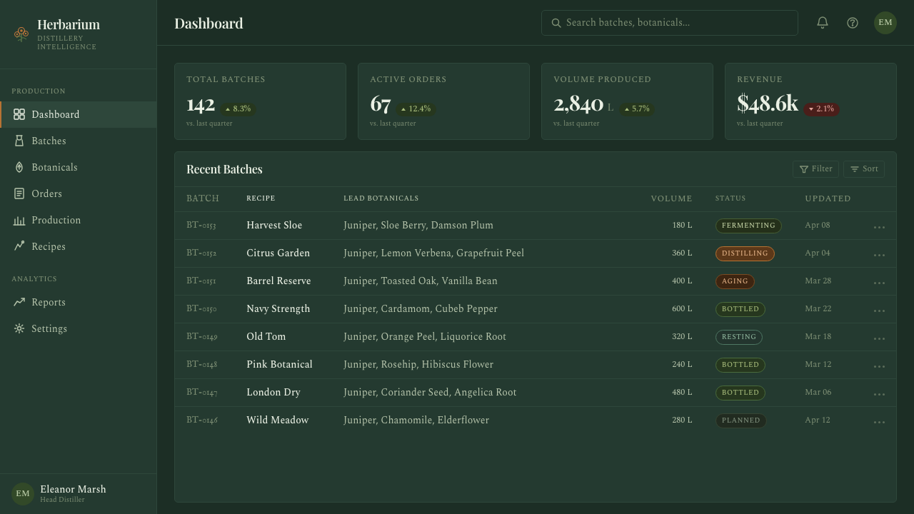
For web interfaces, the style can work well on dashboards and pricing pages that want to feel considered rather than app-like: dark herbarium backgrounds, copper as the single accent for interactive elements and tier distinctions, and card components bordered in hairline rule rather than built from soft modern shadows. Restraint is essential — a dashboard drowning in engraved botanical illustration reads as costume rather than craft; the botanicals should appear as occasional, deliberate flourishes, not wallpaper.
For editorial and marketing work, the style is well suited to long-form storytelling about origin, ingredients, or process — an About page or product story reads naturally as a specimen sheet, with pull quotes framed like label panels and section breaks marked by hairline rule rather than casual whitespace. Marketing pages benefit from treating each product or feature as its own labeled specimen, given a symmetric crest and its own contained frame rather than laid out in a loose, scrolling grid.
A common mistake when applying Gin Botanical is over-decorating: filling every available space with botanical line-work until the page reads as busy rather than studious, which destroys the sense of restraint the style depends on for credibility. Another frequent error is reaching for bright, saturated color or glossy highlights to make the design feel more premium — the opposite is true here. The style earns its authority through dark, confident negative space and sparing, precise ornament, not through visual abundance.
Gin Botanical — FAQ
Is Gin Botanical the same as generic 'botanical illustration' style?
They overlap but are not the same. Generic botanical illustration can appear on a light ground, in full color, or in a casual, decorative register aimed at gift wrap or stationery. Gin Botanical is specifically the fusion of engraved botanical line-work with the apothecary label and heraldic crest — it is always dark-grounded, always disciplined into symmetric, framed panels, and always paired with copper or brass metal accents that reference the pot still. Remove the crest, the frame, or the metal accent, and the result reads as decorative botany rather than as this style.
Can Gin Botanical work with a light background instead of a dark one?
The style is built around a dark, herbarium-toned ground, and this is close to load-bearing: the deep background is what makes copper accents and fine engraved line read as precious and precise rather than flat. A light inversion is possible for specific components — a printed spec sheet or a single label panel can work on aged-paper cream — but a full light-ground treatment loses much of the apothecary-at-night mood that distinguishes this style from ordinary vintage botanical decoration. If a lighter register is required, it works best confined to a secondary panel rather than the whole system.
Why does this style rely so heavily on symmetry?
Symmetry is borrowed directly from heraldry and pharmaceutical labeling, both of which used centered, mirrored composition to project an unquestionable, established authority — a crest is not meant to look invented yesterday. For a young craft distillery, symmetric framing is a shortcut to credibility: it tells the eye 'this follows an established convention' even when the brand itself is new. Breaking the symmetry undermines this signal and can make the same botanical motifs read as merely decorative rather than authoritative.
Does the fine engraved line-work translate well to small digital surfaces, like app icons or badges?
It requires care. The style's engraved botanicals depend on fine, dense cross-hatching to build shadow and volume, and at very small sizes this detail can collapse into visual noise rather than reading as a recognizable motif. For small surfaces, it works better to simplify the botanical to a single clean silhouette or a reduced-line version, reserving the full densely hatched engraving for larger panels, covers, or label-scale applications where the detail has room to resolve.
What kinds of products or brands should avoid Gin Botanical?
The style struggles wherever speed, casualness, or mass-market accessibility is the desired signal — fast-consumer apps, playful youth brands, or any product wanting to feel instantly approachable rather than studied. Its formality and dark restraint can also read as heavy or somber in contexts that call for lightness, and its historical, European apothecary references may sit awkwardly on products with no plausible connection to that heritage. It is best reserved for products where craft, provenance, and unhurried quality are genuinely part of the story, not simply borrowed for visual interest.
Related design styles
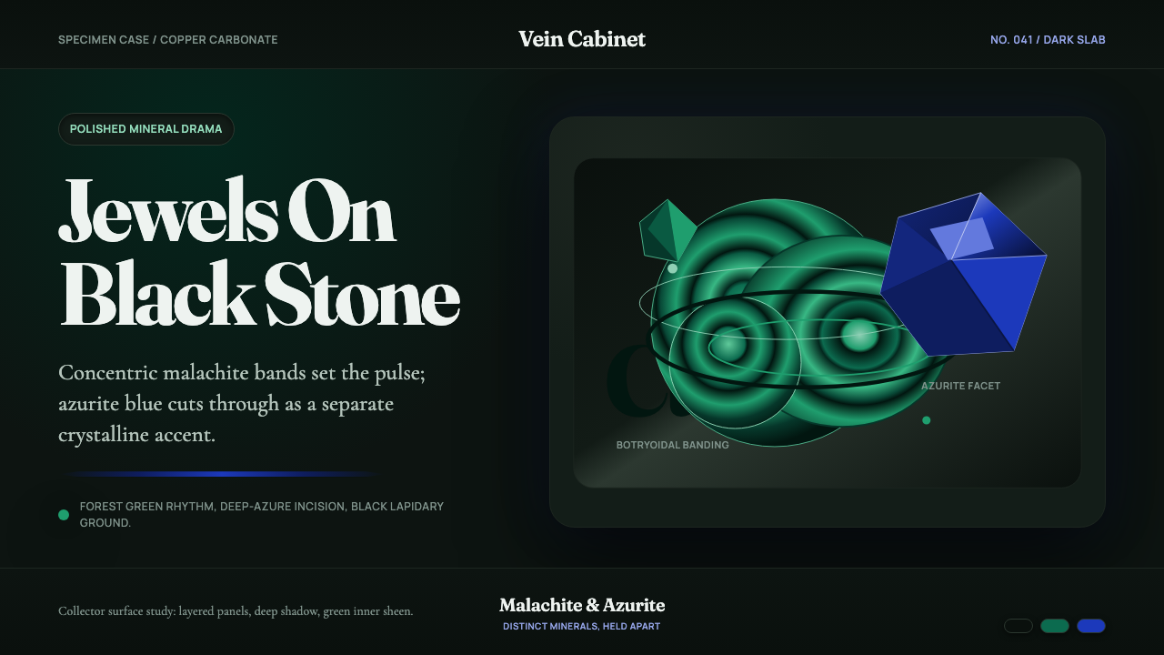 Malachite & AzuriteLiving jewels on black stone. Fraunces type meets green rings and sharp azuri…
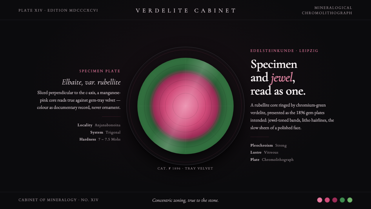 Tourmaline Crystal SliceSpecimen and jewel as one. A watermelon-tourmaline slice — pink core, green r…
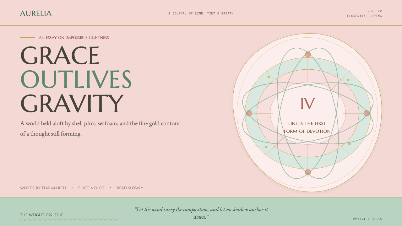 Botticelli Birth of Venus (1486)Grace defeats gravity. Shell pink, seafoam, and fine gilt contours keep every…
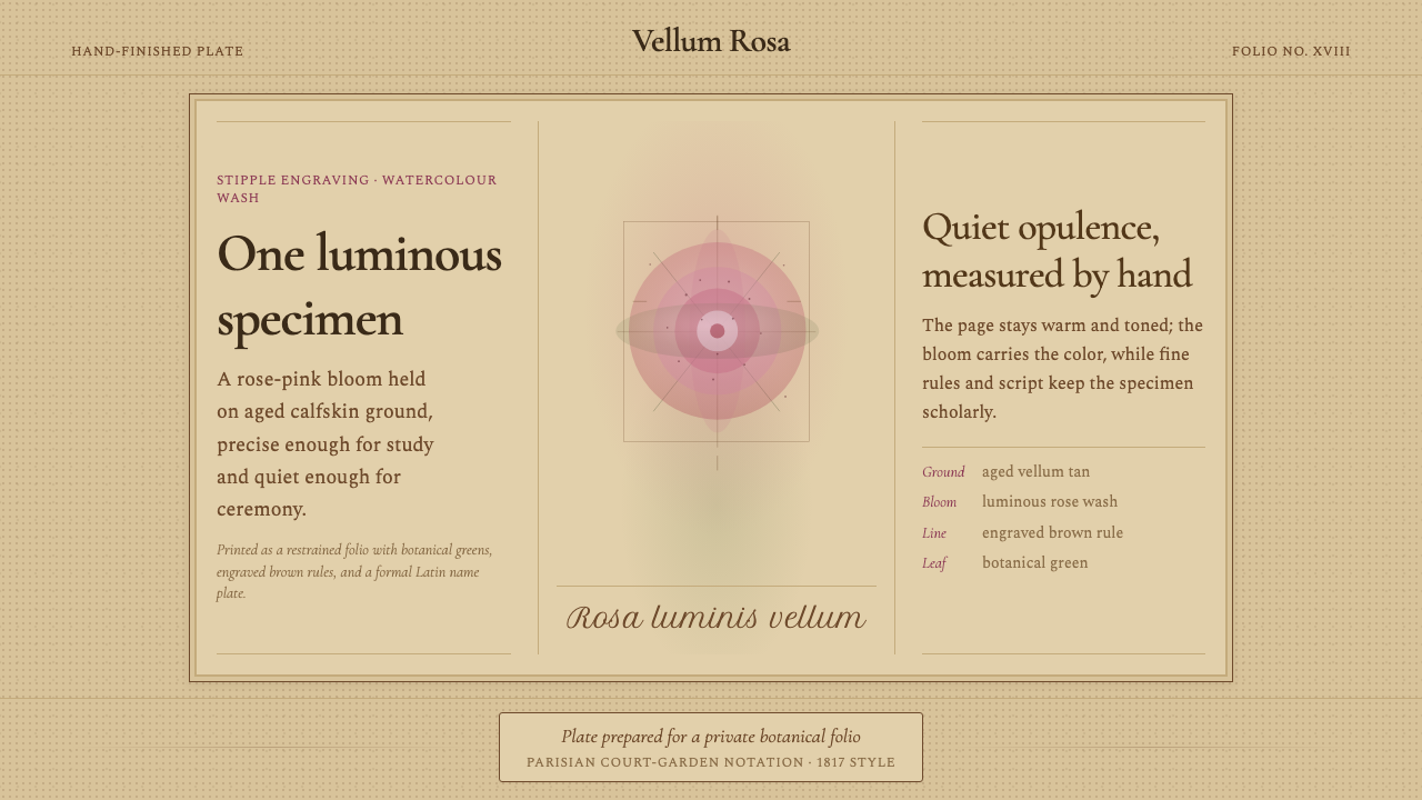 Redouté BotanicalScholarly opulence. Rose wash on aged vellum, framed by engraved brown rules.
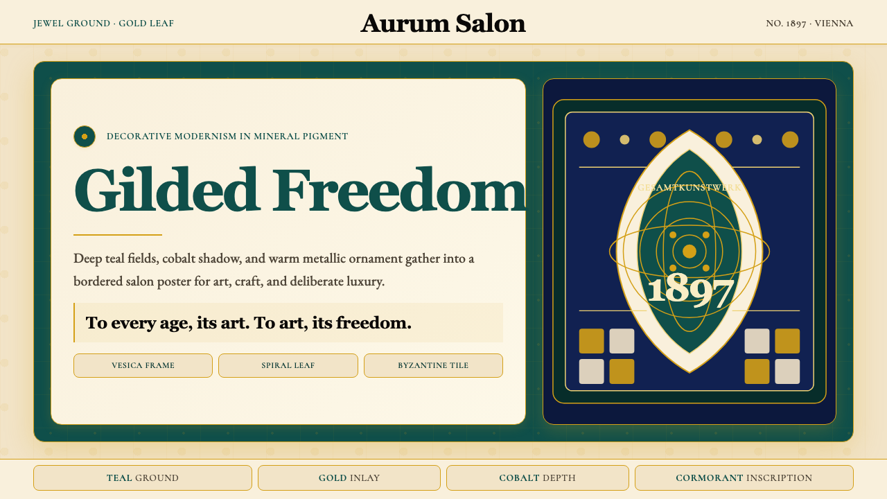 Wiener Secession (Klimt)Opulence made modern. Teal grounds, gold inlay, vesica frames and Cormorant d…
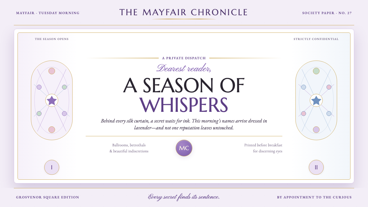 Bridgerton Regency (2020)Scandal wears lavender. Wisteria pastels and gilt rules frame a sharp letterp…