What is Tourmaline Crystal Slice?
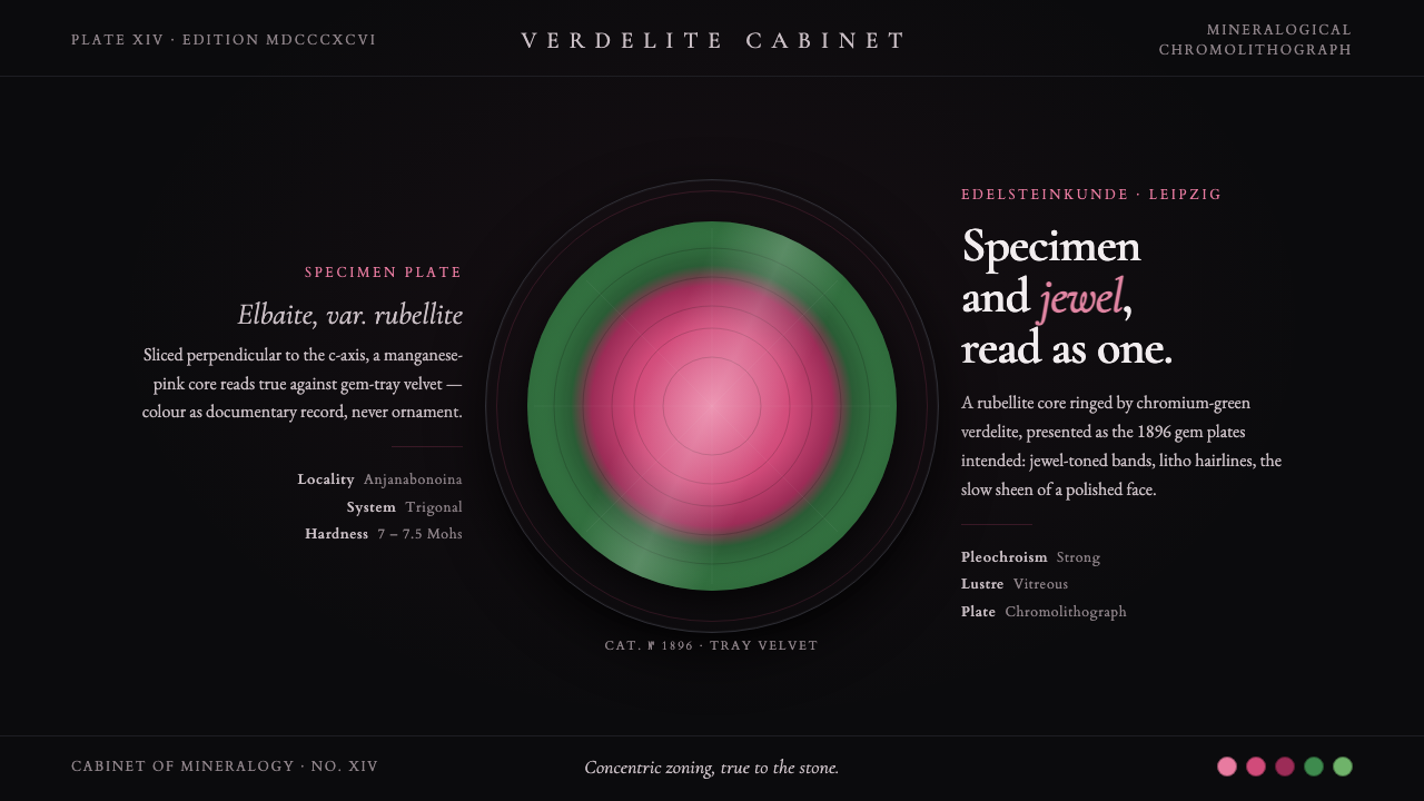
Tourmaline Crystal Slice turns a mineral specimen into a jewel-like digital plate: a luminous pink center, a green crystalline rim, and the quiet authority of black velvet.
Tourmaline Crystal Slice in brief
Tourmaline Crystal Slice is a dark design style distilled from the polished cross-section of watermelon tourmaline as presented in Max Bauer’s Edelsteinkunde, published in Leipzig in 1896. Its governing image is geological but immediately decorative: a manganese-pink rubellite core enclosed by a chromium-green verdelite rind. The composition treats that concentric mineral structure as the central event. Rather than using color as an atmospheric wash, it uses it as evidence of material difference, as though each band had been revealed by cutting, polishing, cataloguing, and placing the specimen under glass.
The style belongs to the meeting point of specimen display and fine jewelry. A black gem-tray velvet ground gives the bright mineral slice a theatrical field without making it feel loud. Fine chromolithographic and engraved line work introduces the language of close observation: contour, fracture, radial growth, and the slight irregularity that separates a real mineral from a decorative target. The result is neither a generic luxury treatment nor a laboratory interface. It is scientific-looking because it respects the specimen, and luxurious because it lets the specimen remain rare.
In digital use, Tourmaline Crystal Slice translates the atmosphere of a protected nineteenth-century gem plate into a disciplined visual system. Dark space acts like velvet, pale serif typography acts like a plate annotation, and jewel-toned accents appear with the restraint of a selected specimen rather than an all-over palette. A page should feel curated, tactile, and held at close range. Its beauty comes from contrast between darkness and polish, precision and organic growth, scholarship and desire.
Where does Tourmaline Crystal Slice come from?
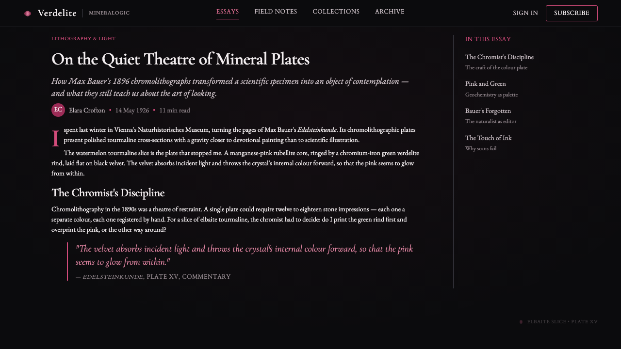
The visual source is Max Hermann Bauer’s Edelsteinkunde, a Leipzig publication from 1896 situated within the nineteenth-century mineralogical plate tradition. The relevant image is a polished slice of watermelon tourmaline: rubellite at the center, verdelite around it, and a presentation that makes the mineral’s internal zoning legible. This is important because the style does not begin with an abstract color pairing. It begins with a documented specimen image, where the pink and green relationship is inseparable from the physical history of a crystal.
Victorian scientific mineralogy supplied the intellectual frame. A mineral plate needed to do more than decorate a page: it had to make material characteristics available for inspection. Concentric bands, edge definition, and finely described surface detail therefore carry descriptive responsibility. Tourmaline Crystal Slice preserves that responsibility in digital form. Its circular or irregular-slice motifs should read as observed sections, not as decorative rings detached from an object. The style works best when every luminous accent appears to belong to a named, bounded, examinable thing.
Natural-history chromolithography supplied the visual method. Period chromolithographers translated mineral specimens into colored plates through controlled layers of hue, line, and sheen. In this system, a line is not merely an outline; it can indicate the edge of a band, the pressure of engraving, or the precision of a scientific record. The dark ground also has historical force. Black gem-tray velvet was the documented presentation surface for the period gem plate, allowing bright polished material to emerge with a contained, almost ceremonial intensity.
Typography completes the plate rather than competing with it. Garamond-family serif lettering is used as a restrained annotation voice, connecting the specimen to the composed, printed authority of a historical book plate. It should feel measured, learned, and close to the object. The style’s historical character does not require imitation of an old page in every detail. Its transferable lesson is more specific: let image, caption, ground, and ornament cooperate so that a mineral appears both scientifically legible and exceptionally precious.
What defines the Tourmaline Crystal Slice look?
Concentric Mineral Bands
The defining motif is the transition from manganese-pink rubellite core to chromium-green verdelite rind. These bands should retain some irregularity of a polished crystal slice: they may swell, narrow, drift, or break at the edge. A perfectly mechanical target pattern loses the geological premise. The center is a source of attention, while the green ring gives that attention containment and material context.
Black Velvet Ground
Darkness is not empty background here; it is a presentation material. The black ground should feel absorbent, quiet, and protective, like a gem tray that makes polished color appear more concentrated. It creates a generous field around the specimen and should not be crowded with unrelated decoration. The page gains depth through contrast and spacing, not through theatrical lighting effects.
Engraved Plate Line
Fine line work should suggest lithographic observation and engraving rather than digital filigree. Use it to describe rims, radial marks, sectional boundaries, small specimen labels, or quiet framing devices. Lines are most effective when they appear purposeful and sparse. Their task is to make the object feel studied and printed, not to add a lace-like luxury surface.
Plate Sheen
The surface may carry a restrained sense of polish, recalling a tissue-guarded plate and a carefully finished gemstone. This is a sheen of preservation and material finish, not a glossy interface treatment. Keep it localized to the specimen, selected dividers, or paper-like details. When every region shines equally, the hierarchy collapses and the mineral ceases to feel singular.
Restrained Garamond Serif
Garamond-family serif typography gives the style its scholarly register. It should be used with calm hierarchy: a specimen title, plate-like caption, category label, or a short block of interpretive text. The type should never become ornate enough to rival the crystal. Its value lies in quiet precision, making the page feel catalogued without becoming bureaucratic.
Scientific-Jewel Tension
The style succeeds by holding two readings together. It must preserve the seriousness of a natural-history object while admitting the pleasure of rarity, color, and polish. Leaning too far toward science creates a cold archive; leaning too far toward luxury produces an ungrounded jewel mood. A caption, contour line, or visible sectional structure can keep even the most sumptuous composition connected to the specimen.
Who shaped Tourmaline Crystal Slice?
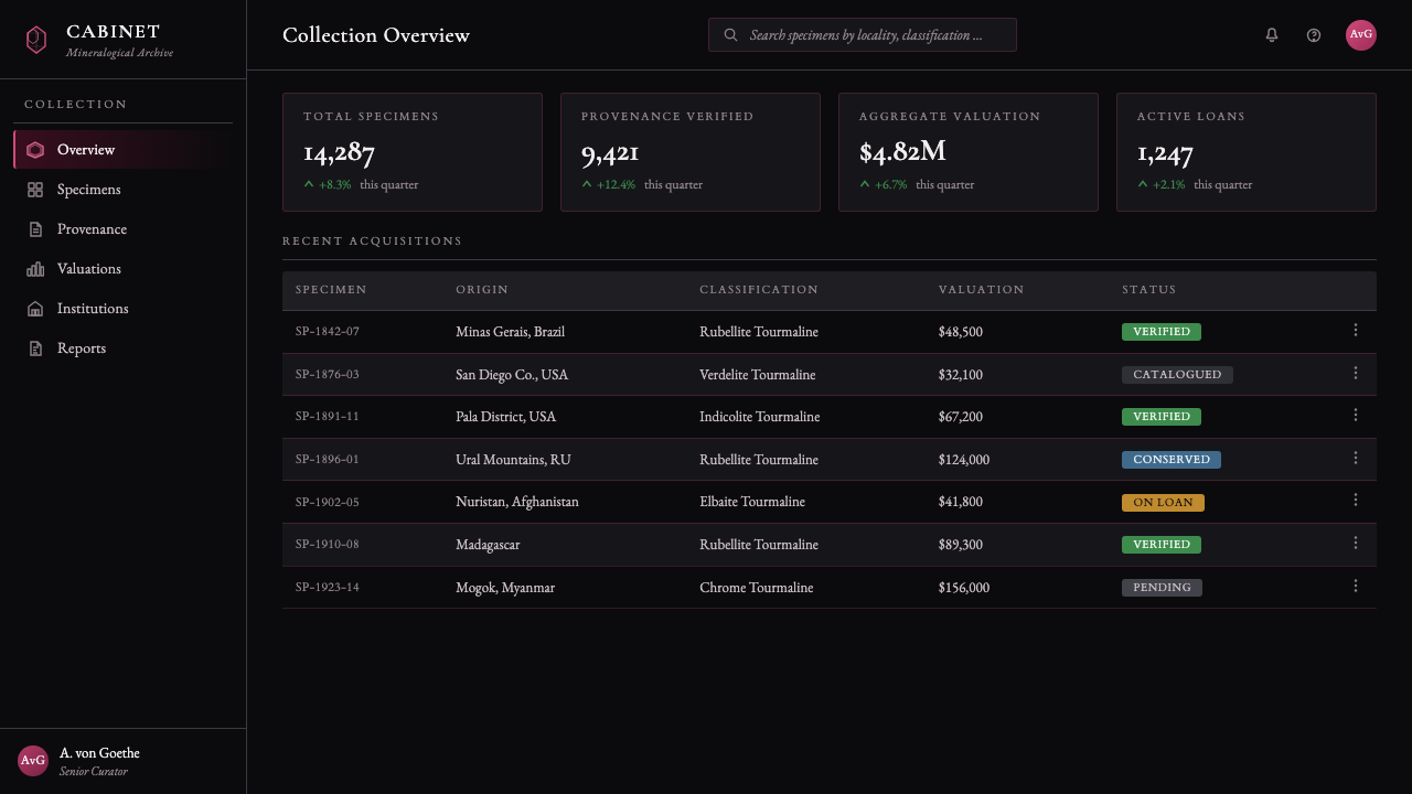
Bauer is the named author connected to Edelsteinkunde, published in Leipzig in 1896. The Tourmaline Crystal Slice style takes its central reference from the book’s presentation of a polished watermelon-tourmaline cross-section. His role matters because the design language begins with a published mineralogical plate rather than a later fantasy of gemstone luxury.
The chromolithographers of the period represent the craft tradition behind natural-history plates: translating observed specimens into controlled color, fine line, and printable surface presence. In this style, their legacy appears as careful sectional description and disciplined saturation. The goal is not to simulate age, but to inherit the plate maker’s responsibility to make a specimen both visible and credible.
The Anjanabonoina specimen tradition anchors the style in a named tradition of tourmaline specimens. It reinforces the central idea that the crystal slice is not merely a circular graphic device. It is a mineral object with internal zones, a polished face, and a history of being selected for display and study.
How do you use Tourmaline Crystal Slice today?
For presentation slides, use the style’s specimen logic to separate cover, content, and data pages. A cover can place a single large crystal slice or cropped concentric form against a broad black field, with a concise Garamond-family title and a quiet plate-like subtitle. Content slides should behave like annotated trays: one focal image, restrained labels, and short passages arranged with ample dark space. On data slides, avoid turning every chart into decoration. Use the mineral bands to distinguish a primary story from supporting categories, while line work and captions preserve the sense of an observed plate.
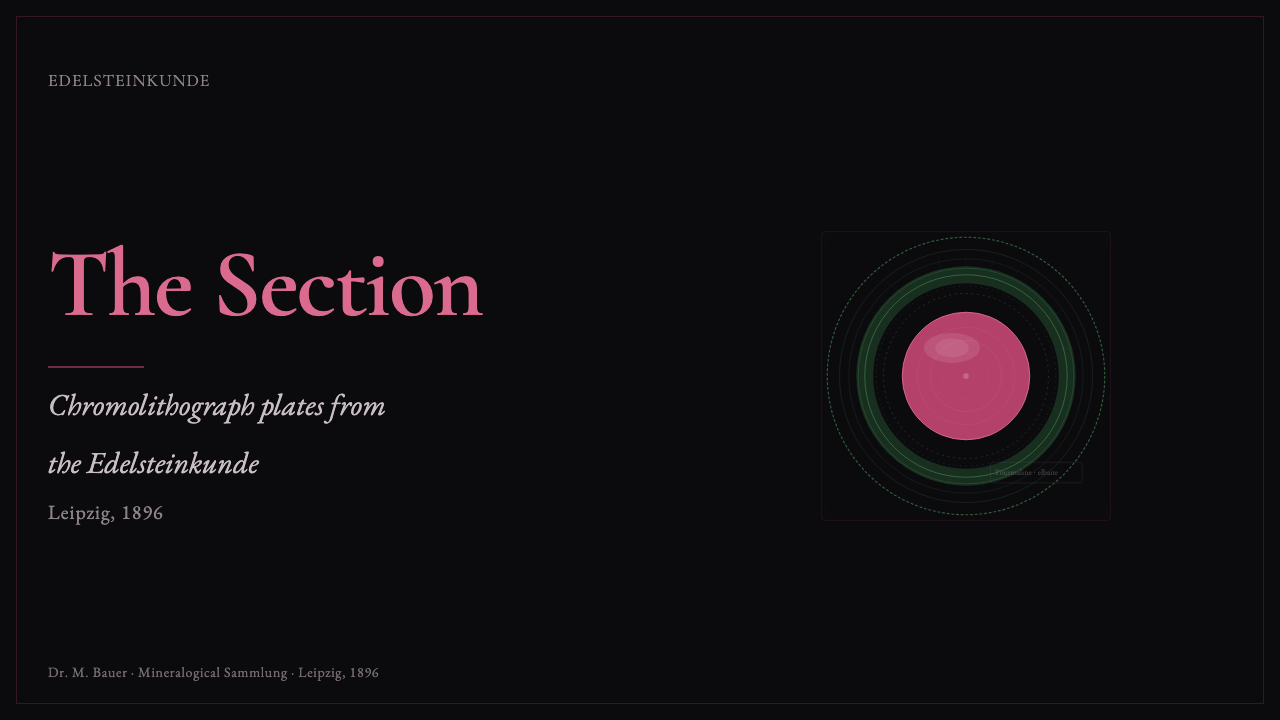
For web interfaces, Tourmaline Crystal Slice is especially suitable for museum collections, private archives, premium editorial catalogs, and high-consideration product stories. A dashboard can use black velvet-like space to establish focus, then reserve pink and green mineral accents for selected states, provenance, or featured objects. A pricing or membership page can frame each offer as a curated tier without making it look like a conventional luxury storefront. Typography should carry navigation and hierarchy, while specimen imagery provides moments of reward rather than filling every panel.
For editorial and marketing work, build a rhythm between close observation and narrative pause. A long-form article can open with a cropped slice, continue with captioned details, and use engraved rules or small labels to mark changes in subject. Marketing pages work best when they tell a material story: what is being examined, why it is rare, and what the viewer is invited to notice. The dark background gives copy emotional gravity, but the page must retain enough pale annotation and open space for reading to remain effortless.
The common mistake is treating this style as a pink-and-green luxury gradient on a dark page. That removes the mineralogical reason for the palette and usually turns a specimen into a generic cosmetic effect. Another mistake is overusing sparkle, metallic ornament, ornate type, or repeated crystal badges. The strongest applications choose one or two moments of polish, keep the concentric structure irregular and believable, and let captions, line work, and negative space establish the scientific half of the aesthetic.
Tourmaline Crystal Slice — FAQ
Is Tourmaline Crystal Slice simply a dark luxury style?
No. Luxury is one half of the effect, but the style is grounded in a mineralogical plate and a documented specimen presentation. Its pink core and green rim should imply rubellite and verdelite within a polished cross-section, while the black ground should behave like gem-tray velvet. If the material logic disappears, the result may still look expensive, but it no longer carries the scientific-jewel identity that defines the style.
Can the pink and green accents be used everywhere in an interface?
They should be selective. Their impact depends on reading as mineral bands revealed against darkness, not as a constant decorative field. Let one color lead in a featured specimen or selected state, and let the other define its boundary or supporting information. Broad, repeated use weakens the sense that these hues belong to a rare cross-section and makes the interface feel less curated.
How should photography or imagery be handled in this style?
Treat imagery as a specimen record or a close material observation. Crops should reveal section, edge, polish, banding, or surface detail rather than merely provide atmosphere. Pair images with concise captions, quiet labels, or engraved framing lines so that they feel catalogued. Decorative images without a material relationship can interrupt the style’s discipline and make the page drift away from natural-history presentation.
Does Garamond-family typography mean every text block should look historical?
No. The serif voice supplies restraint and authority, not costume. Use it where annotation, naming, and measured interpretation matter most, then keep the rest of the hierarchy clear and readable. The goal is to recall the composed intelligence of a plate, not to imitate an antique page so completely that contemporary navigation and comprehension become difficult.
Related design styles
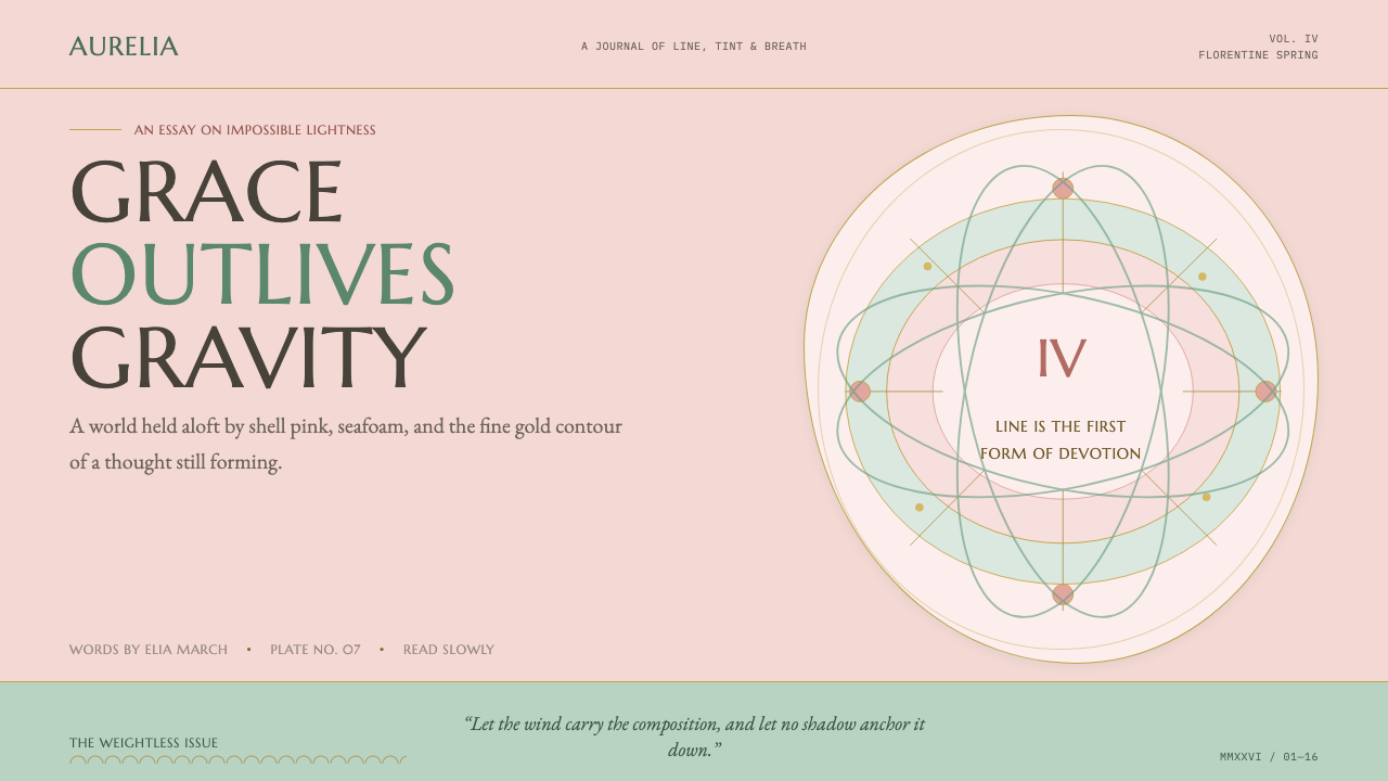 Botticelli Birth of Venus (1486)Grace defeats gravity. Shell pink, seafoam, and fine gilt contours keep every…
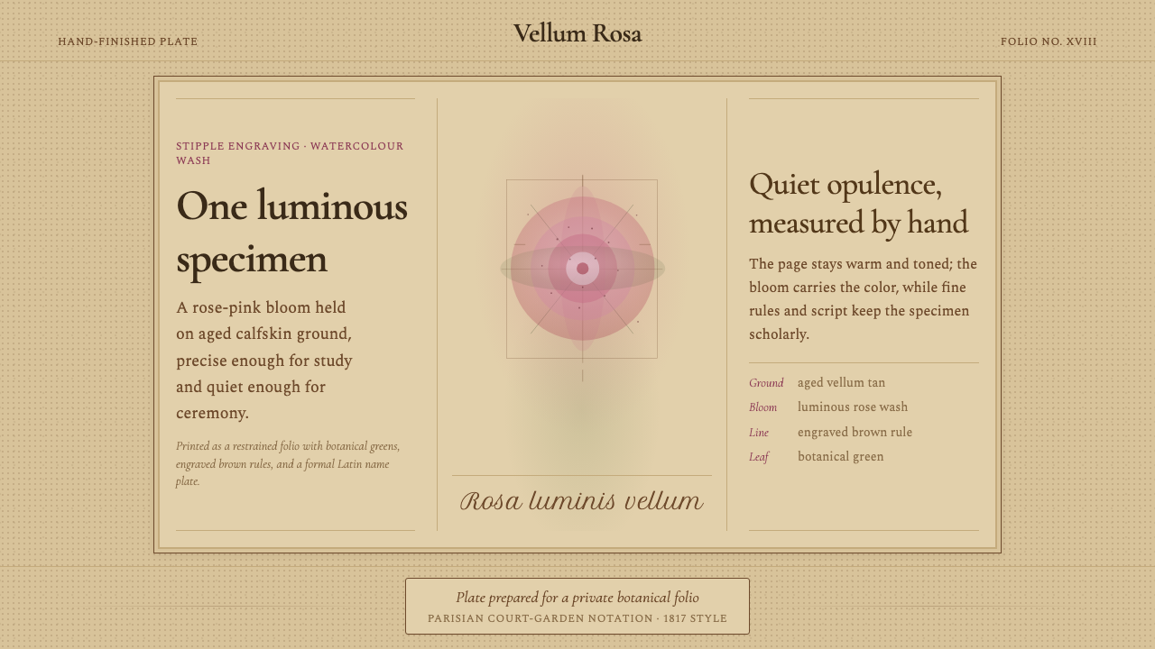 Redouté BotanicalScholarly opulence. Rose wash on aged vellum, framed by engraved brown rules.
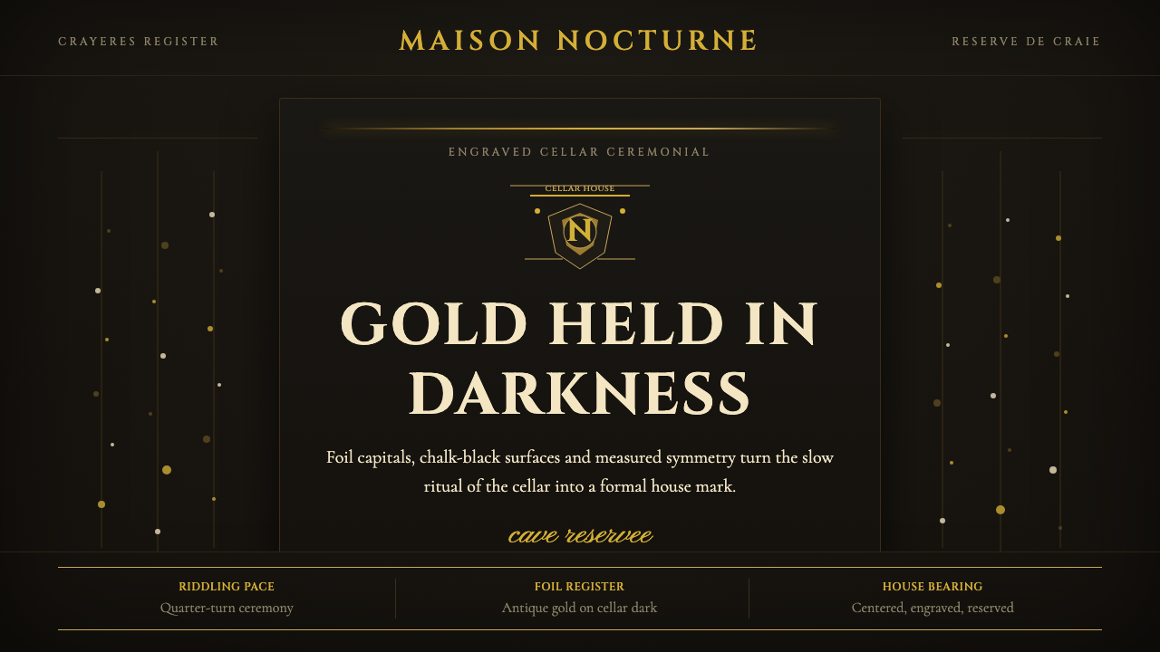 Champagne MaisonGrandeur without glitter. Cinzel capitals and gold foil rules glow in cellar…
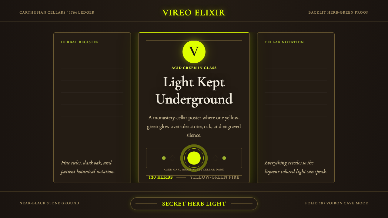 Chartreuse Liqueur GreenAcid glow rules the cellar. Cormorant Garamond and brass hairlines frame yell…
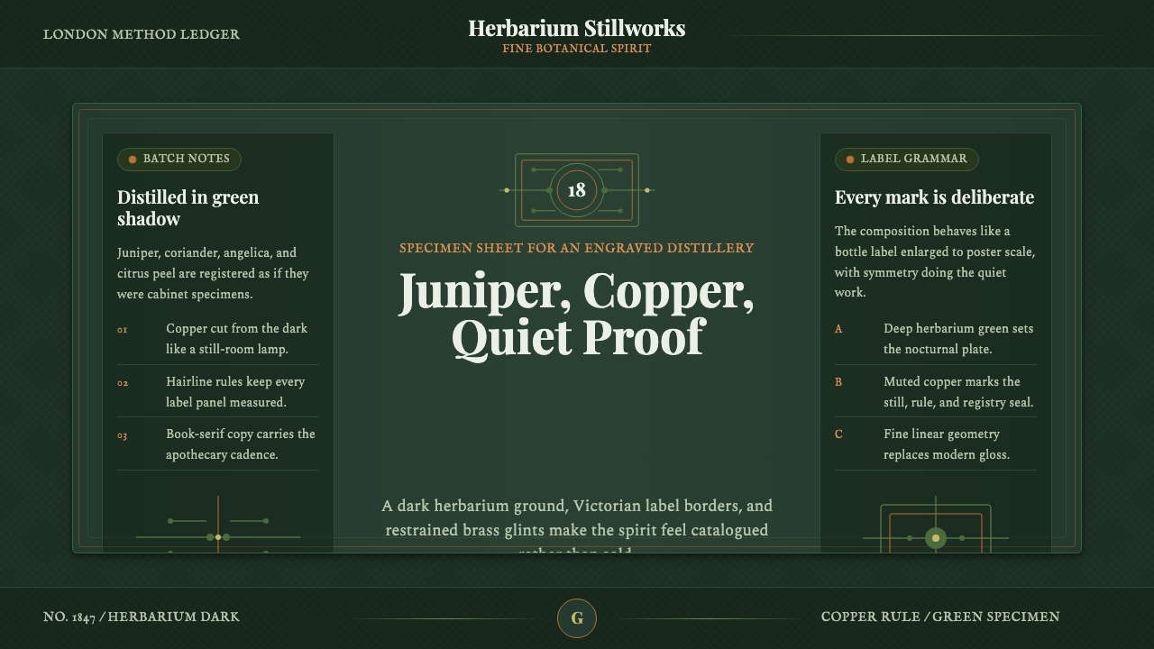 Gin BotanicalHerbarium precision. Dark green frames, Playfair serif, and copper rules hold…
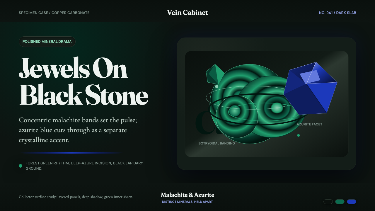 Malachite & AzuriteLiving jewels on black stone. Fraunces type meets green rings and sharp azuri…