What is Chartreuse Liqueur Green?
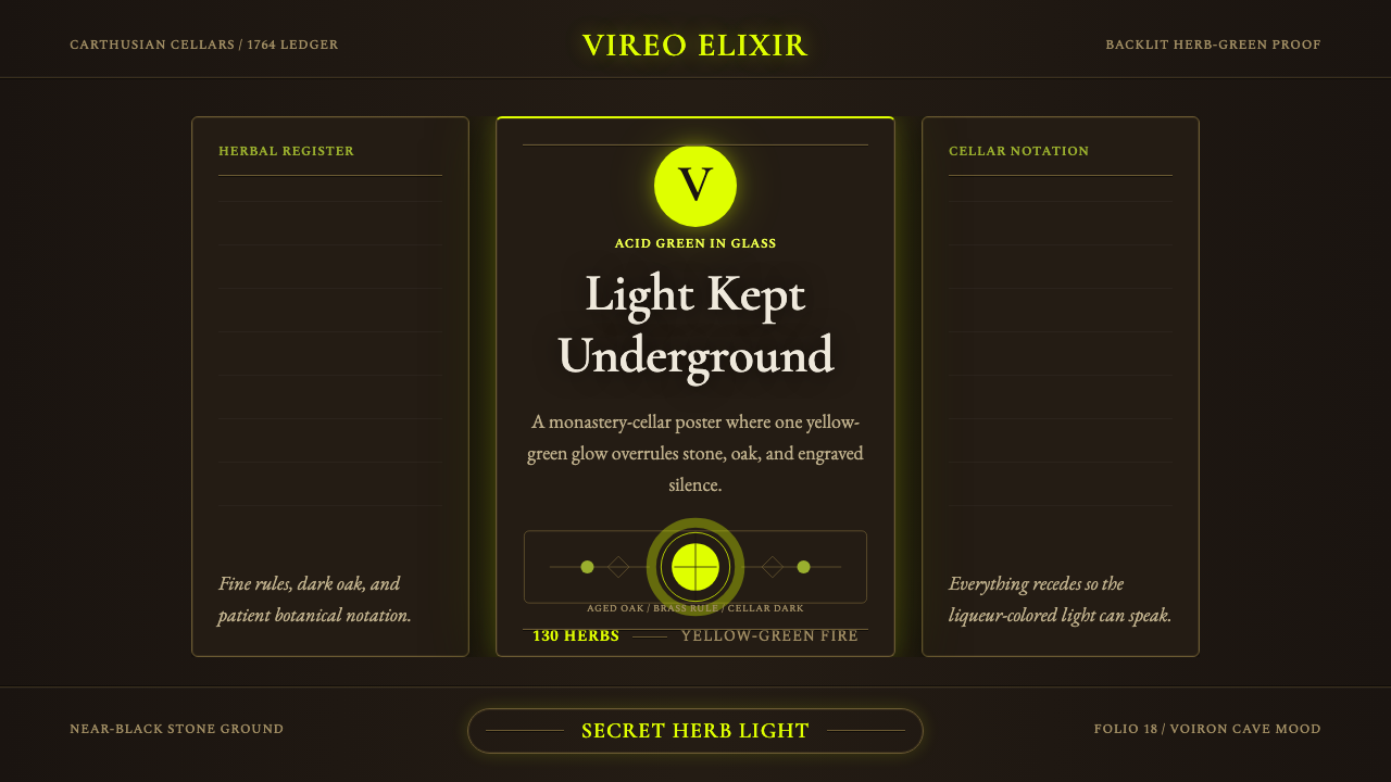
Chartreuse didn't just get named after a color — it invented one: a liqueur so singularly yellow-green that the world borrowed its own name for the hue.
Chartreuse Liqueur Green in brief
Green Chartreuse is a French herbal liqueur distilled by Carthusian monks from a secret recipe of roughly 130 plants, herbs, and flowers, and it is the rare case of a product lending its name to a color rather than the reverse. The liqueur's naturally occurring yellow-green — produced by chlorophyll extracted from its plant ingredients rather than any added dye — is distinctive enough that when English and French speakers needed a word for that exact acid, glowing yellow-green, they simply borrowed the drink's own name.
The design system built around it stages that glow inside near-total darkness. Where most spirit branding lights a bottle against a bright, neutral field, this system does the opposite: aged stone, dark oak, and a cellar-black ground surround the liquid so completely that the yellow-green becomes the single dominant light source in the whole composition, as if the glass itself were the only thing glowing in an unlit room.
Supporting motifs draw on the liqueur's own material history. Fine hairline engravings of botanical specimens echo the centuries-old tradition of herbalist illustration used to record and identify plant ingredients; bordered, apothecary-style label panels recall the liqueur's origin as a medicinal tonic rather than a modern consumer spirit; and brass and metal hairline accents suggest the aged fittings, stills, and ironwork of an old monastic distillery rather than contemporary bottle design.
Where does Chartreuse Liqueur Green come from?
The Carthusian order that still produces Green Chartreuse was founded in the eleventh century by Saint Bruno of Cologne, who established a monastery in a remote mountain range near Grenoble, France — the Chartreuse Mountains, which gave both the monastery and, eventually, the liqueur their name. Carthusian life is built around silence, solitude, and extreme simplicity, a discipline that sits in striking contrast to the elaborate, secret 130-ingredient formula the order has guarded for centuries.
According to the order's own account, the monks received an alchemical manuscript in the early seventeenth century — a formula reputed to grant long life, containing an elaborate list of herbal ingredients — but the recipe was so complex that it went largely unused for more than a hundred years. It was only in the eighteenth century that the monks succeeded in refining the formula into something reliably reproducible: first a high-proof herbal elixir intended as a medicinal tonic, and then, by 1764, a more approachable table liqueur meant to be drunk rather than dosed — the version that became Green Chartreuse.
The recipe's secrecy is itself a structural, centuries-old practice rather than a marketing device: by long tradition, the complete formula is known to only two monks at any given time, who alone prepare the herbal base before it is sent for distillation and aging. Because authorship is deliberately anonymous and communal — held by the order rather than credited to any named individual — the liqueur's identity is bound up with the monastery itself rather than with any single inventor, reinforcing the apothecary, almost alchemical mystique the design system draws on.
The order's continuity has not been unbroken. In 1903, French laws targeting religious congregations forced the Carthusians into exile, and production of the liqueur relocated outside France for decades before eventually returning. Through all of that disruption, the color itself entered everyday language: 'chartreuse' is first recorded as a color name in the closing decades of the nineteenth century, adopted precisely because no existing word captured that particular glowing yellow-green — speakers reached for the name of the one thing everyone already pictured when they needed to describe it.
What defines the Chartreuse Liqueur Green look?
Color
The palette is built around one unmistakable, high-saturation yellow-green — not a synthetic-looking neon, but a color with the faint golden warmth of something extracted from real plant matter, luminous rather than flat, and treated as light rather than as a printed hue.
Contrast
That green is staged against grounds so dark they read as near-black — aged stone, dark oak, deep cellar shadow — creating extreme value contrast that makes the green function as the composition's only real light source, the way the liqueur itself glows when held up in an otherwise dim room.
Line Work
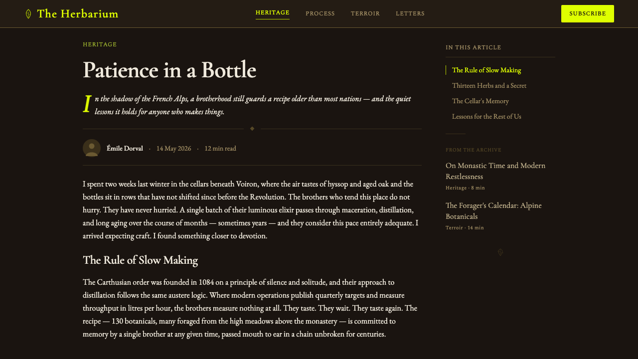
Fine, precise hairline engraving renders botanical specimens — leaves, stems, seed heads — in the manner of historical herbalist illustration, giving the system a scientific, cataloguing quality that echoes the centuries of plant identification behind the liqueur's secret formula.
Material References
Surfaces reference aged stone and dark, worn oak alongside brass or other burnished metal hairlines, evoking the fittings, stills, and ironwork of an old monastic distillery rather than the polished glass and chrome of contemporary spirit branding.
Label Convention
Panels are bordered and rectangular in the manner of historical apothecary and pharmaceutical labels, a packaging convention that predates modern consumer branding and ties the liqueur back to its origin as a medicinal tonic rather than a lifestyle product.
Typography
Display type favors a classical, old-style serif register — humanist proportions, moderate stroke contrast, gently bracketed serifs — set with a restrained, engraved-plate quality that reads as considered and historical rather than commercial or contemporary.

Who shaped Chartreuse Liqueur Green?
Founded in the eleventh century by Saint Bruno of Cologne, the Carthusian order has produced Green Chartreuse since the eighteenth century from its monastery in the mountains near Grenoble that share the liqueur's name. The order's discipline of silence and radical simplicity stands in deliberate contrast to the elaborate secret formula it has preserved for centuries.
By long-standing practice, the complete list of roughly 130 plants, herbs, and flowers in the recipe is known to only two monks at any given time, who alone prepare the base mixture before it leaves the monastery for distillation. That structural anonymity — no named inventor, no individual credit — is central to the liqueur's apothecary mystique.
The monastery that gives the liqueur its name sits in the Chartreuse mountain range near Grenoble, France, and remains the spiritual home of the recipe even though the liqueur itself is distilled and aged nearby, since the monastery's own life of enclosure and silence is kept separate from the production facility.
Long before Green Chartreuse existed as a table liqueur, European monasteries were centers of herbal medicine, cultivating and cataloguing plants for tonics and remedies. That apothecary tradition — bordered labels, careful botanical documentation, a tonic rather than a beverage — is the direct ancestor of the liqueur's visual identity.
The fine hairline illustration style associated with the liqueur draws on the broader tradition of scientific botanical engraving that flourished across the eighteenth and nineteenth centuries, when herbalists and naturalists across Europe systematically illustrated plant specimens for identification and study.
How do you use Chartreuse Liqueur Green today?
Because the entire system depends on extreme contrast between near-black grounds and one glowing color, applying it well means committing to real darkness as the default rather than treating black as an occasional accent. The green should always read as scarce and luminous — the single brightest thing in the frame — never repeated so often that it stops feeling like a glow.
On presentation slides, a cover works well as a near-black field with a single glowing green element — a numeral, a short title, a thin botanical line drawing — positioned so it reads as the only light source on the page. Content slides should keep the dark ground consistent throughout and use the green sparingly, reserved for the one number, label, or call-out that most needs attention; body text is better rendered in a warm, muted neutral than in pure white, so the green retains its status as the brightest element. Data slides suit a single glowing metric or highlighted data point against the dark field rather than a chart with many equally bright series, since the system reads as monochrome-plus-one-accent rather than a full palette.
For web interfaces, the style suits premium, editorial, or apothecary-adjacent products — spirits, fragrance, wellness, botanicals, or any brand trading on heritage and craft — where a dark, considered interface signals seriousness rather than gloom. Dashboards should keep most surfaces close to the near-black ground, reserving the glowing green strictly for primary actions, active states, or the single metric meant to draw the eye; overusing it as a general accent color collapses the contrast the whole system depends on. Pricing pages read well with the recommended plan picked out in the glowing green against otherwise dark, restrained cards.
In editorial and marketing contexts, the style suits long-form storytelling around craft, heritage, and process — distillery features, apothecary or wellness branding, luxury spirits marketing — where fine botanical linework and bordered, label-like panels can carry real content rather than mere decoration. Marketing pages benefit from treating the green the way the liqueur itself is presented: revealed gradually against darkness, rather than splashed across a bright background where it loses its glow.
The most common mistake is lightening the background to make the green 'pop' more conventionally — doing so destroys the entire premise, since the color's luminous quality only reads correctly against real darkness. A second frequent error is using the green too liberally, as a general brand color rather than a scarce, reserved highlight; the original liqueur is precious and rationed, and a design system that treats its signature color as decoration rather than a single, considered point of light loses the apothecary gravity that makes the style recognizable.
Chartreuse Liqueur Green — FAQ
Why is the color named after the liqueur, and not the other way around?
Because the liqueur came first by more than a century. Green Chartreuse has been distilled since the eighteenth century, and its naturally occurring yellow-green — produced by chlorophyll from its herbal ingredients, not an added dye — was distinctive enough that when a word was needed for that specific hue, in the closing decades of the nineteenth century, speakers borrowed the drink's own name rather than inventing a new one.
What is actually in the recipe?
That's deliberately unknown outside the monastery: the complete list of roughly 130 plants, herbs, and flowers has been kept secret for centuries and, by tradition, is known in full to only two monks at any given time. What's public is the outline — a large, complex herbal formula prepared at the monastery before being sent for distillation and long aging — not the specific ingredients or proportions.
Is the liqueur the same thing as the elixir?
No, though they share a common origin. The monks first adapted their old manuscript formula into a high-proof herbal elixir intended as a medicinal tonic, and only later, by 1764, refined a gentler version meant to be drunk as a liqueur rather than dosed as medicine. Both are still produced today, but the elixir remains closer to the original tonic in strength and purpose, while the liqueur is the version built for the table.
Why do only two monks know the full recipe?
It's a long-standing internal practice meant to preserve both secrecy and continuity: keeping the knowledge to a small, rotating pair rather than a single individual means the recipe survives any one monk's death or departure, while still limiting how many people could ever disclose it. The practice also reinforces that the recipe belongs to the monastic order as an institution, not to any named inventor.
Is there a yellow version of Chartreuse too?
Yes — a milder, sweeter, lower-proof yellow variant exists alongside the green, developed later as a gentler alternative. It uses a different balance of the same herbal tradition and a different natural coloring, but it's the green version, with its distinctive acid glow, that lent its name to the color the world now calls 'chartreuse.'
Related design styles
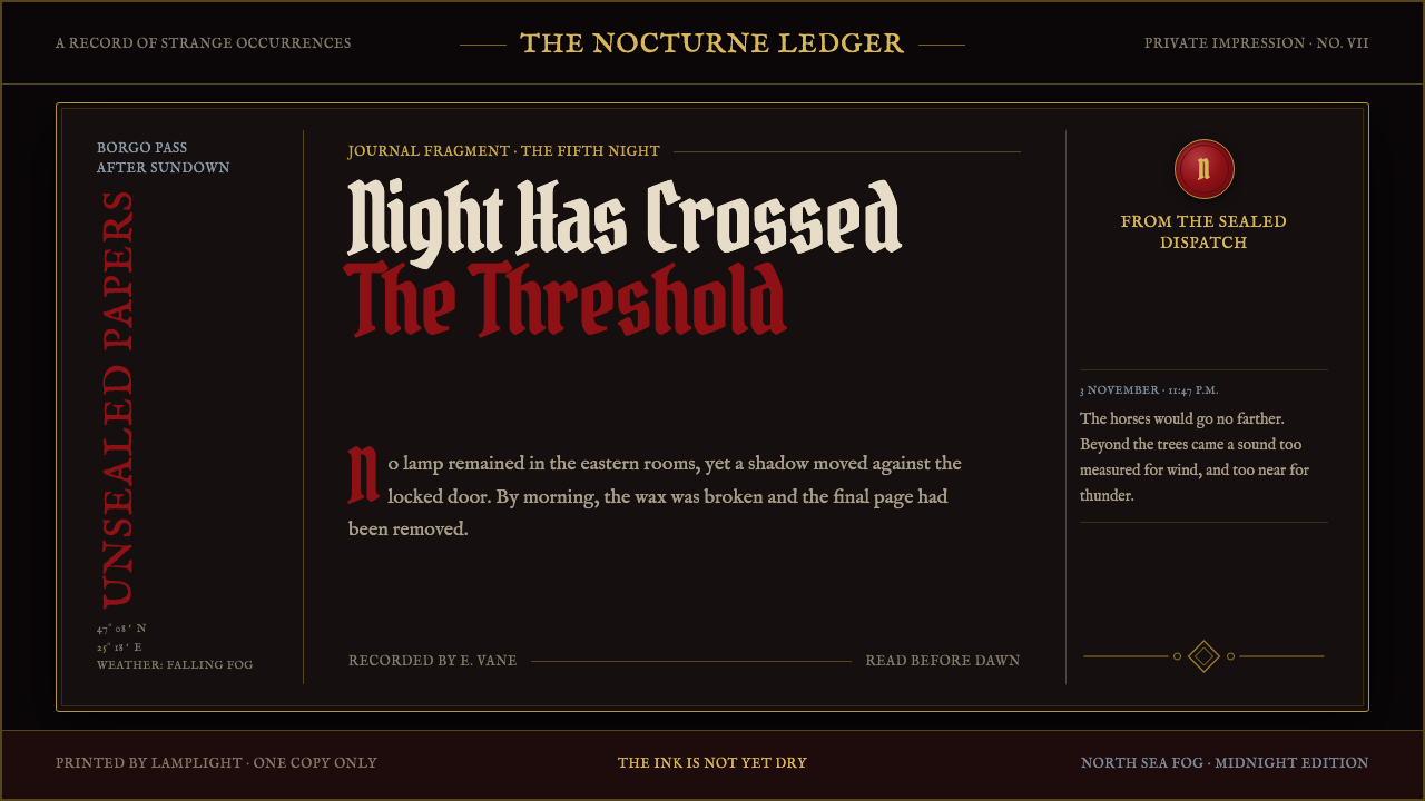 Dracula Gothic (1897)Victorian dread after dark. Blood-red initials and tarnished gilt haunt coffi…
 Dutch VanitasTime waits at the table. Olive-black depths, earth-brown type, and one candle…
 Ex Libris BookplateScholarly ownership, cut in ivory. Cinzel caps and crosshatch rules rise from…
 Rembrandt BaroqueDarkness becomes theatre. Honey-gold spotlight and blackletter rise from Van…
 Babylonian Hammurabi SteleAuthority carved in stone. Basalt-black grids, parchment panels, and imperial…
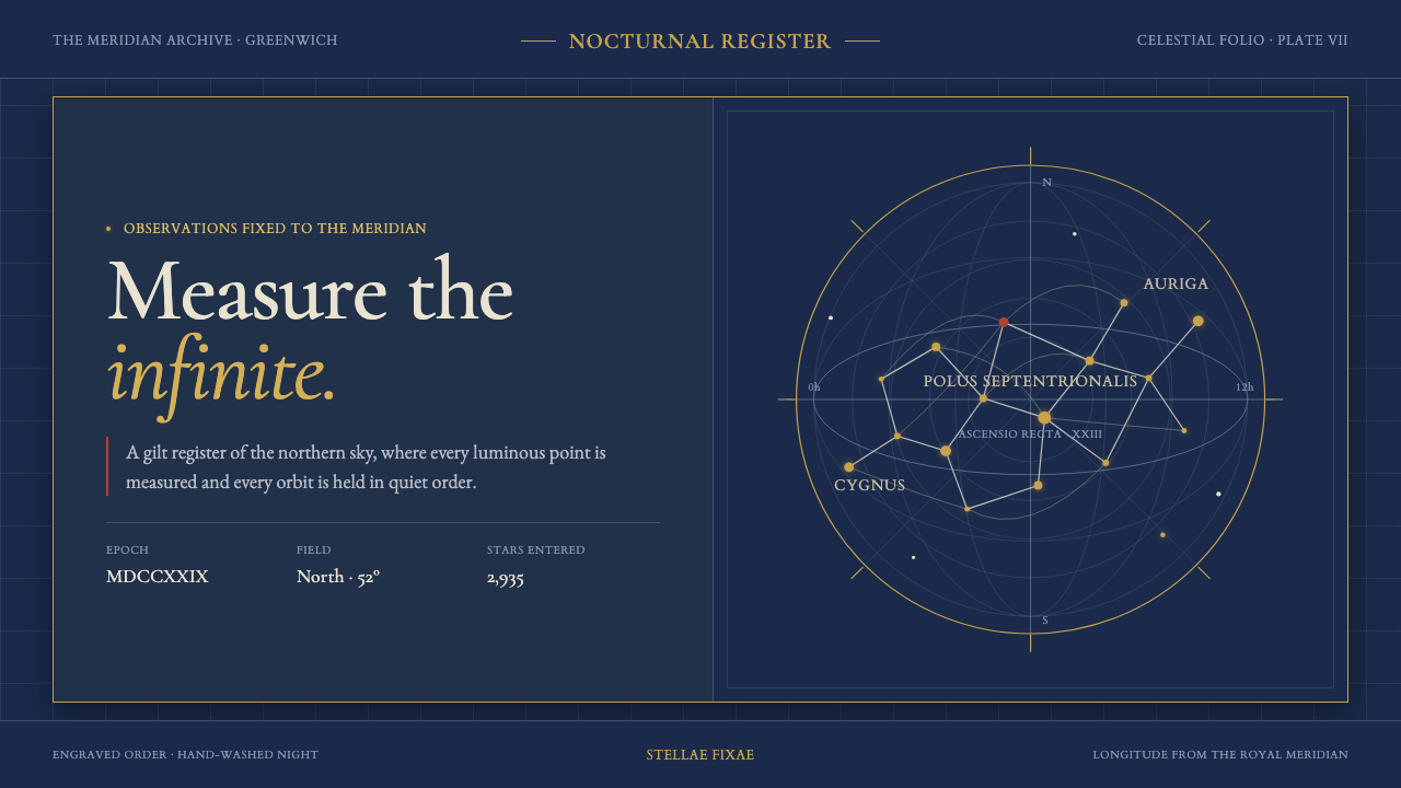 Flamsteed Atlas CoelestisMeasurement wears mythology. Ivory engravings and gilt stars cross a deep ind…