What is Dutch Vanitas?
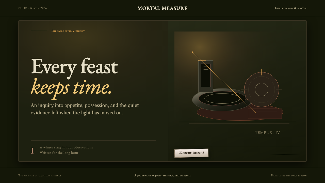
Dutch vanitas painting threw out color entirely to make a point about time: a near-black ground, a narrow band of earth tones, and one candle flame are all that separate a skull and a tipped glass from the dark.
Dutch Vanitas in brief
Dutch vanitas still life is a genre of painting that emerged around 1629 in the Dutch Republic, built on an almost total rejection of color. What remains is a single dark asphaltum ground, a narrow band of grey-brown earth tone, and a single candle — against which objects such as a skull, a tipped roemer wine glass, or a lemon peeled in one unbroken ribbon surface out of unlit depth and fall back into it.
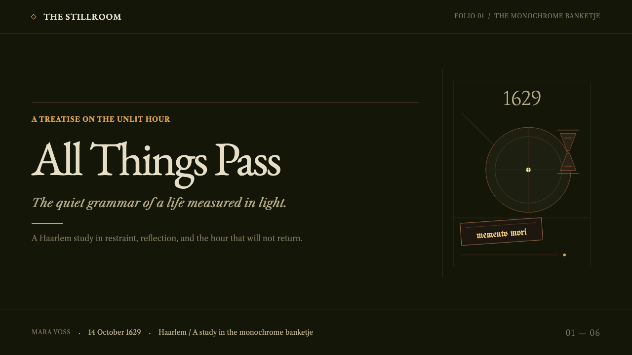
This is not simply a dark palette for mood; it is a genre with a specific message. The Dutch term for these paintings was 'monochroom banketje' — monochrome breakfast piece — and their subject, regardless of the objects depicted, was always the same: memento mori, a reminder that time does not wait, that pleasure and possession are temporary, and that even a well-laid table will eventually be cleared.
The system built from this genre works the same way the paintings do. Hierarchy comes entirely from value, not hue — the page itself is a near-black olive tone, and every surface or piece of type is read off it in graded browns. The hot candle-flame yellow is allowed to appear on only a few square millimetres of any composition, and nowhere else. Restraint here is not an aesthetic mood; it is the governing rule of the entire genre.
Where does Dutch Vanitas come from?
The genre crystallized in the 1620s and continued through the 1650s in the Dutch Golden Age, with the monochroom banketje specifically codified around 1629 in the cities of Haarlem and Leiden. This was a period of enormous prosperity for the Dutch Republic, and the genre's insistence on transience and mortality can be read as a deliberate counterweight to that new wealth.
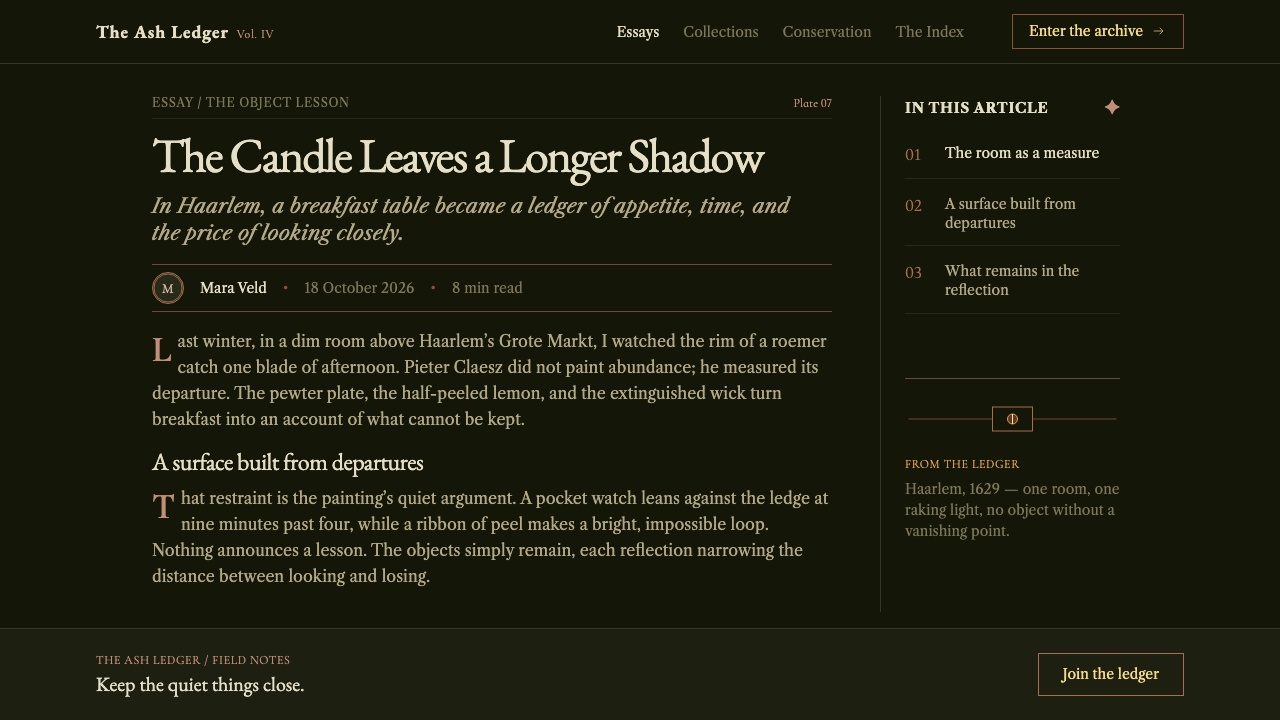
Two Haarlem painters, Pieter Claesz and Willem Claesz. Heda, are credited with establishing the mature form of the style around 1629, stripping earlier, more colorful still-life traditions down to the dark asphaltum ground, narrow earth-tone band, and single candle that define the genre. Their compositions favored a small number of objects rendered with intense material precision rather than crowded, varied displays.
The broader vanitas and memento mori tradition, of which the monochroom banketje is one specific strand, also included painters such as Harmen Steenwijck and Jan Davidsz. de Heem, who worked within the same Dutch Golden Age still-life movement. Across these painters, the recurring objects — skulls, tipped glassware, peeled fruit, guttering candles — functioned as a shared visual vocabulary for the genre's single message about mortality and the passage of time.
What distinguishes the monochroom banketje within this broader tradition is its specific formal discipline: where other vanitas painting could still use varied color to depict its symbolic objects, the Haarlem and Leiden monochrome breakfast pieces reduced the palette itself to near-nothing, making restraint of color a formal echo of the genre's message about the emptiness of material abundance.
What defines the Dutch Vanitas look?
Near-Black Asphaltum Ground
The dominant field is a deep, dark asphaltum tone that reads as almost black under normal viewing conditions. This ground is the largest single area of any composition and functions as the unlit depth that every object surfaces from and sinks back into.
Narrow Earth-Brown Band
A restrained range of grey-brown earth tones sits between the near-black ground and the single candle-hot highlight. This band carries most of the readable surface detail — objects, type, structure — without ever brightening toward a true light tone.
Single Candle-Hot Accent
A hot, saturated yellow appears on only a few square millimetres of any composition, echoing the single candle flame of the original paintings. This accent is never spread across a surface or used as a general highlight color — its power comes entirely from its scarcity.
Value Over Hue
All hierarchy in this system is expressed through graded darkness and lightness rather than through different colors. Two elements at different levels of importance are distinguished by how dark or light they sit against the ground, not by being assigned different hues.
Objects Surfacing from Darkness
Forms are composed to look as if they are emerging from the dark ground rather than sitting cleanly on top of a lit surface. Edges soften into the darkness at their outer boundary even as their lit face carries crisp, precise detail — a skull's brow, a glass's rim, a curl of peeled fruit skin.
Restraint as Genre Rule
Sparse use of color and a small number of depicted objects are not simply an aesthetic preference but the formal discipline that gives this genre its identity, echoing its subject matter of transience and the emptiness of material abundance.

Who shaped Dutch Vanitas?
Claesz was one of the two Haarlem painters credited with establishing the mature monochroom banketje form around 1629, reducing still-life painting to a dark ground, a narrow earth-tone band, and a single candle.
Heda worked alongside Claesz in Haarlem to establish the monochroom banketje style, favoring compositions of a small number of objects — tipped glassware, peeled fruit — rendered with intense material precision against the genre's dark ground.
Steenwijck worked within the broader Dutch Golden Age vanitas and memento mori tradition that the monochroom banketje belongs to, contributing to the shared visual vocabulary of skulls and symbolic objects that carries the genre's message about mortality.
De Heem worked within the same Dutch Golden Age still-life movement, part of the wider vanitas tradition that established the recurring symbolic objects — skulls, glassware, peeled fruit, guttering candles — used across the genre.
How do you use Dutch Vanitas today?
Because this system depends on a near-black ground, a narrow earth-tone range, and one hot accent used with extreme scarcity, it suits any project that wants gravity, seriousness, and a sense of weight — long-form editorial, archival or memorial content, and premium brands that want restraint to signal quality rather than cheerfulness to signal accessibility.
For presentation slides, a cover slide can use the full near-black asphaltum ground with a single candle-hot accent marking the title or a key figure, exactly as the original paintings use their one flame. Content slides should stay within the narrow earth-brown band for nearly all text and structure, reserving the hot yellow for a single data point or quotation per slide, never more.
For web interfaces, this palette suits long-form editorial, luxury or heritage brand sites, and any product where a dark, dignified tone reinforces trust or seriousness. Interactive states can use the single accent color exactly once per view — a primary action or key highlight — rather than distributing it across multiple buttons or links.
For editorial and print-style layouts, the system rewards treating type and imagery as if they are surfacing from the dark ground: crisp detail on the lit face of an element, with edges that soften toward the surrounding darkness. Section breaks work well as a shift in value — a slightly darker or lighter passage — rather than a colored divider.
The most common mistake is treating this as a generic dark theme and adding multiple bright accent colors for different UI states or content types. The system's entire effect depends on the accent color's scarcity — spreading warm color across many elements collapses the value-based hierarchy and turns a disciplined genre into an ordinary dark mode.
Dutch Vanitas — FAQ
Why is color almost entirely absent from this style?
Because the genre's subject is transience and the emptiness of material abundance, and the Haarlem and Leiden painters who codified the monochroom banketje around 1629 made the near-total absence of color a formal echo of that message. A vivid, varied palette would work against the genre's entire point.
Does the single candle-hot accent always need to represent an actual flame?
No — the flame is the historical origin of the accent, but the transferable principle is the scarcity itself: exactly one small, hot point of color against an otherwise near-black and earth-toned field. That single accent can mark a title, a key data point, or a call to action without needing to depict fire literally.
How is this different from a generic dark UI theme?
A generic dark theme typically still distributes several accent colors across different states and elements. This system is built on a single reserved accent used with extreme scarcity and a hierarchy carried entirely by value — how dark or light something sits against the near-black ground — rather than by assigning different hues to different levels of importance.
What kinds of projects should avoid this style?
Anything that needs to feel bright, cheerful, or immediately energetic will fight this system's core logic. Consumer products built around everyday delight, playful marketing, and content aimed at quick, upbeat engagement all rely on qualities — varied bright color, even lighting, minimal contrast — that this near-black, restrained palette deliberately withholds.
Related design styles
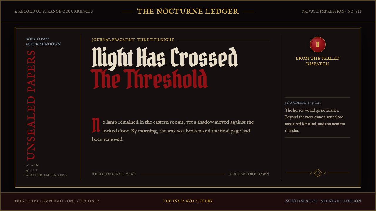 Dracula Gothic (1897)Victorian dread after dark. Blood-red initials and tarnished gilt haunt coffi…
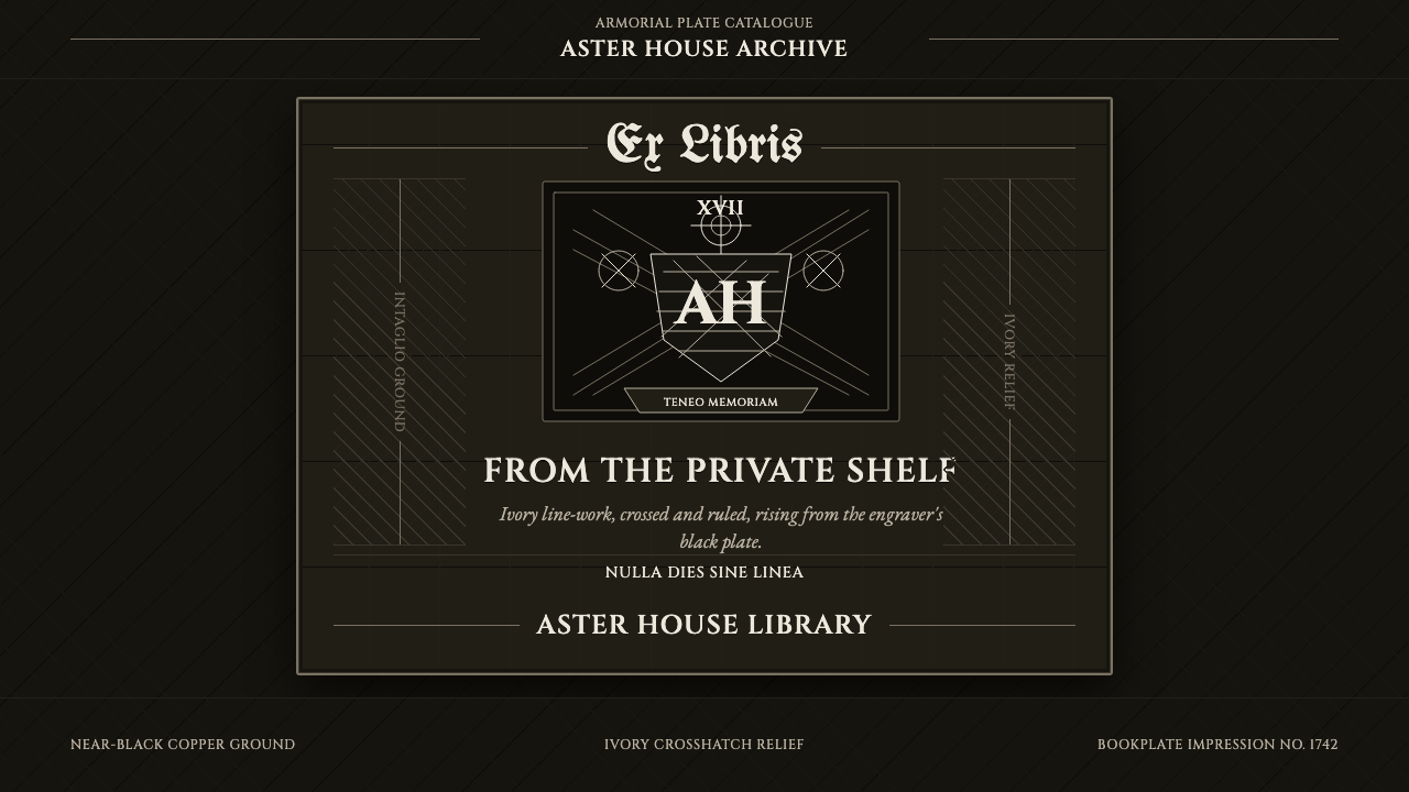 Ex Libris BookplateScholarly ownership, cut in ivory. Cinzel caps and crosshatch rules rise from…
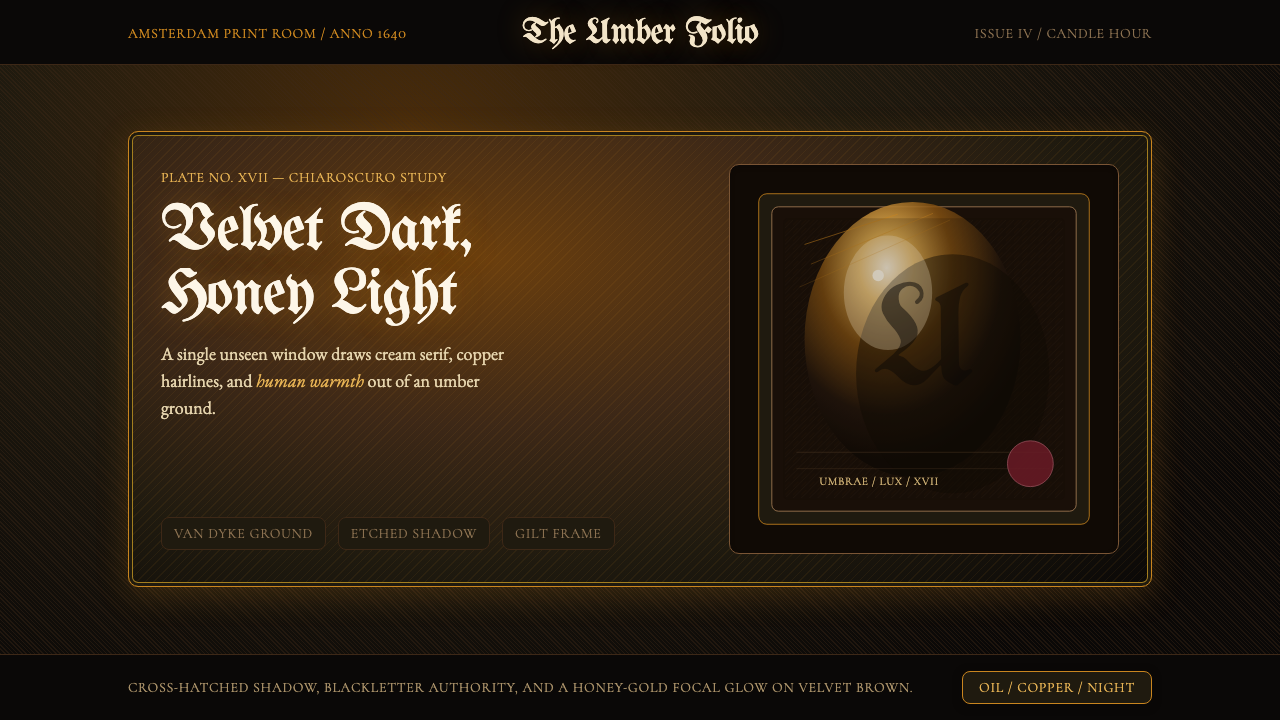 Rembrandt BaroqueDarkness becomes theatre. Honey-gold spotlight and blackletter rise from Van…
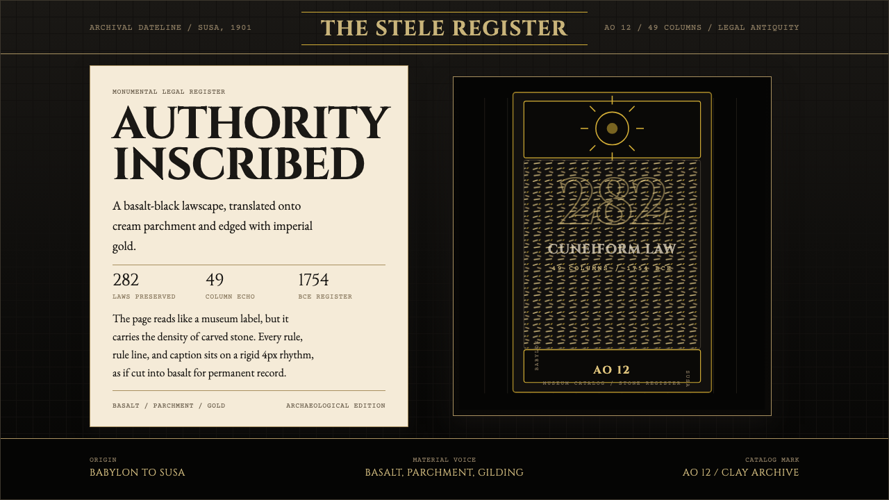 Babylonian Hammurabi SteleAuthority carved in stone. Basalt-black grids, parchment panels, and imperial…
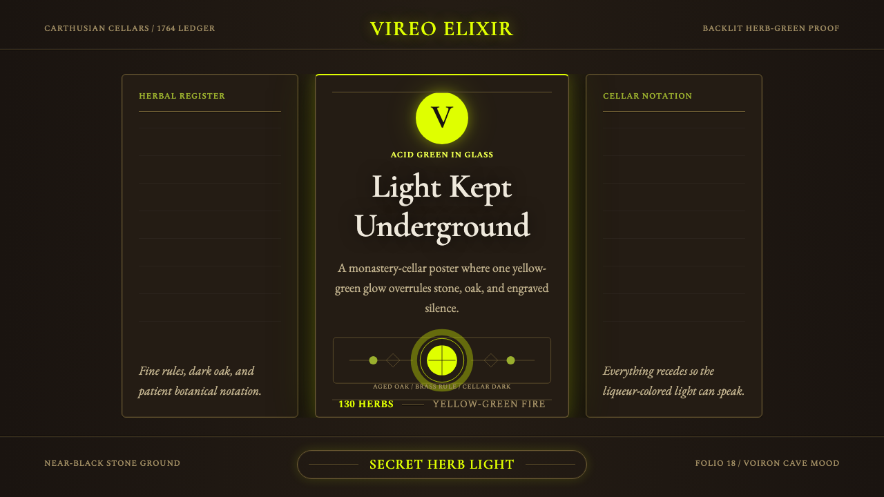 Chartreuse Liqueur GreenAcid glow rules the cellar. Cormorant Garamond and brass hairlines frame yell…
 Flamsteed Atlas CoelestisMeasurement wears mythology. Ivory engravings and gilt stars cross a deep ind…