What is Dracula Gothic (1897)?
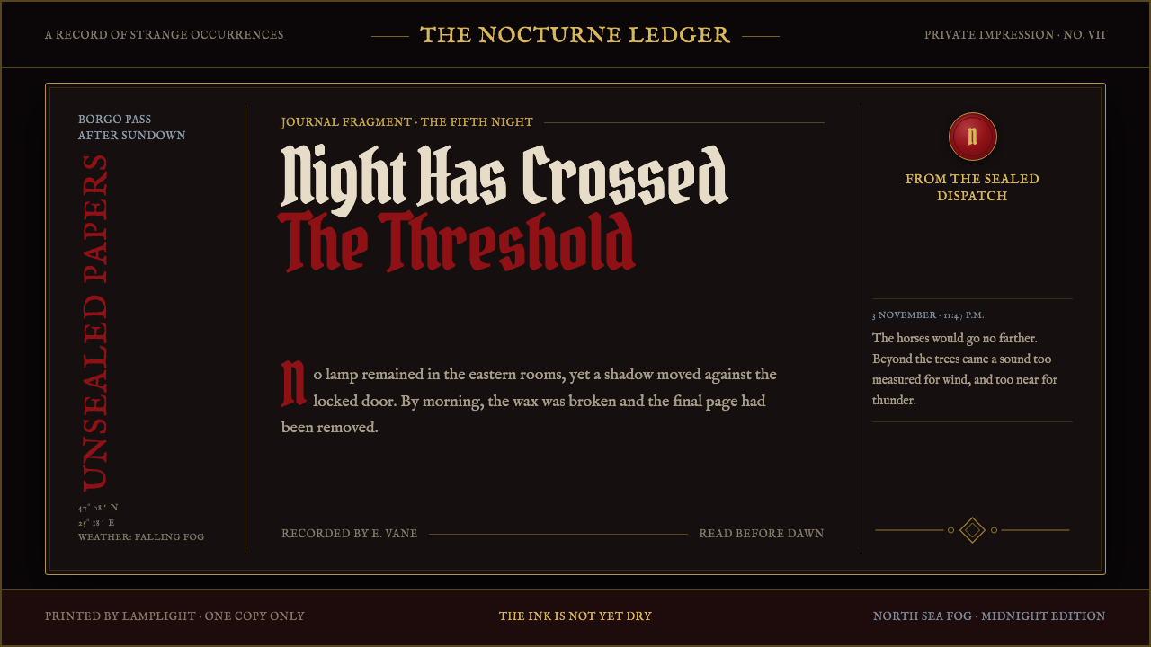
Dracula Gothic turns a Victorian first edition into a nocturnal digital world: blood-red initials, tarnished gilt, and dread gathering over coffin-black pages.
Dracula Gothic (1897) in brief
Dracula Gothic is a dark editorial design language imagined as a Victorian first edition that has escaped a Carpathian crypt and demanded a website. Its world is nocturnal from edge to edge: near-black grounds suggest velvet, soot, sealed rooms, and extinguished corridors; blood red emerges through drop initials and selective marks; thin tarnished-gilt rules hold the composition together like worn metal on an old binding.
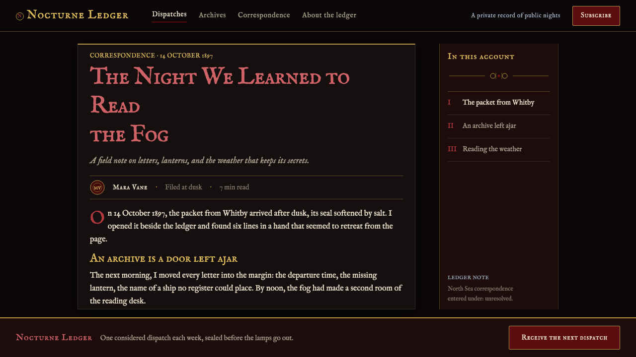
The style draws its atmosphere from the visual and literary conditions surrounding Dracula in 1897: Victorian Gothic literature, the epistolary novel, and fin-de-siècle decadence. Rather than presenting a clean contemporary interface with Gothic decoration applied on top, it treats every page as a recovered document. Journal entries, telegrams, and shipping ledgers become the organizing model for content. Dates, headings, marginal fragments, seals, and engraved dividers give information the sense that it has been recorded, posted, stamped, or found.
Its emotional force comes from restraint. Darkness is not an empty backdrop but a field under pressure, interrupted by ink, aged metal, faint paper damage, and carefully rationed red. The page should feel illuminated by failing lamplight rather than by a bright screen. Ornament is welcome, but only when it behaves like an antiquarian engraving: bats, thorns, crosses, garlic rings, and corner devices are line-work witnesses to the story, never playful icons.
Where does Dracula Gothic (1897) come from?
Dracula Gothic begins with the 1897 first edition of Dracula, published in London by Archibald Constable & Co. Its geographic imagination moves outward from Britain toward Transylvania and the Carpathians, so the style carries both the procedural texture of Victorian publishing and the threatening distance of an unfamiliar mountain landscape. A page is never merely decorative: it is a threshold between a London document and a remote, hostile night.
Its principal literary root is Victorian Gothic literature, where dread is built through atmosphere, delayed evidence, letters, reports, and the sense that ordinary systems of knowledge have become unreliable. Dracula Gothic therefore favors material signs of transmission: written entries, ledger-like records, dated notices, and fragments that imply a larger archive. Content appears accumulated rather than freshly composed, as though readers have been admitted into a file that was not meant to remain open.
The epistolary form is central to the system. A conventional page can be recast as a sequence of entries with distinct headers, archival dividers, and shifts in documentary voice. This does not require imitating a historical document literally. It means using structure to create suspense: one item can read like a private journal, the next like a telegram, the next like a ship record, each preserving the sensation that the story advances through evidence rather than exposition.
Fin-de-siècle decadence gives the style its worn richness. Tarnished gilt, dampened ink, fogged edges, and engraved ornament suggest beauty that has survived but not remained untouched. Bram Stoker anchors the literary source; Vlad III Drăculea and Emily Gerard belong to the pre-approved constellation surrounding its Transylvanian and Carpathian imagination. Archibald Constable & Co. supplies the first-edition frame that keeps the system tied to a book rather than to generic horror.
What defines the Dracula Gothic (1897) look?
Nocturnal Ground
The foundation is coffin-black rather than neutral dark. It should suggest velvet, old soot, sealed wood, or a room beyond lamplight. Empty space remains active: darkness surrounds text like silence around a confession. Light elements must appear scarce and deliberate, never floating in a bright, frictionless interface.
Blood Red and Tarnished Gilt
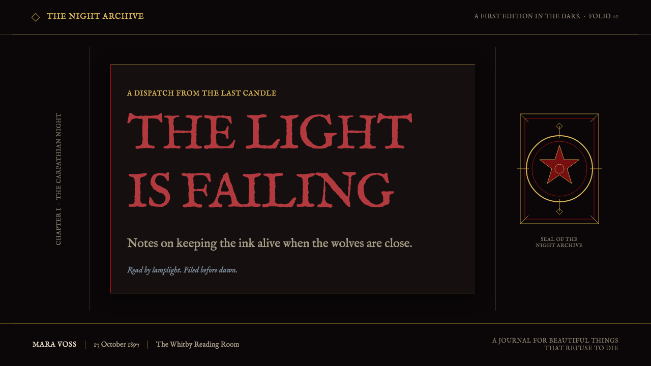
Red is a disturbance, not a general-purpose accent. It belongs to drop initials, warnings, seals, selected headings, and marks that feel slightly dangerous. Tarnished gilt serves a different role: hairline rules, frames, and engraved details. Together they create tension between fresh menace and aged ceremony, while preserving the dominance of darkness.
Antiquarian Typography
Type should feel pressed into paper under weak lamplight. Antiquarian letterpress character matters more than sterile historical imitation: uneven visual texture, dignified serif forms, conspicuous initials, and compact documentary headings all contribute to the impression of a book that has lived through handling and weather. The reading experience remains primary, even when the page feels haunted.
Epistolary Structure
Information is organized as evidence. Journal entries, telegram-like notices, shipping records, and dated fragments create a rhythm of discovery. Headers should feel like document metadata rather than generic interface labels. Rules and columns do not simply divide content; they make each section feel filed, transmitted, or retrieved from an archive.
Engraved Ornament
Bats, thorns, crosses, garlic rings, wax-seal roundels, and corner ornaments belong to an engraved visual vocabulary. Their line-work quality is essential. They should appear as printed artifacts with narrative function: a seal closes a section, a thorn marks danger, a corner device frames a recovered page. Flat emoji-like symbols break the illusion immediately.
Damp Paper and Failing Light
Texture is atmospheric evidence rather than surface noise. Faint mildew, ink bleed, darkened page edges, and a thread of North Sea fog can make the field feel vulnerable to weather and time. These effects remain subordinate to text and structure. The governing sensation is not theatrical clutter, but the moment before the light fails and something outside draws nearer.
Who shaped Dracula Gothic (1897)?
Stoker is the literary anchor of Dracula Gothic. The system takes its governing mood from the 1897 first edition of Dracula: dread is accumulated through documents, entries, and an atmosphere that makes ordinary records feel contaminated by something approaching from the dark.
The London publisher provides the first-edition frame for the style. Its importance is not as a decorative reference but as a reminder that Dracula Gothic should behave like publishing: pages carry sequence, hierarchy, material suggestion, and the authority of a designed book.
Vlad III Drăculea belongs to the source material's Transylvanian constellation. Within Dracula Gothic, that association helps keep the visual world oriented toward the Carpathians and the sense of an old, distant power entering a British documentary world.
Emily Gerard is part of the approved context surrounding Transylvania and the Carpathians. Her presence supports the style's emphasis on distance, regional mystery, and the uneasy meeting between orderly Victorian records and an environment that resists being fully explained.
How do you use Dracula Gothic (1897) today?
For presentation covers, treat the slide as a title page from a dark volume. Let the title emerge from the nocturnal ground with one blood-red initial or a restrained gilt rule carrying the composition. An engraved corner ornament or wax-seal roundel can establish the book-like premise, but the cover needs generous darkness around the title. The goal is an invitation into an archive, not a conventional horror poster.
For presentation content and data slides, make the epistolary model do practical work. Section headings can resemble dated entries; explanatory text can sit in orderly document blocks; charts can be framed like ledger evidence rather than dressed with decorative effects. Use red only to identify a critical finding or rupture, and use gilt rules to separate records. The result should make analytical material feel investigated, not obscured.
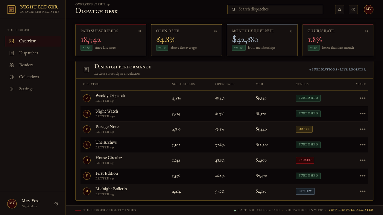
For web interfaces, Dracula Gothic is most persuasive in editorial archives, narrative experiences, reading environments, collections, and atmospheric product pages. Dashboards and pricing pages can use its hierarchy if they preserve clear reading paths: dark fields, firm document-like section boundaries, direct labels, and restrained ornament. Navigation should feel like a table of contents or catalog index, not a row of novelty Gothic symbols.
For editorial and marketing work, the style excels when content can unfold as a dossier. Long-form articles can alternate between journal-like passages, telegram-style interruptions, and ledger fragments. A campaign page can reveal its story in sealed sections, framed notes, and engraved interludes. Let the decorative system reinforce suspense and provenance rather than competing with a call to action or burying essential information.
The common mistake is turning Dracula Gothic into generic black-and-red horror. If red appears everywhere, if every edge is crowded with bats and thorns, or if distressed texture makes text difficult to read, the Victorian document premise disappears. Keep darkness spacious, make ornament print-like and purposeful, reserve the strongest red for moments of consequence, and allow the implication of dread to carry more weight than overt theatricality.
Dracula Gothic (1897) — FAQ
Is Dracula Gothic simply a horror style?
No. Horror is its emotional register, but its structure comes from a Victorian first edition, Gothic literature, and epistolary narration. The distinguishing feature is not darkness alone; it is the feeling that the page is a document carrying evidence. A successful application combines dread with publishing logic, readable hierarchy, and the material suggestion of ink, paper, seals, and engraved print.
Can Dracula Gothic work outside a Dracula-related project?
Yes, when a project benefits from archival suspense, nocturnal atmosphere, literary darkness, or a recovered-document narrative. It can support fiction, cultural collections, immersive editorial work, and campaigns that need a sense of sealed history. It is less suitable when the product needs casual warmth, frictionless utility, or a cheerful and immediate tone.
How should red be used in the system?
Use it as a sign of consequence. Blood red is strongest in a drop initial, a seal, a warning-like detail, or a selected heading where the narrative needs a rupture. It should feel as though it has bled through the page, not as though it has been applied to every interactive surface. The surrounding black makes limited red more unsettling and more meaningful.
How literal should the historical document treatment be?
It should be suggestive rather than theatrical. Use document signals such as dated headings, rules, seals, columns, and engraved corners to establish provenance, while keeping modern content legible and navigable. The design does not need to impersonate a scanned antique page. Its purpose is to give contemporary information the tension and sequence of an archival discovery.
What most often makes an application feel inauthentic?
Generic horror shortcuts are the main problem: indiscriminate red, novelty symbols, excessive distress, and decoration that has no relationship to the content. Dracula Gothic becomes convincing when its visual details behave like parts of a book and an archive. Every rule, initial, seal, ornament, and weathered trace should either guide reading, mark a transition, or deepen the sense that the page has a history.
Related design styles
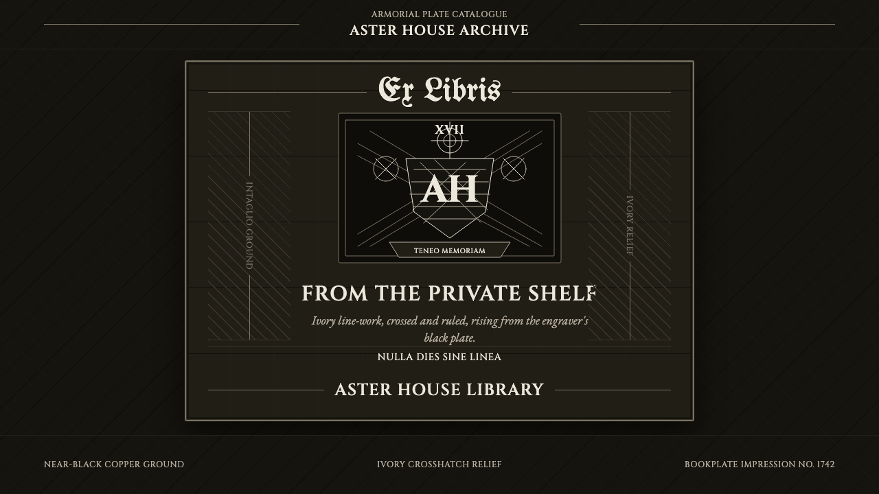 Ex Libris BookplateScholarly ownership, cut in ivory. Cinzel caps and crosshatch rules rise from…
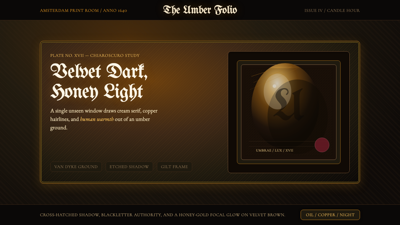 Rembrandt BaroqueDarkness becomes theatre. Honey-gold spotlight and blackletter rise from Van…
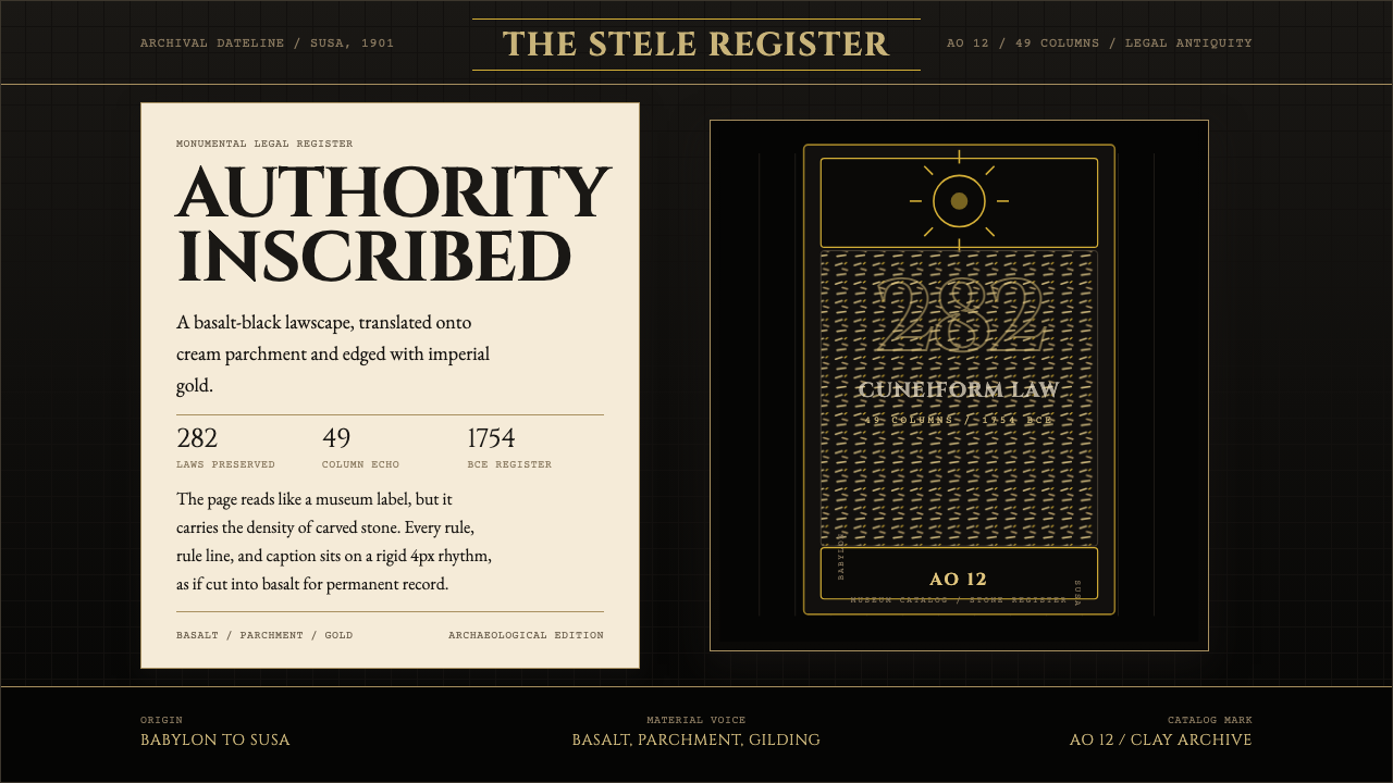 Babylonian Hammurabi SteleAuthority carved in stone. Basalt-black grids, parchment panels, and imperial…
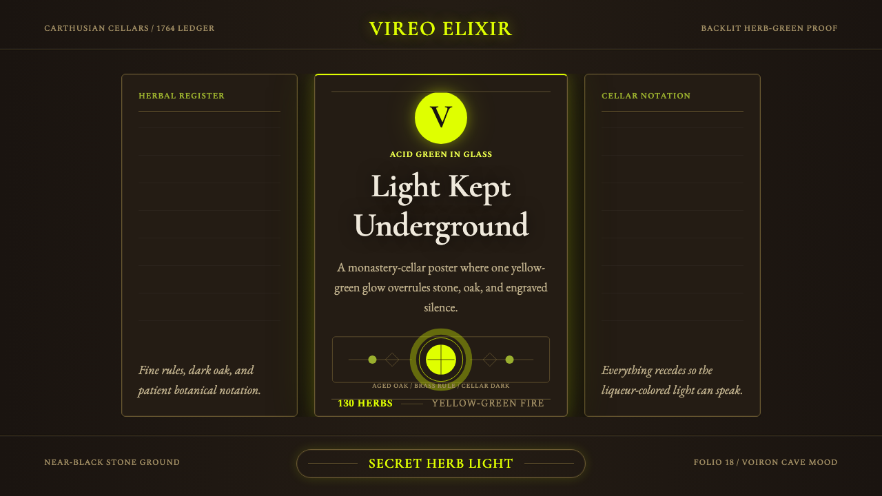 Chartreuse Liqueur GreenAcid glow rules the cellar. Cormorant Garamond and brass hairlines frame yell…
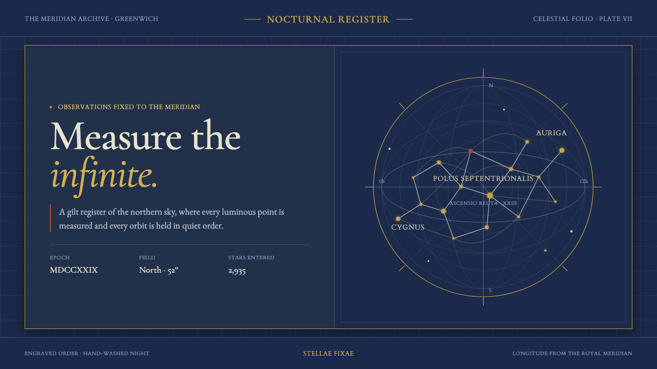 Flamsteed Atlas CoelestisMeasurement wears mythology. Ivory engravings and gilt stars cross a deep ind…
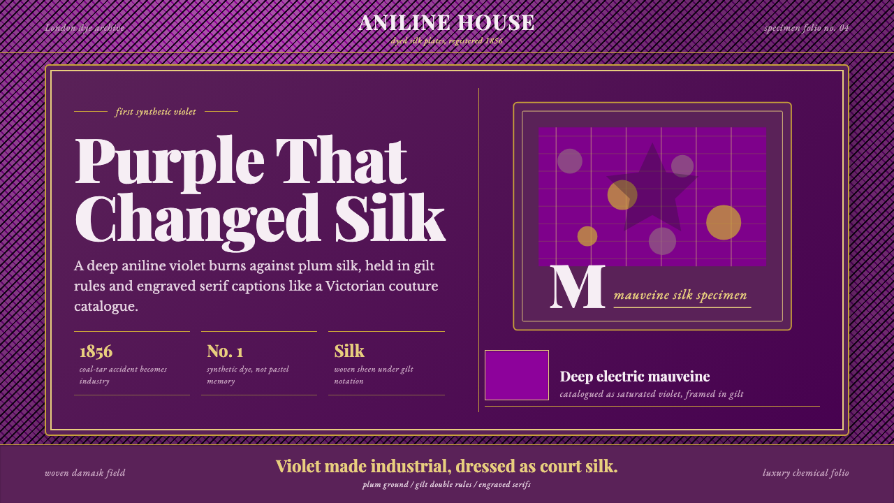 Mauveine (Perkin 1856)Electric purple, framed as luxury. Gilt rules and Playfair serifs turn dye in…