What is Victorian Taxidermy Cabinet?
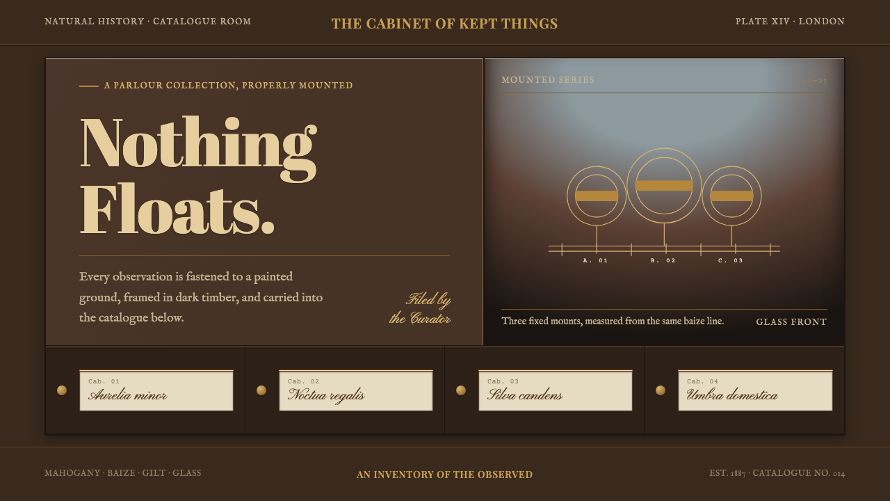
Nothing floats: the Victorian taxidermy case fixes every element, mounted, standing or filed, behind glass and mahogany, lit from above and labelled in gilt and copperplate.
Victorian Taxidermy Cabinet in brief
The Victorian Taxidermy Cabinet is a design style drawn from the glazed display cases of Britain's age of taxidermy, 1837 to 1901. Such a case is parlour furniture first and natural history second: French-polished mahogany, ebonised beading, a glazed front, and a specimen standing on baize above a row of shallow drawers. The style takes that construction literally.
Everything in the system is mounted, standing or filed. Elements are pinned to the back of the case, stood on a plinth, or sorted into a drawer; none hover. Type is letterpress and copperplate, with gilt lettering sitting on dark timber, and the beading divides the surface into vertical bays: a glazed exhibition space in the upper half, drawers in the lower.
Depth in this world comes from the lighting inside the case rather than from effects laid on top. The top is lit and the floor is dark, so objects gain weight from where they stand, not from a drop shadow beneath a card. The result is a dark, warm, ordered interface that feels catalogued and permanent, like a collection someone has spent years arranging.
Where does Victorian Taxidermy Cabinet come from?
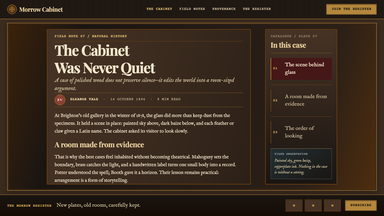
The style belongs to the Victorian passion for natural history between 1837 and 1901, when Britain and Western Europe filled parlours and museums with displays of birds and animals. The taxidermy case was both a scientific instrument and a status object: it showed what its owner knew and what they could afford. The record places its centres in Piccadilly in London, Bramber in Sussex and Brighton, three places that stand for three different ideas of what a case could be.
Rowland Ward sold cases and mounts from Piccadilly, in a shop known as The Jungle, and his name stands for the commercial side of the trade: orderly rows of glass-fronted bird cases ready to be taken home. Walter Potter filled his cases with anthropomorphic tableaux, small animals arranged into human scenes. Edward Booth built curved painted skies behind his Brighton birds, so that the sky bent upward and met the light from the top of the case, and those cases later became the Booth Museum of Natural History.
Behind the display sat a method of order: Linnaean cataloguing. The drawers beneath a case held specimen cards filed according to the Linnaean system, so the cabinet was a visible classification, display above and index below. This is where the style's insistence on filing comes from. The cabinet of curiosities, the older tradition from which the Victorian case descends, collected wonders. The Victorian case ordered them.
A fourth strand, the habitat diorama, is what Booth's painted skies belong to: the idea that an animal should be shown in a setting rather than on a bare stand. The style borrows that idea as a way to treat space, with a lit upper area that opens toward a painted backdrop and a dark lower floor that grounds everything. The four strands, Victorian natural history, the cabinet of curiosities, the habitat diorama and Linnaean cataloguing, make a style about classification and display at once.
What defines the Victorian Taxidermy Cabinet look?
Glazed Mahogany
The case is French-polished mahogany, a deep warm red-brown with a hand-rubbed sheen, set with ebonised beading and fronted by glass. The wood is dark but not black, polished but not glossy like plastic. In design, this becomes a warm, dark ground with a soft depth to it, and glass is a front panel through which things are seen, not a blurred translucent layer.
Gilt Lettering on Dark Timber
Names and titles are set in gilt lettering that sits on dark timber, like a plate on a case. Gilt is a warm, muted metallic yellow, used for labels, rules and headlines, never as a large field. Its brightness comes from contrast against the wood. Used sparingly it reads as expensive and orderly; used everywhere it turns into costume jewellery.
Letterpress and Copperplate Type
Type comes from the printing house and the clerk's desk: letterpress for headings and body, copperplate script for labels and specimen cards. The letterforms are formal, a little worn and historical in tone. Hierarchy is made by switching between the two modes, not by inflating size, so a label in copperplate reads at once as a handwritten catalogue entry.
Beading That Cuts Vertical Bays
The ebonised beading divides the cabinet into vertical bays, with a glazed exhibition space in the upper half and drawers below. In layout, this means a page organised into upright compartments with thin dark frames, an upper display zone and a lower index zone. Each bay holds one subject, and the frames are part of the content, not merely a border around it.
Mounted, Standing, Filed
Every element has a fixed place: pinned to the back of the case, standing on a plinth or filed in a drawer. Nothing floats, hovers or casually overlaps. Cards sit on surfaces, labels are attached to what they describe, and lists are filed in rows. If an element in a layout seems to be hanging in space, it has no business there.
Lit Top, Dark Floor
Depth comes from the light inside the case: bright toward the top, dark toward the floor, as if a lamp shone from above through glass. Objects and panels gain weight from where they stand in that gradient of light, not from a drop shadow beneath a card. It is a lighting condition of the whole space, never a per-element effect.
Baize and Specimen Cards
The specimen stands on dark baize, and the drawers below hold cards filed according to the Linnaean system. The baize is a soft, matte stage; the cards are small paper labels with copperplate entries. Together they give the style its two surfaces: a quiet felt-like ground for display and a paper-light surface for the written record.
Who shaped Victorian Taxidermy Cabinet?
Rowland Ward sold cases and mounts from Piccadilly, in a shop known as The Jungle, where rows of glass-fronted bird cases stood ready for the parlour. He stands for the commercial polish of the trade: the case as furniture, orderly and saleable. For a designer, Ward is the reference for repeatable, well-finished presentation, with the same frame and labelling logic applied to many subjects.
Walter Potter, whose work is associated with Bramber in Sussex, filled cases with anthropomorphic tableaux, small animals arranged into human scenes. He is the narrative pole of the style: a case as a stage with a story, not just a specimen on a stand. Borrowing from Potter means giving a single framed compartment a scene to tell while still respecting the glass, the frame and the fixed place of every element.
Edward Booth built curved painted skies behind his Brighton birds, bending the backdrop upward to meet the light from the top of the case. His cases later became the Booth Museum of Natural History. Booth is the reference for how space works in this style: a painted, lit upper area that opens above a dark floor, giving depth without any floating element or drop shadow.
How do you use Victorian Taxidermy Cabinet today?
The Victorian Taxidermy Cabinet suits subjects that value collection, classification and permanence: museums and archives, natural history and science publishing, antiques and auction houses, libraries, luxury and heritage brands, whisky and curated shops. It is a dark, warm style, and it rewards design that feels catalogued rather than casual.
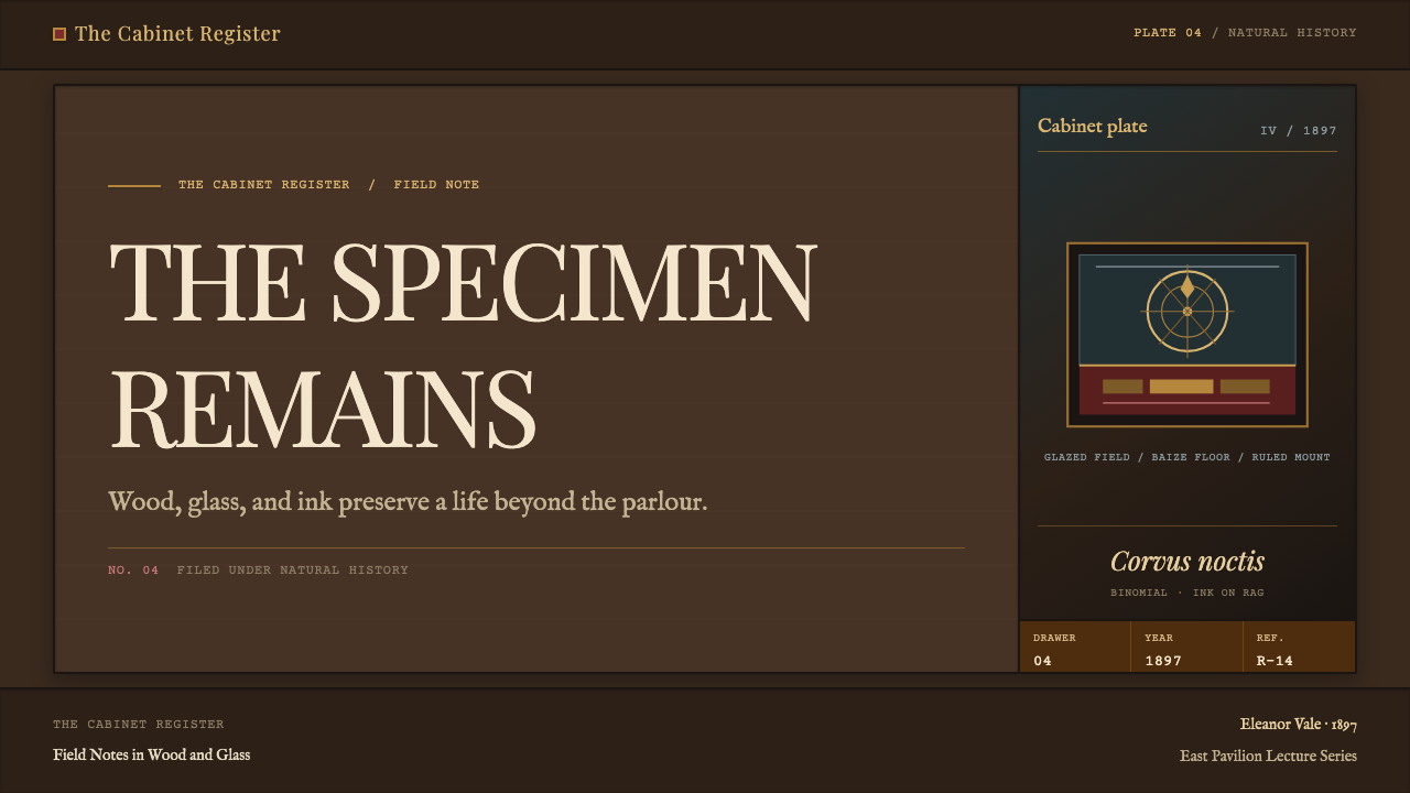
On slides, a cover can be a dark mahogany ground framed by a thin black bead, with the title in gilt lettering like a plate on a case. Content slides use vertical bays, with a display area above and a short filed caption below; data slides present tables as drawers of labelled cards. Light falls from the top of each bay and never from a card shadow.
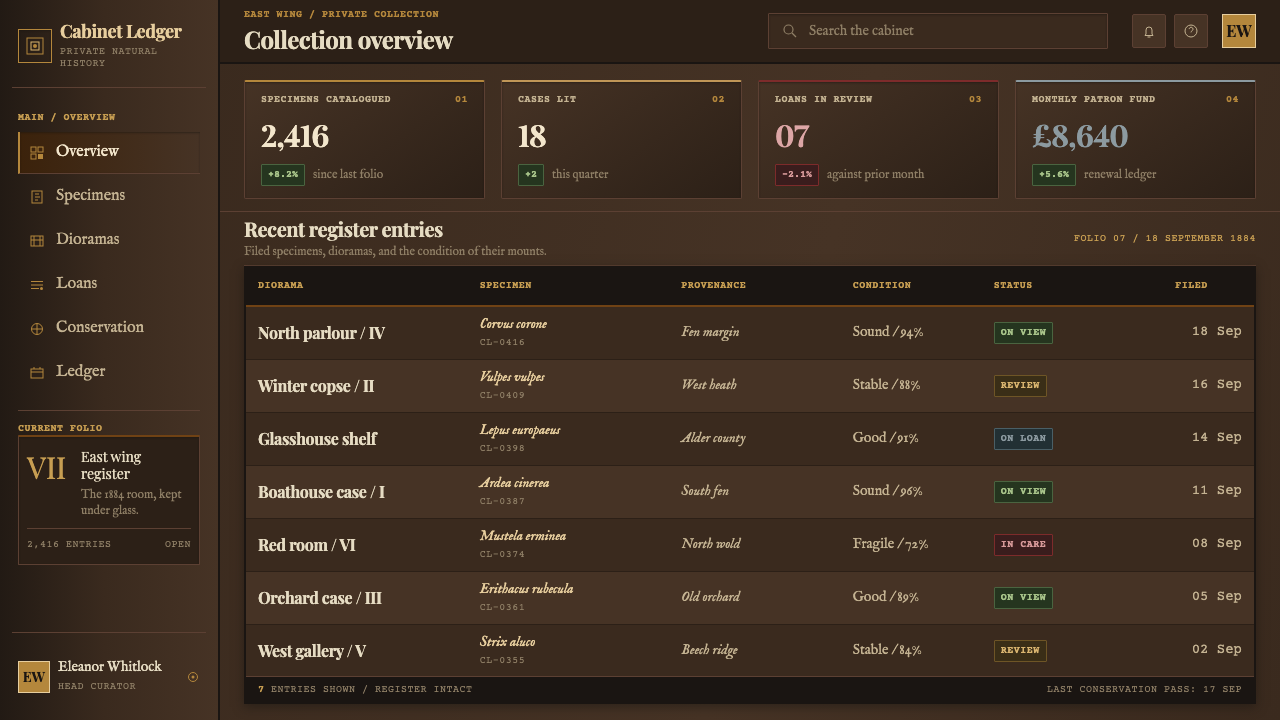
For web interfaces, build the layout as a cabinet: upright compartments with dark frames, a display zone above and an index zone below, and navigation that reads like labels on drawers. Cards are fixed in place and carry no drop shadow. Use gilt for labels and rules only, and keep body text in a warm light tone that reads clearly against the dark timber.
In editorial work, catalogues, museum guides and long-form natural history essays suit the style well. Set headings in letterpress, captions and specimen notes in copperplate, and treat each plate or figure as a framed item with a numbered label. An index of filed entries at the end of a piece reinforces the sense of a collection. The style rewards completeness and order above flourish.
The most common mistake is letting elements float. Cards with soft drop shadows, glassmorphism blurs and translucent layers contradict the cabinet's logic, because glass here is a front panel, not an effect. Others include using gilt on everything, switching to a clean modern sans-serif, and filling the page with bright white. Keep the dark timber, the fixed places and the lit-top, dark-floor depth, and the style holds together.
Victorian Taxidermy Cabinet — FAQ
What is the Victorian Taxidermy Cabinet style?
It is a design style drawn from the glazed display cases of Victorian Britain, 1837 to 1901. Its look comes from the case itself: French-polished mahogany, ebonised beading, a glazed front, a specimen on baize above shallow drawers, gilt lettering and copperplate labels. Everything is mounted, standing or filed, and nothing floats.
Does the style require imagery of animals?
No. The style borrows the construction of the case, not its contents. You can fill the glazed bays with objects, books, products or diagrams, and the logic of mounting, standing and filing works the same way. Keep any imagery respectful and use it only where the subject calls for it.
How is it different from an ordinary dark-mode interface?
A generic dark mode just inverts a light layout. This style is a specific construction: warm mahogany rather than neutral black, gilt and copperplate type, vertical bays divided by beading, and depth from a lit top and dark floor. Elements are fixed in place rather than layered with shadows, so the result feels like furniture, not a screen.
Can it work with light elements?
Yes, inside the dark frame. The cabinet holds light things such as paper specimen cards and pale labels, so a light card on a dark timber ground is entirely in keeping. What should not happen is a bright white page with a dark header, which loses the lit-top, dark-floor depth and the sense of a contained case.
How should I use the gilt colour?
Sparingly and for text and lines: labels, rules, headlines and the occasional plate. Gilt is a warm, muted metallic yellow whose brightness comes from contrast with dark wood, not from glow. Large gilt fields or gilt on every element make the page look like costume jewellery and remove the sense of an ordered collection.
Related design styles
 Chartreuse Liqueur GreenAcid glow rules the cellar. Cormorant Garamond and brass hairlines frame yell…
 Benin Bronze (Edo, 1500)Royal memory, cast in bronze. Cream plaques and gilded lines carry museum gra…
 Dracula Gothic (1897)Victorian dread after dark. Blood-red initials and tarnished gilt haunt coffi…
 Dutch VanitasTime waits at the table. Olive-black depths, earth-brown type, and one candle…
 Ex Libris BookplateScholarly ownership, cut in ivory. Cinzel caps and crosshatch rules rise from…
 Flamsteed Atlas CoelestisMeasurement wears mythology. Ivory engravings and gilt stars cross a deep ind…