What is Botticelli Birth of Venus (1486)?
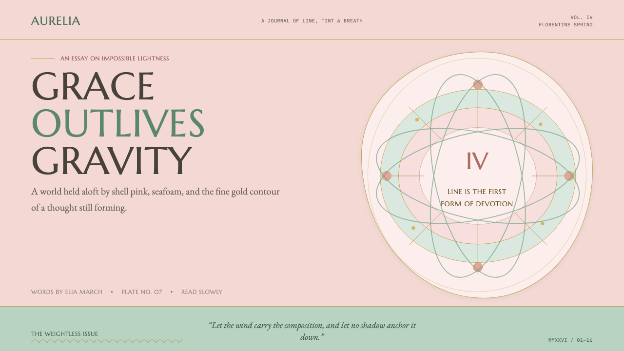
Botticelli Birth of Venus (1486) is grace winning out over gravity — shell pink, seafoam, and fine gilt contours that keep every form afloat.
Botticelli Birth of Venus (1486) in brief
This is the Birth of Venus rebuilt as a design language: the softest, most weightless tempera surface the Quattrocento ever produced. Drapery and hair stream sideways on a mannered, decorative wind, and no cast shadow ever anchors a form to the ground the way weight and gravity would in a more naturalistic painting. The ground is a warm shell pink, the sea a cool seafoam green, and figures are drawn rather than modeled — contours traced in a fine gold-brown line instead of built up through dark shading.
Hair and a handful of accents carry gilt-thread highlighting, a delicate touch of gold rather than a gilded ground, which keeps the overall surface feeling like tinted drawing rather than treasure. Every value in the system sits high-key, chalky, and desaturated; nothing is allowed to go dark or saturated enough to feel heavy, because darkness and saturation read as weight, and weight is exactly what this style refuses.
The result is a Neoplatonic daydream: a pagan myth painted with the sweetness and linear clarity of a devotional altarpiece. Grace is treated as more true than physical accuracy — proportions bend gently to serve the flow of a line rather than anatomical correctness, and the whole composition behaves as though the wind, not gravity, were the organizing force of the page.
Where does Botticelli Birth of Venus (1486) come from?
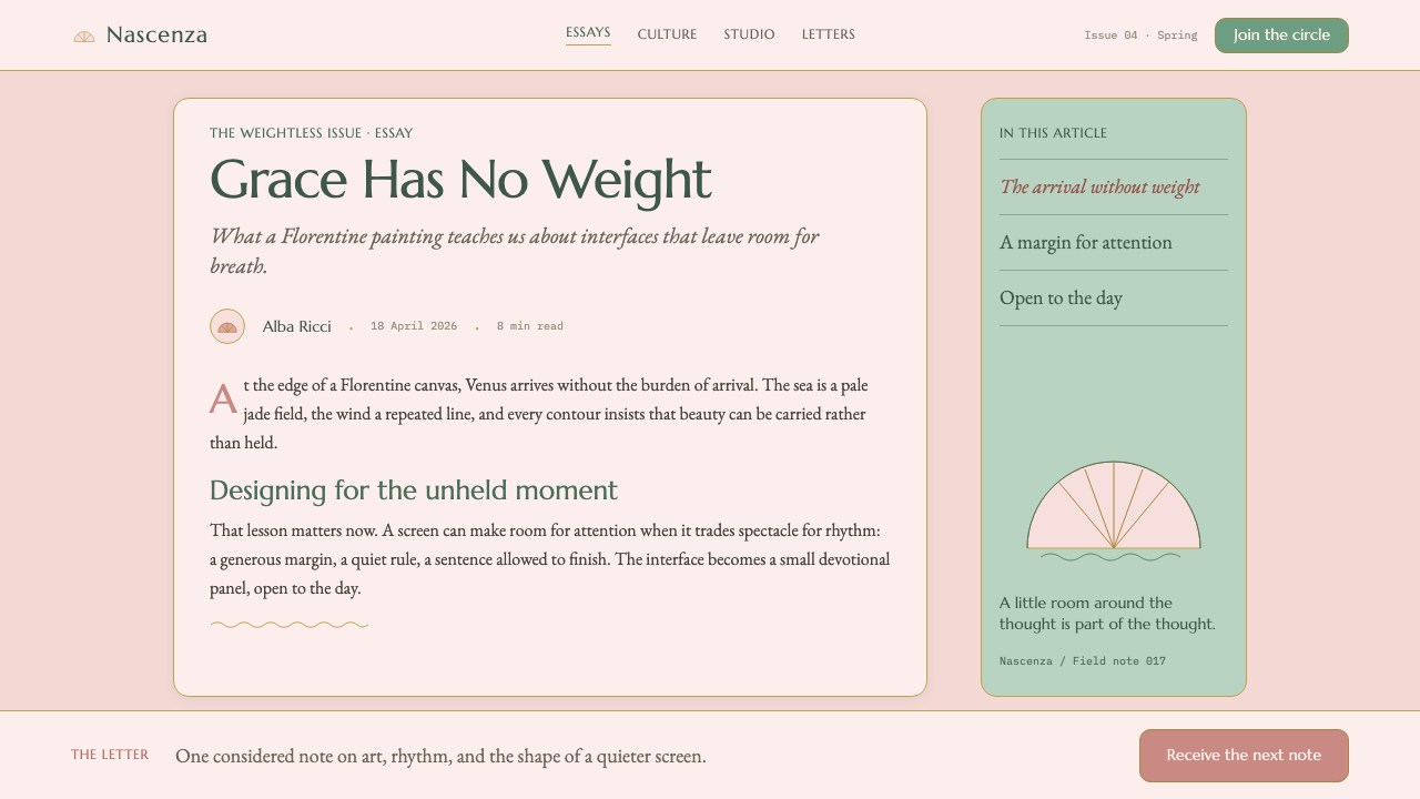
The painting was made in Florence in the mid-1480s for the Medici family, generally believed to have been commissioned by or for Lorenzo di Pierfrancesco de' Medici, a cousin of Lorenzo the Magnificent from a junior branch of the family that was itself an active art patron. It is a secular, mythological subject at a moment when most large-scale painting in Florence was still religious, and it was executed in tempera on canvas rather than the more common wood panel — a lighter, more portable format suited to a country villa setting rather than a church.
The intellectual climate around the Medici court gave this subject its license and its meaning. Marsilio Ficino, the philosopher who led Florence's revival of Neoplatonism by translating Plato's dialogues into Latin, argued that earthly, physical beauty was a reflection of a higher, divine beauty. That framework let a painter depict a nude pagan goddess without the image reading as merely scandalous; instead, Venus's beauty could carry near-sacred philosophical weight.
The Medici court's leading humanist poet, Angelo Poliziano, wrote verse describing Venus's birth from sea foam in imagery that closely parallels Botticelli's composition, and scholars generally treat his poetry as a probable literary companion, if not a direct source, for the painting — tying the picture's visual invention directly to the same humanist literary culture that produced Ficino's philosophy.
Botticelli translated that literary and philosophical idealism into an entirely linear, weightless style, prioritizing pure contour and delicate tint over the more sculptural, shadow-built realism other painters of the Florentine Quattrocento were pursuing at the same moment. The figures read more like a graceful line drawing brought into soft color than like solid, three-dimensional bodies — a deliberate choice consistent with a philosophy that treated ideal, non-corporeal beauty as more true than heavy physical rendering.
What defines the Botticelli Birth of Venus (1486) look?
Color
A warm shell pink ground pairs with a cool seafoam sea-green, kept high-key, chalky, and desaturated throughout. No color is allowed to go dark or saturated enough to read as heavy; every hue stays light enough to feel breathable.
Weightless Composition
Drapery, hair, and drifting flowers stream sideways as if carried by a decorative wind, and no cast shadow ever anchors a form to a ground plane. The organizing force of the layout is implied motion, not gravity.
Fine Gold-Brown Contour
Forms are defined by a fine, continuous line in gold-brown rather than by dark tonal modeling. The line does the work that shadow would normally do, describing a form's edge while keeping the interior surface flat and light.
Gilt-Thread Accent
Gold appears only as delicate thread-like highlighting, typically in hair, rather than as a gilded ground or heavy metallic fill. It should read as a glint, not a surface treatment.
Line Over Shadow
The system deliberately avoids the sculptural, dark-shadow modeling common elsewhere in Renaissance painting. Form emerges from drawing and tint, not from a light-and-shadow model, which is what gives every figure its floating, almost weightless quality.
Generous Negative Space
Open, lightly toned space surrounds figures rather than crowding them, letting the composition breathe and reinforcing the sense that nothing here needs to feel dense or heavy.

Who shaped Botticelli Birth of Venus (1486)?
The Florentine painter who executed the work in the mid-1480s, translating Medici-circle Neoplatonic ideals into an entirely linear, weightless painting style that prioritized graceful contour over sculptural, shadow-built realism.
A cousin of Lorenzo the Magnificent from a junior Medici branch, generally believed to have commissioned or received the painting, situating it within the Medici family's broader culture of art patronage.
The Medici court's leading humanist poet, whose verse describing Venus's birth from sea foam closely parallels Botticelli's composition and is generally treated as a probable literary companion to the painting.
The philosopher who led the Florentine revival of Neoplatonism, translating Plato's dialogues into Latin and arguing that earthly beauty reflected a higher, divine beauty — a framework that gave this painting's nude pagan subject its philosophical legitimacy.
How do you use Botticelli Birth of Venus (1486) today?
This system rewards contexts that want to feel graceful, light, and idealized rather than grounded or authoritative — beauty and wellness brands, fashion, and editorial work built around softness and aspiration all suit it well.
For presentation slides, a cover works best with a shell-pink field, a single drifting figure or motif rendered in fine gold-brown contour line, and no drop shadow anywhere near it — shadow reintroduces the gravity this style exists to avoid. Content slides should let text sit in generous negative space rather than dense blocks, with any emphasis carried by a thin gold-brown rule rather than a bold fill.
For web interfaces, the fine-contour-line principle translates well into icon and illustration treatment: thin, continuous linework rather than filled shapes or heavy drop shadows on cards. Backgrounds should stay in the shell-pink-to-seafoam range, and buttons or highlights can use a restrained gilt-thread accent rather than a solid gold fill.
For editorial and marketing work, the style supports a soft, aspirational tone: generous margins, pastel-adjacent but never fully desaturated color blocks, and imagery that favors flowing, diagonal composition over static, centered framing.
A common mistake is treating this as generic 'pastel design' and adding soft drop shadows or gradient fills for depth — both contradict the system's core refusal of gravity and modeling. Another is overusing gold as a solid fill rather than a fine accent line, which makes the surface feel gilded and heavy instead of light and drawn.
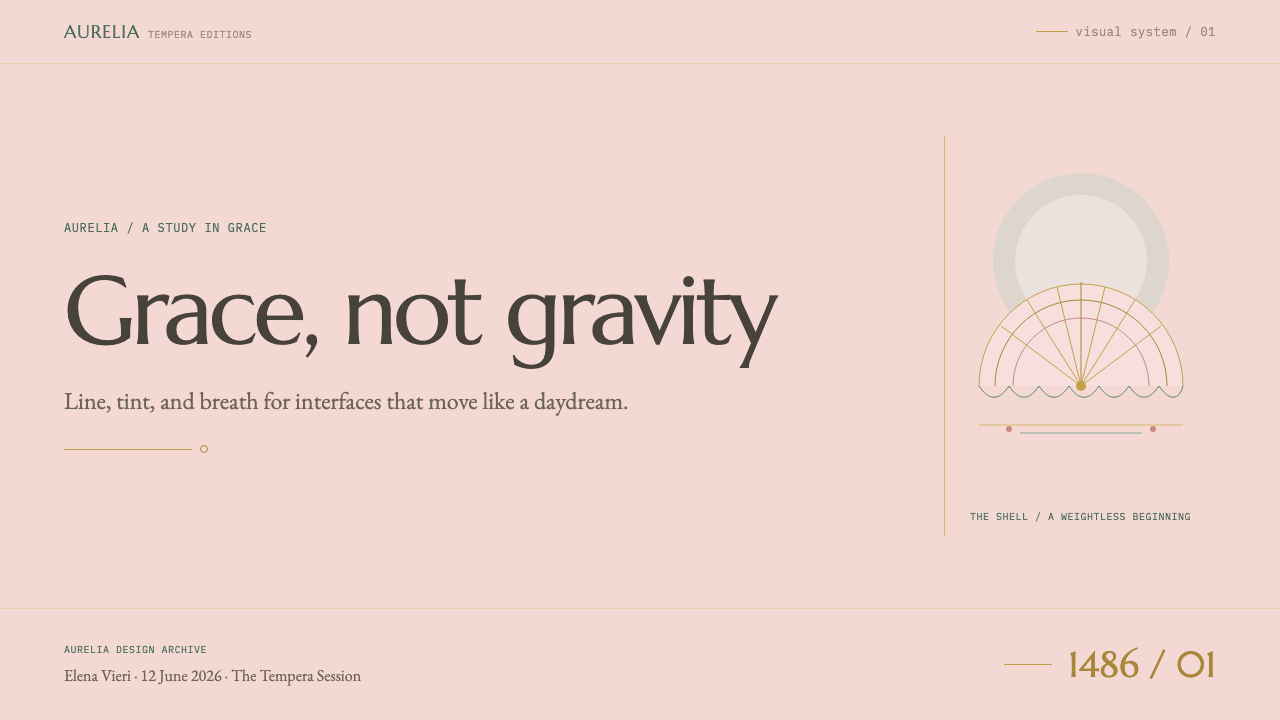
Botticelli Birth of Venus (1486) — FAQ
Why does this style avoid shadow modeling so deliberately?
Because shadow and dark tonal modeling are what make a form read as physically weighty and grounded, and this system is built entirely around the opposite idea — grace and beauty as something that floats free of gravity. Replacing shadow with a fine contour line lets a form still read clearly without ever feeling heavy.
Why tempera rather than the oil painting more associated with the Renaissance?
Egg tempera was the dominant medium in Florence at this moment, and it naturally produces flatter, more linear results than oil's capacity for deep, gradual shadow — which suited exactly the weightless, drawing-like quality this composition was after. The choice of canvas over the more common wood panel also points to a lighter, more portable object suited to a domestic villa setting rather than a church altar.
What is the connection between this painting and Neoplatonism?
Neoplatonism, as developed in the Medici circle by the philosopher Marsilio Ficino, held that physical beauty was a reflection of a higher, divine beauty rather than something merely sensual. That idea gave Botticelli license to paint a nude pagan goddess with the same sweetness and reverence normally reserved for religious subjects, which is why the painting reads as devotional in feeling despite its mythological content.
How is this different from a generic soft pastel aesthetic?
A generic pastel look is simply a light, low-saturation palette applied to any composition. This system pairs that palette with a specific structural logic — no gravity-implying shadow, form built from fine gold-brown contour line rather than tonal modeling, and gold used only as a delicate accent rather than a fill. Without that structural discipline, a pastel palette alone will not produce the same weightless, graceful effect.
Related design styles
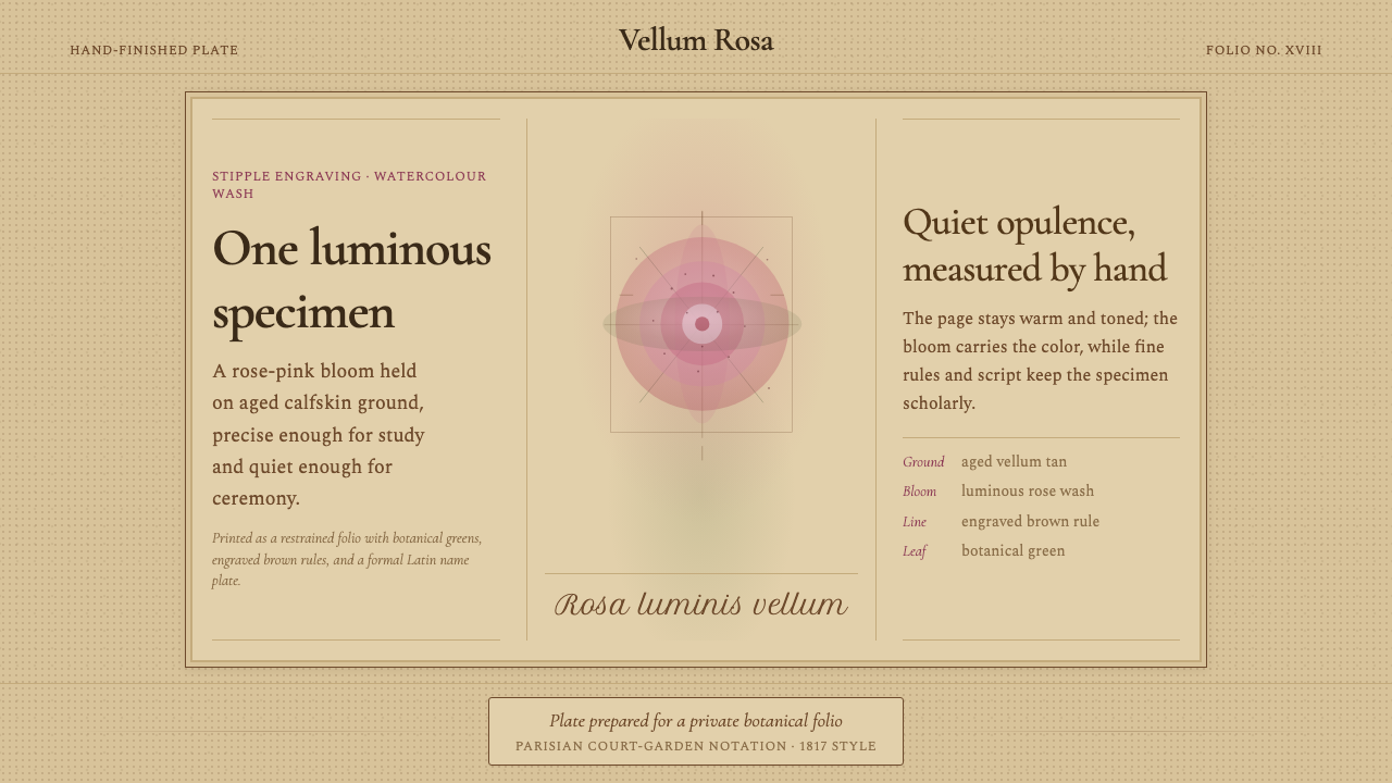 Redouté BotanicalScholarly opulence. Rose wash on aged vellum, framed by engraved brown rules.
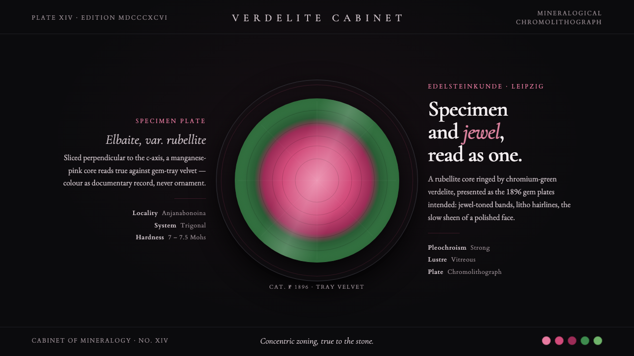 Tourmaline Crystal SliceSpecimen and jewel as one. A watermelon-tourmaline slice — pink core, green r…
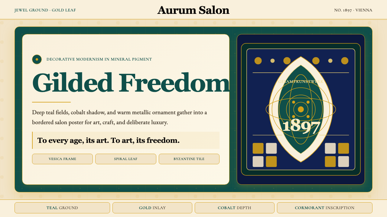 Wiener Secession (Klimt)Opulence made modern. Teal grounds, gold inlay, vesica frames and Cormorant d…
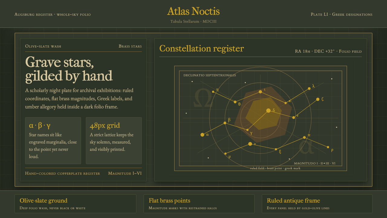 Bayer UranometriaGrave celestial folio. Olive-slate grid, brass stars, Greek labels, old-style…
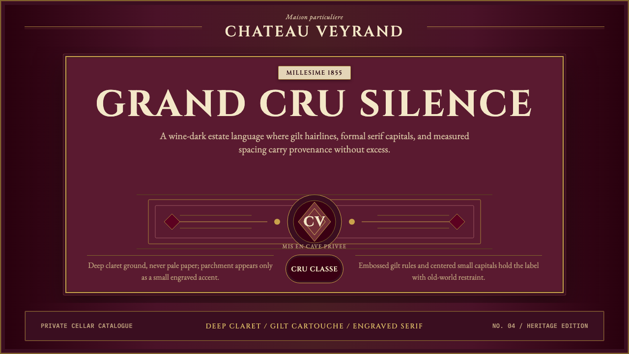 Bordeaux Wine ChâteauAged claret authority. Cinzel capitals, gilt rules, and label symmetry on win…
 British Royal MonarchyCeremony becomes structure. Amethyst panels, gilt borders, blackletter, mirro…