What is Bayer Uranometria?
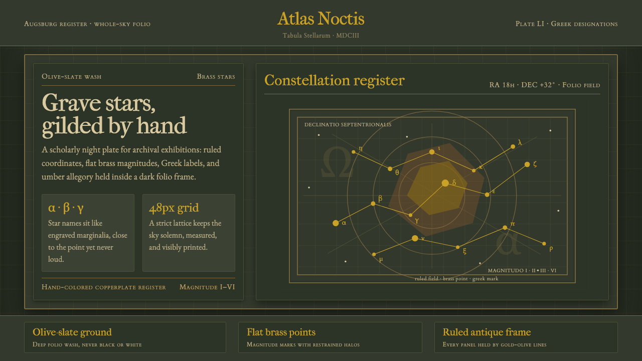
Bayer Uranometria turns the night sky into a grave Renaissance instrument: olive-slate ground, brass stars, Greek names, and an exact celestial grid held together like a hand-colored copperplate.
Bayer Uranometria in brief
Bayer Uranometria is a design system based on Johann Bayer’s Uranometria, printed in Augsburg in 1603 and engraved by Alexander Mair. The atlas was the first to chart the entire celestial sphere across 51 copperplate plates, and it placed Greek-letter designations beside the stars. Reinterpreted as a single visual language, it becomes a grave celestial folio rather than a decorative astronomy theme.
Its atmosphere is deliberately archaic and controlled. A dark olive-slate wash forms the ground, while flat brass-gold star points appear as measured marks rather than glowing effects. Greek labels sit within the field like catalogued evidence, and gilt-highlighted allegorical figures bring the mythic constellations forward without turning the composition theatrical or sentimental.
The system depends on tension between wonder and order. The stars suggest an immense, unknowable sky, but the grid, lettering, and engraved figures insist on classification. Nothing should feel casually placed. Every point, label, line, and figure belongs to a larger celestial instrument whose dignity comes from precision rather than ornament.

Where does Bayer Uranometria come from?
Uranometria belongs to the late Renaissance and was printed in Augsburg, Germany, in 1603. Its subject is the celestial sphere, but its lasting design significance lies in the way observation, naming, engraving, and allegorical imagery are joined within one atlas. The work treats the sky as both a field of wonder and an object that can be systematically described.
Johann Bayer supplied the atlas’s authorship and its central act of organization. The introduction of Greek-letter designations beside the stars gave the celestial field a readable naming system. Stars were no longer only points in an immense darkness; they became identifiable entries within a shared visual and linguistic order.
Alexander Mair engraved the atlas as a sequence of copperplate plates. That production method is essential to the style’s character: line, pressure, density, and controlled marks become visible parts of the image. Even when the system is adapted for contemporary interfaces, it should retain the feeling that every line was cut, placed, and inspected with deliberate care.
The source atlas covered the entire celestial sphere across 51 plates. Bayer Uranometria therefore combines total scope with local detail: a grand map of the heavens is built from carefully arranged fragments. The resulting design language is neither purely scientific nor purely mythological. It is a Renaissance negotiation between measurement and story, rendered through a dark ground, metallic star points, Greek labels, and allegorical constellation figures.
What defines the Bayer Uranometria look?
Olive-Slate Ground
The ground is dark, muted, and mineral rather than pure black. Olive undertones keep the darkness organic and historical, like pigment washed across an old plate. The background should feel dense enough to hold the stars, yet quiet enough that the grid and labels remain legible.
Brass-Gold Stars
Stars appear as flat brass-gold points, not luminous spheres. Their value comes from contrast and placement rather than glow. A restrained metallic warmth against the olive-slate field creates the impression of gilt annotation, with each point functioning as both celestial body and graphic mark.
Celestial Grid
The grid is fine, continuous, and quietly authoritative. It should organize the field without becoming a decorative pattern. Lines establish orientation, explain relationships, and give the stars a measured context, making the composition feel charted rather than merely illustrated.
Greek Labels
Greek letters are treated as navigational marks within the sky. They should sit close to their stars, but never crowd them, creating a rhythm of names and points across the field. The labels bring language into the image without breaking its silence or turning the composition into ordinary interface text.
Old-Style Type
Typography should carry the authority of an old celestial folio: measured, literary, and slightly archaic. Old-style forms support the historical setting, while restrained contrast between display labels and supporting text preserves the hierarchy. Type is part of the artifact, not a neutral layer placed over it.
Allegorical Figures
The constellation figures are allegorical and gilt-highlighted, linking mapped stars with inherited stories. They should feel engraved and symbolic rather than naturalistic. Their presence adds narrative depth, but the figures remain subordinate to the celestial structure and never overwhelm the coordinate field.
Engraved Materiality
The visual language depends on the memory of copperplate work: controlled lines, dense hatching, crisp marks, and pigment that appears applied by hand. Texture should suggest labor and age without becoming distressed decoration. The impression is archival, precise, and made rather than digitally generated.

Who shaped Bayer Uranometria?
Bayer is the central author associated with Uranometria and the figure who gave the atlas its organizing intelligence. His contribution is represented here through classification: stars become named, legible entries within the celestial sphere. The design system therefore treats typography and astronomy as inseparable acts of ordering.
Mair engraved the atlas, and his role defines the system’s material memory. Copperplate linework, controlled density, and the sense of marks cut into a surface all belong to this inheritance. When adapted for digital use, the style should preserve the discipline of engraving rather than imitate random antique texture.
This movement supplies the historical frame: the sky is observed, measured, named, and rendered as a coherent map. Its influence appears in the balance between scientific structure and allegorical imagery, allowing the design to feel both exact and imaginative without resolving the tension between them.
The Bayer stellar designation system represents the atlas’s most transferable act: giving celestial points a shared language of reference. In the visual system, Greek letters are not decoration. They are compact evidence that the field has been studied, indexed, and made navigable.
How do you use Bayer Uranometria today?
For presentation covers, Bayer Uranometria works best as a concentrated celestial plate. Use the olive-slate field as the quiet foundation, place a restrained cluster of brass-gold stars or a partial grid as the visual anchor, and let the title sit in old-style type with generous surrounding darkness. Content slides should reduce the astronomy to structure: a clear heading, a small number of labeled divisions, and thin coordinate lines that guide reading without becoming a backdrop pattern.
For data slides, treat charts as instruments within the atlas rather than modern dashboard widgets. Use brass-gold marks for primary observations, muted olive variations for secondary groupings, and Greek-style labels where naming matters. A chart should feel catalogued and deliberate, with the grid explaining relationships and the empty field protecting the significance of each data point.
For web interfaces, the system suits dashboards, analytical tools, archives, and pricing pages that want to communicate seriousness and depth. Dark olive-slate surfaces can establish the main field, while brass-gold accents identify selected states, important values, or active navigation. Cards should feel like inset plates or catalogued panels, with crisp borders and restrained depth. Pricing tiers benefit from names, labels, and aligned values rather than decorative badges.
For editorial and marketing work, the style supports long-form stories about history, science, archives, exploration, and cultural memory. A feature page can open with a large star field or allegorical figure, then move into narrow reading columns supported by marginal labels and quiet coordinate lines. Marketing pages can use the language of the folio to make a product feel considered and enduring, especially when the message depends on expertise, research, or careful craft.
The common mistake is treating the theme as generic dark luxury: black backgrounds, excessive gold, glowing stars, and ornamental astronomy icons. That approach loses the source material’s discipline. Bayer Uranometria is not a night-sky effect package. Its character comes from the relationship between muted ground, flat metallic points, historical lettering, precise gridwork, and allegorical imagery kept under control.

Bayer Uranometria — FAQ
Is Bayer Uranometria simply a dark astronomy theme?
No. Astronomy supplies the subject, but the identity comes from the historical logic of the atlas: a muted olive-slate ground, flat brass-gold stars, Greek labels, copperplate discipline, and a precise celestial grid. Remove that structure and the result becomes generic dark space imagery rather than Bayer Uranometria.
Why are the stars flat instead of glowing?
Flat brass-gold points preserve the feeling of a chart or engraved plate. They are marks within a system, not simulated lights floating in space. Their authority comes from placement, contrast, and naming. A glow would shift the style toward contemporary fantasy and weaken its archival, measured character.
What role do the Greek labels play?
The labels express the atlas’s central act of organization: stars are given a shared language of reference. They should remain legible and closely associated with their points, but they should not dominate the composition. In interface work, they can identify categories, entries, or selected values while retaining the atmosphere of a celestial catalogue.
Can the system be used for a bright interface?
It can be adapted, but the dark olive-slate field is central to the supplied identity. A bright variant would need to preserve the same qualities through restrained mineral color, archival typography, brass-like accents, fine gridwork, and carefully spaced labels. Simply replacing the dark ground with white would change the historical weight and should be treated as a reinterpretation.
Where does this style work best?
It works best where authority, research, history, and considered observation matter: analytical dashboards, archives, scientific or cultural editorial work, specialist pricing pages, and presentations about systems or knowledge. It is less suitable when the product depends on bright immediacy, playful warmth, or highly casual communication. Its strength is solemn clarity.
Related design styles
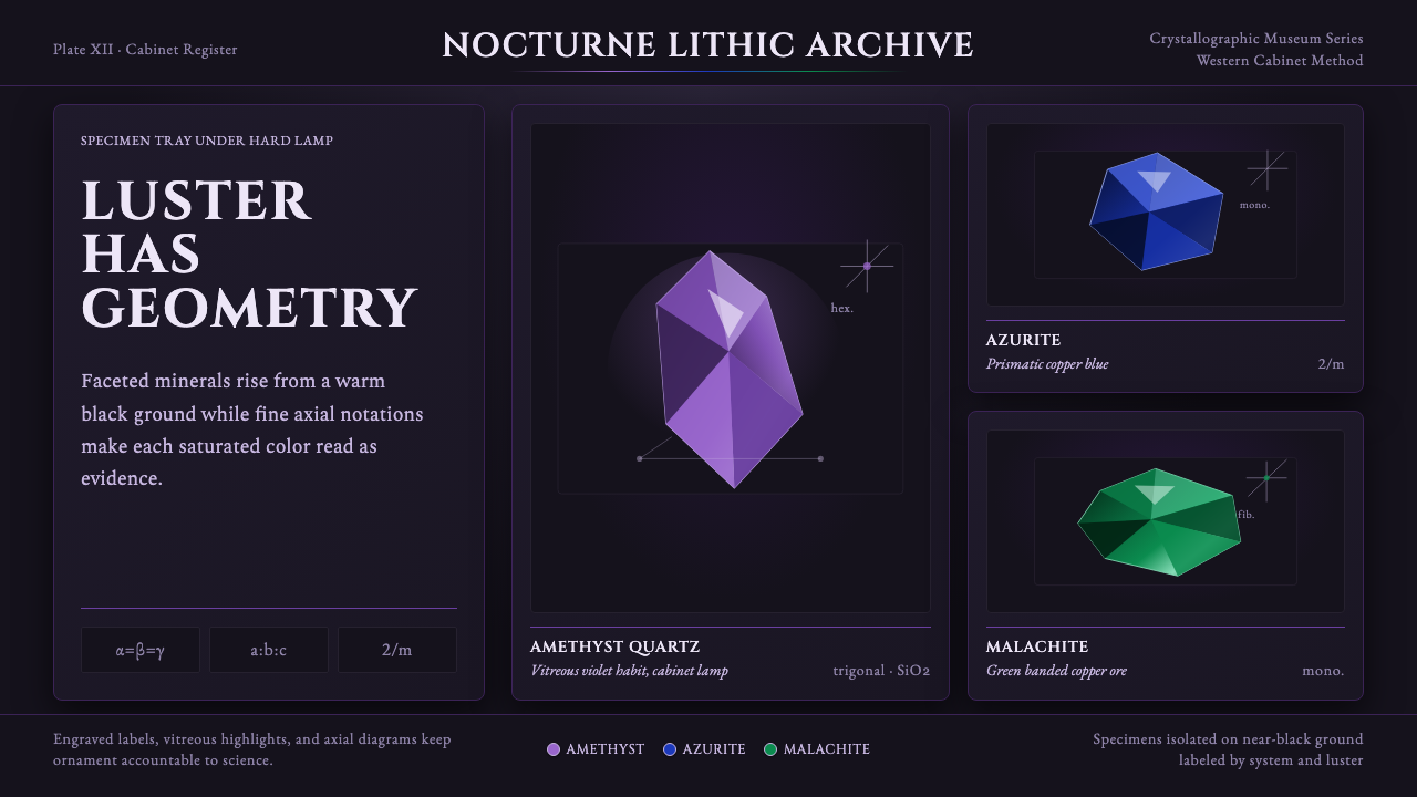 Mineral Specimen PlateScience becomes ornament. Amethyst, azurite, and malachite facets glow on bla…
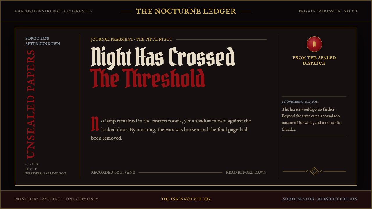 Dracula Gothic (1897)Victorian dread after dark. Blood-red initials and tarnished gilt haunt coffi…
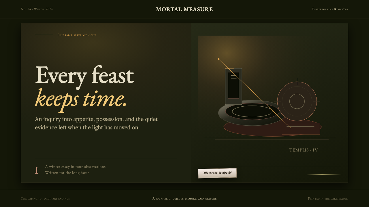 Dutch VanitasTime waits at the table. Olive-black depths, earth-brown type, and one candle…
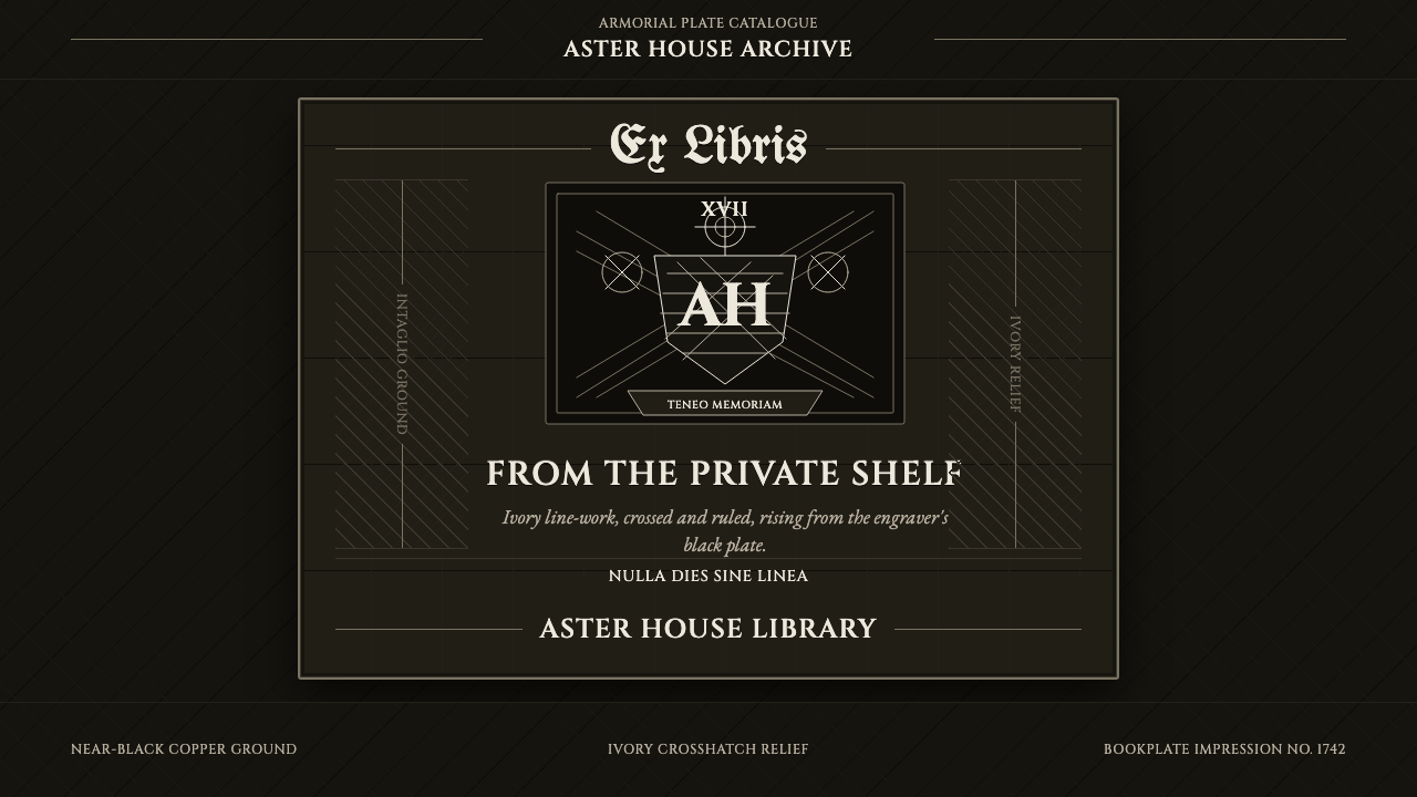 Ex Libris BookplateScholarly ownership, cut in ivory. Cinzel caps and crosshatch rules rise from…
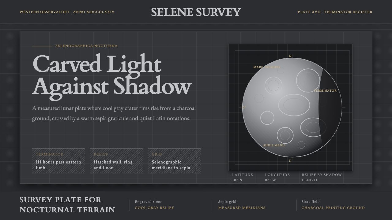 Lunar SelenographyMoonlight becomes measurement. Slate ground, sepia grid, and hatched gray cra…
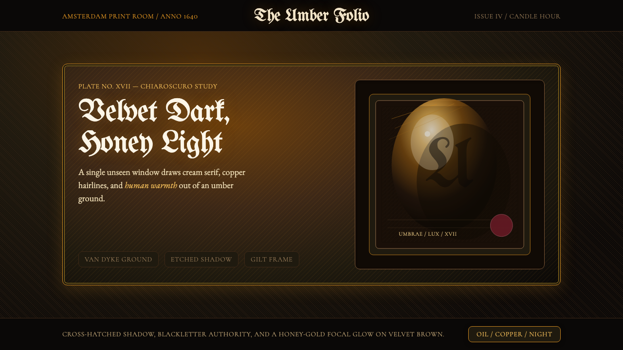 Rembrandt BaroqueDarkness becomes theatre. Honey-gold spotlight and blackletter rise from Van…