What is Lunar Selenography?
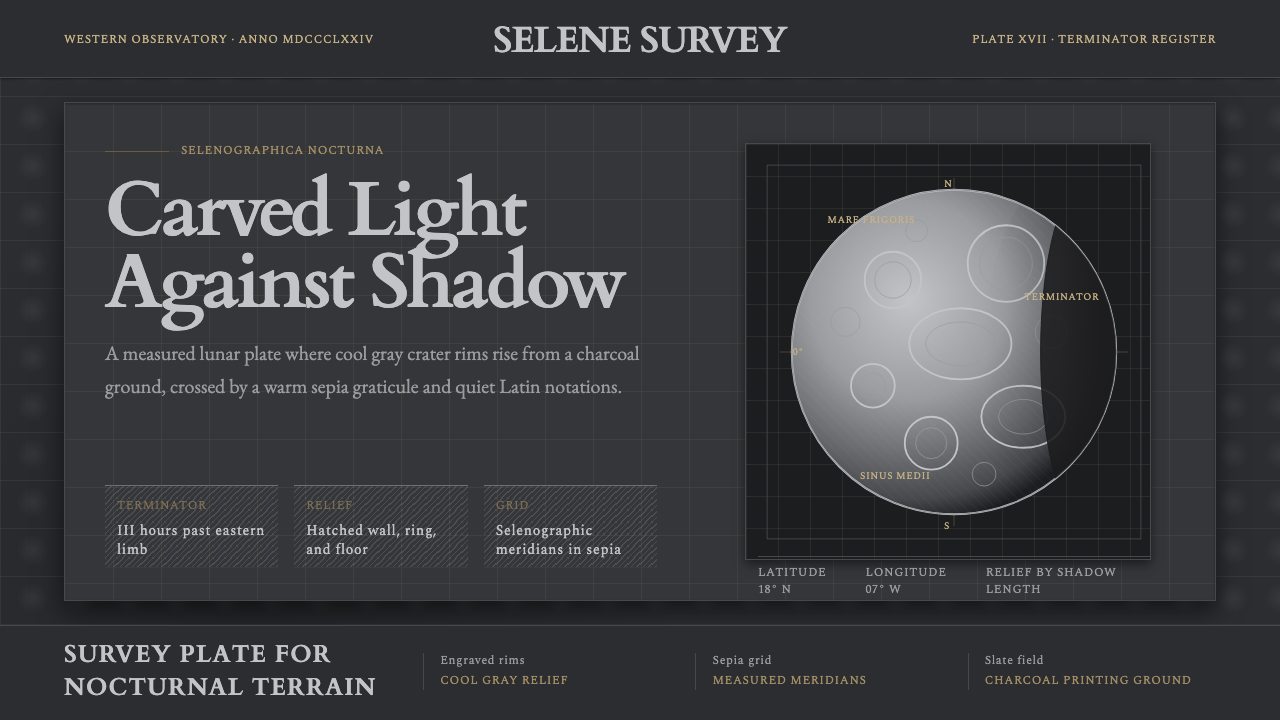
Lunar Selenography turns the night sky into a technical drawing — a dark, engraved cartography of the Moon where craters are carved from hatched shadow rather than painted with light.
Lunar Selenography in brief
Lunar Selenography is a design language lifted directly from the great engraved moon atlases of the nineteenth century — the era when astronomers first mapped the Moon's surface with the same rigor cartographers once reserved for oceans and continents. Its visual signature is unmistakable: a near-black slate ground standing in for the void of space, crossed by a fine sepia-toned graticule of latitude and longitude lines, and populated by craters rendered not as flat circles but as hatched, ringed reliefs — each one a small study in engraved shadow.
The style treats the Moon as an object of measurement before it is an object of wonder. Every crater carries the ghost of a Latin name, lettered in a restrained, engraved hand along the graticule. The lit portion of the lunar disc is never rendered as bright, glowing light — it is built from the absence of ink, so that brightness reads as relief carved out of darkness rather than illumination added on top of it. The boundary between lit and unlit hemispheres, the terminator, is the darkest value on the entire sheet: a near-black edge that gives the whole composition its sense of depth and occasion.
Where most historical design styles are named for a movement, a nation, or a decade, Lunar Selenography is named for a discipline — selenography, the scientific charting of the Moon's surface. That origin shows in every decision the style makes: nothing is drawn for decorative effect, everything is drawn because a surveying instrument once required it to be recorded precisely.
Where does Lunar Selenography come from?
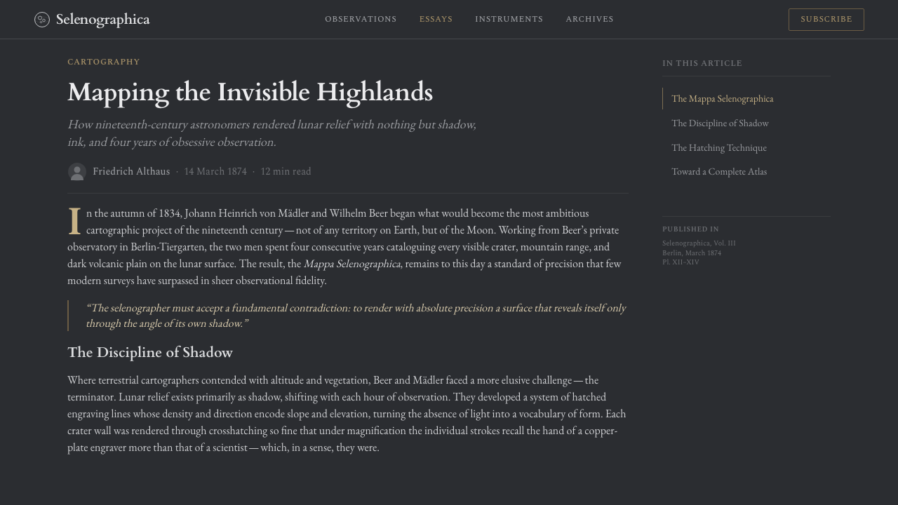
Lunar Selenography draws its visual vocabulary from a specific window of astronomical history: the decades between 1834 and the 1880s, when telescopic observation of the Moon matured from curiosity into rigorous science. The touchstone work is Wilhelm Beer and Johann Heinrich von Mädler's Mappa Selenographica, published in Berlin beginning in 1834 — the first truly systematic, measured map of the lunar surface, built from years of patient observation through the telescope and painstaking engraving onto copper plates. Beer, a banker and amateur astronomer, financed the private observatory; Mädler, a professional astronomer, did the measuring. Together they fixed the positions of roughly a thousand lunar features with a precision that would not be substantially improved upon for decades.
The tradition Beer and Mädler began was carried forward by two other key figures whose names anchor the style historically. Edmund Neison, a British astronomer, published The Moon in 1876, a substantial synthesis of lunar observation aimed at both scientific and educated general readers, with detailed engraved plates that refined the crater catalog and popularized the discipline in the English-speaking world. Johann Friedrich Julius Schmidt, a German astronomer working from Athens, spent decades producing an exhaustive survey of lunar craters, eventually publishing a colossal 1878 chart compiling tens of thousands of measurements — widely regarded as the most detailed selenographic map produced in the pre-photographic era.
What unites these efforts is the medium as much as the subject: engraving on copper or steel plates for print reproduction. Engraving cannot render a soft gradient the way a painting can — every tonal value has to be built from the density and direction of hatched lines, cut by hand with a burin. This technical constraint is the direct ancestor of the style's visual grammar: craters read as three-dimensional because of directional hatching that implies a light source, not because of blended shading. The near-black terminator line and the warm sepia ink used for labels and graticule reflect period printing conventions — sepia-toned ink was standard for scientific and cartographic engravings of the era, valued for its legibility against dark grounds and its resistance to fading.
This was also a moment when astronomy still overlapped heavily with amateur gentleman-scientists working from private observatories, and when a map of the Moon was as much a status object — a demonstration of instrumentation, patience, and engraving craft — as it was a scientific instrument. That dual identity, part data and part achievement, is part of why these maps feel so deliberately composed rather than merely functional; they were made to be studied, admired, and reproduced.
What defines the Lunar Selenography look?
Ground Color
The field is never white or pale. It is a dark, near-black slate — the color of an inked printing plate before anything has been wiped from it — used to stand in for the void of space. This dark ground is the single most important decision in the style: everything else, from crater relief to graticule lines, depends on reading as light or ink emerging from that darkness rather than as marks placed on a blank page.
Crater Relief
Craters are built from hatched relief shading rather than flat tone or gradient fill. Fine parallel or crosshatched lines, denser on one side and thinning toward the other, imply a consistent raking light source and give each crater a convex, sculptural presence. A cool gray rim traces the crater's upper edge, distinguishing the raised wall from the shadowed interior. No crater is ever rendered as a simple filled circle; the hatching is what makes it read as topography rather than symbol.
The Terminator
The line dividing the lit and unlit halves of the lunar disc is rendered as the darkest, most absolute value on the sheet — near-black, with none of the softening a photograph would apply to a shadow boundary. This hard terminator is what gives the whole composition its sense of occasion: it is the single edge the eye is drawn to first, and every other tonal decision on the page is calibrated relative to it.
Sepia Graticule
A fine network of latitude and longitude lines runs across the entire lunar field in a warm sepia tone — never the cool gray of the crater rims, never the ink-black of the terminator. This third, distinct value gives the surveying grid its own visual register, so it reads clearly as a measuring instrument laid over the Moon rather than a feature of the Moon itself. The graticule is deliberately thin and unobtrusive; it organizes without competing.
Engraved Labeling
Feature names are lettered in a restrained, engraved hand that follows the curvature of the graticule rather than sitting in flat horizontal blocks. Labels are sparse and functional, never decorative flourishes — the same discipline that governs the crater relief governs the type: it exists to record a name precisely, not to draw attention to itself.
Tonal Restraint
The entire palette operates on only three values doing distinct jobs — near-black slate for the void and the terminator, cool gray for crater rims and relief, warm sepia for the graticule and labels. No other hues intrude. This restraint is what keeps a subject as visually rich as the Moon's surface from ever feeling cluttered: every mark on the sheet belongs to one of three legible categories.
Instrumental Composition
The lunar disc is typically composed as a single dominant circular form, filling most of the available field, with the graticule extending to its very edge — treating the whole sheet as the instrument's field of view rather than a decorative frame around a picture. There is no vignette, no ornamental border, no allegorical figure in the margins. The composition is what a surveying telescope would have recorded, drawn as faithfully as a burin allows.
Who shaped Lunar Selenography?
Beer was a Berlin banker and amateur astronomer who financed and co-built the private observatory from which the Mappa Selenographica was produced, beginning publication in 1834. His resources and organizational discipline made possible a level of sustained, systematic observation that most contemporary astronomers, working alone, could not have afforded. Beer's map set the visual template — dark ground, engraved crater relief, fine measuring grid — that every later selenographic atlas, and this style, still follows.
Mädler was the professional astronomer who carried out the exacting measurement work behind the Mappa Selenographica, fixing the positions of roughly a thousand lunar features with unprecedented precision. His methodical approach to naming and cataloging craters established a nomenclature system that later observers, including Neison and Schmidt, built upon rather than replaced — making Mädler's measuring hand as influential to the style's underlying logic as its visual surface.
Neison was a British astronomer whose 1876 volume The Moon brought selenography to a wider English-speaking audience, pairing detailed engraved plates with accessible scientific narrative. His work sits at the point where the discipline began shifting from a private, elite pursuit toward something closer to public scientific literature — an important step in why lunar maps of this era were engraved and printed for circulation rather than kept as private research notes.
Schmidt, working from an observatory in Athens, dedicated decades to an exhaustive personal survey of lunar craters, culminating in a monumental 1878 chart compiling tens of thousands of measurements. His obsessive thoroughness — often cited as the most detailed selenographic work of the pre-photographic era — represents the style's ideal taken to its furthest point: a map so dense with hatched, measured detail that it approaches the limit of what engraving by hand can record.
How do you use Lunar Selenography today?
Lunar Selenography is a striking, high-commitment style, and its clearest home is anywhere a dark, technical, faintly reverent mood is an asset rather than a liability — space and astronomy content, science communication, luxury or heritage branding, and any narrative that benefits from feeling like a rare instrument rather than a casual graphic. Applying it well means preserving the dark ground and the hatched, engraved relief as the load-bearing elements; everything else in a layout should defer to them.
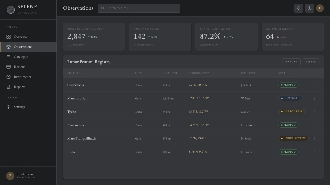
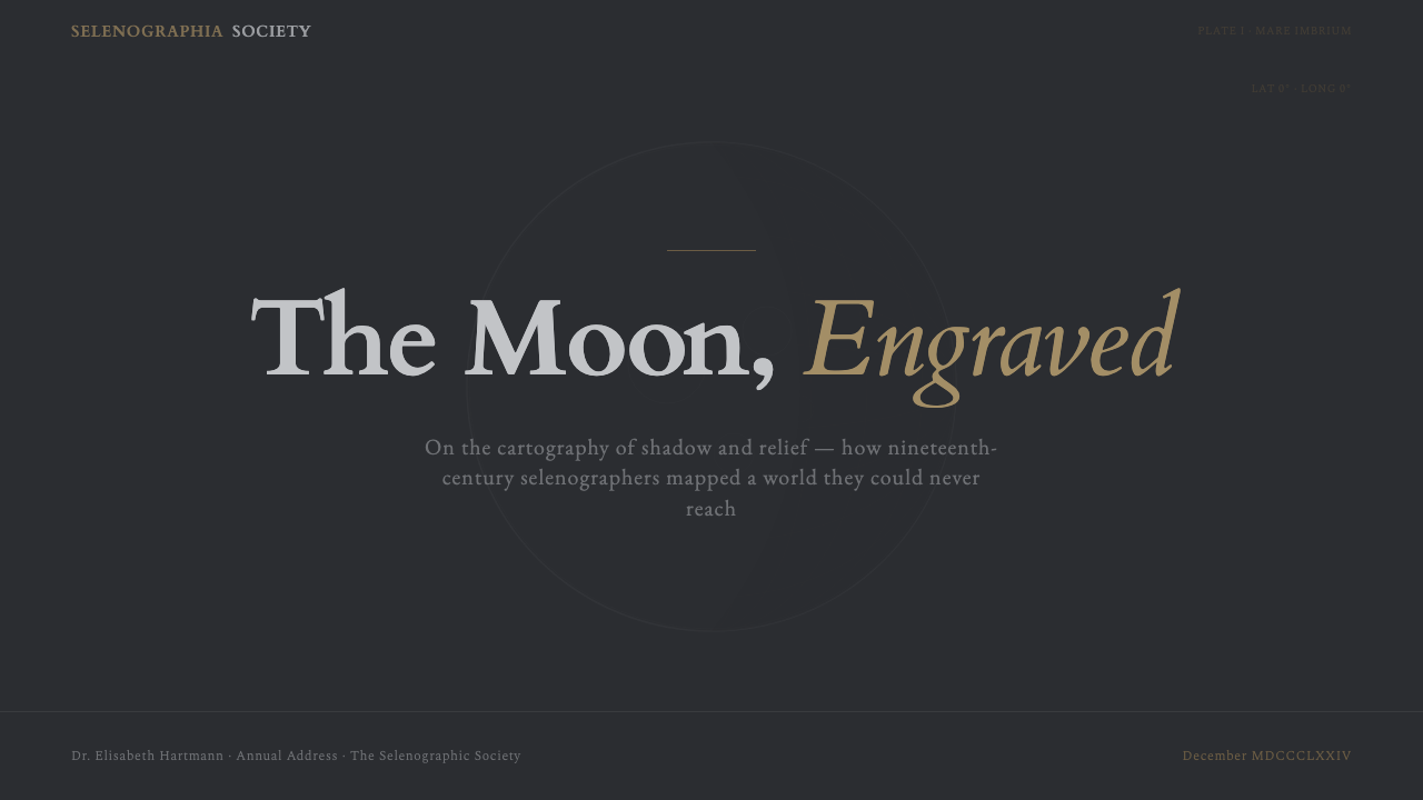
For presentation cover slides, the style is unusually strong: a large dark field with a single dominant circular or crescent form, a fine sepia grid running to the edges, and restrained engraved-style type for the title produces an immediate sense of gravity and precision. Content and data slides should keep the same three-value discipline — dark ground, cool gray for structural lines and secondary text, warm sepia for labels, callouts, and any measurement-flavored data (coordinates, dates, figures). Data visualizations benefit especially: a chart rendered with fine hatched fills and a thin sepia grid reads as measured and considered rather than decorated.
For web interfaces, the style suits dashboards and pricing pages that want to project precision and authority rather than warmth — analytics tools, scientific or research products, premium subscription tiers positioned as instruments rather than conveniences. A dark near-black surface, cool gray for card borders and dividers, and sepia reserved strictly for labels, active states, or highlighted figures keeps the hierarchy legible. Flat, hatched-texture fills for chart or icon elements read more authentically than smooth gradients, which pull the design toward a generic 'dark mode' rather than this style's specific engraved character.
For editorial and marketing work, Lunar Selenography rewards long-form, essay-like treatments — a feature article on space exploration, a heritage brand story, a luxury product launch — where a dark field, a fine sepia rule separating sections, and engraved-style pull quotes create a sense of occasion. It is less suited to fast-scrolling, high-frequency content; the style asks to be read slowly, the way an atlas plate is studied rather than skimmed.
The most common mistake is treating this as a generic 'dark mode with gold accents' rather than an engraving discipline. Substituting smooth gradients for hatched relief, using a bright gold instead of a muted sepia, or filling the terminator and shadow areas with soft blur immediately breaks the illusion — the style depends on flat, decisive value changes and directional line work, not ambient glow. A second frequent error is over-using the sepia tone as if it were a general accent color; in authentic selenographic work sepia is reserved almost exclusively for the measuring grid and labels, never for large decorative fields.
Lunar Selenography — FAQ
What exactly does 'selenography' mean, and why does the style use that word instead of 'lunar' or 'moon map'?
Selenography is the scientific term for the study and mapping of the Moon's physical surface — its name comes from Selene, the Greek personification of the Moon, paired with the Greek root for writing or description. Astronomers of the nineteenth century used the term deliberately to signal that they were doing the same rigorous, measured work that geographers did for the Earth's surface, not merely sketching or admiring the Moon. The style borrows that precise, disciplinary word because its entire visual grammar — the graticule, the measured crater catalog, the engraved labels — comes from that scientific tradition rather than from lunar imagery in general.
Why is the ground dark instead of the pale off-white typical of most historical print material?
The dark ground is doing double duty: it represents the physical fact of space as a void, and it lets the crater relief and terminator read as carved light rather than applied ink. A pale ground would force the crater hatching to read as dark marks on light paper — the opposite of how a telescope actually shows the Moon, as a bright disc against a black sky. Committing to the dark field is what allows the whole composition to feel like an observation rather than an illustration.
Can this style work with color, or is it strictly limited to the slate, gray, and sepia palette?
The three-value discipline is the core of the style's identity, and departing from it too far breaks the illusion of an engraved scientific plate. That said, the palette can flex slightly within its own logic — a slightly cooler or warmer sepia, a touch more blue in the gray — as long as the roles stay fixed: one value for the void and deepest shadow, one for structural relief, one for measurement and labeling. Introducing a fourth unrelated hue, especially a saturated one, immediately reads as a modern intervention rather than a period-accurate engraving.
Is this style only appropriate for space or astronomy subject matter?
Its origin is astronomical, but the underlying design logic — dark ground, hatched relief standing in for light, a fine measuring grid, restrained engraved labeling — transfers well to any subject that benefits from feeling precisely surveyed and slightly rare: heritage and luxury branding, scientific and research products, archival or historical content, and premium editorial features. It is a poor fit for anything that needs to feel warm, casual, or contemporary and fast-moving; the style's entire appeal rests on deliberateness, and that deliberateness reads as slowness in the wrong context.
How does Lunar Selenography differ from a generic astronomy or space-themed design?
Generic space design usually reaches for photographic imagery, glowing nebula gradients, and starfields — a sense of vastness and color. Lunar Selenography does almost the opposite: it is restrained, monochrome-leaning, and built from the specific technical vocabulary of hand engraving — hatched relief, a measuring graticule, Latin labels, a hard terminator edge. It is less about the romance of space and more about the discipline of having measured it. That distinction — wonder versus instrumentation — is the fastest way to tell whether a design is genuinely working in this style or simply borrowing a dark color scheme.
Related design styles
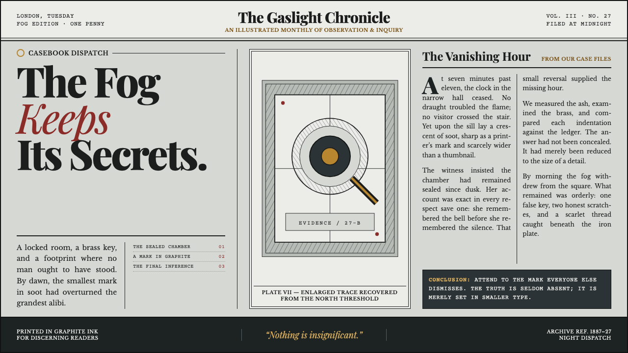 Sherlock Holmes — Baker Street (1887)Mystery, printed in ink. Fog-gray columns and cross-hatched plates glow with…
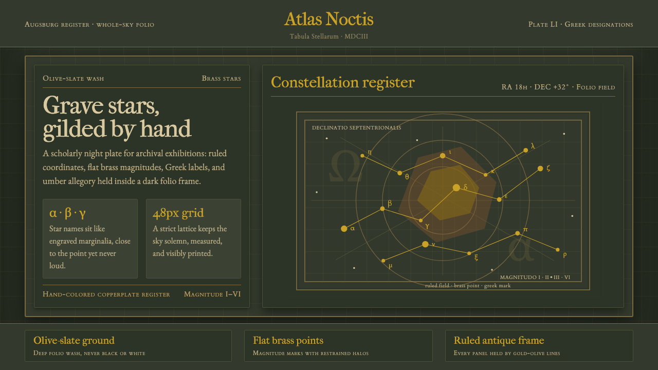 Bayer UranometriaGrave celestial folio. Olive-slate grid, brass stars, Greek labels, old-style…
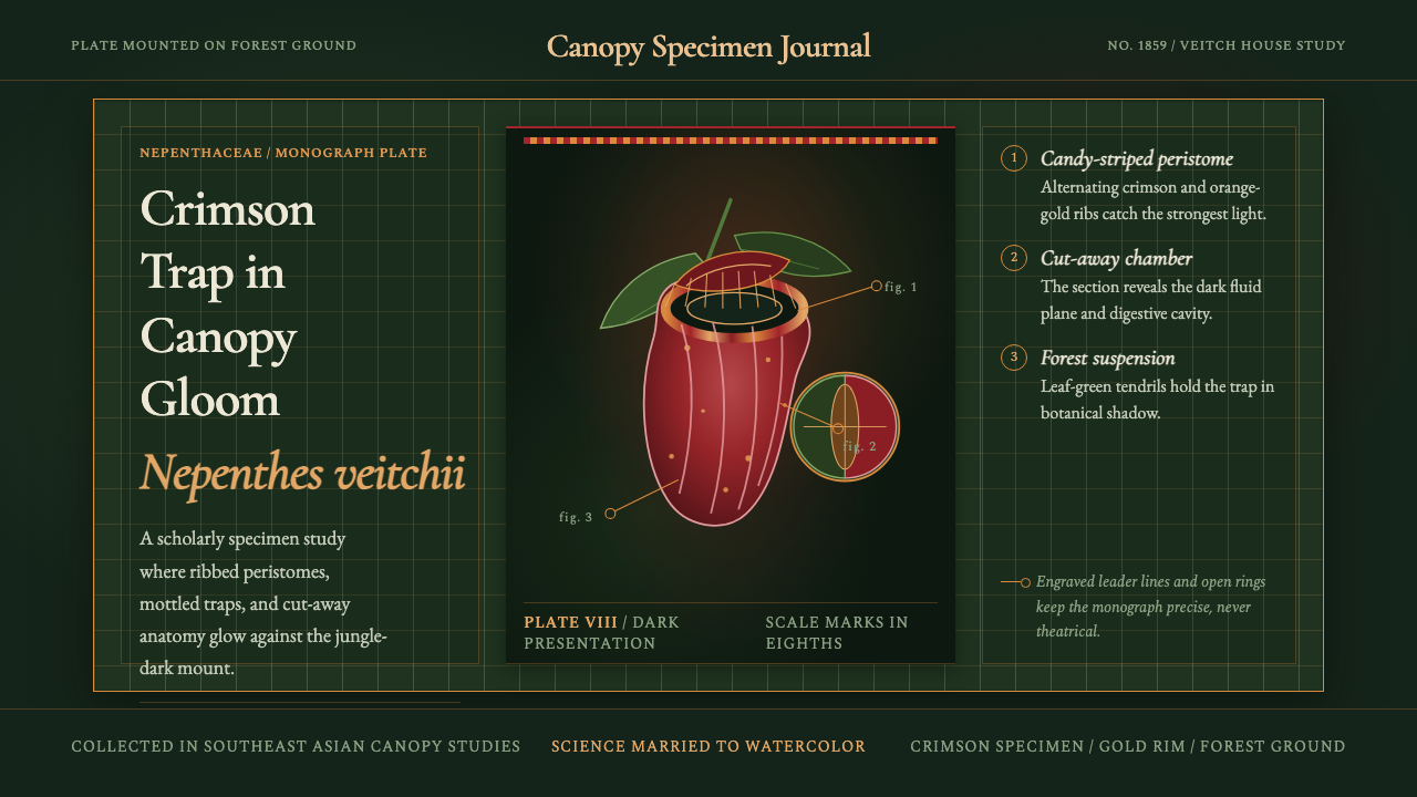 Carnivorous Pitcher PlantBotanical danger glows. Crimson traps and gold rims float on jungle-dark gree…
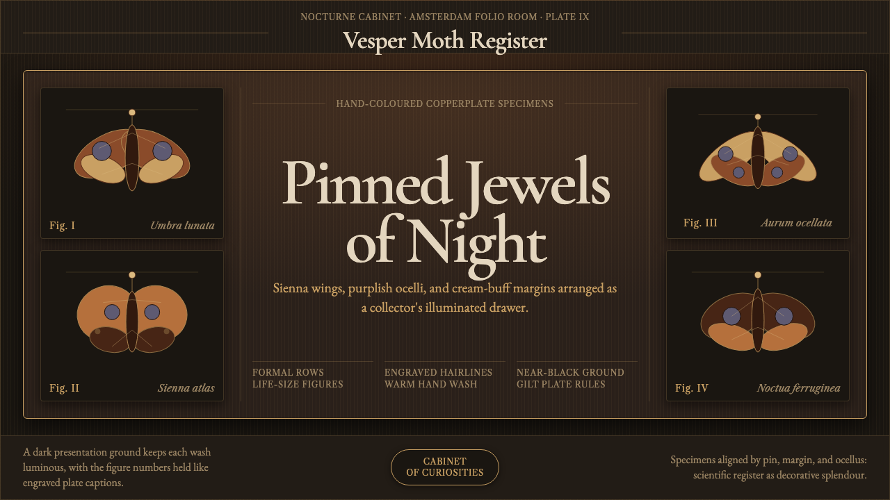 Cramer Exotic MothsJewel-like precision. Sienna specimens glow in formal rows on a near-black pl…
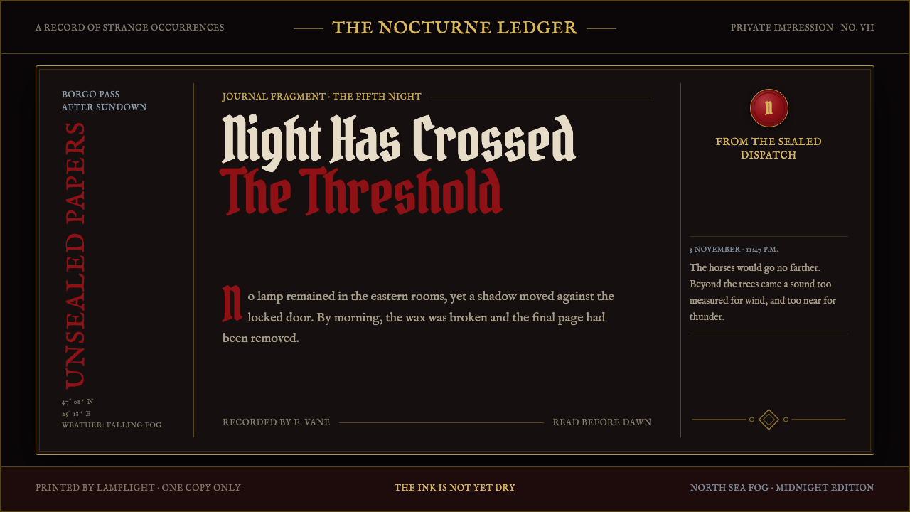 Dracula Gothic (1897)Victorian dread after dark. Blood-red initials and tarnished gilt haunt coffi…
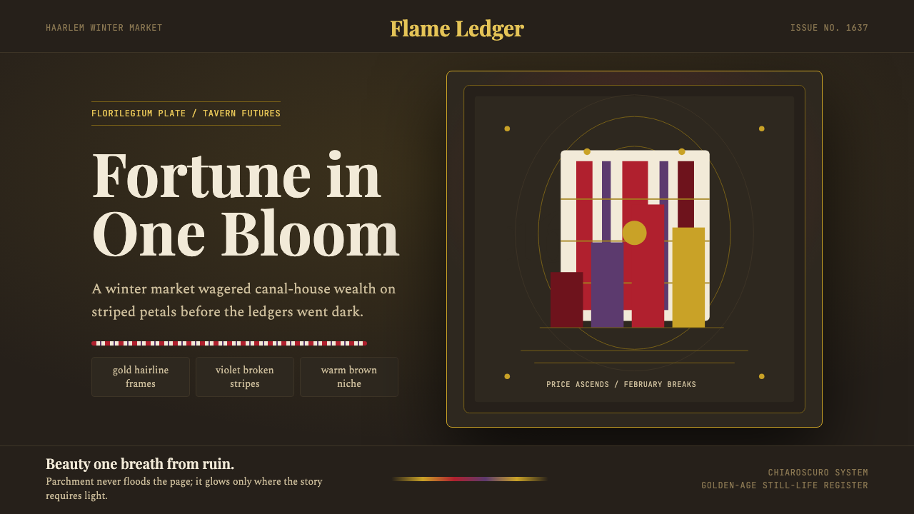 Dutch Tulip ManiaSpeculation burns in shadow. Flame red petals, violet stripes, gold frames on…