What is Dutch Tulip Mania?
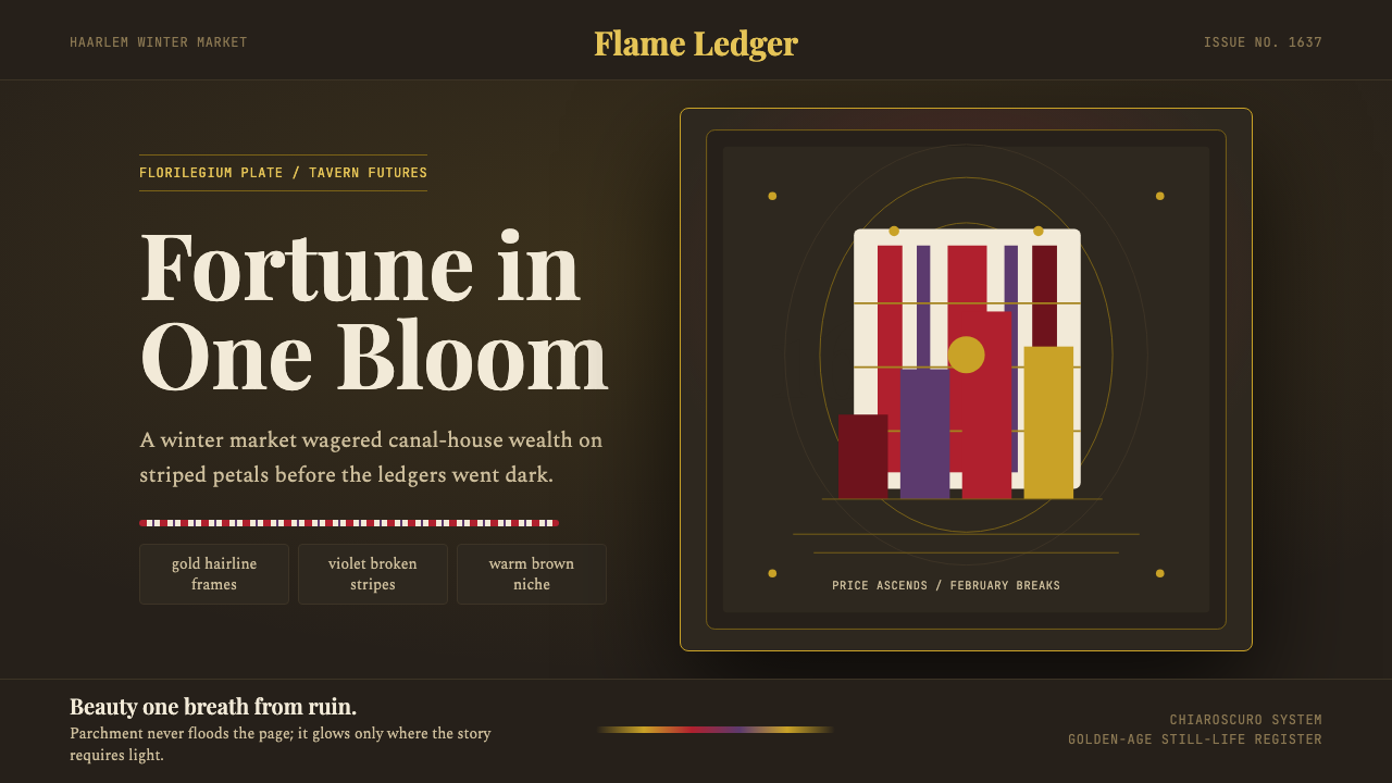
Dutch Tulip Mania translates the most celebrated speculative fever in history into a visual language rooted in Golden-Age oil painting — deep chiaroscuro shadows, flame-struck petals, and the luminous restraint of objects painted as if they might not survive the week.
Dutch Tulip Mania in brief
Dutch Tulip Mania is a design system rooted in the visual culture of the Dutch Golden Age, specifically the still-life tradition of the 1620s to 1660s. Its palette is theatrical and concentrated: a near-black warm-brown ground evokes the shadowed niches behind the flower arrangements in works by Hans Bollongier and Ambrosius Bosschaert, while flame red, feathered violet, deep foliage green, and burnished gold emerge from that darkness with the authority of candlelight catching lacquered petals. Off-white parchment appears only as the color of blooms and written cards — never as a background tone filling the page.
The historical reference point is specific. At the peak of the tulip craze in the winter of 1636 to 1637, the most coveted specimens were 'broken' tulips — flowers infected with a mosaic virus that caused their petals to feather in dramatic flame and stripe patterns. These aberrant blooms became objects of obsessive speculative desire, changing hands through futures contracts called bloemisten before they even emerged from the ground. The visual system captures that paradox: the feverish desirability of something inherently fragile, made permanent through the painter's illusionism.
As a design aesthetic, this system belongs to a tradition of vanitas and still-life painting that treated luxury objects — tulips, pearls, oysters, overturned glasses of wine — as simultaneously seductive and transient. The visual tension between richness and shadow, between vivid color and dark ground, is not decorative but philosophical. Objects glow because they are impermanent. This gives the system a gravity and emotional complexity that separates it from more straightforwardly opulent historical styles.
Where does Dutch Tulip Mania come from?
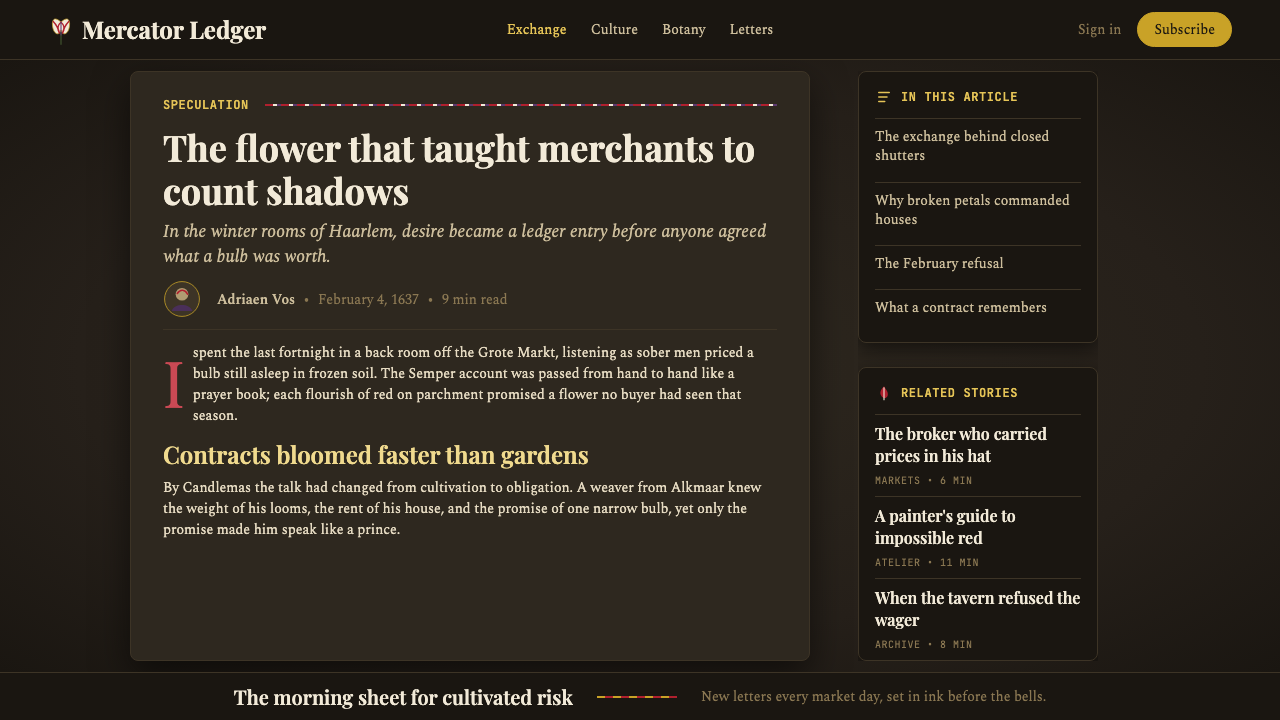
The tulip arrived in the Dutch Republic from Ottoman Turkey in the mid-sixteenth century, carried by the Flemish botanist Carolus Clusius, who planted the first specimens at the Leiden botanical garden around 1594. The flower was exotic, structurally unlike the flat-faced blooms familiar to northern European gardens, and its cultivation spread rapidly among wealthy merchants and collectors who prized it as a status object. By the 1620s, a secondary market in bulbs had formed, with prices beginning to reflect rarity, variety, and the unpredictable glamour of the broken color mutations caused by a mosaic virus — then unknown to growers — that had begun circulating through Dutch bulb stocks.
The market for tulip futures entered a speculative frenzy between 1634 and early 1637. During the winter of 1636 to 1637, contracts for unplanted bulbs were traded in tavern futures markets, with individual bulbs of the most prized varieties — Semper Augustus with its white petals slashed in red, Viceroy, and Admiral van Enkhuizen — fetching sums equivalent to the annual salary of a skilled craftsman or, in the most extreme recorded cases, the price of a well-situated house on an Amsterdam canal. In February 1637, buyers stopped appearing at contract auctions. Within weeks, bulb prices collapsed to a fraction of their peak, ruining many of those who had borrowed against their holdings.
The Dutch Golden Age still-life painting tradition — which had been developing since the late sixteenth century in Antwerp and Middelburg before migrating north — provided the dominant visual language for tulip culture. Painters like Ambrosius Bosschaert the Elder specialized in florilegia: detailed, botanically precise compositions that often depicted specimens from different seasons as if assembled together, arranged in Chinese porcelain vases against dark niches. Jan Davidsz. de Heem brought the tradition to its most sumptuous peak in the mid-seventeenth century, loading his compositions with rare blooms, dew drops, and the subtle interplay of reflected light on petals of varying textures.
The collapse of 1637 did not end the culture of tulip cultivation, which remained central to Dutch horticulture and commerce for centuries afterward. But it fixed the historical episode in memory as the archetypal cautionary tale of speculative excess — a narrative later elaborated by Charles Mackay in his 1841 book Extraordinary Popular Delusions and the Madness of Crowds, which popularized the term 'tulip mania' and gave the episode its enduring place in the vocabulary of economic history. The paintings outlasted the frenzy, freezing the perfection of the broken tulip at the moment before it could wilt.
What defines the Dutch Tulip Mania look?
Ground and Shadow
The defining quality of this system is its near-black warm-brown background — not a flat neutral but a depth that suggests the shadowed interior of a painted niche or cabinet shelf. Objects emerge from this darkness rather than sitting on top of a surface. The chiaroscuro contrast is the primary structural device: forms are defined by where light catches their edges, not by outlines. This gives the visual system its characteristic sense of drama without theatricality — the shadows are not decorative but spatial.
Flame and Feather Color
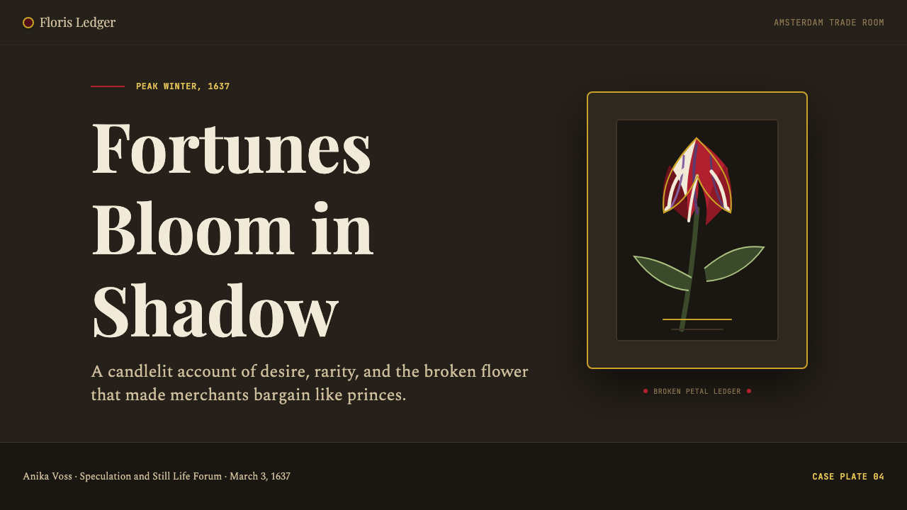
The signature palette is organized around the visual phenomenon of the broken tulip: flame red feathered with white, petals streaked and banded in violet-purple, foliage rendered in deep hunter green. Gold and burnished amber appear as framing elements — vase rims, stamens, the gilded edges of cards and labels. This palette is warm throughout: there are no cool blues or stark whites in the primary register. The warmth is intensified by the dark ground, which makes the reds and golds appear to glow from within rather than reflect light from without.
Botanical Precision
Dutch Golden-Age florilegium painters were not working from imagination but from direct specimen study, sometimes depicting varieties that existed only as single bulbs. This observational precision — the distinct curl of a petal edge, the precise angle of a stamen, the way a leaf bends under its own weight — is a defining characteristic of the aesthetic. In contemporary application, this translates to a preference for detailed, carefully observed visual elements over simplified or abstracted ones. Ornamentation, when it appears, is earned by its specificity rather than its quantity.
Luminosity Through Contrast
The Golden-Age still-life painters achieved luminosity not by using bright pigments but by placing vivid colors against deep shadows. A flame-red tulip appears incandescent not because the red is especially intense but because it is surrounded by near-black. This principle — luminosity through contrast rather than through inherent brightness — governs the entire system. Accents and focal points should be kept to a small surface area and surrounded by dark or deep-toned fields. Distributing the brightest colors across a large area destroys the effect.
Layered Texture and Material Richness
The still-life tradition excelled at representing different surface qualities within a single composition: the matte interior of a petal, the specular highlight on a glass vase, the soft bloom of a velvet surface, the cool reflectiveness of porcelain. This layering of material qualities — each rendered with its own characteristic treatment of reflected light — gives the style its sense of physical weight and presence. In design application, this translates to a deliberate differentiation of surface treatments rather than a uniform material tone across all elements.
Vanitas Restraint
Beneath the visual richness, Golden-Age still-life painting carried a memento mori undertone — the reminder that beauty is temporary, that the flower will wilt, that wealth can collapse overnight as the tulip market itself demonstrated. This philosophical register inflects the aesthetic with a quality of seriousness and intentionality that prevents it from becoming mere decoration. The darkness is not just a compositional device but a statement about impermanence. This gravity distinguishes authentic applications of the style from imitations that borrow the palette without understanding its weight.
Gold and Precious Framing
Gold appears throughout the Golden-Age still-life tradition not as background fill but as accent and structural frame — the gilded rim of a Chinese export-ware vase, the stamens at the center of a bloom, the embossed lettering on a card tucked among the flowers. This use of gold as a precise, localized accent (rather than a diffuse warmth spread across all elements) is essential to the system's sense of refinement. Gold should punctuate, not wash. Applied too broadly, it reads as excess rather than elegance.

Who shaped Dutch Tulip Mania?
Bosschaert (1573–1621) was the founding figure of Dutch flower painting and among the first artists to make the tulip a primary subject of systematic still-life composition. Working in Middelburg and later Utrecht, he developed the characteristic arched-window or niche format that would define the genre: a symmetrical bouquet arranged in a glass or ceramic vessel against a window or dark recess, with individual specimens given space to display their full botanical character. His work established the representational conventions that would govern tulip portraiture for a generation, and his three sons continued the tradition after his early death.
Bollongier (c.1600–c.1672) worked in Haarlem during the height of the tulip craze and produced several of the most botanically specific and commercially informed tulip compositions to survive from the period. His 1639 floral still-life in the Rijksmuseum, painted after the crash, shows varieties that would have been worth extraordinary sums just two years earlier. Bollongier's work demonstrates the relationship between the painting tradition and the commercial market: his compositions were not merely decorative but functioned as documentation of rare and valuable specimens, a visual inventory of the collector's world.
De Heem (1606–1684) worked in Utrecht and Antwerp and brought the Dutch floral still-life to its most sumptuous expression, combining the botanical precision of the Haarlem tradition with the richer, more theatrical chiaroscuro of Flemish painting. His compositions introduce greater complexity of surface — the interplay of matte and specular finishes, the weight of overripe fruit against the lightness of petals — and push the vanitas undertone toward greater philosophical explicitness. His influence extended across generations of still-life painters throughout the seventeenth and eighteenth centuries.
Not a person but a tulip variety — the single most celebrated and expensive specimen of the entire mania. Semper Augustus was a broken tulip of extraordinary beauty: white petals slashed and feathered with deep carmine-red stripes in a pattern that appeared almost painted. At the height of the market, a single Semper Augustus bulb reportedly changed hands for thousands of guilders — enough to purchase a prime Amsterdam canal house. The variety effectively became the symbol of the entire episode: the paradox of a disease-caused accident of nature being transformed into the most desired luxury object of its age.
Clusius (1526–1609) was the Flemish botanist who introduced the tulip to northern European cultivation and created the conditions for the mania that would erupt decades after his death. As director of the Leiden botanical garden from 1593, he cultivated specimens sent from the Ottoman court and worked to understand bulb propagation and the causes of the color variations that would later become so commercially valuable. His scholarly interest in botanical documentation — he published the first detailed European account of the tulip in 1601 — established the link between scientific observation and aesthetic appreciation that would characterize the Golden-Age still-life tradition.
How do you use Dutch Tulip Mania today?
Dutch Tulip Mania is a high-drama historical style that rewards deliberate application. It works best when the product or communication has genuine weight — a premium offering, a historically inflected brand, an anniversary or commemorative context, or any context where the values of refinement, rarity, and considered impermanence serve the message. It is not a neutral or approachable style; it makes a strong claim on the viewer's attention and implies a certain seriousness of purpose.
For presentation slides, the system works most powerfully on cover and section divider pages. A cover built on a deep warm-brown or near-black ground with a single bold floral or botanical motif — positioned asymmetrically, occupying roughly a third of the frame — and a title set in warm off-white or gold-toned type creates an immediate sense of occasion. Content slides should be treated sparingly: dark grounds with light type, limited color accents, and generous negative space. Avoid the temptation to fill content slides with the same visual richness as the cover; the drama of the system depends on restraint in the interior pages. Data slides can adopt a dark-field approach with flame-colored accent lines and bars against the near-black ground, treating each data series as if it were a botanical specimen given its own precise identity.
For web interfaces, this system suits premium e-commerce, luxury editorial, auction or gallery platforms, and any context where the product being presented is positioned as rare or curated. The dark warm-brown background works exceptionally well for product photography: objects lit against dark grounds appear to have the same luminous quality as Golden-Age paintings. Navigation should be restrained — typographic only, with gold or warm-white accents reserved for active states. Interactive elements that signal rarity or exclusivity (limited availability, premium tier badges, invitation-only labels) translate naturally into the gold-accent vocabulary of the system.
For editorial and marketing work, the style supports long-form immersive layouts — the kind where a reader is meant to slow down rather than scan. Section headers in warm off-white against a dark ground, body text in a warm off-white on deep brown, pull quotes treated as if they were inscribed on velvet — all translate the still-life's sense of careful observation into typographic form. Marketing campaigns for cultural institutions, fine wine or spirits brands, high-end floristry, or any product where provenance and artisanal specificity are primary selling points find the system a natural fit.
The most common mistake when applying this style is reversing the ground-to-accent ratio: spreading flame reds and golds across a large area rather than concentrating them as points of luminosity against a dark field. The entire logic of the Golden-Age still-life depends on the dark ground making accents glow; remove the dark ground and replace it with a light neutral, and what remains is a conventional floral pattern with no emotional weight. The second common mistake is treating the gold as a warm yellow fill color. Gold in this system is always metallic and precise — a rim, a stroke, an edge — not a tonal wash. When gold starts functioning as background color, the system's sense of restraint collapses.
Dutch Tulip Mania — FAQ
Is this style historically accurate to seventeenth-century Dutch painting, or is it a modern interpretation?
It is a design system inspired by and rooted in the visual conventions of Golden-Age Dutch still-life painting, not a literal reproduction of historical works. The color relationships, the approach to dark grounds, the logic of luminosity through contrast — these are faithfully derived from the source tradition. But a seventeenth-century painting is an object made with oil on panel or canvas; applying those visual principles to digital interfaces, type, or slides necessarily involves interpretation. The goal is fidelity to the visual logic rather than period accuracy, and understanding this distinction helps avoid both slavish imitation and casual misappropriation.
How does this system differ from other dark, rich historical styles like Victorian or Baroque?
The key differentiators are botanical specificity and the philosophy of earned luminosity. Victorian dark aesthetics tend toward ornamental density — pattern fills, repeated motifs, the horror vacui approach to surface decoration. Baroque styles often emphasize dynamic movement and grand compositional sweep. Dutch Golden-Age still-life is quieter: the drama comes from stillness, from the concentration of light on a small number of precisely rendered objects against deep shadow. There are no flowing curves or dynamic diagonal lines; the composition is stable, even solemn. The warmth of the palette is the warmth of candlelight, not of a summer garden.
Can this style work on a light background, or is the dark ground essential?
The dark ground is not incidental — it is structurally essential to how the system achieves its characteristic luminosity. A parchment or warm cream ground can work for subsidiary elements such as text fields, cards, or pull quotes, where it evokes the florilegium illustration tradition rather than the oil painting one. But a layout built primarily on a light background loses the defining quality of the system: objects no longer appear to glow from within shadow, and the palette reads as autumn-warm-toned rather than Golden-Age-still-life. If the context absolutely requires a light background, the style should be understood as borrowing the botanical and palette vocabulary of the tradition without fully inhabiting its logic.
How should typography be handled in this system, given that the historical tradition was painting rather than type-based?
Because the historical source is painting rather than graphic design, the system does not prescribe a specific typographic tradition in the way that, say, Bauhaus or Swiss Style do. The approach that best serves the system's values is old-style or transitional serif type — letterforms with bracketed serifs, varying stroke weight, and a calligraphic quality that connects them to the manuscript and engraving traditions of the period — set in warm off-white or gold against the dark ground for display uses. For digital readability, a high-contrast version of the warm-off-white-on-dark approach works for body text. What the system demands above all is type that does not feel industrial or modernist: the humanity of the letterform matters here.
The tulip mania ended in financial ruin for many people. Is there a risk that using this style feels tone-deaf in commercial contexts?
The risk is real but manageable. The system draws its visual language from the painting tradition surrounding the event, not from the speculative crash itself. The association with financial ruin is an intellectual and historical one, not a visual one — few viewers will experience a flame-red tulip on a dark ground and immediately think of seventeenth-century futures contracts. Where the association does matter is in brand positioning: products or services that explicitly connect to themes of investment, risk, or financial speculation should probably avoid this aesthetic precisely because of the historical resonance. For luxury goods, premium cultural experiences, artisanal or horticultural brands, and historical institutions, the association with Golden-Age refinement vastly outweighs the cautionary tale.
Related design styles
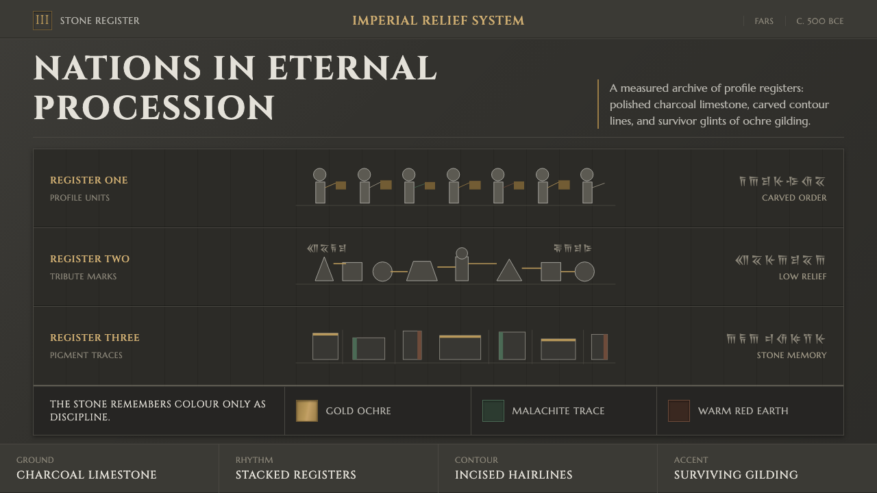 Achaemenid Persepolis ReliefImperial restraint in stone. Charcoal registers carry ochre, green, and red p…
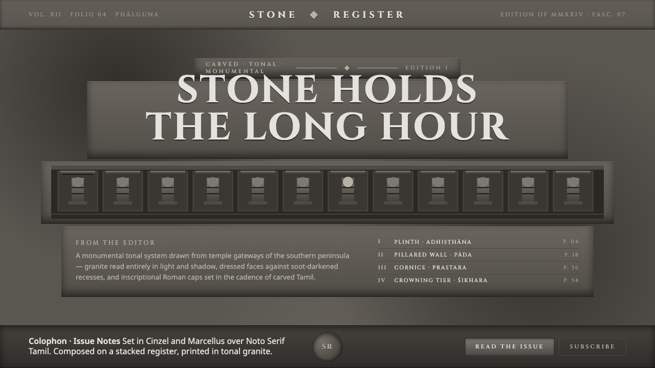 Dravidian Granite GrayscaleRead entirely in grayscale. Soot-dark recesses against dressed granite, Cinze…
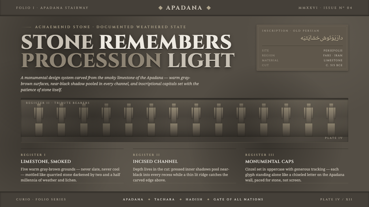 Persian Gray Stone ReliefStone remembers. Smoky weathered limestone, near-black shadow in every channe…
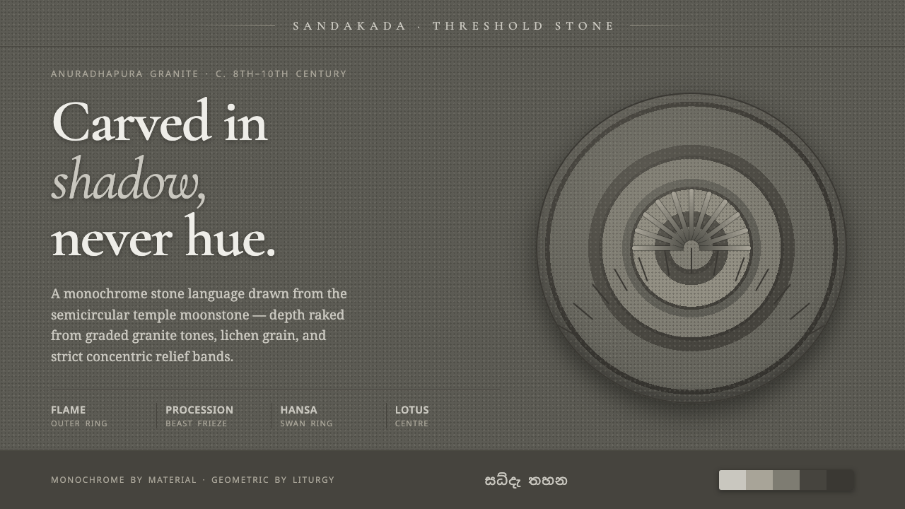 Sandakada Pahana MoonstoneDepth carved from shadow, never hue. Weathered-granite grays in concentric mo…
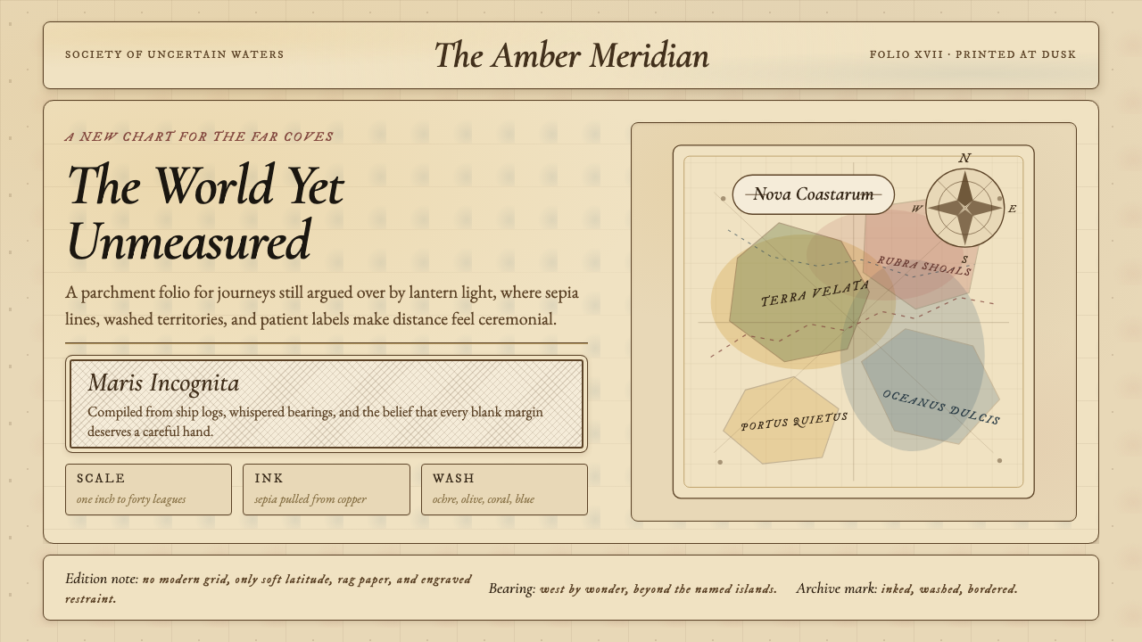 Vintage CartographyDiscovery feels ceremonial. Sepia copperplate on aged parchment, framed by co…
 Assyrian Lamassu ReliefAuthority carved into silence. Buff-gray stone, monumental capitals, and cune…