Design style guide设计风格指南
What is Cambodian Angkor Bas-Relief?什么是 Cambodian Angkor Bas-Relief?
Carved into half a mile of sandstone over nine centuries ago, the bas-reliefs of Angkor Wat constitute the longest continuous narrative frieze in the world — a visual archive of empire, cosmology, and human procession that still sets the terms for one of the most distinctive design sensibilities in Southeast Asia.九百年前刻入半英里砂岩的吴哥窟浮雕,是世界上最长的连续叙事带饰——一部帝国、宇宙论与人类行列的视觉档案,至今仍界定着东南亚最独特的设计语境之一。
Cambodian Angkor Bas-Relief in briefCambodian Angkor Bas-Relief 速览
Cambodian Angkor Bas-Relief is a design aesthetic rooted in the visual language of the twelfth-century Khmer temple complex at Angkor — specifically in the sandstone carvings that line its outer galleries in unbroken frieze across nearly all four cardinal walls. The aesthetic channels the particular quality of light and stone that archaeologists and photographers have spent a century documenting: olive-shadowed registers of carved figures caught in raked torchlight, a muted ochre ground wearing centuries of monsoon patina, and a reserved use of golden or amber tone reserved exclusively for deities, royalty, and figures of highest rank.柬埔寨吴哥浮雕是一种植根于十二世纪高棉寺庙建筑群视觉语言的设计美学——尤其取自几乎贯穿四面外廊、连绵不断的砂岩雕刻带饰。这种美学汲取了考古学家与摄影师百年来记录的特殊光影与石质:斜光下显现的苔绿暗影层叠人物、历经季风侵蚀的暗赭底色,以及专门保留给神灵、王族与最高等级人物的克制金色或琥珀调。
The visual grammar is deeply narrative and horizontal. Figures move in ordered procession across registers stacked one above another, each layer separated by a carved molding line that functions like a paragraph break in stone. Space is not illusionistic — there is no vanishing-point perspective, no modeled volume in the Western sense — but it is rigorously ordered. Importance is conveyed through scale: a king or deity appears several times larger than soldiers or attendants in the same register. Repetition is used expressively, with armies of carved warriors or celestial dancers extending for meters without loss of detail or ceremony.视觉语法深具叙事性与水平性。人物在叠置的横带中有序行进,每一层横带由一道刻入石中的线脚分隔,如同石头上的段落分行。空间并非幻觉式的——没有西方意义上的消失点透视,没有模拟体积感——但秩序严谨。重要性通过尺度传达:同一横带中,国王或神灵比士兵或侍从大上数倍。重复被用于表达——成列的武士或天界舞者延伸数米,始终不失细节或仪式感。
What makes the aesthetic distinctive in contemporary design terms is its register of mood: aged, archaeological, torchlit rather than spotlight-bright. Colors are muted to olive, amber, and deep antique shadow. There is visible grain — the sandstone's texture reads through every surface. The feeling is of a record walked-by-torch through a temple corridor, not a cleaned-up photograph taken for a tourist brochure. This quality — granular, narrative, low-key in luminosity — is what the design system distills from the source and makes transferable.这种美学在当代设计语境中的独特之处,在于其情绪气质:陈年的、考古式的、火把照亮而非聚光灯刺白。色彩被压缩至苔绿、琥珀与深邃的古色阴影。可见的颗粒感无处不在——砂岩的质地从每一个表面透出来。那是一种持火把行走于寺庙回廊时留下的记录感,而非为旅游手册清洁处理过的照片。正是这种颗粒性、叙事性与低亮度的品质,是该设计系统从源头提炼并使之可移植的核心。
See the Cambodian Angkor Bas-Relief design system →查看 Cambodian Angkor Bas-Relief 完整设计系统 →
Where does Cambodian Angkor Bas-Relief come from?Cambodian Angkor Bas-Relief 从何而来?
Construction of Angkor Wat began around 1113 under King Suryavarman II of the Khmer Empire and was largely complete by around 1150 — a span of roughly four decades during which thousands of stone carvers worked under royal commission to produce the most elaborately decorated temple complex the medieval world had yet seen. The outer galleries alone contain approximately seventeen hundred square meters of bas-relief, depicting scenes from Hindu cosmology — the Churning of the Ocean of Milk, the Battle of Lanka, the Heaven and Hell frieze — alongside historical records of Suryavarman II's own military campaigns and royal court. These carvings were not decorative flourishes applied to a finished building; they were the narrative program of the building itself, making the temple a legible cosmological text as much as an architectural monument.吴哥窟的建造始于高棉帝国苏利耶跋摩二世国王约1113年的授命,主体工程大约于1150年完工——在约四十年间,数千名石雕匠人奉王室之命劳作,创造出中世纪世界迄今所见最精细的装饰性寺庙建筑群。仅外廊部分就包含约一千七百平方米的浮雕,描绘印度教宇宙论场景——搅拌乳海、楞伽岛之战、天堂与地狱带饰——以及苏利耶跋摩二世本人军事征战与王廷生活的历史记录。这些雕刻并非施于完工建筑之上的装饰点缀,而是建筑本身的叙事纲领,使寺庙同时成为可读的宇宙论文本与建筑纪念物。
The Khmer carving tradition drew on techniques developed across centuries of earlier temple building throughout the Angkor region. Relief sculpture at Angkor is shallower than classical Indian models but more densely populated: figures are typically carved to a depth that allows raked torchlight to produce a strong shadow line at their edges, while the surrounding ground is recessed just enough to separate the carved figure from the stone without creating deep undercutting. This technique is precisely calibrated to the conditions of interior gallery lighting — low, horizontal, moving — so that the reliefs are most legible when lit by a source moving along the wall rather than by overhead ambient light. The aesthetic of 'torchlit stone' that contemporary designers work with is thus not a historical accident but a deliberate optical engineering decision.高棉雕刻传统汲取了吴哥地区数百年寺庙建造史中积累的技艺。吴哥的浮雕比古典印度模型更浅,但人物更为密集:人像通常雕刻至一定深度,使斜射的火光能在其轮廓处产生强烈的阴影线,同时背景凹陷程度恰到好处——足以从石面中分离出雕刻人物,却不至于形成深层镂空。这种技法针对内廊采光条件——低角度、水平方向、移动光源——进行了精确的光学工程计算,使浮雕在光源沿墙面移动时比在顶部漫射光下更为清晰易读。当代设计师所借用的「火把照亮的石头」美学,因此并非历史的偶然,而是蓄意的视觉工程决策。
After the decline of the Khmer Empire in the fifteenth century and the abandonment of Angkor as a capital, the temples passed into the stewardship of local Theravada Buddhist monks and were never entirely forgotten — though they were largely unknown to the outside world until the French naturalist Henri Mouhot's widely published 1860 account of his visit brought them to European and American attention. Mouhot's descriptions and drawings initiated a century of French scholarly and archaeological engagement with Angkor, culminating in the systematic documentation and partial restoration work carried out by the École française d'Extrême-Orient throughout the late nineteenth and twentieth centuries. The visual language of Angkor as it is known in contemporary design — muted, granular, archaeological — was substantially shaped by the EFEO's photographic archive: black-and-white and muted-tone photographs shot under the particular conditions of gallery lighting, emphasizing texture and shadow over color.十五世纪高棉帝国衰落、吴哥作为国都被废弃之后,寺庙的守护权转交当地南传佛教僧侣,始终未被彻底遗忘——尽管直到法国博物学家亨利·穆奥1860年广泛传播的访问记述,才将其带入欧美视野。穆奥的描述与绘图开启了法国学界与考古界对吴哥的世纪性介入,并以法国远东学院在十九世纪末至二十世纪进行的系统记录与局部修复工作为顶峰。吴哥视觉语言在当代设计中所呈现的形态——低沉、颗粒化、考古式——在很大程度上由法国远东学院的摄影档案所塑造:在回廊采光特殊条件下拍摄的黑白与低饱和色调照片,强调质感与阴影,而非色彩。
Two figures stand apart in the modern engagement with the Angkor visual tradition. Vann Molyvann, Cambodia's most influential twentieth-century architect, absorbed the horizontality and stone-register language of Khmer classical architecture into a modernist idiom during Cambodia's post-independence New Khmer Architecture movement of the 1950s and 1960s. His buildings transpose the stacked horizontal register of bas-relief panels into concrete brise-soleils, colonnades, and water features that echo the proportions of Angkor without directly quoting its ornament. This abstracted inheritance — Khmer structure without Khmer decoration — is a model for how the design aesthetic can be applied without pastiche. The UNESCO World Heritage designation of Angkor in 1992 also marks a significant turning point: it began a phase of systematic international conservation that produced the high-quality photographic documentation on which contemporary design references draw most heavily.在现代对吴哥视觉传统的承续中,有两位人物格外值得一提。柬埔寨二十世纪最具影响力的建筑师万·莫利万,在1950至60年代柬埔寨独立后的「新高棉建筑」运动中,将高棉古典建筑的水平性与石料层带语言融入现代主义词汇。他的建筑将浮雕面板叠置横带的比例关系转化为混凝土遮阳板、柱廊与水景,呼应吴哥的比例而不直接引用其装饰。这种抽象化的传承——高棉结构而非高棉装饰——为如何在不沦为仿古的前提下应用这种设计美学提供了范本。1992年吴哥入选联合国教科文组织世界文化遗产,也标志着一个重要转折点:由此开启的系统性国际保护工作产生了大量高质量摄影文献,成为当代设计参考最为倚重的视觉资料来源。
What defines the Cambodian Angkor Bas-Relief look?Cambodian Angkor Bas-Relief 的视觉特征是什么?
Muted Olive and Earth Palette低沉苔绿与大地色板
The palette is anchored in the colors of monsoon-darkened sandstone: deep olive greens, dusty ochre, and warm amber, with the darkest registers reserved for shadow channels between carved figures. This is not a palette of vivid natural greens or bright yellows — it is specifically the color of stone that has been worn, stained by centuries of moisture, and photographed under diffuse gallery light. Antique gold, used sparingly, marks figures and objects of highest status. White or cream never appears at high brightness; even the lightest surfaces carry a warm, aged cast.色板锚定于季风侵蚀后的砂岩色彩:深沉苔绿、满是尘埃的赭黄,以及温暖的琥珀调,最深的色域留给雕刻人物之间的阴影槽。这不是鲜亮自然绿或明艳黄的色板——它特指那种经年磨损、被数百年湿气染色、在漫射回廊光线下被拍摄的石材颜色。古金调被克制地用于标示最高等级的人物与器物。白色或奶油色从不以高亮度出现;即便是最浅的表面也带有温暖的岁月色泽。
Horizontal Register Composition水平横带构图
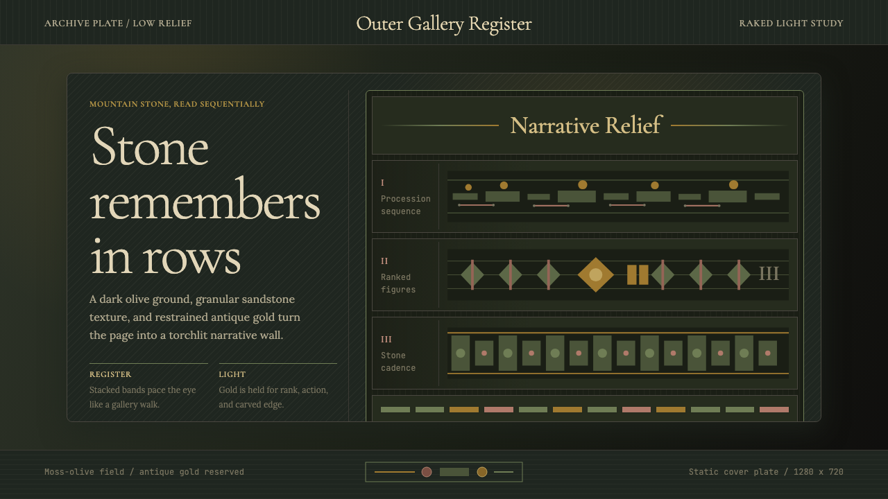
Layouts are organized in stacked horizontal registers, each one a self-contained narrative band separated from adjacent registers by a carved molding line or a narrow gap of negative space. Within each register, figures are aligned to a shared baseline, creating the sense of a frieze that extends indefinitely in both directions. The register system imposes visual order on extremely complex narrative content: armies, processions, and crowd scenes become legible because every figure belongs to a clearly assigned horizontal layer. This principle translates directly to multi-row content grids, timelines, and table-based layouts.版面以叠置水平横带组织,每一横带都是独立的叙事层,由刻入石中的线脚或窄负空间与相邻层分隔。在每一横带内,人物对齐于共同基线,造成带饰可向两端无限延伸的感觉。横带系统对极其复杂的叙事内容施加了视觉秩序:军队、行列与群体场景因每一人物都归属于明确的水平层而变得清晰可读。这一原则可直接转译为多行内容网格、时间线与表格式版面。
Scale as Hierarchy尺度即等级
Status and importance are communicated entirely through the relative scale of figures, not through color differentiation, position on the page, or typographic weight. A king may be carved twice the height of his generals; a deity towers over all mortals in the same register. This hierarchy-through-scale principle is both ancient and rigorously effective: it requires no color coding, no labels, and no legend. Applied to contemporary design, it suggests that the most important element on a page should simply be the largest one — and that a layout in which everything is the same size has no hierarchy at all.地位与重要性完全通过人物相对尺度传达,而非依赖色彩区分、页面位置或字重变化。国王的雕刻高度可达将领的两倍;神灵在同一横带中凌驾于所有凡人之上。这种以尺度传达等级的原则既古老又严格有效:它不需要色彩编码、标签或图例。应用于当代设计,它暗示:页面上最重要的元素应当只是最大的那个——而一个所有元素等高等大的版面,其实毫无层级。
Visible Grain and Texture可见颗粒与质感
Unlike polished marble or glazed ceramic traditions, Angkor sandstone is a warm, granular material whose surface texture remains visible in every carved face, ground plane, and transition zone. The design aesthetic preserves this grain quality: backgrounds are not clean, smooth, or neutral in the digital-neutral sense, but carry a visible, slightly uneven surface that reads as aged stone. This grain is not noise — it is a tonal carrier that gives depth to flat surfaces without requiring modeled shadows or gradient fills.与抛光大理石或上釉陶瓷传统不同,吴哥砂岩是一种温润、颗粒性的材料,其表面质感在每一张雕刻的面孔、每一个地面平面与每一个过渡区域中都清晰可见。该设计美学保留了这种颗粒品质:背景不是数字化意义上的洁净、光滑或中性,而是带有可见的、略显不均的表面,使人联想到风化的石头。这种颗粒感不是噪点——它是一种色调载体,无需模拟阴影或渐变填充,即可赋予平面以深度。
Raked Shadow Logic斜光阴影逻辑
Angkor's carvings were designed to be read in torchlight moving horizontally along the gallery wall — a strong, low-angle, directional light source that produces crisp shadow at the edges of carved figures and leaves recessed ground planes in deep shade. The shadow is not ambient or diffuse; it is sharp, directional, and tied to a specific light angle. Design work in this aesthetic uses shadow in the same way: hard-edged, cast from a single consistent angle, used to separate figures or elements from their ground rather than to create volumetric depth. Soft, diffuse shadows are foreign to the visual system.吴哥浮雕的设计以沿回廊墙面水平移动的火光为阅读光源——一种强劲、低角度、有方向的光源,在雕刻人物边缘产生清晰阴影,将凹进的背景地面留在深邃的暗色中。这种阴影不是漫射的或环境性的;它是锐利的、有方向的,与特定光线角度相连。该美学中的设计作品以同样方式使用阴影:硬边、从单一固定角度投射、用于将人物或元素从背景中分离,而非创造体积深度。柔和漫射阴影对这套视觉系统而言是异质的。
Densely Populated Surface高密度人物铺面
Angkor bas-reliefs are not sparse or minimalist. They are dense with figures, bodies in motion, overlapping limbs, cascading drapery, and narrative detail that rewards extended looking. Negative space appears primarily as the background stone between register lines, not within the registers themselves. Applied to design, this quality suggests richness through density rather than through ornamental complexity — it is the density of information, event, and figure rather than the density of decorative pattern. The key is that the density is ordered by the register system, so it reads as abundance rather than clutter.吴哥浮雕并不稀疏,也非极简。它们密布人物、运动中的身体、相互叠压的肢体、层叠的衣褶,以及值得长久凝视的叙事细节。负空间主要出现在横带线之间的背景石面,而非横带内部。应用于设计,这种品质暗示通过密度而非装饰复杂性来营造丰富感——这是信息、事件与人物的密度,而非装饰图案的密度。关键在于,这种密度由横带系统加以秩序化,因此读来是丰盛而非杂乱。
Archaeological Restraint in Finish考古式克制的表面处理
Contemporary photographs of Angkor — particularly those from the EFEO documentary archive — share a specific tonal restraint: muted highlights, compressed shadows, no specular reflections, no punchy saturation. The temples were not built to glitter; they were built to endure and to narrate. Design work in this aesthetic should carry the same restraint in surface treatment: no high-gloss finishes, no neon brightness, no aggressive contrast ratios. The visual language operates in the mid-tones, with brightness reserved for the most important narrative element in a composition, just as gold was reserved for deities.吴哥的当代摄影——尤其是法国远东学院文献档案中的那些——共享一种特定的色调克制:柔和的高光、收紧的阴影、无镜面反射、无强冲饱和度。这些寺庙的建造不是为了闪耀,而是为了耐久与叙事。该美学中的设计作品应在表面处理上保持同等的克制:无高光泽表面,无霓虹亮度,无强烈对比比率。视觉语言在中间调区域运作,亮度仅保留给构图中最重要的叙事元素——正如金色仅保留给神灵。

See the Cambodian Angkor Bas-Relief design system →查看 Cambodian Angkor Bas-Relief 完整设计系统 →
Who shaped Cambodian Angkor Bas-Relief?谁塑造了 Cambodian Angkor Bas-Relief?
The Khmer king who commissioned Angkor Wat's construction beginning around 1113, Suryavarman II appears in the bas-reliefs themselves — identifiable by his elevated scale relative to surrounding figures and by the ceremonial umbrella canopy depicted above him. He is depicted in one of the most celebrated panels conducting a royal audience and leading his army south toward the Cham enemy. His reign represents the political and artistic apex of the classic Khmer period and the moment at which the narrative bas-relief tradition achieved its most ambitious form.于约1113年授命建造吴哥窟的高棉国王,苏利耶跋摩二世本人出现在浮雕之中——以其相对周围人物的突出尺度和上方描绘的仪仗伞盖为辨识标志。其中一幅最著名的场景描绘他主持王廷觐见、率军南征占城。他的统治代表了古典高棉时期政治与艺术的顶峰,也是叙事浮雕传统达到其最宏大形式的时刻。
The late-twelfth-century king who expanded the Angkor complex into the walled city of Angkor Thom and commissioned the Bayon temple, with its extraordinary tower-tops bearing enormous carved stone faces. Jayavarman VII's building program was the last major phase of Khmer temple construction and shifted the aesthetic register from the solar, hierarchical grandeur of Angkor Wat toward a more encompassing symbolic presence — the faces of the towers look outward in all four directions simultaneously. His reign marks the transition from Hindu to Buddhist iconographic programs in Khmer monumental art.十二世纪末的国王,将吴哥建筑群扩展为吴哥通城墙城市,并授命建造以巨型石雕人面塔顶闻名的巴戎寺。阇耶跋摩七世的建造计划是高棉寺庙建设的最后一个重要阶段,将美学气质从吴哥窟太阳式、等级分明的宏伟转向一种更具包容性的象征存在——塔顶的人面同时向四个方向凝视。他的统治标志着高棉纪念性艺术从印度教向佛教图像纲领的过渡。
The French naturalist whose 1860 visit to Angkor and subsequent widely distributed accounts — including illustrations he drew on site — introduced the temples to European and American audiences. Mouhot died of fever in Laos in 1861, but his posthumously published travel narratives triggered the sustained French scholarly and archaeological interest in Angkor that would eventually produce the photographic archive on which the modern design aesthetic draws. His drawings, made under candlelight in the galleries, capture the same quality of low-angle illumination that characterizes the Angkor visual tradition.法国博物学家,1860年到访吴哥并发表广泛传播的记述——包括他在现场绘制的插图——由此将这些寺庙介绍给欧美受众。穆奥于1861年在老挝死于发热,但他身后出版的游记激发了法国学界与考古界对吴哥持久的兴趣,最终产生了现代设计美学所倚重的摄影档案。他在回廊烛光下绘制的插图,捕捉到了与吴哥视觉传统一脉相承的低角度光照品质。
Cambodia's foremost twentieth-century architect and the central figure of the New Khmer Architecture movement, Molyvann studied under Le Corbusier in Paris before returning to help design the built environment of newly independent Cambodia under Prince Sihanouk in the 1950s and 1960s. His buildings — including the National Sports Complex in Phnom Penh and the Chaktomuk Conference Hall — translate Khmer classical proportions, horizontal stacking, and the play of strong light against shadow into a modernist concrete vocabulary. He represents the most distinguished example of absorbing the Angkor visual tradition without replicating it.柬埔寨二十世纪最重要的建筑师,新高棉建筑运动的核心人物。万·莫利万曾赴巴黎师从勒·柯布西耶,此后回国参与设计1950至60年代独立后柬埔寨在西哈努克亲王治下的建成环境。他的建筑——包括金边国家体育馆与查道摩克会议厅——将高棉古典建筑的比例关系、水平叠置与强烈光影对比转化为现代主义混凝土词汇。他代表着在不复制吴哥视觉传统的前提下,对其进行最杰出承续的范例。
A French archaeologist and artist who spent much of his career at Angkor in the early twentieth century under the auspices of the École française d'Extrême-Orient. Groslier produced systematic photographic documentation of the bas-reliefs and wrote the first detailed analytical studies of Khmer decorative art, including the register system and the carving techniques specific to Angkor. His photographic work — made under natural gallery lighting conditions — established the tonal and compositional conventions for representing Angkor that later documentary photographers and, eventually, contemporary designers would inherit.法国考古学家与艺术家,二十世纪初在法国远东学院的主持下在吴哥工作多年。格罗斯利耶对浮雕进行了系统性摄影记录,并撰写了关于高棉装饰艺术——包括横带系统与吴哥特有雕刻技法——的第一批详细分析研究。他在自然回廊光照条件下拍摄的摄影作品,确立了再现吴哥的色调与构图惯例,后来的纪录摄影师,以及最终的当代设计师,都在继承这一遗产。
How do you use Cambodian Angkor Bas-Relief today?今天怎么用 Cambodian Angkor Bas-Relief?
The Cambodian Angkor Bas-Relief aesthetic is well suited to design contexts where gravitas, narrative depth, and a sense of historical accumulation are desired — heritage and cultural institutions, premium editorial work, documentary presentation decks, hospitality branding in a heritage key, and any product that wants to signal that its content has weight and duration behind it. It is not a light aesthetic: the muted palette, visible grain, and torchlit register read as considered and archival, which means they work best when the subject matter genuinely warrants that seriousness.柬埔寨吴哥浮雕美学适合那些期望传达庄重感、叙事深度与历史积淀感的设计语境——文化遗产机构、高端编辑类作品、纪录片风格的演示文稿、遗产定向的酒店品牌,以及任何希望传递「其内容背后有分量与时间」的产品。这不是一种轻快的美学:低沉色板、可见颗粒感与火把照亮的横带层次,读来是经过深思熟虑的、存档式的,这意味着它在题材本身确实值得这种严肃性时效果最佳。
For presentation slides, the register system is the most directly applicable principle. A cover slide benefits from a full-bleed stone-textured background in the olive-to-amber range, with a title set in type that commands scale — large, high contrast, positioned like the king-figure in the dominant register. Section divider slides can use a narrow horizontal band across the middle of the frame, evoking the register-line of the carved frieze, with the section title placed within the band. Content slides should organize information in clear horizontal tiers — a headline register, a body-text register, and an optional data register — separated by thin ruled lines rather than white space alone. Data visualization works well in this aesthetic when charts are treated as carved panels: muted, textural fills rather than flat saturated color, with one amber or antique-gold accent to mark the most significant data point.在演示文稿中,横带系统是最可直接应用的原则。封面幻灯片适合以苔绿至琥珀调的全出血石质肌理背景呈现,标题以命令性尺度排版——大字、高对比度、定位如主横带中的王者人物。章节分隔幻灯片可在画面中部使用一道水平横带,唤起雕刻带饰的线脚感,章节标题置于横带之中。内容幻灯片应将信息组织为清晰的水平层——标题横带、正文横带与可选的数据横带——以细线脚而非单纯留白加以分隔。数据可视化在该美学中最有效的处理,是将图表视为雕刻面板:低沉的、有肌理的填充而非平涂饱和色,以一处琥珀或古金调标记最重要的数据点。
For web interfaces, the aesthetic is most appropriate for contexts where a premium, archival, or heritage signal is appropriate: museum and gallery sites, documentary platforms, cultural journalism, high-end hospitality booking interfaces, and luxury goods with an artisanal or historical identity. Dashboard and informational interfaces can use the horizontal register principle to organize content into clearly stacked rows, with the olive-and-earth palette providing visual cohesion without the brightness-for-engagement that most consumer interfaces rely on. Navigation and typographic elements should be set in deep antique tones, with amber reserved for the primary call-to-action, mirroring the way gold was reserved for divine and royal figures in the original carvings.对于网页界面,该美学最适合需要高端感、存档感或遗产感信号的语境:博物馆与画廊网站、纪录片平台、文化新闻、高端酒店预订界面,以及具有工艺或历史身份的奢侈品牌。仪表板与信息类界面可运用水平横带原则将内容组织为清晰叠置的行,苔绿与大地色板提供视觉凝聚力,而不依赖大多数消费类界面所倚重的「亮度促参与」策略。导航与字体元素应以深沉的古色调呈现,琥珀色保留给主要行动号召——呼应原始雕刻中金色仅用于神圣与王族人物的逻辑。
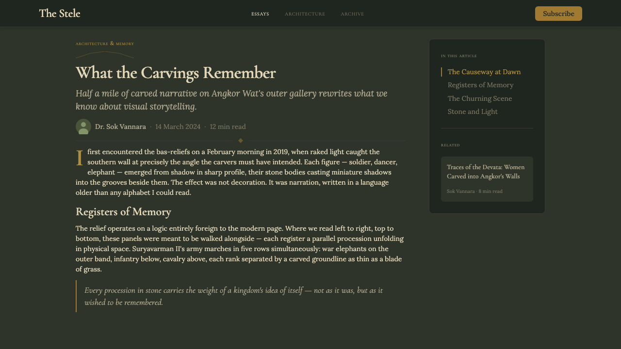
For editorial and marketing design, the aesthetic suits long-form content, annual reports, printed catalogues, and brand materials for institutions that want to communicate permanence. A Bas-Relief-derived editorial layout might use a wide outer margin that functions as a frieze boundary — a stone-colored field that frames the text column the way the carved molding lines frame each register at Angkor. Pull quotes and call-outs can be treated as large-scale figures in an adjacent register, set at a size that asserts their importance relative to surrounding body text. Photography, when used, should be treated with a muted, desaturated grade — shot in conditions that emphasize texture over vivid color — rather than cleaned up for maximum brightness.对于编辑与营销设计,该美学适合长篇内容、年报、印刷目录,以及希望传达持久性的机构品牌材料。吴哥浮雕衍生的编辑版面或许会使用宽外边距作为带饰边界——一个石色调区域,以吴哥横带线脚框住文字专栏的方式框住文字。引语与标注可被处理为相邻横带中的大尺度人物,以断言其相对于周围正文重要性的尺度设置。摄影图像若被使用,应以低沉的、降饱和度的调式处理——在强调质感而非鲜亮色彩的条件下拍摄或后处理——而非清洁至最大亮度。
A common mistake when working with this aesthetic is conflating 'ancient' with 'decorative'. Angkor Wat is not a decorative tradition in the sense of applied surface pattern; it is a narrative and structural tradition in which every element carries meaning and position. Overlaying lotus border motifs or generic 'Asian' pattern fills on an otherwise neutral layout is not Bas-Relief — it is a different register entirely. The correct move is structural: organize content in horizontal registers, let scale do the work of hierarchy, restrict color to the muted earth-and-shadow range, and trust that grain and torchlit shadow provide enough surface richness without any additional decorative layer.运用该美学时最常见的误区,是将「古代」与「装饰性」混为一谈。吴哥窟不是施用于表面图案意义上的装饰性传统;它是一种叙事性与结构性传统,其中每一个元素都承载意义与位置。在一个原本中性的版面上叠加莲花边框纹样或泛化的「亚洲」图案填充,并不是吴哥浮雕——那是完全不同的语域。正确的做法是结构性的:将内容组织为水平横带,让尺度承担等级传达的工作,将色彩限制在低沉的大地与阴影范围,并相信颗粒感与斜光阴影提供了足够的表面丰富性,无需任何额外的装饰层。
See the Cambodian Angkor Bas-Relief design system →查看 Cambodian Angkor Bas-Relief 完整设计系统 →
Cambodian Angkor Bas-Relief — FAQCambodian Angkor Bas-Relief · 常见问题
Is this aesthetic appropriate for digital products, or is it too 'ancient'?这种美学适用于数字产品吗,还是显得过于「古老」?
It is entirely appropriate for digital products, provided the product context supports a premium or heritage signal. The key is that Angkor's visual logic — horizontal registers, scale hierarchy, muted grain, directional shadow — is structural rather than decorative, and structural principles translate well across media. A dashboard built on register logic with an earth-tone palette reads as considered and trustworthy, not as ancient. The mistake to avoid is surface archaeology: applying ruin textures or lotus motifs without the underlying compositional logic. Structural Angkor reads modern; decorative Angkor reads costume.完全适用于数字产品,前提是产品语境支持高端感或遗产感信号。关键在于,吴哥的视觉逻辑——水平横带、尺度等级、低沉颗粒、定向阴影——是结构性的而非装饰性的,而结构性原则能很好地跨媒介转译。以横带逻辑与大地色板构建的仪表板,读来是经过深思熟虑的、值得信赖的,而非古旧的。需要避免的误区是表面考古学:在没有底层构图逻辑的情况下叠加废墟纹理或莲花纹样。结构性的吴哥读来是现代的;装饰性的吴哥读来是戏服。
How is this different from other Southeast Asian design traditions?这与其他东南亚设计传统有何不同?
Angkor Bas-Relief is distinguished from most other Southeast Asian visual traditions by its monochromatic register logic and archaeological tone. Thai and Burmese temple art, for example, tends toward high color saturation, gilded surfaces, and intricate multicolor mosaic — a visual richness that reads as celebratory and ornate. The Angkor tradition as it has been received through the EFEO photographic archive is instead muted, granular, and somber — the opposite of celebratory. It is also more horizontal and more narrative-dense than most Southeast Asian ornamental traditions, which tend to organize decoration in vertical towers or centralized medallions rather than in long horizontal friezes.吴哥浮雕与大多数其他东南亚视觉传统的区别,在于其单色横带逻辑与考古式色调。例如,泰国与缅甸的寺庙艺术倾向于高饱和色、镀金表面与繁复的多色镶嵌——一种读来喜庆而华丽的视觉丰富性。而经由法国远东学院摄影档案流传下来的吴哥传统则相反:低沉、颗粒化、带有一种沉肃感——与喜庆正相反。它也比大多数东南亚装饰传统更具水平性与叙事密度,后者倾向于将装饰组织在垂直塔楼或中心式团花中,而非绵延的水平带饰里。
Can this aesthetic work in light-background layouts, or does it require dark grounds?这种美学能用于浅色背景版面,还是必须用深色底面?
It works on both, but the character shifts. Dark grounds — deep olive, warm charcoal, near-black with a warm undertone — most faithfully reproduce the experience of torchlit stone and the gallery shadow that defines the source aesthetic. Light grounds in warm parchment or aged cream can work well for editorial and print contexts, and they allow the olive and amber accents to read more clearly. What does not work is a cold neutral white or a bright digital white: these strip out the warmth and age that are essential to the aesthetic. The background needs to carry the sense of a material surface, however minimal — slightly warm, slightly textural, never aggressively clean.两者均可,但气质会有所转变。深色底面——深苔绿、温暖的木炭灰、带暖色调的近黑——最忠实地再现了火把照亮的石头与界定源美学的回廊阴影体验。温暖羊皮纸或陈年奶油色调的浅色底面,适用于编辑与印刷语境,并让苔绿与琥珀调更清晰地显现。不适用的是冷调中性白或明亮的数字白:这些会剥除对该美学而言至关重要的温度感与岁月感。背景需要传递一种材料表面的感觉,无论多么克制——略微温暖、略微有质感,绝不过度洁净。
How should photography be handled in this aesthetic?在这种美学中应如何处理摄影图像?
Photography in the Angkor Bas-Relief aesthetic should be treated with the same tonal restraint that defines the rest of the visual system. The EFEO documentary photographs that established this visual tradition were made under low, directional light and printed in muted tonal ranges — they did not clean up stone, brighten colors, or eliminate imperfections. Contemporary photography intended for this aesthetic should be graded to reduce saturation, warm shadows, and compress highlights rather than chasing maximum dynamic range or vivid color. Subjects that involve texture, surface, and figure in procession work best; busy color-saturated scenes or high-key portraits fight the palette rather than reinforcing it.吴哥浮雕美学中的摄影,应以界定整个视觉系统的同等色调克制来处理。确立这一视觉传统的法国远东学院纪录摄影,在低角度定向光线下拍摄,以低沉色调范围冲印——它们不清洁石面、不提亮色彩、不消除瑕疵。为该美学准备的当代摄影应调色为降低饱和度、暖化阴影、压缩高光,而非追求最大动态范围或鲜艳色彩。涉及质感、表面与行列中人物的题材效果最好;繁杂色彩饱和的场景或高调人像与色板相互抗争,而非相互加强。
Does this style work for brands that want to seem approachable and warm rather than austere?这种风格适合希望显得亲切温暖而非严肃的品牌吗?
Not without modification. The Angkor Bas-Relief aesthetic is inherently weighty and archival — it signals duration, seriousness, and accumulated history. A brand that needs to read as playful, spontaneous, or warmly approachable in the casual-consumer sense will find this register works against those goals. That said, the warmth in the palette — the amber, ochre, and stone tones — is genuine warmth, not cold authority. For brands seeking a premium warmth rather than a bright warmth — aged whisky, heritage craft, cultural institutions, high-end travel — the aesthetic can signal quality and care without coldness. The test is whether 'torchlit' is the right metaphor for the brand's emotional register.若不加以修正,则不适合。吴哥浮雕美学本质上是厚重的、存档式的——它传递的是持久性、严肃性与积淀的历史。一个需要在休闲消费意义上显得活泼、自发或亲切易接近的品牌,会发现这种语域与其目标相悖。话虽如此,色板中的暖意——琥珀、赭黄与石色调——是真实的温度感,而非冷硬的权威感。对于追求高端温暖而非明亮温暖的品牌——陈年威士忌、遗产工艺、文化机构、高端旅行——该美学能传递品质与用心而不带冷意。检验标准是:「火把照亮」是否是适合该品牌情感语域的正确隐喻。
Related design styles相关设计风格
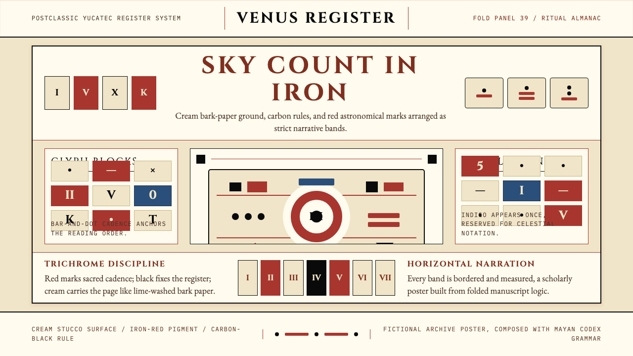 Mayan Dresden CodexSacred astronomy, measured. Cream registers, iron-red glyphs, carbon rules.神圣天文的克制秩序:奶米色横栏、铁红字块、碳黑细线。
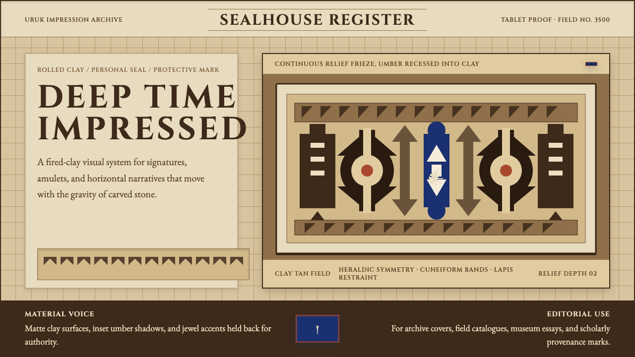 Sumerian Cylinder SealAncient weight, pressed in clay. Cinzel caps and cuneiform wedges cut umber i…古老而沉重。Cinzel 大写与楔形纹把深褐压入陶土。
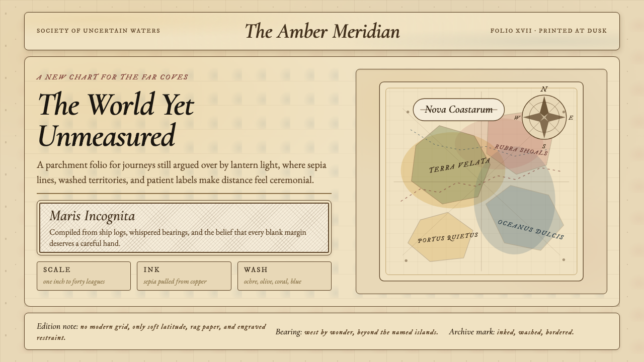 Vintage CartographyDiscovery feels ceremonial. Sepia copperplate on aged parchment, framed by co…发现如仪式。旧羊皮纸上的棕褐铜版线与罗盘几何。
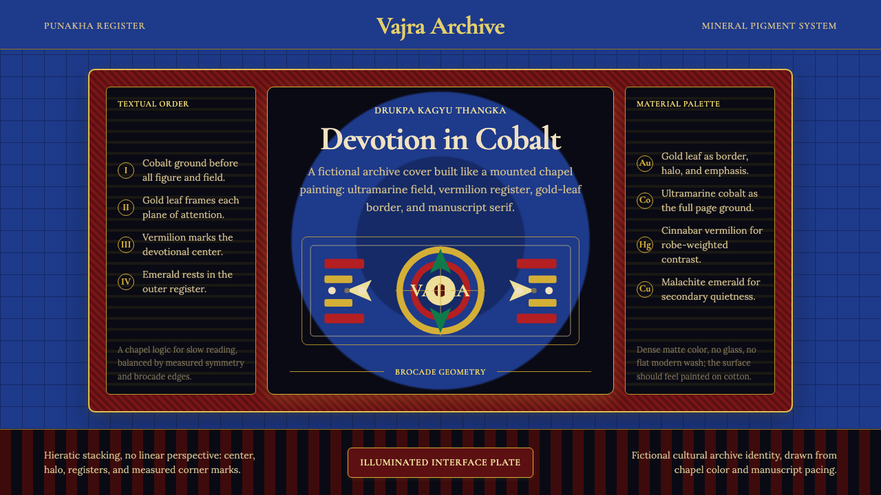 Bhutanese Drukpa Kagyu ThangkaDevotion made cobalt. Gold frames, Cormorant serif, and vermilion marks hold…钴蓝承载虔敬:金框、Cormorant 衬线与朱砂标记构成佛殿秩序。
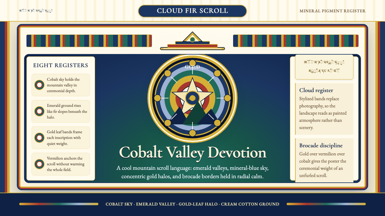 Bhutanese Thangka (Druk Style)Sacred cool-mountain clarity. Cobalt fields, emerald ground, and gold halos f…冷峻山岳的神圣感:钴蓝场、翡翠地与金色光环构成卷轴。
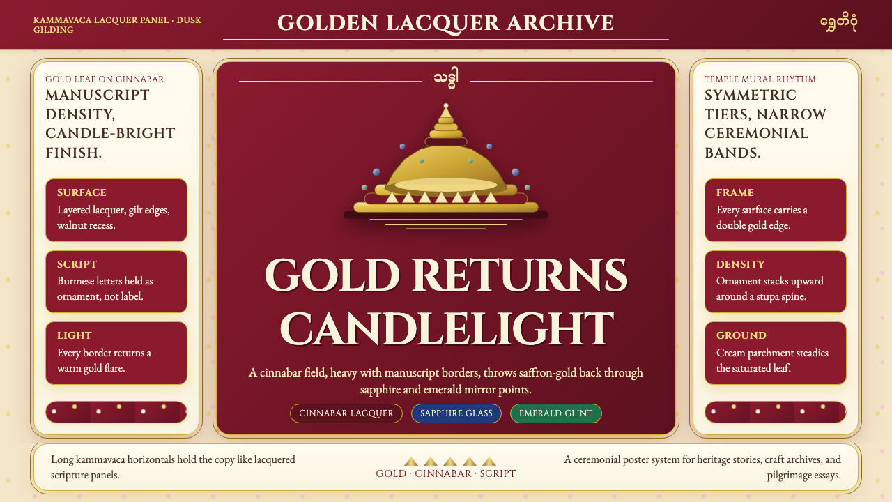 Burmese Shwedagon Gold-LacquerOpulence catches fire. Gold-leaf gradients on cinnabar panels frame a stupa s…虔诚的金色密度:朱漆面板上的金箔渐变,围出佛塔中轴。