What is Vintage Cartography?什么是 Vintage Cartography?
When maps were art, every coastline was a brushstroke and every unexplored margin an invitation — Vintage Cartography returns design to that age of beautiful uncertainty.当地图即艺术,每一条海岸线都是笔触,每一片空白边缘都是邀请——古典制图风格将设计带回那个美丽而充满未知的年代。
Vintage Cartography in briefVintage Cartography 速览
Vintage Cartography is a design aesthetic rooted in the hand-engraved atlases of seventeenth and eighteenth-century Europe — the era when Joan Blaeu, Abraham Ortelius, and Nicolas de Fer produced volumes that were simultaneously instruments of navigation and treasures of decorative art. The visual vocabulary draws directly from copperplate engraving: fine parallel hatching to suggest terrain relief, swelling italic letterforms pressed into aged parchment, and compass roses rendered with obsessive geometric precision.古典制图是一种植根于十七、十八世纪欧洲手工雕版地图集的设计美学——那个时代,约翰·布劳、亚伯拉罕·奥特柳斯与尼古拉·德菲尔制作的地图集,既是航海仪器,也是装饰艺术的珍品。其视觉词汇直接源自铜版雕刻:用细密的平行排线暗示地形起伏,用饱满的铜版斜体字母压印在泛黄的羊皮纸上,用极尽精确的几何绘制罗盘玫瑰图案。
The palette is warm and restrained — ochre, parchment cream, dusty coral, and olive washes layered over a ground that suggests paper aged by two or three centuries of use. Sepia ink does the work that black ink would do in a more modern idiom: it outlines, hatches, and labels, but always with a softness that modern black cannot achieve. The effect is not nostalgia for its own sake; it is the suggestion that the subject being presented has weight, history, and authority.色板温暖而克制——赭黄、羊皮纸奶油、暗珊瑚与橄榄绿的水彩晕染,叠置于一张仿佛历经两三个世纪岁月的底面之上。棕褐色墨水承担着现代语境中黑色墨水所做的一切:勾勒轮廓、填充排线、标注文字——却始终保有现代黑色无法企及的柔和质感。这种效果并非为怀旧而怀旧;它暗示着所呈现的主题拥有分量、历史与权威。
What distinguishes Vintage Cartography from merely decorative use of aged texture is its structural integrity. Historic maps were disciplined artifacts: compass bearings had to be geometrically accurate, scale bars had to be legible, cartouches had to frame their text without obscuring the surrounding geography. The design system inherits this discipline. Every ornamental element — the cartouche, the compass rose, the sea monster in the margin — exists within a composition that is fundamentally organized and readable.将古典制图与单纯的做旧纹理装饰区分开来的,是其结构上的完整性。历史地图是严格的人工制品:罗盘方位必须几何准确,比例尺必须清晰可读,卷边饰框必须在不遮蔽周围地理信息的前提下框住文字。这套设计体系继承了这种严谨。每一个装饰性元素——饰框、罗盘玫瑰、页边的海怪——都存在于一个从根本上有组织、可阅读的构图之中。
See the Vintage Cartography design system查看 Vintage Cartography 完整设计系统
Where does Vintage Cartography come from?Vintage Cartography 从何而来?
The tradition begins in earnest with Abraham Ortelius, whose Theatrum Orbis Terrarum, published in Antwerp in 1570, is widely regarded as the first modern atlas — a bound collection of uniform-format maps with facing-page text, conceived as a complete geographic reference rather than a loose portfolio. Ortelius was a merchant by trade and a cartographic compiler by method: he synthesized the best available geographic knowledge from dozens of sources, credited his sources in a bibliography, and produced a volume that went through more than forty editions before 1600. The visual style he established — copperplate engraving on heavy laid paper, elaborate cartouche frames, sea filled with ships and sea creatures — became the template the next two centuries would refine rather than replace.这一传统真正的起点是亚伯拉罕·奥特柳斯——他于1570年在安特卫普出版的《世界舞台》(Theatrum Orbis Terrarum)被广泛视为第一部现代地图集:一本以统一格式装订的地图汇编,每幅地图对页附有说明文字,作为完整的地理参考而非散装的作品集而构思。奥特柳斯以商人为本业,以汇编为制图方法:他从数十个来源综合了当时最优质的地理知识,在参考书目中注明出处,制作了一部在1600年前再版超过四十次的作品。他确立的视觉风格——厚纸上的铜版雕刻、精心制作的卷边饰框、布满船只与海怪的大洋——成为此后两个世纪不断精炼而非替代的模板。
The Dutch Golden Age of cartography, spanning roughly 1570 to 1700, coincided with the Netherlands' commercial and maritime dominance. Amsterdam became the capital of the map trade, and firms like the Blaeu workshop and the house of Visscher and Jansson competed to produce the most geographically accurate and the most visually spectacular atlases. Joan Blaeu's Atlas Maior, issued between 1662 and 1665 in eleven volumes, was the largest and most expensive book produced in the seventeenth century. Its maps combined the finest available geographic survey data with engraved illustration — decorative borders filled with city views, costume figures representing the inhabitants of distant regions, and allegorical imagery drawn from classical mythology. Owning a Blaeu atlas was a statement of wealth, education, and worldly ambition.荷兰制图黄金时代大约从1570年延续至1700年,恰与荷兰的商业与海洋霸权同步。阿姆斯特丹成为地图贸易的首都,布劳工坊、维斯赫尔与扬松家族等商行竞相出版地理上最精确、视觉上最壮观的地图集。约翰·布劳于1662至1665年间分十一卷出版的《大地图集》是十七世纪体量最大、造价最高的书籍。其地图将当时可获得的最优质地理勘测数据与铜版插图融为一体——装饰性边框中填满城市景观、代表遥远地区居民的服装人物,以及取自古典神话的寓言图像。拥有一部布劳地图集,是财富、教养与世界视野的宣言。
Copperplate engraving was the technical foundation of the entire tradition. Unlike woodblock printing, which could only produce bold, relatively crude lines, copperplate allowed engravers to achieve a range of line weights — from the hairline of a river tributary to the swelling stroke of a place name in copperplate italic — with a single burin. The process was slow, expensive, and required highly skilled artisans, which is why the great atlas workshops were also schools, training generations of engravers. The characteristic hatching patterns used to indicate mountains, the stippled washes that suggested shallow coastal waters, the delicate cross-hatching of shadow on a cartouche — all of these were standardized techniques transmitted through workshop apprenticeship over decades.铜版雕刻是整个传统的技术基础。与只能制作粗犷线条的木版印刷不同,铜版允许雕刻师用一把刻刀就能实现从支流细线到地名铜版斜体饱满笔画的全系列线重变化。这一工序缓慢、昂贵,且需要技艺高超的工匠——这正是伟大的地图集工坊同时也是学校的原因:它们训练了一代又一代的雕刻师。用于表示山地的标准排线图案、暗示近岸浅水的点刻晕染、饰框阴影处的精细交叉排线——所有这些都是通过数十年工坊学徒传承而标准化的技法。
The aesthetic began to decline after approximately 1750, as the Age of Enlightenment shifted cartographic values toward scientific precision and stripped away the decorative elements that had defined the seventeenth-century tradition. By the early nineteenth century, lithography had replaced copperplate engraving as the dominant printing technology, enabling faster and cheaper production but eliminating the fine line quality that gave the earlier maps their distinctive character. The maps of Guillaume De L'Isle, working in Paris in the early eighteenth century, represent a transitional moment: still beautifully engraved, but increasingly austere, with simpler cartouches and fewer sea creatures. What followed was cartographic modernism — accurate, functional, and almost entirely stripped of the ornamental richness that makes the seventeenth-century tradition so enduringly appealing to designers.大约1750年后,随着启蒙时代将制图价值观转向科学精确性并剥去了十七世纪传统所具有的装饰性元素,这一美学开始衰退。到十九世纪初,石版印刷取代铜版雕刻成为主流印刷技术,生产更快更廉价,却也消除了赋予早期地图独特性格的精细线质。十八世纪初在巴黎工作的纪尧姆·德利勒的地图代表了一个过渡时刻:雕刻依然精美,却日趋简朴,饰框更简单,海怪更稀少。此后是制图现代主义——精确、实用,几乎完全剥去了令十七世纪传统对设计师至今依然具有持久吸引力的那种装饰丰盛。
What defines the Vintage Cartography look?Vintage Cartography 的视觉特征是什么?
Color and Tone色彩与色调
The palette is anchored by aged parchment — a warm, slightly uneven cream that reads as old paper rather than as a clean design choice. Over this ground, watercolor washes of ochre, olive, dusty rose, and pale coastal blue pool softly within territorial or oceanic boundaries, never filling to a hard, uniform edge. Sepia ink, in values ranging from a deep warm brown to a pale amber, does all the structural work: outlines, hatching, lettering. Black is largely absent; the darkest values in the composition are still unmistakably brown. The overall temperature is warm, slightly desaturated, and unified by the parchment ground rather than by any single applied color.色板以泛黄羊皮纸为锚点——一种温暖、略显不均匀的奶油色,读来像旧纸张而非干净的设计选择。在这一底面上,赭黄、橄榄绿、暗玫瑰与淡蓝色的水彩晕染柔和地积聚于疆域或海洋边界之内,从不填充至硬朗均匀的边缘。棕褐色墨水,从深暖棕到淡琥珀的各种深浅,承担所有结构性工作:轮廓、排线、文字。黑色几乎缺席;构图中最深的色值依然无疑是棕色的。整体色温温暖、略微去饱和,由羊皮纸底面而非任何单一施加的颜色统一。
Copperplate Engraving Line Quality铜版雕刻线质
The defining graphic quality of Vintage Cartography is its line variation: a single engraved stroke can swell from a hairline to a full, weighted mark and taper back again, following the pressure of the burin on the copper plate. Coastlines are drawn with this organic variation; they read as both precise and handmade. Terrain is suggested through systems of fine parallel hatching and stippling that build up tone through density rather than through fill. Rivers taper as they approach their sources. Nothing is mechanically uniform. This quality of line is what distinguishes the aesthetic from merely using a sepia color scheme on otherwise modern geometry.古典制图最具决定性的图形品质是其线条变化:单一雕刻笔画能从发丝般细线膨胀为饱满、有重量的笔触,再逐渐收细——随着刻刀在铜板上的压力变化而变化。海岸线以这种有机变化绘制,读来既精确又手工感十足。地形通过精细平行排线与点刻的密度积累来暗示,而非通过填充来表现。河流在靠近源头时逐渐收窄。没有任何东西是机械均匀的。这种线质正是将这一美学与单纯在现代几何上使用棕褐色配色方案区分开来的关键。
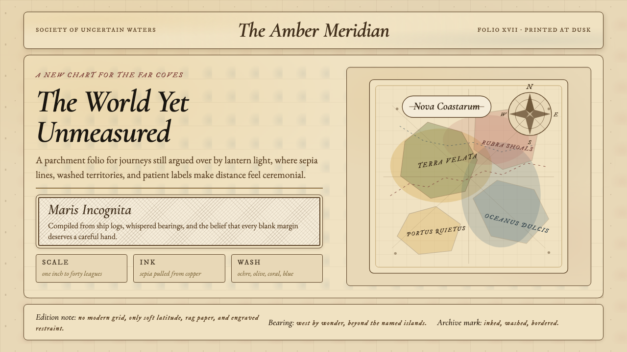
Cartouche and Ornamental Framing卷边饰框与装饰性框架
The cartouche — a framing device derived from the rolled papyrus scroll — is the signature decorative element of historic cartography. In its classic form, it is a scrolling, asymmetric shape built from volutes, acanthus leaves, and ribboned ornament that opens in the center to frame a title, scale bar, or dedication. The cartouche does not merely contain information; it announces it. In contemporary applications of the style, the cartouche logic can be adapted: ornamental frames and scroll-edged borders applied to titles, data labels, or section headings borrow the hierarchical function without requiring literal reproduction of Baroque ornament.卷边饰框——一种源自卷起的莎草纸卷轴的框架装置——是历史制图的标志性装饰元素。在其经典形式中,它是一个由涡卷、莨苕叶和飘带装饰构成的滚动、非对称形状,在中央开口以框住标题、比例尺或题献文字。饰框不仅仅是容纳信息;它是在宣告信息。在这一风格的当代应用中,饰框逻辑可以被改编:施加于标题、数据标签或章节标题的装饰性框架与卷边边框,借用了其层级功能,而无需字面再现巴洛克装饰。
Typography and Lettering字体排印与手写文字
Historic cartographic lettering is almost exclusively italic — a consequence of copperplate engraving technique, in which the burin naturally produces the swelling, tapering strokes of an italic hand more readily than the vertical strokes of a roman. Place names of greater importance are set in larger, more swelling letterforms; secondary names in smaller, tighter versions of the same italic hand. The relationship is one of scale and stroke weight, not of different typefaces. In contemporary applications, typefaces that genuinely reference copperplate italic calligraphy — with clear thick-thin stroke contrast and the characteristic forward lean — are far more appropriate than generic serifs, and certainly more so than any sans-serif form.历史制图文字几乎全部为斜体——这是铜版雕刻技法的结果,刻刀在铜版上自然更容易产生斜体手写字的膨胀收尖笔画,而非罗马正体的垂直笔画。更重要的地名以更大、更饱满的字形呈现;次要地名则以同一斜体手写字的较小、较紧凑版本呈现。层级关系是尺寸与笔画粗细的关系,而非不同字体的关系。在当代应用中,真正参照铜版斜体书法的字体——具有明显的粗细笔画对比和特有的前倾姿态——远比通用衬线字体更为合适,当然也远胜于任何无衬线字形。
Compass Rose and Geometric Instruments罗盘玫瑰与几何仪器
The compass rose is both a functional navigational diagram and a decorative centerpiece. In its elaborated form, it displays sixteen or thirty-two points, each labeled with its cardinal or intercardinal direction, and is often decorated with fleur-de-lis on the north arm and decorative fillets between the primary and secondary points. The rhumb lines radiating from compass roses across the map body — straight lines that a navigator could use to plot a constant compass bearing — are another characteristic element, creating a geometric web over the geographic content. Both elements carry their visual logic from their original practical purpose: they are not decorative additions but operational diagrams rendered beautifully.罗盘玫瑰既是功能性导航示意图,也是装饰性视觉中心。在其精细形式中,它展示十六或三十二个方位点,每个点都标注其主方位或间方位名称,并常在北方位臂上装饰百合花饰,在主次方位点之间施以装饰性条带。从罗盘玫瑰向地图主体辐射的等角航线——航海者用来绘制恒定罗盘方位的直线——是另一个标志性元素,在地理内容之上创造出几何网格。这两种元素的视觉逻辑均来自其原初的实用功能:它们不是装饰性添加物,而是被美丽呈现的操作性示意图。
Aged Surface and Texture做旧表面与质感
The illusion of age in Vintage Cartography is achieved through layered, imperfect texture rather than through any single applied effect. Parchment was a material with natural variation — thicker and darker at the edges where the hide was tanned, lighter and more translucent at the center, marked by the occasional worm hole or water stain. Faithful application of the aesthetic means surface unevenness is a feature: slight tonal variation across the ground, soft vignetting at the edges, and the occasional imperfection that confirms the hand rather than denying it. The texture should read as inherent to the material, not as a filter applied over a clean digital ground.古典制图中岁月感的幻觉是通过层叠的、不完美的质感来实现的,而非通过任何单一施加的效果。羊皮纸是一种具有自然变化的材料——在皮革鞣制的边缘较厚较深,在中央较薄较透明,偶有虫洞或水渍留痕。忠实应用这一美学意味着表面不均匀是一种特色:底面轻微的色调变化、边缘柔和的暗角,以及偶发的不完美——这些确认了手工痕迹而非否认它。质感应当读来像是材料本身固有的,而非覆盖在干净数字底面上的一层滤镜。
Illustrative Marginalia装饰性页边插图
The borders and empty ocean expanses of historic maps were rarely left blank. Sea creatures — often based on travelers' accounts of unfamiliar marine animals, heavily embellished — fill open water. Ships in full sail mark major trade routes. Allegorical figures representing continents or seasons populate the decorative borders. Wind heads, mythological personifications of the cardinal winds, blow from the corners and edges. In contemporary applications, marginalia function as the element that most clearly signals the aesthetic register: restrained use of one or two such motifs in an otherwise clean composition is usually more effective than literal coverage, and prevents the design from becoming a costume rather than a language.历史地图的边框与空旷海洋区域很少留白。海怪——往往基于旅行者对陌生海洋动物的描述、大量润色而成——充填着开阔水域。满帆行驶的船只标记主要贸易航线。代表各大洲或各季节的寓言人物装点着装饰性边框。风头——主方位风的神话拟人化形象——从角落和边缘呼气吹风。在当代应用中,页边插图是最清晰地标志美学调性的元素:在一个其他方面相当简洁的构图中克制地使用一两个此类母题,通常比字面意义上的全覆盖更为有效,也能防止设计沦为戏服而非语言。
See the Vintage Cartography design system查看 Vintage Cartography 完整设计系统
Who shaped Vintage Cartography?谁塑造了 Vintage Cartography?
Ortelius was the Antwerp merchant-cartographer who published the Theatrum Orbis Terrarum in 1570, inaugurating the modern atlas format. What distinguished his contribution was not original surveying — Ortelius was a compiler — but editorial intelligence: he gathered the best available maps, standardized their format, provided scholarly text, and created a bibliography crediting his sources, an innovation remarkable in any field of sixteenth-century publishing. The visual vocabulary he standardized — copperplate engraving on laid paper with elaborate cartouches and ornamented sea areas — defined the tradition for the two centuries that followed.奥特柳斯是安特卫普的商人制图师,1570年出版了《世界舞台》,开创了现代地图集格式。使他的贡献与众不同的,不是原创勘测——奥特柳斯是一位汇编者——而是编辑智慧:他汇集了最优质的可用地图,统一其格式,提供学术文字,并创建了一份注明出处的参考书目——这在十六世纪出版的任何领域都是非凡的创新。他所标准化的视觉词汇——布纹纸上带有精心饰框和装饰性海域的铜版雕刻——定义了此后两个世纪的传统。
Joan Blaeu, son of the Amsterdam cartographer Willem Blaeu, presided over the most ambitious cartographic enterprise of the seventeenth century: the Atlas Maior, issued in various editions between 1662 and 1672 in up to eleven volumes and containing nearly six hundred maps. The work was as much a luxury object as a geographic reference — a statement of Dutch commercial and intellectual dominance at the peak of the Golden Age. Blaeu's maps set the highest standard for the engraved border decoration and the quality of hand-coloring that characterized the period's prestige productions. The Amsterdam workshop fire of 1672, which destroyed much of Blaeu's stock and equipment, effectively ended the dynasty and contributed to the shift of the map trade's center toward Paris and London.约翰·布劳是阿姆斯特丹制图师威廉·布劳之子,主持了十七世纪最雄心勃勃的制图事业:《大地图集》,于1662至1672年间分最多十一卷出版,收录近六百幅地图。这部作品与其说是地理参考书,不如说是一件奢侈品——是荷兰黄金时代鼎盛时期商业与智识霸权的宣言。布劳的地图为雕刻边框装饰和手工上色品质设定了最高标准,这些正是该时期顶级制作的特征。1672年阿姆斯特丹工坊的火灾烧毁了布劳大部分库存与设备,实际上终结了这一王朝,并推动了地图贸易中心向巴黎和伦敦的转移。
Mercator is best known for the map projection that bears his name — introduced in his 1569 world map — which represents lines of constant compass bearing as straight lines and thereby transformed oceanic navigation. His contribution to the visual tradition of cartography was equally significant: he was among the first to develop the italic letterforms specifically suited to copperplate engraving that became the standard for place-name lettering throughout the golden age. The Mercator italic hand — swelling, forward-leaning, with pronounced thick-thin contrast — is the typographic signature of the entire tradition and has been revived in numerous typefaces designed for digital display of the aesthetic.墨卡托最为人知的是以他名字命名的地图投影——于1569年的世界地图中首次引入——它将等角航线表示为直线,从而改变了海洋航行。他对制图视觉传统的贡献同样重要:他是最早发展出专门适合铜版雕刻的斜体字形的人之一,这种字形成为整个黄金时代地名文字的标准。墨卡托斜体手写字——饱满、前倾、粗细对比显著——是整个传统的排印签名,已在为这一美学的数字呈现而设计的众多字体中得到复兴。
Working in Paris in the early eighteenth century, De L'Isle represents the transitional moment between the decorative exuberance of the Dutch Golden Age and the scientific rigor of Enlightenment cartography. His maps were significantly more accurate geographically than his predecessors' — he corrected major errors in the depiction of coastlines and was among the first to render the interior of North America with meaningful accuracy — but they retained the copperplate engraving tradition and the ornamental cartouche. The De L'Isle aesthetic, slightly more austere than Blaeu but still unmistakably within the historic tradition, is often the most usable contemporary reference for applications that need cartographic authority without maximum decorative density.德利勒在十八世纪初的巴黎工作,代表着荷兰黄金时代装饰繁盛与启蒙时代科学严谨之间的过渡时刻。他的地图在地理上远比前辈精确——他纠正了海岸线描绘中的重大错误,是最早以有意义的准确性呈现北美内陆的人之一——但依然保留了铜版雕刻传统和装饰性饰框。德利勒的美学,比布劳略为简朴但仍明确属于历史传统,通常是那些需要制图权威感而不追求最高装饰密度的应用中最可用的当代参照。
De Fer was a Parisian cartographer and publisher of the late seventeenth and early eighteenth centuries whose work is less celebrated for geographic accuracy than for decorative ambition. His maps, particularly those depicting the Americas and the Pacific, are notable for their elaborate border panels filled with topographic views, indigenous peoples, and exotic flora and fauna assembled from travelers' accounts. De Fer's approach — treating the map as an encyclopedic visual argument as much as a spatial record — exemplifies the tradition's understanding that the decorative elements were not separate from the informational content but were, in the context of the period, part of what made a map authoritative and complete.德菲尔是十七世纪末至十八世纪初的巴黎制图师和出版商,其作品在地理精确性上不如在装饰雄心上著称。他的地图,尤其是描绘美洲与太平洋的那些,以精心制作的边框图版著称——充满地形景观、土著居民、以及从旅行者记述中汇集的奇异动植物。德菲尔的方式——将地图视为百科全书式的视觉论证,与其说是空间记录——体现了这一传统的理解:装饰性元素并不独立于信息内容之外,而是在当时的语境中,构成使地图具有权威性与完整性的一部分。
How do you use Vintage Cartography today?今天怎么用 Vintage Cartography?
Vintage Cartography is best understood not as a skin to apply but as a set of compositional and tonal commitments that reorganize a design around qualities of age, craft, and geographic authority. Applying it correctly means grounding the entire composition in warm parchment tones before adding any other element, and treating every piece of content — a section title, a data label, a call-to-action button — as if it might appear on a seventeenth-century map face. The question to ask of each element is not 'does this look old?' but 'does this look as if it was made by someone who cared deeply about what it communicated?'古典制图最好被理解为一套构图与色调的承诺,而非一层可随意叠加的外皮——它围绕岁月感、工艺感与地理权威感重新组织设计。正确应用它,意味着在添加任何其他元素之前,先将整个构图奠基于温暖的羊皮纸色调之中,并将每一片内容——章节标题、数据标签、行动号召按钮——视为可能出现在十七世纪地图面上的东西。对每个元素应当问的问题不是「这看起来像古物吗?」而是「这看起来像一位对自己所传达的内容深深在意的人所制作的东西吗?」
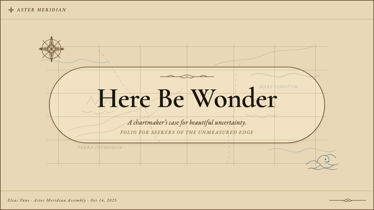
For presentation slides, the style excels in cover pages built around a central cartouche or compass rose motif, with the title framed by ornamental scrollwork and the background a parchment wash that darkens subtly toward the edges. Content slides should maintain the tonal ground but simplify the decorative element — a single ornamental rule or corner flourish is sufficient to maintain the register without overwhelming the data. Data slides, particularly those showing geographic distributions or market landscapes, respond naturally to the style: maps can be rendered in the aesthetic directly, and non-geographic data can be placed within cartographic grids that reference the tradition without requiring literal map imagery.在演示文稿中,这种风格在以中央饰框或罗盘玫瑰母题为核心构建的封面页上表现出色——标题由装饰性涡卷框架,背景为向边缘微妙加深的羊皮纸晕染。内容页应维持色调底面,但简化装饰元素——单一的装饰性线条或角落花饰足以维持美学调性而不致淹没数据。数据页,尤其是呈现地理分布或市场格局的页面,自然与这种风格契合:地图可以直接以这一美学呈现,非地理数据也可置于参照这一传统的制图网格之中,而无需字面地图图像。
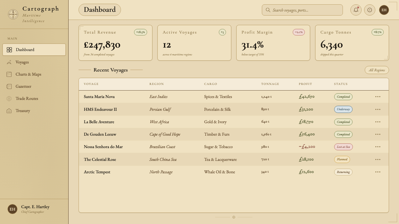
For web interfaces, the aesthetic is particularly well suited to dashboards that deal in history, provenance, exploration, or premium positioning. A pricing page in this style might use parchment-toned card backgrounds, ornamental dividers between tiers, and a typographic hierarchy that mimics the scale variation of cartographic lettering — dominant tier names in large italic letterforms, feature lists in a smaller, lighter version of the same hand. Navigation elements should avoid contemporary iconography in favor of linework indicators that reference compass or survey instruments. Dark mode is not native to this aesthetic and requires careful handling: a very deep warm brown as the ground, rather than cool dark grey, preserves the tonal character.对于网页界面,这一美学尤其适合处理历史、来源、探索或高端定位的仪表板。这种风格的定价页面可以使用羊皮纸色调的卡片背景、等级之间的装饰性分隔线,以及模仿制图文字尺寸变化的排版层级——主要等级名称以大号斜体字形呈现,功能列表以同一手写风格的较小、较轻版本呈现。导航元素应避免当代图标语言,转而采用参照罗盘或测量仪器的线描指示符。深色模式并非这一美学的本土形态,需要谨慎处理:以极深的温暖棕色而非冷调深灰作为底面,才能保留其色调特性。
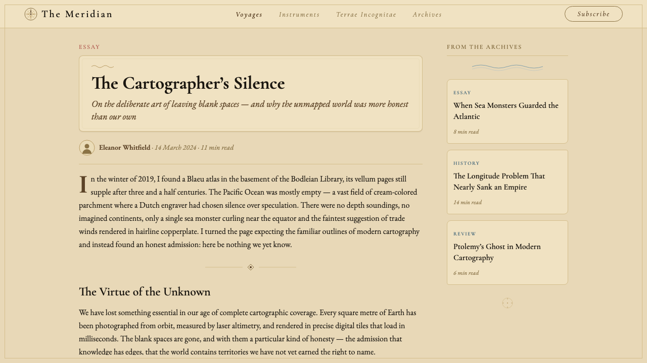
For editorial and marketing work, the style's authority and richness make it well suited to long-form content about history, travel, geography, heritage brands, and premium goods. An editorial spread might use the full cartographic treatment — parchment ground, sepia illustration, cartouche-framed pull quotes — while a marketing page might extract only the tonal palette and typographic approach, using the ornamental elements selectively as hierarchy markers rather than as decorative field. The style also works well for packaging and print collateral where the tactile quality of aged paper can be reinforced by actual material choices — uncoated stocks, warm-toned inks, and edge-worn finishes that extend the aesthetic into the physical object.对于编辑与营销内容,这种风格的权威感与丰富性使其非常适合关于历史、旅行、地理、遗产品牌与高端商品的长篇内容。一个编辑跨版可以使用完整的制图处理——羊皮纸底面、棕褐色插图、饰框框住的引语——而营销页面则可以只提取色调色板与排版方式,将装饰性元素有选择地用作层级标记而非装饰场域。这种风格也适合包装与印刷配套材料,在这些场合,做旧纸张的触觉品质可以通过实际材料选择来强化——未涂布纸张、暖色调油墨和边缘磨损的表面处理,将美学延伸至实物之中。
The most common mistake when applying Vintage Cartography is filling every available surface with decorative elements and aged texture without establishing a clear compositional hierarchy first. Historic maps were dense but organized: every element had a location, a scale, and a relationship to the elements around it. Contemporary applications that treat the style as license for maximum visual density typically produce work that reads as cluttered rather than rich. A second frequent error is applying aged texture as a filter over an otherwise contemporary layout — the texture should be the ground on which the composition is built, not a layer added at the end. Similarly, combining the cartographic palette with modern geometric forms, contemporary icon systems, or flat design conventions breaks the internal logic of the aesthetic and produces an uncomfortable hybrid that persuades in neither direction.应用古典制图时最常见的错误,是在没有首先建立清晰构图层级的情况下,用装饰元素和做旧质感填满每一块可用表面。历史地图密集但有组织:每个元素都有位置、尺度,以及与周围元素的关系。将这种风格视为追求最大视觉密度的许可而进行的当代应用,通常产生读来杂乱而非丰富的作品。第二个常见错误是将做旧质感作为滤镜叠加在原本当代的版面之上——质感应当是构图赖以建立的底面,而非最后添加的图层。同样,将制图色板与现代几何形态、当代图标系统或扁平设计惯例结合,会破坏这一美学的内在逻辑,产生两头都说服不了的尴尬混合体。
See the Vintage Cartography design system查看 Vintage Cartography 完整设计系统
Vintage Cartography — FAQVintage Cartography · 常见问题
Is Vintage Cartography appropriate for digital interfaces, or is it primarily a print aesthetic?古典制图适合用于数字界面吗,还是说它主要是一种印刷美学?
The aesthetic originated in print and its richest applications remain in contexts where print qualities — texture, detail, warm tone — can be fully realized. That said, digital applications are entirely viable when the implementation is committed and coherent. The key challenges in digital contexts are: achieving the tonal warmth of parchment on screens calibrated for cool brightness, reproducing the fine line quality of copperplate engraving at typical screen resolutions, and ensuring that the ornamental elements remain legible rather than becoming visual noise at small sizes. Web applications built around the style typically work best when the decorative density is reduced compared to a print equivalent — fewer marginalia, simpler cartouche frames, more breathing room in the composition — and when the typographic choices genuinely reference the calligraphic tradition rather than substituting a contemporary serif.这一美学起源于印刷,其最丰富的应用依然在于能够充分呈现印刷品质——质感、细节、温暖色调——的场景中。尽管如此,当实施投入而连贯时,数字应用完全可行。数字场景中的关键挑战在于:在为冷色调亮度校准的屏幕上实现羊皮纸的色调温暖感;在典型屏幕分辨率下再现铜版雕刻的精细线质;以及确保装饰性元素在小尺寸下保持清晰可读而非沦为视觉噪声。围绕这种风格构建的网页应用,通常在装饰密度比印刷版本有所降低时效果最佳——更少的页边插图、更简单的饰框、构图中更多的呼吸空间——并且排版选择真正参照书法传统,而非用当代衬线字体替代。
How do you handle color in data visualizations while keeping the cartographic palette?在保持制图色板的同时,如何处理数据可视化中的色彩?
Historic cartographers solved exactly this problem for territorial and oceanic differentiation: they used the watercolor wash tradition, which allowed adjacent areas to be distinguished by hue while remaining unified by the warm, slightly muted quality of the overall palette. For contemporary data visualization, the same principle applies — use hue for differentiation and tone for hierarchy, but keep all values within the warm ochre-olive-coral-dusty-blue family rather than introducing saturated modern primaries. A choropleth map or a pie chart built from these washes reads as cartographic rather than generic. For data types that require more precise color encoding — where a viewer needs to match a segment to a legend — ensuring clear tonal contrast within the warm palette is more important than hue variety, and a cartouche-style legend frame preserves the aesthetic register even when the chart type is modern.历史制图师在疆域与海洋区分上恰好解决了这个问题:他们使用水彩晕染传统,允许相邻区域以色相区分,同时在整体色板温暖、略微低饱和的品质上保持统一。对于当代数据可视化,同样的原则适用——用色相做区分,用色调做层级,但将所有色值保持在温暖的赭黄-橄榄-珊瑚-暗蓝色系之内,而非引入饱和的现代主色。由这些晕染构成的地理分级色图或饼图,读来有制图感而非通用感。对于需要更精确色彩编码的数据类型——观看者需要将图段与图例对应——确保温暖色板内清晰的色调对比,比色相多样性更为重要;而饰框风格的图例框架,即使图表类型是现代的,也能保持美学调性。
Does Vintage Cartography work for brands that have no literal connection to maps or geography?古典制图风格适合与地图或地理毫无字面关联的品牌吗?
Yes, but the justification needs to come from the values the style conveys rather than from thematic literalism. Vintage Cartography communicates discovery, craftsmanship, the authority of accumulated knowledge, and a sense that the subject being discussed has been carefully surveyed and found worthy of this level of attention. Any brand or product that can authentically claim those associations — a premium whisky, a long-form publishing platform, a heritage travel company, a financial advisory firm positioning itself on depth of expertise — can use the style without geographic literalism feeling forced. The style struggles where those values are absent: a fast fashion brand, a technology startup emphasizing speed and disruption, or any context where the suggestion of age and deliberateness would actively contradict the brand's core proposition.可以,但理由需要来自这种风格所传达的价值观,而非主题上的字面关联。古典制图传达的是:探索、工艺、积累知识的权威感,以及一种被讨论的主题已被仔细考察、值得如此程度关注的感觉。任何能够真实地宣称这些关联的品牌或产品——高端威士忌、长篇出版平台、传统旅行公司、以专业深度定位的金融咨询公司——都可以使用这种风格,而无需地理字面感显得牵强。这种风格在那些价值观缺席的场合则表现欠佳:快时尚品牌、强调速度与颠覆的科技初创公司,或任何岁月感与审慎感的暗示会积极抵触品牌核心主张的场景。
What is the difference between Vintage Cartography and other aged or heritage aesthetics like Victorian, Steampunk, or Rustic?古典制图与维多利亚、蒸汽朋克或质朴风等其他做旧或遗产美学有何区别?
The distinctions are rooted in different historical sources and therefore in different visual grammars. Victorian design is typographically denser, more symmetrical, and associated with ornate letterpress printing and chromolithographic color — rich jewel tones, ornate borders, and display typography of extreme decorative complexity. Steampunk overlays Victorian elements with industrial and mechanical motifs — brass fittings, rivets, gears — producing a hybrid that has no direct historical precedent. Rustic aesthetics reference hand-painted signage, worn wood, and agrarian craft tradition, with irregular letterforms and earthy, desaturated palettes. Vintage Cartography is specifically geographic and engraving-derived: its distinctive elements — the compass rose, the cartouche, the copperplate italic hand, the parchment wash — have precise historical referents, and the discipline of the style comes from the technical constraints of cartographic production rather than from the decorative conventions of any printing tradition.这些区别植根于不同的历史来源,因而形成不同的视觉语法。维多利亚设计在排版上更为密集、更具对称性,与华丽的活版印刷和彩色石版印刷相关联——浓郁的宝石色调、繁复的边框、装饰复杂性达到极致的展示字体。蒸汽朋克将维多利亚元素与工业和机械母题叠加——黄铜配件、铆钉、齿轮——产生没有直接历史先例的混合体。质朴美学参照手绘标牌、磨损木材与农业工艺传统,带有不规则字形和朴素、去饱和的色板。古典制图则具体地植根于地理与雕刻:其标志性元素——罗盘玫瑰、饰框、铜版斜体手写字、羊皮纸晕染——都有精确的历史参照,这种风格的严谨来自制图生产的技术约束,而非任何印刷传统的装饰惯例。
How much ornamental detail is too much?装饰细节到什么程度算是过度?
The historic maps themselves provide the calibration guide. A seventeenth-century map face is rich in detail but organized around a clear compositional center — the geography itself — with ornamental elements at the margins and in the cartouche. When the decorative density of the ornamental elements begins to compete with the primary content for visual attention, the balance has broken. In contemporary applications, a useful test is to ask whether a reader encountering the design for the first time could identify the most important piece of information within three seconds. If the cartouche, compass rose, sea creatures, parchment texture, and border ornament collectively prevent that, the detail has exceeded its purpose. As a practical rule: one major ornamental element per composition (cartouche or compass rose, not both at full elaboration), texture as ground rather than overlay, and marginalia only at genuine margins.历史地图本身就提供了校准指南。一幅十七世纪地图面内容丰富,但围绕清晰的构图中心——地理本身——有序组织,装饰性元素处于边缘和饰框之中。当装饰性元素的密度开始与主要内容竞争视觉注意力时,平衡就已打破。在当代应用中,一个有用的测试是:第一次看到这个设计的读者,能否在三秒内识别出最重要的信息?如果饰框、罗盘玫瑰、海怪、羊皮纸质感和边框装饰共同阻止了这一点,细节就已超越了其目的。作为实践准则:每个构图只设一个主要装饰元素(饰框或罗盘玫瑰,而非两者同时以完整细节呈现),质感作为底面而非叠加层,页边插图仅出现在真正的边缘处。
Related design styles相关设计风格
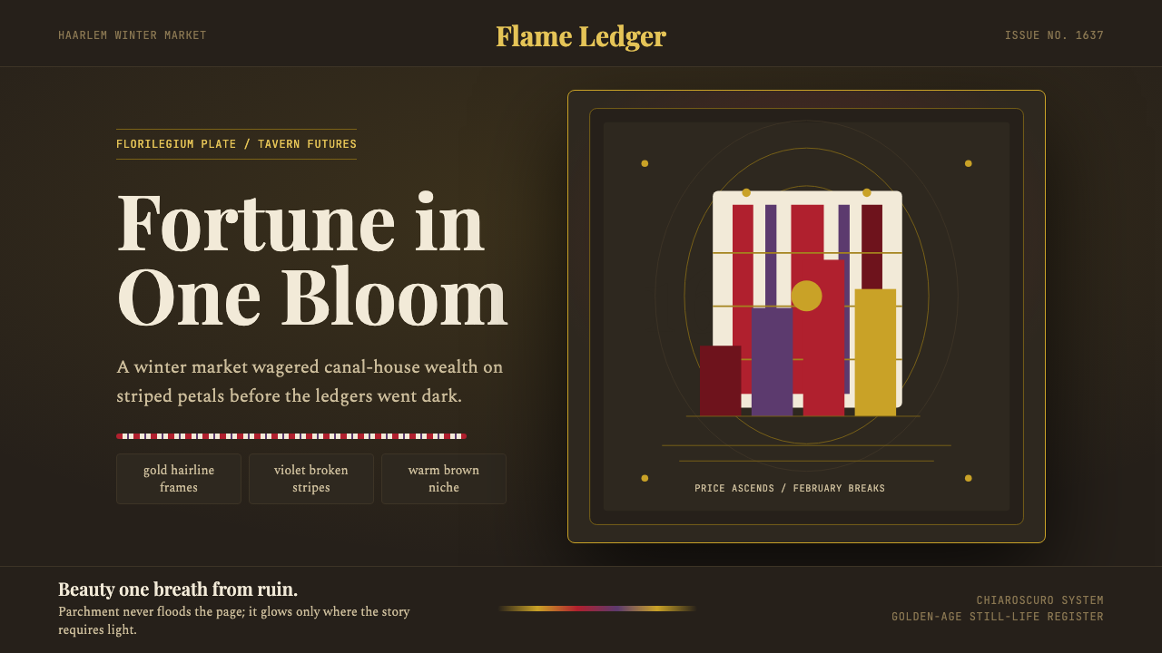 Dutch Tulip ManiaSpeculation burns in shadow. Flame red petals, violet stripes, gold frames on…投机在暗处燃烧:暖棕壁龛中,火红花瓣、紫纹与金框发光。
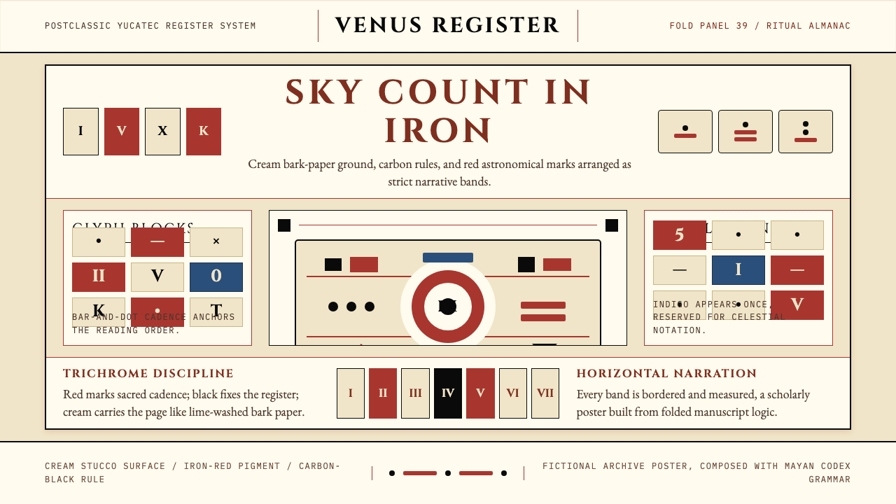 Mayan Dresden CodexSacred astronomy, measured. Cream registers, iron-red glyphs, carbon rules.神圣天文的克制秩序:奶米色横栏、铁红字块、碳黑细线。
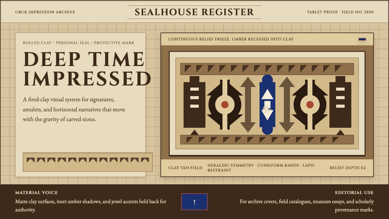 Sumerian Cylinder SealAncient weight, pressed in clay. Cinzel caps and cuneiform wedges cut umber i…古老而沉重。Cinzel 大写与楔形纹把深褐压入陶土。
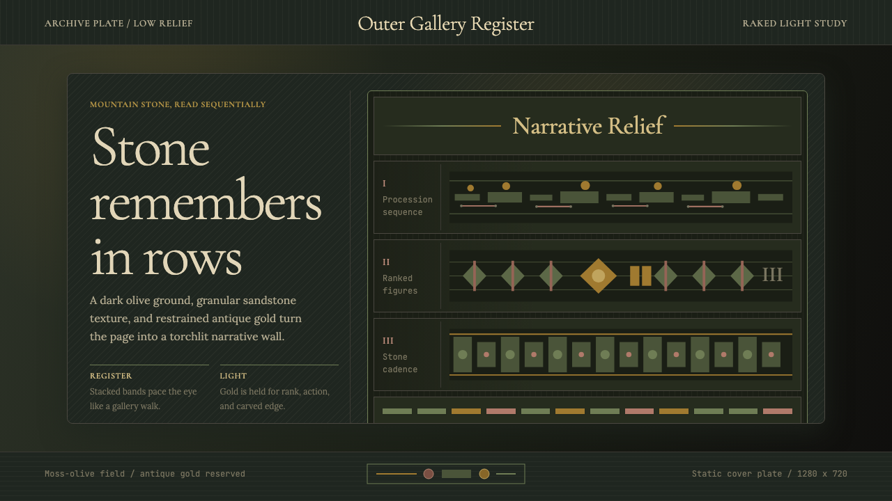 Cambodian Angkor Bas-ReliefStone speaks in shadow. Olive registers and antique gold carve a torchlit arc…石在暗影中叙事:苔绿横栏与古金刻出火光档案。
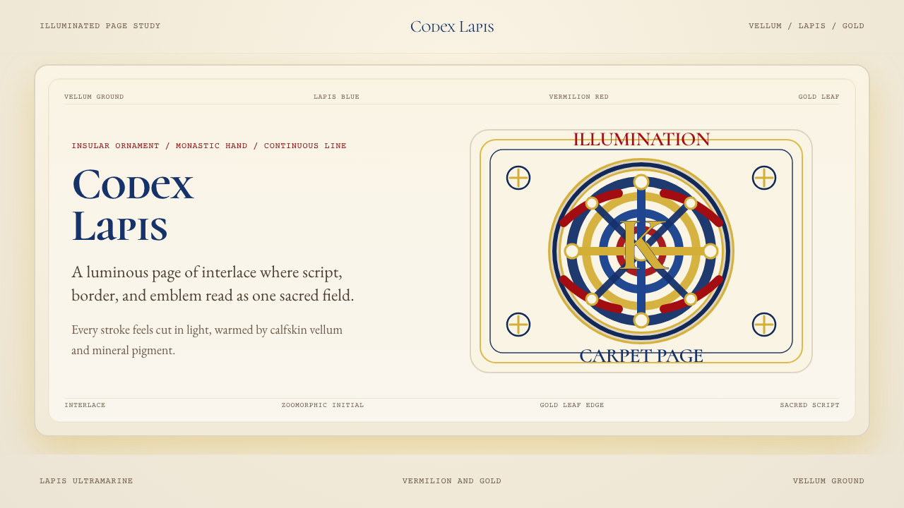 Book of Kells Celtic (800)Sacred and precise. Vellum cream, lapis, vermilion, and gold knotwork.神圣而精密。奶油羊皮底上铺陈青金石、朱砂与金色缠结纹。
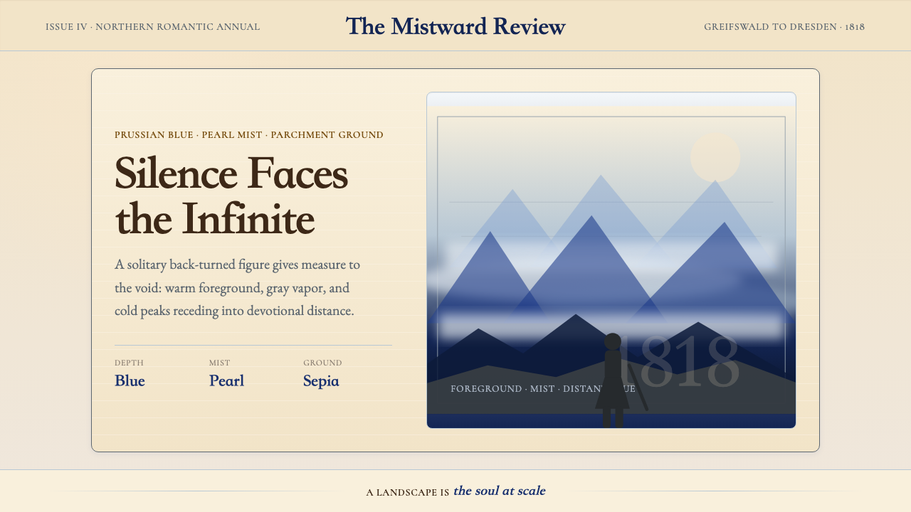 Caspar David FriedrichSilence becomes vast. Prussian blue depth, pearl mist, and parchment framing…寂静变得辽阔:普鲁士蓝纵深、珍珠雾与羊皮纸框层层后退。