What is Caspar David Friedrich?什么是 Caspar David Friedrich?
Friedrich's paintings taught the world that emptiness is not absence — it is the loudest thing in the room.弗里德里希的画作告诉世人:空旷并非缺席,而是房间里最响亮的存在。
Caspar David Friedrich in briefCaspar David Friedrich 速览
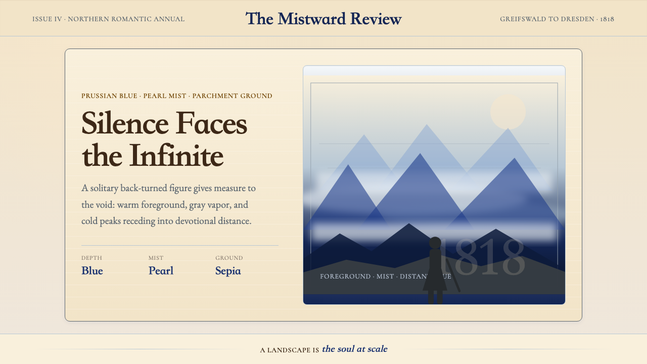
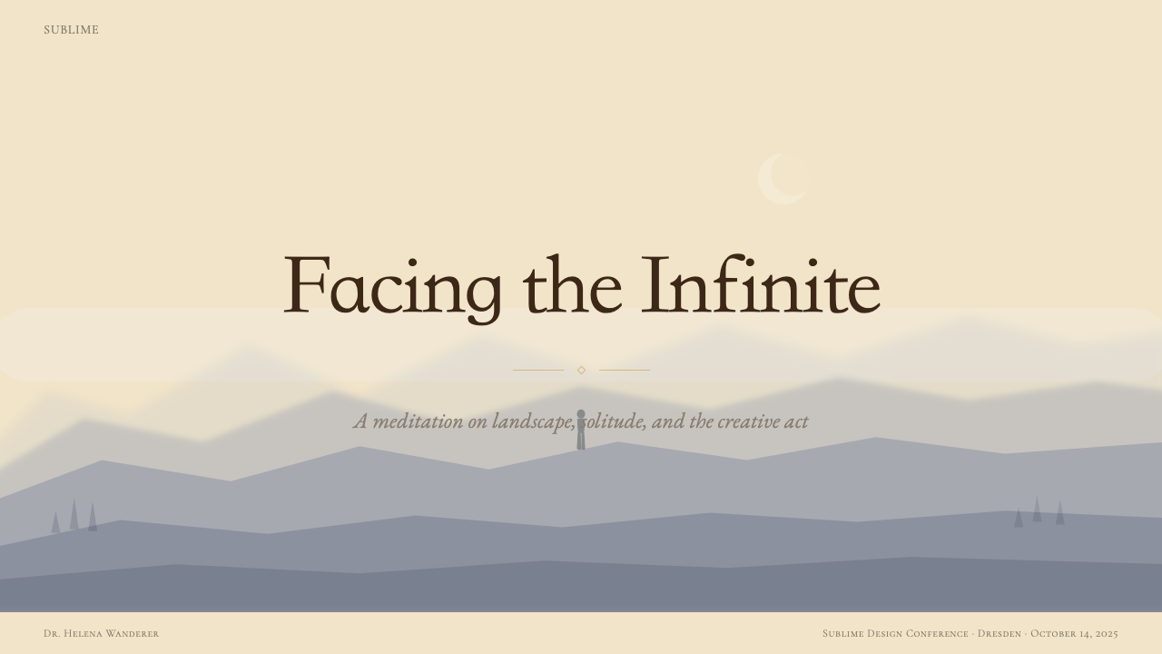
Caspar David Friedrich's visual language is built on a single, radical act: the figure turned away from the viewer. Where other traditions placed the human at the center of nature as its master or its measure, Friedrich positioned the lone wanderer as a supplicant — back to us, face to the void, dwarfed by mist, mountains, and the infinite sky. The landscape is not backdrop; it is protagonist. The human presence exists only to establish scale, and that scale is always humbling.卡斯帕·大卫·弗里德里希的视觉语言建立在一个单一而激进的姿态之上:背对观者的人物。其他传统将人置于自然的中心——作为自然的主宰或尺度;弗里德里希则将孤独的漫游者安置为一个恳求者——背朝我们,面向虚空,被迷雾、山峦与无垠天空所矮化。风景不是背景,而是主角。人的在场只是为了建立比例,而那个比例永远令人谦卑。
The palette that carries this emotional weight is deliberately narrow. Deep Prussian blue anchors the atmospheric voids and distant water. Pearl gray and silver-white mist diffuse the middle distances, dissolving firm edges into suggestion. Warm parchment and amber tones hold the foreground — gnarled oak roots, snow-dusted ruins, a lone pine silhouetted against dusk — before the eye is pulled irresistibly into the cold recession beyond. This warm-to-cold color journey encodes a journey of the soul: from the familiar and earthbound toward the transcendent and unknowable.承载这种情感重量的色板是刻意收窄的。深邃的普鲁士蓝锚定大气深渊与远处水面;珍珠灰与银白色的迷雾在中景漫漶,将坚实的边缘溶解为暗示;温暖的羊皮纸色与琥珀色调把持着前景——扭曲的橡树根、积雪的废墟、黄昏中的孤松剪影——然后,目光不可抗拒地被拉入冷峻的纵深远方。这段从暖到冷的色彩之旅,编码了一段灵魂的旅程:从熟悉的、大地般的此在,走向超验的、不可知的彼岸。
Friedrich's compositional approach is architectural in its precision. Foreground framing elements — a stone arch, a frame of fir branches, a cliff edge — enclose and direct the gaze into a luminous, receding depth. Hairline horizontal bands of subtly differentiated tone separate sea from sky, valley from ridge, fog layer from fog layer. The effect is not illustration but meditation: each painting is a structured invitation to dwell in vastness.弗里德里希的构图手法在精准上近乎建筑。前景的框架元素——石拱门、冷杉枝叶的边框、悬崖边缘——将视线围合并引导进一片光明而退缩的纵深。由细微不同色调构成的水平地带,将海面与天空、山谷与山脊、雾层与雾层彼此分隔。效果不是图解,而是冥想:每一幅画都是一次有组织的邀请,邀请观者驻留于广袤之中。
See the Caspar David Friedrich design system查看 Caspar David Friedrich 完整设计系统
Where does Caspar David Friedrich come from?Caspar David Friedrich 从何而来?
Caspar David Friedrich was born in 1774 in Greifswald, a Baltic port town then belonging to Swedish Pomerania. His early life was shadowed by a sequence of personal losses — his mother died when he was seven, and as a young man he witnessed his brother Christoph fall through ice and drown, possibly while attempting to save Caspar himself. These experiences of sudden absence and the cold indifference of nature appear to have marked his imagination permanently. He studied at the Copenhagen Academy of Fine Arts from 1794 to 1798, absorbing the Northern European tradition of topographic landscape painting, then moved to Dresden, where he would spend the rest of his life.卡斯帕·大卫·弗里德里希于1774年生于格赖夫斯瓦尔德,这是一座当时属于瑞典波美拉尼亚的波罗的海港口城镇。他早年生活笼罩在一连串个人丧失之下——母亲在他七岁时去世,青年时代他目睹弟弟克里斯托弗落入冰面之下溺亡,而那次事故据说正是弟弟在试图营救卡斯帕本人时发生的。这些骤然的缺席与自然冷漠的残酷体验,似乎永久地印入了他的想象世界。他于1794至1798年间在哥本哈根美术学院求学,吸纳了北欧地形风景画的传统,随后迁往德累斯顿,并在那里度过了余生。
Dresden in the early nineteenth century was a crucible of German Romantic thought. The philosopher Friedrich Schelling had argued that nature was the visible form of the infinite spirit, and that the artist's task was to find the Absolute within the finite world. The poet Novalis wrote of a 'blue flower' — Blaue Blume — as the symbol of Romantic longing for an unattainable ideal. Friedrich absorbed these ideas and translated them directly into paint. His breakthrough came in 1808 with 'The Cross in the Mountains' (Tetschener Altar), a painting that placed a crucifix at an alpine summit and framed it like an altarpiece — proposing, controversially, that landscape itself could function as a sacred image.十九世纪初的德累斯顿是德国浪漫主义思想的熔炉。哲学家弗里德里希·谢林主张,自然是无限精神的可见形式,艺术家的任务是在有限世界中寻找绝对本体。诗人诺瓦利斯以「蓝色之花」(Blaue Blume)为符号,象征浪漫主义对不可及理想的渴望。弗里德里希吸收了这些思想,并将其直接转化为绘画。他的突破来自1808年的《山中十字架》(泰申祭坛画),这幅画将一个十字架置于高山之巅,并以祭坛画的形式加以框定——颇具争议地提出,风景本身可以作为圣像而存在。
The years 1810 to 1825 — Friedrich's peak period, centered on Dresden — produced his most celebrated works. 'Wanderer above the Sea of Fog' (circa 1818) distilled the Romantic ideal of the solitary contemplative hero into a single unforgettable composition. 'Chalk Cliffs on Rügen' (1818) and 'The Wanderer above the Sea of Fog' used the island of Rügen — a place Friedrich visited repeatedly and associated with the purity of the Baltic coast and his own childhood — as a theater for spiritual encounter. 'The Sea of Ice' (1823–1824) transformed polar shipwreck into a meditation on nature's crushing indifference. Friedrich often collaborated with the painter and naturalist Carl Gustav Carus, who admired Friedrich and later wrote the 'Nine Letters on Landscape Painting,' helping to theorize the spiritual landscape tradition Friedrich had pioneered.1810至1825年间——以德累斯顿为中心的弗里德里希创作巅峰期——诞生了他最负盛名的作品。《雾海上的漫游者》(约1818年)将浪漫主义的孤独沉思英雄理想凝练为一幅令人难忘的构图。《吕根岛的白垩悬崖》(1818年)以吕根岛——弗里德里希反复造访、并将其与波罗的海海岸的纯净及自身童年相联结的地方——为灵魂相遇的剧场。《冰海》(1823—1824年)将极地船难转化为对自然碾压性冷漠的冥想。弗里德里希常与画家兼博物学家卡尔·古斯塔夫·卡鲁斯合作;卡鲁斯深为弗里德里希所折服,后来撰写了《关于风景画的九封信》,为弗里德里希所开创的精神风景画传统提供了理论依据。
Friedrich's reputation collapsed dramatically after 1825. Tastes shifted toward the realism and narrative history painting championed by the Düsseldorf School, and Friedrich — increasingly isolated, weakened by a stroke in 1835 — died in poverty in Dresden in 1840. His rediscovery came largely through the twentieth century: the Norwegian art historian Andreas Aubert and later the Symbolists recognized in Friedrich's work a precursor to their own spiritual preoccupations. By the mid-twentieth century, he was firmly established as one of the defining masters of German painting, and by the late twentieth century his imagery — the Rückenfigur (figure seen from behind), the misty gorge, the lone tree against twilight — had entered the global visual vocabulary as the defining image of Romantic solitude.1825年后,弗里德里希的声誉急剧衰落。时尚转向杜塞尔多夫学派所倡导的写实主义与叙事历史画;弗里德里希日益孤立,1835年中风后体力大衰,最终于1840年在德累斯顿贫困中离世。他的再发现在很大程度上源于二十世纪:挪威艺术史学家安德烈亚斯·奥伯特以及后来的象征主义者,在弗里德里希的作品中认出了与自身精神关切的先驱关系。至二十世纪中叶,他已作为德国绘画的决定性大师之一被牢固确立;至二十世纪末,他的视觉意象——Rückenfigur(背对观者的人物)、迷雾峡谷、暮色中的孤树——已进入全球视觉词汇,成为浪漫主义孤独的定义性图像。
What defines the Caspar David Friedrich look?Caspar David Friedrich 的视觉特征是什么?
Receding Depth层递纵深
Friedrich's compositions are organized around a consistent three-zone recession: a warm, detail-rich foreground of rocks, roots, or architectural ruins; a dissolving middle distance of mist and indistinct forms; and a luminous, cold, nearly featureless far distance. This spatial grammar communicates the Romantic idea that the material world gives way to the spiritual one as the eye travels inward. Applied to design surfaces, it translates as a layered visual hierarchy where foreground elements are grounded and warm, and background fields grow progressively cooler, lighter, and more diffuse.弗里德里希的构图围绕一种一贯的三区递退组织:温暖而细节丰富的前景——岩石、树根或建筑废墟;溶解于迷雾与模糊形态的中景;以及光明、冷峻、几乎没有特征的远景。这套空间语法传递了浪漫主义的核心理念:随着目光向内延伸,物质世界让位于精神世界。应用于设计界面,它转化为一种分层的视觉层级——前景元素有根基、有温度,背景区域则逐渐变得更冷、更亮、更弥散。
Contemplative Palette沉思色板
The core palette runs from deep Prussian blue and slate gray in the atmospheric depths, through silver-white and pearl mist in the middle registers, to warm parchment, amber, and muted ochre in the foreground. This is not an illustrative palette — it is a psychological one. Deep blue evokes the infinite and the nocturnal; parchment suggests the human and the historical; silver-white mist marks the threshold between the knowable and the unknown. The palette contains no saturated, high-energy accent colors. Every tone is modulated toward quietude.核心色板从大气深处的深普鲁士蓝与石板灰,经由中段音区的银白与珍珠迷雾,到达前景的温暖羊皮纸色、琥珀色与低调土黄。这不是一套图解性色板,而是心理性的。深蓝唤起无限与夜色;羊皮纸色暗示人的在场与历史的沉积;银白迷雾标记着可知与未知之间的门槛。这套色板中没有饱和的高能量强调色,每一个色调都向宁静方向调制。
The Rückenfigur背影人物
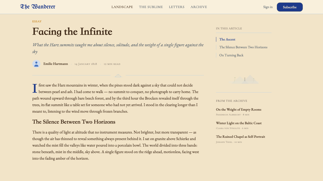
The most recognizable formal device in Friedrich's work is the figure seen entirely from behind — back to the viewer, face to the landscape. This figure functions as a surrogate: the viewer inhabits the figure's perspective rather than observing it as a separate subject. The psychological effect is one of shared solitude, of being drawn into the contemplative experience rather than witnessing it from outside. In design terms, this is the principle of the immersive view — a compositional choice that subordinates the near to the far and positions negative space, not the foreground element, as the true subject.弗里德里希作品中最具辨识度的形式装置,是完全从背后呈现的人物——背朝观者,面向风景。这个人物充当替身:观者进驻人物的视角,而非将其作为独立主体加以观察。心理效果是一种共享的孤独感——被引入沉思体验之内,而非从外部旁观。在设计层面,这是沉浸式视野的原则——一种将近景服从于远景、将负空间而非前景元素确立为真正主题的构图选择。
Atmospheric Dissolution大气溶解
Friedrich rendered fog, mist, and atmospheric haze not as obstacles to visibility but as active, meaning-laden presences. Forms in the middle and far distance lose their sharp edges and merge with the ambient atmosphere, creating a quality of visual suspension — objects that seem to float rather than rest. This dissolution is controlled and gradual, not random: near edges remain articulated, distant ones fade. The technique produces a measurable sense of depth without the need for strong perspectival geometry, relying instead on tonal graduation from warm-dark to cool-light.弗里德里希笔下的雾、薄霭与大气迷蒙不是可见性的障碍,而是主动的、充满意义的在场。中景与远景中的形体失去清晰边缘,与周遭大气融为一体,产生一种视觉悬浮的品质——物体似乎漂浮而非静止。这种溶解是受控而渐进的,不是随机的:近处的边缘仍保持清晰,远处的则逐渐消隐。这种技法无需强烈的透视几何,仅凭从暖-深到冷-亮的色调梯度,便制造出可量感的纵深。
Framing Architecture框架建筑
Friedrich consistently used strong foreground frames — Gothic arches, the silhouette of a ruined nave, overarching tree branches, cliff edges — to enclose and direct the gaze toward the luminous far distance. These frames are never neutral; they carry their own symbolic weight. A Gothic arch implies the sacred; a dead tree implies mortality; a cliff edge implies the limit of the known. The frame and the view it reveals are in dialogue, each qualifying the meaning of the other. This principle — that the container shapes the meaning of the contained — is directly applicable to screen layouts, where headers, panels, and borders are never merely structural.弗里德里希惯常使用强有力的前景框架——哥特式拱门、废弃中殿的剪影、拱起的树枝、悬崖边缘——将视线围合并引导向光明的远景。这些框架从不是中性的,它们承载着自身的象征重量:哥特式拱门暗示神圣;枯树暗示死亡;悬崖边缘暗示已知世界的边界。框架与它所揭示的视野处于对话之中,彼此限定对方的意义。这一原则——容器塑造所含之物的意义——可直接应用于屏幕版面,其中页头、面板与边框从来不仅仅是结构性的存在。
Silence as Tone寂静即音调
Friedrich's canvases are almost entirely devoid of narrative event. No action is depicted; no story is being told. The single figure stands, or sits, or looks. The landscape simply exists — vast, quiet, indifferent. This deliberate emptiness is not a failure of content but a content in itself: the experience of being alone before something immensely larger than oneself. In typographic and compositional terms, this translates to a willingness to leave large expanses of a surface unoccupied, treating generous negative space not as waste but as the primary communicative material.弗里德里希的画布几乎完全没有叙事事件。没有动作被描绘,没有故事被讲述。单一的人物站立、或端坐、或凝望。风景就那样存在——广袤、寂静、漠然。这种刻意的空旷不是内容的缺失,而是内容本身:独自面对某个远比自身宏大之物时的体验。在排印与构图层面,这转化为一种意愿:将版面的大面积区域留白,视慷慨的负空间不为浪费,而为首要的传达材料。
Symmetry of Weight, Not Form重量而非形式的对称
Friedrich's most celebrated compositions are not strictly symmetrical, yet they feel profoundly balanced. 'Wanderer above the Sea of Fog' places the figure slightly left of center; the mist and mountain peaks are disposed asymmetrically around him. Balance is achieved through visual weight — the density of tonal contrast in one region answering the diffuse openness of another. This is compositional tension held in equilibrium rather than the static rest of mirror symmetry. It is a balance that feels earned rather than given, dynamic rather than inert.弗里德里希最著名的构图并非严格对称,却给人以深刻的平衡感。《雾海上的漫游者》将人物置于略偏中心的位置;迷雾与山峰的分布则围绕他不对称展开。平衡是通过视觉重量来实现的——某一区域色调对比的密度,回应着另一区域漫射般的开阔。这是张力在平衡中维持,而非镜像对称的静态安息。这是一种感觉上被赢得而非被给予的平衡,是动态的而非惰性的。
See the Caspar David Friedrich design system查看 Caspar David Friedrich 完整设计系统
Who shaped Caspar David Friedrich?谁塑造了 Caspar David Friedrich?
Friedrich (1774–1840) remains the central figure of the German Romantic landscape tradition and the originator of the visual grammar this style is drawn from. Working almost entirely in Dresden, he transformed the topographic landscape tradition he absorbed in Copenhagen into a vehicle for spiritual and philosophical meditation. His output spans oil paintings, sepia drawings, and prints, all unified by the same compositional and emotional logic. Despite a dramatic fall from critical favor in his final decade, he has since been established as one of the most influential painters in European art history, his imagery recycled by filmmakers, photographers, and designers from the late nineteenth century to the present.弗里德里希(1774—1840年)是德国浪漫主义风景画传统的核心人物,也是本设计风格所汲取的视觉语法的创始者。他几乎全在德累斯顿创作,将在哥本哈根习得的地形风景画传统转化为精神与哲学冥想的载体。他的作品涵盖油画、棕色墨水素描与版画,统一于同一套构图与情感逻辑之下。尽管在生命最后十年里声誉急剧下滑,他此后被确立为欧洲艺术史上最具影响力的画家之一,其视觉意象被从十九世纪末至今的电影人、摄影师与设计师反复借鉴。
Carus (1789–1869) was a physician, naturalist, and painter who became Friedrich's close friend and intellectual companion in Dresden. His 'Nine Letters on Landscape Painting,' published between 1815 and 1824, provided the theoretical framework for the spiritual landscape tradition Friedrich practiced — arguing that landscape painting at its highest aspiration was 'earth-life painting' (Erdlebenbildkunst), a form of visual philosophy. Carus documented Friedrich's working methods and preserved accounts of his thought that help illuminate the intentionality behind the visual decisions.卡鲁斯(1789—1869年)是医生、博物学家兼画家,在德累斯顿成为弗里德里希的挚友与思想伴侣。他于1815至1824年间发表的《关于风景画的九封信》为弗里德里希所实践的精神风景画传统提供了理论框架——主张风景画在其最高志向上是「大地生命画」(Erdlebenbildkunst),一种视觉哲学形式。卡鲁斯记录了弗里德里希的创作方法,留存了关于其思想的陈述,有助于阐明那些视觉决策背后的意图性。
Runge (1777–1810) was Friedrich's contemporary and the other great originator of German Romantic painting. Where Friedrich oriented his work toward landscape and the horizon, Runge pursued a symbolic, allegorical mode centered on the human figure and the cycle of day and night. His major project, 'The Times of Day,' proposed a total integration of painting, music, and poetry into a single contemplative artwork. Runge died at thirty-three, leaving his ambitions largely unrealized, but his theoretical writings on color — developed independently from Goethe — influenced the broader Romantic color sensibility that informs this design tradition.龙格(1777—1810年)是弗里德里希的同时代人,德国浪漫主义绘画的另一位重要开创者。弗里德里希将目光导向风景与地平线,龙格则追求以人物形象与昼夜循环为中心的象征性、寓言性模式。他的主要项目《一天的时辰》提出将绘画、音乐与诗歌整合为单一的冥想艺术作品。龙格三十三岁即去世,抱负大多未能实现,但他独立于歌德发展的色彩理论写作,影响了更广泛的浪漫主义色彩感性,而这一感性正是本设计传统的来源之一。
Johann Wolfgang von Goethe (1749–1832) was not a visual artist but exerted enormous influence on the Romantic movement through his 'Theory of Colors' (Farbenlehre, 1810) and his role as the pre-eminent cultural authority of German Romanticism. Goethe saw color as a phenomenological experience rather than a purely physical fact, arguing that colors carry inherent emotional and moral qualities — blue produces a restless, yearning state; yellow is cheerful and active; red is serious and dignified. While Goethe criticized some of Friedrich's work as too private and obscure, his broader framework for understanding color as expressive rather than merely descriptive is foundational to the emotional logic of Friedrich's palette.约翰·沃尔夫冈·冯·歌德(1749—1832年)本人并非视觉艺术家,却通过其《颜色论》(Farbenlehre,1810年)以及作为德国浪漫主义首席文化权威的地位,对浪漫主义运动施加了巨大影响。歌德将色彩视为现象学体验而非纯粹的物理事实,主张色彩承载着固有的情感与道德品质——蓝色产生一种不安的、渴慕的状态;黄色欢快而主动;红色严肃而庄重。尽管歌德批评弗里德里希的部分作品过于私密与晦涩,但他将色彩理解为表现性而非仅仅描述性的更广泛框架,是弗里德里希色板情感逻辑的基础。
Dahl (1788–1857) was a Norwegian landscape painter who settled in Dresden and became Friedrich's closest friend and householder — the two men literally shared a building for many years. While Dahl's own naturalistic style diverged from Friedrich's spiritualized approach, his presence in Dresden's artistic community kept Friedrich connected to the broader European landscape tradition and the Northern Romantic networks centered on Scandinavia and the Baltic coast. Dahl was also responsible for preserving many of Friedrich's works and advocating for his legacy after Friedrich's death and eclipse.达尔(1788—1857年)是一位定居德累斯顿的挪威风景画家,成为弗里德里希最亲密的朋友与同居者——两人字面意义上在同一栋楼里共同生活了多年。尽管达尔本人的自然主义风格与弗里德里希的精神化取向相异,他在德累斯顿艺术圈的在场,使弗里德里希与更广泛的欧洲风景画传统以及以斯堪的纳维亚和波罗的海海岸为中心的北方浪漫主义网络保持联结。弗里德里希去世并遭遮蔽之后,达尔也是保存其大量作品、倡导其遗产的关键人物。
How do you use Caspar David Friedrich today?今天怎么用 Caspar David Friedrich?
Friedrich's visual grammar is not simply a color palette to borrow — it is a spatial and emotional system built on the logic of recession, contemplation, and the subordination of the near to the far. Applying it correctly to contemporary digital surfaces requires understanding what the system is actually doing: creating a felt sense of depth through tonal temperature, reserving warm and detailed elements for the foreground plane, and treating the background as the true subject — the vast, open, quietly luminous field that gives foreground elements their meaning.弗里德里希的视觉语法不仅仅是一套可以借用的色板,而是建立在纵深退隐、沉思与近景服从远景逻辑之上的空间与情感系统。将其正确应用于当代数字界面,需要理解这套系统实际在做什么:通过色调温度制造纵深的感受,将温暖而细节丰富的元素保留给前景平面,并将背景视为真正的主题——那片广阔、开放、静静发光的场域,为前景元素赋予意义。
For presentation slides, this style works with particular force on cover and transition pages. A cover should commit to the three-zone recession: a strongly colored or textured foreground element at the bottom of the frame, a soft middle band of mist-tone — silver-gray, pearl, or cool white — that blurs into nothing, and a pale, luminous sky-field at the top with the title set in fine, period-echoing serif type. Content slides should carry the spatial logic more quietly: parchment-warm panels floating on a cool, receding background field, section headers in slate, data presented with the restraint of a scientific illustration. Avoid energetic compositional movement — Friedrich's slides should feel still.在演示文稿中,这种风格在封面与过渡页上具有特别强的效果。封面应全情投入三区递退结构:帧面底部一个色彩强烈或质感丰富的前景元素,中间一条柔和的迷雾调——银灰、珍珠或冷白——溶解消失,顶部是苍白而发光的天空场域,标题以纤细的、呼应时代感的衬线字体置于其上。内容页应将空间逻辑表达得更安静:羊皮纸暖调面板漂浮于冷峻退后的背景场域之上,节标题以石板色处理,数据呈现保有科学插图般的克制。避免充满能量的构图动势——弗里德里希风格的幻灯片应给人静止的感受。
For web interfaces and dashboards, this style is best suited to products that wish to project depth, authority, and meditative calm rather than speed or playfulness. A pricing page or comparison dashboard using this visual language might use deep slate-blue as the primary surface, layered with pearl-gray card panels that read as floating in shallow depth. Interactive states should use the warmest tones in the palette — muted amber or parchment — as hover and selection indicators, reserving the coldest blues for inactive or background states. Navigation should be spare and typographic, with thin hairline rules used instead of heavy separators.对于网页界面与仪表板,这种风格最适合希望传递纵深感、权威感与冥想式宁静的产品,而非追求速度或玩趣。使用这套视觉语言的定价页面或对比型仪表板,可以将深石板蓝作为主要界面底色,叠加珍珠灰卡片面板,呈现出漂浮于浅纵深之中的质感。交互状态应使用色板中最温暖的色调——低调琥珀或羊皮纸色——作为悬停和选中的指示,将最冷的蓝色保留给非激活或背景状态。导航应简洁而字体化,以细发线规则代替粗重分隔线。
For editorial and marketing work, Friedrich's compositional logic supports layouts of unusual gravitas. A long-form article design might open with a full-width image field that occupies the top two-thirds of the viewport, with body text anchored at a narrow measure at the foot of the frame — reprising the figure-standing-at-the-horizon compositional logic in typographic terms. Marketing pages benefit from alternating between a cool, deep-receding background section and a warm-foreground section with rich parchment tone, creating the warm-to-cold rhythmic alternation that drives Friedrich's spatial narrative. Pull quotes should float in the mist zone — set in a lighter tone against the mid-range background, occupying the middle distance.对于编辑与营销内容,弗里德里希的构图逻辑支持具有非凡庄重感的版面。长篇文章设计可以以占据视口上方三分之二的全宽图像场域开篇,正文以窄行宽锚定于帧底——将「人物伫立于地平线前」的构图逻辑以排印的方式重演。营销页面受益于在冷峻深退背景区段与富有羊皮纸暖调的前景区段之间交替,制造出驱动弗里德里希空间叙事的暖-冷节律性交替。引述段落应漂浮在迷雾地带——以相对中段背景更浅的色调呈现,占据中景。
A common mistake when applying this style is treating it as a dark, moody aesthetic and increasing contrast and saturation to produce drama. Friedrich's actual palette is not high-contrast — it is atmospherically diffuse, relying on subtle tonal gradation rather than strong value jumps. Saturating the Prussian blue toward electric or navy, or forcing the foreground and background into high-contrast opposition, destroys the mist and recession that are the style's defining qualities. The goal is quietude, not intensity. Another frequent misstep is using this style for content that demands urgency or action — calls to action, checkout flows, error states — where the contemplative slowness becomes a liability rather than a strength.应用这种风格时最常见的错误,是将其视为一种黑暗而充满情绪的美学,通过提高对比度与饱和度来制造戏剧性。弗里德里希的真实色板并非高对比度的——它在大气上是弥散的,依赖微妙的色调梯度而非强烈的明度跳跃。将普鲁士蓝向电光蓝或深海蓝饱和,或将前景与背景强制推入高对比度对立,会摧毁风格定义性品质中的迷雾与纵深。目标是宁静,不是强烈。另一个常见失误,是将这种风格用于需要紧迫感或行动力的内容——行动号召、结账流程、错误状态——在这些场合,沉思式的缓慢成为负担而非优势。
See the Caspar David Friedrich design system查看 Caspar David Friedrich 完整设计系统
Caspar David Friedrich — FAQCaspar David Friedrich · 常见问题
How is this style different from other Romantic landscape traditions?这种风格与其他浪漫主义风景画传统有何不同?
The British Romantic landscape tradition — Turner and Constable above all — is equally atmospheric but oriented toward the drama of weather, light, and sublime terror. Turner's skies explode with chromatic energy; Constable's fields are damp and mortal. Friedrich's German Romantic counterpart is quieter, more formal, and more explicitly spiritual. Where Turner paints the storm, Friedrich paints the stillness after the storm. Where Constable grounds the viewer in agricultural England, Friedrich turns the viewer away from the familiar world entirely. Compositionally, Friedrich is also more architectural and symmetrical in his underlying geometry, relying on a stable horizon line and frontal framing that other Romantic traditions often deliberately destabilize.英国浪漫主义风景画传统——首先是透纳与康斯太布尔——同样富有大气感,但导向天气、光线与崇高恐怖的戏剧性。透纳的天空以色彩的能量爆炸;康斯太布尔的田野湿润而有死亡气息。弗里德里希的德国浪漫主义同行更安静、更形式化、更明确地带有精神性。透纳画风暴,弗里德里希画风暴之后的静寂。康斯太布尔将观者根植于农业英格兰,弗里德里希则将观者完全转离熟悉的世界。在构图上,弗里德里希的底层几何也更具建筑性与对称倾向,依赖稳定的地平线与正面框架——而其他浪漫主义传统常常刻意将此不稳定化。
Can this style work for light-mode and dark-mode interfaces equally?这种风格在亮色模式和深色模式界面上都能发挥作用吗?
Friedrich's canonical palette is light-ground — parchment and pearl mist over Prussian blue depths, with sky-fields tending toward pale luminosity rather than darkness. A light-mode implementation is most historically faithful and tends to produce the mist and recession the style depends on. A dark-mode inversion is possible — using deep slate as the ground, floating pearl and warm parchment panels as elevated surfaces — but requires more care. The risk in dark mode is that the warm foreground tones become too prominent and the cool background loses its sense of infinite recession. In dark mode, restraint with warm tones is essential: they should appear as gentle illumination, not as aggressive contrast.弗里德里希的标准色板是浅色底面——羊皮纸和珍珠迷雾覆盖于普鲁士蓝深处之上,天空场域倾向于苍白的发光而非黑暗。亮色模式的实现最忠实于历史原型,也最能产生这种风格所依赖的迷雾与纵深感。深色模式的反转是可行的——以深石板色为底面,以珍珠色与暖羊皮纸色的面板作为抬升的界面层——但需要更谨慎。深色模式的风险在于,暖调前景色调变得过于突出,而冷调背景失去无限纵深的感觉。在深色模式下,对暖色调的克制至关重要:它们应当以柔和的光晕出现,而非作为攻击性的对比。
Is this style appropriate for data-heavy products like analytics dashboards?这种风格适合数据密集型产品(如分析仪表板)吗?
It can be, with deliberate adaptation. Friedrich's style is naturally suited to contexts where depth, authority, and a sense of looking into something vast are desirable — which maps well to certain analytical tools where the user is surveying large datasets and needs to feel oriented in a complex information landscape. The risks are the style's slowness and quietude: a dashboard that demands rapid scanning and instant comparison may suffer if the color system is too muted and the spatial hierarchy too atmospheric. The practical approach is to use the Friedrich spatial logic for macro layout and navigation — cool, receding backgrounds; warm, floating foreground panels — while using sharper tonal contrast within individual charts and data elements to ensure local readability.可以,但需要有意识地调适。弗里德里希的风格天然适合那些希望传递纵深感、权威感以及「凝视某个广阔事物」感受的场景——这与某些分析工具相当吻合,在那里用户正在俯览庞大数据集,需要在复杂的信息全景中感到有所定向。风险在于这种风格的缓慢与宁静:一个需要快速扫描和即时对比的仪表板,若色彩系统过于低调、空间层级过于大气漫漶,可能会受到影响。实际的做法是:将弗里德里希的空间逻辑用于宏观版面与导航——冷调、退后的背景;温暖、漂浮的前景面板——同时在单独的图表与数据元素内部使用更清晰的色调对比,以确保局部可读性。
What typefaces best suit this visual tradition?哪些字体最适合这种视觉传统?
Friedrich's work predates modernist typography entirely — his era was one of German blackletter scripts and the transition toward the early humanist serifs that would characterize nineteenth-century book design. The typographic tradition most congruent with this style is the early nineteenth-century roman and italic: letterforms with moderate contrast between thick and thin strokes, slightly bracketed serifs, and a quality of quiet elegance rather than either extreme of geometric precision or baroque decoration. Avoid ultra-modern geometric sans-serifs — they import the wrong century. Avoid heavily decorative Victorian display types — they are too ornamental. A well-set classical serif at a considered scale and weight is the appropriate choice, paired with very restrained use of italic for mood and emphasis.弗里德里希的作品完全早于现代主义排印——他所处的时代是德语黑体脚本以及向早期人文主义衬线体过渡的时代,而后者将成为十九世纪书籍设计的特征。与这种风格最为契合的排印传统,是十九世纪初的罗马体与斜体:笔画粗细对比适中、衬线略带括弧、具有一种安静的优雅品质——既非几何精准的极端,也非巴洛克装饰的另一端。避免超现代的几何无衬线字体——它们引入了错误的世纪感。避免维多利亚时代装饰性极强的展示字体——它们过于繁饰。在经过考量的尺度与字重下排好的经典衬线体,是恰当的选择,辅以极为克制的斜体用于营造情调和强调。
Which kinds of brands or products should avoid this style?哪些类型的品牌或产品应该避免这种风格?
Friedrich's visual language communicates solitude, contemplation, spiritual gravity, and a longing for the infinite — qualities that are genuinely desirable for certain products and actively counterproductive for others. Brands oriented toward community, warmth, celebration, or fast-paced interaction should avoid it: social platforms, marketplace products, food and beverage brands, children's applications, and consumer entertainment products all benefit from visual languages that foreground human connection and sensory pleasure rather than solitary introspection. High-conversion e-commerce contexts will also struggle — the quiet pace of Friedrich's atmosphere works against the urgency that drives purchase decisions. The style is best reserved for products where the user experience benefits from contemplative depth: premium editorial platforms, research tools, heritage luxury goods, cultural institutions, and any product where the user's fundamental mode is reflective rather than reactive.弗里德里希的视觉语言传递孤独、沉思、精神庄重感与对无限的渴望——这些品质对某些产品而言是真正可取的,对另一些则是积极有害的。以社群、温暖、庆典或快节奏互动为导向的品牌应当避免:社交平台、市场型产品、食品饮料品牌、儿童应用和消费娱乐产品,均受益于以人际联结与感官愉悦为前景的视觉语言,而非孤独的内省。高转化率的电商场景也会受到挑战——弗里德里希大气感的安静节奏与驱动购买决策的紧迫感相悖。这种风格最好保留给那些用户体验受益于沉思深度的产品:高端编辑平台、研究工具、传统奢侈品、文化机构,以及任何用户基本模式是反思性而非反应性的产品。
Related design styles相关设计风格
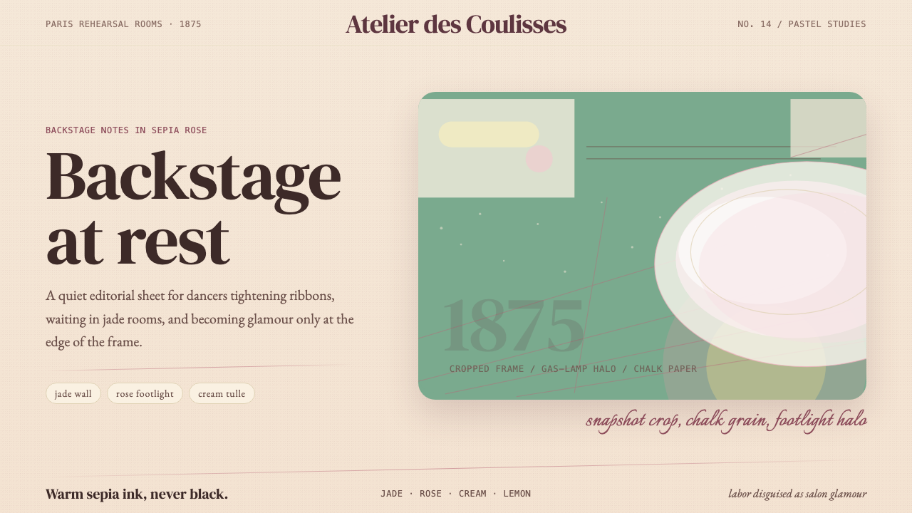 Degas Ballet PastelsBackstage glamour is labor. Jade walls, rose footlights, cropped serifs on cr…后台华丽即劳动。玉墙、玫瑰脚灯与裁切衬线落在奶油纸上。
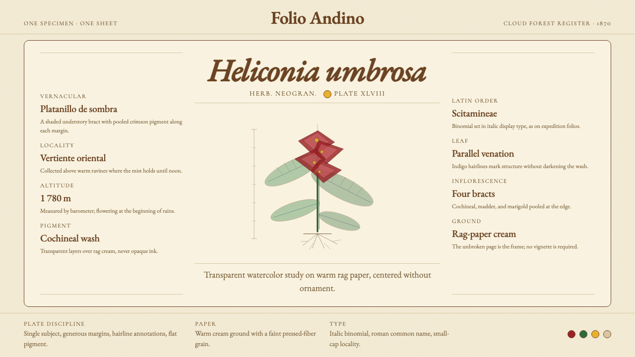 Colombian Botanical (Triana)Observation becomes ornament. Crimson watercolor specimen breathes on cream r…观察即装饰。绯红水彩标本静置于奶油破布纸。
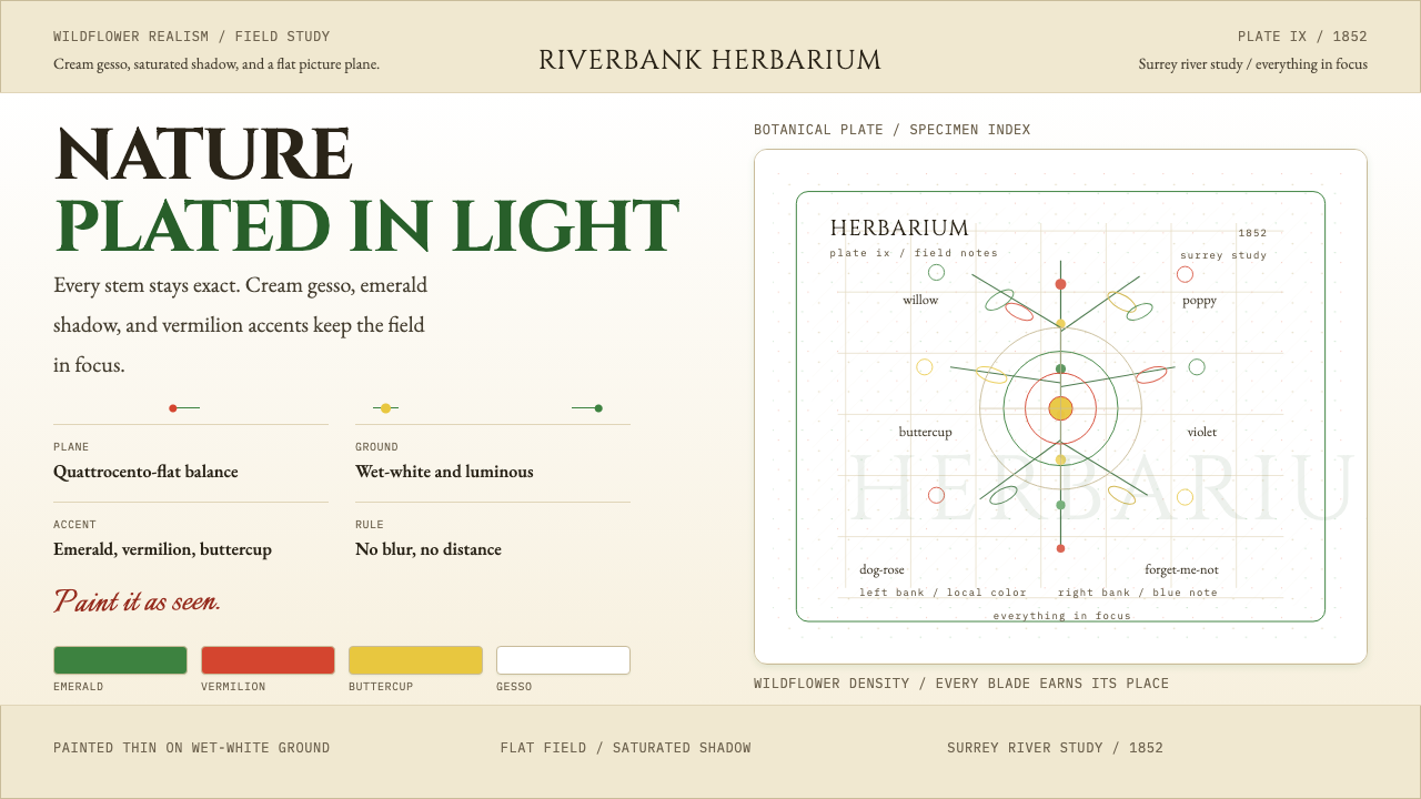 Millais — Ophelia / Wildflower Pre-RaphBotany, rendered with conviction. Cream gesso, emerald, and vermilion stay in…植物画得极其笃定。奶油底、祖母绿、朱红始终清晰。
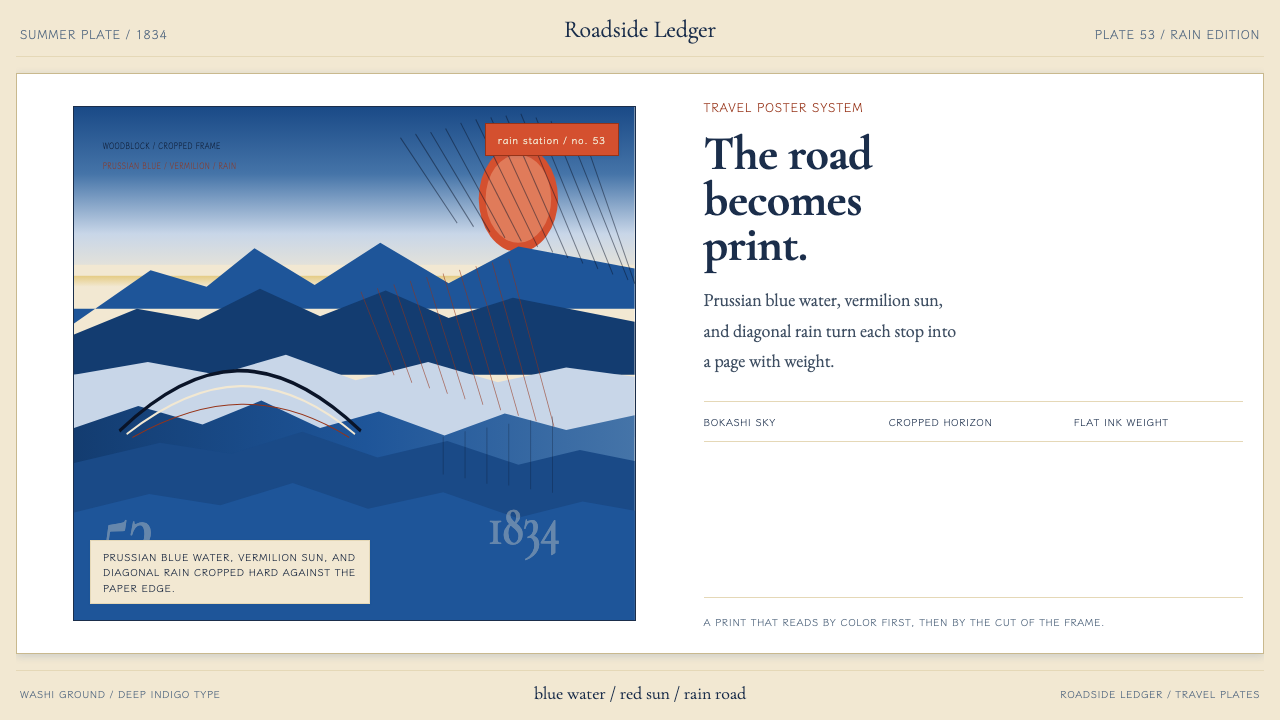 Hiroshige — Tokaido RoadA road print in motion. Prussian blue blocks, vermilion cartouches, diagonal…会行进的路途海报。普鲁士蓝色块、朱红题签与斜雨。
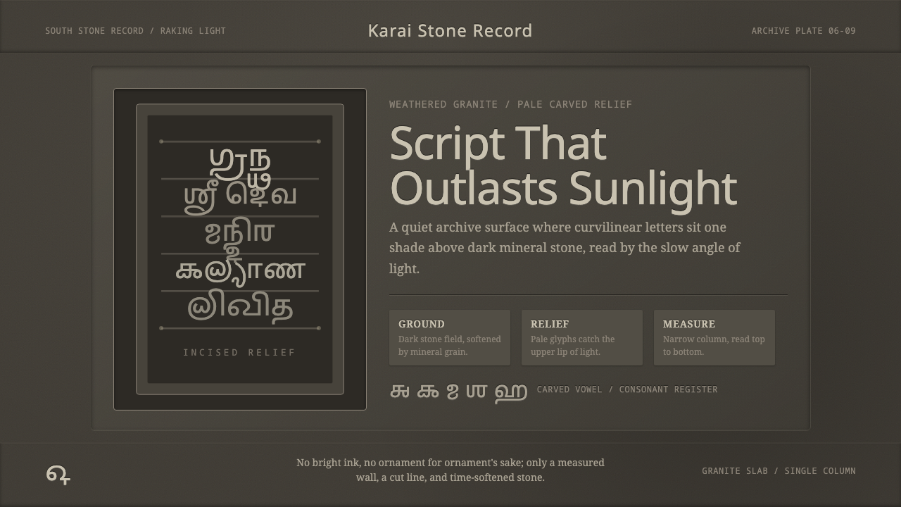 Tamil Grantha InscriptionSacred stone, quietly lit. Pale Grantha glyphs float on dark granite in a nar…肃穆如石:浅色格兰塔字浮在暗花岗岩上,窄列静读。
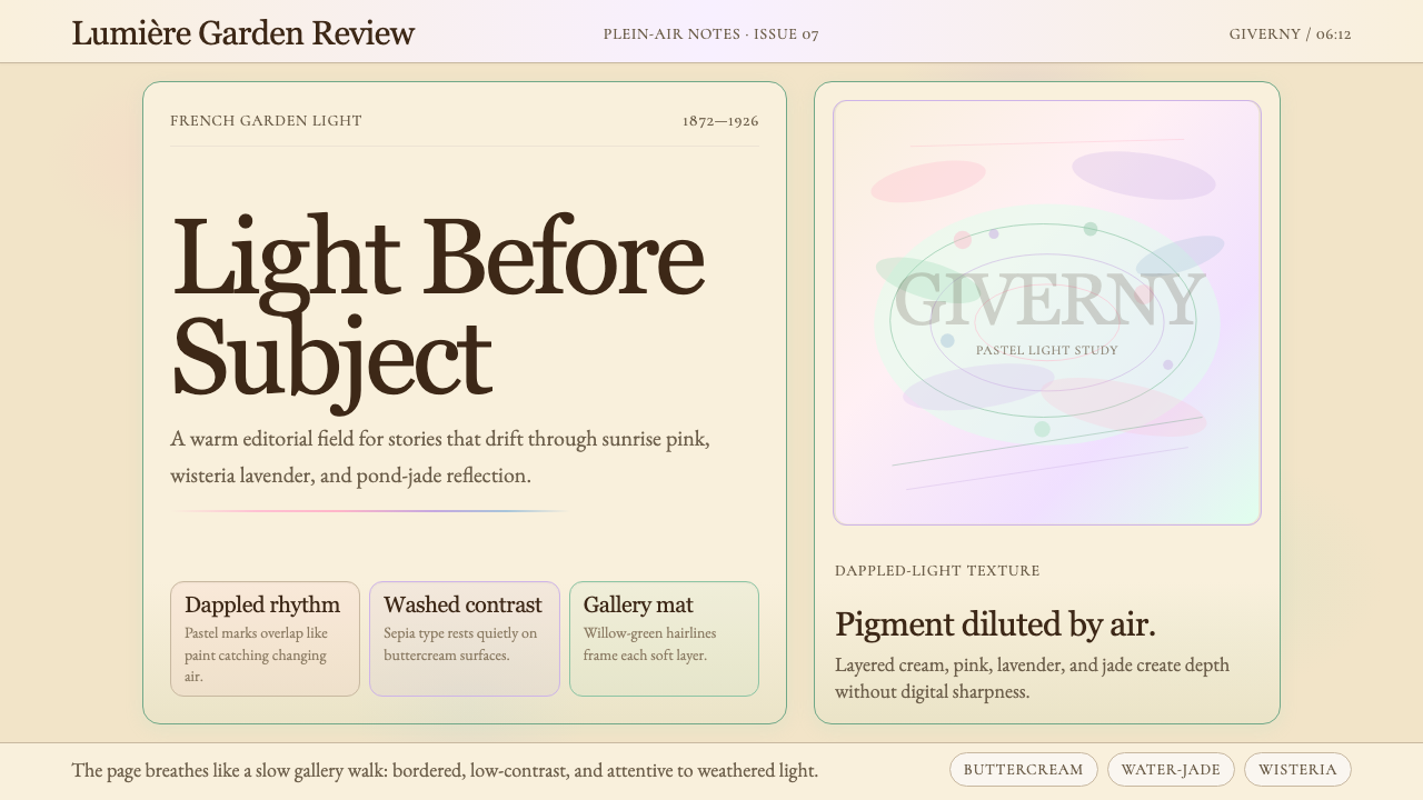 Claude Monet ImpressionistLight becomes the subject. Buttercream, pastel dapples, and Cormorant serif s…光成为主题。奶油底、粉彩斑点与Cormorant衬线柔化画面。